#design guidelines
Explore tagged Tumblr posts
Visit Tumblr Blog
Explore Tumblr blogs with no restrictions, modern design and the best experience.
Last Seen Tumblr Blogs


Fun Fact
In 2020, 44% of users from Denmark used Tumblr daily.
Text

i see you in my nightmares
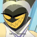
#very.. very quick fintan thing… wanted to see how fast i could paint a portrait but forgot to time it.. think it was around 1 hr 40 min??#i’m still working on his design… squashes him like a bug#he’s shirtless because i didn’t make a sketch for this and it’s way too hard to draw clothes without guidelines ❤️ call it artistic nudity#kotlc#kotlc fanart#keeper of the lost cities#keeper of the lost cities fanart#fintan pyren#procreate#sketch#kinda#my art#costracan
69 notes
·
View notes
Text
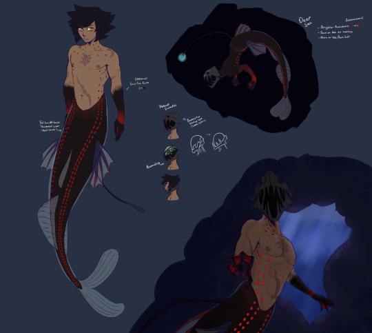
(*^▽^*) HI HELLO... i wanted to get this done before the end of may but ummmm well things happen. so!!! i wanted to take a shot at mer!vani (i like to think of it as world form but honestly im also just a sucker for mermaids) hes supposed to be a viperfish!
#escuerel's art#kh#kingdom hearts#vanitas#kh vanitas#vanitas kh#ummmm <:)c i also realized the lure would look different only after i was almost done AND how viperfish use their lures isnt like that#but it was already drawn. + who cares + having fun + playing#i tend to lean toward simpler designs i feel like i couldve done more but im satisfied with it.#vanitas having a red color scheme makes it easy for him to be a deep sea fish because of how red works as a color its neat#also!!! i dont make references i am a big “i just wing it” person so this is new!!! so sorry <:3c#i also dont take references as strict guidelines if you think something would look better drawn some way go for it if u draw this!!
155 notes
·
View notes
Text
looking at fanart of the presaux team together is so funny because you'll be like omg look at them all!!! there's mensah, that one's pin-lee, and that's ratthi of course. and there's arada and overse, you can tell it's them cus they're posed together, probably also next to ratthi, no clue which one's which but they look great,
#none of presaux get a ton of description but like#i think generally the fandom follows some general guidelines for how a lot of them look#or you can identify them from a specific trait (like Gurathins augments)#but arada and overse? we got nothing#no consistency in their designs#which honestly? i love that for us. love that for them#possibly the most variety in design outside murderbot itself#you go girls. shout out arada and overse#the murderbot diaries
117 notes
·
View notes
Text

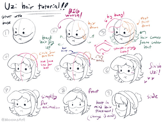
Someone asked me for a tutorial on how I draw the biscuitbites (specifically their hair) so here it is!
#murder drones#serial designation n#uzi doorman#md n#md uzi#md#moon’s art#I'm unsure if my handwriting is clear or not rip#either way this isn't like very specific guidelines or anything#none of my previous murder drones art has ever had the exact same hair lol#ESPECIALLY for N he's the hardest#but still! hope it helps! most important thing is to have fun <3
94 notes
·
View notes
Text
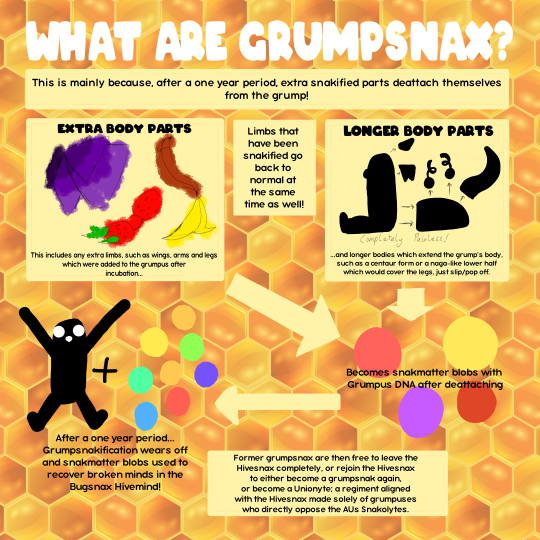
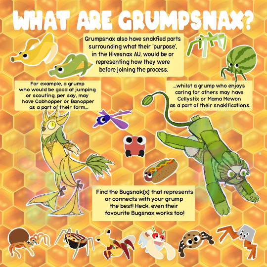
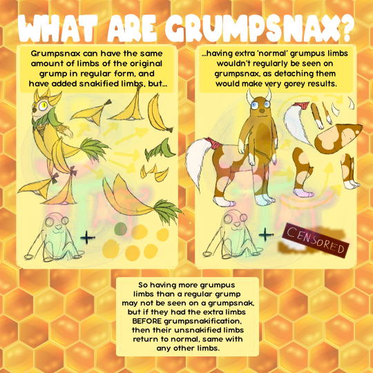
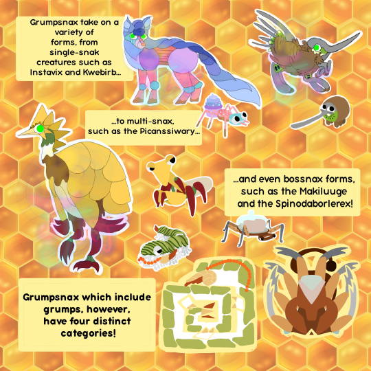
Grumpsnax Guidelines
CLICK ON THE IMAGES FOR BETTER QUALITY
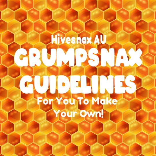

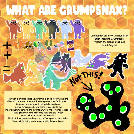
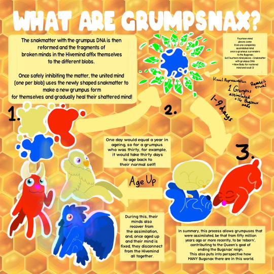
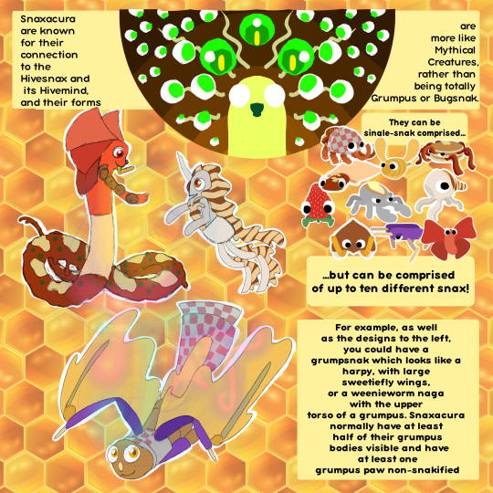
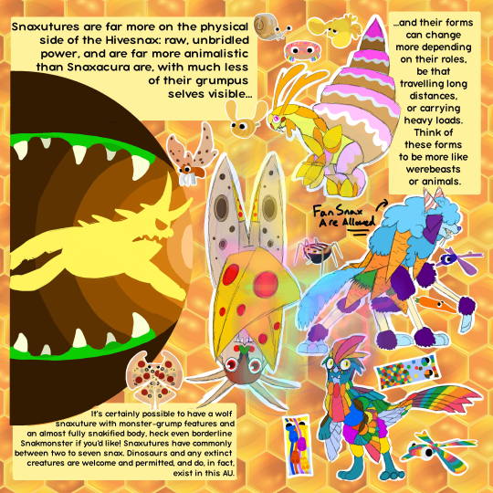
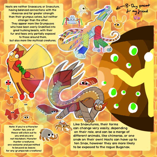
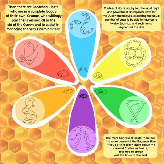

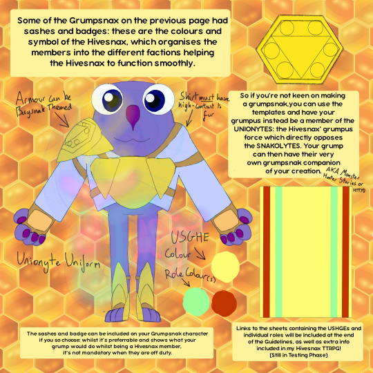
As a quick reminder, sashes have the base colour of the USHGE (Check the sheets if you're not sure), then have a trim/pattern of the colour which matches the jobs/roles your Unionyte or Grumpsnak would have! You could even have more than one and not belonging to the same USHGE, but maybe make sure to have the colours of the USHGEs they're involved with.
Here are the links as promised!
For the Different Positions and USHGEs - Hivesnax AU Roles/Jobs
For the TTRPG - Hivesnax TTRPG
For a Collab We did - Hivesnax Collab
And For the Current Contessal Hosts - Contessal Hosts
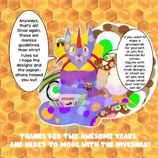
Check out more awesome posts and tag your creations with my username or #hivesnax au / #hivesnax I do not mind being tagged as long as it's not spam (this is tumblr I absolutely expect spam XD)
HUGE THANKS TO
@orb-the-watchman @moominmamma-time @studyingmoominvalley @azazel-embers @braverynight @/millymoon @andykitkatt @polysquad11 @fungusry @renguro-main and @averie-flickersnap for allowing me to use their Grumpsnax designs! They're all amazing people, please check them out!
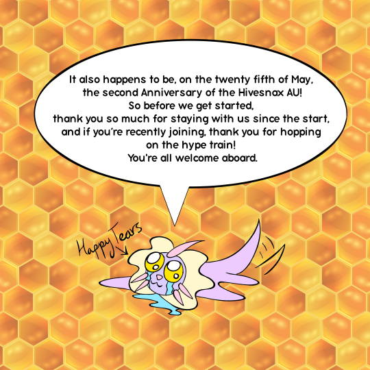
THANK YOU AGAIN FOR 2 YEARS OF HIVESNAX CRAPPERY
AND IF YA STILL DON'T KNOW WHY YOU'RE HERE
HERE IS THE ENTIRE SERIES-- TAGS ARE SUPPLIED AS WARNINGS, I UPDATE WHENEVER I'M INSPIRED
GO AND ENJOY AND THANK YOU!
G'NIGHT
~ Kay
#bugsnax#art#bugsnax au#bugsnax oc#hivesnax au#hivesnax#artwork#anniversary post#ANNIVERSARY OF THE HIVESNAX LETS GOOOOOO#character design#character guidelines#character creation#worldbuilding#creeetuurreessss#digital art#creatures#grumpsnax
80 notes
·
View notes
Text
unrelated tangle design rambling. but i really love that she DOESN’T look 100% like a real life ringtailed lemur with her markings and color balance.
out of any (idw-present) sonic character except maybe marine and sticks, tangle has the color palette most true to her irl species inspiration… which isn’t bad, because ringtailed lemurs ARE very visually striking animals, and white and grey are colors that always play nice with one another. (white being a very hue-adopting color also gives you great opportunity to exploit different lightings for her! the only drawback of her color scheme i see is the wide variance in light vs dark greys used for her, which you can see both in fanart and official art, that looks very inconsistent… <- which is a frequent thing as far as any portrayal of tangle anyway :,D)
but i like that she’s different and not JUST a carbon copy of a ringtailed lemur, that she gets a little bit of unique flair in having ‘inverted’ colors. it actually gives her a distinct appearance, as opposed to being a generic example character, while still maintaining resemblance to her species inspiration. (it still kinda looks like she’s just a hybrid of sifaka and ringtailed lemurs, but ¯\_(ツ)_/¯)
similarly, i love messing around with yellow/orange eyes for tangle… but i appreciate her canon eyes being purple, A] because it’s stylish and cool, B] because it’s distinct (and infrequently used)
anyways tangle’s design is peak, and both gives a lot of room for cool artistic reinterpretations, AND is a design that’s really solid as-is
#like it’s not a hard rule ‘no yellow eyes on tangle’ or ‘no realistic lemur patterns on tangle’ for me#but the part of me that loves taking guidelines and just twisting them a little to the side#a little out of shape to make something new#loves that her *base* design is something different from the norm. that you can bring it back to accurate ringtail if you want-#-but it’s not the seed EVERYONE works off. yknow?
12 notes
·
View notes
Text


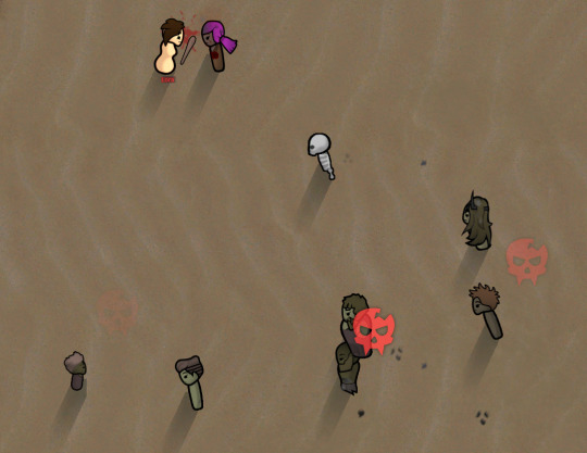
A shambler summoning ritual was the easiest one to do in a short amount of time- and they were fortunately intimidating enough to stop the cultist's skip abduction ritual. Hooray! We love shamblers. I think the skeleton one is especially cool.
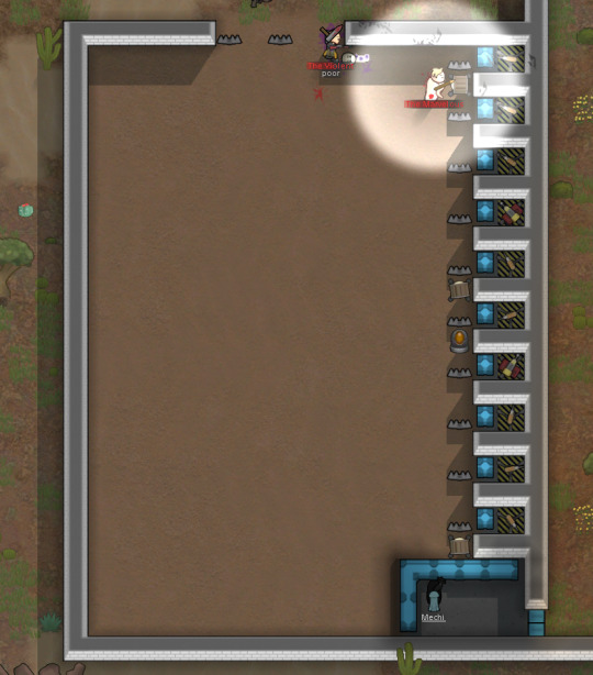

The few (three) cultists not beaten to a pulp by the shamblers were quickly dealt with by Mechi and his newly-constructed (and probably very poorly designed) killbox.
First | Next | Previous
#rimworld#gracie plays#A Mechanitor's Message#art#my art#traditional art#rimworld art#unpolished art#slightly more polished art than usual#Mechi seems the type to dramatically fling his duster aside for effect#born to be a jedi#poses are hard to draw#these pages took way too long because I had to keep starting over#that's what I get for not drawing guidelines and just starting with ink I guess#ah well#shamblers are cool#and cultists are less cool#I am not very good at killbox design#but this one does an adequate job so I'll leave it be for now#who needs turrets when we can summon shamblers anyway?#Have a fabulous day everybody!! <3
62 notes
·
View notes
Text
Tumblr Media Violation Images (Font Identification)
Tumblr has a number of placeholder images it uses when an image is removed. The most famous, by far, is the community guideline violation image. "This content has been removed for violating Tumblr's Community Guidelines."

Most of you have likely seen this image, if not in its intended place, by someone using it for the aesthetic. Did you know that this is actually an old variant, and there was at least one even older variant?


These are all the iterations I could find for this specific media violation image, the 500x375 pixel Community Guidelines violation image, in order. All of these files are called community_guidelines_v1_500.png and the versions can be found on the Internet Archive. The newest version is also called user_guidelines_v1_500.png.
The transition from the first variant to the second happened sometime on January 3rd, 2019, specifically between 16:52 (last) and 23:30 (first) GMT. The transition from the second to the third was on July 16th, 2024 between 14:03 (last) and 14:58 (first) GMT. Differing resolutions of this image seem to have been replaced at various different times.
The first iteration's gray background style is consistent with the other media violation images available at that time. Each had a custom desaturated color graphic in the center of the image, with the text of the image as a centered subtitle. The current style is made up of a single chunk of left-justified text over several lines in the upper left corner on a dark blue background. The start of the text as well as the final period is colored according to a scheme; blue for community guidelines, pink for copyright, orange for privacy. The colored text is for the preamble "this content has been removed for" with the reason being in white. The "all" violation does not match this format exactly, instead its old iteration is simply text, and its new iteration does not have colored text. Notably, both series are color coded, but the color coding was changed.
The community guidelines violation image is the only one with three variants. All of the others only have two.
copyright_v1_400.png


privacy_v1_500.png


all_v1_100.png


The fonts
Notably, if you look very closely at the new variants you can see that almost all of them have their i-dots (tittles) off center, shifted to the left, with the right edge aligned with the right edge of the i body. Additionally, in all of the images the apostrophes are relatively ornate for the otherwise grotesque sans-serif typeface. The only new style image which does not have the tittles off-center is the newest variant of the community guidelines image.
The original images use a Helvetica typeface, likely Helvetica Neue. However, the text is not simply typed out in Helvetica, the apostrophes seemingly have all been manually replaced with the comma character. I suspect manual replacement since I do not believe Helvetica to have a style option for replacing the apostrophe with a comma.
The new variants use a custom typeface called Favorit-Tumblr. Similarly to the original variants, the apostrophes have been replaced with commas. I think the off-centered tittles lend credence to the idea that the apostrophes were manually replaced.
Sources
All of the images were taken from the Internet Archive. A full list of all indexed media violation images can be found at this link, which includes various resolutions of each. The exact change times were found using a manual binary search in a few minutes.
#This content has been removed for violating Tumblr's Community Guidelines#fonts#font identification#graphic design#internet history#tumblr history#helvetica#favorit#dinamo
9 notes
·
View notes
Text
The US censure situation has gotten so bad that as non usamerican healthcare workers we're advices to no longer rely on usamerican articles on PubMed, instead to pull sources only from non usamerican articles bc so many got removed there's no way of trusting the ones left. Search results in us sources are in the hundreds while relying on others leads to thousands of results (as they should). This is SO wild
#nursing stuff#horrifying!!!!!#so many designer drugs start in the usa and now we suddenly lack so many primary resources and guidelines
11 notes
·
View notes
Text
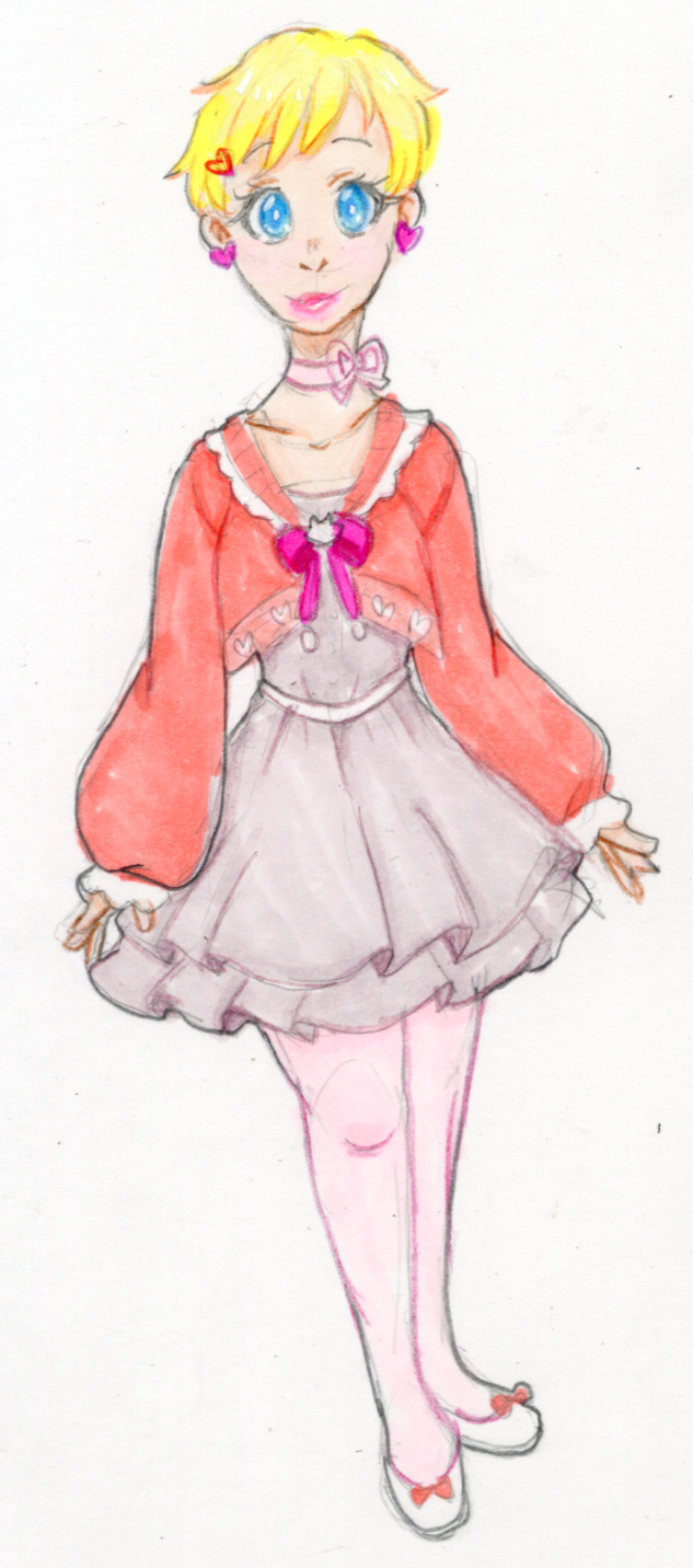
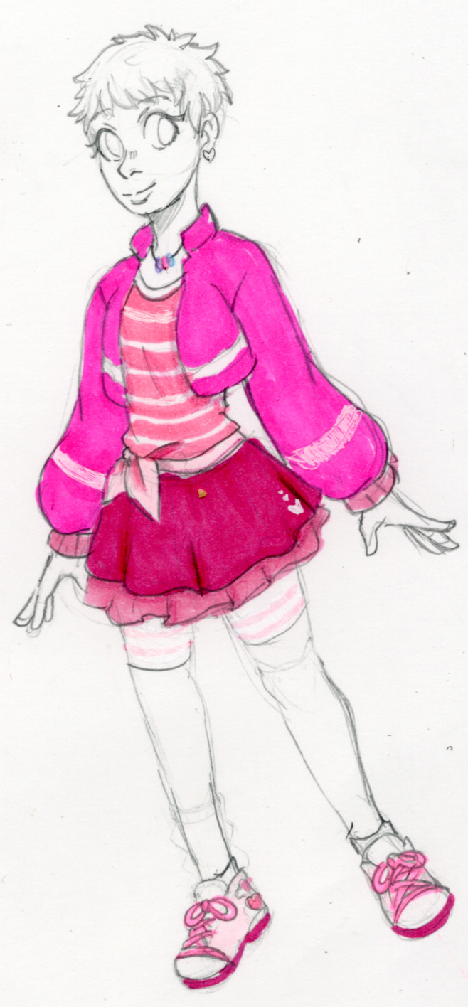
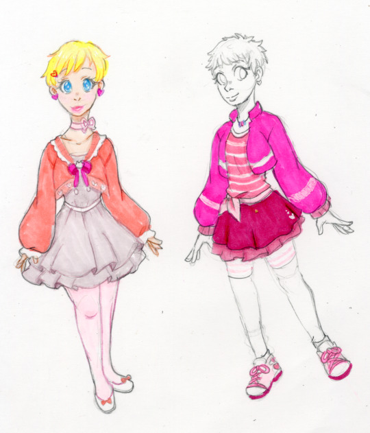
Me, bleeding from the mouth as I remind myself that I do redesigns for fun and self satisfaction in challenging myself, not spite: I totally find Rose's new season 6 design fine and acceptable, but if I allowed to make a few tiny suggestions...
#Miraculous Ladybug#Rose Lavillant#Clover Draws#My Art#traditional art#leftmost is what I would love to see#While rightmost is what I would do if I had to work within the original design's guidelines
22 notes
·
View notes
Text
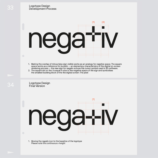
negativ
164 notes
·
View notes
Text
would it be like. stupid to turn in “stephcass supporter” sticker designs for a class project
#the project was create a sticker/pin design for a fandom/piece of media#and i feel like that follows the guidelines but also..thats embarrassingggggg#i would make ‘i survived stephcass sistergate’ designs but i fear that’s too niche#ive also drafted designs for vague future foundation and esu stickers as back ups#fran talks
19 notes
·
View notes
Text

36 notes
·
View notes
Text

Wanted to try a more cutesy style with these two
#fe5#thracia 776#finn fire emblem#eyvel fire emblem#eyvel x finn#finvel#Eyvinn#my art#I AM ONCE AGAIN DRAWING THESE TWO#I’ve recently tried drawing without guidelines and trying to do more cartoon styles#and they have been my muses I’ve got way too many sketches of em of me trying to draw without my fav lil circle#I honeslty might try to make this drawing into a Valentine’s Day card…. to satisfy the graphic designer in me….Mayhaps print iit#that’s for future me to decide
13 notes
·
View notes
Text
Feeling gratitude, right now!
Called the hair-dresser to set up an appointment for Tiny. She was willing to make an exception today, but explained that the higher-ups are requiring online appointments, now. I sadly mentioned I'd probably have to stop coming, can't make online appointments¹, and then gave her my info.
At this point, she saw the kids' names and remembered who I was. NQ is quite memorable, and we have to specially book ONLY her, because she likes the challenge and NQ now trusts her. (At least a LITTLE.)
So now I have an exemption! I can make phone appointments, and if anyone is concerned, she'll cover for them with head quarters! I get to use the excuse that we have disabilities. Which we do. The one being accommodated isn't the one on file, but the accommodation is still greatly needed!
-
¹ Partly, it's an executive dysfunction thing - my brain classifies online booking as more steps than a phone call, and gets overwhelmed. Mostly, it's a 'can't follow the logic flow of most websites' thing. I end up spending SO LONG stuck on seemingly minor steps - unable to find a button, or remember a password, or figure out what it's telling me to do. And anxiety about that happening contributes to the executive dysfunction, making the situation worse!
#neurodivergence#disability#accessibility#the death of in-person and phone bookings is leaving me a LOT more socially disabled than I was a decade ago#also#a decade ago online registration forms were often still designed by incredibly autistic people in ways that made sense to them#now there are GUIDELINES#and neurotypicals' gains are my losses#I LIKED the 'unintuitive' forms!
9 notes
·
View notes
Text

This creature is a design commission for Chrysokami (link goes to instagram), so said Combat Form for her character Echo. I was specifically asked to make postcreated -style exoskeleton so I couldn't say no to the idea. I got guidelines and basic structure for the creature was already existing. Body is colored in inks, otherwise mix of colored pencil and watercolor.
Necessary footnote: Postcreated creatures are my headworld creatures, and they're not available in terms of adoptable creatures, but I don't own stylished-skeletal-something -creatures in general, so I can make postcreated-inspired characters for others.
#traditional art#chrysokami#character: echo#commission#commission art#space creature#creature#creature design#ink painting#ink#i don't remommed inks to anybody unless you're weird traditional media freak like me#in general I like to inspire people nowadays so if you want make a critter inspired by postcreateds then go wild#just that THE postcreateds are my things#I don't offer adoptables without guidelines or anything from my species#if I design anything from scratch I get attached and it becomes mine
12 notes
·
View notes