#designfundamentals
Text
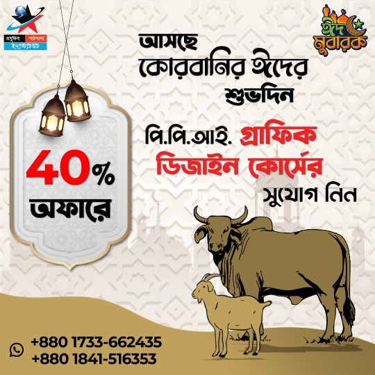
✨ ঈদুল আযহা উপলক্ষ্যে ৪০% ছাড়ে ক্রিয়েটিভ গ্রাফিক্স ডিজাইন শিক্ষার মাধ্যমে ফ্রিল্যান্সিং করে নিজের ক্যারিয়ার গড়ুন 💹
🔰 আপনি যদি একজন ক্রিয়েটিভ চিন্তার মানুষ হয়ে থাকেন, এবং ক্রিয়েটিভ কিছু করতে মন চায়, তাহলে শুধুমাত্র আপনার জন্যই আমাদের প্রযুক্তির পাঠশালা ইনস্টিটিউটের গ্রাফিক্স ডিজাইন কোর্স।
🌏 আজকের প্রতিযোগিতামূলক বিশ্বে, 💪 নিজেকে সবার থেকে আলাদা করে তোলার জন্য একটি অনন্য দক্ষতা থাকা অতীব গুরুত্বপূর্ণ। 😍 ক্রিয়েটিভ গ্রাফিক্স ডিজাইন একটি জনপ্রিয় এবং মূল্যবান কোর্স, যা আপনাকে বিভিন্ন উপায়ে আপনার ক্যারিয়ার গড়ে তুলতে সাহায্য করবে।
🤔 ক্রিয়েটিভ গ্রাফিক্স ডিজাইন কি❓
📣ক্রিয়েটিভ গ্রাফিক্স ডিজাইন হল ভিজ্যুয়াল যোগাযোগের একটি মাধ্যম যা গ্রাফিক্স, টাইপোগ্রাফি এবং ছবি ব্যবহার করে বার্তা প্রকাশ করা। ✔️ গ্রাফিক্স ডিজাইন বিশেষ করে বিজ্ঞাপন, ওয়েবসাইট ডিজাইন, লোগো ডিজাইন এবং সোশ্যাল মিডিয়া মার্কেটিং এ ব্যবহার করা হয় তা ছাড়া আরও অনেক কিছুতেও ব্যবহৃত হয়।
🎯 ক্রিয়েটিভ গ্রাফিক্স ডিজাইন শেখার পরে আপনি কিভাবে ক্যারিয়ার গড়বেন❓
😍 কেননা ফ্রিল্যান্সিং এর মাধ্যমে আপনি আপনার নিজের সুবিধা অনুযায়ী সময় নির্ধারণ করে বিশ্বের যেকোনো জায়গা থেকে কাজ করতে পারবেন। বিভিন্ন মার্কেট প্লেসে, বেক্তি গত ভাবে ক্লায়েন্টের সাথে এবং আমাদের এজেন্সির মাধ্যমে।
💪🏻 ক্রিয়েটিভ গ্রাফিক্স ডিজাইন একটি মূল্যবান দক্ষতা যা আপনাকে বিভিন্ন উপায়ে আপনার ক্যারিয়ার গড়ে তুলতে সাহায্য করতে পারে।
😊 তাহলে আর দেরি কেন? আজই আমাদের গ্রাফিক ডিজাইন কোর্সে ভর্তি হয়ে নিজের উন্নত ক্যারিয়ার গড়ে তুলুন।
👇 ক্রিয়েটিভ গ্রাফিক ডিজাইনের কোর্সটি করে আপনি যেসব কাজ করতে পারবেন:
✅ লোগো ডিজাইন
✅ বিজনেস কার্ড ডিজাইন
✅ ব্যানার/পোস্টার ডিজাইন
✅ ফ্লায়ার ডিজাইন
✅ ব্রুশিয়ার ডিজাইন
✅ সোশ্যাল মিডিয়া ডিজাইন
✅ কর্পোরেট ডিজাইন
✅ স্টেশনারি ডিজাইন
✅ বুক কভার/প্রচ্ছদ ডিজাইন
✅ ওয়েবসাইট ব্যানার
✅ মোকআপ ডিজাইন
✅ ওয়েডিং পিকচার ইডিট
✅ বেসিক টাইপোগ্রাফি
✅ প্রোডাক্ট ডিজাইন
তাই এই সুযোগ হাত ছাড়া না করে আজই যোগাযোগ করুন
যোগাযোগের ঠিকানাঃ
📞 মোবাইলঃ 01733662435
🌐 আমাদের ওয়েবসাইটঃ https://www.projuktirpathshalabd.com/courses
🏢 আমাদের ঠিকানাঃ House 10, 6/A Level 7, Road 02, Sector 6, House Building, Uttara 1230, Dhaka, Bangladesh.
#GraphicDesignCourse#DesignTraining#CreativeSkills#VisualCommunication#DigitalDesignCourse#ArtisticTraining#DesignFundamentals#IllustrationCourse#TypographyTraining#AdobeDesign#CreativeProcess#GraphicDesign101#DesignEducation#VisualDesignSkills#DesignWorkshops
0 notes
Text
0 notes
Link
In the dynamic world of web design, staying abreast of the latest trends and technologies is crucial. However, amidst the whirlwind of innovation, it's easy to lose sight of the foundational principles that underpin effective web design. Understanding these fundamental principles is paramount for designers seeking to create compelling and successful websites. By delving into
0 notes
Text
The Art of Visual Communication in Graphic Design
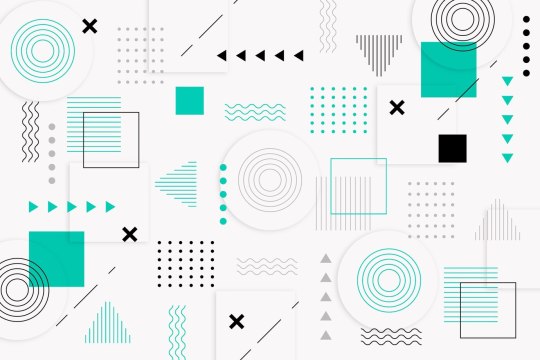
Graphic design is a dynamic field that blends creativity with technology to convey messages and ideas through visual elements. Among the essential components of graphic design, one of the most crucial is the art of visual communication. This article delves into the second point, "Elements of Design," which encompasses the fundamental aspects of graphic design that every designer should master.
1. Color: The Palette of Emotions
Color is a powerful tool in graphic design, as it has the ability to evoke emotions, set the tone, and create a visual hierarchy. Designers must understand color theory to make informed choices when selecting color palettes for their projects. For instance, warm colors like red and orange can convey energy and passion, while cooler tones such as blue and green often represent calm and serenity. The skillful use of color can guide the viewer's eye and elicit specific emotional responses.
2. Typography: The Art of Letterforms
Typography is the art and technique of arranging type to make written language legible, readable, and visually appealing. Choosing the right typeface is crucial, as different fonts carry various connotations and can greatly impact the message. For example, a playful and whimsical typeface may not be suitable for a formal document, while a sleek, modern font can enhance the aesthetics of a tech startup's logo. Proper alignment, spacing, and hierarchy within text also contribute to readability and aesthetics.
3. Images and Graphics: Telling a Visual Story
Images and graphics play a pivotal role in graphic design, whether it's creating stunning illustrations, enhancing photographs, or crafting compelling infographics. Designers often utilize software like Adobe Photoshop and Adobe Illustrator to manipulate and edit visual elements. The choice and placement of images should align with the design's purpose and message, reinforcing the overall visual narrative.
4. Layout and Composition: Organizing the Visual Space
Layout and composition involve arranging all design elements within a defined space to create a harmonious and visually pleasing composition. Concepts like balance, contrast, alignment, proximity, and repetition guide designers in achieving effective layouts. A well-structured layout ensures that the viewer can easily navigate the content and grasp the intended message.
5. Hierarchy: Guiding the Viewer's Eye
Visual hierarchy is about emphasizing certain elements over others to lead the viewer's eye through the design. This involves using techniques such as varying font sizes, colors, and placement to guide attention to the most important information. Effective hierarchy is vital for ensuring that the viewer can quickly and intuitively understand the content's significance.
6. Simplicity: Less is Often More
The principle of simplicity emphasizes the importance of clarity and minimalism. Graphic designers should avoid clutter and excessive detail that can overwhelm the viewer. Often, simplicity leads to elegance and a more profound impact.
In conclusion, understanding and mastering the elements of design is fundamental for any graphic designer. These elements serve as the building blocks for creating visually compelling and effective designs. By harnessing the power of color, typography, images, layout, hierarchy, and simplicity, designers can craft visual narratives that captivate, inform, and inspire. Whether working on a logo, a poster, a website, or any other project, these design elements remain at the heart of every successful graphic design endeavor.
#GraphicDesign#DesignPrinciples#VisualCommunication#ColorTheory#Typography#ImagesAndGraphics#LayoutAndComposition#VisualHierarchy#DesignElements#DesignFundamentals#CreativeDesign#DesignAesthetics#VisualArt#DesignBasics#SimplicityInDesign#DesignSkills#ArtOfArrangement#DesignConcepts#EffectiveDesign#GraphicDesignTips
0 notes
Photo

What does "play" in design mean to you? As an antidote to the slow and steady work of upgrading Toronto's housing stock. Cyan has been exploring 'play' and 'fun' through a community engaged art project with @moicagq and @al.fergani and @camibencosme. Sneak preview! we think we could all use a little levity. Stay tuned for details.... thanks @laynemarley for the bang up powerpoint ;) Image Description: 1. Poster with black text on an abstract colorful background saying, "What does 'play' in design mean to you?" #cyanstation #carmartin #introspective #architecturalmusing #playindesign #playfuldesign #torontoarchitect #torontoartist #homes #communityspaces #kaleidoscope #sneakpeak👀 #communityengagement #communityart #designplay #torontohousingmarket #torontohousingcrisis #torontohousing #collaborativedesign #collaborativearchitecture #collaborativeart #glitchyart #levity #designershavingfun #designquestion #philosophyquestions #fundesigns #designfun #designfundamentals https://www.instagram.com/p/CniQC2jJIQj/?igshid=NGJjMDIxMWI=
#cyanstation#carmartin#introspective#architecturalmusing#playindesign#playfuldesign#torontoarchitect#torontoartist#homes#communityspaces#kaleidoscope#sneakpeak👀#communityengagement#communityart#designplay#torontohousingmarket#torontohousingcrisis#torontohousing#collaborativedesign#collaborativearchitecture#collaborativeart#glitchyart#levity#designershavingfun#designquestion#philosophyquestions#fundesigns#designfun#designfundamentals
1 note
·
View note
Video
youtube
డిజైన్ ఫండమెంటల్స్ (Design Fundamentals in Telugu)
మీకు ఈ వీడియో నచ్చితే దయచేసి మా ఛానెల్ని లైక్ చేయండి, షేర్ చేయండి మరియు సబ్స్క్రయిబ్ చేయండి. సభ్యత్వం పొందినందుకు ధన్యవాదాలు! మీకు సభ్యత్వం లేకపోతే, ఇప్పుడే సభ్యత్వాన్ని పొందండి (If you like this video please like, share, and subscribe to our channel).
#teluguvideos#designfundamentals#multimedia#graphicdesigning#designprinciples#designelements#webdesign
1 note
·
View note
Text
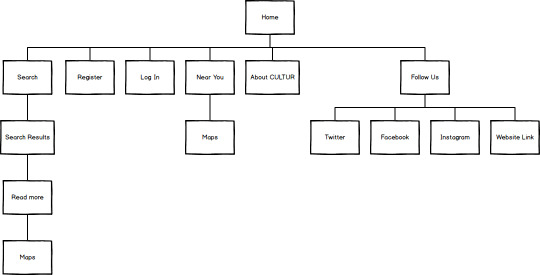
UX/UI Terminology
F-Shaped Pattern - Users often read web pages in an F-shaped pattern
Sketching - A drawing which designers use to propose, explore, refine and communicate ideas
Wireframe - A simplified sketch of the important information on a page. Also known as page architecture, page schematic, or a blueprint. Basically, it’s a skeleton of the design and should contain all the important elements of the final product.
Mockup - A medium or highly detailed static representation of the design. A good mockup demonstrates the information structure, content and basic functionality in static form. Moreover, mockups make it easy to perceive the idea of the final product, and the process of mockup creation is less time-consuming compared to prototypes.
Prototype - Often confused with a wireframe, a prototype is a medium or a highly detailed representation of the final product. It simulates user interaction with the interface and allows the user to rate the content and interface and test the primary options for communication with the app. Though, prototype may not look exactly like the final product, but it definitely should not be sketched in shades of gray. In addition, interactions must be modeled in a way that closely mimic the final product.
Accessibility - The measure of a web page’s usability by persons with one or more disabilities.
Golden Ratio - A mathematical ratio, also known as the Greek letter Phi. It is found in nature, and has made its way into graphic and print design as people deem it to be the most visually appealing layout to the human eye. The Golden Ratio approximately equals 1.618. We find it when we divide a line into two parts so that the full length divided by the long part is equal to the long part divided by the short part.
Grid - System of horizontal and vertical lines providing a structural basis for page layout and design. It communicates order, economy and consistency. The grid provides a common structure and flexibility for organizing content.
Color Wheel - This circle shows the relationships between primary colors, secondary colors and tertiary colors. Artists and designers use red, yellow, and blue primaries arranged at three equally spaced points around their color wheel.
Corporate Identity Guideline - Defines how your company’s brand, image and messaging are delivered to the public and particularly to your key audiences. The corporate identity guideline positions the company, no matter how big or small. The rules for consistent typography, color use, and logo placement are all laid out in the corporate identity manual.
Dots Per Inch (DPI) - A way to measure the density of a print or video image. The number of differently colored dots that can fit into a one-inch space provides information about the resolution of an image. If an image is not of adequately high quality, it may not be able to be resized or printed without a loss of resolution.
Mindmap - A diagram used to visually organize information. A mindmap is hierarchical and shows the relationships among the parts of the whole. It is often created around a single concept to which associated images, words and parts of words are added. Major ideas are connected directly to the central concept, and other ideas branch out from those.
Responsive Web Design - RWD provides an optimal viewing experience across platforms and devices. The content and layout of a website should efficiently adapt to the sizes and technical abilities of the device it is opened on.
Information Architecture (IA) - The organizing of information, including site hierarchies, web content, labeling schemes and navigation. IA makes it easy for people to find, understand and manage information.
Scalable Vector Graphics (SVG) - An imaging application and language written in XML. The SVG interface offers a solution to the problem of sharing many sophisticated Web-based images and animations.
Breadcrumbs - Breadcrumbs are a navigation element that allows users to orient themselves within a Web site or move to one of the intermediate pages. It is usually placed near the top of the page (generally, right under the browser’s address bar). Actually, it allows users to find their way to the homepage.
Persona - The creation of a representative user based on available data and user interviews. Though the personal details of the persona may be fictional, the information used to create the user type is not.
White or Negative Space - The use of blank space on a page to promote content and navigation. To be precise, when the products or pages have enough white space, it helps them feel uncluttered, elevates them, and makes them feel special. And it makes people want to take a closer look.
End Users - Refers to those people who use a website.
User-Centred Design (UCD) - An approach to designing a product or service (user interface design), in which the end user is in the center of the process.
1 note
·
View note
Photo

did a lil thing today and recreated an Impressionist Artwork. I chose "Cypresses" by Vincent Van Gogh 💚 Ive always loved the colour of this piece and the way it seems to move. A little piece of the masters mind 🦋 #outtaamind #cypresses #vincentvangogh #vangogh #impressionist #acrylicpaint #acrylicpainting #inspired #designfundamentals #tafensw #brushstrokes #paintingprocess #acrylicpainting #naturepainting #landscape #green #cypress https://www.instagram.com/p/CSvnSu3l3ou/?utm_medium=tumblr
#outtaamind#cypresses#vincentvangogh#vangogh#impressionist#acrylicpaint#acrylicpainting#inspired#designfundamentals#tafensw#brushstrokes#paintingprocess#naturepainting#landscape#green#cypress
0 notes
Photo

Typography design 045
-
THE MASTHEAD:
[ VEGN8 ]
THE TAGLINE:
[ The Journal for Veganism ]
THE DATELINE:
[ August 2020 ]
THE MAIN COVER LINE:
[ In this issue: Instagram accounts of organisations fighting for the animal rights across the world ]
THE BODY COPY:
[ Features: Animal Save Movement AnimaNaturalis Anonymous for the Voiceless Best Friends Animal Society Blue Cross of India Cruelty Free International Farm Sanctuary Hayvan Haklari Federasyonu Mercy for Aimals People for the Ethical Treatment of Animals The Humane Society of the US Veganuary World Animal Protection US ]
ARTWORK CREDIT:
Siddharthraj Lunakid
0 notes
Photo

Bella is asleep and you know what that means? Time to study design fundamentals! Back to the basics. Someone brought plums into work and so that is my late night snack. Hmmmm juicy. #plumsareyummy #latenightstudysession #backtothebasics #designfundamentals (at Louisville, Kentucky) https://www.instagram.com/p/CC4x1tslaGi/?igshid=1xfp0phdsqpfn
0 notes

Photo

L I N E S. #takeawayfromgandhinagar #designfundamentals #design #blackandwhite #basicbuteffective #instamood #instapost #picsoftheday #observe #grasp #create #fashionpeople #india #rimanshupatel #travel (at Ahmedabad Airport Terminal 1) https://www.instagram.com/p/Bz2bBp_ghsh/?igshid=1agdnmck4iftp
#takeawayfromgandhinagar#designfundamentals#design#blackandwhite#basicbuteffective#instamood#instapost#picsoftheday#observe#grasp#create#fashionpeople#india#rimanshupatel#travel
0 notes
Text

New poster design I design for the gagoma gallery exhibition in Brisbane for assignment in cert III in design fundamentals
0 notes
Photo

Posted @withrepost • @artobsessed_phx High contrast studies 08 #highcontrast #bnw #textureandpattern #blackandwhite #composition #graphic #designnerdsunite #diagonal #abstractdesign #designfundamentals #ikea #2ddesign #backtobasics #pointlineplane #iphoneart #digitalphoto #everydayobjects https://www.instagram.com/p/ByO6RWglBWM/?igshid=atfyjl23z3rs
#highcontrast#bnw#textureandpattern#blackandwhite#composition#graphic#designnerdsunite#diagonal#abstractdesign#designfundamentals#ikea#2ddesign#backtobasics#pointlineplane#iphoneart#digitalphoto#everydayobjects
0 notes
Photo


Mock-up spread I created for “CRAP” Basic Fundamentals. School project.
0 notes
Last Seen Blogs

hosangcouple-blog
𝔤𝔬𝔡 𝔥𝔬𝔰𝔞𝔫𝔤

himbo-buckley
polination (noun. member of polin nation)

toko-susan
Tanpa judul

vitasigns
Untitled

bigbootyboss212
Sexy & Sweet