#VisualHierarchy
Explore tagged Tumblr posts
Visit Tumblr Blog
Explore Tumblr blogs with no restrictions, modern design and the best experience.
Last Seen Tumblr Blogs


Fun Fact
69% of Tumblr users are millennials.
Text


Consistency is Key 🎨 Great design is not just about creativity but maintaining harmony across all elements. Stick to these tips and elevate your designs to new heights! 🚀
🌐 Visit: fluxitsolutions.in 📧 [email protected] | 📞 +91 8527471171
#DesignTips#ConsistencyIsKey#GraphicDesign#CreativeDesign#DesignInspiration#BrandingTips#WebDesign#DigitalMarketing#UXDesign#UIUX#Typography#ColorPalette#VisualHierarchy#WhiteSpaceMatters#MobileOptimization#HighQualityDesign#ProfessionalDesign#ModernDesign#DesignDaily#MarketingTips#SocialMediaDesign#BusinessBranding#CreativeAgency#FluxITSolutions#DesignGoals#ElevateYourBrand
2 notes
·
View notes
Text
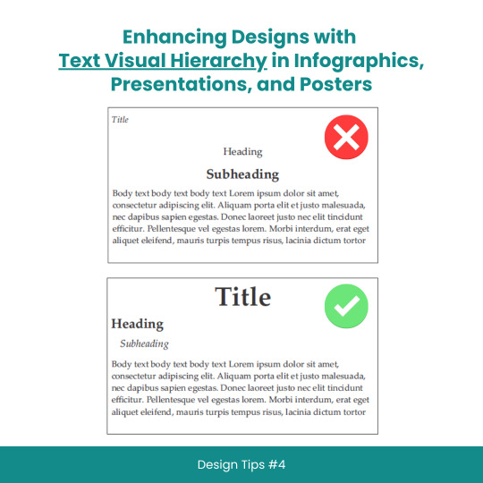
Enhancing Designs with Text Visual Hierarchy in Infographics, Presentations, and Posters
#scicomm#sciencecommunication#VisualHierarchy#TextHierarchy#Typography#InfographicDesign#PresentationDesign#PosterDesign#Layouts#Fonts#Contrast#Alignment#DesignTips#DesignPrinciples#GraphicDesign#WebDesign#PrintDesign#CreativeProcess#DesignInspiration#DesignCommunity#DesignThinking#GoodDesign#EffectiveDesign#DesignMatters
8 notes
·
View notes
Text
🎯 Ever wondered what REALLY makes a design pop and stop the scroll?
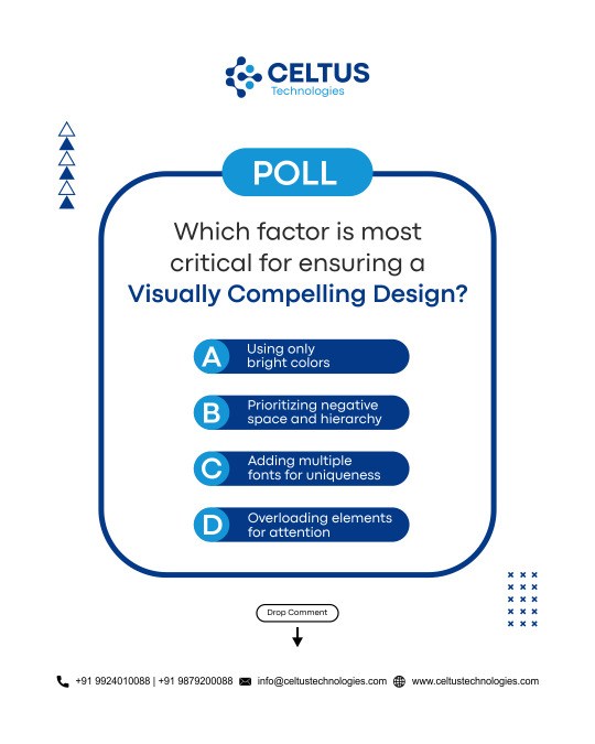
You’re not alone—so many designers get caught up in trends like neon colors and wild fonts… but is that what truly hooks your audience? 🤔
Let’s get real for a sec👇
A visually compelling design isn’t about throwing everything at the screen and hoping it sticks.
It’s about creating balance, focus, and flow. That’s where the magic happens. ✨
🗳 We want YOUR take on this!
Which factor do YOU think is most critical for a killer design?
A) Bright colors 🌈 B) Negative space & hierarchy 🎯 C) Multiple fonts for uniqueness 🔠 D) Overloading elements for attention 😵💫
💬 Drop your answer in the comments – we’re reading all of them! 👇 Let’s see who’s got that creative eye!
✅ Visit Our Website: www.celtustechnologies.com 📩 Email: [email protected]
#VisualHierarchy#DesignBalance#UITricks#BrandDesignTips#DesignStrategy#MinimalDesign#CreativePolls#DesignDebate#CeltusTechnologies#PollTime#DesignQuestion#PickOne#ScrollStopper#DesignChallenge#InteractivePost#LetUsKnow#YourOpinionMatters#Edited · 3d
0 notes
Text
The Impact of Typography on Mobile App Design
In the ever-evolving landscape of mobile app design, typography plays a critical role in shaping the user experience. The right choice of fonts, sizes, and layouts can make a significant difference in how an app is perceived and utilized. In this article, we will delve into the profound impact of typography on mobile app design, exploring its importance, best practices, and the psychological effects on users.
Why Typography Matters in Mobile App Design
Typography is not just about choosing a pretty font; it’s about creating a seamless and engaging user experience. Good typography enhances readability, guides users through the app, and reinforces the brand identity. In contrast, poor typography can lead to confusion, frustration, and ultimately, app abandonment.
Readability and Legibility
The primary goal of typography in mobile app design is to ensure readability and legibility. Readability refers to how easily a block of text can be read, while legibility concerns the clarity of individual characters. Given the small screens of mobile devices, achieving these two elements is paramount.
Font Selection: Choose fonts that are easy to read at various sizes. Sans-serif fonts like Arial, Helvetica, and Roboto are popular choices for mobile apps due to their clean and straightforward appearance.
Font Size: Optimal font size is crucial. Text that is too small can strain the eyes, while text that is too large can disrupt the layout. A common practice is to use a base font size of 16 pixels for body text.
Line Spacing: Adequate line spacing (leading) improves readability by preventing lines of text from blending together. A acceptable location to start is with a line height that is 1.5 times the font size.
Hierarchical Structure
Typography aids in creating a visual hierarchy that leads readers logically and naturally through the information.
By differentiating text elements such as headings, subheadings, and body text, designers can highlight important information and improve the overall user experience.
Headings: Use distinct font sizes, weights, or styles for headings to make them stand out. This helps users quickly identify key sections of the app.
Contrast: For better readability, make sure the text and background have enough contrast. Dark text on a light background is typically more readable than light text on a dark background.
Consistency: Maintain consistency in font choices, sizes, and styles throughout the app. This results in a unified and clean look.
Psychological Impact of Typography
Typography also has a psychological impact on users, influencing their perception and emotional response to the app. Different fonts and styles can evoke various feelings and associations, making it crucial for designers to choose wisely.
Serif vs. Sans-Serif: Serif fonts, with their decorative strokes, can convey a sense of tradition and reliability. Sans-serif fonts, however, are thought to be modern and clean. Depending on the app's purpose, one might be more appropriate than the other.
Font Personality: Each font carries a unique personality. For example, a playful, rounded font might be suitable for a children’s app, while a sleek, geometric font might be better for a tech-focused app.
Emotional Response: Typography can influence users' emotions and engagement levels. Well-chosen typography can make an app feel more inviting, trustworthy, and enjoyable to use.
Best Practices for Mobile App Typography
To harness the power of typography in mobile app design, follow these best practices:
1. Prioritize Clarity and Simplicity
Keep text clear and simple. Refrain from using excessively ornate typefaces as they may impede reading. Stick to a limited number of fonts and styles to maintain a clean and professional look.
2. Optimize for Different Screen Sizes
Ensure that your typography looks good on various screen sizes. Test your designs on different devices to make sure that text remains readable and well-organized.
3. Use Typography to Enhance Branding
Typography should align with your brand’s identity. Choose fonts and styles that reflect your brand's personality and values. Consistent use of typography helps reinforce brand recognition.
4. Implement Responsive Typography
Design your typography to be responsive. This means using relative units like ems or percentages for font sizes, allowing text to scale appropriately across different devices and screen orientations.
5. Focus on Accessibility
Accessibility is a key consideration in mobile app design. Ensure that your typography choices accommodate users with visual impairments. This includes providing sufficient contrast, using readable font sizes, and supporting screen readers.
Case Studies: Successful Use of Typography in Mobile Apps
1. Airbnb
Airbnb’s mobile app is a prime example of effective typography. The app uses a clean and modern sans-serif font, with a consistent hierarchy that guides users through listings, reviews, and booking details. The typography enhances readability and reinforces the brand's friendly and approachable image.
2. Instagram
Instagram utilizes a simple and elegant typography system. The use of bold fonts for usernames and light fonts for captions creates a clear visual hierarchy. This makes it easy for users to distinguish between different types of content and interactions.
3. Medium
Medium’s app focuses on readability, using a serif font for body text that mimics the experience of reading a printed article. The typography choices contribute to a comfortable and immersive reading experience, encouraging users to spend more time on the platform.
Conclusion
In conclusion, typography is a fundamental element of mobile app design that significantly impacts user experience. By prioritizing readability, establishing a clear visual hierarchy, and considering the psychological effects of font choices, designers can create more engaging and effective apps. Following best practices and learning from successful examples can help ensure that your mobile app's typography is both functional and aesthetically pleasing.
Website Here:- https://intorque.com/
#Typography#MobileAppDesign#UXDesign#UserExperience#FontChoice#Readability#Legibility#DesignTips#VisualHierarchy#PsychologicalImpact#AppDesign#DesignBestPractices#ResponsiveDesign#AppAccessibility#BrandIdentity#DesignInspiration#TechDesign#DigitalDesign#UIUX#GraphicDesign#DesignTrends
0 notes
Text
Key Elements to Elevate Your Website Design
#shorts#WebsiteDesignTips#WebDevelopmentEssentials#DigitalDesignTricks#UserExperienceUpgrade#VisualAppealBoost#ResponsiveLayoutIdeas#CreativeWebSolutions#InnovativeDesignConcepts#ModernWebFeatures#InteractiveInterfaceDesign#WebDesignEssentials#DesignElements#WebsiteCreation#UserExperienceDesign#VisualHierarchy#ResponsiveLayout
1 note
·
View note
Text
Crafting Seamless Experiences: User Experience Design Principles for Website Crafting Seamless Experiences: User Experience Design Principles for Websites
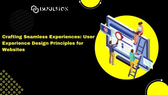
In the digital age, user experience (UX) has emerged as a cornerstone of effective website design. A well-crafted user experience not only delights visitors but also drives engagement, fosters loyalty, and ultimately leads to conversions. As we navigate the intricacies of website design in 2024, let's explore the fundamental principles of UX design that are essential for creating seamless and intuitive experiences for users.(Read More)
Understanding User Needs
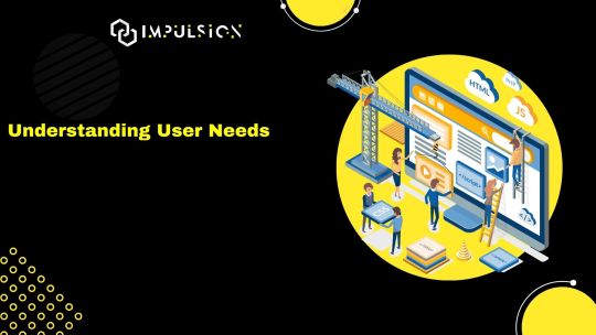
The foundation of exceptional UX design lies in understanding the needs, preferences, and behaviors of your target audience. Conducting user research, gathering feedback, and creating user personas are crucial steps in empathizing with your users and designing solutions that address their pain points effectively.(Read More)
Prioritizing Accessibility
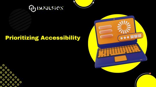
Inclusivity is paramount in UX design, and prioritizing accessibility ensures that your website is usable by everyone, regardless of ability. Considerations such as color contrast, keyboard navigation, and screen reader compatibility play a vital role in making your website accessible to users with disabilities, enhancing the overall user experience for all.(Read More)
Embracing Mobile-First Design
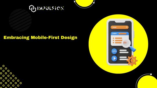
With mobile devices accounting for a significant portion of web traffic, adopting a mobile-first approach to design is imperative in 2024. Designing for smaller screens forces prioritization, ensuring that only the most essential elements are included and encouraging a streamlined and intuitive user experience across all devices.(Read More)
Simplifying Navigation
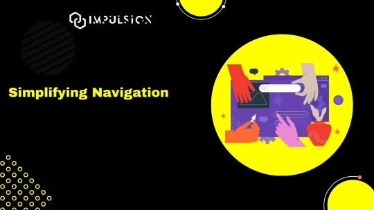
Clear and intuitive navigation is key to guiding users through your website and helping them find the information they need efficiently. Implementing familiar navigation patterns, such as top or side navigation menus, breadcrumbs, and clear calls-to-action, simplifies the user journey and reduces friction, resulting in a more satisfying experience.(Read More)
Fostering Visual Hierarchy
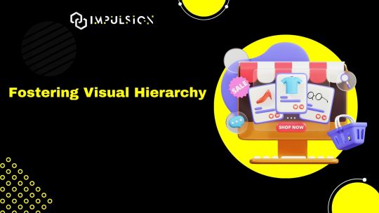
Visual hierarchy plays a crucial role in directing users' attention and guiding them through the content hierarchy of your website. By employing techniques such as contrast, spacing, and typography, you can create a clear and intuitive visual hierarchy that emphasizes important content and aids users in understanding the structure of your website.(Read More)
Ensuring Speed and Performance
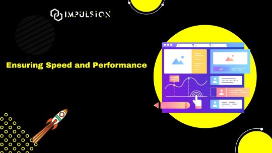
In an era of instant gratification, website speed and performance are non-negotiable. Optimizing loading times, minimizing server response times, and leveraging caching mechanisms are essential steps in ensuring a fast and responsive website that keeps users engaged and prevents frustration.(Read More)
Iterating and Testing Continuously
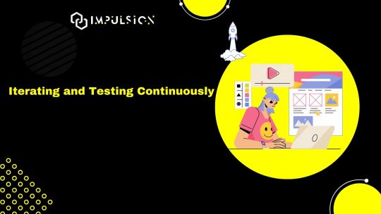
UX design is an iterative process, and continuous testing and refinement are essential for optimizing the user experience over time. Conducting usability tests, analyzing user behavior metrics, and gathering feedback through surveys or user interviews enable you to identify areas for improvement and make informed design decisions that enhance the overall user experience.(Read More)
Conclusion: Elevating User Experience in 2024
In the rapidly evolving landscape of website design, prioritizing user experience is more critical than ever. By embracing the fundamental principles of UX design—understanding user needs, prioritizing accessibility, adopting a mobile-first approach, simplifying navigation, fostering visual hierarchy, ensuring speed and performance, and iterating continuously—you can create websites that not only meet user expectations but exceed them, driving engagement, fostering loyalty, and ultimately achieving business success in 2024 and beyond.
Ready to elevate the user experience of your website in 2024? Embrace these principles, prioritize user needs, and embark on a journey of crafting seamless and intuitive experiences that delight and inspire your audience.
Visit our website: www.impulson.in
#UXDesign#WebDesign#UserExperience#Accessibility#MobileFirst#VisualHierarchy#WebsitePerformance#UsabilityTesting#DesignPrinciples#DigitalExperience
0 notes
Text
The Art of Visual Communication in Graphic Design
Graphic design is a dynamic field that blends creativity with technology to convey messages and ideas through visual elements. Among the essential components of graphic design, one of the most crucial is the art of visual communication. This article delves into the second point, "Elements of Design," which encompasses the fundamental aspects of graphic design that every designer should master.
1. Color: The Palette of Emotions
Color is a powerful tool in graphic design, as it has the ability to evoke emotions, set the tone, and create a visual hierarchy. Designers must understand color theory to make informed choices when selecting color palettes for their projects. For instance, warm colors like red and orange can convey energy and passion, while cooler tones such as blue and green often represent calm and serenity. The skillful use of color can guide the viewer's eye and elicit specific emotional responses.
2. Typography: The Art of Letterforms
Typography is the art and technique of arranging type to make written language legible, readable, and visually appealing. Choosing the right typeface is crucial, as different fonts carry various connotations and can greatly impact the message. For example, a playful and whimsical typeface may not be suitable for a formal document, while a sleek, modern font can enhance the aesthetics of a tech startup's logo. Proper alignment, spacing, and hierarchy within text also contribute to readability and aesthetics.
3. Images and Graphics: Telling a Visual Story
Images and graphics play a pivotal role in graphic design, whether it's creating stunning illustrations, enhancing photographs, or crafting compelling infographics. Designers often utilize software like Adobe Photoshop and Adobe Illustrator to manipulate and edit visual elements. The choice and placement of images should align with the design's purpose and message, reinforcing the overall visual narrative.
4. Layout and Composition: Organizing the Visual Space
Layout and composition involve arranging all design elements within a defined space to create a harmonious and visually pleasing composition. Concepts like balance, contrast, alignment, proximity, and repetition guide designers in achieving effective layouts. A well-structured layout ensures that the viewer can easily navigate the content and grasp the intended message.
5. Hierarchy: Guiding the Viewer's Eye
Visual hierarchy is about emphasizing certain elements over others to lead the viewer's eye through the design. This involves using techniques such as varying font sizes, colors, and placement to guide attention to the most important information. Effective hierarchy is vital for ensuring that the viewer can quickly and intuitively understand the content's significance.
6. Simplicity: Less is Often More
The principle of simplicity emphasizes the importance of clarity and minimalism. Graphic designers should avoid clutter and excessive detail that can overwhelm the viewer. Often, simplicity leads to elegance and a more profound impact.
In conclusion, understanding and mastering the elements of design is fundamental for any graphic designer. These elements serve as the building blocks for creating visually compelling and effective designs. By harnessing the power of color, typography, images, layout, hierarchy, and simplicity, designers can craft visual narratives that captivate, inform, and inspire. Whether working on a logo, a poster, a website, or any other project, these design elements remain at the heart of every successful graphic design endeavor.
#GraphicDesign#DesignPrinciples#VisualCommunication#ColorTheory#Typography#ImagesAndGraphics#LayoutAndComposition#VisualHierarchy#DesignElements#DesignFundamentals#CreativeDesign#DesignAesthetics#VisualArt#DesignBasics#SimplicityInDesign#DesignSkills#ArtOfArrangement#DesignConcepts#EffectiveDesign#GraphicDesignTips
0 notes
Text
Elevating Brands with Captivating Website Graphic Design

In the digital realm, where attention spans are fleeting, a visually captivating website is the key to making a lasting impact. This is where the power of website graphic design comes into play. By seamlessly blending aesthetics and functionality, businesses can elevate their brands and engage their target audience. Let's explore the transformative potential of website graphic design and how it can shape the online success of your brand.
The Art of Visual Seduction
Website graphic design is the art of visual seduction. It goes beyond mere decoration and delves into the realm of creating an immersive experience that captures the essence of your brand. A masterful website graphic design seamlessly combines colors, typography, and imagery to evoke emotions and leave a profound impression. Every visual element is thoughtfully curated to reflect your brand's personality, values, and unique selling proposition, creating a visual language that speaks directly to your target audience.
Designing for User Delight
A successful website graphic design is not just visually appealing; it also prioritizes user delight. It understands the importance of user-centered design principles and creates intuitive interfaces that guide visitors effortlessly through your website. By employing strategic placement of elements, clear navigation structures, and engaging interactions, website graphic design enhances usability and ensures a seamless user experience. The ultimate goal is to create an enjoyable journey that keeps visitors engaged, encourages exploration, and drives conversions.
The Power of Visual Hierarchy Website
Graphic design leverages the power of visual hierarchy to guide users' attention and communicate information effectively. It strategically arranges content elements, such as headings, images, and call-to-action buttons, to establish a clear hierarchy of importance. By employing visual cues, such as size, color, and position, website graphic design directs users' focus towards key messages and desired actions. This not only enhances the user experience but also increases the chances of driving desired outcomes for your brand. Amplifying Brand Identity Website graphic design serves as a powerful amplifier for your brand identity. It helps you establish a consistent visual language that resonates with your target audience across all touchpoints.
By incorporating your brand's color palette, typography, and imagery into the design, website graphic design reinforces brand recognition and creates a cohesive brand experience. This strengthens brand loyalty, fosters trust, and differentiates your brand from competitors in the crowded digital landscape. In the digital age, where first impressions are formed within seconds, investing in captivating website graphic design is crucial for elevating your brand. It combines the art of visual seduction with user-centered design principles to create immersive experiences that captivate your target audience. By amplifying your brand identity and guiding users through an intuitive journey, website graphic design empowers your brand to make a lasting impact and drive online success.

#WebsiteGraphicDesign#VisualSeduction#UserDelight#VisualHierarchy#BrandAmplification#decish#DigitalSuccess#CaptivatingDesign#BrandExperience
0 notes
Video
youtube
(via Divi: Shifting Elements with Z-Index for Layering Effect!)
Dive into the world of web design wizardry with our latest blog post, "Divi: Shifting Elements with Z-Index for Layering Effect!" In this comprehensive guide, we'll explore how to masterfully manipulate the stacking order of elements on your Divi website using the Z-Index property. Whether you're a seasoned Divi user or just starting your journey, this step-by-step tutorial will empower you to create stunning layered designs that captivate your audience.
0 notes
Text
Why 'Imitate First' is the Golden Rule of Learning and Innovating🥢🌈
In a society that values creativity, imitation often receives negative attention. However, imitation is not mere copying but a way to learn. It lays the groundwork for mastering the essentials before you create something new. Many successful innovators, artists, and entrepreneurs have started this way.

Read more 🌈 https://designerdollar8.blogspot.com/2024/11/why-imitate-first-is-golden-rule-of.html
Here’s why and how "imitate, then innovate" can lead to success:
⁜ Why imitating is the First Step ↴
→ Learn From Experts 🧑🏫
↝ You can grasp industry standards and learn effective techniques by mimicking established work. It’s like learning to walk before you run.
→ Build Your Confidence 💪
↝ Reproducing successful work helps you gain the skills and confidence to take creative risks later.
→ Save Time and Effort 🔄
↝ Starting with a strong foundation allows you to focus your energy on refining and innovating.
⁜ How to imitate Effectively ↴
→ 1. Study Carefully 📚
↝ Watch how the experts operate. Analyze their techniques and strategies to see why they succeed.
→ 2. Practice Consistently 🎨
Use what you’ve learned by replicating their work. This builds your skills and confidence.
→ 3. Review and Enhance 🔍
↝ Look at your work and compare it to the original. Identify your strengths and areas for improvement.
→ 4. Add Your Personal Flair ✨
↝ Once you feel confident, infuse your ideas or style into your work. This is where true creativity begins.
-- Connect me ↷
🎖️ Behance: www.behance.net/designerdollar8
🎖️ Dribbble: www.dribbble.com/designerdollar8
🎖️ YouTube: www.youtube.com/@designerdollar8
🎖️ Pinterest: www.pinterest.com/designerdollar8
Connect Me: 📝[email protected]
⁜ Why Creation Follows ↴
After mastering the basics through imitating, you are ready to:
→ Think Creatively 🧠
↝ With a solid understanding of what works, you can adapt these ideas to solve new problems.
→ Differentiate Yourself 🌟
↝ Your creations are now based on expertise, giving you a competitive advantage.
→ Motivate Others 🔥
.
.
#designguidelines #designguide #commondesignerrors #designerdollar #kazifaizahmed #letsconnect #dollarproduction #graphicdesign #motiongraphics #animation #QuickHacks #DesignTips #GraphicDesign #DesignMistakes #VisualHierarchy #RuleOfThirds #ColorTheory #TypographyTips #DesignConsistency #UIUXDesign #CreativeProcess #DesignInspiration #DigitalDesign #CompositionRules #VisualStorytelling #DesignSuccess #DesignThinking #ProDesignTips #BetterDesigns #CreativeWorkflow
0 notes
Text
Master Visual Hierarchy with AND Academy

Unlock the secret to making your designs stand out! Discover how to create a visual hierarchy that guides your audience’s eyes and makes your designs easier to understand. From size and scale to colour, contrast and perspective—learn the techniques that make your visuals shine.
For more information visit - https://www.andacademy.com/graphic-design-courses/
#DesignTips #GraphicDesign #DesignGuidelines #DesignInspo #GraphicDesigner #Designer #DesignTricks #VisualBalance #DesignInspiration #VisualHierarchy #ANDDictionary #CreativeProcess #GraphicDesignCourse #GraphicDesigner
0 notes
Text
See, how color and contrast can alone make a big impact in a design

Color and Contrast, are one of the most important visual hierarchy principles every designer should know.
Read more such design rules - Good Design Rules
1 note
·
View note
Text
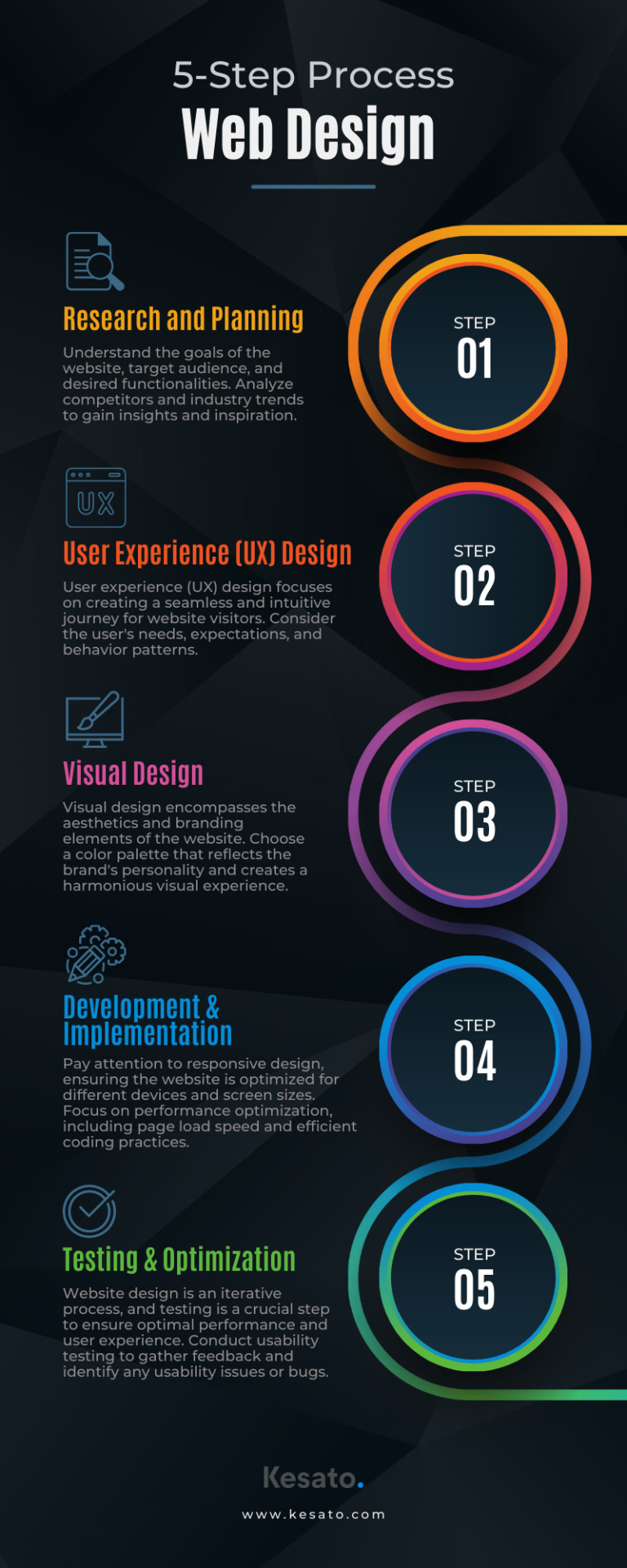
Discover the essential 5-step process to create captivating websites that captivate users. From planning to optimization, master website design!
#WebDesign#UserExperience#UIUX#ResponsiveDesign#WebsiteDevelopment#CreativeDesign#DigitalDesign#VisualIdentity#GraphicDesign#InteractionDesign#MobileDesign#WebUsability#InformationArchitecture#Wireframing#WebOptimization#FrontEndDesign#WebAccessibility#ContentStrategy#VisualHierarchy#WebTrends
0 notes
Note
What are you usually looking for in an Editorial portfolio for client`s like Orbit books or Tor books? I really want to work for them. I know having some covers in your portfolio is good, but for example, can I have just the cover image with no type? It makes sense to me just to show the image and not the type since I want to be hired as an illustrator and not as a designer. Thanks!
Never put type on your illustrations unless you are a designer and want the type to be judged. It makes publishing ADs twitch and the bad type completely distracts them from the quality of your illustration.
Truth be told, your image should look suitable for a book cover without having to be explicitly told it is. It’s about composition, visual hierarchy*, and focal point. Having pieces be in a roughly 6x9″ vertical format helps, but ADs looking for book covers can tell if you’ll be good at covers by how you handle composition & visual hierarchy in any shaped piece in your portfolio.
—Agent KillFee

* Visual Hierarchy is how you control where the viewer’s eye goes, manipulated through size, contrast, color, silhouette, etc. You need to not only have a very strong focal point, but decide a 2nd, 3rd, etc. The shape of the path that the viewer’s eye makes thru your piece gives it subconscious emotion, and is the difference between the eye glazing over it on a shelf (or row of thumbnails) vs. getting sucked in deeper.
47 notes
·
View notes
Photo

Live UI/UX Design Reviews - The Negative Space http://ehelpdesk.tk/wp-content/uploads/2020/02/logo-header.png [ad_1] Submit your work for review: htt... #3dmodeling #adobe #adobeillustrator #adobexd #aftereffects #autocad #blender #characteranimation #characterdesign #design #digitalpainting #drawing #garysimon #graphicdesign #live #livecoder #live-coding #marginpadding #motiongraphics #photoshop #revit #spacinginui #spacinginuidesign #spacingui #userexperiencedesign #userinterface #visualhierarchy #visualhierarchytutorial #visualhierarchyui #visualhierarchywebdesign #webdesign #webdesigntutorial #whitespace #whitespacetutorial #whitespace #whitespacetutorial #wordpress
0 notes
Text
How to Use #VisualHierarchy to Create Impactful Interfaces https://t.co/UlEu9220SI #UI https://t.co/9qbGctvbpC
How to Use #VisualHierarchy to Create Impactful Interfaces https://t.co/UlEu9220SI #UI pic.twitter.com/9qbGctvbpC
— Macronimous.com (@macronimous) August 28, 2019
from Twitter https://twitter.com/macronimous August 29, 2019 at 12:22AM via IFTTT
0 notes