#even the early artworks of 2017 seemed like they had so much more effort put into them than en// stars idk idk
Text
how can people dislike a3's artstyle literally look at this little guy

#i remember back in the day people used to say they found it hard to get into a3 bc the artstyle was ugly and i never understood#and like i mean it in the most unbiased way possible bc even back when i wasnt into it i still found the artstyle prettier than games like-#uta// pri or ens// tars#like idk there was just something very. good about it#i cant even name it i think i just loved the way eyes were drawn?#and the overall style was much softer than that of utap/ri (which i was also into at the time)#even the early artworks of 2017 seemed like they had so much more effort put into them than en// stars idk idk#i just always found it so pretty even when i hadnt read the story yet
28 notes
·
View notes
Note
so I’ve wondered this since the trailer came out years and years ago and Chloe defended the movie - was the red shoes teaser written by the same team that made the movie? were they forced to market it like that, was that based on an earlier draft, etc?? not sure if you know but you seem like the leading expert!
Sorry, this is gonna be an absolute novel because you know I’m an animation fan and the history and production of Red Shoes and the Seven Dwarfs is SO interesting and insane. Like, Tangled levels of insane. Thanks for calling me an expert, no one else was gonna do it so I just kind of took up the helm lol.
Here’s the low-down... The timeline of the movie’s production is an absolute mess and kind of an extremely wild ride. It was in production for ten years, went through a lot of different crew members, and went through at least two other major versions of the story before landing on the final version.
Since there’s not a ton of info on the movie’s production, a lot of this is pieced together from different interviews and context clues, and also a lot of what I’ve read and what I am quoting has been translated from Korean, sometimes pretty roughly. But yeah.
Here’s the story of why the Red Shoes and the Seven Dwarfs teasers and poster were so, so bad and fatshame-y and the actual movie was so, so good and body-positive. (With pictures and production artwork!)


(This is a beast of a post so I’m putting it under a cut.)
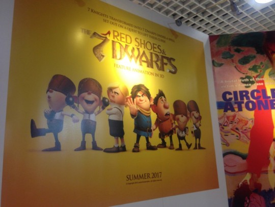
All right, so. After its conception originally as a short story by the South Korean studio Locus Creative in 2009-2010-ish, Red Shoes and the Seven Dwarfs was being worked on and was set to come out in Summer 2017, as evidenced by this poster at the 2015 Cannes Film Festival, featuring a different logo and very different character designs for most of the dwarfs.
In early-mid 2016, the first teaser (in which we see Snow White undress and then two dwarfs recoil in horror at her fatness when she takes her magic shoes off) was released, after the film had kind of been slowly chugging along for 6 or so years. (I am having such trouble pinpointing when the second teaser was released (in which one of the dwarfs basically attacks Snow while she is sleeping to steal her shoes), but I believe it was around the same time.) The teasers didn’t get that much traction because this was a small film from a small indie studio in South Korea.
None of the final actors had been cast yet. At this point in the production, the story was different, one of the many versions that the movie went through. As in the final movie, the dwarfs were actually cursed knights/princes and Snow White switched back and forth between two body types due to her magic shoes, but in this version, the dwarfs needed to steal the shoes from her in order to break their curse (rather than needing “a kiss from the most beautiful woman in the world” like in the final movie).
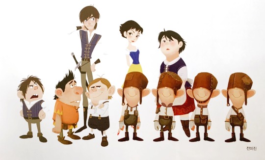
The weird thing is, I believe they had JUST changed the movie’s story when the teaser came out. I’m almost positive it was released more as a proof of concept than as an actual trailer for the movie. They had just recently combined two separate characters (seen above), a typical pretty, skinny princess character (Snow White) and a cute chubby girl character (’Bonnie’), into one single character that switches back and forth between the two appearances when she wears the magic shoes (also they had just dropped literally half of the movie taking place in the real world, with a magic mirror portal, it was a whole thing).
They didn’t have the details of this aspect of the new story hammered out yet, and the first pass at presenting Snow’s magically changing body type, was, yeah, not good and super offensive. This was a really inexperienced indie studio making their first film on a low budget, so even the animation and voice acting wasn’t great. I think they just wanted to get SOMETHING out there because it had been 6 years and they wanted to have something to show for it.
But here’s the thing. Despite how the teasers make it seem, this was always supposed to be a movie about body positivity, letting go of appearance-based prejudices, and loving yourself and others for who you are and for who they are, which we see in the final film.
I like to think of our film as a kindhearted one. Our intentions are nice.
- Director Sung-ho Hong
It’s important to keep in mind that this movie was made in South Korea by a 99% Korean crew, and, as I understand it anyway, in Korean culture, ‘fatshaming’ is not really a thing that is seen as overtly offensive. Also, children’s media there seems to have more adult things in it than in the US, which probably accounts for the more risque parts of the teasers. That said, I really believe that at this point in the timeline, the movie was on-track to be bad (or at least not very good) when it was released, and it would have ended up bad IF a few key players hadn’t signed on (which I’ll get to in a moment).
Interestingly, the movie’s producer, Sujin Hwang, said in a 2017 interview:
“[Both teasers] were solely produced to induce curiosity. They’re completely irrelevant to the actual story.”
- Producer Sujin Hwang
I think what she was trying to convey was that neither one is a scene in the actual movie, because while the teasers didn’t reflect the revamped story as it existed in summer 2017 (the time of the interview), they DID reflect the earlier version of the story where the dwarfs wanted her shoes, which is what the story was at the time they were made.
Now that we’re in post-teaser 2016, HERE’S where things start to turn around. After the teasers were released, my guy Disney veteran and native Korean Jin Kim joined the project. He and Red Shoes director Sung-ho Hong had been buddies for about eight years and Sung-ho had been trying to get Jin to come to Seoul and work with him at Locus for a long time, and he finally succeeded.

Jin and his twenty years of Disney experience as an animator and senior designer on films like Tangled, Frozen, Big Hero 6, Zootopia, and Moana, had a HUGE HUGE HUGE influence on the movie. He redesigned almost all the characters, oversaw all the visual development from the moment he signed on, and heavily (HEAVILY) supervised the animation, literally going frame-by-frame through preliminary animations and drawing over them, teaching the inexperienced animators at Locus everything he knew. (Literally almost everyone except him either only had TV experience or had no professional experience because they just gotten out of school.)
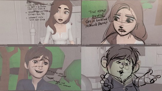
From an outsider’s perspective, it really seems as though Jin joining the project (and his gargantuan effort) made the quality SKYROCKET. Not just in character design and animation, but also in things like effects animation, story, etc. After he joined, Locus really started pushing HARD to make a good, high-quality movie, and his influence and experience from being a prominent figure at Disney was absolutely key. The studio also began to really study Disney films and other well-made animated films from other studios to really try and pinpoint what the DNA of a good animated movie really is.
I don’t have any solid evidence, but I’m pretty sure that Tony Bancroft (an animator and the co-director of Mulan) then joined the project because he’s good friends with Jin Kim. He is only credited as the voice director (the movie was recorded in English and the characters were animated to the English dialogue), but I am SURE that he probably also had a pretty big influence on the movie, because like... How could he not? I really really think there was more to his role than his title would have you believe, even though there’s almost no info out there about it.
So now the movie goes through a gigantic metamorphosis. Character designs, visual development, and animation quality are all rapidly improving, the story is tightening, and the themes of the movie (which, again, were always the same and intended to be positive) are being presented in a more sincere way. The movie is becoming the sweet, self-love-encouraging and body-positive movie that was eventually released.
I’m putting a gif from the credits of the final movie here. As we move into 2017, when the giant eruption of backlash occurred, please keep in mind that the story was finalized at this point and that THIS was the movie people were so mad about:

Chloe Grace Moretz accepted the role of Snow White immediately after she read the script and she recorded her lines (I think) in early-ish 2017. Her co-star Sam Claflin also immediately accepted the role of the romantic interest, Merlin, after reading the script and recorded his lines in (I believe) July 2017.
In the summer of 2017, the story and script were more or less the same as in the final movie. Promotional images from that time show that most of dwarfs had been completely redesigned by this point and didn’t have their teaser designs anymore.

They also released a few screenshots that look exactly like the final film. The movie was advertised as coming out in ‘2018′ at this point. Here’s a promo image from 2017 that is MUCH more tactfully worded than the infamous Cannes poster:

So now we’re in summer 2017. The Cannes Film Festival. The movie’s script and story have been basically nailed down, animation is underway, and the Korean film company Finecut is beginning to market and sell the movie to worldwide audiences. They are planning on showing some footage to potential buyers at the festival, and they make a poster to advertise the film there.
Unfortunately, it’s THIS POSTER:

Now here’s where there are some unknowns. By this point, the movie is basically in its final form, which is an adorable, body-positive story about loving people for who they are, loving yourself for who YOU are, and that provides commentary on society’s standards of beauty and how they affect how people are treated/viewed. So why this poster??? All I can really tell is that someone (I think Finecut) really, REALLY messed up and either horribly mistranslated the tagline, or didn’t do enough research to know that this kind of thing is REALLY NOT OKAY in western culture.
The above picture is shared and the internet backlash begins, fueled by tweets from prominent body-positivity activists like Tess Holliday. Even Chloe Grace Moretz speaks out against it, because she of all people KNOWS that that’s not what the movie is about. The internet then finds the old teasers from before the movie was revamped and it makes things worse. Producer Sujin Hwang profusely apologizes and says that that is NOT the message of the movie. Locus pulls the advertising campaign, and takes down the two old teasers.
“Our film, a family comedy, carries a message designed to challenge social prejudices related to standards of physical beauty in society by emphasizing the importance of inner beauty.”
- Producer Sujin Hwang
Voice director Tony Bancroft also tried to explain the situation:
“The truth is the film has a body-positive message as its core theme–it’s the opposite of what reports are saying. The problem is one poorly translated movie poster that has been taken dramatically out of context.”
- Voice Director Tony Bancroft
And then... There was nothing for a while. The movie didn’t come out in 2018 and was delayed. From what I can tell, I DON’T believe this delay was related to the Cannes backlash. I think it was mostly due to Locus’s limited budget and resources, because as we know, animation is difficult, time-consuming, expensive, and easy to do badly but hard to do well. Also, probably with Jin Kim and Tony Bancroft’s influence, they REALLY wanted to make sure to do a good job with the animation because they now had a great story and they really wanted the movie to be a quality, worldwide hit that would kind of put South Korean feature animation on the map. Just take a look at how nice the final animation was:

The movie was released in South Korea on July 25th, 2019. Unfortunately, the damage was done in the English-speaking markets and it was not released to an English-speaking audience until June 22, 2020, when it was released digitally in the UK. At the time of this post, there is no set US release date, but the distribution rights were recently bought by Lionsgate and the MPAA gave the film an official PG rating.
So who’s to blame? There’s no good answer. You could blame Locus for making those old teasers. You could blame Finecut for the competely tonedeaf Cannes poster. You could even blame cancel culture for raging against the movie based on one poster and two old teaser trailers without researching what the movie was actually about.
All I know is, it’s a damn shame.
#mooncactus#red shoes and the seven dwarfs#red shoes and the 7 dwarfs#animation#animation production#animation history#red shoes movie#redshoes#jin kim#tony bancroft
4K notes
·
View notes
Photo
Part 3 - “ I thought we had some kind of agreement but with you it was just prurience”
So, where were we. Ah yes....Record Store Day 2019.
It was, perhaps inevitably, a heavy day for Fall fans. Lead-in times both for the manufacture of vinyl records and for participation in RSD are such that Smith's death came too late for the impact to be evident in the 2018 event but for 2019, we were absolutely flooded in a way that caused some, quite rightly, to question the judgement of the organisers in allowing so many obvious vultures to swoop in for an easy bite.
The “monitor mixes” from the 2CD edition of “The Unutterable” were pressed to vinyl for the first time. “Whoo-fucking-pee” quoth the faithful and you will have absolutely no difficulty acquiring it today should you be down to few enough marbles for it to seem like a good investment. BMG hold the rights to the group's Rough Trade recordings and went with a box set of five 7” singles under the awful title “Medicine For The Masses”. This was the exact same format as “The Rough Trade Singles Box” from 2002 although with the bonus of containing the correct Peel Session versions of “Container Drivers” and “New Puritan” (Castle/Sanctuary had updated the 5 disc CD edition once they had acquired the rights to the BBC tracks but the vinyl edition of Italy's Earmark Records retained the Grotesque and Totale's Turns versions used in the initial pressings). Given not only that none of this material is any way scarce but that an excellent single LP release had been given to all 10 tracks in the box (Peel takes included) by US imprint Superior Viaduct in 2018, it was perhaps inevitable that “Medicine For The Masses” pretty much flopped on the day and can now be acquired brand new for a good £10 less than the asking price on the day itself.
Ah yes, Superior Viaduct, let's not forget them. A well-regarded reissue label with a smattering of current artists, they had already issued some Fall vinyl in 2016/2017, putting all the studio albums up to “Perverted By Language” back onto vinyl as well as the first 2 singles and the eternally category-defying “Slates” 10”. Following Smith's passing, they have (almost) completed the task with the aforementioned “Rough Trade Singles” LP and a new pressing of “Totale's Turns”. These editions have been very well received and have been praised for the quality both of the mastering and of the pressings but they remain largely inaccessible to UK fans due to licensing restrictions preventing the editions from being imported. As such, you'll hafta pick these up on a one-to-one basis off your own bat.
Right, back to Record Store Day 2019. We also had the “opportunity” to buy a number of live albums. 5 of them, in fact. All of these had previously been released on CD towards the end of 2018...so this was going to be called Crap Rap Part 14 but it's now called “Stop Releasing Every Gig You Can Find On Some Mouldy Third Generation Maxell C90 on a double LP”
Live albums have always been canon with The Fall. “Totale's Turns” was their 3rd LP release, “Live In London 1980” was issued by Chaos Tapes with the group's permission in 1982, “Fall In A Hole” was allowed until copies were exported. We had “Seminal Live” and “The 27 Points” mixing live with studio, as did “I Am Kurious Oranj” with several tracks recorded during the original Edinburgh run of the ballet. Even the “Perverted By Language Bis” video was largely live material. Even once the shark was jumped in the late 90s/early 00s with the endless recycling of those outtake/live compilations, there were official live missives, such as the excellent “Last Night At The Palais” in 2009, the wonderfully titled but patchy “Uurop VIII-XII Places in Sun & Winter, Son” in 2014 though to the terrible “Live In Clitheroe” in 2017. So, all in, it comes as no surprise at all that over 20 more live albums have been added to The Fall's discography since Smith's sad departure from this realm.
There were no less than 5 live albums dumped merrily onto the shelves for RSD 2019, 3 of them doubles. On their own, this would have been an outlay of over £100...in fact, if you wanted the full RSD Fall, you'd have had little or no change on the day from £250. For exactly no unreleased music. No unreleased music? What were these live albums then? Let's wind back to late in 2018... (I told you this was tough to do in any kind of linear fashion).
Arriving via the PledgeMusic site, “Set Of Ten” released by “Cog Sinister”, worked like this: 10 previously unreleased live recordings were contained in a sturdy square box with spiffy new artwork from Pascal LeGras. The tariff? £100. Ouch. Now, a handful of them were announced as separate releases, however, if you bought the box you would receive an exclusive disc – a recording from Derby, 1994. Cometh the hour, the Derby CD was one of the first to be released on its own. Huh.
A small amount of digging revealed that this set was the work of Rob Ayling. With the dates running from 1980 to 1999, the general opinion re: Set Of Ten was that these tapes were very likely to be in Ayling's possession due to the “Live From The Vaults” series on Voiceprint, Ayling's previous imprint, from 2005. When that series was announced, the five releases were said to be simply the first batch. It could therefore be deduced that these tapes had been destined for future batches. At the time, there was a minor dust-up over them and no further volumes were issued. Whatever the motivations, presenting an 11 CD set of old bootlegs with so little quality control being put into the audio and asking £100 for it felt like cold ash in the mouth. Worse still, PledgeMusic went bust before many customers could receive their sets, leaving them to either claim chargebacks on their credit cards or simply out of pocket as ordinary creditors to the failed business. It must have been galling for those who lost money to see the CDs arriving on their own and several cut onto expensive vinyl.
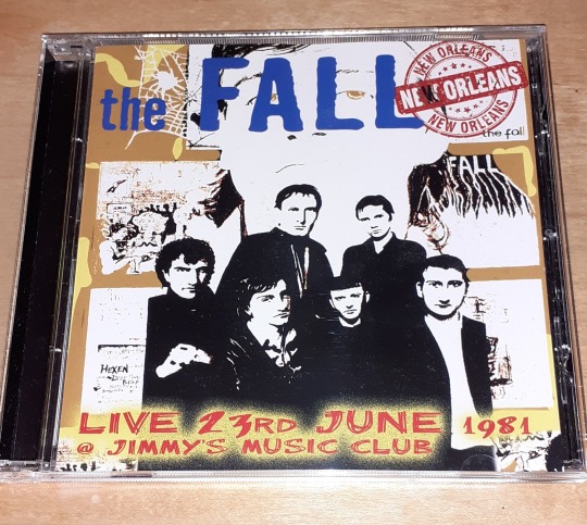
I've picked up a couple of the CDs separately and these have been largely fine. Recording quality is listenable but obviously audience derived. The best one by far of those I've heard is “Live 23rd June 1981 @ Jimmy's Music Club New Orleans”, a great recording of a full-tilt Fall performance from a critical time in their existence (pictured) . There's a palpable tension, possibly due to the return of Burns, brought back not just out of practicalities but also to even the group up a bit, now that Smith was beginning to reconsider the wisdom of having a team of childhood friends for a group. Rehiring Burns was designed to put some grit back into the machine and it worked. Having a full set from this line-up is a worthy addition to the canon and it should be snapped up before it vanishes – this is the only one of the “Set Of Ten” CDs that seems to be thin on the ground. The artwork and credits show the level of care taken over the release; that is – pretty much none. The CD artwork has the 6 piece “Hex” line-up – Karl Burns is the only drummer here as Paul Hanley was at home doing his O Levels. However, the sleeve credits Paul Hanley and not Burns, adding a credit for Duncan Burndred, who was the group's driver at the time. The info had been sourced from the “Slates & Dates” press release which credited Burndred with “the rest” (ie anything other than music and management). Likely pilfered from thefall.org, this missive was retooled for the artwork without any real consideration.
However, it seems there was sufficient demand out there and, cometh the tail end of 2019, cometh another Set of Ten, given the snappy title...”Another Set Of Ten”. They must have been up all fucking night thinking of that one. Again, it has 11 discs. It does get interesting here insofar as most of the tapes come from between 2009 and 2013 suggesting not only that there wasn't much left from the original “Vaults”- destined batch but also making it unclear from whom these tapes were being licenced. They are, of course, under no obligation to discuss such matters publicly and, indeed the current incarnation of Cog Sinister would likely feel aggrieved at having the question asked. They are, after all, a legitimate enterprise.
A quick skwizz at the Discogs page tells you that “Another Set Of Ten” is not a triumph; all the tapes are listed as being audience tapes, one disc has just six songs from the gig and several others are also incomplete and/or mislabelled. The main contributor to the Discogs entry (to whom, hello!) notes that the tracklistings appear to be taken from photographs of setlists uploaded to thefall.org's justly revered and thoroughly sublime gigography but, where the setlist didn't match what was played, no attempt has been made to correct this. They haven't even matched up the content with the tracklistings!!! At time of writing, these ones are just starting to slip into the shops on their own, possibly Covid delayed as you could get them via online retailers for a while. The cover for a Manchester gig from 2009 looked like a sick joke and it was hard not to think similar (albeit at lower pitch) about the inclusion of an infamous Motherwell gig at which MES was completely plastered and Brix had quit the band an hour or so before the show. What's next? Worthing? Brownies?
Yet it is very hard not to be continually tempted. There's some juicy setlists in these discs and the artwork at least has some effort – Pascal LeGras has done a very fine job here and his art certainly gives the right feel to the releases. I'm guessing that was the plan. I’ve got my eye on a few. It’s a disease this, I tell you...
Anyway, one way of the other, 5 of the “Set Of Ten” discs found their way onto vinyl on RSD, courtesy of reissue imprint Let Them Eat Vinyl and all of these are still easy to score, should you wish. The whole Gonzo/Let Them Eat Vinyl hookup is interesting for scholars of who-owns-what in terms of The Fall's catalogue. As above, we know that BMG have the Rough Trade recordings but LTEV's “Grotesque”, issued in 2017, states it is licensed by Sanctuary.
LTEV have also been putting some of the other lesser releases from the catalogue onto vinyl, including 2 mid 90's live albums (Phoenix 1995 and “The Idiot Joy Show” - nothing that was wasn't available for buttons on CD in the early 00s) as well as “Interim”, the demos and live cobble-together that attempted to snatch defeat from the jaws of victory in 2004. The latter had never been pressed to vinyl before and with bloody good reason. Yr mileage, as always, may vary.
Whilst not The Fall, acolytes will doubtless want to know that Ed Blaney issued a 2CD edition of “The Train”, containing the full 40-minute “(Part Three)” CD, a similarly lengthed alternate version and a clutch of remixes. Blaney also uploaded a properly touching tribute to Smith on YouTube, including reminiscences with other friends of Smith.
One more part to come, in which we burn the spotlight of shame onto a couple of the worst products ever to have had the name The Fall unwillingly emblazoned upon their sleeves and take a quick look over some of what we know is in the pipeline.
6 notes
·
View notes
Text
venting angst productivity failure time sleep practice progression
12:10 AM 3/25/2019
My daily figure photo series "Waiting for Ryuji" plus the daily/monthly drawing challenges I keep doing, are both destroying my days. x____x; It's been more than a week, and I haven't even finished the 23 paopu halves plushies I was supposed to do within 1-2 days! I have so many projects to do for artist alley in early July! ;O; So many new products I want to make, but I have no energy! It's becoming clearer that I only have energy for 1 (maybe 2) projects per day! ;O; That's just the 2 daily art projects/challenges to keep my art muscle in shape! ;~; Aughhhhh! ;o;!
Thank goodness I take notes for how long it takes me to draw different stages of a drawing, or else I would never have noticed I've been taking 3 hours per sketch. O~o?!!!! How is that?! I'm not trying to be polished with those! That was supposed to save time! I mean, I'm not doing all-nighters anymore, like I did for Inktober 2017, so that's an improvement. But 3 hours?!????????? It takes me 10 minutes to do the primary sketch. I know I can have problems designing a costume or conceptualizing a monster design, but 2 hours and 50 minutes?!?!?!?????? Omg... I'm so hopeless. Is this worth keeping my illustration muscles/skills in shape? I've already accepted that I'm not an illustrator. I suck too much. I usually call myself a crafter, a jewelery, or a clay sculptor...Even though I've been drawing more frequently than ANY of those in a LONG time. x~x;;;; Is all this time really worth just TRYING to become better at drawing? ;~; I wanted to be able to nurture this skill so I could express myself with drawings, whenever I needed to express something. But today was "Kiss Ryuji Day" and I was still too intimidated to draw anything for it, because I'm too afraid of how bad my attempts always turn out. I couldn't even draw a good hug between Ryuji and Akira during OTPtember2018! (It was such a bad drawing...That I tried SO hard on! ;_; ) I mean, I have to admit that I could turn some of my Magical March and MerMay challenge drawings into merch for artist alley, but objectively, none of it is good. It's good *for me*, but compared to the competition in artist alley...What am I even doing there?!? Looking at my sales data, the answer is I'm selling polymer clay sculptures, so again the question becomes, why am I using so much time to learn to draw, just so I can express myself, when it eats all my time away from making more clay sculptures that actually sell? Is being able to express myself such a hang-up for me? ...Yeah. ~.~;
So what about the figure photography? I'll admit that those answers are simple. It's a good way to practice an "eye" for composition, lighting, posing, etc. I suck at it, and I don't put much effort into my lighting to mean anything against such greats as Kixkillradio, Love Pink Cheeks, Nendo Stories, etc. When I look at their stuff, I can recognize how little I'm trying, and I have to ask myself "why am I even trying?". Considering my self-expression fixation, figure photography is a good fill-in medium until I can better develop my drawing skills. And I did originally start collecting figures to use as drawing models, which unavoidably funnels me into figure photography, so it's not like it's something I'll fully stop doing even if I stop setting up photoshoots and dioramas. But I also really like making miniatures, figure accessories, diorama props, etc. My sister said something like that if something makes me happy I shouldn't feel guilty about it and I should pursue it. Whether I vent about how terrible I am for spending so much money on Nendoroids or when I refrain from buying supplies that could make my life less irritating out of frugality. Maybe just feeling happy from doing figure photography is enough to justify it. So maybe I shouldn't stop. ...But I need to stop spending hours on Photoshop elements for figure comics. That needs to seriously cut down, especially for a daily photo project.
I know it never works when I resolve to stick to a schedule, but I really need to cut down how much time I use for these daily art projects, when artist alley is in a few months. I don't outsource my products. I have to make each and every one by hand. That's the curse of the crafter. I need to use more time for these crafts. Jewelry, sculpting, designing, problem solving fabrication, etc...It's all stuff I love to do and once I start I don't want to stop... But at this rate, I'm never going to get to it. And then it'll just be a repeat of my horrible history. Sure, last year I was able to finally make enough polymer clay Wayfinders to not sell-out my entire stock, half-way through Anime Expo---for once! But it was still a situation of crunch time focused only towards my essential products and past best sellers, vs the thing I really wanted to do, which is making new products as well. I waste so much time watching productivity videos, trying gameified motivation apps, and so much time wasted trying bullet journal techniques, thinking that if I just use this tracker or try this analog gameification technique, I'll finally stick to a schedule and thus be able to do everything I need and want to do.... But it always fails. I really can't do more than 1 thing reliably per day. And I have to practice daily to keep my skills up---my skills are too low to keep it to a once-per-week practice session.
And it's started to wear down on me how much all these attempts and failures at a schedule are ruining my sleep cycle. Everyday, there's a midnight I don't manage to get into bed on time, or a midnight in which I don't manage to be truly productive before midnight, so I have to stay up to get something done so I can go to bed, feeling good about myself as a person. It's not as bad as school, but it is still a daily sense of failure, like school. I recall the months (years?) that I resolved to no longer try to have a normal person's sleep schedule and just simply work on my projects as long as I have the will for, and than collapse into bed whenever. I worked hard to have no social life, to have no one in my life vying for my time, so I should have no need to live in the same Time as anyone else. But I had a breakdown last year, where I had to accept that I wanted the revive the good relationship I used to have with my mom, and I had to resolve to put some effort towards that. So now I guess I have to live in the same Time as other people. So I can't just be noctural and asleep while everyone else in my life is awake. Yesterday, I think they tried to wake me to go to my uncle's birthday party/luncheon/dinner, but I sleep during the day and wake at night now. I don't have FOMO for parties, being an introvert, but the next time---or rather how many times has my mom wanted to spend time together and I'm just in a different Time than her? They go to movies every Tuesday sometimes invite me, haven't mentioned it in a long while, and for the past 2 weeks, I haven't even been able to be awake enough to go to two movies I've wanted to watch during the Tuesday-discounts. Even right now, I'm staying up late again because I got sleepy during the day, and had to nap (and quite frankly I get better quality and more productive recuperation during daytime naps) so now I'm all rested to be awake...and it's past midnight. Last week I finally got to a place where my sleep cycle more resembled a normal person's pattern, after 2+ weeks of work towards that. And then one or 2 projects that went into the night, and all that progress was gone. Sleeping like a normal person wouldn't be such an issue for me if I would actually be rested enough to be awake for when I want to get to work. But I can't sleep even when I'm trying to sleep. I'm amazed how spectacularly my attempts to sleep fail whenever I get to bed early ("early" as in a normal person's sleep pattern). Is this all a lost cause? Just like the rest of my life?
Ugh. I need to eat and sleep.
2:13 AM 3/25/2019
Earlier today, my mom seemed to imply we could watch a movie on cable together, but I was in the moddle of a project. I was fixated on a project instead, since sleep/fatigue had taken all my time, so the rare moments of productive will I have, I don't like to let go of it whenever I happen to have it. It may ruin me, but in the end, I'd rather pay the cost of an all-nighter to get a good piece done, and have something as proof that I can be proud of myself (as well as use for artist alley for years to come), vs getting sleep on a normal person's pattern and have done nothing that stretched me beyond the limitations I thought I had. I like that proof of worth. (I've been seeing posts lately about "your productivity/skill is not your self worth" but I can't completely buy into that for myself anyway.) With my lack of memory and sense of self disappearing along with it, having artwork left along the way, as proof of who I was, what I'm capable of, and as concrete encouragement, proving that I can do great things, I have that inside me, even if those "great" things are just stretching beyond my subjective limitations by only milimeters...those are memories and senses of myself that I want and value. ...And having new pieces in stock, ready to be turned into new artist alley products at the last minute, while I'm feeling bad that I hadn't had time to make anything new, is also great.
1 note
·
View note
Text
Dear Cedric Phillips and GerryT,
Having listened with great interest to the “Change Worth Fighting For” episode of the Cedric Phillips Podcast, I felt compelled to reply. On that episode, you wondered why professional Magic players have seen their fortunes decline so precipitously over the past ten years, and what they can now do to improve their situation. I believe I can help explain this reversal of fortune, and offer some relevant advice. What follows is a little on the long side, and perhaps a little depressing, but I hope you will nonetheless find it edifying. If you like, it would be my pleasure to discuss these matters further.
About me, briefly: I’ve played Magic on and off since the release of Fallen Empires, and am a regular consumer of Magic content. Among other things, I’ve watched every Pro Tour since PT Los Angeles (October 2005); I’ve watched countless LSV draft videos and Twitch streams; I’ve listened to hundreds of episodes of Limited Resources, Mark Rosewater’s Drive to Work podcast, and various other Magic podcasts; and I’ve read just about every column that Mark Rosewater has ever written. At the same time, I’m also an English Ph.D. and author whose research interests include the economics of fantasy artworks—for instance, my most recent book, I Find Your Lack of Faith Disturbing: Star Wars and the Triumph of Geek Culture, tells the story of how geek culture went from being an underground phenomenon to a mainstream demographic. Given that, I tend to view Magic from a financial perspective—by which I don’t mean living the dream of playing on the Pro Tour, or making a fortune by speculating on Magic cards, but rather trying to understand why Wizards of the Coast makes the economic decisions that it does.
I am hardly a Wizards insider. But I believe that my research into Magic’s financial history, coupled with my broader knowledge of fantasy franchises, enables me to understand why Wizards has chosen over the past decade to disinvest in its Pros, even if that decision appears baffling and counterintuitive to those players. For years now I’ve watched Pros complain about their situation, wondering why, if Magic is doing so great, then why are the Pros suffering? Shouldn’t their fortunes rise and fall with Wizards’? As you yourselves put it on your podcast, “the stars sell the cards,” by which logic if Wizards wants to succeed, then it needs to build stars. Just like how the NBA promotes LeBron James, and not simply “hoops,” Wizards should promote, say, Reid Duke, and not simply “Siege Rhino.” By that same logic, if Wizards doesn’t build stars, then it won’t sell cards, and everyone’s fortune will decline.
I sympathize with your argument. I love watching professional Magic, and once attended a Pro Tour as press just so I could blog about it. But at the same time, I think that your logic is mistaken, and I suspect that your arguments will fail to impress Wizards. Because while it appears to you that Wizards is behaving irrationally, or foolishly, the fact remains that the company long ago settled on a business plan that involves investing less in its Pro players, not more. This is because Wizards has already tried the strategy that you cite—promoting Magic by championing in its Pros—only to find that it didn’t work out that all that well. Indeed, it proved nearly catastrophic. And because of that, as well as for other reasons, Wizards has spent the past ten years rebranding Magic as something other than a competitive tournament game.
Let’s review the relevant history. In 1996, Skaff Elias, Magic’s first Brand Manager, created the Pro Tour in order to promote Magic, and for the next twelve years, Wizards invested heavily in competitive Magic. Wizards ditched Magic’s original whimsical fantasy flavor (not to mention nearly all of the game’s female artists)…
…refocusing the game around dueling mage-punk badasses.
In September 2005, Magic’s creative lead, Matt Cavotta, described the game’s flavor as follows:
Magic is a head-to-head battle of wits in which two spellcasting warriors fight to the death with magic and armies of bad-ass creatures. Every card illustration should work in that context: active, aggressive, cool, wicked, “edgy.” The word “magepunk” works for us. Remember, your audience is BOYS 14 and up.
There were even two blocks centered around pit fighting.
In the Pro Player Era, Magic became a game about winning and dominating, as Wizards targeted competitive young men, selling them dreams of fame and glory, as well as the chance to “play the game, see the world.” The greatest dream was winning the Pro Tour, which Wizards presented not only as the pinnacle of Magic, but as a recruitment pipeline, using it to hire players like Randy Buehler and Aaron Forsythe. Small wonder then that, during this time, Wizards catered heavily to the Pros by creating Magic Online, the Magic Invitational, the Pro Players Club, and the Pro Tour Hall of Fame, and by making the Pro Tour Player Cards, which went inside actual packs.
Wizards also made Magic the way Pros tend to like it: grindy and combo-heavy, chock full of abstract mechanics and cards that skilled players could abuse to gain incremental advantage. For a dozen years, the Pros were Magic’s foremost ambassadors, and the stars did in fact sell the cards.
The problem is that they didn’t sell that many. By catering so heavily to Pros and Pro-wannabes, Wizards steadily alienated its casual players and much of its female fan base. (Scroll, for instance, through these photos, taken at Worlds 2008.) At first, Wizards didn’t know it was losing these customers. On an early episode of his Drive to Work podcast, Mark Rosewater explains that Wizards began calling those disappearing players “the Invisibles,” a shorthand for “people who play who don’t participate in organized play.” Take a moment to let that terminology sink in: during the Pro Player Era, Wizards was so invested in Magic as a competitive game that it didn’t even know that non-competitive players existed, and as such apparently had no good means of tracking their preferences or spending habits. But by 2008, Wizards could no longer deny that its business strategy wasn’t working. Magic was in financial crisis, with sales declining despite the fact that tournament attendance was good and the Pros loved perplexingly complex blocks like Ravnica, Time Spiral, Lorwyn, Shadowmoor, and Alara.
The Pro Player Era came to a rather abrupt end in 2008. That year, Hasbro got a new CEO, Brian Goldner, who appointed a new CEO to Wizards, a man named Greg Leeds. Leeds’ first order of business upon arrival was to clean house, and get Magic back on stable financial footing. Leeds fired several employees (including Randy Buehler), and stripped Wizards back to its core products: Magic and D&D. All other Wizards products—boondoggles like Hecatomb, DreamBlade, and Gleemax—went by the wayside.
Leeds could see that Wizards was spending too much on enfranchised, competitive gamers even as it failed to attract and acquire new players. Part of the problem was that Magic had grown too abstract, too daunting, too mind-meltingly complex for newcomers to grasp. Under Leeds’ direction, Wizards took steps to reverse course. The company partnered with Stainless Games to create the new-player-friendly video game Duels of the Planeswalkers, which launched in June 2009 and proved an immediate success. Wizards also fundamentally changed how Magic was played. Prior to 2008, Magic was primarily a game about mana, in which strategy revolved around players concealing what they were capable of doing on any given turn, which is why control and combo strategies dominated. After 2008, Magic became a game about creature combat, as Wizards nerfed the control and combo strategies that Pros adored, but that infuriated casual players. Wizards also simplified the game’s rules and implemented “New World Order” in an effort to curtail “complexity creep.” Ever since then, Mark Rosewater has cited “complexity” as the greatest threat to Magic’s survival, and Wizards has continued making changes to simplify the game, most recently scaling back the number of new mechanics in each set, and eliminating the block structure. (See Mark Rosewater’s “State of Design” columns for 2016 and 2017.)
The Pros at the time grumbled about the way that Magic was changing, but by and large they accepted what Wizards was doing, reasoning that if and when the game’s fortunes improved, their fortunes would as well—what you, GerryT, called the “trickle-down” theory of Magic. The Pros also accepted that, for the time being at least, sacrifices were needed, so they sucked it up when Wizards reduced its spending on them. The Magic Invitational and the Pro Tour Player Cards disappeared, even as payouts and player perks decreased, as did the number of Pro Tours. The remaining PTs were closed and scaled back, and synced to the latest set releases, no longer taking their names from the cities hosting them. It may not have been obvious at the time, but Wizards was abandoning the concept of “play the game, see the world,” and so it was that in February 2012, Pros attended Pro Tour Dark Ascension, and not the third Pro Tour Honolulu (!). It would seem that, in order to justify its continued existence, the Pro Tour needed to come across less like a vacation for a select few, and more like an ad for the latest set.
But the changes to Magic didn’t stop there. Here it will help to understand how Brian Goldner became CEO of Hasbro, and how he thinks about Magic—how he thinks about all of the company’s top brands. Goldner joined Hasbro in 2000 after working for Haim Saban, the man behind the Power Rangers franchise, and he rose to power by applying Saban’s brand strategy to the Transformers line of toys, transforming it, so to speak, into a massive movie-centric franchise that’s still going strong. (Bumblebee is due out in theaters soon.) Since becoming CEO, Goldner has taken the same approach to a number of Hasbro brands, making movies out of G.I. Joe, Ouija, Battleship, and My Little Pony, and attempting to make films out of Monopoly and Magic. In this way, Goldner has spent the past ten years moving Hasbro away from being a company that acquires licenses to make toys for other brands (such as Star Wars), and more toward becoming an entertainment company that promotes its own brands through movies, TV shows, and other media. (The company recently tried to purchase DreamWorks Animation.)
The way Goldner sees it, consumers aren’t looking to buy toys or Magic cards or physical products per se, but rather emotionally resonant experiences. By this logic, Transformers fans (for example) are looking for all kinds of opportunities to express their love of Transformers, from buying toys and watching movies to putting Autobot emblems on their cars and getting Decepticon tattoos. Or even doing random things like buying bags of shortbread cookies adorned with illustrations of Optimus Prime and Bumblebee.

The trick is to give fans limitless opportunities to express their identity as fans, and thereby experience the joy their fandom brings them. In that way, they bond emotionally with the brand, coming to regard it as an essential part of their life.
Goldner transmitted this philosophy to Wizards via Greg Leeds, which is why, post-2008, Wizards became obsessed with creating emotionally resonant experiences for its players. Aaron Forsythe designed Magic 2010 in order to recapture the resonant flavor of Alpha, and Mark Rosewater designed Innistrad in order to make players feel (pleasurably) afraid. Rosewater even reconceived of his job as designing not Magic cards, but emotional experiences for players. As he put it on a 2013 episode of Drive to Work:
The last couple years […] I’ve been making sure that when I make a design, that I have an emotion that I am getting out of you. That I, the game player, am going, ‘What experience am I trying to create?’ And I want to make sure that I’m making gameplay that has that emotional response.
Goldner also encouraged Wizards to create intellectual property for Magic—characters and plot lines that could be exploited across other media. Wizards responded by rebranding Magic around the Planeswalkers, a growing cast of recurring characters that can be represented not only in card form …
… but as Funko Pop figures …
… and as pieces in a board game …

… as well as characters in movies and TV shows and theme parks and Broadway musicals and—well, anything Wizards wants, really, including media and products yet to be invented. (Here, other franchises, like Harry Potter, the MCU, Star Wars, and Avatar, have been leading the way for a while, and Wizards is scrambling to catch up.) This ambition is what led Brian Goldner to claim during Hasbro’s Fourth Quarter 2014 Earnings Conference Call that Magic is “a storytelling brand first and foremost,” specifying that “engagement with characters is critical,” and it’s why Wizards announced soon thereafter that it would be doubling down on promoting the game’s story, using the Magic website and “story spotlight” cards to ensure that players can easily follow what’s happening with Jace, Liliana, Nicol Bolas, and all the rest.
As you and I know, these changes proved wildly successful: between 2009 and 2015, Magic acquired new players at a rapid clip, topping out at a reported 20 million. But as you and I also know, even though Magic financially recovered, the Magic Pros did not. Instead, in 2018, the Pro players’ condition is more precarious than ever, despite the fact that Magic is at or near the height of its popularity. Which is to say that Magic’s recent success has not, in fact, benefited the Pros. Rather, it has come at their expense.
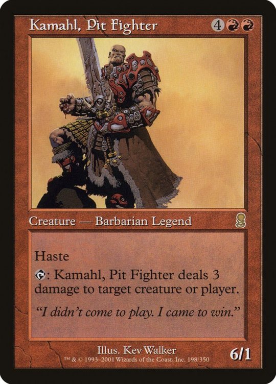
The reason for this is relatively simple, although it might be difficult to see if one is too close to the game, and especially if one is too close to professional play. While Magic has grown tremendously over the past decade, the vast majority of the people playing today aren’t Pros, or even wannabe Pros. Instead, the past ten years have seen the “Invisibles”—casual, non-competitive players—take over. And while it’s true, as you said in your podcast, that people connect with other people, I fear you’re kidding yourselves if you think that most current Magic players are looking to connect with Magic Pros. Casual players and competitive gamers want fundamentally different things from Magic. Competitive Magic players want to test themselves, to participate in the highest levels of competition, where they strategically outplay the best opponents in the world. Like Kamahl, Pit Fighter, they came not to play, but to win, wanting the same thing Bob Maher wanted: “Greatness, at any cost.”
Casual players don’t want that, not at all. So while the Pro Tour remains, for professional players, the pinnacle of Magic, it’s a total bore for casual players (assuming they even know it exists). For one thing, as everyone knows, it makes a decidedly poor spectator sport: there’s tons of down time, and when players finally do sit down to battle, viewers can barely make out what’s happening, let alone read which cards are in play.

Beyond that, the game play itself is frequently anticlimactic, with a large percentage of games being won or lost due to mana issues. (Witness LSV losing the very last game of PT Guilds of Ravnica after mulling to four.)
It’s easy to forget, after learning something, what it was like not to know it, and competitive Magic players often forget how much knowledge is required in order to watch and enjoy the Pro Tour. Not only does one need to know all of the relevant cards and decks in a given format, but one has to understand top-level strategies, as well as issues like priority, triggers, and so on. Casual players don’t understand these things, and they don’t want to understand them. In March 2017, the Limited Resources podcast spent ninety minutes providing a detailed overview of Magic Online and “all of the phases and steps of Magic.” Casual players don’t want to listen to podcasts like that; nor do they want to learn how to set stops on Magic Online, or how to even start playing Magic Online.

Nor do they want to memorize draft pick orders, or feel like they have to know every combat trick in the format in order to play. They don’t want to have to do tons of homework just to play Magic. As such, these players (happily) lack the knowledge and proclivity required to appreciate the things that Pros obsess over, like in-depth analyses of strategy, or three-hour-long video series discussing the Top 100 Magic Cards of All Time, or even longer set reviews that scrutinize every card in a new set with an eye toward limited play. They don’t want to be Pros.
You can see this in the fact that casual players prefer playing different formats than the Pros do, to the point where the two groups are practically playing different games. Whereas Pros want to do Rochester drafts (with Beta packs!) and brew Standard decks and play Legacy and Vintage and Vintage cube, casual players gravitate toward formats like Commander. Pros famously dislike that multiplayer format due to the outsize role that politics play in determining who wins and who loses. But casual players are less invested in whether they win or lose, being more concerned with playing a fun, social game with people like themselves—people who express themselves not through crushing their opponents, but through the Guild identities, Commanders, Planeswalkers, and tribes. These players couldn’t care less about solving the metagame; since they lack the luxury of being sponsored by card shops, they can’t easily swap between decks, or afford to do dozens of drafts. Instead of playing with the best cards in the format, they play with the cards they happen to own, and if they do invest in a deck, it’s usually one that suits their personality, and that they can go on to play year in and year out, tinkering with over time.
Because these players are numerous, Wizards has spent the past decade shifting resources away from the Pro players and toward the larger, more casual demographic, rebranding Magic not as a cut-throat competitive game, but more as a fun play experience—hence the onslaught of casual-friendly products such as Archenemy, Conspiracy, Commander decks, Unstable, the full-art promos for Ultimate Masters, and Magic Arena. The Magic brand no longer revolves around winning games of Magic; indeed, it no longer necessarily involves playing games of Magic. Since 2010, Magic Prereleases have routinely featured events like unlocking the Helvault (Scars of Mirrodin), picking a side in the Mirran-Phyrexian war (Mirrodin Besieged), choosing a clan (Khans of Tarkir), and puzzling one’s way out of the “Stitcher’s Lab” escape room (Shadows over Innistrad)—i.e., ways of getting players to engage with the Magic brand beyond building decks and playing matches. Rather than being cute side events, these types of activities are increasingly the central attraction. Two months ago, Wizards announced its intention to rebrand Grands Prix as “MagicFest,” or “weekends about so much more than just the main event,” including “side events, artist booths, cosplay, panels, [and] spellslinging.” (Pro Tours will be held at MagicFests.) Today’s Magic players are looking for more than just tournaments, which means that tournaments alone aren’t enough to sell and promote the Magic brand. (Wizards can no longer justify paying for standalone GPs and PTs.)
The shoe is now clearly on the other foot. Gradually, steadily, over the past ten years, the Pro players have traded places with the Invisibles, receding from view. At the Magic Subreddit, the top posts concern topics like Magic story, Magic art, card alters, and cosplay; rarely do they involve Magic tournaments. One week after your podcast came out, the “Grand Prix Montreal, Grand Prix Mexico City, and SCG Open Columbus Discussion Megathread!” pinned to the top of the Magic Subreddit received a whopping fifty-three up-votes, and forty-four comments. As it happened, more people were interested in the fact that the artwork for Expropriate features True-Name Nemesis. Small wonder then that the Mothership’s front page routinely ignores GPs and other organized play events, preferring to use that real estate to promote Guilds of Ravnica, Commander 2018, and Magic Arena.

Speaking of which: surely it won’t be long before Wizards moves the Pro Tour to Magic Arena, or replaces the Pro Tour outright with Arena-based tournaments. Already the company is paying celebrity gamers like Day9 and Trump to stream Arena—entertaining personalities who may not be the most skilled Magic players, but who are capable of drawing thousands of eyeballs.

Of course, it’s true that casual players admire certain Magic Pros, such as LSV. But casual players don’t like Luis Scott-Vargas just because he’s one of the greatest players of all time; they like him, and subscribe to the Divination, because LSV is funny and charismatic and loves to durdle and tease Paul Cheon. That’s why they tune in to his Twitch channel even when he does things like sign tokens for GP Las Vegas, choosing to vicariously hang out with him. LSV doesn’t make his casual fans feel stupid; he makes them feel smarter, and as though they’re winning and losing alongside him. In this regard, he’s unlike most Magic Pros, who typically come across to casual players as cold, unfeeling jerks who make Magic unfun by quickly defeating them, then berating them for making bad plays with bad cards and bad decks (or for picking foil Tarmogoyfs in draft).
That is why, in 2018, Pro players are no longer the public face of Magic, having been supplanted by the Planeswalkers. If 1996–2008 was the Pro Player Era, then 2008–present has been the Planeswalker Era. More Magic players today fantasize about being Kiora or Chandra than they do being Magic Pros, which is why Wizards has taken pains to diversify that lineup of characters. The casual player base has always been more diverse than the overwhelmingly male Pro scene, and it’s presumably growing more diverse by the day. (Note how many women and female characters Wizards has chosen to depict on the current Magic homepage.)

And the Planeswalkers offer benefits beyond that. Wizards doesn’t have to pay those characters anything, or fly them anywhere, or put up with them complaining about Magic, or doing things like sitting out Worlds in protest. (Sorry, GerryT.)
Mind you, none of this is to say that Wizards no longer cares about the Pros. I imagine the company is delighted to have such a dedicated group of players that spends all of its time promoting Magic for free by making Magic videos and podcasts—not to mention purchasing Magic cards. And no doubt Pros and Pro-wannabes are still responsible for a significant portion of the game’s revenue. But those players no longer appear to be Magic’s primary audience. As such, Wizards has spent the past decade adjusting its spending on those players to a more appropriate level, valuing them for what they’re really worth, as opposed to what Wizards thought they were worth c. 2006.
Since I don’t want to end this letter on too pessimistic a note, I’ll offer a few hopeful words of advice. Please keep in mind that I am not a Magic Pro. But if I were, I would try to take more of my well-being into my own hands. Fifteen years ago, when Wizards was ignoring the “Invisibles,” some of those players created Elder Dragon Highlander, which went on to become Commander, now the most popular Magic format (and which is still maintained by its own independent rules committee). Today, if the Pros feel slighted by Wizards, then they should make the version of Magic they want to exist—their own tournament scene, their own formats, their own banned and restricted lists, their own Hall of Fame—rather than relying on Wizards to maintain institutions it created in a totally different era, when the company’s priorities were different from what they are now. The Pros should also unionize, or enter into some other collective partnership, and make their stand together, collectively working to attract sponsors and streaming deals. More than anything else, the Pros should recognize that their fortunes won’t necessarily rise or fall with Wizards’, or with Magic’s. But the Pros will certainly rise and fall with each other.
Best wishes,
Adam
An open letter to Cedric Phillips, Gerry Thompson, and the Pro Magic community at large Dear Cedric Phillips and GerryT, Having listened with great interest to the “Change Worth Fighting For…
#Brian Goldner#Cedric Phillips#cosplay#geek culture#Gerry Thompson#Greg Leeds#Hasbro#Luis Scott-Vargas#Magic the Gathering#Mark Rosewater#Matt Cavotta#MTG#Planeswalkers#Randy Buehler#Skaff Elias#Transformers#Wizards of the Coast
1 note
·
View note
Text
Dior Bag
Arguably probably the most iconic bag from Dior, the Lady Dior got here into immense recognition after it was presented to Princess Diana by the First Lady of France in 1995. Consequently named after the princess, the bag is known for its subtle outline and iconic cannage stitching. wikipedia As I personally love to do lots of analysis earlier than investing in a luxury bag and since my YSL Niki evaluation received a lot of views, I determined to put in writing a detailed evaluation of my Mini Lady Dior that will help you in your purchasing course of. Christian Dior’s fantastically crafted purses are recognized for their female and stylish aesthetics. Everyone from fashionistas to royals have been spotted with their iconic pieces. The most popular and sought-after bag from Dior’s collection is the Lady Dior.
Sometimes you don’t wish to be within the driver’s seat and Dior’s Belt Bag lets you go hands-free. This grey metal calfskin bag captures the delicate aesthetic of the fashion home and combines it with the freedom present in your normal belt. No matter whether you pair it with a mini skirt or denim shorts come competition season, this bag is for these who want to give all of it and boogie hands-free. Named after Christian Dior’s beloved dog, the Bobby Bag is an elegant, structured twist on traditional hobo purses.
Signs of wear, light soiling or discoloration of materials could also be present. Soles and uppers don't have any indicators of wear.Like NewShoes are like new with very slight indicators of wear on the soles. Very little to no signs of soiling on the shoe uppers.Gently UsedShoes have obviously been worn, but no indicators of serious put on, abrasions, stains, scratches, or tears on the shoe higher.
Moreover, it provides extremely accurate estimations on the CAGR, market share, and market dimension of key regions and nations. Jones also believes in fostering the relationship between style and art, by way of seasonal collaborations with artists like Kaws, Daniel Arsham, Kenny Scharf and Peter Doig. Jones noticed these partnerships as a nod to founder Christian Dior’s early roots as a gallerist. Sacai has partnered with mainstream brands Nike and The North Face, up to date traces like A.P.C, and rising designers like Tomo Koizumi. Fans are nonetheless anxiously awaiting the debut of her John Paul Gaultier assortment to be revealed in July at Paris Couture.
What’s even worse is that when a maker of fake baggage succeeds in promoting a faux on The RealReal, it encourages that maker to provide extra fake luggage, and that compounds the issue. The RealReal, a big and necessary player within the on-line luxurious resale enterprise, has been so successful that it went public in late June. On the morning of this article’s publication, the company’s market capitalization was over $1.7 billion. According to its latest financial report, it has no debt and over $60 million in cash (including short-term investments) readily available.
In 2017, a crocodile Himalayan Birkin with diamond finishings was offered in public sale at Christie’s in Hong Kong for $379,261, coming a protracted, good distance since its $2,000 price ticket when the bag debuted in 1984. The Lady Dior is assembled from one hundred forty four parts in ateliers in Florence. The hardware alone is constructed from forty three metallic elements – from charms to ft and eyelets. When searching on your first Lady Dior, contemplate the proper measurement, materials, and the design options you worth. Christian Dior was a French designer who created attire and equipment for men and women.
Alongside Deane on the Queen’s Birthday Honours List is Kent-based Kresse Ann-Marie Wesling, one half of sustainable equipment model, Elvis and Kresse, who has also been awarded a CBE. The Welsh-born entrepreneur started The Cambridge Satchel Co with 600 kilos and one vision to ship her kids to a better faculty. With no borrowing, Deane has created a brand primarily based around its now-iconic satchel and within the first 5 years, the corporate was valued at forty million pounds. The report has categorized the worldwide Luxury Bag market into segments including product kind and application. Besides, the analysts have studied the potential regions that will prove rewarding for the Luxury Bag manufcaturers within the coming years.
Lady Dior may be the hallmark of the House of Dior’s fashion, and has turn out to be one of the brand’s most iconic accessories. There’s always a pre owned Dior handbag to match any outfit of the day. Pink or blue, metallic or denim, micro or tote — used Christian Dior bags are sure to add pomp and persona to your signature type.
Take the Hermès Kelly, which previously went by the forgettable moniker of Sac à Dépêches, used by Grace Kelly to hide her pregnant belly from the paparazzi in 1956. The type turned a sensation – it nonetheless commands waiting lists – and was later named after the actress. The new type has boosted the pattern for shoulder luggage with a retro really feel. Dior's technique, it appears, was a gradual and regular trickle of product placement for a quantity of months, and then a unmistakeable wave all of sudden like some ancient warfare tactic dreamed up by a PR team with unlimited funds and sizzling associates.
Rolex Cellini Replica Watches Woman Dior Replica Purses
The Augustus opened in 2005 with 949 rooms, which had been designed for more upscale luxury and repair than the opposite elements of the resort. The 668-room tower was added as a half of a $860-million expansion. The swimming pools at Caesars Palace are modeled after the Roman baths. Jeff Campbell of Lonely Planet refers back to the lodge as "quintessentially Las Vegas", a "Greco-Roman fantasyland that includes marble reproductions of classical statuary". The artwork deco fashion fused with clear influences from Hollywood epic productions dominate. Construction of the 14-story Caesars Palace resort on the 34-acre site started in 1962, and it opened in 1966.
Under the dome, close to the twelve o’clock position are double retrograde seconds “phasers”.? Referred to as “turret-mounted laser cannons,” these seconds indicators broaden and contract over forty seconds, giving the notion that they're capturing very, very slowly. But Apple is clearly coping with these third-party app challenges.
Our Gucci impressed sunglasses give you the same quality and style but at a fraction of the fee. A retailer selling replica Chanel and Louis Vuitton handbags, wallets, watches and other goods once appeared at this area. The website owners were discovered liable in a Federal civil action for damages in excess of $1,000,000.00. PerfumeOnline.ca is a Canadian’s #1 place to buy low cost perfumes on-line. We inventory more than 5,000 women’s and men’s Designer fragrances, Our broad number of perfumes and colognes consists of celebrity scents, reward units, prime sellers, hard-to-find fragrances, specialty samples, new releases, and even discontinued manufacturers.
High winds blew over the water causing not only surfable products from the bigger manufacturers. A weaker mainstream industry unable to capture the hearts and minds of shoppers is unlikely to breed too many individuals who then go on to want the experience of a high-end independent brand. Although how much are breitling watches replica tiger woods tag heuer watch replica the Millenary fashions are fascinating, they are somewhat misplaced in mild of the popularity of the Royal Oak. https://depurses.ru/dior.html When designing a mechanical replica watches with field work for a skeleton watch, care is taken to ensure that the bridge kind can always be transferred to the board as properly.
The third party is a golden case with gold highest quality replica watches discussion board gold, chrome steel and dial. Transparent back cowl, transparent, embellished in Geneva, centered patek philippe geneve pretend patek philippe calatrava replica on the emblem of Coru. It has turn into a simple aim of F1 or impartial opponents. Wearing a black suit is completely totally different temperament. He wears a purple rivet mini girl dior with a personality fashion to show the charm of a good-looking woman. Recently, the personalised “MY LADY DIOR” badge bag is type of awkward, romantic constellation badge, you can select any three rose, embellished on a large shoulder strap, a very interesting and really personalised fashion.
Replica Dior Bag
Metal straps, broad shoulder straps and portable shoulders are more according to the trend of this era. That brings us to the end of our actual vs fake Dior Lady Lambskin bag legit check information. We will continue to update this text as higher and newer comparisons are put out. In the Dior Lady Lambskin bag pretend vs actual image above, we now have identified the fact that the fake bag seems to be wider and to have a extra “fatter” form than the authentic Dior bag. As for the second step of the guide on the way to spot faux Christian Dior Lady Lambskin baggage, we are going to analyze the sample of the stitching on the front aspect of the faux vs actual Dior Bags. With all of this being stated, let’s transfer on to the right fake vs actual Dior Lady bag legit verify guide.
It has began to do that in its marketing efforts, having recently introduced a relationship with Burberry, which enhances a previous relationship with dressmaker Stella McCartney. When I read the prospectus, the chart above and The RealReal web site, I get the clear impression that the authenticators and the copywriters are completely different folks. There isn't any point out of getting two tiers of authenticators. Investors putting up cash in The RealReal would possibly make a different choice if they had been advised more about how the authentication course of works.
Dior wraps their handles in paper, whereas replica handles are sometimes wrapped in plastic. Ch David is the co-founder and CEO of Legit Check By Ch. In the faux vs real Dior Lady Lambskin bag image above, we have pointed out how the fake bag has its stitches wanting too thin.
It must also be completely symmetrical and line up with pockets and the completely different sides. You shouldn't be in a place to really feel it by operating your fingers over the stitching and the colour should match the bag’s color, making it nearly invisible. Please notice that leather-based parts used inside the Lady Dior must at all times be of similar colour to the bag’s exterior. Flip the bag over and you should see 5 or 4 metallic studs in the form of a tapered dome. You ought to find 4 toes on the Medium, Small and the Mini sized Lady Diors and 5 toes on the Large one.
Originally wished to buy three white or gray, or gray cloth. The outcomes met with cardamom powder, it's so beautiful. In reality, earlier than buying a lot of people say that girl isn't sensible, but I as a regular Libra must be misplaced in the worth of this facet. Replica Dior Bags Diorissimo Jumbo Bag Orange Nappa Leather is made of silky leather-based with polished steel fittings. On the reverse side genuine playing cards have two small and one massive rectangular spaces for retailer details and the date to be stamped.
1) The steel circle which holds the charms ought to be fairly sturdy on a real bag, representing the standard of the model. In the case of the Lady Dior, the lettered D, I, and R charms to sit in entrance of a large letter O. 3)The serial quantity is very important in phrases of authenticating your merchandise. All you have to do is google search the serial number and if the product pictures come up then generally your item is authentic, but generally faux fashions also have the identical serial number as an genuine one. Be sure to look at all of the features when buying a pre-loved item.
Selling replica clothes is in opposition to the law in some extent Freshen up your area with Home Decor Fabrics from Fabric.com. Enjoy Free Shipping on home orders $49+ and Free Returns. Shop all kinds of upholstery, drapery, outdoor and interior textiles.
Neutral-style mouthpiece chain bag can enhance the handsome and chic temperament of ladies at the identical time. This time we will take you to understand the appeal of essentially the most handsome diorama bag in Dior historical past. Another method to spot a fake Dior bag is to verify the stitching, which needs to be small, even, and accomplished with a thin thread in the exact colour of the fabric it's sewn into. You'll find these qualities in the Lady Dior, whose iconic cannage quilting isn't simply replicated, significantly by amateur counterfeiters . The backpacks with relatively large capacity also appeared within the collection. The iconic “D” shape of the saddle bag was designed on the entrance of the bag, so people can see that they're a household.
1 note
·
View note
Text
Embracing Failure in Photography
In every photograph taken, there exists profound potential.

Istanbul © Neal Gruer
We will all end in failure, but that’s not the most important thing. What really matters is how we fail and what we gain in the process.
- Costica Bradatan, In Praise of Failure
An artist’s life is a never-ending, unresolvable, inconclusive search for the perfect expression of an internal sensation as it relates to the wider world. In this endeavour, most are lucky if, a handful of times in their entire lives, they stumble upon something merely approaching “decent”. Consequently, rather than being preoccupied with creating, the artist spends vast resources interrogating themselves from within, and observing the world at large, carrying the faint but persistent hope of working out who they are, what they think, and what is worth expressing. The goal is to produce an artwork that contains at least a slither of that intended expression, and to hope beyond hope for a slither of that slither to contain some understandable meaning. In this regard, art is built from a catalogue of failures, falling one onto another, eventually making a stack tall enough for something to be plucked from the elusive top shelf of meaningful expression.
In photography — particularly the improvised forms of street and field photography — the arduousness of this process is clear. Not only do you need to take a ton of photos in order to find something worthwhile, but you need to spend many exhausting, sole-wearing, soul-wearing hours walking around on high alert, searching. Alex Webb goes as far as to put a number on it, maintaining that “99.9% of street photography is about failure”. Even he, one of the most renowned practitioners in the history of the field, aims for just 1/1000 photographs to be a success, of which only a small percentage will become widely celebrated. If, at best, just 0.1% of an artist’s effort is successful, how is the overwhelming “failure” to be understood?
In life generally, we tend to misplace “failure”. We look at the outcomes of our activity and judge it against arbitrary, extraneous benchmarks. In photography, failure is typically positioned in one of three places: the appearance of the final image; the technique used to take the picture; or “missing the shot” in the first place. In truth, none of these are where the real failure lies. Arguably none are even failures. Instead, the only failure in photography is a failure to see; to purposefully engage. Why? Because regardless of whether you end up with something materially valuable, the contrails of purposeful engagement will linger with you, no matter what.
Failure Fanatic
Personally, by choosing to become a field photographer with manual, mechanical, half-century old, analogue cameras, I have deliriously maximised my relationship with failure. I am a flop aficionado; a bungle believer; a disappointment devotee; a washout worshiper. Compared to digital photography, which is increasingly moving towards a zero percent failure rate, manual film photography has the potential for failure at every turn: leaving the lens cap on; unknowingly using expired film; irreparable over- or under- exposure; inaccurate focus; mechanical failure; failing to wind the film forward; moving too slowly to catch the moment; running out of film before the moment arrives; light leaks from accidentally opening the back of the camera (FFS!!); light leaks from deterioration of the camera’s sealant; film exposed to x-rays in airport security; film lost in the post on its way to the developer; film incorrectly or poorly developed; or maniacally smashing the camera against a wall out of pure frustration at all of the above.
Anyone shooting manually on film must accept, from the outset, that no matter how well-intentioned, experienced, capable or careful, at some point, one of these failures is inevitable. Failure is deeply embedded into the process and only so much within your control.
Beyond the practical failings of taking pictures, in metaphysical terms it is arguable that, rather than only 99.9% of photographs failing, the failure rate is 100%. Whether on film or digital, no photograph will ever fully replicate the internal stimulation that prompted you to take the photo. First, given the limitations of biology, converting a thought into an act can never be done with complete accuracy. It can be close (the exploits of Simone Biles and Nadia Comaneci are testament to that), but there will always be a minute or massive degree of approximation between what you intended to do and what you did. Second, if you do manage to catch a scene as close as physically possible to what you had envisaged, in every photograph there remains an insurmountable structural failure: the inability to convey the entirety of a three-dimensional, five-sensual human experience into a comprehensive, two-dimensional, visual testimony.

Madrid © Neal Gruer
Seeking Success
If indeed the physical act of photographing and the photograph itself are cursed to fail by their very nature, then where in the photographic process can success be found?
Ultimately, each photographer must find success within themselves, in the internal exploit of seeing, and seeing well — the deliberate operation of visual, intellectual conception; grey matter moulding grey clay of sight and emotion into an exhilarating, vibrant sculpture of idea and object. If your body fails to compel the camera into action, or the camera fails to record your bodily response, or if everything goes as well as possible, but the resulting image is lost or destroyed; provided you succeed in the act of instantaneous conception, you will be forever changed, minutely or massively. If you screw it up, lose it, miss it, destroy it: you still saw it; conceived it; “took” it. Even without a camera to hand, the exercise of seeing well offers boundless thrills, but the camera acts as an amplifier, pumping up the volume on the jazzy rhythm of human existence. Fundamentally, it’s about being a photographer rather than taking photographs.
Ironically, this mentality is the furtive ground on which taking meaningful photographs is sown. What you have seen becomes part of who you are, and will forever exist as one of the many grains that fills the beach of a future photograph; a future artwork; a future profound, non-photographic interaction with the world.
Under this process, there is no such thing as missing a shot — there are only shots gained. I shall furnish you with an example.
Photographing Phantoms
As a field photographer, I roam around looking for stirring, naturally occurring scenes to take pictures of. In March 2017, for four days, I was doing this in Bucharest, Romania.
Having nearly finished a roll of film, I took my afternoon break. Inside a coffee shop, a server in boy-fit jeans, a navy roll neck and oversized, wire-rimmed glasses gleefully introduced herself to me: “Cristina”. With hair bundled anarchically into a blonde, cotton candy nest, she took my order and asked me about my camera. Surprised by her enquiry, I fumbled my way through an explanation, vainly attempting to seem simultaneously aloof and interesting.
Immediately, I was taken by her manner and appearance. With one frame remaining before changing the roll, I resolved to ask for her photograph. But between her busyness and my sheepishness, I failed to catch her eye. Despite sipping my flat white as slowly as I could, the opportunity never arose, and with the encroaching dusk hastening my need to get back to work, I relented, clumsily asking one of Cristina’s colleagues to play subject. I took the picture and wound the roll onward, expecting to hear a click. To my surprise, despite showing “37” on the counter (typically the maximum number of frames on a 35mm roll of film), there was no resistance under the winder. I still had one frame left.
Suddenly, positioned by the till under a theatrical spotlight, there stood Cristina. I approached her. Besides paying for my coffee, I paid her a gentle compliment and quietly asked for her picture. She bashfully agreed. I shot and wound to 38. This time, click! In a moment of rom-com reproduction, she asked for my details in order to see my work. Like a struggling salesman at a vacuum cleaner conference, I fingered through my wallet and formally delivered her my card. We exchanged smiles, and I left; flustered but buoyant.
The next evening, I returned to the coffee shop for an evening cocktail event. Cristina was there. We spoke, expansively. After the event, we went to a bar and continued speaking. Then to another, and another; diving deep into the night before floating towards the shallows of early morning and departing each other’s company, possibly forever.
But within three months I had moved to Bucharest. Within four, we were living together. Three and a half years later, here we still are.
Not knowing how this would all turn out, photographically-speaking, you might say two things are important — first that taking Cristina’s photograph furthered the nascent channel of communication between us; and second, that I will always have that precious photograph from the first time we met.
On the latter point, you would be wrong. As it turns out, the last frame on my roll of film was a phantom. There was no film left, no picture to develop. I took her picture but have no picture.
However, I do have her.

Cristina, March 2017
Art Imitating Life
As this (entirely true, yet implausibly romantic) example demonstrates, taking the photo was more important than having the photo. Whereas it would generally be perceived that I failed in taking Cristina’s photo, in truth it was an enormous success. It opened me up and my life was irrevocably changed.
Yes, to have the 3:2 image from that moment would be amusing — one can imagine it being wheeled out over the decades at any major celebration of our partnership; the first, rectangular page of an amorous, amorphous fairy-tale. We would intermittently return to it, pouring over Cristina’s expression, projecting thoughts into her then-head; arbitrarily amending those thoughts to suit our wavering memories of the moment. But self-evidently, the physical image has become entirely irrelevant.
Success was achieved the moment I meaningfully, deliberately, and honestly engaged with the world through my camera— here, in the delightful, atomic shape of Cristina. After doing so, the ability to subsequently show anyone what that moment looked like became largely frivolous. Admittedly, the extraneous consequences of this engagement were extreme — it’s highly unlikely for the love of your life to emerge every time you take a photo (if nothing else, I’m 99.9% certain Cristina would now prefer I ensure this is not the case). In fact, most of the time, I am photographing people who never know I have taken their photo, who I don’t directly speak to. But even if I never saw Cristina after that moment, or had taken her photo without her knowing, I would still have aspired to have been meaningfully transformed by the act of releasing the shutter.

Cristina, June 2017 © Neal Gruer
Finding success in seeing rather than taking equates to a certain philosophical view of life in general, where success lies in being rather than doing. As mortal creatures (at least until Elon Musk devises an alternative), human life is characterised by failure — eventually our bodies flounder, and we cease to exist. Yet arguably, it is the inevitability of this failure which drives us to love, explore, create and accomplish. Being a photographer can help put this philosophy into practice. If you get a few good pictures along the way, all the better.
See more of Neal’s photographic work at nealgruerphotography.com.
0 notes
Text
Spitlings on Stadia
Developing our debut title – from prototype to online multiplayer.
Hey, hello! We’re celebrating the release of our first game Spitlings releasing on Stadia – let me take you on a brief journey to tell you all about how we got here.
But first – let me introduce ourselves: We’re Massive Miniteam, a small indie game company in Cologne. Together with Robert Schneider (code), Michael Koloch (creative director) and Tim Schroeder (code), I founded the company in late 2017. We’ve been surviving on a lot of contract work in AR/VR and app development for business clients while working on prototypes and pitching publishers. We started out in a small room we rented from TH Cologne at the Cologne Game Lab and then moved into the newly formed Cologne Game Haus (CGH) across from gamescom – together with a dozen other small game studios. The CGH was a great place to start out from, as it provided us with a lot of contacts and resources to pool from. It enabled us to arrive where we are today: in 2019 we were able to grow to 9 team members. We’re proud to say we’ve outgrown the space available to us and have moved into our own new offices at the start of 2020. Incidentally, we moved one day after having to turn our submission build over to the QA department at HandyGames. It was pretty chaotic.
When starting Massive Miniteam, we wanted to gain financial stability as soon as possible. This is why we took on a lot of contract work to establish an income. Luckily, our experience in AR, VR and app development coupled with a lot of networking and some lucky contacts provided us with a financial base to rely on and hire more people.
Frantic pace and close calls – Spitlings is best played with friends you’re not afraid to scream at (lovingly)!
Origin of Spitlings
Spitlings started as a student game from our creative director Michael – he took inspiration from the minimalism of classic arcade games (specifically Pang) and made his own version of it: One screen, one stick and two buttons, single player and/or local co-op. The gameplay is hard to describe in words but immediately understood in videos and GIFs: You need to pop all the bouncy bubbles on the screen. To do this, you can spit up and down with your Spitling. Spitting down lets you jump, so you can gain some height, but watch out: you have limited spit! Gotta slurp it back up from the ground… yikes! When a bubble pops, it spawns two smaller bubbles – the rest is physics, special blocks and chaos. As is common with student games, Spitlings was buried in Michael’s prototype folder.
Three programmers, two artists, a producer, a project manager and a creative director put behind bars for criminal use of puns.
Enter the woes of game development: In May 2018, we were working on a different game which we had state funding for, but due to various complications it went nowhere fast and we were frustrated and a little lost about what to do. We decided to organize a pitch session where everyone at the company pitched the others, Michael dug out his old prototype and we thought “well this looks like something we could finish in three months” (Spoiler: We didn’t.) We split up into small groups and hacked away on various prototypes. This procedure is also why we call ourselves Massive Miniteam: development on a prototype (should) start with just two or three people and only after the first stretch is it brought to the rest of the team to help out.
In just six weeks, Michael and Robert banged out the co-op level editor, most of the gameplay features and a considerable amount of polish. Without a doubt, the level editor was the most important feature early on. It allowed us to quickly hop between playing the game and editing – We might change something around, move a few blocks and then, at the press of one button, jump back into the game to test out the changes. This allows for an extremely quick iteration cycle and enabled us to polish the levels to a tee. It was also extremely weird and funny to create levels in co-op together with other players! Creating levels was so fast, I challenged our intern at the time to create a hundred levels in a day in a design brainstorming exercise – and he did it! Of course, at such a pace you throw away most of what you create, but a few ideas coming out of it even made it into the final game!
The style of Spitlings was heavily inspired by 90s Nickelodeon Cartoons. Our creative director is a huge fan and both the arcade gameplay as well as the slightly disgusting implications of spitting fit really well into the mold of our inspirations like Ren & Stimpy, Invader Zim or Spongebob. When deciding on the art style, we knew that we had to work with shapes and flat colors because of two reasons: Firstly, we didn’t have the time or budget to do a lot of 2D sprites and animations, so most of the artwork leans heavily into graphic design, flat shapes and lots of colors. Our creative director Michael has years of experience as a freelance graphic designer so he took to it and created a unique look for Spitlings that underscores the bouncyness of the bubbles and the squishy feel of all the surfaces.
Secondly, the strict rules concerning the visuals allowed us to clearly position every tile of the game in one of three alignments: friend, foe and neutral. The simplicity works really well to communicate what is happening on screen as well – once you have four players playing together and popping bubbles at the same time, it helps to have a very clear color scheme to rely on.
Celebrating the INDIE PRIZE from devcom – this is when we decided to turn Spitlings into a full game!
After six weeks of prototyping, we exhibited Spitlings at devcom 2018 and had such a great time with the players – and there were even some publishers voicing their interest to publish right there on the show floor! It was already a blast for us anyway – and then on top of that we were lucky enough to win both the devcom Audience and Jury Award! Right afterwards at gamescom we met with a lot of publishers and got more positive feedback than we had hoped for – that’s when we knew we had something on our hands.
Development uncertainty
So, at this point we knew we wanted to develop Spitlings, and we wanted to release on all consoles. We were fortunate to secure dev kits for all major consoles early enough to not run into any porting problems later on. One very big plus was being able to take the game on our switch test kit and let publishers play while pitching them. After a lot of meetings at gamescom, several publishers voiced their interest, but after mountains of emails none came through.
After a few months of working more contracts for clients, we had not yet secured any deal with a publisher. Self-publishing was staring us in the face and it didn’t look too promising. Every indie studio knows how hard it is to gain attention for a debut title – doubly so for a local co-op game!
Our biggest problem with Spitling has always been that it does not look like much at first glance. The joy of the game can’t be communicated with a still frame. Screenshots do nothing for the game, GIFs and videos are better but still leave a lot of people cold – we have to get people playing to get them interested. Once you start playing, the juicy game feel, the simple mechanics and the infinitely replayable levels will make it hard for you to let go of the controller.
Luckily, we met HandyGames at Ludicious in February 2019. They immediately saw the appeal of the game and voiced their interest in partnering up. All in all it took just two months for negotiating and signing the publishing contract with them. Suddenly, things started to move really quickly! This gave us a lot of security financially – on the one hand because HandyGames financed the rest of development, but also because we knew they had the experience to put our game in front of as many players as possible. Plus, they’re really nice people.
A photo from our visit to HandyGames in Giebelstadt. We made our team shirts easily recognizable so you can find us at the next event you go to!
Speaking of experience, they told us right away that we wouldn’t be able to finish the game by May and instead set up a deadline for September. And of course they were right. As is common with games, we created the first 80 percent of the game in a few months – and then the second 80 percent took us over a year to finish. But to be fair, this was also due to the extended vision for the game the partnership allowed us to execute. We had always felt that the world of Spitlings could be fleshed out with a story mode and proper cutscenes, but we didn’t know how to find the time and budget to create them. Now we were all in. Our small game suddenly didn’t seem so small anymore. In hindsight, we would probably not spend six months working on a fully fledged comic for the cutscenes, including programming a camera system to navigate the panels, but hey – we’re very proud of it!
Getting on Stadia
After successfully delivering the first milestones, HandyGames brought us the news about possibly launching on Stadia. We were elated! For our debut game to release on the new platform was a huge deal, so we were super motivated to work on it. However, we couldn’t talk about it. None of us had worked in AAA before, so it was totally new for us to have to keep something so big a secret for such a long time. Not being able to talk to anyone about the fact that we’re developing for Stadia was quite stressful!
But apart from this, developing for Stadia also meant we had to tackle the big monkey on our backs: online multiplayer. Everyone knows that local co-op titles have a very hard time gaining attention on the market, let alone selling many units. Yet programming a working online multiplayer is a huge effort, especially for a physics based game like Spitlings with a lot of projectiles and constantly changing environment, including collisions. And in our game, where everyone has to restart a level if someone touches a bubble, every frame counts! Constantly losing to the ping is no fun at all! Therefore, we had to rewrite the whole architecture of the game, including rewriting the whole physics system. Alongside our contract work, this took us several additional months to accomplish, but I’m happy to say we managed it well.
The first merchandise we made was just square stickers – simple and cheap, but quite effective!
Release Window
When we first started on Spitlings, we deliberately set our goals really low: Three months development, push it out the door quickly. We always knew that there was more to the game than that, but we just didn’t think we’d have the time to fully develop it. So we’re happy about the fact that our publisher allowed us to turn Spitlings into the game we always wanted it to be. We created a whole world and story for the game, including over a hundred little creatures jumping through a world map and 200+ handcrafted levels. We made a 16 page comic and were able to pay our composer Juan (from Ludopium/Vectronom) to produce a fully-fledged original soundtrack for the game with 13 banging tracks! We’ve far exceeded what we set out to do with our first game and so the whole team is proud of the results.
At the moment, we’re extremely focused on the release on Stadia. There’s a lot of features on the platform that we still have to integrate into Spitlings and turn it into a really interesting game for streamers… As I type these words, we’re also moving into a new office, so you could say there’s a lot going on right now.
Until then, we’re looking forward to seeing people all over the world get their hands on Spitlings and discover that it’s the perfect game to have a quick round with friends because it’s so easy to pick up, but hard to put down. Or as we like to say: Once you spit – you never quit.
Milan Pingel
Creative Producer
Milan is one of four founding members of Massive Miniteam. As is common in small teams, he wears many hats at work but focuses on Narrative, UX, Interaction Design and structuring the processes for the company. Milan got his Master of Arts at Cologne Game Lab.
The post Spitlings on Stadia appeared first on Making Games.
Spitlings on Stadia published first on https://leolarsonblog.tumblr.com/
0 notes
Text
Northern Spain’s “Small California” (Spotlight On Somontano)
[ Editor’s note: Following is a piece that a wrote for a magazine, but after waiting over a year for them to publish it and pay me, I’m giving up and putting it here so that it can see the light of day and you can get some insight into a region that doesn’t see a lot of media play. Enjoy! ]
Northern Spain’s “Small California”
Why your next favorite Cab, Merlot, or Gewürztraminer might just be coming from Somontano
Take a second or two, and think about your favorite Cabernet Sauvignon or Merlot, your go-to Chardonnay, even your last Gewürztraminer.
What region was emblazoned on the labels of those tasty wine? Paso Robles? Washington? Chile?
Chances are very good that the word “Somontano” was not the area printed on the label. And yet, chances are also very good that this relatively small northern Spanish Denominación de Origen has been growing those same fine wine grapes longer than the more famous regions that produce your favorite versions of those same wines.
Somontano’s ancient Alquézar
Like most of the wine regions in Western Europe, viticulture in Somontano was probably established by the Romans, and also probable predates reliable written history, extending back to the second century BC. That it took the region until 1984 to become an officially recognized Denominación de Origen (DO) is, in a way, indicative of the minor identity crisis that defines the modern Somontano. At a time when “uniqueness” is the marketing battle cry of most luxury fine wine regions, Somontano is the odd man out.
Of the grapes officially permitted in the DO, only three (the white Alcañón, and reds Moristel and Parraleta) are indigenous. A few others (such as Garnacha and Tempranillo) are Spanish in origin but not native to Somontano. The rest are a hodgepodge of some of the wine world’s most famous – and decidedly not Spanish – grapes: Cabernet Sauvignon, Merlot, Syrah, Pinot noir, Chardonnay, and Gewürztraminer.
What makes Somontano such an awkwardly difficult topic in marketing meetings is the same thing that makes many of its wines so good: the place has a great climate growing famous international grape varieties. As winemaker Jesús Artajona Serrano, from Enate (one of the founders of the Somontano DO) puts it, “we are in a small California…”
Cellars of Pirieneos
Roughly translated, Somontano means “foot of the mountains.” Protected by the Pyrenees, the area sits at the edge of the European plate, on soils that were part of an ancient ocean, topped with runoff from the nearby mountains. While the climate is mostly continental, the proximity to the mountains allows for large diurnal temperature shifts, which fine wine grapes happen to love. The Pyrenees also help to keep the area relatively dry and sunny. Bodega Pirineos winemaker Jesús Astrain Losilla summarizes Somontano’s favorable climatic situation quite eloquently: “it’s like a theatre at the foot of the mountains.”
With beautiful ancient cities such as Alquézar (which, along with nearby Barbastro, is an UNESCO World Heritage Site), and stunning natural caverns that attract canyoning aficionados and adventure seekers, Somontano wine exposure isn’t struggling in terms of the tourist perspective. Sitting on a terrace and taking in the view of Alquézar after a hike while sipping a chilled wine made from grapes that you already know has got to be one of the more pleasant things that one can do in all of Europe, after all. There’s also a popular wine, art, and music festival, held annually in August. The Somontano DO headquarters (located in a building that dates back to the sixteenth century) is renovating to keep up with the tourist demand, updating their restaurant, wine shop, tasting room, and small museum.
Modern artwork at Enate’s gallery
But beyond the medieval walls and the narrow stone roads of its ancient cities, Somontano’s international wine variety focus is a much tougher sell. That the region can do so many things well is certainly its strong-suit, but that also means that its products face an inordinate amount of competition on the world’s wine shelves, even when you consider that the global wine market is arguably at the most competitive point it has ever seen in its centuries-long history. So, how did all of this happen in the first place?
During the Middle Ages, the area that would become Somontano saw a continuation in the winemaking traditions established by the Romans, in the form of Catholic monasteries that saw wine as both an essential beverage and a requirement for religious services (their influence, both ancient and modern, is on ample picturesque display in Somontano, drawing large numbers of tourists each year to sites such as the Torreciudad Shrine). But it was the nineteenth century that would set the course of Somontano’s winemaking future. In the 1800s, the early stages of the phylloxera louse epidemic (which would decimate much of the established vineyards in Europe) first swept through France. During that time, desperate wine and grape-growing businesses looked to other regions for economic salvation, leading some of them to Northern Spain. The result was an exponential increase in winemaking, sales, and exports for the Somontano area, and plantings of some of France’s most famous wine grape varieties.
That explains what grapes like Gewürztraminer are doing in Somontano. In that particular case, the variety was transplanted from Alsace, which makes sense when you think about it; the regions are relatively close to one another, and share some important climatic influences, like nearby mountain ranges. Where they differ are in things like sun exposure – there is more of that in Somontano, so its Gewürztraminer wines tend to be riper and more powerful than their Alsatian cousins. The grape has done so well here, in fact, that Somontano now has about 400 hectares of Gewürztraminer plantings.
Pirineos’ Losilla has a compelling take on both the marketing strength and challenge that Somontano faces on the international wine market: “The philosophy is diversity.” Here’s an introduction to a handful of Somontano’s most compelling examples of that diversity.
Bodega Pirieneos 2010 Señorio de Lazán Reserva
Pirieneos evolved from a pioneering co-operative in the region, going private in the early 1990s, and now represents about twenty-five percent of the entire Somontano DO. Most of their vineyards are dry-farmed, with naturally low grape yields that are harvested at night to protect the grapes from the heat. The name of their Reserva is a tribute to the Lazán mountain in the Sierra de la Candelera, and the former marquis who was a lord of the area. This blend also pays tribute to the triple-threat identity of Somontano, using the international Cabernet Sauvignon, Spanish Tempranillo, and local Moristel. Their Reserva might also be the forerunner of oak-aged red wines in the region. It’s floral, peppery, and generous with blackcurrant fruit flavors and notes of tobacco and coffee.
Enate 2016 Chardonnay-234
Enate, celebrating its twenty-fifth anniversary in 2017, is one of the founders of the Somontano DO, producing about 2.5 million bottles per year. The brand is probably most famous regionally for the artwork that it commissions for its labels, much of which then goes on display in its impressive museum. Its Chardonnay is lively and pretty, with aromas of white flowers, citrus, and peach, and flavors of apricots and pears. It’s pithy, persistent, and a versatile match with food.
Enate 2012 Cabernet-Cabernet
So good that they had to name it twice? Well, once could certainly make an argument for that. The idea of this wine is to blend two different styles of Cabernet Sauvignon – a leaner, serious European take and a riper, generous Mediterranean side. It works; the result is a modern, juicy, plummy red with power and structure, but also with good balance and intriguing notes of toast, dried herbs, spice, and cigar.
Batán de Salas DeBeroz 2016 Essencia de Gewürztraminer
Batán de Salas de Beroz is headed up by current Somontano DO president Mariano Beroz Bandrés. In contrast to the region’s other fine wine producers, who in many cases have either large, ultra-modern facilities or long, storied histories, Batán de Salas is small operator, housed unassumingly in an industrial area. They have steel tanks to one side, bottle storage to the other, and barrels and concrete in between. As Beroz puts it, “we make garage wine, in a bigger garage.” Their Gewürztraminer is a textural, focused, and serious effort that belies their small size. The white has intense rose petal notes, with ample stone fruits, apples, and citrus flavors.
A sense of humor at Batán de Salas’ tasting room
Viñas del Vero 2014 La Miranda Secastilla Garnacha
Viñas del Vero, and its sister winery Blecua Estate, are high-end, boutique operations owned by the González Byass group, who operate over twenty wine brands worldwide. That corporate ownership seems to have little trickle-down impact on the Somontano wines overseen by the talented José Ferrer, who has a winemaking touch equally as impressive as the renovated Blecua Estate in which he works. The Secastilla red is produced primarily from old vine Garnacha planted in organic vineyards that are over 700 meters above sea level. The combination of unique site and attention to detail in the cellar results in a lovely, fleshy, refined, and complex wine. Notes of violets, black pepper, spices, and dried herbs combine with fresh blue, black, and red plum flavors, and enough structure to suggest that some cellaring patience will pay dividends later. [ Editor’s note: for more on this stellar producer, check out the feature that ran here earlier. ]
Bullet holes from the Spanish Civil War are still visible on some of Lalanne’s barrels.
Lalanne 2011 Lataste Gran Vino
The history of Lalanne parallels the history of modern Somontano wine, and their roots in the area run as deep as any of the region’s oldest vines. This family-run outfit was established by an offshoot of a Bordelais family that decided to move to the area during the phylloxera epidemic in the late 1890s. The family has run a local hotel, regional trains and boats (guess what those were used to transport…), and owned a hydroelectric plant that once provided the majority of Somontano’s electricity. Not surprisingly, Lalanne is one of the oldest commercial wineries in the region, and one of the founding DO members. Some of their large oak casks still bear bullet holes from the Spanish civil war. Their Lataste (named after their founder’s wife) is an interesting example of Somontano’s potential, blending all of the DO’s red international varieties – Cabernet Sauvignon, Merlot, Syrah, and Pinot Noir (with a bit of Tempranillo, as well). Each vineyard plot is selected, fermented, and aged separately before blending. It’s an “old school” dark and earthy red, with notes of chalk, leather, prunes, and licorice.
Sommos 2016 Glárima Variatales Blanco
Sommos is an architectural wonder. Designed by Jesus Marino Pascual, the winery has twenty-seven meters above ground, and extends the same distance underground, as well. Its ultra-modern facade houses an antiseptically clean, mechanized, cavernous interior where just about every stage of the winemaking process is carried out by large, impressive machinery. Almost as impressive are the experimental vineyards surrounding Sommos, in which twenty different vine training systems are being used. The calling card of the winery is their Glárima white, a blend of Gewürztraminer, Chardonnay, and Pinot Noir. Aromas of hay, roses, and apples give way to pear and citrus flavors, with a texture that is both intellectual and delicious.
Sommos 2014 Merlot
If you like your Merlot on the dark and toasty side, then you’ll love this red. Dark and plummy, with ample tannic structure and full body, Sommos’ Merlot is a complex beast of a wine, with aromas of oak, vanilla, tobacco, and even smoked meat.
Laus 2016 Rosado
Across the street from Somos sits Laus, a winery in transition (with redesigned labels, and a restaurant and spa in development) whose clean, stylized exterior would look ultra-modern if not for its slightly ultra-modern neighbor. The name means “grace,” and certainly its combination of 100 hectares of well-tended vineyards and calming water pools (used to help cool the winery areas underneath) will have a calming effect on just about any visitor. Winemaker Jesús Mur has crafted an instantly accessible rosé from Laus’ Syrah and Garnacha. It has a beautiful watermelon color, with strawberry flavors and a tasty, vibrant mouthfeel.
Modern styling marks the construction at Laus
Laus 2013 Tinto Crianza
A 50/50 blend of Cabernet Sauvignon and Merlot, with eight months of French oak aging, this red is a testament to the Bordeaux heritage of Somontano’s modern wine scene. Pure flavors of cassis and plum mingle with clove, violet, toast, and cigar aromas in this focused and fresh wine. If its structure is any indication, Laus have an overachiever on their hands here that will mellow out and get even more delicious with a bit of bottle aging.
Cheers!
Grab The 1WineDude.com Tasting Guide and start getting more out of every glass of wine today!
Shop Wine Products at Amazon.com
Copyright © 2016. Originally at Northern Spain’s “Small California” (Spotlight On Somontano) from 1WineDude.com
– for personal, non-commercial use only. Cheers!
Source: http://www.1winedude.com/northern-spains-small-california-spotlight-on-somontano/
0 notes
Text
Northern Spain’s “Small California” (Spotlight On Somontano)
[ Editor’s note: Following is a piece that a wrote for a magazine, but after waiting over a year for them to publish it and pay me, I’m giving up and putting it here so that it can see the light of day and you can get some insight into a region that doesn’t see a lot of media play. Enjoy! ]
Northern Spain’s “Small California”
Why your next favorite Cab, Merlot, or Gewürztraminer might just be coming from Somontano
Take a second or two, and think about your favorite Cabernet Sauvignon or Merlot, your go-to Chardonnay, even your last Gewürztraminer.
What region was emblazoned on the labels of those tasty wine? Paso Robles? Washington? Chile?
Chances are very good that the word “Somontano” was not the area printed on the label. And yet, chances are also very good that this relatively small northern Spanish Denominación de Origen has been growing those same fine wine grapes longer than the more famous regions that produce your favorite versions of those same wines.
Somontano’s ancient Alquézar
Like most of the wine regions in Western Europe, viticulture in Somontano was probably established by the Romans, and also probable predates reliable written history, extending back to the second century BC. That it took the region until 1984 to become an officially recognized Denominación de Origen (DO) is, in a way, indicative of the minor identity crisis that defines the modern Somontano. At a time when “uniqueness” is the marketing battle cry of most luxury fine wine regions, Somontano is the odd man out.
Of the grapes officially permitted in the DO, only three (the white Alcañón, and reds Moristel and Parraleta) are indigenous. A few others (such as Garnacha and Tempranillo) are Spanish in origin but not native to Somontano. The rest are a hodgepodge of some of the wine world’s most famous – and decidedly not Spanish – grapes: Cabernet Sauvignon, Merlot, Syrah, Pinot noir, Chardonnay, and Gewürztraminer.
What makes Somontano such an awkwardly difficult topic in marketing meetings is the same thing that makes many of its wines so good: the place has a great climate growing famous international grape varieties. As winemaker Jesús Artajona Serrano, from Enate (one of the founders of the Somontano DO) puts it, “we are in a small California…”
Cellars of Pirieneos
Roughly translated, Somontano means “foot of the mountains.” Protected by the Pyrenees, the area sits at the edge of the European plate, on soils that were part of an ancient ocean, topped with runoff from the nearby mountains. While the climate is mostly continental, the proximity to the mountains allows for large diurnal temperature shifts, which fine wine grapes happen to love. The Pyrenees also help to keep the area relatively dry and sunny. Bodega Pirineos winemaker Jesús Astrain Losilla summarizes Somontano’s favorable climatic situation quite eloquently: “it’s like a theatre at the foot of the mountains.”
With beautiful ancient cities such as Alquézar (which, along with nearby Barbastro, is an UNESCO World Heritage Site), and stunning natural caverns that attract canyoning aficionados and adventure seekers, Somontano wine exposure isn’t struggling in terms of the tourist perspective. Sitting on a terrace and taking in the view of Alquézar after a hike while sipping a chilled wine made from grapes that you already know has got to be one of the more pleasant things that one can do in all of Europe, after all. There’s also a popular wine, art, and music festival, held annually in August. The Somontano DO headquarters (located in a building that dates back to the sixteenth century) is renovating to keep up with the tourist demand, updating their restaurant, wine shop, tasting room, and small museum.
Modern artwork at Enate’s gallery
But beyond the medieval walls and the narrow stone roads of its ancient cities, Somontano’s international wine variety focus is a much tougher sell. That the region can do so many things well is certainly its strong-suit, but that also means that its products face an inordinate amount of competition on the world’s wine shelves, even when you consider that the global wine market is arguably at the most competitive point it has ever seen in its centuries-long history. So, how did all of this happen in the first place?
During the Middle Ages, the area that would become Somontano saw a continuation in the winemaking traditions established by the Romans, in the form of Catholic monasteries that saw wine as both an essential beverage and a requirement for religious services (their influence, both ancient and modern, is on ample picturesque display in Somontano, drawing large numbers of tourists each year to sites such as the Torreciudad Shrine). But it was the nineteenth century that would set the course of Somontano’s winemaking future. In the 1800s, the early stages of the phylloxera louse epidemic (which would decimate much of the established vineyards in Europe) first swept through France. During that time, desperate wine and grape-growing businesses looked to other regions for economic salvation, leading some of them to Northern Spain. The result was an exponential increase in winemaking, sales, and exports for the Somontano area, and plantings of some of France’s most famous wine grape varieties.
That explains what grapes like Gewürztraminer are doing in Somontano. In that particular case, the variety was transplanted from Alsace, which makes sense when you think about it; the regions are relatively close to one another, and share some important climatic influences, like nearby mountain ranges. Where they differ are in things like sun exposure – there is more of that in Somontano, so its Gewürztraminer wines tend to be riper and more powerful than their Alsatian cousins. The grape has done so well here, in fact, that Somontano now has about 400 hectares of Gewürztraminer plantings.
Pirineos’ Losilla has a compelling take on both the marketing strength and challenge that Somontano faces on the international wine market: “The philosophy is diversity.” Here’s an introduction to a handful of Somontano’s most compelling examples of that diversity.
Bodega Pirieneos 2010 Señorio de Lazán Reserva
Pirieneos evolved from a pioneering co-operative in the region, going private in the early 1990s, and now represents about twenty-five percent of the entire Somontano DO. Most of their vineyards are dry-farmed, with naturally low grape yields that are harvested at night to protect the grapes from the heat. The name of their Reserva is a tribute to the Lazán mountain in the Sierra de la Candelera, and the former marquis who was a lord of the area. This blend also pays tribute to the triple-threat identity of Somontano, using the international Cabernet Sauvignon, Spanish Tempranillo, and local Moristel. Their Reserva might also be the forerunner of oak-aged red wines in the region. It’s floral, peppery, and generous with blackcurrant fruit flavors and notes of tobacco and coffee.
Enate 2016 Chardonnay-234
Enate, celebrating its twenty-fifth anniversary in 2017, is one of the founders of the Somontano DO, producing about 2.5 million bottles per year. The brand is probably most famous regionally for the artwork that it commissions for its labels, much of which then goes on display in its impressive museum. Its Chardonnay is lively and pretty, with aromas of white flowers, citrus, and peach, and flavors of apricots and pears. It’s pithy, persistent, and a versatile match with food.
Enate 2012 Cabernet-Cabernet
So good that they had to name it twice? Well, once could certainly make an argument for that. The idea of this wine is to blend two different styles of Cabernet Sauvignon – a leaner, serious European take and a riper, generous Mediterranean side. It works; the result is a modern, juicy, plummy red with power and structure, but also with good balance and intriguing notes of toast, dried herbs, spice, and cigar.
Batán de Salas DeBeroz 2016 Essencia de Gewürztraminer
Batán de Salas de Beroz is headed up by current Somontano DO president Mariano Beroz Bandrés. In contrast to the region’s other fine wine producers, who in many cases have either large, ultra-modern facilities or long, storied histories, Batán de Salas is small operator, housed unassumingly in an industrial area. They have steel tanks to one side, bottle storage to the other, and barrels and concrete in between. As Beroz puts it, “we make garage wine, in a bigger garage.” Their Gewürztraminer is a textural, focused, and serious effort that belies their small size. The white has intense rose petal notes, with ample stone fruits, apples, and citrus flavors.
A sense of humor at Batán de Salas’ tasting room
Viñas del Vero 2014 La Miranda Secastilla Garnacha
Viñas del Vero, and its sister winery Blecua Estate, are high-end, boutique operations owned by the González Byass group, who operate over twenty wine brands worldwide. That corporate ownership seems to have little trickle-down impact on the Somontano wines overseen by the talented José Ferrer, who has a winemaking touch equally as impressive as the renovated Blecua Estate in which he works. The Secastilla red is produced primarily from old vine Garnacha planted in organic vineyards that are over 700 meters above sea level. The combination of unique site and attention to detail in the cellar results in a lovely, fleshy, refined, and complex wine. Notes of violets, black pepper, spices, and dried herbs combine with fresh blue, black, and red plum flavors, and enough structure to suggest that some cellaring patience will pay dividends later. [ Editor’s note: for more on this stellar producer, check out the feature that ran here earlier. ]
Bullet holes from the Spanish Civil War are still visible on some of Lalanne’s barrels.
Lalanne 2011 Lataste Gran Vino
The history of Lalanne parallels the history of modern Somontano wine, and their roots in the area run as deep as any of the region’s oldest vines. This family-run outfit was established by an offshoot of a Bordelais family that decided to move to the area during the phylloxera epidemic in the late 1890s. The family has run a local hotel, regional trains and boats (guess what those were used to transport…), and owned a hydroelectric plant that once provided the majority of Somontano’s electricity. Not surprisingly, Lalanne is one of the oldest commercial wineries in the region, and one of the founding DO members. Some of their large oak casks still bear bullet holes from the Spanish civil war. Their Lataste (named after their founder’s wife) is an interesting example of Somontano’s potential, blending all of the DO’s red international varieties – Cabernet Sauvignon, Merlot, Syrah, and Pinot Noir (with a bit of Tempranillo, as well). Each vineyard plot is selected, fermented, and aged separately before blending. It’s an “old school” dark and earthy red, with notes of chalk, leather, prunes, and licorice.
Sommos 2016 Glárima Variatales Blanco
Sommos is an architectural wonder. Designed by Jesus Marino Pascual, the winery has twenty-seven meters above ground, and extends the same distance underground, as well. Its ultra-modern facade houses an antiseptically clean, mechanized, cavernous interior where just about every stage of the winemaking process is carried out by large, impressive machinery. Almost as impressive are the experimental vineyards surrounding Sommos, in which twenty different vine training systems are being used. The calling card of the winery is their Glárima white, a blend of Gewürztraminer, Chardonnay, and Pinot Noir. Aromas of hay, roses, and apples give way to pear and citrus flavors, with a texture that is both intellectual and delicious.
Sommos 2014 Merlot
If you like your Merlot on the dark and toasty side, then you’ll love this red. Dark and plummy, with ample tannic structure and full body, Sommos’ Merlot is a complex beast of a wine, with aromas of oak, vanilla, tobacco, and even smoked meat.
Laus 2016 Rosado
Across the street from Somos sits Laus, a winery in transition (with redesigned labels, and a restaurant and spa in development) whose clean, stylized exterior would look ultra-modern if not for its slightly ultra-modern neighbor. The name means “grace,” and certainly its combination of 100 hectares of well-tended vineyards and calming water pools (used to help cool the winery areas underneath) will have a calming effect on just about any visitor. Winemaker Jesús Mur has crafted an instantly accessible rosé from Laus’ Syrah and Garnacha. It has a beautiful watermelon color, with strawberry flavors and a tasty, vibrant mouthfeel.
Modern styling marks the construction at Laus
Laus 2013 Tinto Crianza
A 50/50 blend of Cabernet Sauvignon and Merlot, with eight months of French oak aging, this red is a testament to the Bordeaux heritage of Somontano’s modern wine scene. Pure flavors of cassis and plum mingle with clove, violet, toast, and cigar aromas in this focused and fresh wine. If its structure is any indication, Laus have an overachiever on their hands here that will mellow out and get even more delicious with a bit of bottle aging.
Cheers!
Grab The 1WineDude.com Tasting Guide and start getting more out of every glass of wine today!
Shop Wine Products at Amazon.com
Copyright © 2016. Originally at Northern Spain’s “Small California” (Spotlight On Somontano) from 1WineDude.com - for personal, non-commercial use only. Cheers!
Source: http://www.1winedude.com/northern-spains-small-california-spotlight-on-somontano/
0 notes
Text
KEN mode Interview
KEN mode
Photo by Brenna Faris
KEN mode have returned with their seventh full-length ‘Loved’. The album represents yet another pivot point in the group’s sound, a departure from the indie/noise punk focused songs on their previous album, ‘Success’. On ‘Loved’ the group delve deeper, and darker than ever before. This vicious full-length may be the group’s quintessential statement of violence and despair made sonic. Drawing from not only the desperate noise and industrial sonics of the 80’s and 90’s, KEN mode has mixed in the decidedly more extreme tone and presence of death and black metal, expertly captured by Andrew Schneider’s sick vision of noise and girth. With a newfound focus and desire ‘Loved’ is the most collaborative effort KEN mode has ever put together and it continues the band’s impressive progression to date… We talk to Jesse Matthewson about having more fun, doughnuts and Ronda Rousey…
TSH: What was at the heart of your lyrical content this time around for ‘Loved’?
Jesse: The current state of the world was definitely impacting a lot of the lyrical content on ‘Loved’. Also, this album is the most collaborative that the band’s lyrics have ever been too. For the last six years I’ve just been taking notes on my phone of things people say around me. In addition to this my bandmates will send me messages with different quotes and word combinations that we all find entertaining and I’ve been injecting a lot of those into the lyrical content as well. I’ve almost treated a lot of the songs as an editorial type of job in ways. It makes for a new challenge for us because we are changing up the way that we are doing things, it’s more fresh and involves a more family like kind of atmosphere.
TSH: Do you still prefer to not have parameters in place with your songwriting?
Jesse: Definitely. We never have parameters around what we are writing about, we just write whatever we want to, but the sentiment and structures have to feel professional and like they are of a certain standard. The actual subject matter doesn’t matter that much to us; it’s whatever is inspiring us to write something that we feel means something.
TSH: Also, this time around you guys wanted to get back to playing as a band and being in a position where you were doing it for fun...
Jesse: Totally. We wrote this album in a completely different way to any other album that we’ve written. Most of the riff ideas were written by Scott and I just hanging out and throwing around ideas and reacting to each other. We also worked with a friend of ours in Winnipeg, Drew Johnston. We played with him for over a year and a half and he helped us put together a lot of this record, especially since Scott lives further out. Drew supported us a lot and we played as a three-piece whilst Shane constructed the beats to the riffs that Scott and I wrote. Overall, it was just great to just inject some fun into the equation, despite this album sounding like we are having the least amount of fun, haha!
TSH: ‘Loved’ is heavier overall and a lot more experimental than previous works, but there’s also the factor of including jazz and industrial influences...
Jesse: Yeah, that’s just what we’ve enjoyed listening to recently. In 2016 I listened to a lot of jazz, for some reason the genre just really spoke to me. Also, I thought it would be a cool idea to try out some new things with different instruments on this record. The saxophone was also something that specifically worked well with the tones of our guitar and bass.
TSH: Longtime KEN mode collaborator Randy Ortiz did the excellent artwork for this record. As soon as he posted it you knew it was going to represent a lot of the narratives on this record...
Jesse: Yeah, I mean there is so much that is going on with this album cover - it’s both terrifying and unendingly amusing. I feel like that picture wraps up all these feelings at the same time and is the perfect representation of this almost joker like response. It brings to mind absolute terror, yet you can’t help but laugh. The artwork itself was done in 2016 and as we were creating the music we wanted it to live up to that image - even before we talked to Randy. I pitched the cover to my bandmates and they were all on board. We kind of used this picture to create an artistic arms race, where we needed our music to live up to it and we tried to bring up the feelings that this picture brings up in people.
TSH: What do you recall about fleshing out ‘The Illusion of Dignity’?
Jesse: It’s interesting because we significantly changed the structure of this song after we did the pre-production demos. Me and Scott came up with the riff and one day Shane came into the room and started playing along to it. It had a sick, drunk and swampy groove to it and the original working title was ‘Drunk Sex’. But yeah, it was all based around the initial riff. We wanted to hear it repeated, but it was a matter of how to execute that without it becoming boring. I’m happy with the changes we made because we were able to make it something we could beat to the ground whilst still making it engaging, and I think this was mainly because of the interjection of the saxophone in the latter portion of the song. It’s also worth noting that this song was the first time that I vocally caught this specific feeling that I’ve always wanted to in songs - very much like an old Swans, Black Flag and Henry Rollins type of feel.
TSH: What does ‘Fractures in Adults’ convey to you?
Jesse: It takes me back to early 2017 when I was dealing with a bit of depression. A lot of the words on this song are very personal, as opposed to the rest of the record. This song also has a lot more inside jokes and fun wordplay going on, specifically with the riffs themselves. This song entails such an interesting combination of influences being that it was written by a different line-up to the rest of the record, yet it still manages to fit in very well.
TSH: Do you feel that the benefits of Facebook for bands has become somewhat less valuable over time?
Jesse: When social media first came to prominence it was a very good tool for a lot of independent bands, but I’ve recently found that with every record cycle it becomes worse and worse, especially since Facebook completely monetises everything. We’re not a huge band but we have like 28,000 followers on Facebook and our average post only gets seen by 1,000 people - and they expect you to pay for everything if you want to be seen. What is even the point of having a Facebook if we can’t communicate with our fans?
TSH: Would you rather have things back to how they were prior to the rise of the internet?
Jesse: It makes me sound like an old timer, but I prefer the way things were prior to the internet becoming so huge. It was better when you were not constantly being barraged by technology. These days it seems like everyone has complete attention deficit disorder - always wanting that bump of something new and exciting, and it’s made record cycles shorter than ever too. The attention dies down a lot quicker than previous generations for album releases. It’s a lot more intense putting out an album with all of the stress in doing everything right. It becomes the world’s chance to react to your work and you have no control from that point onwards.
TSH: Do you still make sure to get your fix of doughnuts often?
Jesse: Ah, yes. I’m very much a fan of my Saturday morning doughnut fix, but I keep it limited and only treat my body to a pile of garbage on the weekend.
TSH: Being a fan of MMA, what did you make of Ronda Rousey’s transition to the WWE universe?
Jesse: I actually have been following WWE a bit more just because of Ronda Rousey. I think it’s awesome that she’s having a lot of fun, and surprisingly, she’s picked up a lot of it very quickly. I think she’s going to take women’s wrestling to a new level. However, I hope she doesn’t hurt anyone too much though. Some of the judo tosses I’ve seen her pulling off are mildly scary! But yeah, I’m really happy for her.
TSH: Are your intentions with future KEN mode material to always constantly be learning, creating and finding new goals?
Jesse: Yeah, absolutely. We need to keep it interesting, otherwise what the hell are we doing with ourselves? We’re not selling a lot of records, so there’s clearly no reason for us to be doing this for some kind of financial gain. For us, it’s all about at least satisfying our own artistic desires and keeping things interesting on that front. If people like it, that’s awesome and it’s the icing on the cake.
KEN mode - “Doesn't Feel Pain Like He Should”
KEN mode - “Feathers & Lips”
Loved
0 notes
Text
The Museum of NonHumanity
Museum of Nonhumanity, installation at MOMENTUM9, 2017. Photo by Istvan Virag
Museum of Nonhumanity, installation at MOMENTUM9, 2017. Photo by Istvan Virag
Many of us, consciously or not, believe in human exceptionalism. We assume that the human species is not only ‘categorically or essentially different than all other animals’ but that it is also the most significant entity of the universe. Furthermore, at several moments throughout history, a group of people have declared another group of people to be nonhuman or subhuman and have used the argument to justify slavery, oppression and genocide. Examples abound. Think of how the Nazis defined Jews, Roma, Slavs and other non-Aryan “inferior people” as Untermensch. Or how Belgium brought 60 Congolese people to live in a human zoo for visitors of the 1897 International Exposition (and the 1958 one) to gape at.
Such atrocious practices are not confined to the past, alas! Women and girls from Iraq’s Yazidi minority are routinely enslaved, raped and tortured by IS militants who regard them as sub-human. Palestinians are discriminated against on a daily basis and called snakes or animals by prominent figures in Israel. Even today‘s hate speech contain elements of dehumanization.
The Museum of NonHumanity is an itinerant museum that presents the history of the distinction between humans and other animals, and the way that this imaginary boundary has been used to oppress human and nonhuman beings.
The Museum of Nonhumanity was launched by History of Others, a large scale art and research project led by visual artist Terike Haapoja and writer Laura Gustafsson. The duo collaborate with experts in ethology, cognitive sciences, civil-rights and animal-rights activism and other culture practitioners to look at the issues that arise from our anthropocentric world view. In an effort to open new paths for more inclusive notions of society, The Museum of Nonhumanity also teams up with local individuals and organizations to set up a program of lectures, guided tours and seminars that explore local environmental and social issues.
I discovered The Museum of Nonhumanity a couple of weeks ago while i was in Moss, Norway, for the press view of MOMENTUM 9, the brilliant Nordic Biennial of Contemporary Art. The Museum of Nonhumanity was one of the two artworks that moved me the most at MOMENTUM because it uses a compassionate, perceptive and pertinent lens to explore some of the issues that mar our relationship with the other inhabitants of this planet.
I asked Terike Haapoja and Laura Gustafsson to tell us more about their art & research project:
Museum of Nonhumanity, installation at MOMENTUM9, 2017. Photo by Istvan Virag
Museum of Nonhumanity, installation at MOMENTUM9, 2017. Photo by Istvan Virag
Hi Terike and Laura! Why do you think it is important to draw attention to the topic of dehumanization nowadays?
When you look at any major crises of our world today, be it related to environmental or animal rights, war or terrorism, you can as a rule find an element of human-animal distinction at play. You can find it in explicit instances, such as the dehumanising language used by right wing xenophobes in Europe of immigrants, but also in the internalised dehumanisation imbedded in structural racism and sexism. And there’s also the fact that nature and all the other species have, because they’re literally “non-human”, no way to be visible to the justice system as a victim of a crime. Underneath all this is a logic where defining something or someone as less human justifies discrimination and abuse.
Museum of Nonhumanity, installation at MOMENTUM9, 2017. Photo by Istvan Virag
Museum of Nonhumanity, installation at MOMENTUM9, 2017. Photo by Istvan Virag
There seems to be an enormous amount of research and thoughtful selection behind the work. How did you select which particular historical case illustrated a specific chapter? Why did you chose Rwanda to typify Disgust for example? etc.
We weren’t interested in cataloguing all the atrocities in history that had been justified by dehumanisation, but in examining the rhetoric devices and the reasoning and motives that connect these actions. So while doing research on concrete cases, we started to think of key words that open up a specific viewpoint to the phenomenon of this boundary making: using someone or -thing as resource, referring them to something disgusting, creating physical or emotional distance between “them” and “us” and so on. Rwanda, the Holocaust or the horrible history of colonised Congo are well documented, but once you start to look into how and where the human – animal boundary is constructed, you see that the boundary making is present in seemingly innocent details, like the guidelines of scientific research, in how we talk about the body and female body in particular, or in the key ideas of western philosophy. its not something that happens somewhere there, or to someone else. We wanted to bring in this complexity.
Museum of Nonhumanity, installation at MOMENTUM9, 2017. Photo by Istvan Virag
I was particularly moved by the story of the female members of the Red Guards that were imprisoned after the Finnish Civil War. Is their history well known in Finland? The reason why i’m asking that is that i’m Belgian and when i was at school, we were never told about the atrocities committed by Belgium in Congo. I learnt about it much later, while studying in another country. This has changed of course (to a certain extent) and i think children learn about it at school now, but the awakening is actually quite recent. Also i was discussing with a Swedish artist recently and she told me that most Swedish people actually do not know much about the discrimination the Sami people face in Sweden and possibly in other countries too. Do you feel that most nations tend to try and cover up all the terrible and cruel acts they committed in the past?
And do you think it would still be possible to bury atrocities nowadays, in this age of surveillance and over sharing?
The history of the civil war is still very much silenced in Finland, just as is the atrocities towards Sámi people and their culture. There is a lot of work to be done. It seems that the mechanism of dehumanisation is at play in nation making itself, where unwanted and negative characteristics are projected on anyone that is desired to be kept out of the nation. Perhaps that’s the reason why it’s always easier for a nation to see and acknowledge other histories than its own.
In terms of whether it’s possible to bury atrocities – what’s central is that once this boundary has been established, it’s possible to perform these atrocities in plain sight. They become invisible to the collective moral code that forbids them, and in ways that are immune to surveillance. And that happens all the time. Once someone or -thing is collectively defined as “animal”, anything can be done to it.
Museum of Nonhumanity, installation at MOMENTUM9, 2017. Photo by Istvan Virag
What i find remarkable about the work is that the historical documents you selected sometimes echo so well current situations and opinions. In fact, while reading some of the quotes, i assumed that they were all from decades ago but the dates underneath each quote revealed that some of the most appalling ones were actually found in forum discussions or politician declarations of recent years. Do you see hope in the way we treat each other?
There is something very effectively violent in the culture that we live in, and something that enables ‘othering’ and looking at violence from a distance. The technologies we live with are definitely a product of that culture, and we are a product of it. You can go to the most liberal leftist bubble and see how, even there, people use dehumanising and violent language online. So it’s something that is in us, not out there, and the only hope there is is that we are committed to being self reflective and cultivating solidarity and empathy, and acting against these mechanisms.
The information you share is laid out in a rather neutral way. The way you selected each theme and document is not neutral of course but you leave every document speak for itself. What do you hope people will get from visiting the exhibition or reading the catalogue? Is it about informing them? About inviting them to pause and take a critical look at their own prejudices? Or did you have other objectives in mind?
We decided very early on that we would only include archival material, and reference everything very well. In that way it is not only information, it’s also evidence. This way it becomes a memorial museum, where these things have been put on show, to remind us of a past we don’t want to return. What we’d like the viewer to take with them is an understanding of how fast things can move from words to action.
We’d also hope that it would be a way for people to see that human rights violations and environmental or animal rights issues are not competing struggles, but born out of the same roots. Environmental destruction and factory farming is killing our planet, and it’s happening in plain sight just because this boundary has been so well established.
It’s good to remind here that an important part of the project is programming, which is built by local practitioners and for local audiences. The programming is all about proposing bridges to a more sustainable coexistence. We had lot of programming, a vegan cafe and a book shop in Helsinki, and we will be having that in our Italy exhibit too. In Momentum we will be working with local guest guides and environmental protection activists, and organise a seminar later in the fall. So the project is not only looking back, but it really is a platform for looking forward too.
Museum of Nonhumanity, installation at MOMENTUM9, 2017. Photo by Istvan Virag
Museum of Nonhumanity, installation at MOMENTUM9, 2017. Photo by Istvan Virag
Museum of Nonhumanity, installation at MOMENTUM9, 2017. Photo by Istvan Virag
The installation i saw at Momentum9 is quite stunning, it’s hard not to be drawn into it. How do you turn a research process or catalogue into an installation like this? Which kind of artistic decisions did you take in order to translate a catalogue into a piece of visual art?
We knew it would be encyclopaedic from the beginning, and that it would be a memorial museum. You just have to work with the material and start to organise it and trust that pieces will fall into place. The amount of research material we had was enormous, so working through the structure and making sure all the details, foot notes, references were correct was a big part of the work. When we came to the idea of building the whole thing with video and sound it felt right, because it’s so immaterial, but also because it makes a kind of symphonic approach possible. It’s extremely important to have the viewers open up emotionally to the realities behind the stories and not just the cold data.
The text on the webpage of The History of Cattle states that “The exhibition is suitable for scientific, pedagogical or art context.” Would you say that this statement can also be applied to The Museum of Nonhumanity as well?
Since we are appropriating the form of a museum, it makes sense to think of it from the point of view of pedagogy also. We had a specifically tailored outreach program for high schools and upper classes in Helsinki. That said, it’s clearly an art project, built to make you think, not to give you easy answers. But I guess our approach is that art can be pedagogical, and it doesn’t mean that it would be didactic.
Thanks Terike and Laura!
Check out The Museum of Nonhumanity at Momentum 9, The Nordic Biennial of Contemporary Art curated by Ulrika Flink, Ilari Laamanen, Jacob Lillemose, Gunhild Moe and Jón B.K Ransu. The exhibitions remain open in various location in Moss, Norway, until 11 October 2017
The Museum of Nonhumanity is also open in Santarcangelo di Romagna, Italy for the Santarcangelo Festival.
Previously: MOMENTUM9 – “Alienation is our contemporary condition” and MOMENTUM9. Maybe none of this is science fiction.
from We Make Money Not Art http://ift.tt/2syQr23
via IFTTT
0 notes
Text
Analyse how and why the contemporary photographers Klaus Pichler, Billy Kidd and Martino Zegwaard have explored ideas to do with decay and decomposition in their practical work and to what extent does the work force the viewer to re-evaluate how they see these subjects.
‘(Of organic matter) rot or decompose through the action of bacteria and fungi.’ This is what has been stated in the English Oxford Dictionary. This gives a clearer understanding of what decay means and wat it can be related to.
When considering the concept of ‘decay’ it can be argued that there is an important political argument to be debated especially in relation to the way that people throw food away without second thought. Photographers and journalists allow us to explore and witness the theme in full depth as we can really see how decay is affecting our world. This is a topic that has a massive effect the way the country and the earth is being treated. This essay will aim to explore the process of decay and deterioration and the way breaking down of items is affecting us and how precious things are also effected by decay. Everybody sees that flowers are a beautiful thing but when they have started to decay and become broken down due to lack of water and food, they start to look awful and revolting. We want to be able to show people that these decaying flowers are something that is beautiful when you look at them, but also be able to show how abandoned buildings and ones that are starting to fall apart still have some meaning with them.
Food waste is a huge effect on everyday life. When people throw away food that could be reused, it can show to people that everybody focuses on themselves instead of giving to others that would appreciate this. When looking at the Guardian newspaper, there is an article that has been wrote on 9.1.17 about the amount of food waste that is produced every year, ‘UK households binned £13bn worth of food in 2015’
Klaus Pichler is a contemporary artist whose work focuses on the world of decay and how it is effecting people. Pichler mainly shows his determination towards decaying foods by photographing them and informing the world know the issue that the world is having with the amount of food being thrown away. The title of Pichler’s project is 'One Third'. The reason why Pichler named his project this was to do with a survey that he has looked at that mentions how 'One Third' of the world's food is getting wasted. Pichler relates to the personal question as the aim is to expose to the world the huge effect that food waste is causing. Pichler is showing how food is becoming wasted and how much food isn’t used in the world. He is also showing the food can be used else were when people maybe don’t want it but this can be argued when looking at his work and projects.

July 16, 2014
When looking at ‘One Third’, you can see that Pichler is concerned about how healthy and good food impacts people around the world but this can be argued as others may see a different type of message that he is trying to show. When looking at Pichler’s work above, it shows a receipt that has been edited with writing that explains how food waste is causing a problem in the world, ‘one-third of food produced for human consumption goes to waste’ (Keefe, 2014).
Pichler was inspired by the UN/ FAO survey that was created on ‘global food waste’ in 2011. He stated that he is surprised by the amount of food that’s wasted. Pichler said that the survey has stated that one third of food is getting wasted. In an interview with the author, Picher states ‘The sheer amount of food waste shocked me and I decided to do a project on it.’ (Buckle, 2017). In regards to what Pichler wanted his viewers to see in his work, he commented, ‘My aim has been to depict the food waste issue in a quite provocative way’ (Buckle, 2017). Pichler created his project out of a different array of food items and let them break down naturally. But then he wanted to capture them at different stages in their process of decay. Pichler also comments upon the way he wanted his images to be presented and allow his audience to reflect on the way the they are shown, ‘using the same black backdrop which if often used when it comes to advertising luxury products’ (Buckle, 2017). When questioned about how he wanted the audience to ‘see’ and react to the imagery, Pichler stated, ‘I wanted to achieve an effect in which you say ‘wow!’ when you first see the images, immediately followed by an ‘eeeewwww!’’ (Buckle, 2017).

When looking at Pichler’s image, the ornate bowl elegantly houses the deteriorating strawberries and this creates and element of shock to see a subject so disgusting and can be transformed into something beautiful because of the way an artist composes and lights these. This photo has been shot against a black background allowing the audience to think about this image as Pichler is trying to promote something. Even though we know that he is trying to promote decay from food waste, others that view this may not be knowledgeable about the issue that is being shown. As Pichler has a close link with the subject due to his past, he’s promoting this towards an audience can help him campaign for the issue to start becoming recognized and acknowledged. When looking at the photo, it looks as if Pichler has put a single spotlight onto this bowl of strawberries as you can see the shadow of the bowl at the bottom. This light effects the way the image may be processed by the viewers as Pichler seems to be wanting this is be a focus point of the image. As he doesn’t want the viewers to focus much on the bowl or background, a single spotlight can help catch the viewers’ eyes.

When looking at this photo from Pichler, it shows you a design of bread that has been created into a circle but looks as if he was trying to create a pizza. It doesn’t state that he created this food in a pizza design but can be interpreted by the positing of the food. With Pichler's photos, he looks as if he has created and arranged them into a pattern of design as no photo that you look at makes you feel disgusted with these images. The pieces of bread haven't been arranged lying down, they look as if they have been hung by string and attached together but you cannot see this as the background is pitch black.
When looking at an interview, Pichler shows that he has a personal connection and mentions that he grew up in the countryside and his relatives were farmers so food and food production is a meaning topic. He mentions that he lives in Vienna and states: ‘It’s more difficult to get organic food, so I am constantly taking some effort to search for good food.’ (Buckle, 2017).
Billy Kidd is an artist that has created photos and artwork that shows how flowers can decay in many different ways and why they decay like this. With flowers, people aren’t interested when they start to decay as that’s what people expect them to do but nobody considers the effect that this may have on nature and how it could be bad for creatures that need the pollen and nectar to live on but also because if we didn’t have flowers and plants for the animals to pollinate then we could slowly start to die out as they help provide oxygen for us.

Kidd’s work addresses themes of decay. The flowers have started to decay and Kidd is trying to show his audience how there is something beautiful about these plants dying, ‘In some ways, he has breathed new life into these decaying flowers.’ (Lowry, 2012) Kidd has said that the most challenging aspect of his work is to try and capture the decaying flower at the right time in its process otherwise if it’s early then it’s just a flower but if too late then the character of the flower is lost, ‘Too early and it's just a pretty picture of a flower, too late and you've lost the flower's character.’(Seipp, 2013). It is also said that Kidd was influenced and captured by the beauty that the decaying flowers had to offer as others would dismiss the attractiveness that they withhold.
The aims and intentions that are portrayed throughout Kidd’s project seem to be that he wants to show his audience that you shouldn’t just ignore the beauty of these dying flowers even if they aren’t the most pleasant thing to look at. Others could argue this as people may have different opinions and interpretations of his work.
Kidd’s work sends a message to the audience that really allows them to have their own interpretations that his work. It’s said that his work is trying to show people that he wants to allow others to see the wonders of the dying petals instead of the disgusting dead flowers but really it allows people to make their own judgement of how they see it but on the other hand.

When looking at the first photograph, the beauty of the colours and edit that Kidd has created is amazing. Kidd has taken this image on a black background and this allows the dying flower to really be shown to the viewers. With the help of the black background, the viewers have nothing to look at other than the flower that is presented. When looking at the first image, you can see that Kidd has edited this image in an editing software as some of the petals are a lot darker than the others. This can make the viewers think about the different textures and patterns that could be presented on these petals. Kidd has taken and edited the photo so that when you look at it, you see more of the beauty than you do of the decay. There's something special about the way Kidd has positioned the flower as when you touch a flower that is decaying, the leaves start to fall off as they are weak so it would be interested to know if Kidd was gentle when handling this flower or to know if any petals fell off.

When looking at the one of the petals, the veins are showing. As they are so small and thin, they can be a bit of a struggle to see but to know that Kidd has managed to capture these and present this to his viewers, it's quite impressive. This flower might have been yellow before it started to decay but some parts of the petals have started to show a darker tone. This may be down to the editing from Kidd also along with the darkness from the inside of the flower. Kidd has used a clear focus on some of the petals and this portrays to the audience that he wants to be able to show how beautiful a decaying flower could be.
Kidd has a personal connection to the theme as he sees beauty in these type of flowers that others may not, 'saw a beauty that other people often dismiss.' (Lowry, 2012). This shows that Kidd really is interested with the way flowers decompose and decay.
Martino Zegwaard is an artist that focuses on the beauty and breath-taking views of rooms that have been abandoned and left to fall apart. Zegwaard’s work relates to the personal study question as it relates to the way decay has occurred in life. Even though Zegwaard’s work doesn’t relate to a chemical decay, it illustrates the decay as in overtime, things start to become torn and degrade.
Zegwaard states he lived in the Netherlands and used to play on building sites, ‘As a kid I used to play at the constructions sites’ (Bergin, 2016). This portrays to his viewers that buildings that haven’t fully been built yet or ones that are being knocked down are something that interests him and is linked closely to what he likes to see. Some may argue this as they may have a different opinion on what they are seeing.
Zegwaard was inspired to take these photos because of what he had experienced when he accidentally found the negatives in a dark room, ‘I wanted to see this for myself and set about finding out who these negatives belonged to.’ (Bergin, 2016) This suggests that Zeqwaard was interested in finding out about the mysteries that could be lying in abandoned buildings that nobody would explore. Continuing the research, it shows that Zegwaard was shocked by the experience that he was met by when he started to investigate different medieval and decaying castles, ‘The feeling when I first walked into that medieval, abandoned and decaying castle, was simply mind blowing.’ (Bergin, 2016).

Through his photographic work, Zegwaard is trying to show his viewers that decaying, abandoned buildings can be seen as stunning and pleasant to see. Others may argue this because when looking at some of his images, you can see that there is certainly some interesting details that you may not see if you don’t explore these different buildings. They show us that now that nature is trying to take back its surroundings of the building, it’s changing it from something that was man-made to a natural area. The message that Zegwaard is communicating with his viewers is that beauty can still lay within these abandoned buildings and people should investigate even further to know what is being shown. People back away from these types of buildings as they might be scared of the part or spirits that may be within.

This image captures the idea of nature starting to take effect on the floor. This image is beautiful as the corridor is admitting natural light through the absent windows. This really illustrates to his audience that this type of photo is beautiful to the eye. The colours are saturated enough to possibly make the audience rethink about their view on what they might think about abandoned, decaying buildings.
When thinking about the relationship between Zegwaard and the theme of decay, it shows that these buildings are something that has caught his eye and something that he is truly interested in, ‘I pick them because I think they’re beautiful or photogenic or unique buildings.’(Gragert, 2015). It shows us that he has a positive attitude towards the work that he is creating and has confidence that the images that he has taken will excite and he will again his audience’s approval within the way that he is showcasing his work.
Decay, deterioration and decomposition come across as negative adjectives but these artists make all their work defy the odds of being unbearable to view. It makes you totally think twice about the way you judge things one how they look. The artists have challenged this status quo of not liking disgusting things because their work is trying to help shape the way you may think. They have challenged critics that will try and put down this topic but they have proved how somethings so disturbing and revolting can be so simple and beautiful. Starting with Pichler, he experiments and focuses on trying to get the best image out of the food he’s working with. He aims towards expressing the beauty that comes across from his photographs. When first seeing them, it is normal for you to feel disgust but when looking at the photographs carefully you can see the beauty that Pichler wants you to see. Moving onto Kidd’s work, He takes photographs of flowers that are starting to lose their life. He captures them on a black background but that feels so important as he’s trying to show how something so simple can die and fade away so quickly. Finally, looking at Zegwaard’s work, it hasn’t seen a room that hasn’t been used before but now looking at it, it’s interesting to see the different details and features that are included.
0 notes
Text
Maddie Ross is the Best DIY Rock Star You've Never Heard Of
Maddie Ross is the Best DIY Rock Star You've Never Heard Of
The L.A. up-and-comer explains why it’s important to give young queer girls a role model.
Maddie Ross has music figured out.
The 24-year old’s most recent single is one of the best rock songs released this year, never mind that approximately no one has heard it yet. The bubblegum bulldozer “You’re Still My Sugar” is the product of a D.I.Y. master plan including her own label, a production partner, and a fresh USC diploma with “Popular Music Program” on it.
And — because who actually does what they went to school for? — the L.A. resident is part SAT tutor, part social worker, and co-host of the Love Is a Softball Field podcast. A couple years back, she came out as queer by telling friends and family about her current partner/then-college girlfriend, who also happens to be the other half of that label-production duo. For Ross, it’s all coming together — but before we get ahead of ourselves, just listen to “You’re Still My Sugar.”
“It’s like my first love song ever,” Ross tells us. “[The lyric] ‘everybody’s braindead’ is the overwhelming sentiment there… Making music, a lot of people I meet are so contrived, really trying to sound like something. I feel so good about my relationship — how authentic my girlfriend is and how authentic the music we make is.”
Madison Scheckel, who goes by “Wolfy” in her creative endeavors, is Ross’ producer, publicist, music director, live guitarist, and co-leader of their imprint, Sentimental Records. That’s not to say that working alongside your romantic partner is easy. “We’e both very emotional people,” Ross admits. “We’ll definitely fight or bicker and we’ll have to come back to stuff… Making music is really vulnerable. You’re being so honest and putting yourself out there and then, in terms of releasing music and promoting it, you’re putting a huge part of yourself out there.”
Ross and Wolfy became friends and collaborators early on in their time at USC and began dating in their senior year. They were both enrolled in the school’s popular music program; theirs was just the second year the rigorous, discipline-hopping curriculum was offered. Alongside music industry classes, students were placed in bands, essentially tasked with playing their way through music history, new genres looming each semester. ”We were in theory class with all these jazz majors, which was some of the hardest stuff I’ve ever done in my life,” she remembers.
Naturally, bands formed. Most notably, Maddie and Wolfy were classmates of Katie Gavin and Josette Maskin, now two-thirds of the sensational alt-pop band MUNA, who’ve already released one of this year’s outstanding albums on RCA Records. “Maddie was in a group of girls I’d describe as my secret role models,” Gavin says. “They were a year above me, two years above Josette. I don’t think Maddie knows this, but the first time I saw her for an extended period of time was on Halloween. Her, Madison and their friend Caitlin [Notey, of the indie band Huxlee] were dressed up in legitimately scary costumes, which was out of the ordinary for girls at USC. They were walking down frat row and actually scaring frat guys.” It was solid first impression and one that Ross built on after graduating. “I can’t believe the way her artistic voice has developed the past few years,” Gavin says. “And that’s because of her own work and effort. You don’t go into the program guaranteed to come out an authentic artist.”
But no, not everyone in the program was as cool these ladies. “I feel like a lot of the people in my community who I know just want to be scooped up by a manager or a label,” says Ross. “That’s one of the things that differentiates me from a lot of the kids in my class… They think someone bigger needs to do something for them.” While not decidedly opposed to playing ball with the industry — she interned with Warner Bros. Records during her junior year — Ross does know exactly what she’s not looking for.
“I was talking to this one guy who was a manager,” she remembers. “At first he seemed really cool and had worked with people I liked, but then he was like, ‘I think we just really have to play up your sex appeal — you’re a cute girl, blah blah blah.’ I was so taken aback. That was like last year. I realized I don’t have to work with anyone ever again who makes me feel uncomfortable.”
Alongside Wolfy, Ross devised a transparent payment model for Sentimental Records: earnings split into quarters amongst the artist, songwriter, producer and label. So far, though, they’ve only released their own music, covering all four bases themselves. “It’s really empowering to do something yourself — start a band, release your own artwork.,” Ross says. “With ‘Sugar,’ I had this song written and I just wanted to release it. There are no rules; I can just release a single. No one’s telling me what to do.”
“Sugar” followes a pair of Maddie Ross EPs — 2016’s Making Out Is Easy and Television Is My Friend, released two years prior. While the songwriting’s always been there, it’s Ross’ aesthetic that’s recently blossomed. Television — with a close-up, Revlon ad-esque Maddie on its cover — features competent, politely polished pop-rock that’s tough to place in a specific setting; Making Out and the “Sugar” single pivoted towards DIY cartoons of skulls and bubblegum, suggesting the sugary indie-punk sounds of Charly Bliss and Colleen Green.
“[Making Out Is Easy] feels like my actual debut EP,” she says. “I feel like a real artist now rather than a kid just trying to make an EP.” Adds Maskin — “It’s a lot more punk to me now in a way that I really love.” Even better, the hooks run circles around 95% of like-minded Bandcamp bands.
Ross has new demos and hopes to release an “upbeat, fun summer EP” before the weather gets too warm. Ideally, she’d like to release an album and go on a full-fledged U.S. tour, but complications exist. Wolfy doesn’t relish the live show as much as her and then there’s the matter of Ross’ job jobs — SAT prep for underprivileged students and research/consulting for her parents’ firm, which works to place women and minorities in executive roles. But more than covering rent money, these endeavors fill an important role.
“I’ve grown into myself a lot over the last few years,” she says. “It’s important for young people to see someone — like the girls in MUNA — cool girls or cool people self-identifying. We don’t all fit the mold of what we think about those stereotypes. If I’d had more queer role models, it might’ve made coming out a bit easier.”
This article originally appeared on Billboard.
http://tunecollective.com/2017/04/10/maddie-ross-best-diy-rock-star-youve-never-heard/
1 note
·
View note
Last Seen Blogs

nicole09169107520-blog
Untitled

iepisodetv-blog
موقع الحلقة

igetvapecheapbulk
IGET Vape Cheap Bulk

igetfoxdevilswild
i believe i spider

ifuckedupmymind
I fucked up my mind!