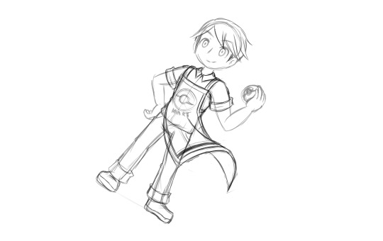
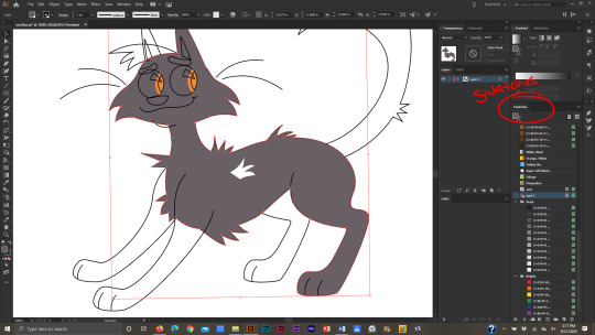
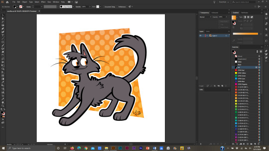
#for the first time I used the curve tool while using a graphic tablet... but the lineart ain't done so it's not included
Explore tagged Tumblr posts
Visit Tumblr Blog
Explore Tumblr blogs with no restrictions, modern design and the best experience.
Last Seen Tumblr Blogs


Fun Fact
12.7% of mobile users access Tumblr.
Text

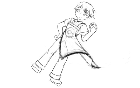
#wip#actually this might be too much effort going into smth shitpost adjacent#I prepped a file with ref images and such on friday already but idk I felt like I had base stuff to get out first I guess#for the first time I used the curve tool while using a graphic tablet... but the lineart ain't done so it's not included
1 note
·
View note
Text
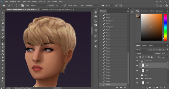
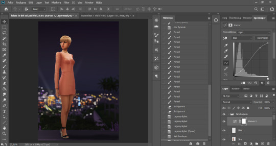
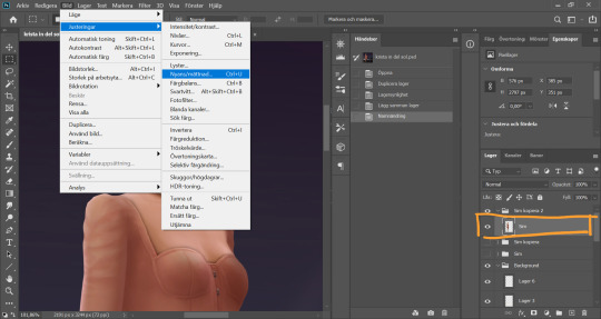
Tu... torial? Pt. 5.
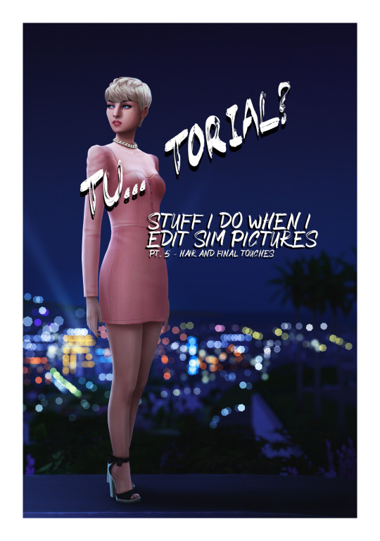
Final part of my tutorial! This is a little all over the place, because that’s how I am in this stage of editing. Also I didn’t proofread this...
Open this in dashboard for best view of the screenshots.
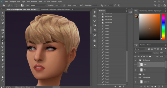
Disclaimer: I have no formal training for any kind of graphics stuff, I work in an office as a receptionist - I serve coffee for a living. I am absolutely self taught and while I consider myself pretty comfortable with photoshop, that doesn’t mean that there isn’t about a gazillion of other things that can be done that I have no idea about. There are people far superior than me in the Sims community. This is just how I do it, with techniques I have picked up through the years. Some things I go over in these will be pretty basic, some things a little more unorthodox. Disclaimer 2: My edits take time. This is what I do to relax, one edit takes several hours for me. Sometimes days :))) Disclaimer 3: My photoshop is in Swedish, which is my first language. I tried my best to find the English translations for every step that I do.
Tools used: The Sims 4, Adobe Photoshop 2020, One by Wacom Pen Tablet (very basic and unfancy).
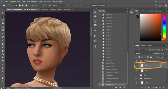
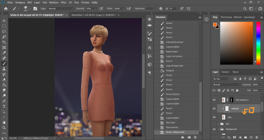
It´s hair time baby! I very much enjoy drawing hair on sims. I make a new empty layer on top of my base Sim layer.
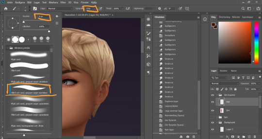
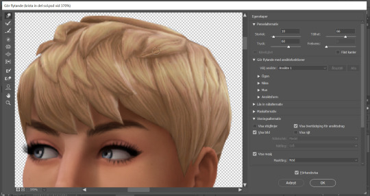
This is where having a drawing tablet makes a huge difference. We need the brush to be sensitive to pressure to get the effect of hair strands. I chose a hard brush, small small size (how small depends on the picture size of course, but I usually land somewhere 6-9 px)
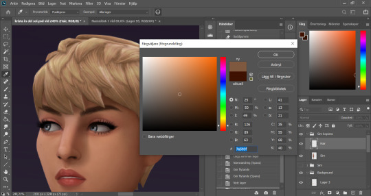
I pick up a color from the hair, I usually starts with a medium light color.
I start by drawing strands around any tips of the hair so they don't look quite so solid. I do this part with both short and long hairs. Hot lazy tip: straight unlayered hairs is the absolute easiest. This is a layered hair so I start with the bottom and work my way up. I pick up different colors from the hair as I go along, to add dept.
Continuing up in the hair and add strands to the pointy bits.
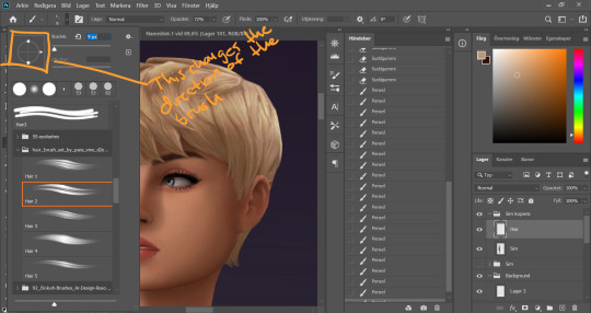
When I feel like the pointy bits have been softened I select one of my hair brushes. I use these ones by Para Vine.
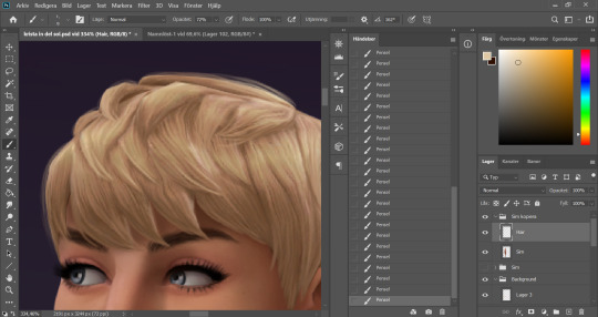
I start painting "around" the hair with one of the lighter colors picked up from the hair, changing the direction of the brush every once in a while for a more natural result.
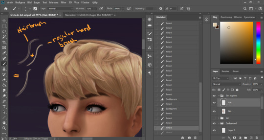
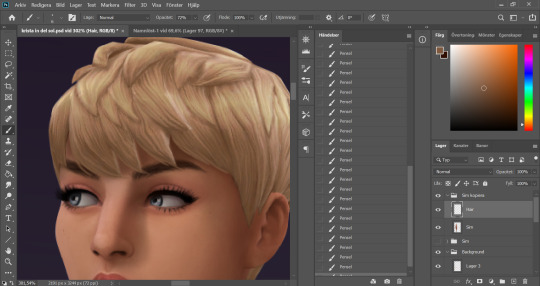
After this the hair is looking a little fuzzy, so I'm going to go back with my small harder brush to fill these parts out.
I don't add a lot of them, just small bits here and there for filling.
This is a little overkill but... now we have some of that "squary" thing going on in the hair as well that are still showing through our painted layer. Now we could paint over these, but painting can actually be overdone and I wan't to keep the hair recognizeable because the creator put a lot of work into it! So I go into liquify and smooth over any wonky lines still showing, just slightly.
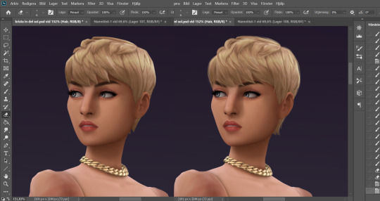
A comparison of before and after hair. Still recognizeable, but softer.
This is our result so far. We've come a long way, but we're not done.
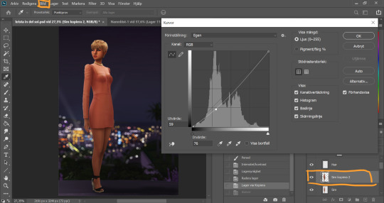
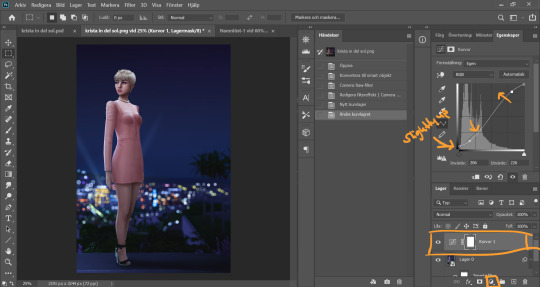
At this point (or actually sometimes sooner) I add an adjustment Curves layer, this will not end up in the finished image, this is just to give me an idea of what the image might look like with more contrast (which we will add later). I keep this at the very top of the layer panel and turn this on and off as I go. Very important to have it turned off if we are going to eyedrop a color and use that to paint, since it would pick up the wrong hue if we have it turned on.
Now I still want the front of my sim to be a little darker to fit my lighting, but I don't want to go over with any more shadow. So I duplicate my Sim layer, and go to Layer -> Adjustments -> Curves. This will only change the active layer, as opposed to creating an adjustment layer down in the Layer panel that will change all layers below it. I drag the curve down a bit to make my new Sim layer darker.
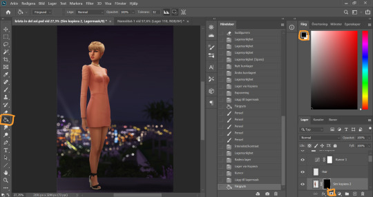
I add a layer mask to my new Sim layer, and bucket fill it with black color so the new layer gets hidden.
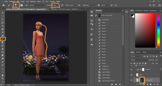
I chose an absolutely HUGE soft brush, with medium opacity, and starts painting white on the areas where I want the new darker layer to be showing. And blend by going back with black where the line is to harsh.
Time to add some highlights. I create a new empty layer between my two Sim layers, and add a clipping mask by holding Alt and hovering on the line between the new layer and my bottom sim layer, until the little square with the arrow symbol comes up and then click. This will make whatever I do on my new highlight layer, only show up on the areas where the layer underneath is filled.
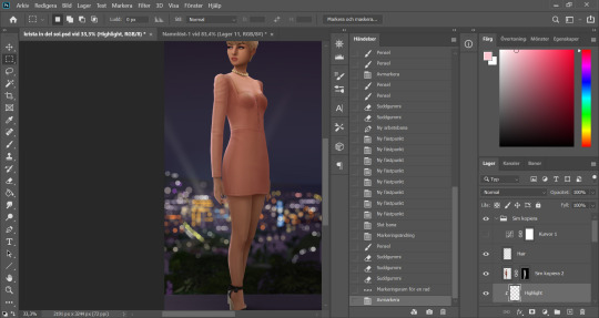
Time to paint. I disable the curve adjustment layer for this. I choose a bright color, in this case a light pink because I didn't want a contrasting color for this picture. I go with a big soft brush around the edges where I want my highlight to hit. In this case, the arm, the hand, the arch of the back and the calf. I didn't add anything to the face in this picture because I didn't like the way it looked, but usually a little highlight to one of the cheeks is just *chef's kiss*
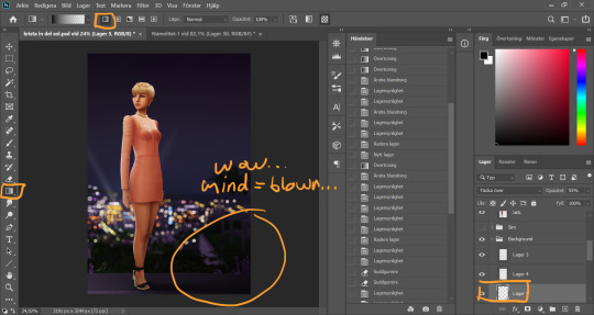
And somewhere around here I got really stuck and really struggled to follow with this tutorial. I felt the picture was lacking something and I tried several different things. I added light rays, tried creating different light sources, there was a moon at some point. But I ended up with just a simple additional gradient shadow down in the right corner (on a new layer down in the Background layer group). Life changing…
And then I didn't like the pink highlight on the skin (sigh, this is how I work, but it’s not recommended to be this indecisive) so I removed that and added a more beige-yellowee highlight instead. And forgot to take a picture after the highlight was added....
And now I go into nitpicking mode. I add a new empty layer on top of my Sim layer, I add it under the highlight layer so it automatically takes on the clipping mask of the Sim layer, I name it Clean-up Crew and go in to refine anything slightly wonky. Picking up colors with the eyedrop tool and going over flaws with a tiny brush.
When I fixed this little light area on the back of her head I left the Clean-up Crew layer and went to my Hair layer instead, because I still have that separate and it's above all the other layers.
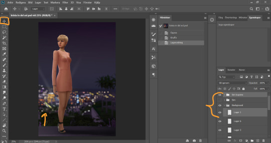
I thought my sim was a little too far down in the picture so I moved her up by selecting my whole Sim layer group and the layer on which I have her ground shadow, chosing the move tool and pushing them up. This will move all the layers in the Sim layer group as well as the ground shadow layer equally.
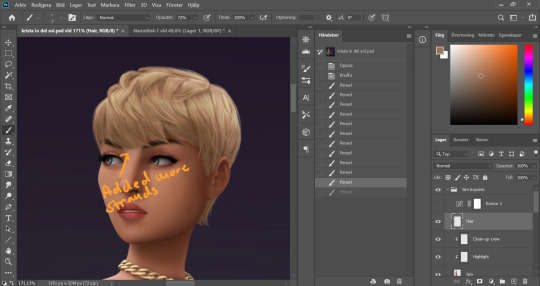
I'm telling y'all, nitpicking mode could go on forever. Added more strands to the bangs.
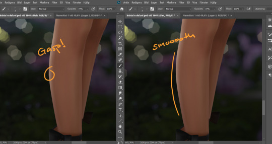
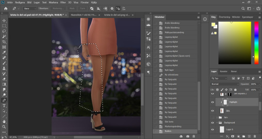
Noticed a little pointy part on the calf, so I wen't into Liquify on the base Sim layer and smoothed that out. Since the highlight layer has a Clipping Mask corresponding to the Sim layer, the highlight stayed in place.
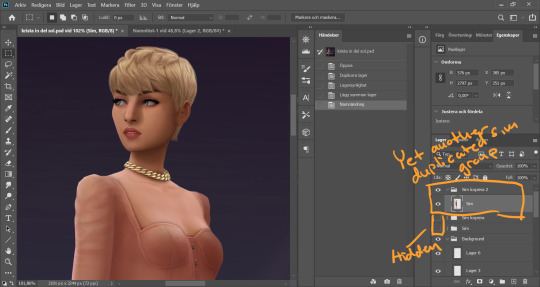
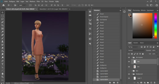
I duplicate my Sim layer group once more, and merge the layers within this group. So now the Hair, Highlight and Clean-up Crew is all merged onto the Sim layer. I hide the previous Sim groups.
With my new Sim layer selected, I go to Image -> Adjustments -> Hue/Saturation. I want to make my Sim a little less bright so it will match the background a bit better.
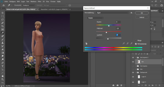
I drag down the Saturation and Brightness slider a bit until I like what I see. After this I save my whole image as a PNG-file because from now on I want to edit the whole picture but still want to keep this psd-file as it is for anxiety purposes. Important: I disable my curves layer before saving this as a picture, I don’t want that brought with me into the next steps because I will be adding new curves there.
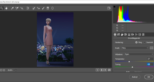
I open my new saved PNG-file. I go to Filter -> Convert for Smart filters. This will allow us to go back and change any filters we add to this layer. I go to Filter -> Camera Raw Filter and for some reason this window opens up humongus. I start by dragging down the temperature. How much depends on the picture, usually more if it's nighttime.
I pull up the Whites a bit for a cleaner look.
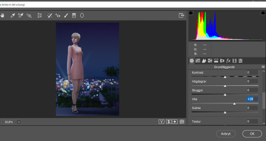
Now I add a Curve Adjustment Layer. Now you can add Contrast in the Camera Raw Filter as well, but I prefer the curve layer because I like to control the different levels. This way I can make my darkest parts a little brighter, giving just a little washed out flair to it all.
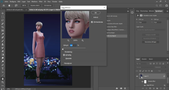
I select my background layer again and go to Filter -> Noise -> Add Noise and choose a level that I think looks good. This just brings the picture together a bit more. Also vintage vibes :)))
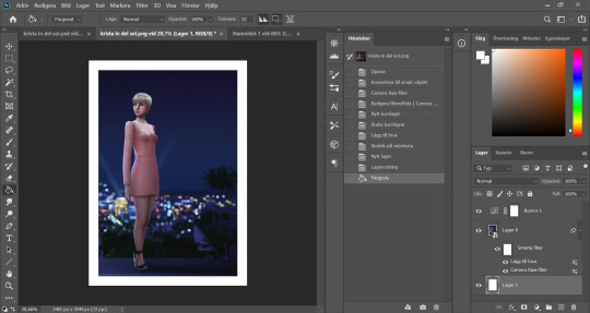
I add my frame (because it´s my aestethic and I think it looks cool on tumblr) by resizing my workspace and adding a filled white layer underneath the background layer.
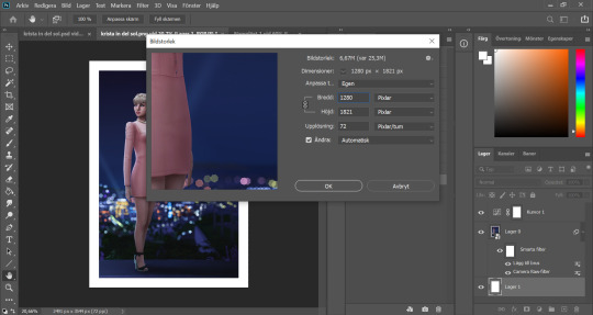
I resize my picture (Image -> Image Size) because we don't need it to be huge.
And they I just fine tune the Filters and Curves until the end of time :’)))
And that is that my friends! That’s the end of the tutorial! I hope you could follow somewheat and that someone found it useful. Thank you for reading and never be afraid of contacting me if you have any questions :) I’m very friendly.
65 notes
·
View notes
Note
Hello! May I ask how you draw? I'm currently learning how to myself and would be highly interested into a step to step process by you! Like from sketch to the done thing (no color necessary)
Hello there!
I dunno how I feel about showing how I work/giving advice to someone who’s learning (and I say it as a pro artist who went through years of traditional art education) because when I do the illustrations you see here on my tumblr I BREAK THE RULES you’d learn though life drawing routine, and give in to bad habits, and my methods are rather unplanned and chaotic which makes it difficult to pinpoint significant stages. But I used my portable potato to take some photos during working on my last piece, so I’ll throw it here with a bit of an explanation of what’s going on.
Before I begin - and because you’re about to look at a mess of a WIP - I’d like to give you some general advice that generally makes life easier when you draw (again, things that I learned in traditional arts education - another artist might advise you the complete opposite, dunno!)
Work holistically. Forget them satisfying-to-look-at clips on instagram showing someone produce a hyperrealistic portrait starting from an eye, with each and every element emerging being finished before they proceed to another part. It takes a lot of talent, yes, but these are ppl redrawing a photo in a kind of a mechanical manner. Most artists don’t work this way. Especially if you’re working without a reference, or if you’re doing a life drawing - your process will be layering and changing and finding what works best to give an impression of what you’re drawing rather than reproduce the exact image, and your artwork is likely to look messy most of the time.That said: don’t start with the details. Don’t spend too much time on a particular part while neglecting others. Your goal is to keep the whole piece at the same level of ‘finished’ (even though it’s unfinished - do I make sense?) before you’re confident that everything is where it should be and proceed to the details. So sketch out the composition first. See how things fit, what’s the dynamics. You’ll save yourself from limbs sticking out from the frame, odd proportions etc etc.
Because it’s a game of relationships between different parts of the picture/scene. I ask you not to worry about finishing a single element before laying out the rest because you’ll find that said element will look different once the other part appears! For instance - you might think that the colour you picked for a character’s hair is already very dark. But once you’re done with the night sky background, you’ll find that it’s in fact too light, and doesn’t work well with the cold palette. You’ll have to revisit different parts of the image as you go to balance these relationships and make the picture work as a whole.
Give an impression of something being there without actually drawing it ‘properly’- because details are hard, mate. You’ll see that my lineart usually has hardly any, and my colouring is large unrefined stains, but the finished thing looks convincing. Like, fuck, I can never focus on how Crowley’s eyes are really shaped. So I just turn them into large glowing yellow ellipses crossed by a line, and heard no protests so far.
Don’t panic if you messed up (you probably didn’t anyway). It might turn out to be a completely unnoticeable mistake - because, remember, things work together to balance each other, so another finished off prominent element will probably drown that badly placed line that looked so visible and out of place a second ago.
It might not look good before it’s finished. I’m mostly immune to it after years of drawing, and my recent illustrations all follow a specific method (ykno, my sunset glow effects and all that) so I can kinda predict the next stage. But I do my linearts on a specially picked crap paper, I don’t bother erasing the smudged graphite, and it looks messy af until I make the background white in Photoshop. Conclusion: you might have a moment of doubt as you work through a piece, but try to break through it - I often suddenly start to like what I cursed a minute before! - and try to finish it even if it’s meant to be bad. This way, looking through your past pieces, you’ll see the progress. And trust me, I can’t even look at my art from literally three months ago. It’s normal.
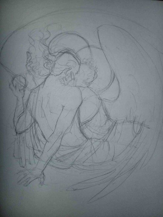
Now, pics! The sketches are paler in real life, but I increased the contrast a little so you can see something.
1. Laying out the composition!
I wanted to just show them kissing, but I got carried away due to some Art Nouveau inspiration. As you might have noticed, most of my illustrations are quite self-contained (ykno - they look like a sticker on a plain background). So I wanted a tight swirl bordered by Aziraphale’s wings creating a sort of rounded, yin-yang like bubble around them. Consequently I made the whole composition revolve around their heads.

2. Adding more details to the sketch. It’s messy af. It will be messy until I’m done. It’s fine.
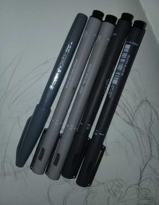
3. These are the fineliners I use for the linearts! They are made by Uni-ball and come in light and dark grey. I also sometimes use the guy on the left - ‘Touch’ sign pen by Pentel, when I want more brush-like, wider strokes. I work in grey because when I scan it and do my usual boring trick with sunlight highlights - which is an Overlay mode layer in Photoshop - the highlights ‘burn out’ the lines too and make them vanish a little, and the lighting effect gets more striking. I also like to use the light grey ones to make something look pencil-y without actually using pencil, because pencil fucking smudges.
4. It smudges! So because I am right handed, I start inking from the right hand side, no matter how tempted I am to do their faces first.
5. You can see the composition directions here. I made it intuitively, but ofc some ppl actually use grids etc to lay out their drawings.
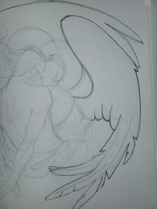
6. See how pale ans thin the lineart was at first? I kept adjusting it as new inked parts were appearing. It starts to look nice and consistent now!
7. Finished lineart? There are some mistakes which I later corrected in PS. Notice that Aziraphale’s face has hardly any details on it - I tried to make the drawing suggest his expression rather than risk overdoing it.
8. Photoshop time!! You can totally do what I did here even if you don’t have a graphic tablet. I used Curves tool to enhance the lineart, then Quick Selection Tool to select the background around around my sticker-like piece and filled it white (on a new layer ofc). I keep this white layer on top of the layer order so it works as a mask as I colour. I decided I did not like the hatching shading underneath Aziraphale’s halo, so I erased it with a Stamp tool (because I wanna keep the textured grey fill my crap paper naturally gives me!). It’s done roughly but won’t be visible once the thing is coloured.
9. And the reason why I keep the grey shade instead of easily getting rid of it by using Curves/Levels is because when I set this layer to Multiply mode and colour underneath, it gives me this nice desaturated look like from an old cheap paper comic page. It works as a natural filter! But of course I can’t do bright colours this way, so all my glowing highlights happen ABOVE the lineart layer - on a separate layer in Overlay mode!
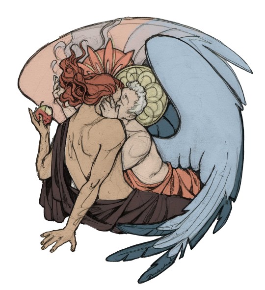
Finished thing here!
_____
Commission infoBuy Me a Coffee - help me with my transitioning expenses!Prints and stickers and things on my Redbubble!
#ask the buckwheat#long post#tutorial#drawing advice#drawing tutorial#good omens#ineffable husbands#good omens fanart#good omens art#my illustrations#doodles#toastedbuckwheat
1K notes
·
View notes
Text
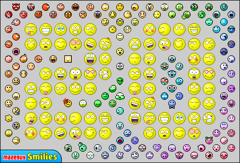
20 Years of Mazeguy Smilies, 35 Years of Pixel Art
It's been twenty years since I first shared my smilies with the world! To celebrate the occasion, I made this collage:
Coincidentally, this year also means I've been making pixel art for about 35 years. I've written an article about my journey which you can read here, but I'll recap a few highlights:
1986: Dazzle Draw
The reason Mazeguy Smilies exists is probably due to Dazzle Draw, a painting program released by Broderbund Software in 1985. My family had an Apple IIe computer at the time, and I believe we bought Dazzle Draw the following year. I was eight years old at the time.
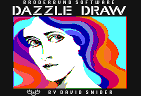
Back in those days, I didn't have a Wacom tablet, and drawing freehand was difficult. I figured out that the best way to create the curved lines and details I wanted was to zoom in and draw one dot at a time. Unbeknownst to me at the time, I was learning the basics of what would later be called "pixel art". Today, I create smilies using the exact same technique.
My siblings and I had a lot of fun with Dazzle Draw, filling fifteen floppy disks (the ones that actually WERE floppy) with over 100 paintings. Unfortunately, only one has survived to this day. This portrait of Bowser was converted to black and white, and printed in my junior high school's newspaper.
1992: Mario Paint
My next drawing program was Mario Paint for the Super Nintendo. I loved the fact that you could combine art, animation and music to create multimedia. I still have my copy of Nintendo's Official Mario Paint Player's Guide, even though it's quite worn out from reproducing video game sprites and songs.
Mario Paint included several "stamps", small pictures you that could paste onto the canvas or use as a paintbrush. A Stamp Editor tool let you edit existing stamps or design new ones on a large, 16x16 grid. Sound familiar? Thanks to Mario Paint, my pixel art skills were refined a little further.
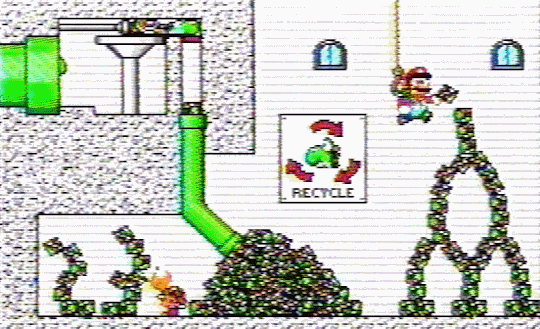
So, what kind of videos did I make using Mario Paint? Well... Um... Stuff like this...
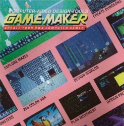
1994: Game-Maker
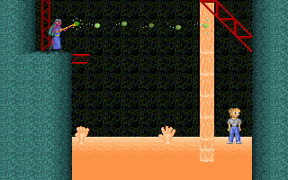
Game-Maker was developed by Recreational Software Designs. It's a collection of design tools that allows users to create their own DOS games. To test out the software, I made a simple game in which a guy tries to get through a maze. Yes, this is where "mazeguy" came from. Somehow, it became my nickname, then the name of my website.
Mazeguy grew in complexity, and eventually morphed into Invasion of the Blobs, which later got a sequel. Both games required drawing and animating backgrounds, enemies, and heroes. Title cards, level intros, and cutscenes were also illustrated pixel by pixel.
2001: Flash Kit and Tripod
At the beginning of the new millennium, I started using Flash for the first time. I needed help learning how accomplish certain tasks, and discovered many helpful tutorials at FlashKit.com. I joined the forums, and found a thread titled "Smiley Award Winners". A user named ThundaChunk, a.k.a. JohnnySix, was awarding a small banner to the best smilies submitted in an earlier thread.

It was too late for me to participate, but after fifteen years of creating pixel art, the idea of making smilies intrigued me. I made a whole bunch and put them on my Tripod website. While I was having fun seeing how many emoticons I could come up with, I was also secretly hoping that another smiley contest would be held in the future, and I'd get my own Smiley Award.
Then, on March 29th, 2001, The all new FK members smiley thread appeared. I quickly posted a link to my collection. And so, after a little prodding, I got my Smiley Award.

Over the next two years, my website would get more traffic, and suggestions from visitors helped make my smiley collection grow. Both of these factors caused the site to routinely go over Tripod's bandwidth limit. My free web hosting service was no longer sufficient, so I registered Mazeguy.net on October 25th, 2003.
2005: Hoagie's Revenge
My brother and some of his friends formed a film group, and they needed an animator for one of their short films. It's about a man challenged by his roommate to complete a brutally difficult video game. My job was to build an original Nintendo game that is so unfair, so impossible to beat, that the programmers didn't even bother creating a second level.
You can read more about Hoagie's Revenge, the game within the movie, as well as complete sprite sheets here.
2013: Wordlock
Fifteen years after completing Invasion of the Blobs 2, I revistited Game-Maker and made a puzzle game containing 100 riddles. The graphics weren't particularly complex, but I think the sci-fi font I designed was pretty neat.
You can learn more about Wordlock and how to play it here.
2021: What's Next?
The introduction of emoji have pretty much made smilies obsolete. One avenue that might be worth pursuing is Twitch Emotes, but I've kind of moved away from creating pixel icons.
These days I spend most of my time working on my webcomic, Chuck's Devils. Sometimes I depict the main characters in pixel form, as seen here:
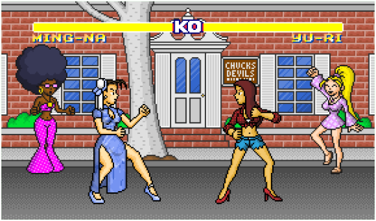
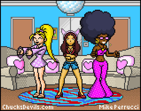
While the series is nowhere near as popular as my smilies were, or even my domino toppling videos (which is a story for another day), I like the process of creating wacky misadventures for Candace, Yu-Ri, and Lily. I hope you'll check out the comic and follow along. :)
5 notes
·
View notes
Text
How much money is spent on gaming
Major 20 Gaming Blogs You Should Be Following
It is time to recognize the very best gaming blogs of the year. SHIELD portbale is built on Tegra four, providing unmatched Android gaming overall performance and graphics high quality. We place together an amazing list of the most effective WordPress Gaming themes that are designed and created for gaming magazines, blogs and critique internet sites. A site for a casual mobile game about a restaurant may well have a absolutely different target audience so believe about this whilst producing your decisions about your very first gaming weblog. You might need to have to focus on your mobile site design or monetize with various advertisements or affiliate goods.
In this short article I asked 300 gamers what they wanted for birthday and Christmas so I could show anybody interested in getting a present for a gamer what the gamer genuinely wanted. Here, on the other hand - pun intended - I speak about how I resolve my challenges with wrist discomfort immediately after extended gaming and operate sessions. It's not significantly of a list if the colossi of gaming news are not included. This initial tier is solely for the gaming community's elder statesmen—the eight web pages that are generally abreast on what's hot in gaming and are recognized by gamers worldwide to be a reputable supply of information in the sector.
Reasonably priced with a pretty vast community of developers, Unity supplies the very best value for an very advanced game improvement engine. With superb editing tools very easily extended via plug-ins, this platform supports a surprising huge variety of asset formats. It has the longest track record of all gaming platforms with mobile games. The free of charge license is sufficient to cover the majority of functions of the gaming engine with a beginner possessing tiny to no use of the features of the pro version. The paid version nevertheless, is also reasonably priced as properly. The high quality of results achieved from Unity is undeniably impressive with one of the most well known game of all instances getting been developed on it: the Get in touch with of Duty.
Available The Door For COMPETITION By Using These Basic Tips
Our VA choose is really a bit special due to the fact it is an Ultrawide, curved 35” Acer Predator Z35. While it is not the most effective for competitive gaming (most on the internet games don't allow you to use the complete width of the screen due to the fact it is a competitive advantage) it'd be a terrific choose for any person that enjoys single-player gaming, or watching movies.
Kongregate are a video game studio, bringing a enormous array of games to the table. Their devblog and forums give invaluable insights into the gaming planet, seeking behind the scenes and enabling you to ask those burning queries in an atmosphere full of experts. I applied on line. The procedure took a week. I interviewed at Green Man Gaming (London, England) in June 2018.
So you want to get started a gaming blog? Excellent for you! Gaming is a great topic to write a weblog about, with lots of people today out there interested in this niche. No matter if you want to start a weblog as a hobby or you're seeking to make a bit of dollars from blogging, the following advice can support you get began.
Ask a Game Dev is a Tumblr weblog committed to hosting a wealth of answers to any queries that arise about the planet of generating video games. The weblog has been operating for quite a few years and has amassed a substantial archive in that time, but the creator nevertheless answers new concerns on an ongoing basis. Gaining the type of insight that only an business insider can give is a great tool for these aspiring to break into game improvement, and the concerns answered can be particularly topical during big gaming events such as E3.
You have played thousands of distinct board games, yes that is correct not hundreds, but thousands. You are a member of several gaming groups, and you have come to realise that different groups have different personalities and exclusive dynamics. You comprehend what style of games you delight in and precise mechanics that you do and do not like in a game. You don't actively preach or tell people about board games, but when asked you are an ambassador for the genre and with your vast expertise you can generally add thoughtful discussion and predictions relating to games you are yet to play. Your collection is the fantastic variety of games that you like. It is not simple for a new game to make it into your collection, and you have a defined a rigorous trial of fire that any game must meet to make it effectively into your collection.
If you're in the industry for cheaper or far more very affordable games, make positive that you verify the Hot Deals section of the web page. Green Man Gaming consists of a hyperlink to that page on all its pages. You can look at the Deal of the Day or at present specials that let you save up to 75% off the MSRP on preferred games. The Hot Bargains section also contains some VIP specials chosen by prime games from around the world.
Did you know that Mobile games now account for 51% of worldwide revenues in the gaming sector followed by Console games (25%) and Pc Games (24%) 62% of smartphone owners install a game inside a week of getting their phones and Mobile Games now account for much more than 43% of total time spent on smartphone. Verify out our infographic on The State of Mobile Gaming Industry” for newest mobile gaming statistics and trends.
This blog aims to make a actual community that cares about subjects like technologies, gaming and gadgets, giving news and reviews. Additionally, it allows the readers to interact with the rest of neighborhood by means of comments and polls, but also enabling them to write guest posts. Green Man Gaming's publishing arm performs with developers to support publish and market their personal games, supporting them each and every step of the way. Their vibrant on line neighborhood also connects gamers and rewards them for in-game activity. This gameplay data enables them to further strengthen the overall gaming encounter.
Some of the most viewed internet websites for gaming-associated content material are YouTube and Twitch, both of which are streaming websites that boast hours of videos. The quantity of video content material that has been accessed consistently over the past couple of years have steadily improved, creating video content material an invaluable element of any Search engine optimisation or social media campaign.
Green men gaming vacation sale games, quite low-priced for a excellent game. Sonic the Hedgehog” gave this Japanese multinational firm immense accomplishment both in terms of revenues and recognition. Sega did knowledge significant losses immediately after its selection to discontinue its hardware organization and focus on http://elvitra.online third celebration software improvement. Having said that, because 2005, Sega has been going powerful in the gaming sector.
While PUBG has discovered a natural house in Japan, it is also a global success story. It has achieved higher percentages of players in quite a few smaller sized territories, grabbing the focus of 22.5% of Pc gaming enthusiasts in Norway, 21.9% in Australia, and 17.1% in New Zealand. In April 2017, Green Man Gaming appointed former Take-Two CEO, 35 Paul Eibeler, to its Board as an Advisor and hired Sam Bennett, ex-Sony Entertainment, EA and Activision Community Manager and Consumer Engagement Head, as EVP to lead its newly formed Customer Encounter and Communications team.
When numerous of smartphone gaming apps pale in comparison to these games that are developed especially for handheld gaming consoles like the PlayStation Transportable, the Nintendo DS3, and other folks, they can nonetheless, deliver you with just about the exact same level of gaming knowledge. This can be further enhanced if you use the Power A MOGA Pro Mobile Gaming System that attributes an Xbox A single-inspired game controller that you can use to attach your Android-primarily based smartphone or tablet. It comes complete with complete-sized grips, dual analog sticks, D-pads, illuminated action buttons, triggers, and even shoulder buttons to mimic the gaming practical experience of a genuine gaming console. Make sure you also check the rest of our Xbox a single accessories for much more good products like this.
2 notes
·
View notes
Text
The Shocking Revelation of Graphic Design Edmonton
Graphic Design Edmonton has usually been at the upward thrust, and I trust this has lots to do with the truth that Edmonton is a growing town. Graphic layout is some thing this is used in genuinely every enterprise. People use image design to express themselves, make their mark on the arena around them and to promote their wares. There is a very steep mastering curve with regards to becoming an expert in photo design, but there are many assets available for folks who are looking to research the artwork of designing. If you've got a innovative facet and would really like to specific your self the use of graphics, right here are a few locations in which you can find the statistics which you need.
Specialize in advertising and marketing
The first region that you have to look for records about photograph design is your local library. There are frequently guides which are posted right here so that humans have a chance to get a few design ideas. In addition to having courses available at your local library, look for brochures or catalogs at nearby shops that specialize in advertising and marketing or layout. These will normally provide some primary information and examples of some of the specific forms of photographs that may be used.
The very last place you may look to examine pc portraits is on the Internet. There are many websites which might be devoted to automated arts and a lot of them have training with a purpose to display you the way to make images. Many of these classes even have screenshots in their paintings that you can peruse and get an idea of the way the completed product might appearance. You also can discover websites in order to teach you to attract a specific picture, which include a car or a flower. As soon as will teach you to do that plenty faster than conventional strategies and in lots of instances may be some distance greater powerful for your specific wishes.
Amazing way to express yourself
In precis, in case you are serious approximately getting to know to attract you have to take advantage of all resources that you could discover. Learning to draw cartoons can be quite difficult in case you do not have the proper tools vital to help you analyze. There are an abundance of books and online tutorials as well as live classes where you may get help from professional artists. Drawing cartoons can be a amazing way to express yourself creatively and produce enjoyment to humans's lives. With a little patience, every person can end up an artist just through purchasing some beneficial drawing suggestions.
One of the pleasant drawing hints is to get your hands on some drawing tablets or maybe a laptop application so one can aid on your efforts to learn how to draw cartoons. A lot of the drawing hints are to be had on the net so finding a drawing application might not be vital in case you are lucky sufficient to have your own laptop or pill. Drawing cartoons is an art form and in case you pick out to take it up as a interest you will be devoting a number of time to study and exercise until you could draw cartoons which you are pleased with.

It is really useful that you choose a few simple cool animated film characters to your classes earlier than you begin drawing real cartoons. This will ensure which you recognize the fundamental drawing approach and may create precise high-quality cartoons. If you select to draw your very own cartoons, be sure to choose a fashion that you like because in case you select one that doesn't suit you, it will be tons extra hard to draw. Also, exercise is very critical. This means which you ought to be equipped to spend a while drawing cartoons. Just like learning another ability, the extra you draw cartoons, the higher you turns into.
1 note
·
View note
Text
Illustrator Tutorial
So for quite a while I’ve been mulling over the idea of making a tutorial of how I create art in Adobe Illustrator. I’m not the best at explaining things but I just thought I’d share how I make my art! Warning—this is a super long post. And it’s not exceptionally interesting. Sorry about that….
I draw traditionally, so when I’m satisfied with my drawing, I open up Illustrator, make a new file, and place the artwork in it.
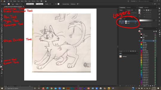
This is how I set up my file and work space. My layers are at the right of the screen (the top layer is my drawing layer, the bottom layer is my “sketch” layer, locked and usually set on 65-72% opacity). If I wanted to change the size of my Artboard (the file, basically) I would go to the Artboard window (located above my layers) and make my changes there. To the left is the Toolbar. It contains a ton of useful tools, such as the Selection tool (basically the “mouse”), Direct Selection tool (helpful for editing line work), the Pen tool (what I use to trace over my drawings), Type tool (for typing), Rectangle tool (for making quick shapes like squares, stars, circles, etc), Shape Builder tool (for merging shapes), the Hand tool (for moving the screen around—if that makes sense…) and the Zoom tool (lol pretty self-explanatory). There’s many more tools of course, but these are the ones I utilize the most. (Uh unfortunately the tools I am using aren’t showing up in my screenshots while I work…so I’ll just point them out as I use them)
Now that I’ve got my file set up and drawing in place, I trace over it with the Pen tool. There is also another way to make line work. If you’ve got nice line work that you’re satisfied with you can simply select your drawing, then click “Image Trace.” Illustrator will make a vector image of the drawing. Personally I don’t like making line work that way because, well, I’m sorta odd when it comes to line work and I prefer to use the pen tool.
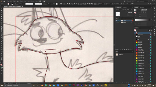
When I make a shape and connect two anchor points together, they make a single shape, like this head. You don’t necessarily have to make shapes in Illustrator, but it does make things easier imo.
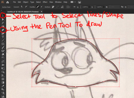
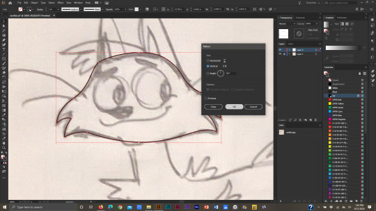
To edit my line work, I select the line work itself using the Selection tool, then go to Object>Transform>Reflect.

Another window will pop up, and from there, I can choose if I want the image to be flipped horizontal or vertical. Then I click “Ok.”
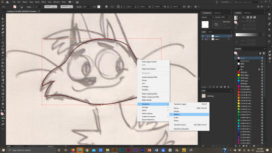
I make edits using the Direct Selection tool. Then I flip the line work back to how it was. I can do this by right clicking the line work and going to Transform>Reflect. The same window will pop up again, and I click Ok.
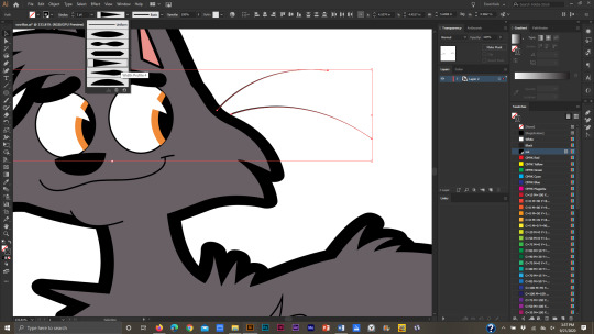
But how do I make lines in Illustrator? I use the mouse when I work in Illustrator (I used to just use my laptop’s track pad, but uh…I highly suggest that you don’t do that! Using the mouse is a lot easier on the hand, and the track pad is pretty bad for carpal tunnel). You can also use a Wacom tablet or whatever, but I prefer using a mouse. Anyway, to draw in Illustrator using the Pen tool, simply click anywhere on the canvas to make an anchor point and drag the mouse away from where you clicked. As the mouse moves around, a line will follow it. If you click again, a straight line will appear.
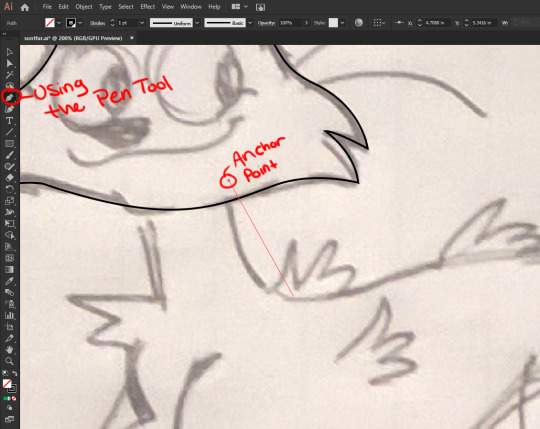
To make curved lines though, after you click on the canvas, drag the mouse around to make a curved line.

To merge shapes, select each shape with the Selection tool (click on a shape, and while holding down the Shift key, click on another shape. Two shapes are selected at once now…or just drag the Selection tool over multiple shapes at the same time).
Drag over the selected shapes with the Shape Builder tool…
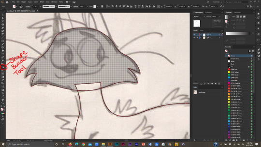
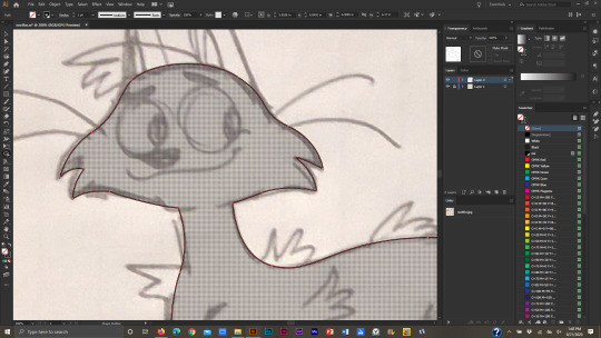
…and one shape will be formed.
So that’s how I make line work and shapes in Illustrator. If I want to rearrange which shape is “in front” or “behind” another shape, I select the shape, right-click on it, go to Arrange>then Send to Back or Bring to Front.

If I want to make a duplicate of a shape, I select it with the Selection tool, click “alt” (on Windows) then drag the new shape away. Then I de-select it.
When building shapes, sometimes I have to “delete” part of a shape so that it doesn’t show up in the final illustration. For example, when I make pupils. To do this, I select the shapes that have to be edited: the iris, pupil, and the eye itself. The eye won’t change, but in order to make the iris and pupil fit inside the eye, I’ll have to select it. If I don’t then all I’ll manage to do is merge the iris and pupil together.

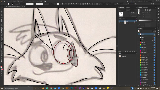
So after they’re all selected I use the Shape Builder tool and drag it over the part of the iris and pupil that I don’t want anymore. While doing this I hold the “alt” key down, so that when I’m done editing the eye, the extra shape will be deleted.
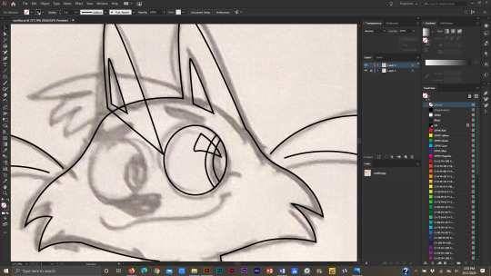
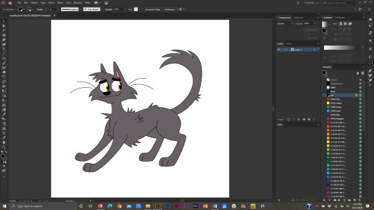
And finally the line work is DONE!

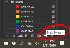
Now to add color. To change the color of a shape, I select it with the Selection tool then change the color from the Swatch window.

When the artwork is colored, I get into the intricacies of line work! I like bold line work, and I like to create tapering lines for legs, mouths, and other little details. To make a bold outer line, I select all the major shapes that form the “outside” of the image, make a copy of them, and send them to the back (Arrange>Send to Back)

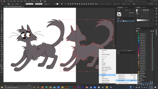
To make the lines bold I change the stroke to a 5 pt. Oval (the upper left section is where the lines, or “strokes,” can be edited) then increase the stroke weight to 4 points.
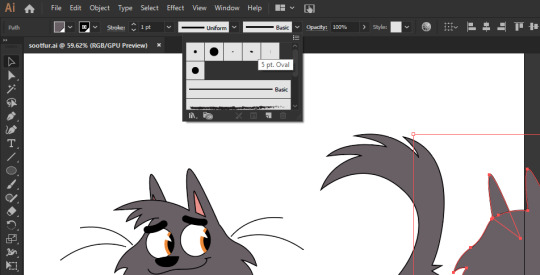
I slide all the shapes back behind the “front” shapes like so.

For the front leg, I don’t want to keep the line work near the shoulder odd-looking like this.

So I use the Direct Selection tool, select the anchors at the shoulders, and move them around till I’m happy with how they look.

To further edit my lines I can select individual lines and change their shape from the “Uniform” line to any design I want. I like using this triangle-shaped line for whiskers and toes. Then I can edit the stroke width to be bigger or smaller.

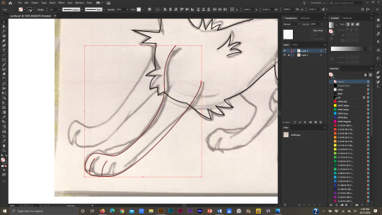
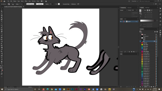
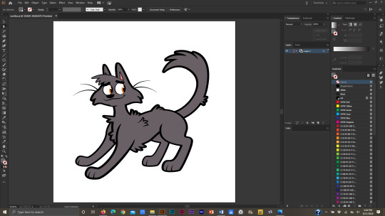
And finally, a cat is born!
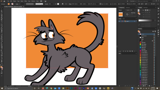
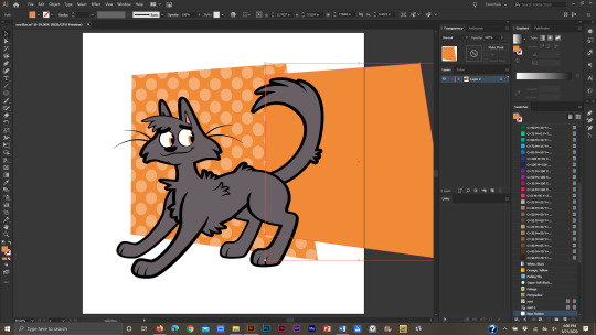
I’ll go over how I make backgrounds too. It’s not all that interesting though XD When I make backgrounds for my Warrior Cat drawings, I like to include patterns and gradients in them. First though, I make a simple shape.
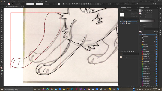
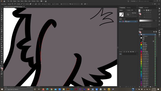
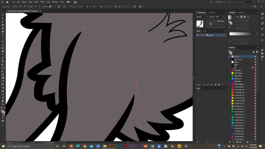
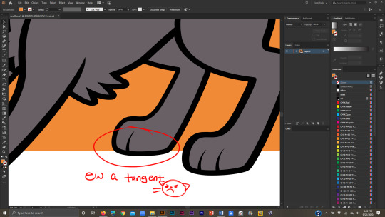
I try to avoid tangents at all costs so I use the Direct Selection tool to move the anchor points and lines around the main drawing. (BTW a “tangent” is when two lines touch each other without intersecting. It isn’t the most desirable thing to have in a piece of art). For example, the edge of the background square touching the bottom of the cat’s foot forms a tangent.
When I’ve settled on a final design for the background shape, I make a pattern to fill it.

I like to keep my patterns simple, so for this one, I made a circle pattern. To make the pattern, select the shapes you want for the pattern…

…go to Object>Pattern>Make. A window will pop up saying that a new pattern has been added to the Swatches panel; click ok.
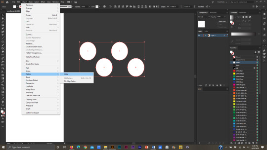
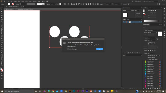
In the dialogue box to the far right, the pattern can be edited even further. When I’m done editing it I click “Done” in the upper left corner of the screen.

And a new pattern has been added to the Swatches! I make a duplicate of the background shape and change the Fill color to be the new pattern.

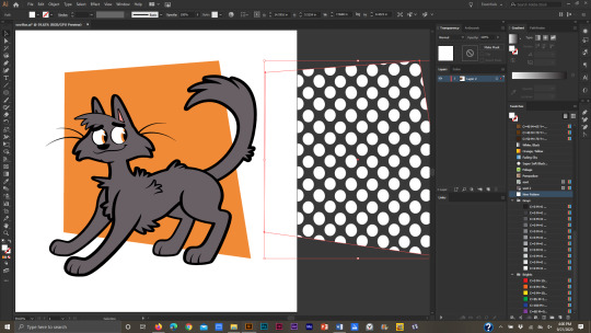
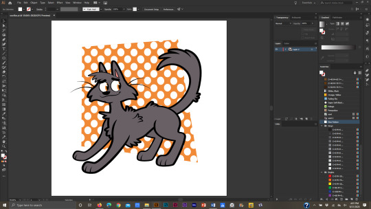
Then I slide the patterned box in front of the orange one, but behind the cat, then I adjust the opacity.

I make a third copy of the background shape, move it in front of the last two shapes, then click on the gradient box in the gradient window. It automatically makes a white and black gradient in the shape.
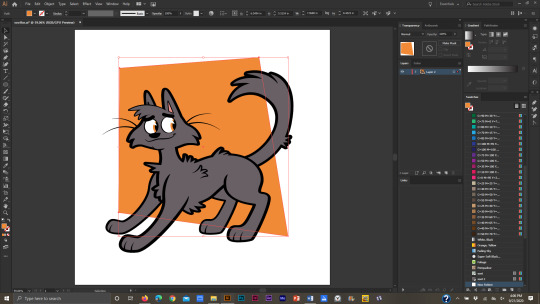
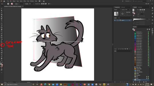
To edit the gradient I click on the Gradient tool in the Toolbar. Then I can adjust the direction of the gradient.


In the gradient window I can change the colors. I also change the opacity of the shape and switch it to “Overlay.”
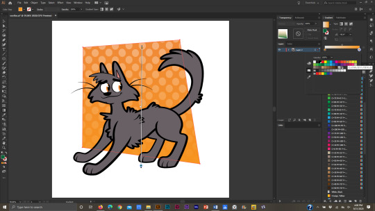

I add a bold white line behind the illustration, add my watermark, and I’m done!
If I want to add shadows, I draw them over the illustration and adjust the opacity of the “shadow-shapes” till it looks decent. I change the shadow-shapes to “Multiply” as well. (I uh was just too lazy to add them to this pic but I have examples of cell-shading in a lot of my other pics).
Like I said, I’m not the best at explaining things, so here’s one of my speed drawings that show me using all the tools mentioned to make my drawings: https://www.youtube.com/watch?v=hD3wA_pwn4k
To finish this long (and probably boring) post, Adobe Illustrator is a vector based program. It doesn’t utilize pixels—I am NOT eloquent enough to discuss the differences so here’s a few sites that do:
https://stinajones.co.uk/the-difference-between-vector-and-pixel-graphics/
https://www.printcnx.com/resources-and-support/addiational-resources/raster-images-vs-vector-graphics/
https://www.ionos.com/digitalguide/websites/web-design/pixel-graphics-vs-vector-graphics-a-comparison/
Anyway I hope this was useful, even if in a small way! If any other Illustrator artists have tips, tricks, or tutorials they’ve made or have found useful, please share!!
2 notes
·
View notes
Text
Huion New 1060PLUS graphics tablet review
So a couple of weeks back, my Wacom Intuos Pen and Touch died on me (and then resurrected itself as soon as I got my Huion, of course...). I needed a tablet for a number of project, and since the Pen and Touch is no longer manufactured, I figured it would probably be cheaper and faster to just buy a new tablet instead of trying to get my old one repaired. I’d heard about Huion, a Chinese tablet company, before, so I decided to give it a try. I found the New 1060PLUS for $80, and paid $14 for two-day shipping, bringing it to a total of $98. This is roughly the same price as the cheapest tablet Wacom currently has to offer, though the Wacom Intuos Graphics is about half the size of the Huion New 1060PLUS.
I have now had the tablet for two weeks, making multiple drawings daily with it, and feel like I have used it enough to do a review.
Initial Thoughts
My initial thoughts on the Huion was that it handled at a similar quality to my old Wacom, though with perhaps somewhat more pressure points. However, the first attempt at drawing it was exceedingly frustrating due to some weird quirks of the tablet, which I will get to in the Cons section of this review. Once I got the kinks ironed out, it performed fine. It was comparable to my old Wacom, but not particularly better.
Pros
Price
Size
Pressure points
The Huion’s price point is its big selling factor. It is far cheaper than my old Wacom, which cost me $200 in 2015. That the Huion would be less than half the price but delivery the same quality of work is very impressive. The size of it is also good, having a slightly bigger workspace than my old Wacom, which makes it a pretty large drawing surface. It has slightly more pressure points than my old Wacom, making for pretty smooth handling.
Cons
Doesn’t initially play well with Clip Studio Paint
Bizarre touch keys
Driver issues
Stylus needs to be charged
Stylus doesn’t have an ‘eraser’
As I said in my initial thoughts, there were a lot of issues right out of the box. I primarily use Clip Studio Paint on a Macbook, so this may not affect you if you use Photoshop or Sai or a Windows. When I started using the tablet, it somehow changed key commands in CSP. I don’t know how, but it changed hotkey settings so that pressing the Command key by itself would switch whatever the current tool was to the move tool. It was then almost impossible to switch it back. This meant if I was trying to hit undo and clicked ‘Command’ and THEN ‘Z’ instead of tapping them at the exact same moment, it would switch my tool. I use undo a lot and I always start by pressing Command, so this was very frustrating. This had never happened in the 8 months I’ve been using CSP. I had to do a lot of digging on the internet to fix the issue.
For anyone who may encounter the issue, the fix is to go to Modifier Key Settings under CLIP STUDIO PAINT, then change ‘Cmd’ from ‘Change tool temporarily’ to ‘Common’ or ‘None’.


The tablet itself had many issues with the touch keys that were extremely frustrating to me. As with many tablets that have side buttons on the stylus, touching them would change the current tool. However, they were FAR more sensitive than any side buttons I’ve ever used... except when you were trying to switch back. It was so easy to brush the button by accident, have my brush switch to the eraser tool, and then, no matter how many times or how hard I pressed the button, it would not turn back.
The fix for this is to go to Huion’s application, select the Stylus Pen, click on the side buttons, and deselect ‘Switch Tool’.


For a few days after I figured this out, it was clear sailing. But then I started to have a new problem. Sometimes while drawing, the stylus would experience pressure sensitivity issues, were the tablet would only register part of the strokes I was making. It looked like this:

The thick dark red strokes are places where the tablet registered my stylus, the thin dark red scribbles were my scrawling on the tablet trying to get it to register the stylus. The light pink strokes were made while the tablet was functioning normally. This was much harder to fix. I looked around the internet, including Reddit and Huion’s forum, trying to find a fix, and the closest advice I found was just to reinstall the drivers. While I did. And it would work fine for about an hour, and then have the problem again. When I looked at Huion’s application, it was showing that the tablet was disconnected, even though it obviously wasn’t. Unplugging the tablet and then plugging it back it seems to work, but it can take multiple tries to get it to connect.
Those are the big issues I have, the other points are nitpicks.
First, the stylus needs to be charged. I’ve never encountered this in a tablet before. It charges via USB, so it’s possible to keep working while it’s charging, but the cord feels cumbersome and top-heavy. The stylus lights up red while it’s charging, and the light turns off when it’s done. However, there is no way to tell if the charge is dying. I should note that I have charge the stylus once, when I first took it out of the box, and it hasn’t appeared to need a charge again.
Second, the port for the charger is on the back end of the stylus. In a Wacom, this is where the ‘eraser’ is, and flipping the stylus over like an actual pencil will switch the current tool to the eraser. The Huion stylus lacks the feature. It’s not a huge deal, I can just click the eraser tool myself (and if the side button worked in a way that made sense, I could just use that) but after years of Wacom tablets it does interrupt my workflow somewhat.
Final Thoughts
The Huion has some bizarre and frustrating issues that have made it very strange to work with, but when it does work, it works fine. It is not, however, a game-changer.
If you are currently using a Wacom and have the funds and want to trade up, I would not recommend the Huion. Going from Wacom to Huion has been a very steep learning curve and I think that if you have the funds to buy a better tablet, you should do so.
However, if you are looking for your first tablet, or your current tablet has died and you don’t have the funds for a more expensive one, a Huion will do the work you need it to do, just be ready to have to puzzle out some very strange issues.
20 notes
·
View notes
Text
Pixelmator Photo for iPad
This will take awhile to get to the point so if you’re interested, buckle in for a winding, drawn out reason about why I’m not switching to Pixelmator Photo as much as I want to.
I’m an avid Lightroom CC user. I have never used Photoshop, not because I don’t want to but because I’m too stupid.
In the past I was an Aperture user and it never clicked. The catalogue was too confusing to me. Again, stupid. When it was discontinued I switched to Lightroom and have done well with it since. Adobe later released Lightroom Mobile (now the cross-platform Lightroom CC) during the time I had adopted a heavy iPhone/iPad travel workflow and I grew up with the program. Lightroom was straightforward and essentially offers the simple tools that I used in the darkroom- dodging and burning, with digital exposure and color edits. Plus a little more.
I have had a strange fascination with Pixelmator for years. Many times since 2012 I’ve tried to use Pixelmator which is a layers based graphics editor. The price was right and they were an Apple only product that worked to make the most of the Apple hardware. They even released a mobile app with some of the core features. But again it’s a layers based editor and if I couldn’t figure out Photoshop this wasn’t going to help me. I looked often for tutorials to learn the software but they weren’t available like they are for Adobe products.
When Pixelmator Pro for the Mac was being released last year I was fully ready to make an attempt at using it and abandoning Lightroom.
Why would I leave Adobe? I don’t like that I’m boxed into one system. I pay 20 dollars a month for the photography Creative Cloud account with 2 TB of data. I have to be very careful with that catalogue as I go because 2TB isn’t a lot for a full and active catalogue over years, even with mindful archiving. And I’m managing two different photography catalogues- Lightroom and Apple Photos. Finally, the way you import photographs into Lightroom on the iPad or iPhone is plain silly, but that’s really on Apple and we’re not going to get into file management on iOS because that’s a dead horse for now (until some future iOS iteration).
But the big reason was: “minimalism”.
Over 2018 I started doing a deep dive into my life again. A significant breakup, several moves, and a job change made me evaluate everything. I adopted minimalism around 2009 when I started paring down my belongings and moved into a small loft apartment. When I moved to Rhode Island in 2011 I sold almost everything I owned then put an add on Craigslist to come get the rest for free and people swooped in en masse. I kept things lightweight as possible but things creep back in. My digital files were a mess. Papers kept following me around the country. When I lived on the Rez it was like Little House On The Prairie and I bought enough supplies and things to fix anything and felt I needed a lot of comforts. “Things” piled up. Tools, paint, gardening tools, furniture, home gym equipment, entertainment. By late 2016 I was maintaining 3 addresses over 3 states with homes and ‘stuff’ in all of them, a lot of it duplicated. Then I had to pack up all of the places and put them into storage and nothing makes you realize how crazy your life is than rampant disorganization, poor sleep, and putting your hands on every single thing you own. I literally started having recurring dreams about boxes of papers.
While I was traveling I couldn’t manage my physical things but I could manage my finances and digital assets. I was shocked by how many apps and pieces of software I owned or had a subscription to. I made the spreadsheet that showed monthly recurring charges and a lot showed up and were pared down. And this drew my eye to the Adobe subscription. It has jumped up from 9.99 a month to 19.99. 240 dollars a year every year. I can afford it and I use it aggressively but did I need it at that price?
iOS has become my main platform for doing everything. The iPhone alone can do most things you need and when you need the luxury of a bigger screen go to an iPad. When I watch or read reviews of any iPad people talk about how it can’t replace a computer and it makes me nuts. What does anyone do on a computer besides browse the web, shop, message your friends, watch YouTube and Netflix, and check email, and write (in that order)? iOS is fine for 99.99 percent of people except working graphics and video professionals, engineers, architects, and medical professionals (because medical software is the worst on earth and just can’t function on anything except a 12 year old Windows PC). I find working on an iPad is far more efficient than working on a Mac both digitally and physically. The ergonomics of touch with a Smart Keyboard are just better than keyboard and mouse (there is a reason the keyboard is so short- it’s so you can reach the screen easily). I edit photos with a pencil. I manipulate windows and screens like Minority Report. When I want to read something my ‘computer’ turns into a book/magazine/comic book/magical future tablet. I believe that my next Mac upgrade will likely be the last traditional computer I ever buy.
That aside over when I evaluated my tools, a lot of software like Word and Ulysesss, Byword, Simplenote, Evernote and OneNote, were abandoned for free, excellent software that came with my devices. Notes and Pages took over drafting, writing, and note collection. iCloud Drive replaced Dropbox, Music replaced Spotify. It kept everything neat, my data and privacy were secure and organized in one place, and I took the time to master the software. Where I had limped along on Excel for decades, I buckled down and did the full Lynda.com Numbers course and for the first time spreadsheets stopped being mysterious things nerds used to optimize their lives and instead became easily accessible tools that helped me solved real problems. A lot of this was also pushed by many of the privacy concerns arising in digital ecosystems (Facebook, Google, apps sending data out that users are unaware of, etc.).
But besides managing my day to day life and writing what do I use my tech for?
Photography.
Could I get rid of all of these photo editing apps? I adore shooting and editing on my iPhone and I seriously considered selling all of my cameras and becoming an iPhone only photographer. But different working opportunities continue to present themselves and so I kept using ‘real’ cameras and instead focused on addressing the software. Snapseed left. It’s a terrific app but I can do everything in Snapseed with Lightroom, but better. And I don’t trust Google anyway. All of the other silly one off apps disappeared too. They were niche cases and often all I needed was to dig into Lightroom to figure out how to replace them. But could I replace Lightroom with free Apple software?
Aperture was discontinued by Apple in 2015 (and it was definitely not free). The people who fully embraced it loved it, probably in the way people love Final Cut Pro. It was a different beast than their consumer product iPhoto which most people were familiar with and used without issue, mostly for collecting their images but also for doing basic editing. Apple replaced iPhoto with Photos (minimalism) with the emphasis on the iCloud Photos library and cataloguing. But on MacOS they were sneaking some Aperture features in on later releases like curves. It seemed like they were beefing up the Photos app for greater things and these features seemed to be mirrored onto the iOS versions of the app. With the release of the iPad Pro and the Apple Pencil it seemed like any week Apple would release some brushes but they didn’t. Instead you were stuck with very basic global edits (and of course stupid filters) and didn’t even have access to the MacOS features like HSL.
But you could open photos in other apps. Like Pixelmator for iOS. And... it didn’t work. It was a garbage dream and ultimately nothing was able to replace the features I used all the time in Lightroom CC, specifically: editing metadata, the gradient and radial filters, and dehaze. Add to that geometric perspective correction and the fact that on the Mac Lightroom CC was adding in Photoshop/Lightroom Classic features like panoramic merge and more.
When Pixelmator announced they were releasing a photography (vs graphic design) focused app, and that it was for the iPad I was thrilled. I signed up for email updates and trolled the web periodically for information. When it arrived (at the phenomenal price of 4.99) I had already preordered it. I downloaded it and got to work straight away. I love that it uses either Photos or Files for the catalogue (easier to manage and takes out a step used in Lightroom). And that’s it for the good. It uses Machine Learning. They want you to know that. They’ve pushed the hardware in the iPad. I believe it. But their big focus is on automagic edits and cropping, filter presets, and global edits. Honestly I can get that from Photos.app.
There are no brushes, no focal dodging and burning, no radial or gradient filters. It’s 2019, the iPad has this amazing Pencil, and neither Apple nor Pixelmator are taking advantage of it. If I cannot dodge or burn specific areas of a photograph, I am doing worse than I was in the chemical darkroom in 1997.
Photos.app needs to also beef up for me to use Pixelmator, specifically adding brushes and filters and one or the other needs to add the ability to batch edit photos.
In addition they need to add an iPhone app because I often edit only on my phone.
We’ll see what Pixelmator adds in the future. I’m sure I’ll still be paying attention for some reason.
Originally, about 6 months ago, this article was going to be about how I was going to switch from the yearly subscription of Adobe to Pixelmator but every time I tried to move my workflow over with serious photography I stuck with Lightroom CC because the tools are so strong. Without those tools I’m not going to use another photo editor. And I know there are others like Affinity Photo. For some reason I’m not interested. I just had this weird obsession with Pixelmator.
So that leaves me with what this article is about. I started deleting the original version of Pixelmator off of my iOS devices and Mac because I just don’t use it. Pixelmator became the thing to remove. It became an exercise of giving up the goat and not worrying so much about digital minimalism as using a tool that works and I that lets me be an artist. When I’m working professionally I can’t imagine not using Lightroom. And I use Lightroom CC which is considered ‘light’ anyway (but that’s foolish and something I should address later if people want me to). They’ve also recently added the features I wanted like stitching panoramas so for me it’s feature complete. It’s just the duplication of catalogues, online space, and the monthly fee that drive me crazy.
I’ve been making attempts of various strength since 2012 to use versions of Pixelmator and I’m not sure why it has seemed so important to me. I don’t need to use an app that makes global edits to a photo when I need to brighten eyes or increase the contrast in select areas of landscapes. I just need to use Lightroom.
#iPad Pro#Photography#Pixelmator#lightroomcc#Travel Photography#Pixelmator Pro#Apple#Pixelmator Photo#iOS
1 note
·
View note
Text
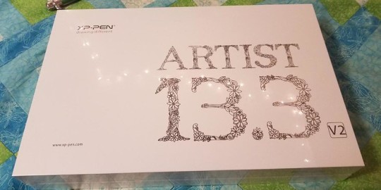
Review: XP-Pen Artist 13.3 Graphics Display
Review: XP-Pen Artist 13.3 Graphics Display
Review: XP-Pen Artist 13.3 Graphics Display
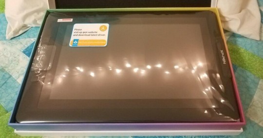
First Impressions
The product arrived on time.The packaging was pretty impressive The box was very well, I loved the packaging it has a beautiful and very firm and strong box so in case you are shipping it far away rest assure the package is well protected.
The overall build quality is solid. Edges are all rounded off. It actually looks quite good. Can’t compare to the build and looks of the Wacom Cintiq but the price is much more affordable. XP-Pen Artist13.3 is one of the most affordable Cintiq alternatives out there, price-wise. It’s really a good choice if you’re cash-strapped, as long as you don’t mind drawing on a smaller screen.
Specifications
Product dimensions: 39 x 25 x 1.4cm
Active area: 29.3 x 16.5cm
Screen: 13.3 inches with 1920 x 1080 resolution
Panel type: IPS
Colors: 16.7 million
Input: USB-C
Graphic ports supported: HDMI, miniDisplay
Pen does not require battery
Visual Angle:178°
Pressure sensitivity: 8,192 levels
Display Color Gamut:75% Adobe RGB
At the time, it’s selling at site:https://www.storexppen.com/buy/artist13_3.html
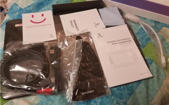
Package Contents
XP-Pen Artist13.3 V2 tablet
HDMI/Power/USB all-in-one cable
USB extension cable
HDMI to miniDisplay adapter
Pen and stand
8 replacement nibs
Wall charger and various international plugs
Manual, warranty card, cleaning cloth and glove
The packaging box features a very simple clean design. With this box, you lift up the cover to reveal the pen display and all the things included.
The Screen
XP-Pen-Artist13.3-Screen
When you first open up the box, the screen has a protector film over it which has to be peel off to reveal the matte screen protector. It’s a nice texture to draw on.
On XP-Pen Artist13.3’s screen there’s a screen protector that adds texture to the screen. The purpose for this texture is to add friction while you draw, and to hopefully make it similar to drawing on paper. the anti-reflective coating reduces glare by 56 percent.
Calibration on the tablet is decent and does stray a bit towards the edges, but not so bad to ruin the drawing experience. I recommend calibrating the tablet before you draw if you are moving the tablet around.
The XP-Pen Artist13.3 comes with a 13.3-inch screen, which provides you with a decent drawing area (the active drawing area is 293.76 X 165.24 mm). the tablet used an IPS panel so colour reproduction is quite decent. Some one will think this is small draw area, but you could get used to it if this is your first pen display, or if you want a portable one to take with you on the go.
This 13.3 inch pen display supports a 1920 x 1080 resolution. For a screen this size, which isn’t too big, everything appears sharp.Using a Spyder5PRO colour calibrator, I get a readout of 89% sRGB, 68% NTSC and 70% Adobe RGB.
The Pen
XP-Pen Artist 13.3
XP-Pen-Artist13.3-Drawing-Pen
XP-Pen Artist13.3 comes with a passive pen. The pen supports 8,192 levels of pressure sensitivity. It does not use battery so it does not need to be charged.it has two side buttons but no eraser.
The pen comes with a pen holder to store it away while not in use. Inside the pen holder, you can find 8 replacement nibs. Replacing the pen nib is something you ought to do when the current nib become pointy.
Hot Keys
XP-Pen-Artist13.3-Hot-Keys
XP-Pen Artist13.3 comes with 6 hot keys. You could customize these keys to do all sorts of the shortcuts you do on your art program. For example, you could set one of the keys to switch to the selection tool(assuming you use it a lot), while having another one to activate a certain filter. The possibilities are high.
Having 6 hot keys in a cheap drawing pen displays like this is really nice too. It can help you replace the keyboard in case you don’t need that much keyboard shortcuts.
The Driver
Before you get to install the driver, it’s important you remember to uninstall any graphics tablet driver on your computer, either from Wacom or another manufacturer.
You can install the driver from the USB storage included. But it’s always best to download the latest driver from XP-PEN’s website.
With the driver, you can change the pressure sensitivity, assign functions to the side and physical shortcut buttons, calibrate the screen to compensate for parallax offset and switch to left-handed mode if you want to.
When you’re using it for the first time, there’s going to be parallax. The glass is close to the screen but there’s still a distance. There’s parallax so you’ll definitely want to calibrate the screen.
It is very easy to install and I love the way everything looks and feels. I use both photoshop, paint sai, and clip studio and this tablet works great for all of those programs.
Drawing performance
Most of the functions such as sketch, paint, design and edit can be executed directly from the tablet screen, work naturally and intuitively.
There’s this inconsistency or the challenge of maintaining a consistently smooth line when drawing curves. When you’re testing for it, it’s going to show up, but when actually drawing with it, it’s not that big of an issue. Out of all the apps, Clip Studio Paint works perfectly without any of the wobble or stroke issues.
Enjoy Every Detail Artist13.3 driver can support 4K displays, allowing you enjoy every sharp detail and every soft line. The newest brightness adjustable buttons help you to find the most suitable lightness, offering you an comfortable drawing experience.
If you’re using Windows, the performance of the pen is better than on Mac. You get nicer looking lines.
Pros
Good build quality and design
Pen does not require battery
8 replacement tips included
6 shortcut buttons are useful
Matte anti-glare screen does not have reflections
Screen has decent colour accuracy and viewing angles
Price is very competitive on this size
cons
Matte screen protecter affects sharpness of the screen
Parallax exists, corrected by calibration
No stand included for the display
Summary
It’s a great little drawing tablet! Full support for Windows 10, I definitely recommend this tablet to artists who cannot afford the Wacom price.
For anyone that wants one of those fancy Wacom Cintiqs but can’t afford one, this tablet might be a great alternative!
Warm Reminder: the drawing tablet could draw power from USB port, as that could mean the ability to use it on the go more easily than other pen displays.
If you want to learn more about the XP-Pen Artist 13.3, check out the link below:https://www.storexppen.com/buy/artist13_3.html
1 note
·
View note
Text
mangas
Want to purchase X-Males t-shirts on-line? Whether or not you could have a love for The Avengers, Incredible 4, Thor, or X-Males there are a lot or t-shirts and different merchandise to own. My childhood included a love for 60s and 70s Marvel and DC comics, and my capability to draw originates in part from finding out the tales I read in these days. We worked for a year together on the piece to plan and draw it. Toy companies like Hasbro and Kenner used to produce hundreds of Batman action figure than is launched every year with some variation in it. Transformers 2, the science-fiction film is the most recent sensation, and is the most awaited film of the 12 months. Let's take the film Avatar as an example. Once in a while I went again to the game to take a number of extra screenshots to increase a plot. Within a few minutes, I started making comic strips. Unlike his other comic strips, in Battling Boy, the hero is a kid, who is on a mission to avoid wasting town.
In reality, the opposite series of battling boy grew to become widespread. To conclude on this topic, I believe it's an incredible concept to give our kids the funny comics created means-back-when, comics from your and my childhood. To read a narrative in adventurous manner is sort of exciting for all the kids. You've to beat the constraints of speech bubbles and the difficulty of telling a narrative body by frame. Admit it you may have! I’m positive you've heard this popular on-line store. Since Children's Graphic Novels are really simply an outdated idea with a fancy new name, why should not you explore taking outdated successful comicbook concepts and reinventing them for a brand new era? The concept was to convey the identical meaning with phrases that I suggested via colors, textures and pictures. Popular Online Comics solidify a that means of a word because pictures help that means to words. The nomination was a significant achievement for an artist who had - quite literally -started out small, drawing Submit-it note sized comics and hiding them in different people’s work in bookshops. The primary comic strips appeared in Germany in 1865. It was about two boys who're getting punished for always stepping into mischief.
Moreover, if we're sincere with ourselves, we all know that plenty of mischief is downright humorous. Why are previous coins price more than at the moment's coins? Full collections will fetch lots greater than random particular person comics. Our purpose is to give our readers a very good piece of entertaining and educational comics on which will develop up not one in all the long run generations. These blockbuster movies performs a vital function in the comeback of comics. People who need to cherish their childhood recollections with the comics; they can easily find low cost comics to start out their comedian collection. In today of "I need the latest and latest," we actually discover that some of the real treasures are issues of old. Comedian books are detailed stories. Apart from conventions, yard sales and used guide shops can be extraordinarily price efficient sources for collectible comic books. A comic e-book adaption in addition to a novel publication is being carried out for the movie's promotion. That assumption is mistaken and is an insult to your complete comedian ebook community.
These comic guides give you the type of knowledge you want like the place to get the uncommon and useful comics and where you can get first problem comics as nicely as the back concern ones as well. By selling and buying and selling comics you may be there were the art work is most loved and valued. Moreover, that's where you get the meet fellow fans and catch up on the most recent in the comic books world; information that can show invaluable. Some comedian books editions are collector's objects and if preserved in mint quality condition. Books are restricted because the reader cannot physically see what the writer envisions. Are these behaviors to be condoned? Eyes grow to be circles or dots, mouths are diminished to curved traces, and noses or toes are triangles. Get the newest news. Those that already evaluate huge talents of our website, confess that it is actually essentially the most handy and easy way to be in contact with the most recent innovations of the world of comics.
Properly aware of the advantages that come from studying comics. Which Marvel comics do you have to read earlier than (or after) Captain Marvel? Repetition. Return to your each day newspaper and look on the comics’ page. The cartoonist is using repetition to determine the character. Therefore, we could say that it has nothing to do with a changing developments, no matter is new and trendy, photograph to pop art print stays within the midst of its identified usability in area of art. I regarded, and there before me was a pale horse! There really is one thing for everybody. Cosplay also means costume play and the fans usually come to the comic conventions dressed in costumes. Eight delectable Expansions that adopted added to the joy of the sport play. Then by all means, use it. By way of the use of these exaggerations, it doesn’t matter what other details I include. The possessed doll first hit the screens within the 1988 horror classic 'Kid's Play'. Corey Haim, the lead of the unique horror movie, and Corey Feldman, the 2 Coreys, reprise their authentic roles. Nevertheless, in 2003 Hasbro would relinquish management to Batman's rights to Mattel. You also get preferential treatment in some circumstances and entry to particular events and performances. Did You Know About Fish Smarty? Educational Portal With Many Interactive Games
Brian Michael Bendis is often a critically-acclaimed writer that's popular for his self-published Image and Marvel comic series. He is responsible for many Marvel Crossovers inside the mainstream superhero genre including Secret Invasion, Secret War, House of M, and the popular Ultimate Spider-Man, where he could be still working on today. He has been in keeping with his writing and that he has the maids touch because on the decade now his works have sold considerably well. Batman Unmasked:
Before we proceed into the main topic, let's reintroduce first who's Batman with regard to those who find themselves different about him. Batman is probably the many superheroes that is certainly located in comic strip stories. His alter ego is Bruce Wayne, a billionaire playboy who while very young witnessed the unfortunate murder of his parents Flash by common thugs. It was this event that gave Bruce the motivation to seek revenge not just to those that killed his parents, but to all criminals situating in Gotham City. He then wore a mask had become the hero known as Batman. But that might be evolving as increasing numbers of comics are increasingly being sold for computers and tablets. On the web, independent writers and artists don't have to face the drawback to paying higher per-book print prices on smaller print runs. And there are numerous storefronts and purchasers tools sellers can utilize to trade their original work on favorable prices. Needless to say, the better known platforms will continue to serve the important publishers, but the digital store is not as limited as the space inside a physical store. Using a live model have their benefits in that you can earn from doing live portraits at art fairs along with other public events. A more convenient method specifically for beginners is by using photos. When drawing a portrait you should focus firstly on the face. Here are some tips to achieve accuracy inside your drawing. There are many strategies which come into play when dealing with collectable investment potential and I have only shared two. I believe these are the two main strategies which will help provide some potential now, as well as some protection against weak economic times. They can also help you utilize strong economic times later on. The bottom line is that will have possessions, and memories to go along with those possessions. Some of the key ingredients to collectable buying a weak economy are identical key ingredients in your life. If you balance yourself, you can find enjoyment and happiness. If you extend too much, you risk your balance and happiness. Think ahead. Live today. Cherish your love ones. Enjoy your hobby.
1 note
·
View note
Note
Hi! Do you have any tips on getting into digital art? I'm getting an art tablet soon, but I don't know where to begin. I want to draw animals if that helps
Congrats in advance on getting a tablet! I’m still pretty new to the whole digital art thing myself (I only got my first tablet like one-and-a-half years ago), but I’d be happy to give some tips on getting started!
1. Don’t try to create a masterpiece the first time you use the tablet. This might sound a bit obvious but the first thing you should do with a tablet is a lot of sketching and messing around to be able to get the feel of using a tablet, which can be a pretty unfamiliar sensation. If you expect yourself to be able to create a beautiful digital painting the first time you use a tablet, you’ll probably be disappointed. Just playing around with little sketches is a much better way to get accustomed to digital drawing.
This is the first thing I ever drew with a graphics tablet. Just a sketch of an Allosaurus head with which I then proceeded to attempt an obscene amount of detail and gave up after I barely started. It’s okay to start small!
2. Play around with the brush settings in your art program. Most art programs have a wide variety of brush settings that you can fiddle around with to adjust size and transparency based on pen pressure, as well as different styles of brush that give different effects. I’d recommend messing around with these a bit while you’re doing your practise sketching to find a brush type that is most comfortable for your style of drawing.
You can get a ridiculous amount of variation in brushes by fiddling around in the settings. I use Photoshop, but other drawing programs probably have similar tools. There are plenty of tutorials online on how to create your own personal brushes on different art programs, which can be a fantastic way to personalise your art and make it a bit more special.
3. Practice shading and highlights. One of my absolute favourite things about digital art is that it gives you the ability to easily create strong, bright highlights over your drawings, which is something that you just can’t do easily with a lot of traditional media such as coloured pencils. If you put in the time, effort, and practice to get this right, you can create really solid, three-dimensional-looking art. I can’t offer a lot of great advice on this since it’s still something that I’m working on myself, but there are plenty of tutorials on the internet on shading and highlighting in digital art that are really worth checking out and studying.
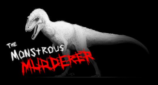
This Teratophoneus is probably one of my proudest achievements in shading and highlighting so far. The ability to draw light colours on top of pretty much anything is incredibly useful for creating good, solid highlights
4. Don’t feel pressured to be amazing at digital art immediately. There is definitely a learning curve to becoming good with a graphics tablet, and you almost certainly won’t be able to create beautifully-lit, photorealistic art right away. I’m still very early on in my digital art exploration, so I know that it can often be disheartening to see accomplished digital artists creating amazing pieces of art while you’re still trying to figure out how to use the lasso tool. The important thing to remember is that these artists probably have years more experience than you. That being said, if you put effort and care into practising digital art, you will improve at it, just like any other art form. Your first attempts will probably not be all that impressive, but your first attempts do not reflect what you will develop into as a digital artist.
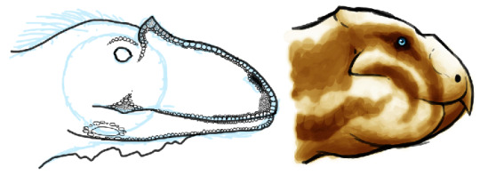
Two dinosaur heads, drawn by me, roughly 1.5 years apart. I only just found this really old drawing today, and I am honestly shocked by how far I’ve come. Art improvement might be hard to notice as it happens, but it’s so rewarding to look back and see where you came from.
And finally, the two most important ones (in my opinion):
5. Experiment with whatever you feel like. Digital art is an amazingly versatile medium. You can essentially make your artworks look like anything you want to. That can sound quite daunting, but it’s a great opportunity to spread yourself out and challenge yourself artistically. Want to draw something simple and cartoony? You can do that. Want to draw something so detailed it looks like a photo? You can do that too! Want to just go completely nuts with colours and see where it takes you? Guess what, you can also do that!
Don’t be afraid to try doing something new with digital art. I have at least three very different digital art styles that I can use interchangeably whenever I want it, and I feel like that’s the real power of digital art. The ability to create whatever you want to do, whenever you want to do it, however you want to do it. The ability to diversify and branch out and explore completely new styles and methods without having to worry about resources or media or buying lots of expensive pencils or paints that you might never use again. Whenever the mood strikes you, just sit down and start creating anything you want.
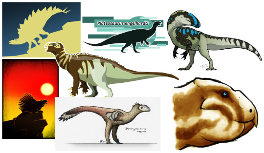
ABOVE: The many digital art styles of Tas. From abstract graphic design to realistic, anatomical illustrations, digital art is an incredibly broad medium.
6. Keep practising traditional art. This is something that I think is essential as an artist. Digital art should not take over any traditional art methods that you already use. Instead, it should be treated as something to expand your range, not replace it. I’ve raved about digital art quite a bit in this post, but to me there’s still nothing that feels better than a graphite pencil on a sheet of paper.
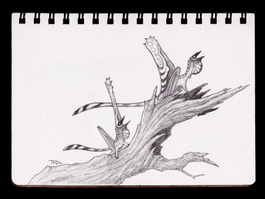
I drew a series of Triassic reptiles in graphite last year, and they remain some of my favourite restorations of prehistoric animals that I’ve ever done. Don’t underestimate the humble HB pencil.
The great thing about doing digital and traditional art is that one method informs the other. You might figure out some cool new technique with watercolours, graphite, coloured pencils, or whatever you prefer to use, and then use that same technique in your digital art. Likewise, digital art can also influence how you approach your traditional works. I have personally learned a lot more about shading since I started creating digital artworks, and I’ve been able to apply that knowledge to my traditional pieces as well.
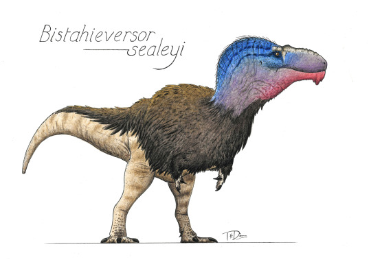
This Bi-stahieversor is my most recent traditional artwork, and almost all of the shading and texturing techniques are based on things that I’ve learned from doing digital art. I highly doubt I would have been able to learn these as well if I hadn’t done a lot of shading practice in digital art.
Well, this has turned out to be significantly longer than I thought it would be. If anyone else has any other advice, please feel free to add it! I’m sure there are plenty of more experienced artists out there who have much more to teach than I could at this point in time.
Good luck with your new tablet, Anon, and best wishes in your artistic endeavours!
#ask#palaeoart#art#digital art#long post#I did not expect to write this much#but here we are I guess#hopefully this isn't too unreadable#art advice
132 notes
·
View notes
Note
You are a source of inspiration..Any recommendations if someone wanted to make a game of their own? (I.e what programs to use, things to look out for, etc)
I’ll get the expected answers out first. Here’s the programs I use (and the plugins I use for each of those):
Blender, which I use for modeling, rigging, and animating
Rigify plugin for rig creation (this comes bundled with Blender, you just have to enable it)
RetopoFlow for retopologizing high-poly to low-poly (has a free version in Github, the paid version just entitles you to technical support)
Substance Painter for texturing (this sometimes goes on sale on Steam, so watch out for it every time Steam goes on a discount sale)
Photoshop CC for creating GUI art, and image manipulation needs ($10 per month sounds fair for all the things it could do for me)
Unity for the game engine
StrangeIoC, an open-source code framework (I explain what it is exactly here)
TextMesh Pro for the GUI labels (free)
ShaderForge for making my own shaders (used to be paid, but it’s now free)
InControl, for user customization of controls (has an old, free version in github)
Unity’s Post-processing Stack for visual effects (free)
A custom AI plugin that I made, called INTLord
A custom game editing tool I made that I simply call Attack Editor (for now)
Visual Studio Community Edition (the free version) for the IDE
Resharper plugin for VS is immensely helpful for me (this is pretty expensive, but worth it for me as I use C# heavily)
Git for backup and version control
I use Git Extensions as the front-end GUI
Dropbox and Google Drive for backing up other things like raw art assets
Portable Kanban for keeping a todo list (I can recommend HacknPlan for an online alternative)
But I think the number one thing to look out for here is that, while it seems I’m able to do this game with ease, I can assure you that it is not smooth sailing all the time. I’m only sharing the end result of my work each time I post. All the mistakes and errors I encounter, I tend to discard and not share, but only because I think no one cares to really read about them. My point here is that even when I tell you what programs I use, just using those won’t guarantee you success.
If you’re having a hard time making a game, that doesn’t mean you’re not cut out for this, because I have a hard time too. It’s an inescapable part of something as complex as game development. I think what really makes a person not cut out for this, is when they give up easily when encountering difficult problems, like an overwhelmingly confusing bug, or getting a crash and finding out your work got corrupted. The proper response here is to approach problems methodically instead, and take steps so you tend to not encounter those things again in the future.

Don’t expect to get things perfectly the first time, but do take time and effort to improve each time you blunder.
There’s one pattern I see a lot with beginners who never get far: they love to complain. Don’t end up like that. If after all your best effort and research, things still don’t work, then I can finally concede that you have the right to complain.

These beginners would blame the engine, the programming language, or the art tool if something goes haywire, when, majority of the time, the mistake was their misunderstanding what the tool was for, and a way to solve it was in the user manual. So make sure you’ve done your homework before going on a rant.
Second thing: Practice a lot. They build your skill set. If you have no idea where to start, I suggest just making a simple game like tic-tac-toe in the game engine of your choice. The point here isn’t to build something amazing, it’s to get your feet wet with the tools you’re using. You’ll be doing it more to learn how to get graphics drawn on the screen, how to detect and react to user-input, how to code gameplay logic, etc.
The fact that you’re making a simple tic-tac-toe game helps ease the difficulty curve of trying out a new game engine. Then work out how to put a main menu on it, a highscore that gets saved to a text file, etc.
Then try out making a tetris game, then a side-scrolling platformer, etc. The more familiar you get with your tools, the easier it is to create more and more complex things.
There’s a theory out there that the amount of vocabulary you have with your spoken language influences what you tend to say (or even think!). I think it’s the same with you and your gamedev tools. You might have never gotten around to doing some crazy idea you had, simply because, lacking knowledge in your tools, you didn’t think it was possible.
I do game jam games to try out learning something new.
One thing you need to realize is, if you’re not having fun doing the nitty-gritty details of these steps in game-making, maybe you should reconsider your choice of wanting to make games, because this is how it is all of the time. Or probably at least consider specializing in one aspect instead, and get help with the rest.
The third thing to look out for is having no direction. What really helped me out with making this game is having a clear goal of what I want: a 3d action game about the last days of a terminally-ill henshin hero, taking place in a modern day city.
When you have no clear goal, you have no idea if what you’re currently doing is beneficial or detrimental to your game. You would have no yardstick to measure progress.
It’s fine to experiment without having decided yet what the game will look like, or what genre you’re going for, but I think even among experiments, the good ones are those that have at least some general direction of what they’re trying to test or prove.
This is the earliest photo I could find of my work on the game, dated 2014, Dec. 31. On my pen tablet display there is my early concept for Desparo.
There’s a lot of things to consider when deciding to make a game. I myself was thinking whether I make this game a turn-based, or a real-time action RPG. I was also wondering if I should do it in 2d or 3d, if I go with anime or realistic art style, etc.
I knew I needed to finalize my decisions if I ever hope to progress. I think the proper way to have done it would have been to make a turn-based RPG prototype alongside an action RPG prototype, and then compare the two. But in the end I just went ahead with the real-time action game, simply because I wanted to try out something new.
Sometimes, you start out making a game prototype with just boxes, and deciding it has potential, flesh it out further by attaching a theme/story/premise behind it. I think that’s also a viable approach. It just so happened Ghost Knight Victis started the other way around, with the story first before the gameplay.
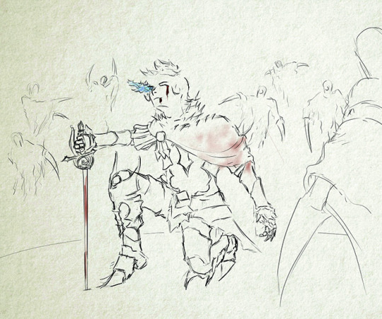
And how do you get that spark of an idea of what your game should be? My game’s premise was a culmination of several ideas that have been brewing in my mind for a long time (years). After going through something pretty significant in my life and one lonely December, with two bottles of Tequila and playing through Transistor, all the incongruent ideas started making sense and fit together.
I’m not saying people need to go beat themselves up just to get something “cool”. In fact, if you have a content and happy life, consider yourself lucky if you couldn’t find inspiration to create something really artistic. Because those things tend to come from some deeply-buried, strong feeling, like anger or resentment. Then again, dealing with such thoughts are a normal challenge of growing up, living in a community, or even something as mundane as struggling with where to get a stable income. You just need to change your perspective on where inspiration comes from.
Fourth is to pace yourself properly. Match your expectations with what you can do at the moment. Aim too far out of your comfort zone, and you’ll likely fail, get discouraged, and stop trying. The trick is to aim only a little bit outside your comfort zone. You still compel yourself to improve, but at the same time, it’s a manageable amount of work for you.
Scrum and Kanban are the usual things to learn about here. I personally use Kanban a lot. The idea is simple:
As a task gets further along to completion, the more it moves to the right. But, you have one restriction: only up to 3 tasks at a time can be in the “Doing” column.
This means if you are already devoted to working on 3 tasks in the “Doing” column, and you want to work on something new, you have to finish at least one of those 3 first. This makes you concentrate on getting things done. It stops you from diluting your focus, trying to work on too many things at a time.
You could also decide to move a task from “Doing” back to the “Ready” column. But I normally do it only when either I realize something else is of more importance and I need to stop what I was doing, or perhaps I’m stumped and really can’t progress on that task, in which case I give up and swap it for a different task instead.
Scrum has a lot of techniques, but one thing I take from it is the idea of sprints. You do your work in a per 2-week period, called a sprint. On the start of each sprint, you decide what you will get done, and commit to finishing those tasks within 2 weeks. After those 2 weeks, you again pick which tasks to do for the next 2 weeks, and so on. This is also a method to help you focus on getting things done, because you only concentrate on a few tasks at a time, but it also forces you to take a look at the bigger picture and re-prioritize after every 2 weeks.
In my case, I don’t have 2 weeks. My sprint is only 2 days: every weekend. So I make sure each task I write in a card is achievable within 2 days. If I think a task can’t be finished in 2 days, I divide it into several subtasks.
For example, “obtaining items from chests” might be too complex, so I could divide that to these subtasks:
being able to define chests as a list of the items inside it, and being able to save that data to file
being able to place chests in the map, each chest being: a 3d model of the chest, and the data file saying what items are inside it
create the GUI art for viewing items inside a chest
put the GUI art in-game and adding code to allow it to react to user-input
implement the code for transferring items from a chest to the player’s inventory and vice-versa
Fifth is to concentrate on having a working, playable work-in-progress.
The thing to aim for here is that at the end of each sprint, whatever progress you make should be something that works in-game. It’s fine if you don’t get that all the time, but I think aiming for it helps pull everything towards that direction.
I think this video of Bayonetta’s prototype says a lot:
youtube
For reference, here’s how the final product looks like:
youtube
You can see from that prototype video that you can already start working on the gameplay even if you don’t have the art finalized yet (because the art can take a long time to get done).
I think that’s the wiser method of doing things, you get a playable work-in-progress without being stalled by the fact that the art is incomplete. It’s even better because it’s easier to adjust animations while they’re still rough: it’s less motions to re-arrange and tweak whenever you need to adjust it.
It’s also not good to base your judgement of how correct an animation is from just looking at it in Blender/Maya/etc. alone, because you aren’t seeing it being used in-game. For all you know, the sword attack you’ve been polishing for so many days doesn’t really work because the arc of the sword swing doesn’t really reach the intended target! Or maybe you didn’t realize that the swing is making the sword pass through the ground mesh unintentionally!
Or maybe there’s certain situations where your animation really just needs to be tweaked (when fighting inside narrow hallways, or when you are standing on a flight of stairs & attacking a target below you, etc.). It’s really better to test it out in-game as soon as you’ve established the key frames of your animation.
Frankly, this is something that I should learn to do myself!
And what about for the story? I think this is a neat trick in designing a prototype for your game’s story:
youtube
(the video’s about half an hour long, but it’s worth it)
The basic gist is that you design a “board game” out of your game’s story. And I think that’s the proper way to do things. There’s really more to it than what I just said, so I encourage you all to watch that video.
Sixth is to handle feedback as objectively as you can. As a solo developer, you will tend to see your game as your “baby”, something that in your eyes is a flawless creation.
Maybe you expect players to always do something, but turns out it never crosses their minds at all. That might be a symptom that you need to fix your game’s design.
Be clear with what you are asking feedback for. Just posting screenshots, and a vague “this is my game, suggestions and feedback are welcome!” will not help, because people will tend to give you suggestions that are not in line with the goal you have set in mind for the game, and you end up sounding defensive trying to explain things.
Explain your intent with what you’re specifically showing, and ask for feedback if people think your work achieved that intent or not. But start with a 2 to 3 sentence blurb that describes the premise of your game, to set the tone. Here’s a good tutorial for that.
Take the time to appreciate when people praise you, but don’t let it get to your head.You shouldn’t keep yourself in a circle full of yes-men, you will just not improve there. On the other hand, don’t think that just because you’re being the target of verbal abuse that you are finally getting the so-called brutally honest feedback.
You really have to ignore the emotional parts of what people post, good or bad. Read between the lines of what’s being said, to find the truly useful feedback you want for improvement (if there is even any in their posts).

But don’t just follow every suggestion that comes along your way. Sift through it and think about why someone said what they said.
In my first playable demo, many were complaining that the player should be allowed to move more responsively, to be able to cancel attacks into movement. But that went against my intention of giving it a Dark Souls type of combat (instead of a Dynasty Warriors style of combat).
I realized, people were having that problem because I placed far too many enemies in the level. No one suggested that I lessen the amount of enemies, but that was really my mistake with that one.
So there really was a problem, but their suggestion was not the best way to fix it.
Another example: When Magicka was still being developed, some beta testers complained that friendly fire ruins the experience, and kept suggesting to remove it, or at least have the option to disable it. But the developers doubled down on their decision to have friendly-fire, because friends hitting each other was part of the humor that they wanted to achieve, so they decided to leave it there, and they were right.
I’ll end all of this by saying, this is only my way of doing things. It’s perfectly reasonable if you discover a different way that works for you!
I always keep a bottle of Tequila handy under my desk.
115 notes
·
View notes
Text
XP-Pen Artist 10S v2
Yeah... that’s a mouthful ain’t it?
I recently got myself a graphics tablet... with a SCREEN!! I’ve been wanting one of those since I knew they existed, but for the longest time only the insanely-priced Cintiqs were available.
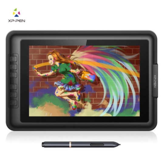
In recent years, it turns out, other manufacturers have branched into screened graphics tablets also--slowly bringing down the price to an attainable level.
I got my Artist 10S for £199.99 from Amazon. Let me tell you how it went.
From the Top
I have done art before. I was half-decent at it when I was around 10 or so. But it’s been a while. I got myself a decent “dotted” sketchbook and started sketching things out in it to run my RPG sessions. That’s really what gave me the bug to get into drawing again. And to actually buy a tablet to do so!
I downloaded Krita, a free Photoshop-like application for artists. It’s super-powerful, once you figure out how it works. But there are plenty of tutorials online about that if you’re interested in checking it out.
...But anyway, Krita has some nice smoothing algorithms you can turn on for drawing with a pen tablet. The pen doesn’t have tilt and rotation detection, but pressure sensitivity works well with Krita and gives me plenty of expressiveness to get on with. And I was pretty instantly busting out some sweet curves!
It was a pretty amazing experience, really--getting to draw freehand while also having the capability of undo, erase, etc. I’m not saying it brought a tear to my eye, but it was a nice moment. 😂
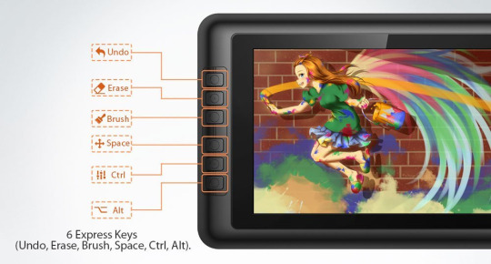
Config
The tablet has 6 “Express Keys” along the side, which are configurable to key combinations. When you hold them down, that key is held down (this’ll become important later). I currently have them set to things like canvas pan/zoom/rotate, and a couple of other “hold to use” shortcuts.
The pen is somewhat triangular along the barrel, meaning it won’t roll around on your desk. But it’s smoothed out enough to feel just fine in your hand. It has two barrel buttons, though these are only configurable to mouse various clicks and a preset “brush/eraser” toggle (which didn’t work with Krita out of the box). There is no “eraser” button at the other end (like a pencil with an eraser at the other end)... but I’d find that too fiddly and time consuming to flip it around anyway.
The lack of options for the pen is a little disappointing. Things like this are insanely easy to implement in code--as demonstrated by the express key options. So there’s not really any excuse for it other than the company being small, and this product originally belonging to a different company XP-Pen... bought out or something? I dunno. We’ll get onto them in due course.
Oh, a little side note... the configuration app is only readily accessible from a system tray icon (in Windows). This is fine when you first install the drivers. (And then install the updated drivers so the tablet actually works.) But it has a habit of just... disappearing. After Hibernation or Sleep, that icon tends to wander off somewhere.
And all XP-Pen have to say on that score is to give instructions on how to make it appear again--which only works half the time and may require a restart anyway. I’ve since figured out where the config application itself is kept, and made a shortcut to it in my start menu. In case anyone else is having the same troubles as me, here’s the file path: “C:\Windows\SysWOW64\tabcfg.exe”

Screen
This tablet has a screen! Still getting over that XD
The screen is only 10.1″ corner to corner, which is a little smaller than the average screen tablet such as the Cintiqs. But it’s plenty big enough when it’s sitting right in front of your for actual drawing.
Another reason I pulled the trigger on buying one of these is to get a second screen. I often watch various Youtube videos in the background while I’m playing games and whatnot. I used to prop my Chromebook up next to my regular monitor. This worked fine, but pausing everything when someone came in to speak to me (just a politeness thing I like to employ; nothing sneaky going on)... was a bit of a hassle. And balancing the audio between devices had its own fiddliness (besides the piddly Chromebook speakers not being able to get loud enough for quieter videos).
But now, with two monitors hooked up to the same computer, everything’s a lot easier. I can move windows between screens easily enough. And pausing a video is as simple as moving the mouse over to the other screen and clicking.
Colour Calibration
However! I am having some trouble with the colours. I was drawing away just fine, a simple cartoon character to try out the shading tools and so on and get used to Krita. Then for whatever reason, I saw the picture on my main monitor. The skin tone was way off--too red for what I was actually going for. It seems the tablet screen likes to give everything a yellow tint--making picking colours pretty tricky.
I’ve tried keeping a preview window open on my main monitor so I can see the “true” colours, but this is really not conducive to a productive work space. Or something ^^
I spend a few days trying to configure the colour management side of things from Windows and NVIDIA (the tablet has back light brightness buttons and that’s it)... but it’s just darned fiddly! I can never quite be sure if it looks right or not--or if both screens at least look similar. All I want is a “click on a colour on the screen, and remove some yellowness from it.” You wouldn’t have thought it would be that hard to do, would you?
But instead I had to use gamma, brightness, and contrast sliders. I think I get brightness and contrast... and I thought I knew what gamma was. But it just never turns out quite how I expect. All I want is a step-by-step tutorial on “First, get your gamma correct across all colours. Here’s how you do that...” And so on and so forth.
There are plenty of test-card images out there, which are a good start. But nothing giving you a list of instructions.
See, if you fix the brightness and contrast, it doesn’t necessarily mean things look right. So then you mess with the gamma and nothing makes sense any more. It seems as though you need to adjust all 3 at the same time to be sure you’re actually making any progress.
I even had a Windows bug where my colours wouldn’t stick. I had to create a new user account (with all the headaches of setting things up all over again) just to fix that issue and make any progress whatsoever!
/sigh/
And this doesn’t even talk about the contrast issues it already has. No matter what I do, it’s too bright in some areas and too dark in others. And with my colours fixed the way they are now, they look closer to my main monitor but not perfect. And they make some things just look a tad awful, across the board.
I’m managing, though. Using it for art--at least black and white art--is great, and as long as I focus on the tablet itself, the colours work just fine.
I did contact XP-Pen, to see if they had a solution. Most companies allow you to download an .icc file--a colour profile so the computer can correct a monitor’s output perfectly--but they just straight-up don’t. After 3 workdays of waiting, they told me to use Windows’ built-in calibration tools--which of course I’d been bashing my head against for the past week.
In case anyone else is having similar colour problems, I’ll give you the settings I used to half-fix it. Note that this is far from perfect, but it certainly seems a lot better than it was before, to my eye.
As I have an NVIDIA graphics card, I used their control panel to change the settings to the following values:
Red: 85% Brightness, 25% Contrast, 0.69 Gamma.
Green: 62% Brightness, 25% Contrast, 0.89 Gamma.
Blue: 90% Brightness, 25% Contrast, 0.72 Gamma.
I think the “All channels” part is just an average of the 3 colours. But in case it’s not...
All channels: 77% Brightness, 25% Contrast, 0.76 Gamma.

XP-Pen
That brings me onto the company itself. From what I understand, they’re a small company out of China? Or maybe the US? Or both? It’s really hard to tell from their website.
But anyway... I can only assume they’re too small a company to really provide decent support for their products. The response time is way too high, considering the price tags attached to their products. And the “shrug” attitude instead of providing solutions didn’t go down well with me.
Now, there are devices out there that calibrate a screen for you. The cheapest I could find is £90, and comes with a single-computer license. And that’s fair enough; most people don’t need them, and the ones that really need them are photography professionals who have to be willing to shell out some cash or produce poor work. But I’d prefer not to have to get one just to use it once and never look at it again.
The thing is, with this calibration thing, XP-Pen saying something very telling to the customer. They aren’t willing to get a calibration tool themselves, use it on a tablet, and make the resulting .icc file available for all of their customers to use--at least as a good starting point. Instead, they insist that each individual customer buys one themselves if they want any hope of getting relatively accurate colours from their purchase.
I may contact them again, to point this out to them. I mean, it may be that my unit is simply faulty and should be replaced... but then it should be replaced.
/sigh again/
Overall
I am happy with using the tablet. The tech is amazing, for the price. But such a lack of support is really dragging down the experience.
I highly recommend getting a screen tablet. If not this one, then perhaps another. Maybe your Artist 10S won’t have this issue at all and it’ll be perfect right off the bat.
It’s so awesome to be able to draw on your screen, and has really helped me get back into art-ing. I can already see improvement in my skill over the past week, through drawing every day after such a long time not drawing at all!
1 note
·
View note
Note
HEY MARI!!! i LOVE your artwork and i truly admire them so much, i get so excited when you post new ones. thankyou for being an angel and sharing your artwork with the fandom. it inspires me to take up digital art as well! i just wanted to ask as well, what software and tools you use for your drawings? im sorry if you've gotten this question before, i was just curious! and what kind of advice do you have for artists who wants to take up digital art?
First of all, this is SO NICE OF YOU TO SEND TO ME?! I was NOT expecting to EVER receive a sweet message like this omgggg.THANK YOU NONNIE!!!!!!! YOURE SO SWEET 💕I try to share what I end up liking with you guys!! Being part of this fandom has been such a great experience so far and I wouldn’t change it for the world. You guys have been so welcoming to my little fan artist-self. Love coming up with things and letting the bugfam see!! I haven’t been drawing much up until I watched this dang show and here I am now..all I can draw is them ;)) I’m glad you’re liking the stuff that I post!!Second of all! I’m so HAPPY that I can inspire you and anyone else out there to want to take up my favorite hobby and medium of art: digital. It’s new and different, but it’s honestly SO convenient. Tools: Clip Studio Paint (the site has sales here and there ESPECIALLY during Black Friday and Christmas. I got my program for $18 dollars USD, and it usually runs for about $60 USD)Wacom Bamboo Graphic Tablet (I got it way back in ‘09, it’s old but it still works fine!! I’m looking to upgrade to a screen tablet soon though~)Lastly, I know for a fact that digital isn’t easy to figure out. If you’re someone who’s used to editing on Photoshop and are familiar with the workings of that program, then CSP should be easy to maneuver through as it looks the same-ish. Getting used to figuring out how to draw while looking at a screen is also a trip, but the more that you draw and doodle, the more that you get used to working with a tablet. TRUST ME when I say that it’s FRUSTRATING, but the more that you work with it, the less of a hassle that it becomes. I find that working traditionally is difficult for me now as I’m too used to my tablet and easy access of the tools that come with CSP. That isn’t to say that you’re going to suck at either, but it takes time to get to used to digital. You can’t expect to be awesome in a weeks time, so DRAW DRAW DRAW!!! I LOVE digital, it’s so refreshing to me to work with, I’m still learning as I go, you never stop figuring out how to work programs :)) Another thing is the tablet itself, name brand or not (ex. Wacom vs Huion) both are good! You don’t have to spend hundreds on a tablet just because of its name. You can always start off with something small like the Bamboo series from Wacom like I did. I love mine, but I’m looking to upgrade soon to a screen tablet from Huion! So don’t worry too much about that!! You can also get those touch screen laptops (or you might already have one! Who knows!) but don’t rely on the expensive stuff!! Start off with something under 100 bucks and experiment from there on, especially if you end up doing digital for years (like me) Digital is complex when you first start off, but with programs like Clip Studio Paint, Photoshop (most confusing to me tbh) or Paint Tool SAI (old program that I used to use, GREAT for beginners) they’re all great and have their own learning curves, but it’s fun :D I hope that you get to do digital, I’d LOVE to see what art you come up with💕
4 notes
·
View notes
Quote
Let’s start with a question. What is the first thing that a user interacts with on a website? The interface, of course. The look and feel of the website is the first thing that creates the “First Impression” on the users. An interactive web application can make or break the deal for users, this is why more and more people opt for UI testing or User Interface testing for their web applications. Whatever the user sees and plays with on a website falls under the category of user interface. It is the space on which the website and the user interacts. So when you click on the wheel with section Play and Win on Amazon every Sunday and the wheel rotates to award prizes, it is interacting with the user. They could have done it with a simple ‘click and see’ feature but they know the importance of user experience. UI or User Interface testing has become a lot more important in the past decade. As the number of competitors in our niche increases, we need to make sure that we stay ahead of the curve and give our users the best user experience. Also as the web application comes bundled up with a number of features which can be pretty complex at times. This is why it becomes vital to make this process smoother and intuitive for the user. Otherwise they might just leave your application frustrated by the complexity. This is why UI or User Interface has become so vital and thereby UI acceptance Testing! In this article I’ll discuss in detail about UI testing and why it is important. I will also share some details on the methods of UI testing along with some important tools for UI testing So, What is UI Testing? User Interface testing or UI acceptance testing is the type of testing whereby we check if the UI for the web application works fine or has any defect which hampers user behaviour and does not meet the written specifical. For example, for UI testing we can perform the test on a text field that will take input from the user or the dropdown that slides down when the mouse is hovered over it. It is vital to know how the user will interact between the user and the website, in order to perform UI testing. In other words, by performing UI testing, the tester tries to mimic the user’s behaviour to see how the user will be interacting with the website and see if the website is performing as expected and there are no flaws. A small flaw in the UI such as an issue in the CTA button might result in your website visitor not being able to fill up the lead form, thereby never converting. Who knows, if this was the user who would finally give a boost to your ROI. A website consists of a lot of different web elements from CSS, JavaScript and many other languages. UI testing captures these elements and performs tests and assertions on them. It mainly focuses on the structural and visual part of the website since these are what the user is concerned with rather than how the data is stored inside the database. Since the UI testing covers the user interactive part and the website element can be connected to either screen, keyboard, mouse or any other component that the user uses to interact with the website, this ultimately falls under UI testing The following test scenario will help you understand a component that is important for UI testing. In this test scenario, I am trying to book 3 tickets for a movie on BookMyShow, a popular website for booking movie and event tickets. When I select the seat E-13, it automatically selects 3 seats like this: They are selected continuously which is great since most of the people booking tickets will sit together. Now, if I select F-23 instead of E-13, let’s see what happens. Notice that E-13 is automatically deselected since the application expects that the people would want to sit together and the next selection would be F-22. When I select E-13 as the next seat, the application would select only that seat. This is a major issue as the application could automatically select E-13,14,15 after selecting E-13 as in the first step. Failure in these types of features could harm the user experience and might leave them sight frustrated. Thereby, it becomes vital to perform UI testing. Is UI testing the same thing as GUI testing? GUI (Graphical User Interface) and UI (User Interface) are often viewed as two similar concepts in the world of front-end testing. But, on a deeper level, they are not. UI testing is a broader field and GUI testing can be considered as a subset of UI testing. GUI testing includes the testing of graphical interfaces such as the colour of the elements, the functioning of the elements visible to the user, etc. Whereas the UI testing also includes the non-graphical part of the interfaces such as command line reader or anything through which the user will interact along with GUI. The reason that UI acceptance testing and GUI testing are viewed as similar is that many of the components of UI testing are used less often today. So, in a way, whatever is used inside the area of UI testing today is majorly the GUI testing Manual or Automated, Which Way To Go? Like any other type of testing, UI acceptance testing can also be performed either manually or through automation. Manual UI acceptance testing requires the tester to perform each test manually on every element. For example, testing an input field would require typing in different values again and again for any discrepancies. At first glance, it might look that if there are fewer components of a web UI testing, it is better to go for web UI testing through the manual process which would be done easily and quickly. While it is correct and should be done for a simpler and basic website, it should not be the way to go for complex ones. Today’s websites with rich user interfaces make the manual UI testing quite inefficient, time-consuming and error-prone. Imagine the times you would have to enter the values manually if there are five input boxes and five dropdowns that get populated on the input. It’s insanely high So, why to go for Web UI testing automation? Speed: The first and foremost is the speed. Time is the major resource for every company and automating web UI testing saves a lot of it. Selenium Automation testing for UI acceptance testing requires us to write the tests only once and run them again and again without any intervention with different values and different scenarios. Accuracy: Selenium Automation testing for UI acceptance testing helps us in executing tests without any error, provided the tests are written correctly. Manual testing for UI acceptance testing’s main disadvantage is that it is prone to human error. Transparency: Selenium Automation testing for web UI testing also helps in building reports quickly and sharing with the team as soon as the testing is completed. On the other hand, manual testing takes time in extracting results and reporting them manually to generate reports through a software or manually Also, while performing web UI testing it is equally important to make sure the web application does not have any cross browser compatibility issues. Since every browser works with a different browser engine and might not support the same CSS features. Thereby it becomes important that we make sure that our UI or User interface renders seamlessly on all of the major browsers. Testing on different browsers is called cross browser testing, It helps the tester test his website on multiple combinations of all the major browsers and devices including mobiles, tablets, casts etc. Similar to the above-mentioned areas, cross browser testing can also be performed in both the ways (Manual and Automation). But, hundreds and thousands of web UI testing can be too much for a person or a team to test manually. This needs to be automated. Automation is the human’s way of telling the computers that, “I am handing this over to you with the instructions, please do the magic as you always do”. Automated cross browser testing is done through scripts and running them over multiple browsers. The number and language of the tests is up to the tester. Selenium is the best way to go for automated cross browser testing. A great learning curve helps testers run the selenium tests quickly and easily. To have hassle-free testing, it is recommended to use an online cross browser testing platform that integrates with Selenium and can provide many features through drag and drop functionality In the next test scenario, I’ll demonstrate the importance of cross browser testing in UI testing. This testing has been performed using an online cross browser testing tool, LambdaTest. To perform our UI test, I’ve taken a simple web page demonstrating the zoom property. Let’s say you decide to build a website where a major element is a box which zooms when hovered over by the mouse. You implement this functionality by using the zoom property of the CSS. But, since you were using Google Chrome as your default browser, zoom worked perfectly fine. Maybe you tested in IE, Edge or Safari and it was working fine there too. It looked like this But now, when your check your website in Firefox browser, you’ll notice that box doesn’t scale: UI Testing Sample p { font-size: 24px; color: firebrick; } #zooming{ padding: 50px; background-color: cadetblue; width: 100px; height: 100px; } #zooming:hover{ zoom : 1.5 } This page demonstrates the importance of cross browser Testing in UI Testing 1 2 3 4 5 6 7 8 9 10 11 12 13 14 15 16 17 18 19 20 21 22 23 24 25 26 27 28 29 30 31 32 33 34 35 UI Testing Sample p { font-size: 24px; color: firebrick; } #zooming{ padding: 50px; background-color: cadetblue; width: 100px; height: 100px; } #zooming:hover{ zoom : 1.5 } This page demonstrates the importance of cross browser Testing in UI Testing UI Testing Tools To test the user interface of your website, there are a few good tools available online: Grunt: Grunt is a Javascript based selenium automation GUI & UI testing tool. It provides a lot of plugins for easy performance of the tasks. Karma: Karma is a Javascript runner tool which helps in the GUI & UI testing. It can also be used to run the Jasmine tests. Karma comes loaded with helpful tools and features for test running. What Are The Techniques For Web UI Testing? Testing techniques are required to know the answer to the question, “How to perform the testing? In the various techniques described below, various processes are followed. Once we have decided on the type of testing technique we are following, it becomes easier to just follow the concept and generate the results. Exploratory Testing Exploratory testing requires no pre-planning and the tester just creates tests on experience and various other parameters such as previous test results. These parameters may differ from project to project. Exploratory testing provides a very flexible and open opportunity for the tester. Exploratory testing in the web UI testing helps identify hidden test cases as the UI may behave differently in different machines. A tester can make use of the automation while tackling exploratory testing challenges to run the cases on different data. Exploratory testing can also be performed efficiently manually. Scripted Testing If exploratory testing is performing testing without any planning, scripted testing is just opposite to that. Scripted testing is done after the scripts have been written and the test cases have been decided beforehand. As the first step in scripted testing, the tester defines the scripts which denote the tester’s entries and the expected output. The results are then analyzed and reported accordingly. Similar to the exploratory testing, the tester can go ahead with automated scripted testing or manual scripted testing. Although, automated testing in the scripted testing is recommended today because of the large number of lines of code and increased complexities of the project User Experience Testing The user experience testing technique in web UI testing can be done by providing the built project to the end user. The end user can then use the product like we all do and provide his feedback which can then be conveyed to the developer through the testing team. The companies sometimes also release a beta version of the product to their end-users to collect the feedback according to the vast geographic locations. This creates a great testing environment It is not so hard to decode that the user experience testing is a type of exploratory testing since the users do not know what to test and how to test i.e. there is no pre-defined plan. Needless to say, it is done manually. User experience testing can also be done on the partial product to check the UI on a large number of screens and on different locations without developing the complete project. This helps the companies test smaller components with the same intensity as the complete project would have been tested which ultimately improves the quality of the product. How does your UI performance matter? The average size of the website has increased over time. From a few pages to hundreds of pages in a single website today, websites are bigger than ever. Not only this, a single page contains hundreds of elements to create the complete website. This creates a huge load on the server from which the website is being fetched. A slower website is not a good sign for any web developer. Testing this also comes under the umbrella of UI testing and the performance can certainly be improved. Evidently, the improvement of 50% in the back-end system loads the website just 10% faster while the improvement of 50% in the front-end loads the website 40% faster. This makes UI testing a necessary process in improving the overall performance of the website. Achieving speed definitely gives an edge above other websites. Wondering how to achieve this? There are loads of software available online which can be used for performing GUI & UI testing such as YSlow and PageSpeed. The UI testing performs checks on the elements that weave together to create the user interface. Writing tests again and again and executing them manually is becoming redundant. This is why the world is moving towards UI testing automation. Role of UI testing automation has increased significantly in the past years due to increasing complexities and bigger projects. Also read: 17 UI Design Mistakes That Fails Your Website All in All In a nutshell, web UI testing requires testers to test the website as if to mimic the user’s behaviour. Combining all the possibilities and permutations, the tester needs to make sure that the website works seamlessly with all the elements working as intended. Also, since no browser is the same, cross browser testing needs to be performed to ensure your website performs seamlessly across all major browsers. Web UI testing automation will further help you gain an extra edge over your competitors and make your users addicted to your web application. AS That’s all folks! Stay Safe and Happy Testing!
http://damianfallon.blogspot.com/2020/04/all-you-need-to-know-about-ui-testing.html
0 notes