#foundry: linotype
Explore tagged Tumblr posts
Visit Tumblr Blog
Explore Tumblr blogs with no restrictions, modern design and the best experience.
Last Seen Tumblr Blogs


Fun Fact
Tumblr was named as a finalist in Lead411’s New York City Hot 125 in Aug 2010.
Text
#MiniatureMonday


Black Man's Verse
Happy Mini Monday! Today's item is Black Man's Verse, a book of poetry by Frank Marshall Davis made mini by Norman W. Forgue at Black Cat Printing in 1961. This mini book is larger than the last few mini Mondays, coming in at around 66mm x 59mm.
Bound by Monastery Hill Bindery using black leather, this book was printed using handmade paper from England. The title on the spine is gilt which means that it has a very fine layer of gold leaf or paint inlaid. The typefaces used were Linotype Caledonia, Bodoni Bold, and Foundry Ultra Bodoni. It was completed in February 1961, so happy 64th birthday to this beautiful mini!
Originally published in 1935, Black Man's Verse was revolutionary. It was lauded for his portrayal of black life and pride by critics such as Harriet Monroe. Dudley Randall, another literary critic, referred to him as the father of modern Black poetry.
Frank Marshall Davis was a journalist, poet, activist, and businessman. You can check out some of his other works in collections such as I Am the American Negro, Awakening, and Other Poems, and 47th Street.
For more information about Davis, please check out this biography by the Poetry Foundation: https://www.poetryfoundation.org/poets/frank-marshall-davis
Smith Miniatures Collection PS3507.A727 B5 1961
--Hailee M.
50 notes
·
View notes
Text


Typography Tuesday
This week we present some "Grandre Lettres" from the French specimen book Le Livret Typographique Spécimen de Caractères, published in Paris by the Deberny foundry around 1900. The foundry began in 1826 when the French literary legend Honoré de Balzac (1799-1850) founded Imprimerie H. Balzac. A year later, Balzac purchased the typesetting firm of Jean-François Laurent (1818-1823) with funding from his mother and his mistress, Louise-Antoinette-Laure De Berny (1777-1936). It seems likely that his printing/publishing firm would have been successful if Balzac wasn't such a spendthrift.
Deeply in debt, Balzac gave the company over to Mme De Berny in 1828, who in turn passed it on to her son Alexandre De Berny, (1809-1881). De Berny partnered with Jean-François Laurent until 1840 when Laurent sold his share to De Berny, who renamed the company "Deberny." In 1877, De Berny then joined with his illegitimate son Charles Tuleu (1849-1934), who inherited the business when his father died in 1881. Tuleu ran and expanded operations until 1914, when he partnered with an old school chum, Robert Girard, who changed the name of the company to Girard et Cie when Tuleu retired in 1921. It then merged with the Peignot type foundry in 1923, becoming Deberny & Peignot. It was bought by the Haas Type Foundry (Switzerland) in 1972, which in turn was merged into D. Stempel AG in 1985, then into Linotype GmbH in 1989, and is now part of Monotype Corporation.

View more type specimen books.
View more Typography Tuesday posts.
#Typography Tuesday#typetuesday#Deberny#Deberny et Cie#Le Livret Typographique Spécimen de Caractères#type specimens#type specimen books#type display books#French type#19th century type
24 notes
·
View notes
Note

hi how are you can you tell me the title and author font asap 😭😭😭
(i need it for a school project)
font detected: Linotype Didot
didot is a typeface designed in the late 1700s by the french type and publishing family didot. it's considered a neoclassical typeface. Linotype Didot is a digital version of the typeface designed by Adrian Frutiger of the linotype foundry -- yes, that adrain fruitger, the namesake of the aesthetic now called Frutiger Aero.
#font detected#linotype didot#didot#fonts on book covers#the secret history#thanks for the ask#kryscent
9 notes
·
View notes
Text
What Fonts are used for the Grand Theft Auto franchise Logos and Menu Texts? (Gaming) (Grand Theft Auto) (Fonts Blog) (What Fonts)


Logos ©Rockstar Games
Article by @warrenwoodhouse #warrenwoodhouse
The fonts that are used for the various logos and menu texts throughout the Grand Theft Auto franchise are:
The font that is used for the logo of GTA is called font name by developer
add link here
The font that is used for the logos of GTA London 1969 and GTA London 1961 is called font name by developer
add link here
The font that is used for the logo of GTA 2 is called font name by developer
add link here
The font that is used for the menu texts in GTA, GTA London 1969, GTA London 1961 and GTA 2 is called font name by developer
add link here
The font that is used for the Grand Theft Auto III logo and the menu text is called Pricedown by Typodermic Fonts ( @nagoyish )
The font that is used for the Vice City logo and menu text is called Rage Regular by URW Type Foundry
The font that is used for the San Andreas logo and menu text is called Old English by developer
add link here
The font that is used for the Liberty City Stories logo is called Varsity by developer and the font that is used for menu text is called Pricedown by Typodermic Fonts ( @nagoyish )
add link here
The font that is used for the Vice City Stories logo and menu text is called Rage Regular by URW Type Foundry
The font that is used for the IV logo is called a_CampusGrav by Arsenal Company
The font that is used for the menu text on GTA IV is called Neue Helvetica Paneuropean 85 Heavy by Linotype
add link here
The font that is used for The Lost and Damned logo is called TLAD by Rockstar Games
No link available
The font that is used for The Ballad of Gay Tony logo is called Neue Helvetica Paneuropean 85 Heavy by Linotype
add link here
The fonts that are used for the GTA V logo are called:
The font that is used for the V lettering is called font name by developer
add link here
The font that is used for the FIVE lettering is called Dollar Bill by developer
add link here
#warrenwoodhouse#2024#gaming#grandtheftauto#gta#grand theft auto#gta v#gta 5#gtav#vice city#fontsblog#whatfonts#what fonts#logos that use the pricedown font#logos that use the neue pricedown font#logos that use the tlad font#logos that use the a_campusgrav font#logos that use the old english font#logos that use the varsity font#logos that use the rage italic font#logos that use the rage regular font
2 notes
·
View notes
Photo
This is actually my field of research (broadly speaking), so I wanted to throw in a few more things:
Being "out of sorts" comes from literally running out of sorts (characters of type) in your case.
Stereotypes are made from molds made from set type. So once you've put together the text you want to be able to reproduce quickly, you take a mold of the type, and then make a stereotype plate from that mold. Printers sometimes offered stereotyping services, which could include storing the plates indefinitely, as with Rand, Avery & Co.
The linotype machine is named that because it literally makes a line o' type on demand. I can't explain all the mechanics, but when you type a line, the machine casts it into a single line of lead type. This was hugely helpful for printing things quickly, especially things with tight deadlines like newspapers. But I do want to mention that typesetters (who were assembling texts with single characters instead of lines of type) could be extremely fast, to the point that typesetting races were an actual spectator sport in the 19th century in the US.
Before standardized point sizes, typefounders in the US used actual names for their sizes, like diamond, primer, and pica, but there was a ton of variation as to how big these sizes were in practice, both between and within foundries. The switch to point sizes was complicated, but clearly stuck. If you want to know more about the switch, Wesley Washington Pasko talks about this under Standards of Type in American History of Printing and Bookmaking (1894).


TiL (click to go to the thread, which probably has more interesting tidbits I missed).
Bonus:

#unironically if you have a printing/book history question I may be able to help you find the answer#I'm not an expert and my focus is mostly on 19th century US printing but#printing history#book history#undescribed#describe later
166K notes
·
View notes
Video

flickr
Image from page 765 of "Canadian printer & publisher" (1920) by Internet Archive Book Images Via Flickr: Identifier: canprinterpublish1920toro Title: Canadian printer & publisher Year: 1920 (1920s) Authors: Subjects: Printing Printing Publisher: Toronto, Maclean-Hunter [etc.] Contributing Library: Fisher - University of Toronto Digitizing Sponsor: University of Toronto View Book Page: Book Viewer About This Book: Catalog Entry View All Images: All Images From Book Click here to view book online to see this illustration in context in a browseable online version of this book. Text Appearing Before Image: STEREO PAPERSDixon & Co., Ltd., L. S., Liverpool, England. TINNING. ETC.Cooper Calendar Metal Co., Toronto.TYPE-HIGH MACHINESThe Challenge Machinery Co., Grand Haven, Mich.Westman & Baker Limited. Toronto. TYPE, LEADS AND SLUGS(Includes Type of all kinds—Wood, Brass or Lead.)DeCarle-Wareham Co.. Toronto.Eastern Brass & Wood Type Co., New York City.Stephenson, Blake & Co., Toronto.Westman & Baker, Ltd., Toronto.Toronto Type Foundry Co., Ltd., Toronto, Mont-real, Winnipeg.Miller & Richard. Toronto and Winnipeg. TYPESETTINGMono-Lino Typesetting Co.. Toronto. TYPESETTING MACHINESCanadian Linotype, Ltd., Toronto.Miller & Richard, Toronto and Winnipeg.Lanston Monotype Machine Co., Toronto.Linograph Co., Davenport. Iowa.Stephenson. Blake & Co.. Toronto. WIRE (Tinned Stitching:)Steel Co. of Canada. The. Hamilton. WOOD-TYPEEastern Brass & Wood Type Co.. Inc.. New York,N.Y. 64 PRINTER AND T U B L T S H E R LINOTYPE INTERTYPE MONOTYPE ELECTROTYPE STEREOTYPE Text Appearing After Image: HOYT METAL COMPANY MONTREAL TORONTO WINNIPEG INDEX TO ADVERTISERS Albion Sewing Cotton Co., Ltd 43 Allen Paper Co., Ltd., The 58 Automatic Printing Devices Co 5.5 Babcock Printing Press Mfg. Co 13 Barton Mfg. Co 63 Berry Machine Co 62 British Smelting & Refining Co 9 Buntin, Gillies & Co., Ltd 50 Canada Metal Co 47, 62 Canada Paper Co Inside front cover Canada Printing Ink Co Inside back cover Canadian Press Clipping Service 56 Canadian Linotype Ltd Back cover Canadian Mercantile Agency 62 Cromwell Paper Co.. The 15 Challenge Machinery Co., The 50 Chauncey Wings Sons 60 Christensen Machine Co 58 Columbia Printing Ink & Roller Co 60 Cooper Calendar Metal Co 60 Dawson Ltd., W. V 49 DeCarle-Wareham Co 54 Dexter Folder Co 44 Dick Estate, Rev. Robert 55 Don Valley Paper Co 12 Dominion Printing Ink Co 1 Eastern Brass & Wood Type Co 60 Esleeck Manufacturing Co 4 Ellis New Method 58 Golding Mfg. Co 8 Goss Printing Press Co 54 Great Western Smelting & Refining Co... 62 Hall Note About Images Please note that these images are extracted from scanned page images that may have been digitally enhanced for readability - coloration and appearance of these illustrations may not perfectly resemble the original work.
#bookid:canprinterpublish1920toro#bookyear:1920#bookdecade:1920#bookcentury:1900#booksubject:Printing#bookpublisher:Toronto__Maclean_Hunter__etc__#bookcontributor:Fisher___University_of_Toronto#booksponsor:University_of_Toronto#bookleafnumber:765#bookcollection:canadiantradejournals#bookcollection:thomasfisher#bookcollection:toronto#flickr
0 notes
Text
wk03 / helvetica (2007) --- gary hustwit / notes + quotes
peer discussion about the film:
discussed and shared my opinion on helvetica with a classmate. both of us came to the conclusion that it works in certain contexts (e.g. professional settings or for long pieces of script), but for all else, there are definitely better options out there. we also both thought that while it was modern, it is overused and a bit boring / bland.
notes:
a ubiquitous typeface generated by a desire of having better legibility. inspired by swiss modernism design trends in the early 50s.
considered a rational typeface - is neutral and can be used for all identities.
originally called die neue haas grotesk, however was changed as it would be difficult to read for english speakers.
was a modernised version of a pre-existing typeface called 'akzidenz grotesk' (a traditional german sans-serif).
designed by max miedinger in 1957, created by eduard hoffman, director of swiss foundry 'haas' in műchenstein, switzerland.
is now owned by linotype (a german foundry which owned 'haas')
focuses on the interrelationship of negative shape, the figure ground relationship, the shapes between and within characters.
quotes:
'most people who use helvetica, use it because it's ubiquitous. it's like going to mcdonald's instead of thinking about food. because it's there, it's on every street corner, so let's eat crap because it's on the corner.' (erik spiekermann)
'the meaning is in the content of the text and not in the typeface, and that is why we loved helvetica very much.' (wim crowel)
'type is saying things to us all the time. typefaces express a mood, an atmosphere. they give words a certain colouring.' (rick poyner)
'if l see a brochure now, with lots of white space that has like six lines of helvetica up on the top, and a little abstract logo on the bottom, and a picture of a businessman walking somewhere, the overall communication that says to me is, "do not read me, because l will bore the shit out of you".
'if you want to evoke a sense of warmth, humanity, or personality, helvetica is not going to do it for you.'
'it's ubiquitous; it's a default. lt's air, you know, it's just there. there's no choice. you have to breathe, so you have to use helvetica.' (erik spiekermann)
'as is always the case with any style, there's a law of diminishing returns. the more you see it, the more the public sees it, the more the designer uses those typographic and graphic solutions, the more familiar, predictable, and ultimately dull they become.'
'the image of helvetica as the corporate typeface made it the so-called typeface of capitalism, which l would actually reject and say it's the typeface of socialism because it is available all over and it's inviting dilettantes and amateurs and everybody to do typography'.
Hustwit, G. (Director). (2007). Helvetica [Video file]. Film First Corp.. Retrieved March 26, 2025, from Kanopy.
1 note
·
View note
Text
Quotes from Helvetica
“I don’t think typeface should be expressive at all.” (0:05:54)
“It is a modern type, it is a very clear type, it’s good for everything.” (0:06:10)
Wim Crouwel
“Im always interested in clarity, it should be clear, it should be readable, it should be straightforward.” (0:12:00)
Different typefaces… “I don’t like it”.
“Creating order is typography.”
“You can’t do better design with a computer, but you can speed up your work.”
Matthew Carter
“It’s very hard for a designer to look at these characters and ask how would I improve them.” (0:17:30)
Munchenstein, Switzerland
Haas Type Foundry
“Helevetica was born here.”
Mike Parker
“What it’s all about, is the interrelationship of the negative shape.” (0:21:10)
“It’s brilliant, when it’s done well.”
“It was exactly what the designers were looking for.” (0:24:45)
Linotype owns Helvetica.
Helvetica is Latin for ‘The Swiss Typeface’
Michael Bierut
“I imagine there was a time when, it just felt so good, to take something that was old dusty and homemade, and crappy looking, and replace it with Helvetica.” (0:25:28)
“It was done over and over and over again.” (0:27:10)
Leslie Swan
“Governments and corporations love Helvetica, on one hand it makes them feel neutral and efficient, but also its the smoothness makes them seem almost human, that is quality they all want to convey.” (0:28:15)
“By using Helvetica, they can come off seeming more accessible, transparent and accountable.”
“Clean, official and efficient”
Jonathan Hoefler
“I think there’s something about the typeface that invites open interpretation.” (0:29:55)
“Helvetica says everything.”
“Nobody doesn’t know what Helvetica is.” “It’s the ultimate typeface in some way.”
Erik Spiekermann
“Its a default, its air, its just there, there’s no choice, you have to breath so you have to use Helvetica.” (0:37:02)
Neville Brody
“The way the something is presented will defiant the way you react to it.”
“The choice of typeface is the prime weapon.” (0:40:46)
Lars Muller
“The typeface of socialism.” (0:43:33)
“We would miss very much it it wasn’t there”
Paula Scher
“Two separate cultures of design, one was the corporate culture, and the corporate culture was visual language of big corporations, and at that time they were persuasively, Helvetica.” (0:46:19)
“Typography could have personality.” “Type had spirit and could convey mood, and that it could be your own medium.” (0:48:43) “To express all kind of things.”
0 notes
Text

of composing machines
mention of the term composing machine summons in the mind of most typographers the late 19th century class of composition caster that finally gained prominence over hand composition—most notably linotype [1885], & monotype [keyboard, 1885; caster, 1890]. however, these composition casters were preceded by an earlier class of machine that composed from foundry types, i.e. did not cast. the image is the young & delcambre composing machine [1842]—unique in its use of a piano keyboard; also noteworthy in advocating female operators, as evidenced by the image—further potential savings given women were outside the [male] trade & thus compositors’ pay scale. composing machines that followed added capabilities—justification, distribution. most famous of this class was the kastenbein [1869], notably employed at the office of The Times.
cf, james moran, ‘Farlow Wilson and the Young/Delcambre Composing Machine’, The Black Art, vol. 1, no. 1, 1962, pp 20–7.
image is abstacted from illustration, ibid., p22.
1 note
·
View note


Text

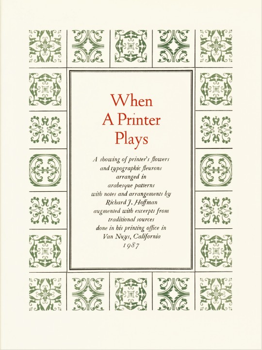


Typography Tuesday
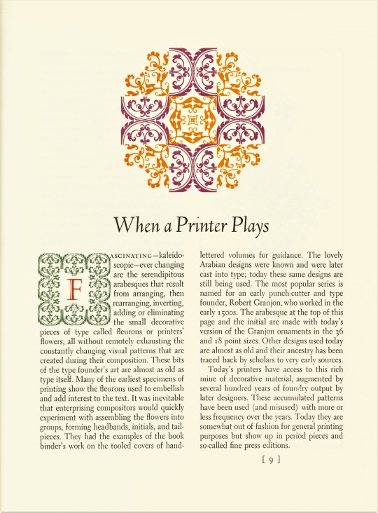
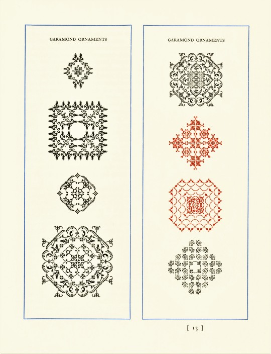
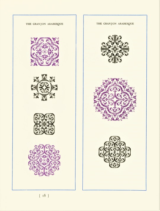
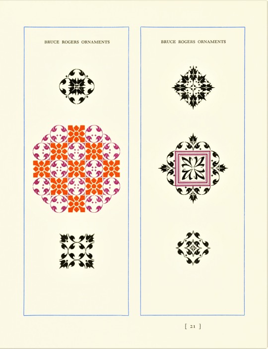
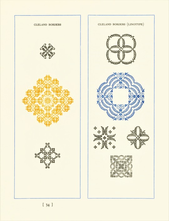
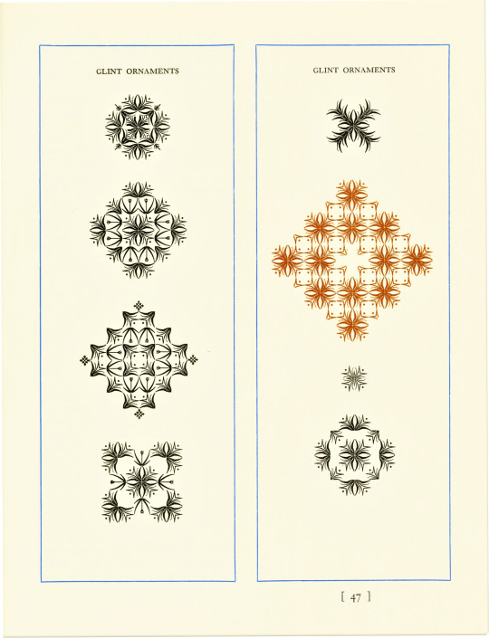
Richard J. Hoffman (1912-1989) was a long-standing letterpress printer and collector of type in the Los Angeles area from 1925 until his death in 1989. One of his final projects was this publication, When a Printer Plays, printed in 1987 at his shop in Van Nuys, California in an edition of 200 copies. The book is an historical presentation of fleurons and printers' ornaments with over 200 designs of his own invention made from individual pieces of foundry and monotype units that he collected over more than 50 years. California rare book dealer John Howell called When a Printer Plays Hoffman's magnum opus, noting that "Hoffman lavished the utmost care upon every detail of typesetting, arrangement, margins, proportions, multi-colored patterns, and illustrations."
Hoffman begins with Garamond and Granjon ornaments first designed in the 16th century and moves toward more contemporary ornaments by designers such as Bruce Rogers, Will Bradley, Thomas Maitland Cleland, David Bethel (Glint Ornaments), and Rudolph Ruzicka (Fairfield Ornaments). All the letterpress printers we know delight in creating borders and designs from typographic ornaments, and Hoffman quotes Bruce Rogers:
When my own time comes to be marooned on a desert island . . . instead of taking along the favorite volumes that most amateur castaways vote for, I think I shall arrange to be shipwrecked in company with a Monotype caster and a select assortment of ornamental matrices. The fascination and amusement . . . that can be got out of the almost numberless combinations of a few simple units would enable me to cast away for an indefinite period with great contentment.
Linotype Electra was used for the text in this book, with Deepdene for display. Our copy of When a Printer Plays is yet another donation from the estate of Dennis Bayuzick.
View more posts of type ornaments.
View other books from the collection of Dennis Bayuzick.
View more Typography Tuesday posts.

#Typography Tuesday#typetuesday#decorative type#type ornaments#Richard J. Hoffman#When a Printer Play#type display books#type specimens#type specimen books#ornamental type#fleurons#Bruce Rogers#Linotype Electra#Deepdene type#Dennis Bayuzick
177 notes
·
View notes
Text
What Fonts does the Simple Theme Kit use for its usable Fonts in Share Factory Studio? (Gaming) (Share Factory Studio) (Fonts Blog) (What Fonts)

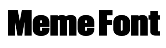
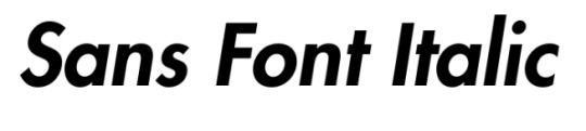
Article and Screenshots by @warrenwoodhouse #warrenwoodhouse
The fonts that are used in the Simple Theme Kit in Share Factory Studio are:
The Neon Font uses the font called Neon Bugler Regular by Breauhare
The Meme Font uses the font called OL Newsbytes Black by Dennis Ortiz-Lopez
The Sans Font Italic uses the font called Futura Paneuropean Heavy Oblique by Linotype
0 notes
Text
Typetober
The machines were humming at the C.C. Stern Type Foundry today. Connie, Joe, and Rebecca were working on the comp caster and had success in casting type for our upcoming issue of The Point. Jeff and I filled a Linotype galley with decorative border rule (also for The Point) and type to be used for bookplates. It has been a gorgeous day out here in the Pacific Northwest, made better with the gathering of the type casting crew and happy machines.
0 notes
Photo
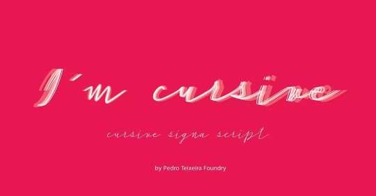
50%Off - Huge Script Family - 30 fonts = 30 bucks As you can see in the post, all the letters are different, even the repeated ones, given an customized effect. You can achieve this by selecting the same letters and alternate between the several fonts in the family. You can purchase this and other fonts by going to linktr.ee in @pedroteixeirafoundry Bio or in the links below 👇 Check also for the usual available promos 🤑 https://crmrkt.com/9dOPw9 https://www.myfonts.com/fonts/pedro-teixeira/cursive-signa-script?tab=familyPackages/?refby=ptx https://www.fontspring.com/fonts/pedro-teixeira/cursive-signa-script/?refby=ptx https://fontbundles.net/vectalex/556449-50-off-cursive-signa-script-family-30-script-fonts?ref=ituqRl https://www.myfonts.com/foundry/Pedro_Teixeira/?refby=ptx https://www.fonts.com/font/pedro-teixeira?refby=ptx https://www.fontshop.com/designers/pedro-teixeira/families/?refby=ptx https://www.fontspring.com/foundry/pedro-teixeira?refby=ptx https://creativemarket.com/Vectalex?u=Vectalex https://www.creativefabrica.com/designer/pedro-alexandre-teixeira/ref/2144/ https://www.linotype.com/5209393/pedro-teixeira-library.html?page=1 https://www.fontbros.com/foundries/pedro-teixeira-type-foundry https://fontbundles.net/vectalex?ref=ituqRl #font #fontetipografica #variablefont #advertising #graphicdesign #designgrafico #typography #ilovetypography #magazine #displayfont #minimal #webdesign #bestype #goodtypography #fonts #myfonts #linotype #fontspring #fontbros #creativemarket #creativefabrica #fontshop #fontfamily #fontart #typevariable #typetopia #logofont #logotype #calligraphy #cursive @myfonts @bymonotype @creativemarket @font.bros @fontspring @fontbundle https://www.instagram.com/p/CT7ax2nsCAd/?utm_medium=tumblr
#font#fontetipografica#variablefont#advertising#graphicdesign#designgrafico#typography#ilovetypography#magazine#displayfont#minimal#webdesign#bestype#goodtypography#fonts#myfonts#linotype#fontspring#fontbros#creativemarket#creativefabrica#fontshop#fontfamily#fontart#typevariable#typetopia#logofont#logotype#calligraphy#cursive
1 note
·
View note
Text
Nike Font
About Nike Font
Nike Font
Nike Font is a well-known American brand that has been established in more than 60% of the athletic shoe market. It has grown into the world's biggest supplier of sportswear and apparel, as well as many other disciplines. The company was established in the year 1964. It was originally called Blue Ribbon Sports, it is sold by the Onitsuka Tiger shoes. All of that changed in 1971, when the company's founder, Phil Knight, has decided to launch its own range of products under the braAnd name of Nike Font.
Greek goddess
It is believed that the logo is associated with the Greek goddess of Victory. The Nike Font swoosh logo was designed by a grave of a student. It is believed that the sound of a whistle, that's the symbol of the women's wing of the air, is a mythological symbol of the victory of the speed and. The founder, Phil Knight, has said that it will have a graphic sign, a view that would bring energy and movement to.A lot of people are ambivalent about it, the type, the Nike Font logo on it. If you are looking for the Nike-like font styles, we've got you covered.
Why is it that the Nike font is so well-known?
The Nike font that is very well known, it is one of the most popular fonts on the web. Font is Futura Extra Bold Condensed, together with manual settings: the components of the time and the desire. Now, as a family, kit, make it good. This Nike font that was originally introduced in 1928 by the Bauer Type foundry. Later, in 1936, by Paul Renner was developed and released for the linotype.
How do I get Nike's, this is a font available to download?
The Nike Font Impact font, italic, and sans-serif font, created by Jeffrey Lee, in 1965. This is a commercial font and can be used for personal use only. Nike free fonts are available to download here.
When a user logs in to the Nike+ website, and as you can see that Nike has practically turned up to the shop from the gothic, the brand name and the font is to be the number one. However, in a number of different areas on the Internet, Futura Extra Bold Condensed, which is, as a rule, the trade Gothic Bold Condensed. Use a font that can be used for personal use only. If you want to use, for commercial purpose please buy it.
Nike Font IS A GREAT SOURCE OF INFORMATION
The Nike Font Name
To enter, you have to Open the current type of the
The Designer Is Paul Renner
A Commercial License Is
A Sans-serif font, style,
OTF TTF file size
Similar The Nike Font
We picked out a few of the Shots, such as the font below it.
From Mad Max To The Font
What is the Nike font.
In spite of the vast number of typefaces available on the market today, with the Nike Font , which is a font, it is well-known to everyone. However, it is the most similar to Google's font, Nike font is.
What is the best style for your logo?
Bebus Neue
Great shade
Norwester
Cloud, Without A Channel
Soft
Where can I get one Nike font download?
Nike Font Get.com it also has the largest selection of fonts, such as Nike.
What is the Nike font.
The Nike font is a sans serif typeface with its own unique settings.
1 note
·
View note
Text
Additional Color and Type Information
Type
Didot
Designer: Firmin Didot
Foundry: Designed for his father’s foundry
Year: 1784
Bodoni 72
Designer: Dmitry Kirsanov
Foundry: ParaType
Futura Pt
Designer: Vladimir Yefimov and Isabella Chaeva
Foundry: ParaType
American Typewriter
Designer: Joel Kaden and Tony Stan
Foundry: ITC
Year: 1974
Helvetica Neue
Designer: Nadine Chahine, Linotype Design Studio, Monotype Design Studio, and Edik Ghabuzyan
Foundry: Linotype
Year: 1957
Escafina
Designer: Riley Cran
Year: 2014
Liberator
Designer: Ryan Clark
Color
Fourth Choice
Palette 1:
Pantone 1915 C
Pantone 1905 C
Pantone 706 C
Pantone 12-0712 TCX
Palette 2:
Pantone 4080 C
Pantone 2074 C
Pantone 577 C
Pantone 5815 C
Third Choice
Palette 3:
Pantone 11-0604
Pantone 13-0324
Pantone 14-1324
Pantone 13-3805
Second Choice
Palette 4:
Pantone 13-1404
Pantone 14-1315
Pantone 18-1018
Palette 5:
Pantone 191 C
Pantone 183 C
Pantone 732 C
Palette 6:
Pantone Warm Gray 1 C
Pantone 4066 C
Pantone 2445 C
Palette 7:
Pantone 191 C
Pantone 11-0604
Palette 8:
Pantone 14-1324
Pantone 732 C
First Choice
Palette 9 (combo of 7 & 8):
Pantone 191 C
Pantone 11-0604
Pantone 14-1324
Pantone 732 C
Color Meaning
Pinks: friendship, affection, harmony, inner peace, and approachability
Browns: steadfastness, simplicity, friendliness, dependability, and health
Purples: creativity, wisdom, dignity, grandeur, devotion, peace, and pride
Greens: growth, harmony, freshness, and fertility
Grays: formal, conservative, and sophisticated
Creams: neutral, calm and relaxing
1 note
·
View note