#gradient hues
Explore tagged Tumblr posts
Visit Tumblr Blog
Explore Tumblr blogs with no restrictions, modern design and the best experience.
Last Seen Tumblr Blogs


Fun Fact
Tumblr has been providing a Korean-language service since 2013.
Text

Swooned & Knighted
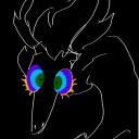
#i was doubting what i was seeing when this happened but then someone pointed out that the file is literally#krisknighting or smth like that#so :::DDD kris honey darling sweety gravy what have you been up to#art#crowberri.png#kris dreemurr#susie#ralsei#the roaring knight#deltarune spoilers#deltarune#the perspective is fucked but whatever#i did have a grid i just suck at placing characters in perspective and keeping my loose brush strokes to the grid#doodle -> value study -> random gradient maps go -> ok i guess im overpainting my sketch -> oh its 3am#its so dark but i dont wanna fix it anymore#i spent actual time on susie meanwhile ralsei is barely a sketch one hue layer to make him green and like 3 brush strokes lmfao#the canvas is like half the size of my usual illust canvases i didnt bother upscaling the sketch have fun counting pixels
2K notes
·
View notes
Text
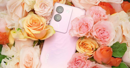
Unwrap the Power of Pink this Christmas with the limited edition vivo V29 5G in Rose Pink
In the spirit of festive delight, vivo is thrilled to introduce a limited edition that promises to illuminate your holiday season – the Rose Pink variant of the vivo V29 5G. This enchanting addition is set to bring an extra layer of warmth and romance to your Christmas celebrations. A Visual Symphony: Unwrapping the Magic Commencing on December 1, the Rose Pink beauty takes center stage,…
View On WordPress
#120Hz refresh rate#4600mAh battery#80W fast charge#AMOLED display#camera setup#christmas#christmas gift#Christmas joy#Crystal Blue#elegant design#exclusive gifts#festive celebrations#festive cheer#festive selfie#Forest Black#gradient hues#holiday companion#holiday season#holiday surprise#limited edition#limited edition launch#Magic Maroon#Make A Wish campaign#press release#Rose Pink#seasonal edition#smartphone#smartphone features#smartphone launch#special edition
1 note
·
View note
Text
I think 90% of my gripes with how modern anime looks comes down to flat color design/palettes.
Non-cohesive, washed-out color palettes can destroy lineart quality. I see this all the time when comparing an anime's lineart/layout to its colored/post-processed final product and it's heartbreaking. Compare this pre-color vs. final frame from Dungeon Meshi's OP.


So much sharpness and detail and weight gets washed out and flattened by 'meh' color design. I LOVE the flow and thickness and shadows in the fabrics on the left. The white against pastel really brings it out. Check out all the detail in their hair, the highlights in Rin's, the different hues to denote hair color, the blue tint in the clothes' shadows, and how all of that just gets... lost. It works, but it's not particularly good and does a disservice to the line-artist.
I'm using Dungeon Meshi as an example not because it's bad, I'm just especially disappointed because this is Studio Trigger we're talking about. The character animation is fantastic, but the color design is usually much more exciting. We're not seeing Trigger at their full potential, so I'm focusing on them.
Here's a very quick and messy color correct. Not meant to be taken seriously, just to provide comparison to see why colors can feel "washed out." Top is edit, bottom is original.
You can really see how desaturated and "white fluorescent lighting" the original color palettes are.
[Remember: the easiest way to make your colors more lively is to choose a warm or cool tint. From there, you can play around with bringing out complementary colors for a cohesive palette (I warmed Marcille's skintone and hair but made sure to bring out her deep blue clothes). Avoid using too many blend mode layers; hand-picking colors will really help you build your innate color sense and find a color style. Try using saturated colors in unexpected places! If you're coloring a night scene, try using deep blues or greens or magentas. You see these deep colors used all the time in older anime because they couldn't rely on a lightness scale to make colors darker, they had to use darker paints with specific hues. Don't overthink it, simpler is better!]
#not art#dungeon meshi#rant#i'm someone who can get obsessive over colors in my own art#will stare at the screen adjusting hues/saturation for hours#luckily i've gotten faster at color picking#but yeah modern anime's color design is saddening to me. the general trend leans towards white/grey desaturated palettes#simply because they're easier to pick digitally#this is not the colorists fault mind you. the anime industry's problems are also labor problems. artists are severely underpaid#and overworked. colorists literally aren't paid enough to do their best#there isn't a “creative drought” in the anime industry. this trend is widespread across studios purely BECAUSE it's not up to individuals#until work conditions improve anime will unfortunately continue to miss its fullest potential visually#don't even GET ME STARTED ON THE USE OF POST-PROCESSING FILTERS AND LIGHTING IN ANIME THOUGH#SOMEONE HOLD ME BACK. I HATE LENS FLARES I HATE GRADIENT SHADING I HATE CHROMATIC ABBERATION AND BLUR
2K notes
·
View notes
Text
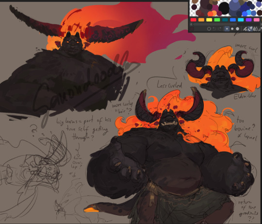
bunger???????????????
#ganondoodles#art#zelda#tloz#demise#doodles#wip#i either need to learn blender quickly or commission someone to model his horns for me bc i dont want to twist my brain-#-trying to load a model up in my head from scratch everytime#i am pretty good at thinking in 3d but his horns are always a mystery#either way ......... i am considering giving him a gradient again#though it doesnt show as much on this screen its supposed to have a redder hue#and i started too late once again so i am up too late once again too
399 notes
·
View notes
Text

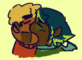
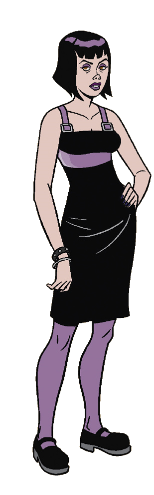
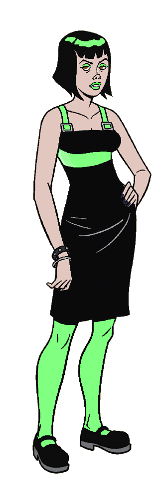
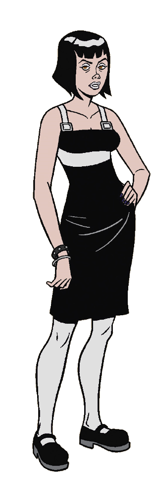
Thank u for liking my Morro design. Here is more of her
More ⬇️
get yuried
#first time drawing him with yellowish hues#green is literally the worst color ever hate that guy#ninjago#morro ninjago#lego ninjago#morro wu#my art#francis wancis art#shes like if an unpleaant gradient was a lesbian#citrusshipping#lol#if u saw the first one no u didnt there was a line pissing me off#ninjago art
206 notes
·
View notes
Note
I did a little pixel headshot of Vasco! I was originally planning on doing it for artfight but I ran out of time and motivation, so here it is now. I'm a little out of practice with canine faces, and I find drawing gradients in pixels difficult, but overall I'm pretty happy with how it turned out

.
#!!!!#tiny pixel Vasco!#I've never tried doing pixel art but I'm under the impression that it's harder than it looks#I can imagine gradients being time consuming to get right#his markings look great here! the colors are spot on#I think I'm seeing even the subtle lighter yellow under his eyes#the light sky blue background compliments the warm golden hues of his fur beautifully#thank you!#gift art#darkflamethedragondame#Vasco#own characters#big dark puppy eyes
242 notes
·
View notes
Note
what filters did you put on your Tenna sculpt?
gradient maps and grain!

i made this gradient map using colours from an old board game box and it's one of my favourites to use.
it adds a lot of fun!
#faq#theres also a pixelate filter over tenna hehe#theres other filters like hue adjustments on there and stuff but the gradient map is doing most of the heavy lifting
55 notes
·
View notes
Text

The divas are fighting
#i love how the bg has this nice gradient from this deep purple to a more green hue#excellent colouring here#marik ishtar#dark bakura#evil bakura#yugioh#yugioh dm#cide watches yugioh#cide watches yugioh dm#yugioh duel monsters
26 notes
·
View notes
Text
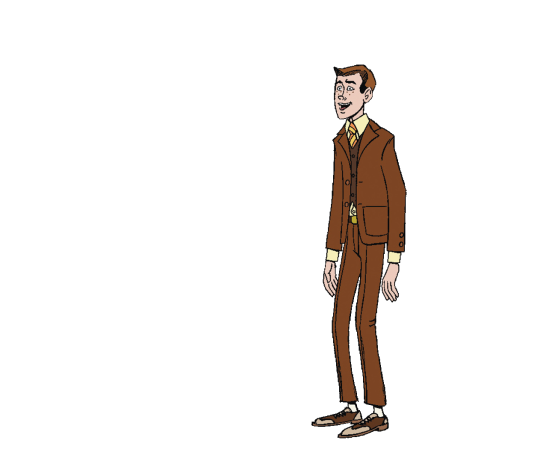
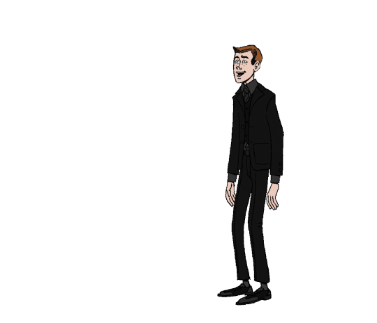
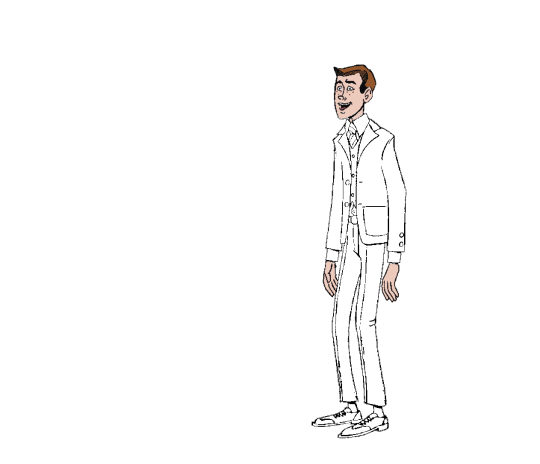
It's Dean Venture! One of the Venture Brothers, you know. He's the brainy one.
I've been trying to figure out color palletes in FireAlpaca, and because he's wearing a three-piece suit (for his date, you see), this image turned out to be a nice guinea pig.
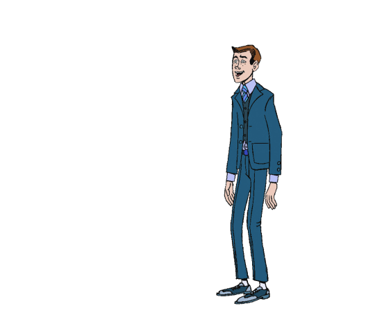
This is just a change in hue (with the head and hands, which I don't want to change, hidden in a different layer). I tried changing the suit to different colors by changing hue:
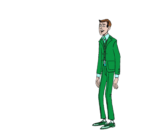
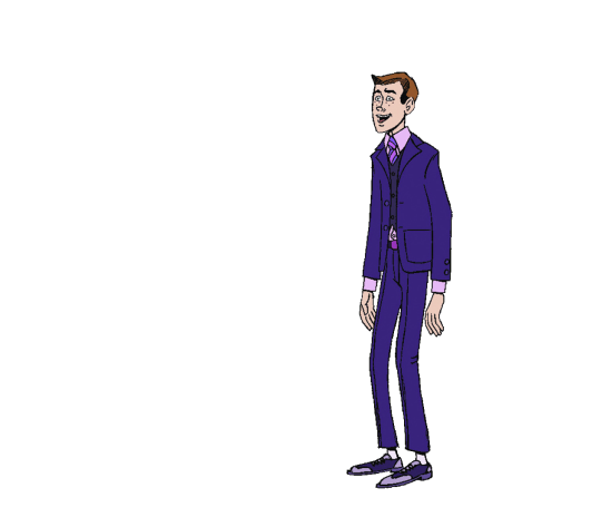

Those look pretty good. By changing brightness and gamma, I can also make him look a bit less goofy
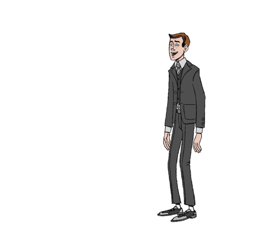
See? just a regular kid in a gray suit.
Next, I tried changing gradients. That didn't work out that great, at least not with FireAlpaca's premade gradients, because they don't take into account he dark ink. But, I got some good results with a black and white gradient I made:
A fancy white tie look.
And, the gradient I often use for coloring background with the red-black-and-white style I like:

A bit garish, but I like it.
Our friend Dean was out on a date with Triana, the girl he thinks is his girlfriend, and who thinks Dean is "nice":
With her, I just made a layer with the purple highlights in her outfit, and changed gradients:
Collect them all!
#firealpaca#gradients#hue change#layer change#The Venture Bros#The Venture Brothers#Dean Venture#triana orpheus#Coloring
9 notes
·
View notes
Note
fav brushes???? i go insane for ur stuff haufhdhhd
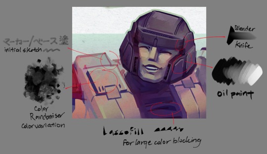
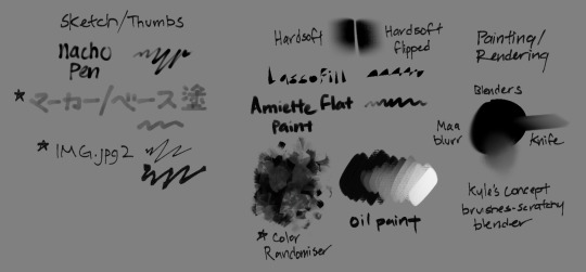
Here you go! These are just my CSP usuals. In photoshop, I tend to lean towards more square brushes. In procreate, I’m more likely to use hard round brushes. I could not explain to you why. It creates this really funny effect where you can tell what programs I used on different pieces, or if I swapped out at some point.
The palette knife blender is a new addition, but I’m definitely keeping it around. Color randomiser has been a staple for years, as well as imgjpg2.
#I’m sure if you go through my pieces within the last year or so you’ll definitely see s few of these pop up here and there#hope this answers your question!#for favourites… it’s definitely imgjpg2 and lasso fill#lasso fill has been a huge wrist saver (as well as its sibling lasso eraser)#the hard soft ones are really nice for lighting and also because procreate doesn’t have a gradient tool#color randomiser is also super fun for adding hues#I could also not tell you where I got like 90% of these brushes on my teachers just offload them onto me#and I love to click download on strange links#nacho the marker amiette and the oil are from the clip studio store tho!#as well as the maa blur#not art#ask
31 notes
·
View notes
Note
If I may, how do you typically approach choosing colors in your art? It always has just a lovely feel to it, so I was a bit curious; don't feel pressured to answer ofc :]
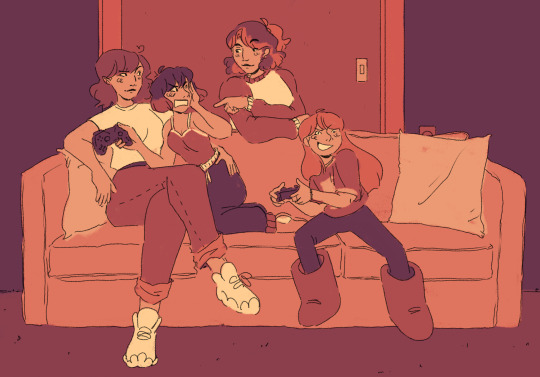
I’ve been using a lot of gradient maps lately, they work by switching the greys in your piece with a corresponding colour according to its value. Basically, I colour in black and white, grab a gradient map, and then I adjust the colours by hand until I’m happy with it. This isn’t the only kind of colouring I do, but it works great if you’re in a rush or you’re struggling to find a good starting point for your colours. I’ve been operating under a time crunch for these Sketchbook Week drawings and the Plenism promo stuff I made, so for all except one I used gradient maps. I’m actually in a bit of a funk with my colours right now soooo I’ll come back and do a proper colouring tutorial for my style once I’m happier with how my non gradient mapped colours are looking !
#after sketchbook weeks over I wanna sit and do some colour studies to find palettes I’m more happy with#even these gradient map ones I’m not thrilled with#they’re fine! but I could do better#in terms of other tricks I use I’ll often adjust the hues and saturations if the whole piece to give things more unity if I’m struggling#and/or add a new layer on top of everything and fill it with one base colour#and play around with different layer settings and opacities on top#I’ve found a luminosity layer on a low 5-10% setting is quite nice#basicslly I fuck around and find out#and if I’m in a rush I use a gradient map#they’re not neccesarily a quick fix! if you’re like me you’ll still want to do some tweaking after it’s been applied#and you need to pay attention to your values when you’re colouring in black and white#but that’s another good thing about gradient maps - they force you to focus on value over hue which is an important skill to build#so yeah I’ll come back to this and make an actual colouring tutorial once I feel like I have actual good advice to give#cause rn I’m just very meh in my colouring and I don’t think I have anything very helpful to add#need to find some tutorials myself first !#ty for the ask!#ask#art#my art#bpcol-reblogs#textpost#blethering#for this piece the adjustments were minimal in comparison to what I usually do btw#because I was rushinggggg lol#I did more for my Plenism posters n such#but I can’t really show good comparisons because I. didn’t save them like that#I usually smush all my layers together when I’m drawing sooo yeah makes it hard to go back my bad whoops#but I saved as I was going whilst drawing this so I could provide examples yipee!#if I’d been smarter and remembered more I could’ve had more process screenshots butttt oh well lmao
19 notes
·
View notes
Text
55 notes
·
View notes
Text


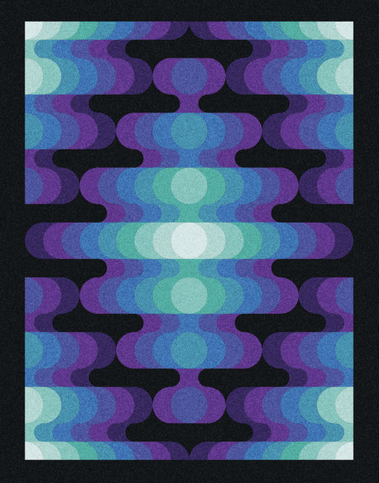
#London Hue#Rose Bud Cherry#Blackberry#Blackcurrant#Finn#desktop background#desktop wallpaper#graphic design#gradient#artists on tumblr#hautecouturehues#digital arwork#digital aritst#fade
3 notes
·
View notes
Text
oh right pink is just the 404 error screen of the human limited colour receptors; hanar skin could have the range of secret shrimp colours and we wouldn't know better
#“hey human why do you keep mixing the hanar up with each other? they're a literal walking rainbow it's so easy to tell them apart.”#“...what do you mean they're one solid colour to you.”#“what the hell is pink???”#“what do you mean they're one solid colour to all of humanity?”#“HOW MANY PHOTONRECEPTORS? I'm sorry there is no way it's just three but thats-”#“you can't see the stripes on salarians??”#“at least you can spot the shimmer and hue gradient on turians...right?”#“oh...goddess. this explains so much”#“mostly why the humans kept pressing the wrong coloured button in the nuclear powerplant—no matter how many times we dyed them...#...they'd still complain about them looking too similar and confusing“#☆hanar#☆humans
16 notes
·
View notes
Text

COULD SOMEONE PLEASE HELP ME SOLVE THIS FUCKASS COLOR PUZZLE.
#random thoughts#yes that is what i call them. color puzzles......#the ones with the dots in the middle are FIXED POINTS.#and you're supposed to move the pieces until you get a perfect little gradient. i'm usually quite good at these.#i've done 172 with little to no problems sporadically since september 2023.#BUT THIS ONE. THIS ONE IS FUCKING ME UP.#(game is i love hue too. {: )
3 notes
·
View notes
Note
May, I might have said it before, but your new aesthetic is so absolutely adorable, an pretty!
It’s giving me off big flower field vibes, especially when the sun is going down and it’s vibrant light hits on the petals of each flowers. It’s giving off picnic date vibes, filled with sweet treats. And, it emanates vanilla with honey scent... So preciously comforting!! I love it! 💗
Aah you're too kind!! You are also spot on with what I was trying to achieve! A garden glowing during golden hour!
I'm so honoured that you like it! It took me some tries to get everything as I wanted but I'm really happy others can see the effort <3 <3
#may answers <3#may's marvelous mutuals#aaaah#I'm so happy that others like it#and also you're soo good at describing the vibes that I was going for#it lowkey took me awhile to get all the colours as I wanted#and to find the right hues so everything matches#to get the gradient text how I wanted#so much work#but I'm so happy with the end result
8 notes
·
View notes