#graphing linear equalities notes
Explore tagged Tumblr posts
Visit Tumblr Blog
Explore Tumblr blogs with no restrictions, modern design and the best experience.
Last Seen Tumblr Blogs


Fun Fact
Tumblr’s website traffic is steadily declining.
Text
Phonograph pick ups.
Also known as cartridges.
As I am into vinyl these are an essential component. And even though small they can be extremely expensive, or not. There are many cartridges in the 5 figure range. If you buy into the idea that more expensive always means better then job done.
But that is not really the case at all.
If you have read this thing going back you will have noticed I generally slag moving coil cartridges. I do that as they are usually the most expensive and require special equipment to work. Extra complication and more things between you and the tiny wiggles.
Prepare for more detail in this discussion, but in my conclusion I will say just use moving magnet or moving iron type and be happy.
There are three basic types of pickup. Moving Coil (MC), Moving Magnets (MM), and Moving Iron (MI). The last may need a bit of explaining. MIs work by having fixed coils of wire around a magnetic armature with a strong magnet nearby. A small piece of Iron wiggles within the magnetic field and the coils pick that up with an electrical current. The moving part is small, but the coils and magnets can be big.
The MC tribe is always bragging that the tiny coils mean the moving parts are small and light and that means they respond to higher frequencies. Straight up myth.

This is a micro-photograph of a small moving coil assembly beside a smaller SoundSmith moving iron equivalent. Which do you think is lighter?
MCs are not superior for lightness and therefore have no special excellence at high frequencies. They have different impedance requirements which means the device you use to amplify the tiny signals must be adjusted to suit them. That means small impedance matching transformers and / or different loading to the phono preamp input, and often special additional gain stages. It aint simple.
A moving magnet like the twin V bits in Audio Technicas is probably about the same mass as the MC in the above picture. MMs and MIs do not require extra devices or special handling to work with standard phono preamps. Simpler.
There was a time when the high end manufacturers expected a user to use the "best" stuff with their preamps and therefore tailored the phono inputs to suit MC pickups. My ARC Sp14 came from the factory with 600 pF input impedance on the phono. Good for MCs and very bad for MI and MM types.

This Graph is from Hagerman Technology. Note the big peak at 9kHz with 500 pF. So my AT 7V would ring like mad with the factory load from ARC. Better use an MC, or do as I did and remove the 560 pF caps to make the impedance 40 pF at the box.
Audio Science review did a plot of an AT 7V properly loaded and it is remarkably linear.
Electrically MCs do not show this peaking behavior so under factory ARC loading of the era they would sound better. Conspiracy?
SoundSmith is high end, boutique and expensive and prides itself on being better than all moving coil types.
Audio Technica and Ortofon make both types as that is what the market demands. The prices are from reasonable, even cheap to how high is up?
Another maker is Grado Labs who exclusively make moving iron pickups and have for many decades. They make cheaper stuff and high end types. They had the original US patent on the moving coil type but considered them poor performers.
Dr Floyd Toole did double blind studies (PhDs do that kind of thing) that demonstrated the different voices of various pickups (including MCs) was due to simple frequency response which could be equalized out.
The evidence is that moving coils have no objective superiority to other types.
Recently some golden ears have played in the cheap seats with low end pickups and found them pretty good. That surprised and almost upset them. The AT VM95E was mentioned ($69usd).
In my experience low cost like $100 bucks and under do not sound quite as good. My two most expensive cartridges are about $300 usd current market. One is MM the other MI. They are excellent. Oh and one is rated to respond to 43 kHz linearly. Take that high frequency braggers.
That all said there is plenty to hunt for in the non-moving coil world. If you want to spend $15000 Grado will appreciate the business. Sound Smith will sell you a Hyperion for $10k USD. Or just be happy with $300 ish and still hear lips parting. I mean, how much do you need to dig down?
#audiophile#high end audio#audioblr#vinyl#audio research preamp#high end sound#hi fi stereo#phono pickups#phono cartridges#moving iron cartridge#moving coil cartridge#moving magnet cartridge
1 note
·
View note
Text
Dark Souls 2 Stamina Just moved to Tumblr and I wanna write down all about the game mechanics I've investigated so why not. Note that I will only speak on current patch Scholar of the First Sin and have no interest in comparing with other patches or games.
So! Stamina Regen! At 0% current equip load, the Player regenerates 51.9 Stamina per second. (Internally the game actually treats it as 519 but the display numbers for stamina are a tenth of that.)
Now, what happens when wear anything? Every single percent of equip load lowers your stamina regeneration. However, not by the same amount.
There are 3 tiers of penalization that apply to every percent within that range: - 0 to 30% are x0.25 (1/4) - 30+ to 70% are x0.6875 (11/16) - 70+ to 120% are x0.5 (1/2)
So for example, if you're at 20% current equip load, you'd have a (20*0.25)% penalty or 5% of 51.9 However, if you had 45% current equip load, you'd have a [(30*0.25)+(15*0.6875)]% penalty or 17.81% of 51.9 The max penalty you can have is at 120% current equip load, equal to [(30*0.25)+(40*0.6875)+(50*0.5)]% or 60% of 51.9
This means that you are on a pseudo-linear graph that makes every point matter. A lot of people ask what the best equip load is and honestly, what ever you like to play on, the game doesn't have any harsh weight tiers under 70%
Let's also look at stamina regen boosting gear. These apply their effects to your current regen, so they give more stamina if you have a lesser load. Chloranthy Ring 12.50% Chloranthy Ring+1 20.00% Chloranthy Ring +2 25.00% Regen Shields 5.00% Green Blossom 15.00%
As you can see, Regen Shields have a very small bonus and they weigh a fair bit so, usually they're just not worth the slot on New Game runs. At least, not unless you're running around naked.
Here's a Calculator for this: https://docs.google.com/spreadsheets/d/15BqKyGgU1-MIBe9A50Wp39V-jPKMDcZlLWrX7CAdHec/edit?usp=sharing
Shout outs to Evan (https://twitter.com/halfgrownhollow) for helping me find these values and to Etuca for being the best resource on the topic for a long while http://acuteanthrax.blogspot.com/2014/04/dark-souls-2-bleed-mechanic-research.html


10 notes
·
View notes
Text
Graphing Linear Inequalities
-- for the vertical line x = a -- if x > a, shade the half-plane to the right of x = a -- if x < a, shade the half-plane to the left of x = a
-- for the horizontal line y = b -- if y > b, shade the half-plane above y = b -- if y < b, shade the half-plane below y = b
.
Patreon | Ko-fi
#studyblr#notes#math#maths#mathblr#math notes#maths notes#graphing#graphing notes#graphing linear inequalities#linear equalities#linear equalities notes#graphing linear equalities notes#math rules#maths rules#mathematics#mathematics notes
8 notes
·
View notes
Text
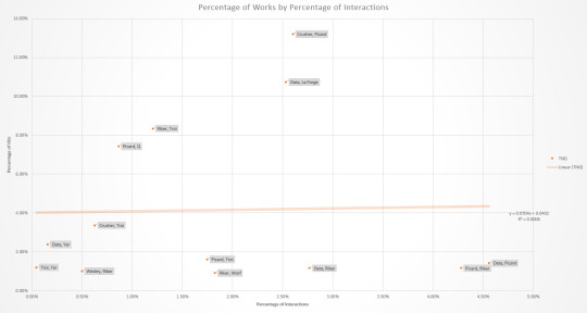
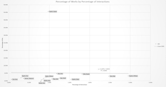
Star Trek Interactions and Fanfics
The results are in, as per this post. Data on interactions in shows is from TrekViz based on episode transcripts from Chakoteya, and fanfic data is based on works on AO3 tagged 'Character/Character' and/or 'Character & Character'.
For character pairs to analyze, I went through the top twenty relationship tags on AO3 for each series (TOS, TNG, DS9, VOY, and ENT), discounting those that had more than two characters or included characters not in the TrekViz data, and combining '/' and '&'. That left: 8 characters in 9 pairs for TOS, 10 characters in 13 pairs for TNG, 16 characters in 14 pairs for DS9, 7 characters in 10 pairs for VOY, and 7 characters in 12 pairs for ENT.
A comparison of number of interactions and number of works is presented as a table, as well as a graph with linear regression.


Correlation coefficients are 0.9106 for TOS, 0.0243 for TNG, -0.0130 for DS9, 0.6793 for VOY, and 0.2310 for ENT. Swapping straight counts out for percentages (number of interactions/works for a given pair divided by the total number for the respective series) gives an overall correlation of 0.4814. (Correlation coefficients range form -1 to 1, with the closer to 0, the less of a correlation; 1 is a perfect positive correlation and -1 is a perfect negative correlation)
Overall, about 48% of the variation in number of works for a given pair can be explained by variation in the number of interactions. TOS has the greatest correlation - both the show and fanfic are about as equally focused on the triumvirate. Next highest is for VOY, with the two biggest outliers are Chakotay and Janeway being about as overrepresented as Janeway and Tuvok are underrepresented. Then there's ENT, with just about the only thing note of being that technically Hoshi/Reed is just barely overrepresented. TNG just barely has a positive correlation. DS9 has even less of a correlation, but stands out in being the only negative correlation of the lot. To the surprise of I'm sure no one, this is pretty much single-handedly due to Bashir/Garak. Individual graphs with labelled data points for each show (with percentages) are below the cut.


#Star Trek#Trekking across the universe#TOS#TNG#DS9#VOY#ENT#statistics#undescribed#I did also collect some individual data on '/' and '&' for different pairs and might do an analysis based on that later#And because Star Trek fans continue to act like Star Trek fans the number of works went up as I was collecting data#so it's not even really an accurate snapshot of time#But the difference is slight enough that it shouldn't matter
39 notes
·
View notes
Text
lessons from 1000 hours of tutoring high school kids - a letter to my past self
not all those hours were maths, but this is about maths
Not in order of importance; in the order they came to my head.
1. Do not trust a kid when they say that they understand something. They understand jack shit. Make them explain it back to you.
2. When teaching sth new try to prod them to reaching the conclusion themselves instead of just straight up explaining it, if time permits.
3. Things I have assumed and have been sorely mistaken:
a) If an area is identified to be an issue in the lesson, the kid will go and do some questions and revise themselves to fix it.
b) Kids take notes. (I’m still kicking myself for only realising this more than 6 months in with this kid. I get paid too much to be making stupid mistakes like this.)
c) Kids know how to take notes. (Session 1: Take notes, here is a detailed outline that you can then expand on with examples and stuff. Session 2: The kid has copied my scaffold word for word and not expanded anything on it. Me: You need to actually EXPLAIN how to complete the square for example, not just write “completing the square”. Kid: Okay yeah I get it. Session 3: For each topic he’s googled an explanation and copied entire paragraphs word for word, because he “thought they’d phrase it better than him”. He’s using terminology that I 100% guarantee he does not understand at all. I now understand why high school teachers always said use your own words when making notes - something that I had always thought should be blindingly obvious to everyone.)
4. Not everyone is as obsessed with not making mistakes or not being able to solve problems are you are. (For these kids, being stumped at a difficult question isn’t the end of the world.) They think a question ends at figuring out the answer, whether that be from the help of a textbook, the solutions, their friend, or me. You need to impress upon them that it doesn’t matter what the answer is! It’s about what you learn from the question. How was the way they were thinking about the question incorrect? How can they avoid this in the future? What general advice can they give themselves? And then they need to actually commit to reducing incidences of the same mistake in the future. Some kids I’ve been giving the same damn advice to every problem they get stuck on, and magically they can solve it after I give them the advice. Just remember the general advice!! You’re spending all this time studying but you’re running into the same wall over and over again instead of remembering to take the rope out of your bag. I’m not magic! I’m just sitting here reminding you that there IS a rope in your bag!! (Not that my method of angry scribbling in red pen across my working and writing that I’m a fucking idiot is something I’d actually recommend, but they could definitely afford to be less laissez-faire about learning from their mistakes.)
5. Actually make good notes during the session; otherwise, the kids probably retain nothing. It is kinda awkward to be sitting there writing away but it is a necessarily evil. Also, you can write while they’re chipping away at a question themselves, and that way you don’t need to be watching them like a hawk while they do algebra painfully slowly. (I feel like kids make more mistakes in sessions than they do normally.)
6. The key to being able to solve a problem is believing that you CAN solve the problem. I’ve been saying this a lot recently - if you follow the rules for maths, there’s no reason it should be wrong - when I have Year 11s and 12s asking me every step of simple algebra if something is correct, or asking whether you’re allowed to do something, and I ask them, “what do you think?” and they reply, “I don’t know.” (Related: Another thing I’ve been saying a lot is that algebra is about doing the same thing to both sides. They just think it’s magic!) Anyway, I brought this up because of problem solving questions actually, not basic algebra. Of course, you can teach them how to break down the question, or general processes like “if you don’t have enough information, go back and check you’ve used everything in the question”, but all that’s useless if they don’t believe that they can solve it by themselves. That means
a) You need to actually encourage them. Even though you’re not a... fluffy or particularly inspiring person, just try.
b) YOU need to believe that they can do it too. Think of the number of times you’ve been shocked that some kid managed to make a leap of logic you thought was beyond them. Kids are better than you think (and also worse than you think, but we’ve already talked at length about that).
7. It’s most of the time more beneficial to force the kid to go through the expanded version of the working instead of the abbreviated version. They’re not you, trying to economise as much as possible on working to save precious seconds for rechecking at the end. Don’t push that obsession onto them when their goals and skill level is completely different. Especially if they’re:
a) making silly mistakes
b) not understanding why something works and just following the pattern for a specific context, and then being completely lost in another context. (eg. not being able to use the null factor law for when the factors weren’t linear with a gradient of 1, because they always skipped straight to x= instead of actually writing out each factor equalling zero, and then rearranging).
8. Stop lecturing for too long. Make sure you’re writing stuff down, not only for the purpose of notes for them to look at later, but because not everyone’s good with auditory learning (you’re one of those people! and yet you subject others to the same shit you rant about out length about your professors!). Make them do work through a problem or part of a problem or ask them questions or something.
9. A lot of kids do not know how to study properly. A few important things:
a) Do not automatically look back at past questions when solving a Q. You need to treat every question as completely new, and only look back if you’re stuck. That way you force active recall every question and thus making sure you’re actually remembering what the process is. You don’t get any worked examples in your exam.
b) I do not know how this is every single fucking kid but knowing how to use your dang calculator saves lives!! It’s literally 50% of your grade and you’re sitting there two days before your exam struggling to graph a parabola??? After all the hours you poured into studying the content? Yes your calculators are gross and unfriendly but they’re your best friend. Not only should you know how to use them, you should be fast at using them, and you should know everything it can do that could be remotely helpful.
c) Sit full exam papers under exam conditions. That shit is like gold and kids are piddling it away by just leisurely working through one question at a time with the help of their textbook (and me).
d) Print out the formula sheet, and use it. Know what’s on there and what’s not.
I don’t know if this is a pretty standard experience for people with a track record of excellent academic results* (by this I mean just assuming some things are obvious to everyone) or if I’m particularly bad because I’ve always only interacted with a very narrow range of people. anyway feels fucking bad for my kids but. im trying. god knows ive come a long way since i first started.
*or as I prefer to state it, a track record of being a huge fucking nerd
#writing these reflections always gives me high school ptsd#the visceral fear i got when i didnt know how to solve a question#esp if my friends could solve it since they're all smart as shit#because i *needed* as close to 100% as possible in those exams#sheesh#ramblings
12 notes
·
View notes
Text
Readers‘ engagement on AO3
This time it will be less scientific, and more like me writing down my stream of consciousness. But the methodology was really straight-forward, so I think I can spare us the details, and I wanted to show you a detour I made trying to untangle the reasons behind certain fandom reactions. Join me for a trip?
AO3 is rather infamous for its lack of readers engagement (see all the initiatives supporting the commenting: @ao3commentoftheday, @longlivefeedback), at least among the fics and writers I am in contact with (and I do pay attention to the stats, you can believe me 😉 ). Nevertheless, some people feel very comfortable on this platform and for quite some time already I wondered what leads to such diametrically different writers’ experiences.
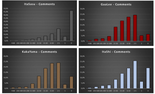
I started with analyzing Comments for Sakura’s ships. Since I did the same analysis for four Sakura’s ships: SasuSaku, NaruSaku, KakaSaku and MadaSaku on ff.net, we can have a direct comparison, especially as the time scope of existence Pairing Option and AO3 as a platform are very similar, and fic numbers are also comparable.
Very briefly: I sorted the fics into the following bins: >500 Comments, 201-500 Comments, 101-200 Comments, 51-100 Comments, 21-50 Comments, 11-20 Comments, 6-10 Comments, 2-5 Comments, 1 Comment, 0 Comments. All data are presented in percentage to allow for comparisons between the ships.
So let’s dive in:
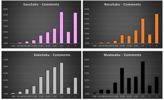
On the first glance the graphs look peculiar: there is always sort of a double maximum for “0 Comments” and “2-5 Comments” divided by a minimum for “1 Comment”. But once we remember that the Comments on AO3 include also author’s responses the situation becomes clear: the majority of fics have 2 comments: namely 1 real Comment from a reader and one answer from the author.
To put this hypothesis into a test I checked how many fics have 2 Comments, and it is 316 out of 839 of SasuSaku fics in “2-5 Comments” bin, 84 out of 204 fics for NaruSaku and 104 out of 315 fic for KakaSaku – which gives always ca. one third of comments in the “2-5 Comments” bin.
At that point I deliberated for a while whether I should modify my bins to include “2 Comments” as a separate category, but I opted out of it for the sake of (future) comparisons with ff.net (and because I think by bins are very good, thank you).
As a side note: on the first 4 graphs we can also see that MadaSaku has a different distribution than all the other ships, but it is worth mentioning that it was also an outlier on ff.net. We will come to this later.
Peculiarity of distribution aside – the feedback on 3 main Sakura’s ships is consistently miserable. But, I reasoned, AO3 is famously M/M oriented so maybe the F/M audience is simply not there. Therefore, I set off to check all the Naruto ships in the order of their popularity, which btw is the following:
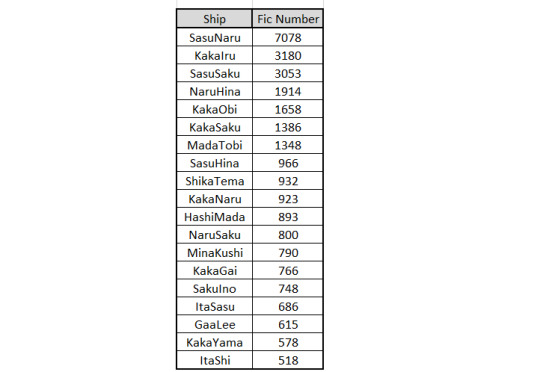
So, working down the list we get this:
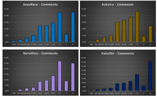
And, WTF Naruto fandom? Most of the fics for hugely popular, established ships have no comments??!! Or one comment and an answer from the writer??!!
That was a really disappointing exercise…
Until I found that:
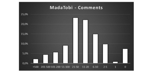
MadaTobi was the first ship that displayed a different pattern of readers interactions! It has a maximum in “21-50 Comments” per fic which is perfectly decent and corresponds well with the values for the ships I examined before on ff.net.
Encouraged by this discovery I dug further: (And tbh for a moment I thought I have here a “Madara-effect”, since both MadaTobi and MadaSaku displayed encouraging results 😉 )
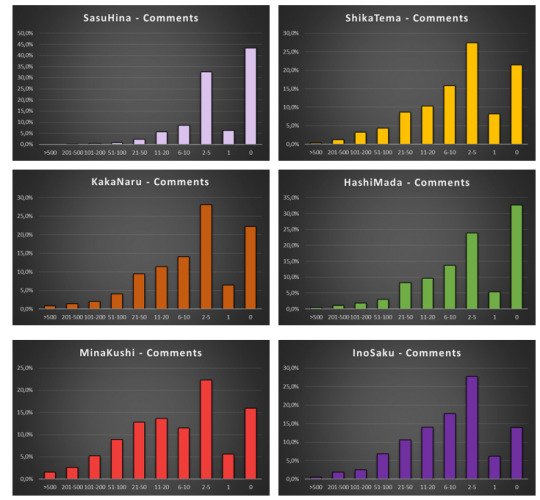
But Madara-effect was not the case (HashiMada displays the same distribution as all the other ships) and further data were even more disappointing. (Let me repeat myself: WTF, Naruto fandom?!)
Until I found another instance of good readers’ participation:
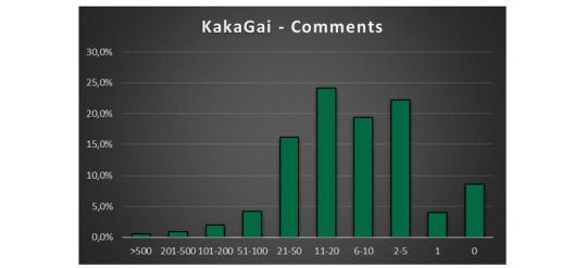
KakaGai! So, at that point we had three ships that were behaving differently than the norm: MadaTobi, KakaGai and MadaSaku.
I looked further to see if I can find more examples of fandom positivity, but, spoiler alert – No. For the sake of appearances lets look at the data though. GaaLee is sort of a borderline case, so let’s flag it as “tentative” for now.
So, what could be the reason for such a drastically different behavior of distinctive pockets of the fandom? Over the course of last year, I was observing how MadaTobi was rapidly gaining popularity, so that hinted me to follow this line of reasoning.
For each ship, I broke down the fics numbers into years when they were published. I ignored all the fics published in 2020 (because the year has only started and including those data would skew the image). To be able to compare the ships (which vary widely in term of fic numbers) I calculated the percentages of fics published in each year. I.e if a ship had 100 fics published until December 2019 and 30 of them were published in 2019, then 2019 had 30% of all published fics. It was at that point irrelevant how many fics were published in 2020, they weren’t counted either the way. I included only data from 2011 on, because earlier ones are very fuzzy due to back-dating customs that were in fashion at that time (for explanations see here).
Let’s look at the data. Tadaaa!!!
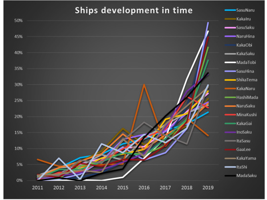
Isn’t it absolutely beautiful?! (yes, I know!) Does it look like a tangle of knitting yarn? (yes, I know that as well!)
So, let me break it down for you:
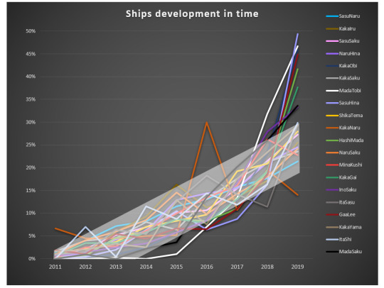
See that, that general trend? This is the growth curve that most of the ships follow – pretty linear, with maybe a bit of acceleration in 2019.
Now let’s focus on outliers: (3 most popular ships: SasuNaru, KakaIru and SasuSaku are included for reference – they illustrate the general trend pretty well).
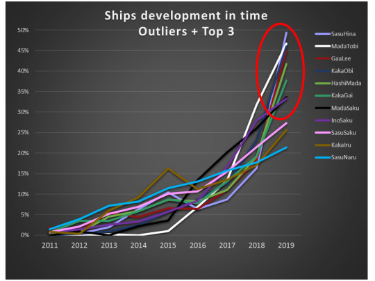
The ships that grew more than 30% in 2019 are: SasuHina, MadaTobi, GaaLee, KakaObi, HashiMada, KakaGai, MadaSaku and InoSaku. So, among those eight, 4 (3 obvious, and 1 tentative) are the ones which showed outstanding readers’ engagement!
So, are newer, more energetic parts of fandom also the ones with best readers’ engagement? That would be a very optimistic message… But what about four ships that grew tremendously, but still show very poor readers behavior?
SasuHina is an easy case. If there exist a ship that has a captain, then it is this one. And the captain is @365daysofsasuhina who contributed staggering 438 fics (out of total of 966) to SasuHina! (Seriously, a round of standing ovation, because this is amount of dedication, work and talent that we can all only dream about. Talking about being a change you want to see!). And 90% of that contribution was done exactly in 2019, which explains the growth spurt of the ship. Sadly though, the audience response didn't keep up with the supply of new fics, therefore great many of them remain with very few comments.
So what about the remaining ones: KakaObi, HashiMadara and InoSaku?
Scrolling through the fic lists I noticed that great many of KakaObi fics are written in Chinese, so I decided to look into it deeper.
I analyzed the percentages of Chinese fics for all the examined ships (and percentages of English ones, just in case there was a ship with overrepresentation of some other language):
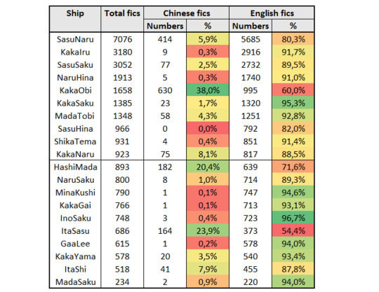
And we can see that both KakaObi and HashiMada have a very strong presence of the Chinese fics!
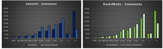
At that point I thought I have it, and proceeded to look at the distribution of Comments for Chinese KakaObi and HashiMada fics. And indeed, the reader’s engagement is sadly, almost nonexistent (165 out of 182 HashiMada fics and 478 out of 630 KakaObi fics have no comments at all). The reasons for that may be multiple; one that come to my mind is that the Chinese readers are still to follow their writers to AO3, or that the fics published recently are in reality not new (which for sure they are not, given the sheer amount of them) and received already their share of feedback on other platforms.
But, even if one subtracts the Chinese fics from the overall fics, the distribution remains the same! ☹ KakaObi and HashiMada still display the standard Comment distribution, despite having grown 45% and 41% in the last year!
It looks a bit better, but still follows standard, not very flattering trend of most of other ships.
So, then I thought that maybe if I subtract the Chinese fics the sudden growth in 2019 will disappear?
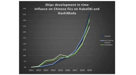
The answer is unfortunately, no. The growth spurt is still there, language independent.
So, at this point I don’t know... I am convinced that there is some effect coming from the influx of Chinese fics, but I cannot put my finger on it. (It is also a beautiful example of how correlation does not equal causation.) I also have no explanation for InoSaku behavior…
Nevertheless, I think it is possible to draw some conclusions, and those conclusions are of vital importance for the health of fandom as it is currently on the move from ff.net to AO3. And I would hate to see the good habits that are in place among ff.net readers getting lost during this move!
It seems that the readers response is better in the pockets of fandom that experience rapid growth, which in itself is very positive news. But one would think that the entirety of Naruto fandom is experiencing such growth (as the fandom is moving to AO3, remember…?). Unfortunately, it isn’t the case.
There can be yet another factor in play: namely the question if the ship is well represented on ff.net, and most of the ships are. Let’s take a final look at our three outliers: MadaTobi, KakaGai and MadaSaku.
Quick look into ff.net (by quick look I mean: sum of two main Ship Names plus Pairing Option minus fics that were double-tagged) shows that there are 174 KakaGai fics, 132 MadaTobi fics and 230 MadaSaku fics (my carefully calculated MadaSaku fic number was 232 in December 2019, so now I believe this number will be slightly higher).
MadaTobi and KakaGai are definitely underrepresented on ff.net (though MadaSaku is not). Therefore, new fics are not being published on ff.net in parallel to AO3, but rather on AO3 exclusively. It is a speculation only, but maybe if readers are given a choice between commenting on ff.net and on AO3, they are choosing the older platform. That would imply that the authors who make a complete move can still count on feedback, as with absence of ff.net-uploaded fics the readers would have only one place to comment on. At least that’s my hope…
And finally, dear Naruto fandom – step it up. Those numbers are a shame, and I know that people can do better than this.
#fandom stats#naruto stats#ff.net vs ao3#sasusaku#sasunaru#kakairu#madatobi#kakagai#kakaobi#madahashi#sasuhina#madasaku#shipping stats
113 notes
·
View notes
Text
GRAPHICAL ANALYSISIf we set fit_reg=False then this line will remove which is shown below: The total number of countries with employment rate is 166.
Here, it is clearly shown that on an average, 58% employment rate is there in different countries. The standard deviation is about 11%, suggesting that there is quite a bit of variability from country to country in terms of the employment rate living in different countries.
3. Female Employment Rate:
Now we will plot the same set of values by using the “distplot” command in python.
The following code is added to our program
UNIVARIATE GRAPHICAL ANALYSIS
After analyzing the variables numerically, we will shift our domain to graphical approach.
I have chosen three variables that is, incomeperperson, employrate and femaleemployrate
1.Income per person:
We will investigate this data by 2 ways, Categorical Count Plot and Distributive Plot.
Categorical Count Plot:
To plot incomes by converting into categories, we will first cut the range of incomes into four intervals. The first interval is from 0 to 5000, second is from 5000 to 15000, third is from 15000 to 25000 and last is from 25000 to 82000.
The frequency table obtained is shown below
And the graph obtained for these counts is:
This proves that our numeric interpretation of this variable was correct. Out of 183 countries, 111 have per person income between 0 and 5000. Also, just 22 incomes lie between a great range of 25000 and 82000.
Distributive Plot:
Now we will plot the same set of values by using the “distplot” command in python.
The following code is added to our program:
The graph obtained against this code is shown below:
This automatically generated graph over equally distributed range also depicts loudly that more countries exist with lesser per person income. The bars are higher in the starting phase and start decreasing gradually as we move right. The bars disappear after 40000, showing that not much countries are there with average income more than 40000.
2. Employment Rate:
Now we will plot the same set of values by using the “distplot” command in python.
The following code is added to our program:
The graph obtained against this code is shown below:
Description of Employment rate:
We make use of .describe() method to show the result in more clear way:
The input for this is,
The output is
The total number of countries with employment rate is 166.
Here, it is clearly shown that on an average, 58% employment rate is there in different countries. The standard deviation is about 11%, suggesting that there is quite a bit of variability from country to country in terms of the employment rate living in different countries.
Conclusion:
Comparing employrate and femaleemployrate, on an average employment rate is more than female employment rate among different countries.
Bivariate Graphical Analysis
Now we move to the final step of our research, the bivariate analysis of our variables. From the previous observations and explanations, we are expecting to see a relationship between all the variables (employment rate and female employment rate), (income per person and employment rate) and (income per person and female employment rate).
1. Bivariate graphical analysis for employment rate and female employment rate:
To obtain the final plot between both these variables by using “seaborn.regplot”, add the following code to the program:
The graph obtained by the above code is:
If we set fit_reg=False then this line will remove which is shown below:
In this scatter plot, the data points follow the linear pattern quite closely. This is an example of a very strong relationship.
Therefore, there is strong relationship between employrate and femaleemployrate.
2. Bivariate graphical analysis for income per person and employment rate:
To obtain the final plot between both these variables by using “seaborn.regplot”, add the following code to the program:
In this scatter plot, the points also follow the linear pattern, and predicts that the income per person lies more in between 10000 and 20000 for employment rate, few people have income in between range of 20000 and 30000, while less people have income in the range of 30000 and 40000, only 1 person has income range around 50,000 among different countries.
3. Bivariate graphical analysis for income per person and female employment rate:
To obtain the final plot between both these variables by using “seaborn.regplot”, add the following code to the program:
The output is
In this scatter plot, the points also follow the linear pattern, and predicts that the income per person lies more in between 10000 and 20000 for female employment rate, few people have income in between range of 20000 and 30000, while less people have income in the range of 30000 and 40000, only 1 person has income range around 50,000 among different countries.
Conclusion:
The total number of countries with employment rate and female employment rate is 166 that is, number of countries having employment rate and female employment rate are equal in counts but the countries may be different.
Comparing employrate and femaleemployrate, on an average employment rate is more than female employment rate among different countries.
The standard deviation for employment rate is about 11% and for female employment rate is 15%, suggesting that there is quite a bit of variability from country to country in terms of the employment rate and female employment rate living in different countries.
Now, when we look at the scatter plot of employment rate and female employment rate, the data points follow the linear pattern quite closely which shows that they have very strong relationship.
Therefore, we conclude that there is strong relationship between employrate and femaleemployrate.
For employment rate and female employment rate, it is predicted that the income per person lies more in between 10000 and 20000 for employment rate and female employment rate, few people have income in between range of 20000 and 30000, while less people have income in the range of 30000 and 40000, only 1 person has income range around 50,000 among different countries.
1 note
Jul 4th, 2020
MORE YOU MIGHT LIKE
MY FIRST PROGRAM
import pandas as pd
import os cols = [‘age_afm’, ‘consumer’, 'h_often_12m’, 'h_often_5beer_12m’, 'edu’] def read_data(): # this function reads the wanted subset of the data and renames the coloumns col_wanted = ['S1Q4A’, 'CONSUMER’, 'S2AQ5B’, 'S2AQ5G’, 'S1Q6A’] data = pd.read_csv(’/home/data-sci/Desktop/analysis/course/nesarc_pds.csv’, low_memory=False, usecols=col_wanted, ) data.rename(columns={'S1Q4A’: 'age_afm’, 'CONSUMER’: 'consumer’, 'S2AQ5B’: 'h_often_12m’, 'S2AQ5G’: 'h_often_5beer_12m’, 'S1Q6A’: 'edu’}, inplace=True) return data “'pickling data makes it easy to not having to loud the csv file every time we run the script so the pickle_data and get_pickle are for that ”’ def pickle_data(data): data.to_pickle('cleaned_data.pickle’) def get_pickle(): return pd.read_pickle('cleaned_data.pickle’) def the_data(): ““"this function will check for the pickle file if not fond it will read the csv file then pickle it ”“” if os.path.isfile('cleaned_data.pickle’): data = get_pickle() else: data = read_data() pickle_data(data) return data def distribution(var_data): "“"this function will print out the frequency distribution for every variable in the data-frame ”“” var_data = pd.to_numeric(var_data, errors='ignore’) print(“the count of the values in {}”.format(var_data.name)) print(var_data.value_counts()) print(“the % of every value in the {} variable ”.format(var_data.name)) print(var_data.value_counts(normalize=True)) print(“———————————–”) def print_dist(): # this function loops though the variables and print them out for i in cols: print(distribution(the_data()[i])) print_dist()
1 note
MY FIRST PROGRAM
In my previous blog I talked about suicide. As we all know suicide among teenagers and youth continue to be a serious problem. To find out about my questions I carried out a program to find out the frequencies about- how many times they thought of committing suicide? How many times they tried? How many times they succeeded?
The program is as follows-
In output I got the frequencies table of how many times –
* Thought of committing suicide
* tried to commit
* ties you succeeded
Frequency Missing = 204
DATA MANAGEMENT
*Assignment 3 **
IDE used- Jupyter NoteBook
Dataset - Gapminder
Variables used :
alcconsumption(alcohol consumption),
suicideper100th(suicide per 100 thousand persons),
employrate (percentage of persons employed in a year).
Research Questions :
(1)Does alcohol consumption leads to suicide?
(2)Does unemployment linked to alcohol consumption?
Selecting Required columns for which we want to work on:
As our main question revolves around suicide so using describe function to know stats of the column. Clearly, 75% data is less than 12. So taking data sor more than 12 and creating a copy of this.
Data Management-
Our columns contain quantitative values and not categorical like 0 or 1. So classification is done on percentile and creating ranges.
Data Management of alcohol consumption :
Here , data is managed by percentile using sub_copy where suicide>12(mentioned above). Also frequency and percentage_frequency has been found out.
Data Management for Suicide:
Original data is classified using bins into 5 ranges for better further analysis.
Using original ‘data’ instead of sub_copy to classify suicide into percentile
and finding out frequency and percentage of it.
Data Management of Employ Rate:
Using bins =5 to get a overall idea of quantitative data.
Based upon analysis ,creating empgroup function to divide data into different categories.
Finding frequency and percentage of it.
Summary of data management results of all the 3 variables/columns.
1. For the alcohol consumption rate, I grouped the data into 4 groups by quartile pandas.qcut function.
Almost every percentile is highly dependent on alcohol consumption is linked to high suicide rate .
2. For the suicide rate, I grouped the data into 4 groups by quartile pandas.qcut function.
75 percentile data is linked to high suicide tendency. As we verified above where 75% suicides are greater than 12(using describe function).
3. For the employment rate, I grouped the data into 5 categorical groups using def and apply functions: (1:32-50, 2:51-58, 3:59-64, 4:65-83, 5:NAN).
The employment rate is between 51%-58% for people with a high suicide rate.
1 note
·
View note
Text
Introduction to Statistics - Brain Mentors
Statistics is one of the major branches of mathematics and stats is one of the biggest reasons behind the success of Data Science, because the methodologies and techniques statistics provides are very helpful for Data Scientist in daily life. Statistical Analysis plays a major role in life cycle of data science.
Definition: Statistics deals with the methods which helps us to gather, analyze, review, and make conclusions from the data. Statistics is used when the data set depends on a sample of a larger population, then the analyst can develop interpretations about the population primarily based on the statistical outcomes from the sample. Like mean, median, mode, range etc.
It comes into the role when a user wants to see the insight of data or wants to find out hidden patterns and it is used in almost every field and department like:
· Weather reports
· In Sports to show players and teams performances
· In TV Channels to perform analysis on TRP
· Stock Market
· Products Based Companies
· Disease and their impact
From very small to very large, each company need statistics to evaluate their growth and how their products perform in market. Let’s see few examples of statistics:
So, these was the few examples of statistics that how everything is being shown to us with the help of graphs and graphs are the best way to show data to users.Before we talk about statistics, first we need to understand data and its different types.
Data and its types:
Categorical Or Qualitative : Categorical data is a type of data which represents categories. Data is divided into two or more categories like gender, languages, cast or religion etc. Data can also be numerical (Example : 1 for male and 0 for female). Here numbers do not represent any mathematical meaning.
Nominal : Type of data that has two or more categories without any specific order. Nominal values represents discrete units and used to label variables that do not have any quantitative value.
Examples :
· Gender – Male and Female
· Languages – Hindi, English, Chinese
· Exams – Pass, Fail
· Grades – A, B, C, D
Ordinal : Type of data that has two or more categories but they have a specific order. Ordinal values represents discrete and ordered units. So it is almost similar to nominal data but they have some specific order.
Examples :
· Movie Ratings : Flop, Average, Hit, Superhit
· Scale : Strongly Disagree, Disagree, Neutral, Agree, Strongly Agree
Numerical Or Quantitative : Numerical data represents continuous type of data which has a mathematical meaning and measured in a quantity.
Interval : Interval type of data represents data in equal intervals. The values of interval variable are equally spaced. So they are almost similar to ordinal type of data but here data could of any continuous range.
Examples :
· Temperature – Generally temperature is divided into equal intervals like 10 – 20, 20 – 30, 30 – 40
· Distance and speed could also be given in equal intervals
Ratio : It is interval data with a natural zero point. When a value of any variable is 0.0 then it means there is none of that value. Suppose you are given temperature and it is 0 degree, so it is valid because temperature could be 0 degree. But if I say that your height is 0 ft then it doesn’t mean anything.
Let’s Dig into Statistics
Statistics is also divided into 2 major categories :
· Descriptive Statistics – Presenting, organizing and summarizing data
· Inferential Statistics – Drawing conclusions about a population based on data observed in a sample
Descriptive Statistics
Descriptive Statistics helps to find out the summary of data and tells us the value that best describes the data set. It also tells how much your data is spread and scattered around from its average value or mean value. You can also find out minimum and maximum range of your data.
Descriptive Statistics is broken down into :
Measure of Central Tendency (Mean, Median, Mode)
Measure of Variability / Spread (Standard Deviation, Variance, Range, Kurtosis, Skewness)
Measure of Central Tendency
Here we can describe whole dataset with a single value that represents the center of its distribution. There are 3 main measures of central tendency : Mean, Median and Mode.
I know most of you are already aware of simple arithmetic mean but there are few more types of mean that you should learn about. Different types of mean :
· Arithmetic Mean
· Weighted Mean
· Geometric Mean
· Harmonic Mean
Relationship b/w AM, GM and HM
Measure of Variability
Measure of variability describes how spread out a set of data is. We can observe how widely data is scattered when we have large values in the dataset or how data is tightly clustered when we have smaller values in the dataset. It tells the variation of the data from one another and gives the clear idea about the distribution.
The spread of a data is described by a range of descriptive statistics which includes variance, standard deviation, range and interquartile range. Here the spread of data can be shown in graphs like : boxplot, dot plots, stem and leaf plots. The measure of variability tells how much your data is deviated from its standard or in simple terms we can say that how much data is far away from center point or from average value.
Note : We are not going in depth of measure of central tendency or measure of spread. Soon there will be a separate blog for these topics. Here in this blog we are just having introduction to statistics
Probability Distributions
You might have heard the term probability a lot of times earlier and might have studied in schools or colleges as well. There were few common examples when we used to learn probability like probability of head or tail when we coin the toss or probability of getting a 6 if roll the dice.
Definition : Probability Distributions are the mathematical functions from which we get to know about the probabilities of the occurrence of various possible outcomes in an experiment. There are different types of probability distributions like :
• Bernoulli Distribution
• Uniform Distribution
• Binomial Distribution
• Normal Distribution
• Poisson Distribution
• Exponential Distribution
• T-Distribution
• Chi-Squared Distribution
I have just written few of the most popular ones. There are few more types of distributions. Note : We are not going into details of these distributions right now, because each distribution needs a separate blog. So in upcoming blogs we will see these distributions one by one.Here in this blog we are just having introduction to statistics.
Inferential Statistics
Inferential Statistics is used to make conclusions from the data. Generally here we take a random sample from the population to describe and make inferences about the population.
Inferential statistics is used a lot in data analysis field. We conduct different types of test on random samples from a given set of data and get to know about the effect of the product. Inferential Statistics use statistical models to help you compare your sample data to other samples or to previous research. Most research uses statistical models called the Generalized Linear model and include :
· Student’s t-test
· ANOVA (Analysis of variance)
· Regression Analysis
Inferential Statistics includes :
· Hypothesis Testing
· Binomial Theorem
· Normal Distributions
· T-Distributions
· Central Limit Theorem
· Confidence Intervals
· Regression Analysis / Linear Regression
· Comparison of Mean
So this was a introduction to statistics and its different types.
1 note
·
View note
Text
Calibrate Me
Lines, symbols, dots and
Numbers
Adding up to something that is
Worthy of attention
Graphs, charts, margin notes
Equals full completion.
Hindsight calls and then I see that’s why it’s been so hard
To understand the fact
That healing is not linear;
You can’t find a perfect equation.
It’s ups and downs and periods with abrupt beginnings and thoughtless
Endings,
It has no sense of order,
But still I sit and wonder how difficult it could be
To plot a point and graph out a solution;
Something
To calibrate me.
7 notes
·
View notes
Text
Reconstructing groups and rings from faithful actions
Groups and group actions
Let \(G \curvearrowright X\) be a faithful group action. It is not necessarily transitive, and the actions of \(G\) on its orbits do not have to be faithful either. For each orbit \(O\) of \(G \curvearrowright X\), let \(K_O\) be the kernel of the associated group homomorphism \(\phi_O : G \to \operatorname{Sym}(O)\). Faithfulness is equivalent to \(\bigcap_O K_O = 1\).
The motivating question is:
Question. How do we recognize the image \(G' \subseteq \operatorname{Sym}(X)\) of \(\phi_X : G \hookrightarrow \operatorname{Sym}(X)\)?
Clearly, a necessary condition for a permutation \(\sigma \in \operatorname{Sym}(X)\) to be in \(G'\) is for all the orbits of \(G \curvearrowright X\) to be invariant under \(\sigma\).
Generalizing slightly, note that \(G\) (and \(\operatorname{Sym}(X)\)) have a natural product action on any power \(X^{I}\) of \(X\), by \(g.(x_i)_{i \in I} \overset{\operatorname{df}}{=} (g.x_i)_{i \in I}\). We call an orbit of the product action on \(X^I\) an \(I\)-orbit of \(X\). For \(\sigma\) to belong to \(G'\), it is also necessary that for every \(I\), every \(I\)-orbit of \(X\) is \(\sigma\)-invariant.
Suppose that we restrict to the permutations with respect to which all the orbits of \(G\) are invariant. Unless if \(G\) is a product of the permutation groups of those orbits, the subgroup of all such permutations is larger than \(G\).
This leads to the next natural question:
Question 2. Can we specify a collection of index sets \((I_{\alpha})_{\alpha}\) such that \[\left\{\sigma \in \operatorname{Sym}(X) \operatorname{\big{|}} \text{for all $\alpha$, for every $I_{\alpha}$-orbit $O$, $O$ is $\sigma$-invariant}\right\} = G'?\]
So in the previous paragraph, we saw that the answer to this question is “no” if \((I_{\alpha})_{\alpha}\) is just \(\{1\}\).
Proposition. We can answer “yes” to Question 2 by putting \((I_{\alpha})_{\alpha} = \{|X|\}\).
Proof. Fix an enumeration \((x_i)_{i \in |X|}\). Its orbit \(O\left((x_i)_{i \in |X|}\right)\) is an \(|X|\)-orbit of \(X\), and looks like \[\left\{(g . x_i)_{i \in |X|} \operatorname{\big{|}} g \in G\right\}.\] If \(\sigma\) is a permutation such that \(O\left((x_i)_{i \in |X|}\right)\) is \(\sigma\)-invariant, then there exists some \(g \in G\) such that \[\sigma . (x_i)_{i \in |X|} = (\sigma . x_i)_{i \in |X|} = (g. x_i)_{i \in |X|}.\]
Therefore, for every \(x \in X\), \(\sigma(x) = g . x\), and so \(\sigma = \phi_X(g)\), where \(\phi_X\) is the action map \(G \to \operatorname{Sym}(X)\). \(\square\)
Actually, this previous argument works to reconstruct \(G'\) even when the action is not faithful, and in fact only requires just that one \(|X|\)-orbit, not any of the others.
Here is an alternate way of reconstructing \(G\). Recall that if \(G \curvearrowright X\) is a faithful and transitive action, then it is isomorphic as a \(G\)-set to the regular action \(G \curvearrowright G\), and \(\operatorname{Aut}_{G\text{-}\mathbf{Set}}(G \curvearrowright G) \simeq G\) (by looking at what the action does on the identity \(e_G\)).
Here’s the trick: we can define what it means for a permutation \(\sigma\) to be an automorphism of a \(G\)-set \(G \curvearrowright X\) by requiring \(\sigma\)-invariance for certain subsets of \(X \times X\).
Lemma. A permutation \(\sigma : X \to X\) is compatible with a \(G\)-action \(G \curvearrowright X\) (i.e. \(\sigma\) is \(G\)-equivariant) if and only if for every \(g \in G\), the graph \(\Gamma(g) \subseteq X \times X\), given by \(\Gamma(g) \overset{\operatorname{df}}{=} \left\{(x, g.x) \operatorname{\big{|}} x \in X \right\}\), is \(\sigma\)-invariant.
Proof. Suppose \(\sigma\) is already \(G\)-equivariant, so that for all \(x\) and for all \(g\), \(g. \sigma(x) = \sigma(g.x)\). Then for every \(g\), \(\sigma.(x, g.x)\) = \((\sigma(x), \sigma(g.x)) = (\sigma(x), g.\sigma(x)) \in \Gamma(g)\).
Conversely, suppose that for every \(g\), \(\Gamma(g)\) is \(\sigma\)-invariant. Then for every \(x \in X\), \(\sigma(x, g.x) = (\sigma x, \sigma(g.x)) \in \Gamma(g)\), which means that \(\sigma(g.x) = g.\sigma(x)\). \(\square\)
So, suppose that \(G\) acts faithfully on \(X\). As we mentioned in the beginning, this action doesn’t need to be faithful on any of the orbits. However, let’s look at the product action on \(X^X\). Fix an enumeration \((x_i)\) of \(X\), which will be an element of \(X^X\). Then \(G\)’s action on the orbit of \((x_i)\) is faithful: if \(g_1 \neq g_2\), then since the original action was faithful, there exists some \(x_j\) such that \(g_1. x_j \neq g_2.x_j\). Then \(g_1.(x_i)\) and \(g_2.(x_i)\) do not agree at the \(j\)th component, and so are not the same. Since an orbit is by definition transitive, \(G \curvearrowright O\left((x_i)\right)\) is faithful and transitive (and therefore we have found an isomorphic of \(G \curvearrowright G\) inside \(G \curvearrowright X^X\)!) Now, name the graphs of the action of each \(g \in G\) on \(O(\left((x_i)\right))\). These are subsets of \(X^{X \times X}\), and if they are simultaneously invariant under some \(\sigma \in \operatorname{Sym}(X)\), then \(\sigma\) acts as a \(G\)-set automorphism on \(O((x_i)_{i \in I})\) and as a \(G\)-set automorphism on \(X\).
So the subgroup of all such \(\sigma\) embeds via some map \(\psi\) into \(\operatorname{Aut}(O((x_i))) \simeq \operatorname{Aut}(G \curvearrowright G) \simeq G\).1
Conversely, let \(\rho \in \operatorname{Aut}(G \curvearrowright G)\). Then \(\rho\) is given by right-multiplication by some group element \(g\); chasing \(g\) through the isomorphism \(G \curvearrowright O((x_i)) \simeq G \curvearrowright G\) yields another group element \(g'\) such that right-multiplication by \(g'\) gives an automorphism \(\rho'\) of \(O((x_i))\), and \(\psi(\rho') = \rho\), showing that \(\psi\) is bijective, so the subgroup of all such \(\sigma\) is isomorphic to \(G\).
Rings and modules
The last thing I want to mention is that this all works equally well for rings and modules in place of groups and sets, and linear self-maps in place of permutations. Indeed, the two arguments presented above go through mutatis mutandis.
Proposition. Let \(R \curvearrowright M\) be an \(R\)-module. Fix an enumeration \((m_i)\) of \(M\). Then the image \(\phi_M(R)\) of the action map \(\phi_M : R \to \operatorname{End}(M)\) is equal to the following set: \[\left\{\sigma \in \operatorname{Hom}_{R\text{-}\operatorname{\mathbf{Mod}}}(M, M) \operatorname{\big{|}} O((m_i)) \text{ is $\sigma$-invariant under the product action} \right\}.\]
Proof. It is clear that for each \(r \in R\), scalar multiplication by \(r\) belongs to the set displayed above. Conversely, let \(\sigma\) belong to the set displayed above. Since \(O((m_i))\) is \(\sigma\)-invariant, there exists some \(r \in R\) such that \[\sigma.(m_i) = (\sigma . m_i) = (r . m_i),\] and so for every \(m \in M\), \(\sigma.m = r.m\). \(\square\)
Similarly, if \(R \curvearrowright M\) is faithful, then \(R\)’s product action on the orbit of \((m_i)\) is faithful and transitive, and thus \(O(m_i)\) is isomorphic to \(R \curvearrowright R\), which is isomorphic to \(R\). And \(\operatorname{Hom}_{R\text{-}\operatorname{\mathbf{Mod}}}(R, R)\) is again \(R\), so naming the graphs of the scalar multiplications does the trick as in the case for groups.
These isomorphisms are obtained as follows. We can choose a \(G\)-\(\mathbf{Set}\) isomorphism \(\iota : O((x_i)) \simeq G\). \(\iota\) induces by conjugation an isomorphism \(\operatorname{Aut}_{G\text{-}\mathbf{Set}}(O((x_i))) \simeq \operatorname{Aut}_{G\text{-}\mathbf{Set}}(G)\), and then there is a canonical isomorphism \(G \to \operatorname{Aut}_{G \text{-}\mathbf{Set}}(G)\) by right-multiplication.↩
32 notes
·
View notes
Text
Quadratic inequalities

#QUADRATIC INEQUALITIES HOW TO#
#QUADRATIC INEQUALITIES FULL#
We hope you found this Math math tutorial "Quadratic Inequalities" useful.
Continuing learning inequalities - read our next math tutorial: Graphing Inequalities.
See the Inequalities Calculators by iCalculator™ below.
#QUADRATIC INEQUALITIES FULL#
Check your calculations for Inequalities questions with our excellent Inequalities calculators which contain full equations and calculations clearly displayed line by line.Test and improve your knowledge of Quadratic Inequalities with example questins and answers Inequalities Practice Questions: Quadratic Inequalities.Print the notes so you can revise the key points covered in the math tutorial for Quadratic Inequalities Inequalities Revision Notes: Quadratic Inequalities.Helps other - Leave a rating for this tutorial (see below) Solving Quadratic Inequalities by Studying the SignĮnjoy the "Quadratic Inequalities" math tutorial? People who liked the "Quadratic Inequalities" tutorial found the following resources useful: Inequalities Learning Material Tutorial ID Please select a specific "Quadratic Inequalities" lesson from the table below, review the video tutorial, print the revision notes or use the practice question to improve your knowledge of this math topic. Therefore, we are dedicating this entire tutorial only to quadratic inequalities. Obviously, such inequalities are more complicated to solve compared to linear ones. inequalities that contain one of the variables in the second power.
#QUADRATIC INEQUALITIES HOW TO#
Now, we will explain how to solve quadratic inequalities, i.e. In the previous tutorial, we explained how to solve linear inequalities in one or two variables. How to find the solution set(s) of a quadratic inequality?.How to study the sign of a quadratic inequality?.What happens to the sign of a quadratic inequality when the discriminant is positive? Zero? Negative?.How to write a quadratic inequality in the standard form?.How to identify whether a given number is a root of a quadratic inequality or not?.We also know the endpoints are excluded since 3 creates a denominator of zero and we have a strict inequality.Inequalities Learning Material Tutorial ID $$(-2)^2 - 5(-2) - 6 > 0$$ $$4 + 10 - 6 > 0$$ $$ equire$$ Since the test of the number 4 produces a false statement, we know values that are greater than 4 will not satisfy the inequality. Let's choose -2, we will plug this in for x in the original inequality. Let's begin with interval A, we can choose any value that is less than -1. Step 3) Substitute a test number from each interval into the original inequality. This interval is labeled with the letter "C". Lastly, we have an interval that consists of any number that is greater than 6. This interval is labeled with the letter "B". One interval contains any number less than -1 and is labeled with the letter "A". On the horizontal number line, we can set up three intervals: We have split the number line up into three intervals. These endpoints will allow us to set up intervals on the number line. $$x^2 - 5x - 6 > 0$$ Step 1) We will change this inequality into an equality and solve for x. The endpoints are included for a non-strict inequality and excluded for a strict inequalityĮxample 1: Solve each inequality.If a test number makes the inequality false, the region that includes that test number is not in the solution set.If the test number makes the inequality true, the region that includes that test number is in the solution set.Substitute a test number from each interval into the original inequality.Use the endpoints to set up intervals on the number line.These endpoints separate the solution regions from the non-solution regions.The solutions will give us the boundary points or endpoints.Replace the inequality symbol with an equality symbol and solve the equation.Quadratic Inequalities A quadratic inequality is of the form: $$ax^2 + bx + c > 0$$ Where a ≠ 0, and our ">" can be replaced with any inequality symbol. In this lesson, we will learn how to solve quadratic and rational inequalities.
0 notes
Text
Flowjo table editor

Select a sample that you want the number of molecules for. Copy the derived parameter to the All Samples group.(An a/b symbol appears beneath your sample.) Derive Parameters window, showing the parameter definition. x is the parameter being used to measure the number of molecules, andįigure 8.The derived parameter should equal the definition of a line, y = mx + b, where: Enter the slope of the line from Step 19.Ĭlick the “+” button, and add the intercept from Step 19.Click the Multiply button, or add an asterisk to the nascent expression.Select the parameter used for the calibration (for example, FITC).Just below the plot, in the formula panel, click Insert Reference.In the Derive Parameters menu, enter a name for the parameter (for example, the No.From the drop-down menu, select Derive Parameters.In the workspace, right-click on a sample.Correlation Plot, showing slope and intercept. (You can save the image, or leave the plot open.)įigure 7. Note the slope of the line and the intercept.(If they’re reversed, simply click Transpose Axes.) Ensure the target fluorochrome is on the X-axis and the “No.In the Plots band, click the Correlation Plot button. In the Table Editor, highlight both entries.Table Editor, showing the original and new entry. The Table Editor should now have two entries, the MFI statistic and the “No.Add Column dialog, showing the File Keywords pane. Select the keyword you added in Step 2 from the list of keywords in the left pane, and click OK.įigure 5.Add Column dialog, showing the Keyword tab. In the Add Column dialog window, click the Keyword tab.įigure 4.From the Columns band, select Add Column. Drag in the MFI statistic node into the Table Editor.Add the median or geometric mean statistic (MFI) to one of the gated populations, and copy it to the group.įigure 3.Move the ranged gates in the remaining samples to their appropriate positions.Copy the gate to the group (Command + Control + Shift + G).Graph window, showing a ranged gate on the histogram’s modal population. Create a ranged gate on the modal (peak) population.įigure 2.Change the plot to a histogram with the primary channel on the X-axis.Open the sample representing the calibration blank.(These should be known values provided by the manufacturer, for example 8,000, 16,000, 64,000, and so on.) In the workspace, add the appropriate values to the “No.Sample window, showing new keyword column. (Note: If you have a keyword/value pair that corresponds to the number of molecules on the cell, you can skip this step and the next)įigure 1. (Note: if your calibration standards were acquired as one tube, first export the individual peaks, and then re-import the new FCS files into FlowJo). Place your calibration standard samples into their own group.The following steps guide you through creating the standard curve, calculating the line that fits the curve, and ultimately deriving the number of molecules on the surface of a cell in your experiment: Have three or more standards that cover the anticipated range of expression on your target cells, together with a blank. In FlowJo v10, we need to start with data from your calibration standards. The strict measurement being determined here is the molecules of equivalent fluorescence (MESF). Note: In the following example, we assume one bound antibody per molecule, which may not be true depending on antibody class, distance between molecules, and number of targeted epitopes on a given molecule. With the standard curve we derive a linear relationship between fluorescence intensity and number of molecules on a given cell. Considering that fluorescence intensity is correlated with molecules on the surface of the cell, can the relationship between the two be quantified? If so, how can we use that relationship to calculate the number of molecules on the surface of a cell in a given experiment?Īs with all indirect measurements, a standard curve must first be created using calibration standards (for example, cytometric bead arrays), to establish the relationship between the fluorescence intensity measurements and the antibody binding to its target molecule. Measuring the fluorescence intensity of cells and particles is routine and the basis of the vast majority of inquiry in flow cytometry.
0 notes
Link
Anyone following Nassim Taleb's dissembling on IQ lately has likely stumbled across an argument, originally created by Cosma Shalizi, which purports to show that the psychometric g is a statistical myth. But I realized that based on this argument, not only is psychometrics a deeply flawed science, but so is thermodynamics!
Let us examine examine pressure.
…
We can repeat this experiment for different steel vessels, containing different quantities of gas, or perhaps using the same one and increasing the temperature. If we do so (and I did so in freshman physics class), we will discover that for each vessel we can make a similar graph. However, the graph of each vessel will have a different slope.
We can call the slope of these lines P, the pressure, which has units of force divided by area (newtons/meter^2).
To summarize, the case for P rests on a statistical technique, making a plot of force vs area and finding the slope of the line, which works solely on correlations between measurements. This technique can't tell us where the correlations came from; it always says that there is a general factor whenever there are only positive correlations. The appearance of P is a trivial reflection of that correlation structure. A clear example, known since 1871, shows that making a plot of force vs area and finding the slope of the line can give the appearance of a general factor when there are actually more than 10^23 completely independent and equally strong causes at work.
These purely methodological points don't, themselves, give reason to doubt the reality and importance of pressure, but do show that a certain line of argument is invalid and some supposed evidence is irrelevant. Since that's about the only case which anyone does advance for P, however, it is very hard for me to find any reason to believe in the importance of P, and many to reject it. These are all pretty elementary points, and the persistence of the debates, and in particular the fossilized invocation of ancient statistical methods, is really pretty damn depressing.
…
Thus, we have determined that under these simple assumptions, pressure is nothing fundamental at all! Rather, pressure is merely a property derived from the number density and velocity of the individual atoms comprising the gas.
But - and I can hear people preparing this answer already - doesn't the fact that there are these correlations in forces on pistons mean that there must be a single common factor somewhere? To which question a definite and unambiguous answer can be given: No. It looks like there's one factor, but in reality all the real causes are about equal in importance and completely independent of one another.
…
Of course, if P was the only way of accounting for the phenomena observed in physical tests, then, despite all these problems, it would have some claim on us. But of course it isn't. My playing around with Boltzmann's kinetic theory of gases has taken, all told, about a day, and gotten me at least into back-of-the-envelope, Fermi-problem range.
All of this, of course, is completely compatible with P having some ability, when plugged into a linear regression, to predict things like the force on a piston or whether a boiler is likely to explode. I could even extend my model, allowing the particles in the gas to interact with one another, or allowing them to have shape (such as the cylindrical shape of a nitrogen molecule) and angular momentum which can also contain energy. By that point, however, I'd be doing something so obviously dumb that I'd be accused of unfair parody and arguing against caricatures and straw-men.
…
I'll now stop paraphrasing Shalizi's article, and get to the point.
In physics, we call quantities like pressure and temperature mean field models, thermodynamic limits, and similar things. A large amount of the work in theoretical physics consists of deriving simple macroscale equations such as thermodynamics from microscopic fundamentals such as Newton's law of motion.
The argument made by Shalizi (and repeated by Taleb) is fundamentally the following. If a macroscopic quantity (like pressure) is actually generated by a statistical ensemble of microscopic quantities (like particle momenta), then it is a "statistical myth". Lets understand what "statistical myth" means.
The most important fact to note is that "statistical myth" does not mean that the quantity cannot be used for practical purposes. The vast majority of mechanical engineers, chemists, meteorologists and others can safely use the theory of pressure without ever worrying about the fact that air is actually made up of individual particles. (One major exception is mechanical engineers doing microfluidics, where the volumes are small enough that individual atoms become important.) If the theory of pressure says that your boiler may explode, your best bet is to move away from it.
Rather, "statistical myth" merely means that the macroscale quantity is not some intrinsic property of the gas but can instead be explained in terms of microscopic quantities. This is important to scientists and others doing fundamental research. Understanding how the macroscale is derived from the microscale is useful in predicting behaviors when the standard micro-to-macro assumptions fail (e.g., in our pressure example above, what happens when N is small).
As this applies to IQ, Shalizi and Taleb are mostly just saying, "the theory of g is wrong because the brain is made out of neurons, and neurons are made of atoms!" The latter claim is absolutely true. A neuron is made out of atoms and it's behavior can potentially be understood purely by modeling the individual atoms it's made out of. Similarly, the brain is made out of neurons, and it's behavior can potentially be predicted simply by modeling the neurons that comprise it.
It would surprise me greatly if any proponent of psychometrics disagrees.
…
However, none of this eliminates the fact that the macroscale exists and the macroscale quantities are highly effective for making macroscale predictions. A high IQ population is more likely to graduate college and less likely to engage in crime. Shalizi's argument proves nothing at all about any of the highly contentious claims about IQ.
1 note
·
View note
Text
Quadratic inequalities

#QUADRATIC INEQUALITIES HOW TO#
To be neat, the smaller number should be on the left, and the larger on the right. The distance we want is from 10 m to 15 m: (Note: if you are curious about the formula, it is simplified from d = d 0 + v 0t + ½a 0t 2, where d 0=20 , We can use this formula for distance and time: We also know the endpoints are excluded since 3 creates a denominator of zero and we have a strict inequality.A stuntman will jump off a 20 m building.Ī high-speed camera is ready to film him between 15 m and 10 m above the ground. $$(-2)^2 - 5(-2) - 6 > 0$$ $$4 + 10 - 6 > 0$$ $$ equire$$ Since the test of the number 4 produces a false statement, we know values that are greater than 4 will not satisfy the inequality. Let's choose -2, we will plug this in for x in the original inequality. We can solve quadratic inequalities to give a range of. Let's begin with interval A, we can choose any value that is less than -1. Quadratic inequalities are similar to quadratic equations and when plotted they display a parabola. Step 3) Substitute a test number from each interval into the original inequality. This interval is labeled with the letter "C". The solution to a quadratic inequality in one variable can have no values, one value or. Let us consider the quadratic inequality x2 5x Lastly, we have an interval that consists of any number that is greater than 6. The standard quadratic equation becomes an inequality if it is represented as ax2 + bx + c 0).
This interval is labeled with the letter "B". One interval contains any number less than -1 and is labeled with the letter "A". Quadratic Inequalities Given 3 x 2 > -x + 4 Rewrite the inequality with one side equal to zero. On the horizontal number line, we can set up three intervals: We have split the number line up into three intervals. It shows the data which is not equal in graph form. Introduces a conceptual basis for solving quadratic inequalities, looking at linear inequalities and using a knowledge of what quadratic graphs look like. An equation is a statement that asserts the equality of two expressions and a linear inequality is an inequality which involves a linear function. These endpoints will allow us to set up intervals on the number line. In quadratic inequalities worksheets, we learn that a quadratic inequality is an equation of second degree that uses an inequality sign instead of an equal sign. Therefore, set the function equal to zero and solve. For a quadratic inequality in standard form, the critical numbers are the roots. $$x^2 - 5x - 6 > 0$$ Step 1) We will change this inequality into an equality and solve for x. It is important to note that this quadratic inequality is in standard form, with zero on one side of the inequality.
The endpoints are included for a non-strict inequality and excluded for a strict inequalityĮxample 1: Solve each inequality.
If a test number makes the inequality false, the region that includes that test number is not in the solution set.
If the test number makes the inequality true, the region that includes that test number is in the solution set.
If it is less than or greater than some number or any other polynomial. Consider a quadratic polynomial ax2+bx+c.
Substitute a test number from each interval into the original inequality Graphing a quadratic inequality is easier than you might think You just need to know the steps involved This tutorial takes you through those steps to. What do you mean by Quadratic inequalities.
For example, to solve a quadratic inequality -x2+x+2>0, we can find the values of x where the parabola.
Use the endpoints to set up intervals on the number line Students will solve quadratic inequalities and match each inequality with its solution set. Quadratic inequalities are best visualized in the plane.
These endpoints separate the solution regions from the non-solution regions.
If the quadratic inequality is not in one of the. is an example of a quadratic inequality, as it contains a single variable raised to the second power at maximum.
The solutions will give us the boundary points or endpoints Hence, we obtain four possible general forms of quadratic inequalities: ax 2 + bx + c > 0.
Replace the inequality symbol with an equality symbol and solve the equation.
Quadratic Inequalities A quadratic inequality is of the form: $$ax^2 + bx + c > 0$$ Where a ≠ 0, and our ">" can be replaced with any inequality symbol.
#QUADRATIC INEQUALITIES HOW TO#
In this lesson, we will learn how to solve quadratic and rational inequalities.
0 notes
Text
Velocity physics

VELOCITY PHYSICS HOW TO
Divide the distance by time: velocity = 500 / 180 = 2.77 m/s.
Change minutes into seconds (so that the final result would be in meters per second).
Provided an object traveled 500 meters in 3 minutes, to calculate the average velocity you should take the following steps: It's time to use the average velocity formula in practice. In other words, velocity is a vector (with the magnitude and direction), and speed is a scalar (with magnitude only). The former is determined on the difference between the final and initial position and the direction of movement, while the latter requires only the distance covered.
VELOCITY PHYSICS HOW TO
īefore we explain how to calculate velocity, we'd like to note that there is a slight difference between velocity and speed. In order to calculate how much gas will be used during a particular journey, try our gas calculator. The relationship between distance and time is also needed when estimating the fuel use of your car. Remember you can always easily switch between all of them in our tool! In the metric SI system the units are meters per second m/s and kilometers per hour km/h. British imperial units are feet per second ft/s and miles per hour mph. What is your average velocity? With the velocity calculator, you can find that it will be about 59 mph.įrom the above equations, you can also imagine what are velocity units. For example, you drive a car with a speed of 25 mph for 1 h in the city and then reach 70 mph for 3 h on the highway. You should use the average velocity formula if you can divide your route into few segments. Average velocity formula - weighted average of velocities:Īverage velocity = velocity₁ * time₁ + velocity₂ * time₂ +.Velocity after a certain time of acceleration:įinal velocity = initial velocity + acceleration * time.In the previous section, we have introduced the basic velocity equation, but as you probably have already realized, there are more equations in the velocity calculator. For example, if you drive a car for a distance of 70 miles in one hour, your average velocity equals 70 mph. The average velocity formula describes the relationship between the length of your route and the time it takes to travel. When an object has only angular velocity, it doesn't displace (the distance is zero), and you can't use the average velocity formula. To learn more about it, head to the speed vs velocity section.Īside from the linear velocity, to which we devoted this calculator, there are also other types of velocity, such as rotational or angular velocity with corresponding physical quantities: rotational kinetic energy, angular acceleration or mass moment of inertia. You have probably noticed that we use words speed and velocity interchangeably, but you can't do it every time. Keep in mind that this velocity formula only works when an object has a constant speed in a constant direction or if you want to find average velocity over a certain distance (as opposed to the instantaneous velocity). If you want to put this rule down in the form of a mathematical formula, the velocity equation will be as follows: It is one of the fundamental concepts in classical mechanics that considers the motion of bodies. The graphs must be consistent with each other and help interpret the calculations.Velocity definition states that it is the rate of change of the object's position as a function of time. This analysis of comparing the graphs of position, velocity, and speed helps catch errors in calculations. The slope of x( t) is decreasing toward zero, becoming zero at 0.5 s and increasingly negative thereafter. We can also interpret velocity as the slope of the position-versus-time graph. But in (c), however, its speed is positive and remains positive throughout the travel time. The particle’s velocity at 1.0 s in (b) is negative, because it is traveling in the negative direction. At 1.0 s it is back at the origin where it started. The reversal of direction can also be seen in (b) at 0.5 s where the velocity is zero and then turns negative. In (a), the graph shows the particle moving in the positive direction until t = 0.5 s, when it reverses direction. By graphing the position, velocity, and speed as functions of time, we can understand these concepts visually Figure. The speed gives the magnitude of the velocity. The velocity of the particle gives us direction information, indicating the particle is moving to the left (west) or right (east). The instantaneous velocity at a specific time point Like average velocity, instantaneous velocity is a vector with dimension of length per time.
0 notes
Text
D3.js Bar Chart Tutorial: Build Interactive JavaScript Charts and Graphs

Recently, we had the pleasure to participate in a machine learning project that involved libraries like React and D3.js. Among many tasks, I developed a few d3 bar charts and line charts that helped to process the result of ML models like Naive Bayes.
In this article, I would like to present my progress with D3.js so far and show the basic usage of this javascript chart library through the simple example of a bar chart.
After reading this article, you’ll learn how to create D3.js charts like this easily:

The full source code is available here.
We at RisingStack are fond of the JavaScript ecosystem, backend, and front-end development as well. Personally, I am interested in both of them. On the backend, I can see through the underlying business logic of an application while I also have the opportunity to create awesome looking stuff on the front-end. That’s where D3.js comes into the picture!
Update: a 2nd part of my d3.js tutorial series is available as well: Building a D3.js Calendar Heatmap (to visualize StackOverflow Usage Data)
What is D3.js?
D3.js is a data driven JavaScript library for manipulating DOM elements.
“D3 helps you bring data to life using HTML, SVG, and CSS. D3’s emphasis on web standards gives you the full capabilities of modern browsers without tying yourself to a proprietary framework, combining powerful visualization components and a data-driven approach to DOM manipulation.” - d3js.org
Why would You create charts with D3.js in the first place? Why not just display an image?
Well, charts are based on information coming from third-party resources which requires dynamic visualization during render time. Also, SVG is a very powerful tool which fits well to this application case.
Let’s take a detour to see what benefits we can get from using SVG.
The benefits of SVG
SVG stands for Scalable Vector Graphics which is technically an XML based markup language.
It is commonly used to draw vector graphics, specify lines and shapes or modify existing images. You can find the list of available elements here.
Pros:
Supported in all major browsers;
It has DOM interface, requires no third-party lib;
Scalable, it can maintain high resolution;
Reduced size compared to other image formats.
Cons:
It can only display two-dimensional images;
Long learning curve;
Render may take long with compute-intensive operations.
Despite its downsides, SVG is a great tool to display icons, logos, illustrations or in this case, charts.
Getting started with D3.js
I picked barcharts to get started because it represents a low complexity visual element while it teaches the basic application of D3.js itself. This should not deceive You, D3 provides a great set of tools to visualize data. Check out its github page for some really nice use cases!
A bar chart can be horizontal or vertical based on its orientation. I will go with the vertical one in the form of a JavaScript Column chart.
On this diagram, I am going to display the top 10 most loved programming languages based on Stack Overflow’s 2018 Developer Survey result.
How to draw bar graphs with SVG?
SVG has a coordinate system that starts from the top left corner (0;0). Positive x-axis goes to the right, while the positive y-axis heads to the bottom. Thus, the height of the SVG has to be taken into consideration when it comes to calculating the y coordinate of an element.

That’s enough background check, let’s write some code!
I want to create a chart with 1000 pixels width and 600 pixels height.
<body> <svg /> </body> <script> const margin = 60; const width = 1000 - 2 * margin; const height = 600 - 2 * margin; const svg = d3.select('svg'); </script>
In the code snippet above, I select the created <svg> element in the HTML file with d3 select. This selection method accepts all kind of selector strings and returns the first matching element. Use selectAll if You would like to get all of them.
I also define a margin value which gives a little extra padding to the chart. Padding can be applied with a <g> element translated by the desired value. From now on, I draw on this group to keep a healthy distance from any other contents of the page.
const chart = svg.append('g') .attr('transform', `translate(${margin}, ${margin})`);
Adding attributes to an element is as easy as calling the attr method. The method’s first parameter takes an attribute I want to apply to the selected DOM element. The second parameter is the value or a callback function that returns the value of it. The code above simply moves the start of the chart to the (60;60) position of the SVG.
Supported D3.js input formats
To start drawing, I need to define the data source I’m working from. For this tutorial, I use a plain JavaScript array which holds objects with the name of the languages and their percentage rates but it’s important to mention that D3.js supports multiple data formats.
The library has built-in functionality to load from XMLHttpRequest, .csv files, text files etc. Each of these sources may contain data that D3.js can use, the only important thing is to construct an array out of them. Note that, from version 5.0 the library uses promises instead of callbacks for loading data which is a non-backward compatible change.
Scaling, Axes
Let’s go on with the axes of the chart. In order to draw the y-axis, I need to set the lowest and the highest value limit which in this case are 0 and 100.
I’m working with percentages in this tutorial, but there are utility functions for data types other than numbers which I will explain later.
I have to split the height of the chart between these two values into equal parts. For this, I create something that is called a scaling function.
const yScale = d3.scaleLinear() .range([height, 0]) .domain([0, 100]);
Linear scale is the most commonly known scaling type. It converts a continuous input domain into a continuous output range. Notice the range and domain method. The first one takes the length that should be divided between the limits of the domain values.
Remember, the SVG coordinate system starts from the top left corner that’s why the range takes the height as the first parameter and not zero.
Creating an axis on the left is as simple as adding another group and calling d3’s axisLeft method with the scaling function as a parameter.
chart.append('g') .call(d3.axisLeft(yScale));
Now, continue with the x-axis.
const xScale = d3.scaleBand() .range([0, width]) .domain(sample.map((s) => s.language)) .padding(0.2) chart.append('g') .attr('transform', `translate(0, ${height})`) .call(d3.axisBottom(xScale));
Be aware that I use scaleBand for the x-axis which helps to split the range into bands and compute the coordinates and widths of the bars with additional padding.
D3.js is also capable of handling date type among many others. scaleTime is really similar to scaleLinear except the domain is here an array of dates.
Tutorial: Bar drawing in D3.js
Think about what kind of input we need to draw the bars. They each represent a value which is illustrated with simple shapes, specifically rectangles. In the next code snippet, I append them to the created group element.
chart.selectAll() .data(goals) .enter() .append('rect') .attr('x', (s) => xScale(s.language)) .attr('y', (s) => yScale(s.value)) .attr('height', (s) => height - yScale(s.value)) .attr('width', xScale.bandwidth())
First, I selectAll elements on the chart which returns with an empty result set. Then, data function tells how many elements the DOM should be updated with based on the array length. enter identifies elements that are missing if the data input is longer than the selection. This returns a new selection representing the elements that need to be added. Usually, this is followed by an append which adds elements to the DOM.
Basically, I tell D3.js to append a rectangle for every member of the array.
Now, this only adds rectangles on top of each other which have no height or width. These two attributes have to be calculated and that’s where the scaling functions come handy again.
See, I add the coordinates of the rectangles with the attr call. The second parameter can be a callback which takes 3 parameters: the actual member of the input data, index of it and the whole input.
.attr(’x’, (actual, index, array) => xScale(actual.value))
The scaling function returns the coordinate for a given domain value. Calculating the coordinates are a piece of cake, the trick is with the height of the bar. The computed y coordinate has to be subtracted from the height of the chart to get the correct representation of the value as a column.
I define the width of the rectangles with the scaling function as well. scaleBand has a bandwidth function which returns the computed width for one element based on the set padding.

Nice job, but not so fancy, right?
To prevent our audience from eye bleeding, let’s add some info and improve the visuals! ;)
Tips on making javascript bar charts
There are some ground rules with bar charts that worth mentioning.
Avoid using 3D effects;
Order data points intuitively - alphabetically or sorted;
Keep distance between the bands;
Start y-axis at 0 and not with the lowest value;
Use consistent colors;
Add axis labels, title, source line.
D3.js Grid System
I want to highlight the values by adding grid lines in the background.
Go ahead, experiment with both vertical and horizontal lines but my advice is to display only one of them. Excessive lines can be distracting. This code snippet presents how to add both solutions.
chart.append('g') .attr('class', 'grid') .attr('transform', `translate(0, ${height})`) .call(d3.axisBottom() .scale(xScale) .tickSize(-height, 0, 0) .tickFormat('')) chart.append('g') .attr('class', 'grid') .call(d3.axisLeft() .scale(yScale) .tickSize(-width, 0, 0) .tickFormat(''))
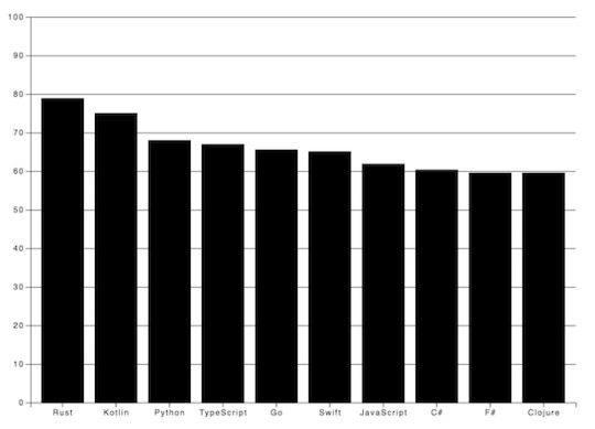
I prefer the vertical grid lines in this case because they lead the eyes and keep the overall picture plain and simple.
Labels in D3.js
I also want to make the diagram more comprehensive by adding some textual guidance. Let’s give a name to the chart and add labels for the axes.

Texts are SVG elements that can be appended to the SVG or groups. They can be positioned with x and y coordinates while text alignment is done with the text-anchor attribute. To add the label itself, just call text method on the text element.
svg.append('text') .attr('x', -(height / 2) - margin) .attr('y', margin / 2.4) .attr('transform', 'rotate(-90)') .attr('text-anchor', 'middle') .text('Love meter (%)') svg.append('text') .attr('x', width / 2 + margin) .attr('y', 40) .attr('text-anchor', 'middle') .text('Most loved programming languages in 2018')
Interactivity with Javascript and D3
We got quite an informative chart but still, there are possibilities to transform it into an interactive bar chart!
In the next code block I show You how to add event listeners to SVG elements.
svgElement .on('mouseenter', function (actual, i) { d3.select(this).attr(‘opacity’, 0.5) }) .on('mouseleave’, function (actual, i) { d3.select(this).attr(‘opacity’, 1) })
Note that I use function expression instead of an arrow function because I access the element via this keyword.
I set the opacity of the selected SVG element to half of the original value on mouse hover and reset it when the cursor leaves the area.
You could also get the mouse coordinates with d3.mouse. It returns an array with the x and y coordinate. This way, displaying a tooltip at the tip of the cursor would be no problem at all.
Creating eye-popping diagrams is not an easy art form.
One might require the wisdom of graphic designers, UX researchers and other mighty creatures. In the following example I’m going to show a few possibilities to boost Your chart!
I have very similar values displayed on the chart so to highlight the divergences among the bar values, I set up an event listener for the mouseenter event. Every time the user hovers over a specific a column, a horizontal line is drawn on top of that bar. Furthermore, I also calculate the differences compared to the other bands and display it on the bars.
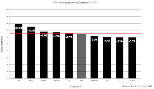
Pretty neat, huh? I also added the opacity example to this one and increased the width of the bar.
.on(‘mouseenter’, function (s, i) { d3.select(this) .transition() .duration(300) .attr('opacity', 0.6) .attr('x', (a) => xScale(a.language) - 5) .attr('width', xScale.bandwidth() + 10) chart.append('line') .attr('x1', 0) .attr('y1', y) .attr('x2', width) .attr('y2', y) .attr('stroke', 'red') // this is only part of the implementation, check the source code })
The transition method indicates that I want to animate changes to the DOM. Its interval is set with the duration function that takes milliseconds as arguments. This transition above fades the band color and broaden the width of the bar.
To draw an SVG line, I need a start and a destination point. This can be set via the x1, y1 and x2, y2 coordinates. The line will not be visible until I set the color of it with the stroke attribute.
I only revealed part of the mouseenter event here so keep in mind, You have to revert or remove the changes on the mouseout event. The full source code is available at the end of the article.
Let’s Add Some Style to the Chart!
Let’s see what we achieved so far and how can we shake up this chart with some style. You can add class attributes to SVG elements with the same attr function we used before.
The diagram has a nice set of functionality. Instead of a dull, static picture, it also reveals the divergences among the represented values on mouse hover. The title puts the chart into context and the labels help to identify the axes with the unit of measurement. I also add a new label to the bottom right corner to mark the input source.
The only thing left is to upgrade the colors and fonts!
Charts with dark background makes the bright colored bars look cool. I also applied the Open Sans font family to all the texts and set size and weight for the different labels.
Do You notice the line got dashed? It can be done by setting the stroke-width and stroke-dasharray attributes. With stroke-dasharray, You can define pattern of dashes and gaps that alter the outline of the shape.
line#limit { stroke: #FED966; stroke-width: 3; stroke-dasharray: 3 6; } .grid path { stroke-width: 3; } .grid .tick line { stroke: #9FAAAE; stroke-opacity: 0.2; }
Grid lines where it gets tricky. I have to apply stroke-width: 0 to path elements in the group to hide the frame of the diagram and I also reduce their visibility by setting the opacity of the lines.
All the other css rules cover the font sizes and colors which You can find in the source code.
Wrapping up our D3.js Bar Chart Tutorial
D3.js is an amazing library for DOM manipulation and for building javascript graphs and line charts. The depth of it hides countless hidden (actually not hidden, it is really well documented) treasures that waits for discovery. This writing covers only fragments of its toolset that help to create a not so mediocre bar chart.
Go on, explore it, use it and create spectacular JavaScript graphs & visualizations!
By the way, here's the link to the source code.
Have You created something cool with D3.js? Share with us! Drop a comment if You have any questions or would like another JavaScript chart tutorial!
Thanks for reading and see You next time when I'm building a calendar heatmap with d3.js!
D3.js Bar Chart Tutorial: Build Interactive JavaScript Charts and Graphs published first on https://koresolpage.tumblr.com/
0 notes