#guilty gear is actually an interactive album
Text
I have decided having a main is dumb and I will instead play whichever character whose theme I am currently hyperfixating on
#as daisuke intended#guilty gear#ggst#guilty gear strive#guilty gear is actually an interactive album#mypost
20 notes
·
View notes
Note
What are the characters like on social media?
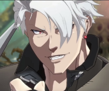
Sol Badguy has only one Social Media and it is Myspace. He has two friends on there, one of which is Axl who made a Myspace before other options were available and the other is a bot. He only posts once a year to review a Queen album (all 10/10) or to post a picture of his motorcycle.
Ky is a christian facebook mom. He has a “No Swearing on my Profile Please” banner.
May sometimes posts pictures of the dolphins or group photos with the other jellyfish pirates, but she’s mostly here to play browser games. Flash never died in the world of Guilty Gear.
Zato is considered one of the funniest people on twitter, none of which is intentional. He posts shit like “Eddie ate a rat today...effervescent.” and everybody loves it. He isn’t verified so everybody assumes that he’s some kind of parody account.
Millia runs a beauty instagramm that’s mostly just her explaining how to take care of your hair when it’s A) more mass than your entire body and B) Alive
Potemkin runs an art account, where he posts pictures of the paintings he drew. Most of his tweets are garbled messes of text however, due to him being forced to author all his tweets in text to speech, since his fingers are too large for a keyboard or touchscreen.
Chipp has a twitter account on which he posts government reforms and anime reviews. There’s a 50/50 chance if his next tweet will be “We’ll be raising taxes on cigarettes and alcohol” or “Alter Memory didn’t really hook me. Had only one ninja. 3/10″
Faust runs a blog in which he gives medical advice to anyone who asks. Its become an urban legend that if your symptoms are vague enough, the blog owner will break down your door and treat you personally.
Axl has 20 different twitter accounts, all of which are from different timelines with different email addresses. Usually by the time he manages to log into one, he gets thrown into another timeline.
Kliff mostly posts really outdated memes like “Me and the boys awake at 3 AM looking for GEARS” while tagging every single member of the Holy Order.
I-no was a casuality of the tumblr p*rn ban.
Testament has a social media account on which he posts pictures of the grove and the local wildlife. He has only one person in his contacts and its. Whenever anybody else tries to interact with his account or comments on his pictures, they’re instantly blocked.
Justice used to have a twitter, Apparently trying to wipe out all of humanity gets you banned from twitter thought. She’s still active on facebook however.
Baiken only posts pictures of cool swords
Anji has nothing but sockpuppet accounts which he uses to join antivaxxer/flatearth conspiracy groups so he can debate them for shits n giggles
Venom only follows Zato on twitter and is sure to like and retweet everything he posts. Without fail, the top comment on everything Zato posts is venom saying “Banger tweet milord.”
Johnny lost his social media priviledges because he kept infecting the mayships board computer with viruses since he refuses to stop clicking on the horny ads.
Jam runs an account for her restaurant, doing her best to advertise herself on social media.
Dizzys page is filled of pictures she has taken with people around the Kiske household. It gained a lot of followers one day when somebody noticed that both Ramlethal who declared war on the world like a month ago and two kings of Illyria were in one of the pictures she posted.
Bridget is forced to make memes for Jams social media account. They’re the only reason anyone follows the account.
Slayer runs Haikubot on tumblr.
Zappa has found much popularity with the youths, due to them misinterpreting his posts screaming for help as self deprecating humor. Most of his posts are something like “My body is a screaming wreck being haunted by 12 different spectres and I will never know peace.” and every single reblog is tagged as #Mood
Robo-Ky runs the bakeries actually succesful meme page. Most of his posts are vaguely bread related deep fried images and weirdly horny posts. They have 200k followers but most aren’t convinced they’re an actual real bakery.
Bedman posts all his hot takes on the internet and has sworn vengeance against twitter for limiting him to 280 letters.He constantly gets into arguments with people, none of which actually engage him in debate due to the fact that everything he posts is atleast 7 pages long.
Daisuke Ishiwatari runs this blog
Sin runs a tumblr blog where he pretends to be Ky, making satirical posts bullying his dad for being a nerd.
Ramlethal made an account after Elphelt and Sin pressured her into doing so. She posts pictures of her magehound and nothing else.
Elphelt is currently on her 12th account due to the fact that she keeps getting hacked. No matter how many times she’s told to block them, she keeps falling for horny spambots every single time.
Raven has been banned from every social media website in existence.
Leo posts whatever he feels like at the time, which consists of rants about Ky, new definitions to his dictionary or pictures with whoever happened to be nearby in Illyria castle. There are three different “Whitefang Out Of Context” accounts currently active.
Answer does damage control for Chipp. Whenever Chipp ends up getting into an argument with another world leader on Twitter due to differing opinions on anime, he DM’s them to apologize. His actual posts mostly consist of pictures of his frogs.
Nagoriyuki posts pictures of his haikus on social media. While they are fairly popular in their own right, most of his fanbase comes from people thirst following him from that time his reflection was visible in one of his pictures.
#guilty gear#sol badguy#ky kiske#may#chipp zanuff#axl low#potemkin#zato-one#millia rage#faust#kliff undersn#testament#justice#baiken#anji mito#venom#johnny#jam kuradoberi#dizzy#bridget#slayer#zappa#i-no#robo-ky#bedman#daisuke ishiwatari#gearsters#sin kiske#ramlethal valentine#elphelt valentine
444 notes
·
View notes
Text
GG Strive Thoughts: Part 3
Welcome to the last part of my Guilty Gear Strive thoughts!^_^ I'll be focusing on the art-style and character designs, so there will be lots of pictures in this post. I hope you enjoy reading!
Art-Style & Graphics
---------------
Guilty Gear's visuals always had a detailed, Sci-Fi fantasy anime look with creativity of the 1990s and early 2000s. This mostly stayed the same until Xrd SIGN, which introduced 3D cel-shaded graphics in a new way. The art-style also changed a bit from previous games, although it has kept its creativity.
GG Xrd SIGN and the following games(Revelator and Revelator 2) look beautiful, but it took me a while to get used to the art-style because of those dreaded chins. The characters should've just used their chins to fight cause of how long and pointy they are; just go "SLLASSHHHH!" XD Certain features of characters were exaggerated like Sol's shoulders being a bit too wide for his body or how Baiken's hair is thicker and spikier. Some people say it's "too anime", but that isn't the right word for it. I would say "whimsical" is main trait from the art-style, which is fitting for how funny the interactions are in-game and lighter tone in story.
Guilty Gear Strive keeps the cel-shaded 3D graphics, but manages to expand it further. Instead of its presentation akin to an anime TV series, it's now akin to a high-budget anime movie with detail given to both the characters and the environments. It's less whimsical this time, giving the impression the story will be darker in tone. I'm really happy the art-style was changed to being closer to the older GG games like X2; no more ice-cream cone chins!XD The characters also got redesigned to match the essence of the new game. I'll be talking about eachone in order from least to most in terms of design changes. I'll also rate them in Guilty Gear style grade form.
POTEMKIN
-------------------
There seems to be mixed reactions when Potemkin got revealed for GG Strive. Some were happy he looked generally the same while others were a little disappointed and asked, "How come he didn't get a huge redesign like the other characters?!" The answer is he already did; this is how Potemkin originally looked like in the GG series.
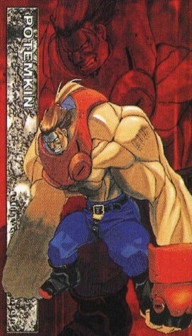
This design relates to Potemkin's story in the beginning. The Zepp empire in the past was a very corrupted, technology advanced nation. It contained battle-slaves with strength enhancement steriods and bound them with a special limiter. Potemkin was one of these battle-slaves with his huge, red metal color being the limiter. If he ever took it off, it would explode. However, Zepp was changed when Gabriel became President and freed all the Zeppian slaves, including Potemkin. He now serves as Gabriel's bodyguard out of genuine loyalty, gratitude, and care for his mentor and the renewed Zepp.
Judging on his old design by itself, I think he looked average(based on what he's wearing). His features definitely fit the saying "don't judge a book by its cover" because Potemkin is actually a gentle giant who's very intelligent. But the way he looks(except when interacting with certain characters), it's like he wants to break someone's bones, lol.
In the concept artwork in Guilty Gear X Plus(Japanese exclusive game), it hinted of what Potemkin will eventually developed into look-wise and story-wise. Even the pose from this pic was used later in Xrd SIGN. I really wish the design of the boots was used instead those weird looking ones he's wearing now, XD.
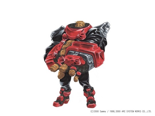
Now to look at Potemkin's design in Xrd SIGN.
This is Potemkin's drastic redesign needed because of the changes in his life and his resolve being tested. I love this design so much because it accurately portrays Potemkin's personality. The first is his steel helmet with a spike at the top, accented with the Zepp symbol at the center of his forehead. His face is mostly shrouded in darkness except for the glowing lens. The yellow ponytail fur attached adds to the essence of a modern steel knight. Next is the black collar having spikes at the front; he also has on spiked shoulder plates to emphasis his strength. The power part is also in the round-shaped limiters attached to the upper parts of his uniform and glove compartment of his gauntlets. The design of his gauntlets is derived from the GGX Plus concept art, except the gloves completely cover his fingers and has a robotic aesthetic to it. I notice green is the most dominant color in Potemkin's design and there's a reason why besides it being Zepp's uniform.
Here is the Green Personality taken from Color Psychology
(https://www.empower-yourself-with-color-psychology.com/personality-color-green.html):
You are a practical, down-to-earth person with a love of nature. You are stable and well balanced or are striving for balance - in seeking this balance, you can at times become unsettled and anxious. Having a personality color green means you are kind, generous and compassionate - good to have around during a crisis as you remain calm and take control of the situation until it is resolved.
You are caring and nurturing to others - however you must be careful not to neglect your own needs while giving to others. You are intelligent and love to learn - you are quick to understand new concepts. You are a good citizen and like to be involved in community groups. You have high moral standards and doing the right thing is important to you.
There is more, but I only taken pieces that describe Potemkin's personality, showing why green is his main color. Now onto his look in GG Strive starting with his helmet.

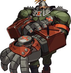
On the forehead of the helmet, the Zepp symbol is no longer a design mark, but an carved symbol with the words "Armor-clad faith" underneath. Instead of just darkness on his face, it accentuates the robotic aesthetic with the gears and the lens having an orange tint. Next is a full body screenshot of Potemkin.
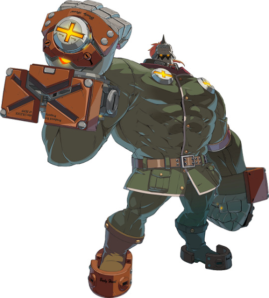
The spiked shoulder plates is less noticeable and his uniform is more formal. There's now a maroon-red collar with white trim and yellow buttons. The spikes on the black collar part of his outfit is gone, there's thick pockets on the lower part of his suit and has a brown belt instead of black. His boots is also brown instead of black and the plates around his feet is orange instead of red. There's additional limiters on his upper back that is revealed when doing certain attacks, showing his power has grown more. His muscle mass has also gotten super HUGE to the point I wouldn't be surprised if he reached Sentinel(X-Men) size, XD.
Design Rating: S++(Fantastic!)
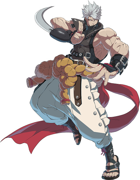
SOL BADGUY
------------ ----------
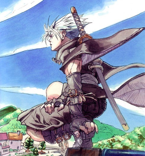
Sol Badguy is the main protagonist, so there was never a worry or surprise of his GG Strive design. There's also the fact his design isn't really new; it's heavily derived from the artwork of Guilty Gear 2:Overture. But first is looking at Sol's most iconic design from the GG series.
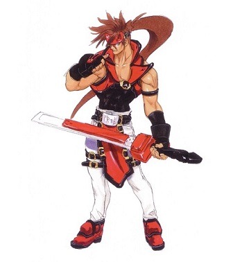
I'll always love this design because I think it's stylish, cool, and timeless. He's handsome in the traditional tough-guy way and perfectly fits the anti-hero type. His metal red headband acts as a limiter for his Gear powers and has the words "Rock You" in the center of his forehead. Besides it symbolizing his love for Queen's "Sheer Heart Attack" music album and controlling his Gear powers, it also symbolizes how he keeps his inner thoughts to himself and close-mindedness. He wears a black undershirt layered with a sleeveless, chest-length red jacket with a buckle strap. This style is very unconventional, which is exactly Sol is; he doesn't follow typical conventions. His red and black gloves conveys his toughness while his belt with the "FREE" tells of his philosophy. This also hints complexity to his nature since the belt is from when he was in the Holy Order, an aspect of his past. This shows he's inwardly caring and values the people in life along with his experiences. Lastly, is his white pants accented with buckles and red shoes.

The GG2:Overture Short Stories goes into some detail of the events before the game like how he was entrusted to raise Sin(Ky & Dizzy's son), etc. The major difference with Sol's design from the short stories is he's wearing a sensible red jacket similar to his old one, but its design still has traits of being its own style. His black undershirt is slightly different with a small V-shape cut-out in the middle, longer sleeves, and slightly loose around his stomach instead of fitted. His gloves has more of a biker vibe to them and no aspect of red nor buckles within them. He still wears red shoes on his feet, though tweaked in its looks. While this did hinted of Sol's character development, it wasn't a large factor because alot of the huge events at the time and before were placed on him rather than him confronting it by himself. It's why for Xrd SIGN, he primary reverted to his iconic look, though his GG2:Overture Short Stories look did get tweaked and used within the game's Story Mode. Now for his GG Strive look.
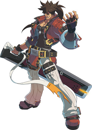
His GG Strive design blends both his GG2:Overture Short Stories look and aspects of his iconic design, which I really like. The red jacket with black trim conveys his free-spirited persona, yet also comfortable and relaxed. There's also a little bit more white seen on the cuffs of his jacket, meaning his heart is more open. This relates to his character development of finally confronting his past, his feelings, and his relationships. But he's still Sol Badguy and there's much for him to find out and explore, especially since red and black is still his main colors. There is deep meaning to this too.
Red Personality(https://www.empower-yourself-with-color-psychology.com/personality-color-red.html):
You are action oriented and physically active - sex is a necessity to you - you have strong survival instincts. Lovers of red are the explorers and pioneers of the world, the entrepreneurs and builders who like to be first in discovering new physical realms. You are always in a hurry, wanting to do everything right now. Patience is not one of your strong points. Red people can be aggressive and easy to anger, often exhibiting a violent temper - this is negative passion and energy. You flare up instantaneously but calm down quite quickly once you get it out of your system and then forget it ever happened. You have a strong need for power and control which is connected to your basic survival instincts.
Black Personality(https://www.empower-yourself-with-color-psychology.com/personality-color-black.html):
You are independent, strong-willed and determined and like to be in control of yourself and situations. You may appear intimidating to even your closest colleagues and friends, with an authoritarian, demanding and dictatorial attitude. You hold things inside and are not good at sharing yourself with others, possibly out of fear. You may be retreating behind black during a difficult time in your life such as a serious illness or a period of grief - black protects, allowing for a deep inner healing without interference from others.
I'll add traits of the color White since there's a noticeable amount on Sol.(https://www.empower-yourself-with-color-psychology.com/color-white.html):
Positive traits of White: Simplicity, self-efficient, growth/new beginnings, open, equality, rescuer, and sense of completion.
These traits describe Sol. Overall, I like the design and feel it suits him well.
Design Rating: S+++(Perfect!)
MAY
-----------
So far, May is the only female character revealed for the initial roster of GG Strive. There's mixed reactions with May's redesign for the new game. Some are happy she finally looks like she's in her early to mid teens(like 14 or 16) instead like a little girl. But others aren't happy with the changes to her outfit, saying it's bland. Let's look at May's iconic design.
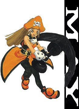
In my opinion, May is the coolest looking child character. Her open-sides style coat with side slits layered with a skin-tight bodysuit blends both cute and stylish. Adding to it is the tricon pirate hat, silver plating on her wrists and neckline, and orange short boots with black trim. Lastly, a black belt is around her waist while buckles accents her orange coat. This shows she's spunky, cheerful, and deceptively strong. In the story, her origins was unknown at the time, which perfectly fits due to there's black as part of color scheme(one of the meaning for black is mystery). Story-wise, May's development gradually grows from finding Johnny and later recruiting Dizzy as a member of the crew. Her curiosity of her heritage surfaces, causing some changes in her design.
In Xrd SIGN, Her skin-tight bodysuit is gone and replaced with just a black, fitted tank underneath her orange overalls. Her pants is loose-fitting along with having a big buckle around her waist and different boots still in orange with black trim. She doesn't have the silver plating collar, but other aspects of her iconic look like her pirate hat is kept. May finally finds out she's Japanese and dealing a mysterious condition that (currently) can't be cured. This is a huge story development for May that leads to be expanded further and another redesign. First is looking up the facial shot of May for Guilty Gear Strive.
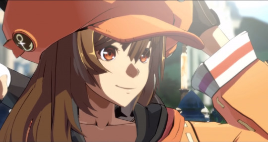
May's facial features is the first noticeable difference. The art-style is a strong factor in this, but May looks physically older. She still has big, cute brown eyes, though not as large as in Xrd SIGN. This makes her face appear a little longer face to convey a hint of maturity. Yet, she still hasn't escaped being just cute in an innocent way. Another difference is her hair is slightly shorten to halfway to her back instead to her waist. It's also loose instead of a thick ponytail within her pirate hat, which I think it's a nice little change. Her hat is shaped more round instead of oversized tricon while still retaining the pirate skull at the front. The anchor design on the sides makes it both simple, yet stylish. Now to see the full body of May's new look!

.....Lol, May is wearing a dumb orange hoodie, XD. What's worse is the hoodie has no special designs pertaining to May's personality or style; it's overly casual. There's also no shape, making her look like a fat fish. The skin-tight black short-shorts doesn't help with how oversized the hoodie is, which if it weren't for certain angles, it gives the illusion she isn't wearing anything on her lower body. It looks like lounge wear meant to be worn around the house instead of clothing a person would wear going on an adventure. Speaking of adventure, she has a backpack.
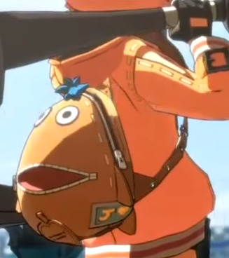
The backpack itself is cute because it's Chimaki(mascot of GG) and do see the the letter J with a heart; meaning love for Johnny. But other than this, this backpack also doesn't really relate to May. Besides being the mascot for the series, Chimaki is specific to Sin because it's favorite toy. None of May's official art ever showed her having a Chimaki toy or accessory. The casual look gives me the impression she quit the Jellyfish Pirates, but her winning animation of her saying "Jellyfish victory!" and Leap(the elderly lady who cooks) being there disproves this theory. Besides the hat, the only things kept from her iconic look is her gloves and boots. There's a heart on one of her thighs; a fitting aspect for a pirate.
Now to look at the Orange personality since it's May's main color(https://www.empower-yourself-with-color-psychology.com/personality-color-orange.html):
With orange as your favorite color, you are warm, optimistic, extroverted and often flamboyant. You are friendly, good-natured and a generally agreeable person. You are assertive and determined rather than aggressive - having a personality color orange means you are more light-hearted and less intense than those who love red. You thrive on human social contact and social gatherings, bringing all types together.
You live your life based on your 'gut reactions'. You are an adventurer - you love the outdoor life, camping, climbing mountains and indulging in adventurous sports such as sky diving and hang gliding. You are the daredevil, always looking towards your next challenge, your next great adventure.
This definitely fits May's nature. My impression of her simpler look probably hints of May is unsure of herself and trying to figure something out. Her expression in her new character portrait has this too; it's the first one of her not smiling. But I still think this new look for May is bad(except for the hat, the boots, and the gloves). Her design should've been something like this picture link below.
https://imgur.com/Ue1XdhT
The top would need to cover her stomach, but this design perfectly fits with May's nature and role as a Jellyfish Pirate. It also conveys she's adventurous and can easily implemented the backpack as part of the design. But it wasn't used... I'm nicknaming her May of the Jelly-Fat, lol. Worst design so far(and hopefully the only one).
Design Rating:D(for Derailed)
KY KISKE
-----------------
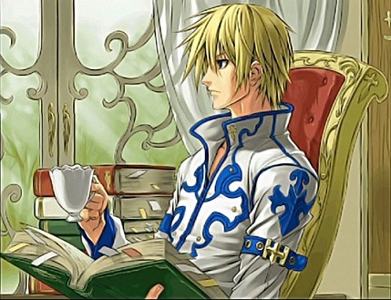
Ky's radical redesign for GG Strive was such a huge shock to everyone. At first, people thought it was Sin(Ky's son) until examining him closely. It's funny how many people are saying "Ky's handsome now" and saying he has an athletic body when in reality, he always did, XD. It isn't the first time Ky got big changes to his look based on the events in his life, but I'm going to focus on Ky's iconic design.

Ky is the opposite of Sol; the traditional knight-in-shining-armor type hero. This is another design I'll call timeless and my personal favorite look for Ky. He's very handsome in a princely way, which is fitting since Ky is a French noble. He wears a white shoulder cape containing a high collar with blue trim. It's attached to the blue knight-tunic with black trim in the front, accented with a white, trench-coat like detail. There's twin belts attached to his blue and black gloves while one is on his matching boots. Layered underneath his uniform is his black and white, sleeveless turtle neck and fitted detached sleeves. The belt around his waist with "HOPE" conveys Ky's philosophy. This attire is the Holy Order uniform, which conveys how strongly Ky holds onto the teachings and experiences he had during those times. His story at the time was about fulfilling his duty and doing what he knows and believes is right. Blue and white has always been Ky's main colors, which tells alot about his personality.
Meaning of White Personality(https://www.empower-yourself-with-color-psychology.com/personality-color-white.html):
Having a personality color white means you are neat and immaculate in your appearance, in the presentation of your home and in your car, almost to the point of being fanatical. You are far-sighted, with a positive and optimistic nature. You are well-balanced, sensible, discreet and wise. You think carefully before acting - you are definitely not prone to impulsive behavior. You tend to have a great deal of self control. You may appear to be shy, but you do have strong beliefs about most things and love the opportunity to air those beliefs. The challenge for you is to be open-minded and flexible and to communicate your needs and desires.
Meaning of Blue Personality(https://www.empower-yourself-with-color-psychology.com/personality-color-blue.html):
You are conservative, reliable and trustworthy - you are quite trusting of others although you are very wary in the beginning until you are sure of the other person. At the same time, you also have a deep need to be trusted. You are not impulsive or spontaneous - you always think before you speak and act and do everything at your own pace in your own time. You take time to process and share your feelings. You are genuine and sincere, and you take your responsibilities seriously. Having a personality color blue means you have a deep need for peace and harmony in your everyday life - you don't like having your feathers ruffled. You would benefit from daily meditation and quiet time for reflection, introspection and self-discovery.
You appear to be confident and self-controlled, but may be hiding your vulnerable side. Being a personality color blue means you are generally fairly even-tempered, unless your emotions take over - then you can become either moody and over-emotional, or cool and indifferent. You are sensitive to the needs of others and caring with your close circle of friends. While you are friendly and sociable, you prefer the company of your own close group of friends.
You are a rescuer and love to be needed but one of your lessons is to learn to love yourself first - you live from your heart and are always busy putting the needs of others first. You can be rigid - you like to stick to what is familiar to you and it is hard to sway you from your path - you stubbornly do things your way even if there is a better way. You need to have direction & order in your living and work spaces - untidiness and unpredictability overwhelm you.
You are approachable and friendly, always making people feel welcome in your life. You have a thirst for knowledge in order to gain wisdom and appear knowledgeable in whatever area interests you. You are spiritual or religious with a high degree of devotion to family, God, or other causes that are important to you. If reacting negatively, you are prone to self-pity.
These perfectly fit Ky's personality and has mostly stayed with him throughout his character development. Now to look at his GG Strive redesign beginning with the head.

One of the obvious difference is Ky's hair is short, reminiscent of his iconic look. But it raises the question of how since according to the story, it's stated his hair grows rapidly no matter how many times he tries to cut it(due to heavily implying he's part Gear). I'm guessing either Ky followed Sin's method of cutting his hair every 3 days or he found a special hair product to prevent rapid growth, XD. I notice the style of his hair is a bit different; the strands of his bangs is shorter and thicker. It creates a boyish look instead of a young man, which doesn't fit Ky. It doesn't seem noticeable during gameplay, but cutscene-like sequences it's the opposite. His hair should've been exactly like GGX2.
His facial structure and eyes in GG Strive is exactly like in GGX2 except for one part; his chin. While Ky's chin was never wide like most male characters, it usually isn't this narrow either. The narrower chin makes him look younger and with how the hair is styled, it gives the impression it's Ky from an earlier timeline. If his chin was similar to how it was in GG X2, it will improve his look alot and show he's mature and sophisticated. Next is examining the full body picture of his new look.
This is a huge departure in many ways. The only aspect inspired from his iconic design is the shoulder cape, but it lacks the blue trim around the helms and collar. Instead, there's black trim at the helms and hints of blue at the back with the words "Illyrium". His semi-fingerless gloves with fingernail plating is something he doesn't usually wear, but the back of his hands does have plating saying "Nothing can be done without hope". It shows he still generally has the same philosophy and key traits he's known for. The fact his "HOPE" belt is replaced with 2 standard belts(one black and the other brown) implies his mindset he carried from the Holy Order is gone and became open-minded. His open, V-neckline shirt with a single sleeve is inspired from this.
I do find it interesting how this reveals(pun intended) a different side of him, XD. It adds a sense of sensuality that leading men from romantic novels have and obviously it being sexy. Next is his fitted pants accented with blue crosses at the front then his boots with blue trim at the bottom. The most significant change is how Ky's dominant color is now black, which has important meaning to his character development.
Positive traits of Black: Include protection and comfort, strong, contained, formal, sophisticated, seductive, mysterious, endings & beginnings.
Negative traits of Black: Depressing and pessimistic, secretive and withholding, conservative and serious, power & control, sadness and negativity.
All of these fit Ky and since he's wearing alot of black instead of blue and white, this implies he has or going to have an internal struggle. I haved mixed feelings about his new design.
I love the concept of it and think it's nice to see Ky wear something different as his main attire. By itself the outfit is good and easy to adjust to, it's just not as unique as his original design. The design of blue crosses from his GG Accent Core Plus ending should've been implemented in the new design and add some gold trim to balance out all the black. I think his gloves should be changed to be more stylish along with the silver plating. If it had these tweaks, Ky's new design would be perfect.
Design Rating: A(Great!)
CHIPP ZANUFF
------------------------
The reveal of Chipp's redesign has mostly been positive, but all of us immediately said "He is so BUFF!" People say he looks handsome now and have joked he worked out at the same gym as Chris Redfield, XD. Let's look at Chipp's previous design!
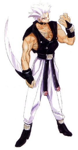
Chipp's iconic look definitely displays the street-punk style and rowdy persona. This perfectly fits with his dark past of being a former biochemical drug dealer and addict. He has wild spiky hair, small red earrings, and a leather choker around his neck. The fishnet undershirt is both punk-style and those who practice ninjitsu wears. He has fingerless gloves with silver, square-shaped plating. This aspect is also on his belt and short-length boots. There's two leather buckles strapped around the right leg of his white pants and has on a loose-fitting ninja vest with silver buttons. This highlights his newly adopted values he got from his mentor and father-like figure Master Tsuyoshi. Chipp even has on black eyeliner around his eyes to emphasizes the punk look. Since he primarily wears black and white with hints of red, this tells about his personality. Black and white together obviously means viewing things in a straightforward way instead of complex like gray. Red conveys of his hot-headed masculinity, passion, and impatient nature. Combined with the other colors, it shows Chipp's other side of having pure intentions, even though it doesn't always come across right.
In Xrd SIGN, only minor tweaks were made such as adding a red sash attached to his belt, extra detail on his pants and boots, and slightly thicker eyeliner. Ever since becoming president of a (currently) unofficial nation dubbed "Eastern Chipp Kingdom", Chipp's personality seemed to have mellowed some, though still has his impulsive tendencies. Chipp has been through alot of character development since the beginning. Now for his redesign for GG Strive starting with his face.
One of the things I notice about Chipp's face is while it's still narrow, it's a little fuller and smoother with slightly higher cheek bones. His chin is also about an inch or 2 wider than how it was in the Xrd series. His eyes still has the same defined shape, but the eyeliner isn't as thick. These tweaks to his facial features makes him look handsome and approachable instead of angry and rough. But his fiesty side is still there because besides his eye shape, his upper teeth now has some small fangs. Now to see a full body picture...
Chipp's hair also got tweaked; tt's still spiky, but more stylish instead of wild. Instead of strands of hair rest on his forehead, he has noticeable asymmetrical bangs. Besides his red earrings, Chipp's 2 main colors(black and white) is kept along with a little more red from the strings attached to his ninja gauntlets and strapped sandals. He still has the red sash attached to his belt, though this time he has a thick, rope belt(I think it's called "Obi"). His white pants is very loose-fitting and no longer has twin buckle straps, but does have a little more detail with the side silver buttons. On his upper body, Chipp has on a leather vest with a form-fitting, sleeveless turtleneck. The height of the collar covers his mouth and contains buckle straps. This look is inspired from his design in "The Butterfly and Her Gale".
It has aspects of the high collar, gauntlets, and boots, even though the boots was tweaked to be sandals. This redesign shows Chipp fully embraces Japanese culture and the ways of ninjitsu. I think it may also hint of him being or becoming a master himself and training others, especially with how he's gotten so muscular. The way they mixed old and new with Chipp's redesign is amazing and love the tweaks to his face and hair. I do think his pants maybe a bit too wide along with the rope-belt, but other than that his look is perfect.
Design Rating: S++(Awesome!)
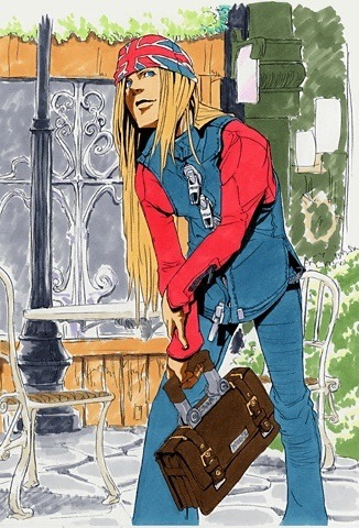
AXL LOW
-------------------
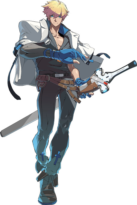
"Axl got PANTS!" is the main reaction people had when he got revealed and the majority agree it's a much needed upgrade. This is the 3rd time Axl has gotten major design changes since GG:The Missing Link. His look from GGX and onwards greatly emphasizes he's heavily inspired from real-life singer Axl Rose. For Axl, I'm going look at his redesign for Xrd SIGN.
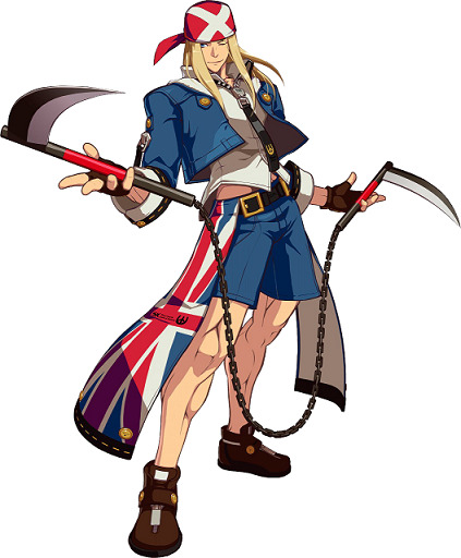
In comparison to the others, Axl's design was never high-fantasy or elaborate, but it makes sense he's from the 20th century. His look in Xrd mixes aspects from the 1st GG and GGX, which conveys his easy-going nature and trying to adapt to the future he's in while maintaining his values of the past. He still has his signature UK cap, brown fingerless gloves, and matching shoes. His white shirt has a unique black zipper tie that adds a hint of contemporary along with his blue jacket. Attached to his black belt on the hips is cloths of the UK flag and has on blue shorts. Red and blue has mostly been his main colors(with some white) that tells of his peaceful, friendly, and passionate nature. In the story, Axl is finally confronted about why he time-skips and must make a hard decision that forever change his life. The choice he made leads him to major character development along with what role he will play in the story, so he needed another redesign to reflect this.
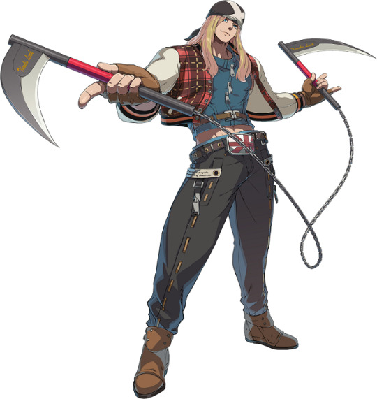
This design shows Axl has embraced the current timeline while maintaining his love for his country. His fingerless gloves is a lighter brown along with his ankle-length boots. He wears a red plaid jacket with white sleeves and black with orange trim at the helms. Underneath is his a sleeveless, form-fitting tank with 3 zippers at the front and a brown buckle at the mid-section. On his lower body is a belt with a UK buckle and fitted, detailed black pants with zippers on the side. This look is inspired by the concept art.
I notice his new design as a mixture of colors compared to before, though it seems black is the most dominant color. One of the meanings for black is power and control, which fits with how Axl now has control over his Time powers. He also has an aura of confidence compared to his uncertainty in the past games. This is the perfect design for Axl because he looks amazing and conveys his personality well.
Design Rating: S+++(Perfect!)
Thank you for reading this! I'll make a series of this as more characters of the game are revealed in the future!^_^
#GG2020#Guilty Gear 2020#GGS#Guilty Gear Strive#GG Strive#arc system works#daisuke ishiwatari#Sol Badguy#Ky Kiske#May#Chipp Zanuff#Potemkin#Axl Low#character redesign#my thoughts#analysis
13 notes
·
View notes
Text
Me and fandom
In almost all of my 23 years, I can’t remember not being a fan of something. As the youngest one in my family I grew up with 2 cousins and my sister, all at least 4 years older than me. Growing up in rural Bavaria, my cousins introduced me to fandom before I could even talk properly, as they plastered everything in their rooms and themselves with merchandise of soccer clubs they loved. So, it is funny enough that I never even started to care about a single soccer club, other than my 5-year-old me assuring them that I was in love with Bavaria Munich in order not to get a wedgie. However, when I was old enough, I was allowed to tend for their neglected video game consoles for a limited time whenever I was over, which is the first time I really understood what fandom actually meant. Both cousins had games for the Tony Hawk’s Pro Skater franchise, games that focus on displaying semi-realistic skateboarding action with real-life brands, skaters and locations. The first time I was exposed to this type of media I became obsessed with it. I would call my mother over to read me the names of the skaters and levels, I started to recognize the brands in the game in real life, I wanted my cousins to tell me about this Tony Hawk guy. I even wished for an actual skateboard, a hobby that I still casually but passionately perform to this day even going to contests to see some of my heroes of the sport. This must have been in late 2000 however, so researching on the internet was not a real possibility, plus I was barely literate enough to write my own name. Luckily enough, some of my friends also started to get into video games via their older brothers etc., so there soon was a small community around video games, small in every sense of the word. It was mostly me and my friend Peter, who came from an even lower income family than myself and unlike me he was allowed to basically play video games all day, every day, so we used to sit in front of a television for hours, playing all sorts of video games and eating chunk food. For a long while skateboarding and video games of all sorts were my obsession. Franchises like the Tony Hawk’s games, Metal Gear Solid, Fallout, Need for Speed and many more were part of my daily life. As soon as the internet became more accessible and I was smart enough to wrap my head around it, I would watch videos about these games via pages like YouTube and spend a lot of time finding out more about my favorite skateboarders. While watching a compilation of the video game Skate 2, I found my new obsession, which was going to be music.
Though at this point the band that was playing in the video is merely a nostalgic guilty pleasure, Korn turned me into a full-blown music fan. No one in my family was ever even interested in music despite liking something that may have been on the radio, but this band had really touched me in a completely new way. I would get every album, watch every interview, learn about their instruments, analyze all their lyrics, buy their merch with my pocket money and generally annoy everyone out of their mind with this band. Oddly enough no one around me seemed to like the band all that much, but a lot of the community that came with it for me was on the internet anyway. As much as I don’t care for the band now, I’m still more than grateful to this band as they were the reason why I picked up the bass guitar and started making music, which is to this day still the biggest joy in my life. The pattern of passionately plunging into fan communities also established here. Even today, whenever I find bands, fictional universes, authors or anything else that tickles me in a certain way, I tend to immerse myself completely. For fictional universes I usually lose myself in endless reads on wiki pages about the happenings and characters of whatever I am into, trying to know absolutely everything about this universe, whether it is Harry Potter, Fallout or Elite. Being part of the fan communities is also a big part of enjoying the experience. For me, Reddit and YouTube are the places where I have the most interaction with other community members. Whether it is a discussion over lore on r/falloutlore or comments on a video about the latest patch of Elite Dangerous, I always seem to find time to stay in contact with people I will probably never meet, but have the same passion about fiction that I have. As far as fan fiction goes, by far the most contact I had, is with a more unusual approach to fan fiction, which is modding. Modding means modifying existing video games and adding new user generated content for others to enjoy. This can mean everything from improving graphics and mechanics of games, to using the game engine as a foundation for expanding the story, which is what I was always interested in. I consider this fan fiction in video games. Fans of a franchise take the existing narrative and either fill the holes or add more to it, all the while creating their own virtual places with new characters to interact with. For me, the games that I adored the most for this were the Fallout games, as they actively encouraged modding with every part of it. They are open world role playing games in a futuristic post-apocalyptic setting that still has a foot in 1950s America, that allow the players to go about the story at their own pace, making it easy for modders to easily add more and more without interrupting the pacing of the story. The mod community of these games are still as active as when they were brand new.
As far as my fandom in music is concerned, everything is a lot more personal and therefore much harder to describe. For me, the music that I listen to and the musicians I obsess over seem to always seems to reflect where I am in life. Not to say that I inevitably tend to lose interest in all the music I listen to at some point, there are certainly constants. Artists and bands like Mark Kozelek, Neil Young, Sufjan Stevens, Mr. Bungle and many more are always in my rotation of music that I love. Listening to music is also not the only way I enjoy it. Like already mentioned, I like to get to know the people behind the music, analyze the lyrics, learn the songs on my instruments, find out more about their gear, their creative process and pretty much everything around the music itself. Though it may not seem like it, I am a very different fan of music than I am a fan of all kinds of fiction. For one, the community aspect is way less pronounced, as music is a way more personal hobby unless it comes to my own music. Most of my friends don’t share my musical taste and it has pretty much always been like that, so I like to think of my music fandom as something that only exists between me and the music that I can relate too, which is more than fine by me.
It is safe to say that fandom is an enormous part of my life and I don’t think this will change much. Being a fan of something does not only mean enjoying something to a great extent, it also means being part of a community that shares your interests. Fan interaction takes mere entertainment and turns it into something far more personal, yet communal. All the things I have been a fan of left a major impression on me as a person, whether it is a video game series, a band or some fictional universe, and I certainly look forward to getting into new and interesting fandoms that further accompany me through my everyday life.
1 note
·
View note
Text
D.B. Cooper in Pop Culture: 15 Best Movie and TV Moments
https://ift.tt/eA8V8J
On November 24, 1971, a man calling himself Dan Cooper hijacked Northwest Orient Airlines flight 305 from Portland to Seattle (a trip known as a “milk run” due to the short distance involved). A few minutes into the voyage, he got the attention of a flight attendant and made it known that he had a bomb that he intended to use unless his demands were met. What did he want? $200,000 in unmarked bills and four parachutes.
After the plane was on the ground in Seattle, the passengers were let go, the plane was refueled, and Cooper was granted his money and chutes. He instructed the pilot to head towards Mexico City, making it clear that the wing flaps were to remain at 15 degrees and landing gear to stay deployed, the cabin remain depressurized, and that the craft was not to exceed an altitude of 10,000 feet.
Some time after the trip to Mexico City began, he strapped the cash to himself, put on a parachute, and exited the aircraft in flight via the aft staircase. He was never seen again.
It was a bold and brazen move that instantly captivated the world’s imagination. In the confused rush to get the story out there, the skyjacker was misidentified as D.B. Cooper, and the false name stuck. Suddenly everyone was transfixed by the Cooper story. Who was he? Did he survive the jump? Why did he do it? These unanswered questions only served to build up Cooper’s mystique and his legend grew exponentially.
To this day, no one really knows who D.B. Cooper was or what became of him. Other than some of the money being discovered by a kid who was building a campfire along the Columbia River in 1980, there have been no verifiable leads in the case. In 2016, the FBI closed the case. D.B. Cooper had committed the perfect crime, and gotten away with it.
And still, people continue to obsess about the enigmatic, and, by some accounts, charming skyjacker.
Because his crime didn’t harm anyone, D.B. Cooper became an instant folk hero. He was a living representation of the “sticking it to the man” ethos of the era. And before you knew it, a pop culture phenomenon – one that continues to this day – was born. Cooper has been the focus of countless books, a few movies (including the Seth Green comedy Without a Paddle), songs, and has impacted the general consciousness in unexpected ways. (David Lynch and Mark Frost were rumored to be inspired by the skyjacker when naming Agent Dale Bartholomew Cooper on Twin Peaks).
These are the most memorable ways he impacted pop culture. Let’s take a look.
The Mystery of D.B. Cooper
Almost 50 years on and we still have no idea who D.B. Cooper was and what his motives were. Or do we? HBO Max’s The Mystery of D.B. Cooper, an in-depth documentary that aims to be the definitive word on this true-crime saga.
You can read our review of The Mystery of D.B. Cooper here.
In Search Of…
One of the earliest, and still the greatest, examination of the Cooper case is a 1979 installment of Leonard Nimoy’s cheesy/sublime 1979 investigational series In Search Of…
Over the course of 22 odd minutes, a delightfully porn-stached Nimoy runs through the particulars of the case. Complete with ominous re-enactments and insights from FBI agent Ralph Himmelsbach (whose obsession with the solving the case would eventually reach Captain Ahab proportions), this episode is the perfect starting point for aspiring Cooperphiles.
The Pursuit of D.B. Cooper
Due to the strong intrigue surrounding the Cooper skyjacking, it was only a matter of time before Hollywood tried to profit off of the crime. Thus in 1981, The Pursuit of D.B. Cooper hit theaters. The film starred Treat Williams, a slumming Robert Duvall, and the late, great Paul Gleason.
Loosely inspired by J.D. Reed’s novel Free Fall, the popcorn flick aimed more at entertaining audiences than actually delving into the hardcore mystery surrounding the man and his confounding actions. As such, the finished project is an amiable adventure that owes more to The Dukes of Hazzard and Smokey and the Bandit-type diversions than actual history.
HA HA HA
In 1983, interest in all things D.B. Cooper had already waned. Yet despite this, Signum Books LTD. published this purported autobiography that suggests that Cooper is just as good at spinning a wild yarn as he is jumping out of airplanes and ripping off the government.
The most interesting aspect of this novel is how it was also a contest. Readers could unravel clues hidden in the book to win $200,000 of their own. We have no idea if anyone ever made good of this offer, but this form of interactive fiction could be seen as a precursor to similiar and more mainstream literary experiments like J.J. Abrams and Doug Dorst’s S.
Prison Break
Before it broke our hearts by downfalling into mediocrity, Prison Break was one of the most engaging Fox shows of its time. One thing that bugs us though? Somehow we never pictured Cooper — portrayed in the series by character actor great Muse Watson — as a cat owner.
Skyjack
In 2012, CBS Films optioned the rights to journalist Geoffrey Gray’s Skyjack. Sadly, that project is currently residing in development hell, which is especially upsetting because Gray’s thoughtful analysis of the case and its obsessive, often damaged main players could be the next Argo. It’s a strange and joyous read.
Do Gray’s new leads result in finally identifying Cooper? That would be telling. Plus, as with many things in life, it’s not so much the destination as the strange odyssey that is undertaken along the way that is key.
NewsRadio
The fifth and final season of Newsradio obviously suffered from the creative energy that was lost following the senseless murder of Phil Hartman. However it began to gain some serious steam with a three-part story arc in which it was revealed that Jimmy James (the peerless Stephen Root) might actually be D.B. Cooper. As fun as this all was, nothing could prepare viewers for the joyous shock that came from the revelation that Cooper was, in fact, Adam West.
Journeyman
Journeyman, we still miss you so. NBC’s 2007 time-travel drama starred Kevin McKidd as a successful reporter, recovering gambling addict, and family man who began mysteriously travelling back in time. Because his adventures often resulted in him putting right what once went wrong, the Quantum Leap comparisons never stopped. But Journeyman was so much more than just an adventure of the week story. You see, when McKidd’s character went back in time, the present kept on going, meaning that he could return hours, days or weeks after he mysteriously vanished. This ramped up the domestic and career drama greatly in a way that Sam Beckett’s “oh boy”-worthy exploits could only dream of.
Five episodes in, the installment “The Legend of Dylan McCleen” was a quick exploration of the Cooper mythos, with the name changed to protect the guilty, apparently. As if we didn’t love it enough already, they had to go and bring Cooper into the mix. Why was this show cancelled again?
1971 CBS News Report
When word of Cooper’s skyjacking first hit the media, the news was so audacious that it became a national obsession (and still is, to be honest). Above you see CBS News’ original report about the Cooper case. Join Walter Cronkite and Bill Kurtis for their coverage of this history-making event.
Bigfoot vs. D.B. Cooper
Full disclosure: We’ve never seen this low-budget flick that looks like the next big SyFy sweeps event. But D.B. Cooper and Bigfoot? Together? That’s gotta be a recipe for entertainment, right?
cnx.cmd.push(function() { cnx({ playerId: "106e33c0-3911-473c-b599-b1426db57530", }).render("0270c398a82f44f49c23c16122516796"); });
Skyjacked
While based more on the rash of skyjackings that plagued American skies in the early 1970s than Cooper’s specifically, the 1972 proto-disaster film Skyjacked was clearly impacted by the folk hero’s actions. With stars like Charlton Heston, James Brolin, Rosie Grier, and TV’s Spider-Man, Nicholas Hammond, the film is a tense thriller about a skyjacker who seeks to divert a passenger plane to Alaska. As the terrorist is revealed to be a traumatized Vietnam War veteran, his actions lead to an international incident — resulting in a conclusion that remains gripping to this day.
Everything Is Fine, “Vapor Trails and Light”
In 2005, murky shoegazers Everything Is Fine released their album Ghosts Are Knocking on Walls, a guitar-drenched affair that featured two tracks inspired by Cooper’s antics.
While “D.B. Cooper” was a reverb-heavy instrumental imagining of what the skyjacker’s leap into history might have emotionally felt like, “Vapor Trails and Light” explored the mindset of the plane’s occupants. “You hijack the flight and disappear into the night,” sings vocalist Marc Manning in a delicate growl before adding “vapor trails and light, all we see tonight but it’s all right.”–-indicating that ultimately D.B.’s antics were the sort of victimless crime that resulted in his folk icon status. It’s a fantastic song that brings to mind the works of Slowdive and This Mortal Coil. In other words, essential listening for the 120 Minutes crowd.
Dan Cooper Comics
In the 1950s, France’s Dan Cooper comics chronicled the exploits of the titular Royal Canadian Air Force pilot. Since the skyjacker identified himself to the flight crew as Dan Cooper, it has been speculated that he borrowed his false identity from these comics…something that seems more than plausible given the similarities between both Coopers. The only problem is that the Dan Cooper stories were unknown to Americans in 1971, adding another speculative wrinkle to an already fascinating case.
The Far Side
Gary Larson’s seminal comic strip The Far Side once speculated on Cooper’s final fate. It may not be pretty for him, but it sure is funny.
Todd Snider, “D.B. Cooper”
Folk-twinged alt-country singer/songwriter Todd Snider paid a musical tribute to Cooper on his 2000 album Happy to Be Here, which speculates that D.B. did in fact survive his leap, and celebrated with a champagne toast. “I hope they never see D.B. Cooper again,” Snider croons, echoing the sentiments of those who yearn for this case never to be solved. After all, history needs its mysteries…
What’s your favorite D.B. Cooper pop culture moment? Let us know in the comments! And be sure to check out our D.B. Cooper Spotify playlist!
The post D.B. Cooper in Pop Culture: 15 Best Movie and TV Moments appeared first on Den of Geek.
from Den of Geek https://ift.tt/33gu16g
0 notes
Last Seen Blogs


shaowllikesguts
Poor Dio, they will suffer

emmamills
tracing a line in the infinite

neptunetiger33366
Queer and Full of Fear

shanarocks17
Sexy bisexual girl