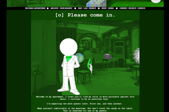
#hopefully i can draw more 'pieces' like this
Text
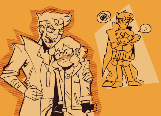
hi @marykedoesart, this is my gift to you for @natsume-ss' spring exchange!
you said you like tanuma/natsume and heartfelt, emotional themes so i went very symbolic with this, haha. i really love the idea of using imagery from the fish pond in tanuma's backyard to represent these two and their dynamic, so that became the concept i ran with. i'll explain my whole thought process below, but in the meantime i hope you like it! 💖
pls bear with me here bc this is going to be very long and wordy lol
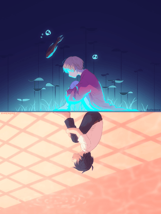
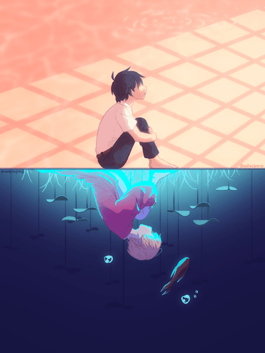
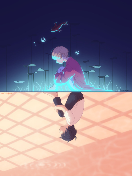
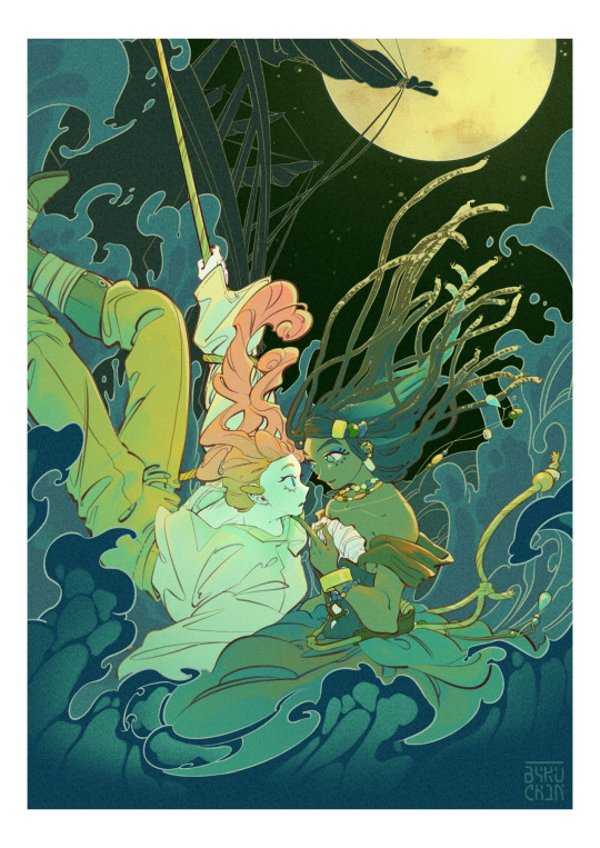
so there's a definite theme of separate worlds here; while the environments are both pretty abstract, the idea was that tanuma is sitting in his house looking out towards his backyard where the pond is, representing the "real world," whereas natsume is in a more fantastical underwater setting, representing the world of youkai. also there's the implication that he's sitting at the bottom of the pond, aka completely immersed in that other world, while tanuma can only perceive hints of it in the reflected light & shadow on the wall.
tanuma's side is lit by the glow of the setting sun, and natsume's by an otherworldly blue light. also, there's their clothes: tanuma is in his regular school uniform while natsume is in a yukata, something that pretty much all humanoid youkai wear.
next, their poses; they're both sitting exactly the same way as a reflection of each other but natsume has his head bowed while tanuma is looking up; this is meant to represent their different approaches to their relationship. natsume is definitely more closed off, both as a defense mechanism and because he wants to protect tanuma & keep him away from the dangers of youkai. tanuma, though, is open and contemplative, maybe even hopeful; he wants to be let in and he wants to help, even if it is dangerous.
the lighting reinforces these conflicting attitudes, with tanuma's side being brighter and warmer while natsume's is darker and colder, representing this sort of "optimism vs pessimism" dynamic.
so now, the fish. the bridge between their different worlds, basically. on natsume's side it's a real fish while on tanuma's it's a shadow cast on the wall, which is obviously the original conceit of the scene in the source material: natsume can literally see the fish, while tanuma can only see its shadow. still, even if it manifests differently, it still exists to both of them, so it's a connection between them concerning youkai.
so they're both in their separate worlds, but because of this connection they affect each other, maybe in small ways at first; as the fish crosses over the barrier it leaves little effects, little disturbances behind. on natsume's side, bubbles drift up towards the surface, little pockets of air like little lifelines showing the way, and on tanuma's side little droplets fall and create ripples in the reflected water, these small things that grow and grow outward until they're not so small anymore. little feelings that bubble up and ripple out, hoping to reach the other in their own way.
the fish brings these feelings across the barrier, endlessly looping around them as they endlessly call out to each other, trying to navigate this relationship they have; it's possible to bridge the gap between them as long as they look and listen and learn to embrace the things that make them different just as much as those that bring them together.
and that's about it! my goal was to make a symbolic piece about their struggle to understand each other but with a hopeful note, so hopefully that comes across! i hope my explanation at least sort of made sense and wasn't too confusing! (to be completely transparent i only had about half of that in mind while i was drawing it, the rest sort of came together as i was writing this. neat!)
and finally, here's a still frame in the original higher resolution so you can see it a bit nicer! 💖
#natsuyuuspringex2024#natsume yuujinchou#natsume's book of friends#natsume takashi#tanuma kaname#tanunatsu#natsuyuuss: it's a smaller exchange so your gift can be more simple!#me immediately: I Am Going To Animate Something#and then i did!#i love these two and their magical fish imagery#and i hope you do too!#rieley draws#rieley animates#digital#fanart#(i will be posting on twitter too just. give me a min for that one lol#im not as used to formatting over there orz)
233 notes
·
View notes
Text
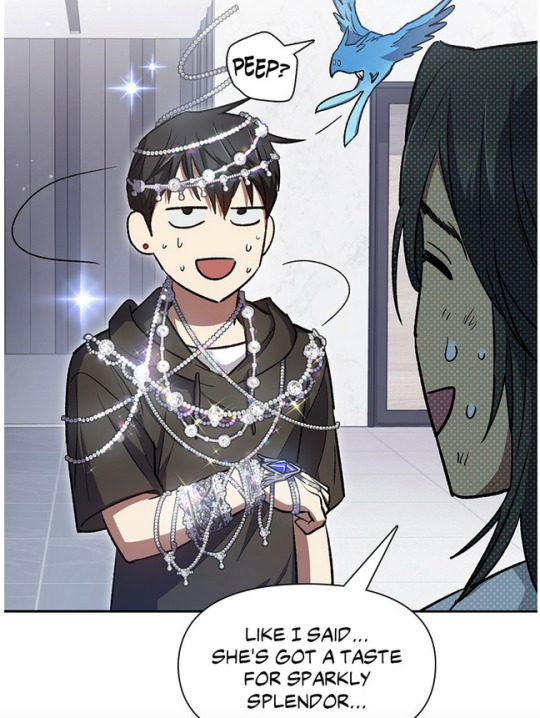
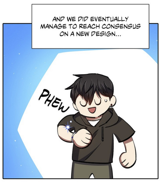
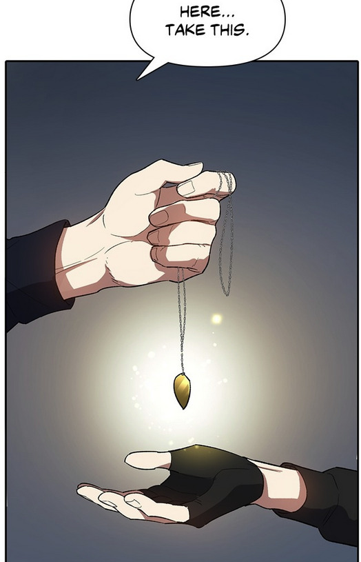
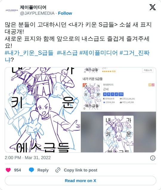
Han Yoojin's Black Choker
This post isn't going to be everything, but it's going to hopefully be easier to find/navigate than the handful of posts I'm seeing floating around and that I've responded to: a summary of official art with Han Yoojin wearing the black choker in S-Classes that I Raised, its maybe appearances in the text of the novel, and its maybe relationship with fanart. For the short answer, yes it appears in multiple pieces of official novel art, and maybe at least once in the novel text. But it might also be a fan design that's sort of accepted as official at least in some cases? Explanation beneath the read more.
Yoojin's black choker is most likely Grace, the protection item Myeongwoo made from Shalos. Other folks have said it's the translation item he gets from Yoohyun, and I disagree, but I'll get to that.
The novel text
Text-wise the "choker" is possibly from novel chapter 109, where Grace turns into a sparkling choker at one point (which Yoojin notes would actually be less over the top than a bracelet during his struggle to get her to turn into something less ostentatious). Some folks looked at different text in the novel here for how it and particularly Grace look, but just as a warning, there is no official English translation for the novel outside what we get in the manhwa, which is somewhat modified because it's a manhwa adaptation. There are fan translations for parts of the novel, but a lot of folks use machine translation, which can be very dubious.
In other places in the novel she's just described as turning into a necklace, not specifically a choker, though in novel chapter 176, it's described as sitting close around Yoojin's neck (which sounds like a choker). Whatever jewelry she turns into is specifically described as having a blue/silver jewel from which her bird form emerges (as she has in novel chapter 156, which is the chapter one fanwiki lists it appearing in, and in which she is described as turning into a necklace, not specifically a choker).
Revised ebook novel volumes
SCTIR the novel was (and still is) originally released chapter by chapter on Naver, Munpia, and Ridibooks (currently Side Story is only available on Naver, but the chapters of the main story are on all three). The main story was eventually collected into 35 volumes and partially revised or at least given additional scenes in places. Each volume contained at least two pieces of art. For volumes 1-14 this was seemingly a character portrait with their bio (e.g., age, height, likes, dislikes), and 1 piece of interior art, with the latter at least being by 비완 (the manhwa artist). Volumes 15+ switched up interior artists, for a total of I think at least 3-4 artists, and those volumes had at least 2 pieces of interior art, with volume 35 having 3. The individual chapters didn't have this, it was added for the ebook release.
The volumes themselves are available on Ridibooks and Naver (they might be somewhere on Munpia but I couldn't find them).
The first volume of the ebook released in May 2020 (the Ridibooks release lists an earlier date for some reason than the one on Naver, which is November 2020). By this point, fans had already been drawing Yoojin wearing a black choker with a gem (usually blue or silver) on it since at least 2019: 1, 2, 3, 4, 5, 6. <This fanart is by onlyraii, the artist who went on to make the new cover for the novel published in April 2022 (included down below). So at least some of the official artists were involved in the community and knew of popular fan designs (though notably, Yoojin is not wearing the choker on the official book cover).
비완 potentially drew Yoojin wearing the choker in volume 13, for the Chuseok art (September 2020). It's very hard to tell whether that's his shirt collar or a choker. But it sort of looks like it.
(I'm going by the Ridibooks release dates)
The next time it was potentially drawn was by a different artist in volume 18 (July 2021). It's hard to tell because he's holding a bouquet that mostly covers his neck, but on the right side of his neck seems to be part of a black choker.
The clearest earliest example of him wearing it in official art is in volume 19 (April 2022), where he's clearly visible wearing a black choker with a blue gem on it. I don't see it mentioned as something he's wearing in that chapter, at least from a brief browse.
He's also definitely wearing it in two pieces of art for volumes 20-21 (April 2022).
In volumes 22 (April 2022) and 25 (August 2022), Yoojin seems to be wearing Grace as a cat collar with a similar design in two other pieces of art. Not exactly a choker, but the design is similar.
After that, they switch artists at least once if not twice and none of them drew Yoojin with the choker - or any necklace at all - that I can see. He didn't lose Grace for good in the novel, though he doesn't wear her all the time, but no other artist for the interiors drew him wearing the choker for the last 10 volumes of the revised ebook novel release. Whether that's a narrative choice or the inclusion of the choker at all is random/whatever the current artist wants/what was geunseo/the publisher's mood, who knows?
The manhwa adaptation
This is how manhwa episode 103 depicts Yoojin trying to get Grace to turn into something wearable after first receiving her (art by 비완):
I'm not seeing a black choker anywhere. The black line near his neck is the collar of his shirt.
As of posting on June 3rd, 2024, at least on the free to read Webtoons page and Tappytoon English chapters of the manhwa, there is no art of Yoojin wearing the choker, either as Grace or the translation item he got from Yoohyun. The manhwa depicts the translation item differently, and Grace has only appeared as fancy necklaces or a bracelet.
In the manhwa, Grace is shown turning into a simple bracelet after negotiation in episode 103:
You'll note he often wears shirts with black collars on them.
This is the translation item that Yoohyun gives Yoojin as it appears in manhwa episode 55:
Which is roughly how it's described in novel chapter 68, absent any specific color description for the metal ornament. Someone else said this is actually what people are drawing when they draw the choker because the design is vague enough to match a choker, which is strange to me, because from what I recall, Yoojin has this in his pocket/inventory most of the time. He's not wearing it constantly (he also already had it when he got Grace). It's kind of implied if not stated he doesn't like wearing it much and only puts it on out of necessity and takes it off at the first opportunity. He does, however, typically wear Grace (though he does, for various reasons, take her off a decent amount).
The April Fool's 2022 art by ? and the 2022 official novel cover by onlyraii
Someone else pointed out the "sketch" for the official novel art by onlyraii (final art below):
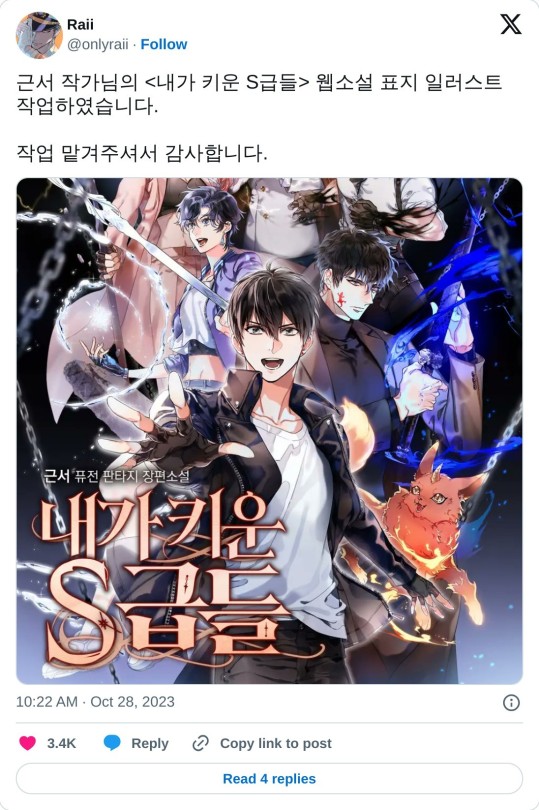
And here it is when it was released seemingly originally on 31 March 2022/1 April 2022 (KST).
In the other post I'm seeing about the "sketch" for this, the unfinished "sketch" listed was actually the April Fool's Day joke for 2022 that seems to parody onlyraii's cover, but with all the guys being bald:
(A lot of manhwa and I think Korean webnovels do April Fool's Day joke posts with fake "new" art done by official artists; 2022's SCTIR manhwa April's Fool's Day joke was magical girl themed, and this was 2024's, which had most of the cast become dinosaurs).
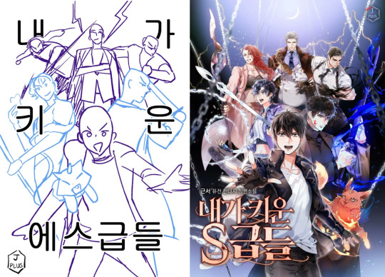
You can also see that while there are similarities, this is very much not what they ended up with, and again, it's dubious this was an actual sketch for the cover: it's not on onlyraii's twitter, though that doesn't mean it wasn't posted elsewhere, and seems more in the style of 비완's art, so it's likely this is the manhwa team doing a jokey post (the manhwa started in November 2021, and 비완 was still doing art for the novel ebook revision at least around 2020, so they'd have been around, and serikachan, the lead storyboard artist, does post about recent novel chapters on twitter, so at least some of them pay attention to the novel). I think it's intentional that all the men are bald as well, to note it's a joke; a lot of the Korean commenters are commenting on their baldness.
A core issue is the similarity and that they were released 11 hours apart (the gag went up around 11 hours before the official cover was released; onlyraii commented on their work for the cover around 40 minutes after the official cover was released). The "sketch" seems to show maybe a planned choker, but if it was an actual sketch in whole or part, it was clearly nixed for the final design.
"Sketch" or not, again, onlyraii has drawn Yoojin with a choker many times in their fanart dating back to 2019: 1, 2, 3, 4, 5, 6. Before the 2022 piece. If onlyraii and/or 비완 wanted to incorporate a fan design into the official art in some way, they wouldn't be the first fanartist/community member to do so on official artwork.
In conclusion:
At this point I don't fully know if the design comes from the novel or fanon that was later incorporated by fans into canon when they worked on the official art, or if geunseo suggested it or at least okay'd its inclusion on official art, but these things at least are true:
Grace is apparently mentioned as being a choker at least once in the novel text, but it's described as being rather fancy
the fan design/idea of the black choker with a small gem in the middle predates at least the release of the ebook art (if they were released earlier than that on an artist twitter somewhere, in some form, encouraging fans to use it in fanart prior to the book releases, I have no idea)
Yoojin wears a black choker with a gem in the middle of it in at least 3 if not 7 pieces of official ebook interior art
after the choker shows up on those 3-7 pieces of interior art, it stopped appearing at all (his neck is visibly bare of any necklace of any kind in multiple art pieces)
So does he wear a choker? Maybe, at least sometimes. Does it look like it does in fan designs? Maybe. The publisher and/or possibly geunseo okay'd at least some art with it on (though I don't know how much control geunseo has in that decision).
I'll try to keep this updated if new information/art comes out, so if you're seeing this as a reblog, check the source post to see if there's an update.
#han yoojin#sctir#my s class hunters#s classes that i raised#han yoojin's choker#han yoojin choker#내가 키운 s급들#this is probably annoying to people but I was curious too and wanted to know if it was official#it's a long novel it's easy to forget details#it's not a criticism I just like having information clear#also I feel bad responding with all this to all those posts#sorry the opening is text heavy I tried to go semi chronologically#and while a past version of this started with the manhwa I felt it made more sense to start with the novel#fallfthoughts
19 notes
·
View notes
Text
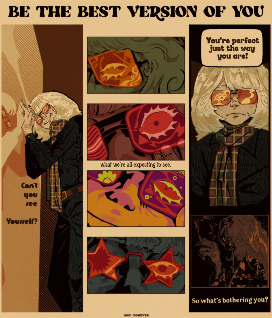
never change, man !
#phantom of the paradise#potp#swan potp#nightmaretheater#65 layers and about 24 hours . Eeeyyuppp#Look into my beautiful mind boy#Its a bit unusual to what i usually draw#but i had to push a specific look for this piece#hopefully you all are picking up on the corperate look . the advertisment look#Sneeze. Anyways my point is industry destroys creative people. This includes swan#I feel like phrases like these ; how he was put on a pedistal…. it lead him to be Like That#as awful as he is he desperately needed help#it might seem like vanity on the surface#but i think its… more than that#long story short: we need to destroy the beauty industry. the skincare industry. the anti-aging industry#It ruined his psyche forever and he cant let go of the ideal version of himself he will never truly be again#i dont think he can at this point. hes in too deep and hes suffering for it no matter how much he feels hes fixed his problems#he cant accept a version of himself that isnt that perfect young man. because he never confronted his problems. he just ran away#anyways . Hi swath *punches him**kicks him*#i dont care if nobody gets me lalalalla my truths and headcanons are awesome forever and i live in my own reality lallaallal#sorry i think im gonna be posting about swan alot for a few months hes making me sick#i wass gonna post this earlier but my internet was real bad#*lays down in my pile of pillows* eat up boys. haha#sidenote: drawing white blond people is horrifiying. Boy your skin and hair are the same color. Introduce some contrast to yourself. Please#adding on: its inportant to note this focuses on him looking st himself in the mirror alot on purpouse#to remind himself what he ‘’’’really’’’’ looks like#the 4 middle pannels all represent that too . u have to be in my brain ri get this#sorry for unleashijg another swan essay in my tags. will happen again lol
300 notes
·
View notes
Photo
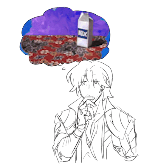


had some fun making the sparda boys think abt random funny gifs
(greenscreen versions i made below so you guys too can make them think about random funny things)


sorry that v’s thought bubble space is a bit more limited im too lazy to redraw it </3
#this originally started out as just dante bc i drew a quick sketch of him thinking#and then someone said that it reminded them of the spongebob gif so i made that real quick for shits and giggles#and then a bestie just started suggesting me things for the other boys and i decided to make a whole set bc why not </3#anyway sorry for no proper art ive been drawing smth slightly bigger for awhile... hopefully i can finish it soon...#follow me on twitter @TIANHAI_03 for more random doodles like this and also wip of the big piece im most active there unfortunately <3#devil may cry#dante(dmc)#vergil(dmc)#nero(dmc)#v(dmc)#gifs#this is what i learned video editing in school for btw#allyart
1K notes
·
View notes
Photo
see, dearest, loving me did not save you. you scraped by just fine without. but it doesn’t hurt, does it?
#pokemon#swsh#professor sonia#gym leader nessa#aquaheartshipping#sonessa#hi. this is pre-dr.jones!sonia and callie!nessa btw#doesnt affect the piece much but I just want u to know#I love that potc made up the whole davy jones/calypso thing and I ate that shit up unquestioned#dont care it slaps it means everything to me now. next#litcherally used those vibes for like anything I can I just think that should be a thing more#but also! the original dr.jones!sonia joke has like seven extremely stupid layer that make it very dear to me#so Im not willing to let go yet. even tho dr. jones is now technically involved in a tentative thing I have on the side#along with the other two (gun haveman and the cloudwalker)#this is actually! kind of a color study again. but also I just really wanna draw the girls#I think Im just gonna spend october drawing critters and the kids in costumes. I need it#this is hopefully the first! I'll try to unclench my brain and let it do its stuff#now tho? I sleep#tomorrow I have a promising dinner to look forward to. and the next day? noodles#have a good weekend lads! doesnt hurt to have a bit of love on ur side
901 notes
·
View notes
Text
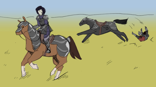

more knight au doodles
(i know jamie is canonically proficient in horseriding i forgor :sob:)
#doctor who#classic who#doctor who fanart#dw knight au#jamie mccrimmon#zoe heriot#the horses in the first image i drew over photos and you can very much tell#especially in comparison to the pencil sketch#why are its legs like that? who knows dude#also will cybermen turn up in the story itself? ive no idea man#my process for thinking up a story is Try Everything and figure out what i like best#edgars art#these are pretty low quality sorry i intend to do some more proper pieces hopefully soon!!#im starting art school in a few days so im hoping thatll get me in The Zone for drawing more conceptual pieces#assuming ill have the time HDFGHD
52 notes
·
View notes
Text
Fake comic book cover thing that has taken WAY too long but WE GOT THERE!
#SRRY ZOMBLORB ART HAS BEEN SLOW :( and art in general WHOOPS#2nd semester is kicking my ass so HARD rn (<- said in the Jean Claude Van Damme Street Fighter 1994 voice)#which isn’t to say I feel pressure to post art or zomblorbs but I ENJOY it and I’m sad I can’t spend more time on it :’’(((#I miss my chirren#BUT at least I like this piece :3#hopefully next I can make an actual drawing of vinny FINALLY#the zomblorbos#drew lancaster#toastytag#oc art#my ocs#original character#original art#digital art
30 notes
·
View notes
Text
@stainedglassthreads asked about my inspirations when it comes to comics creation, which I am always excited to talk about! (You have unwittingly activated my trap card, so be prepared for a long ramble!)
My comics are primarily a product of the 2014 Image boom and the 2000s webcomic scene....
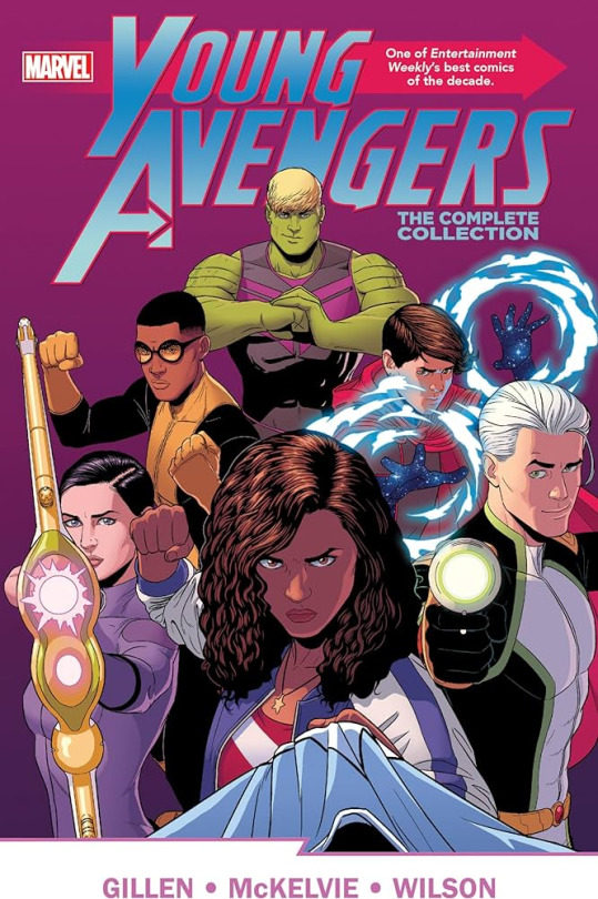
...and the main sources of my comics craft knowledge are the works of writer Kieron Gillen, artist Jamie McKelvie, and colorist Matt Wilson. They're an incredible team and everything they've done together is worth checking out, but I'm going to talk about two of their comics here. Young Avengers (2012) is a good place to start. Tons of formalism and interesting panel layouts. It's the first place I looked for inspiration when I was planning the design for Looking Glasses. Definitely worth checking out if you like cape comics, but also worth it if you don't, it's pretty stand alone. (Plus it introduces a lot of ideas and characters that Marvel is currently pillaging for the MCU, so it's always nice to see those ideas in their original context before my employers ruin it)
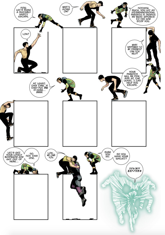
I can't talk about comics without bringing up The Wicked + The Divine (2014, written by Kieron Gillen, art by Jamie McKelvie, colors by Matt Wilson, lettering by Clayton Cowles). It's an incredible comic and a formalist masterpiece. 12 young people are reincarnated as gods, they have two years to live, and also they're pop stars. Issues frequently challenge the way you read comics, or break into completely other mediums (One issue was written almost entirely by real world magazine writers interviewing the in-universe characters). You can see my influences here pretty clearly: the interstitials, the style shifting, my recent (incredibly blatant) reference to Lucifer's transformation. Also the fashion, Jamie McKelvie is a fantastic designer! This comic is a must read for anyone interested in the medium of comics, especially Kieron's writers notes (all available here on tumblr at @ kierongillen), where he breaks each issue down panel by panel. The writer's notes are essentially a free masterclass in comics craft. (and when you've read that, check out the zine I organized with @gen-is-gone and 37 other artists here on tumblr at @iconic-zine) I cannot overstate that this comic is the reason I make comics.
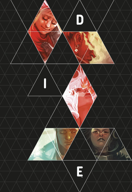
I feel like I can't not mention DIE (2018, written by Kieron Gillen, art by Stephanie Hans, lettering by Clayton Cowles). Six kids disappeared into their d&d world and returned two years later, now they're adults and their past is coming back to haunt them. It's a fascinating exploration of portal fantasies, and has definitely influenced how I approach the dark world/darkners. (also, if you read DIE and want a good breakdown of the historical stuff, be sure to check out the podcast DIE-Compressed)
Honorable mentions:
The visual stylings of Caspar Wijngaard in Home Sick Pilots (2021, Watters, Wijngaard, Bidikar, Muller)
The colors of colorist Jordie Bellaire, in this case Injection (2015, Ellis, Shalvey, Bellaire)
The work of Emily Carroll
Everything from Pretty Deadly (2015, Deconnick, Rios, Bellaire, Cowles)
A lot of stuff from Sex Criminals (2014, Fraction, Zdarsky), it's an incredible comic that goes way beyond it's (fairly nsfw) concept. There's a ton of formalist stuff here, and it tackles all sorts of concepts with a level of depth you wouldn't expect from such a silly setup.
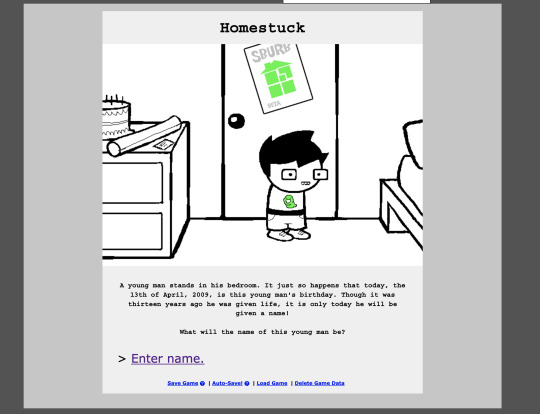
In terms of webcomics influence, I am, unfortunately, a bit of a Homestuck. There's a lot to be said about this comic and I'm trying to keep my word count down here, so let's just say that it's arguably one of the most influential webcomics, and while many of it's ideas aren't necessarily unique or are derivative of other works it is singular in it's scope and presence. I find it mainly affects my own work in the way I think about the website design. (Plus, you know, Toby Fox)
Other notable webcomics that have influenced my work:
The works of Evan Dahm
Barbarous
Stand Still Stay Silent
Lackadaisy
(and a bunch more, but this has gone on long enough)
#nickel for my thoughts#I can really talk about comics for ages and I feel like I cut this down a lot but there are still so many that I left off#wicdiv is truly the influence of all time though#that's the piece of media that explains why I am the way I am#I think one of the most important things when creating is to consume a lot of other works#I like to draw inspiration from everything I read and I'm always trying to find new and interesting comics#I'll happily talk about this stuff more if anyone is curious#I've got a suite of craft posts that I'm working on right now so hopefully those will be out soon
12 notes
·
View notes
Text


Been working on characters recently
#artists on tumblr#character design#ocs#my ocs#rem ocs#rem draws#they all have names but I couldn’t find a way to like write them down on their respective pieces#without making the composition look too cluttered or whatever#so if you’re really interested in learning their names send me an ask lmao#these are all part of a project I’m working on :) and by working on I mean still thinking about#I came up with the idea like a week ago and have just been designing characters for it since#very excited about it#also trying to become less scared of posting my ocs on social media. if anything it means more people can learn about them hopefully
79 notes
·
View notes
Text
Lone Ranger Gunslinger! Fernando (context)
#this would probably be more fitting for COTA but for ME it is very relevant and important#thank you DC for inciting this from me i guess 😭#the only correct way to draw any Wild West art is to:#listen to Marty Robbins' Gunfighter Ballads and Trail Songs#and cry when El Paso comes on 😭😭😭😭#so yeah if anything is mentioned over the course of a weekend that could be turned into an AU +#be assured that I can and will draw it >:)#if people like this maybe i wil draw some more for cota 🤭 i just wont have a lot of free time around that wknd tho ah#though i will say ive already discussed this possible AU with C a lot already 😭😭😭😭#you already know what ship it would be......hehehe....#anyways if youre ever curious where i get my ref photos. its called i play dress up in my room LMFAO#the outfit ref for this was a banger ngl. maybe ill wear it to school sometime 🤭🤭#its almost kinda a shame hes wearing the coat in this bcs god damn the waist was absolutely snatched!#i love 3 piece suits sob sob sob#okay anyways hopefully fernando will continue to be a sharpshooter this weekend!!!!!#he should shoot for....a podium 🤭🤭🤭 he should shoot for....a win! 😮#oh also i love how both c and i looked at clint eastwood pics as ref for this 😭😭 same brain 😭#if i ever draw more of this au i def gotta draw him with that look!#f1#formula 1#fernando alonso#catie.art.#fa14
35 notes
·
View notes
Text

redraw of an older fredgar piece 😊
#my art#fredgar#edgar valden#freddy riley#idv#you all WILL love this. OKAY? PROMISE. NOW.#i mmight turn on reblogs for this one because i like it a little bit#but thats only if someone wants to rb it#OH i can respond to REPLIES with THIS BLOG now too!!!!!!!!!!!!!!!!#so exciting#it took me ~5-6hrs to make?#so thats pretty awesome i think im getting Faster#i really need to work on my actual things now though#decided to make the sketch runaway and record keeper again because i realized the poses between them were similar#and i wanted to see if i improved (kind of? i definitely shade more complicated but comparing this to my other pieces its not as much impro#ement as id like)#anyways i hope you guys like it#hopefully i can get back into drawing again soon#this is the first fanart piece ive made all of 2024#:(#wanted to make one earlier but im just. ugh
13 notes
·
View notes
Text
Sier? I haven’t even met her! Laugh.
#keese draws#oc art#oc#ocs#eternal gales#today has been a shit day but Im feeling a bit better now that I’ve drawn sier#long story short one of my friends is being harassed by their ex#so I’ve been in a blinding rage all day and combined with me not getting enough sleep and cleaning all day today quite sucked#but hey. I drew sier and made them a new mini ref so that’s gotta count for something#but yeah sier my beloved I’ve been thinking abt them all day they’re just so cute and I love drawing them#I forgive them for being a human character they’re silly and have shapes#I now have only 4 eg refs to go I think? which is honestly a lot closer than I thought I was I thought this was gonna be another year of#last minute refs for artfight and some that don’t get remade but honestly this is super doable#rly the only big problem is going to be fydd since it’s been so long since I’ve drawn him properly#the other three are just dodie tali and bloom which shouldn’t be too bad at all#now idk if the icons are happening but it’s definitely feeling a lot more doable now so idk maybe I’ll get to some of them#key word maybe I make no promises#thankfully I don’t rly have any other ocs that I feel pressed to make new refs for so I can take it easy leading up to artfight this year#I’d like to get some of them icons but that’s not necessary#hopefully sier will get drawn this year she hasn’t been attacked since her old design from years ago lol#but sier is also a character I’ve gotten other pieces of art of over the years so I won’t be heartbroken if they keep getting ignored lol#I don’t rly know who I’d like to see attacked most tbh#obviously I’m always happy to see art of any of my ocs but usually I do have a preference#so Im excited to see who gets attacked even if it’s only a few of them#I’m willing to bet teke will get at least one attack I believe in him#hopefully teka gets drawn too I love her dearly as well#anyways shower time and then sleep time gn gamers
3 notes
·
View notes
Text
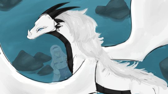
"A dragon is born to be relentless. They do not know the meaning of giving up. If they give their heart to you it's a sign of undying loyalty: and of a trust that will kill them if you break it."
#the mighty extra: one girl changes the world#the mighty extra#Fian Hylde#i have 99+ notifs rn here for some reason and im afraid to look at why#so anyways here's the prettiest dragon of the 3 dragon bois in TME!!!#tried to capture how the creator drew him but i made a tiny few alterations for my drawing sanity#i have so many sketches for this manga created already and im proud all of them ngl#i can feel my skills improving to a point im happy with bc of this manga and it makes me !!! to see#this is the only one ive managed to color fully atm (mostly bc ive been on vacay/am now sick TwT) but i hope to finish + post the others as#i go!!! because im very well aware of the fact im slow but man do i wanna make a hell of a lot more content for this manga i do i do#and you can bet i wanna draw fanart for like 99% of the cast#if not everyone#because honestly i don't think there's a single character that's hateable in this story#and by hateable i mean no one in this story is written disappointingly at all#like i love the depth each character gets no matter how small their role is it's honestly envious as a writer to see#also i LOVE drawing water backgrounds and i love drawing dragons so this piece was so fun ngl#hopefully tumblr doesn't wreck the quality like it does in the preview bc i really like this piece!!!
2 notes
·
View notes
Text

HEY HOMIES !!!
Here’s the big baddie 😮💨 my final for Digital Illustration I ! I was so excited to do this assignment when I first heard about it in Week 1, I had kinda planned from the start for it to be an Aiah and Polor piece since I can’t get their dynamic outta my head. Came back to an old rendering style I haven’t touched in ages and really tried to push the color palette this time around (I learned about gradient maps ! They’re super cool !!) In the end, I think there’s a lot about it I wouldn’t change at all. This is honestly one of my best pieces if I’d have to judge, haha.
I’m super pleased with the finished version even though it drained every ounce of my life force <3 I now vanish to pursue more back-breaking projects
#enthusiasm at its best#original character#aiah#buttoncraft#polor#character design#digital illustration#minecraft oc#ain’t got nothin else to say about this it killed me is all#it’s so so sexy tho i’ll be sweet and loving to my art#everyone in class kept going on and on about how polor’s got the anime villain vibe going on and i went Yeah Where Do U Think I Got It From#tbh i did it without an exact ref but someone else in the class did a tokyo ghoul card and it reminds me a lot of kaneki’s hand thing#i’m rly obsessed with this palette tho it’s so … it’s so hot listen#im so crazy over their hair colors and how well it worked out im gonnaTRHWO UP#but no fr this piece rly made me want to quit school LMAOOO which i guess isn’t good but#i was working on it literally days on end and wasn’t finished even when i had to turn it in like 2 minutes before the deadline#i just refined it a bit on my own time bc i actually love it that much#hehe hoohoo so anyways more hw posts soon but hopefully they’ll be inchresting ! i’ve got my background to post of aiah’s hometown#concept art I is already killing me 👍 but we’re good#we know it’s life drawing IV it can die
37 notes
·
View notes
Text
Michel illbleed but I hit her design with the sydneyfication beam
#I watched a review on this game and im a bit obsessed with it#its so goofysilly and i respect goofysilliness#my art#syd's art#illbleed#im in a bit of an art rut rn :( i can only draw simple character pieces </3#hopefully more elaborate art soon? I'm workin on a painting for school that i like so i might show it if i like how it turns out YAYAYAY
35 notes
·
View notes
Text
[uses the word 'image' five hundred thousand times]
#just me hi#[just kind of stares at it for a bit]#[ignores it anyway]#hbvasfhvhsvf#i am a one-word at a time kind of pal. can only have One descriptor at a time. that descriptor is Image#/anyway i gotta stop looking at that screenshot bc it's doing unscientific things to my brain hfvbahf#i might change my computer pfp to the guy with the spagetti. i literally#i [grabbing and shaking gesture]‚ ya know what i mean :)#why am i talking about it so much? it is making my brain produce Chemicals! that is all we know at this time. no more questions loll#//now i am Goooing to finish this piece- what was i working on actually#how did i forget hfvbsh#ah yes. ref#now i'll finish this ref at some point‚ hopefully today :>#//suddenly it's very important to me that you know what it sounds like to me when i'm in text form#in my head its like a silly faux high-pitched voice with ridiculous highs and lows in pitch but never really dropping further than an octav#like. how do i explain that this is the Silly Voice i use when i haven't eaten in 10 hours and i'm trying to make my siblings laugh#//anyway it's almost one a.m.!! i have very important person things to do. such as.. drawing :) and sleeping i guess‚ but mostly drawing :3#so Boo! see you !!
3 notes
·
View notes
Last Seen Blogs
evangelosyyc
EVANGELOS_YYC

princesa-de-la-magia-antigua
Isabella

sbtau14589
無標題

recklessmindd
heavy heart, messy soul, reckless mind