#html – Colspan all columns
Explore tagged Tumblr posts
Visit Tumblr Blog
Explore Tumblr blogs with no restrictions, modern design and the best experience.
Last Seen Tumblr Blogs


Fun Fact
Tumblr.com is the 103rd most visited website in the world.
Text
html – Colspan all columns
Warning: as mentioned in the comments below this is actually the same as colspan=100. Hence, this solution will break for tables with css table-layout: fixed, or more than 100 columns.
I have IE 7.0, Firefox 3.0 and Chrome 1.0
The colspan=0 attribute in a TD is NOT spanning across all TDs in any of the above browsers.
Maybe not recommended as proper markup practice, but if you give a higher colspan value than the total possible no. of columns in other rows, then the TD would span all the columns.
0 notes
Text
Designing for the Unexpected – A List Apart
I’m not sure when I first heard this quote, but it’s something that has stayed with me over the years. How do you create services for situations you can’t imagine? Or design products that work on devices yet to be invented? Article Continues Below
Flash, Photoshop, and responsive design#section2
When I first started designing websites, my go-to software was Photoshop. I created a 960px canvas and set about creating a layout that I would later drop content in. The development phase was about attaining pixel-perfect accuracy using fixed widths, fixed heights, and absolute positioning. Ethan Marcotte’s talk at An Event Apart and subsequent article “Responsive Web Design” in A List Apart in 2010 changed all this. I was sold on responsive design as soon as I heard about it, but I was also terrified. The pixel-perfect designs full of magic numbers that I had previously prided myself on producing were no longer good enough. The fear wasn’t helped by my first experience with responsive design. My first project was to take an existing fixed-width website and make it responsive. What I learned the hard way was that you can’t just add responsiveness at the end of a project. To create fluid layouts, you need to plan throughout the design phase. A new way to design#section3 Designing responsive or fluid sites has always been about removing limitations, producing content that can be viewed on any device. It relies on the use of percentage-based layouts, which I initially achieved with native CSS and utility classes: .column-span-6 { width: 49%; float: left; margin-right: 0.5%; margin-left: 0.5%; } .column-span-4 { width: 32%; float: left; margin-right: 0.5%; margin-left: 0.5%; } .column-span-3 { width: 24%; float: left; margin-right: 0.5%; margin-left: 0.5%; } Then with Sass so I could take advantage of @includes to re-use repeated blocks of code and move back to more semantic markup: .logo { @include colSpan(6); } .search { @include colSpan(3); } .social-share { @include colSpan(3); } Media queries#section4 The second ingredient for responsive design is media queries. Without them, content would shrink to fit the available space regardless of whether that content remained readable (The exact opposite problem occurred with the introduction of a mobile-first approach).
Components becoming too small at mobile breakpoints Media queries prevented this by allowing us to add breakpoints where the design could adapt. Like most people, I started out with three breakpoints: one for desktop, one for tablets, and one for mobile. Over the years, I added more and more for phablets, wide screens, and so on. For years, I happily worked this way and improved both my design and front-end skills in the process. The only problem I encountered was making changes to content, since with our Sass grid system in place, there was no way for the site owners to add content without amending the markup—something a small business owner might struggle with. This is because each row in the grid was defined using a div as a container. Adding content meant creating new row markup, which requires a level of HTML knowledge. Row markup was a staple of early responsive design, present in all the widely used frameworks like Bootstrap and Skeleton. 1 of 7 2 of 7 3 of 7 4 of 7 5 of 7 6 of 7 7 of 7
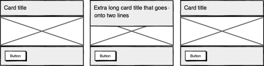
Components placed in the rows of a Sass grid Another problem arose as I moved from a design agency building websites for small- to medium-sized businesses, to larger in-house teams where I worked across a suite of related sites. In those roles I started to work much more with reusable components. Our reliance on media queries resulted in components that were tied to common viewport sizes. If the goal of component libraries is reuse, then this is a real problem because you can only use these components if the devices you’re designing for correspond to the viewport sizes used in the pattern library—in the process not really hitting that “devices that don’t yet exist” goal. Then there’s the problem of space. Media queries allow components to adapt based on the viewport size, but what if I put a component into a sidebar, like in the figure below?

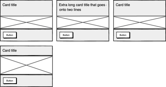
Components responding to the viewport width with media queries Container queries: our savior or a false dawn?#section5 Container queries have long been touted as an improvement upon media queries, but at the time of writing are unsupported in most browsers. There are JavaScript workarounds, but they can create dependency and compatibility issues. The basic theory underlying container queries is that elements should change based on the size of their parent container and not the viewport width, as seen in the following illustrations.
Components responding to their parent container with container queries One of the biggest arguments in favor of container queries is that they help us create components or design patterns that are truly reusable because they can be picked up and placed anywhere in a layout. This is an important step in moving toward a form of component-based design that works at any size on any device. In other words, responsive components to replace responsive layouts. Container queries will help us move from designing pages that respond to the browser or device size to designing components that can be placed in a sidebar or in the main content, and respond accordingly. My concern is that we are still using layout to determine when a design needs to adapt. This approach will always be restrictive, as we will still need pre-defined breakpoints. For this reason, my main question with container queries is, How would we decide when to change the CSS used by a component? A component library removed from context and real content is probably not the best place for that decision. As the diagrams below illustrate, we can use container queries to create designs for specific container widths, but what if I want to change the design based on the image size or ratio?
Cards responding to their parent container with container queries

Cards responding based on their own content In this example, the dimensions of the container are not what should dictate the design; rather, the image is. It’s hard to say for sure whether container queries will be a success story until we have solid cross-browser support for them. Responsive component libraries would definitely evolve how we design and would improve the possibilities for reuse and design at scale. But maybe we will always need to adjust these components to suit our content. CSS is changing#section6 Whilst the container query debate rumbles on, there have been numerous advances in CSS that change the way we think about design. The days of fixed-width elements measured in pixels and floated div elements used to cobble layouts together are long gone, consigned to history along with table layouts. Flexbox and CSS Grid have revolutionized layouts for the web. We can now create elements that wrap onto new rows when they run out of space, not when the device changes. .wrapper { display: grid; grid-template-columns: repeat(auto-fit, 450px); gap: 10px; } The repeat() function paired with auto-fit or auto-fill allows us to specify how much space each column should use while leaving it up to the browser to decide when to spill the columns onto a new line. Similar things can be achieved with Flexbox, as elements can wrap over multiple rows and “flex” to fill available space. .wrapper { display: flex; flex-wrap: wrap; justify-content: space-between; } .child { flex-basis: 32%; margin-bottom: 20px; } The biggest benefit of all this is you don’t need to wrap elements in container rows. Without rows, content isn’t tied to page markup in quite the same way, allowing for removals or additions of content without additional development.

A traditional Grid layout without the usual row containers This is a big step forward when it comes to creating designs that allow for evolving content, but the real game changer for flexible designs is CSS Subgrid. Remember the days of crafting perfectly aligned interfaces, only for the customer to add an unbelievably long header almost as soon as they’re given CMS access, like the illustration below?
Cards unable to respond to a sibling’s content changes Subgrid allows elements to respond to adjustments in their own content and in the content of sibling elements, helping us create designs more resilient to change.
Cards responding to content in sibling cards .wrapper { display: grid; grid-template-columns: repeat(auto-fit, minmax(150px, 1fr)); grid-template-rows: auto 1fr auto; gap: 10px; } .sub-grid { display: grid; grid-row: span 3; grid-template-rows: subgrid; /* sets rows to parent grid */ } CSS Grid allows us to separate layout and content, thereby enabling flexible designs. Meanwhile, Subgrid allows us to create designs that can adapt in order to suit morphing content. Subgrid at the time of writing is only supported in Firefox but the above code can be implemented behind an @supports feature query. Intrinsic layouts #section7 I’d be remiss not to mention intrinsic layouts, the term created by Jen Simmons to describe a mixture of new and old CSS features used to create layouts that respond to available space. Responsive layouts have flexible columns using percentages. Intrinsic layouts, on the other hand, use the fr unit to create flexible columns that won’t ever shrink so much that they render the content illegible. fr units is a way to say I want you to distribute the extra space in this way, but…don’t ever make it smaller than the content that’s inside of it. —Jen Simmons, “Designing Intrinsic Layouts” Intrinsic layouts can also utilize a mixture of fixed and flexible units, allowing the content to dictate the space it takes up.

Slide from “Designing Intrinsic Layouts” by Jen Simmons What makes intrinsic design stand out is that it not only creates designs that can withstand future devices but also helps scale design without losing flexibility. Components and patterns can be lifted and reused without the prerequisite of having the same breakpoints or the same amount of content as in the previous implementation. We can now create designs that adapt to the space they have, the content within them, and the content around them. With an intrinsic approach, we can construct responsive components without depending on container queries. Another 2010 moment?#section8 This intrinsic approach should in my view be every bit as groundbreaking as responsive web design was ten years ago. For me, it’s another “everything changed” moment. But it doesn’t seem to be moving quite as fast; I haven’t yet had that same career-changing moment I had with responsive design, despite the widely shared and brilliant talk that brought it to my attention. One reason for that could be that I now work in a large organization, which is quite different from the design agency role I had in 2010. In my agency days, every new project was a clean slate, a chance to try something new. Nowadays, projects use existing tools and frameworks and are often improvements to existing websites with an existing codebase. Another could be that I feel more prepared for change now. In 2010 I was new to design in general; the shift was frightening and required a lot of learning. Also, an intrinsic approach isn’t exactly all-new; it’s about using existing skills and existing CSS knowledge in a different way. You can’t framework your way out of a content problem#section9 Another reason for the slightly slower adoption of intrinsic design could be the lack of quick-fix framework solutions available to kick-start the change. Responsive grid systems were all over the place ten years ago. With a framework like Bootstrap or Skeleton, you had a responsive design template at your fingertips. Intrinsic design and frameworks do not go hand in hand quite so well because the benefit of having a selection of units is a hindrance when it comes to creating layout templates. The beauty of intrinsic design is combining different units and experimenting with techniques to get the best for your content. And then there are design tools. We probably all, at some point in our careers, used Photoshop templates for desktop, tablet, and mobile devices to drop designs in and show how the site would look at all three stages. How do you do that now, with each component responding to content and layouts flexing as and when they need to? This type of design must happen in the browser, which personally I’m a big fan of. The debate about “whether designers should code” is another that has rumbled on for years. When designing a digital product, we should, at the very least, design for a best- and worst-case scenario when it comes to content. To do this in a graphics-based software package is far from ideal. In code, we can add longer sentences, more radio buttons, and extra tabs, and watch in real time as the design adapts. Does it still work? Is the design too reliant on the current content? Personally, I look forward to the day intrinsic design is the standard for design, when a design component can be truly flexible and adapt to both its space and content with no reliance on device or container dimensions. Content is not constant. After all, to design for the unknown or unexpected we need to account for content changes like our earlier Subgrid card example that allowed the cards to respond to adjustments to their own content and the content of sibling elements. Thankfully, there’s more to CSS than layout, and plenty of properties and values can help us put content first. Subgrid and pseudo-elements like ::first-line and ::first-letter help to separate design from markup so we can create designs that allow for changes. Instead of old markup hacks like this— First line of text with different styling... —we can target content based on where it appears. .element::first-line { font-size: 1.4em; } .element::first-letter { color: red; } Much bigger additions to CSS include logical properties, which change the way we construct designs using logical dimensions (start and end) instead of physical ones (left and right), something CSS Grid also does with functions like min(), max(), and clamp(). This flexibility allows for directional changes according to content, a common requirement when we need to present content in multiple languages. In the past, this was often achieved with Sass mixins but was often limited to switching from left-to-right to right-to-left orientation. In the Sass version, directional variables need to be set. $direction: rtl; $opposite-direction: ltr; $start-direction: right; $end-direction: left; These variables can be used as values— body { direction: $direction; text-align: $start-direction; } —or as properties. margin-#{$end-direction}: 10px; padding-#{$start-direction}: 10px; However, now we have native logical properties, removing the reliance on both Sass (or a similar tool) and pre-planning that necessitated using variables throughout a codebase. These properties also start to break apart the tight coupling between a design and strict physical dimensions, creating more flexibility for changes in language and in direction. margin-block-end: 10px; padding-block-start: 10px; There are also native start and end values for properties like text-align, which means we can replace text-align: right with text-align: start. Like the earlier examples, these properties help to build out designs that aren’t constrained to one language; the design will reflect the content’s needs. Read the full article
0 notes
Text
Designing for the Unexpected
I’m not sure when I first heard this quote, but it’s something that has stayed with me over the years. How do you create services for situations you can’t imagine? Or design products that work on devices yet to be invented?
Flash, Photoshop, and responsive design
When I first started designing websites, my go-to software was Photoshop. I created a 960px canvas and set about creating a layout that I would later drop content in. The development phase was about attaining pixel-perfect accuracy using fixed widths, fixed heights, and absolute positioning.
Ethan Marcotte’s talk at An Event Apart and subsequent article “Responsive Web Design” in A List Apart in 2010 changed all this. I was sold on responsive design as soon as I heard about it, but I was also terrified. The pixel-perfect designs full of magic numbers that I had previously prided myself on producing were no longer good enough.
The fear wasn’t helped by my first experience with responsive design. My first project was to take an existing fixed-width website and make it responsive. What I learned the hard way was that you can’t just add responsiveness at the end of a project. To create fluid layouts, you need to plan throughout the design phase.
A new way to design
Designing responsive or fluid sites has always been about removing limitations, producing content that can be viewed on any device. It relies on the use of percentage-based layouts, which I initially achieved with native CSS and utility classes:
.column-span-6 { width: 49%; float: left; margin-right: 0.5%; margin-left: 0.5%; } .column-span-4 { width: 32%; float: left; margin-right: 0.5%; margin-left: 0.5%; } .column-span-3 { width: 24%; float: left; margin-right: 0.5%; margin-left: 0.5%; }
Then with Sass so I could take advantage of @includes to re-use repeated blocks of code and move back to more semantic markup:
.logo { @include colSpan(6); } .search { @include colSpan(3); } .social-share { @include colSpan(3); }
Media queries
The second ingredient for responsive design is media queries. Without them, content would shrink to fit the available space regardless of whether that content remained readable (The exact opposite problem occurred with the introduction of a mobile-first approach).

Components becoming too small at mobile breakpoints
Media queries prevented this by allowing us to add breakpoints where the design could adapt. Like most people, I started out with three breakpoints: one for desktop, one for tablets, and one for mobile. Over the years, I added more and more for phablets, wide screens, and so on.
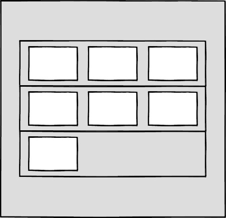
For years, I happily worked this way and improved both my design and front-end skills in the process. The only problem I encountered was making changes to content, since with our Sass grid system in place, there was no way for the site owners to add content without amending the markup—something a small business owner might struggle with. This is because each row in the grid was defined using a div as a container. Adding content meant creating new row markup, which requires a level of HTML knowledge.
Row markup was a staple of early responsive design, present in all the widely used frameworks like Bootstrap and Skeleton.
<section class="row"> <div class="column-span-4">1 of 7</div> <div class="column-span-4">2 of 7</div> <div class="column-span-4">3 of 7</div> </section> <section class="row"> <div class="column-span-4">4 of 7</div> <div class="column-span-4">5 of 7</div> <div class="column-span-4">6 of 7</div> </section> <section class="row"> <div class="column-span-4">7 of 7</div> </section>

Components placed in the rows of a Sass grid
Another problem arose as I moved from a design agency building websites for small- to medium-sized businesses, to larger in-house teams where I worked across a suite of related sites. In those roles I started to work much more with reusable components.
Our reliance on media queries resulted in components that were tied to common viewport sizes. If the goal of component libraries is reuse, then this is a real problem because you can only use these components if the devices you’re designing for correspond to the viewport sizes used in the pattern library—in the process not really hitting that “devices that don’t yet exist” goal.
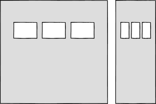
Then there’s the problem of space. Media queries allow components to adapt based on the viewport size, but what if I put a component into a sidebar, like in the figure below?

Components responding to the viewport width with media queries
Container queries: our savior or a false dawn?
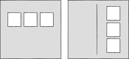
Container queries have long been touted as an improvement upon media queries, but at the time of writing are unsupported in most browsers. There are JavaScript workarounds, but they can create dependency and compatibility issues. The basic theory underlying container queries is that elements should change based on the size of their parent container and not the viewport width, as seen in the following illustrations.

Components responding to their parent container with container queries
One of the biggest arguments in favor of container queries is that they help us create components or design patterns that are truly reusable because they can be picked up and placed anywhere in a layout. This is an important step in moving toward a form of component-based design that works at any size on any device.
In other words, responsive components to replace responsive layouts.
Container queries will help us move from designing pages that respond to the browser or device size to designing components that can be placed in a sidebar or in the main content, and respond accordingly.
My concern is that we are still using layout to determine when a design needs to adapt. This approach will always be restrictive, as we will still need pre-defined breakpoints. For this reason, my main question with container queries is, How would we decide when to change the CSS used by a component?
A component library removed from context and real content is probably not the best place for that decision.
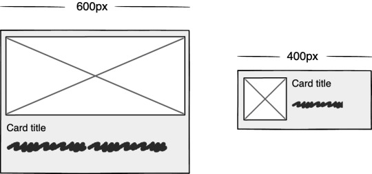
As the diagrams below illustrate, we can use container queries to create designs for specific container widths, but what if I want to change the design based on the image size or ratio?

Cards responding to their parent container with container queries
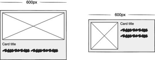
Cards responding based on their own content
In this example, the dimensions of the container are not what should dictate the design; rather, the image is.
It’s hard to say for sure whether container queries will be a success story until we have solid cross-browser support for them. Responsive component libraries would definitely evolve how we design and would improve the possibilities for reuse and design at scale. But maybe we will always need to adjust these components to suit our content.
CSS is changing
Whilst the container query debate rumbles on, there have been numerous advances in CSS that change the way we think about design. The days of fixed-width elements measured in pixels and floated div elements used to cobble layouts together are long gone, consigned to history along with table layouts. Flexbox and CSS Grid have revolutionized layouts for the web. We can now create elements that wrap onto new rows when they run out of space, not when the device changes.
.wrapper { display: grid; grid-template-columns: repeat(auto-fit, 450px); gap: 10px; }
The repeat() function paired with auto-fit or auto-fill allows us to specify how much space each column should use while leaving it up to the browser to decide when to spill the columns onto a new line. Similar things can be achieved with Flexbox, as elements can wrap over multiple rows and “flex” to fill available space.
.wrapper { display: flex; flex-wrap: wrap; justify-content: space-between; } .child { flex-basis: 32%; margin-bottom: 20px; }
The biggest benefit of all this is you don’t need to wrap elements in container rows. Without rows, content isn’t tied to page markup in quite the same way, allowing for removals or additions of content without additional development.
A traditional Grid layout without the usual row containers
This is a big step forward when it comes to creating designs that allow for evolving content, but the real game changer for flexible designs is CSS Subgrid.
Remember the days of crafting perfectly aligned interfaces, only for the customer to add an unbelievably long header almost as soon as they're given CMS access, like the illustration below?

Cards unable to respond to a sibling’s content changes
Subgrid allows elements to respond to adjustments in their own content and in the content of sibling elements, helping us create designs more resilient to change.

Cards responding to content in sibling cards
.wrapper { display: grid; grid-template-columns: repeat(auto-fit, minmax(150px, 1fr)); grid-template-rows: auto 1fr auto; gap: 10px; } .sub-grid { display: grid; grid-row: span 3; grid-template-rows: subgrid; /* sets rows to parent grid */ }
CSS Grid allows us to separate layout and content, thereby enabling flexible designs. Meanwhile, Subgrid allows us to create designs that can adapt in order to suit morphing content. Subgrid at the time of writing is only supported in Firefox but the above code can be implemented behind an @supports feature query.
Intrinsic layouts
I’d be remiss not to mention intrinsic layouts, the term created by Jen Simmons to describe a mixture of new and old CSS features used to create layouts that respond to available space.
Responsive layouts have flexible columns using percentages. Intrinsic layouts, on the other hand, use the fr unit to create flexible columns that won’t ever shrink so much that they render the content illegible.
fr units is a way to say I want you to distribute the extra space in this way, but...don’t ever make it smaller than the content that’s inside of it.
—Jen Simmons, “Designing Intrinsic Layouts”
Intrinsic layouts can also utilize a mixture of fixed and flexible units, allowing the content to dictate the space it takes up.
Slide from “Designing Intrinsic Layouts” by Jen Simmons
What makes intrinsic design stand out is that it not only creates designs that can withstand future devices but also helps scale design without losing flexibility. Components and patterns can be lifted and reused without the prerequisite of having the same breakpoints or the same amount of content as in the previous implementation.
We can now create designs that adapt to the space they have, the content within them, and the content around them. With an intrinsic approach, we can construct responsive components without depending on container queries.
Another 2010 moment?
This intrinsic approach should in my view be every bit as groundbreaking as responsive web design was ten years ago. For me, it’s another “everything changed” moment.
But it doesn’t seem to be moving quite as fast; I haven’t yet had that same career-changing moment I had with responsive design, despite the widely shared and brilliant talk that brought it to my attention.
One reason for that could be that I now work in a large organization, which is quite different from the design agency role I had in 2010. In my agency days, every new project was a clean slate, a chance to try something new. Nowadays, projects use existing tools and frameworks and are often improvements to existing websites with an existing codebase.
Another could be that I feel more prepared for change now. In 2010 I was new to design in general; the shift was frightening and required a lot of learning. Also, an intrinsic approach isn’t exactly all-new; it’s about using existing skills and existing CSS knowledge in a different way.
You can’t framework your way out of a content problem
Another reason for the slightly slower adoption of intrinsic design could be the lack of quick-fix framework solutions available to kick-start the change.
Responsive grid systems were all over the place ten years ago. With a framework like Bootstrap or Skeleton, you had a responsive design template at your fingertips.
Intrinsic design and frameworks do not go hand in hand quite so well because the benefit of having a selection of units is a hindrance when it comes to creating layout templates. The beauty of intrinsic design is combining different units and experimenting with techniques to get the best for your content.
And then there are design tools. We probably all, at some point in our careers, used Photoshop templates for desktop, tablet, and mobile devices to drop designs in and show how the site would look at all three stages.
How do you do that now, with each component responding to content and layouts flexing as and when they need to? This type of design must happen in the browser, which personally I’m a big fan of.
The debate about “whether designers should code” is another that has rumbled on for years. When designing a digital product, we should, at the very least, design for a best- and worst-case scenario when it comes to content. To do this in a graphics-based software package is far from ideal. In code, we can add longer sentences, more radio buttons, and extra tabs, and watch in real time as the design adapts. Does it still work? Is the design too reliant on the current content?
Personally, I look forward to the day intrinsic design is the standard for design, when a design component can be truly flexible and adapt to both its space and content with no reliance on device or container dimensions.
Content first
Content is not constant. After all, to design for the unknown or unexpected we need to account for content changes like our earlier Subgrid card example that allowed the cards to respond to adjustments to their own content and the content of sibling elements.
Thankfully, there’s more to CSS than layout, and plenty of properties and values can help us put content first. Subgrid and pseudo-elements like ::first-line and ::first-letter help to separate design from markup so we can create designs that allow for changes.
Instead of old markup hacks like this—
<p> <span class="first-line">First line of text with different styling</span>... </p>
—we can target content based on where it appears.
.element::first-line { font-size: 1.4em; } .element::first-letter { color: red; }
Much bigger additions to CSS include logical properties, which change the way we construct designs using logical dimensions (start and end) instead of physical ones (left and right), something CSS Grid also does with functions like min(), max(), and clamp().
This flexibility allows for directional changes according to content, a common requirement when we need to present content in multiple languages. In the past, this was often achieved with Sass mixins but was often limited to switching from left-to-right to right-to-left orientation.
In the Sass version, directional variables need to be set.
$direction: rtl; $opposite-direction: ltr; $start-direction: right; $end-direction: left;
These variables can be used as values—
body { direction: $direction; text-align: $start-direction; }
—or as properties.
margin-#{$end-direction}: 10px; padding-#{$start-direction}: 10px;
However, now we have native logical properties, removing the reliance on both Sass (or a similar tool) and pre-planning that necessitated using variables throughout a codebase. These properties also start to break apart the tight coupling between a design and strict physical dimensions, creating more flexibility for changes in language and in direction.
margin-block-end: 10px; padding-block-start: 10px;
There are also native start and end values for properties like text-align, which means we can replace text-align: right with text-align: start.
Like the earlier examples, these properties help to build out designs that aren’t constrained to one language; the design will reflect the content’s needs.

Fixed and fluid
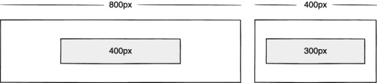
We briefly covered the power of combining fixed widths with fluid widths with intrinsic layouts. The min() and max() functions are a similar concept, allowing you to specify a fixed value with a flexible alternative.
For min() this means setting a fluid minimum value and a maximum fixed value.
.element { width: min(50%, 300px); }

The element in the figure above will be 50% of its container as long as the element’s width doesn’t exceed 300px.
For max() we can set a flexible max value and a minimum fixed value.
.element { width: max(50%, 300px); }
Now the element will be 50% of its container as long as the element’s width is at least 300px. This means we can set limits but allow content to react to the available space.
The clamp() function builds on this by allowing us to set a preferred value with a third parameter. Now we can allow the element to shrink or grow if it needs to without getting to a point where it becomes unusable.
.element { width: clamp(300px, 50%, 600px); }
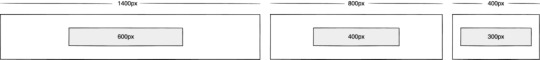
This time, the element’s width will be 50% (the preferred value) of its container but never less than 300px and never more than 600px.
With these techniques, we have a content-first approach to responsive design. We can separate content from markup, meaning the changes users make will not affect the design. We can start to future-proof designs by planning for unexpected changes in language or direction. And we can increase flexibility by setting desired dimensions alongside flexible alternatives, allowing for more or less content to be displayed correctly.
Situation first
Thanks to what we’ve discussed so far, we can cover device flexibility by changing our approach, designing around content and space instead of catering to devices. But what about that last bit of Jeffrey Zeldman’s quote, “...situations you haven’t imagined”?
It’s a very different thing to design for someone seated at a desktop computer as opposed to someone using a mobile phone and moving through a crowded street in glaring sunshine. Situations and environments are hard to plan for or predict because they change as people react to their own unique challenges and tasks.
This is why choice is so important. One size never fits all, so we need to design for multiple scenarios to create equal experiences for all our users.
Thankfully, there is a lot we can do to provide choice.
Responsible design
“There are parts of the world where mobile data is prohibitively expensive, and where there is little or no broadband infrastructure.”
“I Used the Web for a Day on a 50 MB Budget”
Chris Ashton
One of the biggest assumptions we make is that people interacting with our designs have a good wifi connection and a wide screen monitor. But in the real world, our users may be commuters traveling on trains or other forms of transport using smaller mobile devices that can experience drops in connectivity. There is nothing more frustrating than a web page that won’t load, but there are ways we can help users use less data or deal with sporadic connectivity.
The srcset attribute allows the browser to decide which image to serve. This means we can create smaller ‘cropped’ images to display on mobile devices in turn using less bandwidth and less data.
<img src="image-file.jpg" srcset="large.jpg 1024w, medium.jpg 640w, small.jpg 320w" alt="Image alt text" />
The preload attribute can also help us to think about how and when media is downloaded. It can be used to tell a browser about any critical assets that need to be downloaded with high priority, improving perceived performance and the user experience.
<link rel="stylesheet" href="style.css"> <!--Standard stylesheet markup--> <link rel="preload" href="style.css" as="style"> <!--Preload stylesheet markup-->
There’s also native lazy loading, which indicates assets that should only be downloaded when they are needed.
<img src="image.png" loading="lazy" alt="…">
With srcset, preload, and lazy loading, we can start to tailor a user’s experience based on the situation they find themselves in. What none of this does, however, is allow the user themselves to decide what they want downloaded, as the decision is usually the browser’s to make.
So how can we put users in control?
The return of media queries
Media queries have always been about much more than device sizes. They allow content to adapt to different situations, with screen size being just one of them.
We’ve long been able to check for media types like print and speech and features such as hover, resolution, and color. These checks allow us to provide options that suit more than one scenario; it’s less about one-size-fits-all and more about serving adaptable content.
As of this writing, the Media Queries Level 5 spec is still under development. It introduces some really exciting queries that in the future will help us design for multiple other unexpected situations.
For example, there’s a light-level feature that allows you to modify styles if a user is in sunlight or darkness. Paired with custom properties, these features allow us to quickly create designs or themes for specific environments.
@media (light-level: normal) { --background-color: #fff; --text-color: #0b0c0c; } @media (light-level: dim) { --background-color: #efd226; --text-color: #0b0c0c; }
Another key feature of the Level 5 spec is personalization. Instead of creating designs that are the same for everyone, users can choose what works for them. This is achieved by using features like prefers-reduced-data, prefers-color-scheme, and prefers-reduced-motion, the latter two of which already enjoy broad browser support. These features tap into preferences set via the operating system or browser so people don’t have to spend time making each site they visit more usable.
Media queries like this go beyond choices made by a browser to grant more control to the user.
Expect the unexpected
In the end, the one thing we should always expect is for things to change. Devices in particular change faster than we can keep up, with foldable screens already on the market.
We can’t design the same way we have for this ever-changing landscape, but we can design for content. By putting content first and allowing that content to adapt to whatever space surrounds it, we can create more robust, flexible designs that increase the longevity of our products.
A lot of the CSS discussed here is about moving away from layouts and putting content at the heart of design. From responsive components to fixed and fluid units, there is so much more we can do to take a more intrinsic approach. Even better, we can test these techniques during the design phase by designing in-browser and watching how our designs adapt in real-time.
When it comes to unexpected situations, we need to make sure our products are usable when people need them, whenever and wherever that might be. We can move closer to achieving this by involving users in our design decisions, by creating choice via browsers, and by giving control to our users with user-preference-based media queries.
Good design for the unexpected should allow for change, provide choice, and give control to those we serve: our users themselves.
Designing for the Unexpected published first on https://deskbysnafu.tumblr.com/
0 notes
Quote
The internet has been around for a long while, and over time we’ve changed the way we think about web design. Many old techniques and ways of doing things have gotten phased out as newer and better alternatives have been created, and we say that they have been deprecated. Deprecated. It’s a word we use and see often. But have you stopped to think about what it means in practice? What are some examples of deprecated web elements, and why don’t we use them any more? What is deprecation? In everyday English, to “deprecate” something is to express disapproval of it. For example, you might be inclined to deprecate a news story you don’t like. When we’re speaking in a technical sense, however, deprecation is the discouragement of use for an old feature. Often, the old feature remains functional in the interests of backward compatibility (so legacy projects don’t break). In essence, this means that you can technically still do things the legacy way. It’ll probably still work, but maybe it’s better to use the new way. Another common scenario is when technical elements get deprecated as a prelude to their future removal (which we sometimes call “sunsetting” a feature). This provides everybody time to transition from the old way of working to the new system before the transition happens. If you follow WordPress at all, they recently did this with their radically new Gutenberg editor. They shipped it, but kept an option available to revert to the “classic” editor so users could take time to transition. Someday, the “classic” editor will likely be removed, leaving Gutenberg as the only option for editing posts. In other words, WordPress is sunsetting the “classic” editor. That’s merely one example. We can also look at HTML features that were once essential staples but became deprecated at some point in time. Why do HTML elements get deprecated? Over the years, our way of thinking about HTML has evolved. Originally, it was an all-purpose markup language for displaying and styling content online. Over time, as external stylesheets became more of a thing, it began to make more sense to think about web development differently — as a separation of concerns where HTML defines the content of a page, and CSS handles the presentation of it. This separation of style and content brings numerous benefits: Avoiding duplication: Repeating code for every instance of red-colored text on a page is unwieldy and inefficient when you can have a single CSS class to handle all of it at once. Ease of management: With all of the presentation controlled from a central stylesheet, you can make site-wide changes with little effort. Readability: When viewing a website’s source, it’s a lot easier to understand the code that has been neatly abstracted into separate files for content and style. Caching: The vast majority of websites have consistent styling across all pages, so why make the browser download those style definitions again and again? Putting the presentation code in a dedicated stylesheet allows for caching and reuse to save bandwidth. Developer specialization: Big website projects may have multiple designers and developers working on them, each with their individual areas of expertise. Allowing a CSS specialist to work on their part of the project in their own separate files can be a lot easier for everybody involved. User options: Separating styling from content can allow the developer to easily offer display options to the end user (the increasingly popular ‘night mode’ is a good example of this) or different display modes for accessibility. Responsiveness and device independence: separating the code for content and visual presentation makes it much easier to build websites that display in very different ways on different screen resolutions. However, in the early days of HTML there was a fair amount of markup designed to control the look of the page right alongside the content. You might see code like this: Hello world! …all of which is now deprecated due to the aforementioned separation of concerns. Which HTML elements are now deprecated? As of the release of HTML5, use of the following elements is discouraged: (use instead) (use ) (use CSS font properties, like font-size, font-family, etc.) (use CSS font-size) (use CSS text-align) (use ) (use CSS font properties) (use ) (not needed any more) (not needed any more) (not needed any more) (use text-decoration: line-through in CSS) (use text-decoration: line-through in CSS) (use ) There is also a long list of deprecated attributes, including many elements that continue to be otherwise valid (such as the align attribute used by many elements). The W3C has the full list of deprecated attributes. Why don’t we use table for layouts any more? Before CSS became widespread, it was common to see website layouts constructed with the element. While the element is not deprecated, using them for layout is strongly discouraged. In fact, pretty much all HTML table attributes that were used for layouts have been deprecated, such as cellpadding, bgcolor and width. At one time, tables seemed to be a pretty good way to lay out a web page. We could make rows and columns any size we wanted, meaning we could put everything inside. Headers, navigation, footers… you name it! That would create a lot of website code that looked like this: Blah blah blah! There are numerous problems with this approach: Complicated layouts often end up with tables nested inside other tables, which creates a headache-inducing mess of code. Just look at the source of any email newsletter. Accessibility is problematic, as screen readers tend to get befuddled by the overuse of tables. Tables are slow to render, as the browser waits for the entire table to download before showing it on the screen. Responsible and mobile-friendly layouts are very difficult to create with a table-based layout. We still have not found a silver bullet for responsive tables (though many clever ideas exist). Continuing the theme of separating content and presentation, CSS is a much more efficient way to create the visual layout without cluttering the code of the main HTML document. So, when should we use? Actual tabular data, of course! If you need to display a list of baseball scores, statistics or anything else in that vein, is your friend. Why do we still use and tags? “Hang on just a moment,” you might say. “How come bold and italic HTML tags are still considered OK? Aren’t those forms of visual styling that ought to be handled with CSS?” It’s a good question, and one that seems difficult to answer when we consider that other tags like and are deprecated. What’s going on here? The short and simple answer is that and would probably have been deprecated if they weren’t so widespread and useful. CSS alternatives seem somewhat unwieldy by comparison: .emphasis { font-weight:bold } This is a bold word! This is a bold word! This is a bold word! The long answer is that these tags have now been assigned some semantic meaning, giving them value beyond pure visual presentation and allowing designers to use them to confer additional information about the text they contain. This is important because it helps screen readers and search crawlers better understand the purpose of the content wrapped in these tags. We might italicize a word for several reasons, like adding emphasis, invoking the title of a creative work, referring to a scientific name, and so on. How does a screen reader know whether to place spoken emphasis on the word or not? and have companions, including , and . Together, these tags make the meaning context of text clearer: is for drawing attention to text without giving it any additional importance. It’s used when we want to draw attention to something without changing the inflection of the text when it is read by a screen reader or without adding any additional weight or meaning to the content for search engines. is a lot like but signals the importance of something. It’s the same as changing the inflection of your voice when adding emphasis on a certain word. italicizes text without given it any additional meaning or emphasis. It’s perfect for writing out something that is normally italicized, like the scientific name of an animal. is like in that it italicizes text, but it provides adds additional emphasis (hence the tag name) without adding more importance in context. (‘I’m sure I didn’t forget to feed the cat’). is what we use to refer to the title of a creative work, say a movie like The Silence of the Lambs. This way, text is styled but doesn’t affect the way the sentence would be read aloud. In general, the rule is that and are to be used only as a last resort if you can’t find anything more appropriate for your needs. This semantic meaning allows and to continue to have a place in our modern array of HTML elements and survive the deprecation that has befallen other, similar style tags. On a related note, — the underline tag — was at one time deprecated, but has since been restored in HTML5 because it has some semantic uses (such as annotating spelling errors). There are many other HTML elements that might lend styling to content, but primarily serve to provide semantic meaning to content. Mandy Michael has an excellent write-up that covers those and how they can be used (and even combined!) to make the most semantic markup possible. Undead HTML attributes Some deprecated elements are still in widespread use around the web today. After all, they still work — they’re just discouraged. This is sometimes because word hasn’t gotten around that that thing you’ve been using for ages isn’t actually the way it’s done any more. Other times, it’s due to folks who don’t see a compelling reason to change from doing something that works perfectly well. Hey, CSS-Tricks still uses the teletype element for certain reasons. One such undead HTML relic is the align attribute in otherwise valid tags, especially images. You may see tags with a border attribute, although that attribute has long been deprecated. CSS, of course, is the preferred and modern method for that kind of styling presentation. Staying up to date with deprecation is key for any web developer. Making sure your code follows the current recommendations while avoiding legacy elements is an essential best practice. It not only ensures that your site will continue to work in the long run, but that it will play nicely with the web of the future.
http://damianfallon.blogspot.com/2020/04/why-do-some-html-elements-become_4.html
0 notes
Link
The HTML tables allow web authors to arrange data like text, images, links, other tables, etc. into rows and columns of cells.
The HTML tables are created using the <table> tag in which the <tr> tag is used to create table rows and <td> tag is used to create data cells. The elements under <td> are regular and left aligned by default
EXAMPLE
<!DOCTYPE html>
<html>
<head>
<title>HTML Tables</title>
</head>
<body>
<table border = “1”>
<tr>
<td>Row 1, Column 1</td>
<td>Row 1, Column 2</td>
</tr>
<tr>
<td>Row 2, Column 1</td>
<td>Row 2, Column 2</td>
</tr>
</table>
</body>
</html>
Here, the border is an attribute of <table> tag and it is used to put a border across all the cells. If you do not need a border, then you can use border = “0”.
TABLE HEADING
Table heading can be defined using <th> tag. This tag will be put to replace <td> tag, which is used to represent actual data cell. Normally you will put your top row as table heading as shown below, otherwise you can use <th> element in any row. Headings, which are defined in <th> tag are centered and bold by default.
Example
<!DOCTYPE html>
<html>
<head>
<title>HTML Table Header</title>
</head>
<body>
<table border = “1”>
<tr>
<th>Name</th>
<th>Salary</th>
</tr>
<tr>
<td>Ramesh Raman</td>
<td>5000</td>
</tr>
<tr>
<td>Shabbir Hussein</td>
<td>7000</td>
</tr>
</table>
</body>
</html>
CELLPADDING AND CELLSPACING ATTRIBUTES
There are two attributes called cellpadding and cellspacing which you will use to adjust the white space in your table cells. The cellspacing attribute defines space between table cells, while cellpadding represents the distance between cell borders and the content within a cell.
Example
<!DOCTYPE html>
<html>
<head>
<title>HTML Table Cellpadding</title>
</head>
<body>
<table border = “1” cellpadding = “5” cellspacing = “5”>
<tr>
<th>Name</th>
<th>Salary</th>
</tr>
<tr>
<td>Ramesh Raman</td>
<td>5000</td>
</tr>
<tr>
<td>Shabbir Hussein</td>
<td>7000</td>
</tr>
</table>
</body>
</html>
COLSPAN AND ROWSPAN ATTRIBUTES
Example
<!DOCTYPE html>
<html>
<head>
<title>HTML Table Colspan/Rowspan</title>
</head>
<body>
<table border = “1”>
<tr>
<th>Column 1</th>
<th>Column 2</th>
<th>Column 3</th>
</tr>
<tr>
<td rowspan = “2”>Row 1 Cell 1</td>
<td>Row 1 Cell 2</td>
<td>Row 1 Cell 3</td>
</tr>
<tr>
<td>Row 2 Cell 2</td>
<td>Row 2 Cell 3</td>
</tr>
<tr>
<td colspan = “3”>Row 3 Cell 1</td>
</tr>
</table>
</body>
</html>
TABLES BACKGROUNDS
You can set table background using one of the following two ways −
bgcolor attribute − You can set background color for whole table or just for one cell.
background attribute − You can set background image for whole table or just for one cell.
You can also set border color also using bordercolor attribute.
Note − The bgcolor, background, and bordercolor attributes deprecated in HTML5. Do not use these attributes.
Example
<!DOCTYPE html>
<html>
<head>
<title>HTML Table Background</title>
</head>
<body>
<table border = “1” bordercolor = “green” bgcolor = “yellow”>
<tr>
<th>Column 1</th>
<th>Column 2</th>
<th>Column 3</th>
</tr>
<tr>
<td rowspan = “2”>Row 1 Cell 1</td>
<td>Row 1 Cell 2</td>
<td>Row 1 Cell 3</td>
</tr>
<tr>
<td>Row 2 Cell 2</td>
<td>Row 2 Cell 3</td>
</tr>
<tr>
<td colspan = “3”>Row 3 Cell 1</td>
</tr>
</table>
</body>
</html>
Here is an example of using background attribute. Here we will use an image available in /images directory.
<!DOCTYPE html>
<html>
<head>
<title>HTML Table Background</title>
</head>
<body>
<table border = “1” bordercolor = “green” background = “/images/test.png”>
<tr>
<th>Column 1</th>
<th>Column 2</th>
<th>Column 3</th>
</tr>
<tr>
<td rowspan = “2”>Row 1 Cell 1</td>
<td>Row 1 Cell 2</td><td>Row 1 Cell 3</td>
</tr>
<tr>
<td>Row 2 Cell 2</td>
<td>Row 2 Cell 3</td>
</tr>
<tr>
<td colspan = “3”>Row 3 Cell 1</td>
</tr>
</table>
</body>
</html>
TABLE HEIGHT AND WIDTH
You can set a table width and height using width and height attributes. You can specify table width or height in terms of pixels or in terms of percentage of available screen area.
Example
<!DOCTYPE html>
<html>
<head>
<title>HTML Table Width/Height</title>
</head>
<body>
<table border = “1” width = “400” height = “150”>
<tr>
<td>Row 1, Column 1</td>
<td>Row 1, Column 2</td>
</tr>
<tr>
<td>Row 2, Column 1</td>
<td>Row 2, Column 2</td>
</tr>
</table>
</body>
</html>
TABLE CAPTION
The caption tag will serve as a title or explanation for the table and it shows up at the top of the table. This tag is deprecated in newer version of HTML/XHTML.
Example
<!DOCTYPE html>
<html>
<head>
<title>HTML Table Caption</title>
</head>
<body>
<table border = “1” width = “100%”>
<caption>This is the caption</caption>
<tr>
<td>row 1, column 1</td><td>row 1, columnn 2</td>
</tr>
<tr>
<td>row 2, column 1</td><td>row 2, columnn 2</td>
</tr>
</table>
</body>
</html>
TABLE HEADER, BODY, AND FOOTER
Tables can be divided into three portions − a header, a body, and a foot. The head and foot are rather similar to headers and footers in a word-processed document that remain the same for every page, while the body is the main content holder of the table.
The three elements for separating the head, body, and foot of a table are −
<thead> − to create a separate table header.
<tbody> − to indicate the main body of the table.
<tfoot> − to create a separate table footer.
A table may contain several <tbody> elements to indicate different pages or groups of data. But it is notable that <thead> and <tfoot> tags should appear before <tbody>
Example
<!DOCTYPE html>
<html>
<head>
<title>HTML Table</title>
</head>
<body>
<table border = “1” width = “100%”>
<thead>
<tr>
<td colspan = “4”>This is the head of the table</td>
</tr>
</thead>
<tfoot>
<tr>
<td colspan = “4”>This is the foot of the table</td>
</tr>
</tfoot>
<tbody>
<tr>
<td>Cell 1</td>
<td>Cell 2</td>
<td>Cell 3</td>
<td>Cell 4</td>
</tr>
</tbody>
</table>
</body>
</html>
NESTED TABLES
You can use one table inside another table. Not only tables you can use almost all the tags inside table data tag <td>.
Example
Following is the example of using another table and other tags inside a table cell.
Example
<!DOCTYPE html>
<html>
<head>
<title>HTML Table</title>
</head>
<body>
<table border = “1” width = “100%”>
<tr>
<td>
<table border = “1” width = “100%”>
<tr>
<th>Name</th>
<th>Salary</th>
</tr>
<tr>
<td>Ramesh Raman</td>
<td>5000</td>
</tr>
<tr>
<td>Shabbir Hussein</td>
<td>7000</td>
</tr>
</table>
</td>
</tr>
</table>
</body>
</html>
0 notes
Text
XenForo 2.1.1 Stable Full
XenForo 2.1.1 is now available for all licensed customers to download. We recommend that all customers running previous versions of XenForo 2.1 upgrade to this release to benefit from increased stability. We have also made some improvements to the importer framework. Notably it is now possible to perform a multi-process import in order to make better use of multi-core processors. If you run an import via the CLI and you add the --processes option with a value greater than 1, then multiple PHP processes will be used to perform the import, instead of a single CPU core being used as is the PHP default. Your results may vary, but with the number of processes set to equal the number of physical cores on a sufficiently powerful server, you should notice a significant increase in performance. You can also run your import command with the new --finalize option which will run the finalize stage automatically after the data import has finished. While we're talking about importers we should also point out that we are today also releasing XenForo Importers 1.2.0 with a new "Invision Community Forums" importer, XenForo Media Gallery 2.1.1 which reintroduces a number of importers originally included in XFMG 1.x and XenForo Resource Manager 2.1.1 which includes an XFRM to XFRM importer. See below for more information. If you are upgrading from XenForo 2.1.0, please be aware that there is a new option called "Convert Markdown-style content to BB code" which is now disabled by default. If you would like to use Markdown-style formatting in your messages, you will need to enable this option first. Download XenForo 2.1.1 Other changes in XF 2.1.1 include:
Solve a critical bug which may allow an extreme number of push subscriptions to be inserted. (Thank you @vbresults)
When pasting tables into the RTE, remove the rowspan/colspan attributes as they aren't supported. For any rows that don't have enough cells, append additional cells to the end (which is what the BB code renderer would do).
When converting emoji shortcodes, ignore any that are also smilies. This effectively prioritizes smilies over emojis on conflict. Adjust the emoji autocompleter to match this behavior.
Don't set a default alt when inserting an attachment into the rich text editor. (If no alt is present, when rendered, it will default to the filename.)
Ensure that auto-completion does not insert an HTML-encoded value when doing a text-based completion.
Ensure that textareas and code editors do not trim the values received before they are displayed.
Use the absolute date and time for poll closing when editing a poll to ensure a consistent wording for the sentence structure.
Add alt attributes to reaction <img> elements.
Support editor icons in specific FA packs by specifying the icon as "fa(l|r|s|b) fa-icon-name".
Ensure that we use the push receiver's language when rendering a push notification from a template.
Send cache-control: no-cache for error images displayed by the image proxy. For successful fetches, set the max-age of the result based on when the next refresh is planned (and if unknown, cache for a day).
Support Markdown image embedding without any alt text and maintain the alt text from Markdown image embeds.
For min-max options, add validation to ensure that the max is never less than the min.
When adding an avatar URL to a registration, only apply the avatar if the user would have permission (once their account is in the valid state).
Don't set a length when setting up boolean columns in the schema manager as we don't actually output this for integer types.
Re-enable ctrl/cmd+enter to submit textareas by default
Fix an issue where some inline styling (such as colors) before a video can cause text to disappear unexpectedly.
Prevent LESS compilation errors if removing certain style property elements (namely ones passed into H-scroller variations).
Disable inline Markdown matches that are known to be smilies. (Note this only applies to exact matches.)
Prevent URLs from being unfurled in signatures.
Fix a situation where a URL would be double auto-linked if it started with www and was on its own line.
Dynamically adjust the RTE z-index so that editor overlays work as expected when the editor is within an overlay itself
Prevent an error if there is an orphaned user connected account record (for a user that doesn't exist) if that connected account is then re-associated with another user.
When counting line limits in signatures, ensure that URLs are not unfurled as this will give an incorrect line count.
Prevent duplicate key error from push subscription update.
When listing watched forums, properly display forums that are children of nodes that are not displayed in the node list.
Provide extra space in the structured list "meta" information (replies and views) cell for longer translations.
Allow category_view template to have search constraints for "This category".
Adjust phrase used on Google Analytics Web Property ID option phrase.
Correctly use the payment profile display title when displaying a list of payment profiles if a display title is defined.
Re-jig the wording and details of the Stripe payment profile page somewhat in an attempt to make the required steps clearer and ensure the instructions of where to find things is correct.
Clarify the format of the expected event hint for the editor_dialog event. We coerce the dialog name to be alphanumeric so essentially anything beyond a-z/0-9 is stripped.
Remove unused bit of code in the GA template.
Ensure we include the fullUnicode default for new installs in the config.php.default file.
When testing for push support, check we have access to the Notification API also.
Use the correct error phrase when a profile post spam decision has been set to denied.
Add support for the iso6 ftype when detecting whether we have a valid MP4 video.
Use a standard textbox (of password type) for the SMTP password as we do not require strength checking or hide/show buttons there.
Ensure that each editor instance starts with an empty set of buttons to remove so that removals only affect the desired editor.
Sort the locale list when editing a language in an accent insensitive way.
Display an error if no templates or style properties have been marked for mass reversion.
Ensure a user cannot be following or ignoring themselves as a result of a merge, and rebuild following caches correctly.
Automatically suggest a name for the import log table, based on the importer class name and a numeric suffix.
Adjust positioning of reaction summary on the thread list.
Update LightGallery to the latest version in order to fix an issue with the slideshow pause button.
Use correct function name for reaction score ratio criteria.
Use a slightly more strict regex when detecting shortcodes in order to not necessarily attempt to replace embedded shortcodes, especially those inside URLs.
Improve behaviour of lists in content when they are used adjacent to floated images.
When inserting the description received by XF.DescLoader.onLoad run it through XF.setupHtmlInsert to ensure the resulting HTML is activated and any new JS is initialized.
When validating email addresses when handling email bounces, do so in a non-strict mode and ignore minor errors.
Exclude disabled reactions from the thread list reaction summaries.
Adjust usernameLength option so the max value cannot exceed 50 (the hardcoded username limit). Also apply that max value to the register form, rather than the max username limit (50).
Ensure a permission check happens at the point of running a search.
Prevent an error when building the backtrace of an error message that has no arguments.
When deleting a reaction definition, delete all reactions of that type to ensure correct and consistent behavior.
Add contentType values to the Report/ReportComment entity structure.
Add a hint which suggests that adding bookmark labels is optional.
Support passing in a custom perPage value to entityColumnsToJson and tableColumnsToJson methods. Set XF:ErrorLog.request_state to do only 300 per page - this table's records are quite data heavy and has been seen to exhaust memory limits.
Delay logging when inserting an emoji via the editor menu so that the emojis do not switch position until 1.5 seconds after you stop inserting emojis.
Change the double-encoded & to simply & in the custom field edit template.
For consistency with similar option groups, separate the "Enable content tagging" option from the other options on the page.
Ensure the tagLength option cannot exceed a maximum length of 100.
Fix next/prev month button color in the date picker and allow date ranges to pull colors from the style properties.
Apply the body font family to message previews.
When processing ajax responses, activate HTML elements after executing any inline scripts.
Allow detection of failed unfurl image loads even when the image proxy is enabled.
Add new template extension points for member_macros in the XF:action_groupsuter_start and XF:action_groupsuter_end positions.
Display the enableTrophies option on the user-title-ladder page so that the trophy points option can be kept disabled or re-enabled if trophies are being enabled/disabled.
Only apply the "Show value" option to member stats if the sort order is numeric (by default, if the sort order is not "username").
In some option templates, protect against invalid user ID data
Fix accidental N+1 query behavior on received reactions page and ensure consistent "all" vs type-specific counts.
Remove the default values for first_post_reaction_score in the Thread searcher, similar to the reaction_score in the User searcher.
Improve performance of loading the editor emoji menu on Android devices.
Remove inconsistent <b> tags from notice edit message explain phrase.
Add missing fal class in the core_contentrow less.
Remove commented out menu headers from navigation item menus.
Always apply the default prefix for a forum on reports sent into a forum.
Make it easier to add additional menus/buttons to the member tooltip/member view template.
Trigger class extension hint file to be rebuilt on class extension import.
When navigating directly to the post-thread page for a forum, attempt to use a predefined title (from the title URL param) if it is available.
Fix code event description argument list for app_admin_render_page event.
Add aria-hidden="true" to share icon placeholders.
In filter lists, do not count rows which we have forced to show - they most likely represent information rather than found results.
Do not duplicate the data-xf-init attribute on the prefix_input template.
Use SFS' load balanced API for SFS lookups. (Submissions do not appear to have changed).
Parse user mentions before MD parsing to avoid issues with user names that have valid MD-style markup.
Use a sufficient number of backslashes (5!) to appropriately escape the fnMaxLength templater function shortname regex.
Replace all hard-coded instances of N/A to the n_a phrase.
Swap order of filters and additional params on the forum_view "Show older items" link.
Add aria-hidden="true" to icon placeholder in the react HTML.
Hide links within ispoilers (and make them clicking the link not trigger while the spoiler is blurred).
Prevent an InvalidStateError in some cases with the numberbox input. Also change its support detection and prevent the stepping starting from an unexpected number.
Allow content_username and content_user_id to be empty/0 by default in the moderator log.
When navigating to a cached page, use conversation/alert unread counters from the most recent stored data, rather than what may have been included with the cached result.
The following public templates have had changes:
app_nav.less
app_sectionlinks.less
app_staffbar.less
bb_code.less
bb_code_preview.less
bookmark_edit
bookmark_macros
category_view
core_bbcode.less
core_block.less
core_contentrow.less
core_menu.less
core_pikaday.less
core_tab.less
editor.less
forum_post_thread
forum_view
google_analytics
member_macros
member_tooltip
member_view
PAGE_CONTAINER
poll_macros
prefix_input
register_form
register_macros
share_page_macros
structured_list.less
thread_list_macros
Where necessary, the merge system within the "outdated templates" page should be used to integrate these changes. As always, new releases of XenForo are free to download for all customers with active licenses, who may now grab the new version from the customer area. Note: add-ons, customizations and styles made for XenForo 1.x are not compatible with XenForo 2.x. If your site relies upon these for essential functionality, ensure that a XenForo 2 version exists before you start to upgrade. We strongly recommend you make a backup before attempting an upgrade. Current Requirements Please note that XenForo 2.1.x has higher system requirements than XenForo 1.x. The following are minimum requirements:
PHP 5.6 or newer (PHP 7.3 recommended)
MySQL 5.5 and newer (Also compatible with MariaDB/Percona etc.)
All of the official add-ons require XenForo 2.1.
Enhanced Search requires at least Elasticsearch 2.0.
Installation and Upgrade Instructions for XenForo 2.1 Full details of how to install and upgrade XenForo can be found in the XenForo 2 Manual. Note that when upgrading from XenForo 1.x, all add-ons will be disabled and style customizations will not be maintained. New versions of add-ons will need to be installed and customizations will need to be redone. We strongly recommended that you make a backup before attempting an upgrade. Once upgraded, you will not be able to downgrade without restoring from a backup.
XF-V2.1.1.zip
source https://xenforoleaks.com/topic/290-xenforo-211-stable-full/
0 notes
Photo

HERE IS A CODE FOR ABOVE HTML TABLE
<html> <head> <template> NOMAN 942 </template> </head> <body> <br> <br> <table width="15%" align="center" bgcolor="black"> <tr bgcolor="white"> <td WIDTH="33.3%"><b></TD> <TD COLSPAN="2"><B>Two Columns <BR>Merged</B></td> </tr> <tr bgcolor="white"> <td valign="top"><b>C</b><br/> </TD> <TD valign="top"><b>C++</b></TD> <TD valign="top"><b>JAVA</b></td> </tr>
</table> </body> </html>
Memorability refers to how easy a system is to remember how to use, once learned. This is especially important for interactive systems that are used infrequently.If users haven't used a system or an operation for a few months or longer,they should be able to remember or at least rapidly be reminded how to use it.Users shouldn't have to keep relearning how to carry out tasks. Unfortunately, this tends to happen when the operations required to be learned are obscure, illogical,or poorly sequenced. Users need to be helped to remember how to do tasks. There are many ways of designing the interaction to support this. For example, users can be helped to remember the sequence of operations at different stages of a task through meaningful icons, command names, and menu options. Also, structuring options and icons so they are placed in relevant categories of options (e.g., placing all the drawing tools in the same place on the screen) can help the user remember where to look to find a particular tool at a given stage of a task.
The goals of designing interactive products to be fun, enjoyable, pleasurable, aesthetically pleasing and so on are concerned primarily with the user experience.By this we mean what the interaction with the system feels like to the users. This involves explicating the nature of the user experience in subjective terms. For example,a new software package for children to create their own music may be designed with the primary objectives of being fun and entertaining. Hence, user experience goals differ from the more objective usability goals in that they are concerned with how users experience an interactive product from their perspective, rather than assessing how useful or productive a system is from its own perspective. The relationship between the two.Much of the work on enjoyment, fun, etc., has been carried out in the entertainment and computer games industry, which has a vested interest in understanding the role of pleasure in considerable detail. Aspects that have been described as contributing to pleasure include: attention, pace, play, interactivity, conscious and unconscious control, engagement, and style of narrative. It has even been suggested that in these contexts, it might be interesting to build systems that are non-easy to use, providing opportunities for quite different user experiences from those designed based on usability goals.
Design principles are derived from a mix of theory-based knowledge, experience, and common sense. They tend to be written in a prescriptive manner, suggesting to designers what to provide and what to avoid at the interface- if you like, the do's and don'ts of interaction design. More specifically, they are intended to help designers explain and improve the design (Thimbleby, 1990). However, they are not intended to specify how to design an actual interface (e.g., telling the designer how to design a particular icon or how to structure a web portal) but act more like a set of reminders to designers, ensuring that they have provided certain things at the interface. A number of design principles have been promoted. The best known are concerned with how to determine what users should see and do when carrying out their tasks using an interactive product. Here we briefly describe the most common ones: visibility, feedback, constraints, mapping, consistency, and affordances. Each of these has been written about extensively by Don Norman (1988) in his bestseller The Design of Everyday Things. Visibility The importance of visibility is exemplified by our two contrasting examples at the beginning of the chapter. The voice-mail system made the presence and number of waiting messages invisible, while the answer machine made both aspects highly visible. The more visible functions are, the more likely users will be able to know what to do next. In contrast, when functions are "out of sight," it makes them more difficult to find and know how to use. Norman (1988) describes the controls of a car to emphasize this point. The controls for different operations are clearly visible (e.g., indicators, headlights, horn, hazard warning lights), indicating what can be done. The relationship between the way the controls have been positioned in the car and what they do makes it easy for the driver to find the appropriate control for the task at hand.
0 notes
Text
Building a Web App with AdonisJS
AdonisJS is a Node.js MVC framework. It offers a stable eco-system to write web servers so that you can focus on business needs over finalizing which package to choose or not. In this tutorial, I’ll be showing you how to build a web app with AdonisJS.
What We'll Be Building
In order to see how to build applications with AdonisJS, we’ll build a simple task list (todo) application. We’ll be using AdonisJS 4.0 in this tutorial. Below is a demo of what the final application will look like:
Requirements
This tutorial assumes you have the following installed on your computer:
Node.js 8.0 or greater
Npm 3.0 or greater
Installing Adonis CLI
We need to first install the Adonis CLI which will help us in creating new AdonisJS applications and also comes with some useful commands:
npm i -g @adonisjs/cli
Create new project
We'll start by creating a new AdonisJS application. We'll make use of the adonis CLI.
adonis new adonis-tasks
The command above will create a new AdonisJS application with the name adonis-tasks using the fullstack app boilerplate. To make sure everything is working as expected, let’s run the newly created app. First, we cd into adonis-tasks and run the command below:
adonis serve --dev
Then visit http://127.0.0.1:3333 in your browser, and you should get something similar to the image below:
Good! Let’s now start fleshing out the application.
Database and Migration
We’ll start by structuring the application database. We’ll be using the AdonisJS migration schema to define our application’s database schema. Before we dive into the migration, let’s quickly take time to setup our database. For the purpose of this tutorial, we’ll be using MySQL. So, we need to install Node.js driver for MySQL.
npm install mysql --save
Next, we need to make AdonisJS know we are using MySQL. Taking a look at config/database.js, you see config settings for different databases including MySQL. Though we can easily enter our MySQL settings directly in the config file, that will mean we’ll have to change these settings every time we change our application environment (development, staging, production etc.) which is actually a bad practice. Instead, we’ll make use of environment variables and depending on the environment our application is running on, it will pull the settings for that environment. AdonisJS got us covered here. All we have to do is enter our config settings in the .env file.
So, open .env and add the snippet below to it:
// .env DB_CONNECTION=mysql DB_HOST=localhost DB_DATABASE=adonis-tasks DB_USER=root DB_PASSWORD=
Remember to update the database name, username and password accordingly with your own database settings.
For simplicity our application will have only one database table which we’ll call tasks. The tasks table will contain 3 fields id, title, created_at and updated_at. We’ll make use of the adonis make:migration command to create the migration file:
adonis make:migration tasks
On prompt choose Create table option and press Enter. This will create a new file within the database/migrations directory. The file name will be a timestamp with the name of the schema (in my case 1504289855390_tasks_schema.js). Open this file and update the up() as below:
// database/migrations/1504289855390_tasks_schema.js up () { this.create('tasks', (table) => { table.increments() table.string('title') table.timestamps() }) }
The increments() will create an id field with Auto Increment and set as Primary key. The timestamps() will create the created_at and updated_at fields respectively. With that done, we can run the migration:
adonis migration:run
With our database and table set up, let’s now create a model. We’ll call it Task. Though we won’t be making extensive use of the model in this tutorial, we'll use models over writing plain database queries because they bring ease of use and provide an expressive API to drive the data flow and also allows us use Lucid (AdonisJS ORM). To make a model, we use the adonis CLI make:model command:
adonis make:model Task
This will create a Task.js within the app/Models directory.
Creating Application Routes
Open start/routes.js and update with the snippet below:
// start/routes.js Route.get('/', 'TaskController.index') Route.post('tasks', 'TaskController.store') Route.delete('tasks/:id', 'TaskController.destroy')
We define three routes for our task list application. The first route will serve as our application landing page. It is bound to the index() of the TaskController (which we’ll create shortly). The second route is a POST request which will handle adding new task to the task list. It is bound to the store() of the TaskController. Lastly, we have a route with a DELETE request which will handle deleting a task. It takes the ID of a task to be deleted as a parameter. It is bound to the destroy() of the TaskController.
Creating The Task Controller
Having defined our application’s routes and bind to methods on the TaskController, it's time to create the TaskController itself. Again, we’ll use the adonis CLI command:
adonis make:controller Task
On prompt choose For HTTP requests option and press Enter. Now we have a TaskController.js file within the app/Controllers/Http directory.
Note: Before we ran the make:controller command, the app/Controllers/Http wasn’t present. It was created after running the command.
As we have seen from the routes above, the TaskController will have 3 methods (index(), store(), and destroy()). Open TaskController.js and add the following code into it:
// app/Controllers/Http/TaskController.js // remember to reference the Task model at the top const Task = use('App/Models/Task') async index ({ view }) { const tasks = await Task.all() return view.render('tasks.index', { tasks: tasks.toJSON() }) }
The index() simply fetches all the tasks that have been created from the database and renders a view. AdonisJS uses ES7 async/await and ES6 Object Destructuring. The tasks fetched is then passed to a view file tasks.index (which we’ll create shortly).
Creating Master Layout
AdonisJS makes use of Edge as its templating engine which has support for layouts. We are going to create a master layout for our application. All view files must be within the resources/views directory. So within the directory, let’s create a new view file and name it master.edge. Edge files have the .edge extension. Open the newly created file and paste the following code in it:
<!-- resources/views/master.edge --> <!DOCTYPE html> <html lang="en"> <head> <meta charset="UTF-8"> <meta name="viewport" content="width=device-width, initial-scale=1"> <title>Task List</title> </head> <body> <section class="section"> <div class="container"> <div class="columns"> <div class="column is-8 is-offset-2"> @!section('content') </div> </div> </div> </section> </body> </html>
We are using Bulma CSS framework. We use AdonisJS view’s css() global to reference our css files on CDN. The layout is simple, it contain only one section which is content.
Tips: The ! within @!section() indicate that it is a self closing section.
Creating The Task View
For simplicity our task list application will have just one view file. Every view specific stuff will be done within this view file. We are going to place this view within a tasks directory. Create a new directory named tasks within the resources/views directory, then within the task directory, create a new view file and name it index.edge. Now, open the index.edge file and paste the following code into it:
<!-- resources/views/tasks/index.edge --> @layout('master') @section('content') <div class="box"> <h1 class="title">Task List</h1> <table class="table is-bordered is-striped is-narrow is-fullwidth"> <thead> <tr> <th>SN</th> <th>Title</th> <th>Action</th> </tr> </thead> <tbody> @each(task in tasks) <tr> <td> </td> <td> </td> <td> <button class="button is-danger is-outlined"> <span>DELETE</span> <span class="icon is-small"> <i class="fa fa-times" aria-hidden="true"></i> </span> </button> </td> </tr> @else <tr> <td colspan="3" class="has-text-centered">No task created yet!</td> </tr> @endeach </tbody> </table> </div> @endsection
First, we indicate we are using the master layout we created above. We simply display the tasks in a table. If there are no tasks, we display a appropriate message. For the SN of the tasks, we are using the index property of Edge’s $loop variable. The index property holds the iteration index, which starts from 0, hence the addition of 1. Lastly, we have a delete button which does nothing for now.
If we visit the application in the browser, since we haven’t added any tasks yet, we should get something similar to the image below:
Adding New Task
Let’s update the index.edge file to include a form for adding a new task. Add the following code immediately after @section('content'):
<!-- resources/views/tasks/index.edge --> <div class="box"> <h2 class="title">New Task</h2> <form action="/tasks" method="POST"> <div class="field has-addons"> <div class="control is-expanded"> <input class="input" type="text" name="title" value="" placeholder="Task title"> </div> <div class="control"> <button type="submit" class="button is-primary"> Add Task </button> </div> </div> </form> </div>
It’s a simple form with one field for the title of the task. We also add a CSRF field since AdonisJS by default prevent us from CSRF attacks. Lastly, we display a validation error message if the form fails validation.
Next, we need to create the store() that will handle adding a new task to the database. Before we create this method, let’s quickly setup Adonis validator which will be used for validating our form. The validator is not installed by default, so we need to install it first:
adonis install @adonisjs/validator
Next, we need to register the provider inside start/app.js:
const providers = [ ... '@adonisjs/validator/providers/ValidatorProvider' ]
Now, let’s create the store() in TaskController.js. Paste the snippet below just after the index():
// app/Controllers/Http/TaskController.js async store ({ request, response, session }) { // validate form input const validation = await validate(request.all(), { title: 'required|min:3|max:255' }) // show error messages upon validation fail if (validation.fails()) { session.withErrors(validation.messages()) .flashAll() return response.redirect('back') } // persist to database const task = new Task() task.title = request.input('title') await task.save() // Fash success message to session session.flash({ notification: 'Task added!' }) return response.redirect('back') }
First, we validate the requests coming from the form against some rules. If the validation fails, we simply save the validation messages to the session and return back to the form with the error messages. If everything went well, we persist the new task to the database and flash a notification message indicating that the task was added successfully then redirect to the form.
With that done, we can now add tasks to the task list. You should get something similar to the image below:
Deleting a Task
The last functionality our task list application will have is “deleting tasks”. To achieve this, we need to update the dummy delete button created earlier to include actual form for deleting a specific task. Replace the delete button entirely with the code below:
<!-- resources/views/tasks/index.edge --> <form action="tasks/" method="POST"> <button type="submit" class="button is-danger is-outlined"> <span>DELETE</span> <span class="icon is-small"> <i class="fa fa-times" aria-hidden="true"></i> </span> </button> </form>
Remember the route handling deleting of task accepts the ID of the task as a parameter, so we are attaching the task ID to the form action. Also, we are passing the request method (DELETE in this case) as query string. This is the AdonisJS way of doing method spoofing, since HTML forms aren’t capable of making requests other than GET and POST.
Next, we add the destroy() to TaskController.js. Paste the code below into it just after the store():
// app/Controllers/Http/TaskController.js async destroy ({ params, session, response }) { const task = await Task.find(params.id) await task.delete() // Fash success message to session session.flash({ notification: 'Task deleted!' }) return response.redirect('back') }
We first get the ID of the task from the params object and then use it to retrieve the task from the database. We then delete the task thereafter. Lastly, we flash an appropriate message and redirect back to the page.
Below is what we get when we delete the task added above:
Conclusion
That’s it. We have been able to build a simple application with AdonisJS. Though this tutorial only covered the basics of AdonisJS, it should get you started in building your application with AdonisJS. I hope you find this tutorial helpful. If you have any questions, suggestions, comments, kindly leave them below.
via Scotch.io http://ift.tt/2jgd6fi
0 notes
Link
Reading Time: 12 minutes
HTML tables are here from the early days of the web. According to some sources, tables were part of HTML standard since version 3.2. It can be surprising that some web designers never worked with this element. In this article, we will discuss everything you need to know about tables. We will start with basic syntax and semantics. Then, we will try to make our tables responsive. Finally, we will talk about one myth some people, and clients, believe is true. So, let’s begin.
Table of Contents:
Basic syntax of HTML tables
Tables and semantics
Grouping table content
The head and body
Tables with “legs”
Caption and grouping column
Responsive web design and HTML tables
The solution for responsive HTML tables
Scrollable tables and potential UX issues
Smaller table on smaller screen
Crushing the myths: HTML tables are valid
Closing thoughts on HTML tables
Basic syntax of HTML tables
Let’s start this article on a simple note. What are the absolutely necessary elements every HTML table has to have? You need table, tr and td elements. Table is, well it is the element that defines the table. Next, tr, allows you to define a single row inside the table. Finally, td defines a single cell in the row. So, on the top level will be table element. Inside it will be one or more tr. And, inside that will be one or more td. That’s it. This is the minimum markup you need to create a valid table.
HTML:
<!-- Simple table --> <table> <tr> <td>Cell one</td> <td>Cell two</td> <td>Cell three</td> </tr> </table>
Tables and semantics
What if you want to take it to another level? We all know that web is getting more and more oriented on semantic. It is not only about what you say, but also about how you say it. In other words, td is not the same as th, at least not for the browser. Sure, you can use some CSS to style these two elements so they look the same. However, browser will still know that these two elements are different, semantically. It is like h1 and p.
You can think about th as an analogy for h1 or other heading and tr as an analogy for p. Just like th, h1 adds more meaning and weight, if you want, to the text. Put simply, th is for header information. On the other hand, td is for plain data of the table. This is also why th is bold as default – it is more important. There is one thing I forgot to mention. You should always either fill the rows (tr) with the same number of cells (td) or use colspan attribute with specific number. Otherwise, the layout of table might not look like you want.
HTML:
<!-- Simple table with td and th --> <table> <tr> <th>Heading one</th> <th>Heading two</th> </tr> <tr> <td>Cell one</td> <td>Cell two</td> </tr> </table>
Grouping table content
However, this is not everything. Next, you can divide the table into smaller parts with thead, tbody and tfoot. None of these elements is necessary. They are only a “tool” you can use to group the content of the table in more meaningful way and reduce potential mess. You can think about these table elements as analogies to head, body and footer. Well, to a certain degree. If you decide to use these three elements, there are things you should remember.
All these elements have two things in common. First, they can’t be empty. If you decide to use any of these elements, it has to contain at least one row (tr). Otherwise, the table will not be valid. Also, these elements have to contain the same the same number of header (th) or data (td) table cells as the body of the table. Or, you can use the colspan attribute we already talked about above.
The second thing, these elements have in common, is that none of them will affect the layout of the table. As we discussed, when you use th instead td, browser will render the text as bold. Well, unless you use reset or normalize CSS stylesheet, or other custom styles to override the default styles. Reset stylesheet will make th look like td. Normalize CSS will keep th bold. The same is true for thead, tbody and tfoot. None of them will change how the table looks like in the browser.
The head and body
Since it is more likely that you will use thead and tbody, let’s talk about these first. The tbody element the best choice for grouping the “standard” content of the table. Meaning, you can basically take all rows (tr elements) with tds inside and put them inside tbody. Even if you do nothing else, this will be still valid table. Just like a piece of some text, HTML tables also don’t have to have a heading, or thead / th. It can be just a metaphorical pile of rows (tr) and cells (td).
HTML:
<!-- Simple table with tbody --> <table> <tbody> <tr> <td>Cell one</td> <td>Cell two</td> </tr> <tr> <td>Cell one</td> <td>Cell two</td> </tr> </tbody> </table>
Next is on the list is thead. Similarly to its sibling, thead element is also composed of one or more rows (tr). And, these rows can also contain standard table cells (td), along with table headings (th). You can use both types of cells, th and td, and your table will be perfectly valid. However, I don’t think it would be right to put td inside thead, in the terms of semantic. Chances are that if you want to use thead you want to add headings to columns. In that case, th makes more sense.
Otherwise, you could as well ditch the thead completely and put everything inside the tbody. Or, you could ditch both, thead and tbody. Still, this is just my personal opinion and preference. You can put td elements inside thead if you want. One more thing to remember. Thead element has to be before any tbody or tfoot element.
HTML:
<!-- Simple table with thead and tbody --> <table> <thead> <tr> <th>Th one</th> <th>Th two</th> </tr> </thead> <tbody> <tr> <td>Cell one</td> <td>Cell two</td> </tr> </tbody> </table>
Tables with “legs”
The last grouping element you can use in HTML tables is tfoot. Like the previous grouping elements, it should contain at least one table row (tr) with at least one table cell (td). No, unfortunately, there is no special type of table cell, like “tf”, dedicated only to tfoot. I think we already have enough of elements to work with. The question is, when to use this element? It is a good choice if you want to show some summary for each column of the table.
For example, if you have a table filled with numbers, you can use tfoot to show the totals of these numbers. Another way to use tfoot can be adding some footnotes to the table. Still, chances are quite high that you will not use this element very often. To this day, I can’t recall many situations when I used tfoot element. Usually, when I work with tables, I’m using only thead and tbody.
There is one thing in which tfoot is different from its siblings. This element must come after thead before tbody. This is not optional. So, if you use all three grouping elements in your HTML tables, the order is thead, tfoot and tbody. It is interesting that even that tfoot is before the tbody in the code, browser will render it after tbody. So, don’t worry that tfoot will break the layout of your table. Browser will render it in following order – thead, tbody and tfoot.
HTML:
<!-- Simple table with thead, tbody and tfoot --> <table> <thead> <tr> <th>Cost</th> </tr> </thead> <tfoot> <tr> <td>$470</td> </tr> </tfoot> <tbody> <tr> <td>$150</td> </tr> <tr> <td>$320</td> </tr> </tbody> </table>
Caption and grouping columns
There are three last table elements we should discuss as well. These are caption, colgroup and col. Caption, as you probably guessed, specifies the caption of the table. When it comes to caption, remember two things. First, it has to come right after the table tag. Second, you can use it only once for every table you have. It is like h1 heading, only one per article. Col and colgroup come together. The first must be nested inside the later.
You can use col and colgroup to style the entire columns instead of styling every cell in the column individually. Yes, the styles you set on col tags via style attribute will be applied to whole columns. One thing to remember is that col is self-closing tag, like img or input. It doesn’t have an end tag. The rules for using colgroup are simple. You can use it only as a first child (no caption) or right after caption. It has to come before thead, tbody or tfoot. And, col is the only valid child.
HTML:
<table> <caption>Personal data</caption> <colgroup> <col style="background-color: #aaa;"> <col style="background-color: #ccc;"> <col style="background-color: #eee"> </colgroup> <tr> <th>Name</th> <th>Surname</th> <th>Age</th> </tr> <tr> <td>Johny</td> <td>Clark</td> <td>33</td> </tr> </table>
Responsive web design and HTML tables
When web designers and developers talk about HTML tables, they often discuss one issue. HTML tables are not the best friends with responsive web design. Yes, tables can be quite a pain if you want to build responsive website or UI. The reason is simple. HTML tables are quite stubborn. They always take up as much space as their content needs. And, it doesn’t matter how wide or narrow the layout around the table is. Table will simply break it and overlap it.
For example, let’s say you have a website that contains one table. This table is composed of six columns with some random content. Let’s assume that the natural width of the table (fitting the content) is 700px. Then, when the layout gets narrower, the table will not “shrink” itself or become “scrollable”. It will overlap the layout as much as it needs to get those 700px. This is why web designer and developers like to sometimes replace tables with divs. Divs are more … Bendable?
Another interesting thing is that HTML tables is that they will never fill all remaining space on sides. In other words, if the table needs 700px it will take exactly 700px, not less and not more. So, if you want to have a table that spans across the whole width of the layout, you have to force it to do so. Otherwise, it will resize itself to the width its content needs. The question is, what if you want to use table and you need it to be responsive?
The solution for responsive HTML tables
The fastest and commonly used solution is simple. Instead of trying to somehow break the table with dozens of lines of CSS, you wrap it inside a div. Then, you add two lines of CSS. On the first line, set the overflow-x (horizontal) to “auto”. On the second line, set the max-width to “100%”. Thanks to this small tweak, the table will never overlap the wrapper div. Any time the div will be narrower than the table, horizontal scrollbar will appear. It will not let the table to overlap it.
HTML:
<!-- Relatively responsive table with horizontal scrolling --> <div class="table-wrapper"> <table> <thead> <tr> <th>Heading one</th> <th>Heading two</th> <th>Heading three</th> </tr> </thead> <tbody> <tr> <td>Col one</td> <td>Col two</td> <td>Col three</td> </tr> </tbody> </table> </div>
CSS:
.table-wrapper { overflow-x: auto; max-width: 100%; }
Scrollable tables and potential UX issues
Is this the most beautiful solution? No, not at all. In many browsers, the scrollbar may look even worse than table breaking (overlapping) the layout. Another issue is that part of the table is not visible without scrolling. This might not be such a problem if the table is small, if it has only few rows. However, imagine you have table with, say, 30 lines or even more. Since the scrollbar is under the table, user may not know that part of the table is hidden and she has to scroll.
In case like this one, adding a small note, about the fact the table is scrollable, above the table is a very good idea. As a designer, never assume user will somehow know the table might indeed be scrollable. And, never assume the user will try to scroll the table, just to make sure. People often want to do as much as they can with the least amount of effort, and thinking. If something is not visible, like scrollbar below the fold, they may not think it is there. And, they may not try to test it.
Smaller table on smaller screen
This brings me to another potential solution for making HTML tables responsive. You can use CSS to hide specific columns to make sure the table fits into the layout. You can see a demo of this technique here. Sounds good? Here is the catch. Your table has to have some “unnecessary” columns you can hide. Great. What if all columns are necessary? Then, you have two options. First, you can use previous scroll-based solution.
The second option to combine both approaches. Here is what I mean. First, you will wrap the table inside the div with that small CSS tweak. Next, you will hide some columns. Finally, you will add some button or switch so user can “toggle” those columns. As a result, when screen get too narrow, the table will become smaller by hiding some columns. No scrollbar will appear, unless the user clicks the button or switch. Then, columns will appear and table will be scrollable.
What is the difference between this and having only scrollable table? It increases the chance the user will notice that the table is scrollable. She will see the content move aside and this can make her wonder if there is more that’s hidden. In other words, she may try to scroll table. Or, she may scroll the page to see if there is a scrollbar. You can also place the button or switch under the table. So, when user clicks on it, and the scrollbar will appear, it will appear above the fold. She will see it.
Still, scrollable tables? Are you serious? Those scrollbars look like sh*t. I know and I share your pain and disgust. Fortunately, there are some CSS- and JavaScript-based ways to make scrollbars suck less. This is not bulletproof solution, but it can do the job.
Crushing the myths: HTML tables are valid
There is one myth many people, especially outside web design industry, believe to be true. In the last few months, some of my clients asked me if HTML tables are valid. In a fact, one client was actually afraid of using tables on his website. He really though that tables are no longer valid in HTML. It was quite a surprise to hear something like this. However, it makes it at least clear why the website used those pseudo-tables built with div elements and styled like tables.
Fortunately, it was quite fast and easy to explain my client that what he heard was a complete bullshit. HTML tables are as valid in HTML5 as they can. And, they will be valid in HTML5.1 as well. You can take a look at the HTML5.1 draft proposed by W3C. Then, you will see that all the elements we talked about in this article are here to stay, at least for a while. This includes elements such as table, caption, colgroup, col, tbody, thead, tfoot, tr, td and th.
As it seems, no new elements related to tables are coming. However, none of them are going away either. I have no idea where this myth about HTML tables being invalid originated. Take a look at the list of elements deprecated in HTML5. There is not a single mention of table element being deprecated. There are only attributes you could use on table elements that are no longer valid. These attributes like cellspacing, cellpadding, border, frame, bgcolor and so on.
Two things. The first thing is that these attribute are not completely gone. Instead, they were replaced with CSS, which is like ten times more flexible. So, don’t worry. You can still achieve the same effect. Second, who used these attributes anyway? Let me repeat this for one more time. HTML tables are valid in HTML5 and they will be valid in HTML5.1. So, if you have some data you want to show, you can use table. You don’t have to reinvent them with bunch of divs and CSS.
Closing thoughts on HTML tables
This is all I have for you for this article. We discussed the most important things related to HTML tables, from basic syntax, semantics and responsive design to the myths. There is a lot we didn’t talk about. Just like with other topics, there is always another layer to be explored and issues to be solved. Yet, I hope that this article gave you the material you need to start creating valid tables. Last words? Well, two. First, tables are valid. Second, don’t use tables for layout, only for data.
Thank you very much for your time.
Want more?
If you liked this article, please subscribe or follow me on Twitter.
The post What Every Web Designer Needs to Know About HTML Tables appeared first on Alex Devero Blog.
0 notes
Text
Why Do Some HTML Elements Become Deprecated?
The internet has been around for a long while, and over time we’ve changed the way we think about web design. Many old techniques and ways of doing things have gotten phased out as newer and better alternatives have been created, and we say that they have been deprecated.
Deprecated. It’s a word we use and see often. But have you stopped to think about what it means in practice? What are some examples of deprecated web elements, and why don’t we use them any more?
What is deprecation?
In everyday English, to “deprecate” something is to express disapproval of it. For example, you might be inclined to deprecate a news story you don’t like.
When we’re speaking in a technical sense, however, deprecation is the discouragement of use for an old feature. Often, the old feature remains functional in the interests of backward compatibility (so legacy projects don’t break). In essence, this means that you can technically still do things the legacy way. It’ll probably still work, but maybe it’s better to use the new way.
Another common scenario is when technical elements get deprecated as a prelude to their future removal (which we sometimes call “sunsetting” a feature). This provides everybody time to transition from the old way of working to the new system before the transition happens. If you follow WordPress at all, they recently did this with their radically new Gutenberg editor. They shipped it, but kept an option available to revert to the “classic” editor so users could take time to transition. Someday, the “classic” editor will likely be removed, leaving Gutenberg as the only option for editing posts. In other words, WordPress is sunsetting the “classic” editor.
That’s merely one example. We can also look at HTML features that were once essential staples but became deprecated at some point in time.
Why do HTML elements get deprecated?
Over the years, our way of thinking about HTML has evolved. Originally, it was an all-purpose markup language for displaying and styling content online.
Over time, as external stylesheets became more of a thing, it began to make more sense to think about web development differently — as a separation of concerns where HTML defines the content of a page, and CSS handles the presentation of it.
This separation of style and content brings numerous benefits:
Avoiding duplication: Repeating code for every instance of red-colored text on a page is unwieldy and inefficient when you can have a single CSS class to handle all of it at once.
Ease of management: With all of the presentation controlled from a central stylesheet, you can make site-wide changes with little effort.
Readability: When viewing a website’s source, it’s a lot easier to understand the code that has been neatly abstracted into separate files for content and style.
Caching: The vast majority of websites have consistent styling across all pages, so why make the browser download those style definitions again and again? Putting the presentation code in a dedicated stylesheet allows for caching and reuse to save bandwidth.
Developer specialization: Big website projects may have multiple designers and developers working on them, each with their individual areas of expertise. Allowing a CSS specialist to work on their part of the project in their own separate files can be a lot easier for everybody involved.
User options: Separating styling from content can allow the developer to easily offer display options to the end user (the increasingly popular ‘night mode’ is a good example of this) or different display modes for accessibility.
Responsiveness and device independence: separating the code for content and visual presentation makes it much easier to build websites that display in very different ways on different screen resolutions.
However, in the early days of HTML there was a fair amount of markup designed to control the look of the page right alongside the content. You might see code like this:
<center><font face="verdana" color="#2400D3">Hello world!</font></center>
…all of which is now deprecated due to the aforementioned separation of concerns.
Which HTML elements are now deprecated?
As of the release of HTML5, use of the following elements is discouraged:
<acronym> (use <abbr> instead)
<applet> (use <object>)
<basefont> (use CSS font properties, like font-size, font-family, etc.)
<big> (use CSS font-size)
<center> (use CSS text-align)
<dir> (use <ul>)
<font> (use CSS font properties)
<frame> (use <iframe>)
<frameset> (not needed any more)
<isindex> (not needed any more)
<noframes> (not needed any more)
<s> (use text-decoration: line-through in CSS)
<strike> (use text-decoration: line-through in CSS)
<tt> (use <code>)
There is also a long list of deprecated attributes, including many elements that continue to be otherwise valid (such as the align attribute used by many elements). The W3C has the full list of deprecated attributes.
Why don’t we use table for layouts any more?
Before CSS became widespread, it was common to see website layouts constructed with the <table> element. While the <table> element is not deprecated, using them for layout is strongly discouraged. In fact, pretty much all HTML table attributes that were used for layouts have been deprecated, such as cellpadding, bgcolor and width.
At one time, tables seemed to be a pretty good way to lay out a web page. We could make rows and columns any size we wanted, meaning we could put everything inside. Headers, navigation, footers… you name it!
That would create a lot of website code that looked like this:
<table border="0" cellpadding="0" cellspacing="0" width="720"> <tr> <td colspan="10"><img name="logobar" src="logobar.jpg" width="720" height="69" border="0" alt="Logo"></td> </tr> <tr> <td rowspan="2" colspan="5"><img name="something" src="something.jpg" width="495" height="19" border="0" alt="A picture of something"></td> <td>Blah blah blah!</td> <td colspan="3"> <tr> <!-- and so on --> </table>
There are numerous problems with this approach:
Complicated layouts often end up with tables nested inside other tables, which creates a headache-inducing mess of code. Just look at the source of any email newsletter.
Accessibility is problematic, as screen readers tend to get befuddled by the overuse of tables.
Tables are slow to render, as the browser waits for the entire table to download before showing it on the screen.
Responsible and mobile-friendly layouts are very difficult to create with a table-based layout. We still have not found a silver bullet for responsive tables (though many clever ideas exist).
Continuing the theme of separating content and presentation, CSS is a much more efficient way to create the visual layout without cluttering the code of the main HTML document.
So, when should we use<table>? Actual tabular data, of course! If you need to display a list of baseball scores, statistics or anything else in that vein, <table> is your friend.
Why do we still use <b> and <i> tags?
“Hang on just a moment,” you might say. “How come bold and italic HTML tags are still considered OK? Aren’t those forms of visual styling that ought to be handled with CSS?”
It’s a good question, and one that seems difficult to answer when we consider that other tags like <center> and <s> are deprecated. What’s going on here?
The short and simple answer is that <b> and <i> would probably have been deprecated if they weren’t so widespread and useful. CSS alternatives seem somewhat unwieldy by comparison:
<style> .emphasis { font-weight:bold } </style> This is a <span class="emphasis">bold</span> word! This is a <span style="font-weight:bold">bold</span> word! This is a <b>bold</b> word!
The long answer is that these tags have now been assigned some semantic meaning, giving them value beyond pure visual presentation and allowing designers to use them to confer additional information about the text they contain.
This is important because it helps screen readers and search crawlers better understand the purpose of the content wrapped in these tags. We might italicize a word for several reasons, like adding emphasis, invoking the title of a creative work, referring to a scientific name, and so on. How does a screen reader know whether to place spoken emphasis on the word or not?
<b> and <i>have companions, including <strong>, <em> and <cite>. Together, these tags make the meaning context of text clearer:
<b> is for drawing attention to text without giving it any additional importance. It’s used when we want to draw attention to something without changing the inflection of the text when it is read by a screen reader or without adding any additional weight or meaning to the content for search engines.
<strong> is a lot like <b> but signals the importance of something. It’s the same as changing the inflection of your voice when adding emphasis on a certain word.
<i> italicizes text without given it any additional meaning or emphasis. It’s perfect for writing out something that is normally italicized, like the scientific name of an animal.
<em> is like <i> in that it italicizes text, but it provides adds additional emphasis (hence the tag name) without adding more importance in context. (‘I’m sure I didn’t forget to feed the cat’).
<cite> is what we use to refer to the title of a creative work, say a movie like The Silence of the Lambs. This way, text is styled but doesn’t affect the way the sentence would be read aloud.
In general, the rule is that <b> and <i> are to be used only as a last resort if you can’t find anything more appropriate for your needs. This semantic meaning allows <b> and <i> to continue to have a place in our modern array of HTML elements and survive the deprecation that has befallen other, similar style tags.
On a related note, <u> — the underline tag — was at one time deprecated, but has since been restored in HTML5 because it has some semantic uses (such as annotating spelling errors).
There are many other HTML elements that might lend styling to content, but primarily serve to provide semantic meaning to content. Mandy Michael has an excellent write-up that covers those and how they can be used (and even combined!) to make the most semantic markup possible.
Undead HTML attributes
Some deprecated elements are still in widespread use around the web today. After all, they still work — they’re just discouraged.
This is sometimes because word hasn’t gotten around that that thing you’ve been using for ages isn’t actually the way it’s done any more. Other times, it’s due to folks who don’t see a compelling reason to change from doing something that works perfectly well. Hey, CSS-Tricks still uses the teletype element for certain reasons.
One such undead HTML relic is the align attribute in otherwise valid tags, especially images. You may see <img> tags with a border attribute, although that attribute has long been deprecated. CSS, of course, is the preferred and modern method for that kind of styling presentation.
Staying up to date with deprecation is key for any web developer. Making sure your code follows the current recommendations while avoiding legacy elements is an essential best practice. It not only ensures that your site will continue to work in the long run, but that it will play nicely with the web of the future.
Questions? Post a comment! You can also find me over at Angle Studios where I work.
The post Why Do Some HTML Elements Become Deprecated? appeared first on CSS-Tricks.
Why Do Some HTML Elements Become Deprecated? published first on https://deskbysnafu.tumblr.com/
0 notes
Quote
The internet has been around for a long while, and over time we’ve changed the way we think about web design. Many old techniques and ways of doing things have gotten phased out as newer and better alternatives have been created, and we say that they have been deprecated. Deprecated. It’s a word we use and see often. But have you stopped to think about what it means in practice? What are some examples of deprecated web elements, and why don’t we use them any more? What is deprecation? In everyday English, to “deprecate” something is to express disapproval of it. For example, you might be inclined to deprecate a news story you don’t like. When we’re speaking in a technical sense, however, deprecation is the discouragement of use for an old feature. Often, the old feature remains functional in the interests of backward compatibility (so legacy projects don’t break). In essence, this means that you can technically still do things the legacy way. It’ll probably still work, but maybe it’s better to use the new way. Another common scenario is when technical elements get deprecated as a prelude to their future removal (which we sometimes call “sunsetting” a feature). This provides everybody time to transition from the old way of working to the new system before the transition happens. If you follow WordPress at all, they recently did this with their radically new Gutenberg editor. They shipped it, but kept an option available to revert to the “classic” editor so users could take time to transition. Someday, the “classic” editor will likely be removed, leaving Gutenberg as the only option for editing posts. In other words, WordPress is sunsetting the “classic” editor. That’s merely one example. We can also look at HTML features that were once essential staples but became deprecated at some point in time. Why do HTML elements get deprecated? Over the years, our way of thinking about HTML has evolved. Originally, it was an all-purpose markup language for displaying and styling content online. Over time, as external stylesheets became more of a thing, it began to make more sense to think about web development differently — as a separation of concerns where HTML defines the content of a page, and CSS handles the presentation of it. This separation of style and content brings numerous benefits: Avoiding duplication: Repeating code for every instance of red-colored text on a page is unwieldy and inefficient when you can have a single CSS class to handle all of it at once. Ease of management: With all of the presentation controlled from a central stylesheet, you can make site-wide changes with little effort. Readability: When viewing a website’s source, it’s a lot easier to understand the code that has been neatly abstracted into separate files for content and style. Caching: The vast majority of websites have consistent styling across all pages, so why make the browser download those style definitions again and again? Putting the presentation code in a dedicated stylesheet allows for caching and reuse to save bandwidth. Developer specialization: Big website projects may have multiple designers and developers working on them, each with their individual areas of expertise. Allowing a CSS specialist to work on their part of the project in their own separate files can be a lot easier for everybody involved. User options: Separating styling from content can allow the developer to easily offer display options to the end user (the increasingly popular ‘night mode’ is a good example of this) or different display modes for accessibility. Responsiveness and device independence: separating the code for content and visual presentation makes it much easier to build websites that display in very different ways on different screen resolutions. However, in the early days of HTML there was a fair amount of markup designed to control the look of the page right alongside the content. You might see code like this: Hello world! …all of which is now deprecated due to the aforementioned separation of concerns. Which HTML elements are now deprecated? As of the release of HTML5, use of the following elements is discouraged: (use instead) (use ) (use CSS font properties, like font-size, font-family, etc.) (use CSS font-size) (use CSS text-align) (use ) (use CSS font properties) (use ) (not needed any more) (not needed any more) (not needed any more) (use text-decoration: line-through in CSS) (use text-decoration: line-through in CSS) (use ) There is also a long list of deprecated attributes, including many elements that continue to be otherwise valid (such as the align attribute used by many elements). The W3C has the full list of deprecated attributes. Why don’t we use table for layouts any more? Before CSS became widespread, it was common to see website layouts constructed with the element. While the element is not deprecated, using them for layout is strongly discouraged. In fact, pretty much all HTML table attributes that were used for layouts have been deprecated, such as cellpadding, bgcolor and width. At one time, tables seemed to be a pretty good way to lay out a web page. We could make rows and columns any size we wanted, meaning we could put everything inside. Headers, navigation, footers… you name it! That would create a lot of website code that looked like this: Blah blah blah! There are numerous problems with this approach: Complicated layouts often end up with tables nested inside other tables, which creates a headache-inducing mess of code. Just look at the source of any email newsletter. Accessibility is problematic, as screen readers tend to get befuddled by the overuse of tables. Tables are slow to render, as the browser waits for the entire table to download before showing it on the screen. Responsible and mobile-friendly layouts are very difficult to create with a table-based layout. We still have not found a silver bullet for responsive tables (though many clever ideas exist). Continuing the theme of separating content and presentation, CSS is a much more efficient way to create the visual layout without cluttering the code of the main HTML document. So, when should we use? Actual tabular data, of course! If you need to display a list of baseball scores, statistics or anything else in that vein, is your friend. Why do we still use and tags? “Hang on just a moment,” you might say. “How come bold and italic HTML tags are still considered OK? Aren’t those forms of visual styling that ought to be handled with CSS?” It’s a good question, and one that seems difficult to answer when we consider that other tags like and are deprecated. What’s going on here? The short and simple answer is that and would probably have been deprecated if they weren’t so widespread and useful. CSS alternatives seem somewhat unwieldy by comparison: .emphasis { font-weight:bold } This is a bold word! This is a bold word! This is a bold word! The long answer is that these tags have now been assigned some semantic meaning, giving them value beyond pure visual presentation and allowing designers to use them to confer additional information about the text they contain. This is important because it helps screen readers and search crawlers better understand the purpose of the content wrapped in these tags. We might italicize a word for several reasons, like adding emphasis, invoking the title of a creative work, referring to a scientific name, and so on. How does a screen reader know whether to place spoken emphasis on the word or not? and have companions, including , and . Together, these tags make the meaning context of text clearer: is for drawing attention to text without giving it any additional importance. It’s used when we want to draw attention to something without changing the inflection of the text when it is read by a screen reader or without adding any additional weight or meaning to the content for search engines. is a lot like but signals the importance of something. It’s the same as changing the inflection of your voice when adding emphasis on a certain word. italicizes text without given it any additional meaning or emphasis. It’s perfect for writing out something that is normally italicized, like the scientific name of an animal. is like in that it italicizes text, but it provides adds additional emphasis (hence the tag name) without adding more importance in context. (‘I’m sure I didn’t forget to feed the cat’). is what we use to refer to the title of a creative work, say a movie like The Silence of the Lambs. This way, text is styled but doesn’t affect the way the sentence would be read aloud. In general, the rule is that and are to be used only as a last resort if you can’t find anything more appropriate for your needs. This semantic meaning allows and to continue to have a place in our modern array of HTML elements and survive the deprecation that has befallen other, similar style tags. On a related note, — the underline tag — was at one time deprecated, but has since been restored in HTML5 because it has some semantic uses (such as annotating spelling errors). There are many other HTML elements that might lend styling to content, but primarily serve to provide semantic meaning to content. Mandy Michael has an excellent write-up that covers those and how they can be used (and even combined!) to make the most semantic markup possible. Undead HTML attributes Some deprecated elements are still in widespread use around the web today. After all, they still work — they’re just discouraged. This is sometimes because word hasn’t gotten around that that thing you’ve been using for ages isn’t actually the way it’s done any more. Other times, it’s due to folks who don’t see a compelling reason to change from doing something that works perfectly well. Hey, CSS-Tricks still uses the teletype element for certain reasons. One such undead HTML relic is the align attribute in otherwise valid tags, especially images. You may see tags with a border attribute, although that attribute has long been deprecated. CSS, of course, is the preferred and modern method for that kind of styling presentation. Staying up to date with deprecation is key for any web developer. Making sure your code follows the current recommendations while avoiding legacy elements is an essential best practice. It not only ensures that your site will continue to work in the long run, but that it will play nicely with the web of the future.
http://damianfallon.blogspot.com/2020/04/why-do-some-html-elements-become.html
0 notes