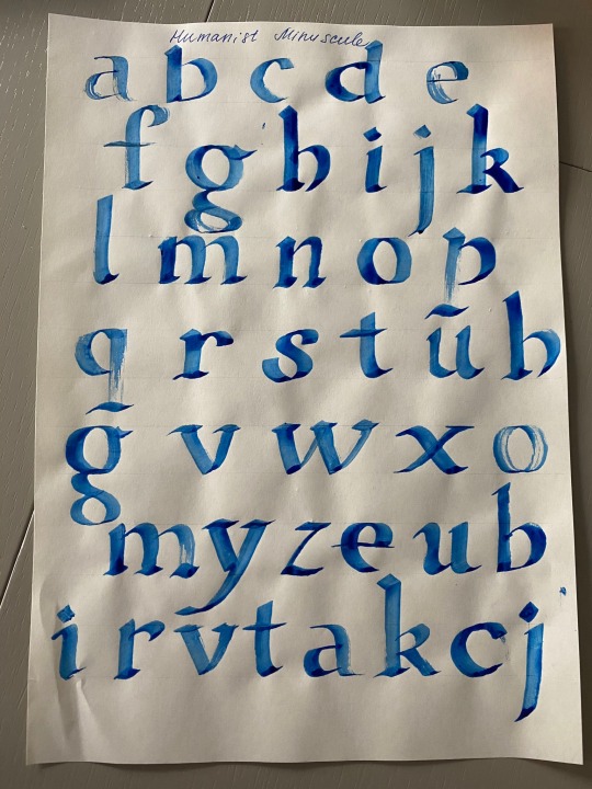
#humanist minuscule
Text
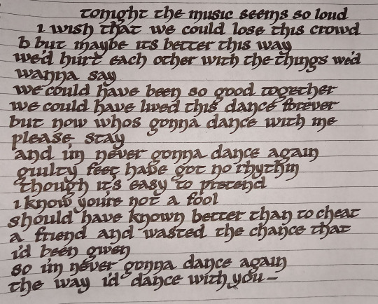
think im getting better at this
210 notes
·
View notes
Text
kids these days aren't learning cursive :( kids these days aren't learning humanistic script :( kids these days aren't learning cursiva anglicana :( kids these days aren't learning protogothic :( kids these days aren't learning caroline minuscule :( kids these days aren't learning rustic capitals :( kids these days aren't learning the etruscan alphabet :( kids these days aren't learning the phoenician abjad :(
632 notes
·
View notes
Note
Hey, I'm writing some bits and bobs of a bigger universe of my own imagining and I came across a little quandary. What do you think Desmond's handwriting is like? And what word doc font suits him best? Right now, I've got him as Lucinda Calligraphy when he's writing normally in English but when he needs a signature then I've got him under Vladimir Script which looks appropriately loopy and signature-ish but what do you think? (He had to learn how to write again after Events and did so in a mix of modern and BCE type calligraphy which translate into everything now.)
If this is set after the Event and you want him to have a mix of modern and BCE calligraphy, you can set it that his handwriting changed to be more like a mix of his Bleeds' handwriting.
Since Desmond would primarily be writing using the alphabet, he would be mixing Anglicana script from Altaïr, Humanist minuscule (lettera antica) from Ezio and English roundhand from Haytham and Ratonhnhaké:ton (who most probably learned to write that way from Achilles).
In general, I would suggest using calligraphy fonts that is a bit slanted to the left (or just italicized the font itself). Choose a font that forms the small 's' like a triangle/ship sail. Also, skip fonts that are more on the round side and have bigger loops unless it's the capital D (D is almost always really big and round because it's compensating for something). His handwriting would have loops especially on the y and g but it won't be big loops. (I just cannot imagine Haytham having big loops)
Of course, if you wish to add a bit of weirdness to it, making Desmond write in 1 font but adding special letters used during the 12th century would be a visual representation of his Bleeds influencing him. Making it anachronistic will also add a sense of 'unnaturalness' to it as well.
For example: instead of him writing the word 'ghost', he writes 'ȝost'.
I don't have word but dafont has a nice selection of fonts you can use. If you wanna use any of them, here's the official instructions from Microsoft on how to install them:
Suggested Handwriting
For Signatures
PS: there are more fonts on that site that you can check out and there's an option to only see fonts that are free as well.
18 notes
·
View notes
Text
The origins of the term “Codicology” can be traced back to Alphonse Dain, a French scholar of Byzantine and Hellenic studies, who first coined the term in his seminal work “Les manuscrits” in 1949. Dain, recognizing the need for a single word to describe the study of manuscripts in English, noted that the Germans already had a word for it, namely “Handschriftenkunde”- . Consequently, Dain proposed “Codicology” as a neologism by combining two words: “codex” or “codocis” in Latin, meaning “book(s)”, and “-logia” in Greek, meaning “the study of a certain subject”. Hence, the word “Codicology” signifies the study of books, particularly manuscripts.
However, it is important to note that Codicology is a vast field of study, encompassing many different areas of research. Thus, while the term may seem all-encompassing, it is not without its limitations. For instance, it does not address the specific study of ancient writings, which is the domain of “Paleography”. Paleography, which also derives from Greek roots “palaiós” and “graphein”, meaning “old-write”, is the study of ancient writings, including those found in manuscripts (think of Caroline Minuscule, Humanistic Script, Beneventan Script, etc.) As such, it is a distinct but complementary field to Codicology, with its own set of methodologies, terminologies, and theories.
DMMapp
6 notes
·
View notes
Text
The monumental bane of OCD - obsessive compulsive disorder
As origin of Homo Sapien species surged ahead,
harboring nascent predominance
asper said primate reproductively bred,
(albeit via incremental fits and starts)
evolutionary forebears didst dread
Tom Tom Club former members
an American new wave band founded in 1981
by husband-and-wife team Chris Frantz
and Tina Weymouth
as a side project from Talking Heads,
rocketing them to super stardom
similar to heights of fame and fortune,
where band zeppelin led
exemplifying, fortifying, and glorifying QED
quod erat demonstrandum
meaning "that which was to be demonstrated,"
whence, (since time immemorial) nasty, short
brutish, loutish, and vampish anthropological,
genealogical, and millennial
report card found forebears
precariously perched, pitched, and positioned quart
toured pièce de résistance purport
head supremacy devastatingly,
heavily, and literally bruited nearly did abort
tentative tenacious status
being supreme species oft times
challenged minuscule leading edge
proto humans rendered
stronghold atop ACME perch
(on evolutionary leading cusp) fund hedge
ching hypothetical bets said simians
nearly toppled off figurative ledge
against being easily uprooted
akin to one weeding out unwanted sedge
imposing fledgling breakfast of champions
clinging to niched wedge
while serial incessant challenges nearly wrote
snuffed out clinched placed viz ass him tote
often at fateful loggerheads,
where survival of the fittest smote
cream of the crop sacrificed for Ares
poised to strike dawn of dusky mankind
viz apish creatures almost got rote
off while chance dominance, eminence grise
pitted, spitted, and got vetted sans un quote
able primal screaming expletives
pitted Neanderthal progenitors note
worthy kickstarter scrum held dim promise,
whether weathered brood
which smattering population comprised
a scattered handful of rudimentary
destined to become a GOAT
contemporary competitive lass or dude,
whence latent talent to net fame and fortune
voluntarily sharing wealth as altruistic,
deterministic, humanistic, and idealistic
amidst looming global warming
legacy of industrial revolutions,
which pointedly wreaked havoc
radioactive Superfund sites still exude
toxins, where dangerous fallout glommed,
rained, and frankly zapped the tocsin
muted, muffled, muddied waters
where pollution never
confronted Wilma or Fred Flintstone
generic Geico caveman/woman respectively,
and aside from external
threatening ecological depredations
violent crime comprises tribal (family) feud
where might versus right,
the deterministic factor aye include
at undoubtedly animalistic behavior
defied being categorized as lewd
since each monkey's uncle
similarly frolicked, gallivanted, and hocked
like a CRO-MAGNON
European early modern humans,
when he flirted in done nude
videre licet dangling modifier
attested courtesy punctuated equilibrium
(the hypothesis evolutionary development
marked by isolated episodes
of rapid speciation
between long periods
of little or no change)
courtesy Stephen Jay Gould
fate didst not occlude
also absence of consciousness rued
until...fast forward to the present day,
when carnal, feral,
and integral leanings attempted
to rope hormonal, gonadal,
and banal found
more recent ancestors (discovered
visa vis like Ancestry.com and/or 23andme)
rolled in the hay
under the natural predilection to lay naked,
especially frisky comb early
May procreative force
engendered the writer of this poem,
when his parents coaxed foreplay
unbeknownst, that their singular heir,
would be afflicted with countless
obsessive compulsive mailer to slay
ritualistic controlling psychic threnody
dominated favored holistic paradigm oy vey
dystopia prevails every which way
Gaia will be declared winner yay!
0 notes
Text
MTT Roma, une célébration de l’école d’imprimerie italienne
À quel genre de lecture attendez-vous lorsque le titre même d’un article porte sur un caractère intitulé MTT Roma ? Le nom de la police de caractère est un hommage à la ville éternelle de Rome et à son patrimoine culturel. Je ne vais pas vous faire un rappel sur l’origine des caractères d’imprimerie ni sur l’influence des graveurs d’origine italienne, croyez-moi. Même si le lien entre cet héritage et le dessin conçu par TypeFirm est évident et prédomine les intentions initiales du studio.
TypeFirm est une fonderie numérique localisée au 7 Via Vivarini à Milan. Luca Limone ainsi que chaque membre éditent et distribuent des caractères au sein d’un marché international. Typographie et image de marque constituent l’activité principale du studio. Leur travail se fonde sur une méthode précise qui mêle analyse stratégique et optimisation des ressources, selon leurs propres mots. Termes insipides, me direz-vous. Il est vrai que ces mots ne traduisent pas tout à fait la démarche qui anime l’activité de ces designers. MTT Roma l’exprime davantage, vous le verrez.
« L’intersection de la forme et de la fonction pour créer du sens. »
La recherche autour du dessin de ce caractère, menée par Mattia Bonanomi, s’inspire des capitales romaines obtenues par gravure lapidaire. Le typographe propose une interprétation moderne des caractères classique, combinant la spécificité de ces formes monumentales et la recherche de fonctionnalité afin de répondre aux besoins contemporains qu’exige la communication visuelle. Dès le départ, l’idée est de transposer l’atmosphère de la ville de Rome au sein d’un contexte d’utilisation contemporain et cela par le biais de la typographie.
Le MTT Roma associe volonté esthétique avec un fonctionnalisme de base.
S’inspirant des caractères gravés à la base de la colonne de Trajan, l’esthétique de ce caractère typographique évoque les inscriptions lapidaires romaines. Elle-même à l’origine des majuscules modernes de l’alphabet latin, ces inscriptions puisent leurs particularités dans leur structure monolinéaire. C’est l’outil qui règle les contrastes et caractérise la forme de ces lettres. L’utilisation du calame exige la découpe du tracé en plusieurs gestes, produisant alors certaines imperfections. La construction des courbes se fait en deux traits distincts. Ces étapes confèrent au caractère une forme qui n’est pas parfaitement géométrique. Le studio TypeFirm tente de faire référence à cette cassure du trait produite par l’outil par l’intégration d’éléments de rupture : des sommets aigus dans les épaules de lettres - partie incurvée qui prolonge un fût - telles que n et h.

Tout l’enjeu de la création de ce caractère typographique est son utilisation dans un contexte actuel. Cela entraînant la recherche indispensable d’une compétence en matière de lisibilité. L’optimisation des largeurs de traits du MTT Roma permet l’uniformisation du rythme de lecture, dès lors plus efficace. Par la suite, les contrastes sont réduits pour améliorer la lisibilité des petits corps. Pour finir, Mattia Bonanomi dépouille le dessin d’empattements pour une meilleure utilisation sur les plateformes numériques. Dès lors, ce caractère typographique est conçu selon l’utilisation qu’il projette.

Qu’achète-t-on véritablement ?
Le glyphset d'un caractère typographique ne ressemble à aucun autre en termes d’étendue. Typefirm renseigne les symboles, les nombres et les variations que propose le dessin du MTT Roma. Le Thin, Light, Regular, Medium, Bold, Heavy, Thin Italic, Light Italic, Regular Italic, Medium Italic, Bold Italic ou encore Heavy Italic. Bien entendu, l’amplitude de ces possibilités esthétiques permet de produire différents effets et par le même biais rend ce caractère désirable. Mais ce n’est pas tout. La version sans empattement des lettres majuscules s’accompagne de caractères minuscules enrichis d’éléments humanistes pour tenir compte de la nature asymétrique de leur forme originale. Les bas de casse renforcent le ton esthétique de ce caractère typographique qui cherche à célébrer Rome. Ces ajouts d’éléments spécifiques permettent des correspondances entre la technique lapidaire romaine et la qualité de ce caractère à s’inscrire dans un usage contemporain.
Dès lors, la police de caractères MTT Roma se distingue par son va-et-vient entre notre héritage typographique et les contraintes qu’induit l’utilisation actuelle du caractère typographique. Un va-et-vient parfaitement maîtriser par la fonderie de caractère milanaise.
0 notes
Text
Robert Slimbach, typographe de génie ?
Cher lecteur, cher lectrice, il y a quelque temps déjà, j’ai remarqué que le Arno pro et le Adobe Jenson, « matchaient » plutôt bien ensemble. Et ce n’est pas simplement parce qu’elles sont deux typographies à empattements, mais bien parce qu’elles ont toutes deux le même créateur. Mais en les analysant de plus près, quelles sont les spécificités de ces typographies de labeur ? Pourquoi existent-elles ? Par qui ont-elles étaient créées? Voici les quelques interrogations qui me viennent à l’esprit.
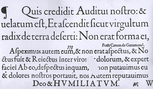
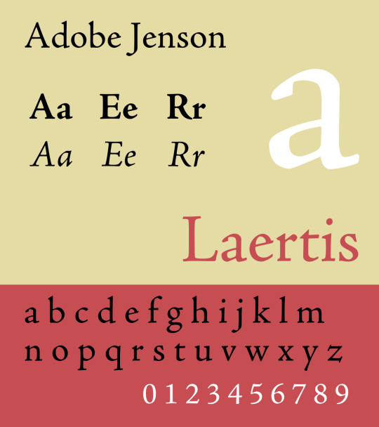
Robert Slimbach, graphiste et créateur de caractères américain, rejoint la firme californienne Adobe en 1987. À la demande de celle-ci, il part étudier les originaux de Garamond, au Musée Plantin-Moretus, dans le but de proposer un revival numérique du caractère. En sept ans, il créera ainsi trois fontes numériques : le Adobe Garamond Pro, le Adobe Jenson et le Adobe Minion. Trois caractères pensés pour l’impression et la composition des livres, ils sont également tous des caractères à empattements commercialisés par Adobe. Mais regardons cet Adobe Jenson de plus près…

Le Adobe Jenson est le revival d’un caractère pensé par le célèbre typographe et graveur de poinçons italien du XVe siècle : Nicolas Jenson. Père du caractère typographique romain, il ébauche les premiers caractères du Jenson dans le Lactence en 1465, avant de le perfectionner et de le mettre complètement au point dans Epistola Ad Brutum de Cicéron. Ce romain à empattements épais s’inspire de la calligraphie et en garde d’ailleurs le st et ct ligaturés. Par la suite, en voulant harmoniser les bas de casses avec les capitales, il unifie sa minuscule humanistique avec le modèle des capitales romaines en utilisant les empattements des bas de casses pour les ajouter aux capitales et en homogénéisant leurs pleins et déliés.
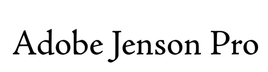
Lorsque Robert Slimbach s’empare de ce caractère, plus que d’en proposer une version numérique, il la décline et propose toute une famille de caractères qu’il étalonne en fonction des tailles de corps.
Il crée pour le besoin une légende graduée avec des corps dessinés pour différents usages : caption (pour les notes), regular (pour le texte courant), subhead (pour les sous-titres) et display (pour les titrages). Avec ce coup de génie il réussit à faire revivre un caractère très complet, parfait pour l’impression avec un large spectre possible d’utilisation.
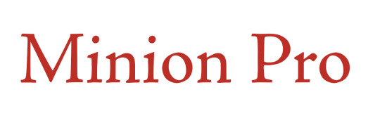
Il réalise un second coup de maitre avec son Minion Pro quelques années plus tard : ce sera effectivement le premier caractère Adobe à utiliser la technologie du multiple master, l’ancêtre des fonts variables offrant une possibilité de décliner les graisses et la chasse d’un caractère. Inspiré d’un caractère de la renaissance, le Minion Pro est maintenant devenu la typographie par défaut du logiciel Indesign. Mais Robert Slimbach n’est-il doué que pour les revivals de la Renaissance ?
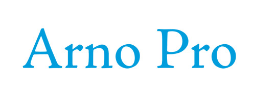
Le Arno Pro, inspiré lui aussi des premiers caractères humanistes des XVe et XVIe siècles, est tout de même résolument contemporain, autant dans son apparence que dans sa fonction. Slimbach suit la tradition des premières polices de caractères vénitiennes et aldines et réunit plusieurs des idéaux explorés dans ses précédents caractères tels que le Minion et le Brioso.
En tant que famille OpenType polyvalente, avec le complément de glyphes latins le plus complet jamais proposé par Adobe, Arno offre une prise en charge étendue des langues pan-européennes, y compris le cyrillique et le grec polytonique. La famille offre également des subtilités typographiques telles que cinq gammes de tailles optiques, de vastes ensembles italiques ornés et de petites majuscules pour toutes les langues couvertes.
Qu’en est-il de son dessin ? Le Arno Pro prend certaines de ses inspirations dans le Jenson. Si, à première vue, leurs proportions semblent équitables avec des ascendantes et descendantes assez similaires et une hauteur d’x plutôt équivalente également, regardés en détails, ce sont deux caractères à empattements très différents. Le dessin du second est bien plus contemporain : son axe oblique est davantage vertical, les panses du e et du a sont plus importantes (s’apparentant davantage au Minion), ce qui en fait des bas de casse moins rigides que le Jenson qui a un tracé plus carré. La Arno délaisse les fûts en biseau et les empattements propres au tracé à la plume carrée au profit d’un dessin plus souple et des capitales légèrement inférieures à celles du Jenson. Concernant leur italique, les deux caractères se rejoignent, ils ne sont pas aussi penchés que des caractères plus contemporains et on peut clairement voir la différence des tracés utilisés ; assez abrupt du Jenson.
En réalité, avec cette fonte, Robert Slimbach à l’ambition de créer un caractère encore plus lisible pour les livres. Le designer et calligraphe Paul Shaw suggère que sa création représente une approche plus "vivante" du Minion. Finalement, c’est une vraie réussite pour Robert Slimbach qui réalise en l’Arno Pro un caractère de génie : une famille multi-graisses, multi-styles, multi-optiques et multilingues contemporaine, bien qu’inspirée de la tradition vénitienne classique.
Julia Ducretet, le 22/01/23.
0 notes
Text
Letter 6 | 9th August, 2022
Dear Reader,
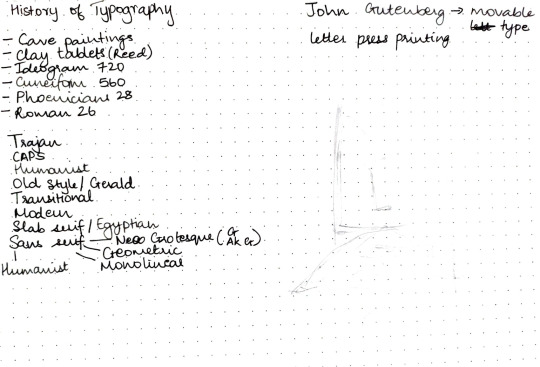
History of Typography is confusing at first.
History of Typography
First evidence of typography was found in cave paintings which eventually shifted to clay tablets where the tool used to write was reed. Ideograms or Egyptians hieroglyphs were the next signs of typography in history. There were 720 symbols. Cuneiforms came next with the number of symbols being cut down 560 and then came Phoenicians with the number being 28. Eventually as years passed and with more evolution came the roman lettering with 26 alphabets.

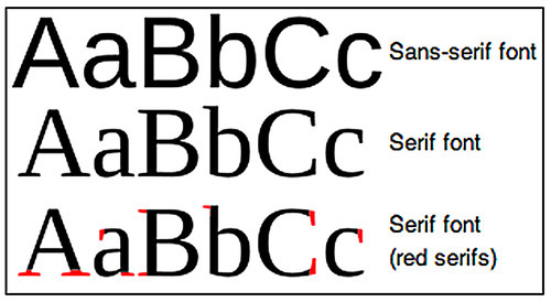
Serifs, sans serifs and everything in between:
Trajan:
Roman capitals(monumental typeface) tool used was chisel which created the serifs.
Uncials:
fewer strokes, rounded letters saved ink and page
Half-uncials:
again to save space, precursors to lowercase lettering
Carolingian minuscule:
Calligraphic standard so that the literate could easily recognize it from one region to another.
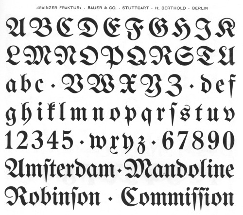
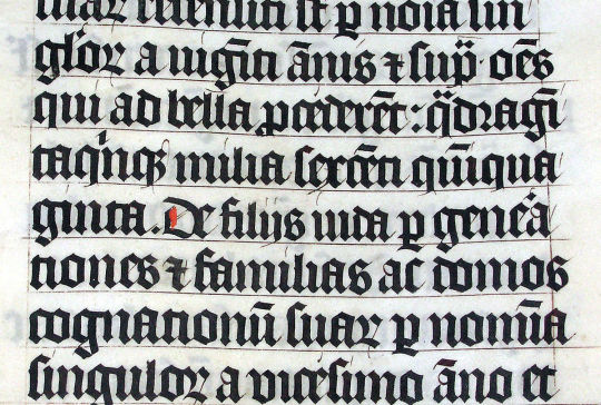
Blackletter/textura:
The styles of typography changed quite a lot throughout the years with the first typeface being founded by John Gutenberg(also considered the father of typography) who created the movable type(letter press printing) and blackletter. Blackletter was created to mimic the handwriting of monks who used to hand transcribe manuscripts before the inventions of printing press.
Humanist:
Eventually came the humanist style of type where the serifs, vertical stress and angles were designed in such a way that they replicated handwritten letters. Ex Jenson typeface by Nicholas Jenson
Old style/Gerald:
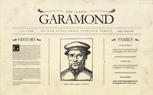
Little contrast between thick and thin strokes with serifs being bracketed, stress is diagonal. Italics were produced around this time as well, again to save money and space. Ex Garamond by Claude Garamond.
Transitional:
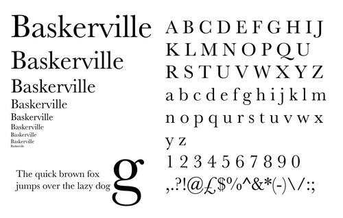
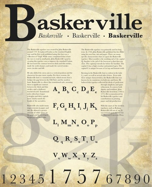
relatively higher contrast between thick and thin strokes but less than modern. Axis was almost vertical, bracketed serifs and round terminals. Ex Baskerville by John Baskerville
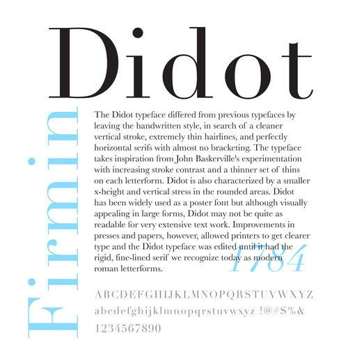
Modern/hairline serifs:
High contrast between thick and thin strokes, vertical axis non bracketed serifs. Ex Bodoni by Giambattista Bodoni
Slab serifs or Egyptian typeface:
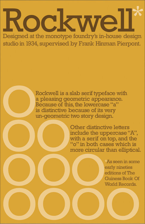
industrial revolution; serifs got bolder with thick slab like styles, typefaces had low contrast Ex Rockwell
Sans serif:
grotesque. Serifs were considered beautiful and Caslon the fourth removed them to create sans serif. We have categories in sans serif as well with geometric sans, humanist sans, neo-grotesque, etc.
Spontaneous Activity
All of us were tired after taking in a bunch of history lessons so while taking a break we randomly started doing type by humans.
TYPE
MILLY
Senior Review!!!!
We had to bring all of our existing work to class to get feedback from our seniors who were a year ahead of us. I was majorly given feedback by Angel.
The feedback was insightful as it was from a third person's perspective and not just limited to the faculty and peers which already understood the essence of the assignments. This way we got an idea if a design was able to be independent of its explanation or not and whether it could stand alone.
Feedback:
AR/Scanimation:
look at other’s work if you are stuck somewhere. Research on topics other than yours and eventually get back or start fresh.
Design movement:
moodboard looks more like a poster, explore more compositions for it as well as constructive fonts to add relevant keywords in the moodboard
liked the outcome idea said could make a digital version as well
Word expressive art:
adjust spacing so that anxious is more readable and a comprehensive word.
Typography and senior review are daunting in different ways. With one being extensive history(I'm not too fond of it.) and the other having your work analyzed. However after writing down the History of Typography document, it become much more simpler and easier to remember. Senior review turned out to be very candid and helpful.
Font regards,
Jiali Thakkar.
0 notes
Text
Today I am thinking about the scene with Tissaia in her nightgown gazing longingly at Yen's wanted poster (and many thanks and curses to T. for introducing the term "w*nk bank" to me) and how twn just, used the modern Latin alphabet (in contrast to the games inventing a whole new script to write the common tongue).
And it's with a humanist typeface nonetheless (*).
But what took me the fuck out was, of course, the unnecessary umlaut, because how to make it look European? Throw an umlaut in that'd do the job.
(*): on why the use of a humanistic typeface is the funniest ever because
1. the popularization of printing in the Western part of the world is closely tied to Christianity, so since the witcher universe is so diverse in term of religion, which tome is the equivalence of the Gutenberg bible?
2. I know for sure that the witcher universe is made up so its progress is different to ours but let's just say for the sake of my nerding out, it has the printing revolution, which was in the 15th century, then is the world of the witcher around/past its own renaissance as well?
3. yes yes let's assume that printing was popularized in the witcher world reasons 404 not found for the sake of argument, what's still funny about it, is the humanist typeface. The typeface that was popular for printing in Europe up until the 17th century was Blackletter (Gothic/Textura), and the humanist typeface was popular as a handwritten script i.e. why the hell would you use it for printing duh
4. the humanist typeface, as suggested by the name, was invented by Italian Renaissance humanists, which focused on the study of classical antiquity. It was the obsession with classical antiquity that led them to invent this script (based on the Carolingian minuscule, which they considered to be ancient Roman). Not to make a they don't even have France joke here but the history of calligraphy and printing and all that mess is closely tied to some very our-own-earth-specific parts of history that would take a hell lot of explaining to transfer to a high-fantasy setting so please just, idk, invent your own script again, that would save a nerd from this much rambling.
The random use of umlaut still took me the fuck out though.
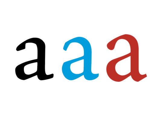
#i might be very rusty on the history of calligraphy though feel free to correct me#again on why it's humanist minuscule: just look at the letter 'a' that's a modern 'a'#personal rant#the witcher#i guess#JUST WRITE IT IN THE MOST COMMON GOTHIC FONT YOU CAN FIND WHY TWN WHY
1 note
·
View note
Text
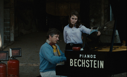
Movie Review | Weekend (Godard, 1967)
This review contains spoilers.
When I went on a bit of Godard jag a few years ago, what really struck me was how much fun they were to unpack. I was not nearly learned enough to grasp all the allusions being lobbed at me, but even when I wasn’t entirely keen on a film (as was the case with 2 or 3 Things I Know About Her), there were always a few things going on formally that made it compulsively watchable. His work in the ‘60s in particular benefits from being seen in context given their tremendous influence (Godard can make a more credible claim than most to having changed the medium), but that might downplay how dynamic it is, as if the films are evolving before our very eyes. In that sense, Weekend might be his most thrilling. It’s a story of an amoral bourgeois couple going to collect an inheritance that escalates into the collapse of modern society and, as the closing titles proclaim, the end of cinema. It’s equal parts absurd, abrasive and horrifying, which made this rewatch feel singularly resonant in the closing days of a particularly absurd, horrifying and abrasive chapter of our current moment.
Godard announces his politics early on. The couple are secretly entertaining killing each other off and only conspiring to kill the wife’s mother to maximize their respective shares of the inheritance. They look over their balcony nonchalantly as a vicious fight breaks out over a fender bender. Upper-middle-class apathy is attacked repeatedly throughout the film. The couple get in a fight over another automotive mishap with a family who attack them with a shotgun and a tennis racket. Even objects of leisure are weaponized. The couple makes their way through a countryside littered with wrecked cars, that quintessential consumerist symbol seen repeatedly in almost uniform states of destruction. A bourgeois girl (Juliet Berto, who played a solipsistic, performative radical in La Chinoise) gets in a scuffle with a farmer after her car crashes into his tractor, shouting antisemitic slurs and demeaning him for his socioeconomic status, until the two abruptly decide to bond over class lines. It’s a succinct expression of the glibness and limits of political cinema, a theme Godard explored previously in La Chinoise and later in Tout Va Bien. The reds, whites and blues of the film’s colour palette lend to this political charge, bringing to mind the flags of both France and America. The film is shot in startlingly rich colours, which makes the bizarre proceedings all the more jarring.
The protagonists’ interactions with black and Arab immigrants highlight the absurdities of global geopolitics, with a minuscule morsel of bread representing the frugality of America’s economic contributions to African countries and a kiss followed by a slap representing the hard diplomatic bargain presented to Arab nations. Godard tried earlier to make a moving, humanist film about the Algerian War with Le Petit Soldat and had it suppressed; the bluntness here plays in part like an admission his earlier strategy had failed. These characters launch into a speech about revolutionary movements, which is simultaneously tryingly inane and sympathetically delivered, and pretty soon a group of cannibalistic guerillas come into the picture, at once trying to navigate, instigate and make order of the societal collapse around them. This could very well have been merely didactic, but Godard’s handling of these elements is consistently funny and startling. Scuffles look to be play-acted until the slide into horrific violence, only to slide back into comedy (or vice versa). The film’s most famous scene is a traffic jam which extends for a maddening amount of time while the camera pans past a number of amusing or ridiculous sights (motorists tossing balls to each other or having picnics, trucks carrying animals) only for the scene to end with the sight of a gruesome accident. Blood is splattered all over the road while a policeman motions for the drivers to advance one at a time, a grim punchline about the inconveniences of modern life, the resulting dehumanization and the futility of order in the face of tragedy.
True to the film’s abrasiveness, the characters learn no lessons throughout all this. Every horrifying or remarkable sight they immediately determine to be an inconvenience to be resolved as callously as possible. Each time they come across a car wreck they try to pick the clothes off the dead. The closest they come to an emotional reaction is when the wife loses her Hermes handbag in a flaming car. Near the end, a character’s life slowly slips away, yet Godard mocks any sentiment that might be felt with a parody of his own jump-cut technique. In another famous scene, the camera does two full rotations as a character plays piano in an attempt to bring culture to the sticks. The camera reverses its rotation and for a moment we think the protagonists might have been moved by the music, yet pretty soon it becomes clear that wasn’t the case. The film hints at their inner lives when the husband listens to the wife graphically describe a menage-a-trois with her lovers. It’s hard not to think of Godard’s relationship with Anna Karina (who I suspect wasn’t cast not just for personal reasons but also because he didn’t want the viewer to identify too strongly with the characters) and there is a certain boldness here in how unabashedly ugly and kinky the scene is (if cinema is ending, you might as well let it all hang out). Yet with the bizarre denouement (a sex act involving groceries, an inconclusive answer to whether the events described actually happened), the ominous music and the fact that Godard lifted it from George Bataille’s Story of the Eye (which, full disclosure, I have not read), it becomes a joke on that very same concept. The characters do evolve in one sense, with the heroine being forced to join a radical group that goes about shooting up or preying on the countryside and, in the final shot, contentedly eating her husband. There are a few ideas here, none of them comforting: that the bourgeois won’t be satisfied until their true savagery is unleashed, that real change is only possible through radical shock tactics, and whether or not that change is even desirable in the first place. Godard finds images bold enough to do them justice.
13 notes
·
View notes
Text
Каллиграфия
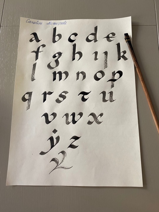
Humanist minuscule и Caroline minuscule. Пока что не до конца разобралась во многих построениях. Из-за этого отсутствует единообразие.
5 notes
·
View notes
Text
Brief History of Type
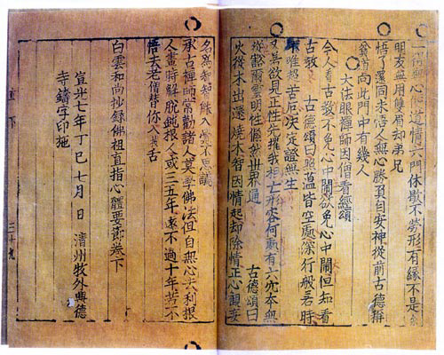
Printing with moveable type actually started in China and Korea in the 8th century AD and printed type (via wood block printing) began to be distributed. In Japan, a devout empress commissioned one million copies of a prayer for distribution to pilgrims. During this time a print runs took six years to complete.
In the middle of the 15th century a German goldsmith Johannes Gutenberg invents moveable metal type and the printing press.
Print and typography were transformational in many ways. For example, typography helped seal the notion of “text” as a complete work, a stable body of ideas in one form.
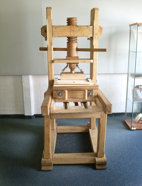
Before the printing press, books were produced by scribes circa the 12th century.
When Gutenberg produced his first typeface, he designed the typeface that was popular at the time. This first type was called “Black letter”.
Black letter is a descendant of “Caroline minuscule”, a calligraphic script developed in Charlemagne’s empire (800-1100 AD). Blackletter soon got competition from "humanist" typefaces created during the 15th century by Venetian printers. These typefaces looked more like writing found in the humanistic (renaissance) manuscripts of the time. Most printers started using “humanist”-style fonts but Germans were not swayed: they used Blackletter or “Fraktur” until the 20th century.
In the first decades after the invention of print, type designers drew their inspiration from handwriting or calligraphy. Frenchman Claude Garamond completed the development of transitional typeface with his typeface. Garamond gives up on trying to imitate handwriting, for him, type becomes its own art. “Garamond” becomes the most popular typeface in Europe.
Transitional typeface
“Transitional” type is so-called because of its intermediate position between old style and modern. The distinguishing features of transitional typefaces include vertical stress and slightly higher contrast than old style typefaces, combined with horizontal serifs.
Master calligrapher John Baskerville (1706–1775) wanted to improve legibility and worked hard to create typefaces with sharpness and contrast unlike anything else at the time.
Firmin Didot (1764–1836) created what is considered the first Modern typeface. ``Modern’’ typefaces are distinguishable by their sudden-onset vertical stress and strong contrast. Modern serifs and horizontals are very thin, almost hairlines. Although they are very striking, these typefaces are sometimes criticized as cold or harsh, and may not be quite as readable for very extensive text work, such as books.
The industrial revolution shaped the 19th century - and it also shaped typography. Mass production led to mass consumption, which led to mass communication. Advertising exploded and with it the need for bold in-your-face type, soon typefaces of all widths and heights appeared. Serifs lost their role as finishing details and became independent components.
20th Century
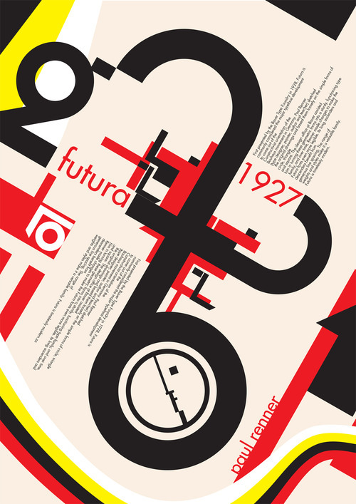
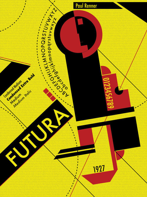
In the early 20th century avant-garde artists went a step further in rejecting historical letterforms. Following the Bauhaus credo of radically simplified forms and functionality, Paul Renner designed Futura based on simple geometric shapes. In his quest for simplicity, Renner avoided all decorative non-essential elements.
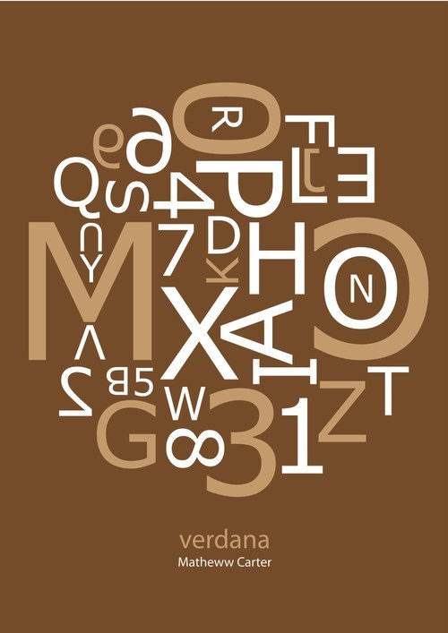
Futura has a refined yet cool element, so when Swedish furniture retailer IKEA abandoned Futura in their catalogues for Verdana (a Microsoft-produced online font), it received severe complaints from customers.
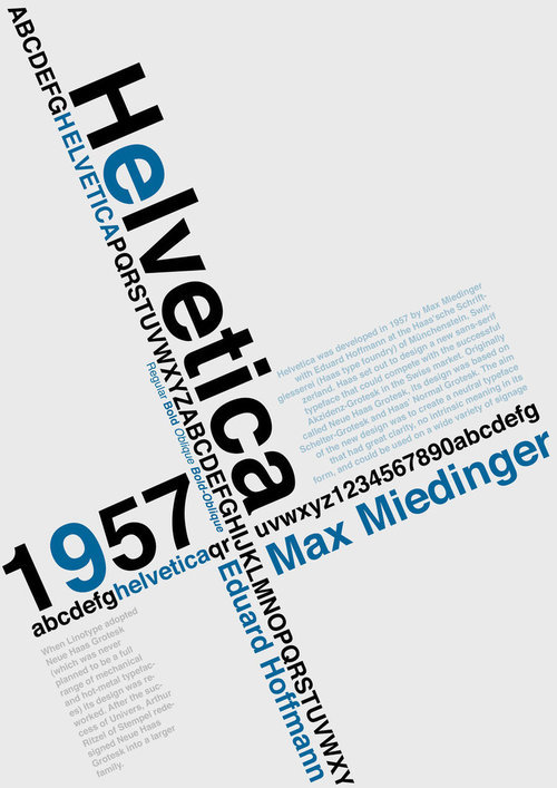
1957
Helvetica is everywhere. Born in neutral Switzerland in 1957, its neutrality soon took the world by storm. Business quickly embraced the clear but honest look and soon it became the font of choice for logos, transport signs, and product packaging. Today, it is virtually impossible in America to spend a day without somehow seeing the font.
1950’s
After the proliferation of typefaces Concrete Poetry became popular. Coined in the 1950’s Concrete poetry or shape poetry is poetry in which the typographical arrangement of words is as important in conveying the intended effect as the conventional elements of the poem, such as meaning of words, rhythm, rhyme and so on.
It is sometimes referred to as visual poetry, a term that has evolved to have distinct meaning of its own, but which shares the distinction of being poetry in which the visual elements are as important as the text.
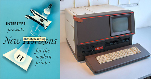
Phototypesetting, 1950s: this machine projects light through a cut-out of a font character, onto a film that is then treated chemically to bear the mark permanently. This system has the advantage of scalability — magnifiers can be used to adjust the size of the type image freely, without having to bring in a new font cutout. Of course, digital vector technology would soon leave this advancement in the dust.
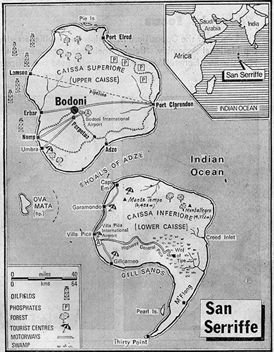
1977
On April 1, 1977, the Guardian newspaper published a seven-page supplement on the island of San Seriffe, a nation celebrating ten years of independence. The country consisted of two main islands, Caissa Superiore (Upper Caisse) and Caissa Inferiore (Lower Caisse). The capital city, located on Upper Caisse, was the city of Bodoni. Other cities included Port Clarendon, Garamondo and Cap Em (printed with full map and description). Of course, the islands were not real, but many readers called the newspaper wanting to book a vacation. The elaborate typography prank was one of the most successful in history and has spawned online travel guides and more. Why was it so successful? It happened right before the PC revolution, when suddenly everybody could become a type expert.
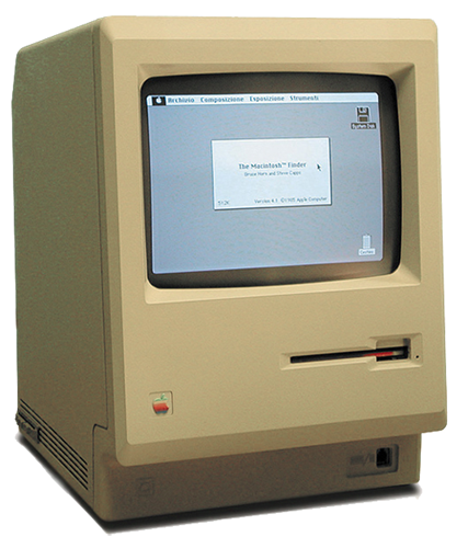
The reason that even people who do not care one bit about typography know several fonts and some specialist terms, is the personal computer. Specifically, the first Mac. Steve Jobs had attended a calligraphy class in college which left such a great impression on him that he pushed hard to have several typefaces included on the first Mac. At the time, this was a revolutionary concept but it set in motion the proliferation of digital fonts we know today.
Digital typography (mid 1980s – present)
Bitmap (raster) fonts: a data file that contains glyphs in pixel form. Because it is not scalable like a vector, a bitmap font must contain many sets of pre-determined sizes (traditionally just 8, 9, 10, 12, 14, 18, 24, 36, 48, and 72pt), each in every permutation of regular, bold, and italic.
Bitmap font formats: PCF, BDF, SNF, DWF, BF, AFM, FON, BMF, PSF, PK
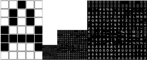
A pixilated bitmap character (image from Wikimedia Commons) and bitmap files for 3 font sizes (image fromJOT)
Outline (vector) fonts - sets of mathematically described lines and curves that trace the outline of glyphs. They are infinitely scalable without pixilation.
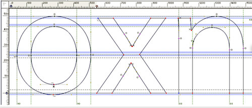
Vectorized font (image from Adobe)
The computer era came with the promise of unlimited font choices.
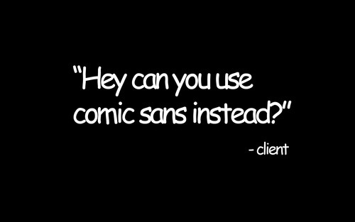
Fonts soon got used in grotesque ways, the worst offender being Comic Sans, a quirky hand-writing font distributed through Microsoft’s operating system. Intended as a script for an animated dog, Comic Sans became popular because it was part of Microsoft Windows’ standard font package.
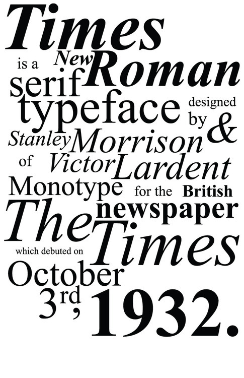
Since everybody had a PC, fonts in Windows became pretty much default standards. The rise of Times New Roman, for example, is directly correlated with this phenomenon.
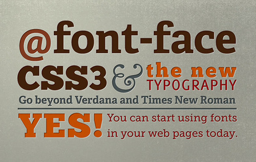
For a long time, the Internet ran on a few fonts, namely those available on most computers. A few years ago this changed with the introduction of CSS3 and faster broadband speeds. Now, websites can display fonts delivered through the web and the world is better of because of it.
2007
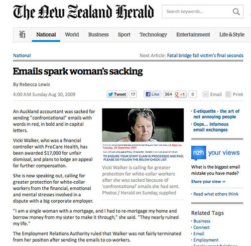
On September 25, 2007, Vicki Walker put this in an email and pushed send: TO ENSURE YOUR STAFF CLAIM IS PROCESSED AND PAID, PLEASE FOLLOW THE BELOW CHECKLIST. Her company in New Zealand did not like her use of the caps lock button and fired her for sending “confrontational emails”. Walker won damages in court but the episode tells us something about the power of typography. We don’t like to be screamed at in our face and WE DON’T LIKE TO BE SCREAMED AT ON OUR SCREEN. LET THAT BE A LESSON FOR ALL OF US.
What are the most popular fonts of all time? The poster below combines various Top 100 lists and puts Helvetica, Futura and Bodoni in the top three spots.
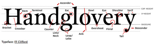
Typeface Terminology
Works inspired by typeface design
2 notes
·
View notes
Text
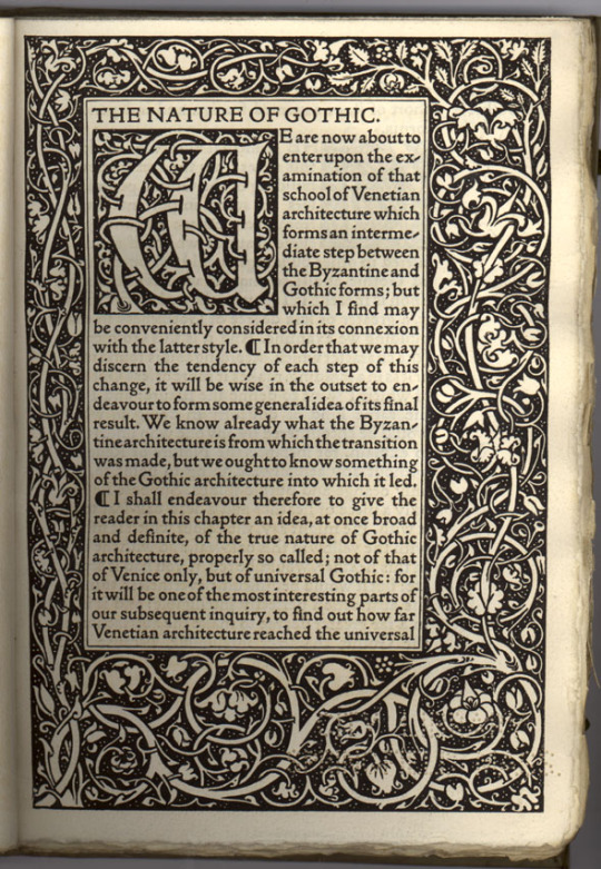
Typographical development up to and beyond Nicolas Jenson’s roman typeface
Introduction
While reading about the history and early development of typography, I grew interested in the point at which typographic design became, for the first time, abstract; moving away from letterforms that mimicked handwritten script towards new styles that were driven by a growing awareness and appreciation of the formal possibilities allowed by the nascent technique of letterform printing. This technical and conceptual shift is generally attributed to the French typographer, Nicolas Jenson, who designed one of the earliest and finest Roman style typefaces in 1470s Venice: a typeface now referred to as Jenson.
Background/history of writing
Typography, of course, derives from writing, which can be traced back to the 3rd millennia BC, an era in which cultural interactions between the societies of ancient Egypt and Mesopotamia, saw the Sumerian cuneiform script of the latter influence the development of hieroglyphics in the former, both written forms establishing themselves as powerful communicative aids before developing into new forms which influenced the creation of subsequent abjadic and alphabetic stems of writing.
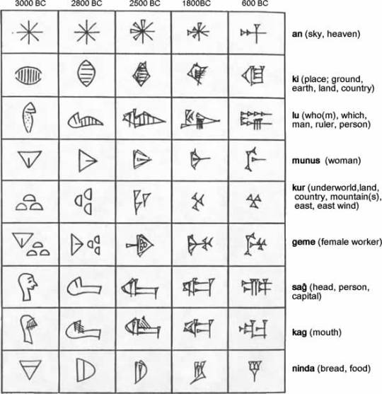
Sumerian cuneiform
Egyptian hieroglyphics
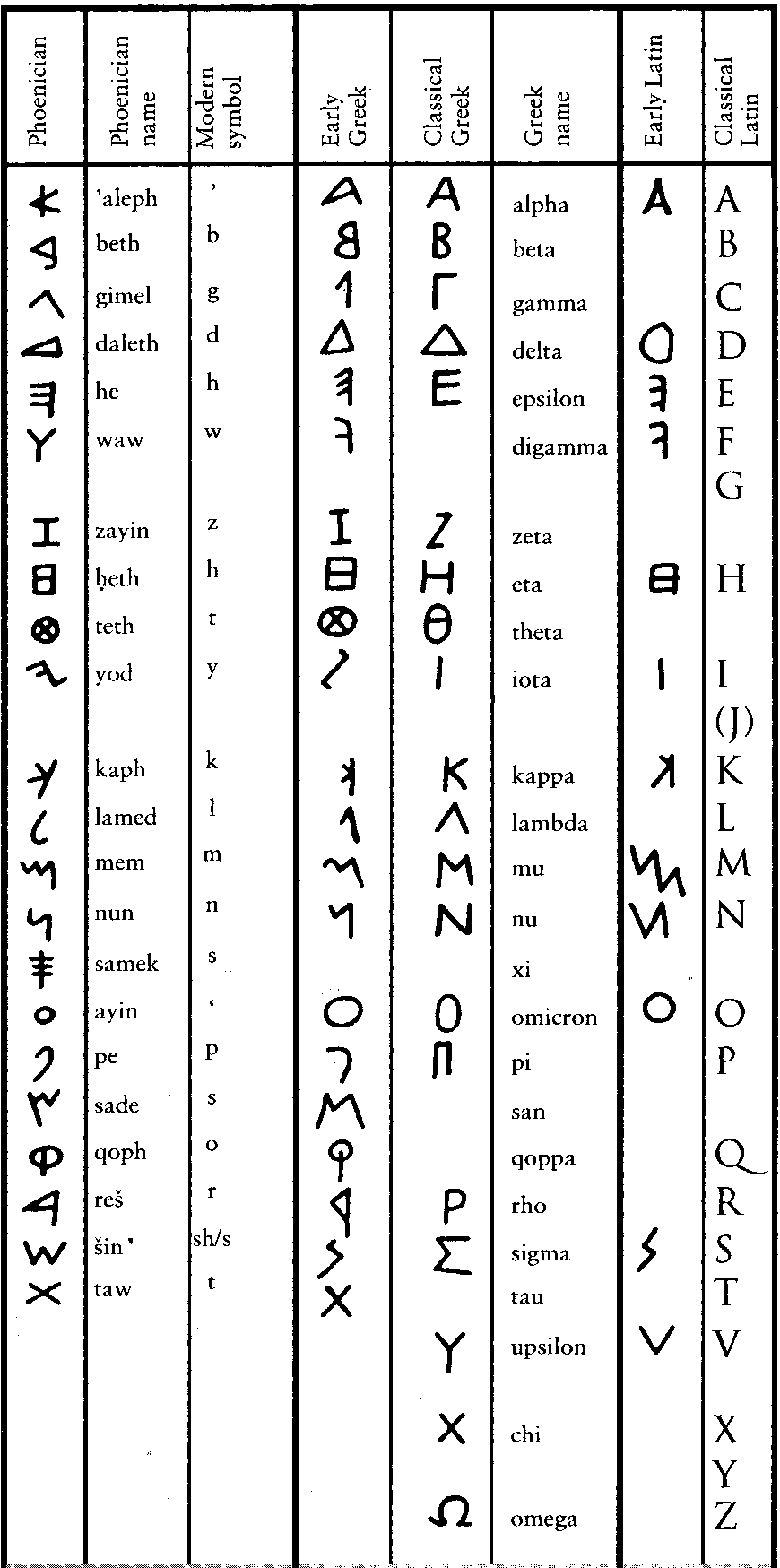
The Phoenicians simplified the act of writing by drastically reducing the number of letterforms, creating what is now recognised as the first abjadic alphabet, consisting entirely of consonantal sounds. The Greek alphabet derived from the Phoenician, but included letters for vowel sounds, making it the first of a new form of alphabet. This, in turn, informed the development of written Latin - a system that, according to Eric Gill, ‘reached a permanent type about the first century AD.’
Development of the Phoenician, Greek and Latin alphabets
During the next fifteen-hundred years, a period in which the Latin alphabet itself remained for the most part fixed, the forms of lettering written in the languages derived from Latin developed in manifold ways: from the square capitals that were a characteristic of Roman lapidary inscriptions, through later and less formal cursive, insular and uncial scripts that eventually found a level of standardisation from the ninth to the early thirteenth centuries in the form now referred to as Corolignian miniscule. In turn this form of script developed into blackletter, or Gothic script, that was used from the 1150s through to the invention of printing and beyond.
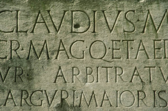
Roman lapidary inscription
An example of uncial script
Carolignan miniscule
Gothic blackletter
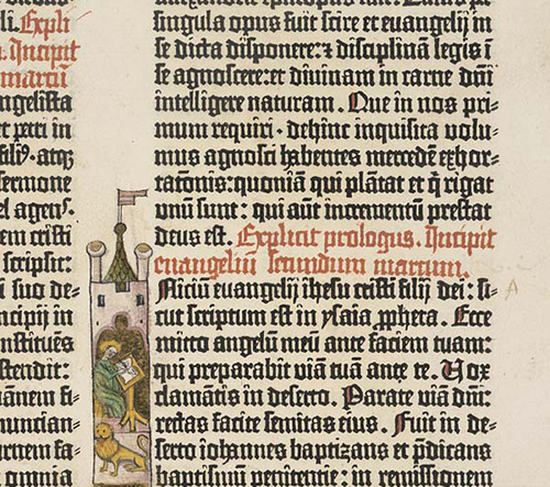
At the time Johannes Gutenberg introduced printing with moveable type in 1439, the new technology was conceived as a means by which texts - specifically indulgences - that had previously been produced, painstakingly, by hand could be mass produced and the process of manufacture and dissemination made more efficient. The focus was on the speed and convenience that the mechanical process allowed, rather than clarification or any improvement in the aesthetic quality of handwritten script. This meant that the initial conceptual scope of mechanical printing was to produce scripts in the style in which they would, previously, have been handwritten. The standard method of writing in the germanic world used Gothic letterforms and, since printing was invented in Germany, the early typefaces mimicked Gothic script.
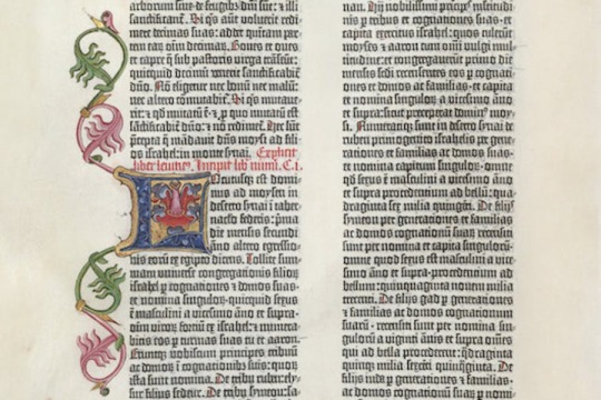
A page from Gutenberg’s bible of 1454
However, as Italy was the most culturally developed country in Europe at the time, German printers moved south to cities like Venice and began creating typefaces that took account of humanistic handwriting that was developing in Italy - a form that took as its inspiration the clarity of Roman lettering, marrying this with minuscule forms that had developed during later eras.
In his Essay on Typography, Eric Gill explains that the process of using current technology to repeat received forms of lettering was not new and that, in an earlier era when lapidary inscriptions were the norm, texts written using a very different technology, the pen, mimicked the then culturally dominant form:
Pen writing, even as late as the fourth century, shows very clearly that the scribe had no idea of inventing ‘pen’ forms of letters, but was simply making as well as he could with a pen what he conceived to be ordinary lettering. Whether he held the pen one way or the other (so that the thick strokes came vertically or horizontally) makes no difference to the primary intention of the scribe. He was not inventing letters; he was writing forms already invented.
…whatever tools or materials or economic circumstance (that is hurry & expense), the artist, the letter-maker, has always thought of him self as making existing forms, & not inventing new ones. Thus, the Lombards of the fourteenth century did not sit down and invent Lombardic lettering. The Siennese inscription in the Victoria and Albert Museum, dated 1309, is simply a stone version of the pen letters with which the letter-cutter was familiar. The letter-cutters of the fifteenth century did not invent ‘gothic’. They had the job of cutting stone inscriptions, and they did it in the ordinary letters of their time. The forms of their letters were what we call ‘pen’ forms. But they cared nothing about that. To them they were simply letters. And just as we saw that in Roman times the Roman scribe imitated the stone inscription forms because, for him, nothing else was letters; so, in the fifteenth century, when the written was the most common and influential form of lettering, the position is reversed, & the letter-cutter copies the scribe — the stone inscription is imitation pen-writing (with such inevitable small modifications as, in stone, cannot be avoided), whereas in the fourth century the written book w as an imitation of the stone inscription (with such small modifications as the pen makes inevitable).
Gill goes on to say that,
…the first printers were no more the inventors of new letter forms than any other craftsmen had been. The first printed books were simply typographic imitations of pen writing, just as were fifteenth century inscriptions in stone.
So there was a sense in which the originators of typography, like the practitioners of earlier techniques, were tied by custom to past practice - in their case the organic, humanistic (in the sense of being physically formed by humans) physicality of scribal penmanship, which was deep rooted, and linked to a seemingly intrinsic need to make marks.
However, while early typographical practitioners referred to earlier calligraphic forms, increased usage and improved technology had significant implications as the categorical difference between handwritten and printed letters became apparent: as Elaine Lupton says in her book Thinking With Type, ‘Words originated as gestures of the body. The first typefaces were directly modelled on the forms of calligraphy.Typefaces, however, are not bodily gestures — they are manufactured images designed for infinite repetition.’ As people worked with type, there was an emerging realisation of the new formal possibilities inherent within the new medium.
The move away from traditional forms took place quickly, during the space of fifteen years, from Guttenberg’s Blackletter type in the mid-1450s, through Gothic Roman to the emergence of humanistic Roman types that emerged in 1470, and was inextricably linked with the movement of German practitioners to Italy and the influence Roman capitals combined with contemporary Italian handwritten forms on typographical development.
Characteristics and sample of Gutenberg’s Textura blackletter

Characteristics and sample of the Gothic Roman Subiaco Type
Characteristics and sample of Jenson’s roman type
Characteristics and sample of the Von Speyers’ roman type
Images above taken from Paul McNeils The Visual History of Type
The earliest instance of this is, what’s now known as the Subiaco Type, was created by two German monks, Sweyynheym and Pannartz, who established the first printing press in Italy and developed a hybrid, Gothic Roman type that combined elements of medieval lettering with renaissance forms, to appeal to local audiences. The typographer, Stanley Morison, thought that Sweyynheym and Pannartz’s invention is entitled to rank as the first humanistic or roman type’, because it established a principle, of movement away from Germanic towards humanistic letterforms, that influenced the emergence of new typographical forms and new ways of thinking about the possibilities of the medium. For this reason, Paul McNeil, in The Visual History of Type, says that, ‘The Subiaco typeface represents a milestone in the history of printing and typography.’
De divinis institutionibus by Lactantius; printed by Pannartz and Sweynheim in 1465
So the typographical style now known as Gotica Antiqua, invented by Sweyynheym and Pannartz and developed by practitioners such as Gunter Zainer, represents a significant movement away from a earlier purely germanic forms and a broadening of awareness of the formal possibilities of the still nascent technology. However, it was the development in 1470 of a purely Roman typeface that constituted a complete shift away from medieval lettering and Blackletter type towards printed lettering that seems familiar to us today. There is some dispute as to who should be given credit for this - the Von Speyer brothers (also known as da Spira brothers) or Nicolas Jenson, who seem to have made similar breakthroughs simultaneously. Of the Von Speyers’ roman type, printer and historian of typography D.B. Updike wrote in the 1930s, ‘Many roman types of varying degrees of purity and attractiveness were used by Italian printers of this period. It was reserved for John and Wendelin de Spire to show a roman type which today appears roman to us.’
An example of the Von Speyers’ roman type
However, it is Jenson’s roman that is the more famous today, considered the progenitor or all subsequent roman typefaces. Paul McNeil states that, Jenson’s type, ‘marks a turning point in the history of printing. A blueprint for all that followed, it continues to influence type design today.’ He goes on to say that, ‘Nicolas Jenson’s work elevated the nascent craft of printing to a fine art. The balanced proportions of the letters, the evenness of their spacing and the restrained overall tone of his pages demonstrate why he was acclaimed above other printers working in fifteenth-century Italy and why his work has remained a cornerstone in the history of typography.’
Jenson’s roman type
In his, An Essay on Typography, Eric Gill in summarising the impact of Jenson’s roman, says that it represents, ‘the emancipation achieved from the gothic of northern Europe and from handwriting generally. Henceforth, the designing of type was primarily the work of punch-cutters, that is of engravers. Letters were still reminiscent but no longer an imitation of handwriting.’ So while Italian printers, advanced the art of typography by moving from a type that was an imitation of Germanic handwritten forms to one that took Roman capitals and contemporary Italian minuscule for inspiration, the revolutionary insight was that mechanical typography - a new technology that allowed standardisation of letterform, technical refinement and reproducibility - made possible a formal abstraction, away from handwritten letterforms to a distinct system of lettering, occupying a different conceptual space to handwriting, that could improve efficiency and readability, while constituting an artform in its own right.
This relationship between the written and the printed letterform is one of the defining characteristics of typography. As Ellen Lupton says, in her book Thinking With Type, ‘The history of typography reflects a continual tension between the hand and the machine, the organic and the geometric, the human body and the abstract system.’
This excerpt from an article on Jenson’s roman by Paul Finn of Fitzroy & Finn studio, goes someway towards explaining what makes Jenson’s roman typeface special:
Gutenburg's invention was realised by Jensons first True Roman typeface. A convergence of all that had gone before. The alphabet now became in focus, sharpened through sacred geometry, asymmetric logic and the golden section. A monastic devotion of meditation brought forth a revelation. Jenson's inspired amalgamation of Roman capitals with the humanistic handwritten miniscule of the day imposed a structural unity upon the miniscule through remodelling the serif structures bringing form and clarity, unifying an essence of perfectly proportioned form.
The Renaissance. Rebirth. The revival of Ancient Rome. Classical antiquity; mathematics, geometry, architecture, art and science infuse Jenson's typeface. Jenson sought a suitable vehicle to disseminate the knowledge of humanities new epoch. He created the typeface which became the foundation stone of all future typographical endeavours. Constructed with architectural precision he attained a unified cohesive whole. Practising the Renaissance ideal of balance between Form and Space, when white space is as important as the blackness of form. Presence v's Absence. This is illustrated in his 1470 edition of Eusebius, De Evangelics Praeparatione the counters, wordspacing, linespacing are suspended in perfect equilibrium with the letterform, whose relationship with the extender lengths add elegance to the balanced body of type. These decompressed forms are reaction to the dense blocks of Blackletter type of Gutenburgs printed matter. Instead spacious circular rhythmic forms grace the paper enticing the reader.
Jenson’s roman has has a fundamental impact on subsequent typographical development. The principles behind his work formed the basis for later well-known roman faces, such as Griffo’s Roman (or Bembo), which was cut for the Venetian printer Albert Manutius by the punch cutter Francesco Griffo. In his book The Visual History of Type, Paul McNeil states that Griffo’s roman, ‘became the progenitor of all old-style typefaces, setting a new standard for typographic excellence.’
Griffo’s Roman or Bembo
In turn Griffo’s roman influenced later generations of type cutters, such as Claude Garamond, whose roman type has become one of the most popular Old Style typefaces in the world
A sample of Garamond’s roman typeface
More recently, from the end of the nineteenth century to the present day, direct revivals of Jenson’s roman have been either cut or - in the digital era - computer designed.
These include William Morris’ 1890 Gold Type on Jenson' type in 1890.
Cobden-Sanderson modelled his typeface for Doves Press on Jenson's alphabets in 1900.

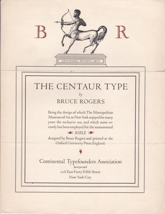
Bruce Rogers’ Centaur of 1914
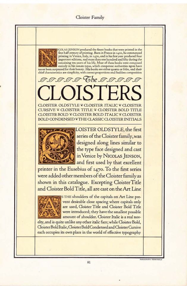
Morris Fuller Benton’s Cloister Old Style from 1926
Robert Slimbach's digital Adobe Jenson from 1996
3 notes
·
View notes
Photo
alcuin’s motto
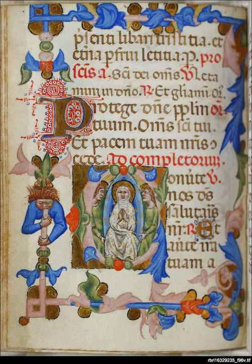
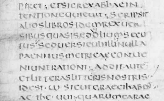
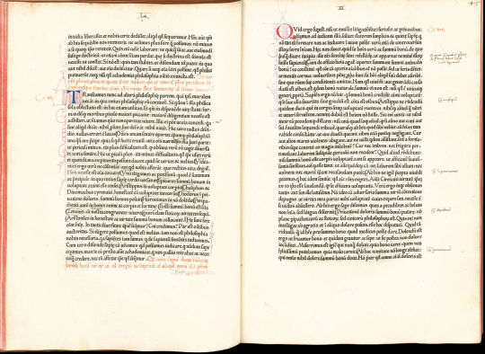
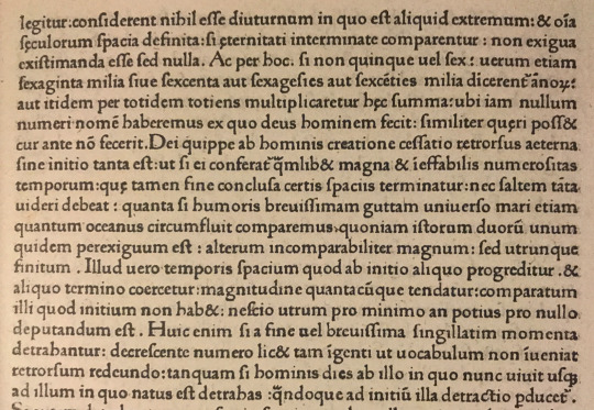
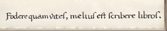
prof albert c. clark [fellow & tutor of queen’s college, oxford, late-19c–early-20c] tells us in «The Reappearence of the Texts of the Classics» [The Library, ser iv, vol ii, 1922, p15]: «In 782 Charlemagne, wishing to restore learning in his kingdom, summoned an Englishman, Alcuin of York, to act as his Minister of Education. Alcuin became Abbot of St. Martin at Tours, where he founded a scriptorium, in which the famous Caroline minuscule came into being. He taught his monks to write, instead of devoting themselves to the cultivation of the vine. His motto was: ‘Fodere quam vites, melius est scribere libros.’ His own studies lay chiefly in the direction of grammar and orthography. He succeeded in arresting the process of natural decay, and reintroduced classical Latin. Barbarous spellings disappeared as if by magic, and manuscripts were written by competent scribes.»
to which prof b. l. ullman adds: «There are those who deny that any existing manuscripts written in the ‘regular’ style of Tours, i.e. the characteristic Tours style with cursive elements all but eliminated, date from the time of Alcuin, and that Alcuin had any part in its development. Others believe that several manuscripts written in this style date from Alcuin’s time and that he was responsible at least for the encouragement of this script, although they admit that most of the examples, as well as those of the still better, ‘perfected’ style, were written after Alcuin’s death.» [Ancient Writing and its Influence, longmans, green & co, new york, 1932, p110].
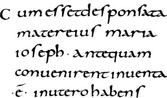
humainist scholars (salutati, niccoli, poggio) evolved scripts for editorial & scribal work adapted from the carolingian script that they appraised highly for calrity & legibility—the only suitable script for copying latin literature. these ‘humanistic scripts’ were adapted, a mere half century later, by the proto-typographers for the types they evolved into the typefaces printers classify as roman & italic.
1st illustration: alcuin’s motto written emulating the neo-caroline, humanistic script. at one time poggio favored rustic «F» [stanley morison, «Early Humanistic Script and the First Roman Type», The Library, 4th series, vol xxiv, 1943, p15]; «ſ» [long-s] at the end of a word is humanist [b.l. ullman, The Origin and Development of Humanistic Script, edizioni di storia e letteratura, roma, 1960, p17]; «v» [minuscule] was introduced by poggio in 1425 [ibid, p53].
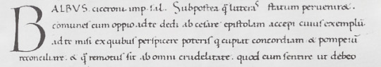
2nd illustration: poggio’s littera formata [florence, laur.49, col.125r, 1425; ibid, plate 23].
7 notes
·
View notes
Text
History of Typography
Type is very powerful and depending on what type face you use, can represent so many different connections, moods and aesthetics.
These are examples of different type faces:
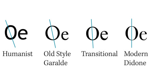
The angle of stress is what determines contrast in type [1]. It relates back to the ancestry of calligraphic print. Wide nibbed pens that were used by scribes would create varying thicknesses of strokes depending on the angle they were held at by hand. By drawing a line through the thinnest strokes of a letter you can see the angle of stress on a font or typeface.
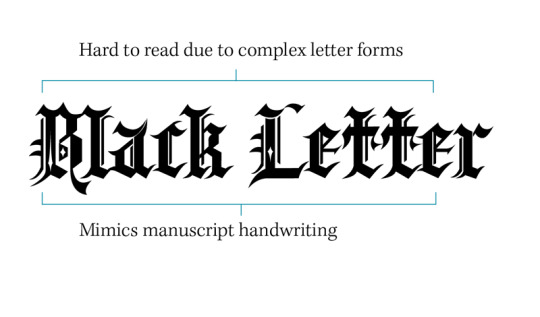
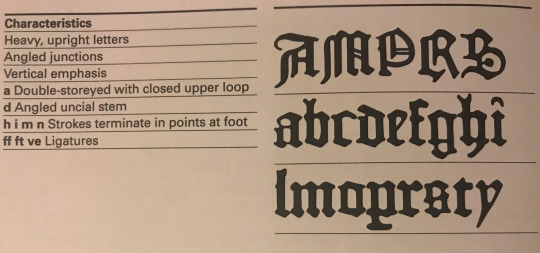
Blackletter, also known as gothic script or gothic minuscule was used throughout europe from the 1100s right up until the 17th century. They were the earliest typefaces to emerge along with the printing press and strictly resembled the manuscript writing of that time[2].
Because of the complex letterforms in gothic type they can be very hard to read and are rarely used today as they once were.
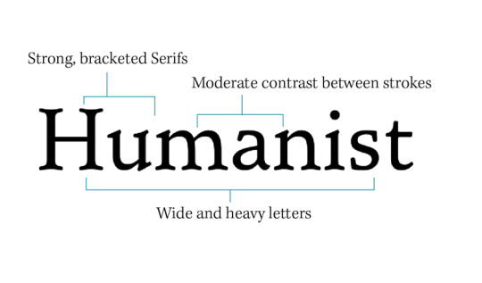
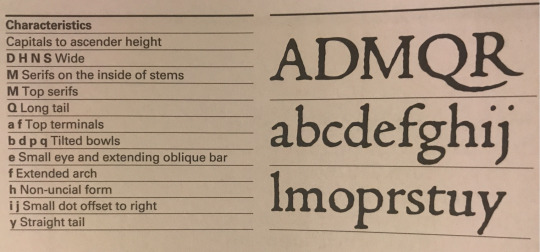
Humanist typefaces, also known as Venetian were initially designed to imitate the handwriting of Italian renaissance scholars[3]. They can be characterised by their strong bracketed serifs. Generally the letters have a wide and heavy appearance, they have a square full point, small X-heights with a moderate contrast between the strokes and an acute angle of stress. Another defining feature can be the sloped crossbar on letters such as the lowercase e but this can vary in extremity.
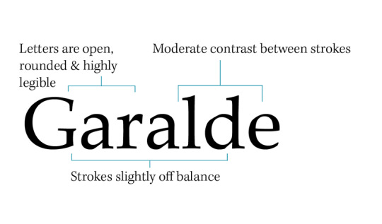
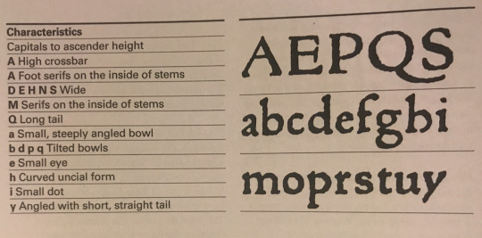
Old style typefaces, also known as Garalde mimic the hand held angle of pen nibs used by people. They are characterised by small X-heights, the letters are open and rounded making them very readable and the thick strokes of the curved letters are off balance.
The diagonal stress in the characters mimic the angle at which a pen is held by the human hand, instead of a vertical stress which would typically be expected of a machine, but less acute than in humanist typefaces[4]. It was also within this type movement that the first italics originated.
0 notes
Last Seen Blogs

chartsacademy-blog
CHARTS Academy
tumblngdice
Goals & Getters

east-coast-hiphop
Pasang IndiHome Jogja

teqkillahh
Chimichanga Dip

dadsinsuits
Dads in Suits