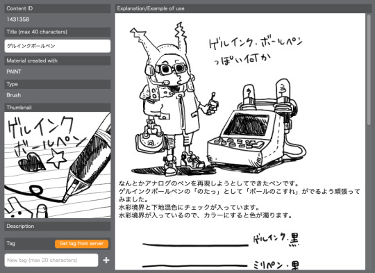
#i don't usually do linework but it's super fun
Text
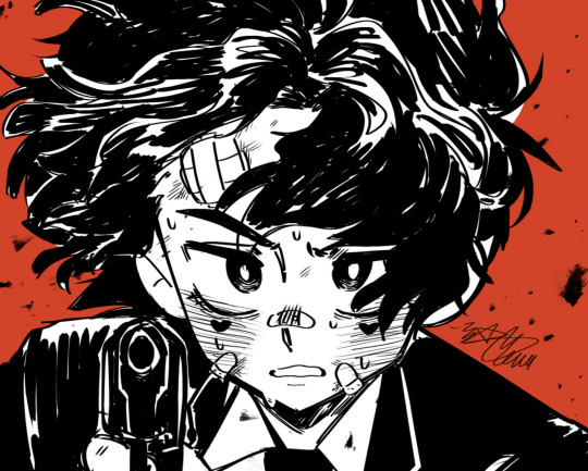
SOMEbody failed his wisdom save to resist unlimited tadpole power, and that somebody is definitely my tav Mayhew. a WIP:
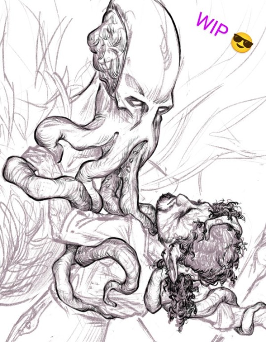
mindflayers are incredibly fun to draw fwiw, do recommend
#i don't usually do linework but it's super fun#the bg3 theme about loss of identity - often expressed through increasing monstrosity - is incredibly my jam#what if you can't make it through as the same person you began - literally? what if you save everyone and are made worse for it?#what if you're a liar and a cheat in a story where consequences are inevitable & inescapable? what if there are debts that always come due?#how much worse would you make yourself for love? for curiosity? for the sake of others who deserve better? for power?#mayhew's answer so far to all of those has been 'a lot worse' and consequences just came to call#bg3#the emperor#bg3 emperor#mayhew#gnome tav#my art#me drawing: how buff can i make a tentacle. very buff? even buffer than that?
293 notes
·
View notes
Note
Have u ever posted your comic or animation workflow anywhere? Im super curious on how you tackle the process, especially not using a drawing tablet. I know you have a very simple (and adorable) style so that probably helps in terms of workflow -- Im just curious about the steps you take.
Thank you! With both comics and animation my key thing is to not spend too much time on any particular thing, just draw loose and fast. Honestly the only downside to drawing with a mouse is that I can tell my arm has extremely specific muscle memory regarding it- if my mouse breaks and I get a new one I have to spend a good month or so just letting my hand get used to it again lol. Same with if my setup gets readjusted too much- right now my setup is my mouse on one of those padded mousepads, on top of 2 books, with my elbow resting on my 3DS case (I'll get an actual pillow or something for it eventually lol). But luckily thanks to this I suffer very minimal wrist pain 👍
(...Okay I started to go really in depth in my process here, so sorry if this is way more than what you were asking. Putting it under a readmore just to save space lol)
With MFM in particular, I start by writing out the entire script for the next story arc, which really is just all of the dialogue and vague notes about any important actions. Then I do the paneling with very loose stick-figure like sketches of where the characters are and what they're doing. I prefer having very little planning when it comes to character poses and panel shapes, coming up with those on the fly makes things much more exciting and faster to make. But it's the opposite with dialogue... it needs to be 100% FINAL before I draw a single line lol.


That's part of my script for my most recent chapter, as well as what my extremely loose goofy thumbnail sketching is like. I write the script as one big thing and don't separate it into pages until I actually start drawing- then I go and color change it just to keep track of what dialogue goes on each page
After that, I go back and do the ACTUAL sketch, as well as the lettering (I don't believe this is how it's done professionally. I used to do lettering as the very last step in the process... but then found it hard to cram speech bubbles in the right places lmao.) After that is lineart, coloring, background flat colors, then shading/rendering for all of it. I do each step in batches, as in I sketch out ALL pages of a chapter before moving to lineart, I line ALL pages before starting coloring, etc. I find it way easier to be productive when it's broken up like that, though when I first started the comic I used to draw each page to completion before starting the next (but also, the comic's style was DRASTICALLY simpler back then haha)
(Unfortunately I merged some of the shading to the background flat colors so it's not entirely accurate... oops) FireAlpaca has a sand texture feature that I only found out about last year- adding that to the backgrounds makes them look 10x better with WAY less effort.
With animation, it depends on the project. For simple 5-10 second animation I make for fun, there's very little planning lol. I skip some steps in the process- I'll sketch out the keyframes (and maybe any difficult inbetweens if necessary), line those, then go straight into making linework inbetweens. I'm not a cleanup artist and have no experience in that, so I always find trying to line my rough animation makes everything jittery and wobbly. If I do it with a clean line from the start then I can avoid that and save a lot of time 👍
For my bigger projects (such as the Parvey cartoon and the MFM Kickstarter trailer), I do the whole animatic with final audio first and foremost, with the animatic being almost like the keyframes. I split them up into individual shots, .mp4 files anywhere between 1-30 seconds usually, and animate those one at a time. I'm a huge fan of free to use programs and try to use them as much as I possibly can, here's a list of the ones I use:
FireAlpaca- for the actual drawing part itself (storyboarding/animating/etc). FireAlpaca has a feature that lets you export every frame as it's own drawing, as well as an onion skin mode
Windows Movie Maker- for compiling all of those frames into video format, creating individual shots. If you upload all of your frames and set them to around 0.08 seconds, it equals about 12fps (I usually animate at 0.10 seconds/10fps, its a bit slower but looks nice)
Onlinesequencer.net- for making music. It's the place I've made all of my songs on, like the timeloop song, hyperworkaholic, and the background music for the MFM Kickstarter trailer.
Audacity- for editing audio/music. Also great for recording things directly from your desktop
DaVinci Resolve- for editing and putting together all of the shots into one big video. Can get kind of intensive on the computer during rendering, so watch out.
YouCut (app)- also for editing and compiling shots, I used this one a lot a couple years back but I'm not sure how well it holds up. Doesn't need much phone storage to download but needs a lot to render videos.
MS Paint (yes really)- for typing up text. FireAlpaca has a text option but I don't like it as much as Paint's.
...The only thing I genuinely can't do alone is voice acting. Luckily there's a big voice acting community on Twitter and they're all amazing to work with!
This got... way more in depth than I planned for it to be, so sorry if this is way more than what you were asking lol. But that's my general process when it comes to my art 👍
32 notes
·
View notes
Note
Your last post about your animatic process was super interesting to read! I've always wanted to get into animatics but they become super intimidating to me once I finish thumbnailing. Do you have any tips on ways to keep from getting overwhelmed with big animatic projects?
Also, how do you decide how many frames a moment needs? Do you just start out with stills and then see what feels stale or is that something you figure out in the planning stages? Sorry for all the questions haha, love your work!
Im glad the post was informative!! and dont worry I love fielding questions like this !!
I'm sorry to say that there really is no big secret or anything about getting to the finish line on an animatic but making sure you keep going. If it's any comfort, if this is something you're doing for fun because you're interested in it and think it could be cool to make, there is no rush to the finish line! It's daunting, but there's no race. and think of how cool it'd be to see it to completion
For me personally, making sure I keep toiling away on it even if it's just refining half a shot per day is a big thing because I'm someone who'll forget his keys are if they are not in my direct line of sight (they are in my back pocket )
I've always had a pretty good grasp of timing (aurghhh 12 animation principles . explodes ) for animation so the framecount always comes naturally to me. I usually determine those timings during a cleaned up sketch stage, or even at the linework stage itself if I feel confident enough in the shot's comp.
I generally do begin with just one panel to span a whole section, then break it down based on 'beats' in audio (or dialogue captions). I like to frame animations based on accents in audio - change the drawing on an aural beat and I find it makes the animation more appealing that way!! (And if you're drawing with OR without audio, I often act it out in real time and get video reference of it, and see how I naturally move and if my timing matches up with that.) Sometimes the original plan changes, too, so don't be afraid to remove or add more frames if you feel like it may be better that way!
86 notes
·
View notes
Note
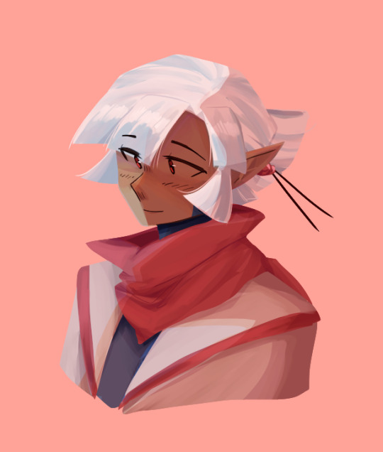
You've already seen this, but this is me formally giving you permission to rip it to shreds with critiques ✨️

Have fun hehe
Honestly I've been dying to actually be okay at art so im getting my notes ready 🧎♀️
Okay hi I was blocking some lighting for a drawing and now I'm making tea before bed and I'm ready to go. This is gonna get lengthy so cutting here for everyones convenience
I like the general vibe of it. You set the tone of the drawing very well and I can see the type of imagery you're going for! That's really great because understanding vibes and emotions is something that is harder to teach and easier to have an instinct for. I don't know if thats what you're going for but if it is congrats and also a huge part of my comments will be based on this because my goal in a critique is to understand your intent and help make that come through as best as possible
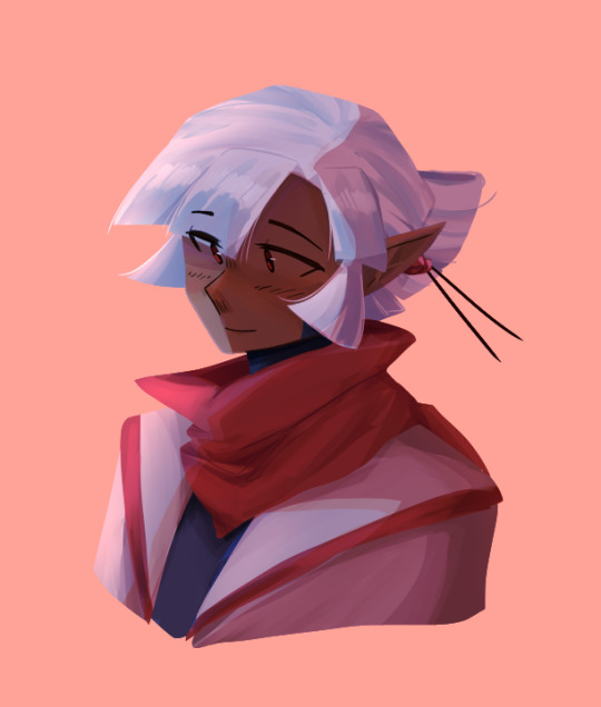
Also, hands are hard and these are not bad at all. I feel like they're probably referenced which is excellent, always use references if you can't get it right and use references even when you think you can (i say, knowing i don't use references like half the time rn). Building your visual library is the one of the most important things to learn as an artist.
I think my main overarching theme for my critiques is that its taking the middle road (hear me out).
This is a very common thing for a lot of people which is that they don't go super detailed, but don't go super simple. They don't go super dark, or super light. Everything is kind of low contrast, wishy-washy, if that makes sense. You wanna go one way or the other. If you want it to be detailed go detailed, if you want it to be simple go simple. Right now it's in this middle ground between simple (with the blurred airbrushed blending and the light lines on the hands) and detailed (with the folds of the fingers and on the creases on the thumbs and the nails).
Similarly, you want to make a definitive decision on whether or not you are using linework on your drawings, or if you want to use some linework but not everywhere (like on the rest of the hands vs the nails) you want it to make sense with the image.
If we're talking values (as in light and dark) of the image, the creases on the hands should be darker than the outlines (fold ur hands the same way as the image, you'll notice that these are the darkest spots).
Personally I definitely mix line-work and paint over in my art but if you take a look at this hand from my Blackjack drawing you'll notice that the line-work is either lighter or not present where the light hits on the back of the hand.

it's probably a little more obvious what i mean in my cheerleader annabeth. when I do leave lines on my work i actually alpha lock the lineart and colour over them with a lighter colour where the light would hit.
while we're on the topic of middle roads and values, i'm gonna segue into my point about contrast.
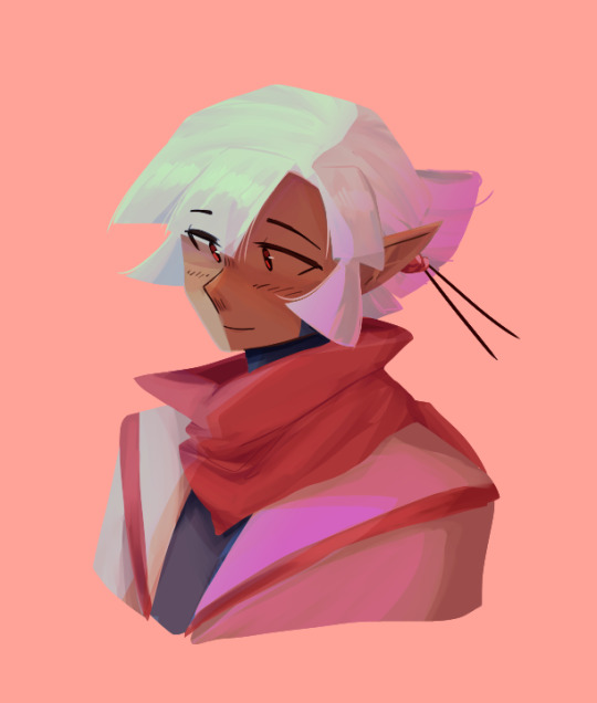
i totally get the like washed out light vibe but even images like that need dark darks and light lights. some people post pics that totally wash the image out for the aesthetic but when you're drawing you generally wanna have contrast.
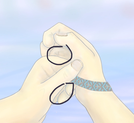
these spots (marked) should have your darkest shadows. especially if you're looking out onto water which would generally add a slightly backlit effect to the lighting because water reflects a helluva lot of light and usually have pretty harsh shadows as a result (you can fold ur hands like this and put it against a light and see what I mean). personally would recommend a super dark shadow there with a touch of rim lighting.
i know the lighting isn't quite the same but if you take a look at the polaroid of my late night talking drawing you'll see what i mean when i say that washed out soft vibes still have dark darks. the dark darks are actually what make the light lights pop and make it feel purposely washed out.


stealing this from carries moodboard but as you can see, waterfront image with a washed polaroid aesthetic still has dark darks and light lights.
My second point about contrast is sort of a comment on sharpness (?). This is another thing that's common with a lot of digital artists is that they will simply airbrush/smudge/blend until they die and this results in super soft shadows. IRL does not always have super soft shadows. Here is my rendering process if you're curious
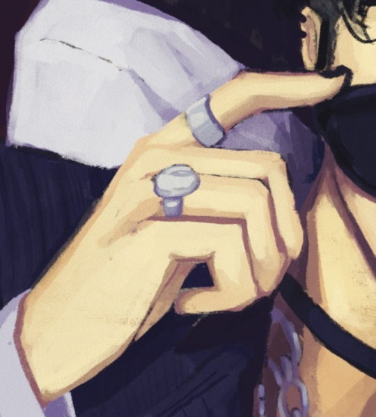
I think you could use some harder shadows (especially given the setting) in particular around the creases of the hands. Especially with the blurred background (which, same so true) you want the focal point of the drawing to be less soft. This is why the bracelet looks so good. It's got all the darkest darks, and highest contrast, and it's the sharpest. If you look at my work (when will i shut up about myself smh) you should be able to see a healthy mix of soft shadows and sharp shadows. Its about the balance 🤌
Another point that is also about contrast (ugh i know, but art is all about balance and contrast unforch). Is that I think you need sharper lines and shapes overall. Again this is why the bracelet is so nice to look at because of the sharp lines. Fingers have bones and therefore have hard edges. If you look at someone with their hand balled up you'll see that the knuckle is a much sharper edge than the curved line you're currently using on the left hand. It's so key to find a balance of sharp lines and curves (if you go back to the real time video of me inking you'll be able to tell, especially in the hands, how I mix curves and hard lines).
Some other minor comments:
i think the fingers on the right hand are a little off, it should be a little more tapered and you should see some of the nail from this angle
the composition is super centered so i think you should straighten out the horizon line a little bit. the hands are already asymmetrical so you want to balance that out with a perfectly straight horizon
personally i would make the sky a slightly more sky blue shade than you've got going right now. skies are often actually closer to white on like an overcast day and don't usually hue warm/purple until sunset.
i think you're using black or something to shade? i won't be that type of person to say you definitively can't use black to shade (and to you're credit i think i see a tinge of orange and blue around the shadows) but you should know that most shadows aren't black and that using black can grey out or desaturate your image and make it feel flatter and more lifeless. personally i use deep blue/purple on shadows but if you want to learn to make black work for you more power to you.
Anyways this is a behemoth. Thank you for letting me do this 🫶
17 notes
·
View notes
Note
21, 30, 7 hehe
21. Art styles nothing like your own but you like anyways
Art styles that rely heavily on linework, or a solid ink kinda style, are SUPER cool. My usual style is 'glob of colors exploded haphazardly onto the canvas' so anything involving a lot of tiny detail ESPECIALLY with the lines makes me go heart eyes. I also really enjoy cartoony, exaggerated styles. I love love love super stylized facial expressions, they're SO fun.
Some examples of artists/artwork I really like and am inspired from:
Niccillustrates has a beautiful style that features solid, largely unshaded colors and gorgeous linework/inking, which is most obvious in their Undertale fan art. Seems like they've taken down a lot of their older stuff which is a shame, this piece is one of my absolute all time favorite inspirations of mine. The little lines in everything, especially the flowers...AGH!!! Here's a more recent work! The contrast is gorgeous and I adore the shapes in this so much.
Retroautomaton's art has this overall pleasantness and smoothness to it that makes me feel like I'm drinking a milkshake, but like in visual form. Here's a few pieces I especially like. The fluidity and sense of movement in the lines/figures along with the bright, poppy colors is just!!! so lovely!!!!
ArtsyDudeJude's pieces are so EXPRESSIVE!!! The way he really pushes facial expressions in particular is super inspiring - all his original character design stuff in general is tbh. I look at linework like his and go. man I couldn't do that but it looks SO GOOD. Here's some of my favorites!
Last one I swear but I wanna mention my pal Dana, RedEyesRetroDragon on here! The way she stylizes characters is SO fun and dynamic I love it a lot. I don't know barely a thing about ygo BUT I care these guys bc of Dana's art. PLUS her inking!!!! Holy woah! LOOK AT THIS PIECE!!! AND THIS ONE!!
30. What piece of yours do you think is underrated?
Hmm this is hard! Usually when I get reception on my art it's really kind and lovely and when I don't, I generally chalk it up to people just not being online/not seeing it at that time so I don't worry too much about it.
I suppose...since I draw a lot of fanart, it's easier for my original stuff to sort of slip by the wayside. So I'll use this one as an opportunity to gush a bit about this piece I did a little while ago!

People have left some really kind and sweet comments on it so I can't say it's underrated but it is my favorite original piece I've ever done. I felt clever about the caption because you can see it a few different ways - maybe 'taking form' refers to the canvas, reaching out and taking over the person. Or maybe the person is reaching IN, merging with the painting. Maybe the painting isn't taking form as in stealing, but taking form as in manifesting itself a human body. The possibilities are endless! Also I like the silly goofy expression here <3
OH AND WHILE I'M HERE. This piece is also not underrated but this was pretty cool too.
7. A medium of art you don't work in but appreciate
SO MANY!!!!! But the first one that comes to mind is photography! Photography is so cool and fascinating and while I don't think I could ever get /super/ into it, I have a huge amount of respect and admiration for the craft! A good photograph is SOOO satisfying to look at, like it's literally the art of composition and lighting!! How cool is that??
ALSO music!!! Gah I want to make my own music so badly!!! But there's SO MANY building blocks I'm finding it kind of difficult to learn. That said I have such an appreciation for people who make songs and sounds and things!! OH AND SOUND EFFECTS. EDITING. THAT'S AN ART TOO AND I LOVE IT.
Production work in general!!! To me it's art and it's beautiful and I want to be a part of it. If I could have any job in the world no questions asked, I would want to work in stage lighting. Concerts, theatre, idc, that kinda work is right up my alley. There's just something I adore about like, all the little details that go into making a production work that most people don't think about or notice because it's designed not to be noticed, but people still worked on it!!! People still put their time and effort and craftsmanship into it! <3 <3 <3
this is about to turn into a whole essay about all the different art mediums i love efjkdshajhg Sorry this is so long but i really can gush for hours about this stuff. Thank you so SO much for sending these!!!
#THANK U AGAIN#i have so much love in my heart for art#i also keep a folder full of art pieces i rly lke that ive reblogged over the years#im at almost 2000 images now and nowhere near done sorting everything
2 notes
·
View notes
Note
do u have any tips for digital painting for people who like.... exclusively have experience in only lineart and simple cell shading ? i rly want my art to look like that but it always turns out horrible when i try to paint. i simply don't know how to blend colors i guess
this is going to be kinda long since im not very good at explaining things so i'll just run through my drawing process when im working on a digital painting!
first things first tho, im still learning to get the hang of it myself since im also super used to working with lineart/cell-shading rather than painting. so as time goes on my process will probably change as i learn new things!
first, i start out with a sketch of what i'm gonna be painting. i'll use one of my ocs as an example
when im working with lineart, i usually put the lineart layer over the sketch but when i'm painting, i tend to put the layers i'll be working on underneath the sketch! i do this cuz since i wont really be doing much defined linework, and it makes it a lot easier for me to do the next step which is:
blocking out shapes!
under my sketch layer, i'll block in shapes of color corresponding to my sketch, this works as a guidemap for me and usually each block of color gets a seperate layer to avoid getting frustrated while trying to work on areas where they intersect. (for example, the face, the bangs, and the back of the head are all separate layers to make it easier to avoid blending things i dont want to blend, like the face with the hair)

now here i start to work on each of the separate layers ive made, and i work on blocking in shadows. i usually clip layers together to avoid overlapping any unwanted things

at this point my process isnt super straightforward and i honestly havent exactly figured out what i do here definitively but i usually start working smaller and more focused on specific layers and work my way through the painting usually with one or two brushes. mainly, i use these two brushes, one for blending and making strokes, the other for VERY small details (i use clip studio paint so depending on what program you use and what you want out of your painting, your brushes may vary)

at this point im SUPER unsure on how i actually do what i do but i DEFO recommend studying other peep's art and using references to get things like hair and clothing textures. you'd be surprised on how some super complex-looking pieces tend to use less blending then you would think!
a tip when it comes to blending: i know it's super tempting to blend everything but from messing around with this style for a bit i can say that sometimes less is more! while blending is fun, it can sometimes lead to the colors or certain parts of the piece feel 'overblended' in which it might lose it's defined shape. although this is something that you'll learn to work through as you learn new ways to approach it!
now here is my final stage in where i might spruce things up a bit using layers to alter the colors and make things look a bit more unified and cohesive! honestly my fav step since i try out different layers that might bring out certain characteristics in my art!
also before i end this i wanna say that this is only the process i use and that you might use a completely different approach to it but if you find anything here that might be helpful, don’t be afraid to try it out and experiment!
and honestly… i think that's it? i tried my best to go through my process and hopefully people can see and try out what might work for them! idk if any of my points came across that well since im not very good at explaining but YEAH SORRY THIS GOT LONG OOPS
15 notes
·
View notes
Note
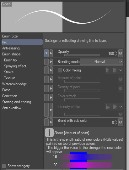
*offers a meek cookie* what,,,,brush do you use? on what software? it pretty,,,
[accepts cookie] thank u!
so the thing is , i rotate through a handful of brushes that i've gotten most comfortable with, so you'll have to be more specific with what brush you're referencing. sometimes i'll just get really bored of a brush so i won't use it for a while, but then use it again just because i feel like it LOL
all that to say, i use CSP (clip studio paint) with nearly all of my digital work now, and here are the main brushes i use frequently. if you're interested, i implore you to click/tap the images to get a closer gander:
1

this is one of the first brushes i've ever downloaded on CSP, back in 2020. i really love this brush. i owe it my firstborn child
it's meant to mimic a ballpoint pen, so it has the same texture, resistance and overall style of a real ballpoint pen! super cool! for example, when you color in something manually with this brush, it will have the same random gaps and holes in between strokes like a real pen stroke would. it's very reliable too, i feel like i've never encountered a time where i absolutely loathed this brush because it wouldn't provide me the outcomes i wanted. it also responds really well to pen pressure, so you can get pretty different lineweights based on how hard or soft you press on your tablet
i use it a lot because i'm a sequential artist first, and everything else second ^^; i recommend it to everyone who likes to draw with lines as much as me, 10/10
2
this brush is a little different from 1; it more resembles a pen with ink that reacts to paper than a pen with ink that simply sits on top of paper (like a ballpoint pen). like ... think microns or other standard art inking pens lol
if you want a brush that provides a more "manga" look to it, i reckon this is the one! i mean there are like a bajillion downloadable manga pens in CSP because that's what the program is known for, but this is the one i use. i use it when i want to evoke a more stereotypical manga comic vibe instead of a general comic vibe. it has excellent resistance (aka it doesn't feel like my stylus is smoothly gliding over my tablet) but not-so-excellent pen pressure difference, so in order to get different lineweights, you'd probably fare better if you just changed the brush size accordingly
3

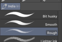
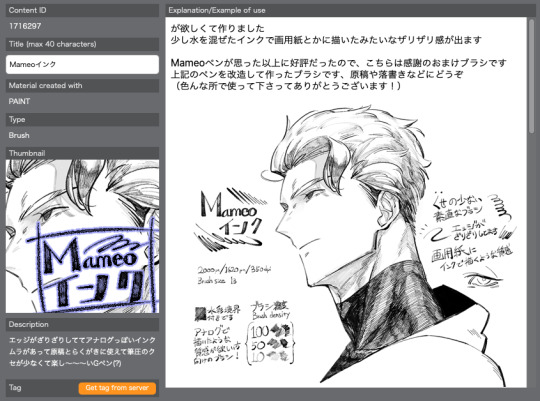
ok so this brush is not downloaded LOL it comes with the program but for some reason i really love it ... literally how i found it was just fucking around in the program and trying out pre-provided brushes and going AYO?
as the name suggests, it's meant to resemble rough india ink. i don't know how successful that is because i rarely use india ink in real life, but whatever. it's appealing to me because of its semi-opaque texture and PEAK resistance; no joke i usually use this brush when i line bigger drawings (such as colored ones), because the resistance is just SO GOOD. it makes me feel like a stable line artist for once ... it does have a tendency to appear faint though, so if you want a more solid, opaque linework brush then this might not be the one for you (unless you're willing to duplicate the line layer to make it darker LOL)
4
so i don't remember when i got this brush but apparently i've had it for a while, i just never used it until recently. it's kind of got a brush-pen type of feel to it, with an inherently slanted cursor
i like to use this one when i'm doodling really fast and i don't really care about the cleanliness of my lines. it works really well for simple doodling, or if you're looking to give your art a "freer" feeling! the inherent slantedness feels good to draw with also, but that might just be me lol. i also find that coloring and (cel) shading with this brush is a lot more fun than coloring/shading with a circle-tip brush (like the standard G-pen for example), but again that might just be me
5
i don't normally use this brush for any sort of linework so uh yeah. i only use it for "line art" if i'm experimenting with coloring+lineless coloring ... or if i'm doodling meaningless shit and this happened to be the brush i was using LMAO
anyway this is probably my main shading/rendering brush! i really like the chunkiness of the line if that makes any sense, and how flat it is :') it blends very well too, so it's great for layering colors on top of each other. the square end also gives way for lots of cool shading effects, at least in my opinion; it makes it look more like a painting to me! and since it's rather opaque on its own, you can still use it for standalone lines if you want, as well as make bold spots of color. i'm not an avid color user but whenever i need to paint/render, i usually turn to this one or a default oil brush
i also use other brushes of course, but those are the 5 brushes i normally shift through nowadays. it's very possible that i could get sick of these and i'll switch to new brushes JHFGJFG we'll just have to see B)
hope this helped a bit!
72 notes
·
View notes
Text
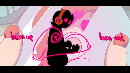

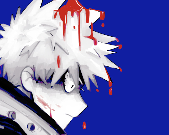
i burn up, burn out / (i shouldn't do this to myself)
first off: the new porter robinson song is really, REALLY good. like, honestly incredible. ive had it stuck in my head all day, and the MV for it has such wonderful energy to it + i love the art style and how everything flows together. like, this is now one of my top favourite songs.
secondly, as you know, i Still am hyperfixated on blaseball. and, as it turns out, Musician fits MaX really, really well imo
i don't do redraws / draw-overs super often but they're fun! and im actually p happy w how this came out, even if my linework is shakier than usual.
#leo chirps#leodoodles#blaseball#seattle garages#wyatt mason x#also this is a redraw of 2 frames but i got inspired by green's frame redraws and layered them fgkljxfh#SO. THANKS GREEN
19 notes
·
View notes
Text
WELCOME TO MY PROFILE!!!
┏━ •◦இ•◦ ━┓
┊ ┊ ┊ ┊ ┊ ┊
┊ ┊ ┊ ┊ ˚✩ ⋆。˚ ✩
┊ ┊ ┊ ✫
┊ ┊ ☪︎⋆
┊ ⊹ ┊
✯ ⋆ ┊ . ˚
˚✩
⊰᯽⊱┈──╌❊╌──┈⊰᯽⊱
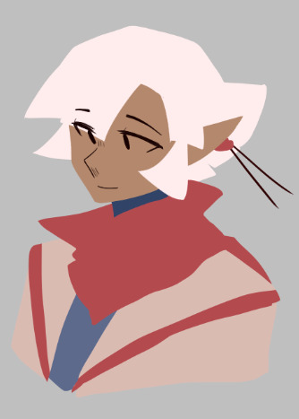
hello, I am the gremlin of this account. I mainly post artwork of my main OCs ((Anna and Eliot))
The two mean the world to me. It'd be appreciated it y'all didn't repost my drawings of them, tbh, it makes me low-key uncomfortable.
but! with that aside, let's talk about the admin for a moment!
Call me Casper, I am a 19 year old. And I'm female (she/her)
I'm always tired and like to annoy the hell out of my brother. I'm very smol (5ft) and my family likes to poke fun with that. I'm overall a pretty chill person, I got the "I don't care" type of mood 24/7
anyway
OCs that I most likely gonna be drawing and posting on this account
Annabelle Harper
Eliot Harper
these two, like I said, mean the world to me. They are beings from another dimension. This dimension is know as Euphasia (You-fae-shuh) and it has these demon like creature. No, they're not demons they are a species that I made a little while ago called Euphs. (you-fs) I will be explaining more (hopefully) in the near future.
Annabelle is the more chaotic one while Eliot is just the lazy one. They're considered Irish twins since they were born on different month's
Isadora Lance
she's a lil ghost girl, she was previously supposed to be this voice that people head and had the ability to mimic someone else's voice, but I scrapped that idea a while back, so now she's a ghost!!
Halo
Halo is a demon Queen that I made, very rude at times. Uh, I have really thought into who she is and whatnot
Jessie Quinzel
She is my DC OC. Being the daughter of Harley Quinn (the last name is obvious) and Joker. She's a somewhat chaotic, carefree individual. She has two other siblings, Seth and Stacy Quinzel. Actually, she use to be my old Creepypasta OC. Now she's my DC OC
Blake Wilson
Blake is a wendigo, being about to shift to human form at will. He is destructive when he wants to be. He and Anna were together for a little while, but it didn't work out. He has an older sister named Hannah
Salah Marbus
Another being from Euphasia. Very little is known about her. She tends to keep herself isolated and to herself in general. Her species is known as an Alph. She has no other family, unfortunately.
Dhara Crypta
Dhara, also known as Dee, is a hunter/warrior like individual. She, herself, is also an Alph, like Sal. She is most known by the King and Qween of Euphasia, standing by their side when necessary.
Clara Wilson
No, she is not related to Blake, for starters. Clara is, YET ANOTHER, being from Euphasia. She is one of the more dangerous ones. She is one with The Dark Ones. The Dark Ones are these shadowy-like figures. They only come out at night.
Orchid Arwen
She is the only one of her species, a Whispering Fairy. Like Sal, not much is known about her. She hides herself from civilization on most days.
Jason Wellerman
One of the most chaotic demons in all of Hell. He an honoree individual, very very rude at all times. He has three other siblings, a twin sister, Luna, an older sister, Abby, and and older brother, David.
Wysteria Flynn
Fairy baby, fairy baby!! Wysteria is a fairy. A nice fairy. She's best friends with Anna. She has green cat like eyes and short brown hair. She has no other siblings
Lorelei Winston
Corelei Winston
These two are identical twins. They were both born with supernatural abilities. Four abilities each.
Lorelei's abilities
Sonic screech
Levitation
Bilocation - being in multiple places at once
Telepathy
Corelei's abilities
Channeling - being able to communicate with a spirit
Telekinesis
Ability to see through someone else’s eyes
(Basically she see what someone else is seeing, only she’s looking that person’s eyes-)
Super strength
Mariana
She is my Siren OC. Nothing much about her, she has the ability to shift to a human form when she's out of the water.
Lana Wine
Lana is a solo gangster. She ran away from home at the age of 13. Marco, a leader of a gang (which has no name yet) took her in, so Lana would have a roof over her head. She soon left said gang and now running a solo gangster life. She has an older brother (unnamed at the moment) and a younger sister (unnamed at the moment)
Lucia Roslyn
Lucia is another demon OC. She previously was supposed to be the devil, but I decided to scrap that idea as well. She's tall. Lucia has a younger sister, Elana and an older brother, Lex.
Cynthia Martins
I'm not for sure if I wanna make her my My Hero Academia OC or not. But she can shapeshift. I don't normally talk about her, so.
Matthew Mercer
Matt is just another hooman OC. Not a whole lot about him. He loves video games and causing chaos with Anna
Odyssey Celeste
Odyssey is a light-bringer. Basically she has the power of light. She brings light to the darkest places. A light-bringer is another being from Euphasia.
⊰᯽⊱┈──╌❊╌──┈⊰᯽⊱
OK!! Now that I have all my OCs out of the way, most of you may be wondering.
Dear Gremlin, what is the magical fantasy land known as Euphasia? Well Euphasia is a land, mostly consisting of floating islands. It's broken up into multiple territories. The Euphs have their own territory while the Alphs have their own territory. And the Light-bringer travel from territory to territory along with The Dark Ones.
There are four guardians, elemental guardians. The Air, Fire, Earth, and Water guardians. There is also a goddess like being who is most commonly known as Ivolyn. (eye-vo-lynn)
I haven't actually looked all into the Guardians that much, so when I do so, I will immediately be putting it in the pinned post!!
⊰᯽⊱┈──╌❊╌──┈⊰᯽⊱
Now, I think that's all out of the way. Time for socials!
Instagram
Main account: @/cotton_candy_dreams12
Art account: @/the_doodle321
Discord
Main and only Discord: @/GremlinBaby#6366
Snapchat
pandachild20
Tik Tok
@/nutella_child101
Twitter
@/Color_Addict
YouTube
https://youtube.com/channel/UCh0-7hl7eQ-5ZySeavahnTw
⊰᯽⊱┈──╌❊╌──┈⊰᯽⊱
The type of artwork I'll be posting. It's going to be both traditional and digital artwork. I rarely draw digitally, and I usually sketch when i comes to traditional artwork.
I try to use watercolors
I use alcohol markers to fill in for color or I just keep the linework and call it good.
Some of my illustrations may or may not have some bits of gore, considering that most of my characters are..gorey in a way.
I draw mostly OC art
Very rarely will I draw a canon character from any show, novel, etc.
⊰᯽⊱┈──╌❊╌──┈⊰᯽⊱
Alright with that all out of the way, I think my pinned post is all done, I hope you enjoyed it and like I said, I hope you enjoy my artwork.
CREDIT
Aesthetic image: Made by me in PicsArt
Text Art: From Amino
╓┈♔◦☓◦☙◦♔◦☙◦☓◦♔┈╖
Now I think that's all, I hope you enjoyed yourself and have a nice day!!
╙┈♔◦☓◦☙◦♔◦☙◦☓◦♔┈╜
#pinned post#about the admins#talking about OCs#aesthetic#meet the admin#art talks#fantasy world#admin
2 notes
·
View notes
Last Seen Blogs
adoringsentiment
in my save file era
pikaboubou
:3
kimikyan
Bacchus
snarfblats-and-dinglehoppers
Its Sidney!
t4tnalu
i've got the ego of a God