#i draw consitently to have a 'style'
Text
These hands are rated E for everyone as in I can Do Whatever I Want to my favorite fictional character's..
I am a god
#mori speaks#idk i just love my recent drawings so much..#like i can accuratly draw what i want now#i always dreamed of this as a kid! man i feel fucking accomplished#like.. its just such a feeling of joy and euphoria#writing is different LMAO#i draw consitently to have a 'style'#and i dont finish most of my wips anymore rip#hyperfixating on smth else every 5 months messes with me lol#but i like how i write too#i like to think i describe a scene good enough for it to be visualized
1 note
·
View note
Note
Hi! I really love your cute rodent art! Will you be posting anymore ratblr stuff? Thanks and have a great day! 😃


I will :3
Though it's hard to say when exactly and whether they will look like that popular post with pastel rodents. I really struggle with keeping a consitent art style, it feels like for every drawing another style would be more convenient ^^'
But I do love smol pink-nosed babies and you can for sure expect more of the ratty goodness, in this style or another :3
#ratblr#mousblr#rat art#mouse art#rodents#rodent art#rodent#rat#rats#mouse#mice#animal illustration#animal drawing
78 notes
·
View notes
Photo

Alan loves you very, very much~
I had to make a hard decision here. Draw the round golfball head or keep the style consitent and and draw Alan in my own style. I chose the latter as you can see and I have to say I am quite satisfied with how he turned out. The perfect mix of cute and menacing~
#my dear hatchet man#mdhm#mdhm alan#yandere boy#I have to admit I have played mdhm the least#Still like Alan though#So cute yet so feral#10/10 would keep as a pet
55 notes
·
View notes
Note
went on rlm reddit 'cause I was bored
rlm redditors will make the most vile looking fanart I Don't Know WHY they are so fixated on making some nasty looking drawings of these wisconsinites its baffling
I've been trying to figure out the reason why redditors have consitently posted/drawn repulsive looking cartoons of RLM, and my only theory is that they probably want to prove that they're Actually Not Really big fans ("they're all gross looking seee? though i went through all the effort of drawing it...") and Most Definitely Not Gay for them. Or it's a projection of self-deprecation.
I don't know how they manage to erase all flattering features and deform all recognizable ones. Do they find people or men specifically that disgusting? Do they see the world like this? I find it hard to believe somebody could possibly like to draw/look at art like that, but at the same time I consider myself pretty narrow-minded in terms of art so it could be.
They're personally frustrating to me because they dance a line between being unskilled (why is that line there, this looks like 23848 styles unskillfully mishmashed together) and skilled (clear technical capabilities like clean lines, consistent shading etc.), and also it never really gets gross enough to call it gross art or cartoonified enough to call it a great caricature. It gets close to annoying me about as much as the anime girl design of the week since all I ever see change is the hair and the clothes, but it doesn't because I just care so little for that art.
#blortchmod#call me when people at rlm reddit have stopped drawing rlm like unsettlign wojaks#can't wait to get crossposted or something and then get hate#something would happen on this blog for once
6 notes
·
View notes
Note
I don't know if this is okay but what designs did you hate in heroes. To me I agree with lachesis as to me she looks like an actual child. She isn't in her source material. I don't have any complaints on dancer lachesis. She looks smug and young but not a child kinda young more young adult. I dislike base lysithea as she looks too young like an actual child. The worst for me is Loyd as he looks like a drug addict.
It's fine anon ! Don't worry, the real problem with Heroes is that it's a different game from the other. I mean aside from the fact it has SO many character.
That is to say that not only the design differs greately between character but also the artstyle since IS hire diffrent artist to draw different heroes even sometimes from the same game. Hating a design and an artstyle are different tho.
A design is the outfit for the character and how it is designed. A charac design is the basic appeareance of the character such as skin color, hair color, eye color, basic stuff. And those things remains more or less consitent even when a different artist with a different artstyle draw this character.
For example, anon, your complain seems to actually rely more on you disliking the artstyle choosen for those Heroes rather then their design since the differences between them and their OG design is small. It's possible to like a design but dislike an artstyle and from what you say, it seems to be more the case.
In the case of Lachesis here are her sprite.

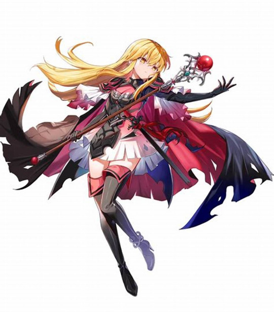
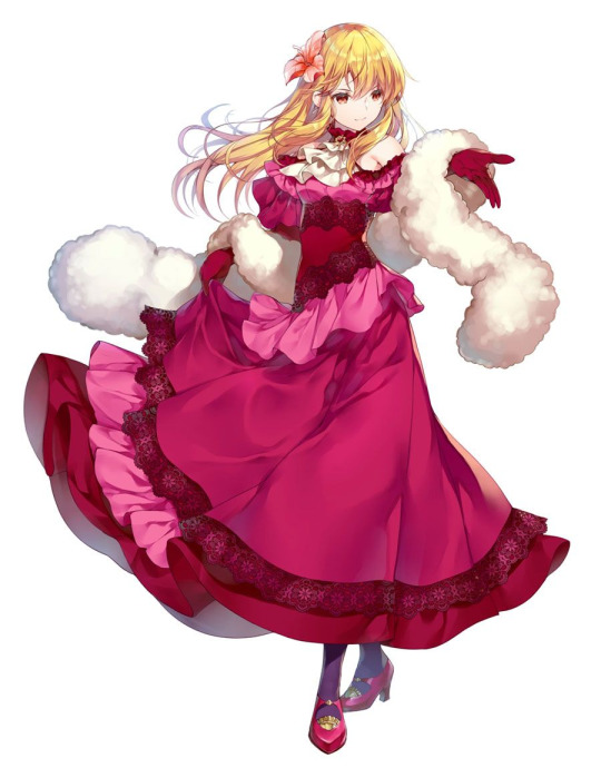
When you compare her first OG art to her Heroes sprite her outfit aren't that different, however the artstyle does maker her appear youger due to it being a moe artstyle. Moe artstyle like Mika Pikazo's for example, those artist are good at drawing young characters however all character seems younger then their age. For example; Lucky Star anime uses that style, and the character despite being 17, look like they are nine !! It's more evident when you compare the different art she has gotten, with her Resplendant looking like she is 12 whereas her ball alt look closer to her age, 15-16. It seems more like it's an evolution since Miwabe Sakura drew both her base buil and ball build, but they couldn't look more different !!
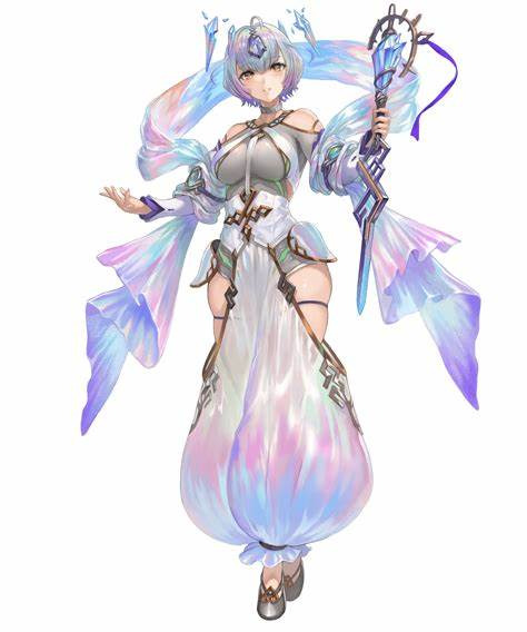
Lysthea's main artist for the base build also has that style, hence why comparing to Chinatsu Kurahana this Lysithea looks like she is.. ten.


Her artist, Yuichiro Enkyo seems to draw young character that way even though she is around the same age as Soleil and Selkie for whom they provided art as well, and they don't look that young.
As for Lloyd

His design isn't that different, however his artist drew him thinner, his cloack his lighter and the reason why he gives you those vibes as to comes from the coloring and the rendering. His artist Pikomaro didn't use that kind of palette on character like Wrys or Bridal Charloote tho, despite it being the same artist.
That's for it. I agree with you on the artstyle looking weird compared to the OG art, but the design are relatively the same. The artstyle was probably not best appropriate for them. I am fine with Llyod, but I agree that Raquesis and Lysithea looks too young.
When it comes to speak of Heroes though, I choose to speak of OG character because speaking of design, if I choose one specific heroes, this means it's their usual outfit I don't like and therfore it's more on the I dislike said unit outfit in their OG game category.
I can give you an example of a design I like but artstyle I dislike and one design I hate despite liking the artstyle.

For example, Respendlant Lucina's design. I like her outfit. But the artstyle is weird ? She looks like a toodler. Why did IS ask a moe artist to draw her when she is in her 19 in the main game ? Also, I am not a fan of the coloring in general.
And
An example of design I would hate are Loki and Seidr. Because their outfit makes 0 sense.
How does this makes sense ? The palette looks pretty but the composition of the outfit is weird ??? How is there any harmony in the composition because ... her pants reminds me of Olivia's and I didn't like her pants in her default outfit because of how ridiculous it looked. Even though Yoshiku has a pretty cute artstyle.
So those are the first one to come to mind. Thanks for asking me and for sharing your opinion anon and sorry if it took a bit long to answer.
By the way, you can check out here to compare between the different artist for Heroes :List of artists - Fire Emblem Heroes Wiki (fandom.com)
2 notes
·
View notes
Text
how to have a consitent art style how to learn to draw poses correctly chat I need to fuel my hyperfixation
0 notes
Text


Animal Welfare Pocket Experience
METHOD: Iterate - Design thinking bootleg: Prototype to decide & Identify a variable.
Prototype to decide
Keep Grateful and... (No.13) & Pocket Poem (No. 16). Iterations from last prototypes, drawing on user feed back of legibility and aesthetics. Have ensured both are easy understand for those who can't read smaller writing/details (children, elderly), playing with different text/background colours for contrast. No. 13's constraints were similar to above .
Will print and take votes from users for most legible and appealing aesthetics.
Identify a variable
Drawing on feedback from users in previous posts, I have identified the variables as aesthetics and certain wording, as well as consitency. The aesthetics have been addressed, using 3 different styles and colour schemes (and images). I have ensured the wording is not 'condescending' as per stated by a few younger users (taking out the part where it mentions the loved one being proud). Some users mentioned that picking up garbage and being grateful weren't related (a consistency issue), so I have added the first grateful item to the list as "Living in a clean country" as I believe this ties it all together and also creates an awareness if any one came from a polluted town. It's thought provoking and would prompt them to do something about it if they felt they didn't live in a clean country.
POLL UPDATE:
No.13
Black & Gold: 7 votes
Yellow & Black: 2 vote
Rainbow: 6 votes
No.16
Green/Paper: 4 votes
Navy/Gold: 2 votes
Pastel Animal: 9 votes
FEEDBACK: The feedback from the users are that the 'pastel/animal' prototype is their favourite, though they said that the animals and foilage were too overwhelming. So, I will implement this on the last iteration/prototype, ensuring to minimise foliage and shrink animals.
0 notes
Photo

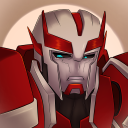
oh look its Jon The Magnus Archives
#goblinart#the magnus archives#tma#jonathan sims#i couldnt pick a specific fashion for him i was like#casual? librarian? guy who wears a leather jacket to trick ppl into thinking hes cool?#and then i realized that y'know. ppl can wear more than one style#so. its all of the above#now i just have to draw him consitently#the volume of his hair keeps increasing lmao#im working on my version of the other characters#but jon is the only one im mostly happy with
3K notes
·
View notes
Text

i just got a new tablet for drawing so i wanted to share my first zutara art. i have more art from my phone but just so you guys know my style isn't gonna be super consitant because im using a completely different device to draw on. but commissions are open :)
(ID: two digital drawings. the drawing on top has zuko hugging katara from behind as they look at katara's phone. they're wearing blue and red hoodies. both are smiling. the second drawing is of katara's phone with her hands holding them. on the phone screen is a picture of katara taking a selfie with zuko where she is smiling and zuko is confused about what's happening.)
#zutara#strawberry tag#zuko#katara#zk#art#zuko x katara#zutarian#zutara love#modern zutara#zutara art
184 notes
·
View notes
Text
Hey there! I was wondering if you could critique this ref sheet of this character I made? Please and thank you!

----------------------------------------------------------------
sure thing!
I really enjoy the style you have here, very fun and cartoony! The drawing has a nice consistent color scheme and shows a lot of personality, both very important for establishing a character. The anatomy is a bit lacking, but thats not a huge negative, just something to practice. One of the legs is bending at an odd angle and the hands are very static. Again, not terrible, but something to be improved through practice and time.
The lineart is very clean and so is the coloring. The shadow beneath them could look a bit more realistic but doesnt take away from the overall drawing.
The placement of the text could be improved, having the name be at the top of the page with the other info below it. Maybe consider using fonts instead of writing it out for future ref sheets? This helps with legibility and consitency in sizing.
Honestly, overall this is a decent ref sheet and gives all the necessary info you would need for introducing a character. Improving the actual drawing (again, through time and practice) and the legibility of the text are really all that's needed to improve. Maybe making the background look a bit more centered? Like this:

See how the color change in the background is centered and creates a nice border? I think it just looks a bit better.
I hope you found this useful and please remember: These are just suggestions. Ultimately, you know your art and skills better than anyone else. Keep up the good work!
#art criticism#art critique#neat character btw#im not sure if this is an oc for a fandom#but i do like their design#submission
1 note
·
View note
Note
Do you have any tips on how to find your own art style??
i would say dont overobsess about it. Social media and how it treats artists could make one think consitency and a very defined style is the most important thing but i think thats not true. I would say just draw in a way you like. Draw in a way that comes natural to you. The way you naturally depict things without any influence from the outside IS your art style. of course you can refine it later on but for the beginning, just focus on yourself and your art without all the shit that influences you
35 notes
·
View notes
Text
My friend wanted to read my gay porn fic so here.
It was an early morning and Darrell was out and bout in his disguise. He was sent out on a mission, because since directly attack the plasa wasn't working, why not attack the heroes one by one at their homes. This seemed like a flawless plan to Darrell. He almost tripped over himself for the third time in the past ten minutes while wearing Shanon's high heals that she let him borrow.
"She'd be laughing at me right now if she saw this." Darrell mumbled to himself, almost hearing her annoying pig-snorting like laugh.
He was wearing an outfit consiting of many shades of pink, to the pastel pink shirt with ruffles, to the hot pink skirt and knee high socks with lighter pink hearts on them. The high heals and wig were the same magnificent shade of magenta, the only thing that didn't consist of pink were the light green sunglasses(the left lens missing) that Raymond let him borrow. Darrel continued on in an unsteady pace in an effort to not fall over.
He finally made it to his first stop, Rad's apartment. He peeped through the window, and what he saw was completely unexpected. Rad was doing pull-ups...in his underwear.
"Damn..." he thought, even though Rad was an enemy, Darrel had to admit that he was quite attractive. "His perfectly sculpted muscles...his strong arms...his..his..-snap out of it Darrel!" he said the last part a little louder than he would have liked and ducked under the window.
He heard some shifting around and before he knew it, Rad was opening the window,"K.O, is it you again? Oh...hello ther little lady- Darrell!?"
It was in this moment that darrel screeched and fell over before his right leg went in the air and kicked Rad in the face. And Rad, with his awesome reflexes,grabbed Darrel's leg and dragged him inside where they toppled over, Darrell lying on top of Rad. They both just sat there for a while, processing what happenned.
Darrell was the first to make a move as he sat up and looked down at Rad, "uhhh...I can explain?"
He felt a hand on his waist as he saw Rad smirk, "I don't think you need to explain a single thing." Darrell was then aggressively pulled into a rough kiss. He knew it was wrong to let Rad do it, but it felt amazing and he couldn't resist. Rad had made his was sometime during their short make out and when he pulled away, he tugged on Darrel's shirt, "You wanna get frisky?"
"Uhh-uh-I-uh-duh-I mean-...yes?" Darell had no idea what was going on anymore and decided to just play along with it, what was the worst that could happen anyway?
Rad got up and scooped Darrell into his arms, carrying him bridal style into his somewhat messy room and carefully plopped him onto his bed. Rad locked the door and closed the blinds and looked over at Darrell, "Strip."
Darrell did as he was told, not really caring for the clothes anyway. He threw them off to the side without much care. Rad came over to lie down with Darrell while pulling him close as they started to make out again. Darrell decided to take control and got on top of Rad and stradled him. He started grinding against Rad and was content with the pleased sounds that the larger man was making. He leaned forward and started kissing Rad's neck, biting it enough so it left a mark, but didn't draw any blood.
Darrel felt a rather large buldge in the other's trousers, "Mmm, what's this now?" he slowly tugged the trousers down to Rad's knees and was mildly suprised at what he saw.
He carefully grabbed the tentacle-like appendage and watched as it wrapped itself around his hand. He heard a quiet, "Fuck yes." from Rad and started to jerk him off. Darrell enjoyed watching Rad squirm under him. He didn't know what it was, but he liked it. He wanted to see Rad like this more. Darrell started to think of all the things he could do to him in this position. He had been lost in thought for a while until rad let out an ear-shattering moan as he came all over Darrell.
"That was amazing." Rad whimpered as he looked up at Darrell.
Darrell didn't answer. He traced his left hand towards Rad's neck before he whispered in a seductive tone, "I think purple would look good on you~."
He then proceed to take his other hand and wrap it around Rad's neck as well before he started to strangle him. Immediately, Darrell was thrown off and fell to the ground beside the bed. Rad then got up and looked at him with a mix of disgust and betrayal.
Darrell had the biggest toothy grin on his face, "You thought I loved you?" Darrell started to laugh before he was cut off by Rad punching him in the face. He got back up and attempted to throw a punch back, but failed when Rad grabbed his wrist and tore his arm off. He fell to the floor again and Rad stomped against his chest. The force was enough to deactivate the Darrell and everything went black for a few moments before he found himself back at home.
"How bad did you get smashed this time, loser?" Shanon teased while rubbing one eye, still very much tired.
"Not as bad as you would have." Darrell retorted before going off to his room.
@dimentionnumbr8 take my dirty sins
1 note
·
View note
Text
UFC Fight Night 106 catch up
It’s becoming incredibly apparent that I can’t stay up to 10 because I can not keep awake for the life of me on these cards. Anyway, I slept through a pretty damn fun main card.
Alex Oliveira subs Tim Means, round 2 - I keep forgetting that Oliveira is still a fresh face to MMA having only really been fighting since like 2012 with limited martial arts experience. He’s making huge jumps in technical ability between fights and that really showed here. Went from getting toasted by Tim Means in their first encounter to controlling him in the clinch and on the mat. Means just never got anything going consitently and the fight ended with Oliveira taking Means down and locking up the RNC. Cowboy is a big, strong, athletic dude at welterweight. Interesting to see how far he makes it.
Marion Reneau and Bethe Correia fight to a Majority Draw - I pretty much agreed with the draw though there’s an argument for a Reneau win I guess. After the Rousey KO, people have kind of dismissed Correia as a bad fighter but she’s not. She is/was inexperienced. She’s a solid enough striker and wrestler but lacks the athleticism to make her style work at the highest levels. Reneau is a solid athlete that can get lost when things don’t go her way. Here we got Correia managing to take two rounds on the scorecards by controlling the fight in the clinch and countering Reneau early before putting together combos. THen the 3rd round came and Reneau cracked Correia hard and spent the entirety of the round just wailing on her. Fun scrap between two ladies stuck on the borders of the top ten.
Ray Borg take UD over Jussier Formiga - Ray Borg and Jussier Formiga had a fun, high pace scrap that showed off their growing striking games. Borg especially since he was a really, really not good striker going into that Justin Scoggins fight. Not as many combos from Borg as I would have like but he was sticking and moving and throwing with a lot of intent. Formiga showcased some tremendous defense wrestling and showed why he’s a top 3 back-take artist in MMA in the 3rd when he reversed a Borg TD attempt into a back-take. Unforunately for him, Borg is tremendous in the scramble and managed to reverse it so that he was on top. From there he dropped a lot of really heavy GnP (something I’m happy we’re finally seeing more of from him) that opened up Formiga and stole him the fight late. Borg picks up the biggest win of his career thus far, toppling the #3 guy in the division in impressive fashion. Hopefully he continues to make weight cause the man is much watch for 125lbs.
Edson Barboza KOs Beniel Dariush, Round 2 (KNEE) - Barboza landed one of the most perfectly timed flying knees in the history of the sport and just turned off all the lights in Dariush. Dariush started strong with his high paced pressure attack, forcing Barboza to move and not letting him plant his feet. But you got the sense towards the end of the 1st round that Barboza was starting to get his timing. The overhand rights started missing their target and the kicks were starting to land. Then, in the 2nd, Dariush threw a jab, took a step to the outside and made like he was going to shoot in. Barboza proceeds to hit a flying knee that immediately ends the fight. Brilliant stuff for Barboza. IF the UFC can manage to make Ferguson-McGregor, I wouldn’t be adverse to a fight between Khabib and Barboza for a #1 contender’s bout.
Shogun Rua KOs Gian Villante, Round 3 - While Shogun is way past his peak, he stills shows some really good shot selection. That was the story of this fight for me. He got clipped hard in round 1 and then proceeded to buckle down and out kickbox Gian Villante from there. Didn’t try to over-engage in the pocket, moved his head when was throwing, and made sure Villante wasn’t in a position to fire back. My favorite part of the fight though was Villante’s corner screaming for head movement because I’m like “dude, don’t you know your guy?” The only sad thing about this fight is that it inches Shogun closer to a title shot against either Rumble or DC and no Shogun fan should want that.
Kelvin Gastelum KOs Vitor Belfort, Round 1 - It feels weird to quantify this fight this way but if Gastelum was going to be any type of threat at middleweight, he was going to have to win this fight in dominating fashion. And he did just that without having to resort to the wrestling. Despite a couple of scares from the explosive power of Belfort, Gastelum had his way with Vitor in this one. Landed his power shots every time he threw and visibly hurt Belfort. Dropped him twice. Beat him in the first round where Belfort is the most dangerous. All around great night for Gastelum. And in the case of Belfort, perhaps it is not a great indicator when you’re headed into a fight with a 25 year old and you’re talking about wanting a “legend’s league” so you don’t have to fight young guys.
5 notes
·
View notes
Last Seen Blogs

puppyfleshlight
mutt !!
mio00520
我是小二

pissed-arapachick
Indigenous Rant

dumapp-blog
양말 맨발 스타킹
mr-miss-anonymous
Anon Man🏳️🌈🏳️⚧️