#i just saw this ratio on my most recent art pieces and it made me kind of upset im ngl
Text
Not to seem ungrateful, but I genuinely don't understand how many times a user on here has to be told to reblog the art they like before they actually listen. I don't understand how I can see posts from artists begging for people to interact with their posts still circulating from 2015 when this was first an issue, and still get 300 likes and 25 reblogs on art I post.
#tai talks#its just incredibly frustrating#it just makes me think my art isnt worth the rb and I know im not the best artist in the world but cmon#i cant tell you how EXCITED i get when i see someone rb my art and write things in the tags i get SO excited#and I go back and I re read peoples commentary all the time i really do#i just saw this ratio on my most recent art pieces and it made me kind of upset im ngl#it just gets me thinking why do i even bother posting things#i post for the 5 people that always rb my art i love you guys more than you could EVER know
5 notes
·
View notes
Photo
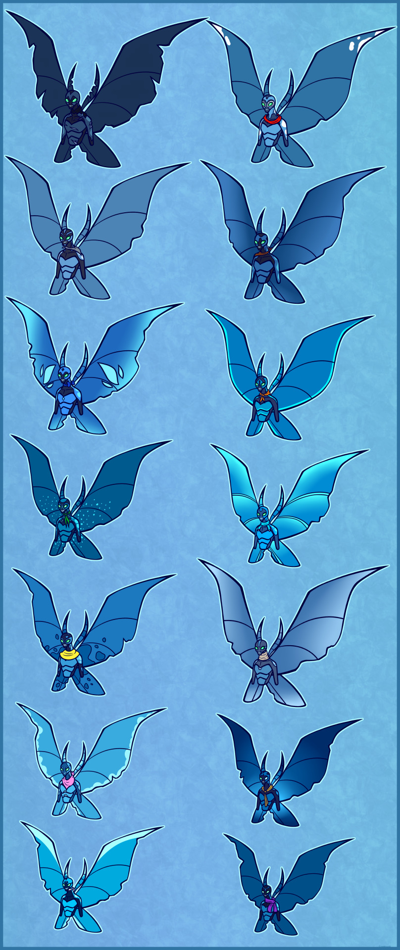
Since I saw people talking about Ben's little big chill kids, I thought I'd finally do some headshots of my ones, who are also a part of my Ben 10 Next Gen. For me, I've always imagined that for young necrofriggians, they all start out looking the same (Beyond some size difference), but as they grow older, they'll start to develop their own patterns, small body traits and shades of colour, as showcased here. I'll share the little info on each sibling, and the basics of who they are as a person.
When Ben first found them again, saving them from poachers and going full mum mode, they had been developing these different psychical traits, but not enough to identify each properly on their own, so while giving them names, Gwen used bandana pieces to colour code them, and each kid still wears theirs to this day, slightly modified. So here they are now, as full grown young adults.
You can follow from left to right each row, or just the colours next to their names.
-North (Black)-
The largest and physically strongest of the kids, North acts as the leading member when Ben isn't around, doing their best to watch out for their siblings and be a middle ground to them. It's been this way since they were born, looking out for them and doing whatever they can to protect the others. This has resulted in North collecting quite a few scars and wing tears, though they wear them with pride, wanting to display how strong they are to others. They often looks up to Ben when it comes to being a hero, in how their mumdad protects others and the galaxy, and wants to be a fighter like him one day, often asking to train with their mumdad whenever he's around. Ben has suggested Plumber training for North, but they're still thinking about that.
-Tundra (Red)-
Tundra is a very curious one, and is known to wander off when things catch their interest. They prefer using experience to learn from, thus making them quick on their feet when something happens, and good at thinking logical. When the siblings are struggling with something, or come across some kind of problem, it's often Tundra who provides the quickest answers that should go well for them. That being said, due to their wandering, they gave gotten into trouble a few times and need to be saved by their siblings or Ben, as despite how smart they are, they can be a bit of a ditz when something catches their interest.
-Grey (Silver)-
Having a connection to the earth bellow, Grey often spends their time searching caves, and any hidden areas they can find. They especially love to research and find minerals of any kind, ranging from metals to gems, sometimes even studying their metal lunch for the day before eating it. Because of this, they can be carelessly dirty, and aren't the cleanest of people, but does pick up after themself when reminded. Grey is also pretty close with their sibling Storm, and surprising Gwen and Ben when first hearing the two call each other "Dweeb" and "Doofas", when first meeting them again.
-Storm (Brown)-
As someone who likes to spend a lot of time flying and high in the clouds, Storm is fascinated by the weather and how it behaves, and feeling the cold fresh air and challenging themself with flight training. This has provided them to have the most agility in the air, and knows the best ways to build up speeds, while also not draining themself. Whenever they aren't flying around, they're doing research on the weather, very keen to be a meteorologist one day. Whenever Ben visits, they will often ask him about the weather on other planets, and any adventures he's had in the sky. Storm is also pretty close with their sibling Grey, and surprising Gwen and Ben when first hearing the two call each other "Dweeb" and "Doofas", when first meeting them again.
-Crystal (Blue)-
Graceful on their feet, Crystal is a charming and gentle person, with a keenness for the art of dancing, especially when hovering in the air. This was something sparked in them when seeing how the patches in their wings, which are see through, glittered and reflected light through them, making Crystal often move around to see what they could get them to do, and the introduction of dancing was something they latched onto as a result. They are one of the hardest of the siblings to get angry, upset or rile up, and often goes with the flow and speaks in a slow and soft voice. Because of their kind nature and beautiful display of their wings, Crystal has attracted many others who are interested in them, many falling for them after meeting Crystal for a mere minute, though they tend to pretend not to notice, and turn down those who ask.
-Orion (Orange)-
Having an eye for art, Orion is a skilled painter and drawer, while also dabbling into other art forms to create things, their room filled with their works of art, and often creating gifts for others. From when they were little, Orion has always admired their auntie Gwen, and are always keen and eager to hang out with her when she visits, showing every new drawing and painting they have made while she was away. In fact their fondness for auntie Gwen is why they picked the orange bandana, as it reminded them of her hair.
-Neva (Green)-
Fashion focused and head strong, Neva is a keen one, who knows exactly what they like and isn't afraid to say it. They love designing things to wear, especially since fashion isn't that big on Kylmyys, and Ben brings them fabrics and items they request from earth whenever he comes by on a visit. Though, despite Neva's expensive tastes, they are most certainly aren't a snob, and more often than not create outfits and accessories for others that Neva knows they'd like, and wants to bring out the best beauty in them. Though admittedly, they can get a bit carried away if someone asks for fashion advice, or even brings up the idea of something related to it. Neva also a bit of a business mind too, having gotten some clients recently on their homeworld after seeing what Neva could make.
-Raine (Aqua)-
A very sweet young one, Raine has a keen eye for collecting things, particularly shiny or unknown stuff. From gemstones to simple earth utensil, if something interests them, Raine is known to take it with them, sometimes snatching without thinking. They don't mean any harm, and just sometimes think before acting, and will give something back if they've realized what they've done, but if it's clear they can keep it, then they aren't one to share, though do like to show off what they have with joy. They are also very well organized, knowing where everything they own is, and even when their siblings misplace something, having a photography memory and mental list of things. They may own a lot of stuff, but that doesn't mean they want to live in a pigsty.
-Vale (Yellow)-
Being one of the quiet ones, Vale likes to keep a lot to themself, and don't speak very often, only when they need to. They spend a lot of time outside, observing nature as it passes by them, using a little diary to note down what they see, hear, feel, smell and even taste. They like to appreciate silence and the world around them, and the beauty of nature, and collect little things to store away in their diary as memory. Whenever they visit earth, they love to visit the forests in the spring and summer, seeing the range of colours blooming from flowers, and has many flower prints because of this.
-Lux (Beige)-
Quite the basic of people, Lux likes to live life in a simple way, and tends to try and stare clear of any chaos, which is quite hard when you have 13 wild siblings. Because of them, they can come across as annoyed and frustrated at times, and can be blunt and honest, but they do love their siblings, and is often the one that says what's needed to be said. Lux also have massive wings compared to their body, a ratio none of the others have, and use to trip over their feet a lot growing up. Now, their massive wings are a great way to hide away when they're not in the mood to talk to read a book, or to hug a family member when seeing them down.
-Micha (Pink)-
Bubbly and sneaky, Micha has been dubbed the "Pink Ninja" for a reason, someone almost always able to hide away and sneak up on others. They love to jump scare people, and has found more and more crafty ways to get around without being noticed, even without their ability to go invisible. They love to pull jokes and get a laugh out of people, and Micha is known to have a snort with their own laughter. It's always their mission to catch Ben off guard when he visits, as each time it gets trickier due to him knowing it's coming, and his training and skills build up over the years, but Micha always finds a way in the end.
-Zodiac (Gold)-
Patient and often neutral toned, Zodiac is often seen to be pretty wise. From a young age, they've always loved stories from history, especially those about myths and legends they hear from around the galaxy, and spend a lot of their time reading and researching anything they hear about, always keen to hear a new story they may have never heard about before. It always fascinates them how much Ben has seen and done, and the stories he tells, Zodiac is practically fond of those about Alien X and Celestialsapians, and wants to meet one one day.
-Alaska (White)-
High on energy 99% of the time, Alaska is always zooming around and never has time to stop. They rarely sit still for long, and it takes a lot to drain them of their endless energy, always moving in a blink of an eye. Because of this, Alaska is the fastest of the crew, which has come in handy often. But they can be easily bored, and a little frustrating to deal with when they don't pay attention, but they do like to spend that energy by jumping around each sibling to spend the day with, and wants to engage in all of their activities to support them.
-Arlo (Purple-
The smallest of them, Arlo was born the runt of the group, but thanks to their siblings, especially North, they managed to survive childhood when most other necrofriggian runts would have died. This makes Arlo the baby of the group, and the one they all want to protect, even if it can be a little baring at much, wanting to prove they can be strong on their own. And Arlo somewhat got their wish, when reaching a certain age and Ben learning that one of his children had the spark, thus meaning Arlo is an Anodite, and is able to use magic, though they're far from being perfect at it, and their small body sometimes struggles to keep up. But each day Arlo practices, wanting to feel more than just the tiny one, but they are generally kind and great with emotions, being very supportive and just trying their hardest.
#ben 10#B10#ben 10 alien force#ben 10 ultimate alien#ben 10 omniverse#ben 10 original series#ben 10 ben tennyson#ben tennyson#Ben 10 Big Chill#Big Chill#necrofriggian#Baby Chills#Ben 10 Next Gen#next generation#My Art
332 notes
·
View notes
Text
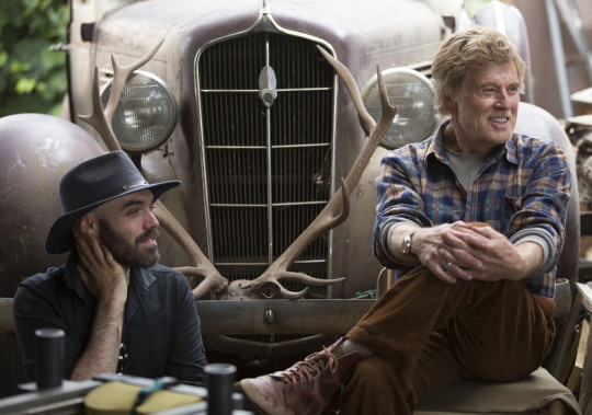
David Lowery Q&A.
“I think everyone in the industry at this moment is saying let’s take a step back and look at what our film sets look like and make sure that we’re not missing out on something.”
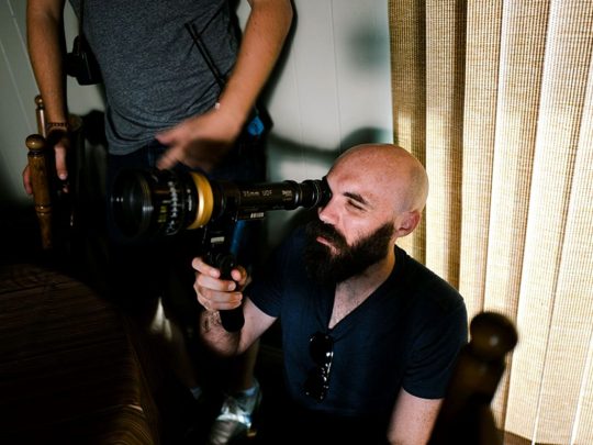
Writer-director-editor David Lowery has worked with Robert Redford twice (Pete’s Dragon and The Old Man & the Gun), and helmed A Ghost Story, which has become a much-admired slow-burner within the Letterboxd community.
We caught up with the Texan filmmaker at the recent Big Screen Symposium in New Zealand (organized by Script to Screen) for a lengthy chat about everything from taking Geena Davis’ advice on writing crowd scenes, to the fact that everyone is wrong in thinking A Ghost Story was filmed in 4:3 ratio, and how that film funded his wife’s debut feature, which in turn now sees her directing a stoner sequel to Home Alone with Ryan Reynolds.
David Lowery is a tease. On his laptop, which sits in plain sight, is an up-to-date spreadsheet of every film he’s seen, in what format, and where. (If it’s in bold, he saw it in a cinema.)
Lowery is a prime candidate for Letterboxd membership, and we tell him so. He agrees (“Letterboxd would be my favorite site if I wasn’t a director”), but will continue to hold out. “I love film criticism, I think it’s a beautiful art-form. I make movies to be part of the conversation about movies.
“But it’s also a conversation that, once I’ve made the movie, I can’t partake in anymore. Some filmmakers can read about their own work and are fine with it. But for me, I get too caught up in it and it’s important for me to keep those blinders on and to not engage with the discussion about my movies because I’ve had my say. The movie is what I’ve had to say and after that I find it almost inappropriate for me to continue the discourse.”
So we tell Lowery that, ever since A Ghost Story was released in 2017, the film has made a nice home for itself at Letterboxd, with its fair share of fans and repeat viewers (“That’s amazing to hear!”). We wonder how he feels about the slow-burning reaction to the film?
“I’m doing a lot of press for The Old Man & the Gun right now and going to a lot of screenings, and the common refrain is ‘The Old Man & the Gun’s great but, man, A Ghost Story is something else!” And I’ve become aware that that might be the movie that defines me more than any other and that’s fine because it’s the movie I’m the most proud of. I certainly know that it has struck a chord.”

David Lowery with Casey Affleck on the set of ‘A Ghost Story’.
Letterboxd: In your Big Screen Symposium keynote, you talked about how A Ghost Story came out of a sort of existential crisis in which you realized you might not become the world’s greatest filmmaker, or the best, so you were questioning why you made films at all. A Ghost Story came from wanting to make a small film about what a life means. An act of anti-legacy, if you will. But the film has become accidentally beloved, which means that, in fact, you’ve possibly created a legacy after all.
David Lowery: What a fascinating paradox. I mean the only thing I can say about that is that there’s no way to plan that. There’s no way for me to set out to make a film that will work the way A Ghost Story worked and it would be foolish to try to do so.
All I can do is make the movies the best that I can. I know that The Old Man & the Gun will be beloved by certain people but it won’t have the effect that A Ghost Story did. But I wouldn’t have known that two years ago. I wouldn’t have known that these two films would both function in such different ways. I would have probably assumed The Old Man & the Gun would be the more important one because of Robert Redford being in it. But A Ghost Story was the more important one for me to make, that’s certainly true, and maybe there’s something to be found in the fact that when you feel so compelled to do something it is because the subject matter at hand is more universal than you might understand in the moment.
A Ghost Story is a strange film, in that it washes over you, as opposed to something like Pete’s Dragon which is very much a dive-in fantasy-adventure.
I like to think of my movies as bodies of water, that’s a great metaphor for them. And I really like my movies to be lakes that just sort of ripple outward and sometimes they need to be diverted into streams or rivers or freeze in the glaciers.
Pete’s Dragon certainly is the most propulsive body of water that I have constructed so far in that the story moves along at a certain clip—and it needs to because it’s a certain type of movie. But A Ghost Story is a small pond that a rock got thrown into and that’s a type of experience that I really value when I go to the cinema.
It’s a very, like, wishy-washy metaphor but it really works for me, I really think about the way my movies move in terms of a natural flow and very often those flows calm down to just pure stasis and there’s great beauty in that.
You also made some really specific artistic decisions in the film. Was it shot in 4:3? [Lowery shakes his head firmly.] No?
It’s basically technically 1.33:1 but there’s a millimeter of difference between that and 4:3.
So how do those technical artistic decisions link in with the storytelling?
They were very intrinsic. I think the very first line, let me see. If I open up the script for A Ghost Story… [Lowery fires up his laptop.] I’ve been telling people this but I don’t actually know if it’s true or not… [Opens a draft of the script.] Yeah, so the first line of script says the whole movie will be shot and projected in a 1.33:1 aspect ratio. And that’s been there from the very beginning. So those things are very conscientious. Or, if I go down here, like, let’s see, yeah, like I’m getting very specific about “camera pans left”. “We hold for a long time.” I think there was a draft where I actually wrote that we hold for an entire minute. I get very technical.
Well then, we need to talk about pie.
Yes.
Four minutes of pie. What does it say in the script about that? Does it say “Rooney Mara eats pie for four minutes”?
I mean it’s pretty specific [reading aloud]: “She walks past the ghost, she enters all in black, she goes to the sink, sees a pour-over filter, takes out the coffee grounds, throws them out, turns on the sink, rinses out the ceramic filter, lets the sink run for too long. Then she grabs a fork and knife and returns to the table, cuts a piece of pie and hungrily eats it down and then she eats the rest of the pie straight out of the dish.”

A Letterboxd exclusive! The pie-eating scene from ‘A Ghost Story’ as seen on Lowery’s laptop.
When you’re getting that specific in your writing, what’s going on in your head? Are you seeing it?
Definitely I am seeing a version of it, I mean if you look at what’s written there it describes her sitting down at the table. But when we got it together to shoot the scene, Rooney wanted to sit on the floor and that made perfect sense, emotionally speaking, and so we refocused the scene to that, but even when she was sitting at the table, still the language and the grammar was going to be the same.
What is the process of developing the scene once you have your actors attached? Because once an actor is on board, they bring their own sense of their character to a scene. Once they read the script—no matter when filming starts—the work begins, doesn’t it?
It really does, it really does. I mean, A Ghost Story was so fast that there wasn’t much time between Rooney reading the script and her showing up to shoot that scene, like, it was very quick. A couple of weeks, I think.

Rooney Mara and Casey Affleck in ‘A Ghost Story’.
Why so fast?
I just didn’t want to wait to make the movie. I mean we had one week of prep for the whole film. We planned it around Pete’s Dragon so I knew that Pete’s Dragon would finish on June 10th and I think on June 17th we started shooting A Ghost Story. And here and there on weekends I would fly to Texas to look for the house and then Jade, my production designer, got there a little ahead of time to start fixing the house up because it was in a state of disarray. But certainly there was not that much time to think things through. We didn’t really have a plan in place. We didn’t even have an assistant director until a day before we started shooting. It really came together very quickly.
In a way that’s even more extraordinary in terms of the way that that film is still growing and finding its audience.
I mean it was interesting looking at that page in the script [the pie scene] and seeing how thoroughly descriptive it was—and if you look at the whole screenplay the movie is very close to it. But at the same time we were just fumbling in the dark every single day and trying things out and just really looking to figure out how to make it, how to cut to the core of what we felt we were after. And we could never put a name on that. We never knew exactly what we were after, but we were collectively working towards it.
Intermission: here’s a Letterboxd list of David Lowery’s five favorite ghost films.
During your Big Screen Symposium keynote, you took time to talk through the first scenes of your new film, The Old Man & the Gun, and the long process of finding a strong opening, in which the relationship between Forrest (Robert Redford) and Jewel (Sissy Spacek) is established. You took a lot of inspiration for this from the diner scene in Michael Mann’s Thief.
When you have more preparation time with your actors, how does that affect the script’s development? What is the process between the draft you send them and the final version that gets filmed?
For example that scene in the diner that we talked about yesterday at the panel, that seemed to not change. That was, I wrote it and that’s what we shot, and [Redford and Spacek] illuminated it but they worked with that material.
But then there are other scenes that they had a lot of input on and Sissy, I give her all the credit for a jewelry store scene in the movie that she latched onto early on. It was a very short scene in the script and she saw a way in which to expand it that she felt was necessary for the character. It was 100% right, she was 100% right about that and it’s one of my favorite scenes in the movie—but it wouldn’t even have been in the movie had it not been for her.
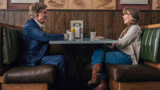
Robert Redford and Sissy Spacek in ‘The Old Man & the Gun’.
Presumably A-list actors are often looking for ways to expand their scenes, but for female actors, who continue to be under-represented in strong roles on screen, it’s even more important?
Definitely, definitely, definitely. That’s an interesting perspective. I hadn’t thought about it from that perspective. Because I always feel like I’m asking the actors to do too much, like, “that big scene? Let’s get rid of that so you can take a break tomorrow.” I mean, I never do that, but in my mind I always feel like I need to remove scenes so they don’t have to work so hard. I always want to give them a break because they’re doing so much.
But certainly, especially a movie called The Old Man & the Gun that’s about men, it was great to find any opportunity in that film to give precedence to the female characters. And so I’m so thankful that Sissy took that opportunity. She has great scenes in the movie. She’s in quite a bit of the film but she really used that scene to define who her character was for her. And then because it worked for her it works for the audience as well and for me.
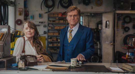
Spacek and Redford in ‘The Old Man & the Gun’.
You also talked a bit about making sure that not everybody on your set looks like you. Would you elaborate on that?
I mean it’s certainly something I took for granted for a long time, it just wasn’t something I thought about and I certainly wasn’t working entirely with men. I’ve been surrounded by wonderful female collaborators since day one, but I think everyone in the industry at this moment is saying let’s take a step back and look at what our film sets look like and make sure that we’re not missing out on something. Missing out on the opportunity to collaborate with people who have different perspectives or can bring something new to the table and who might not have had those opportunities in the past because there is a tendency to just go for what’s familiar. You go for what feels familiar and often what feels familiar is yourself.
So, in spite of the fact that I have always worked with wonderful women and wonderful collaborators who I would never want to make a movie without these days, I definitely am looking at the wider body of our crews and making sure that they’re reflective of the world around us. I think that’s what everyone is doing and that’s a beautiful thing.
And I’m not perfect in it, no one is, but to just all of a sudden have that be part of your process when you’re putting a movie together is very… it’s a wonderful thing. It’s a really exciting thing because all of a sudden you just see the ways in which your movies are going to get better.
Do you write it into your scripts or do you say to your casting agents, “Anyone, this could be anyone”?
I say “anyone” but I’ve also learned that it’s important to write it into the scripts too, because there is that tendency with casting—and it’s nothing against the casting directors—but they assume [that because] I’m a white guy that I’m going to want to see a bunch of white people. So I’m now very consciously writing into the scripts making sure that there’s that diaspora represented on the screen as well.
I wish I could just say it’s open to anybody but I found that if I don’t inject that into the screenplay then I’m only going to see a certain number of actors who all look a certain way. Maybe if I want to be truly color-blind I would in an ideal world not have to do that, I would just see everybody, see actors of all ethnicities, of all creeds, of all colors and I’d get to pick the best actor. But that’s not where we are right now and it’s very helpful in terms of moving the needle to actually go into the screenplay and make sure that you specify that someone is not Caucasian. Or even “not male”.
In The Old Man & the Gun there are a lot of characters in the movie who in the script were ‘bank manager number one’, ‘bank manager number two’, ‘bank manager number three’, and something that was very important for me to do was to give them all names, and then as we were casting to never bring in actors for any specific part. I just said bring in a bunch of actors, I’m not going to tell you who they’re for I just want to meet a bunch of people. And in doing that I met lots of men, women, black, white, Asian, Hispanic, I met everybody.
And then I could just start filling the cast in that way but I just never had people audition for any specific role because that way you free yourself from those expectations and no one knows who you’re bringing these actors in for. The casting director doesn’t know who you’re actually looking at them for and the actors don’t know either and so it just liberates you a little bit. You can’t do that for every part but it was really great on Old Man & the Gun to be able to do that and it’s beautiful to just fill a movie with people who don’t look the same, there’s just something so special.
It’s possibly making a bit more work for yourself?
It does, but that’s good work. It’s good work. Geena Davis said something about how when you write, in terms of getting more women on screen, when you write a crowd scene just write into the script “50% of this crowd is women”.
And that is one of those things that you wish you didn’t have to do but it makes everything work, it makes it so much easier because then the assistant director will read that and was like, “oh we need to have 50%”. They’ll take it literally because that’s their job, to take everything literally and then you wind up with a crowd scene of extras, 50% of whom are women.
And does also reading something like that flip a switch in your brain that maybe wasn’t flipped?
Definitely. I mean it’s very important to be open about the fact that that switch had not been flipped, I just took for granted the fact that I work with a lot of great women. But I certainly never thought about it in a cultural perspective and I never thought about from a woman’s perspective. But now I am and I feel like I’m a much better person for doing so.
Lowery and Redford on the set of ‘Pete’s Dragon’.
A nerdy question: in your wildest dream when you began being a filmmaker could you have imagined making not one but two films with the great Robert Redford?
No. But also because when I first started making movies those weren’t the movies I was interested in, you know? I wanted to make, from an early age, Star Wars movies, so I didn’t even become aware of Robert Redford until I became aware of the Sundance Film Festival when I was 11 or 12 or 13.
And so for me the goal was always to be associated with him through his festival. The goal for me to be a part of what he’d created. His films came later. I got to know him more as a director than as an actor because I saw A River Runs Through It and Quiz Show, I think the first thing I saw him in was The Horse Whisperer. It was only later that I got to know all those early classics. I saw Butch Cassidy and the Sundance Kid shockingly late in life… So working with him twice now I recognize the weight of it but it certainly wasn’t on my checklist of things to do. It’s really been a nice surprise to fall into alignment with him in the way that I have.
What’s the best thing about working with him? What do we not know about the way that he works that you would like people to know?
I feel like everyone sort of expects this and it’s not going to be a surprise but that it’s just so laid back and fun. He just really likes to have fun. He's very, very playful and that twinkle in his eye that we know and love on the big screen is there when you're working with him because he loves doing what he does. And he doesn't take himself seriously. He takes the work seriously but he doesn't take himself seriously and neither do I and so I think one of the reasons we get along so well is because we both are just having fun doing it.
Intermission: here’s David Lowery’s five favorite Robert Redford performances (plus one more).
You directed one of the great recent live-action family films, Pete’s Dragon. What are your earliest movie memories?
Well, I grew up without a television. My parents wouldn’t let us have a TV and so my earliest memories were going to the cinema and I saw Pinocchio and E.T. Those were the first two films I saw and I was obsessed with them. But I didn’t have a way to watch them again so we’d go to the library and at that time you could get storybooks of movies like Star Wars or for E.T. there were storybooks that had lots of photographs in them and so I would just get those books and read them repeatedly. I didn’t even see Star Wars for a couple of years after I had become aware of it. I knew the entire story but it was just through the books.
And finally one day my grandparents taped it off the television and showed it to me. I finally got to see it but I knew the whole story backwards and forwards at that point.
I remember wanting to see Clash of the Titans. I was really into Greek mythology and so I knew that Clash of the Titans was a Greek mythology film and had Medusa in it and so finally we rented this TV and VCR and I went and got Clash of the Titans from the video store and just watched it four times. Like, I just watched it over and over again because I knew that I only had that one weekend to see it.
When you were making Pete’s Dragon was there a sense that you wanted kids to have a similar experience?
Definitely. I just really tried to make a movie that I would have loved when I was seven. That was the barometer. I feel very in touch with me as a seven year old! I feel like I ceased to mature at the age of seven and so it’s not hard for me to tap into that mindset and I just would think about the things that I liked and often what I liked at seven years old were the movies that would scare me. Or that would provoke some emotion in me that I didn’t know how to handle.
I was terrified of Ghostbusters. I had seen the beginning of it at a friend’s house and it terrified me but I couldn’t stop thinking about it and so that was like a really exciting thing to me. The idea of finding that balance of fear and scariness to inject into a movie that would have hooked me at that age, even though it would also have traumatized me to a certain extent. And then also making sure that it was a movie that I as a 37 year old would also really, really like.

Angela (Maia Mitchell) and Jessie (Cami Morrone) in a scene from ‘Never Goin’ Back’, written and directed by Augustine Frizzell.
Since we’ve talked quite a bit about women in film, could you please pimp your wife Augustine Frizzell’s new movie?
Never Goin’ Back? It just came out in the States on Amazon Prime, I think it’ll be on DVD at Christmas. It’s based on her life. When she was 15 she moved out on her own with her brother and just had the most uproariously ridiculous experience as a young, underage teenager living on her own as an adult and it could have gone horribly wrong. It involved everything that you have seen in movies like Thirteen, where it’s just drugs and darkness and terrible things, but for some reason not only did she emerge from it unscathed but she looks at it with a sense of humor.
So she wanted to tell her story as a comedy as opposed to being the typical cautionary tale for young people. She was like, “We were really having a lot of fun back then. We were doing things we should not have been doing but it was a lot of fun, we were being idiots but there’s something glorious about that and the fact that I emerged as a fully formed adult who hasn’t killed too many brain cells, there’s something valuable about that.”
And so she wanted to make what is essentially a Superbad-style comedy for teenage girls. Some of the things that she did I am just like, “Seriously? That really happened and you are the person you are now?!”
And it’s great… I could go on with the long version.
Go on! We are all about husbands using half their interview time to talk about their wives.
She made the movie in 2014. Just jumped right into it, she got a grant the same way I got a grant from the Awesome Film Society to make my first film St Nick. She got a couple of grand together and made a version of the movie that she wasn’t happy with.
She made it right before we came here to New Zealand [to make Pete’s Dragon]. So she finished it, got on a plane to New Zealand, edited it and I remember around Christmas of that year watching the first cut. It was good, there was good stuff in it, but she was not happy with it. She felt like she hadn’t quite done what she wanted it to do. And so we started talking about re-shooting part of it or re-shooting the things that weren’t working.
And at a certain point she just decided, “I’m going to remake the entire thing. From scratch.” So she turned the feature that she had made into a short film.
And that film placed at SXSW and a couple of other places, and then she rewrote the script and recast it and when we made A Ghost Story and sold it to A24, we took proceeds from that and just put it right into her movie and used that to pay for her film. So she made the same film twice and the second time it worked, it was exactly the movie she wanted to make.
And now she has a career as a director and she’s about to make a Ryan Reynolds movie. It is a sequel to Home Alone. The working title that was announced under is Stoned Alone.
And, like, that is nothing that she could have ever planned for but because she’s a female director who made a really bawdy comedy, people reacted to it in a way that they wouldn’t have had a guy made that film. And I’m her husband so it’s easy for me to say this, but I’m just so proud of her for sticking to her guns, realizing that she could do better, making the film a second time and she’s reaping the rewards of having stuck to her intuition and not put a lesser, inferior version of the film out into the world.
As a collaborative partnership, you also did something really important, which is reinvest the money from your film into her film.
Our marriage luckily is founded on a mutual love of movies and so every decision we make about everything comes back to that love of movies. So it just made sense that if she had a movie she wanted to make I would do anything I could to make that happen. And that was one really efficient way to make sure her movie got made more quickly.
I’ve read the script and I don’t want to say too much about it, but as a fan of the first two Home Alone movies, I think this is a great follow up.
Because we’re at an event that is all about story and script, whose scripts have you studied closely or do you go back to again and again?
I go back to scripts that feel really messy, so I love Paul Thomas Anderson’s movies. He’s my favorite filmmaker but I also love his screenplays because they are just full of mistakes.
The Punch-Drunk Love script was published with all of the revised pages so it’s this multicolored document, and you see in that the process of revision that he goes through, and the process of intervention. It’s full of typos and they are so sloppy, but you see the things that matter to him like the fact that he will always randomly imprint that he’s dropping what lens he wants to shoot a shot on.
The Phantom Thread screenplay is also full of typos, and I read an interview with Daniel Day Lewis where he said that he loves the typos and tries to incorporate them into the dialogue. So if there is a typo in the dialogue he’ll make that part of the character because it just amuses him so much that the scripts are so sloppy.
So those are scripts that I like to go back to, just because it’s refreshing to look at something that is not perfect on the page. Out of that miasma they’re able to pull these movies that are just so, in my opinion, brilliant.
It shows a process where he’s obviously in a hurry to get the ideas out rather than to get them perfect.
Yes exactly, exactly. He doesn’t spend too much time polishing it. He just gets it out there on the page, he’s like, “we’re going to be able to make a movie from this document, but this document itself does not need to be perfectly refined. The refinement will come later.”

Last question: A24. Letterboxd members love the indie film production and distribution company. What have you personally gained from being in “the house of A24”?
I guess a lot of cool points, maybe? I don’t know! As someone who is a fan of studio logos there’s always like this certain thrill you get when you see a logo appear on screen that promises something. And you don’t have that that often any more. I feel like there was a period where like Lionsgate used to do that. I remember the old Lionsgate logo that was just the constellation. And you knew it was going to be a certain type of movie. There was like this really weird Canal Plus one that had these weird sounds and it was very strange.
So with A24, in spite of the fact that they make so many different types of movies, they all are within a certain scale. A scale that allows for there to be something, not subversive, but just surprising. They can take more risks and so even if you don’t know what the movie is, you know there’s a possibility for it to go in a direction that you can’t anticipate and that’s exciting.
They also are just very creative about how they get the word out about their movies and that contributes to that sense of culture. I don’t have much social media, I have Instagram and that’s it. But I know they’re very active on social media, and they don’t take themselves too seriously and they make everyone feel part of that. They’re very inclusive.
And so it’s easy to feel as a film fan, not just as a filmmaker, but as a fan, that you are part of a movement when you go see one of their movies or when you talk about one of their movies. There’s a scary aspect of it which is you wonder how long it can last? Because as a company they’re going to need to grow and I know because I’m continuing to make movies with them that they recognize that themselves, and are looking for ways to do that without changing what makes A24 so exciting.
I feel very grateful to have a front-row seat as a fan to see how they’re continuing to make movies, how they’re continuing to evolve, and I look forward to being part of that process myself.
Our thanks to David, Big Screen Symposium and Script to Screen. Here are seven recent films from filmmakers that David Lowery thinks you should watch next.
#letterboxd#interview#director#filmmaking#david lowery#robert redford#sissy spacek#a ghost story#a24
12 notes
·
View notes
Text
Vancouver Museum of Anthropology Trip Report

By Grant Duvall
While on my recent Disney Alaskan Cruise which left from Vancouver, I figured I would see some of the local sites, such as a suspension bridge above the trees and the aquarium. There was one place though, that completely took me by surprise. I did not go to the Museum of Anthropology expecting to write a review for Creepy Kingdom, but within moments of stepping foot inside I immediately started snapping photos.

Anthropology, in a nutshell, is the study of ancient cultures. While there were exhibits on cultures around the world, the Pacific Northwest was the primary focus. While the museum is extremely respectful in the treatment of cultures, the most amazing, eyepopping exhibits were terrifying. As it turns out, ancient cultures loved to be scared and loved to create scary pieces of art, much like the people of today. The totems were particularly frightening, as were many of the wooden sculptures around. I might add that this is not a very big museum as it only took us an hour and change to see it (although had we watched the movies we could have spent more time there), so the ratio of scary to non was pretty impressive. Wooden sculptures featuring people being eaten are not uncommon to find here. I was enjoying it and then I saw the temporary exhibit that blew my mind.

Shadows, Strings, and Other Things is the current temporary exhibit. This runs until October 19th, 2019. This showcases puppets as they existed in the past, as well as an exhibit on how to do stop motion as the style of marionettes was heavily influenced by puppets from hundreds of years ago. There is no Kermit the Frog here, only scary versions of death and people. Devils were very popular in the past as a way to tell morality tales, and sure enough, they were incredibly creepy. Of the hour and change spent at the museum my wife and I easily spend half of our time in this room. Imagine being in a room surrounded by dolls that look like Annabelle and you get the picture. The exhibit was extremely educational as well as each puppet had extensive notes as to why it was made, what it represented, how it was made, and facts about the artist. I could not believe how amazing this exhibit was and the pictures do not do it justice.

If you happen to be in Vancouver by October 19th, 2019, be sure to check out the Museum of Anthropology. This place will creep you out and remind you that our great great ancestors were just as spooky as we are!
Creepy scale- 8 out of 10. This place was unintentionally creepy and sometimes the best freaky stuff comes at the most unexpected times.


0 notes
Text
George Bokhua Research
After looking at the history of logo design and techniques which can be used to create successful logos, my next step is to research into someone who uses these processes effectively. For this, I chose to look at the logo designer and art director George Bokhua as he is someone I am personally interested in.

Originally Born in Georgia, on July 22nd 1978, Bokhua is a practising logo designer meaning his work reflects the modern standard of logo design. He didn’t have a conventional design education; he is self-taught and continues to share his lessons through a learning platform called ‘SkillShare’. Along with this and his social media pages, his modern approach to graphic design has amounted to a large online following which is where I first was introduced to his work.
Most of the artists I have researched so far in this project have been traditional artists, so I wanted to use an example of a more prominent practising artist at this time to compare the work and outlooks on design. I feel like George Bokhua is the perfect example to do so, as in his own way he embodies a new approach to design where the online space is taken advantage of to provide new ways for work to be seen.
Bokhua mostly produces clean, modernistic logos and it is what he is most noted for amongst his audience. More recently, he has started experiment with more illustrative graphics, yet still keeping to the clinical, geometric style of his logotypes.

George Bokhua’s logo work mainly looks at letterforms and animal forms. The examples above show various ways in which he has abstracted and altered the look of certain letters whilst maintaining their original perception. It is important when abstracting a letter, to not go too far that the letter becomes unrecognisable. This applies to any sort of logo, but I think it can be seen in type when the viewer starts to question whether the logo is a letter or simply an abstract symbol. The logo with the most ambiguity out of the above 12, in my opinion, is the right-middle example. The overlap of the circles that the logo is constructed out of made me perceive it as an abstract logo at first. It wasn’t until I noticed the subtle shadows, that I saw the separation between the ‘S’ and the oval. I would say this is the least effective example because, without these shadows, it is unclear whether the logo is meant to be perceived as an ‘S’ or just some shapes. Logos should work in one colour, so for this example, in particular, I feel like the way this logo can be recognised is too reliant on the shadows.
On the other hand, my favourite logo from these 12 is the top right ‘R’. This is because Bokhua has simplified the letterform into two simple shapes. The extension of the bottom right leg of the ‘R’ extends from a place where it wouldn’t usually. This doesn’t make the letterform unrecognisable, however, because Bokhua has identified which are the segments that should remain unchanged so that we still perceive it as an ‘R’. This example is also a more effective use of the shadowing technique in my opinion.

Without the shadows, the logo still works in the same way and the communication isn’t sacrificed at all. The shadowed parts are just replaced with negative space, and the audience is left to fill them by using the continuance of the structure around them.
George Bokhua uses this same abstraction of the letter ‘R’, along with implementing more colours and details to produce a more illustrative example of the ‘R’ letterform.

Although this wouldn’t work as well as a logotype, I still find it to be an interesting example to look at. This was the first piece of work where I saw the fundamentals of logo design starting to be used in his other type of work. The ‘R’ has been abstracted into its key components. These are then altered to feature characteristics of a mouth, with the negative space of the top portion being a mouth (as implied through the two teeth at the top) and the leg of the ‘R’ being an extended tongue, which also adds to the implication of a mouth in the section above. The effect of this is that it gives the image two meanings. One is an ‘R’, which could stand for something or represent a word and the second being the mouth, which has been illustrated in a fun and light-hearted way.

Abstracting an animal requires a different approach to abstracting a letterform. This is because a letter is already a simple piece of imagery, which will, most of the time, already be constructed out of simple geometry. Animals, on the other hand, are an example of more a more organic structure. For me, simplifying animals is harder because of this reason. I personally feel like there is more a jump between making an animal into a logotype than there is making a letter into one. I have already done a project on animal logos this year, looking at simplifying an animal into a modernistic mark. It is here where I learnt a lot about the process of transferring the visual qualities of an animal into a single colour, only using simple geometry and keeping it recognisable. The 12 examples above of George Bokhua’s work are all examples of this being done powerfully.
The simplification of an animal will sometimes go into the simplest forms of geometry—lines. As well as geometry, Bokhua will experiment with line drawings and continuous-lined logos on a regular basis. He does this to practice the technique of simplifying complex things in different ways. The two griffin logos out of the 12 examples above show two ways in which Bokhua uses lines to construct an animal. In the first example (the left-hand griffin), the lines use more circular paths and overlap to add more depth to the wings for instance. The mixture of clinical lines with the smooth flow of the circular directory maintain the organic look of the original animal but simplify it enough that it can easily be redrawn with one continuous line.

In the second example (the right-hand griffin) the effect is pushed further. The lines are sharper, thicker and overall portray more power. The logo is made up of 4 lines of varying lengths which meet together at sharp points. All 4 lines meet at the bottom at the same cut-off level to portray the 4 legs. Then, as these rise up at the same inclined angle, the head and wings are implied simply through these single lines. Along with all of this, the eye has been taken out, which removes the animalistic essence altogether. These two griffin logos show the effect of converting animal forms to shapes as they both do so in different ways.

The whale logo above is constructed solely out of one type of shape. These being ovals allows for a balance between an organic form and a geometric grid making it completely balanced. This allows for more expression to show through the mark and almost adds an element of movement to it. I talked about answering the question “how can a logo be ‘kinetic’?’ in my project proposal and I feel like this is one of the ways to do so. By using more organic lines, the original movement of the animal is represented through the flow of the ovals and how they come into contact with each other.
Golden Ratio
The golden ratio is something I identified in my previous case study on logos as something which can help make a visually balanced symbol. George Bokhua has a number of lessons on the website ‘SkillShare’. Two of these are how to create logos from a grid and how to create them using the golden ratio. Here, he goes through the different ways you can use this ratio in your logo designs to make them visually perfect. Below are some examples of where his logo designs contain the use of the golden ratio. Whether the golden ratio is used to determine the sizes of the shapes he uses to construct a logo or simply to work out a line weight to spacing ratio, it is always used with the intent to achieve visual perfection.

Looking at techniques like these are important because I can learn how to implement them into my own work, but also because I can recognise where these techniques become evident in other types of work. Bokhua’s illustrative experiments, for example, use very similar techniques to his logo design just to create different aesthetics.

For instance, the above examples of a series of geometric explorations showcase similar visual language to the second griffin logo I discussed above. The thick, powerful lines, in this case, are constructed out of circles as well as lines. Being an illustration, this allows for more colours to be used and Bokhua has used this to create what looks like overlapping in some of the shapes. This chaotic effect is made solely out of various shapes and less than four colours. Restricting to colours and shapes are both massive processes to his logo work and the effect of this shows through these geometric illustrations also.
In a way, I can relate the chaotic feeling of this work to David Carson’s work. Whilst there is an element of chaos which is prominent, there is an underlying consistency which keeps it balanced and juxtaposes with the chaos of the shapes. In the case of George Bokhua’s geometric illustrations, the underlying consistency is the way he uses geometry to construct everything and the restriction of colour.

Above are more examples from a different illustrative series he produced. This relates more to the whale logo from above, as geometry is still being used, just in a way to portray a more organic and almost fluid shape. The colours are still being restricted for the most part, so there is still that juxtaposition between the chaos of the shapes and the structure of them individually and their colours. I think the effect of this is that it portrays a sense of movement more so. The fluidity of these illustrations come from how roughly the shapes are put together. Whereas the more geometric versions being restricted to lines and perfect circles appear to be more stagnant.
“Talent is overrated... in our field, it’s all about working and getting the form right and engaging and putting more and more and more time into one piece until you get it right”
When asked about giving a piece of advice to newer designers in an interview with ‘LogoGeek’, Bokhua answers quickly with the phrase “Easy. Again, talent is overrated”. Without hesitation, this is Bokhua’s go-to piece of advice so I would assume it has provided a lot of inspiration for his own practice. He, later on, says “it’s all about working and getting the form right and engaging and putting more and more and more time into one piece until you get it right”. This shows me the importance of hard work and that being a good designer isn’t about natural talent but about the work you put into improving. The fact that Bokhua said this with no hesitation makes it all the more compelling. It is important to constantly look at improving everything you produce until you “get it right”.
Looking Back
Since looking at the brief, I have been aiming to challenge my current ideas with new ones that I pick up by researching and developing practical work. Staying constantly curious throughout this project so far has allowed me to gather a much wider range of ideas and concepts that otherwise I would have limited myself from. This process is backed up by George Bokhua himself in his interview with ‘LogoGeek’. In the same way, producing successful outcomes for this project won't come from natural talent, but from the work that I put in to constantly improving my work over and over again.
I originally chose to look at George Bokhua as an artist because he is someone who personally interests me and offers a different approach to the artists I have look at beforehand. I now see how his processes of creating clean and concise logos resonate with my own preferences of designs that I like, which explains why I like his work so much. I can make a comparison between his logo work and the work on typography I have done up until this point. His letter logos, in particular, offer the most obvious comparison between type and branding. Both are used for communication and the techniques to communicate clearly are synonymous in both fields.
At the design museum, I saw the earliest forms of type being sketched onto a grid. Today, grids are being used to structure the most modern types of logos, which shows the link between even the oldest example of type and the newest examples of logos.
Moving Forward
Some potentials I have gained from looking at George Bokhua and his processes are: using grids to construct logos, experimenting with the golden ratio and using shapes to aid illustrative techniques. I aim to expand on my research over the course of the next two weeks, with these techniques of branding playing a large part into the outcomes that I produce. I believe the first step should be to take it back to basics and mirror the earliest processes of designing type but use that to design logos instead. Restricting myself to a grid when designing a logo will ensure that it is recognisable at a small size and if I start from here it will also work in one colour.
0 notes
Text
Early Peak Returns
Lynch is easily in the pantheon of the great directors of all time. If Mullholland and Inland didn’t clinch, the new Twin Peaks does. As have been saying from the outset, this was going to be Lynch’s magnum opus and a definitive masterpiece. Though I must say, I didn’t expect Peaks to be this exactly. I read a piece just before Sunday that alluded to what Peaks might look like based on his past few films. Very abstract yet artistic — a true auteur for sure. Now a cinematic genius on par with Kubrik?
The visuals alone are striking. All the shots look like his paintings come to life, especially the tree in the Lodge with flesh for brains.… I love the panning across the Lodge floor in the opening, gets the viewer disoriented from the start.
I only watched P1+2 Sunday night, watched P3 Monday, and tonight I’m rewatching P1–3 before watching P4. So I’m Peaking out tonight. Might watch again before P5 on June 5.… I read Lynch didn’t want Showtime to dump all the parts at once for people to binge watch. After all that effort preplanning for years and then the long production and edit times, plus the build up of anticipation and keeping a tight lid on any leaks, Lynch didn’t want the audience to blow their load so quick binging. Lynch wants us to watch and digest for a period of time before consuming more. The series is so dense now, I would actually prefer a week in between showings. It will end in September.
On May 23, 2017, at 4:37 PM, Erik wrote:
It's hard core Lynch to say the least… I'll do a pro's con's list.
PRO's
We now know what happened to Cooper after ep 23. And it's unexpected and interesting. YES. And a revelation in phylosipy, even though he had Bob in him when he exited the Lodge, We also know his doppleganger is on the loose, which is NOT BOB inhabbited. So which is which? Muahahah.
Ben & Jerry are still together and in their character. Love Jerry's new persuit. doesn't he say most of the Hotel profits come from his pot sales? Something like that. Next time around, I am gonna watch with subtitles on. Good to see the Log Lady, but sad as well. She looks very sick. Albert looks pretty good, knowing how sick he was.
Watching Catherine so frail takes me right out of the moment. Al Strobel, too. And Carl the Giant. But that works in this story because it’s 25 years later.… There was a nice onscreen pause right after Hawk and Catherine hangup. Lynch lingers on Hawk a good 5–10 seconds, I can’t help but believe intended as a moment of silence to Catherine Coulson — somewhat in line with Judge Sternwood’s aside, taking a brief moment. I bet Lynch intended that while editing, since Catherine had died by then. Just a thought.
Watching Catherine so frail takes me right out of the moment. Al Strobel, too. And Carl the Giant. But that works in this story because it’s 25 years later.… There was a nice onscreen pause right after Hawk and Catherine hangup. Lynch lingers on Hawk a good 5–10 seconds, I can’t help but believe intended as a moment of silence to Catherine Coulson — somewhat in line with Judge Sternwood’s aside, taking a brief moment. I bet Lynch intended that while editing, since Catherine had died by then. Just a thought.
Denise Bryson in charge of the FBI YES! LOLOLOLOLOL what else can I say?
Lynch is free to Paint Nightmare images on screen again. This all surpasses anything in Fire Walk With Me. Much more like Lost Highway and his Short Films. And his revenge on Michael J Anderson (who said, "I want a million dollars, I'm irreplaceable"). the Arm has "evolved" into A Failed Art Project Tree! LOLOL
Lynch is a painter, filmmaker, and also makes music — Twin Peaks is all of his artistic vision in one medium. This series will be talked about for quite a while, and this singular work will make grand fodder for many film scholars. I think Peaks will stand up to one of the best TV series of all time, mostly because of this recent Series 3.
We are hearing back story about Philip Jeffries (if only Bowie had lived) Helps me believe there is a story thread deep under all this that connects things together. May be hard to follow, but it's there. It's like the X-files on outdated acid.
Beautifully shot and sound designed. But we knew that was always going to be true. Not seeing a lot of Snoqualmie yet though.
Love the drone over the Falls shot… dissolved into the wavey red curtains — like a river flowing. Curtains in Blue Velvet intro, too, right?… I notice the titles have more horizontal spacing between characters, undoubtedly adapted to fit widescreen ratio.
New intruiging characteres.. I am liking most of them, though Coop killed some very pretty girls already..(Marsha Marsha Marsha!!) lol Sorry I had to. :P There are so many it's hard to keep track. (how many Coopers are there?) IMDB has updated the Peaks page with all the Actors and their character names. I printed it out and have it on hand while watching now.
Good idea.… On my iPad. Check.
Findingout what some classic characters have been up to. Bobby? Wow...that was a twist. Natural place for Hawk to be. Lucy Lucy, a career receptionist. Jury is still out on Jacoby.
Expanding the story beyond the Northwest. They did so in the film a bit, and we are not stopping now. We have a LOT of ground to cover to find these new locations. Coop has even gone into Space...or did he? WTF? LOL …
A return to Glastonberry Grove. We saw Hawk up there, but then the story just skips the rest. Did he see the curtins? Did he try to go in? He doesn't even mention it when we see him later (Bobby's Reveal). I could not tell if it was the same place they shot the Grove for the series. I will try to get down there and see if the area has been disturbed. But I see numerous shots in The Return that could have been shot up at Franklin Pond.
I looks to me that Hawk saw the curtains, but knowing the Black/White Lodge mythology knows not to fuck with them. I see Hawk having a significant role in bringing Cooper back, I bet he’s directly involved at some point.… Is that what Peaks is officially being names as, Twin Peaks: The Return? I’ve read that a bunch in reviews.
CON's
Where the HELL is all the awesome music??? I mean, for real? you got Angelo hired and you are scoring entire scenes with Dave Brubeck's Take 5? And the Angelo music we do hear is straight off the Original soundtrack or the Twin Peaks Archive. Very strange. That is what is missing for me the most. I want the drums shuffling under the scenes damn it! Even the movie had this.
I was thinking the very same thing — where’s new soundtrack music and sounds? I only seem to hear a low bass rumble in varying degrees of difference and tone. And it looks like each part is going to end at the Bang Bang Club featuring a different band each night. I get the idea, kinda a good way to feature new music but hope they are atleast songs written for the series and not cherry picked from existing albums. I mean, if Lynch handpicked each performer to appear then ok, I can tolerate that. But why not a Bang Bang house band that played Badalamenti arrangements each night — original compositions of new music for The Return. There would be a slightly more elevated buzz about the series if Lynch graced us with new Badalamenti music.
Ben & Jerry appear for 3 or less minutes in part 1 and it has nothing to do with anything at all and then they are gone. (same with James and Shelly and Mrs. Palmer, even Leland had no purpose).
Where is Audrey, Norma, Big Ed & Nadine, Doc Hayward and the rest? I will wait patiently, but I am missing the RR. (NO pie or donuts references yet at all, one coffee moment so far)
…One coffee moment so far that leads to death! Or is it the act of sex that leads to death?! I don’t know… maybe one and the same. But I agree, I really wish there is more conventional story line featuring the characters of TP, because that’s what made Peaks, as well — not only the Lodge, Giant, Dwarf, BOB, et al. It was the quirky characters that we all enjoyed. Even if the storyline plays us new ones, I’d like to see a narrative that I don’t have to decipher or wait until the scholarly writings appear.
The Music Video endings. Sorry, but really? The songs and cinamatography are not even all that special. It's like listening to KCRW in the morning.lol When Julie Cruise was on stage, it was special. The music was special, the atmosphere was special. It was an important moment in the story. But I guess it's a good way to segway into the end credits, but also seems like a waste of story telling time.
Where is Mark Frost's influence and dialogue? We may never know. But it's never gonna be all that quirky funny abusrd character dialogue. It's almost like there are TOO many characters. (Mullholand Drivesh)
I was thinking this a lot, too, yes. Did Frost sign off on all this? Doesn't he know Lynch is very imaginative and has a penchant for tearing up scripts and shoots whatever he wants?? What’s the script for all the Lynch imagery that has only sound, no dialog?
And his scenes in the Casino? Priceless. But I hate seeing Cooper as a total idiot, unable to speak or compreihend his surroundings after he fell out of the sky. Oh well, I know he is coming back soon. So all of this adds up to a Solid A rating from me. VERY strong and VERY engaging. I am on board for the run. Hope we get to watch at least one episode together this summer!
PS...Better get your arm checked out. lol
Let's descend on Dom for a Sunday viewing and dinner.
On Mon, May 22, 2017 at 7:33 PM, Dom wrote:
So I have now seen each of the 4 episodes at least twice. I am fucking living it.
Here are some random thoughts....if you have not seen all 4 episodes you may want to stop reading now.
`Those shots of New York City were the most beautiful I have seen taken of NYC. Fucking Epic.
In some reviews I’ve read, there’s been several mentions about the NYC shots, how impressive they are.… Dom, I knew immediately as it was playing out onscreen that you were loving the couple getting decimated! And with good reason —it was easily as terrifying as the White Walkers.
`All the scenes in NYC are fucking brilliant.
`Evil Dale is fucking awesome. Another fucking grand entrance.
I frickin’ luv the new Dale! What a fucking bad ass. Kyle plays him well, too. I totally believe him as (big bad) BOB Cooper.
`Weird they went out of their way to say James has always been cool because its universally known James is weak sauce.
`Will every episode end in with a musical performance at the Roadhouse?
`What the fuck is Jacoby up too?
`So happy Jerry is in the weed business.
`The first scene with evil Cooper in that trailer with those weirdos was awesome. What did Ray and Darya give to the freak in the wheelchair as they walked by?
`The last 10 - 12 minutes of the 4th episode with Gordon and Albert is maybe my new favorite sequence of all Peaks. Fucking perfect. Fucking awesome acting by Lynch there too.
`The beginning of the third episode with that chick with her eyelids sewn shut was also hardcore Lynch. Love it.
`I honestly felt Bobby Briggs was going to turn to the light side and join the Bookhouse Boys based on the dream his father had about him 25 years ago. I did not expect him to be a fricking deputy though. I wonder if he is a Bookhouse boy now though?
I'm about to go watch some more. I truly hope you two are enjoying it as much as I am. Channel 33 "The Ringer" did a great break down of the return of Peaks today. Worth the listen.
Peaks TV
Entertainment Weekly A Twin Peaks Podcast
Twin Peaks Unwrapped
Twin Peaks The Return: A Podcast
I woke up today and could barely move my right arm. No joke. Its still kind of numb. Thank god its not my left arm or I would be freaked out.
Cant wait for episode 5.
June 4
#twin peaks#david lynch#cast#twin peaks: the return#angelo badalamenti#agent cooper#mark frost#podcast
1 note
·
View note
Text
Hearts Of Gold – A Very Brief Look at the Character Design of Jojo’s Bizarre Adventure
If I were to describe Jojo’s Bizarre Adventure in a single word, I think it would have to be “audacious.”
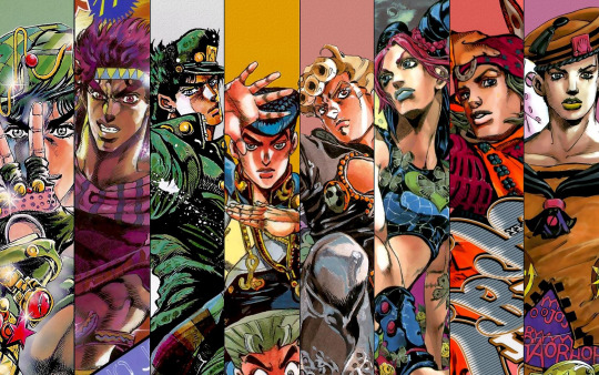
I would be very surprised if there’s anyone out there that doesn’t have even an inkling of an idea of what Jojo is about, but to put it as briefly as possible: Jojo’s Bizarre Adventure is a long-running manga (that has since given birth to a multi-media franchise, including animation, video games, and an exhibit in the Louvre) that tells the story of the Joestar family, spanning years, generations, and various casts of characters. The foes that the Joestars face range from vampires to superhuman immortals to everyday human beings empowered by the ghostly avatars of their resolve and desire. The Joestars and their allies use their own ghostly avatars (most commonly known as Stands), along with other forces such as the manipulation of energy via proper breathing or the weaponization of the Golden Ratio. Oh, and later in the story alternate universes come into play.
I’ve joked in the past that the secret to Jojo’s success is that the mangaka, Araki Hirohiko, simply does whatever he wants. Emotions are rarely anything less than bombastic, characters pose like abstract art pieces, Stand abilities range a seemingly endless range of possibilities, and are named after popular Western musicians and songs, and can be found in infants, turtles, hawks, haunted cat-plant hybrids, intelligent colonies of plankton, and trees. Basically, Araki never seems to ask himself “is this TOO ridiculous?” Honestly, in my opinion, at times it can be— but most of Jojo’s appeal is in how fantastic and delightfully bonkers it can get. If there’s anything Araki does differently, it’s that he is unafraid to let loose, which has made Jojo’s Bizarre Adventure the pop culture sensation it is today.
And if there’s anything Araki is good at letting loose about, it’s character design. Araki (who has gone on the record confirming the importance of the fashion world as an influence for his work) has a knack for designing outfits that are absurd and iconic and outlandish and stunning all at the same time— and in the world of Jojo, a character’s wardrobe is always a key part of their design. Iconic hairstyles, accessories, and tattoos are plentiful. And I could write an entire essay about the otherworldly and delightfully bizarre Stands alone.
I’ve come to find I have a deep love for character design and the thought that artists put into them— so much so that I’m actually in the middle of writing another essay about the character design for another series, Yowamushi Pedal. But as a sort of “appetizer” for that essay (and a “warm-up” to get me back into proper writing form for this blog), I’ve decided to write a small essay on what’s probably my favorite example of character design from this series while also examining what makes it so good.
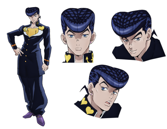
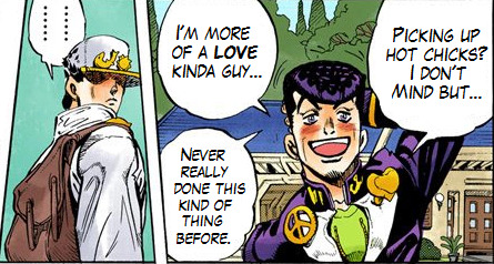
Higashikata Josuke is the protagonist of Diamond is Unbreakable, the fourth major part of Jojo’s Bizarre Adventure, and (at the time of writing) the part that has most recently been adapted into an animated series. Unlike previous Jojo installments, DIU has a specific and consistent setting: Morioh, an average and unassuming Japanese town whose only real oddity is the disturbingly high amount of missing person cases. This, of course, ends up being linked to the power of Stands, and Josuke and his companions take it upon themselves to solve the mysteries of their beloved hometown and bring the unknown killer to justice.
Despite a few vices typical of your average teenage boy and a shockingly explosive (and specific) temper, Josuke’s defining character trait is his kind and noble heart. His major goal of the series is to keep his hometown safe from malevolent Stand users, but he actually ends up befriending many of the enemies he and his companions defeat.
What does all of this have to do with character design? Simple: Josuke’s design effectively communicates almost all of this information.
We’ve already established Araki has an eye for fashion, and even working with a typical high school uniform he’s able to create a look that’s all at once stylish, grounded (at least, for Jojo) and instantly recognizable. But the main thing I want to talk about here is the repetition in Josuke’s design. Repetition is one of the principles of visual design, and the idea is simple: repeating a visual element in your design will create a sense of unity and cohesiveness. This is mostly applied to things like graphic design, but I find repetition is a great way to create excellent character design as well.
Have you guessed what the repeated element in Josuke’s design is? That’s right: he wears his heart on his sleeve.

Or, rather his collar. Josuke customizes his school uniform with pins, and three of those five pins are heart. Most notable is the larger one he wears on his open jacket flap, opposite a large peace sign. One could definitely say that “love and peace” is Josuke’s ultimate goal in bringing the killer of Morioh to justice.
Speaking of the flaps of his jacket, take a close look. While it’s not as obvious as the stylized pins, the shape of Josuke’s open jacket creates what’s unmistakably a heart shape. Even Josuke’s silhouette calls to mind a heart: compare the width of his shoulders and chest to his waist.

Of course, we can’t talk about Josuke without talking about his hair. Josuke’s hairstyle is great, not just because it’s snazzy (it is) but also because it’s a rare QUADRUPLE-hitter of character design. First, obviously, is the fact that it continues the heart motif (only at certain angles— it’s even more pronounced in the anime). More important than that though is the fact that it’s instantly distinctive and even iconic, setting him apart not only from his fellow “Jojos” but from other characters in Japanese pop culture as well. Even if you only saw him in silhouette, you could probably identify Josuke by the shape of his hair alone.
Perhaps most cleverly of all, though, is how it sets up a contrast that serves to communicate Josuke’s character depth. See, in Japan, particularly in Japanese media and pop culture, pompadours are typically shorthand for a delinquent. When the audience first meets Josuke, more likely than not they’d assume he’s a bit of a rough kid (especially since the previous “Jojo” was a delinquent himself), leading them to be surprised when his introduction scene sees him attempting to be friendly with a local turtle to get over his fear of reptiles.
It’s a classic set up and reversal: “the delinquent with a heart of gold.” Nowadays it’s starting to become a bit of a cliché, but at least it’s a starting point for character depth. But Araki gives this trope another twist: in Josuke’s introduction (and establishing character moment), Josuke encounters some of his upperclassmen. They talk down to him, harass him, and even hurt the poor turtle, but Josuke, being a freshman, is of course too polite to talk back to his senpai.
And then one insults his hairstyle.
Instantly Josuke’s entire demeanor changes. One broken nose later, the upperclassmen are running for their lives, the turtle’s shell is mysteriously fixed, and the audience is beginning to get it. Josuke is a nice guy, he has a set of morals he sticks to, but he’s not a pushover, and he’s definitely not opposed to violence. In short, he’s far more than just a high school punk.
As for why Josuke’s hairstyle is such a big deal to him, that’s the last important detail about it: it ties into Josuke’s history, and therefore, his motives. As it turns out, Josuke’s hairstyle is modeled after that of a mysterious stranger that helped him and his mother many years ago. Inspired by the man who saved his life, Josuke decided to live his life as he believed his savior would, which reflects in his compassionate nature at the time of DIU— wouldn’t you know it, linking neatly back to the heart shape, specifically as a symbol of love.
It’s things like this that make me wonder is Araki is a genius, or simply ridiculous.
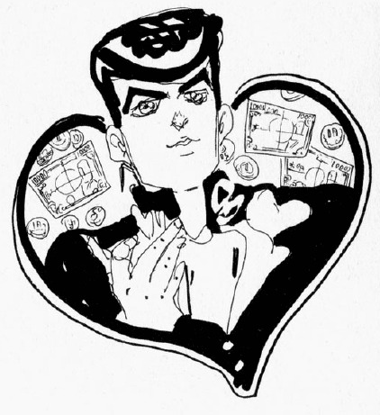
Anyways, the short and long of it is that’s Josuke’s pompadour continues the heart theme. That theme also just so happens to continue in his Stand, Crazy Diamond. There’s hearts all over Crazy Diamond’s design, some blatant, some more subtle (hint: look at its shoulders). And of course, its helmet-like head is an obvious parallel to Josuke’s hair while also incorporating a heart-like shape. As an extension of Josuke, it’d only make sense for Crazy Diamond to also possess his motif.
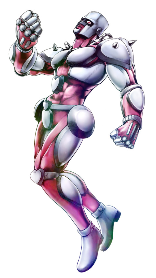
But what does the motif mean? Well, I probably don’t have to tell you. Even if you somehow didn’t know that hearts are visual shorthand for love and affection, the round edges might clue you onto the fact that it’s a “soft” shape, similar to how a circle carries connotations of approachability. Hearts are love, kindness, compassion— all that warm and fuzzy stuff. Basically, Josuke’s “hearts” are all meant to clue the audience to the fact that he’s a good kid.
This is reflected in the main ability of Crazy Diamond. On paper, Crazy Diamond’s ability is “restoration,” allowing Josuke to return anything to a previous state. The most common application he uses this ability for, however, is healing the wounds of others. As Jotaro says early in the story, while humans are naturally drawn to violence and destruction, Josuke’s strength is rooted in his compassion. It’s his compassion that leads to him befriending his many allies over the course of DIU, even those who started as his enemies. And ultimately, it is the culmination of all these different bonds that lead to the defeat of Morioh’s killer.
Diamond is Unbreakable is often referred to by fans as something of a “slice-of-life” series. While there’s plenty of action and drama, this classification isn’t entirely inaccurate, what with the small town setting and the fact that most of the cast are high-schoolers and otherwise average people, despite all the punch ghosts. Even with all the fights and mysteries, DIU is more of a story of characters, of their strengths, weaknesses, inner conflicts and interactions. It’s a “softer” chapter in the story of Jojo’s Bizarre Adventure, and Josuke, with all his “softness,” is the perfect protagonist for it.
In talking about Josuke’s character design, I actually ended up talking a lot about a lot of other things, including Josuke as a character and the themes of Diamond is Unbreakable— and that’s precisely why Josuke’s character design is so fantastic. You see, aesthetics are great, but a character’s design should ultimately tell me about the character, and if it also happens to communicate some central themes of the story, well, the more the merrier. Josuke’s character design is one of my favorite Jojo designs, and stands as a testament to the power of a few repeated elements as well as what a good character design can communicate.
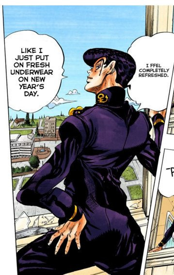
Araki Hirohiko, your manga is ridiculous, but it’s a damn good kind of ridiculous. Shine on, you crazy diamond.
Diamond Is Unbreakable can be watched with subtitles on Crunchyroll, along with all the previous seasons of David Production’s current adaption of Jojo’s Bizarre Adventure.
#jojo's bizarre adventure#jjba#diamond is unbreakable#josuke higashikata#wwydd?#manga#anime#character design
393 notes
·
View notes
Photo

Oppo Find X review: finding space When we’ve talked about full-screen phones in 2018, that’s meant around an 80 percent screen-to-body ratio with a small bottom bezel and a notch housing the front camera. The front-facing camera is an integral part of the phone so this design was necessary — until now. With the Oppo Find X, the Chinese company follows in the footsteps of fellow BBK-owned phone company Vivo, hiding the camera in the top of the phone. However, Oppo’s approach is a little different the Vivo’s NEX, and feels pretty unique. Design The Oppo Find X is a stunning phone. With beveled edges, a beautiful gradient back design and probably the highest screen-to-body ratio available, this thing is quite the looker. The body feels quite similar to the Samsung Galaxy S9 with its curved sides — even the top and bottom contour inwards to create a nearly uniform design. The most obvious design component here is the omission of the rear and front-facing cameras. While Vivo’s NEX showcased the dual rear cameras on the back of the device, the Oppo Find X takes this design to the next level. The small curved window on the rear of the phone would make you think the cameras were hiding in the shadows, but in reality the camera mechanism is much more unique. When you launch an app using the camera, the Oppo Find X will lift the shaded window to reveal the cameras beneath. I know what you’re thinking. Moving parts are a bad idea. I would agree here. Moving parts seem like a bad idea, but I commend Oppo for trying something innovative Oppo claims the camera module can be raised and lowered over 300 thousand times, but the phone prompts you to use the camera much more often than you would on a daily basis. The device has no fingerprint reader, instead relying on a 3D face scanning feature, which uses infrared light to create a depth map of your face. It works well, but moving the camera module up and down every time you unlock your phone seems like a bad idea. It remains to be seen how durable it will actually end up being. The device will be available in Bordeaux red and glacier blue. Be warned the red is definitely purple — at least the one I used was. Nonetheless, the phone is gorgeous. The color is a sloping gradient, transitioning from black in the center to purple on the rims. It looks great, and reminds me a bit of how the OnePlus 6 mirror black edition reflects light. The right side of the phone houses the power button while the you’ll find the volume rocker on the left side. The bottom of this phone is a little different. It’s got the standard USB Type-C port and bottom firing speakers, but Oppo also opted to place the SIM card tray on the other side of the charging port. I think this is perfect positioning, especially there’s no headphone jack. This placement adds a form of symmetry to the phone. Only the power button and volume rockers off axis. Heck, even the word Oppo is a palindrome. See also: Which manufacturer updates its phones fastest? Android Oreo edition As Android Oreo approaches its first anniversary, and Android P looms on the horizon, we thought it was time for a bit of a retrospective. Android Oreo, the latest major Android version, officially released n Aug. … Overall, this is one of the most beautiful phones I’ve ever used. Xiaomi told me that its Mi Mix was accepted into some museums as an art piece. I think Oppo deserves to fight for that title. Display Besides the camera module, the display is definitely the most striking aspect of this device. The face of the phone is almost completely display, clocking a screen-to-body ratio of 92.25 percent. This is one of the highest screen-to-body ratios we’ve ever seen, only rivaled by the Vivo NEX. The phone’s bottom bezel is comparable to that of the OnePlus 6. It’s often said the newest Oppo phone is the reference design for whatever OnePlus releases next. I’d be happy for the 6T to look this good. The display is also fairly massive in general, with a size of 6.42 inches and a 19.5:9 aspect ratio. This display is curved as well, so if you’ve used a recent Samsung phone you’ll know how that feels. Unfortunately, this can lead to some awkward handling especially while taking photos. Edge detection isn’t great here, and I’ve heard Vivo’s software detects accidental presses much better. The phone’s 1,080 x 2,340 AMOLED display looks phenomenal. Colors are punchy and vibrant, and I have nearly no issues with it. I’d also like to give a nod to how dim this display can get. I’m the kind of masochist that reads Reddit and Twitter instead of sleeping, so it’s nice to have a display that doesn’t hurt my eyes. Performance With some of the latest hardware available on the market, the Oppo Find X performs admirably. The one issue I saw with performance which I also saw on Oppo’s R15 Pro was poor RAM management. My model has 8GB of RAM, but keeping just a few apps open used almost 4.5 GB. Having more RAM to work with doesn’t give you an excuse to manage it badly, and I hope Oppo spends some resources making its skin a bit less taxing. If you’re into benchmark scores, we ran the Oppo Find X Plus through Geekbench 4 and 3D Mark. Antutu didn’t want to run on this phone for some reason. Geekbench 4 gave the Oppo Find X a single-core score of 2,391. In comparison, the OnePlus 6 scored 2,454, while the Galaxy S9 scored 2,144. The Find X achieved a multi-core score of 6,216, while the OnePlus 6 scored 8,967, and the Galaxy S9 scored 8,116. Ouch. The Oppo Find X scored 4,148 in 3D Mark, while the OnePlus 6 and Galaxy S9 scored 4,680 and 4,672, respectively. Hardware As I mentioned earlier, the Oppo Find X competes head to head with the latest and greatest from Samsung, OnePlus, and more. No more Snapdragon 600 series — this phone is the real deal. The Find X packs a Qualcomm Snapdragon 845, 8GB of RAM, 256GB of internal storage, and a 3,730mAh battery. This kept the device running smoothly the entire week or so I had to use it, and I really didn’t notice any hiccups during this time. This phone flies, packing Qualcomm's latest Snapdragon 845 chipset Weirdly enough, Oppo omitted a fingerprint reader this time around, which really pushes the user to use the 3D face unlock feature. I was pretty hesitant of this at first, because the phone needs to physically open the top portion of the device to reveal the front-facing camera. While I’m not a huge fan of moving parts being actuated every time you want to unlock your phone, I was surprised how fast the process was. It seemed like the phone was unlocked before I even noticed the camera opening and closing itself. I tried to get some friends to unlock the phone quite a few times and it proved secure every time, so I’m pretty confident in Oppo’s engineering. This 3D face unlock feature works similarly to how the iPhone X and Xiaomi Mi 8 explorer edition do, using infrared light to get an accurate depth map of your face. This makes the phone much more accurate — up to twice as accurate as its fingerprint reader according to Oppo (which doesn’t exist anyway). It’s unfortunate that BBK opted to include the in-screen reader in the Vivo NEX but not the Oppo Find X — I would have liked to see that here. Editor's Pick Best True Wireless Earbuds What are the best options out there? Sadly you wont find a headphone jack on this device, but Oppo includes a dongle in the box. There isn’t any water resistance rating on this phone, but I’m not sure how Oppo would make this water resistant. Having the entire top of the phone lift to reveal the cameras is a cool concept, but bad things will happen if you use it in the rain. There isn’t any expandable storage available on this device. Oppo instead opts for a dual-SIM tray. I would have preferred it added support for a microSD card in this space like many other manufacturers. 256GB is ample storage for a lot of people, but it’s always nice to have more options. Battery This device’s 3,730mAh battery performed really, really well. As noted in my Oppo R15 Pro review Oppo doesn’t meter screen-on time in its ColorOS skin, but I got a solid day and a half with this thing before needing to charge it. I don’t play mobile games, but I still use my phone quite a lot in an average day. I’m often jumping back and forth between Twitter, Chrome, Reddit, and a number of messaging apps throughout the day. See also: OPPO R15 Pro review: Notch what I was hoping for Oppo is a company consistently adopting the latest trends to stay relevant in the market. The R9 added dual cameras to compete head-to-head with flagships from Huawei and Honor, and the R11s slimmed down its … The Find X uses Oppo’s VOOC fast-charging standard, and it juices up the device very quickly. The company has finally moved to USB Type-C after much deliberation, which is really great to see, considering I only have like one microUSB cable left in my house. Unfortunately there is no wireless charging in this device. We would have liked to see that here since the body is made of glass, but such is life. Camera Despite being hidden inside the phone, the cameras aren’t actually that bad. The rear-facing 16 and 20MP cameras perform quite decently. I found they tended to overexpose images more often than not, but the dynamic range was pretty darn solid. If you want to take a look at the images for yourself, you can see our gallery below, or pixel peep by taking a look at the source files here. The 25MP front facing camera performed just as well. Selfies seemed to have nice skin tones, but could have been a bit sharper in my opinion. The biggest issue I encountered with the camera was how long it took to actually launch. Though the mechanism opens up pretty immediately when you launch the camera app, the live view didn’t appear for three or four seconds. Oppo definitely needs to fix this, because it made catching fleeting moments hard. Don't miss: Best Android smartphone cameras (April 2018) In recent years, smartphones have effectively replaced point-and-shoot cameras, and many even outperform them. For many of us, these portable computers have become our main camera, making photo quality a priority when picking a new smartphone. … Oppo included a portrait mode in this device, and it performed quite a bit better than I expected. Despite the live view’s slowness, the processing did a good job of separating the subject from the background. It still suffers from the over-exposure issues of the general camera, though. The camera module got dirty very easily. Just keeping the phone in my pocket normally collected quite a bit of dirt and lint, and left me wishing I kept a cloth with me to clean it out every now and then. Software If you’re not familiar with ColorOS, it’s basically iOS. There isn’t an app drawer, and all your apps will be spread across your home screens as you download them. You can still make folders and such, but I prefer to hide most of my apps to get as stock an experience as possible. ColorOS 5.1 is based on Android 8.1 Oreo. I’m glad to see it updated to the latest Oreo version, because the R15 Pro was still stuck on Android 8.0. While ColorOS on the R15 Pro felt slow and laggy, it really flies on this device. This is more than likely due to the Snapdragon 845, but it’s still nice to use an Oppo phone that doesn’t feel like I’m making huge performance compromises. There was an entire suite of apps installed on this phone out of the box, but I ran the Chinese version. Oppo has announced this phone is coming to the U.S. and some other markets, which will probably come with the Google Play store pre-installed. I had to download the Google Play store from the Oppo app store, but you likely won’t have that issue. I’m really not a fan of this software, but it’s not terrible. I’d still use a custom launcher like Nova to make the experience more manageable, but I used ColorOS during my time with the device so you won’t have to. You’re welcome. Specs Oppo Find X Display 6.42-inch AMOLED 2,340 x 1,080 resolution 19.5:9 aspect ratio Processor Snapdragon 845 Octa-core, up to 2.8Ghz RAM 8GB LPDDR4 Storage 128GB/256GB MicroSD No Camera Rear: 16MP sensor with f/2.0 aperture + 20MP sensors with f/2.2 aperture Front: 25MP Battery 3,730mAh Non-removable VOOC Flash Charge (5V/4.5A) SIM Dual nano-SIM Headphone jack No IP rating No Software Android 8.1 Oreo with ColorOS 5.1 Fingerprint scanner No Other features 3D facial recognition Gallery Pricing, availability, and final thoughts The Oppo Find X is coming to multiple markets, including China, Europe, and even the U.S.. We’ve only heard details about the launch in Europe so far, where it will cost 999 euros (~$1,157) and be available in August. Oppo is also launching a special Lamborghini edition of this device, with 512GB of storage and Super VOOC fast charging. This phone will have a smaller 3,400 mAh cell, but will be able to charge from zero to 100 percent in 35 minutes. Overall, I really like the Oppo Find X. It needs some software updates to fix the sub-par palm rejection and laggy camera, but the 3D face unlock and enormous screen impressed me quite a bit. This feels like a second generation product in its first iteration, and I’m happy to see Oppo pushing the boundaries of smartphone design. I’m eager to see what Google and Samsung announce for the rest of 2018, but Oppo and Vivo are making other manufacturers seem pretty outdated. We’ll likely see more traditional flagships adopt the truly bezel-less standard in 2019. If you want one now, the Find X is one of your only options. What are your thoughts on the Oppo Find X? Is this the future of smartphones? Let us know your thoughts in the comments section below. , via Android Authority http://bit.ly/2lmvrG0
0 notes
Text
Beer with a Painter: Jennifer Coates (Hyperallergic)
Jennifer Samet: You grew up in a suburb of Philadelphia. I’m guessing, based on what you have told me about your background, that you didn’t actually grow up eating the mass-produced foods that have become a subject of your work.
Jennifer Coates: In 2016, I had a show, Carb Load, at the Pennsylvania Academy of the Fine Arts. My mother came to the opening. She was saying to everyone, “I just want you to know, I did not feed Jennifer these foods.” And it’s true! My parents prided themselves on their gourmet cooking skills. I learned to cook from my dad. My friends at school would all eat tuna fish sandwiches on white bread with the crusts cut off. They had ravioli from the can. Those foods freaked me out. And I was just not cool and got teased for everything — from playing the violin to having nice, cute lunches, like a roast beef sandwich with mustard on multigrain bread.
So, I am recapitulating my sense of being an alien as a child. “I’m wrong, everything I do is wrong. I’m different from you, and I don’t understand you.” It is a comfortable perspective, in a way.
JS: Was art-making a part of your childhood? Were there artists in your family?
JC: Drawing was my thing. I drew all the time, picture after picture of wide-eyed little girls. They were like children of the corn, recurring and repeating and multiplying. In high school, I remember being miserable and thinking, “The only thing I have control over is what is on this piece of paper.” From time to time, it’s good to tap into that original impulse — when art history and contextualizing your work can start to take over. It’s about trying to make sense of how to be a person.
Recently, I found a drawing I made for my father, when I was eight or nine years old. He had sprained his ankle, and I was trying to make him feel better. So I made this drawing of an enormous hamburger with five different patties and all kinds of condiments, and his tankard of beer. It’s like you have one idea your whole life, and that’s it.
My maternal grandmother was really amazing. She took art classes starting in her 50s, and then went back to school to get her BFA when she was already a grandmother. She lived in Canada, and when I visited, I slept in her studio, with stacks of paintings. I saw her thesis show when I was in high school. She had learned how to cast in bronze, she made jewelry, and she made these ambitious paintings that were embedded with her experience of being a Jewish immigrant. She was a difficult person, but always very interested in what I was up to. It meant a lot to me.
JS: There’s something you told me a few years ago in your studio that I always think about. You said you grew up with an atheist Jewish mother and that experimenting with spirituality felt like the most forbidden thing. It was very funny. I’ve been thinking about it, since I know you explore relationships between the Occult and modernist art. You also consider your work to have a devotional, iconic quality.
JC: Yes, when I was an undergraduate at the Pennsylvania Academy of the Fine Arts, a friend of mine was involved in a born-again Christian community. Sometimes I went to church with her. I didn’t know if I believed all of it, and I wasn’t necessarily attracted to organized religion. But there was something so ecstatic, which was attractive to me. And yes, I would worry that somehow my mother was going to discover me saying, “Praise Jesus!”
I liked how the ecstatic reorients you to the moment you are in, and wakes you up. My mother saying, “God doesn’t exist… and tell your friends,” just didn’t do it for me. I think anything that makes you feel liberated, in terms of how you see reality, is a good thing. A whole world opens up when we really look at all the things that we put on our bodies, and put in ourselves. I’d rather have that be magical than neutral.
JS: At that time, when I visited your studio, you were making abstract paintings with a lot of pattern and tessellation. When and how did you move into the food-based paintings?
JC: Around the time you visited, I was probably working on “Picnic” (2014). It was a skeletal black warping grid with stuff oozing out of it. I was frustrated with it and didn’t want to be in this nebulous architectural abstraction anymore.
For a few months, I was background processing, trying to figure out where I wanted to go with the work. I had a couple of experiences that affected me. I visited Nicole Eisenman’s studio. She has known my work for a long time. I saw the painting “Under the Table 2” (2014) in the studio, which shows a huge cutaway of salami, and people hanging around the table. There are flecks of fat and meat in it. I was amazed by the painting, and Nicole said, “You could have painted those dots in the meat.” I thought, “Wow. What would it be like, to go from what I’ve been doing, to painting salami?”
Then I came across an image of a Claes Oldenburg sculpture, “Cash Register” (1961). I thought about how it was completely of its moment, but it also looks like it was dug out of the earth. It was like an ancient sculpture.
I also saw photographs of a friend’s vacation in Iceland. There were beautiful, primeval landscapes, and images of him and his wife, sitting at picnic tables, eating little snacks. Little by little, something started to cement in my head, where I thought, “I can talk about the sublime – this radiant, transcendent presence that I’m trying to coax out of paint, and also anchor it back to the everyday.”
I decided it would be really exciting to go back into the black grid with a gingham pattern. It didn’t change anything about how I was painting. But I named it, and made it specific, so that anyone looking at the painting would read it as a picnic blanket or tablecloth. On this particular surface, everything that happened on it or erupted from it felt food-oriented. A stain wasn’t just a painterly stain; it was a barf stain or something that spilled over. That was the beginning of the food.
JS: It seems that your concern in these paintings is to establish an equivalence between the paint and the food substance. Is that accurate?
JC: Paint can do what it wants to do, and the references can be multiple and diffuse. If I am doing a spray of paint, it is icing as well as a Jackson Pollock move. The food often just stages an opportunity. Is it going to be a Pointillist business, or a zip down the middle, or Abstract Expressionism? It became a way to have a lot more fun.
You also begin to think about all the weird decisions that go into preparing foods. There are aesthetic decisions that are not just about nourishment. You want things to look a certain way, or have a certain ratio of liquid to solid. That struck me as exciting to explore.
When you are spreading something on a piece of bread with a knife, you put it on in a special way. Some kids like more peanut butter, and some like more jelly. There are always aesthetic decisions. And I thought, “Well, that’s funny. Maybe making a peanut butter and jelly sandwich is a painting indoctrination experience.”
JS: I wonder why, if you are in search of the spiritual, your subject was mass-produced food. Aren’t they kind of polar opposites?
JC: Embedded in it is a critique. These processed foods are toxic — for us and for the planet. If you buy a Danish, you get a plastic-encased thing. You open it up, and the thing inside has more in common with the packaging than it does with something from your grandmother’s kitchen. How did this food become what it is? It is now made from synthetic chemicals, but why is it the shape it is? The Danish is a spiral — an ancient shape. So, for me, it’s a way to meditate on both the mysterious and toxic nature of processed food.
JS: What kinds of discoveries have you made as far as relating food shapes to symbols and forms?
JC: They are theories more than discoveries. I am sort of a conspiracy theorist-type person. I love this idea of, “Guess what?! This thing that you are so used to and never consider is actually the bearer of ancient ritual religious behavior.” I love making up stories about where things came from and finding deep-time precursors — shape rhymes throughout history.
It is interesting that as human beings we’ve been attracted to certain kinds of forms and shapes and behaviors. We tend to say, “It’s just decorative,” but what if there is something in our anatomy that draws us to similar patterns?
Lately, in lectures on my work, I am making connections between pasta shapes and entoptic forms. Entopic phenomena are the result of your visual cortex seeing your neuroanatomy. Experiments, like the ones that Heinrich Klüver did in the 1920s, have shown that people under the influence of certain hallucinogens draw specific patterns and shapes. The shapes are categorized and called “Klüver forms.” Similar kinds of forms and shapes can be found in petroglyphs and early Paleolithic art.
When I was doing excavation into the bagel shape, I saw images of yoni carved stone forms found in Israel eight thousand years ago. They are thought to conform to fertility or female genitalia worship. They were circular shapes with a hole in the center and a slit down the middle. For me, that’s all I need. You get a bagel, but it’s a bearer of this ancient ritual, affiliated with matriarchy and female shamans.
JS: So when you say they are theories, you’re not necessarily tying to prove them? I know you are interested in the work of Terence McKenna, the ethnobotanist and mystic. How did his work influence you?
JC: When I come up with a theory, it’s not verbal — it is visual. I lay out the pictures.
I want to trust the visual part of my brain — the part that is intuitive, and has shape recognition and pattern recognition. I’m trying to prove my theory through images. My hope is that if you are allowing yourself to think purely visually, you can be very thorough and engaged with what’s around you.
I got into Terence McKenna through the painter Steve DiBenedetto. His lectures are archived online, and I have listened to them constantly in my studio for years. McKenna changed my way of thinking. The desire to dig into history, improvise, and make up a story came from him. McKenna read everything, but he plays with all of the information and ideas. He’s not beholden to any of it. He wasn’t a scholar or a scientist. He just says, “Here’s what I think.”
JS: It seems as if you make a lot of painting jokes in your work. The sprinkles or dots can be abstract ellipses. Are you interested in Pattern and Decoration artists, or Op Art? Who are the figures in art history you are talking to the most?
JC: There are a lot of painting jokes. There are all kinds of moments where I think I can pretend to be this or that artist. It is very satisfying. With the bread and the popsicle paintings, I think about Rothko and Color Field painting. How can the popsicle be radiant? I’m thinking about a color relationship where the paint isn’t just naming something, but also transcending itself.
As for Pattern painters, I’ve always liked James Siena’s work a lot. I like Bridget Riley, but I would want to pee on it. I always want to do something to mess with Op Art.
Turner is somebody I come back to over and over and over again. The moments of light in his paintings are the most impressive and the most physical, but they are also the most ethereal — barely there. It is abject light and also transformative. I love that you can have something be really mucky and crusty, and also a ghost.
Hopefully, what comes across in my work is a kind of heightened devotional object that has a radiant presence. I was thinking about sacrificial stone altars. The slab, where an animal is getting killed with a knife, is like the first abstract expressionist painting. So making a sandwich and spreading substances around with a knife is like a weird descendent of the sacrifice. Peanut butter and jelly can look like bodily fluids or innards. It is gooey business.
JS: Do you see your paintings as feminist in the sense that they are acknowledging this kind of messiness? It is what Mira Schor talks about in “Figure/Ground” (1989), which is an essay you have cited as an influence.
JC: When I was an undergraduate, I was obsessed with Kiki Smith and body art. It was the early 1990s — that moment when body art was prominent. I took a feminist art history class at the University of Pennsylvania. I came from the Pennsylvania Academy of the Fine Arts, where you draw from life and study anatomy. That art history class showed there was a way to use the body to communicate a political, feminist message. That concern with how the body is fragile, and breaks down, and there is pee and blood — I was really into that. And that interest has never left me.
So for me, paint is very bodily. As much as it sort of organizes itself to be a depiction of something, it’s also always restating itself as this amorphous pile of goo. What’s a more amorphous pile of goo than the innards or a decaying corpse? I was trying to paint a sandwich, but then I said, “It is a fucking bloody vagina.” That’s what it is. I want it to look like that. If someone sees something that’s embarrassing and kind of weird, a stain that’s wrong, then I feel good.
I’m really excited about those moments where it becomes unruly and messy, anti-logic or anti-gravity. In his book The Swerve, Stephen Greenblatt discusses ancient Greek and Roman atomistic theory. The idea was that tiny particles shower down in the cosmos, moving in parallel lines. Every now and then, one goes out of its path. That is when things interact. It is that interruption of the pattern, and that interaction, which causes things to happen. Evolution happens. Systems self-exceed. Things progress when there is a mistake. So, I prefer the mistake.
The thing that makes many artists interesting is how they re-tool the past. They confuse our relationship to what we thought was familiar. You have to trust that part of your brain — the part that goes, This, on top of that. Something erupts from the matrix and the orderly. Then, all of a sudden, everything is exciting.
0 notes
Text
Hyperallergic: Beer with a Painter: Jennifer Coates
Jennifer Coates, “Large S’more” (2015), acrylic on canvas, 60 x 72 inches (courtesy Freight & Volume Gallery)
“Here’s some macaroni! And here is rigatoni…” Jennifer Coates says to me as she moves paintings around in her studio. It’s hard not to smile and feel like I’m being offered dinner as well as a studio visit. There’s a generosity and enthusiasm — and total willingness to put herself out there — when Coates is talking about ideas or sharing her work. She loves to joke about all things bodily and will talk about alien life, scatology, politics, and painting in equal measure. She is also a fierce gardener, cook, competitive baker, and musician — a vocalist and violinist in a couple of bands.
Coates’s recent work depicts food: spaghetti and meatballs, sprinkle cookies, and s’mores. Her work is about matter and viscosity, but it is also rooted in grid-like structures, repetitive mark-making, and very sophisticated paint handling. I remember being struck by her painting “BBQ” (2014), which I saw in a pop-up group exhibition — thinking it was intense and elemental, and a great painting joke at the same time. Against the backdrop of a painterly grid (a grill seen from above), was a huge slab of meat — which was also just substance: fire, heat, and red paint.
Jennifer Coates (courtesy the artist)
Coates has developed this interchange in all of her paintings since. Mass-produced and nostalgia-filled foods, like Almond Joy candy bars and thick deli sandwiches, are shown in cross-section. Their overall forms suggest biomorphic shapes in modernist abstract painting. They also look weird and over-the-top, gooey and oozing. Acrylic paint, slathered, smoothed, and textured, is likened to the synthetic colors and substances that are part of processed convenience foods, food dyes, and cake icing. Drips of creamy paint become syrup, pasta sauce, and melting cheese.
Coates received her BFA from the Pennsylvania Academy of the Fine Arts in 1995 and her MFA from Hunter College in 2001. She was the subject of a solo exhibition, Carb Load, in 2016 at the Pennsylvania Academy of the Fine Arts, Philadelphia. Collaborative work with her husband David Humphrey was shown in 2015 in a two-person exhibition, Plus Onus, at Arts + Leisure, New York. Prior solo exhibitions were held at Kinz, Tillou + Feigen (2008) and Feigen Contemporary (2006) in New York. Coates’s writing on art has been published in Modern Painters, Time Out New York, and Art in America. She’s also authored a horoscope column for the blog Two Coats of Paint and co-curated the exhibition The Swerve in 2016 at Ortega y Gasset Projects, Brooklyn, New York. She is known for her artist lectures / visual essays exploring the phenomena and scientific-social history of bubbles. A solo exhibition of Coates’s work, All U Can Eat, is currently on view at Freight + Volume Gallery, New York, through April 16.
* * *
Jennifer Samet: You grew up in a suburb of Philadelphia. I’m guessing, based on what you have told me about your background, that you didn’t actually grow up eating the mass-produced foods that have become a subject of your work.
Jennifer Coates, “Grilled Cheese” (2016), acrylic on canvas, 12 x 12 inches (courtesy Freight & Volume Gallery)
Jennifer Coates: In 2016, I had a show, Carb Load, at the Pennsylvania Academy of the Fine Arts. My mother came to the opening. She was saying to everyone, “I just want you to know, I did not feed Jennifer these foods.” And it’s true! My parents prided themselves on their gourmet cooking skills. I learned to cook from my dad. My friends at school would all eat tuna fish sandwiches on white bread with the crusts cut off. They had ravioli from the can. Those foods freaked me out. And I was just not cool and got teased for everything — from playing the violin to having nice, cute lunches, like a roast beef sandwich with mustard on multigrain bread.
So, I am recapitulating my sense of being an alien as a child. “I’m wrong, everything I do is wrong. I’m different from you, and I don’t understand you.” It is a comfortable perspective, in a way.
JS: Was art-making a part of your childhood? Were there artists in your family?
JC: Drawing was my thing. I drew all the time, picture after picture of wide-eyed little girls. They were like children of the corn, recurring and repeating and multiplying. In high school, I remember being miserable and thinking, “The only thing I have control over is what is on this piece of paper.” From time to time, it’s good to tap into that original impulse — when art history and contextualizing your work can start to take over. It’s about trying to make sense of how to be a person.
Recently, I found a drawing I made for my father, when I was eight or nine years old. He had sprained his ankle, and I was trying to make him feel better. So I made this drawing of an enormous hamburger with five different patties and all kinds of condiments, and his tankard of beer. It’s like you have one idea your whole life, and that’s it.
Jennifer Coates, “Cotton Candy” (2016), acrylic on canvas, 14 x 11 inches (courtesy Freight & Volume Gallery)
My maternal grandmother was really amazing. She took art classes starting in her 50s, and then went back to school to get her BFA when she was already a grandmother. She lived in Canada, and when I visited, I slept in her studio, with stacks of paintings. I saw her thesis show when I was in high school. She had learned how to cast in bronze, she made jewelry, and she made these ambitious paintings that were embedded with her experience of being a Jewish immigrant. She was a difficult person, but always very interested in what I was up to. It meant a lot to me.
JS: There’s something you told me a few years ago in your studio that I always think about. You said you grew up with an atheist Jewish mother and that experimenting with spirituality felt like the most forbidden thing. It was very funny. I’ve been thinking about it, since I know you explore relationships between the Occult and modernist art. You also consider your work to have a devotional, iconic quality.
JC: Yes, when I was an undergraduate at the Pennsylvania Academy of the Fine Arts, I met my friend Sarah Peters, the sculptor. She was involved in a born-again Christian community. Sometimes I went to church with her. I didn’t know if I believed all of it, and I wasn’t necessarily attracted to organized religion. But there was something so ecstatic, which was attractive to me. And yes, I would worry that somehow my mother was going to discover me saying, “Praise Jesus!”
I liked how the ecstatic reorients you to the moment you are in, and wakes you up. My mother saying, “God doesn’t exist… and tell your friends,” just didn’t do it for me. I think anything that makes you feel liberated, in terms of how you see reality, is a good thing. A whole world opens up when we really look at all the things that we put on our bodies, and put in ourselves. I’d rather have that be magical than neutral.
Jennifer Coates, “Picnic I” (2013), acrylic on canvas, 48 x 48 inches (courtesy of the artist)
JS: At that time, when I visited your studio, you were making abstract paintings with a lot of pattern and tessellation. When and how did you move into the food-based paintings?
JC: Around the time you visited, I was probably working on “Picnic” (2014). It was a skeletal black warping grid with stuff oozing out of it. I was frustrated with it and didn’t want to be in this nebulous architectural abstraction anymore.
For a few months, I was background processing, trying to figure out where I wanted to go with the work. I had a couple of experiences that affected me. I visited Nicole Eisenman’s studio. She has known my work for a long time. I saw the painting “Under the Table 2” (2014) in the studio, which shows a huge cutaway of salami, and people hanging around the table. There are flecks of fat and meat in it. I was amazed by the painting, and Nicole said, “You could have painted those dots in the meat.” I thought, “Wow. What would it be like, to go from what I’ve been doing, to painting salami?”
Then I came across an image of a Claes Oldenburg sculpture, “Cash Register” (1961). I thought about how it was completely of its moment, but it also looks like it was dug out of the earth. It was like an ancient sculpture.
I also saw photographs of a friend’s vacation in Iceland. There were beautiful, primeval landscapes, and images of him and his wife, sitting at picnic tables, eating little snacks. Little by little, something started to cement in my head, where I thought, “I can talk about the sublime – this radiant, transcendent presence that I’m trying to coax out of paint, and also anchor it back to the everyday.”
I decided it would be really exciting to go back into the black grid with a gingham pattern. It didn’t change anything about how I was painting. But I named it, and made it specific, so that anyone looking at the painting would read it as a picnic blanket or tablecloth. On this particular surface, everything that happened on it or erupted from it felt food-oriented. A stain wasn’t just a painterly stain; it was a barf stain or something that spilled over. That was the beginning of the food.
JS: It seems that your concern in these paintings is to establish an equivalence between the paint and the food substance. Is that accurate?
JC: Paint can do what it wants to do, and the references can be multiple and diffuse. If I am doing a spray of paint, it is icing as well as a Jackson Pollock move. The food often just stages an opportunity. Is it going to be a Pointillist business, or a zip down the middle, or Abstract Expressionism? It became a way to have a lot more fun.
You also begin to think about all the weird decisions that go into preparing foods. There are aesthetic decisions that are not just about nourishment. You want things to look a certain way, or have a certain ratio of liquid to solid. That struck me as exciting to explore.
When you are spreading something on a piece of bread with a knife, you put it on in a special way. Some kids like more peanut butter, and some like more jelly. There are always aesthetic decisions. And I thought, “Well, that’s funny. Maybe making a peanut butter and jelly sandwich is a painting indoctrination experience.”
Jennifer Coates, “Cherry Danish” (2016), acrylic on canvas, 48 x 48 inches (courtesy Freight & Volume Gallery)
JS: I wonder why, if you are in search of the spiritual, your subject was mass-produced food. Aren’t they kind of polar opposites?
JC: Embedded in it is a critique. These processed foods are toxic — for us and for the planet. If you buy a Danish, you get a plastic-encased thing. You open it up, and the thing inside has more in common with the packaging than it does with something from your grandmother’s kitchen. How did this food become what it is? It is now made from synthetic chemicals, but why is it the shape it is? The Danish is a spiral — an ancient shape. So, for me, it’s a way to meditate on both the mysterious and toxic nature of processed food.
JS: What kinds of discoveries have you made as far as relating food shapes to symbols and forms?
JC: They are theories more than discoveries. I am sort of a conspiracy theorist-type person. I love this idea of, “Guess what?! This thing that you are so used to and never consider is actually the bearer of ancient ritual religious behavior.” I love making up stories about where things came from and finding deep-time precursors — shape rhymes throughout history.
It is interesting that as human beings we’ve been attracted to certain kinds of forms and shapes and behaviors. We tend to say, “It’s just decorative,” but what if there is something in our anatomy that draws us to similar patterns?
Lately, in lectures on my work, I am making connections between pasta shapes and entoptic forms. Entopic phenomena are the result of your visual cortex seeing your neuroanatomy. Experiments, like the ones that Heinrich Klüver did in the 1920s, have shown that people under the influence of certain hallucinogens draw specific patterns and shapes. The shapes are categorized and called “Klüver forms.” Similar kinds of forms and shapes can be found in petroglyphs and early Paleolithic art.
Jennifer Coates, “Everything Bagel” (2017), acrylic on canvas, 72 x 72 inches (courtesy Freight & Volume Gallery)
When I was doing excavation into the bagel shape, I saw images of yoni carved stone forms found in Israel eight thousand years ago. They are thought to conform to fertility or female genitalia worship. They were circular shapes with a hole in the center and a slit down the middle. For me, that’s all I need. You get a bagel, but it’s a bearer of this ancient ritual, affiliated with matriarchy and female shamans.
JS: So when you say they are theories, you’re not necessarily tying to prove them? I know you are interested in the work of Terence McKenna, the ethnobotanist and mystic. How did his work influence you?
JC: When I come up with a theory, it’s not verbal — it is visual. I lay out the pictures.
I want to trust the visual part of my brain — the part that is intuitive, and has shape recognition and pattern recognition. I’m trying to prove my theory through images. My hope is that if you are allowing yourself to think purely visually, you can be very thorough and engaged with what’s around you.
I got into Terence McKenna through the painter Steve DiBenedetto. His lectures are archived online, and I have listened to them constantly in my studio for years. McKenna changed my way of thinking. The desire to dig into history, improvise, and make up a story came from him. McKenna read everything, but he plays with all of the information and ideas. He’s not beholden to any of it. He wasn’t a scholar or a scientist. He just says, “Here’s what I think.”
JS: It seems as if you make a lot of painting jokes in your work. The sprinkles or dots can be abstract ellipses. Are you interested in Pattern and Decoration artists, or Op Art? Who are the figures in art history you are talking to the most?
JC: There are a lot of painting jokes. There are all kinds of moments where I think I can pretend to be this or that artist. It is very satisfying. With the bread and the popsicle paintings, I think about Rothko and Color Field painting. How can the popsicle be radiant? I’m thinking about a color relationship where the paint isn’t just naming something, but also transcending itself.
As for Pattern painters, I’ve always liked James Siena’s work a lot. I like Bridget Riley, but I would want to pee on it. I always want to do something to mess with Op Art.
Turner is somebody I come back to over and over and over again. The moments of light in his paintings are the most impressive and the most physical, but they are also the most ethereal — barely there. It is abject light and also transformative. I love that you can have something be really mucky and crusty, and also a ghost.
Jennifer Coates, “PB&J” (2015), acrylic on canvas, 48 x 48 inches (courtesy Art Museum at the University of Kentucky)
Hopefully, what comes across in my work is a kind of heightened devotional object that has a radiant presence. I was thinking about sacrificial stone altars. The slab, where an animal is getting killed with a knife, is like the first abstract expressionist painting. So making a sandwich and spreading substances around with a knife is like a weird descendent of the sacrifice. Peanut butter and jelly can look like bodily fluids or innards. It is gooey business.
JS: Do you see your paintings as feminist in the sense that they are acknowledging this kind of messiness? It is what Mira Schor talks about in “Figure/Ground” (1989), which is an essay you have cited as an influence.
JC: When I was an undergraduate, I was obsessed with Kiki Smith and body art. It was the early 1990s — that moment when body art was prominent. I took a feminist art history class at the University of Pennsylvania. I came from the Pennsylvania Academy of the Fine Arts, where you draw from life and study anatomy. That art history class showed there was a way to use the body to communicate a political, feminist message. That concern with how the body is fragile, and breaks down, and there is pee and blood — I was really into that. And that interest has never left me.
Jennifer Coates, “Sandwich To Go” (2016), acrylic on canvas, 40 x 30 inches (courtesy Freight & Volume Gallery)
So for me, paint is very bodily. As much as it sort of organizes itself to be a depiction of something, it’s also always restating itself as this amorphous pile of goo. What’s a more amorphous pile of goo than the innards or a decaying corpse? I was trying to paint a sandwich, but then I said, “It is a fucking bloody vagina.” That’s what it is. I want it to look like that. If someone sees something that’s embarrassing and kind of weird, a stain that’s wrong, then I feel good.
I’m really excited about those moments where it becomes unruly and messy, anti-logic or anti-gravity. In his book The Swerve, Stephen Greenblatt discusses ancient Greek and Roman atomistic theory. The idea was that tiny particles shower down in the cosmos, moving in parallel lines. Every now and then, one goes out of its path. That is when things interact. It is that interruption of the pattern, and that interaction, which causes things to happen. Evolution happens. Systems self-exceed. Things progress when there is a mistake. So, I prefer the mistake.
The thing that makes many artists interesting is how they re-tool the past. They confuse our relationship to what we thought was familiar. You have to trust that part of your brain — the part that goes, This, on top of that. Something erupts from the matrix and the orderly. Then, all of a sudden, everything is exciting.
The post Beer with a Painter: Jennifer Coates appeared first on Hyperallergic.
from Hyperallergic http://ift.tt/2mx3iNO
via IFTTT
0 notes
Last Seen Blogs

rissaa1117-blog
Marissa❤️

reinaroyall
Why Am I Like This


passport-adventure
RAFTING FAN

lowlowdown
Efficient, effective fitness for busy people.