#i put the link copied from the google fonts page in the head of the html and i've substituted it to the former font in the {TitleFont}
Text
Free Typesetting Template

So while I try to get some designs set, I thought I'd clean up and share the template I use for typesetting!
Templates save lots of time, and let me keep 'tools' where I like 'em.
Free template here on my google drive ✨.
(As with all my stuff, Personal Use Only!)
This file is for Affinity Publisher ONLY. I highly recommend getting Affinity Publisher if you're doing a lot of typesets and want a high degree of control over details. It has most of the features of Indesign, and far more capabilities than Word or Google Docs. There is a learning curve at the start, but overall it is a great program for typesetting and is a one time purchase, versus a subscription like other services.
Please note, this template is set for my own personal preferences, and I always adjust it according to the text I'm working on. You can make whatever changes you want to suit it to your needs; I just included the normal settings I tend to use.
See below the break for template details! (How to use/notes)*
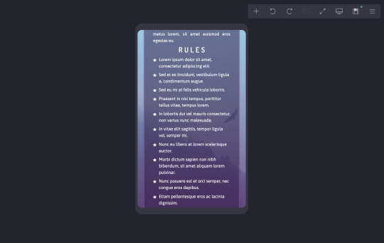
This template is sized for half letter pages.
140% Leading, 11pt Font Size (Body Text)
The baseline grid is set for these exact preferences. If using a different font size/leading, I change these to match and play with the text boxes for 'Master Body' to make them look nice.
The template has the text boxes set up for where I usually insert text, copy, and headers/footers. I usually fill these out with the relevant details, and adjust the placements and sizes as needed.
I put X down where I usually write my name/imprint. The copyright page has a lot of blank space because I like to include my personal logos on there.
The copyright page also has the Project Gutenburg info I like to include, since I mainly do public domain works from there. If I'm doing a fanfic, I'll replace this with the tags/details from the fic's AO3 page.
Main text gets copied and pasted into page 9, then flows into the rest of the pages.
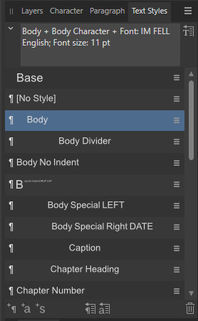
The paragraph and character styles I use are all included.
Very important, after pasting in your text, go to Find and Replace, and turn all italics to 'Emphasis' character style to preserve them.
'Body Divider' is how I include dinkuses.
'Special' paragraph styles are for when texts have things like letters or songs included.
Typically, I use 'Chapter Heading' + 'Chapter Character' for chapter titles, and set a table of contents on page 7 using these settings.
You'll notice that on page 9 I have a text box that links into the Master Body pages. This is my sort of 'test' page for chapter titles. I can freely change the size and layout on this specific page. I move it around based on what design I come up with, then copy that design into my 'Master Chapter Heading' spread to apply to the rest of the chapter title pages.
At the very end of a file, I'll usually put in a colophon. This is not in the template, but it's just a blank page at the end with my stamp and notes on the size of the typeset and what fonts I used.
*I don't have a fully written tutorial at this time, but I recommend joining Renegade Bindery's discord, where a lot of very talented people have shared their tutorials, and provide very helpful live answers.
Edit 9/20: Tutorial post here!
75 notes
·
View notes
Text
How I format my Google Docs & Sheets files to look pretty (to me)
There isn't much to this, so I won't make a big post out of nothing; these are just my personal templates to have my GDocs look exactly how I like them.
You can make a copy of any of these documents to use as a template and tweak and adjust to your heart's content.
For Google Docs, you can set up your favourite font and heading styles, as well as your background configuration, and all your new documents will automatically mimic it. You can also go back to any document you've created before and put them up to date. For more details on this, check my guide on GDocs.
Google Sheets is more annoying. It lets you customise the theme, but it doesn't let you set it as default for new spreadsheets. So instead, I keep my template handy and make a copy of it for every new spreadsheet I create (as opposed to creating a new spreadsheet normally). It sucks a little bit, but I don't make spreadsheets nearly as often as docs, so it's fine.
Google Docs: Light theme

Link to the template
I like the pageless look, since I won't ever have to worry about page division, and I like a simple sans font for the white background. I usually use these for documents I won't be looking at for too long, so there's less strain on my eyes.
Google Docs: Dark theme

Link to the template
For drafting and outlining, dark background is the way to go if I want to avoid migraines, so this is my setup. I like serif fonts for drafting because they have a little bit of drama to them, a little typewriter feel, or maybe that's just my imagination. Whatever the case, this has been my setup for a long time and I love it.
Google Sheets

Link to the template
This is the template I use for all my spreadsheets because I like these pastel colours far better than any of the default themes Sheets offers.
If you want to change the default font or the colours, you can edit the theme from the Format menu > Theme.

From there, a side panel will open. Click on the green 'Customise' button.

From there, change the font you want as a default (the one that will keep popping up every time you cut or delete a cell), and the colours you want to have on hand.

Click 'Done' when you are, and that's it!
I find that I'm more productive when my workspace is visually pleasing. If you think this setup looks terrible, that's fine; have fun with it and make it look perfect for you!
6 notes
·
View notes
Text
Xara web designer 11 premium 64 download

XARA WEB DESIGNER 11 PREMIUM 64 DOWNLOAD HOW TO
XARA WEB DESIGNER 11 PREMIUM 64 DOWNLOAD PDF
XARA WEB DESIGNER 11 PREMIUM 64 DOWNLOAD UPDATE
XARA WEB DESIGNER 11 PREMIUM 64 DOWNLOAD PLUS
XARA WEB DESIGNER 11 PREMIUM 64 DOWNLOAD UPDATE
With cloud.xara and using a web browser, now you can collaborate with clients and colleagues-even if you or they are using a Mac or Android tablet, to update the text and photos on your website. One of the more frequent questions on is can I create a website that my client or colleague can edit? Previously this was possible, but only if both parties had Web Designer, and it required the document files be sent back and forth. Get Your Heads in the Cloud Introducing online editing with cloud.xara (beta).
XARA WEB DESIGNER 11 PREMIUM 64 DOWNLOAD HOW TO
Check with your web hosting company to see which method they prefer and for information on how to configure your Web Designer settings. Secure Publishing In addition to Web Designer’s built in FTP publishing capability, Web Designer 11 now offers two secure publishing options: SFTP (Secure File Transfer Protocol), and FTPS (File Transport Layer Security). All instances of that style are instantly updated. Select the style you want to update, and select Update Style to Match. All I can say is HOW COOL IS THAT?! Update Style To Match You can also select part of the text in an imported document that you especially like and right click and select Update Style to Match.
XARA WEB DESIGNER 11 PREMIUM 64 DOWNLOAD PDF
This works with imported PDF documents as well. And just like that, all instances of the selected font throughout your document are changed to the new font. Now all you need to do is highlight a few words, right click and select Replace Font With and then select a new font from the drop down list. Style Enhancements - Replace Font Replace Font - If you open a website created in a Pre-Styles version, or if you were lazy and did not create a style, changing the font, size, and style throughout your website, especially if it is a big website is not a fun task. When I cut, then paste the photo into the text (to embed the photo with the text), Web Designer 11 auto- matically resizes the photo to the width of the text column. Automatic Resizing of Embedded Objects The photo above was larger than the width of the text column. Highlight the appropriate text, right click on a color on the screen palette, and select Background Color. Another nice touch is the ability to highlight text using a Background Color option. Type in Designer 11 automatically adds the hyper-link. Some features may change, be added or deleted, in the final version.Īutomatic Linking OK, entering links was never that hard. This review is based on a pre-release beta copy. This entire First Look review was designed in Xara Web Designer 11 Premium. Toss in Variants that let you create responsive sites to fit a multitude of devices and you’ve got a web design program that is as good as it gets. Support for Drop Box and Google Drive let you share and collaborate.
XARA WEB DESIGNER 11 PREMIUM 64 DOWNLOAD PLUS
Xara Web Designer 11 is here and the thrill is back! Say Goodbye To Static Web Pages New state-of-the-art features such as Sticky and Stretch objects and photos, plus all new Web Animations and Mouse Over and Click/Touch effects let you put action and pizazz into your websites. Remember how excited you were when you designed your first website? How exciting it was when you could make buttons magically transport your visitors to another page or another site? Make photos appear for all the world to see? Well, if you have never designed a website, or if you have designed a couple of dozen, get ready for some real excitement.
0 notes
Note
Sorry to bother but how did you format your blog. Like make the master lists and Navigation post
how to format a blog
navigations
okay so i like to make my masterlist and navigation match my theme so create some dividers (you can save mine and recolor them if you want), there are many ways to create some but i truly do suggest just taking mine and recoloring them on picsart to save yourself the hassle
decide on how you want your aesthetic to be, i decided to use a font i got from this website (i type in the word and copy from the other side) for my headings, and small fonts for everything else
on my navigation i linked my masterlist, ao3, and my ask box so you can put those up there if you’d like. i also put my tags i use because i use a lot, and an about me/you should know to let people know more about me and things they should know before they follow me. also a ‘do not write’ because there are some things i prefer not to write.
put whatever you want on your navigation/your welcome post that you think you need, it’s all different for everybody— some people put their current works or works they’re working on, etc, it all depends on what you think you need, so feel free to look at other blogs for inspo!
how to link stuff?
—you’re going to want to go to safari or google (whatever web browse you use) and go to the website of what you want to link, for example if i want to link my masterlist i’m going to post my masterlist, go to safari and go to my masterlist post, then copy the web address
— once you’ve copied it you’re going to link it on your navigation (explanation here)
— on desktop just highlight the word where you want to link the link and then press the infinity looking sign in the middle ish, then type in your link!
also you should pin your navigation so its the first thing people see when they come to your page, especially if you have a dni/certain rules
masterlists
masterlists are a bit more work and really vary and depend on you. for example, for me i only have one masterlist because i only write for aot, so my masterlist directly leads you to an attack on titan masterlist, however if you write for multiple fandoms, to make it easier you might want to make multiple masterlists.
on my masterlist i also link my ask box just in case people want to submit something for a character they see i write for.
i divide my masterlist up by character and you should too to make it easy, so every character has their own section with subsections of what i write for them, for example;
eren jaeger <--- heading + its own section
headcanons <---- subsection
drabbles <----- subsection
fanfictions <----- subsection
each of these subsections are linked to the content i write for them, the content i write for them is a whole separate post. so make another post and list out all of the content you have for that character, for example; list out all the headcanons i have for eren on that one post, if i wrote eren as a dad headcanons, i will list it on the post and find the eren as a dad headcanons, copy the link for that post and paste the link.
this way, all your content is organized and easy for everyone to find, if you’re having trouble visualizing my explanation then take a look at my masterlist here, and see if it helps you understand better. remember, it doesn’t have to look exactly like mine, just make it look how you want it to look and organize it to your liking. maybe you want to do;
one shots; drabbles; headcanons;
eren one shots eren drabbles eren headcanons
armin one shots armin drabbles armin headcanons
jean one shots jean drabbles jean headcanons
do what you want, it’s your blog.
i hope this helps!
21 notes
·
View notes
Text
Carrd.co
Hello roleplayers!! Are you looking for an easy, good-looking, and accessible place to host your blog info on outside of Tumblr? Is Google Docs just not cutting it for you? Then I have a solution for you. Consider checking out Carrd.co.
Carrd lets you create “simple, free, fully responsive one-page sites for pretty much anything.” And I know what you’re thinking -- ‘One page? Surely I can’t put all my info on just one page!’ But I assure you, you can. Despite being technically one page, your content can be easily spread across multiple sections for clear organization, much like a blog with pop-ups or tabs here on Tumblr.

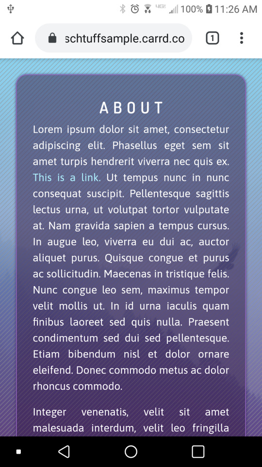
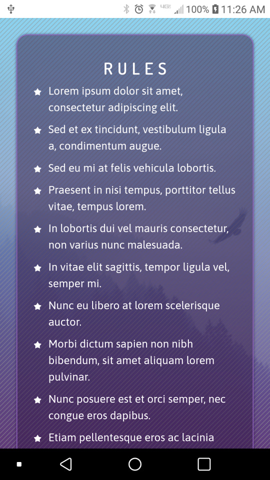
Check out this sample site I whipped up to see what I mean.
In this post, I will walk through how I made this sample Carrd site, to demonstrate how simple and customizable it is. But first, to answer what you’re already wondering -- what makes Carrd any better than Google Docs? And I have three answers for you:
There is no issue of privacy or security. Your account name and email is not accessible anywhere on your Carrd site, nor are any viewers visible.
Carrd is much more mobile friendly than Google Docs. I don’t even attempt to open Docs on my phone anymore, as they’re a bit of a nightmare and I can never do it anonymously. But I’ve never once struggled with a Carrd site. Everything is automatically put into a mobile friendly format, and if the automatic settings do mess up, you have the ability to go in and manually change how things will be displayed on mobile.
This may be a bit more personal opinion, but I found Carrd easier to customize as far as colors, images, backgrounds, etc. After about ten minutes, I was comfortably manipulating all of the elements on my site, and much happier with the end result than anything I’ve seen on Docs.
Join me under the cut for a walkthrough of creating the site linked above.
As a note, I’m not intending this to be a full guide to all of Carrd’s features, just a general overview to see how things are laid out. It’s fairly intuitive so once you see the basics, you should be able to play around with it more and get your site just the way you want it.
When you create a Carrd account, you will be given this screen. (If you’re on the main dashboard instead, click New Site.)

You can either explore premade templates below, or you can start from scratch by clicking the link in “blank canvas”. I prefer a blank slate myself, but I encourage you to check out the templates if they seem easier for you.
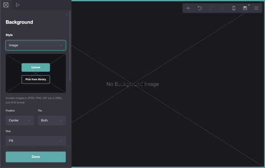
After clicking “blank canvas” you will arrive at this screen.

These are just Carrd’s instructions. I’ll hit ‘Okay, got it!’ to get rid of it.

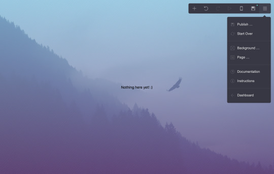
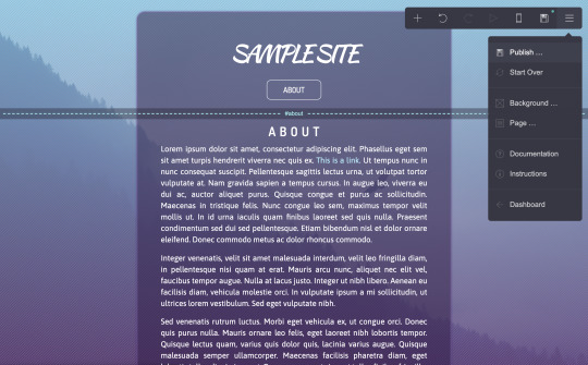
The first thing I want to do is customize the background. It’s a good starting point. To do that, click on the three lines in the top right corner...

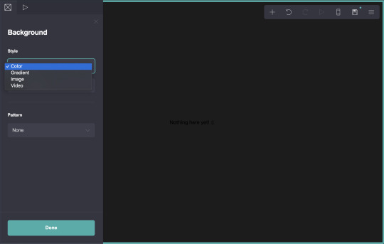
...and select Background.
Options will open on the left side of the screen, as seen here. Your customization options are fairly straightforward.
You can change the color...

Or change it to something else entirely. I’m going to use an image.
After uploading your image, you have the option to recrop it.


Now I hit accept, and this will be my site’s background.
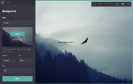
There are other options as well, that can reposition the image, change its size, tile it, etc.
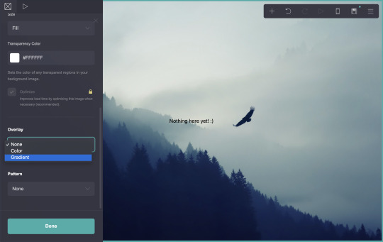
I can also add a gradient or a pattern to this image. I’m going to scroll down to Overlay and select Gradient.

And change those colors and the angle a bit.

Ahh, lovely. I’ll also add a pattern...
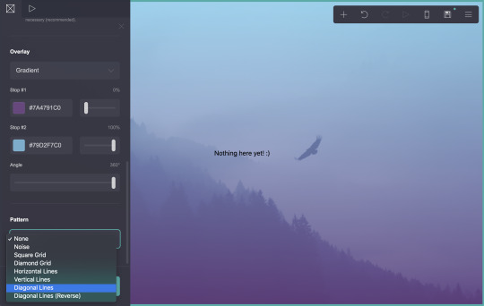
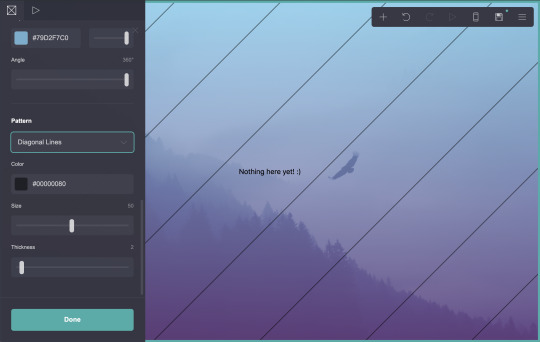
But that looks rather ugly. I think I’ll play with the color, size, and thickness a bit more.

I like that. Nice and subtle. Let’s call the background done.

Now let’s customize the page itself. This isn’t necessary, if you like the text directly on top of your background, but I like how neat it looks.
Go back to the three lines, and this time select Page.

Under Style, I’m going to change Default to Box.


You can change the position, padding, and other settings of the box in this sidebar. Personally, I want to round the corners...
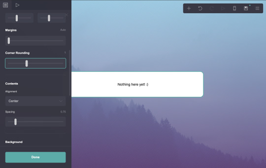
...change the color...

...and change the opacity.

I’d also like to add a border...
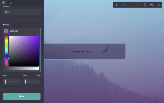
...plus a customized drop shadow.

And we’ll call that done.

Now! Let’s see what this site looks like on mobile. In the top right menu, to the left of the save icon, is an icon that looks like a phone. Click that.
As you can see, your view resized to demonstrate how your site will appear to a mobile user. It’s a very good reference. I’m going to switch back to desktop now (the same button, which now looks like a computer monitor).
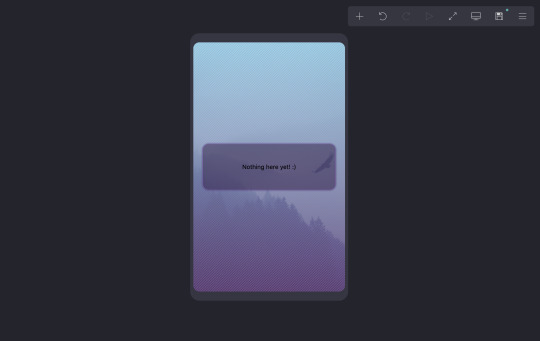
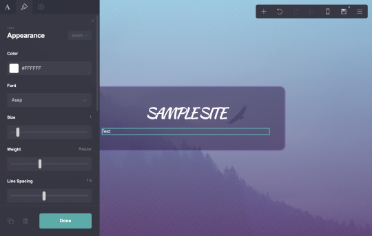
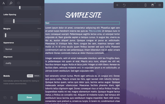
Let’s get some content on this site now! I’m going to start with the text that’s already present, that says ‘Nothing here yet! :)’. Click on that.
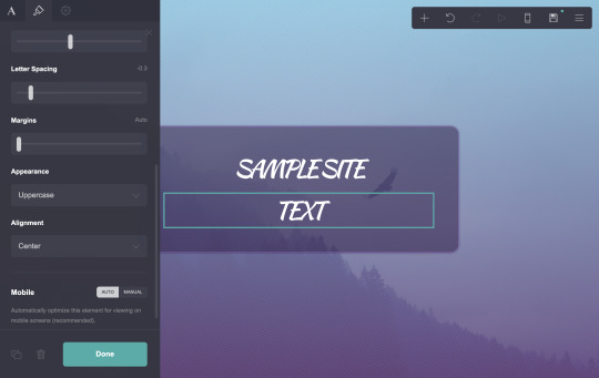
Options for this text will appear. First, I’m going to click the word Text itself. This will cycle through various options, such as default text, headings, subheadings, etc. I want this to be my site title, so I settle on that. (This step isn’t necessary at all, but I find it helps keep me a bit more organized.)
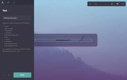

Now, for the content itself. The box is where I enter what I want this text to say. Markdown instructions for bold, italics, links, etc. are always below the box for easy reference.

I want to change how this text looks. Above Site Title, you’ll see an icon that looks like a paintbrush. Click it to reveal the next tab.
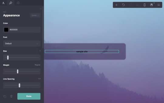
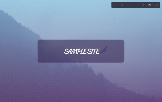
Here you can change color, font, size, weight, and anything else that strikes your fancy. There are a lot of options here and they’re pretty straightforward, so play around with it. Here’s what I settled on.
Remember you can check it on mobile, as well.

Time to add more text. Let’s start with a bio, maybe?
Hit the plus sign in the upper right menu to add new content, then select text.

By default, new text will match the formatting of the most recent text used. I’m going to the first tab, the one marked A, and making this text Paragraph.
Then I go back to the paintbrush tab to make some changes to the style.
Then back to the first tab to add some content. I’m just dropping in some lorem ipsum, since this is only a sample. Obviously you’d want something a bit more practical here.

Let’s say I want a link in there. I’ll follow the markdown format to get one (instructions are below the box, as always).
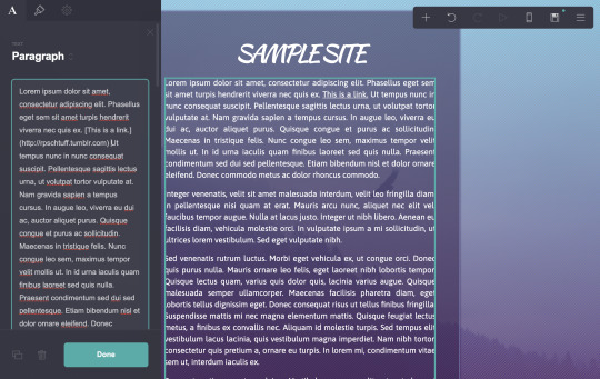
Now it’s in there, as the third sentence. You can see it underlined. But I want to customize that link. If I go back to the paintbrush tab, options for Link and Hover have appeared. I can change the color there.

And if I scroll all the way down, I can change the link style from Underlined to Plain.
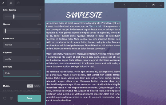
That looks nice. I’ll call that done.
Let’s add a subheading to that section. I’ll add another text box.

Then click and drag it above the previous one.
On the first tab, I’m going to change this one to Main Heading.

Then customize it as before.

Now for the actual text itself.
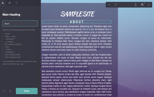
Lovely.
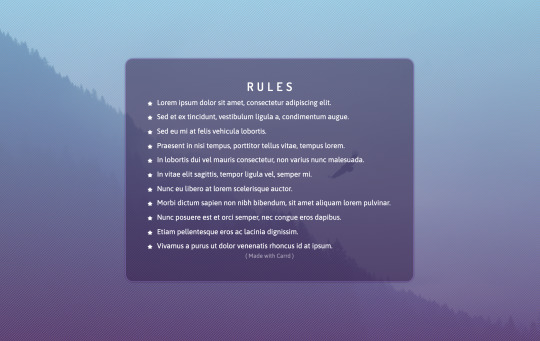
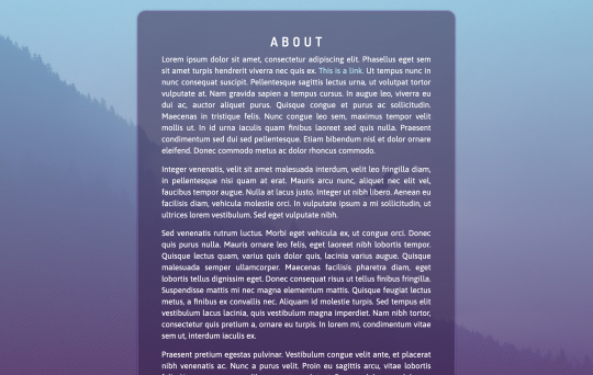
Let’s add some rules! I want to add a new title, so for that, I’m going to select the text that says About. Then in the bottom left is a button that looks like two overlapping squares. This will copy the text, so we don’t need to reformat it identically.
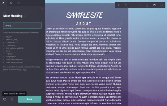

Click and drag the new title where you want it, and change the text to what you want.
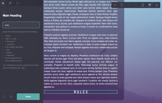
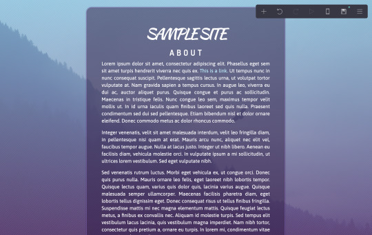
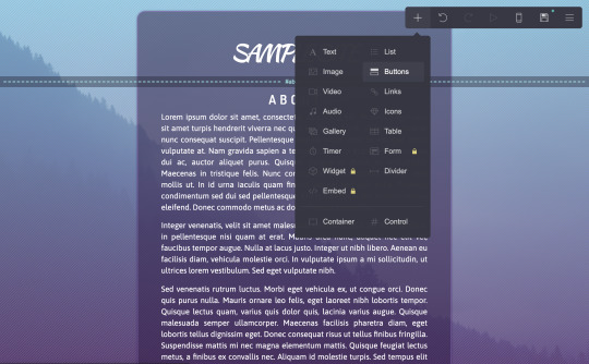
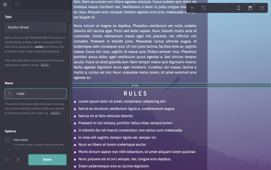
I’m going to add a list now. It’s one of. the other options under the plus sign.

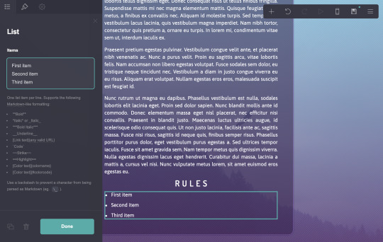
As you can see, some bullet points have appeared. Markdown instructions are still under the box where you enter the content. I’m going to fill it with lorem ipsum again.

Under the paintbrush tab, you’ll see that there are multiple tabs. The first lets you change some style and formatting.

The second lets you change the bullets themselves. I’m going to play with that a bit.
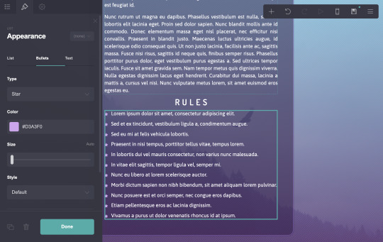
The third lets you change the actual text formatting. (I don’t know why my purple bullet points disappeared, I must have hit an undo at some point without noticing. Pretend they’re still purple.)

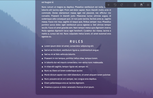
And I’ll call that done.
Mobile check!
Not bad.
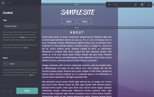
But the question of the hour, how do you make these separate pages? Let me show you. Under the plus sign, choose Control.

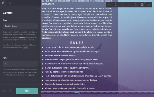
A blue dotted line will appear. Drag this to the top of what you would like to be a new section.

On the left tab, the type should read Section Break. Type in something simple and easy to remember under Name.

This has designated everything under the Control as a new section. We need to create a link to it in the very first section.
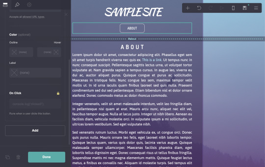
I prefer to use Buttons for this, but any link option on this site should work. I’m going to add a Button under the Sample Site title.

By clicking the small word Button (inside the box on the left tab), I can change its settings.
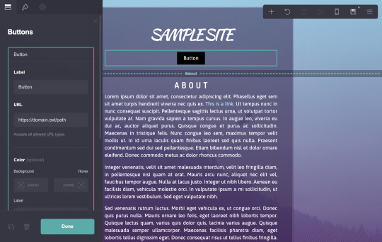
The Label is what the button will actually say. The URL is where the button will take me. I can enter any URL, but if I enter the name of the Control I made with a # in front of it, it will take me to that section.

There are options to. change colors of each button individually, but I prefer to go to the paintbrush tab and change their appearance altogether, so each new button in this group will look the same.


Unfortunately, you can’t properly preview the section breaks while you’re editing. So I’m going to publish this site now so I can view it. Go to the three lines in the top right and choose Publish. Fill out all the options there, then hit Publish. (You can also save as a draft here, if you want to keep your progress but aren’t ready to publish yet, but this doesn’t let you preview it properly.)


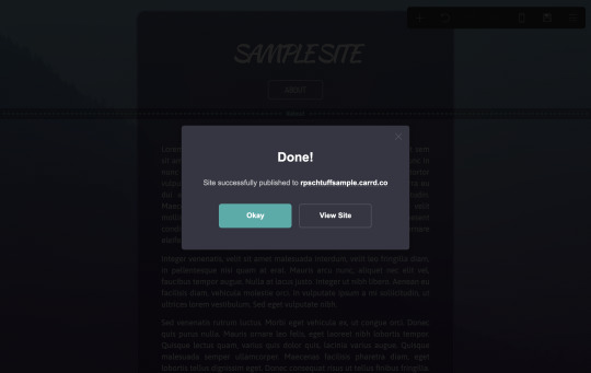
Now, if I hit view site, I will be able to see it properly. And as you can tell...
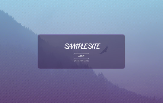
It only displays everything up until that first section break. And when I click the About button that I made...

...everything else appears.
So it’s working! Let’s go back to the editor and add another section break for the rules.
(As a note, you can also set something as a Scroll Point rather than a Section Break, so that any links will scroll down to that spot as opposed to hiding then revealing a new section. You may prefer that option, it’s in the dropdown under Type.)
Now I want to go back to my button...
...scroll down on the left options tab and choose Add.
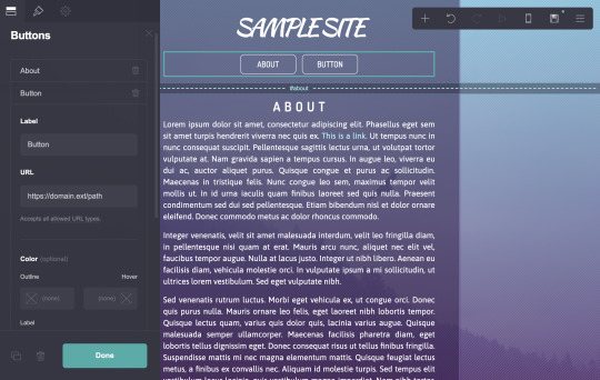
This creates a second button within this group, that I can edit the same as the first.

Lovely. Let’s preview this in mobile quickly.

Notice how the buttons automatically resized for full width on mobile, and are displaying differently than they appeared on desktop? This is by default, but you can change this behavior if you wish. Select the buttons, and on the paintbrush tab, scroll all the way down until you see Mobile.
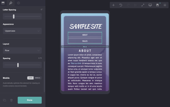
By default, it’s set to Auto, where it makes its best guess at what will work for mobile. If you switch to Manual, you can change its behavior.
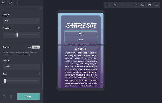
If I change the dropdown under Layout from Stack to Default, it will display as it does on desktop.

For something as simple as buttons, this likely doesn’t matter, and full width buttons may actually be more mobile friendly. But it’s important to know where these options are, in case something is actually broken on mobile and requires fixing. Check everything on your site in mobile to make sure it actually works.
Let’s publish this again to preview it now.

Our new button looks good, and both redirect you to the appropriate place.

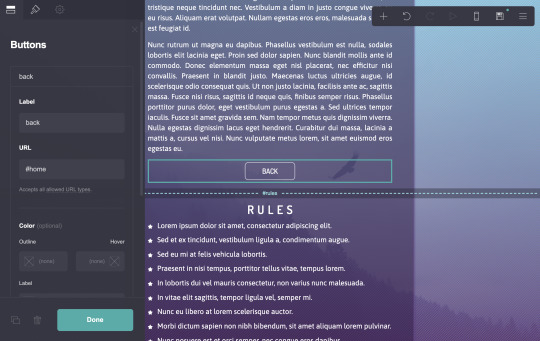
But wait!! Once you’re in one section... there’s no button to get back!! I’m trapped!! This is very important. Always provide a way to leave the current section, so your viewer doesn’t get stuck somewhere on your site.
The easiest way to do this is to add a new Control on your first section, called #home. Then, at the bottom of each section, add a button that will link back to it. (You could also add buttons for all the sections at the bottom of each, but I find that more tedious to set up. But it’s entirely down to your preference.)

Now if you republish the site, it should all be functional, and you can navigate it with ease.

Let’s check the actual site on mobile, too. I’m going to actually get out my phone and go to the URL.

It all looks good there, so I will call this one done.
And that’s a rough guide to using Carrd.co! Obviously this is geared more towards my style and preferences, but there are so many ways to customize this to suit your needs and tastes. I also didn’t cover things like images and videos, as I feel they’re pretty straightforward.
A few notes:
Carrd currently limits free users to only three sites per account. However, Gmail’s alias trick and SessionBox totally work. I run multiple Carrd accounts as easily as I run multiple Tumblrs.
A free Carrd site can only have up to 100 items on it. For my sites, I haven’t even come close to that limit, but I can see larger blogs or multimuses potentially struggling with that.
396 notes
·
View notes
Text
Fic Research 101
A general guideline with various tips and tricks.
What for?
Even if you’re the type who can construct giant fantasy worlds out of thin literary air, research makes the difference and can bring you a lot of enjoyment once the story becomes its own universe. Expanding the horizon is 100% worth it. For beginners, advanced writers, and experts equally. Readers always notice and cherish that level of detail. Even Terry Pratchett preoccupied himself with geography, history, art, or science books. And anything else that would catch his eye, not worrying about whether it was considered cheesy, odd, or stale bread. It was simply for the sake of interest and passion. What I found noteworthy: He actually preferred it over reading stories of his genre (!) as not to reiterate things subconsciously, i.e., what other authors researched and repurposed. We saw the result: He built believable, unique worlds. It doesn’t mean that you have to eschew reading entirely or need to create a groundbreaking universe. It’s just important to be aware how habitual input shapes what knowledge we believe is possible to cover in our stories.
Where/How
Sometimes, it does depend on how you search, not where. The — often grammatical — quality of your search engine request determines the character of what you receive. My favorite trick is to look for “types of [research subject]”. That gives me a wide array of what exists, how it looks like, and also possible substitutions should something not work out. It’s also easy on non-native speakers because definitions will come your way like that.
Mentality also matters. You can approach it like an academic looking for data or a creator of imaginary worlds curious about what people do. It will reflect in your story, big time. So it’s important to keep your style in mind even when you look up menial things, either can work.
When
It can be fun to figure out what kind of researcher you are. Either the one taking in all information first. As in, watching a documentary and then creating a spin-off in your AU. Or the one researching while writing. The advanced form for those with a lot of time on their hands is doing both. It will boil down to how good your long-term VS short-term memory is.
Alienating VS Involving The Audience
A tricky question remains what readers will understand and how they can ease into stories with extensive research. In my eyes, even if there is something they are unfamiliar with, the appeal of the story is times higher when the author goes some extra miles or has notable immersive details as the cherry on top.
The real bad guy that you have to watch out for are complex highbrow words for embellishment that a) nobody has ever heard of b) can’t be logically understood by looking at the situation.
"The family prepared the gallimaufry” will deter readers times more than “Catherine the Great died aged 67″. Because Catherine the Great is self-explanatory and well-known, but nobody has an idea that gallimaufry is a fancy old synonym for ‘stew’. So rather go for Catherine the Great even if the gallimaufry might be period-typical and sounds hilarious. The rule of thumb is: If you give enough context so the reader doesn’t have to research endlessly themselves, you can pull it off, particularly with readers who are native speakers. It’s more difficult with non-native speakers, but I would trust them to look something up if the vocabulary is entirely foreign to them. If you’re in doubt about that, simply provide more background information and describe things viscerally, maybe with a simile or metaphor.
So, unless you put it in the title (that’s a different topic), peppering your story with super fancy words from 200 AD that only you know can make you come across as a show-off trying to be way above the audience, while appropriate research and context makes you look like an artist who loves making stories and gives their readers an experience. I know, long fancy words are tempting, but try to keep them at a minimum if possible. Particularly when your AU is not historical or doesn’t feature fantasy elements. If you do write fantasy and drop something like say Latin as in Harry Potter (the spells), it helps to have a character who inquires about the word from another person in the fic. You give the reader a self-insert for that situation to learn about it. The same goes for new terms you come up with.
About Learning
This one is a big deal. Definitely figure out what type of learner you are (visual, auditory, etc), and what types of intelligence you are good at (logical, musical, linguistic, etc). Once you know how you retain information best, the world is easier. Many authors see research as an unwanted chore just because they take in useful information the wrong way. We all are curious creatures, it just depends on how things are presented to us. Once we find our forte, research loses much of its exhaustion, fear, and pressure.
Beware of comparison with other writers here. E.g. spatial-logical talents will be good at worldbuilding, while kinesthetic-literary talents will write authentic eroticism and action. We all have our niche and modes of brain function, sometimes it’s good to stick to your gifts instead of competing out of envy — which brings us back to Terry Pratchett and reiteration. Mind you, do experiment, do consider various ways of learning, what I mean is that you can make a story work faster knowing your potential in several areas.
Research Topic Masterposts
Perhaps you’ve seen them, the ones helping you construct a realistic XYZ scene. I know the hype around them, the effort is impressive, definitely keep it on your radar. Still, a word of caution. It’s often something you reblog for reference because you see all the options in one place but never go back to it. It can derail your research process immensely, too. The reason: It appears randomly, not when you need it. Heading out to research via browser in the right moment often yields more fitting results and options. After all, the person making the masterpost linked you guides to topics of their preference, often their stories’ research process, which can be far away from yours. I’ve often run into linked articles that are either too advanced or straightforward, it’s a bit of a Russian roulette to find the right insight. Which the masterpost creator obviously can’t and doesn’t have to anticipate, by all means — the same principle applies to this post, you have to cherrypick what resonates.
The problem is that you can’t know how useful to you personally the links are at first glance when you just reblog for later reference. Combing through the links and visiting a bunch to see if it is any good takes forever compared to a 10 sec google search. Ironically, you’d think someone else, maybe a more experienced author, doing the work for you spares you effort and it’s convenient, but the opposite can be the case. Sometimes, you have to research from scratch and rely on your own gut. Should you still find a solid masterpost giving you precisely what you’re looking for, and you remember to go back to it — installing XKit helps with that, it has an archive function: Check the timestamp (also via XKit). If the post has been around for longer, many links might be dead so keep an eye on this.
Wikipedia
Staring at black font against white forever can be frustrating and repetitive. Hyperlinks can distract, it consumes time. In some cases, infographics give you a quicker, more colorful outline with equal amounts of sources. Important: Remember the mentality bit. For some, inspiration comes first. In that regard, infographics can help you out further by providing a visual idea in terms of worldbuilding. If you are the data type and do juggle references, it might be a better idea trying Google scholar to find journals. Tip: Read their abstracts (the summary at the start) to get a quick overview. And then you’re ready to go.
Handy Shortcuts
Disclaimer: Those are for Mac. For Windows: Use Ctrl instead of Cmd.
Cmd + F (search) finds the needle in a stack of hay. This one is essential.
Cmd + T (open new tab) saves time.
Cmd + Z (undo) — every writer’s lifesaver, oh my god.
Cmd + A (select all) helps for copy paste. Mind you, don’t plagiarize.
Cmd + N (open new web page) for a blank slate, all other tabs stay open.
Cmd + down arrow brings you to the bottom of the page.
1) Cmd + Shift + 3 gives you a fast screenshot of the whole screen.
2) Cmd + Shift + 4 lets you select a rectangular/square area to screenshot.
the screenshots will be saved on your desktop.
Windows doesn’t have 2) but uses “Print Screen” for 1).
128 notes
·
View notes
Text
ADAComply v2.0 Demo + Custom BONUS - 3 Steps To Make Website ADA Compliant With ADAComply

ONE IMPORTANT QUESTION: IS YOUR ORGANIZATION WEBSITE ADA COMPLIANT?
THE ACTUAL FACT that WHEN YOUR Business And Website is Based In USA, Website ADA Compliance IS A MUST!
Unless You GET THIS TO Change To Your Website IMMEDIATELY, YOUR ORGANIZATION COULD BE SUED!
In the event that you had never heard about website ADA Compliance, then this video is designed for you and you should pay your 100% attention to this.
WHAT'S Website ADA Compliance?
For all those unaware, ADA stands for Americans with Disability Act.
This acts requires businesses and site owners to make accommodations for folks with disabilities in every their web content.
Reality is, a lot of website owners are ignorant of this Act, this makes it even more dangerous as ignorance is NEVER a justification for breaking the law.
More than 10,000 websites sued in 2019 for their website not being ADA COMPLIANT which involves big and popular companies which you can find the set of lawsuits through google search.
The number is estimated to increase in Year 2020 and beyond.
Head to google search, just enter the keyword ADA website compliance lawsuit and the search engine will pull out many recent articles dated 2019 and 2020 about the website ADA Compliance.
You can refer to THE MOST NOTABLE 10 Most Notable ADA Website Compliance Lawsuits, where, you will see out a few of the top and famous business which got sued.
This consists of restaurants.
Now, let us tell you a scary fact: Some parties out there are taking advantages by searching for those non-complying websites in order to hit these companies and suck monies from them.
Warning: You Might Want To Bookmark THIS WEB SITE, Go Out To Google Search about Website ADA Compliance, Lawsuits, Verify and Later Return To This Page To Make Purchase, If You DECIDED For Your WEBSITE TO TRAVEL ADA COMPLIANT ...
NOW, THIS IS ACTUALLY THE SOLUTION.
Introducing a Software, ADA Comply version 2.0 which can solve this really pressing and expensive problem in only a few simple steps.
ADAComply v2.0 Is 100% Cloud Based So There’s Nothing TO SET UP.
ADAComply v2.0 works in three simple steps;
Step one 1: Add a new website to your ADAComply dashboard with the net URL address.
STEP 2 2: Click to copy the code to your website.
Step three 3: Paste the code in your website’s footer. That’s all!
ADAComply includes a amount of web accessibility tools;
1. Text to speech.
2. Zoom feature.
3. Cursor select.
4. Reader font.
5. Highlight feature.
6. Alt text for everyone images and graphics.
7. Dark mode.
8. Auto-create an accessibility compliance statement.
9. And a whole lot of other features essential to fulfill the ADA Compliance requirements...
Now we will put you to the demo by Mario from ADAComply v2.0 on detail by detail on how to make your website ADA COMPLIANT by using ADAComply v2.0.
Oh, before I forgot, if you get ADAComply through our link, you will get bonus.
About the price, ADAComply v2.0 would only cost you $69, which is far more cheaper than the price your business have to suffer, from thousands to hundred thousands if your business has been sued or hit because of website ADANon-compliance.
It’s Only A Matter of their time Before They Catch Up To You.
And When THEY CERTAINLY? It’s Game Over.
So, what are you waiting for? Follow the link below to get ADAComply v2.0.
Watch Video: https://youtu.be/6n0xXuibs50
Visit Website: https://reviewnbonus.com/step-by-step-on-how-to-make-your-website-ada-compliant/
youtube
#adacomplyv2review#adacomplyv2bonus#adacomplyv2reviewbonus#adacomplyv2bonuses#adacomplyv2softwarereview#adacomplyv2demo#adacomplyv2#adacomply#adacomplyv2softwarepreview#buyadacomplyv2#getadacomply2#adacomply2walkthrough
1 note
·
View note
Text
Self-shippers, wanna see something cool?!
I've been scrolling through / following the #self shipping tag for a while. Noticed I have like, a F/o set up most people probably don't have that I'd love to share / teach anyone else to make! Just shoot me a message, don't be afraid, I literally have nothing better to do and love when people take interest in whatever I'm up to! I'm not worried about damaging any Street CredTM on my main here, I haven't been relevant in forever, if at all.
(This is my first time using a “Keep reading” cut off, since this post is sort of long. I think that sends folks to my blog, sorry if my font is hard to read in, idk how to change it. There’s always copy-pasting into a word processor)
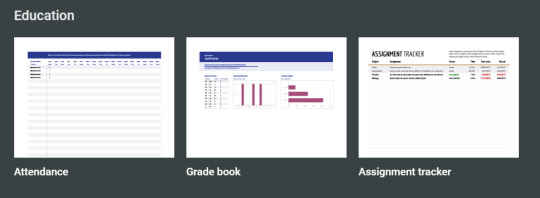
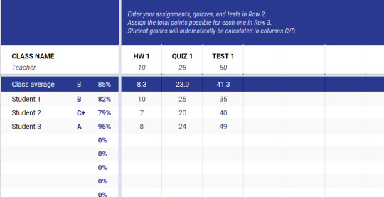
The place where this amazing thing lies? Google Sheets. I guarantee you, it's useful for WAY more than data entry. I've been building up this "F/o set up", let's call it King Kong, an arbitrary name I'd given it that just sorta stuck, since 10/14/17. It all started with the Grade Book template.
Wow, it's been a while since I looked at the base template, so much has been changed since then. Not gonna show the real thing / parallel to this page, because sensitive info, but I will talk 'bout it's features. No one's ever asked and I never plan on sharing the sheet itself, so I'm just gonna rant on all the capabilities (and if anyone's interested, I can share some formulas to help build your own)
Note: This is all 1 Google Sheet, made the whole thing myself except for the /very/ base, which I think was the School Grades template? It's been a year since I started it, it didn't start this awesome.
There's a page full of graphs, info grabbed from my F/os to find what I'm attracted to. I hope to build The Ultimate OC, or one geared towards myself one day with this info.

You get one (1) graph. Looks like I have a preference.

The most used page is the Mobile viewport, or "Mobile RE", (Mobile Random Events) shaped to fit my phone. In the center is a randomized prompt, with pieces taken from another page. A different F/o is generated for each prompt, sometimes multiple (road trips are fun). Some prompts have a "switch" that is effected by character traits, such as characters listed as "Introvert" or "Extrovert" , or “Punchy-fist” or “Pacifist” may see a slightly different prompt
Example prompts -
"Spongebob Squarepants seems to have caught a bad case of the hiccups. Seems frustrating ~ You're just glad it ain't you."
(Has an Honest / Dishonest switch) "While you and Spongebob Squarepants are walking around town, you find a wallet. You could care less what is done with it, but Spongebob Squarepants insists the wallet be returned to it's owner. It's even got the ID in there and everything, so you oblige. One good deed a day."
(While the Dishonest may just pocket it)
(Note: Spongebob ain't in there, just first rando I could think of XD)
I usually just peek at these for like a sec / enjoy 'em / imagine 'em in the moment, but you can write as many prompts as you want, even using them as actual prompts for drawing or fanfiction writing! I’d love to share the premise of some of the prompts I’ve collected if anyone is interested there.
There's also a refresh button, a break switch (seen here "Turned off for editing"), 25+ color themes (got "Chocolate" set in the pic), Night reading mode (love reading white words on black text, it’s on 99% of the time), Game modes such as "Best of" which just shows my favorite prompts, pronoun / name dropdown lists. want your F/o to call you your nickname? One of your kin names? Genderfluid and don’t want to be locked down?.
Sound too good to be true? Hell naw mate, shit's real. Just needed to put a little work into it and boom there it is!
Looking outside the viewport, there's a currency system (Pearls), along with that, a gambling prompt exists (Though I have to calculate winnings / make changes manually), Merchant's Prompt (they can buy stat boosting / effect items w/ pearls), Inventories, Statuses (Cursed Tiki effects a character's stats), Holiday indicators for seasonal prompts, you bet your ass I have a column for each character's MBTI / Enneagram, friendships between characters, even across media sources if it works.
Testing laboratory to check if new characters I've found would fit here (linked because it wouldn’t upload to the post for some reason?)
Team Puzzle the F/os are working on, it's 82% done ~ Each piece is picked up when a certain prompt comes up.
I may not have a self-insert made special for self-shipping or a detailed story of how I met any of 'em / life together like most you have, which is super cool. But I've got this.
I realize some folks still may be too shy to contact me, so here's some useful formulas to start with -
=IF(A1="word", "Yes it is word" , "Nope it's not word")
^ You can nest this formula like there's no tomorrow. Can be used with below for random chance. Ex. Under 50 is tails, over is heads
=if(iserror(SEARCH("thing to find",A1)), "Not contain", "Contains" )
^ Similar to above, checks if a cell CONTAINS a cell instead of is EXACTLY that word
=RANDBETWEEN(1,100)
^ Classic out of 100 randomizer, but numbers can be adjusted
=CHOOSE(RANDBETWEEN(1,2), "Apple", "Banana")
^ Another random choice. Can def have more than 2
=INDIRECT("column letter" & cell with row number)
^ This thing is very smart, let’s you outsource the location of a cell
Say these are all in column A - Red (A1), Blue (A2), Yellow (A3)
=INDIRECT("A" & B1)
Then in B1 or something you have either the number 1, 2, or 3. It will use that number to know where to grab the info from :)
I use this in my main Mobile RE viewport, the row number is randomized outside of it, also allows info / notes on specific prompts to come up in a separate cell since they use the same row but a different column
=INDEX(HP!D1:D88 , L21 , 1 )
^ Incredibly similar to the above “indirect” formula. I grabbed this straight from the sheet. L21 is like B1 in the other formula, and the HP!D1:D88 is like “A” in the other, but this one grabs info ACROSS SHEETS, HP is in a different tab than this formula is in! Very useful
=index(E129:M129, randbetween(1, counta(E129:M129) ) )
^ Big ol' text randomizer. This one is for a single prompt tho
And that's like 99% of my formulas, I probably have minor ones floating around tho. Reblog if you've been inspired / want to contact me to make your own / want to spread this around!
#self shipping#self ship#oc x canon#oc shipping#self insert#i hope this is useful to someone or other#reader x canon
3 notes
·
View notes
Text
Design your own blog
Blogging: how to start a blog, I added another layer and then used the link tool. It's also advisable to play around with the font to determine which one suits your personality. I used AvantGarde BK BT here. I changed the font color and used the same styling effects that I often tried for light bulb. Simply right click the light bulb layer then "Copy Layer Style" then right pick your text and "Paste Layer Style". Don't forget to preserve!
Submit your website to online directories - submit goal to free SEO friendly website directories for quick way to start building one-way links to your web page.
Hand tools you’ll realize that having both a hand shovel also hoe often makes it simpler for you to achieve gardening nirvana. When how to find handy items such these, closely scrutinize the strength of the tool exactly where metal meets the do something about. Many cheaply-made gardening hand tools fall apart within the original hour of serious gardening.
Ah, but what if you do bring something unique into the table as an affiliate. Visualize you might bring in regarding visitors from feed sites and so on. What if you own Rotten Tomatoes and want to list movies from The Amazon website? Well, you don't want to link up with the affiliate network program. Instead, you want to contact the site in question and hammer out a distinct agreement that applies only to you. This agreement is regarded as a strategic alliance agreement could be officially used on a case-by-case basis.
And, we are not even referring to a person here! We're talking with regards to a WordPress manager software may easily be avoided make life simpler by furthermore creating associated with domains for you in only click; and also even aid you organize numerous one convenient location!
Don't rather than "sell" anything, but just let people know you've something fulfill their standards. If they don't yet realize have got that particular need, then give these folks the information to allow them to understand their need. Community wanted to buy, they'd go to at least of at this point online retailers and research it. But someone wants information, they will search the web and that they happen locate you, supply the customer what they expect. Search engines love content and techniques your leads! Fresh content will keep your visitors coming back to your website at their very own will and you will definitely naturally get higher results at search engines. As the saying goes," Content articles are king" as well as your ally how to create a blog wordpress guide for beginners when discussing traffic generating.
Map your calendar into the content. Because you created themes for each month during your marketing plan development, now you can start plugging in content through message method. What features or benefits are better to market inside summer, spring or fall? You will begin to have something to speak about and inspire prospects!! This is goodness friends!
Many consumers are beginning create blogs utilize a service which doesn't have numerous for choices. They simply give you to create the options which enable you to truly customize website. You can break through absence of options by finding and installing some blogging software off the web. You will have the opportunity to of the software to customize your blog, adding whatever you are looking. You will have a way to produce decisions on what your site looks. You are control internet site however such as. When you are done you may have a unique and hopefully very stylish looking blogs. You will be placement update it with ease using blogging software.
Tags: how to create a blog, start a blog
Setup Free blog: free blog setup, Download and open the Kubrick header (kubrickheader.jpg). Note the proportions of the graphic- 760px wide by 200px high. It's very important support the dimensions exactly tennis shoes when changing the graphics but not messing together with stylesheet or the HTML. Add another amount. Save as "kubrickheader2.jpg" (in Photoshop use "Save for Web.")."Save" after each cycle.
Imagine ahead of time write regarding favorite series and post it regarding your blog simply get setup your wordpress blog for free individuals your webpages? It can be that easy and easy if you now what you are actually doing.
There is and its called Joomla and Holly Mann is keen on Joomla blog sites. In fact is actually so keen that she offers on edition of her book that I purchased and in her website in the time of writing this review, to install a CMS for you.
This is a simple script or laptop or computer. It extends the associated with WordPress than its developers aimed. It is usually installed at the plug-in manager in your WordPress dash. It can be done automatically or manually. You can choose from two kinds of WordPress plug-in - free and premium plug-in. With premium plug-in, code tweaks and cloning of your WordPress site can do.
Tags: free WordPress blog setup, setup free wordpress blog
Add Google Webmaster tools: how to add Google webmaster tools in WordPress, You programs have 2 different associated with sites atlases. One is an html page listing all of the pages on a website. This serves as the type of "table of contents" for your user. This becomes increasingly important while your website becomes more elaborate. Concerning type of site map is an xml site map. The xml sitemap is an coded site map which make it easier for the search engine spiders to index all of the pages of one's website. Pay a visit to Google webmaster for seo to join up your XML sitemap.
If in comparison to use online tools, then do a search inside your favorite search engine for "free sitemap generator". You might also visit is proven to work Tools section at Google for an inventory of scripts and software they refer.
Tags: add Google webmasters tools to blog, add Google webmaster in WordPress blog
Install wordpress manually in cpanel: How to install wordpress manually in cpanel, What happened if you have a hot DP to market and during the night 500 people have purchased your lotion? You will spend the full day manually sending 500 emails! Oh dear!
When you transfer your overall website to WordPress, home page of one's website will be replaced a person have how to install wp manually their root of your domain, therefore it is critical that you make sure to copy all the information had been on that home page, before installing the application, ready to put back after. Alternatively you can how in order to wp manually in a folder of your site, so avoiding problem.
What other Web a pair of.0 marketing strategies will help? Firstly, it is well worth creating a blog, it is possible to regularly post content - search engines love the continual updating and blogs get well ranked to that end. Install wordpress manually at Ning.org - if your hosting service offers 'Fantastico' that is a huge help. Or your might will want to hire a coder that can you, effortlessly.
Utilize PPC (pay-per-click) to get started. You won't develop a massive income off from the right away, but absolutely easily make 5-10 bucks a day in given it. That may not sound like a lot. it can be enough with regard to meal just about or airfare after a month, along with the number only gets bigger as your website grows in readership.
Tags: how to install WordPress manually beginners guide, setup wordpress blog manually in cpanel
Install wordpress plugins : How to Install WordPress plugins, Your blog postings can be easily shared on LinkedIn, Facebook, Twitter any other social newspapers. This gives you a potentially greater audience without in order to do any further work.
Once I complete one project, I immediately ask myself "What's next?". Standing still will kill or else you business. Just like a shark, you need to keep moving to stay alive. Our brains are always searching for one more accomplishment, the other challenge.
Tags: Install Wordpress plugins step by step guide, Install Wordpress plugins tutorial for beginners
Install wordpress themes: How to install Wordpress themes, Now the focus with if you are was demonstrating how any WordPress theme will help out with sales and opt ins. We should get directly into how these regarding today are completing the opening.
So see the "upload" area and mouse click on Head to. Now search through your hard drive to an individual have your images, select one you want, and then click upload.
You will obtain a specific quantity of flexibility in customizing a how to install wp themes to extremely needs. This relies on the particular theme you are using. For a lot of of the free themes, you should to stuck to the basic default height, widths and colors etc. Using the premium themes a person more electricity to do as you like.
Once you've found a subject matter you like simply click on the "Install" link and the theme often be installed with your site. You are activate the theme truly live using the net. Easy, right?
Tags: Install wordpress themes step by step, how to install WordPress themes for beginners
Best Website Hosting: Website hosting, Always end your answer with "Thanks for writing in. Please contact us if may help you further." Couch an unforgettable first impression on the client.
Disk space refers to your amount of space you're renting on a server and bandwidth pertains to the volume of data managing is that may move out onto the online market place in specific time. My suggestion is a hosting account which offers unlimited numbers of both with your hosting checking account. It's a common benefit that is not totally necessary but offers piece of mind. To acquire a newer website you probably will not using high of either however, with unlimited bandwidth and disc space, you just won't need to worry about any surprise overage charges.
Tags: best wordpress website hosting companies, top website hosting companies
Wordpress: What is WordPress, Here there are several choices in accordance with where your music is. The tab that will open tend to be upload from computer. Click browse and find your audio file on your laptop. Upload it then, put in a title and click insert. When the music or audio file is already online click, From Web. You will need the web address also called URL in the audio and you then can gave it a championship. If you have already uploaded it to your site then Media Library just what you be needing. Click that and insert it. If you click insert it include it in the blog weblog.
When you launch a blog, you may get only many times hits a month, then after a long time there the many multitudes of find a month. Google highly respects blogs since offer unique contest more often. Start your blog and talk about whatever you sell. Individuals will actually begin reading it. It's free and it's easy. Click on the WordPress platform to build website and fill the blanks.
Tags: learn wordpress, wordpress tutorials
Setup Wordpress SEO: how to setup wordpress SEO, Previous a person can upload your website clone several new domain you actually initial of develop a database on your new web-site. In this stage you may use the MySQL Database work in your new domain page host's cpanel, to come up with a database together with database web surfer. As soon a person have designed the database and person, you allows the consumer full entry privileges to the database, the total amount is needed by the Setup wordpress SEO up (i.e. WordPress demands to entry the database by logging on being a database user).
To do on-page SEO you want some light technical ability. The reason is that you need to actually make modifications to you html computer code. Here is a list of changes you is capable of doing to help improve your site ranking.
Tags: WordPress SEO setup, SEO for WordPress blog
Best Wordpress plugins: Wordpress plugins, It furthermore useful commence examining your 'bounces'. Fat reduction visitors which left your own website without going to a second search page. Be on the look out for occasions when the bounce rate arises. It could be a specific search term which you are getting traffic for that is irrelevant, which probably does not matter. But dig deeper into telephone and seeing uncover specifics about visitors' browsers and browser settings, when they've JavaScript enabled, the resolution of their screen and other detailed stats.
Optimization: An overview of SEO also impact the Talk. You are necessary to add keywords to titles and insert relevant Meta tags and optimize links and images. You also make your URLs SEO friendly. Strategies several essential wordpress plugins to start a blog for optimizing your blog, which can increase blog traffic.
Tags: Best wordpress plugins for small business website, most important wordpress plugins for beginners, get more info
2 notes
·
View notes
Text
How to Write Meta Descriptions in a Constantly Changing World (AKA Google Giveth, Google Taketh Away)
Posted by Dr-Pete
Summary: As of mid-May 2018, Google has reverted back to shorter display snippets. Our data suggests these changes are widespread and that most meta descriptions are being cut off in the previous range of about 155–160 characters.
Back in December, Google made a significant shift in how they displayed search snippets, with our research showing many snippets over 300 characters. Over the weekend, they seem to have rolled back that change (Danny Sullivan partially confirmed this on Twitter on May 14). Besides the obvious question — What are the new limits? — it may leave you wondering how to cope when the rules keep changing. None of us have a crystal ball, but I'm going to attempt to answer both questions based on what we know today.
Lies, dirty lies, and statistics...
I pulled all available search snippets from the MozCast 10K (page-1 Google results for 10,000 keywords), since that's a data set we collect daily and that has a rich history. There were 89,383 display snippets across that data set on the morning of May 15.
I could tell you that, across the entire data set, the minimum length was 6 characters, the maximum was 386, and the mean was about 159. That's not very useful, for a couple of reasons. First, telling you to write meta descriptions between 6–386 characters isn't exactly helpful advice. Second, we're dealing with a lot of extremes. For example, here's a snippet on a search for "USMC":
Marine Corps Community Services may be a wonderful organization, but I'm sorry to report that their meta description is, in fact, "apple" (Google appends the period out of, I assume, desperation). Here's a snippet for a search on the department store "Younkers":
Putting aside their serious multi-brand confusion, I think we can all agree that "BER Meta TAG1" is not optimal. If these cases teach you anything, it's only about what not to do. What about on the opposite extreme? Here's a snippet with 386 characters, from a search for "non-compete agreement":
Notice the "Jump to Exceptions" and links at the beginning. Those have been added by Google, so it's tough to say what counts against the character count and what doesn't. Here's one without those add-ons that clocks in at 370 characters, from a search for "the Hunger Games books":
So, we know that longer snippets do still exist. Note, though, that both of these snippets come from Wikipedia, which is an exception to many SEO rules. Are these long descriptions only fringe cases? Looking at the mean (or even the median, in this case) doesn't really tell us.
The big picture, part 1
Sometimes, you have to let the data try to speak for itself, with a minimum of coaxing. Let's look at all of the snippets that were cut off (ending in "...") and remove video results (we know from previous research that these skew a bit shorter). This leaves 42,863 snippets (just under half of our data set). Here's a graph of all of the cut-off lengths, gathered into 25 character bins (0–25, 26–50, etc.):
This looks very different from our data back in December, and is clearly clustered in the 150–175 character range. We see a few Google display snippets cut off after the 300+ range, but those are dwarfed by the shorter cut-offs.
The big picture, part 2
Obviously, there's a lot happening in that 125–175 character range, so let's zoom in and look at just the middle portion of the frequency distribution, broken up into smaller, 5-character buckets:
We can see pretty clearly that the bulk of cut-offs are happening in the 145–165 character range. Before December, our previous guidelines for meta descriptions were to keep them below 155 characters, so it appears that Google has more-or-less reverted to the old rules.
Keep in mind that Google uses proportional fonts, so there is no exact character limit. Some people have hypothesized a pixel-width limit, like with title tags, but I've found that more difficult to pin down with multi-line snippets (the situation gets even weirder on mobile results). Practically, it's also difficult to write to a pixel limit. The data suggests that 155 characters is a reasonable approximation.
To the Wayback Machine... ?!
Should we just go back to a 155 character cut-off? If you've already written longer meta descriptions, should you scrap that work and start over? The simple truth is that none of us know what's going to happen next week. The way I see it, we have four viable options:
(1) Let Google handle it
Some sites don't have meta descriptions at all. Wikipedia happens to be one of them. Now, Google's understanding of Wikipedia's content is much deeper than most sites (thanks, in part, to Wikidata), but many sites do fare fine without the tag. If your choice is to either write bad, repetitive tags or leave them blank, then I'd say leave them blank and let Google sort it out.
(2) Let the ... fall where it may
You could just write to the length you think is ideal for any given page (within reason), and if the snippets get cut off, don't worry about it. Maybe the ellipsis (...) adds intrigue. I'm half-joking, but the reality is that a cut-off isn't the kiss of death. A good description should entice people to want to read more.
(3) Chop everything at 155 characters
You could go back and mercilessly hack all of your hard work back to 155 characters. I think this is generally going to be time badly spent and may result in even worse search snippets. If you want to rewrite shorter Meta Descriptions for your most important pages, that's perfectly reasonable, but keep in mind that some results are still showing longer snippets and this situation will continue to evolve.
(4) Write length-adaptive descriptions
Is it possible to write a description that works well at both lengths? I think it is, with some care and planning. I wouldn't necessarily recommend this for every single page, but maybe there is a way to have our cake and eat at least half of it, too...
The 150/150 approach
I've been a bit obsessed with the "inverted pyramid" style of writing lately. This is a journalistic style where you start with the lead or summary of your main point and then break that down into the details, data, and context. While this approach is well suited to the web, its origins come from layout limitations in print. You never knew when your editor would have to cut your article short to fit the available space, so the inverted pyramid style helped guarantee that the most important part would usually be spared.
What if we took this approach to meta descriptions? In other words, why not write a 150-character "lead" that summarizes the page, and then add 150 characters of useful but less essential detail (when adding that detail makes sense and provides value)? The 150/150 isn't a magic number — you could even do 100/100 or 100/200. The key is to make sure that the text before the cut can stand on its own.
Think of it a bit like an ad, with two separate lines of copy. Let's take this blog post:
Line 1 (145 chars.)
In December, we reported that Google increased search snippets to over 300 characters. Unfortunately, it looks like the rules have changed again.
Line 2 (122 chars.)
According to our new research (May 2018), the limit is back to 155-160 characters. How should SEOs adapt to these changes?
Line 1 has the short version of the story and hopefully lets searchers know they're heading down the right path. Line 2 dives into a few details and gives away just enough data (hopefully) to be intriguing. If Google uses the longer description, it should work nicely, but if they don't, we shouldn't be any worse for wear.
Should you even bother?
Is this worth the effort? I think writing effective descriptions that engage search visitors is still very important, in theory (and that this indirectly impacts even ranking), but you may find you can write perfectly well within a 155-character limit. We also have to face the reality that Google seems to be rewriting more and more descriptions. This is difficult to measure, as many rewrites are partial, but there's no guarantee that your meta description will be used as written.
Is there any way to tell when a longer snippet (>300 characters) will still be used? Some SEOs have hypothesized a link between longer snippets and featured snippets at the top of the page. In our overall data set, 13.3% of all SERPs had featured snippets. If we look at just SERPs with a maximum display snippet length of 160 characters (i.e. no result was longer than 160 characters), the featured snippet occurrence was 11.4%. If we look at SERPs with at least one display snippet over 300 characters, featured snippets occurred at a rate of 41.8%. While that second data set is fairly small, it is a striking difference. There does seem to be some connection between Google's ability to extract answers in the form of featured snippets and their ability or willingness to display longer search snippets. In many cases, though, these longer snippets are rewrites or taken directly from the page, so even then there's no guarantee that Google will use your longer meta description.
For now, it appears that the 155-character guideline is back in play. If you've already increased some of your meta descriptions, I don't think there's any reason to panic. It might make sense to rewrite overly-long descriptions on critical pages, especially if the cut-offs are leading to bad results. If you do choose to rewrite some of them, consider the 150/150 approach — at least then you'll be a bit more future-proofed.
Sign up for The Moz Top 10, a semimonthly mailer updating you on the top ten hottest pieces of SEO news, tips, and rad links uncovered by the Moz team. Think of it as your exclusive digest of stuff you don't have time to hunt down but want to read!
from The Moz Blog https://ift.tt/2GooXya
via IFTTT
2 notes
·
View notes
Text
25 Web Design Tips for Beginners

The most effective ideas that I can provide you are complying with 25 that are fundamental web design suggestions that most of the web developers would certainly also agree with. You can also find out the best New York web design service
1. Ideally use a light background with a dark typeface, white background with black text. This is so much less complicated on the human eye & the last point you want is getting a site visitor to your site & for them to just click off because the content was tough to read.
2. Web content is vital, on every web page you must have at least 100 words of copy which will include your most important keywords. Google likes material & the more up today & pertinent the content is the better.
3. Have your logo positioned top left of your site as this is the first thing the human eye will see. In addition to your service or web site name, e-mail address & your contact number just to the right of this.
4. If your website is quite big with many pages & items after that make certain you have a Site Browse option for your site. Preferably, this will be put near the top of the web page.
5. Make sure your Title Tags are special for each web page & that they contain your primary search phrases for that particular page. DO NOT simply have 'House' as your Title Tag, make sure it states precisely what your website is around, for instance, 'Web Design Tips for the beginner, suggestions on web site design'.
6. Make your Meta Summary as fascinating & as detailed as can be, you require to capture their interest. Use your keywords yet make it legible & make it more of a sales pitch also. You have around 25-30 words to have fun with.
7. Maintain photos as tiny as feasible, yes they look excellent but as well big a picture will certainly take longer to fill & the site visitor to your site will certainly simply get fed up with waiting & click on to the next site, which will probably be your rivals!
Bear in mind slow pages are annoying! Ideally, maintain your photos to around 10-12KB per image.
8. Always use graphics that are appropriate to the content. You would be surprised at how lots of websites I have seen that are, for instance, concerning Fishing & there are photos of the website owners Ferrari on there!!
9. Try to prevent using Flash photos, as blinking or relocating graphics are distracting & annoying.
10. I have stated that you require content, it must be understandable. Usage sub-headlines to different paragraphs as people skim read.
You require to make it as easy on the eye as you can, do not pack as much web content as you can in just for the sake of it ... make it readable!
11. Ensure that you have Alt Tags on all of your pictures. They assist the aesthetically impaired & blind, as they have a software program that will certainly review the Alt tags & define the photo to them.
Google likewise watches Alt Marks as important so make certain you have keywords in the Tag however DO NOT use a keyword phrase more than two times as Google will believe you are trying to trick them by spamming. Just keep it practical & maintain it real.
12. The fonts you make use of for your text are necessary. Serif is simple to continue reading computers, so stay with Serif for headings & Sans-Serif for your message.
Do not use fancy typefaces even if they look good, as some will not be shown on particular browsers & this will make your internet site look awful. You want your site to look excellent however a lot more importantly, you want it to work.
Stick with Arial, Verdana or Helvetica typefaces, may look dull but they work!
13. Limitation of the variety of various font styles that you use to 2 at the optimum. I try to make use of the same font style throughout my websites as various typefaces simply look incompetent.
14. Do not use loads of bright colors as this likewise looks inexperienced. Discover a color wheel & pick 2 or 3 colors that match or are closely connected on the wheel.
Do not utilize 'shouting' shades such as bright reds, yellows or eco-friendlies. Be refined.
15. Prevent large fonts as people recognize this as 'screaming'. Usage vibrant text only for headlines, sub-headlines & web links.
16. When making use of hyperlinks do not simply put 'Visit this site' see to it you utilize your search phrases as the web link text. Google will love this, so as an example, if I was to put a link in for this post, as opposed to using 'Visit this site' I would certainly make use of '20 Tips for Site Design'.
17. Make navigating of your site simple, self-explanatory & user friendly. Remember you have just 3 clicks to keep the visitor interested, they require to get where they want to enter 3 clicks or less!
It is hard sufficient to obtain site visitors to your site so you do not intend to frustrate them & shed them forever.
18. Adhere to around 7-9 primary food selection classifications, this may be hard so attempt to make use of sub-menus if you need to. Females can bear in mind up to 9 points at the same time but men just 7!
19. Do not use images for web links, constantly use text. Google can not check out images yet will check out the message, so ensure your key phrases remain in the message.
20. The color pattern you select, follow it & utilize it with your website.
21. Use bullet points when listing essential points, as said earlier people skim-read & bullet factors stand out.
22. If you intend on making use of advertising or associates to gain some profits from your site, after that utilize them sparingly as individuals simply tend to switch off with great deals of flashing adverts however may just be brought in to the solitary advert among that message.
23. Blink intros look wonderful however are annoying, the number of watches all of the introductory anyway? I just often tend to click to the following website as opposed to wait for the intro to load. In my viewpoint, do not utilize it.
24. I locate these frustrating & a lot of individuals I understand do also. Try to stay clear of using these. It may look great to you but they are extremely irritating to the individual of a site.
25. Make certain that every one of your crucial content & keywords are above the 'fold'. The 'fold' is the factor on your site where you have to start scrolling down.
Also make sure that your site fits on the majority of screen sizes, one most frustrating thing that turns site visitors off is if they need to scroll from delegated right to watch your site.
Use your search phrases yet make it readable & make it even more of a sales pitch too. I attempt to utilize the very same font style throughout my sites as many different typefaces just look unskilled.
When utilizing links do not just put 'Click Right here' make sure you utilize your key phrases as the web link text. Google will certainly love this, so for instance, if I was to place a web link in for this short article, rather of making use of 'Click Here' I would use '20 Tips for Internet Site Design'.
0 notes
Text
ADAComply v2.0 Review + Mega BONUS - 3 Steps To Make Website ADA Compliant With ADAComply

ONE IMPORTANT QUESTION: IS YOUR COMPANY WEBSITE ADA COMPLIANT?
The Fact that WHEN YOUR Business And Website is Based In United States, Website ADA Compliance IS A MUST!
Unless You GET THIS TO Change To Your Website IMMEDIATELY, Your Business COULD BE SUED!
In the event that you had never found out about website ADA Compliance, then this video is good for you and you should pay your 100% focus on this.
WHAT'S Website ADA Compliance?
For those unaware, ADA means Americans with Disability Act.
This acts requires businesses and site owners to make accommodations for individuals with disabilities in ALL their web content.
Simple truth is, a lot of site owners are ignorant of the Act, this helps it be even more threatening as ignorance is NEVER a justification for breaking the law.
A lot more than 10,000 websites sued in 2019 because of their website not being ADA COMPLIANT and this involves big and popular companies which you can find the set of lawsuits through google search.
The quantity is estimated to increase in Year 2020 and beyond.
Head to google search, just enter the keyword ADA website compliance lawsuit and the internet search engine will pull out many recent articles dated 2019 and 2020 about the web site ADA Compliance.
You can make reference to THE MOST NOTABLE 10 Most Notable ADA Website Compliance Lawsuits, where, you will see out some of the top and famous business which got sued.
This includes restaurants.
Now, why don't we let you know a scary fact: Some parties out there are taking advantages by hunting down those non-complying websites in order to hit these companies and suck monies from them.
Warning: YOU MIGHT LIKE TO Bookmark This Site, VENTURE OUT To Google Search about Website ADA Compliance, Lawsuits, Verify and Later Return To This Page TO CREATE Purchase, IN THE EVENT THAT YOU DECIDED For YOUR SITE TO VISIT ADA COMPLIANT ...
NOW, HERE IS THE SOLUTION.
Introducing a Software, ADAComply v2.0 which can solve this really pressing and expensive problem in simply a few easy steps.
ADAComply v2.0 Is 100% Cloud Based So There’s Nothing To Install.
ADAComply v2.0 works in three easy steps;
STEP 1 1: Put in a new website to your ADAComply dashboard with the net URL address.
STEP 2 2: Click to copy the code to your website.
STEP 3 3: Paste the code in your website’s footer. That’s all!
ADAComply includes a amount of web accessibility tools;
1. Text to speech.
2. Zoom feature.
3. Cursor select.
4. Reader font.
5. Highlight feature.
6. Alt text for many images and graphics.
7. Dark mode.
8. Auto-create an accessibility compliance statement.
9. And a whole lot of other features essential to fulfill the ADA Compliance requirements...
Now we will put you to the demo by Mario from ADAComply v2.0 on step by step about how to make your website ADA COMPLIANT by using ADAComply v2.0.
Oh, before I forgot, if you purchase ADAComply through our link, you will get bonus.
About the purchase price, ADAComply v2.0 would only cost you $69, which is far more cheaper than the price your business have to suffer, from thousands to hundred thousands if your business has been sued or hit because of website ADANon-compliance.
It’s Only A Matter of your energy Before They Catch Up To You.
And When THEY ARE DOING? It’s Game Over.
So, what exactly are you waiting for? Click the link below to get ADAComply v2.0.
Get ADAComply v2.0 +Bonuses https://reviewnbonus.com/step-by-step-on-how-to-make-your-website-ada-compliant/
Watch Video Here https://youtu.be/6n0xXuibs50
youtube
#adacomplyv2review#adacomplyv2bonus#adacomplyv2reviewbonus#adacomplyv2bonuses#adacomplyv2softwarereview#adacomplyv2demo#adacomplyv2#adacomply#adacomplyv2softwarepreview#buyadacomplyv2#getadacomply2#adacomply2walkthrough
0 notes
Text
ADAComply v2.0 Demo + Epic BONUS - Simple Steps Make Website ADA Compliant With ADAComply

ONE IMPORTANT QUESTION: IS YOUR ORGANIZATION WEBSITE ADA COMPLIANT?
The Fact that IF THE Business And Website is situated In United States, Website ADA Compliance IS CRUCIAL!
Unless You GET THIS TO Change To Your Website IMMEDIATELY, Your Business COULD POSSIBLY BE SUED!
In the event that you had never heard about website ADA Compliance, then this video is designed for you and you should pay your 100% focus on this.
WHAT'S Website ADA Compliance?
For all those unaware, ADA stands for Americans with Disability Act.
This acts requires businesses and website owners to make accommodations for people with disabilities in every their content.
Truth is, a lot of website owners are ignorant of the Act, this helps it be even more threatening as ignorance is NEVER a justification for breaking regulations.
More than 10,000 websites sued in 2019 for his or her website not being ADA COMPLIANT which involves big and well known companies which you can find the list of lawsuits through google search.
The quantity is estimated to increase in Year 2020 and beyond.
Head to google search, just enter the keyword ADA website compliance lawsuit and the internet search engine will grab many recent articles dated 2019 and 2020 about the web site ADA Compliance.
You can make reference to The Top 10 PERHAPS MOST OBVIOUSLY ADA Website Compliance Lawsuits, in which, you will find out a few of the most notable and famous business which got sued.
This consists of restaurants.
Now, why don't we let you know a scary fact: Some parties out there are currently taking advantages by hunting down those non-complying websites to be able to hit these companies and suck monies from them.
Warning: YOU MIGHT LIKE TO Bookmark This Site, VENTURE OUT To Google Search about Website ADA Compliance, Lawsuits, Verify and Later GO BACK TO This Page To Make Purchase, If You DECIDED For Your WEBSITE TO GO ADA COMPLIANT ...
NOW, THIS IS ACTUALLY THE SOLUTION.
Introducing a Software, ADAComply v2.0 which can solve this really pressing and expensive problem in simply a few easy steps.
ADAComply v2.0 Is 100% Cloud Based So There’s Nothing To Install.
ADAComply v2.0 works in three easy steps;
STEP 1 1: Put in a new website to your ADAComply dashboard with the web URL address.
STEP 2 2: Click to copy the code to your internet site.
Step three 3: Paste the code in your website’s footer. That’s all!
ADAComply comes with a variety of web accessibility tools;
1. Text to speech.
2. Zoom feature.
3. Cursor select.
4. Reader font.
5. Highlight feature.
6. Alt text for all those images and graphics.
7. Dark mode.
8. Auto-create an accessibility compliance statement.
9. And a whole lot of other features essential to satisfy the ADA Compliance requirements...
Now we will put you to the demo by Mario from ADAComply v2.0 on detail by detail about how to make your website ADA COMPLIANT by using ADAComply v2.0.
Oh, before I forgot, if you purchase ADAComply through our link, you will get bonus.
About the price, ADAComply v2.0 would only cost you $69, which is far more cheaper than the cost your business have to suffer, from thousands to hundred thousands if your business has been sued or hit because of website ADANon-compliance.
It’s Only A Matter of the time Before They Catch YOUR DECISION.
And When THEY CERTAINLY? It’s Game Over.
So, what are you looking forward to? Follow the link below to get ADAComply v2.0.
Get ADAComply v2.0 +Bonuses https://reviewnbonus.com/step-by-step-on-how-to-make-your-website-ada-compliant/
Watch Video Here https://youtu.be/6n0xXuibs50
youtube
#adacomplyv2review#adacomplyv2bonus#adacomplyv2reviewbonus#adacomplyv2bonuses#adacomplyv2softwarereview#adacomplyv2demo#adacomplyv2#adacomply#adacomplyv2softwarepreview#buyadacomplyv2#getadacomply2#adacomply2walkthrough
0 notes
Text
ADAComply v2.0 Review + Custom BONUS - Step By Step To Make Website ADA Compliant With ADAComply

ONE IMPORTANT QUESTION: IS YOUR BUSINESS WEBSITE ADA COMPLIANT?
The Fact that SHOULD YOUR Business And Website is Based In United States, Website ADA Compliance IS CRUCIAL!
Unless You Make This Change To Your Website IMMEDIATELY, YOUR COMPANY COULD POSSIBLY BE SUED!
In the event that you had never heard about website ADA Compliance, then this video is ideal for you and you should pay your 100% attention to this.
What Is Website ADA Compliance?
For those unaware, ADA stands for Americans with Disability Act.
This acts requires businesses and website owners to make accommodations for individuals with disabilities in ALL their web content.
Simple truth is, a lot of website owners are ignorant of this Act, this makes it even more dangerous as ignorance is NEVER an excuse for breaking regulations.
A lot more than 10,000 websites sued in 2019 for their website not being ADA COMPLIANT and this involves big and well known companies which you can find the set of lawsuits through google search.
The number is estimated to increase in Year 2020 and beyond.
Head to google search, just enter the keyword ADA website compliance lawsuit and the internet search engine will grab many recent articles dated 2019 and 2020 about the website ADA Compliance.
You can make reference to THE VERY BEST 10 PERHAPS MOST OBVIOUSLY ADA Website Compliance Lawsuits, where, you will find out some of the most notable and famous business which got sued.
This includes restaurants.
Now, let us let you know a scary fact: Some parties out there are taking advantages by hunting down those non-complying websites to be able to hit these businesses and suck monies from them.
Warning: You Might Want To Bookmark THIS WEB SITE, Go Out To Google Search about Website ADA Compliance, Lawsuits, Verify and Later Return To This Page To Make Purchase, IN THE EVENT THAT YOU DECIDED For YOUR SITE GOING ADA COMPLIANT ...
NOW, THIS IS ACTUALLY THE SOLUTION.
Introducing a Software, ADAComply v2.0 which can solve this really pressing and expensive problem in simply a few simple steps.
ADAComply v2.0 Is 100% Cloud Based So There’s Nothing TO SET UP.
ADAComply v2.0 works in three simple steps;
Step one 1: Put in a new website to your ADAComply dashboard with the net URL address.
STEP 2 2: Click to copy the code to your internet site.
Step three 3: Paste the code in your website’s footer. That’s all!
ADAComply comes with a range of web accessibility tools;
1. Text to speech.
2. Zoom feature.
3. Cursor select.
4. Reader font.
5. Highlight feature.
6. Alt text for all those images and graphics.
7. Dark mode.
8. Auto-create an accessibility compliance statement.
9. And a whole lot of other features essential to fulfill the ADA Compliance requirements...
Now we will put you to the demo by Mario from ADAComply v2.0 on step by step on how to make your website ADA COMPLIANT by using ADAComply v2.0.
Oh, before I forgot, if you get ADAComply through our link, you will get bonus.
About the purchase price, ADAComply v2.0 would only set you back $69, which is far more cheaper than the cost your business have to suffer, from thousands to hundred thousands if your business has been sued or hit because of website ADANon-compliance.
It’s Only A Matter of their time Before They Catch YOUR DECISION.
And When THEY ARE DOING? It’s Game Over.
So, what are you waiting for? Click the link below to get ADAComply v2.0.
Get ADAComply v2.0 +Bonuses https://reviewnbonus.com/step-by-step-on-how-to-make-your-website-ada-compliant/
Watch Video Here https://youtu.be/6n0xXuibs50
youtube
#adacomplyv2review#adacomplyv2bonus#adacomplyv2reviewbonus#adacomplyv2bonuses#adacomplyv2softwarereview#adacomplyv2demo#adacomplyv2#adacomply#adacomplyv2softwarepreview#buyadacomplyv2#getadacomply2#adacomply2walkthrough
0 notes
Text
ADAComply v2.0 Review + Custom BONUS - 3 Steps To Make Website ADA Compliant With ADAComply

ONE IMPORTANT QUESTION: IS YOUR COMPANY WEBSITE ADA COMPLIANT?
The Fact that If Your Business And Website is situated In United States, Website ADA Compliance IS A MUST!
Unless You Make This Change To Your Website IMMEDIATELY, YOUR ORGANIZATION COULD BE SUED!
If you had never heard about website ADA Compliance, then this video is ideal for you and you should pay your 100% focus on this.
WHAT'S Website ADA Compliance?
For all those unaware, ADA means Americans with Disability Act.
This acts requires businesses and website owners to make accommodations for folks with disabilities in every their content.
Reality is, a lot of website owners are ignorant of the Act, this helps it be even more threatening as ignorance is NEVER an excuse for breaking regulations.
More than 10,000 websites sued in 2019 because of their website not being ADA COMPLIANT and this involves big and popular companies which you are able to find the list of lawsuits through google search.
The number is estimated to upsurge in Year 2020 and beyond.
Head to google search, just enter the keyword ADA website compliance lawsuit and the internet search engine will pull out many recent articles dated 2019 and 2020 about the web site ADA Compliance.
You can refer to THE VERY BEST 10 PERHAPS MOST OBVIOUSLY ADA Website Compliance Lawsuits, where, you will find out some of the very best and famous business which got sued.
This consists of restaurants.
Now, let us tell you a scary fact: Some parties out there are taking advantages by hunting down those non-complying websites to be able to hit these companies and suck monies from them.
Warning: You Might Want To Bookmark THIS WEB SITE, VENTURE OUT To Google Search about Website ADA Compliance, Lawsuits, Verify and Later Return To This Page TO CREATE Purchase, IN THE EVENT THAT YOU DECIDED For Your WEBSITE GOING ADA COMPLIANT ...
NOW, THIS IS ACTUALLY THE SOLUTION.
Introducing a Software, ADAComply v2.0 which can solve this really pressing and expensive problem in just a few simple steps.
ADAComply v2.0 Is 100% Cloud Based So There’s Nothing To Install.
ADAComply v2.0 works in three simple steps;
STEP 1 1: Put in a new website to your ADAComply dashboard with the net URL address.
STEP 2 2: Click to copy the code to your internet site.
STEP 3 3: Paste the code in your website’s footer. That’s all!
ADAComply comes with a amount of web accessibility tools;
1. Text to speech.
2. Zoom feature.
3. Cursor select.
4. Reader font.
5. Highlight feature.
6. Alt text for those images and graphics.
7. Dark mode.
8. Auto-create an accessibility compliance statement.
9. And a whole lot of other features essential to satisfy the ADA Compliance requirements...
Now we will put you to the demo by Mario from ADAComply v2.0 on detail by detail how to make your website ADA COMPLIANT by using ADAComply v2.0.
Oh, before I forgot, if you purchase ADAComply through our link, you'll get bonus.
About the price, ADAComply v2.0 would only cost you $69, which is far more cheaper than the price your business have to suffer, from thousands to hundred thousands if your business has been sued or hit because of website ADANon-compliance.
It’s Only A Matter of Time Before They Catch YOUR DECISION.
And When They Do? It’s Game Over.
So, what exactly are you looking forward to? Click the link below to get ADAComply v2.0.
Get ADAComply v2.0 +Bonuses https://reviewnbonus.com/step-by-step-on-how-to-make-your-website-ada-compliant/
Watch Video Here https://youtu.be/6n0xXuibs50
youtube
#adacomplyv2review#adacomplyv2bonus#adacomplyv2reviewbonus#adacomplyv2bonuses#adacomplyv2softwarereview#adacomplyv2demo#adacomplyv2#adacomply#adacomplyv2softwarepreview#buyadacomplyv2#getadacomply2#adacomply2walkthrough
0 notes
Text
ADAComply v2.0 Review + Mega BONUS - 3 Steps To Make Website ADA Compliant With ADAComply

ONE IMPORTANT QUESTION: IS YOUR ORGANIZATION WEBSITE ADA COMPLIANT?
The Fact that SHOULD YOUR Business And Website is Based In United States, Website ADA Compliance IS CRUCIAL!
Unless You GET THIS TO Change To Your Website IMMEDIATELY, YOUR COMPANY COULD BE SUED!
In the event that you had never heard about website ADA Compliance, then this video is perfect for you and you should pay your 100% focus on this.
WHAT'S Website ADA Compliance?
For those unaware, ADA stands for Americans with Disability Act.
This acts requires businesses and site owners to make accommodations for folks with disabilities in ALL their web content.
The fact is, a lot of website owners are ignorant of this Act, this helps it be even more threatening as ignorance is NEVER a justification for breaking regulations.
More than 10,000 websites sued in 2019 because of their website not being ADA COMPLIANT which involves big and popular companies which you can find the set of lawsuits through google search.
The quantity is estimated to increase in Year 2020 and beyond.
Head to google search, just enter the keyword ADA website compliance lawsuit and the search engine will pull out many recent articles dated 2019 and 2020 about the website ADA Compliance.
You can refer to The Top 10 PERHAPS MOST OBVIOUSLY ADA Website Compliance Lawsuits, where, you will find out a few of the top and famous business which got sued.
This includes restaurants.
Now, let us let you know a scary fact: Some parties out there are currently taking advantages by hunting down those non-complying websites to be able to hit these businesses and suck monies from them.
Warning: You Might Want To Bookmark This Site, VENTURE OUT To Google Search about Website ADA Compliance, Lawsuits, Verify and Later GO BACK TO This Page To Make Purchase, If You DECIDED For YOUR SITE GOING ADA COMPLIANT ...
NOW, THIS IS ACTUALLY THE SOLUTION.
Introducing a Software, ADAComply v2.0 which can solve this really pressing and expensive problem in only a few easy steps.
ADAComply v2.0 Is 100% Cloud Based So There’s Nothing TO SET UP.
ADAComply v2.0 works in three easy steps;
STEP 1 1: Put in a new website to your ADAComply dashboard with the web URL address.
STEP 2 2: Click to copy the code to your internet site.
STEP 3 3: Paste the code in your website’s footer. That’s all!
ADAComply comes with a amount of web accessibility tools;
1. Text to speech.
2. Zoom feature.
3. Cursor select.
4. Reader font.
5. Highlight feature.
6. Alt text for many images and graphics.
7. Dark mode.
8. Auto-create an accessibility compliance statement.
9. And a lot of other features essential to satisfy the ADA Compliance requirements...
Now we will put you to the demo by Mario from ADAComply v2.0 on step by step how to make your website ADA COMPLIANT by using ADAComply v2.0.
Oh, before I forgot, if you get ADAComply through our link, you'll get bonus.
About the price, ADAComply v2.0 would only cost you $69, which is far more cheaper than the cost your business have to suffer, from thousands to hundred thousands if your business has been sued or hit because of website ADANon-compliance.
It’s Only A Matter of their time Before They Catch YOUR DECISION.
And When THEY CERTAINLY? It’s Game Over.
So, what are you looking forward to? Follow the link below to get ADAComply v2.0.
Get ADAComply v2.0 +Bonuses https://reviewnbonus.com/step-by-step-on-how-to-make-your-website-ada-compliant/
Watch Video Here https://youtu.be/6n0xXuibs50
youtube
#adacomplyv2review#adacomplyv2bonus#adacomplyv2reviewbonus#adacomplyv2bonuses#adacomplyv2softwarereview#adacomplyv2demo#adacomplyv2#adacomply#adacomplyv2softwarepreview#buyadacomplyv2#getadacomply2#adacomply2walkthrough
0 notes
Last Seen Blogs

slowboiledfrog
Slow-Boiled Frog

thaidubbed-meetingyou
Meeting You (2020) Ep.1-28

hunterdp
Hunter Design & Photography

ghostviper
Do not perceive me, I will cry.

qumrtk
Saudidaiy