#typesetting tips
Explore tagged Tumblr posts
Visit Tumblr Blog
Explore Tumblr blogs with no restrictions, modern design and the best experience.
Last Seen Tumblr Blogs


Fun Fact
Tumblr has been banned in Indonesia for providing people with access to pornographic content.
Text
Oh so I thought of this while plotting (loose term) a small and silly fic in which Sabriel, well into her second trimester with Ellimere but too busy and relatively symptomless to notice she’s actually, y’know, pregnant, is finally pushed gently but firmly into a chair by the house sendings and handed the book they left on her bedside table, the study desk, in her backpack, etc, with signs indicating that she has to read it. Right now.
Said book is an Abhorsen’s guide to pregnancy and child development in wee necromancers, written waaaaay back when by someone, probably Belatiel’s daughter or granddaughter and subsequently heavily revised and argued over, and it included a lot of helpful tips including how to ward the crib of a baby against a baby rolling over into Death by instinct (I maintain this is what Sabriel did as a newborn, which is why she came back normal, and also, that her many-times great grandmother would have sighed and gone ‘well yes, babies want to be with their mother’) and, as she’s reading, she goes…oh I remember these wards, kinda. Dad used to cast them when we were travelling. There’s a further spell to ward a body and tie a spirit to a body, in the event that you have to take a baby with a death sense somewhere not warded, and, particularly, if that somewhere is somewhere where it’s very easy to cross into Death, like, say, a place where many people have recently died or there are broken Charter Stones. This spell includes a variation or note that it can be cast if a spirit has already started to go into Death and needs to be stopped in order to retrieve it (in the same way one might corner a VERY FAST toddler by a closed door) which Sabriel sits and squints at for a long time, because that sounds like a plausible answer for why Touchstone was Like That when she found him.
At this point the librarian sending buries its hood in its spellflesh hands, comes over and turns the pages back to ‘a spell for diagnosing pregnancy’ and points at it.
(Addenda: the whole above ground section of the Abhorsen’s house is, by default, childproofed in this way and probably several other ways. Bel’s daughter or granddaughter and her very small children were living there for this very reason when Hillfair burned, so they all survived. She’s the Queen Victoria character of the Abhorsen line.)
#I have. like. the introduction to this book half written#it’s by the author’s granddaughter‚ a librarian of the Clayr‚ who got handed this one handwritten manuscript of Grandma’s tips and tricks#and went ‘grandma had many children and dozens of grandchildren this is ridiculous. I’m going to typeset this and make copies’#she borrowed the Abhorsen in waiting at the time (her cousin) to check what information might be special secret Abhorsen only knowledge#‘because I’m making three dozen copies‚ Tabithiel! this is a book for NEW MOTHERS you think it’s not going to get damaged?’#the old kingdom series#Abhorsen
105 notes
·
View notes
Text
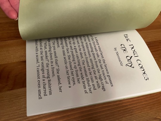
testing testing i think i really like this typeset for my fanfic <33
#typesetting#bookbinding#fanbinding#fanfic#tips on how to make this page more interesting?#(also text is blurred bc the fic isn't published yet <333333 will do SOON i prommyyyyy)#like i want the text to start lower on the page but WHAT to do with that empty space HMM#ooops you can see the grammarly underline lmaoo
15 notes
·
View notes
Text
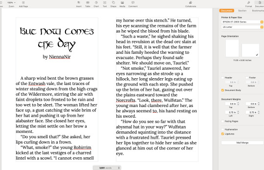
here’s my guide to making typesets! I use Word to make my typesets, Canva for designs, and Adobe to insert the majority of my designs.
this is a ton of info and I tried to make it as readable as possible, but plz let me know if u need any clarification!
Word: always use the app, the online program doesn't have all of the options needed
paper size: US Letter Borderless
then i flip it landscape, do custom borders, and select book fold. I do 1 inch on top and bottom, .75 in inside, and .5 in outside. i leave the gutter option alone and leave it set to 0. You can choose how large you want your signatures to be (sheets in booklet option on the margins page): I normally do 40 page signatures, but if it's a smaller text you'll want to go smaller for stability. after that, you should have a half page to start your typeset!
Inserting your fic:
the next thing you’ll do is insert your fic; on ao3 click entire story, CTRL A to select all, CTRL C to copy it all. Paste it into your document. word automatically detects the headings, and you should be able to see all your chapters on the left side bar (if you can’t see it, click the page numbers on the bottom left to open the tab).
Formatting:
you can do the next few steps in any order, but we’re going to fix the formatting now. you’ll want to CTRL A everything, pick a font and a font size. I normally use georgia and size 10, going smaller or larger depending on the file size.
To have an indent on every line: CTRL A your work to select all, right click the “normal” style, on the home tab. go to the bottom left, open the drop-down menu, and select “paragraph”. next to special, hit first line. i like to do .3, you can do whatever you want. i then like to make sure the space after is set to 0, the line spacing to single, and then hit save. it should automatically adjust your lines to start at whatever indent you picked.
To fix the spacing: go into the layout tab, and go to spacing. There'll be a before and after option: write in 0, then click enter for both of them. Word is a little bit bitchy so you have to force it do things sometimes. after this you can choose if you want single spacing, or 1.5, or whatever you want.
*sometimes, the way the fic was formatted when posted to ao3 means that even after setting the line spacing to zero, there will still be a space in between each line. this is where you have to troubleshoot. you can either go line by line to delete the excess space (yes, for real. and yes, it's just as awful as it sounds) or, sometimes, not every-time but sometimes, you can highlight the chapter text, go into the home tab on top, click the A with the purple eraser to erase all formatting, and then do all the beginning steps again, and it will get rid of the extra space.*
Now that your format is mostly fixed, delete the archive of our own beta, and anything else you don't want. I normally delete everything up to the title of the work, and leave that for creating my copyright page. Remember to do the same for the end of the work!
Page Breaks and Section Breaks:
the next part is the most crucial. it's how we format both the chapters, but also how we format the headings and footer. this was the part that took me the longest to figure out: it's the page breaks and section breaks. page breaks mark the place where one page ends, and another begins. section breaks will create a new section in your document, so you can break the beginning few pages from the rest of your textblock. This will allow you to insert page numbers that start on page one, instead of at the first page of the document.
I like to go the end of the description, and then click on the first chapter. then I'll add a section break. you can find this in the layout tab, click breaks, and then click section break. so now our section 2 starts with chapter one. After this, add a blank page after the description and before your new section, and then click on the first chapter. (adding a blank page allows for smoother formatting later with headers and footers)
I then go to each chapter, delete the authors notes at the start and end of each chapter, and add a page break at the start of each chapter. i like to use the heading tab on the left to click each chapter, so I know I'm actually starting the new page right where I need to, and other formatting won't delete the page break.
when I create a compilation fic, where I have muitlple fics in one typeset, I use section breaks at the starts of each new fic. this will allow the page numbers to continue, but I can then edit each sectio to change the fic title and the authors name. if you're really fancy, you can do this for each chapter title as well, you would just hve to use a section break for each chapter instead of page break. *Remember to click link to previous to turn it off, so you are only editing that section, and not all the other sections. this can be found in the heading and footer tab on the top, which will automatically open when you click on the heading or footer.*
Adding page numbers, authors name, text name:
To add a page number, I click the footer, which automatically opens the header/footer tab on top. Then, I click page numbers, add page numbers. I turn on different odd and even pages, which is also found in the header/footer tab. you'll have to insert page numbers on both an even and odd age to get them to show up once you click that option. Page one should be an odd page, page two should be an even page. I like to put the page numbers on the outside of the page. Then you'll click format page numbers, click "start at" instead of "continue from previous section", and write in 1. now your typeset starts at 1 on chapter one instead of the start of your document! you'll need to go back and delete the numbers that showed up on the first section, but remember to deselect link to previous before you do that! or you'll end up deleting your page numbers again.
to add text on page numbers:
click into the header/footer again. double click directly on the page number, then start typing. You ca highlight the whole thing to change the font, font seize, etc. I normally do the same size as my text, and I'll either do georgia font or garamond font. I google "copy paste line for text" to get that line dividing the page number from whatever text I have next to it.
to add graphics on an entire work:
you can go into the header or footer, go to the insert tab, and insert a picture. Doing it in the header or footer will ensure it's on every single page that shares that header or footer. I have done this in the past, and find it's cute, but it's also tricky because it needs to be small enough to fit inside the header or footer, and won't really be able to interact with the text because it's different on each page, while the graphic will stay in the same position regardless.
Blank Pages:
you want blank pages at the start and end of your textblock: this is what you'll be glueing your end papers to. even more, you'll want to ensure your total page number is both divisible by 4 (each page of paper will have four pages of your text on it, two to each side) and fits into your signature count. If you're working with a 40 page signature, and you have 420 pages, that's fine. You'll end up having the last signature only be 5 regular pages instead of 10, which is plenty enough to sew. you really just want to try and avoid only having one of two pages in that last signature, as that won't be very strong in holding up your end page, or be very stable in sewing on to your book block.
to make sure they're blank, with no page numbers, you'll want to insert a section break on the last page of text. Deselect link to previous, delete the page numbers and you should be all good!
Printing/Saving:
I'm on a mac. I don't know how you would do this on anything but a mac. let that be a warning lmao. but I will CTRL A everything, ensure it's US Letter Borderless, and then hit print. if you don't tell the document it's the right size, it'll be funky when you go to print because of the margins. to insert images, i click save as pdf. it'll save it in the correct order to print for your signatures, and then I upload it into adobe to edit further. that'll have to be a different post bc this is entirely too long already.
If you want to print directly from here, ensure it's printing the right size, flip on short edge, double sided. and you're all done!
#tips and tricks#typesetting guide#i woke up at 630 am with a purpose and shat this out#it might not even be legible#apologies in advance#how to typeset#bookbinding#fanfiction#ao3 fanfic#typesetting#microsoft word#adobe#canva#signature#resource
122 notes
·
View notes
Text
Listen to your elders
So last week I posted abut the importance of downloading your fic. And then three days later AO3 went down for 24 hours. No one was more weirded out by this than I was. But while y’all were acting like the library at Alexandria was on fire I was reading my download fic and editing chapter eight of Buck, Rogers, and the 21st Century. And also thinking about what I could do to be helpful when the crisis was actually over.
So first off, I’m going to repeat that if you’re going to bookmark a fic, you really need to also download the fic and back it up in a safe place. I just do it automatically now and it’s a good habit to get into.
But let’s talk about some other scenarios. Last October I lost power for over a week after hurricane Ian. Apart from not having internet or A/C I did find plenty to do, I collect books so I had plenty to read, but maybe, unlike me, your favorite comfort reads aren’t sitting on a bookshelf. So let’s do something about that, shall we?
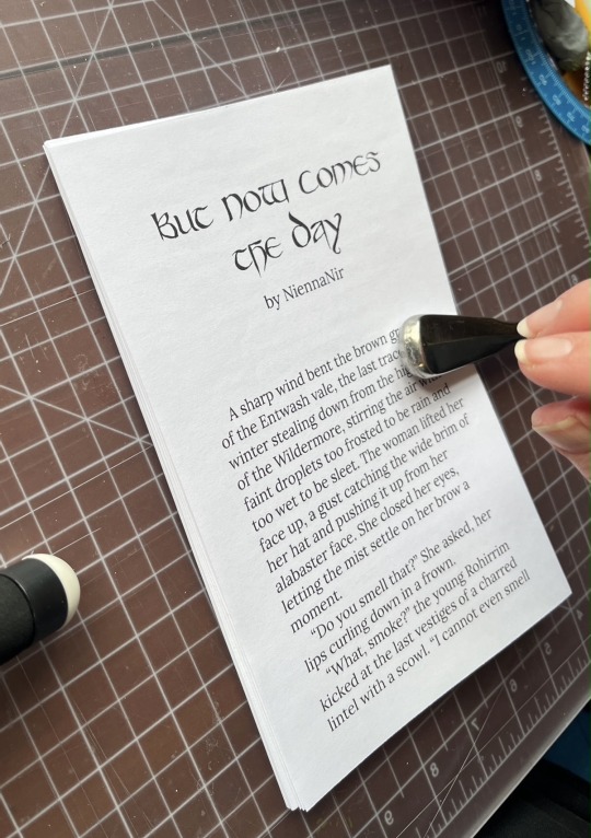
In olden times many long years ago around 1995 we printed off a lot of fic. It was mostly SOP to print a fic you planned to reread and stick it in a three ring binder. And that’s totally valid today too, but you can also make a very nice paperback with a minimum amount of skill and materials.
Let’s start with the download; Go to Ao3 and select your fic, we’ll be working with one of mine. This method works best with one shots, long fic tends to need a more complicated approach. Get yourself an HTML download

Open up the HTML download and select all then copy paste into any word processor. Set the page to landscape and two columns, then change the font to something you find easy to read, this is your book, no judgement. This is all you have to do for layout but I like to play a little bit. I move all the meta, summary, notes to the end and pick out a fun font for the title:
No time like the present to do a quick proofread. Congratulations, you’ve just created your first typeset. On to the fun part.
Now you’re going to need some materials: 8.5x11in paper ruler one sheet of 12x12 medium card stock (60-80lb) scissors pencil pen or fine tip marker sheet of wax paper white glue two binder clips 2 heavy books or 1 brick butter knife
You’ll also need a printer, if you’re in the US there is almost a 100% chance your local library has a printer you can use if you don’t have your own. None of these materials are expensive and you can literally use cheap copy paper and Elmers glue.
Print your text block, one page per side. Fold the first page in half so that the blank side is inside and the printed side out:
use the butter knife to crease the edge. Repeat on all the sheets. When you’ve finished, stack them up with the raw edge on the left and the folded edge on the right. I used standard copy paper, because you’re only printing on one side there’s no bleed to worry about. Take the text block and line everything up. Use the binder clips to hold the raw edge in place.
Wrap the text block in the wax paper so that the raw edge and binder clips are facing out. I’m going to use my home built book press but you don’t need one, a brick or a couple of books or anything else heavy will work fine.
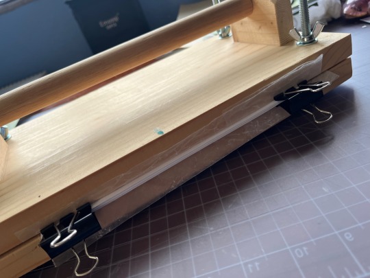
Once the text block is anchored down, take off he binder clips and get out the glue.
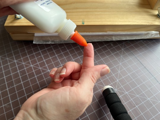
You can use a brush but you don’t need one, smear some glue on that raw edge.
Go make a margarita, watch The Mandalorian, call your mother. Don’t come back for at least an hour
In an hour smear some more glue on there and shift your brick forward so that the whole book is covered. This keeps the paper from warping. While glue part 2 is drying we’ll do the cover. Get out your 12x12 cardstock
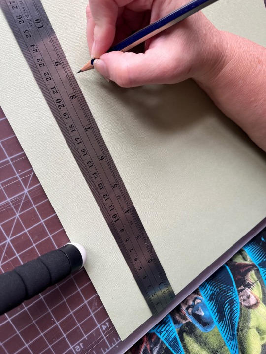
Mark the cardstock off at 8.5 inches and cut it. Measure in 5.5 inches from the left and put in a score line with the butter knife (the back edge not the sharp edge)
Carefully fold the score line, this is your front cover. You have some options for the cover title, you can use a cutting machine like a cricut if you have one, you can print out a title on the computer and use carbon paper to transfer the text to the cardstock. I was in a mood so I just freehanded that beoch. Pencil first then in pen.
Take your text block out from under your brick. Line it up against the score mark and mark the second score on the other side of the spine
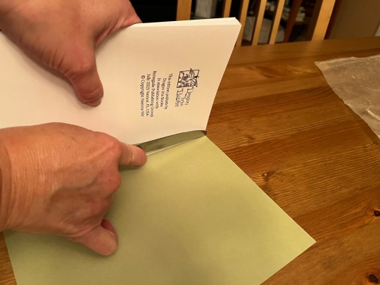
Fold the score and glue the textblock into the cover at the spine. Once the glue dries up mark the back cover with the pencil and then trim the back cover to fit with your scissors.
Voila:
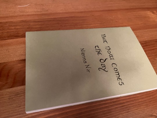
I’m going to put this baby on the shelf next to the Silmarillion.
The whole process, not counting drying time, took less than an hour.
If you want to make a book of a longer fic, I recommend Renegade Publishing, they have a ton of resources for fan-binders.
22K notes
·
View notes
Text
so, you wanted to start bookbinding?
so @princetofbone mentioned on my post for "factory settings" about wanting to know more about the binding style that i used for it. so i thought i might make a post about it.
i was as terrible as i always am for taking in progress shots, but i can link you to the resources i used in order to make my book. i would also like to point out that "factory settings" is my 120th bind, and i have been doing bookbinding as a hobby for just over 3 years now. unfortunately this means some of the methods that i used for that bind aren't particularly beginner friendly, just in terms of the tools and methods i have used, but i would love to point you in the right direction when it comes to resources. i dont say this to sound pretentious which i fear i might come across, just so that youre fully informed. getting into this hobby is fun and rewarding, but it can definitely be intimidating.
with that caveat, heres a list of links and resources that i have used for bookbinding in general, with additional links to methods i used specifically in regards to this bind.
ASH's how to make a book document. it gives you a great introduction into typesetting fics (where you format the text of fics to look like a traditionally published books) and then turning them into a case-bound book (the style i used for "factory settings"). it is comprehensive, and explains how to use microsoft word to do your bidding. it was invaluable to me when i was just starting out! currently i use affinity publisher to typeset/format my fics for printing, but i only bought and learned how to use that after i had been binding books for a year and a half. i made some beautiful typesets with word, and some of my close friends use it still and design stuff that i never would be able to in my wildest dreams (basically anything by @no-name-publishing)
DAS Bookbinding's Square Back Bradel Binding. a great style to do your first bind in! this method requires, when making the case, to attach the cover board and the spine board to a connecting piece of paper, which makes it so much easier to match the size of the case to the size of the text block (your printed out and sewn fic). using this method is what allowed me to get much more accurately fitting cases, and made me much more confident with the construction of the books i was making. a well-made book is something that is so wonderful to hold in your hands!
DAS Bookbinding's Rounded and Backed Cased Book. This is the specific method that i used to create my bind for "factory settings"! even before i could back my books, i found that watching DAS's videos in particular helped me see how books were traditionally made, and i was able to see different tips and tricks about how to make nicer books.
Book Edge Trimming Without... i trim the edges of my text block using my finishing press and a chisel i have sharpened using a whetstone and leather strop with buffing compound on it. i follow the method for trimming shown in this video!
Made Endpapers. i follow this method for my endpapers, as i used handmade lokta endpapers, and they can be quite thin, but they look beautiful! i used "tipped on" endpapers (where you have your endpaper and then put a thin strip of glue on the edge and attach it to your text block) i used for a very long time before this, but these feel like they are much more stable, as they are sewn with your text block.
Edge Sprinkling. this is the method that i used for decorating the edges of my text block. but the principle is basically clamping your text block tight and then sprinkling the edges. i do not believe you need to trim the edges in order to do sprinkles on the edges, and that's what makes it accessible! i personally just use really cheap acrylic paint that i water down and then flick it onto the edges with my thumb and a paint brush.
Double-Core Endbands. i sew my own endbands, which i followed this tutorial for. that being said, it's kind of confusing, and this video is a bit easier to follow, but it is a slightly different type of endband.
Case decoration. i used my silhouette cameo 4 to cut out my design for "factory settings" in htv (heat transfer vinyl). i also used my cameo 4 to cut out the oval of marbled paper on the front, as i honestly didn't want to try my hand at cutting an oval lol. i also glued some 300 gsm card with an oval cut out of the centre of it onto the cover before covering it with bookcloth, to get a kind of recess on the cover. i then glued the oval of marbled paper onto the top of the recessed area once it was covered with bookcloth, so that it was protected. the images i used were sourced from a mix of rawpixel, canva and pixabay. a more accessible way to get into cover decoration is by painting on a design for your cover as described in @a-gay-old-time's tutorial just here. or even doing paper labels, which look classy imo.
physical materials. sourcing these will depend on your country. i am located in australia, and have compiled a list with some other aussie bookbinders of places to buy from. here is a great post describing beginning materials for getting started binding.
@renegadepublishing. this tumblr is great! its what got me started bookbinding, and being in the discord has been inspiring, motivating, and honestly just one of the best online experiences i have ever had. it is full of resources, and most people in there are amateur bookbinders, with a couple of professionals thrown in. the discord is 18+, and anyone can join!
i'm sorry this post got so long, but i hope that this has a lot of information for you if you would like to get started bookbinding. its one of the best hobbies ive ever had, and i genuinely believe i will have it for the rest of my life.
4K notes
·
View notes
Text
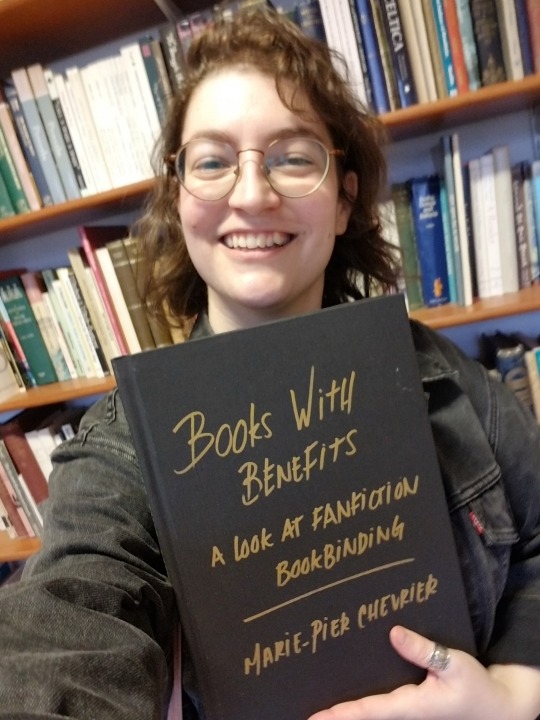
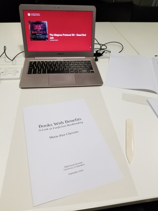
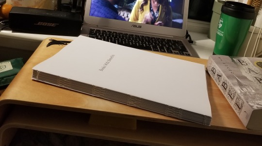
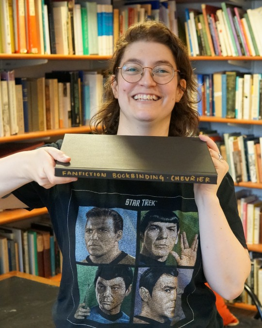
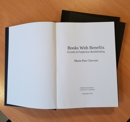
Update on fanbinding dissertation: binding the dissertation itself!
After many days and nights of writing and wrangling footnotes and proofreading (where I couldn't convince my laptop that yes, I meant textualisation, not sexualisation), 'twas time to bind the beasts! In three copies, no less! Which I approached with way too much confidence from my one fanbind experience, and came with many fun little surprises due to the format guidelines I had to follow 🤡
This is going to be a long one, so here's my happy unfocused mug to confirm that it all ends well:
First pickle: The typesetting. I absolutely loved typesetting fanfic, but the dissertation had to be A4 (way less fun, boo-hoo), one-sided, with every page numbered. Did you know that LibreOffice won't let you add blank pages and only number the non-blank ones, without skipping numbers? In order to print signatures I could fold into one-sided pages, only numbered on the right-hand pages, I ended up switching to landscape orientation and including the equivalent of a blank page in the left margin.

Second pickle: The imposing, which I couldn't figure out using the amazing bookbinder with my weird landscape 2-page layout. I finally gave in and rearranged all the pages manually, which looked like p. 1 on the recto / p. 10 on the verso, then p2/p9, p3/p8, p4/p7, p5/p8, p6/p7. And because there was no way I was paying print-in-colour prices for all of this, I further split the manually imposed pages into two files, one for the greyscale printer (cheaper) and one for the colour printer (highway robbery). Still came up to ~£70, just for printing.
Very glad I went in chunks of 10 for the signatures, it made both the math and the folding using sheets from two different piles much easier, highly recommend (if for some absurd reason you also want to bind one-sided numbered pages in folded signatures).
Third pickle: Linear time. Had planned on having so much time to print and bind this thing, but kept writing and rewriting and proofing and oops! It was due in less than 24 hours and it was still not out of the laptop. So.
22/09/24, 6pm: Got to the library, started printing.
6.45pm: Found another printer where all the paper was the same shade of white, started printing again 🤦♂️ (kept the the misprints to use as scrap paper when glueing)
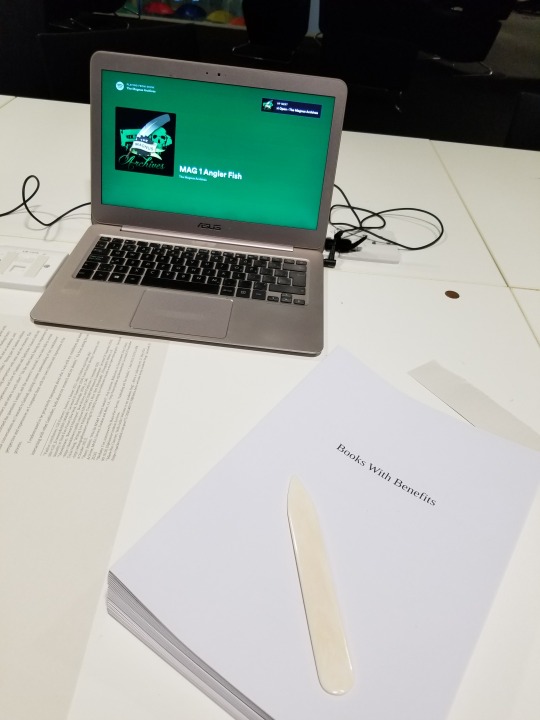
7.30pm: Started folding the 150 sheets of paper (3 x 100-page dissertation, 2 pages per sheet). Went from the last episode of The Magnus Protocol, to an episode of Welcome to Night Vale, to deciding restart The Magnus Archive, which felt almost poetic.
9pm: Headed back home, trimmed the edges (with a borrowed guillotine), folded the endpapers, stabbed everything. Lack of pictures to be blamed on my inability to mess with linear time, and the eventual sleep deprivation.
10.30pm, I think? Started sewing the signatures together, again with Supernatural (which I started rewatching when I submitted my first dissertation assignment in mid-May, and finished 2 days after submitting the dissertation itself, again, such poetry).
2am, probably? Tipped the endpapers and glued cheesecloth over the spines. Somehow figured out where to set the three textblocks to dry (I don't have a press). Sadly gave up on sewing on (or glueing) headbands, because time.
3am-ish: Cut the missing cover pieces out of millboard (had already cut 4 of 6 covers, since I knew it had to be A4), measured the spines of the three textblocks and cut those as well.
???am: Did some math, because sure, that's the right time for that. Cut the bookcloth to size, glued the cover pieces on the bookcloth. Remarkably only messed up the measurements on one of them! That means one of the copies has a millimetre of millboard showing in the inside corners of the back cover, but not enough time/bookcloth/millboard to redo it, onward we go!
Way past dawn: Took a break for food while the covers somewhat dried. Cased the three textblocks in the three covers, with the endpapers bubbling, which took me by surprise since it was the same paper and same glue I had used for the fanbind without any problem. I'm now thinking that bigger book = more time needed to apply the glue = endpapers getting warped, but I was so exhausted by this point that who knows. Again, no time to redo it!
9.30am: Stacked the dissertations under the heavy reference books I used to write the dissertation. Toute est dans toute hein. Went to bed while they (mostly) dried.
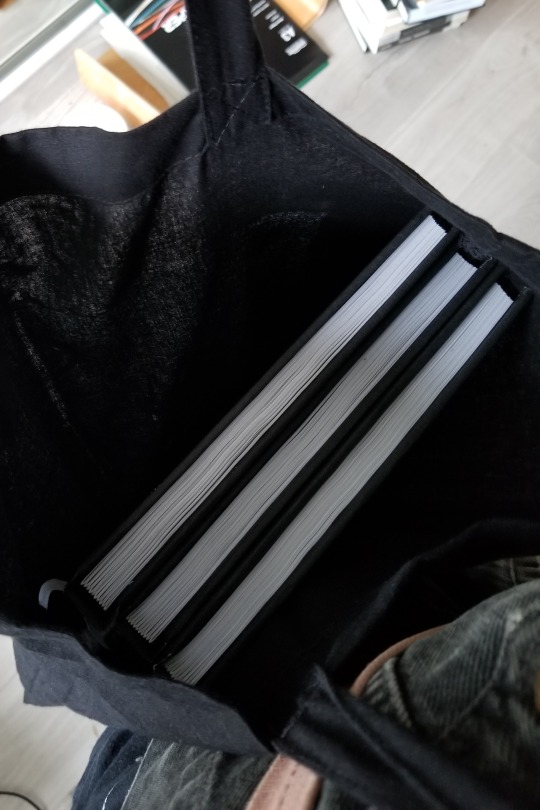
2.30pm: Woken up by my neighbour's dj set. Eventually put all that hard work in a tote and walked to school to hand it in at 4.30pm.
Fourth and last pickle: The titling. Couldn't find paper long enough to do a half-dust jacket like I did last time. Had big cutout plans, ran out of time and couldn't finish testing those. Also had some thicker textured paper I thought of cutting and glueing to the cover as a title card, but it turned out too thin and was warping. Finally resigned myself to submitting it with a blank cover, but one of my teachers asked if I would mind adding the title on with metallic markers to make it easier to identify (one copy will eventually be on the shelf at the Institute), and I'm SO HAPPY with how it turned out. Metallic markers. Why didn't I think of that. (I did, however, think about dressing appropriately for the occasion.)
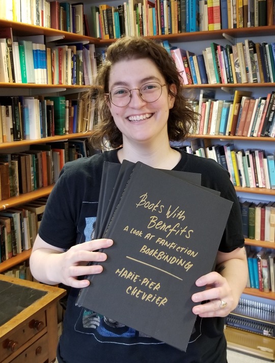
So, is it possible to print and bind 3 books in less than 24 hours? Yes! Am I glad I did it? Also yes, very satisfying, love being extra! Would I do it again? God no, I've been sleeping for two weeks and I still haven't recovered. Can't wait to start binding something else though, so I guess it wasn't that bad.
That's it! That's over! Aaaaaah! Now waiting for the grade and comments, and hopefully soon I'll be able to share the content as well.
I'll also try to post some more about the research/writing process itself, somewhere between the late nights reading international treaties on income tax and the early mornings spent figuring out how to apply for a phd next.
Thank you so much to everyone who followed along, this was way more fun than I ever could have hoped!
#fan studies#fanbinding#bookbinding#research#ficbinding#dissertation#fanbinding dissertation#autoethnography#fanfiction#fandom#fanfic
503 notes
·
View notes
Text
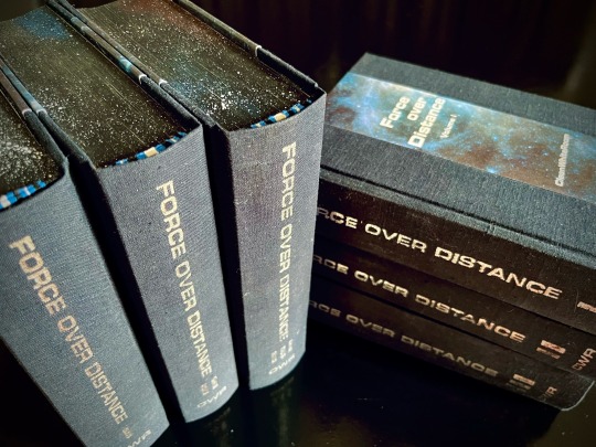
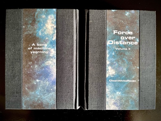
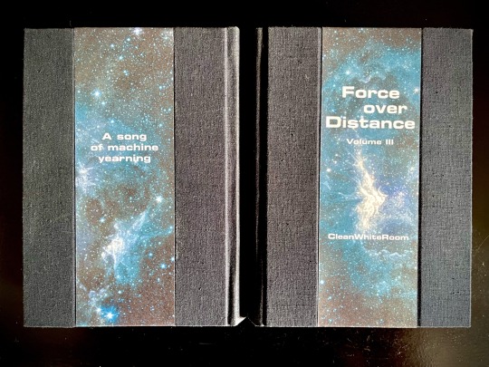


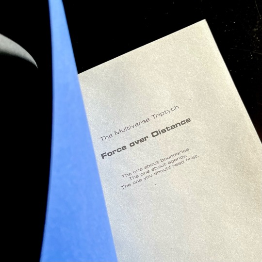
My magnum opus, the jewel of my Binderary round-up, the result of four months of hard work (that is to say, a lot of force applied over distance), the project affectionately known as The Motherfuckers (because it was rather unclear if I was going to finish these books or if they were going to be the end of me).
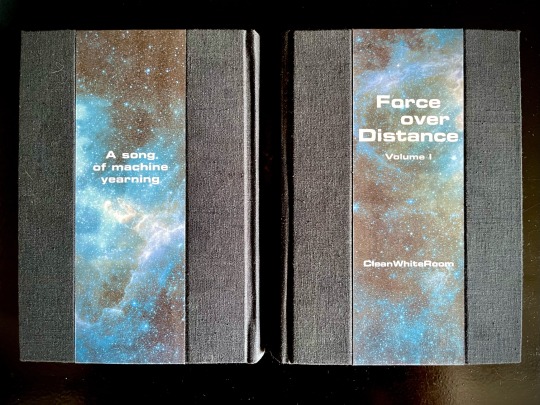
Force over Distance by cleanwhiteroom. It is currently also on AO3.
I was first introduced to this incredible story by a dear friend, who first sold me on actually watching SGU, and then said that they remember this fic since like 2011, which is always a promising sign. I went digging and found out I was in luck - the story was being rewritten and reuploaded on the author's blog. The next two weeks are described by the same friend as "one of the scariest moments in our cohabitation" as I'd spent literally every waking moment injecting the story directly into my eyeballs, and let me tell you, I'd not been doing a lot of sleeping at that time.
Then I gathered up my courage and reached out to CWR re: my burning desire to bind this story. And the rest, well. Let's dig into it, shall we?
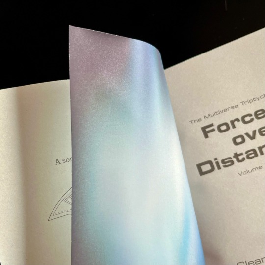
This was my first time typesetting 540k words. Considering I tend to prefer larger font sizes for increased legibility, it was immediately obvious that this was going to be a multivolume project. I settled on three, as it's the relationship between three individuals that forms the core of the story.
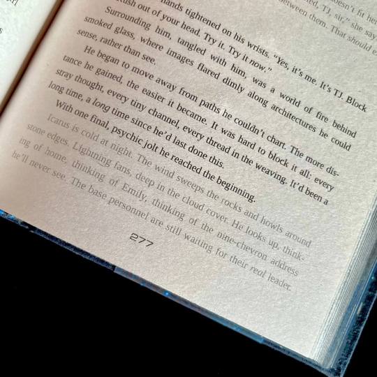
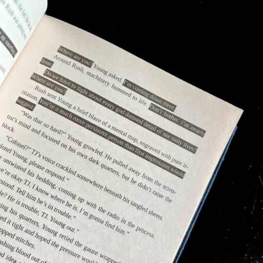
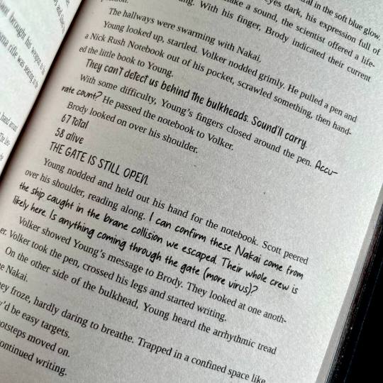
I also knew I wanted to keep the typeset in black and white, but play around with light and dark a lot. So I did. One of the first design idea I actually had was the way I wanted to handle projected speech. Mental link between Young, Rush and Destiny is THE most vital part of the story, and I wanted to make it immediatly obvious. I also wanted to be able to take one glance at the page and tell how much of the action is actually just two guys staring each other down :) Hence the blackout effect of thoughts being represented as light over darkness.
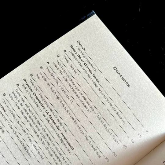
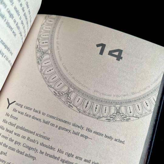
I also wanted to preserve as much of my reading experience as possible. So I saved all the chapter quotes/summaries in the TOC, and hid the chapter content warnings in the frame of the gate that marks the beginning of each chapter. For most of the chapter the warnings stay the same, so after a while you stop really noticing them, but then you open a new chapter and see that the familiar shape of the words has changed, and get this UH-OH feeling. Which, I think is very much how it works in my design, because when the warnings change there's usually another line of text added.
For flashbacks and dream sequences I switched from italics to a lighter shade of gray. I woudn't say it's more legible per say, but it's in keeping with the overall light/dark theme.
There are instances of people using handwritten notes in the story. I collected more than a dozen of assorted handwriting fonts, with each character having their own "handwriting". So when, for example, someone begins writing in someone else's hand, you immediately know it.
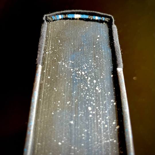
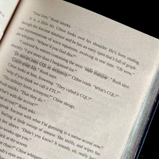
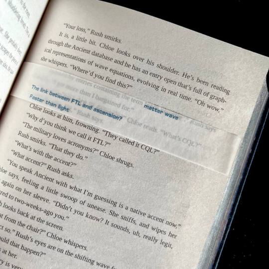
The most insane, labor-intensive part of the typeset, however, was the way I decided to handle the Ancient translations. CWR's gone through the trouble of setting up hover-to-discover for it, which gives you a very different reading experience than, say, having the translations in the endnotes. So, naturally, I said to myself that I want to replicate that, and footnotes just won't do the trick. So. Every instance of Ancient in the text has an underlay of light gray Ancient script. And an OVERLAY of paper vellum with the translation printed in blue. Now, not to toot my own horn too much, but if looks SICK AS FUCK. You also MAYBE SHOULD NOT LIVE LIKE THIS. For the two copies of this work I had to cut up 10 sheets of vellum into strips, and then spent from 20 minutes to an hour per volume tipping the strips in their proper places. I then had to wear kinetic tape on both my hands to help with the joint pain. (It was worth it.)
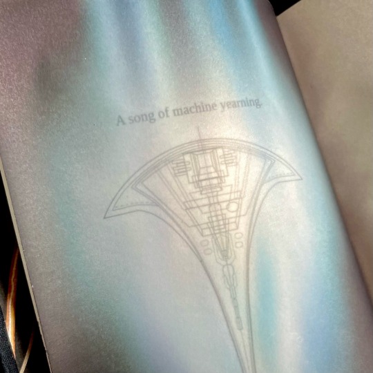
Now for the title spread. It is also paper vellum that you see as soon as you turn the first page (the half-title), and see it covering the title of the book and author's name. And then you turn it. And the shields sing the matter wave of Destiny through the black. And yeah, I think that's very, very clever of me, actually.
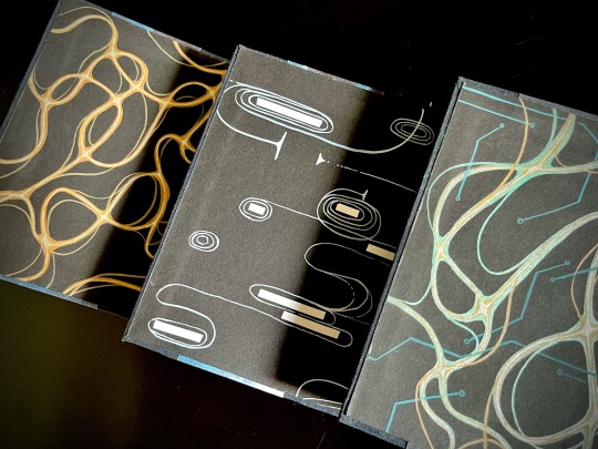
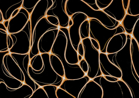
Then, of course, were the endpapers. All 12 of them are unique abstract paintings done on black cardstock by hand with brush pens and correction tape, I scanned a sample of each set for posterity. All of them are my interpretations of characters' midscapes. For volume 1 I went with the fire wind of Rush's thoughts. Volume 2 was for Young, and I went for the reverse blackout poetry effect (because for all the mental talking they do, the unprojected thoughts are opaque to their counterparts) and all the loops, hairpins and blocks he does. Volume 3 is for the combination - Rush's fire wind, changing its color to match the circuitry pattern of Destiny's AI.
The rest, in comparison, is easy. All volumes are stitched with 3 strands of embroidery floss, a combination of black, blue and silvery-gray. The French double-core endbands are sewn in the same color scheme (though with a different shade of blue and gray switched for white for added contrast). The edges are painted and splattered to look like space.
The covers feature my (signature at this point, I guess) half-cloth river pattern, with the base being dark blue linen and the printed parts being Spitzer telescope images of the W51 star forge, Jack-O'-Lantern Nebula and the Eagle Nebula (courtesy of NASA), waxed by hand for added sheen. The spines are foiled in silver with a foil quill.
Each set is 5 pound of solid hand-crafted book, with one set being my personal copy, and the other sent as a gift to the author.
And that's it, folks! This has been an incredible project to work on, and I'm very proud of what I achieved with it.
#mythril thread books#bookbinding#ficbinding#fanbinding#binderary2024#stargate universe#sgu#force over distance#stargate
631 notes
·
View notes
Text
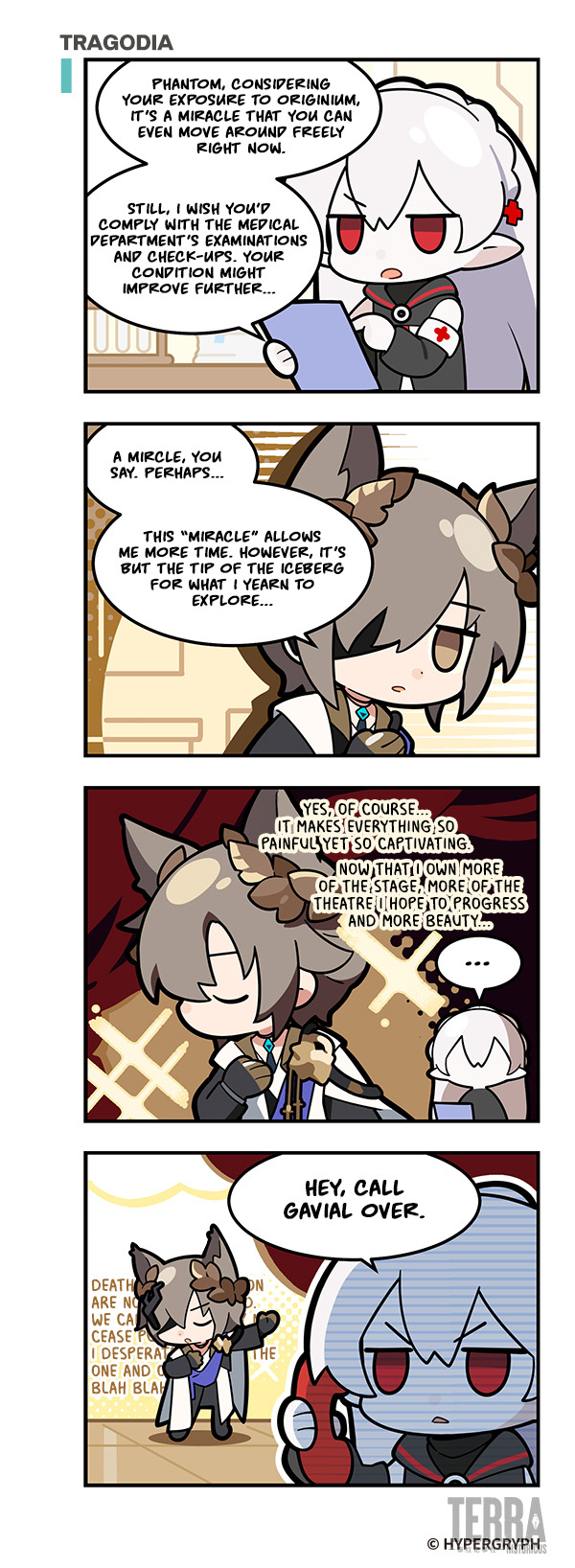

123 Rhodes Island!?: Tragodia.
Translation by my friend 482, typesetting/cleaning/redrawing by me.
T/N: "Tip of the iceberg" is originally a Chinese idiom. The actual saying is "杯水車薪", trying to douse a fire with a single, small cup of water.
85 notes
·
View notes
Text


Bound: A Christmas Miracle by @sleepstxtic
Typeset and bound by: me, @phoenixortheflame.
A Christmas Carol with a Drarry twist.
I bound this lil cutie for @sits-bound as part of a Drarry holiday bind exchange.
The cover design was inspired by a 1999 edition of A Christmas Carol. And the half-title and full-title page illustrations (by moi) were inspired by a scene in the fic in which (spoiler but not incoming) Draco tips a statue of Joseph over onto the baby Jesus.
Besides including my own illustrations, there were a lot of other firsts with this bind: first time participating in an exchange (Thank you, katy for organizing), first time doing a quarto, first time doing a wrap cover.
Quartos are fun! Perfect for shorter fics. And because they use standard letter-size paper, not short-grain, I was able to easily source cream paper — much nicer on the eyes.
Also, the case is smaller! Which means I can print a wrap cover at home. I used 48LB matte photo paper, which held up during gluing. It's slightly thicker than I'd prefer, but it did the trick, even if the spine folds did crack a wee bit.
The endpapers are hand-marbled from George Hill. The colours are so gorgeous. I wish I'd ordered more (I still might).
As always — I made a copy for the author. She'll be getting hers at a later date when I bind another of her fics.
#drarry#ficbinding#fanbinding#typesetting#draco malfoy#harry potter#holiday fic#sleepstxtic#my binds#phoenix binds
157 notes
·
View notes
Text
FTH 2024 Creator Signups are OPEN!
The moment you've been waiting for has arrived! But before you rush straight to the signup form, note that a few things are different from last year:
You will not be able to edit your signup immediately, but you will be able to edit it. We're changing some things on the back end so that we can get posts up faster, but that means that when you get your email confirming your signup it won't have an edit link. Once we've processed your signup (which may take several days), we will send you a link to make edits. Please do NOT fill the signup form out again in order to edit a previous entry! Wait to hear from us.
Typesetting is now an option under Fan Labor. Remember that we only allow digital goods in the main auction - we'll be opening signups soon for the Craft Bazaar if you want to offer bookbinding or other physical crafts.
All Marvel-related fandoms are now under the Marvel top-level fandom (instead of MCU) and all DC-related are under DC. This includes comics. This allows us to stop worrying about, for example, whether Deadpool or Venom is MCU or what "DC Extended Universe" does and doesn't include.
Six of Crows and Shadow and Bone are both covered by the new Grishaverse fandom tag, House of the Dragon is part of ASOIAF/GOT, and 9-1-1 Lone Star is grouped with 9-1-1.
You can view this year's full list of fandoms here - remember that if the fandom you want isn't listed, there is a write-in option. However, check all possible names for your fandom before resorting to write-in! If your fandom is a spinoff, choose the fandom it's related to and specify in your auction notes which parts of canon/the universe you're willing to create for. Every fandom with subfandoms also has an "Any" option if you're willing to create for anything within the top-level fandom and an "Other" option to write in subfandoms.
Even if you've signed up before, please re-read the FAQ to re-familiarize yourself with our policies. If you're new to FTH, check out these tips for first-time creators (and also read the FAQ). It might also help to peruse last year's listings to get an idea for what kind of information people include and how we use the information you give us to form our tagging system.
Remember that you can offer up to three auctions, but you will need to fill out a separate signup for each of those. Each auction can only be for one type of fanwork, but can be offered in up to 3 fandoms (and unlimited subfandoms if you choose a fandom with subfandoms) or "Any fandom." Your bidder will get to choose from any of the fandoms in the listing, so please don't offer something you don't want to create just to get more eyes on your auction.
Signups will be open for two weeks, until February 19th, so there's no rush! Take your time and make sure you understand how it all works and what you're committing to. If you have any questions not covered here or in our FAQ, please email us at fandomtrumpshate @ gmail.com!
Ok, did you read all that? You know what's different from last year? You've refreshed your knowledge of our FAQ?
In that case, sign up for FTH 2024 here!
537 notes
·
View notes
Text
Renegade Exchange '24: Her Kingdom As Great
I participated in @renegadeguild's typesetting and bound fic exchange, in which we trade typsetting/bound fic wishlists with other participants and then typseset/bind at least one fic from their list and send it to them.
This post is about the first fic I bound for @celestial-sphere-press: Her Kingdom As Great by MarbleGlove.
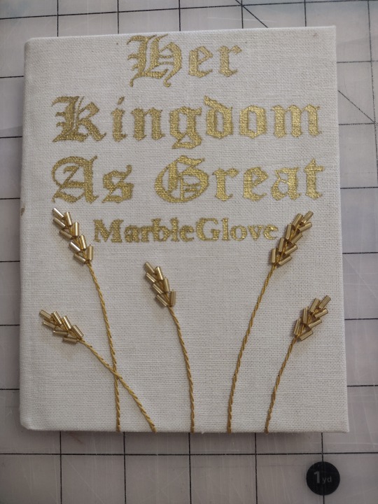
I was excited to see this fic on my requester's wishlist, because I've read this series in the past and really enjoyed it. I liked the imagery of the golden wheat berries from the Nearly Endless Plains being used in embroidery on clothing, so I wanted the cover to feature embroidered wheat sheaves.
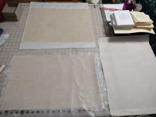
My first step was to work on the book cloth. I knew I wanted something tan that looked kind of hand-woven, so I went to the fabric store and got some linen-look fabric that I liked. I also experimented with three different ways of making it into bookcloth: backed with tissue paper filled with Heat'n'Bond (right), filled with a 50/50 mix of starch paste and matte acrylic medium (bottom), and filled with the paste/medium mix with a piece of tissue paper on the back (top).
I ended up liking the last option the best, though it meant the fabric lost the slubby linen-like texture I had selected it for. I wanted to go all-in on the tan wheat-tone theme, so I also printed the text on cream paper instead of white (the right typeset in the picture above).
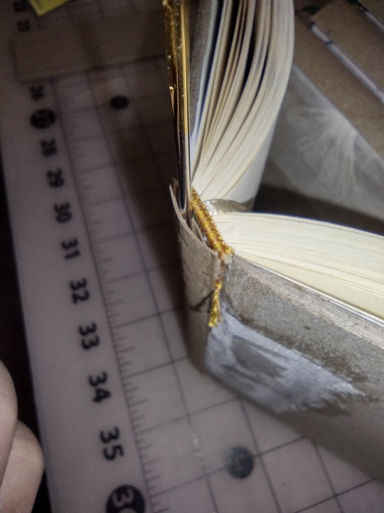
I also added a tan bookmark, embroidered on gold headbands, and added an oxford hollow (although this book is a bit too thin to really need it).
When I went to cover the book, I had every intention of using gold HTV foil. However, I didn't take into account how the beads would inhibit me moving the iron around like I usually do with HTV (to avoid issues with the steam holes). It didn't end well. In fact, it ended very horribly.
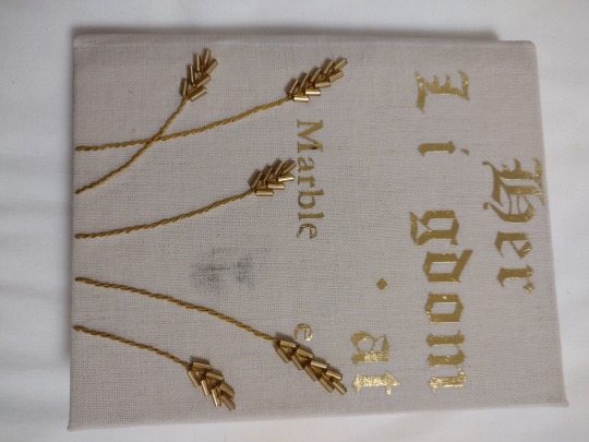
The foil only partially stuck, and when trying to use the tip of the iron to apply heat only on the bits that hadn't stuck, the iron left a big black stain on my bookcloth. Luckily, it came out pretty well with a bit of baking soda on a nearly-dry toothbrush. I ended up asking a neighbor for some gold paint and using some regular vinyl as a stencil, which worked out OK. I found out later that it works better if you put down a layer of acrylic medium or the like first to avoid bleeding around the edges, but you live and learn.
Technical details:
Quarto size (quarter-letter, about A6)
Sewn on tapes
Sewn-on made endpapers
Chisel-trimmed
Rounded but not backed
Sewn-on endbands
Sewn-on bookmark
Oxford hollow
The tapes are frayed and glued to the exterior of the boards
The mull is also glued to the exterior of the boards
Full bookcloth cover
Things I especially liked about this bind:
The embroidery. It turned out pretty much exactly how I had envisioned it
The filled bookcloth. I don't think I'll do it by default, but I liked how it turned out and I like having it as an option in my back pocket
Things I'd like to improve for next time:
The title. I don't mind the paint rather than HTV foil, but I didn't love that it bled under the edges of the stencil. Next time I'll try using acrylic medium to seal the edges first, and see how that turns out.
The endpapers. I've been applying my endpapers with the covers open because I was concerned that they'd pull weird and possibly rip at the hinge. Unfortunately, this causes a big wrinkle in the endpapers that does not look nice. I figured out while doing the back endpaper that it actually is just fine to apply the endpapers as I close the covers on them because of the way I taper my boards and glue the mull on the outside of the cover.
Overall I'm moderately pleased. It's the highest-effort book I've made so far, and it turned out nearly how I had envisioned it with only minor issues.
132 notes
·
View notes
Text
(Re)bound: Everybody Hates a Tourist by @wolfpants
I whipped up a lil paperback yesterday and today, because it’s always a good day to make myself more copies of Wolf’s lovely words.

If you haven't read this fic, you need to: Wolf has such a way of situating Harry and Draco in the real world, and especially in the queer community. This is a story of self-discovery, evident almost immediately for Harry’s side of things: stuck in a boring job at the Ministry, frozen in an increasingly distant relationship with Ginny, and unable to break away from all the expectations placed on him by the Wixen community. Harry sees Draco's self-assurance, his friends and his community, as an enticing beacon of a life he doesn't feel he can have for himself.
But Draco's parallel journey creeps up on you as the narrative unspools. In time, it becomes clear that Draco's not actually living a carefree and gay seaside life, and that running away from the Wixen world has exacted a price from him.
And, listen: this is wolfpants. So there's also sparkling dialogue, brilliant characterization, adorable sausage dogs, and amazing sex scenes.

The typeset I used here is one I made earlier in my fanbinding journey, with only a handful of tweaks to the layout because I was still learning and there were a couple goofs.
The cover is new, but picks up the texting theme from the hardcover version and lays it over a pebble beach that (I hope) evokes Brighton's seaside vibes.

I feel like I've cracked the code on soft touch lamination, or at least have improved a lot, but I'm still working on the paperback technique in general.
Following tips from the paperback genius @jmbinding, I use my thermal binder to bind the text block into a piece of plain/blank presentation paper (same stuff I print onto for the cover), trim that bound block, and then glue on the laminated cover over the thermal bound plain one. Finally, I trim the cover to fit the trimmed book -- which is the step I'm still not super great at! (Don't look too closely at the edges or you'll spy my mistakes.)
Mandatory flip-through video because the floppy give of a paperback is still incredibly pleasing for me.
#bookbinding#fanbinding#paperback fanbinding#paperback binding#drarry#drarry fanbinding#hp fanbinding#ficbinding#wolfpants#plor bindery
67 notes
·
View notes
Text


How Ray Got His Groove Back by Aristide and Bone, due South, Fraser/RayK
A quintessential due South RayK fic and a classic of the fandom for a reason! I knew when I started this whole crazy adventure of binding fanfic that I wanted to make hard copies of things across the fandoms that have been a part of over the years, and due South will always have a special place in my heart, since that's where I met my wife.
I'm to be able to share this fanbind with @the-cimmerians just in time for Fanfic Writers' Appreciation Day! (And thanks to @renegadeguild for encouraging us all to share with the authors we love this day in particular.)
The title of How Ray Got His Groove Back is a riff on the movie How Stella Got Her Groove Back, and the fic even has its own fanlore page. Because it was imported into AO3 from another archive as part of an Open Doors initiative, you too can enjoy some genuine vintage formatting as part of the reading experience! (Get your pre-AO3 mailing list flashbacks right here...)
The spine is Duo magpie bookcloth, and marbled paper found by chance in a household gift shop last winter (I wish they'd restocked it!), and the lettering is stencilled acrylic paint.


I leaned into the romance novel vibe for the typesetting, using the notorious yellow paper of the great paper misorder of 2023 for an aged paperback vibe, and a flowery frame for the cover. Gelli-plate printed endpapers, and a hand-sewn double-core endband in hot pink and purple thread to match.
And about that marbled paper and the stencilled title... this was the book where I discovered that the other paper I had stencilled on with no problems (mulberry fibre Lokta paper, it's lovely) is the exception rather than the rule, and some emergency repairs were needed when the stencil vinyl started to pull up the paper. I did my best with some paint and a fine-tipped maker and a pencil, but hoo boy. We won't be trying that again with this paper.


I'm glad to have this piece of personal fandom history, and also to say, happy Fanfic Writers' Appreciation Day, Aristide & Bone!
#renegade loves fic#fanfic writers appreciation day#ffwad 2024#due south fanfic#aristide and bone#how ray got his groove back#benton fraser#ray kowalski#fraser/rayk#fanbinding#ficbinding
158 notes
·
View notes
Text
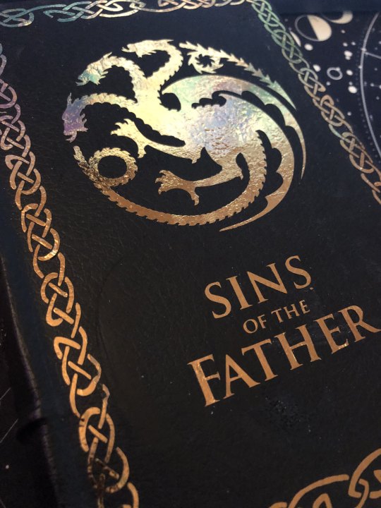
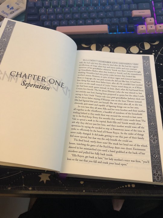
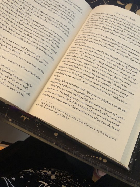
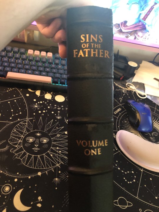
FFWAD 24 - Sins of the Father by @selfproclaimedunicorn
For my first foray into this yearly celebration with @renegadeguild, I picked the brilliant and fantastic story, Sins of the Father by @selfproclaimedunicorn. Misa has taken the fantastic AU premise 'What if Daemon Targaryen and Rhea Royce had kids?' and has run with it in the most delicious and satisfying way. The story isn't complete, but the first 'arc' has a good stopping point at a whopping 160k words, which made for the chonkiest book you could imagine.
This was the twelth book I've bound (both fic and rebinds of old favorites) and I tried several new techniques for it including rounding and backing the spine. I also stretched my legs in the formatting department and went all in with the interior. That meant ordering some special springhill paper to do these fantastic maps for the endpages. Full details behind the cut!
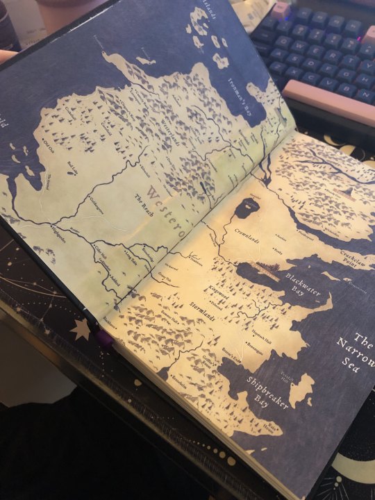
Typesetting: Normally I've kept my settings pretty minimal as I got used to the ins and outs of InDesign (during this, I did purchase Affinity Publisher and might end up moving to that, but I'm finally getting the hang of ID and you can pry it from my cold hands). I really wanted to mimic some of the interior of Fire & Blood for this, so I hunted down the fonts used and took an image of the decorative banner you see on the sides to use for the chapter openers. I also wanted to include timelines and family trees in true historically inspired fantasy tradition.
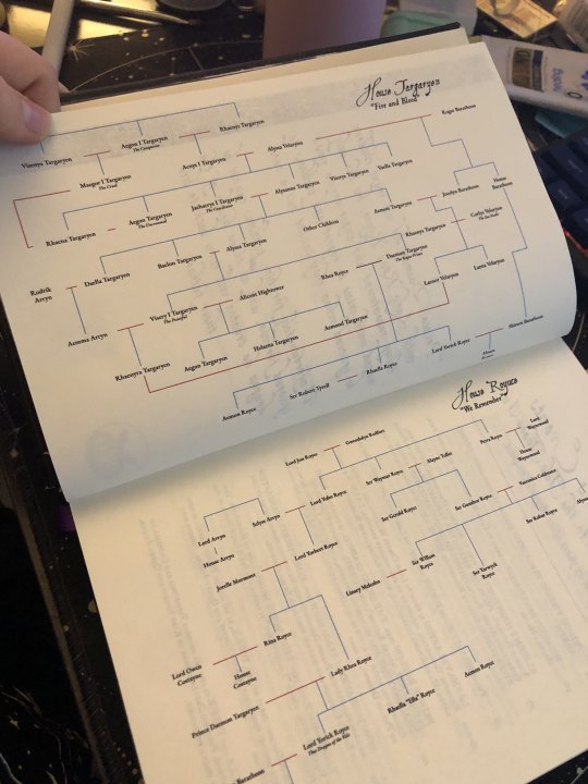
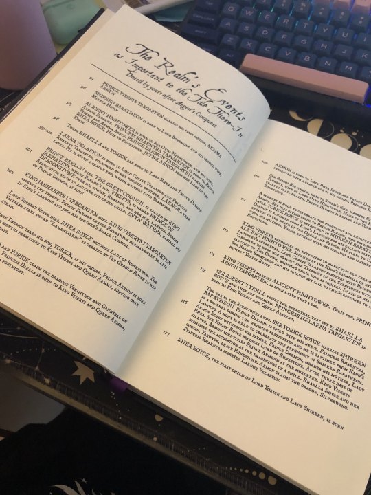
The family tree was created based off of the author's spreadsheet in Google Drawing, which I found to be the easiest thing to use when it comes to creating chaotic family trees like this (In the past I'd used lucid chart for a printable version, but google worked better here).
the timeline is honestly my favorite thing and I learned how to use tables in ID for the first time. I'm incredibly pleased with it. The formatting is based upon the line of kings in the source. The timeline covers the events of the first arc as printed in this particular story.
The chapter openers are some of my favorite! As the children are proud to be House Royce, I wanted to reflect that. The runes you see behind the Chapter number and title are the Floki font and name the character whose the POV for each chapter.
Since there's plenty of High Valyrian spoken and the author doesn't include the translations within narrative, it was the perfect moment to set up footnotes. I'll absolutely be doing this for my own story when I bind it!
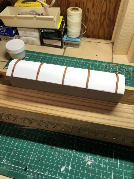
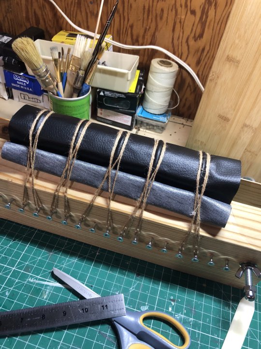
Rounding and Backing: So this was a total adventure, but I really wanted the old book feel. I made the mistake of pressing the book for too long and lost a lot of the swell in the spine to round but it worked out AND I managed to back it a little bit. Since I wasn't doing cord tapes for the spine (this was a version of the three piece bradel), I had to troubleshoot. I ended up cutting strips of the leather cord I bought from michaels and laminating those pieces together and placing them on the oxford hollow on the spine (given how thick the book is, I wanted to give it as much structural strength as possible). The 'leather' covering you see is actually the craft leather (polyester) from Dollar Tree and it's pretty awesome but definitely has difficulties staying put with glue. I followed the normal procedure and slathered both sides up and used twine to compress the bookcloth along those leather pieces. there's a little gaping in some places which I think would help if I'm able to properly apply backing paper to the polyester.
HTV do's and don'ts: Hi! don't be me and forget to apply your teflon sheets before applying the HTV because then you fuck with the polyester but it's not too bad. The other pro-tip is to gently apply the iron to the cover so it's warm before applying the HTV so it can start to stick. I had to apply the front cover in three pieces and do the title twice. Also, it's really difficult to apply HTV to a rounded spine so I'll have to figure out how to set up the spine and cover before applying (since there's a certain amount of stretching the bookcloth over the spine). The spine might end up having to be regular adhesive vinyl for that. Also, it's stupidly hard to find metallic HTV in bronze.
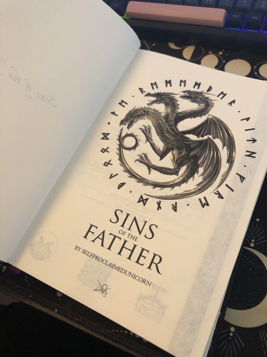
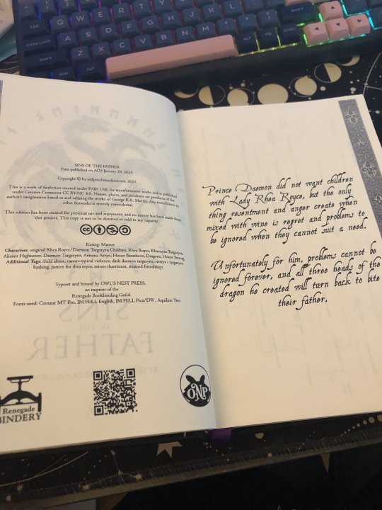
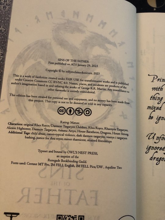
Front matter and final thoughts: The bronze dragon was a lucky find through an extensive google search, and the runes surrounding it are 'we remember with fire and blood', a combination of House Royce and House Targaryen's words. Seems fitting four Yorick, Ella, and Aemon! The copyright page is mimicked off the source's style, including the AO3 information, the creative commons and fair use information, the guild stamp, a QR code to the AO3 page, and my own press stamp! The summary is pulled from AO3 as well.
All in all, I made this book twice and I loved it and learned so much every time.
I'm so happy with this project and I'm so excited to do the next arc! Thank you so much for sharing your wonderful story, Misa!
160 notes
·
View notes
Text

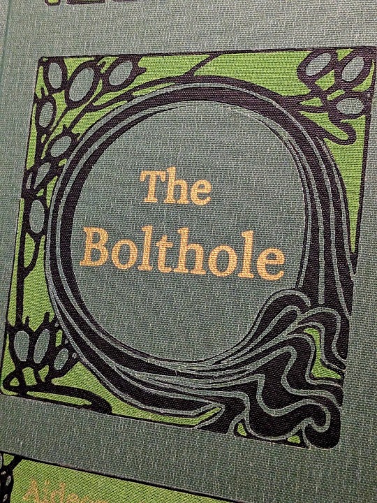
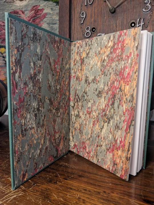
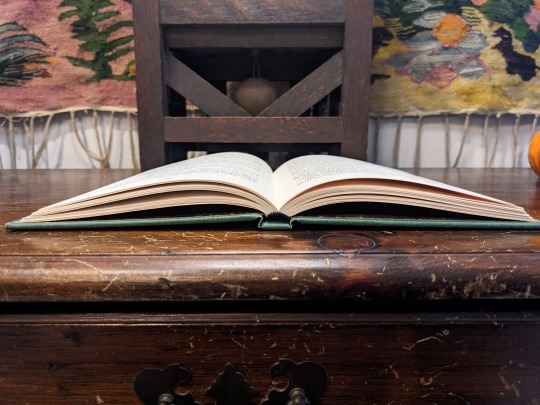
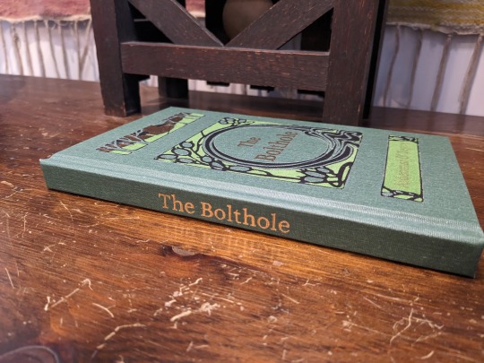
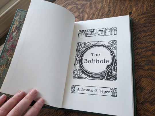
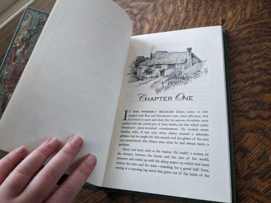
The Bolthole by aideomai, Tepre, and GallaPlacidia
I'm absolutely thrilled to finally share my first fic bind here on Tumblr! I completed this bind back in November, and it introduced me to so many wonderful people.
You can find pictures and detailed explanations of my process under the cut.
This is "The Bolthole" by Aideomai, Tepre, and (formerly) GallaPlacidia on Ao3. The cover design is adapted from "The Little Brother" (1902) by Josiah Flynt. The typeset is my own.

I fell in love with this cover the moment I saw it, and wanted to try to recreate it with book cloth. As a hobbyist book binder, I like to try to revitalize older designs from the public domain. There are so few copies of this book left in the world, so I thought it would be fun to give it new life as the cover of a contemporary story.
The cover is made out of three different colors of book cloth from the Allure and Verona lines. The book cloth and endpapers were bought from Hollander's.
I used my Cameo 4 and a strong tack mat to cut the design out of each color of book cloth. I then assembled the pattern like a puzzle. It was MUCH harder than it sounds! Some of the pieces were incredibly thin and fragile, and they were difficult to keep track of.


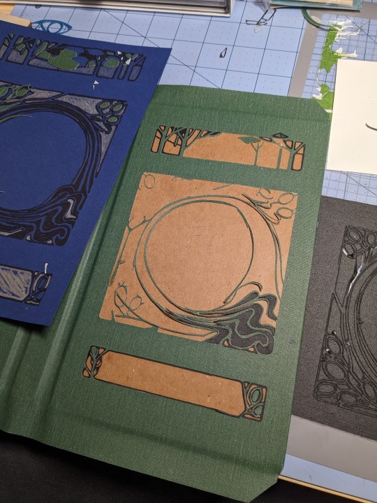

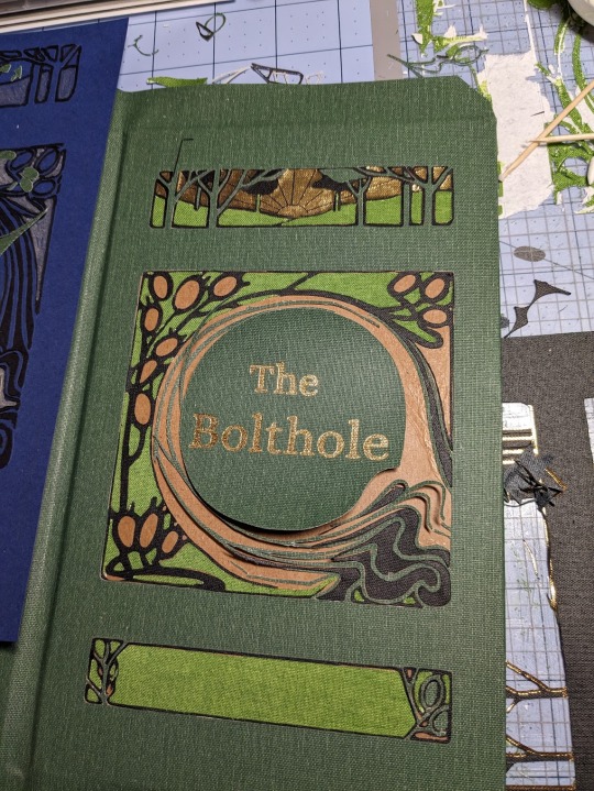
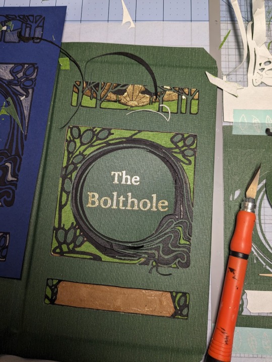
For the foiling, I used my Cameo 4 and the We R Memory Keepers fine tip foil quill for everything but the spine, which I did by hand. I foiled immediately after I cut, without removing my mat from the machine. This helped me line everything up. It did not, however, prevent me from sweating bullets as my machine worked.


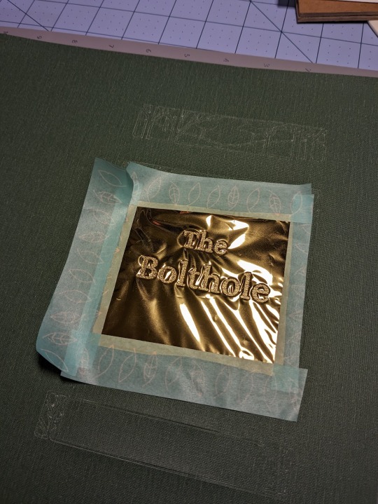
This method was, frankly, torture, but I'm really glad that I tried it. Now that I've had a nice long break, I'd like to try it again soon. I love running my hands over this book, and the texture of the book cloth feels wonderful under my fingertips. I do, however, have a few words of caution. Do not try this out unless you have book cloth to burn! Here are some pictures of just a few of my failures.


The Cameo 4 is not your friend. Your cut-outs can and will get fucked up for no reason. If the mat isn't sticky enough, or the blade isn't sharp enough, or the fabric doesn't adhere properly, your design could get completely shredded. I strongly recommend that you avoid Verona book cloth, or anything with a paper backing and loose fibers. It was absolute hell to work with. When it wasn't shredded by the machine, it was fraying like crazy. Acrylic coated cloth is the way to go if you want clean lines. And, you know, your sanity intact.
This was my most challenging bind to date, but I learned a lot! Aside from experimenting with book cloth, automated foiling, and my Cameo 4, it was also my first time formatting, printing, and sewing a text block. I'm incredibly grateful for all of the online tutorials and wonderful people who helped me make this bind a reality!
#book binding#ficbinding#fanbinding#fanfic binding#drarry#the bolthole#harry x draco#my binds#haxkattpress
333 notes
·
View notes
Text
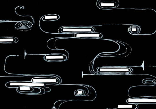
free typesetting ornaments!
okay, more posts of free stuff for binderary! yeah!
here's a bunch of bookbinding/typesetting ornaments that i made! a while ago i went on a kick of drawing random little ornaments to use in book design and typesetting, and all of them are available for free to use in a gdrive folder here!
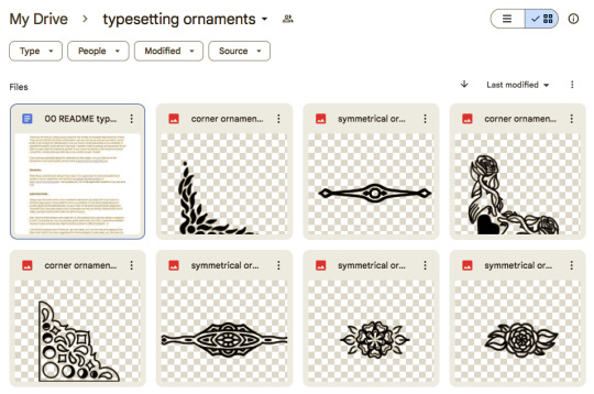
there's also a README document with permissions info - basically, please credit me if you use these, don't use them for for-profit projects or make money off them, and please make note if you edit them from the original. you can also message me if you have ideas for new ones i could make! i do still make more of these every so often.
(also also, these are free to use, but if you really WANT to donate to my ko-fi because you like them... i will never say no to a tip, i am so broke lmao the economy is in shambles)
anyway enjoy!!! have fun!!!! feel free to tag me in a post if you use any of these in your books, i would love to see them and hype you up!!
happy binderary!
83 notes
·
View notes