#i rarely draw buildings
Text
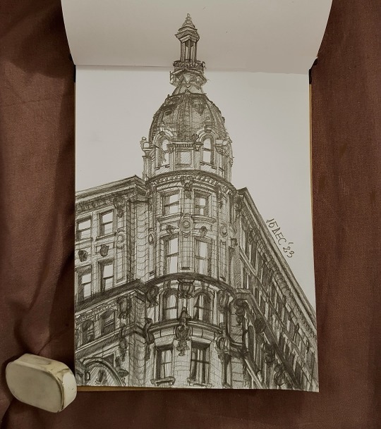
little study i did today
#this was very relaxing ngl#i rarely draw buildings#they're less stressful than people lmaoo#pythoria.txt#my art#traditional art#graphite#sketchbook
55 notes
·
View notes
Text

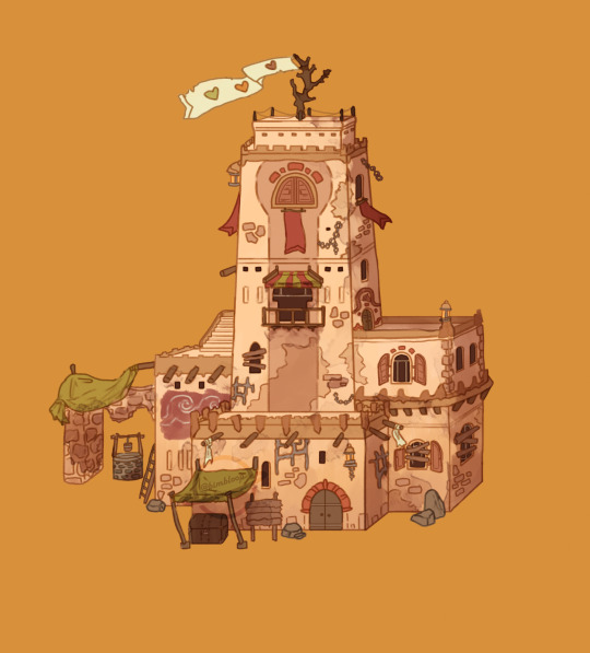
Monopoly Mountain 🏜
#mcyt fanart#mcyt#life series#3rd life smp fanart#life series fanart#bimbloop art#it was super hot over the weekend so I thought 'hey time to draw a building in the desert' hehe#plus I rarely do exteriors so this was a good exercise [:
972 notes
·
View notes
Text


Messiah of Evil (Dead People, 1974)
"Hard to remember back on things... but I - I remember the red moonlight Daddy told me about, only once. Mama gave him a bad look when he talked about it. He was only a boy himself, then. He called it the blood moon. He said that was the night that he lost religion. He learned that men could do... could do horrible things... like animals."
#messiah of evil#blood tw#dead people#the second coming#and a dozen other titles on various reissues and rereleases#willard huyck#gloria katz#marianna hill#michael greer#joy bang#anitra ford#royal dano#elisha cook jr.#charles dierkop#bennie robinson#morgan fisher#walter hill#phillan bishop#american cinema#1974#shot in 71 but not widely released until 74‚ this seems to have slipped into relative obscurity until a gradual reappraisal began in the#last couple of years; rarely was a film more deserving of a second chance bc this is something close to masterpiece. a beautifully original#highly enigmatic nightmare of a film‚ a slow build of dread to an unexpectedly apocalyptic conclusion as one woman's search for her missing#artist father brings her into contact with an insular and terribly twisted community. the details of the plot are left a little sketchy in#the final product but i think that actually suits the vibe better; there's enough hints and suggestions that a viewer can begin to draw#their own conclusions without having the precise nature of the evil spoonfed to them (in fact i even think they could have eased back on#the exposition in the final act a little). some amazing setpieces here too‚ including the grocery store attack which is quite genuinely a#Moment of all time horror cinema. amazing discordant electronic score too‚ it just all fits together wonderfully#the most european feeling American horror film ever made fr fr#feels almost like it's referencing Rollin and later Romero and a dozen others except this came first baby. it's just that smart
9 notes
·
View notes
Text

hey gang apparently i own an expensive card?
#i got it a few months ago#trying to build a silhouette deck i just don't got that much money to be throwin around#i love vanguard youthquake btw#i should draw fanart sometime#anyways i suppose i knew it was a secret rarity card but i didn't know it was THAT RARE#my most prized possession#cardfight!! vanguard#knight not posting art
10 notes
·
View notes
Text
in a perfect world frontiers would've leaned more heavily onto the elements of exploration and combat, taking the wonder rise of lyric wanted to create with the way it places the player into ancient ruins and abandoned facilities to learn more about them, and replicating the love that went into unleashed's werehog gameplay that gave us a fleshed out combo system and a competent beat-em-up. alas sega is a coward, and in this essay i will -
#soda offers you a can#admittedly rise of lyric doesn't exactly give you the lore it wants to because of Everything#i imagine having to rewrite the whole story last-minute for a game you know is a lost cause does not motivate you-#-to motivate you to create new lore that's in line with the new guidelines you have to follow#but it has the spirit still. RoL lets you explore these old places yourself and see everything that remains in them#it gives you material to work with and lets you fill in the blanks#it draws attention to these things and shows them to you and tells you hey! people were here once!#frontiers gives you structures but a funny pyramid isn't really enough on its own#it's all just weird buildings and structures and not much else. it's strange but simultaneously not enough to make you think#RoL gives you old machines and vast chambers filled with technology and dig sites#and those all have personality to them and they feel like something#frontiers's structures rarely feel like anything even if you know they're supposed to#they're neat but not much beyond that#and the combat is. fine. but it's no unleashed. and there's a reason people mod it all the time#frontiers has the building blocks for a game that combines several things i love but the execution falls short unfortunately and it pains m
9 notes
·
View notes
Text
Last week I said i'd include a video of what i've decorated for @littlebeeenergy's house, so here it is! she did the building using a couple of tutorials, though i built cannon's coop based on the design i came up with for my rabbit hutch, and i decorated! now that the back of the house is finished i can begin decorating out back too 83c
she did also convince me to add a couple of mods for it, so we now have furniture and more pets wahee! we're both very excited 83>
#minecraft monday#video#no audio bc i'm in call with a friend while they watch the walking dead#i get to draw personal art so rarely that my blog has visually turned into a minecraft blog whoops#i still draw personal art when i can#you can see a couple of wips on patreon!#but uh yeh i really like how i decorated it 83> and i think her build turned out so cute in the end!
7 notes
·
View notes
Text
Obviously I have nostalgia goggles but I think digimon adventure may still be one of the best childrens shows of all time
#suchobabbles#the kids in digimon adventure are so much more PEOPLE than the characters in any other kids show ive seen#they kids they have limited life experience and they act like it but futdamentally theyre still people#with unique personalities and perspectives on life that are shaped by their unique circumstances#and the way the show handles those circumstances with so much grace is something i just rarely see#especially not from a kids anime whos main draw is cool monster buddy battles lmfao#not even to mention the fascinating absurdism of the way it portrays the digital world#the way the show eschews all the motifs we associate with 'digitas worlds'#like circuitboards and pixels#and instead shows a very realistic world thats just... not right. its put together wrong#and it doesnt explain it right away. you just have to discover it alongside the kids#they dont even say 'its the digital world'#its just a weird place where deserts arebfilled with telephone poles and beaches have phone booths that say nonsense#where unmanned factories build and take apart the same useless contraption over and over again#ITS SO WEIRD! ITS SO FASCINATING! NOTHING DOES IT LIKE DIGIMON ADVENTURE
6 notes
·
View notes
Text
I have big thoughts abt these two
#Floppa Dazai real#KJFF#NITW AU ?? anybody ??#hHHHHHF<FM#kunikida doppo#dazai osamu#bunguo stray dogs#bsd#kite draws#kite watches bsd#I want to draw more of them as these animals specifically I rarely get to draw non wolves or cats#ppuuhhh#lays on the floor facedown oguhghhhhhhhhhhh#I really want to Draw more of this build an actual AU Out of this#they live in a silly small town together and solve crimes#because ugghghhhhh yeaa
50 notes
·
View notes
Text


it went from expression doodles to silly small ideas i wanted to put down to emotional stuff
also trying out these brushes i got back in like 2021
#doodles#oc#Mizuki rarely expresses anger or frustration#but when they do they make very silly faces and then tend to just lose all energy#like rage would build then POOF gone and its nap time.#i think they like start copying other's way of talking occasionally as shown in the fourth one#especially Kara's#im not gonna delve into the third drawings cause theyre a bit too emotional but uhhh#its been a bit since ive acknowledged their inferiority complex#yeee <3
12 notes
·
View notes
Text
btw color picking from images can be fun but it is almost never useful for total accuracy if you want to depict the actual color that something is. also most realistic art does not use the exact hues that an object really is to portray it in a way that looks right. light and shade and color context (such as in the background) alter everything so much which is why color theory matters.
generally none of this is a big deal if you’re not going for hyperrealism, but where it does matter is with color picking for people’s skin tones. for example, too many inexperienced artists portraying a dark skinned black person will use a reference image of the person in bright studio lighting and then put them in a darker or differently colored setting, which completely changes the context and can make them look many shades lighter.
if you are going to use that method i recommend finding lots of images of a person in different lighting situations and selecting a wide range of color picks from those, and then using that palette as a guide rather than a rule, to work into whatever color context and lighting setting you’re putting them in. this can take time to get right but it’s worth the practice.
i don’t personally find color picking or premade palettes very useful in most situations & my preferred method is to set the background hues and tones first and then work up from there, so that i can fairly accurately eyeball the skin tones and other colors in a way that matches the setting.
#i also rarely go for realism anyway but being able to depict skin tones accurately is absolutely vital if ur going to draw people in color#yes i wrote this post bc of the green cat post#which is a fun post & i enjoy it but i know too many people take it seriously as a viable method of building a palette#it may be accurate to use green paints to paint that cat in certain lighting but the cat itself is not green. hope this helps.
18 notes
·
View notes
Text

i promise to always be on my bullshit
oh—points of reference for the spiral roof:
Sant'Ivo alla Sapienza and the Church of Our Saviour in Copenhagen


but with a like, spike at the top instead of the sphere, and also it's solid (green) bronze and covered in gargoyles. lmao.
#kaine's hair is gonna be 50 feet long fwiw#and yes i am going for the platonic brothers route here#arghwrites#it is a little known fact about me that I love to fabricate and describe a weird fucking tower#LOVE it#hell i have a multi-page set of notes on a version of the four freedoms plaza for the AU where it gets rebuilt as a 100 foot cube#more or less#it's just that architecture's usually in miscellaneous worldbuilding docs or settings that most people are not going to see#especially since i rarely if ever draw buildings lol
3 notes
·
View notes
Text
I wonder if my high school biology teacher would regret showing me how to make charts of how plant color genetics are inherited through generations and how different color genes may interact if he knew I'd end up using it with fictional characters instead
#I have charts for hair skin and eye color and (more than anything else) magic types for up to 20 generations with some characters#also: family trees. I have way too many charts of how everyone is related#and the worst part of it is when I have to match the two.#I need to know where the two required genetic traits for making water freeze are from and whether or not they're connected to eye color#currently tracking how many characters in one kingdom have the rare affinity for fire magic and that's connected to eye color#like it doesn't directly determine eye color but it affects the undertone#your eyes can be green or purple or grey or brown or yellow with it depending on what else is going on#but the gene needs to be there and affecting eye color for you to have fire affinity#anyway the charts are useful for when I need to draw because I have easy access to starter tones#I can just build the lighting on top of those
3 notes
·
View notes
Text
Underbite has a jagged beak abd nobody can convince me otherwise
#maccadam#transformers#tf rid15#rid underbite#i absolutely love the Chompazoids' designs and worldbuilding implications#especially since they're considered a type of dinobot#but clearly resemble nothing on earth#the tfwiki compares their build to canids but I'd compare them more to a mix of dinosaurs (avian or nonavian) and birds#their mechano-musculature and large helms are built to rip off large chunks of metal and consume them#almost like a more specialized predacon but instead of somehow cycling out the metal no Chompazoids fuel on the metal itself!#makes me wonder if Underbite might be able to function off of far less energon than other Cybertronians or even no energon#ykw it reminds me of? if you took a predacon and put it in an environment where prey is so much more rare#but in contrast said area would have a fuck ton of scrap metal and wreckage#i can see a dinobot/predacon lineage going from hunting to scavenging to consuming almost solely metal that was never alive#it's fucking cool! especially since i love drawing comparisons to predacons and dinobots#and dissecting the differences in the alternative root mode mecha we see in rid15
7 notes
·
View notes
Text
I AM HOMEE
#ohhh my gooodd#Its been a good week and i detoxed from thr internet so much#i refound my love for drawing!!!!#and anime too rewtaching bnha cus i have all the episodes and movies in my laptop lol and forgooot#and i waa going crazy planning gor mc builds that i couldnt log on to do#rare rambling
2 notes
·
View notes
Text
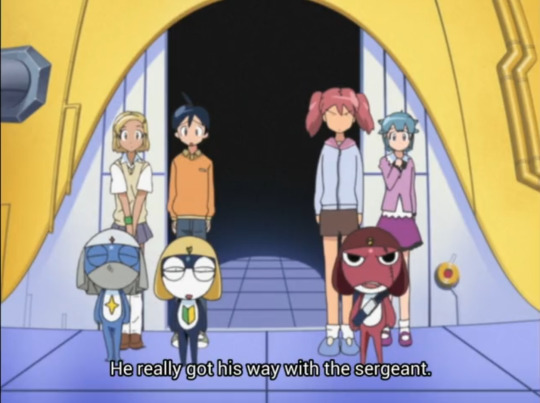

"When he puts his mind to it, the sergeant can get what he wants."
"But he's a vile being. I'm afraid there's just no solution."
#ita dub#keroro#i am gonna do the whole episode dont worry. i already have a difference noted for the gundam moment lol HOWEVER#i had to post this now immediately because i mentioned it to a friend and i wondered just how close it was to the og#turns out... not at all lol IT'S ALWAYS LIKE THIS WITH ME !!! MY FAVORITE MOMENTS? ARE ALL MADE UP#this is a judgement of keroro's character which in my brain is important for the bible i build of them in my head#and this judgement absolutely fits keroro in his overall character it's just... not at all what is said lol#it's like the opposite. in jpn they think kururu came out the winner. in ita its like damn keroro mad successful but also selfish as hell#it's an interesting difference... now if you'll excuse me I'll send this to my friend#:3#another thing is that. im pretty sure natsumi is insulting keroro here? but she might be talking about kururu? im honestly not sure#but considering a couple eps back we had keroro literally impersonate kururu when scheming tbh it's much of the same#a duality that... lends itself to the canon. in a surprising and absolutely not intentional twist#spoiler alert. the drawings of the gunpla were stolen ''to its creator'' not to zeon. which is what makes it rare. kinda crazy#that once again they even bother to put an explanation in place. like im genuinely impressed you dont understand#ep 28b
2 notes
·
View notes
Text

[ @aararepairweek Day 3: AU ]
---
I'm a couple days late with this prompt but that's what I get for actually rendering a piece that I told myself would be just a sketch lmao. Anyways: had to draw some Clayvier with Werewolf!Clay and Vampire!Klavier...just two monsters in love <3
#Quinn does art#ace attorney#clay terran#klavier gavin#clayvier#ace attorney rare pair week#clayvier has a special place in my heart I had to draw them for aa rare pair week even if I didn't have time for every prompt#I might build up lore for monster Clayvier and perhaps write a one shot for this au even though im not a writer#also shoutout to this being my first art post! Yay!
10 notes
·
View notes
Last Seen Blogs

sharonrosemacalintalpancho-blog
atheris squamigeria

letscontemplate-blog
Untitled

audenrps
auden's muses

let-me-love-you-to-death
Am I good enough...for you?

hack-hero-zero-cheat-engine-2
Hack Hero Zero Cheat Engine Download