#image hover elementor
Explore tagged Tumblr posts
Visit Tumblr Blog
Explore Tumblr blogs with no restrictions, modern design and the best experience.
Last Seen Tumblr Blogs


Fun Fact
In February 2021, Tumblr had 518.6 million blog accounts.
Video
youtube
(via Transform Your Images with Elementor: Scroll on Hover Effects Unleashed!)
Hi everyone! Welcome to another Elementor tutorial. This is Jamie from System22 and WebDesignDetectives.com. Today, we've got an exciting and highly requested tutorial for you. We're going to show you how to create a scrolling image effect on hover using Elementor. This effect is fantastic for grabbing attention and adding some dynamic flair to your site.
#https://web-design-and-tech-tips.com/transform-your-images-with-elementor-scroll-on-hover-effects-unleashed/#DiviVerticalMenus WebsiteRevolution DiviTutorial StepByStepGuide WebDesignTips DiviTheme VerticalMenuDesign
0 notes
Text
Mastering Z-Index in Elementor: Everything You Need to Know
When designing websites with Elementor, managing layers and ensuring proper content visibility can be a challenge—especially when multiple elements overlap. This is where understanding Z-Index in Elementor becomes essential.
What is Z-Index in Elementor?
Z-Index is a CSS property that controls the stacking order of elements on a web page. In simpler terms, it decides which element appears on top when two or more elements overlap. The higher the Z-Index value, the closer the element appears to the front.
In Elementor, every widget or section can be assigned a custom Z-Index value. This is especially helpful when creating advanced layouts such as overlapping text, layered images, sticky headers, or pop-ups.
How to Use Z-Index in Elementor
Select the Element: Click on the widget, column, or section you want to modify.
Go to the Advanced Tab: Under the 'Advanced' settings, scroll down to the 'Z-Index' field.
Set the Value: Input a positive or negative number. Higher values will place the element in front.
Example: If your text is hidden behind an image, increasing the text’s Z-Index will bring it forward.
Common Uses of Z-Index in Elementor
Making sticky headers stay on top while scrolling.
Creating interactive hover effects.
Layering background shapes or graphics.
Fixing overlapping issues between sections and widgets.
Tips for Using Z-Index in Elementor
Avoid unnecessary high values: A Z-Index of 9999 might work, but keep your values logical to avoid conflicts.
Use relative positioning: For Z-Index to take effect, elements often need a relative, absolute, or fixed position.
Check responsive views: Overlapping might differ between desktop, tablet, and mobile views.
Special Features of Z-Index in Elementor
The Z-Index in Elementor isn’t just a basic layering tool—it's a powerful feature that gives you full control over how elements appear in relation to each other on your webpage. Below are some standout features and benefits of using Z-Index effectively in Elementor:
1. Precise Layer Control
Z-Index allows you to manually control which elements appear on top or behind others. This gives you the freedom to design complex, multi-layer layouts without coding.
2. Works Across Widgets, Columns, and Sections
Elementor makes Z-Index available for:
Widgets (like buttons, images, headings)
Columns
Entire Sections
This means you can adjust layering at any level of your layout.
3. Dynamic with Position Settings
Z-Index works best when combined with Elementor’s position controls:
Relative
Absolute
Fixed
You can create advanced designs like sticky headers or floating call-to-action buttons that stay on top of all other content using Z-Index.
4. Responsive Control
With Elementor’s responsive settings, you can tweak Z-Index for mobile, tablet, and desktop individually. This ensures your designs remain visually consistent across all devices.
5. Conflict Resolution
Z-Index is your best friend when solving layering conflicts—like when a menu hides behind a section or a popup doesn’t appear as expected.
6. Supports Negative and High Values
You can assign negative values to push elements further back, or high values (e.g., 999) to bring elements to the front. This flexibility is crucial in layered design scenarios.
7. Improves User Experience
Using Z-Index properly ensures that clickable elements like buttons and menus stay accessible and visible, leading to a smoother UX.
Unlock the Full Power of Elementor Pro at an Unbeatable Price
Want to take your web design to the next level with advanced features, templates, and custom controls?
Get Elementor Pro @ Just ₹499 through CVWorld’s Elementor Group Buy and access premium tools affordably!
0 notes
Text
Architecture Website Design Best Practices: What Works in 2025

Introduction
In 2025, an architecture firm’s website is more than just a digital brochure — it's a virtual showroom, brand ambassador, and client acquisition engine rolled into one. The expectations from architecture website design have evolved significantly, driven by advancements in design technology, user behavior, and the competitive digital landscape. For architects looking to stand out, adopting the latest best practices in Architecture Website Design is essential for building trust, showcasing expertise, and winning new business.
Let’s dive into the most effective architecture website design strategies that are defining success in 2025.
Core Elements of Successful Architecture Website Design
At its foundation, every architecture website must seamlessly blend aesthetics with usability. The following core elements ensure a strong foundation:
Visual Storytelling: Architecture is visual by nature. In 2025, websites are leveraging high-resolution imagery, short cinematic videos, and immersive galleries to communicate design philosophy and project details.
Responsive & Mobile-First Design: With mobile usage exceeding desktop for most web traffic, responsive layouts that adapt fluidly across devices are non-negotiable.
Performance Optimization: A slow-loading website will quickly lose potential clients. Optimizing images, using lightweight frameworks, and leveraging CDNs are standard practices.
Clear Navigation Structure: Architecture Website Design should include intuitive menus and logical content hierarchy so users can easily browse portfolios, services, and contact information.
Design Trends That Work in 2025
2025 introduces new visual and interactive paradigms that elevate user engagement:
3D Models and Interactive Walkthroughs: Cutting-edge firms now embed real-time 3D models and virtual tours using WebGL and tools like Matterport to allow users to explore spaces dynamically.
Minimalist and Grid-Based Layouts: Clean lines, consistent spacing, and a grid-first approach help maintain visual clarity and elegance — essential for architectural firms.
Micro-Interactions and Animations: Smooth hover effects, project loading transitions, and subtle animations enhance the user journey without overwhelming the design.
Dark Mode & Accessibility-First Design: Offering dark mode toggle options and ensuring color contrast and screen reader compatibility are now part of inclusive design.
Technical Best Practices
Under the hood, robust architecture ensures a website is visible, secure, and future-proof:
SEO-Optimized Architecture: Use of semantic HTML5, clean URLs, schema markup (especially for projects and team pages), and optimized image alt tags improve search engine visibility.
Accessibility Compliance (ADA): Architecture Website Design in 2025 must meet WCAG 2.2 standards. This includes keyboard navigation, alt text, ARIA labels, and color contrast.
Website Security: Secure SSL (HTTPS), anti-spam forms, and up-to-date plugins/frameworks protect client data and enhance trust.
Core Web Vitals: Google’s performance metrics — Largest Contentful Paint (LCP), First Input Delay (FID), and Cumulative Layout Shift (CLS) — must be optimized to ensure ranking and user satisfaction.
User Experience and Conversion Optimization
Design should not only impress but also convert:
Strategic CTAs: “Schedule a Consultation,” “Download Portfolio,” or “Request a Quote” placed contextually across the site.
Integrated Tools: Live chat, appointment booking tools, and downloadable lead magnets (like design brochures) improve engagement.
Smart Portfolio Filters: Allow users to filter projects by type (residential, commercial, interiors, etc.) to quickly find relevant examples.
CMS and Tech Stack Recommendations
Choosing the right technology is as crucial as design:
WordPress with Elementor or Webflow: Ideal for firms needing full control with visual editors.
Headless CMS with Next.js or Gatsby: Perfect for high-performance, custom-built sites with decoupled frontends.
Reliable Hosting: Use providers offering global CDNs, automatic backups, and high uptime. Services like Vercel, Kinsta, or Cloudflare-backed hosting are great choices.
Case Studies and Real-World Inspirations
Here are a few standout architecture website examples that reflect 2025’s best practices:
BIG (Bjarke Ingels Group) – A masterclass in minimalist, content-first design with immersive project visuals.
Zaha Hadid Architects – A clean UX with strong branding, video headers, and interactive case studies.
Snøhetta – Uses storytelling and bold typography with structured navigation to guide users effectively.
Each of these websites exemplifies how great architecture website design combines beauty with performance.
Conclusion
The bar for Architecture Website Design in 2025 is higher than ever. It's no longer enough to showcase projects — your website must create immersive experiences, offer intuitive functionality, and load flawlessly across all devices. From implementing 3D walkthroughs to optimizing Core Web Vitals and integrating modern tech stacks, every element matters.
0 notes
Text
Essential Elementor Pro GPL Tips for Beginners
Essential Elementor Pro GPL Tips for Beginners
Elementor Pro GPL has revolutionized website creation, making it accessible for beginners and professionals alike. Whether you're building your first website or stepping into web design, mastering Elementor Pro GPL can elevate your skills and creativity. In this blog, we'll explore essential tips to help beginners make the most of this powerful tool.
Why Choose Elementor Pro GPL?
Elementor Pro GPL offers a user-friendly interface, rich design options, and unparalleled flexibility—all without requiring advanced coding knowledge. With its drag-and-drop functionality and pre-designed templates, beginners can create professional-grade websites with ease. Let's dive into some tips to kickstart your Elementor Pro GPL journey.
1. Familiarize Yourself with the Basics
Before diving into complex designs, take time to understand Elementor Pro's interface:
Explore the drag-and-drop editor, which lets you easily add, edit, and move elements.
Familiarize yourself with widgets, such as text boxes, images, and buttons—they're the building blocks of your website.
Experiment with the responsive preview tool to see how your designs look on desktops, tablets, and smartphones.
2. Start with Pre-Made Templates
Elementor Pro GPL comes with an extensive library of templates and blocks:
Browse through templates that suit your industry or project.
Use them as a foundation to speed up your design process.
Customize colors, fonts, and layouts to align with your branding.
Templates are a great starting point for beginners who may feel overwhelmed by designing from scratch.
3. Learn the Power of Sections and Columns
Understanding the structure of Elementor is key to creating beautiful websites:
Use sections as containers for your content.
Divide sections into columns to create versatile layouts.
Adjust the padding and margins to control spacing and achieve a polished look.
Mastering this foundational structure will make your designs professional and visually appealing.
4. Focus on Mobile Responsiveness
Mobile-friendliness is non-negotiable in today's web design:
Use the responsive editing feature in Elementor Pro to customize layouts for mobile devices.
Make sure text is readable and buttons are easy to tap.
Preview and adjust your design to ensure it looks great across all devices.
Responsive design ensures an optimal user experience for visitors on various screens.
5. Experiment with Widgets
Elementor Pro GPL's widgets are your creative playground:
Explore dynamic widgets like forms, sliders, and galleries.
Add interactive elements, such as animations and hover effects, to engage visitors.
Use custom widgets available in third-party libraries to extend functionality.
Widgets unlock endless possibilities for designing unique and impactful websites.
6. Use Global Settings
Streamline your design process by setting global options:
Define colors and fonts that apply across your website.
Save reusable templates and blocks for consistency.
Ensure brand identity is maintained without repeating manual adjustments.
Global settings simplify your workflow, saving time and effort.
7. Practice and Experiment
The best way to learn is by doing:
Create dummy projects to experiment with features and layouts.
Watch tutorials and read guides to deepen your understanding.
Don't be afraid to make mistakes—they're part of the learning process.
With practice, you'll gain confidence and discover your unique design style.
Conclusion
Elementor Pro GPL is a powerful tool that enables beginners to create stunning websites without coding expertise. By following these essential tips—familiarizing yourself with the interface, leveraging templates, focusing on mobile responsiveness, and experimenting with widgets—you'll be well on your way to becoming a proficient web designer.
The journey doesn’t end here. With ongoing practice and exploration, you can unlock even more features and bring your creative visions to life. So, dive in, have fun, and let Elementor Pro GPL guide you on your path to web design excellence.
0 notes
Text
Animate Images in WordPress using Elementor Pro
Dive into the exciting world of web animation with our comprehensive tutorial, "How to animate Images in WordPress using Elementor Pro" This guide is a treasure trove for web designers, content creators, and anyone eager to enhance their WordPress site with eye-catching animated images. Using Elementor Pro, we'll show you how to transform static images into dynamic, engaging elements that captivate your audience.
youtube
Subscribe for free access to 800+ Video Tutorials: https://www.youtube.com/dcpwebdesigners
Table of contents
00:00:00 Introduction 00:00:40 Create a new page 00:01:45 Create a new container with 4 columns (Flexbox) 00:01:55 Add Image widget to 4 containers and select a different image for each container 00:03:50 Apply motion effects to images (fade in) 00:05:00 Apply motion effects to images (Bounce In) 00:05:48 Disable motion effects for mobile devices 00:08:35 Example websites using Elementor image motion effects
ElementorPro #Tutorial
Animating images on your website can dramatically improve user engagement, making your content more appealing and memorable. With Elementor Pro, this once-complex task becomes surprisingly simple, allowing you to apply a range of animations without needing to write a single line of code. From subtle hover effects to more elaborate animations, the possibilities are endless.
In this detailed video, you'll learn:
The basics of image animation and why it's a game-changer for your website's visual appeal.
A step-by-step walkthrough on how to use Elementor Pro to animate images, including selecting the right widget and applying custom animations.
Tips for choosing animations that enhance your site's design and user experience, ensuring that your animations complement rather than distract.
How to apply animations to different device types.
Examples of effective image animation in action, providing inspiration for your own projects.
By the end of our tutorial, you'll be equipped with the knowledge and tools to add sophisticated animations to images on your WordPress site, taking your web design skills to a whole new level.
Don't forget to like, share, and subscribe for more insightful tutorials on leveraging Elementor Pro to elevate your web design. Let's unlock the full potential of your website together, making it not just a site, but an experience.
Animate Images WordPress, Elementor Pro Animation, WordPress Design Tips, Elementor Image Effects, Web Animation Tutorial, Elementor Pro Guide, Creative Website Design, Enhance User Engagement, WordPress Elementor Tutorial, Elementor Animation Widgets, Visual Effects WordPress, Interactive Web Elements, Elementor Pro Techniques, Website Aesthetics Improvement, wordpress elementor pro tutorial, elementor tutorial, elementor tutorial 2024, elementor tutorial for beginners
#Animate Images WordPress#Elementor Pro Animation#WordPress Design Tips#Elementor Image Effects#elementor tutorial#elementor tutorial for beginners#webdesigners#dcpwebdesigners#dcpweb#wordpress#webdevelopment#youtube#wordpresswebdesign#Youtube
0 notes
Text
Foxiz – WordPress Newspaper News and Magazine v2.4.3
https://themesfores.com/product/foxiz-wordpress-newspaper-news-and-magazine/ Foxiz is a WordPress theme that lets you create your dream website with 1000+ Customizable Options, Mobile-Friendly and Lightweight Foxiz is a WordPress News theme Perfect for news magazine blog technology fashion beauty gadget phone hardware art creative lifestyle modern personal education culture travel viral architecture food recipe medical health game minimal video cryptocurrency science podcast audio government school sport pet animals wildlife fitness military review coffee shop business forum elementor guide agency car photography nature conference rating seo powerful fast top speed test simple mobile first lightweight responsive gutenberg newspaper blogging. Foxiz v2.4.3 – WordPress Newspaper News and Magazine Key Features Unlimited sidebars Cross-Browser Compatibility: Chrome, Safari, FireFox, Edge, Opera Auto YouTube, Dailymotion, and Vimeo featured image downloaders. Just need to paste a URL, and the theme will automatically download the featured image for the post. Built-in review system: stars and score, schema markup supported Automatically calculate reading time for posts. Create a custom entry meta Reading progress bar Sponsored posts Svg uploader Preview video: play a short preview video when hovering on featured image. Social followers counter Integrated with Instagram, Facebook, Twitter, Pinterest, Linkedin, Telegram… Instagram images grid Create custom social profiles Built with HTML5 and CSS3 Youtube and vimeo video playlist Floating video iframe Live Demo – https://themeforest.net/item/foxiz-wordpress-newspaper-and-magazine/34617430 Please note that any digital products presented on this website do not contain malicious code, viruses or advertising. https://themesfores.com/product/foxiz-wordpress-newspaper-news-and-magazine/ #NewspaperThemes #WordpressTheme
0 notes
Text
Dick Tracy, der seit 1931 durch Chester Goulds kreatives Genie lebendig wird, bleibt eine Ikone in der Welt der Comics. In "Big City Blues" erleben die Leser das pulsierende Herz einer Großstadt, angereichert mit lebhaften Charakteren und dynamischen Stadtszenen. "Dick Tracy gegen die Unterwelt" führt die Tradition fort, indem es den Detektiv in packenden Auseinandersetzungen mit der kriminellen Unterwelt zeigt. "Der Comic zum Film" bietet eine einzigartige filmische Adaption in Comicform, die eine neue Perspektive auf eine bekannte Geschichte ermöglicht. Diese drei Comics vereinen städtisches Drama, Kriminalgeschichten und filmische Elemente zu einem fesselnden Leseerlebnis. /*! elementor-pro - v3.18.0 - 20-12-2023 */ .elementor-gallery__containermin-height:1px.elementor-gallery-itemposition:relative;overflow:hidden;display:block;text-decoration:none;border:solid var(--image-border-width) var(--image-border-color);border-radius:var(--image-border-radius).elementor-gallery-item__content,.elementor-gallery-item__overlayheight:100%;width:100%;position:absolute;top:0;left:0.elementor-gallery-item__overlaymix-blend-mode:var(--overlay-mix-blend-mode);transition-duration:var(--overlay-transition-duration);transition-property:mix-blend-mode,transform,opacity,background-color.elementor-gallery-item__image.e-gallery-imagetransition-duration:var(--image-transition-duration);transition-property:filter,transform.elementor-gallery-item__contentdisplay:flex;flex-direction:column;justify-content:var(--content-justify-content,center);align-items:center;text-align:var(--content-text-align);padding:var(--content-padding).elementor-gallery-item__content>divtransition-duration:var(--content-transition-duration).elementor-gallery-item__content.elementor-gallery--sequenced-animation>div:nth-child(2)transition-delay:calc(var(--content-transition-delay) / 3).elementor-gallery-item__content.elementor-gallery--sequenced-animation>div:nth-child(3)transition-delay:calc(var(--content-transition-delay) / 3 * 2).elementor-gallery-item__content.elementor-gallery--sequenced-animation>div:nth-child(4)transition-delay:calc(var(--content-transition-delay) / 3 * 3).elementor-gallery-item__descriptioncolor:var(--description-text-color,#fff);width:100%.elementor-gallery-item__titlecolor:var(--title-text-color,#fff);font-weight:700;width:100%.elementor-gallery__titles-containerdisplay:flex;flex-wrap:wrap;justify-content:var(--titles-container-justify-content,center);margin-bottom:20px.elementor-gallery__titles-container:not(.e--pointer-framed) .elementor-item:after,.elementor-gallery__titles-container:not(.e--pointer-framed) .elementor-item:beforebackground-color:var(--galleries-pointer-bg-color-hover).elementor-gallery__titles-container:not(.e--pointer-framed) .elementor-item.elementor-item-active:after,.elementor-gallery__titles-container:not(.e--pointer-framed) .elementor-item.elementor-item-active:beforebackground-color:var(--galleries-pointer-bg-color-active).elementor-gallery__titles-container.e--pointer-framed .elementor-item:beforeborder-color:var(--galleries-pointer-bg-color-hover);border-width:var(--galleries-pointer-border-width).elementor-gallery__titles-container.e--pointer-framed .elementor-item:afterborder-color:var(--galleries-pointer-bg-color-hover).elementor-gallery__titles-container.e--pointer-framed .elementor-item.elementor-item-active:after,.elementor-gallery__titles-container.e--pointer-framed .elementor-item.elementor-item-active:beforeborder-color:var(--galleries-pointer-bg-color-active).elementor-gallery__titles-container.e--pointer-framed.e--animation-draw .elementor-item:beforeborder-left-width:var(--galleries-pointer-border-width);border-bottom-width:var(--galleries-pointer-border-width);border-right-width:0;border-top-width:0.elementor-gallery__titles-container.e--pointer-framed.e--animation-draw .elementor-item:afterborder-left-width:0;border-bottom-width:0;border-right-width:var(--galleries-pointer-border-width);border-top-width:var(--galleries-pointer-border-width).
elementor-gallery__titles-container.e--pointer-framed.e--animation-corners .elementor-item:beforeborder-left-width:var(--galleries-pointer-border-width);border-bottom-width:0;border-right-width:0;border-top-width:var(--galleries-pointer-border-width).elementor-gallery__titles-container.e--pointer-framed.e--animation-corners .elementor-item:afterborder-left-width:0;border-bottom-width:var(--galleries-pointer-border-width);border-right-width:var(--galleries-pointer-border-width);border-top-width:0.elementor-gallery__titles-container .e--pointer-double-line .elementor-item:after,.elementor-gallery__titles-container .e--pointer-double-line .elementor-item:before,.elementor-gallery__titles-container .e--pointer-overline .elementor-item:before,.elementor-gallery__titles-container .e--pointer-underline .elementor-item:afterheight:var(--galleries-pointer-border-width).elementor-gallery-title--space-between:10px;cursor:pointer;color:#6d7882;font-weight:500;position:relative;padding:7px 14px;transition:all .3s.elementor-gallery-title--activecolor:#495157.elementor-gallery-title:not(:last-child)margin-right:var(--space-between).elementor-gallery-item__title+.elementor-gallery-item__descriptionmargin-top:var(--description-margin-top).e-gallery-item.elementor-gallery-itemtransition-property:all.e-gallery-item.elementor-animated-content .elementor-animated-item--enter-from-bottom,.e-gallery-item.elementor-animated-content .elementor-animated-item--enter-from-left,.e-gallery-item.elementor-animated-content .elementor-animated-item--enter-from-right,.e-gallery-item.elementor-animated-content .elementor-animated-item--enter-from-top,.e-gallery-item:focus .elementor-gallery__item-overlay-bg,.e-gallery-item:focus .elementor-gallery__item-overlay-content,.e-gallery-item:focus .elementor-gallery__item-overlay-content__description,.e-gallery-item:focus .elementor-gallery__item-overlay-content__title,.e-gallery-item:hover .elementor-gallery__item-overlay-bg,.e-gallery-item:hover .elementor-gallery__item-overlay-content,.e-gallery-item:hover .elementor-gallery__item-overlay-content__description,.e-gallery-item:hover .elementor-gallery__item-overlay-content__titleopacity:1a.elementor-item.elementor-gallery-titlecolor:var(--galleries-title-color-normal)a.elementor-item.elementor-gallery-title.elementor-item-active,a.elementor-item.elementor-gallery-title.highlighted,a.elementor-item.elementor-gallery-title:focus,a.elementor-item.elementor-gallery-title:hovercolor:var(--galleries-title-color-hover)a.elementor-item.elementor-gallery-title.elementor-item-activecolor:var(--gallery-title-color-active).e-con-inner>.elementor-widget-gallery,.e-con>.elementor-widget-gallerywidth:var(--container-widget-width);--flex-grow:var(--container-widget-flex-grow) Alle Neue Galerie
0 notes
Text
0 notes
Text
How to Customize Your WordPress Theme with Elementor 🎨
WordPress is the most popular and powerful website platform in the world, powering over 40% of all websites on the internet. WordPress offers many benefits for website owners, such as:
Free and easy to use
SEO friendly
Scalable and secure
Flexible and versatile
Compatible and integrable
However, WordPress also has some limitations when it comes to customizing your website’s design and appearance. WordPress themes are collections of templates that define the visual aspect of your website, but they are not always easy to modify or customize according to your preferences.
That’s where Elementor comes in. Elementor is a powerful and popular WordPress plugin that lets you create beautiful and dynamic websites with drag-and-drop tools and widgets. Elementor gives you full control over your website’s design, layout, content, and functionality.
With Elementor, you can customize any WordPress theme without coding or hiring a developer. You can change colors, fonts, backgrounds, images, buttons, forms, and much more. You can also create your own templates and sections and reuse them across your website.
In this article, I will show you how to customize your WordPress theme with Elementor in four easy steps:
1. Install Elementor
The first step to customize your WordPress theme with Elementor is to install Elementor on your WordPress website. Elementor is a free plugin that you can download from the WordPress repository or from the Elementor website.
To install Elementor, go to your WordPress dashboard and click on “Plugins” > “Add New”. Search for “Elementor” and click on the “Install Now” button. Then, activate the plugin.
Elementor also has a premium version that offers more features and widgets, such as:
Theme Builder - Create custom headers, footers, single posts, archives, etc.
Popup Builder - Create popups for lead generation, announcements, promotions, etc.
WooCommerce Builder - Create custom product pages, shop pages, cart pages, etc.
Motion Effects - Add animations and interactions to your website elements
Dynamic Content - Add dynamic data from custom fields, ACF, Toolset, etc.
Form Builder - Create advanced forms with integrations and conditional logic
Custom Fonts - Upload and use any font on your website
Support from Elementor experts
The premium version costs $49 per year for one site.
2. Edit a page with Elementor
The second step to customize your WordPress theme with Elementor is to edit a page with Elementor. You can edit any existing page or create a new one.
To edit a page with Elementor, go to your WordPress dashboard and click on “Pages” > “All Pages”. Hover over the page title and click on the “Edit with Elementor” link.
Alternatively, you can create a new page by clicking on “Pages” > “Add New”. Enter a page title and click on the “Edit with Elementor” button.
This will open the Elementor editor where you can start customizing your page.
3. Insert an Elementor template
The third step to customize your WordPress theme with Elementor is to insert an Elementor template. An Elementor template is a pre-designed layout that you can use as a starting point for your page.
Elementor offers hundreds of templates for different niches and purposes, such as:
Landing pages
Homepages
About pages
Contact pages
Services pages
Portfolio pages
Blog pages
E-commerce pages
And more!
To insert an Elementor template, click on the folder icon at the bottom of the Elementor panel. This will open the template library where you can browse and search for templates.
You can filter templates by category or keyword or use the tabs to switch between free and premium templates.
To preview a template, hover over it and click on the magnifying glass icon. To insert a template, hover over it and click on the “Insert” button.
This will add the template to your page where you can start editing it.
4. Customize the template
The fourth and final step to customize your WordPress theme with Elementor is to customize the template. You can change anything on the template according to your needs and preferences.
To customize the template, you can use two main tools: widgets and settings.
Widgets are elements that you can add to your page, such as:
Text
Image
Button
Icon
Heading
Video
Spacer
Divider
Counter
Testimonial
And more!
To add a widget, drag and drop it from the Elementor panel to the page. You can also search for widgets by name or use the categories to filter them.
To edit a widget, click on it and use the options in the Elementor panel. You can change the content, style, and advanced settings of each widget.
Settings are options that you can use to customize your page as a whole, such as:
Layout - Change the page width, height, margin, padding, etc.
Style - Change the page background, color, typography, etc.
Advanced - Change the page responsiveness, custom CSS, motion effects, etc.
To access the settings, click on the gear icon at the bottom of the Elementor panel. You can also access the settings of each section and column by clicking on their icons.
When you are done customizing your page, click on the “Update” button at the bottom of the Elementor panel to save your changes.
You can also preview your page by clicking on the “Preview Changes” button or exit the Elementor editor by clicking on the “Exit to Dashboard” button.
Conclusion
Elementor is a powerful and easy way to customize your WordPress theme without coding or hiring a developer. You can create stunning and unique websites with Elementor by using templates and widgets and changing settings.
By doing so, you can improve your website’s design, usability, and functionality and provide a better user experience for your visitors.
If you found this article helpful, please share it with your friends and colleagues. And if you have any questions or feedback, please leave a comment below. I would love to hear from you. 💬
#WordPress #Elementor #Theme #Customize #Website
0 notes
Text
WooCommerce Banner Images Plugin: A Guide for Beginners
If you run an online store using WooCommerce, add some eye-catching banner images to your site. Banner images are a great way to showcase your products, promotions, or special offers. They can also help you create a consistent and professional look for your brand.
But how do you add banner images to your WooCommerce site? And what are the best practices for designing and displaying them? In this blog post, we will answer these questions and more. We will also introduce you to the WooCommerce Banner Images Plugin, a simple and powerful tool that lets you easily create and manage banner images on your site.
What are banner images, and why are they important?
Banner images are large, horizontal images that appear at the top of a web page or a page section. They are often used to grab visitors' attention and convey a message or a call to action. For example, you might use a banner image to:
Announce a new product launch or a seasonal sale
Highlight a customer testimonial or a social proof
Showcase a featured product or a bestseller
Promote a free trial or a discount code
Invite visitors to sign up for your newsletter or join your loyalty program
Banner images can help you achieve various goals, such as:
Increasing conversions and sales
Building trust and credibility
Enhancing user experience and engagement
Improving SEO and ranking
Strengthening your brand identity and awareness
However, not all banner images are created equal. To make the most of them, you need to follow some best practices, such as:
Choosing high-quality and relevant images that match your brand style and tone
Using clear and compelling text that communicates your value proposition and encourages action
Optimizing the size and format of your images to ensure fast loading and responsiveness
Testing different variations of your images to see what works best for your audience and your goals
Tracking and measuring the performance of your images to evaluate their effectiveness and ROI
How to add banner images to your WooCommerce site?
Depending on your needs and preferences, there are different ways to add banner images to your WooCommerce site. Some of the most common methods are:
Using the WordPress Customizer: You can use the WordPress Customizer to add banner images to your site header, footer, or sidebar. You can also customize the appearance and behaviour of your pictures, such as adding links, captions, or animations. However, this method has some limitations, such as limited control over the placement and layout of your images and compatibility issues with some themes or plugins.
Using a page builder plugin: You can use a page builder plugin, such as Elementor, Beaver Builder, or Divi, to create and edit banner images on your site. You can also use various widgets, modules, or templates to design and display your pictures differently. However, this method requires some technical skills and knowledge and additional costs for premium features or extensions.
Using a dedicated plugin: You can use a dedicated plugin, such as the WooCommerce Banner Images Plugin, to create and manage banner images on your site. This method offers many advantages, such as ease of use, flexibility, functionality, and compatibility.
What is the WooCommerce Banner Images Plugin, and how does it work?
The WooCommerce Banner Images Plugin is a simple and powerful plugin that lets you easily create and manage banner images on your WooCommerce site. With this plugin, you can:
Create unlimited banner images for any page or product on your site
Choose from different types of banners, such as static, slider, carousel, or video
Customize the appearance and behaviour of your banners, such as size, position, alignment, transition, speed, autoplay, loop, pause on hover, navigation arrows, pagination dots, etc.
Add links, buttons, text overlays, or countdown timers to your banners
Display different banners for different devices, languages, user roles, dates, etc.
Set rules and conditions for showing or hiding your banners based on various criteria, such as page type, product category, product tag,
0 notes
Text
Download Now Image Hover Effects for Elementor - WPCroc.com
Download Now Image Hover Effects for Elementor – WPCroc.com
[ad_1]
DOWNLOAD FOR FREE
LIVE PREVIEWBUY FOR $13

Image Hover Effects is a very good collection of caption animation effects for Elementor page builder WordPress plugin. It has over 25 unique style variations and animation effects, it also has easy to use custom typography and color options. That is why you can use this plugin for any type of business, agency, food, restaurant, lawyer, creative,…
View On WordPress
#content hover#css hover animation#CSS3 hover animation#elementor addons#hover with caption#Image hover effects#image hover elementor#mouse hover#responsive image hover#wordpress#wordpress plugins#wordpress themes
0 notes
Video
youtube
(via Elementor Magic: Master Image Zoom & Lightbox Features)
Welcome to another exciting blog post on Elemental! Today, we’ve got a fantastic feature for you: an impressive image hover effect in Elementor. When you hover over these images, they’ll zoom in, yet stay contained within their column, and you can click to open them in a lightbox or any URL you choose. This feature is perfect for any desktop website and is incredibly easy to implement. Let's dive in and see how to get this set up!
0 notes
Text
Hover Element - The Ultimate Elementor Hover Addon
Hover Element – The Ultimate Elementor Hover Addon
[ad_1]
LIVE PREVIEWBUY FOR $12
Features
The best image hover addon for elementor. No more hover effect with just slider in/out left or right. Time for a change !!!

Best Magazine Addon
[ad_2] Source
View On WordPress
#Addon#css effects#CSS3 Hover Effect#Element#elementor#elementor addons#hover#hover effects#hover with caption#image hover#Image hover effects#image hover elementor#mouse hover#thumbnail hover effect#transitions effects#Ultimate#wordpress
0 notes
Text
Emage v4.3.4 - Image Hover Effects for Elementor - Plugin
#Emage v4.3.4 - #ImageHoverEffects for #Elementor - #WordPressPlugin, Feature your substance in excellent drift impacts with Emage addon for Elementor. Not at all like other comparative addons
Emage v4.3.4 – Image Hover Effects for Elementor – Plugin, Feature your substance in excellent drift impacts with Emage addon for Elementor. Not at all like other comparative addons, it doesn’t offer a decent number of impacts and restricted alternatives. There are 150+ separate float impacts which can be applied to picture, overlay and content independently which would make much more mix…

View On WordPress
0 notes
Text
The Web Building Process: Rebuilding the Research Page
Hello everyone! I am happy to announce that 2/6 of the main pages have been rebuilt. Similarly to the home page, which we worked on previously, rebuilding this page took a little less than 30 minutes. As a refresher, here's what the mockup and wireframes looked like:

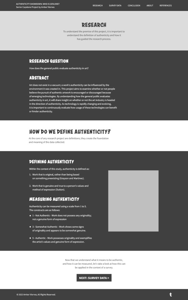
e Something cool that I learned about while rebuilding this page was that you could determine the heading, text, link, and link hover colors per sections. I recall while setting up Elementor that I complained the links only seem to have one style, and that it'd be a pain to change the colors for dark mode. But, this has solved my issues very quickly!
Because all of the main pages share the same call to action format on the bottom of the page, I copied and pasted some elements from the homepage, just for the sake of consistency. If you watch the video you'll see that throughout the building process, I referred to the homepage to make sure that the measurements are consistent.
And of course, I also ended up rewriting some of the website's content while rebuilding. Most notably, I changed the abstract, as well as the call to action at the bottom.
Like the previous post, I also did a short responsiveness test. Since I haven't worked at the tablet or mobile resolutions yet, this page has some shortcomings on mobile. So here are some things I'd like to fix once I finish the main pages and whatnot:
Left/right padding
Order of columns for any two-column sections (e.g. the clipboard section)
HEADER MODIFICATIONS: See if I can make the site title in the navigation header clickable using what I learned about clickable links
I also want to talk about an issue that my website mockups + rebuilt website has so far; it's something that I inherited from my last website project. Specifically, the header/footer alignments don't really match all that well to the content. Here's what I mean:

In all honesty, I didn't end up catching the alignment inconsistency until I worked on the homepage, as the hero image of the Mona Lisa vs the N//F//T parody was able to mask the issue thanks to it's long height. (I also noticed that there's a strange red underline near the tumblr logo... might be from the text settings so I'll also have to fix that)
Thankfully, I do have my previous web design project on hand to reflect on how I fixed the issue. In the comparison below, I believe that I either: A) moved the header/footer inwards, or B) moved the content to match the header/footer. (It's probably option B)
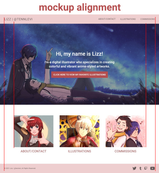
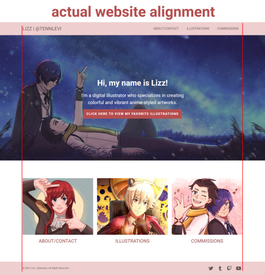
I feel that it's okay to have some x-distance from the heading/footer but the gap right now is way too big (160px or so? that's a lot.).
I'll let this issue marinate for now, and I'll revisit it properly when I have made the other pages. Then, I'll go ahead and make some modifications to the header and footer. It's a bit frustrating that I neglected the misalignment (the difference is much more pronounced in the rebuilt version compared to the mockups), but hey! Nothing that I can't fix.
Anyways, onwards to other pages! Let's get this bread! 🙌
2 notes
·
View notes
Photo

Major Expand: Extended Visual Functionality Add-on for Elementor Page Builder Free Download
You can free download Major Expand: Extended Visual v2.0 Wordpress Addon. Major Expand: Extended Visual latest 2019 nulled free download.
https://scriptuz.com/item/major-expand-extended-visual-functionality-add-on-for-elementor-page-builder-free-download/
#3d hover#background slider#color motion#column order#creative addon#Elementor add-ons#elementor modules#elementor shortcodes#image moving#multi parallax#separator © All Rights Reserved onazio
0 notes