#instead it would be 6 hours so..
Text
the bowuigi tag rn
#bowuigi#bowser#luigi#dont worry guys i expected it too#instead it would be 6 hours so..#it probably would’ve happened if only ILLUMINATION APPROVED#not art#pasta rambles
12K notes
·
View notes
Text
wanna preface this by saying that i am. So normal. anyway i just spent the last week redrawing scenes from mystery skulls animated but as that hermitcraft au i posted about a couple times. you guys should watch msa it is. so so good.


#my art#hermitcraft#mystery skulls animated#geminitay#geminitay fanart#ethoslab#ethoslab fanart#falsesymmetry#falsesymmetry fanart#ignore the fact that etho's hair changes literally every drawing#poses + expressions are traced a bit; and backgrounds aren't mine(well; except for the second one; which you can prolly tell;; sksnsks)#and also (with the help of sap bc i'm bad at color theory) edited the truck bg colors a bit#but even so;; i am!! very very happy with how these turned out#mystery skulls animated spoilers#<- honestly that's mainly for the murder mystery one#granted anyone who hasn't seen the future at this point prolly won't have that tag filtered#etho's murder mystery form(no i don't have a name for it)'s collar tag is a mix between a mable leaf and a vex!#cuz reverb is cub in this au#hence all the blue and stuff;; skdhkdnkd#you'd think that last pic would have been the hardest for me to draw; with how complicated etho's design is#but surprisingly; it doesn't even place top three in terms of how long it took to draw#no; instead it was that Fucking. Truck.#WHY did that take me eight and a half hours#the second longest was only five!!!#the others barely even top 4!#also#WHY are the deadbeats(which are mini tillies here) so deceptively hard to draw#every time i struggle with them orz#anyway. images 3; 6; 7; and 8 are my favs <3#if false and/or pearl see this. o/ hoi
1K notes
·
View notes
Text
ONCE MORE UNTO THE BREACH DEAR FRIENDS, ONCE MORE
prequel
i still have to do BJ's neck [jaw is finished, neck is not. Hawk's neck is tho], and finish the mustache, plus some fine touching to make everything Perfect [bjs forehead, hawk's lips, etc] but. other than that i am DONE with these old heads. fabric is so much easier than faces so im not even stressin abt it. my wrist. it aches.
im FREE no more HAIR except BLURRY STUFF SO NOT LOTS OF DEFINITION
bonus; the end of the journey
#mash#mash 4077#hawkeye pierce#bj hunnicutt#mash fanart#mash art#m*a*s*h#mashblogging#work in progress#theres a button on my tiny tiny stylus that i usually never use. it does the colourpicker#which is faster than selecting the eyedropper and switching back to paintbrush#however. it makes it so i cant hold it normally/comfortably because i need to have a fingie on the button#which is fine! i just wont use the button/wont use it often#except the HAIR means i have to eyedrop a new colour every 2 seconds because im brute forcing it instead of doing it in a smart way#so i gotta do hand yoga and its. not good for me#BUT. the hair is done. except for the mustache but thats like 30 mins vs 4-6 hours so im ok w/ it#im gonna go eat cake now cause i promised myself i would. as a treat#also gamers. theres like 4 different layers rn texturing hawk's hair its not even funny#the salt and pepper is killing me quickly#in many ways actually
66 notes
·
View notes
Text
its so silly but i just keep thinking abt being in norway and seeing for the first time kinda ever that like governments can do things to make peoples life better. for no other reason but just to improve things. like im sure norway has lots of problems i didnt see on a trip but i cannot stress how insane it was that the government had done things because it would be nice. to take care of people. ?????
#tour guide like yeah the minimum wage is decent here its 220 NOK (roughly ovr $22) but its not perfect and literally evryone in our group#being like $22??!?!?!???!?!!? MINIMUM!??!??!!?#i keep thinking about taking the bus and trams in oslo :( and abt walking IN THE STREET in bergen wjthout getting run over#or the restaurant on top of the bergen funiculr mountain getting state owned this year bc it was mismanaged ans going under but#everyone would like there to be a restaurant there so the government just decided to make sure there would be one????#instead ofbjust letting it die???#or ALL THE OIL AND POWER BEING STATE OWNED. HELLO?#its just insane idk. that things can for real be different. where i am theres a revolutionary amt of public teansport for a not huge city#but its still basically one bus and then the slowest most fucked up train in the whole world (40min drive = 2.5 hours by train)#assuming uh thw train doesnt get stuck again lol#it mostly exists to take mormon missionaries to the airport i think lol.#the 'walkable' old town section still has 4 and 6 lane roads you have to cross every block.#i dont know its just... its. augh!!!!!!!!#birdenest#we told one guy the minimum wage for waitstaff was about 21 NOK and he didnt believe us and got upset that we were lying
237 notes
·
View notes
Text
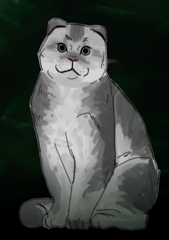
#when i was first coloring him in he was gonna be golden chinchilla colored but then i was like ehhh jonah magnus should be red/orange but#elias should be gray ...so i just desaturated what i already did instead of recoloring lol but#he is now supposed to be shaded silver lol#but thats why his coat pattern is on the darker side compared to what it *should* be#og elias bouchard coming from an important/roch family and while whole thing with thinking he just *deserves* stuff bc of his upbringing.#etc. -> he is purebred and matches the breed standards etc for a scottish fold of his color#obviously the eye color doesn't matter because. ahaha#i thought elias fit the Scottish fold vibes because: Scottish folds are known for looking sort of like owls and having intense eyes#and the cat body/face type (also present in british shorthairs) to me gives off sort of... unnasumming vibes?#like ahaha yes i am a boring boss who loves paperwork look at how unnasumming i am season 1-2 elias y'know#trying to think of what cat breed jonah would be. and also jon gerry etc you know all the other characters i like#would it be boring to have multiple british shorthairs#i mean..#Michael shelley/distortion is a laperm that's all I know#i didn't particularly care with the personality attributes associated with eliascat because it didn't need to fit his personality on account#of not being his original body. but i do try to keep in mind the best personality/look/etc. cat attributes as a whole for a character#also sometimes get obsessed with jt making historical and geographical sense but then it just limits me greatly to a point im not into it#so i don't care about specific breeds in that respect lol#tma#my art#elias bouchard#the magnus archives#some notes looking back(made it 2 hours ago but still looking back ok..) on it now are that i feel like elias would never choose this breed#for his next bodyhop because of the inherent health issues in scottish folds. I saw the breed was created in like the early 1960s and#assumed that maybe the health issues wouldn't have been common knowledge until later enough for jonah to be unaware of them but actually no#there's legislation about it like 6 years later LOL so jonah would..maybe not make this choice#i guess in the future when drawing i will just make him a British shorthair#my catTMA is simultaneously 'they are just regular cats or like all show cats or something' and 'exact tma plot but as intelligent cats'#LOL its just vague in my mind idk..also maybe jon can be an Abyssinian#ALSO WHAT WAS I THINKING 'jonah may not have been aware about x thing' like did i...did i forget. me 2 hours ago was dumb as rocks
30 notes
·
View notes
Text
.
#currently on the worst road trip of my whole entire life! well. i don't want to jinx it lmao but#today i popped TWO TIRES at once in the middle of the Katy Freeway in Houston TX (the widest highway in the US; 26 lanes btw)#managed to make it over to the shoulder without DYING but then had to sit there for like an hour? and panic called a tow truck because duh#I know how to change a tire but I was – again – sitting on the shoulder of the widest freeway on the continent so#anyway I called a tow; a guy showed up. I assumed it was the tow! turned out it was not. but he helped me put on the spare and then was lik#“follow me to my shop I can do the tires for you” and I was like okay! 👍 but then the ACTUAL tow called me and I realized this was#just a random guy (very nice up to that point but then I got scared about following him to a secondary location?) and so I didn't lmao#I just kept driving and didn't follow him but the guy on the phone was then mad at me because I wasn't where I said I would be because#AGAIN – I thought the original guy WAS the tow company that I called? but anyway guy 2 on the phone was like “YOU OWE ME $200!!!!”#and I said for what? also how would I pay you? and he tried to get me to cash app him lmao?? I didn't. I hung up on him#he called me like 6 more times yelling at me until I finally just blocked his number 💀#however NOW at this point I'm driving on one spare tire and one rapidly-flattening second tire and I still have 3 hours left to get where#I was going for the night and to top it all off I'm in the middle of a city I've only been to one time before? so I manage to get to a hote#like a nice-ish one where I'm like “okay if I get stuck here this won't be the end of the world”#because keep in mind today is a national holiday so basically everything is closed!!!! btw!!!!!#but eventually I'm sitting there and it's literally 100F outside and I remember oh right lol I have car insurance which pays for a tow#(a normal one; not a random one I panic-found on google who calls me screaming at me to cash app him $200)#so anyway I call my insurance and the guy on the phone is very nice and is like “it's okay; we'll have someone to you in 45 min”#and I'm like okay. OKAY. 🙌💪 I am a strong independent woman who is figuring this out and no longer on the side of the highway#but instead in a nice calm neighborhood and all I have to do is wait 45 min and everything will be okay#one hour goes by. I call back. get redirected to the tow company that was dispatched. guy says oh! is my guy not there yet?#I say no. he says okay – I'll have him call you. hangs up.#okay. 20 more min go by. guy finally calls me. says “I'm 20-25 min away” at this point I've been waiting about an hour and a half#I say. okay? okay. 30 more minutes go by. I try to call the guy back. straight to voicemail. three more calls. three more no answers.#I call my insurance back. sit on hold for 15 min. eventually get put through to a different person who's like “okay let me check on him”#get put on hold. eventually she comes back and says “okay he says 15 minutes” I've been waiting over 2 hours at this point. I have to PEE#I just... burst into tears. on the phone with this poor random woman from Geico Insurance. I'm bawling my eyes out.#she was trying to get claim info from me but I'm crying so hard she's like “oh baby no. okay. okay. we can get that from you tomorrow.”#when you cry so hard that even the insurance company is like “you know what we're just going to let this one slide”#anyway guy eventually shows up. he's very nice even though I hate him a little for being so late. he drives me to an OPEN TIRE SHOP
14 notes
·
View notes
Text

not-yet-dead-person
silly comic of a conversation in-game i thought was too funny not to make something proper for instead of a doodle ww
(timelapse + wip images (thus silly process commentary in read more if you like artist commentary :3)

i think the sketch looks silly and goofy and funny so i find it important to share with you the mere presence of the faces i drew on it. i drew it on top of the boxes without staying inside its borders because i find my proportions can get wonky if i draw them cropped in a restricted space. and I feel trapped otherwise and i will draw BAD!!! give me spaceeeee to go wild!!!!
the head circles are there for emotional support
very low res speedpaint because truth is the canvas was much bigger than the space where my comic was placed. i didnt account when exporting my timelapse in 720px that that tiny space would look so pixelated ... but it's able to be percieved, so its okay.
(i will now comment on my process and it is not brief sorry)
usually i would try to clean up my sketches and figure out what goes on top before jumping into linework, but since there are multiple panels and drawings i chose to jump into inking right away for the sake of brevity. i just went in with a brush that uses pen pressure and drew what was needed. i added extra line thickness and contrast in areas around the face because it helps direct your eyes there more easily that way.
according to her equipment rei has a chain belt but i only remembered it existed once I was going to color, and i did not like that discovery... I chose to ignore it to maintain my peace. i already have the color palettes for these characters figured out, and i didnt really want to think about a new element at the moment www I tend to overthink those things a lot so i skipped it

the rest is rather straightforward! not that anything else wasn't, but in here i could turn my brain off and sing. linework and sketching require mumbling so i cannot turn my brain off. just block in the characters with a solid color so i can have a mask (something along those lines,) where the color can stay inside. then just color in !!!

Base colors just had slight cell shading on the skin, and for the hair i airbrush a bit of the skincolor in low opacity near the forehead... I'm not sure what it means, but i can look at the faces easier with it somehow. i like the gentle subtlety it adds even if you cant really tell. it makes things look nice.
background was just me blocking in the color of the wall and floor, shade the wall a bit, then slap a noise and free use wood texture on top. work smarter not harder ! yet it took a bit to make it look stylistically fitting with the characters, and even now i think bottom middle panel looks odd. whatever!!!
for the middle panel i thought itd be funny if the background was a solid silly and colorful one to contrast the next panel's sketchy black one. a contrast to how the word widow is seen. on that note my handwritting is not pointy. i gaslighted my hand into thinking that it was indeed pointy in that moment so i could write "not-yet dead person" in letters that didn't seem cute. my hand did not fall for it but it complied anyway
that's basically it! I'm not sure what else i could say that doesn't feel barebones because it really is that straightforward. if you're curious I used clip studio paint for this. only special brush used was for linework (a brush named Lemon Brush), the rest used were just the default. my computer gets the least credit. it was trying to convince me a 20mb file was going to nuke it all the time and hardly let me save multiple times so i do not appreciate it
#re:kinder#fanart#sayaka re:kinder#rei re:kinder#OH I ALREADY RAMBLED IN MY POST WHATEVER SHOULD I TALK ABOUT NOW IN MY TAGS UEEEEEEE😭😭😭#oh yeah do you want to know a fun fact about this drawing#i started it yesterday. i wasnt meant to I DID NOT HAVE PERMISSION...FROM MYSELF... i was meant to be on break#i self imposed a one week break from doing any rekinder related project after the transcript to avoid accidental burn out#NOT THAT I GOT TIRED OF IT AFTER THAT TRANSCRIPT NOT AT ALL#but jumping straight into more hours of creativr work after over 30 hours of it is asking for disaster. it is asking for burn out#yesterday was the last day . 12 hours were left but i was going to die if i didnt draw anything it would have been OVER#(aka my period started recently so i got very gloomy and depressed so i needed to run to my favorite stress relief...drawing rekinder☺️)#(on that note seriously what the fuck please explain the evolutionary advantage to getting horribly depressed every month)#(like hello?!?! rant real quick— i get enough flashbacks everyday i DONT need them to last longer and have me more msierable ?!?!?)#(periods are so dangerous to my mental health for no reason can i get a restriction order on them or some shit what the fuck)#(anyway thats enough of that break of character DONEEEE :3333)#SO YEAH I DIDNT EVEN LAST 7 WHOLE DAYS i even played a new game in between those 6 days youd think itd het my mind of rekinder. WRONNNNGGG#not even another devastating rpg horror gamr could divert my attention for long i hsd to draw rekinder😊#using the newfound power of mt transcript i was decided on drawing rei because i dont draw her enough for how high she is on my fvaorites#i was initially doodling random lines but then i stumbled upon this interactkon and it doesnt really fit into my usual expression sheets#so i thought hey lets do it asife#i thumbnailrd it and from there i was like hey lets do it in comic format isntead of separated messy doodles in tint canvas#and the rest is hisotry .... aka i spent the last two days doing this instead of doing MY HOMEWORK!!!!!#on my defense when i wasnt drawing i was horribly depressed i had no other choice#(seriously fuck off periods WHAT what do you mean i need to be distracted 24/7 to not be struck by crippling meltdowns LEAVE ME ALONE?!?!?)#(they should be banned we as a society should find like a . cure to them it dont do me good to have a whole week where i cant function)#these tags have been more of a weird rant im sorry IVE BEEN FEELING PEEEVEDDD LATELY SO YOU GET. STRANGE DROTTER LORE ????
17 notes
·
View notes
Text

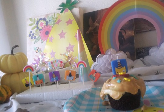
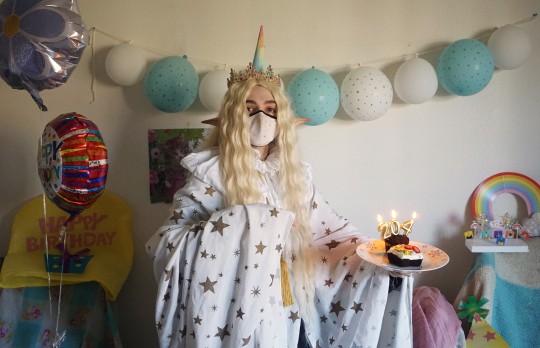

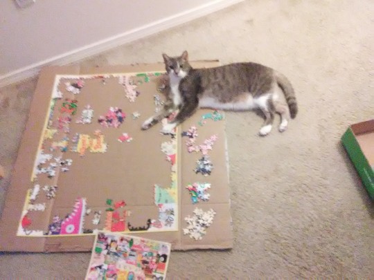
More misc. daily life pictures and such
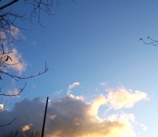
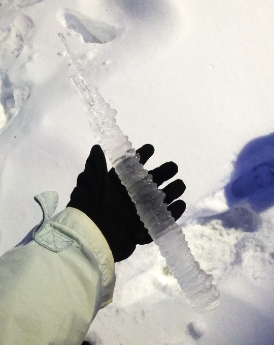
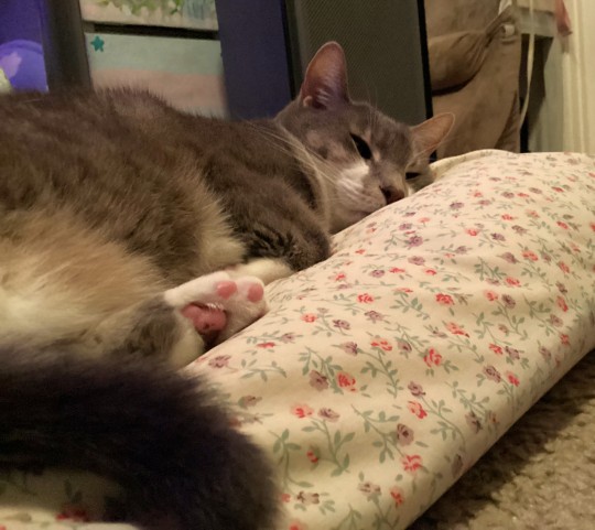
#image commentary in tags once again since they don't allow captions anymore and I feel weird using the alt text for that --#1 & 2 - Very bright pretty looking sky !#2. HUGE icicle that looked like you could kill someone with it or something.. Pulled from near a gutter on the side of a building#3. & 4 & 5 - various images from a silly party I had where I pretended to be some elf king turning like 204 years old lol (also not like#a REAL party. Only my roommates were there really and we're all in the same household bubble.#just to clarify. I would never dare have a large party anyway given#my hermitous nature but on top of that.. didn't want there to be some implication that I'm having a Party while covid is still ongoing lol.#NEVER.. But I do love dressing up as some fantasy character so much.. The only thing that could ever bring a true hermit wizard#to engage with others socially is the prospect of connecting it somehow to fantasy worlds and costumes lol. One must simply dress up#as a silly 200 year old man from time to time and pretend you've never seen a balloon before in your life. etc.#6. bapy boye... feets#7. The main food that I made for the elderly elf man 'party'. which was a Deconstructed Beef Wellington (kind of as ajoke since I watch s#o many silly cooking competition shows and they always make stuff 'deconstructed' at the last minute when under time limits or whatever.)#I've wanted to make beef wellington a few times but Ithink to do it well I'd need like..an actual kitchen and a lot of time and#an oven that fully works to bake things and etc. etc. So I thought this would be an easier method. A thick steak cut round to kind of mimi#c the round tenderloin or whatever it is in a wellington. instead of the puff pastry being wrapped around - I just did star shaped cut outs#of pastry and baked them and put them on top (to go with the star theme). instead of mushroom duxelles being wrapped around in pastry#its in a little circle under the steak. and instead of mustard being brushed onto the meat I made a mustard gravy sauce type of thing#Then of course asparagus on the side.. my favorite... Though I know some wellington#also has a layer of prosciutto I think. or I saw one person use crepes. I didn't feel it was necessary to incorporate that too lol#8. bapy son helping me do a giant puzzle that took me hours and I had no idea it was actually that large of a puzzle#until I started putting it together and for some reason it made me stressed by the end instead of relaxed lol.. puzzle fatigue#photo diary
16 notes
·
View notes
Text
about to lie in phil lester's tumblr ask box
#/j .. maybe#i dont HAVE any real aita relationship situations but he said he's keeping the ask box open to do another video next week#gonna dump b.sd character drama in there just to feel something#aita for plotting revenge on my crush for 6 years and then almost killing him and his adoptive sister#aita for showing up to the opening of my ex's new business drunk and then pissing on the sign#aita for sewing the seeds of rebellion in my crush's established friend group so he would have to join the organization i'm part of#or. where's that one aita ss.kk post abt. aita for losing my rival's coat after he sacrificed himself for me#or the one that's like aita for not telling my rival i was alive right away and going shopping for two hours instead#hello grace here
12 notes
·
View notes
Text
You know sometime you just didn't realize how similar Vlad and Danny are.
Until you tries to write them as friend.
but they keep graviting toward each other evolving into something more.
Like this is like my 17 re write now and it still resulted in Vlad sacifiescing himself so Danny could live caused Danny importance and impact on his life is way more importance to him then his own well being.
And don't get me started with the Groundhog Day where Vlad leaving caused they have a bad fall out essentially caused the worst timeline.
Danny even copy Vlad pun as a coping mechanism and Vlad adopting Danny old stoic behavior.
#like i just can't they would both thown themself at a death ray if it meant people importance to them are safe#both are smatass in their own field of interest#think Vlad monolouge about how Ghost biology work and how anti ghost tech funtion#is bad ???? Hah#wait until You get the 12 hour Space hyperfiated essay from Danny#Have Danny ever like do same for Vlad Yes#in rewrite 6 Danny hang out with the human gang too much#inturn making his entire identidy and worth revolved around protecting people#Vlad is the only one who still treat him like a normal kid and not some omipotent superhero#They have a much deeper bond here#so instead of Vlad raging and burning his humanity away to Save everyone#it was Danny who turn his human shell into ice and beby first Kill streak the whole GIW as well as Freak Show
24 notes
·
View notes
Text
.
#not to sound like a broken record#i know this has already been talked about a lot in current fandom discourse#but all the tommy love also comes from a place of#misogyny (buck’s m/f relationships failed bc the women weren’t good enough. but his first m/m is perfect and destined and tommy is god)#(even though we know next to nothing about them as a couple. cough 1 kiss and 1 failed date cough cough)#and biphobic concepts (buck’s only relationship/partner that is worth shipping and love and fandom time is the m/m one)#(if he’s with a woman he’s not worth our time? the relationship/partner isn’t worth our time. right?)#some people kinda sounding like the conservative haters right now#oliver stark’s voice shouting from afar: he isn’t gay! he is bisexual! he still likes women!#some people like to celebrate bi buck (as we should) but then erase his previous gfs#in favour of this 1 man he’s shared literally 4 scenes with. okay#<- <- <- i drafted this like 6 hours before that interview came out. ollie came to back me up with the ‘he still likes women’ lmao#him dating a guy now does not erase or dismiss his previous m/f relationships or that he’s still into women#one final comment. any time buck got with a girl it was ‘they need to break up immediately’#‘she’s not right for him’#he’s with his first guy and it’s ’they should be endgame’#‘they’re perfect together’#huh?? one. we barely know tommy/them together#two. what exactly makes them endgame material? bc they’re both men? cough biphobic misogyny fetishization cough#three. it would be objectively hilarious if he realises his sexuality and within 2 weeks is dating a guy for the first time#and then that guy ends up being his endgame forever partner. lmaoooo that would be so dumb sawry#not to mention it would kinda lean into the biphobia and misogyny mentioned above#in that it would suggest that his problem with finding love previously was… women#and this problem is now magically fixed because… man#four. not to be a buddie endgame truther but if all the vocal support means this is what we get instead#instead of Them. i’m out see ya bye bye#i am sooooo reading way too much into this but oh well
14 notes
·
View notes
Text
thank god chappell roan didn’t release good luck babe in summer 22!


#i unfortunately had a homoerotic female friendship that ended abruptly and tragically#she was my best friend for YEARS like we met when we were 11#i knew i was queer pretty early on but it’s so painfully obvious in hindsight how badly she was repressing everything#we fell asleep together she liked every guy i liked she was invested in every female situationship i had#like it was so painfully obvious what we were but we were just an undefined weird tension homoerotic pair of besties!#she always wanted to know every detail of my sex life w women refused to hear about the men i was w#she would hold me when we watched movies she wanted to do everything w me and she hated me after we graduated hs!#last conversation was on her birthday haven’t spoken to her once since#this song has sent me into a 3 day spiral session if you can’t tell 😭#never fully gotten over her but i see her post w her new friends at her school 6 hours away like cool cool okay#you’re going to ignore i ever existed instead of confronting your feelings okay! don’t know why she wants nothing to do w me anymore tho#crazy stuff it’s been a year and a half since we stopped being friends but i think about her a lot and i wonder if she thinks about me#i have 2 playlists about her she still follows me on spotify but she didn’t even wish me a happy birthday#at the end of the day i hope she figures everything out. you’re nothing more than his wife and all that#this song THIS SONG SHE WONT LEAVE MY MIND#probably delete later. we’ll see cause all my friends are sick of hearing me talk about her but i can’t stop she’s been in my mind since#this song dropped so thanks chappell 🥹🥹🫡
8 notes
·
View notes
Text
i went to sleep early and didn’t even get any rest bc i was having college stress dreams
#i haven’t been in college in years!!!#i was in class. no matter what i did my pencil would not sharpen#i went through like five!! i couldn’t do the assignment!#and then i left class and got lost and was like an hour late to my next class#which i ended up going to my dorm first and ended up in the wrong apartment bc the keycard opened all the doors#and i ended up in my friends instead. and then i looked at my schedule and i hadn’t picked any of these classes#and i had a dance class that i was like no i have to change it#and i had classes at 8 on fri and not again til 6!!!#anyway i finally made it#to class. paul wesley was the prof. it was a class about video games and he didn’t care i was late#finally a break you might think. NO#i was like please let me make up the start of the class and he was like ok i’m going#to this party and teaching the class there so you should come to that#and he was going to give me a ride. in a cool fun dream this would probably be cool#but it’s my dream and so i was stressed out about having to go to a party and then when he picked me up it was with a 3 row suburban#full of ppl!! and there were no seats for me!! so i had to sit on the edge of the middle seat#and i was so stressed the whole drive WHICH NEVER ENDED BTW#that paul wesley was gonna flip the car and i would die bc i didn’t have a seatbelt#anyway. if you read all that i’m sorry for the most boring stress dream ever unfortunately i am a square#and was really stressed about it all ahdjdksk#good morning#i need a text post tag
5 notes
·
View notes
Text
unfortunately i have found myself mildly captivated by a fancy caffeinated drink. this is bad bc I've avoided coffee all this time and now im being defeated. by $6 cold brew shake orz
#it's nice though#not I NEED THIS ALL THE TIME nice but nice for sure#save me $6 cold brew shake at library coffee shop save me#and my range of food's been limited by my go-outside-as-little-as-possible strat (<- exposed to covid) so a little variety is good#(i also got food im not counting this as like. dinner)#truthfully im reaching the point where i would probably be showing symptoms if i had it (unless asymptomatic)#im still being careful but i think i'll go get tested on friday or smth and that way i can actually know for sure#so i can start making the most of my meal plan. slamming shitty shitty cafeteria food#now that they'll actually LET me bc they cancelled it w/o telling me last week#and then this week i haven't been eating in public bc yk. mask#oh but side note the only reason i got this was bc i went to the library to get some work done and forgot my laptop charger#she was at like 20% so i was like sigh fml etc im going back. and im getting a sandwich. and then we'll try again#currently considering not trying again and sleeping this off instead#the library's open for another like 9 hours it'll be fineeee#anyway :p
4 notes
·
View notes
Text

Saki hair rendering redemption arc

Not posting the finished shit until the morning I know how the algorithm works. but. u already know what’s goin on ‼️‼️ yea baby‼️‼️
#don’t worry about the face seriously don’t even sweat it it happens to all girls her age#mine#my art#‘redemption’ used loosely its not the worlds greatest but it was a rendering study so ¯\_(ツ)_/¯#maybe if I put more effort into the job search instead of spending 6 hours on what is essentially a joke drawing#i would be employed already. but where’s the fun in that.#ask to tag#<- idk if anyone needs a cw for this one just let me know#and I’ll tag it on the finished one as well
3 notes
·
View notes
Text
I will say while I've loved most of elden ring I'm really glad I'm down to just 2 more main boss fights (malenia + maliketh) before I start the endgame boss fights... whew 😮💨
#really gorgeous world but frankly its unnecessarily long. theyre gonna kill me for saying that but its true..#some areas/bosses just become overly repetitive when the game is THAT massive like its unavoidable#they tried rly hard to distinguish every area + honestly its a great effort but it couldve been half the size and just as good#like i just did the elphael ulcerative tree spirit bc i wanted to finish millicents questline. and come on man we didnt need another one#the design is sick + loooove the animation. but its a bad fight not bc of the difficulty but bc its janky as hell#lock on doesnt work properly bc of its size and the way it moves. u cant see shit on ur screen fighting them melee its just hack n slash#and theyre always in the most dogshit arenas possible for them like spaces w no maneuverability. its just not fuuuun#especially after youve fought 5 or 6 already earlier on in the game..#and its cool to have variations like the scarlet rot ones but we already HAD one of those just before lake of rot!! the gimmicks worn off#i did everything except maliketh in farum azula today as well and again. it didnt need to be that long. killing beastmen gets boring#after like the first 20 combat is just mashing buttons.. even the platforming is getting dull bc ive done 120 hours of it now#and theres only so many combinations of ladders and hallways and so on that u can possibly cram in here..#i say all this with fondness like i truly do love it. but it couldve been a lot tighter! regardless ill still 100% complete it#and i get most ppl dont try to get every single armament and talisman etc so they probably dont waste time FULLY exploring like i am#ahhh. anyway ill probably do malenia and maliketh tmr bc im right outside both of their arenas. and then call it quits this weekend#ill get my first ending next weekend probably... and hopefully by june ill have 100% and then i can play something else 😭#ik the dlc comes out in june but ill probably take a month or two break before i get to that#it doesnt even neeeed a dlc.......its excessive as it is just make a new game by this point ahhhhh#anyway its like 1am i need to SLEEP. i said i would go out to watch for northern lights but its overcast and im tired and my roommate#didnt wanna come with.. so i was gonna go to bed early instead but i guess that didnt happen lol#gonna feel like shit tomorrow bc i have to be up early to take my meds and she'll wake me up anyway.. but cross that bridge#typing is getting difficult bc im so sleepy okay goodnight everyone#.diaries
2 notes
·
View notes
Last Seen Blogs

dux24251
台中叫小姐大里區找援交妹line:946981雲熙外送茶

swtorfandompositivity
SWTOR Fandom Positivity

actuallykosak-blog
a cat, a computer, and a sack of lentils

deliciousandveryunique
Unbetitelt

fxngi-rlx
Mush