#is it smth to do with pixel size
Text

Trainer sprite of me :]
(smaller vers under the cut)

#my art#pixel art#pokemon#sprite art#pixel animation#pokemon sprite#pokemon art#hiiii everyone can u tell im on a pixel art kick again#i really like including the smaller version bc the compression really blends the colors nicely#i wish it displayed as actual size on mobile tho instead of just turning crunchy#i had a lot of fun with this i might do more#mayyyybe ill do some ocs or vocaloids or smth#the pokemon style of sprites like this is pretty easy to emulate#though the animation in all of the sprites for bw2 is wayyy more than this#that would take a lot of effort. im not doing all that tbh#or maybe i will. who knows
17 notes
·
View notes
Note
Your strong lines in soft/matching colors to the coloring, the soft shapes combined with sharp edges, the boldness of your colors, and the way you do eyes.
oh like the way i do the lineart in multiple colors to match the flats? skdhfhs also i think the soft shapes w sharp edges are partly my style, partly bc i work on fucking enormous canvases for no good reason (i know i should chill out but u have to understand i need my sharp clean lines i Need them)
i’m glad i’ve been managing to do bold colors i’ve been trying my best :’)
#im talking my standard doodling canvas size is smth like 4000x5000 pixels#and 600dpi but i’m not sure how that affects things exactly#the colored lineart was actually an idea i got from starbite! (artist who does lines for wfa)#i ended up doing it very differently than them i think but they were my first introduction to the idea#it’s just rly satisfying to my eyes and at this point black lineart just doesn’t feel right anymore#amauradermind#splashasks
6 notes
·
View notes
Text
Today, I offer isat cast hugging tinies version. Tomorrow? Who knows...
#aria rants#i have absolutely No idea why tinydile looks so blurry compared to the others and why tinyfrin looks so inky than the others#cuz ngl i cant even remember if i used the lasso tool to change her size (i know i used it to move them around to make better space)#ngl tho i also didnt remember switching my pen so like-- yea (luckily tho the pen i switched to wasnt used on any of em)#but still-- i have no idea how i was able to forget smth like that WHILE i was doing it but it happened. ill just fix tinydile up#tomorrow. i wanted to do some progress on my art cuz ehe i am sleeping early! i WILL sleep early! so for now tinydile will have less pixels
1 note
·
View note
Note
just started animating after procrastinating starting it for years and im already going insane, any tips?
Four things I feel is important to note
Analyze other animations, note things you like and why, slow it down and take in the frames
Go easy on yourself, permit mistakes, make it messy, if there's something you could've done better that you realize after you made the animation then use that knowledge for the future
Take care of yourself!!! Eating, staying hydrated, getting good sleep, all that is super important outside of animating and super important when animating
And. PLAN your animations, each scenario you want, write down how you want the characters to move, I don't normally do this (DON'T FOLLOW MY EXAMPLE 🙏) but it's super helpful when I do
For the animating part itself, I'm not sure how to word it, things I found help me when animating is
- Lower FPS (I usually go with 9-11)
- Playing with duplicated frames, a common thing I do is duplicate frames to avoid redrawing them so much
- Not caring if the outline is blurry, distorted, or messy because I used the lasso tool to correct something. As long as it looks smooth, you know what you're looking at, and it gets the job done
- What I call "fade ins/outs". For example, you have two keyframes (move hand from A to B), you redraw the first one but slightly different (Hand moves like 2 pixels or smth), you redraw it again (hand moves 7 pixels), middle frame (between A and B), and do the exact same process but backwards
BUT a things I want people to know because I see it a lot and it makes me itch in a bad way
- When lip syncing, unless the anatomy of the character is different, or you have a style that fits it, THE JAW ALWAYS GOES DOWN. Your focus should be on opening it downwards
- CONSISTENCY, while your sketches may be lazy, please keep them consistent to the original frame. Don't stray TOO far from the keyframe, like something's too big, or the size keeps changing, or even in cases of lip syncing where the way it moves is different each time (Up down up down up down left up, yk??). THIS ONLY EVER WORKS if the situation calls for it!!!
((I've done tgis before witg lip syncing....))
- PLEASE. Note how to use smear frames. In small movements, it's not necessary, someone raising their arm doesn't need a giant smear to do. Use them when there's exaggerated, quick motions, and make sure there's still form to it so it's not just a blob
(Completely off topic, but there was a trend on tiktok with a filter where they'd make a hand shift into another thing like 🤚 to ✌️, and it bothered me so much because EVRRYYY time there was a smear frame BUT IT WASN'T NECESSARY and sometimes even ruined it)
- Don't be afraid to skip middle frames, like when someone's shaking an item in their hand, as long as the two keyframes are there and a few extra frames after the action, it should be alright, or when someone's laughing
I think that's about all I can say
72 notes
·
View notes
Note
hello! may i ask what device are you using to draw? You mentioned using Procreate, so i think it's an iPad, but i was wondering what model it is and if you'd recommend it for painting
hey there!
thanks for sending in an ask. i’m pretty sure i have the iPad Pro 2020, 12.9in. i use a gen 2 apple pencil with it :)
and abt digital painting etc…
i’d def recommend it for digital painting! since it’s an old model you’d prob be able to get a discount for it, or find a used one in good condition 👍👍 the screen size is sometimes excessive for me, i think the 11in model or anything smaller would work fine. only concern there would be functionality and memory, bc digital painting is very storage taxing
i’ve been using this guy for four years and she’s holding up very well. i’ve noticed that the battery is less effective (draining quicker, charging slower, etc) but it hasn’t severely inebriated my painting practice
i used to have a paper feel screen protector for it, but for the past year i’ve taken it off. i think there was just an adjustment period from traditional to digital and i hated the slippery screen, but i noticed it wore down my pen nib really quickly lol. now i use a nib with a metal tip (kinda looks like a mechanical pencil tip) and the smoothness doesn’t bother me as much. just took some time getting used to
smth abt digital painting on procreate/ipad that i both hate and love is the color display. apple color display is super good, almost too good… laptop/phone screens don’t match up and i find myself editing things for posts or printing lol. important to note, apple specifically functions in their own RGB scale, so exporting files from procreate preserves that color profile. it’s not compatible with printing, sharing, or anything LOL so be careful to convert things to sRGB (learned this the very hard way…)
i do hate procreate sometimes because their DPI is just. SOOOO low. if you transform or rotate anything then it pixelates 😭 i enabled all the hacks and nothing helped. nowadays i set up my canvas to be 3k+ pixels on at least one axis and 600dpi, it’s marginally better but i def do adjust my process to avoid any transformations 😞 maybe its just particularly bad for my style bc i like my details n Things all over the place but yeaaa prolly the biggest pitfall for ipad/procreate
another note (not rlly digital art related), i pretty much just use my ipad for digital painting, gaming sometimes (i had a crazy genshin/hsr phase), note taking on pdfs whtv. it prolly averages to ~2.5 hours per day, which isn’t a lot. so idk if you plan to use an ipad more intensively (ik some pals who deck out their ipad and basically use it as a laptop), then aforementioned problems might be a much larger issue
this got suuuuper long i apologize but all in all, ipad is def good for digital painting! it’s accessible, customizable, transportable (even with my massive 13in screen LOOOOL), and worth :) but at the end of the day, it’s a tool and its utility is what you make of it. hope i could help!
26 notes
·
View notes
Note
What resolution do you draw at? I'm constantly a little annoyed i cant seem to find an acceptable (to me) middle ground of inage resolution and pen size. What kinda brushes do you lean towards?

SUPER HIGH RES ON A SMALL CANVAS AND THEN I DRAW REALLY SMALL CUZ THE TEXTURES LOOK NICE!! If you dont work at at least 600DPI im gonna be sad at you. (unless you're looking for crunchy, pixelated art, i guess?)
oh yeah also im crazy my canvases look like this...

you dont gotta worry about using the whole canvas, you can always just crop it down to whatever size your drawing is.

"tetured color" is just a modified version of the default CSP brush "wet wash" where i set the blending mode to normal instead of multiply and i use that for most of my art. It only works well as a sketch pen at very small size (I'm drawing at 2.5 rn).
Otherwise, for custom brushes, I just look for brushes that are comfortable with my pressure sensitivity. Really sensitive brushes like the G-pen dont work for me, neither do brushes that you have to press really hard for. Gotta find smth in the middle.
18 notes
·
View notes
Text
READING TAGS AND SCREAMING!!!!!!! HUHHHH THANKS........ BUT MY AGGIE SECRET SAUCE.... is....................
idk i didnt think it was secret sauce but here's my brain's setup when im working there. for linework it's just the pixel pen at 1 px size and then im just slapping down my lines quickly and by believing in my line confidence putting that arm to WERKKK. when im doing lineart my goal is always to express everything i need with as few intentional strokes as possible
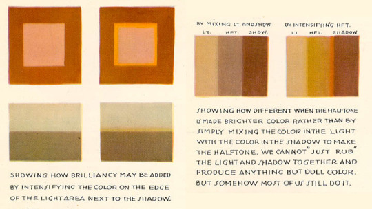
colors im just eyeballing if i'm being real even if im referencing another photo, no eyedropper tool to start with. if things look good together it works for me. vibes first and understanding of color theory second. except for this thing i learned in college and never stopped thinking about, i think this technique is genuine secret sauce. this pic is from andrew loomis' book creative illustration but in general u can find more examples similar to this by looking up subsurface scattering
i use the basic round brush @ different softness levels for coloring everything bc i am too boomer brained to figure out where that one fun textured brush is that a couple of u guys use. posing isn't aggie specific i do this everywhere but keeping it loosey goosey and gestural 24/7 bc im not anatomy's bitch when it comes to drawing cartoons online. thinking abt my little barbie dolls having so much energy in their line of action it's like they drank a case of red bull before i started. do u guys want to call next time or smth for realtime "words" of "wisdom" its hard to explain over text☝️🤓
#I WIKE DRAWING!!!!!!! also i need to put my art degree to good use#it would be really funny if we did like a paint and sip theme next time everyone draws the same thang#wait actually screenshot redraw. that could be so fun and funny#What Ever i just like drawing with anypony whatever we do is fine
26 notes
·
View notes
Note
hi!! i have a question
how did you guys put/make those itty bitty flags on yr rentry ? i want to do smth similar, but am unsure how !!
hi !! we got them from rentry.co/pixelpride ( a rentry we own )
ALTERNATES ARE: rentry.co/pixelflags & rentry.co/20by20pride
FLAG TEMPLATE: section below or spiritchannel 's pixel hoard ( rentry.co/masqueradeball ) pride flag section specifically,

if you want to make it yourself — this is a general template that we use tbh, we just kinda slap our flags over it xdd


it 's very blurry, we know. the whole size of this is about 20x20 pixels iirc, the flag itself we don 't know
123 notes
·
View notes
Note
hihihi !! came across your tumblr while looking at hermitcraft/life series art (your art is lovely by the way, definitely going into my cool people with cool art collection) , and saw that you use/used krita !! as a krita user, i would love to know your main brushes and canvas sizes, and art process too :D would love to get into things like illustration but no clue where to start ,,
hello! since i get asked about stuff like that relatively often and i'm usually too lazy to answer properly everytime i'll use this ask to answer all of those in one big post :D
Brushes

i don't think i have main brushes? i jump from style to style quite frequently and i love love love trying out new stuff so the set of brushes i'm using for any given drawing can change drastically but there're a few that came to my mind

i've been vibing with the first brush the most lately! it's kinda has spray paint feel to it?? but not really? idk but it's fun to make messy sketches with :D 2nd and 3rd are probably the brushes i find myself coming back to most often bc they're just really basic lol
all of the brushes ^ are default krita brushes bc i dont like downloading brushes from the internet so if you wanna find cool non default krita brushes you'll need to ask sm1 else sorry
(btw my advice: don't care about brushes. limiting oneself to a certain set of brushes can also limit the creativity so don't do that)
Canvas Size
my default canvas size is 2000 x 2000 px and it usually goes up from that if i need other proportions for a piece - basically that means that the shortest side of (almost) any of my drawings is minimum 2000px (2000 x 3000, 2500 x 2000, etc). for pixel art it's the same rules but for minimum of 200px!
social media eats the quality of images really hard so i usually don't see the point of drawing on bigger canvases than that ¯\_(ツ)_/¯
Art Process
there isn't much to say about the art process for me bc i'm sure my process is not too different from everyone else's process lol for lineart stuff it's the usual:
super messy, super quick sketch
cleaner sketch (depending on the art style and the vibe i'm going for this step can be skipped)
messy colouring (also can be skipped sometimes; this step is just for myself to find the colour palette i wanna use and to determine whether i like the drawing so far or not so i can change the idea or completely abandon the piece)
clean lineart
flat colouring + shading
adding small details, colouring the lineart, making lighting prettier, etc. (this one cannot be properly described bc for me it's usually a mess of tweaking everything and nothing until i like the final product)

for lineless stuff i don't have a process - i put pretty colours on the canvas and just,, Pray for the best or smth lmao
it most likely won’t be helpful but i do have youtube channel where i (once in a blue moon) post speedpaints! they might help in understanding what my art process is
and that's it i think? i hope this was useful at least in some way :D it's not the best idea to ask me about any of art related things bc my approach to art can be summarised with throwing stuff at the wall until smth sticks lmao
#asks and stuff#this is a Mess#i got very sick exactly on january 1st (good start of the year) and i'm still sick#and bc of that my brain is slow at times so#if anything is incomprehensible i'm sorry
46 notes
·
View notes
Text
i am heavily considering modifying my pin to reflect thst i simply switched to pixel art for many reasons, despite it being FAR LESS popular than anything else.
it has lower barrier of entry than most other major art stuff - mouse and software with eraser and brush hthat can do one pixel stroke are enough.
it has lower skil barrier as well (although just as high ceiling). the amount of space and limitations of the form FORCE you at gunpoint to learn to adapt too. you dont need to worry about colours and brushes and special techniques to make smth that looks good. in doubt just see the other solutions at the same size by well known pixel games
it feels way more approachable to learn. i did digital and trad for 4 years and it looks like garbage. my pixel art also looks like garbage but it does feel like i got better tangible improvment way faster
its lower energy requirement than other forms of art
this is my main reasons for swirching honestly.
6 notes
·
View notes
Note
hey! i found you thru your neocities site and really really wanted to ask, how did you code your art gallery? it's lovely and perfect and i high-key want to steal it
THANK YOU FIRST OF ALL!
secondly... I wish i could give you a comprehensive answer but truth is since i worked on it for over a year i don't remember everything i did? a lot of the things i achieve with my markup is based on trial and error and testing different solutions. i don't actually know what i'm doing lol. i use a lot of tutorials and old forum posts and such and i wish i could just link those but when so much time has passed i can't remember everything i looked up. HOWEVER i'll try my best to provide some basic guidance to what's what, and what it does in my markup, to make it easier if you want to copy my shoestring bullshit. (and past how embarrassing it is that my markup is so messy and inefficient, i have no problem with anyone referencing my source or even copy pasting whole chunks of it to have a base to work from if they wanna make something similar to me. no credit needed ofc , just don't use any of my assets or style it the exact same, make it your own! )
THIS IS GONNA BE A LONG POST SORRY SO I'M GONNA HAVE TO PUT THE REST OF IT UNDER A "KEEP READING" , ANYTHING ELSE WOULD BE INHUMANE...
here are links to the relevant sources for the page, there's also another stylesheet linked but this is just a very basic one for my website that has my fonts and scrollbar styling so it's not important here.
view-source:https://korsse.neocities.org/gallery view-source:https://korsse.neocities.org/sidebarstyle.css
(no idea if these links will work for you or if its different per browser or what, if they don't just go to my gallery and right-click view source or inspect or smth)
btw before reading further its useful to know that i use https://www.w3schools.com/ a lot (playing around with the tryit editor is really helpful to understand HOW shit works. sometimes i even make the basic structure i want in the w3s editor isolated from the rest of my messy markup to ensure i get the basics of it to work before i integrate. this way i know that if it breaks it's because it's conflicting with other shit on the page and not because i fundamentally fucked up. ) and i'm just going to assume you know the basics of stuff like what a div is and the difference between class and id etc...
my gallery is largely based on 3 main types of thing(?) : modal images, tabs and collapsible.
THUMBNAILS AND MODALS
my thumbnails are also css, (I KNOW the method i used for my thumbs is something i got off some forum post or reddit comment or substack or whatever, i can't find it again though.) HOWEVER I would not recommend doing thumbnails the way i did because you do not get an appealing custom crop (or i guess you probably could in theory but to do that for every image would be more work than its worth) and because considering it's really just the full image sized down and cropped with styling, it takes a long ass time to load. ( the only reason i do it this way is to not have to make, edit and host individual thumbnails for 6 years worth of art. it's a real menial task to do when you'd have to do it for over 400 images ) but if you need uniform sized thumbnails the best way to do it afaik is to make them in whatever graphics editor you have. i'm unsure if this would be compatible with image modals ( as constructed in the w3s tutorial ) but if not you could probably just make a box modal do the same thing and have the thumbnails be buttons styled with inline css like this:
<button id="whatever your id is" style="background-image:url(thumbnail path)">
to make them work as thumbnails though you'd have to make all the dimensions of the actual image file for each thumbnail true to the pixel height/width you'd want them to display as on the page and use css to style all the buttons to be those same dimensions. this will interfere with other buttons on the page but you can probably get around this with making a button class. like for example if your thumbnails are 100x100px you slap this in your css
button.thumb {width:100px; height:100px;}
and add this to the button tag
<button id="whatever your id is" class="thumb" style="background-image:url(thumbnail path)">
HOWEVER... this might mean you'd have to make a new modal (on the html side) for every single image so it's probably not ideal if you're gonna have over 400 images like i do... there should be ways to make multiple modals on the same page not a nightmare but you'd have to keep track of unique ids for each one at the very least.
here are both links to the basic w3s modal image and modal box tutorials for convenience.
wish i could have explained what i did better but the modal was like the first thing i did,
and was kind of a nightmare to figure out because i originally wanted it to display a description using the alt text styled in a very specific way that i ended up scrapping because it was broken as fuck and evil and bad. (cw: gore in the bg of the image below btw)
my memory has been corrupted so that the battle with the alt text is all i remember from making it rather than the useful stuff that survived into the current version lololol.
tabs
ok now we're getting into the layout of the page itself. my gallery consists of a sidebar and the page content
in the sidebar the bottom two boxes have the universal stuff that goes on every page that has the sidebar, and the links are just normal links to individual pages. but the top box with the red "links" is the gallery navigation right? and they are not links at all, they're buttons to designated tabs.
for the BASIC layout of the page, it's split into two divs called "sidenav" and "main". [sidenav] is everything that goes in the sidebar space and [main] is literally everything else. there should be nothing directly in the [main] div except for other divs, it is merely a container for the tabs. each and every "page" is a tab, including the "Art" tab that is open by default (i might be wrong but iirc what tab is open by default is simply decided by which one is first in the html document i am so so wrong, it's determined by id in the javascript.)
tab buttons go inside the sidenav div and tabcontent goes inside the main div. i have my tabs styled as inline-block, i can't remember if it matters that much or not but you know... considering what inline-block is, it probably does?
tabcontent contains everything the visitor will see, for most of my gallery tabs this means thumbnails. my thumbnails are laid out in a grid using div classes called "row" and "column" four [column] divs go inside one [row] with one thumbnail directly inside each [column] div. each new line of thumbnails is a new [row] div with another 4 [columns] and their contents, you get it, it's not complicated, just verbose. there are lots of other less amateur ways you can display shit in a grid layout using html/css but my brain is small so this works for me!! :,D
even though they might seem intimidating with the javascript required, tabs in general are pretty simple if you follow the w3s tutorial (there's even one specifically for vertical tabs) . just make sure to keep all the contents of each tab INSIDE said tab and it shouldn't cause much trouble.
since my gallery is so bloated with image links and such i thought i'd also link this example page ( and the source: view-source:https://korsse.neocities.org/temp/exampleignorethis ) i made on the fly for someone else a long time ago. its just a hodgepodge of copy pasted w3s stuff to quickly show off a navbar with tabs and "accordions" (more or less the same thing as collapsible just called smth different in a menu context?) but it's kind of a simple version of the same stuff i did with my gallery? perhaps it can be useful for you as an example, perhaps not. but i might as well link it just in case lol.
collapsibles
the doodle tab also has collapsibles! idk if you even care about this but it's part of my gallery and one of the more fun features that isn't present in your average neocities gallery page. (talking out my ass, maybe they are super common idk, i haven't checked)
the collapsible aren't any more complicated than tabs, and their integration into my gallery isn't any worse than putting the buttons and collapsible content div inside the tabcontent and putting the thumbnails inside the collapsible content div. style as desired with css to make it look the way you want. i didn't do anything too fancy with it. once again easy-peasy if you use the w3s tutorial
uhhh i think that's it? there is more stuff i could explain but i have very little experience with writing explanations like this so i'll leave it at this to start. but don't hesitate to ask if there's anything specific you found confusing, or anything else about how my gallery works that you want me to go into ! ik i could have been more concise but i'd be here all day retyping stuff so i hope u could bear with my long wall of text, i'm not a writer ^^' (i'm a rambler). good luck on your webpage endeavors!
3 notes
·
View notes
Text
this tutorial in photopea <3 for @lightasthesun
Step 1: make ur base gif - i am using a 540x440 black and white base:
Step 2: making your shape gif - i am going to make hexagons, and they will be 128x112. therefore, the smaller gifs imma make are gonna be 130x115. for this step tho, just make the small gif that you will be cutting. this is one of the ones im using after i colored and stuffs:

Step 3: AFTER COLOR, SAVE AND RE-PUT INTO PHOTOPEA. then, group your layers (like in the og tutorial!): go to select → all; layer → group layers (for both gifs)
Step 4: make sure ur folder is clicked in each gif, go to layer → raster mask → add (reveal all)
Step 5: cutting your baby gif: five up from the bottom of the photopea tools is the shape tool.
right click it and choose (for this case, but you can do whatever shape like a triangle or smth) parametric shape with 6 sides (fill should be empty, stroke should be empty; that is important bc it wont cut right if there is color)
fix the sizing by clicking the transform controls box (when you click the mouse tool, it should be at the top above where ur gifs are labeled).
once your shape is above the gif, right click the shape layer and click “select pixels.”
now, click the white box next to your gif (the mask), then go to select → inverse, then go to image → adjustments → inverse
and bam, you should have a baby shaped gif like so:
Step 6: save the baby gifs and add them into your base gif. then go to layer → animation → merge and doneeeee. bingo bango

i hope this helps ann!!! let me know if something doesnt make sense (im running on like two brain cells rn so its very possible)
#ashley creates#photopea#tutorial#this gif is a part of a bigger set that im too lazy to make rn after doing this LMFAO
8 notes
·
View notes
Note
Life is boring
Anyways, tell me smth I should write with simpbur and I'll do it rn 🥰 💅
Hmmmmmmmmmmmmmm.
seeing as we are on the topic of video games with sentience with the others here, what about Simpbur being one of those little shimegies, you know PC companions that roam your screen.
Only with him, he is in all your files, watching through your camera, listening through your mic, craving to be able to actually touch you, have you, to fuck you like you watch those fucking pornstars do in the dark of your room.
But oh how good you looked on those nights, bathed in only the light of the monitor too lost in your pleasure to notice he is still there watching, sitting in his little window hand wrapped around his simulated cock, the pixels matching the one in the porno you were watching, after all, you were watching them so that must be the shape, size and length you wanted right?
Right?
11 notes
·
View notes
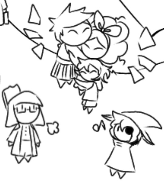
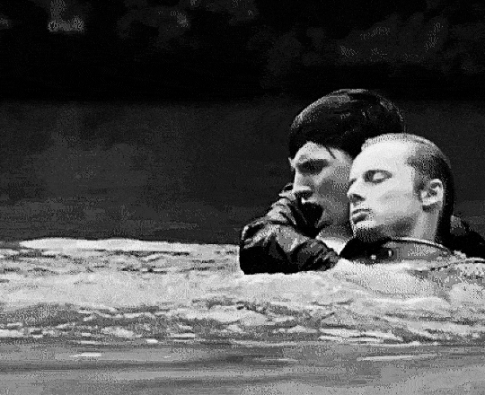
Text
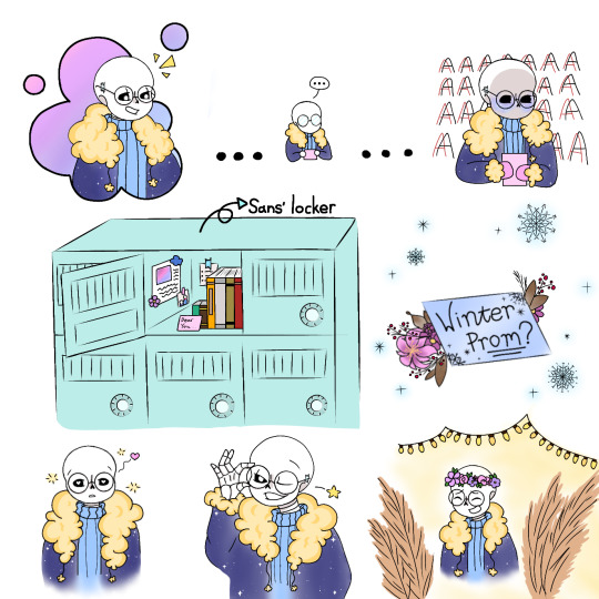

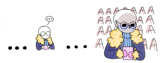
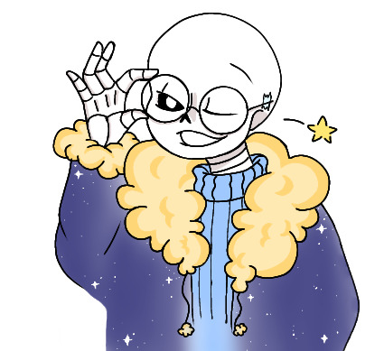
Fanart for @snowflakeimagines, for her fic Written In the Stars :D (I am now obsessed with outertale sans lol)
I couldn't get it out of my mind once I read it, and I drew inspiration from some really cute drawings of hers after stalking scrolling through her blog and seeing her own drawings of outertale sans, so uhhhh yes :)
Click for better quality!
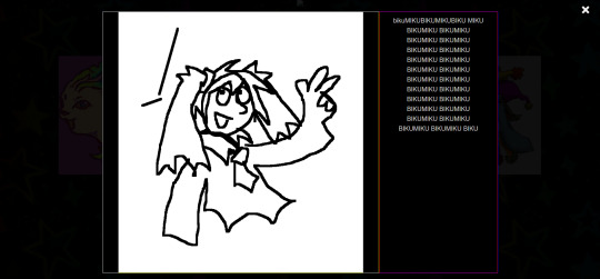
#outertale sans#ot sans#cosmic#fanart#my art#cute#still figuring out how shading + lineart works hehe#also don't ask me what I was thinking when I drew him in the bottom right corner#I just wanted to draw him in a flower crown#ended up adding some weird bushy fern things for no reason#outertale#I am very proud of his jacket#:]#can someone tell me how to not make the drawings look grainy#is it smth to do with pixel size#or the type of brush#send help
3 notes
·
View notes
Text

In honor of pride month I made a bunch of pride flags colorpicked from the Na Na Na video, they’re below the cut. If there’s any more you want me to make just shoot me a message! I’ll be taking requests for them through the end of June.


[Image ID: a variety of pride flags colorpicked from My Chemical Romance’s “Na Na Na” video. The colors have a warm tint to them, like a desert haze. The flags are in order as follows: rainbow flag, gay flag, lesbian flag, bi flag, pan flag, ace flag, aro flag, intersex flag, trans flag, nb flag, genderfluid flag, genderqueer flag, agender flag. End ID.]
#sorry not all of these are the same size i just found them on google and used paint to recolor them#tried to get them mostly around the same size but mostly i just wanted them to not be pixelated etc yk#so that the bucket of paint tool would work#if i get bored i might see if i can do this w other my chem vids but idk if they're all colorful enough#could probably w the i'm not okay vid?#those might be brighter than these tbh there's like a warm filter or smth on the whole vid everything is less vivid than you think#and it's like dusty dirty like it's bubblegum pink spray paint on orangey wood so the actual color is like a deep mauve#so it's useless as a pink#i think almost all my pinks came from that drac getting shot#lots of yellows tho all quite nice#if theres demand i can make a palette from the stuff i used#or just use these as a palette lol#killjoys#danger days#mcr#danger days the true lives of the fabulous killjoys#ddtlotfk#tlotfkj#my chemical romance#my chem#na na na#pride flags#gay pride#lesbian pride#bi pride#pan pride#ace pride#aro pride#intersex pride#trans pride
10 notes
·
View notes
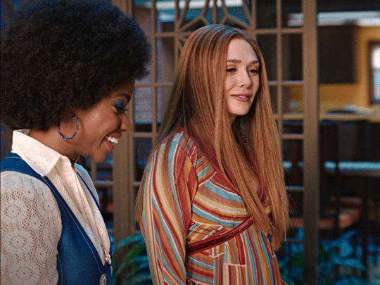
Note
Hi Nia! You're gifs are so pretty! Is it possible for you to show how you get your WandaVision gifs too look so clear and hd? And how do you do your colorings too? (specifically the wanda maximoff in episode 3 gifset ITS GORGEOUS) I'm new to giffing and all the tutorials are kind of old. It's okay if you don't want to though! I understand it may be time consuming.
omg no! never feel intimidated to ask!! i don’t mind at all!
so, i’m going to show you how i made and coloured this gif
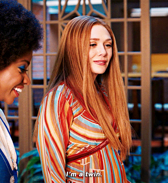
mostly bc it’s the only gif in that set w text and i’m going to share my text settings too!
tutorial is below :)
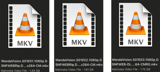
WHAT KIND OF VIDEOS ARE BEST?
.mkv files (the bigger the better BUT i usually think anything above 5 gb is excessive and unnecessary for an episode of television BUT for a movie worth it)
itunes downloads (logolesspro on twitter, hd-source on tumblr, live-action-raws on tumblr have some DEPENDING on what you’re looking for) (also, there’s a chance that if you search "show/movie hd download tumblr” you’ll find a tumblr with its itunes download available)
THAT IS IT NO OTHER TYPE OF FILES MAKE YOUR GIFS LOOK GOOD
- my suggestion is always if its new (like just came out the past month) t*rrent it! it’ll be downloaded quickly and .mkv files look the best! BUT if not check the sources above see who has the BIGGEST file if they even have what you’re looking for and then if not then you look to t*rrenting!!
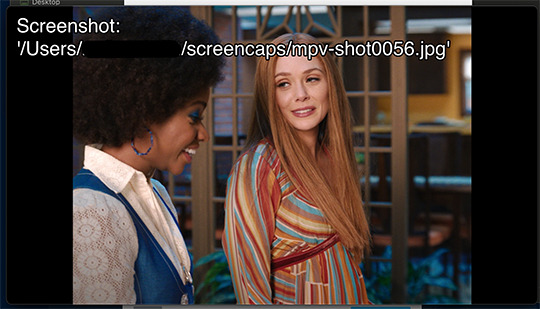
here are the wandavision files i use so you can see!!
SCREENCAPPING
-if you have windows use potplayer! i have a mac so i can’t show you how to use it and it’s not available for me :( HOWEVER back when i had a windows potplayer was the best method in screencapping!!
-I HAVE A MAC! so i use mpv!! (go to mpv.io and follow the directions) BUT DON’T DOWNLOAD THE LATEST ONE (it has a bug that skips frames) try each before the latest one bc from what i heard different ones work differently for everyone!! and i don’t know which one i use (yikes!) THERE ISN’T THAT MANY I PROMISE AND IT’S WORTH IT BC MPV IS THE BEST (i used to use adapter but they didn’t take impressive screencaps in my opinion and it was evident in my gifs you can see it too! )
create a folder for your screencaps! and make sure to rmb the directory order! now we want to create a text file on our built in textedit app on mac! type up all this down below (i like jpg but you can replace jpg w png if you want) AND SAVE THE FILE AS mpv.conf THIS IS IMPORTANT SO DON’T FORGET IT! save it somewhere you’ll find easily and NEVER delete it until you don’t use mpv anymore
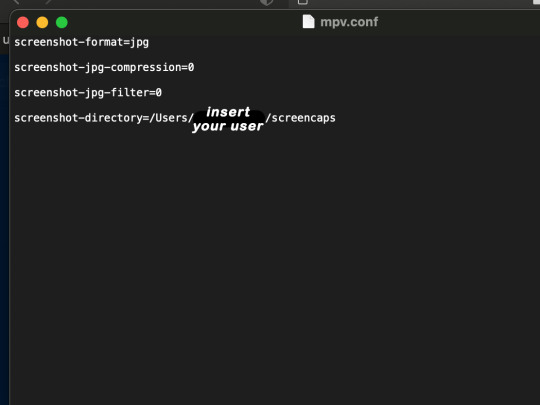
just in case you don’t know what to insert after, go to your screencaps folder
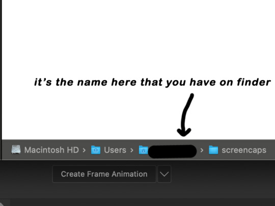
now you want to open mpv and go to the corner towards mpv -> preferences and they’ll tell you that there is no .conf file SO GO LOOK FOR THE TEXT FILE WE JUST MADE AND DRAG IT TO THE FOLDER THEY OPENED FOR US AFTER SAYING THERE IS NO .CONF FILE
(i learned all this from @kylos tutorial!! so if any of what i just said about setting up mpv makes NO SENSE to you check out their tutorial at kylos(.)tumblr(.)com/post/178497909311)
now we can screencap!
so let’s find the scene we want RIGHT BEFORE and MAKE SURE SUBTITLES ARE OFF
i pause and then press (option/alt + s) and then SCREENCAPS ARE BEING TAKEN!! and to end the screencaps being taken you once again press (option/alt + s)!!
now we want to delete the excess frames! and put it all into one folder!! DO NOT DELETE FRAMES IN THE MIDDLE OF WHAT YOU WANT TO GIF!! WHEN YOU SKIP FRAMES IT WILL BE NOTICEABLE!!

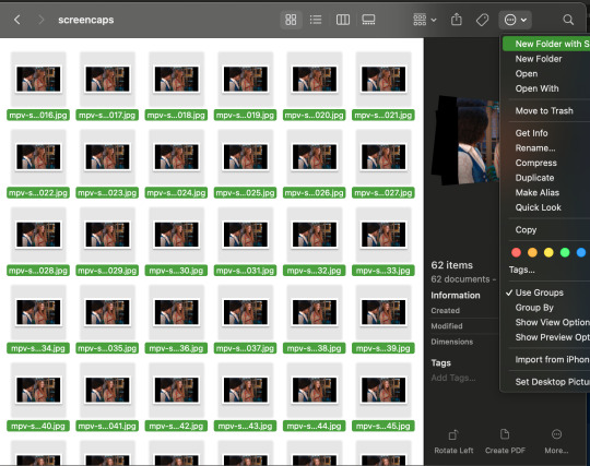
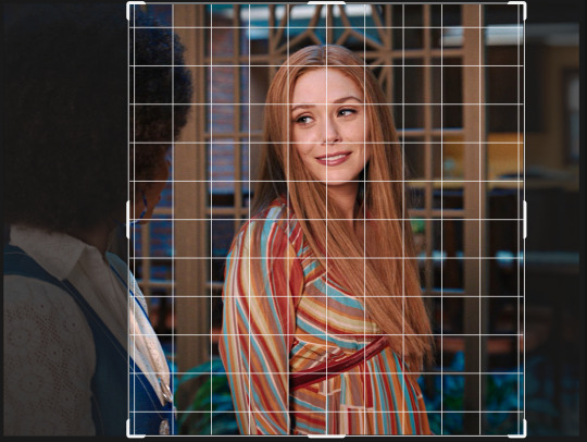
MAKING THE GIF
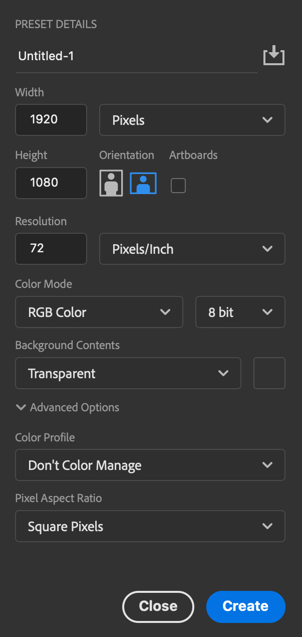
this method isn’t used that much BUT I LOVE IT so this is how i put my frames in! first i check to see the size of my frames: 1920 x 1080

so i create a NEW file on photoshop with those dimensions w these settings
now i set my tool on photoshop to path selection tool bc if you have it set on smth like move tool or crop tool at the end you might end up moving or cropping frames you don’t want to!

ok so now we select ALL our frames and drag it on top of our new file on photoshop and the MOMENT we see our first frame in photoshop JUST KEEP CLICKING ENTER until all the frames are loaded!!

you can do file -> scripts -> load files into stack but it is WAYYY slower in my opinion!
now i crop out the excess BUT i don’t resize the gif yet! the dimensions wandavision is filmed in is 4:3 so i go to crop and set the settings to this:

MAKE SURE IT’S ON RATIO SO WE’RE PRESERVING THE ORIGINAL SIZE JUST CUTTING OFF THE BLACK EDGES!! We are going from 1920 x 1080 to 1440 x 1080 this is the dimensions after i cropped

WE ARE KEEPING THE QUALITY BY NOT CHANGING THE DIMENSIONS OF ANYTHING INSIDE !!
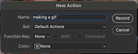
now we want to go to actions and create an action!! open up actions w one of these two depending on what your dash looks like!!


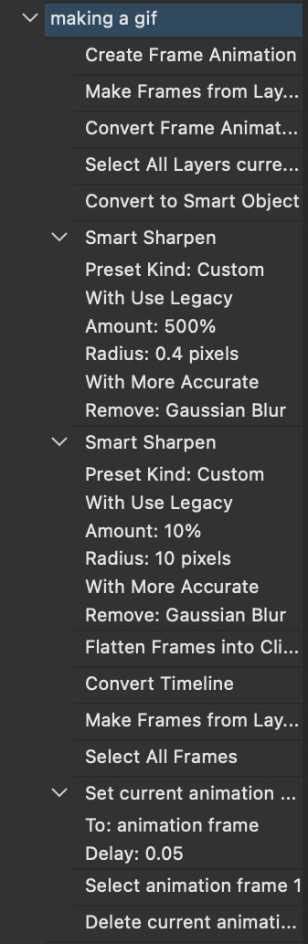
so we create an action with this button on the bottom of actions and we’re gonna title it making a gif and hit record!!

NOW LET’S GOOOOO!!
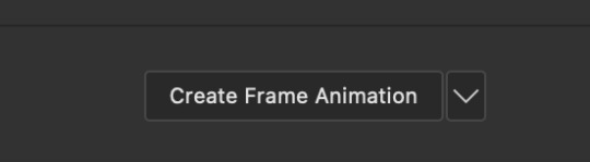
1. make sure you have timeline on your dash!

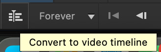
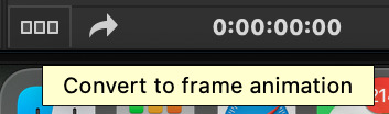
2. create frame animation (if you see create video timeline just click the arrow next to the button to see your other option which is frame animation!!)
3. now let’s meet our best friend!! the little bar in the top right corner that has all the commands for making our gifs and MAKE FRAMES FROM LAYERS
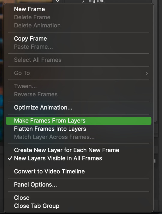
4. WE HAVE TO SHARPEN OUR GIFS NOW BUT TO DO THAT WE NEED TO CONVERT TO A SMART OBJECT SO NOW WE ARE GOING TO CONVERT TO VIDEO TIMELINE there are two ways: the button in the bottom left corner or the button in the top right corner w all the other commands!
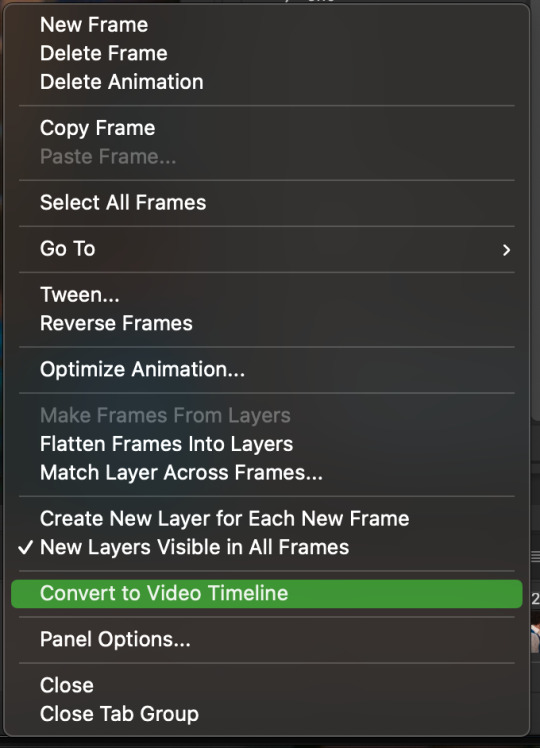
5. select -> all layers DON’T MANUALLY SELECT THEM ALL BC THE ACTION WILL ONLY SELECT THAT SAME NUMBER OF FRAMES SO IF THERE ARE MORE FRAMES YOU WON’T GET THEM IN THE SMART OBJECT!!

6. filter -> convert for smart filters
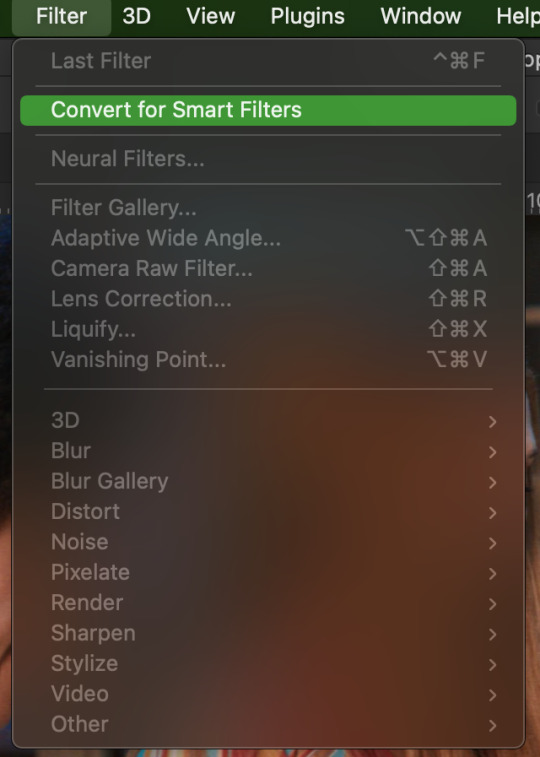
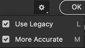
7. NOW WE SHARPEN!! (filter -> sharpen -> smart sharpen) i sharpen twice!! first, make sure we are on legacy w more accurate and remove gaussian blue! the first sharpening will be 500% with 0.4 px radius. NOW SHARPEN AGAIN (filter -> sharpen -> smart sharpen) also w legacy, more accurate and remove gaussian blur BUT this time 10% with a 10.0 px radius!


8. it’s hd now!! so let’s flatten frames into clips!! go to the top right magic button again!! and you should see a pop up saying layers are being made
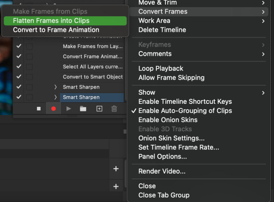

9. now we convert back to frame animation w either the bottom left button or our magic top right command center!

10. make frames from layers

11. select all frames w our magic command button
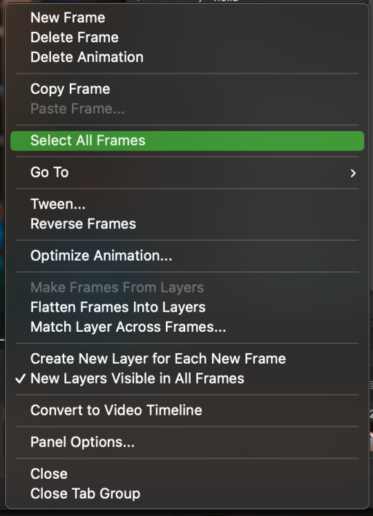
12. set the animation delay to 0.05 THAT IS THE BEST ONE ALWAYS ALWAYS ALWAYS only use 0.06 when the character is moving really fast in the video itself and it makes the gif itself look awkward BUT NEVER GO ABOVE 0.06 it’ll look slow and laggy and we don’t want that and don’t go below 0.05 bc then it’ll be tooo fast and we don’t want that either!


13. now delete the very first frame on the timeline bc it is an oversharpened duplicate of the second frame! end the recording w this button!

this is what your action should look like expanded! if you made mistakes on the way and it shows up you can just click the specific step and press the trash can on the action tab to delete in from the order!!
NOW AFTER LOADING YOUR FRAMES AND CROPPING THE EDGES OF YOUR FRAMES IF YOU NEED TO JUST PLAY THE ACTION AND THEN YOUR GIF WILL BE MADE FOR YOU!!!!
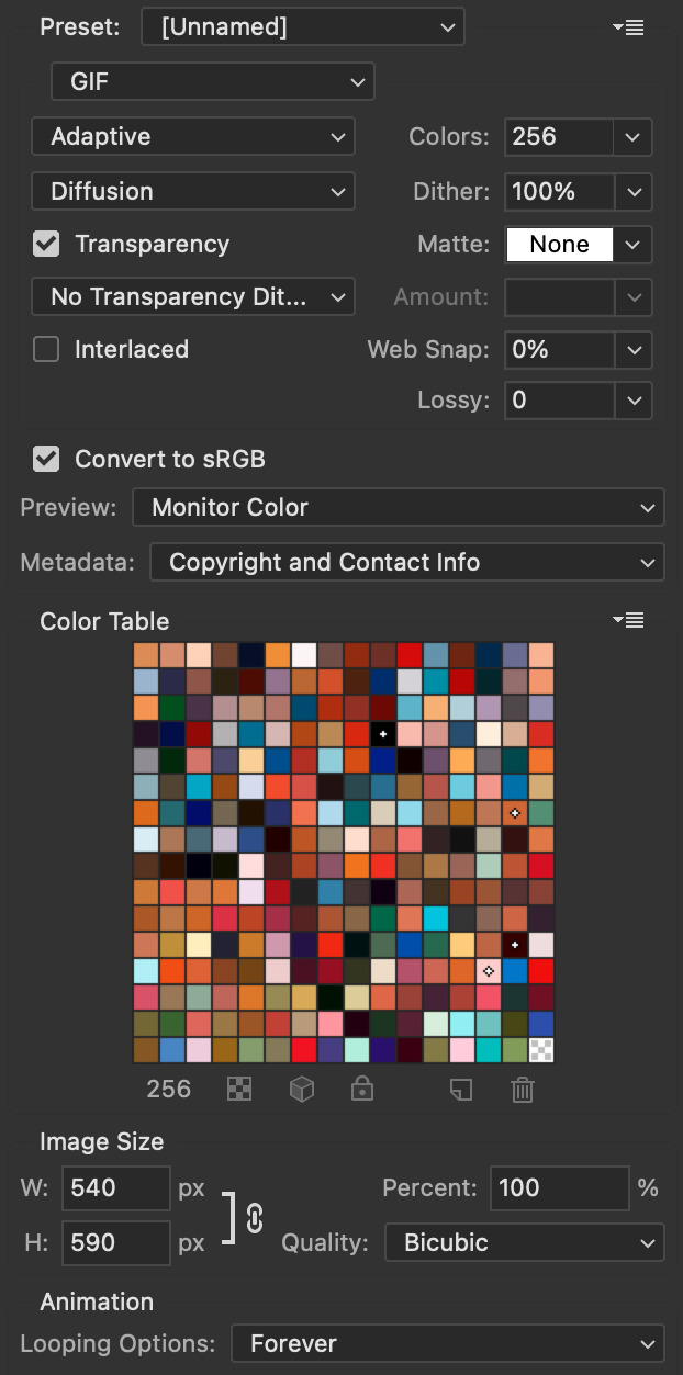
now i delete some unnecessary frames in the beginning and end and this is what my gif looks like (the size was 46 mb and the limit is 10 mb so the dimensions of the gif are 540 x 405 to get it to 5 mb BUT I HAVEN’T CROPPED IT YET SO THIS IS ME CROPPING JUST TO SHOW YOU WHAT IT LOOKS LIKE)
CROPPING THE GIF
in my opinion if you want your gif to look hd you shouldn’t crop before you sharpen!! i believe that if you crop before you sharpen you don’t allow photoshop to sharpen all the pixels whereas if you crop beforehand there is less to work with!!
dimensions is all up to you!! just make sure to go by tumblr rules!! 540 is the max width and if you want to make two gifs per row then my suggested width is 268 and for three gifs per row my suggested is 177 px! Just have the right width and the length can be whatever you want!!
now i’m going to crop my gif to 540 by 590!!

NOW THIS IS WHAT MY GIF LOOKS LIKE!
COLOURING BASICS
let me show you the best adjustment tools in my opinion and a brief explanation for what they do!!
brightness/contrast: pretty simple increase/decrease the brightness/contrast BUT one of my techniques for when i first start colouring a gif is i select all my frames and do nothing to the settings of the adjustment but i set the layer to screen LIKE THIS

curves: ik others use curves to change brightness/contrast w the squiggly thing BUT i like it to set a white point and black point, this is also a technique i use when i first start colouring a gif when screen doesn’t look good for me SO you use white point to select a pixel on the gif to set as the lightest color on the gif (setting the white point) and you use black point to select a pixel on the gif to set as the darkest colour on the gif (setting the black point) usually the white point makes it TOO bright and that’s why we use the black point to counter it and same goes for when i use screen with brightness/contrast, it gets too bright so i use black point to counter it below is the button for white point and the button for black point, respectively they are shaped as color picker tools


vibrance: generally, i never use this except for color p*rn sets but they work really well in making colors seem more strong
hue/saturation: like vibrance, i never use this except for color p*rn sets but this adjustment is to help change the colors or hue of a color for example: turn blue into purple or turn a blue into a little lighter shade of blue
color balance: I ALWAYS USE THIS!! except for in black and white gifs BUT THIS IS MY GO TO AND IF I DON’T USE IT MY GIFS ARE JUST BLAND i feel like color balance is what essentially balances the colors on your gif and adds dimension to it, it makes your gif go from looking way too yellow to a more golden neutral look and it is an essential adjustment in my opinion
channel mixer: i rarely use channel mixer BUT it is so so useful when you are working w a dark scene just play w the settings and all of a sudden all the blue in a dark scene will be a little more yellow and red and your scene will kind of just look brighter and more visible
selective color: THIS IS ALSO AN ESSENTIAL this helps SPECIFIC colors pop you’re working on a scene where there is too much red on someones face you use this tool to remove the magentaness from the yellow section OR when you feel someones face is TOO yellow and needs more blush you add more magenta in the yellow section of selective color
gradiant map: gradiant map is perfect when you’re lazy if you feel like your gif looks more neutral and you want some red in it but you don’t want to mess with any other adjustments just set a red to black gradiant on soft overlay with a very low opacity and BOOM slightly red but not too much red added!
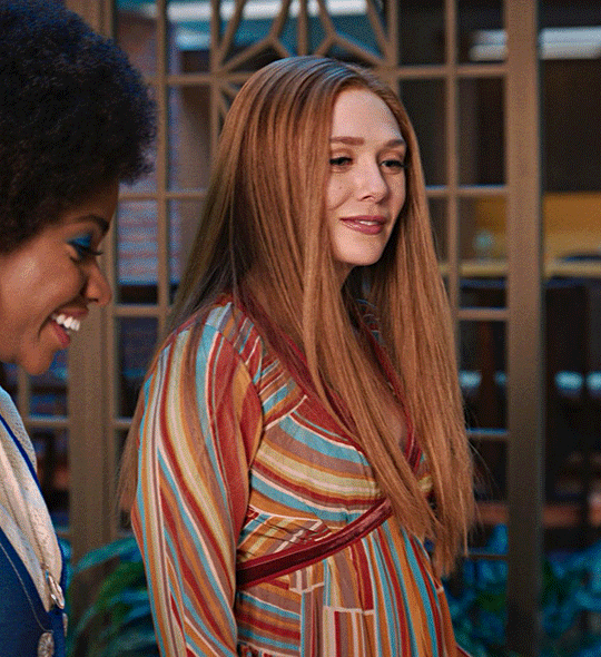
NOW TO COLOR THE GIF!
today i have decided to start with a brightness layer set on screen
and this is what we got!

now that’s a little to bright and washed out in my opinion SOOOO to counteract it, i’m going to use my black point tool in curves and i’m going to select this point on the gif (it’s better to choose smth in the background and not smth that’s paid attention to such as monica’s hair or either of their eyelashes)

now my gif looks like this! the base color is complete!

now i think i need to balance all this yellow and red! SOOOO WE GONNA USE COLOR BALANCE!!
i think the best way to use color balance is to keep swinging the balancer until you see what you like and then keep going midtones i think i want more red and i don’t want a cyan midtone and then for shadows i think i want more cyan to counter the redness of the gif but highlights i don’t touch that much NOW HERE ARE MY SETTINGS SO YOU CAN SEE

and this is what my gif looks like

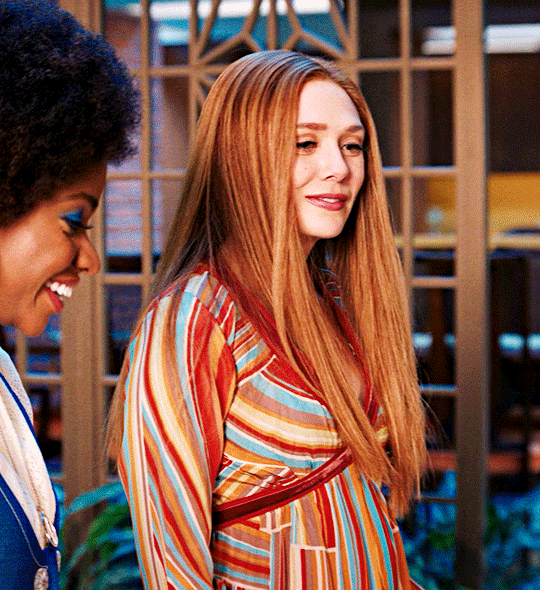
now you can stop here if you want but in my opinion i think the gif looks a lil too dead still SO IMMA USE SELECTIVE COLOR
i think there needs to be a lot lot more RED so i amp up the yellow magenta and black in the red! but i also think the yellows need to be LESS RED so i remove magenta from the yellow! and bc there’s some cyan and blue bc of monica and the flowers in the background im going to make the cyans more cyan and the blues a lil more black! i’m going to remove some yellows from the magenta!! and i add more black to the neutrals and black!! i think it’s always important to add more black to neutral and black bc it adds more depth to the gif by not just making it a bunch of bright colors and having dark colors to contrast to!! my settings are below!

and the result!
now let’s see everything together!

and the before and after!

I HOPE MY COLOURING EXPLANATION MADE SENSE!! if not you can always ask me more questions i don’t mind!!
ADDING SUBTITLES
we want to grab the text tool!
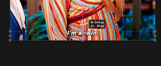
make a text box from anywhere in the middle from the left to right edge. this is so we can make sure our text is centered and will be in the same place for when we have sets w more than one gif w text!

type your text out and make sure you highlight the whole text so that all the settings apply to EACH character! you can find the alignments (for center) in the paragraph tab!

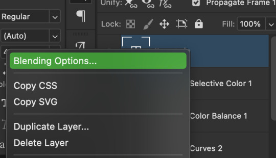
now lets right click on the text layer and go to blending options! add stroke and drop shadow!


now drag it to the desired height you would like and make sure to keep it in mind for when you have more than one subtitled gif in a set!
NOW TO MAKE SURE THE TEXT STAYS IN PLACE AND THE BLENDING STAYS YOU HAVE TO CONVERT TO SMART OBJECT!!

if you want to only have the text applied to certain frames instead of all frames, select the frames you don’t want by clicking the first frame in ur don’t want section ON THE TIMELINE and WHILST HOLDING SHIFT click the last frame of ur don’t want section and then toggle the eye switch next to the text layer
now you see the text
now you don’t
tip: use opacity to fade the text in and out!
the text is going to be on all my frames so i don’t need to toggle the eye but i just wanted to show you just in case!!
now here’s my FINAL RESULT

save for web (file -> export -> save for web)
your gifs have to always be under 10 mb! so, if your WAYYY overboard YOU HAVE TO DELETE FRAMES! or you can divide the gif in two and have two gifs instead of one! however, if you plan on going the deleting frames route MAKE SURE YOU DELETE FROM THE BEGINNING OR END OF YOUR SELECTION i promise you that most of us won’t notice that your characters dialogue is being cut off BUT WE WILL NOTICE IF FRAMES ARE BEING SKIPPED so, don’t delete frames in the middle of ur gif!! idc how little you do it IT WILL RUIN YOUR GIF AND I SAY THIS FROM EXPERIENCE i would delete every fifth frame to cut down my gifs and that may seem like not that big of a deal BUT IT IS my gif looked choppy and poor so it is way better to cut from the end/beginning of the gif
ANOTHER LAST PIECE OF ADVICE in the bottom left of when the save for web menu shows up THERE’S A PREVIEW BUTTON click on it! it’ll show you your gif on your default browser and show you what it’ll look like once uploaded! this is perfect to check the speed of ur gif and the colouring and to notice if there’s a problem with your subtitles or maybe there’s an obvious jump in frames you never noticed before!! i always use preview bc the built-in photoshop viewer of ur gif shows the colors differently and the speed is NEVER ACURRATE!
I USED THESE SAVE SETTINGS!! many say to use selective pattern but i DISAGREE and i think these save settings are the ✨ best ✨
OK NOW THAT IS THE END OF THIS VERY LONG GIF TUTORIAL!! I HOPE THIS IS WHAT YOU WANTED!! IF YOU HAVE ANY QUESTIONS DON’T BE AFRAID TO ASK I SINCERELY DON’T MIND!! JUST DON’T BE RUDE OR ANYTHING BC PPL HAVE BEEN RECENTLY :(
I WISH YOU ALL THE LUCK AND FUN IN YOUR GIFFING ADVENTURES !!
#tutorials#asks#sourceblog#allresources#completeresources#itsphotoshop#dailyresources#resourcemarket#chaoticresources#onlyresources#hisources#sibylresources#dailypsd
405 notes
·
View notes
Last Seen Blogs

andreyalekseevichkorolev-blog
Без названия

your-local-angel-boy
Angel
ronnierorivero
I Heard Death Note Was Relevant Again
yiyao
Watch Customization Factory

sar-bear91-blog
Oh, The Places We Will Go