#it appears theres a recurring pattern
Explore tagged Tumblr posts
Visit Tumblr Blog
Explore Tumblr blogs with no restrictions, modern design and the best experience.
Last Seen Tumblr Blogs


Fun Fact
69% of Tumblr users are millennials.
Text
(looking at my list of monster crushes) What the hell is my type
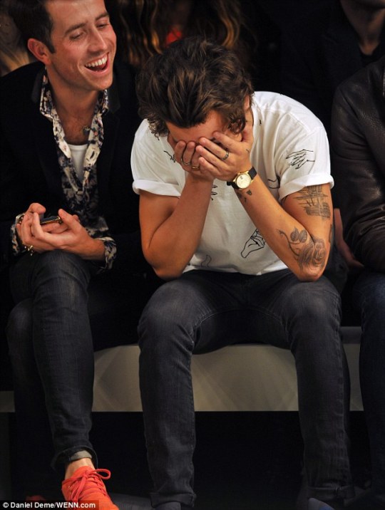
#it appears theres a recurring pattern#of me liking monsters that say stuff like ‘humans are lower’#but i dont have a degradation kink or anything???? LMAO#monsters including aliens and robots#i like monsters prejudiced to humans but still having me as their favorite#hdfkfjgf#also for some reason 3 of thrm are purple
83 notes
·
View notes
Text
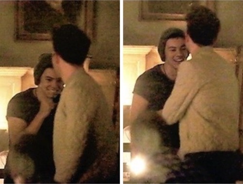
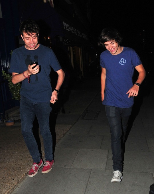
So u wanna know what The Nick Smile™ is, huh?
lets take a little trip back in time to the origins of the Nick Smile™. Shall we begin?

lets take it way way way back to valentines day 2012. over five and a half years ago.
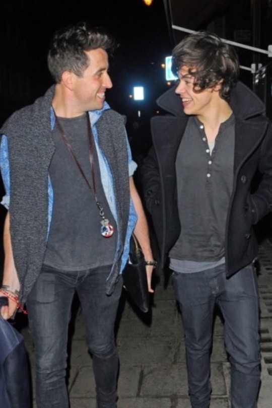
LOOK AT THAT SMILE!

there was the final nighttime show and the infamous ‘no punches please!’ from harry styles from the wanted

seriously, no punches please!
there was ladsm and the early years of the instagrim booth

baby gryles in its youth
the time when nick made fun of harry for listening to miley but harry looked like nick had given him the sun

the time when they went to the fashion shows together in 2013
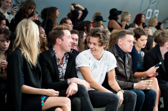
wow
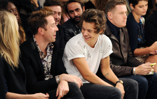
i mean.
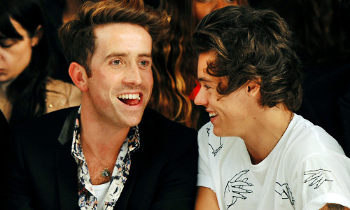
oh. (ok u got me hes not really smiling but...u know)
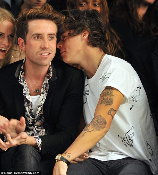
hilarious!
they also have a habit of distracting each other at work, like they time they distracted each other at Big Weekend in 2013

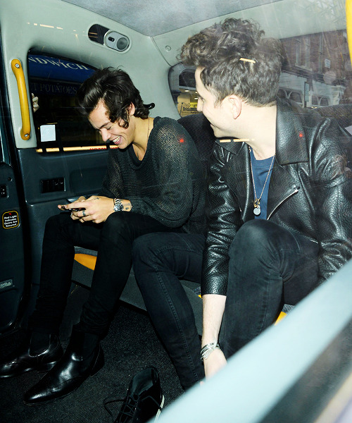
riding in taxicabs in 2014

then harry grew his hair and lost his voice, like the little mermaid

shalalala my oh my look like the boy 2 shy, go on and... kiSss tHe giRlLlllLL (whoa whoa)

they made fiona dress up in one direction fan merch... and harry in nick grimshaw for topman merch...

then...sadly.... gryles went into hiding. understandable...but tragic... one direction went its separate ways at the X Factor finale in 2015 (they still managed to goof off and distract each other at work again though).


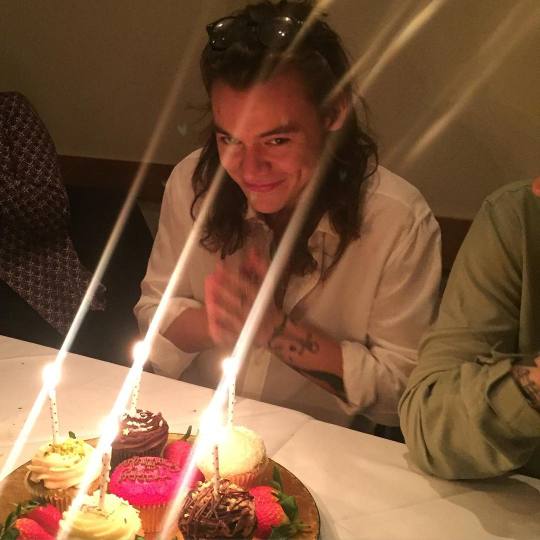
harry had a birthday
gryles drifted in the shadows.... . ... watching... waiting... nick carried on with his show.... harry recorded an album and filmed a movie.... 2016 faded in to 2017...
then this happened
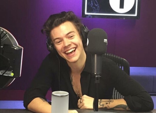
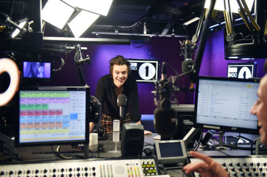
harry debuted his single on the radio 1 breakfast show!!!!!!!!!!!recording it 2 weeks early cos nick was gonna be on his holibobs!!!!! The Great Gryles Renaissance was born!!

oh!

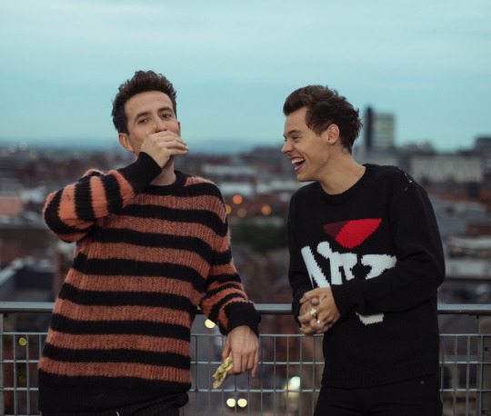
they chatted for THREE. ENTIRE. HOURS. on their own in a little tiny ass radio studio and chatted for so long that an entire hour of it was cut for rubbish nonsensical rambling. they reminisced about all the birthdays and holidays and times they spent together over the years (wow). we only did get 15 minutes of video but we got dozens of Nick Smiles to last a lifetime.

harry said it perfectly here

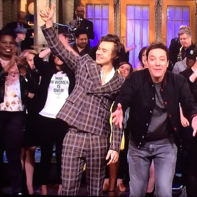
but it gets worse!!!!!!nick was on his holibobs in america when the single debuted and... wait for it... he took his mu m to see harry debut his single livE on television on one of the biggest shows in america and the Nick Smile was debuted on national television

tag urself im jimmy fallon cause same
but wait! theres more!!!!!!! the album came out a month later! and harry appeared on the breakfast show once again, bringing his nick smile once again with him

our fave goofballs

amazing

u see a recurring pattern here?
the Great Gryles Renaissance was not done yet. harry had a movie come out too!


they also got married went to pixie’s wedding on a tropical island in spain (ok i guess its the Harry Smile here but still)

finally if that wasnt enough....they went up to manchester and spent the entire day together playing bingo and eating chips and filming a tv show together

i mean...wow


gigglin over a chip butty

just.

wow.

this brings us to our conclusion of the Nick Smile. i hope it was an informative look in to the history of the Nick Smile. have a blessed gryles night
#gryles#im exhausted#obviously this is nowhere near a complete list of the Nick Smile#but i hope u all get good idea of why it means So Much to us#none of these gifs are mine btw#if u have more u would like to add just send em my way
1K notes
·
View notes
Text
What Colors Represent Democrats And Republicans
New Post has been published on https://www.patriotsnet.com/what-colors-represent-democrats-and-republicans/
What Colors Represent Democrats And Republicans

The History Of The Colors Of The Us Political Parties
Why Democrats Are Blue and Republicans Are Redâand Why Itâs the Opposite Everywhere Else
The history of the colors of the U.S. political parties is rich. According to the article The Color of Politics,
It got started on TV, the original electronic visual, when NBC, the first all-color network, unveiled an illuminated map snazzy for its time in 1976. John Chancellor was the NBC election night anchor who explained how states were going to be blue if they voted for incumbent Republican Gerald Ford, red if they voted for Democratic challenger Jimmy Carter.
While the idea of colored states got started in 1976, it wasnt until 2000 that states were definitely referred to as red states and blue states, and its roots are linked to the Civil War. For example. texts and reference books used blue to represent the Republican party since blue was the color of the Union in the Civil War. Blue is also typically associated with the more conservative parties in Europe and elsewhere, wrote a contributor to NPR.
The Growing Popularity Of The Symbol
Although the donkey was used as a symbol as early as 1828, Thomas Nast is often credited with making it the symbol of the Democrats. Nast, a political cartoonist, first published a cartoon depicting a live jackass kicking a dead lion in Harpers Weekly in 1870. In 1874, He published another cartoon titled Third Term Panic in which he depicted a donkey in lions skin chasing other animals including an elephant which he referred to as Republican vote. Nast used the elephant to represent the Republican and a donkey to represent the Democrats. While the Donkey is synonymous with the Democratic Party, the Democrats have never made it their official party symbol but use it on a lot of their material.
How Did Red And Blue Come To Represent The Two Major Us Political Parties
It all started with television. In the early 1970s, networks like ABC, NBC, and CBS were seeking a way to demarcate which states in the electoral college had been won by each candidate. More American households had color TV sets than ever before, giving news programs covering the election an opportunity to show splashy graphics when a state was called in favor of a given candidate.;
The first network to color-code states during an election results broadcast was CBS in 1972. However, at that time, blue represented the states won by the Republican incumbent Richard Nixon, and red stood in for those taken by challenger US Senator George McGovern of South Dakota.
Theres a good reason why those colors were chosen for each party at the time: global precedent. In Great Britain, red had long been used to represent the more liberal party, which in this American use case were the Democrats. Blue stood in for Republicans by default, in part because the colors in contrast were striking on screen.
But by the late-1980s and early 1990s, those color assignments reversed. Blue became more consistently used for Democrats and red for Republicans.;
Nevertheless, it still wasnt until 2000the race between Democrat and Vice President Al Gore and Republican Texas Governor George W. Bushthat those colors became synonymous with the name of each party.
Read Also: Why Does Donald Trump Wear Red Ties
How Is The Democratic Party Different From The Republican Party
Democrats are generally considered liberal, while Republicans are seen as conservative. The Democratic Party typically supports a larger government role in economic issues, backing regulations and social welfare programs. The Republicans, however, typically want a smaller government that is less involved in the economy. This contrary view on the size of government is reflected in their positions on taxesDemocrats favour a progressive tax to finance governments expanded role, while Republicans support lower taxes for all. However, Republicans do support a large budget for the military, and they often aggressively pursue U.S. national security interests, even if that means acting unilaterally. Democrats, however, prefer multilateralism. On social issues, Democrats seek greater freedoms, while Republicans follow more traditional values, supporting government intervention in such matters. For example, Democrats generally back abortion rights, while Republicans dont. In terms of geography, Democrats typically dominate in large cities, while Republicans are especially popular in rural areas.
Lake Reagan Floods The Us In 1980


In 1980, as Ronald Regan gradually overwhelmed his opponent Jimmy Carter, one TV anchor referred to the Republican victory spreading across the US map like a suburban swimming pool, which the Presidents supporters subsequently dubbed Lake Reagan.
However, this all changed after the interminable 2000 election, when George W Bush eventually overcame Al Gore after 36 days of recounts and controversy.
That year, TV networks had opted to represent the Republicans with red, a system followed by the New York Times and USA Today when the newspapers published their first ever full-colour election results maps.
Archie Tse, the senior graphics editor for the New York Times, told the Smithsonian Magazine that the newspapers decision was not particularly thought out.
I just decided red begins with R, Republican begins with R, he said. It was a more natural association there wasnt much discussion about it.
With the US glued to its TV screens and anxiously scanning newspapers for weeks awaiting the result, colours chosen near enough at random gradually ingrained themselves in the nations consciousness.
And by the time President Bushs victory was finally declared on 12 December 2000, it seemed unforseeable that the victorious Republicans would ever be anything other than red, and the Democrats blue.
Topics
Don’t Miss: What Did Republicans Gain From The Compromise Of 1877?
No Consensus On Colors Before 2000
Before the 2000 presidential election, television networks didn’t stick to any particular theme when illustrating which candidates and which parties won which states. In fact, many rotated the colors: One year Republicans would be red and the next year Republicans would be blue. Neither party really wanted to claim red as its color because of its association with communism.
According to Smithsonian;magazine:
“Before the epic election of 2000, there was no uniformity in the maps that television stations, newspapers or magazines used to illustrate presidential elections. Pretty much everyone embraced red and blue, but which color represented which party varied, sometimes by organization, sometimes by election cycle.”
Newspapers including The New York Times and USA Today jumped on the Republican-red and Democrat-blue theme that year, too, and stuck with it. Both published color-coded maps of results by county. Counties that sided with Bush appeared red in the newspapers. Counties that voted for Gore were shaded in blue.
The explanation Archie Tse, a senior graphics editor for the Times, gave to Smithsonian;for his choice of colors for each party was fairly straightforward:
I just decided;red;begins with r,;Republican;begins with r. It was a more natural association.;There wasnt much discussion about it.
Red States And Blue States
Since around the 2000 United States presidential election, red states and blue states have referred to states of the United States whose voters predominantly choose either the Republican Party or Democratic Party presidential and senatorial candidates. Since then, the use of the term has been expanded to differentiate between states being perceived as liberal and those perceived as conservative. Examining patterns within states reveals that the reversal of the two parties’ geographic bases has happened at the state level, but it is more complicated locally, with urban-rural divides associated with many of the largest changes.
All states contain both liberal and conservative voters and only appear blue or red on the electoral map because of the winner-take-all system used by most states in the Electoral College. However, the perception of some states as “blue” and some as “red” was reinforced by a degree of partisan stability from election to electionfrom the 2000 election to the 2004 election, only three states changed “color” and as of 2020, fully 35 out of 50 states have voted for the same party in every presidential election since the red-blue terminology was popularized in 2000.
Read Also: When Did Democrats And Republicans Switch
The Republican And Democratic Logos
No matter how you feel about the Democratic and Republican parties, their logos are impossible to ignore. Known throughout the world for their color choices, mascots, and more, the two leading US parties have made their mark on history.;
Today, the elephant and donkey are still recognisable outside of the United States.;
If youre keen to learn more about the political party logos, or some of the other emblems famous for shaping our world, you can check out some of our other insightful logo blogs here on the Fabrik website.;
Fabrik: A branding agency for our times.
What Do Different Colors Mean In American Politics
Why Does Blue and Donkeys Represent Democrats and Red and Elephants Represent Republicans?
Color is usually tied in with subjective experiences. Present two people with the same colorful image and theyll typically report two very different interpretations. However, Americans have one part of their life where color is tightly bound to objective associations. Every election comes with a continual bombardment of red and blue signs. To someone from another country this might seem like an odd recurring holiday. But Americans know at a glance that certain colors are associated with political campaigns.
One will find a rainbow of colors tied to everything from presidential elections to local matters. Even ballot measures might bring out some special colors. But what do these colors imply and why were they chosen in the first place?
Also Check: How Many Senate Seats Do The Republicans Have
Donkey Vs Elephant Meaning And Origin
Every political party has a logo. No matter where you go in the world, most political groups rely on similar branding techniques to companies to capture the attention of potential voters and followers.;
In the US, the political groups run some pretty impressive campaigns, complete with everything from unique icons and symbols to brand colors, mascots, and even slogans.;
While each individual presidential candidate or political office has their own branding strategy to offer, the Democrat and Republican logos are a common part of the scene. Since the 19th century, the Republican elephant vs Democratic donkey has defined the political scene in America.;
The question is, where did the symbols come from?
A Final Word On Colors
Many political parties around the world often choose their colors because of their connections to political stances, groups, or ideologies.
For example, red has historically been a color often linked to socialism and communism after a red flag was used by the revolutionaries during the Paris Commune. Revolutionaries may have picked red flags during this time as a possible reference to the 13th century red naval flags of defiance that meant a ship would kill any enemy it saw and so was flying a bloody flag.
As another example, many environmentalist parties around the world will often use the color green to symbolize nature. Finally, fascist parties have often used the color black such as Adolf Hitlers Nazi party and Benito Mussolinis Italian Fascist party because the black color represents what they intend to bring to their enemies: fear, intimidation, and death.;;
Lets finish with a quick trip around the globe to see the colors associated with some prominent political parties. In the United Kingdom, the colors are flipped compared to the United States: the right-leaning Conservative Party uses blue and the left-leaning Labour Party uses red, as do the Canadian parties of the same names. Australias oldest party, the Australian Labor Party, uses red while the Christian Democratic Union of Germany has used orange and black, and Emmanuel Macron of Frances En Marche! uses yellow.;
You May Like: How Many Republicans Did Trump Beat
The Latest Key Updates On The 2020 Us Election Results
Who is winning the US election? Live updates on the latest results
However, in the US blue represents the more left-leaning Democrats, while the Republicans denoted by red, as per Donald Trumps Make America Great Again caps.
One might assume that the colours represent a long-standing tradition, but theyre a relatively recent feature of US elections.
Read More
According to Professor David Scott Kastan of Yale University, writing inThe Conversation, the systems origins lie in the spread of colour TV in the late 1960s, when colour-coded maps were first used on election TV broadcasts.
The red and blue colouring was a nod to the British system, The Verge reports, but initially there was no permanent colour association for either party.
TV networks changed the map coding from election to election, with Prof Kastan explaining: In Cold War America, networks couldnt consistently identify one party as red the color of communists and, in particular, the Soviet Union without being accused of bias.
Indeed, there were famous US election nights where the current colour scheme was memorably reversed.
Red For Democrats Blue For Republicans

During the 1976 election between Republican Gerald Ford and Democrat Jimmy Carter, NBC tallied the incoming votes using a map illuminated with white, red and blue bulbs.
Interestingly, during test runs prior to election night, the thousands of bulbs caused the plastic adhered to the front of each state to melt. Giant air conditioning units and fans were used to keep it from dissolving on-air.
As votes came in that November, the white-lit states began to change color: red for states which had voted for Jimmy Carter, and blue for those backing Gerald Ford.
Originally, the idea between the color choices relied on the fact that blue was the color of the Union in the Civil War, and the hue is associated with more conservative parties in Europe.
Recommended Reading: Are Republicans Or Democrats More Educated
Origins Of The Color Scheme
The colors red and blue are also featured on the United States flag. Traditional political mapmakers, at least throughout the 20th century, had used blue to represent the modern-day Republicans, as well as the earlier Federalist Party. This may have been a holdover from the Civil War, during which the predominantly Republican north was considered “blue”. However, at that time, a maker of widely-sold maps accompanied them with blue pencils in order to mark Confederate force movements, while red was for the union.
Later, in the 1888 presidential election, Grover Cleveland and Benjamin Harrison used maps that coded blue for the Republicans, the color perceived to represent the Union and “Lincoln‘s Party”, and red for the Democrats. The parties themselves had no official colors, with candidates variously using either or both of the national color palette of red and blue .
The Psychology Of Blue
Of the three colors the human eye has cones for red, green and blue blue has the least, around 2 percent. Although it is not as noticeable in our environments as red is, because less of the cones are involved in registering the color, it does not create the same type of eye fatigue.
Biologically, blue is not a color that many things actually are, but it is often a reflection of other elements: for example, the sky is blue because of how light waves interact with the atmosphere; the water in a lake is not blue itself, but the surface looks that way because it reflects the sky.
Because the eye doesnt become as fatigued by blue and humans didnt evolve to physically respond to the hue, it is associated with calm serenity, confidence*, sympathy and intelligence.
Research has shown blue slows heart rate and breathing , boosts concentration and mental clarity, and inspires trust because it is non-threatening. On the other hand, humans react less emotionally with blue, causing its association to be linked with such clear rationality that it can come across as cold or following logic rather than feelings.
Socially since the 60s protests, it has been associated with peace.
You May Like: Senate Partisan Breakdown
Slavery And The Emergence Of The Bipartisan System
From 1828 to 1856 the Democrats won all but two presidential elections . During the 1840s and 50s, however, the Democratic Party, as it officially named itself in 1844, suffered serious internal strains over the issue of extending slavery to the Western territories. Southern Democrats, led by Jefferson Davis, wanted to allow slavery in all the territories, while Northern Democrats, led by Stephen A. Douglas, proposed that each territory should decide the question for itself through referendum. The issue split the Democrats at their 1860 presidential convention, where Southern Democrats nominated John C. Breckinridge and Northern Democrats nominated Douglas. The 1860 election also included John Bell, the nominee of the Constitutional Union Party, and Abraham Lincoln, the candidate of the newly established antislavery Republican Party . With the Democrats hopelessly split, Lincoln was elected president with only about 40 percent of the national vote; in contrast, Douglas and Breckinridge won 29 percent and 18 percent of the vote, respectively.
The Elephant Vs Donkey Argument
What Does It Mean To Be A Democrat?
The elephant vs donkey argument doesnt give a complete insight into the Republican and Democratic symbols. Of course, these animals do say a lot about the two groups.;
Today, the Democrats and Republicans use similar designs for their mascot, each featuring red, white, and blue coloring. The major differences between the two images are the animal being portrayed, and the number of stars.
The Democrat donkey features a set of four stars, with the points facing upwards. Its also worth noting the donkey faces to the left, indicating the central-left views of the Group.;
The Republican party elephant, on the other hand, features three stars, with the points facing downwards. In this case, the animal is facing right, demonstrating the right-wing views of the Group.
The coloring used for both icons are almost exactly the same, intended to represent the American flag. As you might imagine with two symbols for political parties, the elephant and donkey emblems have been the source of a great deal of conversation and debate over the years.;
Even when slight changes are made to the design, it can spark a lot of controversy.;
When the Republicans decided to turn their stars upside down, many people said it made the icons look more satanic.;
Alongside the elephant and donkey, Nast is also well-known for the Tammany Tiger, which the artist also showcased in an edition of the Harpers Weekly magazine.;
You May Like: How Many States Are Controlled By Republicans
0 notes
Text
A PSA for SPN
Looking at the ratings on the CW for Supernatural this past season, it ranked 3rd. Which isnt really that bad, but it could be a lot higher. Many people who watched it from the beginning, dropped out seasons ago, but since Netflix picked them up, theres a fresh new batch of viewers, I am one of them! I absolutely love this show, and feel like it’s getting a bad rap on Tumblr. It’s probably true that less people are watching it because they see the crap written about it here, and think it just plain sucks, and well... it does not. Ive been watching for over a year, from 1.1 to 12.23, and repeat and binge. It might be different for you all that dont binge and its been actually 12 years since you watched S1, but for me, every season is fresh in my head. And it is in no way worse than it was when it started. In my opinion, it’s a lot better! Every season, and I do mean EVERY season has some really crappy episodes, in my opinion, and has some really good ones, In fact, I think S11 was the best of all the seasons. It had a kind of sloppy end (the last 4 episodes) but those episodes didnt suck, they just seemed rushed and the Sam/Lucifer thing was just weird. But the monster hunts were great, the bromance was awesome, and the main arch was very intriguing.
Season 12, no doubt, had its bad episodes. I want to forget LOTUS and the Hitler episode ever happened, but I enjoyed everything else. In fact, at least 4 episodes in S12 made my top 15 all time favorites. “Keep Calm and Carry on” “First Blood” “Regarding Dean” and “Who We Are” in fact, “Who We Are” may be my #1 all time favorite, or at least tied with Swan Song. Supernatural has sort of a “random pattern” (oxymoron I know) but every season has them. There’s the MOTW, the ones heavy on the main storyline, the ones that are lite on Sam and Dean and heavy on side characters (my least favorite, and also not something the very early seasons did) the meta episodes, the high emotional episodes, nearly meaningless fillers, humorous ones, cliff hangers, and game changers. Most seasons contain all of these, some skip the humorous ones (11 and 12 didnt really have any). So when people complain about there not being any MOTW episodes anymore, they really only recall S1 when thats all there was. S2 brought in many of the other types and by s4, we had all of them. People tend to tow the line that Kripke’s era was the best, but really, there were just as many crap episodes in those seasons, as there were in any season. He was the one who introduced recurring angels and demons and their side stories, so the fact that the following seasons did the same thing, isnt a “post Kripke” problem. Though S10 was far too heavy on side character storylines.
What has definitely improved in the later seasons, is that Jared and Jensen have perfected Sam and Dean. They have these characters down cold, they make such an effort to keep them believable that it appears to be effortless. I could go on forever about their talent, but I wont on this post ;) Another improvement is the ability to surprize us (or at least me), It might be something huge like making Chuck- God in S12, or tearing a seam into another reality in S12, or something so subtle, yet great, like introducing The Bunker, and the MoL in S8. When these things came to be, did anyone know they’d become THIS important? The biggest game changers we had in S1 and 2 Sam has demon blood in him and the brothers die, and come back... a lot. The emotional stuff, the tear jerkers, the angst and the deep abiding love between Sam and Dean have done noting but improve every season. The scenes in S12 where Dean has told off Mary, were better than any scene in S1 or 2 where he or Sam told off John. So what I am saying is this.... The show has not lost its integrity, nor has it gotten stupid. It has evolved into something a lot bigger than it started with and that’s a GOOD thing. It still has countless places it can go, and the freedom to go there, given its about making the impossible, possible. So if you havent been watching it because of the negative talk on Tumblr, and other SM, I ask you to get to binging, catch up, and start watching it again in October, because if I had learned about SPN through Tumblr, I never would have watched it at all. It sounds awful! But fortunately, I never checked the social media about it till I was beyond hooked. Lets bring this show back to #2 or hopefully #1 next season :)
14 notes
·
View notes
Photo


25/04/18
My three latest tutorial sheets and clarifying my project and where my idea came from!!
The first tutorial is from before Easter so was more about planning to start initial designs and an idea about a sample that has a pocket for small plants (I could still do that if I have time this week?)
Jan also said that designers will fit into my project as I go, which is true because theres nothing worse than a massive block of research on designers that just kind of feels forced. That being said I have some designers that I do want to look at quickly.
That tutorial also says “come back with a plan for a garment” which didn’t happen as clearly as that - I don’t have a finalised design yet because I still have sampling to do and I’m not quite at that point, but I did come back with a much clearer idea as to what I might make and what sort of look it will have.
The second tutorial is from Thursday last week - apparently I need to look at Goth itself and goth on the catwalk for this project to make more sense to someone other than me. I think the reason it didn’t look at goth in the first place is because the project title ‘Goth Botany’ came from an inside joke in Barcelona and initially the project really wasn’t about goth at all - but now there is definitely a goth influence to some of my designs and the style of the project so it does need looking at more clearly.
I also need to clarify why I chose to do a project about plants - what do I like about them?
Basically I find them interesting, I started drawing some of the plants I saw in Barcelona and that was enough of a turning point to sway my project away from dadaism. I felt like I was surrounded by plants and graffiti in Barcelona and I became slightly obsessed - its actually a similar feeling to when I was in Taipei so I could make a link about that too - but anyway I saw a comparison between how the plants grow amongst the city and through cracks in walls as if they were retaliating against the way humans have taken over and polluted their environment, and the way graffiti spreads across walls and buildings as an anonymous voice of youth culture against the rest of society.
I understand that plants and graffiti are very different and basically not related at all, but to me they both retaliate and adapt to exist with cities (and basically the anthropocene world)
(Anthropocene is the word given to our current geological era - where human civilisation has a direct impact on the environment) (so from the start of the industrial revolution)
I discovered the word anthropocene in the ‘After the end of the World’ exhibition at the CCCB - that exhibition is still a major influence on my project. It also gives my project a link to pollution and the environment - my way of looking at that was through sampling with bleach, oil paint and white spirit, spray paint, printing ink and acrylic ink. I used methods of decoration that are really harmful to the environment to represent the chemicals and pollution humans pour into the world, and on a garment these materials would create a massive contrast to the botanical imagery I am using - this would be a strong comment on the drastic state of our planet.
I chose not to look at sustainable surface pattern methods and dyes because it would limit my creativity with colour and texture massively, and be too similar to the regeneration project. It also wouldn’t hold the same heavy metaphor about pollution.
To summarise:
I chose to look at plants for my project because that’s exactly what I noticed all the time in Barcelona (the main research trip) to the point where plants had completely taken over my project.
The link to graffiti comes from the comparison between plants colonising human spaces and how anti-establishment youth colonise parts of cities with street art.
The anthropocene idea came from the toxic surface patterns/colours comment on the state of our environment and what the plants are having to fight against.
As I’m thinking about it a recurring theme appears to be retaliation - and Goth was a retaliation against society and the strict older generation. I think I just found a strong way to tie in the ‘Goth’ side of Goth Botany.
That tutorial also lists some great sample techniques I should look at (and stuff to buy today) and some designers and artists that would link in really well at this point - So do this in the next few days so I can begin my toile next week.
The last tutorial sheet is from Yesterday, which also lists a bunch of really cool materials I could experiment with and things I could do to make my project research even deeper such as:
“attack garden centres”
Anyway it basically says to go crazy and be ambitious - so I need to do that in order to explore my project to the extreme before deciding the final outcome.
0 notes