#it is easier to work in composition for me in color/contrast.. but then i wind up being 'oh no this anatomy'
Text
Been trying a 'Paint first sketch later' approach. And It is fluid and nice. But it leaves me with multiple stages of my searching in the painting that I like.. but also a sketch that fails to capture what I like best about all the 'searches.'
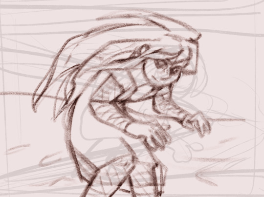
Featuring my oc Zina.
#they almost placed in order of creation (the third and fourth are switched so the more complete one can be placed in the middle)#my art#my ocs#idk if i'll finish this.. I may try the prompt again later#i liked the pallets but then there were things about them that I didn't like#when i do paintings first it's like.. she becomes a transforming glob idk#it is easier to work in composition for me in color/contrast.. but then i wind up being 'oh no this anatomy'#her eyes should be a brighter yellow (and her clothes should be a brighter blue/yellow) but I thought it might ruin the pallet
8 notes
·
View notes
Text
i know it’ll have to drown me, before i can breathe easy
for #tyriaslibraryevent.
Week 5 ( August 29 - September 4 ) — AU / Free
features my character: afritan
moldark @commander-twig, tatule @xurity, oprez @charoban
so, uh, this is long... my bad. incidentally also the first fic for this event that i finished way before the deadline. mainly because i started it back in june. also i'm not done with this au yet, so expect me to put the slow in slow burn some more.
this might be easier to read on ao3
.
Caught in the shadow of the mountain ridge the small specialist team crosses the bridge towards Refugee's Peak, the silhouette of the Priory looming over their backs like a wolfs howling maw.
Afritan shudders through an exhale, the puff of breath stuttering in the crisp afternoon air. Adjusting the sling of his backpack, he slows down to fall into step with the Vigil crusader he’s been side-eying since they’ve been briefed. Afritan's got a gut feeling the crusader must be the former Nightmare courtier he saw at the Grove a while back, the one Tegwen warned him about with a harried voice and a stern expression on her face; like the looks she gives Carys after she's jumped headfirst into the fray.
Sometimes Afritan closes his eyes and sees the courtier's silhouette still, a fever dream, like something took root inside his chest ever since.
His stomach turns oily, and he swallows a wad of spit down when the crusader brings that intense gaze onto him. His sleek breastplate gleams in the firelight of the braziers flanking them left and right.
"Uhm h-hi there," Afritan greets softly, voice barely reaching over the icy wind bouldering through the valley. He keeps his arms tight-pressed to his sides. Trying to refrain from stuttering too badly he continues,"I'm Afritan from the Durmand Priory--" a slight wince, as if the crusader didn't know that already you idiot “--it's nice to meet you…"
The crusader tips his head back; the ashen-tinged leaf around his throat peeks out from the thick leather collar of his armor. His brows are slightly raised. Afritan rubs the back of his neck self-effacingly at the silence.
As they step onto the winding hiking trail under the snow-capped mountain peaks, Afritan makes another attempt at conversation: "What's your name… You d-don't have to tell me of course, I was just wondering since we'll be working together on this mission and…" He trails off, looking away when a heavy patch of snow abruptly falls off a pine's thin-needled foliage.
"I'm Moldark," the crusader says curtly, in a voice much smoother than his imposing figure would suggest. His expression remains stone-faced.
Two longhorn sheep look up from their grazing spot at the side of the road when they pass by. The team's pretty ragtag in composition: a Whispers agent, ten Priory members including himself, two Vigil crusaders and a Vigil marksman. Afritan glances at Moldark from the corner of his eye with the hint of a smile playing on his lips. His profile contrasts starkly with their white surroundings.
"So," Afritan begins again, idly touching the hilt of his sword with skittish fingers. Hoping he won't stumble over consonants when he asks, "What do you uhm make of the mission?"
Moldark doesn't shrug, doesn't hum. "It's straightforward enough. Us Vigil are only hired muscle to ensure the Priory members' safety." His gaze flicks between the road ahead and Afritan for the briefest of moments before settling back on the jagged horizon. "You look like you could handle yourself in a fight however.'
"I'm m-more of a defensive fighter," Afritan replies, ducking his head away to stave off an involuntary smile; his chest grown tight at the comment. He taps the strap of his backpack, stuffed chock-full with scrolls and maps. "B-besides I'm assigned to the p-position of navigator f-for the underwater exploration."
The crusader doesn't respond outright, only gives Afritan a quick once-over and a sharp nod.
It's easy to tell they're nearing Afgar's Steading by the cherry trees appearing alongside the hiking trail. The silence between them gets scuffed by the sound of heavy footfalls and hooves on hard gravel and the chatter of the pack of Priory explorers in front of them. After they round the bend at the longhouse, the hiking trail straightens, and the frozen ground thaws out. His eyes slide over to the former Nightmare courtier.
Up until he first saw Moldark in the Grove, Afritan was led to believe there was no cure for Nightmare.
Afritan worries the soft bark of his lower lip; his curiosity growing teeth. The questions stack up the back of his tongue.
Aloud he asks, "Why exactly d-did you join the Vigil?"
Moldark turns to regard him. It's hard to tell if Afritan's question caught him off guard or not. He mulls over his words, placing a hand on the war axe hanging off his belt. The wedges that run next to his eyes and retreat into his forehead narrow to slits. Afritan wonders what color of glow would peek through in the dark.
"Because the Vigil is frontline support and offense. I can't imagine myself somewhere else," Moldark says eventually.
Moldark's mouth stretches into a thin line and his fingers briefly clench around the curved handle of the axe. He looks like he's on the cusp of saying something more but what exactly Afritan doesn't know.
Afritan puts a thorny tendril behind his ear and looks on ahead. They're going downhill now. He has a clear view of Rocklair with its makeshift sentry towers and bonfires; and of Cascade Bridge where a small squadron of Lionguard is stationed to ward off pirates. The firs and cherry trees are free of snow further down the mountains slope.
"And why did you join the Priory, Afritan?" Moldark asks, the shadow of a smirk touching his lips as Afritan snaps his head around in surprise. "For knowledge or adventure or both?"
"O-oh, well, uhm. I always wanted to explore the world outside the Grove. I've spent hours looking at maps and self-studying c-cartography. The adventuring is an added bonus, I s-suppose. My mentor's in the Priory too so it was a logical choice." His voice shakes, stumbling over certain sounds. Afritan sheepishly rubs the back of his neck again, heat pricking through at the nape.
Conversations aren't Afritan's forte. His stuttering usually scotches any attempts to reach out to kind-looking strangers, and this hesitation in turn gets mistaken for taciturnity. Moldark doesn't point it out. In fact there's none of the cruelty in his demeanor that you might expect from a Nightmare courtier.
The weak sunlight catches a rich amber in his eyes, and Afritan blinks owlishly at the sight, something soft welling up his throat. He coughs in his fist and smiles apologetically.
Moldark tilts his head a little, catlike. Those wedges next to his eyes and into his forehead run thin again, but that shadow of a smile keeps playing along the corner of his mouth. He lazily pats the flat edge of his battleaxe, remarking, “This must suit you best then. Exploration, and adventure.”
“I w-would believe so,” Afritan agrees bashfully, averting his gaze to the ground for a split-second. He bites the inside of his cheek before asking, “B-but what about you? Playing bodyguard isn’t really uhm, frontline work…”
Afritan doesn’t know whether the Vigil operates on the same basis as the Durmand Priory. He got the option to volunteer for the mission and was then assigned a position within the squad later on. Maybe Moldark simply lucked out.
This fledgling Pact that their orders pledged themselves to stands on foal legs, but squads already got formed and dispatched to Timberline Falls; to Mount Maelstrom; going as far as the Straits of Devastation, spearheading into Orr. What they’re set out to do seems boring in comparison. Afritan bites the inside of his cheek, holding onto the strap of his backpack and staring at the ground absentmindedly.
"We're protecting you from pirates and scavengers. I'm certain there will be some action at least," Moldark comments, and while his expression remains stoic, the confidence shines through in the cadence of his voice. Afritan wants to soak it all up.
More questions come bobbing into his head, but it's too early to put them in words. Afritan nods in turn, and they fall into a companionable silence.
.
They pass through Rocklair, pausing only shortly to confer with magister Ghorgon about the general progress of the Priory's expeditions in the area. Aside from pirates, there's the hostile wildlife and the dredge to contend with. Afritan has only fought the latter twice before, both times in the harsh cold of Dredgehaunt Cliffs.
His gaze slides over to Moldark but he remains undaunted. As if nothing could ever faze him. The type to break you before you could dent them, Afritan muses silently; a tingle running down his spine.
Lionguard soldiers salute the members of the team at the head of Cascade Bridge, their plate armors reflect golden in the sunlight. Afritan squints a little. He looks past them, at the calm waters of the lake and the rear end of the pirate ship sticking out from Jetsam Isle, casting its shadow over the depths. On the other side of the bridge the rocky terrain makes way for rolling hillsides and stretches of grassland. Further up north the snow-packed grounds of False River Valley are wedged between steep unclimbable mountains. Rock and more rock.
Their destination is the southernmost point of the lake’s jagged shoreline however, where the underwater complex of dwarven ruins proves most accessible. Afritan points out the bridge connecting Demon’s Maw and Greybeard’s Landing to Moldark.
“It’s the only way to our b-base of operations from the other side of the lake and makes for an ex--, uhm, an excel--” his tongue trips over the word, and Afritan hastily scrapes his throat, trying to mask the slip up. “A-anyway it’s an easy position to defend.”
Moldark crosses his arms over his chest and tilts his head to the side, surveying his surroundings with the same scrutiny a cat would regard its prey. His eyes narrow dangerously.
“I’m wondering about the range of those turrets. They could become a problem,” he says then, not looking away from the pirate camp; the outlines of those blown-apart and stranded ships blurred by the distance.
Afritan follows his gaze and mutters softly, "A-ah, I see what y-you mean."
A hollow thud rings through the open space, and Afritan startles a little, craning his neck to look. Their teammates have started setting up camp.
He makes a curt sound at the back of his throat and continues with some difficulty, "I-if the barrels of their turrets haven't been replaced o-or, uhm, augmented these past few years, I'd uh wager the range to be two hundred yards at most…" Here, he pauses for a moment, pursing his lips. "The eastern wing of the f-fortress may be just within range."
Before Moldark manages a reply, the Vigil marksman, a sylvari too, rounds them both with a sharkish grin; and there's no other way to describe it: sharp and toothy, full of confidence. He's tall and slim, while the crusader's all bulk. The rock gazelle he keeps as a pet trots behind, its hooves quiet in the tall grass.
"Warmaster wants to talk shop. Better wrap things up here," he says to Moldark.
Afritan wrings his hands when the marksman pushes down his sunglasses--revealing deep red eyes that could unsettle any opponent, and bears that grin down on him. The supple leather of his gauntlets squeaks softly from how hard he's rubbing them together.
"You might wanna go check in with that scary Charr lady, 'cause she looks like she's gonna eat her own tail. I'm Tatule by the way. Vigil, but you know that."
His voice breaks around the first two syllables of his own name, and Afritan sighs dejectedly before trying again, "I'm Afritan, I'm the navigator on this e-expedition. It's uh nice to meet you."
Tatule tips two fingertips to his forehead in a quick salute. The scenery reflects distorted on his sunglasses, blurs of black. He gives one high-pitched whistle to draw his pet's attention and walks off.
Afritan glances back at Moldark, scrambling for something to say, anything that isn't redundant or lame.
"I suspect you will join us on our first dive to secure the perimeters," Moldark begins matter-of-factly. "Rest up in the meantime. I imagine the dwarven fortress to be very big, or what's left of it anyway." The sentence gets capped off with a handsome lopsided smile that makes Afritan's chest all tangled up tight.
Moldark leaves Afritan to his thoughts and heads over to the Asuran warmaster. His figure's all angles and pins against the soft green. Afritan inhales sharply and looks off to where magister Mercutia Spectremaw and the other Priory members are setting up the tents and assembling their gear. The sound of waves crashing against the rocks below seems to come from faraway. Another sigh and Afritan grabs onto the straps of his backpack, setting out to help his teammates.
Magister Spectremaw--terrifyingly big with sleek spotted fur and paws the size of shovels-- chews him out the second he checks in. Stop dawdling thornbush and get to it.
.
While Afritan's unrolling his sleeping bag on the uneven underground--and he'll wake up with a crick in his back, he's sure of it-- the Whispers agent saunters into the tent on light feet. Afritan only knows someone's behind him because another shadow falls over his hands. Intentional, no doubt.
"Hello there," the agent greets pleasantly. "I was told by magister Spectremaw to visit you for all sorts of topographical matters."
Afritan uneasily settles back on his haunches and angles his head to regard the Whispers agent: another sylvari, lanky with a runner's build, the brim of his mushroom casting a shadow to his chin. The metal embellishments on his black and red-dyed armor glimmer in the dim.
"Uh, w-well, I suppose so…" Afritan mutters unsurely, slowly standing at full height. A barbed coil slips in front of his eyes, and he clicks his tongue, annoyed.
The Whispers agent hums lightly, rocking on the tips of his toes in place. "I was thinking of undertaking a reconnaissance mission on my own to get a better understanding of the enemy. Oh, and if they stock stolen artifacts on base or not. But to do so, I need a keen understanding of the area--and I'm going too fast, aren't I?" He asks suddenly, blinking bright blue eyes.
Nodding bashfully, Afritan replies, "J-just a little bit, yes."
"All I require are a few maps of the area and some of your expertise," the Whispers agent explains, a reassuring undertone to his voice. He folds his hands behind his back and rises on the tips of his toes briefly.
"I t-think I might be able to help," Afritan says while reaching for his backpack.
Most of the maps he carries around are charts on the lake and layouts of the dwarven fortress in its prime, but he does have a couple on Lornar's Pass and Demon's Maw in particular.
They settle down cross-legged on the ground with the maps spread out on Afritan's bedroll. Musty air wafts up from the parchment. Afritan learns the Whispers agent's name a good five minutes into their discussion about the terrain. Where are my manners? I'm Oprez, pleased to make your acquaintance. The introduction's treated as a formality however, in the face of preparations for his self-imposed mission.
Oprez gracefully rises to his feet. His mushroom cap sheds a ring of shadow over Afritan's toes, neatly sliced through by the pale sunlight pooling inside through the gap of the tent flap. He nods to himself once or twice; pleased.
"Thank you for your assistance in this matter. You were most helpful," Oprez says with a polite smile, then picks up his staff and hooks it to the back straps on his armor. There's no showing off, but the fluid movement alone implies skill.
His bright blue eyes remain unblinking when someone suddenly pulls the flap of the tent aside. Afritan looks over his shoulder. Magister Spectremaw fills up the empty space with her hulking form; the sunlight chisels the silhouette of her broad shoulders and curving horns against the dark underground. Oprez nods at Afritan and walks on over, threading softly out of habit.
"Did you get what you came for, agent?" Mercutia asks, shoving the flap open wider; pale sunlight comes flooding in like an oil spill.
Oprez pauses at her side, and despite his own height he only reaches to her shoulders. He responds politely, "Yes, our navigator here was so very kind for lending me some of his time and patience."
"Then I wish you success on your mission," she says, sounding as if someone tried to shank her in the throat but failed by a couple of inches. What you call a guttural voice.
"As I on yours. I'll try to have returned by nightfall, magister, but I can't make any promises, I'm sure you understand. Now if you would excuse me…" Oprez dips his head and slips past her, the coattails of his chest piece bellowing in motion.
Mercutia remains standing at the tent opening and wrinkles her maw. She speaks up after a beat, "The Vigil needs you outside for first dive, thornbush."
His eyes grow wide, and he scrambles on all fours. Watching how Afritan gathers his charts and maps and manuscripts, neatly folding them and tucking them back into his backpack, Mercutia wags her tail from side to side. Low over the underground. Her muzzle curls into an amused grin when he almost trips over himself in excitement to get his aquabreather.
"That's a proper attitude," she rumbles when he's fully equipped and claps him on the back with her paw, hard. Afritan titters forwards from impact, smiling sheepishly. It's hard not to feel giddy, for some reason.
.
They're waiting for him at the edge of the rocky shoreline. Moldark's overlooking the dark waters with arms crossed while Tatule's propped up against a boulder, one knee bent, restocking his quiver with harpoons for the dive. His rock gazelle is nowhere to be found. The Asura warmaster's cleaning the barrel of her harpoon gun with a rag. Afritan's throat closes up when Moldark throws a glance over his shoulder at him. He swallows curtly, but it doesn't help much.
Afritan spots three skale corpses in the tall grass; rich red blood drying on their skewered hides. The air gets cooler the closer he gets to the lake.
Even if Moldark's the first one to acknowledge him, it's Tatule who speaks up, saying, "You're here. Great. Let's get this show on the road then." He looks towards his warmaster and continues, "Whenever you are, ma'am."
She stands upright, at attention, and sheathes the weapon at her back. The wind runs through her shock of red hair, pushing her long droopy ears past her massive shoulderguards.
"Very well. I am warmaster Narru and I will be your commanding officer during this short expedition. Our objective is securing the perimeters of the dwarven complex. Magister Spectremaw already gave me a report on your skills, explorer. Be warned that I will burk no disobedience in my squad and I will tolerate no liable actions during the mission. Have I made myself clear?" She lifts her head, peering up at Afritan with electric green eyes.
Afritan's gaze flicks from Moldark to Narru, and he nods like a child chastised; eager, eyes downcast.
Warmaster Narru attaches the aquabreather to her mouth and goes into the water, beckoning the rest of them to follow. Tatule gets up, dusts off his leather leggings with a few broad swats.
He claps a hand to Afritan's shoulder and leans in close with a wide grin. "Don't worry about the shark, okay?"
"S-shark? B-but sharks aren't native to these waters," Afritan points out, staring confusedly at Tatule.
Moldark saunters past and searches for Afritan's gaze from over his shoulder, then shakes his head a little. There's a glimmer of a smile playing along the curve of his lips; something rare. Afritan furrows his brow.
"One of his pets," Moldark explains matter-of-factly.
Afritan murmurs an inaudible oh in response.
"At least your reaction was cuter than Moldark's when I first sprung Jaws on him," Tatule says, patting Afritan on the shoulder once or twice; his grin like a serrated blade across his face.
The wind starts to pick up, rustling the tall grass that reaches past their calves. Patches of uneven ground that turn into rock cradling water. Moldark rolls his eyes and slides the aquabreather over his nose, adjusts the oxygen mask over his mouth, trails after his warmaster in purposeful strides. The steel of his spear shines a searing white in the afternoon sunlight. Tatule whistles loudly, a sharp shrill sound, and wades into the water, unhurriedly putting on his aquabreather as a shark’s fin rises above the waves further off. Afritan takes a deep breath and follows their example.
Submerged his vision grows hazy, and the cold comes like an all-encompassing shock to his system. It takes a moment to get accustomed to the temperature, the weightlessness. To the sound of the overflow.
They dive deeper, pieces of flotsam and strands of algae floating past, until warmaster Narru abruptly stops and raises a fist. She gestures downwards with quick, jerky movements. They cautiously observe a pack of krait treasure hunters, jealously guarding their cache at the bottom of the lake. Warmaster Narru stretches her arm sideways, and everyone lines up abreast, weapons drawn. Afritan anticipates the signal to attack, holding onto his spear a little tighter, the rush of adrenalin soaking up his belly.
Tatule’s shark circles overhead, filtering out the sunlight, its shadowy form moving over the underground.
Warmaster Narru cocks her speargun, takes aim. She fires, and the harpoon rips through a krait hunter’s shoulder. Blood spurts from the wound in slow motion. Moldark seizes the opportunity, propels himself forwards with a powerful kick. The krait dart up to intercept him. Afritan doesn’t hesitate and summons a bright blinding mist.
Everything blurs together after: harpoons whizzing past their ears, more blood, the dull ache of a metal bar hard against his abdomen. Afritan sucks in a deep breath, blocks an incoming attack with the handle of his spear.
Tatule’s shark charges the hunter fighting him, tearing into the krait’s snake-like torso with rows and rows of razor-sharp teeth. Earning her name twice over.
Shreds of saggy skin float up. Afritan jabs his weapon through the krait's throat. Angled up, so the sharp spearhead sticks out the back of the krait's well-worn leather mask. Its eyes blown wide open in shock. The krait hunter goes limp between the shark’s tight-locked jaws. One vicious yank; and blood sluices from the krait's neck, gushing all around them.
Afritan whips around, spots Moldark fighting off the leader of the pack.
Wisps of green lake weed wave around them from the force of their blows, and Moldark's relentless, some kind of fierce you only see in a wildcat cornered, dishing out as hard as he gets. He's all power and skill, his glow seeping through the cracks in his bark-like skin like a rescue flare; a bright red. Afritan uses his magic on instinct when the veteran krait hunter tries to get a hit in, shoves down whatever wells up his throat with a curt click of the jaw.
Aegis blocks off the krait hunter's makeshift spear. Moldark's eyes shift over to Afritan for a split second, an acknowledgement.
The magical shield breaks apart, and Moldark continues his offense with a frenzy of strikes. The krait's pushed to the defensive. Especially when a harpoon slices the side of its thick-corded neck open. Moldark plunges his spear straight into the krait's scaly belly. And twists. The krait hunter struggles, death throes, eyes bulging, tail wiggling; its stomach sucked in.
Breath rushed through two slits of nose, a garble of bubbles speeding towards the surface. Then, nothing.
In contrast, there's Moldark, jacked up on adrenalin, punctuated by the rapid rise and fall of his chest, and Afritan finds himself unable to look away. The type to break you before you could dent them. His words come echoing back. Moldark's red glow seems to spread throughout the water. Much brighter than Afritan's own peach-colored one. Afritan draws his shoulders up, holding onto his spear tightly. Tatule's shark swims past him to her master.
They regroup around warmaster Narru. The krait corpses remain suspended at the bottom, arms slack, heads bowed, surrounding the splendid chest they set out to defend, a prayer circle.
Afritan gets instructed to lead the way.
.
It takes a few hours to mark and secure the perimeters of the excavation site. There's debris everywhere. The sprawl of ruin tapers off in chunks of rock, spread across the underground as far as the steady shadow of the beached pirate ship. Low visibility only complicates the task.
When they return to shore, stupid-tired, the expedition members have already started dinner.
They trod over to the modest camphouse the Priory explorers set up in their absence, dripping water the whole way there. People are gathered around the flap of the tent, eating and talking. The smell of stew hangs in the air. Warmaster Narru shoves a wooden bowl into Afritan's hands and heads off with Tatule in tow, eager to get her fill. Afritan stays behind for a moment, enjoying the dying warmth of the evening sun pinned low between the mountains.
He’s not alone; Moldark doesn’t seem to be in a hurry either.
They regard the lake, a blazing red under the orange sky, catching their breath, letting the water dry on their skin. Moldark’s the first to move away.
Iron-cast pots are positioned over poked-apart embers with two cooks tending them. Steam wafts up towards the ceiling of the tent. One of the cooks is a young sylvari whom Afritan occasionally talked to after lectures. Her eyes always smiled so kindly on him. She looks up at their heavy footfalls.
The ladle falls from her hand, clattering against the pot. Those kind eyes of hers bulging like a startled cat's.
Afritan furrows his brow and follows the direction of her gaze.
She’s looking at Moldark.
And Moldark stares straight ahead, statuesque, purposely ignoring the shocked expression on her face, the way she draws into herself, small and unthreatening like a mouse. But the breath he draws is deep, uncomfortable. It’s suddenly too tense inside, too cramped. The young sylvari hastily averts her gaze and grabbles to scoop the ladle out of the stew without burning her fingertips.
Afritan slowly reaches out to take Moldark’s wooden bowl. With a gentle smile he offers a way out. “W-would you like to eat with me? In my t-tent? I, uhm, I’m n-not that fond of crowds. And, ah, don’t you t-think it’s a b-bit crowded outside?”
“Yes, that’s…” Moldark pauses briefly, halfway turning towards the exit. His hawkish gaze lingers over Afritan’s face. “Thank you for the offer. I believe your tent was the one furthest away from shore, right?”
"R-right," Afritan affirms softly. "I'll be right t-there."
Moldark nods curtly and marches off in even strides. Not too fast, not too slow; restrained. Once he's disappeared behind the rough-hewn tent sail, the young sylvari shyly pokes her head up, a little frazzled, a little flustered still. A faint blue dots the pudgy skin on her brow, a bluegill blue.
"I'm sorry," she says, voice sounding pale. "It's just that, well, he looked so much like a, like a nightmare courtier, and oh thorns I just…" Her sentence trails off unfinished, an embarrassed look on her face.
Afritan smiles in understanding. "B-but he's not," he points out, omitting the anymore. "He is p-part of our squad, and we should treat him without preju… prejud--" his admonishment splinters at the word, and he dips his chin, staring obstinately at the dark ground.
It's stupid how he can't string the right syllables together. Stupid stupid stupid.
"No, no, you're right," the young sylvari argues, clutching the ladle tight with both hands. "Come on, let me serve you some stew."
He couldn't have been inside the tent for longer than ten minutes, but the air's grown misty when he gets out, and he's sure heavy fog will come rolling over the lake bank by morning. Flecks of ember eddy in the wind. Afritan retreats from the crowd of expedition members at the camphouse, concentrating on not spilling stew everywhere while he's walking. He spots the Whispers agent and magister Spectremaw conspiring at the entrance of her tent.
Without sparing them much thought, Afritan rounds his own tent and nudges the flap away with his elbow.
Moldark waits in the corner with his arms crossed over his chest, standoffish. The light can't touch him there, and his glow runs through black bark like a fire kindled in dead wood. Something unfurls in Afritan's chest at the sight. The corners of Afritan's mouth twitch into a smile, and he raises a bowl; thin wisps of steam blurring from the movement. He nods to his sleeping roll. Sit, sit.
They settle down side by side, knees bent and feet flat on the hard dirt underground. With the smell of good food wafting in his nostrils Afritan realizes how famished he is.
Conversation's sparse, in between spoonfuls. They don't talk about what transpired a few moments ago in the camphouse, or about homesickness for the Grove and surrounding Caledon. Moldark lives in Hoelbrak anyway. It's something that came up when discussing the climate and peaked Afritan's interest. He could guess why Moldark moved away; he'd seen the reason just moments ago after all.
The wooden bowls are emptied and discarded at their feet, and they share a waterskin.
But why to Hoelbrak?
Afritan glances at Moldark from the corner of his eyes, and his hands are two jittery things in his lap. The leather lining inside his gauntlets itches. Moldark puzzles him; it feels like every tidbit of information he learns and catalogues only prompts him to discover more. Afritan scrapes his throat, curiosity winning over.
"I d-don't mean to pry, b-but w-why did you choose Hoelbrak? Isn't it cold year round?"
Moldark shrugs and unclasps the leather straps of his Vigil gauntlets, revealing a jagged layer of bark over his skin, dark and grizzly like an old pine's. Afritan ignores the urge to take off his own gauntlets and touch the tips of his fingers to Moldark's wrist. How long has he lived in Hoelbrak for his body to adapt--to change-- like this?
"I like it there," Moldark answers matter-of-factly. He clenches his hand in a fist, unclenches, flexes his fingers. "The Norn have a way of living I can relate to and." His eyes search out Afritan's. "They don't judge."
The implication rings loud and clear: They don't know my past. Afritan flusters a little and presses his palms together.
A hush falls over them. Moldark calmly puts his gauntlet back on, buckles the straps one-handedly and tugs on the leather of the glove around the heel of his palm. Then, he stands up. Afritan watches him collect the wooden bowls. The words he wants to say melt away on the tip of his tongue: I won't judge either, I just want to get to know you.
"Thank you for this evening. I'm sure you'd like to turn in for the night and I will not keep you any longer," Moldark says with a sense of finality; the contours of his mouth emphasized by dots of red glow.
Afritan worries his lower lip, a lifetime of insecurities pressing down on his shoulders, and he fakes a smile, tries to keep his voice light and airy when he bids him goodnight. His throat feels closed off, tight.
Before Moldark leaves, Afritan calls out, "You're always welcome t-to eat y-your dinner h-here with me. If y-you want."
Moldark's hemmed into the tent opening by the moonlight. His mouth's slanted into a handsome smile that seems so wholly involuntary, genuine. He nods, turns away, shedding his angular silhouette on the ground, and leaves.
The flap of the tent makes a soft sound as it slides shut behind him. Afritan is alone with his thoughts.
Heavy-limbed he clambers upright and begins to undress. It's pitch dark inside his tent now. There's no sound aside from a lonesome owl, the wind whistling through the tall grass. Afritan places the staff he’s been practicing with the past few months next to his sleeping roll as a precaution and curls up under the padded blanket.
He falls prey to a fitful sleep the second his head hits the pillow, dreaming of leonine eyes flashing in the dark, of strong hands dragging down the expanse of his body.
.
The expedition trundles on for the next couple of days: they dive, excavate, bring artifacts to the shore, reconstruct and refabricate.
'A treasure trove for anthropologists' the magister calls the ruins. Not that she'd taken much stock of what they found. She spends most time in her tent. Something Afritan finds unusual given her work ethic. But she's right: countless theses about dwarven life could be written from what they've dug up alone. Most of it simple pottery and household items, the lonesome weapon; chipped away and eroded.
It also lays bare one of steward Gixx' fears however: whatever in the fortress that could've been helpful against the dragons might have long since been looted.
Afritan grows bored after the first three real dives; his position as navigator loses relevance once the excavation sites are propped up with markers and tapes. It's not like the waters are that tricky either.
Instead he joins the Vigil on their rounds or takes guard or offers to help with the cooking and cleaning. Afritan talks to Moldark often in their downtime, likes to think they've become friends. The Vigil crusader must be bored too; the only security his squad has to offer is against ridgeback skales and river drakes after all.
Across the lake the pirates at Greybeard's Landing remain ominously quiet.
.
On the fifth night the roar of the cannons booms over the waters. Afritan's eyes shoot open, and he scrambles upright in his sleeping roll, feels around for his staff. Whatever grogginess he should feel dissipates when his fingers bump against the weapon. The tumult outside exacerbates the uneasiness in his stomach. His tongue sticks to the roof of his mouth. He slips on his boots and throws the flap of his tent open. The wind's throwing cold, cruel jabs; the hemline of his shirt bunches up around the ridges of his hips.
At the other side of the bridge, flashes of gunfire and grenades slash through the dark.
“Tatule, round up the expedition members and do a headcount. I want everyone accounted for! Check back in as soon as you can! Moldark, with me!”
Afritan hears warmaster Narru yell and snaps his head in the direction he thinks her voice came from: magister Spectremaw’s tent.
If they’re gunning for a fight Afritan’s determined to help; he clutches his staff tighter and runs over. His eyes well up with tears from the wind. Magister Spectremaw stands at full height, looking around annoyed, as if the imminent attack was nothing more than an unwelcome diversion. Her tail sweeps low over the grass. The Whispers agent's there too, taking to the shadows.
“I didn’t expect those Covington pirates to take notice of the tablet’s disappearance this quickly,” Oprez says sheepishly, his tone of voice belying a confession--but it sounds awfully deliberate, played at.
If Afritan were to guess, he'd wager the Whispers agent didn't agree to holding out on the rest of the team.
“Tablet? What tablet? What's the Whispers agent talking about, magister?!” Warmaster Narru demands, whipping around to point an accusing finger at magister Spectremaw. Her long ears perked like a guard dog's.
Afritan tries to quell the uneasy feeling pooling down his belly. The sound of a loud splash washes up the shore; a cannonball, sinking.
Magister Spectremaw flicks a paw at the warmaster and mutters irritably, “A firsthand account of how the dwarves forged the Sanguinary Blade, warmaster. That’s what Oprez is talking about.
A firsthand account? Afritan blinks slowly, taking in the newfound information. Such an artifact, if true, if real, would be invaluable.
Warmaster Narru narrows her eyes into slivers and asks in a stone cold voice, "And just how long have you been keeping this from us, magister?"
"I wasn't keeping anything from anyone. I had to verify the tablet's authenticity first…" Magister Spectremaw growls low then, a dangerous sound, and snaps, "We should focus on the task at hand! We can point claws later."
Her tail wags from side to side, agitated; the sleek fur fluffing up.
Afritan watches the gesture warily; he'd forgotten about the magister's Ash Legion days. Moldark too, seems on edge.
Oprez steps out into the moonlight and holds up his hands in a pacifying gesture; his glow a mellow blue in the moonlight.
He addresses warmaster Narru directly, "My apologies for all this secrecy. I'm aware this warrants my order no credit, but I hope you understand safekeeping the tablet should be our first priority. We cannot under any circumstances let that drunken rabble succeed and... and barter the tablet away."
"Fine! We'll take point at the bridge. Those two Lionguard at the other side won't hold them off for much longer," Warmaster Narru acquiesces tiredly, giving a dismissive wave. Her eyes slide over to Magister Spectremaw, distrustful. "Will you be joining us, magister?"
Magister Spectremaw bristles and draws her daggers; her muzzle contorted in a snarl, baring her teeth. The gesture speaks volumes.
"I believe we're all set then," Oprez remarks wryly before unhooking the bo staff from his back and glancing between his uneasy allies.
They hurry onwards, joined by Tatule who was looking for Afritan to complete his headcount. His rock gazelle nips at their heels, bucking excitedly in the tall grass. The pirates are storming the bridge; the stampede of their heavy footfalls echo through the night like gunfire.
Slashes of silver moonlight slide off their fast-paced forms.
Afritan skids to a halt over the gravel and summons a repulsion glyph at the bridgehead to secure the choke point. Some pirates bound headfirst into the magic barrier. They get flung back, tumbling into the tide of their crew. Moldark takes the initiative and pounces. He takes to the dark seamlessly. Oprez pole vaults into the rabble next and body-slams a burly charr pirate.
From then on it's pure chaos: screams, curses, gunshots, energy crackling through the air, a volley of arrows,…
Tatule's rock gazelle kicks another pirate over the stone railing. A few pirates willingly plunge into the water, try swimming to shore. Tatule holds them off. One swashbuckler, a Norn with bright red tattoos across the lower half of her face, takes four arrows to the chest before she falls to her knees. Gasping, grasping at the arrows.
Magister Spectremaw slits her a smile. Finishes her off with the practised flick of a knife. A spurt of blood on the wet rocks.
Warmaster Narru tries to coordinate the battle, but noises of all frequencies funnel into the ears, a mash of static, adrenalin. Underscored by the lone cannonshot. Afritan focuses on supportive magic, summons sigils that heal and boost speed. Maybe he should've grabbed his sword instead, could've gotten in on some action.
His gaze singles out Moldark, blurred in the crowd.
Moldark moves with the economy and purpose of an alpine stalker. It's exhilarating to witness. He slams an elbow into a pirate's face, whips around. The blade of his axe bites into a shoulder, a collarbone. Afritan squints to see even better, clutches his staff when Moldark parries a cutlass, pushes the barrel of a pistol out of his way.
At one point the turrets stop firing, and the pirate crew breaks apart, disperses.
Don't let up now, the warmaster screams over the battlefield. Keep pushing!
They manage to chase off the remaining pirates, and a hush falls over the lake. The morning sun rises between the mountains and casts a bloody glow over the rocky shoreline, over the waves. Tatule fondly pets his rock gazelle, then crouches over the Norn pirates corpse, yanks the arrows out while whistling. Magister Spectremaw and warmaster Narru confer at the bridgehead with Oprez mediating between the two.
Afritan can hear snippets of their quarrel. Accusations, mostly.
From where he's standing, a rocky ledge jutting out above the shoreline, he has a clear view on Moldark rinsing his battle axes clean of blood. He's covered with the stuff. Viscera too, splattered across his chestplate. The sunlight burnishes Moldark's gauntleted hands golden.
"A-are you hurt?" Afritan calls out to him, needlessly making his presence known.
Angling his head to look up at him from over his shoulder, Moldark replies calmly, "No, I'm not. What about you?"
Afritan shakes his head. Some thorned tendrils slip loose from his ear and slide over his face. Annoyed, he fusses over them.
"I told you, didn't I?" Moldark says, unprompted, and pushes himself up, hooks his axes back to the iron hinges on his belt. There's that lopsided smile again. At Afritan's confused expression, Moldark continues, "On the day we started. I told you that there would be some action. I was right."
And Moldark even looks tentatively pleased when he says this. Crowned by the pink morning sky. The black color of the thin barbs on his head mellowed out in the light. Afritan's chest grows tight, so very tight.
But this doesn't feel good.
Words stammer to a standstill down his throat. Afritan's eyes widen, and suddenly he can't breathe, his windpipe's clogged up with something soft, and then he's choking. His face flushes a bruised yellow. Moldark scurries up the slippery rocks in alarm, but Afritan forcefully shakes his head, makes a gesture with his hand that either means stay back or it's okay.
Raw sounds turn into nasty coughs. He's outright dry-heaving now.
Until that something sticks to the back of his tongue, and he scrapes his teeth over it, spits it into his hand. Afritan catches his breath, shudders through an exhale.
"O-oh thorns," he exclaims, dazed. Uncaring that Tatule, Oprez and the others come running, that Moldark hovers around him, antsy, out of his element.
There are flower petals in the palm of his hand. Wet from spit, frumpled, white, sad-looking. He hurriedly clenches his hand into a fist, hiding away the evidence. Afritan's eyes slide over to Moldark, and he looks at him like it's the first time, like back in the Grove, seeing him in a wholly different light.
Soulmate.
.
16 notes
·
View notes
Text
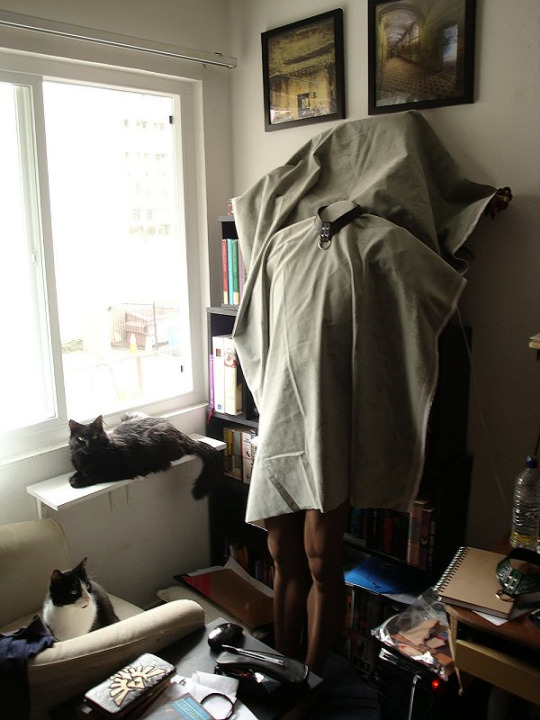
Long tutorial time: How to Take Product Photos That Don’t Suck

If you’re trying to sell your handcrafted work online, then your photos matter so much -- I daresay almost more than the work itself.
“Upcycled” items that are literal trash (but attractively photographed!) can sucker people into paying actual money for them. And on the flip side, the best-quality leatherwork in the world is going to look dubious af when the product shots were obviously taken in someone’s kitchen, lit by fluorescent lights and a camera flash.
You will get more sales and you will be able to charge more for your work if you have professional-looking product photos -- not fair, maybe, but true. So today I am going to show you how to create decent-looking stock photos, ie, a picture of just the thing itself on a backdrop.
(The cat is unrelated -- clickbait, really.)
I’ll admit upfront that I am very, very far from being a photography expert, and I'm sure an expert could do better than me, but I can't afford an expert and probably neither can you. And this isn’t about the mechanics anyway, it’s about the setup, and just making these small changes can seriously up your game.
Step one: camera
Unless you've already got a good camera, your best bet is going to be a smartphone -- and make no mistake, smartphones are a close second, not a distant one. Modern smartphones are phenomenal, they’re far better than even slightly-dated digital cameras. They can't get you the soft-focus background that an actual, professional camera can (the lens simply isn't long enough), but you can approximate that effect with photoshop if you want to, and the set-up I'm demonstrating here doesn't need a fuzzed background anyway.
The only critical feature is that your camera can take sharp, in-focus pictures.
If you don't have a good smartphone, find a friend who does and beg/wheedle/blackmail/bully them into letting you use it for a bit.
Honestly, I've got a good camera, and half the time I still wind up using my phone because I’m too lazy to bust it out.
Step two: backdrop
There are a lot of artistic things you can do if you're taking pictures of a product in situ -- action shots, still lifes, pictures of it worn by models -- and all that will help your customers visualize themselves using the item, but it's also vital to have pictures of JUST the thing, pictures that cleanly and clearly show exactly what the customer is going to be receiving in exchange for the money they throw at you -- aka stock photos.
And for stock photos, you don't want to get creative with your background. In fact, if you can use the same background for many/most of your images, it will contribute to an attractive, coherent look for your shop. That means finding a neutral-toned backdrop that will work with any color item you put on top of it -- white, black, grey, beige, basically.
White can mean a lightbox...

(And there are a million tutorials online for how to rig up your own DIY lightbox)
...or another popular alternative is a white table pushed up against a white wall; the seam between the two is visible, but discreet enough that the eye glides right over it.
Black, you can do with cleverdick manipulation of the settings on an expensive camera, or you can find a non-reflective black backdrop -- which is easier said than done. Fine, dense, matte black velvet (think theatre curtains) is the go-to black backdrop, just make sure you run a lint roller over it before taking pics.
Any other color is going to depend on the backdrop you choose -- I personally have had excellent luck with some warm-grey velvet (?) yardage that I picked up for pennies at a goodwill a million years ago. (I’m not sure what it is -- it has the pile of velvet, but shorter?) I didn’t buy it for that purpose, but it’s since proven to be an incredibly versatile backdrop, and I’ve taken to using it for everything:


etc.
And even if you’re not stumbling onto a super-good-deal at goodwill, a yard or two of your chosen fabric will generally do you fine.
What I don’t recommend is:
- shiny fabric (anything shiny is overall more difficult to photograph -- and shiny spots will draw attention to themselves, rather than your product)
- vivid colors (limits what color items you can display on it; will often clash if the item is close-but-not-quite-the-same color (and what looks fine to your eye may not look fine on film); can distract from the item you’re showcasing)
- patterns (again, distracts from the centerpiece; draws attention to the background; moreover, is hell to clone-brush)
Here is all three of them being the perfect storm of not-a-good-stock-photo:
Which is not to say you can’t do something artistic with it...

...but it’s not very versatile, and it’s not exactly “stock photo” anymore.
One of the reasons I really really like velvet for a backdrop is that there’s nothing in the world easier to clone brush. Which happens, for instance, if I get my roll of photos transferred to the computer and realize there’s some lint I neglected to brush off, or if I was too lazy to iron my backdrop so it’s got wrinkles/creases in it, or if the angle I had to take the photograph from clipped the edge of the backdrop--

--it is super fuckin’ easy to clone all that out. (It also takes the burn tool really well, to darken the edges and point the viewer’s attention toward the middle of the picture, see above.)
Other backdrops that can work are fur (or faux fur):


The great outdoors: mulch, leaves, dirt, sand, etc--
(That was taken at my shitty old apartment complex, so I had to carefully remove the cigarette butts from the shot first. -_-)


(I admit I’ve mostly stopped using these kind of outdoor backdrops -- they’re harder to pull off than wood/concrete/fabric -- but in the hands of someone with an eye for composition, they can definitely be used to good effect, so I’m including them here anyway. You just want to make sure that the background isn’t distracting from the item, which you can sometimes do in post by darkening/fuzzing the background relative to the focal object.)
Concrete:


And wood:

In short, there are many things that are (1) unobtrusive and (2) neutral-colored that will make excellent backdrops.
Professional photography backdrops (essentially, the velvet I have) are close to true neutral, not affecting the “feel” of the picture at all, and there are tons of tutorials online to make your own DIY photography backdrops.
Conversely, you can also use a specific backdrop to help create the mood you want to convey for the piece -- concrete for gritty and urban; fur to evoke a rich and sumptuous feeling (or a primitive one, depending on what you’re selling); wood or rough-spun cloth for something rustic; dirt and leaves to take it back to nature.
I’m not going to say the sky’s the limit, because we’re talking stock photos not ARRRRT!!, you gotta rein it in a bit, but you do have a lot of options -- anything that’s not going to clash with the mood or distract from your product.
Step three: lighting
USE THE FUCKING SUN.
Don’t ever, ever use a flash for product photography, seriously, are you some kind of SAVAGE?
Cardinal sin right there; go straight to hell, do not pass go, etc. Lighting like that, your product looks like it’s drunk at a frat party.
Moreover, unless you are a wildly over-funded professional, and possibly not even then, there is no light source superior to the sun. Sure, if you finish your project at midnight and can’t wait to share it, take some snapshots in your shitty studio light and send them to your friends--
--but do not make that your product listing photo. You can do so much better.

(And notice the color difference too -- natural light tends to be much better at capturing color that is true-to-life. The second picture is far more accurate to the actual item.)
*
That said, direct sunlight is a HELL NO go. The shadows it casts are way too stark, and details can get lost because the camera has trouble navigating the gap between the super-dark parts of the picture and the super-bright parts.
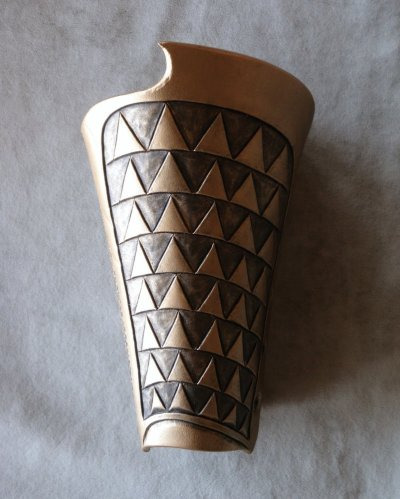
And it turned out that I’d never bothered to keep any of the photos I took in direct sunlight (because they sucked), so for the purposes of this tutorial, I had to take a couple of my WIPs outside and go make some.
Direct sunlight:

The glare and the obvious shadows make these photos look strikingly amateurish. It draws attention to the background, highlights the fact that the bracers are just sitting in some lame dead grass. These photos look like someone finished making the bracer, carried it ten feet out into their backyard, and snapped a picture.
Which, yeah, is what we’re doing, but it doesn’t have to look it.
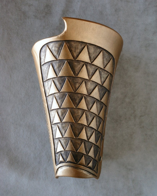
By contrast, indirect sunlight, when I move it four feet over into the shade of the house:

Right away, the diffused light (sort of soft-focus?) is more in line with what you see in professional photos. They still need editing before they’d be ready to roll out -- fiddling with contrast/saturation/white balance; clone-brushing out some of the distracting elements in the background; darker shading around the frame to center attention on the product -- but they have the potential to be decent photos now, instead of being critically flawed from the get-go.
When you’re using sunlight as your source, you’re usually going to be setting up either outside in the shade, or inside next to a window.

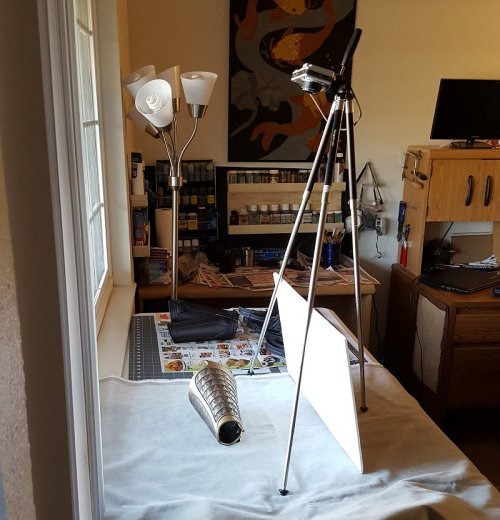
The context for some of these shots can also be hilariously un-sexy when you zoom out:

*
Sunlight tends to be much better at retaining the textural details of your work too, because more light means your camera can take a much quicker shot (low light = camera compensates by leaving the lens open longer to collect more light = blur).
If you want to really capture the fine texture of an item, natural light coming from one side (like through a window) is perfect, because of the shadows it casts:


On that note: if you’re trying to use a window as your light source, you may have trouble with the far side of the object being completely lost in darkness:
Which can be artistic, but doesn’t make for a great stock photo.
The solution is not to use another light source, but to use a reflector -- my go-to is white foam-core posterboard:
Which can fill in the shadows that are obscuring parts of your work:
Mirrors or foil can work for this too, but they tend to cast stark/uneven light, whereas the white board diffuses it, and diffusion is pretty much always what you want.
*
On the subject of diffusion: overcast days are your BEST FRIEND. They basically turn the whole sky into a lightbox for you. You get soft, beautiful light from all directions, muted enough to reduce glare, but there’s still more than enough light to keep your camera happy and your details sharp.
(Man I wish there were more clouds where I lived.)
Here’s an interesting little contrast -- this one was taken on a sunny day, but in the shadow of my house, using a white reflector to move light around:

And then the very next day we had rain, and I was like, hell yeah, and took it outside for more pics:
Obviously both have had the contrast increased to bring out the details, but the mood difference between the two is 100% the weather.
*
And that is FAR from everything there is to say on the subject of photography lighting, but for the purposes of amateur product photography, those are the important bits.
TL;DR:
- Natural light
- Diffused light
*
Step 4: post-production
This is also not something I’m an expert in, I’ve learned just enough to get by and called it good enough. (It’s why I lean on overcast days whenever I can, because it eliminates a lot of the lighting problems that I don’t know how to fix in post.)
But here are some of the things that you will find yourself needing to know, and should be looking up how-to’s on for your graphics editor of choice:
White balance/saturation
Light comes in different colors, but the human eye automatically compensates for it, so often times something looks good to your eyes, but then comes out way funky on film.
Indoor lighting tends to be yellow-hued, because that’s what feels warm and comfortable to humans, but it looks nasty in photographs:

Natural light tends to be white (which is why it gives you more accurate colors), getting more blueish as it heads toward evening:

You can compensate for both by adjusting the white balance, in which the program figures out what white is supposed to look like, and then calibrates all the other colors in the picture accordingly.
Brightness/contrast
Is it bright enough to see the details? Is the contrast high enough to make the details POP, instead of blending together into a muddle?
You can apply brightness/contrast adjustments to the full image, and then (if necessary) go in by hand with the burn/dodge tool (brightness up/brightness down) and add extra highlights.
(Don’t go overboard on this though -- this isn't art, this is a product photo, and if you take it too far from the real object, you are lying in your advertising.)
Blur/sharpen
Are the focal points sharp? Sharp areas of an image are what draws the eye, so if your photos are blurry, they’re no good and there’s no fixing them -- grab your camera and go take some more.
Is your background less sharp than the foreground? A too-sharp background will distract from the central point, so sometimes you can put a very subtle blur on it to trick the eye into ignoring it. (Dropping the brightness and the contrast are also both ways to make the background less eye-catching.)
Clone brush
Basically a mini copy-paste tool, you grab parts of the image and copy it onto other parts. This is good for tidying up your background -- coloring in corners that your backdrop didn’t cover, or removing distracting irregularities.
Again, this is one to be used sparingly, because this is product photography, it needs to be accurate, not idealized. You don’t get to scrub off the imperfections and make it look like you’re better at [whatever] than you are.
The only time I consider it acceptable to use the clone brush tool on the actual product is for editing out flaws in the leather itself. It’s a stock photo; customers are not going to be getting the exact item shown in the photo. I’ll be making a new one for them, one that’s not going to have those exact flaws. (It’ll have excitingly new and different flaws! Such is the nature of organic materials.)
Edge gradients
A subtle shadow around the edge of your picture brings the whole thing together, makes the background recede a bit, and directs the eye toward the centerpiece. Too heavy a hand with this will still look nice, but more staged; it alerts the viewer that you’ve been photoshopping and kills the “I woke up like this~” illusion.
Relatively natural:

Dramatic!

Watermarking
You want people to be able to find their way back to you when your work inevitably gets cross-posted without the source (fuck you in the face, pinterest), so it’s not enough to put your initials or abstract logo or illegible signature on it, you need your google-able name or company name.
At the same time, people have been known to crop out (or clone-brush out) watermarks that are big and tacky, so it’s in your best interests to make your watermark tasteful and inoffensive. (Also: ugly watermarks just bring down your whole image, seriously.)
Some of the pictures above are old enough that they’re sporting my older & less professional-looking watermarks, but what I use at the moment is this:
(But, y’know, smaller.)
Best way to do watermarks is usually to create another layer over your image and blend the two. For dark logo/light background, the settings for the new layer are 1) blend mode: multiply, 2) opacity: 85% (adjust as needed). For light logo/dark background, the blend mode is probably going to be “soft light.” And then just paste your logo in the corner of the new layer -- the blend mode means your logo doesn’t have to be transparent, the program just ignores the parts that are lighter/darker than the background.


*
And that, I believe, is the end. o_O I had no idea I had so many opinions on the subject of product photography.
Again -- I’m not a pro. I don’t know how to use 99% of my camera settings or 80% of my graphics program. (For fuck’s sake, my go-to graphics editor is the bootleg version of Paintshop Pro that I acquired in 1997.) This post represents the sum total of my knowledge on the subject.
But it just goes to show that you can do a lot with only a little, and that your composition and sense of aesthetics are far more important than what gear you’ve got.
#y'all should reblog this#because there are people who NEED TO SEE THIS#much obliged#gremble has opinions#tutorial#photography#diy#making this yo business#long-form tutorial
39 notes
·
View notes
Text
Hello. It’s been awhile.. and I’m finally writing again
Hereby lies my overflowing thoughts of my journey in my 3rd year of studying composition & arranging at Lasalle College of the Arts. Hereby i present to you my logbook. I hope it’s interesting to read..
SEMESTER 1
WEEK 2 || Monday, 7th September 2020
note: Lesson 1 started at Week 2 in 2020.
Topics:
Review of Harmonic Landscape
Advanced Modulation
HARMONIC VOCABULARY
(Belinda Foo. Lasalle College of the Arts 2020)
ADVANCED MODULATION
refer to Max Reger’s text on Modulation
Some key concepts;
No Enharmonics
All modulations approached via cadence-like progressions
Observations;
The modulations are ‘logical’ and can be accountable via tonal relationships
All modulations are arrived at cadentially: IV – V – I, II – V – I, bII – Ic – V – I
It is easier to work out the modulations ‘backwards’ from the dominant of the new key
Relationships between Keys
Pivot chords
Borrowed chords
Neapolitan 6th chords (especially for remote modulations)
Dorian 6th chords (E.g. D major triad in A minor)
2nd super-dominant (E.g. D major triad in C Major)
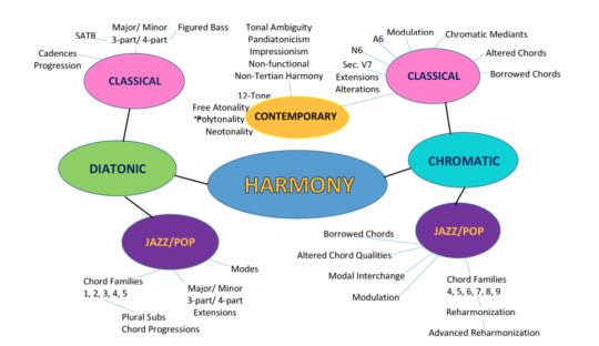
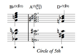
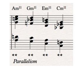
REVIEW ADVANCED REHARM
Review Menu of Chord Choices
Using Outer Line Movement: Directional interaction between Melody and Bass line
Contrary Motion
Parallel Motion
Chromatic Movement
Tonal Movement
Tritone Movement
Pedal Point
Free Bassline
Contrary Motion

Parallelism
Chromatic Movement
Tonal Movement
Tritone Movement
Pedal Point
Free Bass line
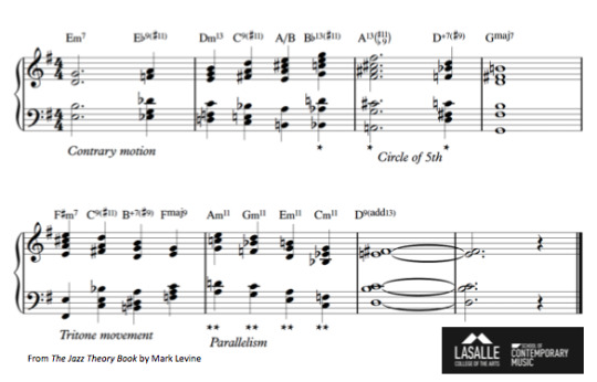
Use of Polychords
C Major triad over Bb7
F# Major triad over A7
Bb Major triad over D7
Use of Minor 11th Shapes:
Open 4th at the bottom
Triad (2nd inversion) at the top
—————————————————————————————
WEEK 3 || Monday, 14th September 2020
In week 2, Belinda discussed the same topics from Week 1 because we had not yet covered everything last week. My summary from this week is concluded in week 1 as it is also pretty much the same from last week. Belinda also further talked about Max Reger’s techniques.
Topics:
Review of Harmonic Landscape
Advanced Modulation
—————————————————————————————
WEEK 4 || Monday, 21st September 2020
In week 3, Belinda further talked about Max Reger’s modulation again. The summary for this one is also included in my week’s 1 summary. Other than that we discussed about Romantic and Late-Romantic music, Wagner’s Lohengrin, and writing for strings.
Topics:
Max Reger Modulation Review
Romantic & Late-Romantic Orchestration
Analysis of Wagner’s Lohengrin
Writing for Strings
ROMANTIC MUSIC PERIOD
basic information:
From about 1830 to 1900
Characteristics: expressive, expansive, virtuosic, inspired by art, literature
New forms beyond the Classical forms, such as: rhapsody, arabesque, song cycle, nocturne and programmatic music
Greater Chromaticism
Extended melodic lines, themes
Romantic Composers
Berlioz, Hector
Brahms, Johanne
Bruckner, Anton
Chopin, Frédéric
Dvorák, Anton
Grieg, Edvard
Mahler, Gustav
Tchaikovsky, Peter
Strauss, Richard
Wagner, Richard
Relevance of Romantic Music Today
Melodies and Harmonies still used in Film & Animation music
Leitmotif: a theme associated with a character, place or idea
Orchestration: Romantic Orchestra & Orchestral techniques
COMPOSING FOR STRINGS
Characteristics of the Strings Family;
Homogenous timbre throughout the family
Virtually tireless for both player and listener
Flexible, versatile in terms of register and ability
Writing for Strings Masterclass:
link: https://www.youtube.com/watch?v=yST6mS8W1f8&ab_channel=JeffPifher
personal note:
This was actually a homework from previous week from Belinda, and i watched the video beforehand. There were some key takeaways to make writing for strings more interesting like (which are actually unbelievably so simple) ;
- “know what to look for” — pay attention to your melody, style, phrasing
- playing with texture (e.g. one line playing staccato, another line playing legato/long lines)
- accents!!! — articulation is key!!!
The Strings Choir as:
Foreground
Middleground
Background
Homophonic Writing
Accompanying Choir
Contrapuntal Textures
Special Effects and other 20th Century devices
String Section Sizes
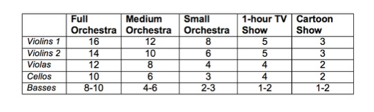
General String Writing Tips
Divisi: divides the section, used to add/ complete harmony. Div a 2, Div a 3, Div a 4 (not common). Not a good idea to divisi violas if they are less than 8 players (6 players minimum)
Double stops: most commonly used to add harmony part. Stick to slow moving passages. Check that the double stops are feasible on the instrument.
Pizzicato: Best kept to the lower 3 strings
Octave combinations: It is common practice to double very high violin lines (Violin 1) an octave lower (Violin 2) to lend the former support.
Bowing Effects
Belinda asked us to refer to this video, which I also watched before the class as it was part of our homework from last week.
link: https://www.youtube.com/watch?v=cEBN2UkJavk&ab_channel=VIOLINLOUNGE byViolinistZlata
ANALYSE WAGNER’S LOHENGRIN PRELUDE 1
note;
during this analysis, our main focus was the string writing, string choir: homophonic writing primary line against accompaniment
link: https://www.youtube.com/watch?v=gT1AfIUgO88&ab_channel=ClassicalMusicScores
—————————————————————————————
WEEK 5 || Monday, 28th September 2020
Topics:
Max Reger Modulation Review
Writing for Woodwind
Analysis of Wagner’s Rienzi
MAX REGER MODULATION REVIEW
This week, Belinda reviewed about the Max Reger modulation. The summary is pretty much the same with the previous weeks we had it.
WRITING FOR WINDS
Characteristics of the Wind Family
Less homogenous in sound (unlike the Strings)
Single reed and double reed timbres differ
Wind players need to take breath
Some Interesting Effects
Double-tongueing/ Triple tonguing
Harmonics - The pitch of the harmonic sounds exactly as it is notated
Fluttertongue - Flautists flutter their tongues to create a “frrr,frrr” sound
personal note;
because of the lessons and workshops I had from Felix’s class (Specialized Ensemble Workshop), these effects were no strangers to me and I am quite familiar with it. I have also used these effects in my composition (mainly in his class). But this lesson was a good refresher to me.
Common Functions
Harmonic background - Homophonic wind writing
Solo passages - Choice of timbre/colours
Contrasting colors - To repeat or echo; create relief
Double other instruments - add richness, warmth; brighten up
Contrapuntal Writing
The unique color of each wind instrument makes for ideal contrapuntal writing
Refer to Britten’s The Young Person’s Guide to the Orchestra, Fugue, mm 1-55
Refer to Stravinsky’s Rite of Spring, “L’Adoration de la terre” mm 40-60.
Special Effects and other 20th Century devices
Belinda showed us some pieces that has examples of special effects. The pieces we discussed were;
1. Penderecki, Dies Irae “Apocalypsis” mm 2-4
Winds first play the highest pitch they are able to produce. Then they trill on the specified notes until the end of the dark line with arrow.
2. Stachowski, Irisation for Orchestra, third movement, mm. 79-83
The composer asks the winds to remove their mouthpieces from their instruments and “play through them.
ANALYSES OF WAGNER’S RIENZI
note:
during this analysis, our main focus was the woodwind writing, homophonic writing, choice of color,relief, highlights, adding warmth, and color
—————————————————————————————
WEEK 6 || Monday, 5th October 2020
Topics:
Writing for Brass
Analysis of Wagner: The Flying Dutchman
WRITING FOR BRASS
Characteristics of the Brass Family
Most powerful sound resource in the orchestra
Not as homogenous in sound as the strings although horns and trombones can blend fairly well
Not’ tireless’ on players and listeners — the brass sound is an imposing one and players need to breathe
Common Functions
Homophonic Unit
Pay attention to voicing, spacing, voice-leading and doubling
Refer to overtone series
Strengten and clarify harmony
Reinforcing harmony played by another choir
As a pedal
Harmonic ‘glue’, background line
State a melody
Choice of timbre, dynamics
Combinations
Double other instrument(s)
To add colour
add weight, power
Build Climaxes
Hold back first, save the colour for climactic event Contrapuntal voice
Use instruments in their best register — clarity go line and balance
Pay attention to timbral differences and articulation
refer to Stravinsky’s J.S Bach Choral Variations, Var. IV, mm. 1-6
Special Effects in Brass
refer to “Contemporary French Horn Techniques - Guide for Composers”
link(s):
https://youtu.be/_FPDrQzRE3o
https://youtu.be/-IwXEyr4uV8
https://youtu.be/qQ1oe3YSqsY
ANALYSIS OF WAGNER’S “THE FLYING DUTCHMAN”
note:
In this analysis, our main focus was the brass writing, choice of color, and orchestral combinations.
another note (not important); everytime i hear the word Flying Dutchman, it reminds me of the movie Spongebob Squarepants :))))). The Flying Dutchman is the ghost that Spongebob and citizen of bikini bottoms most feared of
—————————————————————————————
WEEK 7 || Monday, 12th October 2020
Topics:
Motivic/Thematic Development
Orchestral Devices
Analysis of Holst’s Mats, Mercury, Venus
MOTIVIC DEVELOPMENT
Repetition
Sequence
Changing intervals
Fragmentation
Extension
Inversion
Changing the rhythm
Decorated repetition
Changing order of notes
Augmentation
Diminution
Contraction
Expansion
personal note:
Belinda showed us examples (played it on her keyboard) of motivic development by playing a short motif and expand it by using the devices above. It is such a simple idea yet so useful and i foresee myself using these techniques many times because of the very little amount of time i’ll be having to write for my recital. a.k.a squeezing juice out of my brain!!!
THINKING ORCHESTRALLY
Basic Concepts
Balance
Sonority
Unity, Variety
Tone/ Timbral colour
Clarity, Brilliance
Expressiveness
Orchestral Textures
Orchestral Unison
Melody and Accompaniment
Primary and Secondary Element(s)—Melody, secondary line(s), accompaniment
Part Writing
Isolated Chords
Complex Texture
ORCHESTRAL DEVICES
String Quartet & Wind Quintet
Within Family timbres
Solo feature
Combination of timbres
Tutti unison
String devices; bowing techniques (detaché, legato, marcato, staccato, spiccato, au talon, Punta d’arco), Pizzicato, tremolo, col-legno, sul ponticello, glissandi/portamenti, harmonics
Wind devices; Double-triple tonguing, flutter tonguing, harmonics, slap-tongue
Brass devices; mutes, stopped, double-triple tonguing, glissandi, bells up (horns)
Percussion; Types of Percussion— pitched, unpitched, Metal, Wood, Non-metal, Membranous, Keyboard
ANALYSES OF HOLST’S “MARS”, “MERCURY, and “VENUS”
note;
during this analysis, we focused on the choice of color, orchestral combinations, and motivic/thematic development
personal note; i love love love uncle Holst so much. I wish i wrote his pieces. Some of his pieces from The Planets series also has become my inspirations in writing my recital pieces!
—————————————————————————————
WEEK 8 || Monday, 19th October 2020
Topics:
Review Compositional Devices
Analysis of Holst’s Mercury, Venus, Jupiter, and Uranus
COMPOSITIONAL DEVICES
remember remember remember this!
Common Practice Tonal Centers — Major and Minor
Chord Extensions — 9ths, 11ths, and alterations
Added note chords
Chromaticism and Tonal Ambiguity
Meter-Mixed and Asymmetrics Meter
Modes and other Scale sources, including Synthetic scales
Pandiatonicism
Polyharmony—Polytonality and Polychords
Non-Tertian Harmony — Quartal and Quintal
Scandal Chords — clusters
Parallelism
12-tone Technique and Serialism
Limited Composition—based on intervals
Hexachord Writing
Unrelated Triads
Neotonality
Mirror Writing
Harmonic Direction; Progression, cadential services
Harmonic Synthesis
Indeterminate Procedures
NEOTONALITY
basic information;
Tonality that is not based on any particular diatonic system nor functional harmony (Common Practice Period)
Features non-traditional concepts such as tonal assertion or contrapuntal movement around a tonal centre (which may shift).
Combining the features of Common Practice Period tonality with 20th Century tonal ambiguity and atonal characteristics
Neo-tonal Composers
Paul Hindemith
William Schuman
Roy Harris
Samuela Barber
Vaughn Williams
Sergei Prokofiev
Igor Stravinsky (Neo-Classical pieces)
ANALYSIS OF HOLST’S MERCURY, VENUS, JUPITER & URANUS
i love holst’s piece because it sounds like a film score!
Mercury
The Winged Messenger
Energetic, momentum
Changing tonalities-darting from key to key
Rhythmic & Metric ambiguity
Venus
Bringer of Peace
Woodwinds — overlapping winds, tertian harmonies, sweet
Twinkling effect — 2 harps, glockenspiel
Lines —lower strings
Jupiter
Jollity
Full of beautiful themes, melodies
Use of Timpani
Syncopation
Uranus
Rotates on its side (axis is different from other planets
‘Lop-sided feel’
Strong motif: G-Eb-A-B
personal note:
my favorite is probably the Jupiter piece. It has also become an inspiration for my recital pieces. The sounding-like-film also very much suits my style!
—————————————————————————————
WEEK 9 || Monday, 26th October 2020
Topics:
Review Compositional Devices Pt.4
NEW: Media Music
REVIEW COMPOSITIONAL DEVICES
My summary would be pretty much the same from last week
MEDIA MUSIC
basic information:
Music that is written for film, TV, animation, games, commercials, web applications with the intention of enhancing the production or product.
Practicalities to Note
Specificity of usage
Duration, mixes
Open-ended (looped), Closed-fixed duration
Style, Concept
Target Audience
Functions of music in Media
Commenting
Illustrating Movement
Enhancing Momentum
Create Atmosphere
Portray Emotions
Social/Cultural/Geographical references
Time/Period references
Connects scenes and montages
Alternate the perception of time
Imply a sense of space
Create unreal situations
Create contradictions
Physiological Conditioning
Imply size relationships
—————————————————————————————
WEEK 10 || Monday, 9th November 2020
Topics:
Serial & Atonal Counterpoint
Counterpoint in Hindemith, Bartok, and Stravinsky
Chapter 27 &28 Harold Owen, Counterpoint
SERIAL & ATONAL COUNTERPOINT
during this discussion Belinda showed us examples from;
Schoenberg, No.4 from Five Piano Pieces OP. 23
Webern, Variations for Piano Op. 27, Movement II
Things to pay attention to were;
Texture
Cohesion
Use of Dissonance & Consonance
Temporal Elements,Rhythm, Pulse, Meter
Canonic Qualities
HINDEMITH, BARTOK, AND STRAVINSKY COUNTERPOINT
Belinda showed us examples from these pieces;
Hindemith, Fuga Quarta in A, Ludus Tonalis
Bartok, Theme and Variation from Mikrokosmos, Book IV
Stravinsky, Great Chorale from L’Histoire du Soldat
we also discussed about the things noted below;
Hindemith
Compare the melodic style of hindemith’s fugue with Schoenbrg’s piece
Describe the vertical sonorities, cadences, and treatment of the major triad
Describe the temporal aspects in Hindemith’s fugue and compare them with Schoenberg and Webern
Bartok
What is the tonal centre of this piece?
Describe the melody in this example
What are the intervallic relationships?
Explain the significance of ‘Theme & Inversion’
How are the parts related and yet maintain their independence?
Discuss the rhythmic treatment
Stravinsky
How does the ‘Great Chorale’ resemble a Bach Chorale?
What key is this chorale in? Describe the cadences.
There is liberal use of chromaticism, yet the voice-leading is diatonic. Explain this.
There are triads in the harmony. Discuss how they are used here in comparison to music of the Common Practice Period.
—————————————————————————————
WEEK 11 || Monday, 16th November 2020
Topics:
Review Series & Atonal Counterpoint
Passacaglia writing
Creating Harmonic & Textural Worlds
REVIEW SERIES & ATONAL COUNTERPOINT
Discussed the same thing from last week, and Belinda discussed the things she has not yet covered, making the topic more in-depth. My summary for this is the same from last week.
PASSACAGLIA WRITING
What is Passacaglia form?
Passagcalia is a musical form of continuous variation in triple time. It was a courtly dance that originated in Spain in the 17th Century.
The passagcalia usually begins with an ostinato in the bass, but is also found in other voices.
How to write a Passacaglia?
Begin with a ’tonal’ line that will work well as a repeated pattern
Variation is created as other lines are layered over/ under this repeated pattern
This initial theme can be sequenced, but it should not be modified too much
The initial theme should always be present in at least one of the voices
Famous Passacaglias include:
Bach- Passacaglia and Fugue in C minor for Organ, BWV 582
Ravel- Piano Trio in A minor, III. Passacaille
Copland- Passagcalia for Piano (1921-22)
Hindemith- Passagcalia, Noblissima Visione Suite
William Schuman- Symphony No. 3
Things discussed;
How is the initial theme repeated, varied?
How are layers added?
How is the theme sequenced?
How are dissonances and consonances manipulated?
Observe density and contour
Observe textural changes
—————————————————————————————
WEEK 12 || Monday, 23rd November 2020
Topics:
CONSULTATION FOR HALF RECITAL
General Types of Musical Material
CONSULTATION FOR HALF RECITAL
For my consultation, I showed Belinda my first draft of my first piece from my recital, titled “The Bushfire, The Flood, and The Virus”
GENERAL TYPES OF MUSICAL MATERIAL
Unaccompanied melody
Unified harmony
Composite harmony
Imitative counterpoint
Similar Counterpoint
Contrasted Counterpoint
Composite musical material
Unaccompanied Melody
Solo
Doubled Unison
Doubled at the Octave(s)
Tutti Unison
Unified Harmony
All parts move in the same rhythm
May be minor, incidental rhythmic differences
Uniform tone-quality
example;
with some minor, incidental rhythmic differences;
Composite Harmony
2 or more chordal components are layered, each harmonically completely alone
May be treated as harmonically unified or composite
a large vertical distance between the 2 shapes divides it into 2 parts. The harmonic effect is divisive.
The contrary motion of 2 simultaneous chordal units: produces the effect 2 constituent harmonic units
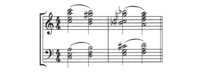
The presence of 2 or more chordal units, with independent rhythms
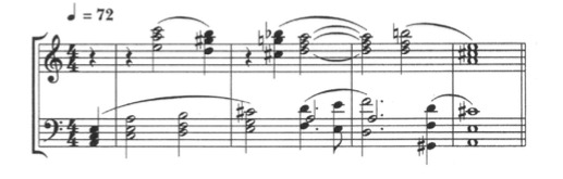
The effect of unified or divisive harmony depends on these factors:
Tone-quality: the use of a single tone-quality or similar tone-qualities will produce a unified effect
Direction: parallel movements tend to be more unifying than contrary motion
Common rhythms are unifying
Large distances between harmonic units have a divisive effect
Imitative Counterpoint
This involves canonic situations.
To bring out the relationship of imitative parts, one tone-quality should be used.
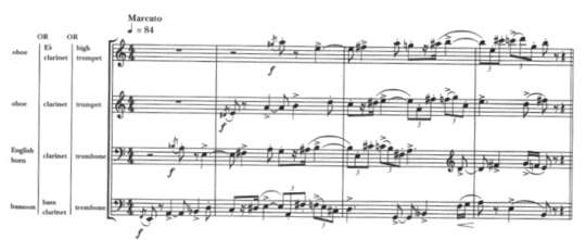
‘Similar’ Counterpoint
This is non-canonic counterpoint.
The parts are related by common rhythmic and intervallic ingredients
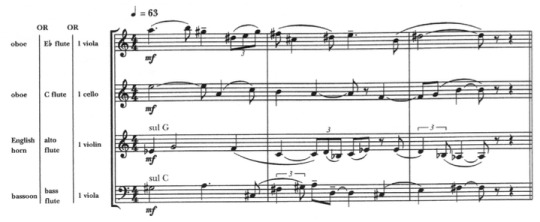
Contrasted Counterpoint
The lines are have noticeable differences in intervals and rhythms
The differences may be accentuated with the use of different timbres
Composite Music Material
A melody with its own rhythm, accompanied by unified harmony in another rhythm, plus composite harmonic interjections:
next example; Imitative counterpoint (piccolo & clarinet) superimposed on unified harmony (strings) in contrasted rhythm, plus a bass line (tuba) in a different rhythm.
Next example: Composite harmony- violins & violas in 1st group, cellos & basses in 2nd group- enclosing a 2-part ‘similar’counterpoint (2 horns), whose rhythm is different from the harmony.
—————————————————————————————
HALF RECITAL
for my Half recital, i submitted 3 pieces out of 4. They were the;
The Bushfire, The Flood, and The Virus (2′20″)
Purple Pinkish Cotton Candy Sky (1′57″)
Full Moon (2′32″)
———————————————————————————
———————————————————————————
———————————————————————————
SEMESTER 2
WEEK 1 || Monday, 18th of January 2021
Topics:
Review semester 1
Scoring for Film, Animation, and Media
Review Semester 1
It was finally the first day of school again! at the beginning of the class, Belinda asked about what we had been doing during the holiday. I personally spent my holiday working on writing 3 shanghai jazz songs for a short film. In addition, I was arranging for lasalle’s Composer’s Concert 2021. Planning the date, concept, musicians (for my own band), and composers who are interested to showcase their pieces at the concert. —— BACK TO THE TOPIC —— Belinda mentioned that she was surprised to hear some of the works from half recital which me and my classmates did and we were happy to hear that! afterwards, the lesson started.
Scoring for Film, Animation, and Media
Finally....SCORING. One of my biggest interest in music is Film Scores. And to be honest with you, the reason i went to Lasalle and took Composition & Arranging as my stream was because i wanted to be a Film Composer. I’ve always dreamed of being one ever since i was young. So, this topic really interest me indeed. I had been looking forward for Belinda to teach this ever since the start of my day 1 studying at lasalle. “Finally... i thought.”
Here are a little summary from it;
Film Scoring — The People
The Producer: responsible for developing and nurturing the project from beginning to end. He hires the proper people, raises money, seems the film. His role is varied and straddles the administrative, financial, and creative.
The Director: responsible for envisioning and approving creative decisions. He wants the score to reflect and enhance the idea of what the film is about.
The Executive Producer: Usually the CEO of the production company. He is not in charge of the daily processes but will exercise final control over all the elements—business and creative.
The Editor: works with the director and cuts, edits his footage into a story flow. He is likely to have a good idea of how the music should fit the footage and can be an excellent liaison between composer and director
The Music Supervisor: handles the administrative part (and sometimes creative) of the music for the film/ TV program. He works with budgets, negotiated deals, hires contractors, arranges recording sessions, etc.
Film Scoring — The Screening
Go in with a notepad
Concentrate on the big picture—the overall emotional effect, the film’s effectiveness
First impressions matter—note them
Get a sense of the mood, feeling
Do not do any spotting yet
Film Scoring — Rough Cut
Establish a concept for the score
Demonstrate that concept the composer
Whilst helpful in providing the composer with a clear musical direction, they can also be a bane when the director is so used to the music that anything else will not satisfy him
Film Scoring — Style & Genre
In every style, genre of film, there is an appropriate response, an expectation, a vocabulary. These expectations are based on a precedent, a thorough study of classic films in a particular genre is essential to successful scoring. It’s not about imitation but about knowing the language and eliciting an appropriate response/reaction.
Film Scoring — Main Genres
Action
Adventure
Animation
Comedy
Crime & Gangster
Drama
Epic/Historical
Fantasy
Horror
Musicals/Dance
Science Fiction (Sci-Fi)
War
Westerns
Film Scoring — The Concept
The concept is the heart of the score. It can be discussed in terms of musical style and will form the basis of the thematic material of the film score. The composers needs to understand the central character and motivations.
There is also another dimension to scoring the character apart from scoring his/her personality, and that is, getting inside the character’s head. That dimension can chance from scene to scene, moment to moment.
On my personal note; i went to surf the internet and read more about this. After reading more about film music, i discovered that film theorists often categorize film music as diegetic or non-diegetic. Diegetic music, the music we perceive the characters can hear, is part of the story world. Meanwhile, Non-Diegetic, also called as commentary or nonliteral sound, is any sounds that does not originate from within the film’s world. Non-Diegetic music (such as a film’s title theme) narrates the film from “outside” the story world and is only audible to the audience. When Belinda mentioned about the music getting inside the character’s head, it can also be referred as diegetic music.
Back to the topic, to summarize, when talking about the concept of the film, it’s important for us the composer to know what the film is really about. Explore the characters and their themes. Often, films will have more than one dramatic theme; a personal theme and a larger overview sort of theme.
another thing to take note is that musical genres/styles are often part of a score and it is IMPORTANT to stay CONSISTENT to those styles throughout the film. Composite style (where several different stylistic elements are fused together) are also permissible but think of the appropriateness of the music to fit what is happening on the screen.
Film Scoring — The Tone
Tone refers to the attitude of the dramatic work. Whether is it dark or uplifting, etc. The composer needs to get a clear direction of tone in order to ‘assist in the storytelling’.
example: “Raiders of the Lost Ark” is a movie whose tone changes drastically from moment to moment: from humor to terror, from impending doom to a swashbuckling escape.
Checklist:
Overall dramatic theme
The central character
other themes
Time (period) / Place / Ethnic flavor
Instrumental Palette
Musical Style
Combination of styles, colors?
personal side note:
Perhaps what i understood about this is that the tone of the music is something that everything revolves around with, and in order to set the tone of the music, we need to understand the concept of the film well enough. Understanding the character, mood, and genre.
The tone can be set by things like our orchestration, instrumentation color palette (timbre), and also the techniques we use to compose like harmonic language and texture.
—————————————————————————————
WEEK 2 || Monday, 25th of January 2021
In week 2, Belinda resumed the topics from week 1. She also discussed more deeply about it. In this week, she also talked about the devices/musical techniques that we should considerate when scoring for a film.
Topics:
Scoring for Film, Animation, and Media (Part 2)
FILM SCORING — ETHNIC, PERIOD
When scoring for films with ethnic/period character, the composer needs to decide if he/she will score totally in that style, just flavored by those musical elements or not influenced by that time and place and all.
In some instances, musicological accuracy is necessary, but most situations call for a combination-approach: ethnic/historical accuracy and other harmonic/melodic language to score the drama and action.
Things to consider:
The film’s point of view
Scales, motifs, folk tunes, harmonies of that ethnicity/ time/ place
Rhythms of that ethnicity/ time / place
Instruments
There us a fine line between authenticity and stating the obvious. Avoid music clichés and other tires and overused references.
FILM SCORING — PLAYING THE DRAMA
Your audience has expectations: as a composer, you need to know what they are before you can use those expectations as tools for manipulation.
You can surprise your audience, but never betray them. Their expectations are tied closely to the function of the score and the style of the movie. The score must do what the audience expects it to do- excite them, lift them up, tug at their heart strings, make them curious, etc.
The composer knows the ending but the audience doesn’t, so it’s really important that the music never “spoils” it or gives too much away.
Whose point of view are you playing? The audience or the character?
If you are playing the audience’s POV, you’re scoring their emotional reaction. If you’re playing the character, then you’re scoring the emotional/ mental state or action that the character is in or is doing.
Main Title: The main title establishes the overall tone and setting for the movie and primes the audience’s expectations.
Dialogue: Underscoring dialogue is tricky as the composer needs to ensure that the dialogue can always be heard and understood. Where the lips can be seen, comprehensibility is easier as the audience can lip read. In instances where the lips cannot be seen, extra care needs to be exercised.
notes on Dialogue:
In general, smooth musical textures are less intrusive. Also, try to keep out of the speaking range.
Stay away from accents and distinct solo lines: allow the spoken line to be the ‘soloist’
Don’t overwrite. It’s an underscore.
MUSIC AND ITS ASSOCIATIONS
Many styles of music already have their visual and emotional associations: Gritty Jazz puts us in a big city, Gregorian chant brings us into a monastery. Use the power of musical associations to get the audience in the right place, in the right state.
for example: the film “Out of Africa” scored by John Barry has the genre of classic romance. The score is associated to the romance rather than about the period film set in Africa.
Musical Points of View
Getting inside the character
De-emphasizing the scene
Juxtaposition—playing against the scene
The minimalist approach (ex: “American Beauty” plastic bag scene by Thomas Newman
Silence
Highlighting, accenting the drama
MUSICAL CONSIDERATIONS
Now that you have a concept for the score, the next step is to translate that concept into musical terms.
The basic elements to consider are melody, harmony, rhythm, and instrumental color.
Unity and Variety
Strong scores strike a fine balance between repetition (recognition) and variety. Repetition in music can help to develop emotional power through the cumulative reactions of the audience to the repetition of a theme. With repetition, the association between the music and the characters/ situation becomes stronger.
The same theme can also be modified/ varied to suit a different setting.
Tempo/Pulse
This is the first task of the composer: to determine the pace of the scene/cue
Checklist:
Does the tempo feel emotionally compatible with the scene?
Does it provide forward motion?
Will it provide too much forward motion?
Is this a comfortable tempo for dialogue?
If the cue calls for tension, play a low repeated note with basic pulse and check if there is dramatic build-up
There are cues/scenes that require a change in pulse and tempo. The composer will need to plot a variable click in those instances.
Hitting/Catching the action
Unless the composer is scoring for cartoon/ animation, he/she will not be catching all the action. This is also known as Mickey-mousing.
The average score catches less and more subtly and often plays through the scene. Composers will score the emotional shifts in the scene, usually subtly, through entry of themes, change in colour, rhythm etc...
Composers need to analyze the scene by taking note of the shifts of emotional emphasis, shifts in action, shifts in camera angles, editorial cuts.
Beginning the Sketch:
Plot out the shifts on your sequence. Note the timings
Decide on the tempo and tempo changes. Plot the click and adjust meters accordingly.
Compose the thematic material for the cue.
Plot it into the sequence. (It may not appear at the beginning of the cue)
Check to see if the entry of the theme is compatible with the visual and shift it/ adjust it until it fits.
Write around the theme- into its entry and after it is stated.
Using the 4 basic elements of melody, harmony, rhythm and instrumental colour, finish writing the cue.
The motif is a powerful compositional tool that composers have used throughout the centuries. The motif allows the composer to write with unity and leaves him/her room for variety.
A strong motif is the key to a strong score.
Examples of strings motifs;
Beethoven’s 5th Symphony
John William’s Jaws
John Barry James Bond- Octopussy
Nino Rota Godfather- Love Theme
John Williams- Return of the Jedi- Darth Vader Theme
Bill Conti- Rocky Fanfare
HARMONIC CONSIDERATIONS
Harmonic language is the emotional palette that composers use to elicit a desired response from the audience.
Triadic shapes and traditional progressions elicit different emotions from atonal and dissonant sources. Composers need to pay attention to the tension or placidity of their harmonic choices and combinations.
Choices:
Diatonic Harmony and Chromatic Harmony
Modal Harmony
Pandiatonicism
Quartal/ Quintal harmony
Exotic/ Synthesized scales
Limited Composition, Hexachords
Polytonality
Atonality/ Serialism
Harmonic Devices:
Vertical Structures (Homophony)
Linear writing (contrapuntal writing)
Pedal points
Ostinato
Complex Texture
—————————————————————————————
WEEK 3 || Monday, 1st of February 2021
Topics:
Influence of Great Composers
17 Functions of Music in Film
INFLUENCE OF GREAT COMPOSERS
In week 3, Belinda showed us some of the most influential composers in the past that also affects film composers nowadays. Some of the composers and their pieces she discussed in the class were;
Stravinsky - “Rite of Spring”
Bartok - “Music for String instruments, Percussion and Celesta”
Orff - “Carmina Burana”
Brahms - ”Symphony No. 3, 3rd movement”
In the class we discussed and analysed about the musical devices that are happening in the pieces. like;
The melodies, lines, motives and identity, motivic development
The harmonies, harmonic devices; harmonic language as an emotional device
Rhythmic devices; rhythm as a thematic idea, uneven meter, polyrhythms
Orchestral devices; orchestration as a tool for characterization/setting, orchestration as an emotional device.
17 FUNCTIONS OF MUSIC IN FILM
1. Commenting
This is a function that shouldn’t be overdone. Music can put a judgement on certain movie scenes, it can state that a certain battle scene is heroic, a certain dialogue is sad etc.
In the early days of film music, the function of the music was most of the time to comment on the images. Nowadays we perceive this as an annoying redundancy most of the time but used cleverly it will help push the audience into the right direction.
2. Illustrating Movement
Another function that feels rather old fashioned and comedy. Accenting with the music every movement seen on screen is so-called mickey-mousing (coming from a scoring technique that was often used in Mickey Mouse cartoons). Hearing xylophone “plings” when someone raises his eyebrow etc. feels very cartoony however it can be great in slapstick moments and when done well even in dramatic situations.
3. Creating Plot Relationships
The use of so-called leitmotifs has been established by Richard Wagner in the opera and has often be used in film context since the early days of film music. Giving certain characters/situations/places thematic identities helps to connect certain plot points together.
When the villain gets a theme and later we hear that theme again when somebody talks about a “stranger” we get a very clear hint of who that stranger might be. It doesn’t need to be that obvious for leitmotifs to work, of course. However, be warned to not overdo that technique. Not every supporting role needs a motif/theme and it can quickly feel very old fashioned when using this method extensively.
4. Creating Atmosphere
This is one of the strongest function of music in the movies. It can set the tone of the movie. Just by the way the score comes in for the first time in the movie makes it possible to know the genre and the “level of drama” of the movie. Of course exactly this really strong function can be used to create plot twists.
5. Portray Emotions
Another very strong function. Music can serve the movie by getting into the emotions of the characters. A face with a neutral expression can be pushed into “feeling” many different things just by what kind of music is used. In the same way it works of course very well to evoke certain emotions with the audience.
6. Social/Cultural/Geographical references
Music can work very well to make clear the heritage of a character/group of characters or the geographic setting of the movie or a scene. Often so-called pseudo authenticity is used that uses music that feels like a certain location to western ears as opposed to actual music that can be heard at that location (which differs quite heavily sometimes).
If for example Irish sounding music can be heard during a certain scene etc. we can easily spot where it’s taking place without the need of visually establishing the location too much.
7. Time/Period references
Music can also work very well to establish a certain time or period. Music that sounds very baroque will put us back into the 18th century but references can also be more subtle. Flashbacks over a few decades for for example can be very well supported by the musical style which adapts to the time portrayed in the movie and therefore makes the flashbacks more understandable.
8. Connects scenes, montages
Music helps very well to glue scenes together. Rather harsh scene changes can be softened by adding music over the scene change. One of the extremes of these forms are montages which work beautiful with music. Even though we might have a lot of jumps in time/places or even periods, when the montage is covered under one score cue it will at the same time be glued together and understood as a whole.
9. Manipulate
One of the functions of music that is and has been used quite a lot, even though it is not one of the most noble functions of music. Doubtful contents of a movie can be pushed into the “right” direction by music as it has been seen with lots of propaganda movies from all periods of times. However it can also be used very cleverly. For example when a character that is being portrayed as “the good guy” but actually is the villain.
However in this case this fact will only be revealed at the end of the movie. Any moment before where the audience might get trapped into maybe thinking that he might be the evil guy, the music can jump in and manipulate in the way of working against these doubts.
10. Alternate the Perception of Time
The perception of time is a fantastic playground for music. Just by altering the tempo of music, it can heavily push or drag any scene. Imagine a chase sequence where the music pushed with lots of tempo, exciting orchestration etc. compared to the same sequence with a calm, slow music. The latter one would almost feel like it’s real but it would make the scene way less exciting. Same goes for any time perception. A scene where we see a person waiting which lasts only 30 seconds can be extended painfully in the perception by the music.
11. Imply a sense of space
Not only the perception of time but also the perception of space can be influenced by the music. Using a very intimate piano+violin duo on a space science fiction movie might seem just as wrong as using a full symphony orchestra in a two character movie that’s taking place in a small flat. Also by the use of register (very deep sub bass or very high violin notes as opposed to music that plays mainly in the middle registers) can leave an impression of “size”.
12. Creating unreal situations
Characterizing nightmares or situations of shock or being paralyzed can be done perfectly by the music. Anything that gives the feeling of not being real can be greatly enhanced by the music. Nightmares of characters can be made much more impressive with the right music.
13. Creating Contradictions
Music that sounds like something that is not expected in a certain scene will create a feeling of “something is not right”. It works great for example on dialogues that are actually neutral from the content of what is being said. However having a really dark and sinister music under this scene will leave the impression that something will be happening, something might be wrong here.
14. Parody
Music can influence very strongly whether we find a scene to be serious or laughable. It can use this ability to create fantastic parodies of characters or situations in the movie. One very simple example would be a character who pretends to be very evil and acts like this, however the music just gives him/her a quirky wannabe-evil march.
15. Physiological Conditioning
Music can also influence and stimulate our very basic emotions like fear and therefore evoke in a best case scenario every physiological consequence that comes with that emotion like racing heart, sweaty hands etc. Especially in the genre of horror and thriller, these effects are used extensively. A certain level of volume will make it impossible for the body and the conscious mind to detach from these emotions.
16. Implying Size Relationships
A little boy walking alone through a huge city is just a scene that might be very suitable for this use of film music. In this case the music can enlarge the visual differences between these things by giving the boy a little innocent flute motif on top of a very low, boiling music which might symbolize the huge city. In this way, things that can’t be seen like that on the screen can be set into relationship.
If this little innocent boy from above might actually be a really brave, heroic person who has done or is about to do big things the music might set him into another “size” dimension to the city even though the images don’t reveal that yet.
17. Psychologically Uniting The Audience
One of the most obvious case of such a function of music are national anthems whose function of course also is, to unite the “nation”. The same works in the music. Especially euphoric, heroic emotions can be used very effectively to get this collective emotion. Often, well known songs/music pieces can be used for that as they are easier accessible than music that the audience hears for the first time.
However, even a very heroic score cue on top of a scene where the heroes of the movie walk through a crowd applauding a cheering at them after they fought the last big battle and won can create exactly this collective feeling of having been part of all that also with the audience.
———————————————————————————
WEEK 4 || Monday, 8th of February 2021
In week 4, Belinda delve deeper into the topic she discussed briefly in week 2 about musical considerations.
Topics:
continuity from week 2—
Musical Considerations
Melodic & Harmonic Considerations
Rhythmic Considerations
Orchestral Considerations
Scoring Examples
When discussing about HARMONIC CONSIDERATIONS, Belinda showed us some examples of good scores, like;
John Williams: Star Wars- The War Reel 1 Part 3
E.T.- The Departure
Jerry Goldsmith: The Omen- The Demise of Mrs Baylock [Youtube- The Omen Pt 8, 1:05]
The Omen- Ave Satani
Michael Small: Star Chamber- Main Title
and when discussing about RHYTHMIC CONSIDERATIONS, she showed us a reference from
Omen- Altar of Sacrifice
Hans Zimmer- Man of Steel (Drums sessions) and Oil Rig, Tornado
The first reference is to showed that rhythm can be a powerful thematic idea on its own. Rhythmic ostinatos are often employed to provide drive and forward motion. Whereas the second reference showed that the percussion section can bring into the score its own color, texture, dynamics, and emotion.
things to note:
Composers should explore asymmetric meters for variety or when the cue calls for a less even rhythmic pattern.
Aleatoric rhythms (improvised) may also be explored as long as the emotional/ dramatic direction of the cue is clearly indicated to the musicians.
ORCHESRAL CONSIDERATIONS
Orchestral colour is a powerful emotional tool. After answering the initial questions: What kind of music does this need? What tempo is this?
The next most important question is: What kind of sound does this need?
Belinda discussed about the how the size of an ensembleand how it affects the sound and the mood. She also gives reference of different scores with contrasting orchestration palette. some of them were;
Vangelis- Chariots of Fire
Daft Punk- Tron Legacy (Mixed- electronic and
Orchestral)
Trent Reznor (Nine Inch Nails) & Atticus Ross- The Social Network
things to take note:
A change in orchestral colour will cause an emotional/ dramatic shift.
A theme can take on different meanings with different orchestration treatments.
Apart from typical idiomatic colours, there are also special effects and extended techniques that can be employed today to inject drama and emotion in new and fresh ways.
The best way to learn how to orchestrate is to study orchestral scores of the Masters, especially the scores of the Romantic and Late romantic composers.
Pay attention to their use of colour, balance, weight, span, sonority, transparency and other orchestral devices.
———————————————————————————————————
Week 5 || Monday, 15th of February 2021
First of all, i was excited for the lesson by seeing the topics list that Belinda showed before the class. Because Neoclassicism has always been apart of my writing style and i draw a great amount of inspirations from the Neoclassicism composers, especially William Schuman. Although Belinda has taught us in Year 2 about this and mentioned it quite a few times, but it was a very good refresher to learn about this again and listened to her explaining about it.
Topics:
Neoclassicism
Score Analyses:
- Stravinsky: Symphony in C
- Hindemith: Mathis der Maler
- Schuman - Symphony No.3
NEOCLASSICISM
basic Information:
A return to ‘Classicism’- to clarity, order, balance, economy, and emotional
restraint.
A reaction to the emotional excesses of Romanticism and dissonance of atonal 20th Century musical movement.
Emphasis on form, rhythm, contrapuntal texture, updated/ expanded harmony
Started between the 2 world wars- 1923 to1950
Composers & Works
Pulcinella — Stravinsky
Symphony in C — Stravinsky
Mathis der Maler — Hindemith
Appalachian Spring — Aaron Copland
Symphony No.5 — Prokofiev
Symphony No.3 — Roy Harris
Symphony No.3 — William Schuman
Menu of Compositional Devices
Common Practice Tonal Centres — Major and Minor
Chord Extensions — 9ths, 11ths, 13ths, and alterations
Added note chords
Chromaticism and Tonal Ambiguity
Meter-Mixed and Asymmetric Meter
Modes and other scale sources, including Synthetic scales
Polyharmony— polytonality and polychords
Non-tertian Harmony — Quartal and Quintal
Scandal Chords — clusters
Parallelism
12-tone Technique and Serialism
Limited Composition — based on intervals
Hexachord Writing
Unrelated Triads
Mirror Writing
Harmonic Direction — progression, cadential devices
Harmonic Synthesis
Indeterminate Procedures
Noise, Sound, and Electronic devices
Extended Techniques
Texture
Microtones
SCORE ANALYSIS
my thought:
I loved the examples that Belinda showed. But my favorite would be Roy Harris’s Symphony No.3. Belinda showed us this technique called “micropolyphony” or actually complex texture. There’s this section from the piece at timecode 7:00 (in youtube) where Harris used the micropolyphony and it sounded beautiful. Although every part plays different notes, but the section just sounded beautifully because their parts shared the same pitch classes. After learning about this technique, I straightly have an idea to use it in one of my recital pieces “The Rain and The Rainbow”. To feature it in the Rain part.
———————————————————————————————————
WEEK 6 || Monday, 22nd of February 2021
This week, Belinda taught us the importance of analysis and how you can benefit greatly from it. I totally agree with the idea of analysis. Whenever i writing something, usually i would always draw and idea from a music that i like. After listening to the music, usually i would transcribe the section that i like then i always learn something from it. In a way i also analyzed it. Even though only in a small chunk, but i benefit so much from it.
Topics:
Analyses: What are you looking for? What are you looking at?
Texture & Timbres
WHY ANALYSE
You’ve heard of the phrase/ method, “reading to write”, which refers to the practice of reading for the purpose of becoming a good writer.
There is an equivalent in music, and that is, analysing scores for the purpose of becoming a better composer.
We begin by developing the habit of listening to good music, and allowing the music to open our ears to good compositional and orchestral devices.
We learn/ imbibe a lot through ‘osmosis’, through a process of immersion. If we immerse ourselves in good music, some of that inspired style and musical eloquence may just seep into our subconscious.
With the score, we then apply analytical skills to better understand how the parts work together to make up the beautiful whole.
A good method for analysis is the ‘Funnel Method’- by starting with the big ideas, broad strokes first, then working through the piece with greater specificity and detail.
A good place to start is the concept of the composition, the purpose or intention for the piece.
Form and structure would be the next logical parameter for analysis: sectional form, phrasal structure and transitions.
Thematic analysis, primary and secondary materials, development and variation would be next.
Texture and Density would follow.
Orchestration, timbre, orchestral devices should be examined.
Rhythm, Meter, Articulation and other devices associated with movement, momentum should be examined.
At all times, dynamics and emotional contour should be observed and all the elements mentioned above taken into consideration.
Don’t forget to ‘pull back’ and take note of the balance of unity and contrast in the composition.
How does the composer achieve cohesion in this piece?
Is the piece comprehensible? If so, how does the composer achieve this comprehensibility?
Annotate, annotate, annotate.
Take note of first impressions and latter impressions.
Compare your analyses with others, share and compare notes.
Listen to various recordings/ conductors you can glean different things from different interpretations
Make a note or make sketches of ideas you can ‘borrow’
TEXTURE & TIMBRES
Texture is the combinations of pitch, timbre, and rhythm
Common categorization of texture: Homophony, Polyphony & Complex
Considerations:
Harmonic/scalar language
Density
Intervallic Relationships
Belinda showed us examples of different textures from different pieces. My favorite of the Micropolyphony examplewould still be in Roy Harris’ Symphony No.3 (timecode 7:00 on youtube).
—————————————————————————————WEEK 7 || Monday, 1st of March 2021
Topics:
Debrief — Composers Concert
Character, Mood, and Emotion
DEBRIEF — COMPOSERS CONCERT
Belinda talked about what went well and not from our Composers Concert 2021.
notes:
As of my piece “Mrs. Puss” that was performed, Belinda told me that the Violin in the piece was quite soft whereas it supposed to be louder since it played some lead lines. I agreed to that, however it wasn’t because of the playing, but was because of the sound that was coming out from the speaker that the audience heard. To me (as the musician who also played together in the band), the Violin sounded okay from my perspective. I was hoping that that they will adjust that in the mixing post-production.
Khushi and Matt also had the same issue with the balancing. But really it was more of the mixing.
Another issue that they were facing was muddiness.
As of the other pieces (string quartet), Belinda referred many of it to be not-so cohesive and comprehensible. and that is one of the key takeaway that we can learn from. The solution lies in the composer himself actually.
Belinda told us that when a piece is cohesive and comprehensible, you won’t notice it, but when it is not then you’ll notice that. I understood what she meant and that’s what i also felt like when hearing the pieces for the first time in the google drive that was shared to me.
A few miscommunication between me and my other peers. Can be improved.
Otherwise, it was a quite successful show. Now just waiting for the release date!!!
regarding the issues that we had (compositionally), Belinda gave us notes about a few things which we can learn and apply it when we’re writing for our pieces for our final recital;
FOCUS & DIRECTION
Intentionality
Focal line(s), focal sound?
Unity (the constant) vs Contrat (variation) beyond the structural, the vamp, the progression. Where are you taking the listener?
Emotional Contour — shape and climax(es)
Pace—maintaining and building momentum
ARTICULATION, DYNAMICS, AND EXECUTION
Ensemble playing & hits:
Accents — the long & short of it
Communication & Tightness
Contrast hits with flow, unison with open voicings
Tight with dynamics, play with changing dynamics
Contrat quick passage with space and breath
regarding communication and tightness, Belinda also critique about my band’s articulation. She told me that my double bassist in the band (Eugene) seemed to be the only who gave the correct articulation whereas the others are too focused in playing the right notes. I mean, playing the right notes is crucial, but afterwards you should learn how to enjoy the song. Honestly, i head bopping and trying to enjoy the piece too, but i guess its true that i was still too afraid to play wrong notes and my gestures was too small. And i guess hm my head bopping was some sort of....hmm..how should i say it.. only gimmick? and perhaps that showed too.
VERTICALS & SONORITY
Pay attention to register- close intervals at lower registers will sound muddy
If the verticals are ‘hot’, it will sound muddier!
Use polytonality with intention & caution. Control dissonances, voice appropriately.
Combine familiar shapes (e.g. triads & quartals) to construct polyharmonies
FORM
The most complex of compositions can be comprehended if FORM is apparent
Pay attention to constructing clear sections (that flow/ transition cohesively)
Pay attention to building & developing motives/ themes: maintaining unity, yet creating diversity/ contrast
important questions:
What am i saying?
How am i saying it?
Finally, Belinda linked it to the lesson——————
CHARACTER, MOOD, AND EMOTION
Music and extra-musical associations
Clarity of expression
Tools:
Melodic line(s)
Harmony/ Verticals
Texture
Orchestral color & devices
All about sound:
The overtones series-consonances and dissonances
Melodic and motivic ideas: steps, skips, and leaps
Intervallic tendencies
Melodic Shape and Contour
Phrasing, Cadences, and Breath
Primary, Subsidiary
Harmonic Language—
Tonality (poly, neo)
Atonality, Key/Mode Colours
Chord/Vertical Colours
Rhythm—
Pulse, Tempo, Natural rhythms
Momentum
Duple/Triple and Asymmetric Meter
Subdivisions, Triplets
Orchestration—
Orchestral Colors
Orchestral Devices
Orchestral Elements and Texture
Form and Structure—
Organization
Development
Sense of Unity
Recognition, Logic, Cohesion, Comprehensibility
FINAL RECITAL
finally Belinda briefly talked about our Final Recital and some checklists;
String Quartet
Wind Quartet: Flute, Oboe, Clarinet, Bassoon
Optional: laptop playback
Possible Combinations:
Full ensemble + Laptop playback
String Quartet
Featured Wind(s) with Strings Quartet
Featured String with Wind ensemble
—————————————————————————————WEEK 8 || Monday, 8th of March 2021
NO LESSON.
—————————————————————————————
WEEK 9 || Monday, 15th of March 2021
Topics:
Key Centers/tonal Centres
Shifting Tonalities
Neotonality
KEY CENTRES
There are many degrees of key center gravity or keylessness
Apart from chordal progression, melodic direction, repetition of notes and instrumentation can suggest/emphasize tonality
MODULATION
The concept of Modulation is based on the relatedness of any chord to any of the 12 tonal centers.
‘Traditional modulations’ are based on pivotal chords.
‘Less traditional modulations’ may be abrupt parallel shifts or based on looser pivots, such as pivot notes and then softened by voice-leading.
POLYTONALITY
Be careful that the combined effect does not produce a haphazard sound. The music must be conceived in polytonal context and not sound accidental.
The composer needs to work this in a ‘total organization’ framework, paying attention to tonal planes.
The Harmonic total must have a sense of direction, flow, tension design and textural consistency.
Use spacing, register, texture and omission to create clarity and avoid muddiness.
examples of displaced tonality;
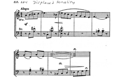
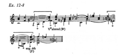
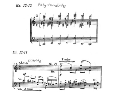
SERIAL HARMONY
The choice of notes in Serial Harmony are either dependent on the row (Total Organization) or include endless possibilities if the method of serial composition is less strict.
Intervallic relationships: consonances and dissonances are important factors in deciding how verticals are formed.
Melodic direction, voice-leading and texture also determine the overall effect of sonorities.
Motivic/ thematic features support cohesion and comprehensibility.
Rhythmic features and articulation are prominent characteristics.
examples of serial harmony;
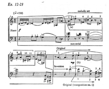
NEOTONALITY
Tonality that is not based on any particular diatonic system nor functional harmony (Common Practice Period)
Features non-traditional concepts such as tonal assertion or contrapuntal movement around a tonal centre (which may shift).
Combining the features of Common Practice Period tonality with 20th Century tonal ambiguity and atonal characteristics
Neotonal Composers
Stravinsky
Bartok
Kodaly
Janacek (maleva likes him)
Vaughn Williams
Prokovief
Shostakovich
Hindemith (maleva likes him too)
Samuel Barber
Villa-Lobos
Ginastera
William Schuman (MALEVA’S FAVORITE)
Roy Harris
William Walton
personal note:
on my personal note, i listen to these composers during my free time. and i found my pieces that really interest me. Some even has become my own personal “temp track” for my recital pieces! for example; Janacek’s “The Cunning Little Vixen: II. Allegro” was my inspiration when writing my piece “Purple-Pinkish Cotton Candy Sky” and “Full Moon”. Other than Janacek, I also took great inspiration from pieces from William Schuman, and others! Don't believe me?? Look at my SPOTIFY PLAYLIST!!! i legitly made playlists for each of the pieces that i want to write. I collect pieces that inspires me the most and built my creativity based on that.
maleva’s playlists for “Purple Pinkish Cotton Candy Sky”;

maleva’s playlists for “Full Moon”

BACK TO THE LESSON;
at the end of the class, Belinda finalised the instruments that we will be having for our recital and remind us again regarding some checklists.
—————————————————————————————
WEEK 10 || Monday, 22nd of March 2021
This week’s class was so interesting, as we dissected the piece of our own BELINDA titled JOB
Topics:
Deconstructing JOB — A Symphonic Dance
Thinking timbrally
JOB — A SYMPHONIC DANCE
form
narrative driven
Dance form
“Through-composed”
Thematic thread
sections in order;
Parade of the Celestials
Gigue of the Adversary
The Challenge
Sabean Attack
Chaldean Attack
The Wind-Collapse-The Sores-Job’s Wife’s Curse
Sitting in Silence
Duet (Dialogue 1)
Dialogue2
Dialogue 3
The Whirlwind
My Eyes Sees Thee
Repent and Retract
Coda-Allegretto
THINKING TIMBRALLY
Wind Quintet & String Quartet configurations
Woodwind
Individual characteristics-flutey, reedy, hollow
Combines timbres
Dove-tailing
Spacing
Register and Dynamics
Harmonic balance
Unison and Doublings
Strings
Individual characteristics
Spacing
Harmonic balance
Register and Dynamics
Unison and Doublings
Combinations
Timbral combinations
Oboe & Cello
Bassoon & Cello
Flute and French Horn
Solo Wind with Strings
Solo Strings with Wind Ensemble
Contrapuntal, mul-timbral applications
Textures: harmonic textures, contrapuntal streams
Percussion & Miscellaneous
Definite and Indefinite pitch writing
Accents, shimmer, highlights, weight
As a features instrument
Orchestration Principles
Balance: feature, main, secondary...
Dynamic and emotional contour
Clarity
Span, register
Weight, Float
Interest
Momentum
Readability
—————————————————————————————
WEEK 11 || Monday, 29th of March 2021
Topics:
Review Form
Analyze Stravinsky’s Babel
Analyze Schwanter’s Aftertones of Infinity
FORM
Binary Form: A B
Ternary Form: A1 B A2
Sonata Form;
Exposition: 1st Subject/ Transition/ 2nd Subject/ Codetta
Development
Recapitulation: 1st Subject/ Transition/ 2nd Subject/ Coda
Simple Rondo Form: A1 B A2 C A3
Rondo-Sonata Form
Exposition: 1st Subject/ Transition/ 2nd Subject/ 1st Subject
Development
Recapitulation: 1st Subject/ Transition/ 2nd Subject/ 1st Subject/ Coda
Theme and Variation: featuring a main theme followed by altered iterations
Passacaglia: A series of variations over a basso ostinato
STRAVINSKY — BABEL
texture and density
Ostinato
Verticals
Chorale treatment
Narrative-Form
Momentum and Motion
SCHWANTER — AFTERTONES OF INFINITY
** i think this piece is amazing. Belinda also mentioned that this piece won a Nobel prize! there were a few things to take note of like;
Shimmering musical timbres
Layers of Sound
Protoset: C#-A-F-Gb-C-B-Ab-Eb-D
Predominant intervals
can be watched from here;
https://www.youtube.com/watch?v=Sns6KLvrb_o
—————————————————————————————
WEEK 12 || Monday, 5th of April 2021
Topics:
Review Compositional Devices
Analyze Toru Takemitsu’s A Flock Descends into a Pentogonal Garden
COMPOSITIONAL DEVICES
Common Practice Tonal Centers- Major and Minor
Chord Extensions- 9ths, 11ths, 13ths and alterations
Added note chords
Chromaticism and Tonal Ambiguity
Meter- Mixed and Asymmetric Meter
Modes and other Scale sources, including Synthetic scales
Polyharmony- polytonality and polychords
Non-tertian Harmony- Quartal and Quintal
Secundal Chords- clusters
Parallelism
12-tone Technique and Serialism
Limited Composition- based on intervals
Hexachord Writing
Unrelated Triads
Mirror Writing
Harmonic Direction- progression, cadential devices
Harmonic Synthesis
Indeterminate Procedures
Noise, Sound & Electronic devices
Extended Techniques
Texture
Microtones
TORU TAKEMITSU
Belinda mentioned how amazing that Takemitsu — although his music is very modern, but he would always never lose his Japanese touches in his music. Belinda also mentioned us about the importance of having a signature sound in our music. And it’s good if we can feature our own identity like where we come from for example.
Takemitsu’s music:
Straddled “parallel music cultures.”
Bi-musicality in modern Japanese culture: mixture of Western music with traditional Japanese music
In this piece, he uses the pentatonic scale (called the yo scale in Japanese.)
TORU TAKEMITSU — A FLOCK DESCENDS INTO A PENTOGONAL GARDEN
Clustered verticals
Silvery glisses
Lyrical melodies
Metallic, bell-like textures
Pentatonic base: C#- Eb- F#- Ab- Bb
Belinda also showed us some examples of some Contemporary String Quartets pieces;
String Quartet No. 2, "musica instrumentalis": III. Double Triple Gigue Fugue- by Aaron Jay Kernis, performed by Jasper String Quartet
link: https://www.youtube.com/watch?v=Y1dxsWGrtzQ
String Quartet No. 1, Op. 8: IV. Fugue- by Alan Hovhaness, performed by Shanghai Quartet
link: https://www.youtube.com/watch?v=VTQmztjK_2g
Love letters for String Quartet by Carter Pann, performed by Ying Quartet
link: https://www.youtube.com/watch?v=ER0faKEz0Ss
my personal note;
The “Love Letters” by Carter Pann was my personal favorite and i even listened back to it after the class ended.
—————————————————————————————
WEEK 13 to WEEK 16
throughout these weeks we had no more lessons but more consultation for our final recital.
0 notes
Text
Ondrej Vanicek Evaulation Essay
In the second semester, we had a task to build our animation project based on one of the Heterotopia principles. I chose one where the build is disturbing the environment and metro station as a building does a really great job in that. I loved the idea of an underground city with a high density of pedestrians a busy place where nothing is really the same every day as posters and advertisements and people changing there very frequently. I played with many ideas on how to build a story around this place. One of the ideas was based on people that travel by the metro every day and I would observe the things they do on a daily basis while waiting for a train to arrive. The second idea was about capturing a contrast between surface and metro station and how the place itself changes over time from new to a ruined building. For the final animation, I chose the second idea, because I liked more the contrast, between the surface and underground and how the place fades away in time. My animatics are stylized to a soviet era. Although soviet stations looked completely different, by making the station industrial themed, it immerse the feeling of the heavily used place. I was inspired by my homeland, where there are plenty of ruined industrial buildings with a lot of tools and old machines, that says a story about buildings past. This mindset goes hand in hand with the soviet setting as well which is also a thing of the past nowadays, but it was once a "great nation". I am also a huge fan of Metro 2033 by Dimitry Glukhovsky. The artworks from the game based on the novel were made by 4A Games Studio also greatly inspired me. It was interesting to see various artists portray the same idea. I was thinking, what I would do differently and how their work fits into the context of heterotopia.I liked how they captured the post-apocalyptic theme. What amuses me is that the game has a post-apocalyptic metro where stations are beacons of peace and the surface is the wild toxic and hazardous place. It is kind of opposite to my rendition of heterotopia.
For this work, I intended to build on my knowledge I gained in the first semester. I think that I improved research and mood board development. I surveyed a general structure of the metro stations around the world as well as the historical and geographical context where I intended to put my story in.During the development of my project, many key features which I intended to use in animatics were successful, but some of them were altered or completely scrapped. When I was creating the storyboard, I was deeply thinking about the camera. I played with different angles and movements, close-ups, and open-ups transitions between still shots and I was also exploring how to properly move the camera in the environment. I was looking into how to catch properly the atmosphere of the place. One of the things I am really happy about is the transition between the surface and the underground. This sequence was inspired by typical cartoon movement between floors or different layers in the cutscenes. The Simpsons did that kind of transition really often in their beginnings. I also like how I chose the pencil draw style for this project. I think it deepens the immersive feeling of the past. I was inspired by black and white television. I have been exploring the past regime by watching old tv reports from Czechoslovakia from 1960 – 1970 on YouTube. It was interesting to see how the environment looked like back then and how this same environment looks nowadays. It was also interesting how people were living, which public transports people used, like for example metro stations and these videos were also useful for me as a great minor mood board and infinite well of references.
However, not everything went so perfect as I wanted to. What I could do better was the sequence when time changes during the story as the train stop by and leave the station, time fades a little bit.
I could do more train stops to show time jumps more obviously or improve it by having more close shots similar to one with a poster that changes over time. From things that were completely scrapped, I could also show more of the surface at the end of the animation. It would be interesting to see the busy surface. I have only referenced this with sounds. What did not make it at all to the final animation is a catastrophic scenario in the metro tunnels where the monster with tentacles rises from an unknown dimension and devastated the tunnels and station and made the people leave the whole place. I realized that this was far fetched scenario and I replaced it with the slightly different one. In the final story, the way how the place was destroyed was changed from monster to biohazard caused by humans itself and I think this is the better option as it added greatly on the realism of the whole story.
For sound, I kept it simple. On the surface, you could hear birds and wind, oppose to the underground where you could here an electric machine sounds, human voices and general noise
of the city. But how time passes in the animation the busy sound of metro station turns to the deep blank hollow space with echoes in the background and dripping water. Basically, the sides flip, and the busy part is above at the end of the animation. It was very important for me to capture the contrast between the surface and underground, the difference between the current time and prospering past. I think that adding sound in this context suits well to the theme of the
whole project.
While creating the animatics I learned and improved a lot of valuable skills. I tried to build on and improve the skills I learned in semester one. My drawings got significantly improved. I feel more confident about my sketches in terms of composition, details, and shading. However, I still need to improve the lighting in my drawings. In terms of research, my skills have significantly improved.
I have looked into things like the technical, historical, and geographical context of the theme I explored things beyond the actual theme of the metro station and I aimed to put together little details that suit a theme and improves the work overall and I think that this work went really well.
I also learned while creating a storyboard that moving camera is actually easier than drawing the storyboard frame by frame and moving objects would be added in AE as moving props. It saved me a lot of time which I could use to polish my project. I did not have any technical issues that I couldn't solve on this project. Feedback from the tutors and also friends and family helped me, as critique and different ideas improved final animatics. I enjoyed exploring the different ideas, talking about it between tutors and friends to figure out the one that works best for my project talking about it made progress much easier and more enjoyable. These improvements in a workflow I made, will carry on to my future projects. Creating a realistic environment and exploring the history of the place was a great experience that sets a stable foundation for future projects very well. But there is still space for improvement. What I will focus on more in the future is digital art. I started learning with a drawing tablet and I cannot wait to try my next storyboard with it. It will also help me to better understand the colors as I do not use colors very often in my creations and that is still something I would like to improve. My experience with After Effects got slightly improved from the first semester however there is still room for improvement. The course exceeded my expectations. I am looking forward to getting more experienced in animation and create better and wilder things in the future. I am especially looking forward to character design and character-driven animations as well as creating dynamic and action scenes in the future.
0 notes
Photo


WEEK 2
José Luis Venegas: Fajardo-Duarte wedding, Tijuana, 1972
Why did you choose this work?
This was my favorite piece out of the whole gallery. I chose to focus on this photograph because of not only the vibrancy of the colors and the harsh contrasts but also the vibrancy of the emotions and excitement that is being had by the subjects in the photo.
What do you think the artist is trying to say with this work?
The artist was going against traditional portrait photography that was common of the time to create wedding photography that embodied emotion and gave a sense of group identity to the higher social classes in Tijuana.
Identify and describe two compositional aspects or photographic attributes
The use of a bright flash captures each subject with hard artificial light from eye-level positioning which makes the image very clear and easy to understand the emotions of. The motion of this photography appears as a moment frozen in time and space without any blur.
Explain how you think these choices influence the meaning of the photograph
I believe this style of photography was very effective in delivering the intended modern life documentary portraits that the artist wanted for his clients. This use of light captures many different individuals at the wedding clearly and freezes this moment in history.
What is the photograph of? What is the photograph about? Are these different?
I believe the meaning and the what the actual photograph depicts are the same but with a higher meaning of purpose to the artist. Venegas was pushing away from traditional portrait documentary photography and was expanding towards this modern style of event photography that his clients liked and saw being used in the U.S.
Armando Cristeto: PolyMarchs, Party Nights series, Mexico City, 1985
Why did you choose this work?
I liked the more conceptual nature of this photograph compared to the other very literal photos that I chose to focus on and enjoyed viewing the vibrancy that it has with selected colors.
What do you think the artist is trying to say with this work?
The artist liked studying the act of and participating in parting as he notes that he knew few who “partied as I did, because I was interested in it for itself.” This work embodies dancing and nightlife and lets the artist understand the components of night life in itself.
Identify and describe two compositional aspects or photographic attributes
The selected use of color of the yellow and pink that is added on post-print with other overlaying shapes and shades. The use of a bright flash captures each subject from the chest down which makes the dancing very clear and frozen in time.
Explain how you think these choices influence the meaning of the photograph
The chosen colors that are added post-print draw the viewer’s attention to those areas to widen the photo and create a sense of jumbled confusion such as one might experience on a night out. This feeling is counteracted with the frozen in time type of lighting and short shutter speed which shows no blur.
What is the photograph of? What is the photograph about? Are these different?
The photograph is of people dancing and having fun on a night out. However, the photo is about the act of partying and what it means to party in particular. They are different and this creates meaning behind the series that Cristeto has photographed.
Pedro Valtierra: Teachers Being Beaten, Mexico, 1987
Why did you choose this work?
I chose this work because it caught my attention with its emotional and violent nature and made me want to understand what was happening.
What do you think the artist is trying to say with this work?
The artist was documenting the violence that was happening to indigenous teachers in the Oaxaca region that created a movement more open to diversity and increasingly critical to federal educational policies.
Identify and describe two compositional aspects or photographic attributes
The motion captured in this photograph with some blurred figures in the background as well as the point of view where the photographer is viewing the act of violence.
Explain how you think these choices influence the meaning of the photograph
By positioning himself in front of the teacher that is being beaten, the viewer sees the reaction on the teachers face while the policeman does not see this. It is an unfiltered and raw emotional take on what exactly was happening. The use of the blurred figures in the background create a sense of chaos with nondescript movements.
What is the photograph of? What is the photograph about? Are these different?
I believe the meaning and the what the actual photograph depicts are the same as this was a documentation of the brutalities that the teachers were facing when creating a movement for more diversity and questioning of federal educational policies.
PHOTO DISCUSSED IN CLASS:
List ten details that you see in the photograph. What else do you see?
The large weather balloon, the snow on the ground, the raw iron red fence, the barren trees, the monochromatic sky, the clouds, the wires holding down the weather balloon, the patch work on the balloon, the evergreen trees at the bottom of the mountains and hills, and the curve of the wires on the left side indicating the wind.
Where is your eye drawn? Describe the pattern, shapes, and colours. Look away and then look at the photograph again. What caught your eye first? Why does that stand out?
The large white weather balloon is what my eyes are first drawn to. All of the colors are very muted and the photograph gives a flat feeling because of those colors. The raw iron red fence also stands out to me because it is the only color that is very different from all the others in the photograph.
Find the pattern of light and shadow. What does the lighting draw your attention to? Describe what is in focus.
The lighting is very dispersed with no clear direction because of the cloudy day it was taken. There are no harsh shadows in the photograph as well making the large weather ballon confusing at first because of its unknown and nondescript purpose. Everything is in focus but the bottom of the balloon has no shadows possibly due to the reflecting nature of the snow bouncing light up from underneath.
What other photographic techniques do you notice? What is the photographer’s point of view (where is the camera in relation to the subject)?
The photographer took this photo from a point of view eye level on top of this mountain top. It gives the feeling that it is angled up towards the balloon but also captures the swooping valley and surrounding mountains. The other photographic technique that is being used is the way in which these two angles are caught and conveyed through this single photograph.
What is the subject of the photograph? What questions do you have about the subject?
I was confused at first when first seeing this photograph, but then once I saw the strings I understood the subject was a weather balloon. I would like to better understand what scientific purpose does this weather ballon serve and what data it collects.
Use an adjective to describe the style of the photograph. Can you guess what genre this photograph represents? What makes you say that?
Overpowering and confusing. The genre could be documentary or conceptual as the photo is of a scientific device but also the way it is taken is very ambiguous so it makes the viewer confused and draws them in to look deeper into the meaning behind it.
How does the photograph make you feel? What does the photograph make you think of? Why do you think the photographer made these artistic choices? What do you think the photograph is saying?
At first it makes me feel confused, but then once knowing what is being photographed I feel a sense of power as the view is positioned on top of a mountain overlooking the valleys. This photograph makes me think of when I go skiing and the bliss of solitude that I feel when up on top of the mountain. I think the photographer made these choices to make the viewer feel the way I did as well as make a commentary on nature vs industry.
Look once more at the photograph and find something you haven’t described yet. What is your reaction to this exercise? Did anything surprise you?
The red iron fence was something that I initially did not put much thought into, but once going back I am surprised to see how significantly different the color is compared with every other thing in the photograph. It draws importance as being now a focal piece that directs the view of the viewer up to the large weather balloon.
What areas were difficult to answer? Photographic attributes and technique? Composition? Content? Style or genre? Meaning?
The meaning was hard to understand because there was not much explanation to pull from and it was up to the viewer to understand what this object was in the photograph. After closer look it can be easier to understand with an open and detailed mind.
1 note
·
View note
Text
A Quick Q&A With Nicholas Merzetti | Photographer
- Do you agree that you are challenged every day to create something that has never been created before?
I don’t. I wish I could say yes but the moment you take on photography as a full-time career you are working with clients. To build your connections, you are going to have to work with someone else’s vision at times. Optimally, they come to you for your vision; but that’s not a guarantee. I don’t think that’s a bad thing at all though. It’s a give and take. The most important part is that every time you use your camera you get better. That keeps me happy and motivated no matter what I’m shooting!
- Can you describe your creative process? What do you look for when creating a shoot and do your shoot line up to be what you expected?
I grew up as a huge cinephile so 9 times out of 10 my inspiration comes from watching movies. I’ll watch a movie and annoy everyone in the room when I make them pause it and start taking photos. From there, I figure out what about it first grabbed me. If it’s just the composition it’s a no go. If it’s a theme or mood then I go with it. My shoot almost NEVER lines up with what I expected. 9 out of 10 times it’s a happy surprise.
- You have to have a favorite artist in mind that drives your creativity or inspires you, who is it?
Nicholas Winding Refn. I’ve been a huge fan since pusher. His dark and weird voice resonates with me powerfully. Some of his most recent movies like Neon Demon are basically a string of fashion images run together at 24 frames a second.
- How would you describe yourself as a person & artist?
I don’t think you can separate those two things. Saying you are an artist is describing your persona, not just your hobby or career. I would say I’m critical of myself, creative and sensitive… sometimes overly so. Beyond that I’m extremely driven.
- How did you know you wanted to be a photographer?
I always felt muted in some way. I had no idea what that feeling was or why I had it but it became life changingly clear the day I picked up a camera. My uncle lent me his camera one day and almost immediately I felt as if I suddenly had blinders taken off.
- Do you have a favorite photographers who inspire you? Why is that?
Andrew Yee is my current love. He’s just functioning on a completely different level when it comes to color and composition. His stuff is just… wow. I’ll get there!
- Can you describe one of your favorite projects that you have worked on and why was it your favorite?
I did an editorial inspired by the movie Beyond the Black Rainbow (yet to be released). Very very dark and very weird. I spent more time creating the set than I ever had before and it paid of hugely. The set really gave this disturbed mood that everyone working with me could feel. When it came time for the models to work, the mood was so great and on point that it was effortless for them. Big lesson that day!
- We have taken a look at your website/portfolio Online, how do you want the viewer to feel when looking at your work?
I wouldn’t say my website accurately reflects my work. It has been a process defining my style but I’m there now. Dark and weird. My website will soon reflect that. Like many photographers that are doing this full time my website currently displays a lot of different genres and that lack of focus is unacceptable. WEBSITE UNDER CONSTRUCTION :)
- Do you ever collaborate with designer brands.
Absolutely! It’s obviously just fine to pull from stores but when you work with the designer directly you not only get more clothes to pull from but you often are getting another creative mind attached to your team. If they are choosing to work with you they are on board with the vision and I’ve never met a designer that doesn’t have a massive creative skillset to bring to bare
.
- In the artistic world of photographers, do you see yourself not only trying to achieve your perfect shoot but also being known for your work?
I think most photographers, including myself, will never achieve their perfect shoot. It’s that process of striving for perfection that not only makes you grow but provides you with the content to get your name known. We’ve all finished a shoot we love and then a month later you look at it and think how shit you were. It’s all part of the growth process. Aim for perfection and you’ll keep getting better.
- If you could shoot an editorial anywhere in the world, where would you go? Why is that?
Norway, Rejkavik, Finland… somewhere with glaciers and ice flows. So much opportunity for contrast and minimalism! And way easier to light softly when the entire ground is a reflector.
- What was the main reason that you decided to become a photographer?
I felt I had no choice. I kept putting off attempting to really invest myself in photography… I think because I was afraid to fail. I went so far as to get my biotech degree to avoid really committing, but eventually I realized that there is only one way I was ever going to be happy… ever going to be proud of myself. I dropped everything and jumped in. It was a struggle at first obviously but now I’m starting to get some of the rewards of my hard work!
- Tell me about your latest shoot. What was your vision when you created it?
I like to work closely with the stylist when it comes to fashion (obviously). She came to me with the idea of an all – denim shoot. We came up with the idea of a morning to night transition, or day-in-the-life of twenty something woman. I’m so happy with the way it turned out. The model was AMAZING!!!
- To be a photographer, you had to undergo a lot of struggles. What was the most difficult obstacle for you when putting together a shoot?
100% it’s the pre-viz and organization. I think a lot of creatives share the same problem where they have many ideas but lack the skillset to properly plan it out. It’s been a year of working on the discipline required to plan and pre-viz these things. The best piece of advice I ever got was: “one minute in pre-viz is worth an hour on set”
- Does your personal life ever effect how you compose your shoots or do you have a set schedule/formula that you follow? What is it exactly?
My personal life definitely affects my shoots. Confidence is the most important thing in everything you do and if you are struggling due to relationships or whatever it can cause second guessing at critical moments or lack of faith in your vision. It takes discipline to create a healthy mind for creativity.
- Who excites you the most (Celebrity) & why?
Jason Bateman. B+ list actor who never really made it huge. He was great in curb your enthusiasm but other than that he’s fallen short of being a star. Then this guy decides “eff this… I’m going to do this myself.” So, he not only creates and directs his own show (Ozark) but he casts himself as the star. It’s amazing. How can you not admire this guy! He took charge of his life and showed people what he’s made of.
- If you had to pass on a suggestion for someone starting out in photography, what would you tell them?
In the pursuit of creating your best work, you really need to learn to be a captain. I think photography for a lot of people is a very solitary pursuit; however, if you are trying to produce editorials it can’t be. Team work and team organization are key. For you to create your vision you need to be in control. So, you need to be able to direct not just the models but the entire team. Also, you need to keep it fun. That will bring more clients back than you would ever expect.
- How is your style of photography different from others different from any other photographers?
I’ve been told that my use of location is unique and I think that comes from my background with cinema. I try to focus on body language over anything else and I think that also shines in many of my photos.
- What are your world-dominating goal.
I have one main goal. Pursuing that goal beyond anything else has brought and will bring all my secondary goals into fruition. JUST. GET. BETTER.
#Fashion Editorial#fashion industry#fashion#New York#news#inspiration#mens fashion#women fashion#promo magazine#photography
0 notes
Text
The Tenba Messenger DNA 13
When I first unboxed[1. I received this bag to review from Tenba free of charge. I am not affiliated with Tenba in any way, and will not receive any money or other rewards from Tenba for this review or future product sales. I always strive to be completely honest with my reviews, and try to never let the price of a free product influence my opinion of it, but bias can always creep in where we least expect it, so take this, and everything you read on the internet, with a grain of salt.] this messenger bag, my mind inexplicably dug up a line from the Princess Bride : “… with eyes like the sea after a storm.” Tenba’s cobalt is more like the stormy sea, perhaps, but it is gorgeous. The blue-green color mixed with black manages to be deep and rich, elegant and subtle all at the same time. If it’s possible for a color to feel luxurious, this one does.
But of course, when it comes to carrying camera gear, color doesn’t count for much. What really matters is whether the bag will hold up to hard use, whether it’s comfortable and easy to use, and whether it’s worth the price. For the Messenger DNA 13, the answer is an almost unqualified “YES”. Let me explain.
[/media-credit] The Tenba Cooper 13 (left) and Messenger DNA 13
Appearance
I have probably already gushed enough about how beautiful this bag is. After all, that is completely a matter of personal preference.
Still, I’ll add a couple of details. The combination of the black and cobalt exterior of the bag, its tapered sides and angled lines produce a bag that is modern and elegant, as opposed to the vintage styling of the Cooper 13 reviewed last year. A khaki interior of rip-stop nylon and a soft, padded insert provides a classy looking contrast with the darker exterior. Very sharp.
Front view of the Tenba Messenger DNA 13.
On the back side of the Messenger DNA 13 we can see the zipper for the laptop sleeve, the trolley strap, and the security-strap D-rings
Both ends of the bag have mesh pockets for holding water bottles or other miscellaneous items.
In addition to cobalt, the DNA 13 is available in a graphite, dark copper, and olive, and a “slim” version is also available for those who shoot with smaller cameras.
Design & Features
As you’d expect, the Messenger DNA 13’s design is pretty similar to that of the Cooper 13; there isn’t a lot of room for creativity with shoulder bags. Both bags have a large, messenger-style flap closure across the top of the bag that is complimented with a built-in zipper for quick access to the main compartment, which is particularly handy for situations where you don’t want to deal with the potential noise of the Velcro that holds the flap closed. The flap of the DNA has gusseted corners for additional protection from wind and weather.
[/media-credit] A Canon DSLR fits into the bag with a 70-200mm f/2.8 lens attached. The khaki provides nice contrast with the exterior blue.
The main compartment holds a padded insert with five removable Velcro dividers. The bag is tall enough that it can hold my Canon 5DIII with 70-200mm f/2.8 attached, leaving space for two additional lenses and some other assorted accessories (chargers, cables, etc). The outside of the padded insert has a couple of additional open pockets on the front. When the padded insert is removed, it is easier to see the permanent pockets on the inside of the main compartment: a large, full-width zippered pocket (great for flat flash modifiers, filters, memory cards), a pair of small pockets and pen sleeves, and across the back of the bag, dual padded tablet sleeves with a Velcro strap to keep them in. The larger tablet sleeve holds my Surface Pro, while the smaller sleeve works nicely for an iPad, Kindle or a tablet up to about 9″ tall.
[/media-credit] With the padded insert removed, the two tablet sleeves are visible here.
With this collection of interior pockets, the Messenger DNA doubles as a wonderful book-bag when the padded insert is removed.
[/media-credit] The “trolley strap” on the back of the Messenger DNA.
On the back side of the bag is a secondary compartment (with a zipper across the top) for a laptop or tablet. As the bag’s name suggests, this will accommodate a thin 13″ laptop, so my 12″ Surface Pro fits easily. Inside the main computer sleeve there are also a few pockets for smaller items (phones, noteboots, pens), and although the idea of more pockets is always welcome in my book, they create one of my few gripes in this instance: they snag the corners of my computer as I try to slide it into the pocket, often forcing me to try several times before I manage to get the device in. With some experience, I’ve learned to press the computer against the outside wall of the pocket as I insert it, but even that doesn’t always work. Luckily, my Surface fits into the interior tablet sleeve. You’ll also find a strap on the back to hold the bag onto your roller-luggage handle at the airport (or wherever you happen to be rolling around). These are always very handy, and this one has a patch of Velcro in the center to connect back to the bag between the uprights (the Cooper does not).
[/media-credit] Looking down into the laptop sleeve you can see the offending pockets.
The front flap of the bag has two pockets but only one with a zipper, and under the flap, the front of the bag has four more pockets but none of them have zippers… or closures of any type. This is my only other gripe with the bag: I’m not comfortable putting expensive filters or memory cards into pockets that have an open top. There are zippered pockets elsewhere, but I wish that these front, easy-to-access pockets had a bit more security.
Buckles on messenger bags can be annoying. Traditional belt-buckles are cumbersome and usually hide a quicker clasp underneath these days (see the ThinkTank Signature Series), but even then, good alternatives are hard to find. Tenba opted to leave off the buckles entirely on the Cooper 13 (there’s Velcro underneath). For the Messenger DNA, Tenba found a pretty good option: they’re called Fidlock buttons, and the latch slides onto a knob mounted on the front of the bag and is held (at least in part) magnetically. It takes a little getting used to, but it’s quick, easy, and seems pretty secure so far.
There’s a security strap that connects between a D-ring on the back of the bag and a loop on the bag’s strap, keeping the bag from sliding off your back and around to your side or front (if you’re riding a bike or leaning over), effectively turning the messenger bag into a backpack. I’ve almost entirely failed to test this out beyond tromping around my apartment with it, since the appeal of a shoulder bag for me is that I can quickly swing it around front and pull out my gear, and I’m not a cyclist. But it seems to work.
Comfort
Without an extra-wide, spongey-soft strap, you can only expect a certain degree of comfort from a shoulder bag with a single strap. The DNA messenger is nothing special, here. The strap is wide enough to keep it from digging into your neck, and the wrap of padding does its job at keeping the shock of life’s jolts from transferring directly into your clavicles, but a heavily loaded shoulder bag will simply get uncomfortable after a few hours. Wearing the bag across your body (as opposed to dangling from a shoulder) makes a big difference and can help extend that comfort period significantly. I’ve been pleased with how comfortable my Tenba bags are, but they won’t break the laws of physics.
Quality
You only need to look at the strap of this bag to know that Tenba is serious about build quality: it’s made of seat-belt webbing. That’s serious durability connected to metal clasps and welded steel D-rings. Exterior zippers are quality YKK hardware, the cool front flap clasps are Fidlock, and the bulk of the bag itself is made of 600 Denier Helix (a sturdy automotive fabric) with a water-repellent coating, but there’s a separate rain-fly for those times when it’s really pouring.
[/media-credit] The DNA 13’s main strap is made of seat-belt webbing. The D-ring on the strap is for the “security strap”.
The rain-fly is a great example of Tenba’s attention to detail and quality. It would have been simple to give us a waterproof cover for the bag and call it good, but Tenba took it a step further, as usual, and made the rain-fly reversible. The interior of they fly is a light, reflective silver, so when you’re hiking along in the hot sun, you can at least keep your gear cool.
The Messenger DNA with rain-fly.
The Messenger DNA with sun-fly.
Similarly, the Velcro patches on the main flap are “Quiet Velcro”, which reduces the pull-apart noise if you tug downward on it first. I’ve never gotten into the habit of using this stuff, but it does seem to work. Finally, it’s worth mentioning that the bottom of the bag is a heavy duty black material. I don’t know what it is, but it feels strong, and it’s supposed to be water resistant. I haven’t tested that claim.
The zipper loops are large and easy to grasp.
This composite image shows the top and under-sides of the strap padding.
One of the two D-rings on the back of the bag can be used to attach the “security strap”.
The unique front flap clasps.
Value
I thought that the Cooper 13 was a pretty fair value at about $250, so I was a bit surprised to find that the Messenger DNA 13 could be found for only about $159. In fact, while I was looking on Amazon, I discovered that the price for the Cobalt version was even less: only about $130, though that price disappeared after a couple of days. Let’s hope it returns.
In order to score well in the “value” department, a product has to exceed expectations for its cost, making the category fairly subjective. It also means that it’s harder for an expensive product to get a high score, since we generally expect more when we pay more. Here, a score of 5/10 means that the product met my expectations for its cost.
As such, I’d give the Tenba Messenger DNA an 8/10. I expected it to be a nice bag, and it certainly is, but I also expected it to be significantly more expensive for its quality. This bag, especially the cobalt version, is a steal. So far, this is the highest “value” score that I’ve ever given in a review.
Conclusion
The Tenba Messenger DNA 13 is wonderful, with a gorgeous design that is stylish enough for everyday use, yet constructed to withstand serious, professional abuse. I’m sold. My only complaints are with a few too many open-mouthed pockets.
[infobox maintitle=”Overall Score: 8.9/10″ subtitle=”A High Quality Bag at a Good Price” bg=”red” color=”white” opacity=”off” space=”30″ link=”no link”]
Review: Tenba Messenger DNA 13 The Tenba Messenger DNA 13 When I first unboxed this messenger bag, my mind inexplicably dug up a line from the…
0 notes
Text
Small Balcony Makeover: A Must-Read for Renters
Just because an apartment balcony is small, that doesn’t mean you have to compromise on comfort and style. You’ll see what we mean with the gorgeous small balcony makeover styled by Chari Herndon of Chic Home Style.
She made the absolute most of her small outdoor space with a lovely outdoor bistro set, outdoor string lights and lanterns, and some cute DIY hanging planters.
Small Balcony Makeover for Spring
I have a confession– in the past 11 years that I’ve rented, I’ve never invested the time and effort into my apartment balcony. Yes, you read that correctly, it’s been 11 years! Although having a balcony is always one of my top “non-negotiable” features when looking to rent a new place, I am guilty of neglecting this space. I always say I’m going to work on it, but somehow it ends up being the one project that’s always overlooked.
Until now!
Before the Balcony Makeover
Here’s a look at my pitiful little balcony before the makeover.
When The Home Depot asked if I would be interested in joining their Patio Style Challenge, I was overwhelmed with excitement. And you can see why– my apartment balcony was in dire need of a facelift.
After the Balcony Makeover
Here’s what it looks like now!
In the past, I’ve felt so “blah” about decorating and styling my small balcony, because I felt my options would be limited as a renter. It seemed like there was not much you could do when you’re renting, and then there’s the challenge of it being such a small space.
When I took on this challenge, my goal was to find unique ideas that would make my balcony feel cozier and inviting. Despite the small size of the space, I was determined to make it functional with a beautifully decorated aesthetic.
The Outdoor Bistro Set
Home Depot sent me the Oak Cliff 3-Piece Bistro Dining Set along with matching Paisley Outdoor Throw Pillows. I chose the color Chili for a fun contrast and bold pop of color.
This was the perfect set for my small balcony makeover. We get a lot of rain and inclement weather here in Houston, and this set features weather-resistant cushions, and the frames withstand outdoor elements.
It’s durable and extremely comfortable to sit and lounge on.
Adding Deck Tiles
The first item I purchased was the Quick Deck Outdoor Composite Deck Tiles. I wanted to cover the awful concrete flooring. The deck tiles were super easy to install. It took me less than 30 minutes to complete it all by myself.
The tiles simply snap together for easy assembly. Best of all, they are super low maintenance and cost effective. When we’re ready to move to our next place, we can unsnap them, and take them with us– and that’s what I call a smart renter’s purchase.
My balcony is about 60 square feet, so it took me five and a half boxes to cover my balcony floor.
Making the decision to cover the concrete instantly changed the look and feel, making it more appealing.
Dining al Fresco
I thought about how I envisioned my time being spent outdoors after my small balcony makeover.
The balcony faces the pool with a nice view. It also gets a lot of shade, so it stays cool even in the summer heat.
I thought it would be great to design a space where you could enjoy brunch or evening dinners.
It was also important to create an ambiance to enjoy day and night.
The Copper Metal Beverage Tub with Stand and Tray is one of my outdoor accessories to make dining and relaxing easier.
The beverage tub is also removable for tabletop usage. I love how versatile it is!
DIY Painted Pot Hanging Planter
I decided to do a small DIY project for my small balcony makeover. There’s not lot of space for plants, so I created a hanging herb and flower garden.
First, I purchased a few terra cotta pots and spray painted them using Rust-Oleum 12oz. Satin White Spray Paint.
The accent color is BEHR Paint in the color Laser Lemon in a matte finish. I used rubber bands to help mark where my accent color lines would start and to make sure they were even and straight.
Then, I cut pieces of rope and tied overhand knots on the ends to make the perfect hangers for my pots.
Finally, I hung the painted terra cotta pots on the 4-Arm Hanging Basket Tree. It holds my little hanging garden without taking up too much space.
Since I don’t have much of a green thumb, I planted mushrooms and herbs, which should be fairly easy to grow. Hopefully, I can keep them alive long enough to enjoy them.
Outdoor Lighting
I wanted to be able to easily transition from day to night, so I added a bit of lighting to the space. I purchased a few different types of lighting beginning with a set of lanterns– the copper 14-in. Lantern and the 22-in. Lantern.
The 10-Light Rattan Ball String Lights hang along the window. I liked the texture and the look of these, as they weren’t the traditional choice that I am used to seeing.
I wrapped two sets of the 100-Light Mini Garden String Lights around the banister. This created the perfect balance of warmth as the sun is setting.
The lights also give the balcony a nice glow at night. It makes for the perfect setting for a romantic dinner or just to relax and wind-down after a long day.
The Completed Small Balcony Makeover
Now that my small balcony makeover is complete, I have spent each day sitting outside and enjoying it. It’s quickly become my office space and my go-to spot for winding down. I’m so happy with how it turned out.
I’m thrilled that I had the opportunity to collaborate with The Home Depot to finally get it done! It’s been a long time coming, and I honestly don’t know how I’ve gone this long without having a nice balcony space to enjoy.
Photography by Savannah Montgomery
Chári Herndon is a Certified Interior Decorator and home stager. She lives with her husband in Houston. For more on her small balcony makeover and the DIY project, visit her blog Chic Home Style.
Follow our Patio Style Challenge board on Pinterest for more patio decorating ideas and inspiration. And check out our Patio Style Challenge playlist on YouTube.
Browse The Home Depot’s online Patio Furniture section for patio sets to fit any style or budget.
The post Small Balcony Makeover: A Must-Read for Renters appeared first on The Home Depot Blog.
from Roofing Pro http://ift.tt/2pwKdtB
Curated by a professional Roofing Contractor
from Blogger http://ift.tt/2p1tcLU
via RoofingProToday
from WordPress http://ift.tt/2nKf89y
0 notes
Text
Small Balcony Makeover: A Must-Read for Renters
Just because an apartment balcony is small, that doesn’t mean you have to compromise on comfort and style. You’ll see what we mean with the gorgeous small balcony makeover styled by Chari Herndon of Chic Home Style.
She made the absolute most of her small outdoor space with a lovely outdoor bistro set, outdoor string lights and lanterns, and some cute DIY hanging planters.
Small Balcony Makeover for Spring
I have a confession– in the past 11 years that I’ve rented, I’ve never invested the time and effort into my apartment balcony. Yes, you read that correctly, it’s been 11 years! Although having a balcony is always one of my top “non-negotiable” features when looking to rent a new place, I am guilty of neglecting this space. I always say I’m going to work on it, but somehow it ends up being the one project that’s always overlooked.
Until now!
Before the Balcony Makeover
Here’s a look at my pitiful little balcony before the makeover.
When The Home Depot asked if I would be interested in joining their Patio Style Challenge, I was overwhelmed with excitement. And you can see why– my apartment balcony was in dire need of a facelift.
After the Balcony Makeover
Here’s what it looks like now!
In the past, I’ve felt so “blah” about decorating and styling my small balcony, because I felt my options would be limited as a renter. It seemed like there was not much you could do when you’re renting, and then there’s the challenge of it being such a small space.
When I took on this challenge, my goal was to find unique ideas that would make my balcony feel cozier and inviting. Despite the small size of the space, I was determined to make it functional with a beautifully decorated aesthetic.
The Outdoor Bistro Set
Home Depot sent me the Oak Cliff 3-Piece Bistro Dining Set along with matching Paisley Outdoor Throw Pillows. I chose the color Chili for a fun contrast and bold pop of color.
This was the perfect set for my small balcony makeover. We get a lot of rain and inclement weather here in Houston, and this set features weather-resistant cushions, and the frames withstand outdoor elements.
It’s durable and extremely comfortable to sit and lounge on.
Adding Deck Tiles
The first item I purchased was the Quick Deck Outdoor Composite Deck Tiles. I wanted to cover the awful concrete flooring. The deck tiles were super easy to install. It took me less than 30 minutes to complete it all by myself.
The tiles simply snap together for easy assembly. Best of all, they are super low maintenance and cost effective. When we’re ready to move to our next place, we can unsnap them, and take them with us– and that’s what I call a smart renter’s purchase.
My balcony is about 60 square feet, so it took me five and a half boxes to cover my balcony floor.
Making the decision to cover the concrete instantly changed the look and feel, making it more appealing.
Dining al Fresco
I thought about how I envisioned my time being spent outdoors after my small balcony makeover.
The balcony faces the pool with a nice view. It also gets a lot of shade, so it stays cool even in the summer heat.
I thought it would be great to design a space where you could enjoy brunch or evening dinners.
It was also important to create an ambiance to enjoy day and night.
The Copper Metal Beverage Tub with Stand and Tray is one of my outdoor accessories to make dining and relaxing easier.
The beverage tub is also removable for tabletop usage. I love how versatile it is!
DIY Painted Pot Hanging Planter
I decided to do a small DIY project for my small balcony makeover. There’s not lot of space for plants, so I created a hanging herb and flower garden.
First, I purchased a few terra cotta pots and spray painted them using Rust-Oleum 12oz. Satin White Spray Paint.
The accent color is BEHR Paint in the color Laser Lemon in a matte finish. I used rubber bands to help mark where my accent color lines would start and to make sure they were even and straight.
Then, I cut pieces of rope and tied overhand knots on the ends to make the perfect hangers for my pots.
Finally, I hung the painted terra cotta pots on the 4-Arm Hanging Basket Tree. It holds my little hanging garden without taking up too much space.
Since I don’t have much of a green thumb, I planted mushrooms and herbs, which should be fairly easy to grow. Hopefully, I can keep them alive long enough to enjoy them.
Outdoor Lighting
I wanted to be able to easily transition from day to night, so I added a bit of lighting to the space. I purchased a few different types of lighting beginning with a set of lanterns– the copper 14-in. Lantern and the 22-in. Lantern.
The 10-Light Rattan Ball String Lights hang along the window. I liked the texture and the look of these, as they weren’t the traditional choice that I am used to seeing.
I wrapped two sets of the 100-Light Mini Garden String Lights around the banister. This created the perfect balance of warmth as the sun is setting.
The lights also give the balcony a nice glow at night. It makes for the perfect setting for a romantic dinner or just to relax and wind-down after a long day.
The Completed Small Balcony Makeover
Now that my small balcony makeover is complete, I have spent each day sitting outside and enjoying it. It’s quickly become my office space and my go-to spot for winding down. I’m so happy with how it turned out.
I’m thrilled that I had the opportunity to collaborate with The Home Depot to finally get it done! It’s been a long time coming, and I honestly don’t know how I’ve gone this long without having a nice balcony space to enjoy.
Photography by Savannah Montgomery
Chári Herndon is a Certified Interior Decorator and home stager. She lives with her husband in Houston. For more on her small balcony makeover and the DIY project, visit her blog Chic Home Style.
Follow our Patio Style Challenge board on Pinterest for more patio decorating ideas and inspiration. And check out our Patio Style Challenge playlist on YouTube.
Browse The Home Depot’s online Patio Furniture section for patio sets to fit any style or budget.
The post Small Balcony Makeover: A Must-Read for Renters appeared first on The Home Depot Blog.
from garage2 http://ift.tt/2pwKdtB via great info
0 notes
Text
Small Balcony Makeover: A Must-Read for Renters
Just because an apartment balcony is small, that doesn’t mean you have to compromise on comfort and style. You’ll see what we mean with the gorgeous small balcony makeover styled by Chari Herndon of Chic Home Style.
She made the absolute most of her small outdoor space with a lovely outdoor bistro set, outdoor string lights and lanterns, and some cute DIY hanging planters.
Small Balcony Makeover for Spring
I have a confession– in the past 11 years that I’ve rented, I’ve never invested the time and effort into my apartment balcony. Yes, you read that correctly, it’s been 11 years! Although having a balcony is always one of my top “non-negotiable” features when looking to rent a new place, I am guilty of neglecting this space. I always say I’m going to work on it, but somehow it ends up being the one project that’s always overlooked.
Until now!
Before the Balcony Makeover
Here’s a look at my pitiful little balcony before the makeover.
When The Home Depot asked if I would be interested in joining their Patio Style Challenge, I was overwhelmed with excitement. And you can see why– my apartment balcony was in dire need of a facelift.
After the Balcony Makeover
Here’s what it looks like now!
In the past, I’ve felt so “blah” about decorating and styling my small balcony, because I felt my options would be limited as a renter. It seemed like there was not much you could do when you’re renting, and then there’s the challenge of it being such a small space.
When I took on this challenge, my goal was to find unique ideas that would make my balcony feel cozier and inviting. Despite the small size of the space, I was determined to make it functional with a beautifully decorated aesthetic.
The Outdoor Bistro Set
Home Depot sent me the Oak Cliff 3-Piece Bistro Dining Set along with matching Paisley Outdoor Throw Pillows. I chose the color Chili for a fun contrast and bold pop of color.
This was the perfect set for my small balcony makeover. We get a lot of rain and inclement weather here in Houston, and this set features weather-resistant cushions, and the frames withstand outdoor elements.
It’s durable and extremely comfortable to sit and lounge on.
Adding Deck Tiles
The first item I purchased was the Quick Deck Outdoor Composite Deck Tiles. I wanted to cover the awful concrete flooring. The deck tiles were super easy to install. It took me less than 30 minutes to complete it all by myself.
The tiles simply snap together for easy assembly. Best of all, they are super low maintenance and cost effective. When we’re ready to move to our next place, we can unsnap them, and take them with us– and that’s what I call a smart renter’s purchase.
My balcony is about 60 square feet, so it took me five and a half boxes to cover my balcony floor.
Making the decision to cover the concrete instantly changed the look and feel, making it more appealing.
Dining al Fresco
I thought about how I envisioned my time being spent outdoors after my small balcony makeover.
The balcony faces the pool with a nice view. It also gets a lot of shade, so it stays cool even in the summer heat.
I thought it would be great to design a space where you could enjoy brunch or evening dinners.
It was also important to create an ambiance to enjoy day and night.
The Copper Metal Beverage Tub with Stand and Tray is one of my outdoor accessories to make dining and relaxing easier.
The beverage tub is also removable for tabletop usage. I love how versatile it is!
DIY Painted Pot Hanging Planter
I decided to do a small DIY project for my small balcony makeover. There’s not lot of space for plants, so I created a hanging herb and flower garden.
First, I purchased a few terra cotta pots and spray painted them using Rust-Oleum 12oz. Satin White Spray Paint.
The accent color is BEHR Paint in the color Laser Lemon in a matte finish. I used rubber bands to help mark where my accent color lines would start and to make sure they were even and straight.
Then, I cut pieces of rope and tied overhand knots on the ends to make the perfect hangers for my pots.
Finally, I hung the painted terra cotta pots on the 4-Arm Hanging Basket Tree. It holds my little hanging garden without taking up too much space.
Since I don’t have much of a green thumb, I planted mushrooms and herbs, which should be fairly easy to grow. Hopefully, I can keep them alive long enough to enjoy them.
Outdoor Lighting
I wanted to be able to easily transition from day to night, so I added a bit of lighting to the space. I purchased a few different types of lighting beginning with a set of lanterns– the copper 14-in. Lantern and the 22-in. Lantern.
The 10-Light Rattan Ball String Lights hang along the window. I liked the texture and the look of these, as they weren’t the traditional choice that I am used to seeing.
I wrapped two sets of the 100-Light Mini Garden String Lights around the banister. This created the perfect balance of warmth as the sun is setting.
The lights also give the balcony a nice glow at night. It makes for the perfect setting for a romantic dinner or just to relax and wind-down after a long day.
The Completed Small Balcony Makeover
Now that my small balcony makeover is complete, I have spent each day sitting outside and enjoying it. It’s quickly become my office space and my go-to spot for winding down. I’m so happy with how it turned out.
I’m thrilled that I had the opportunity to collaborate with The Home Depot to finally get it done! It’s been a long time coming, and I honestly don’t know how I’ve gone this long without having a nice balcony space to enjoy.
Photography by Savannah Montgomery
Chári Herndon is a Certified Interior Decorator and home stager. She lives with her husband in Houston. For more on her small balcony makeover and the DIY project, visit her blog Chic Home Style.
Follow our Patio Style Challenge board on Pinterest for more patio decorating ideas and inspiration. And check out our Patio Style Challenge playlist on YouTube.
Browse The Home Depot’s online Patio Furniture section for patio sets to fit any style or budget.
The post Small Balcony Makeover: A Must-Read for Renters appeared first on The Home Depot Blog.
from together1 http://ift.tt/2pwKdtB via recommended
0 notes
Text
Small Balcony Makeover: A Must-Read for Renters
Just because an apartment balcony is small, that doesn’t mean you have to compromise on comfort and style. You’ll see what we mean with the gorgeous small balcony makeover styled by Chari Herndon of Chic Home Style.
She made the absolute most of her small outdoor space with a lovely outdoor bistro set, outdoor string lights and lanterns, and some cute DIY hanging planters.
Small Balcony Makeover for Spring
I have a confession– in the past 11 years that I’ve rented, I’ve never invested the time and effort into my apartment balcony. Yes, you read that correctly, it’s been 11 years! Although having a balcony is always one of my top “non-negotiable” features when looking to rent a new place, I am guilty of neglecting this space. I always say I’m going to work on it, but somehow it ends up being the one project that’s always overlooked.
Until now!
Before the Balcony Makeover
Here’s a look at my pitiful little balcony before the makeover.
When The Home Depot asked if I would be interested in joining their Patio Style Challenge, I was overwhelmed with excitement. And you can see why– my apartment balcony was in dire need of a facelift.
After the Balcony Makeover
Here’s what it looks like now!
In the past, I’ve felt so “blah” about decorating and styling my small balcony, because I felt my options would be limited as a renter. It seemed like there was not much you could do when you’re renting, and then there’s the challenge of it being such a small space.
When I took on this challenge, my goal was to find unique ideas that would make my balcony feel cozier and inviting. Despite the small size of the space, I was determined to make it functional with a beautifully decorated aesthetic.
The Outdoor Bistro Set
Home Depot sent me the Oak Cliff 3-Piece Bistro Dining Set along with matching Paisley Outdoor Throw Pillows. I chose the color Chili for a fun contrast and bold pop of color.
This was the perfect set for my small balcony makeover. We get a lot of rain and inclement weather here in Houston, and this set features weather-resistant cushions, and the frames withstand outdoor elements.
It’s durable and extremely comfortable to sit and lounge on.
Adding Deck Tiles
The first item I purchased was the Quick Deck Outdoor Composite Deck Tiles. I wanted to cover the awful concrete flooring. The deck tiles were super easy to install. It took me less than 30 minutes to complete it all by myself.
The tiles simply snap together for easy assembly. Best of all, they are super low maintenance and cost effective. When we’re ready to move to our next place, we can unsnap them, and take them with us– and that’s what I call a smart renter’s purchase.
My balcony is about 60 square feet, so it took me five and a half boxes to cover my balcony floor.
Making the decision to cover the concrete instantly changed the look and feel, making it more appealing.
Dining al Fresco
I thought about how I envisioned my time being spent outdoors after my small balcony makeover.
The balcony faces the pool with a nice view. It also gets a lot of shade, so it stays cool even in the summer heat.
I thought it would be great to design a space where you could enjoy brunch or evening dinners.
It was also important to create an ambiance to enjoy day and night.
The Copper Metal Beverage Tub with Stand and Tray is one of my outdoor accessories to make dining and relaxing easier.
The beverage tub is also removable for tabletop usage. I love how versatile it is!
DIY Painted Pot Hanging Planter
I decided to do a small DIY project for my small balcony makeover. There’s not lot of space for plants, so I created a hanging herb and flower garden.
First, I purchased a few terra cotta pots and spray painted them using Rust-Oleum 12oz. Satin White Spray Paint.
The accent color is BEHR Paint in the color Laser Lemon in a matte finish. I used rubber bands to help mark where my accent color lines would start and to make sure they were even and straight.
Then, I cut pieces of rope and tied overhand knots on the ends to make the perfect hangers for my pots.
Finally, I hung the painted terra cotta pots on the 4-Arm Hanging Basket Tree. It holds my little hanging garden without taking up too much space.
Since I don’t have much of a green thumb, I planted mushrooms and herbs, which should be fairly easy to grow. Hopefully, I can keep them alive long enough to enjoy them.
Outdoor Lighting
I wanted to be able to easily transition from day to night, so I added a bit of lighting to the space. I purchased a few different types of lighting beginning with a set of lanterns– the copper 14-in. Lantern and the 22-in. Lantern.
The 10-Light Rattan Ball String Lights hang along the window. I liked the texture and the look of these, as they weren’t the traditional choice that I am used to seeing.
I wrapped two sets of the 100-Light Mini Garden String Lights around the banister. This created the perfect balance of warmth as the sun is setting.
The lights also give the balcony a nice glow at night. It makes for the perfect setting for a romantic dinner or just to relax and wind-down after a long day.
The Completed Small Balcony Makeover
Now that my small balcony makeover is complete, I have spent each day sitting outside and enjoying it. It’s quickly become my office space and my go-to spot for winding down. I’m so happy with how it turned out.
I’m thrilled that I had the opportunity to collaborate with The Home Depot to finally get it done! It’s been a long time coming, and I honestly don’t know how I’ve gone this long without having a nice balcony space to enjoy.
Photography by Savannah Montgomery
Chári Herndon is a Certified Interior Decorator and home stager. She lives with her husband in Houston. For more on her small balcony makeover and the DIY project, visit her blog Chic Home Style.
Follow our Patio Style Challenge board on Pinterest for more patio decorating ideas and inspiration. And check out our Patio Style Challenge playlist on YouTube.
Browse The Home Depot’s online Patio Furniture section for patio sets to fit any style or budget.
The post Small Balcony Makeover: A Must-Read for Renters appeared first on The Home Depot Blog.
from mix1 http://ift.tt/2pwKdtB via with this info
0 notes
Photo

Small Balcony Makeover: A Must-Read for Renters http://ift.tt/2pwKdtB
Just because an apartment balcony is small, that doesn’t mean you have to compromise on comfort and style. You’ll see what we mean with the gorgeous small balcony makeover styled by Chari Herndon of Chic Home Style.
She made the absolute most of her small outdoor space with a lovely outdoor bistro set, outdoor string lights and lanterns, and some cute DIY hanging planters.
Small Balcony Makeover for Spring
I have a confession– in the past 11 years that I’ve rented, I’ve never invested the time and effort into my apartment balcony. Yes, you read that correctly, it’s been 11 years! Although having a balcony is always one of my top “non-negotiable” features when looking to rent a new place, I am guilty of neglecting this space. I always say I’m going to work on it, but somehow it ends up being the one project that’s always overlooked.
Until now!
Before the Balcony Makeover
Here’s a look at my pitiful little balcony before the makeover.
When The Home Depot asked if I would be interested in joining their Patio Style Challenge, I was overwhelmed with excitement. And you can see why– my apartment balcony was in dire need of a facelift.
After the Balcony Makeover
Here’s what it looks like now!
In the past, I’ve felt so “blah” about decorating and styling my small balcony, because I felt my options would be limited as a renter. It seemed like there was not much you could do when you’re renting, and then there’s the challenge of it being such a small space.
When I took on this challenge, my goal was to find unique ideas that would make my balcony feel cozier and inviting. Despite the small size of the space, I was determined to make it functional with a beautifully decorated aesthetic.
The Outdoor Bistro Set
Home Depot sent me the Oak Cliff 3-Piece Bistro Dining Set along with matching Paisley Outdoor Throw Pillows. I chose the color Chili for a fun contrast and bold pop of color.
This was the perfect set for my small balcony makeover. We get a lot of rain and inclement weather here in Houston, and this set features weather-resistant cushions, and the frames withstand outdoor elements.
It’s durable and extremely comfortable to sit and lounge on.
Adding Deck Tiles
The first item I purchased was the Quick Deck Outdoor Composite Deck Tiles. I wanted to cover the awful concrete flooring. The deck tiles were super easy to install. It took me less than 30 minutes to complete it all by myself.
The tiles simply snap together for easy assembly. Best of all, they are super low maintenance and cost effective. When we’re ready to move to our next place, we can unsnap them, and take them with us– and that’s what I call a smart renter’s purchase.
My balcony is about 60 square feet, so it took me five and a half boxes to cover my balcony floor.
Making the decision to cover the concrete instantly changed the look and feel, making it more appealing.
Dining al Fresco
I thought about how I envisioned my time being spent outdoors after my small balcony makeover.
The balcony faces the pool with a nice view. It also gets a lot of shade, so it stays cool even in the summer heat.
I thought it would be great to design a space where you could enjoy brunch or evening dinners.
It was also important to create an ambiance to enjoy day and night.
The Copper Metal Beverage Tub with Stand and Tray is one of my outdoor accessories to make dining and relaxing easier.
The beverage tub is also removable for tabletop usage. I love how versatile it is!
DIY Painted Pot Hanging Planter
I decided to do a small DIY project for my small balcony makeover. There’s not lot of space for plants, so I created a hanging herb and flower garden.
First, I purchased a few terra cotta pots and spray painted them using Rust-Oleum 12oz. Satin White Spray Paint.
The accent color is BEHR Paint in the color Laser Lemon in a matte finish. I used rubber bands to help mark where my accent color lines would start and to make sure they were even and straight.
Then, I cut pieces of rope and tied overhand knots on the ends to make the perfect hangers for my pots.
Finally, I hung the painted terra cotta pots on the 4-Arm Hanging Basket Tree. It holds my little hanging garden without taking up too much space.
Since I don’t have much of a green thumb, I planted mushrooms and herbs, which should be fairly easy to grow. Hopefully, I can keep them alive long enough to enjoy them.
Outdoor Lighting
I wanted to be able to easily transition from day to night, so I added a bit of lighting to the space. I purchased a few different types of lighting beginning with a set of lanterns– the copper 14-in. Lantern and the 22-in. Lantern.
The 10-Light Rattan Ball String Lights hang along the window. I liked the texture and the look of these, as they weren’t the traditional choice that I am used to seeing.
I wrapped two sets of the 100-Light Mini Garden String Lights around the banister. This created the perfect balance of warmth as the sun is setting.
The lights also give the balcony a nice glow at night. It makes for the perfect setting for a romantic dinner or just to relax and wind-down after a long day.
The Completed Small Balcony Makeover
Now that my small balcony makeover is complete, I have spent each day sitting outside and enjoying it. It’s quickly become my office space and my go-to spot for winding down. I’m so happy with how it turned out.
I’m thrilled that I had the opportunity to collaborate with The Home Depot to finally get it done! It’s been a long time coming, and I honestly don’t know how I’ve gone this long without having a nice balcony space to enjoy.
Photography by Savannah Montgomery
Chári Herndon is a Certified Interior Decorator and home stager. She lives with her husband in Houston. For more on her small balcony makeover and the DIY project, visit her blog Chic Home Style.
Follow our Patio Style Challenge board on Pinterest for more patio decorating ideas and inspiration. And check out our Patio Style Challenge playlist on YouTube.
Browse The Home Depot’s online Patio Furniture section for patio sets to fit any style or budget.
The post Small Balcony Makeover: A Must-Read for Renters appeared first on The Home Depot Blog.
Chari Herndon
0 notes
Text
Small Balcony Makeover: A Must-Read for Renters
Just because an apartment balcony is small, that doesn’t mean you have to compromise on comfort and style. You’ll see what we mean with the gorgeous small balcony makeover styled by Chari Herndon of Chic Home Style.
She made the absolute most of her small outdoor space with a lovely outdoor bistro set, outdoor string lights and lanterns, and some cute DIY hanging planters.
Small Balcony Makeover for Spring
I have a confession– in the past 11 years that I’ve rented, I’ve never invested the time and effort into my apartment balcony. Yes, you read that correctly, it’s been 11 years! Although having a balcony is always one of my top “non-negotiable” features when looking to rent a new place, I am guilty of neglecting this space. I always say I’m going to work on it, but somehow it ends up being the one project that’s always overlooked.
Until now!
Before the Balcony Makeover
Here’s a look at my pitiful little balcony before the makeover.
When The Home Depot asked if I would be interested in joining their Patio Style Challenge, I was overwhelmed with excitement. And you can see why– my apartment balcony was in dire need of a facelift.
After the Balcony Makeover
Here’s what it looks like now!
In the past, I’ve felt so “blah” about decorating and styling my small balcony, because I felt my options would be limited as a renter. It seemed like there was not much you could do when you’re renting, and then there’s the challenge of it being such a small space.
When I took on this challenge, my goal was to find unique ideas that would make my balcony feel cozier and inviting. Despite the small size of the space, I was determined to make it functional with a beautifully decorated aesthetic.
The Outdoor Bistro Set
Home Depot sent me the Oak Cliff 3-Piece Bistro Dining Set along with matching Paisley Outdoor Throw Pillows. I chose the color Chili for a fun contrast and bold pop of color.
This was the perfect set for my small balcony makeover. We get a lot of rain and inclement weather here in Houston, and this set features weather-resistant cushions, and the frames withstand outdoor elements.
It’s durable and extremely comfortable to sit and lounge on.
Adding Deck Tiles
The first item I purchased was the Quick Deck Outdoor Composite Deck Tiles. I wanted to cover the awful concrete flooring. The deck tiles were super easy to install. It took me less than 30 minutes to complete it all by myself.
The tiles simply snap together for easy assembly. Best of all, they are super low maintenance and cost effective. When we’re ready to move to our next place, we can unsnap them, and take them with us– and that’s what I call a smart renter’s purchase.
My balcony is about 60 square feet, so it took me five and a half boxes to cover my balcony floor.
Making the decision to cover the concrete instantly changed the look and feel, making it more appealing.
Dining al Fresco
I thought about how I envisioned my time being spent outdoors after my small balcony makeover.
The balcony faces the pool with a nice view. It also gets a lot of shade, so it stays cool even in the summer heat.
I thought it would be great to design a space where you could enjoy brunch or evening dinners.
It was also important to create an ambiance to enjoy day and night.
The Copper Metal Beverage Tub with Stand and Tray is one of my outdoor accessories to make dining and relaxing easier.
The beverage tub is also removable for tabletop usage. I love how versatile it is!
DIY Painted Pot Hanging Planter
I decided to do a small DIY project for my small balcony makeover. There’s not lot of space for plants, so I created a hanging herb and flower garden.
First, I purchased a few terra cotta pots and spray painted them using Rust-Oleum 12oz. Satin White Spray Paint.
The accent color is BEHR Paint in the color Laser Lemon in a matte finish. I used rubber bands to help mark where my accent color lines would start and to make sure they were even and straight.
Then, I cut pieces of rope and tied overhand knots on the ends to make the perfect hangers for my pots.
Finally, I hung the painted terra cotta pots on the 4-Arm Hanging Basket Tree. It holds my little hanging garden without taking up too much space.
Since I don’t have much of a green thumb, I planted mushrooms and herbs, which should be fairly easy to grow. Hopefully, I can keep them alive long enough to enjoy them.
Outdoor Lighting
I wanted to be able to easily transition from day to night, so I added a bit of lighting to the space. I purchased a few different types of lighting beginning with a set of lanterns– the copper 14-in. Lantern and the 22-in. Lantern.
The 10-Light Rattan Ball String Lights hang along the window. I liked the texture and the look of these, as they weren’t the traditional choice that I am used to seeing.
I wrapped two sets of the 100-Light Mini Garden String Lights around the banister. This created the perfect balance of warmth as the sun is setting.
The lights also give the balcony a nice glow at night. It makes for the perfect setting for a romantic dinner or just to relax and wind-down after a long day.
The Completed Small Balcony Makeover
Now that my small balcony makeover is complete, I have spent each day sitting outside and enjoying it. It’s quickly become my office space and my go-to spot for winding down. I’m so happy with how it turned out.
I’m thrilled that I had the opportunity to collaborate with The Home Depot to finally get it done! It’s been a long time coming, and I honestly don’t know how I’ve gone this long without having a nice balcony space to enjoy.
Photography by Savannah Montgomery
Chári Herndon is a Certified Interior Decorator and home stager. She lives with her husband in Houston. For more on her small balcony makeover and the DIY project, visit her blog Chic Home Style.
Follow our Patio Style Challenge board on Pinterest for more patio decorating ideas and inspiration. And check out our Patio Style Challenge playlist on YouTube.
Browse The Home Depot’s online Patio Furniture section for patio sets to fit any style or budget.
The post Small Balcony Makeover: A Must-Read for Renters appeared first on The Home Depot Blog.
from Roofing Pro http://ift.tt/2pwKdtB
Curated by a professional Roofing Contractor
from Blogger http://ift.tt/2p1tcLU
via RoofingProToday
0 notes
Last Seen Blogs

iiurnus
Reyouf

raiu-hora
Raiu_sekai

guoit7e5n9e3
Untitled

melted-morning-glorys
Lucy-colorado-appreciation for art in all forms

hazard-c-horror
Sup I'm new to this