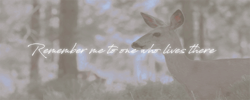
#just recoloured and added text
Text

🌼☮✌🎠
edit: just to be clear this is me editing a page from a colouring in book. i assumed that was obvious but idk. i recoloured the lines and painted everything and added the text but the original lineart was from a g3 mlp colouring book.
just needed to go wild and colour something
242 notes
·
View notes
Note
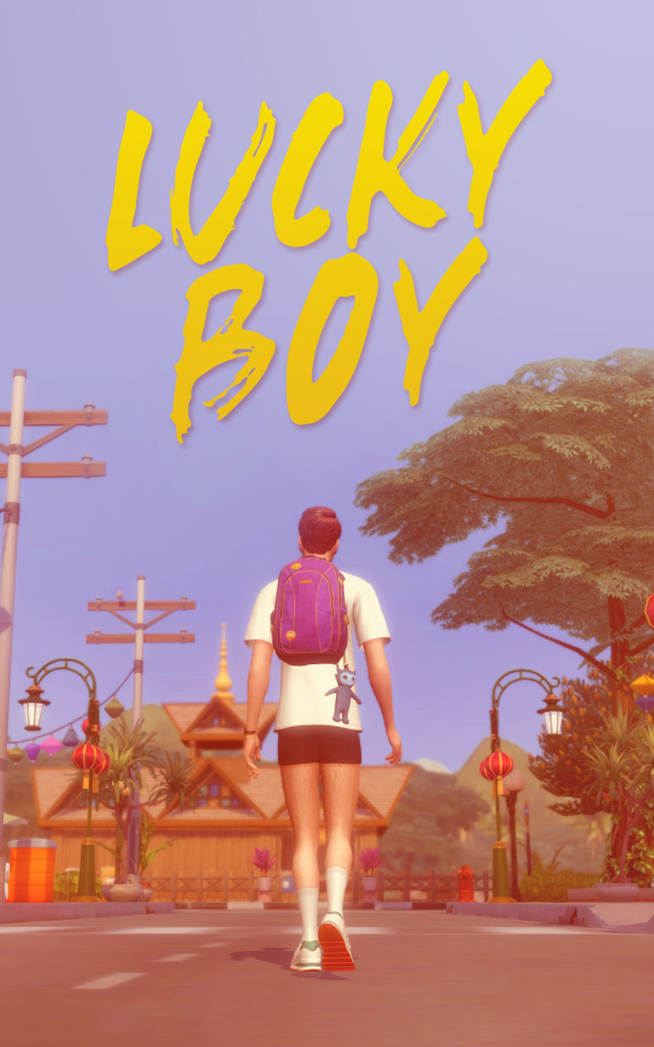
can you put on your creative director / marketing hat and talk about the cover art for lucky boy (and/or both) 🎤
!!! I've actually never been asked about visuals before this is so fun!!
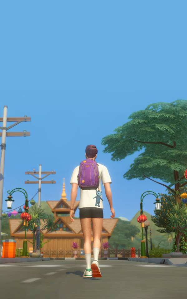
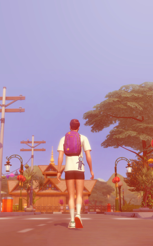
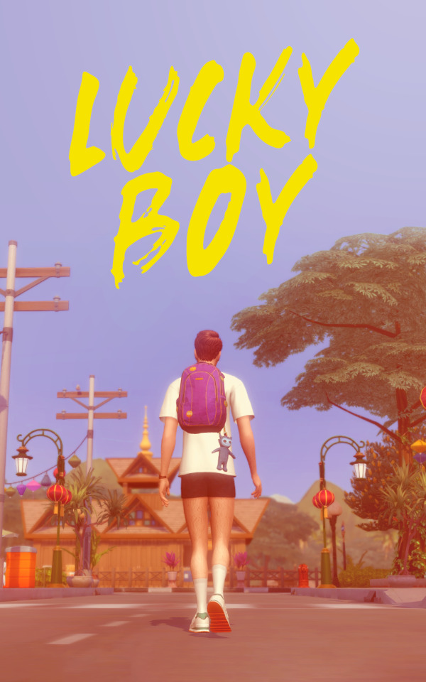
Okay! So here's the cover in question
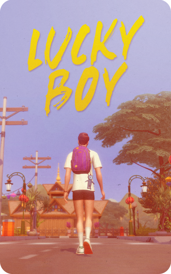
Honestly I love this and I was really proud of how it turned out.
The raw & more detail is below the cut
Alright! so the idea for this was that it's simply an image of Jude: finally free!
Here he is backpacking in Thailand which he hasn't done yet as of the date of this post, but Lucky Girl readers will know that he eventually Does Do That.
You can tell by his hair here too that he's older. He has this haircut when he reunites with Evie briefly in 2012, so I imagine this trip took place sometime around summer-autumn 2011.
To be honest the whole purpose of Lucky Boy was as sort of an extension of the original story for Lucky Girl readers who wanted more in-depth detail about Jude's life, more than what he ever had the time to tell Evie during her portion of the story, so for that reason the story is filled with little hints of what we know will happen, as well as nods to specific things about him that some have already learned - Like, how the story opens with him getting both ears pierced. The fact that he was a boy with two (and eventually 3) piercings was something that Evie found particularly cute and unique about him, and it's something he references in jest from time to time. ("haven't you seen my cute little earrings?")
Anyway, Thailand is where he gets that rather meaningless forearm tattoo, but it's also a place where he spends a lot of time alone. He does travel with a friend, but said friend is holed up with food poisoning for a significant chunk of the trip, which makes me quite certain that Jude spent a lot of time doing a lot of thinking. I'll explore this more in the actual story when I get there, but it's worth pointing out that when Evie meets him after this trip she notices a certain calmness in him, and like he's lost a lot of the boyish energy ("I realise I am looking at a man"). I feel like this trip is somewhat responsible for that.
He's also, clearly, facing away from the camera, which is probably self explanatory. In the chapter with Jen's birthday, as they take the train to the aquarium in Bray he waxes lyrical (as usual, yawn!) about his preference to sit facing the engine, never looking back. It's the same in this image. He is always moving forward.
YET - that is his school bag. (It is the wrong colour, yes, i didn't have the recoloured version when i made this poster lmao) so there's a sense that he's still in some way tied to childhood, to the things that are unresolved. Lucky Girl readers already know what (and who) those things are but I'll develop all that further from my controllers seat here inside Jude's brain.
"It seems like we wanted the same thing (...) Not to grow up too quickly, like, to be allowed to just be a kid.”
Also - the toy attached to it represents Ivy. It's never explicitly stated in the story, but I think it's probably not in his character to have something like that on his bag unless it was gifted from someone important. So, he's carrying her with him too on his travels.
Now, for the artistic stuff (eek!)
I chose this pinky purple as the base colour by messing around with some hard light blending and the colour balance adj. because it creates that kinda fantasy feeling, like wonder and/or enlightenment is ahead, which hopefully for our dumb boy, it is. Purple is also often used in graphic design to indicate creativity, which is apt, seeing as he's an artist and all that.
I slapped in some sun in the corner ala 3 year old child's drawing, and added the text in yellow for no reason other than it's a complementary colour, and it picks up some of the yellows in the image.
Then added a text gradient to blend it in better and a little drop shadow effect
And finally some grain, paper texture and rounded corners because I wanted it to feel tangible, that sweet, nostalgic 35mm camera effect, or like a postcard.
and that's it!!
This was so fun, you know I love 2 yap and you gave me a platform to do so.
Thanks so much for your question!
20 notes
·
View notes
Note
Hii!! I just saw the drawing you made of your flight rising oc and I was wondering how you made the forum signature? I'd like to make one in that style! Have a good evening ✨✨🌌
i looked at old forum signatures on google + went on youtube and searched for old art tutorials for signatures/older graphics for inspiration.
just got a pic of my dragon, a recoloured pink cloud background i got from google, a flipped image of my dragon saturated and half transparent, and I put a pink overlay over it. added white semi transparent 1px lines to give it a scanline look and then I added the pixel art, pixel text/lines, and pixel black and white border afterward.
#never made little designs like this ever in my life (if i had any art programs as a kid other than oekaki i probably would have dslkf)#it was cute looking up lil vids with like. cascada music in the bg
22 notes
·
View notes
Note
Emily !! so for the gifmaker ask, 48, 41, 32, 1, 36, 46 <3 ok love u lots !! hope your day is going well <33
(Giffing asks) <3
Oooh thank you so much!! My day's been going pretty good!! I sort of woke up early, then slept in late, but I'm staying at my Nan's, so it's very relaxed!! I hope yours is going great too!!! xx
1. What are your top 3 favorite sets you’ve made?
Oooh, that's tough!! I think it could be recency bias, but I genuinely love the Umbrella Academy ones I've made lately. I feel like I'll say I Think We're Alone Now, Diego, and this Klaus one (s3 spoilers).
I Think We're Alone Now is just cool. I love how the text looks on it most of all, over the fun, glitchy tinted shots of the siblings dancing. Plus it's one of my favourite scenes, so I was singing the song all day.
The Diego one is the first time I really worked hard to make a cool layout myself, and for some reason stumbled into this sort of... dice thing, which I loved. I am also obsessed with the green and the Matrix vibes of it (especially the middle gif).
And that Klaus one, I'm just shocked by how much I love the purple-pink gradient. Unsure why I added the minecraft poem but it really made me LOVE the set even more.
32. What is your favorite tool/adjustment layer in Photoshop?
Oooh, fun one!!! I'm going to say I love curves. I always start with curves, even if some things end up going underneath it, so it always feels like a lovely start to a recolour, just seeing the colours intensify instantly.
36. Do you gif with something specific in mind or do you just wing it?
Lately I've been more specific, at least partially because I've been low on space and have to be economic with what I screencap and what videos go where. But usually I'm not super specific. It depends on the set. Sometims there's a shot I know I'm using and a parallel I want to make, but other times (Glee songs especially) I would just crap as many moments as I wanted, then chisel it down.
41. What is your least favorite part about your gif making process?
Getting the videos together. It depends on what I'm making, but for my regulars, I normally have d.ire.ct d.own.loads on my phone, then have to cut whatever clips I want, then upload them to drive, then download them via Google drive on my computer. It's just a lot of fiddling before I get around to actually making the gifs.
46. Ever gotten a really sweet compliment over a set.
All the time!!! Everyone in the glee-sphere was always so lovely, but aaah I can't find many of the specifics anymore. I've also had some LOVELY compliments from people within the glee-sphere on my new sets on here, even if they aren't in the TUA fandom. It's basically just been the sweetest group of people!!! xx
48. How would you describe your giffing style
Oooh I don't know! Definitely there's been a lot of playing with colour lately. I quite like having deep blacks. And there's a chunkiness to them, I think. I don't know!!
Thank you so so much for these!!! A lot of fun questions here!!! xx
2 notes
·
View notes
Text
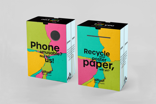


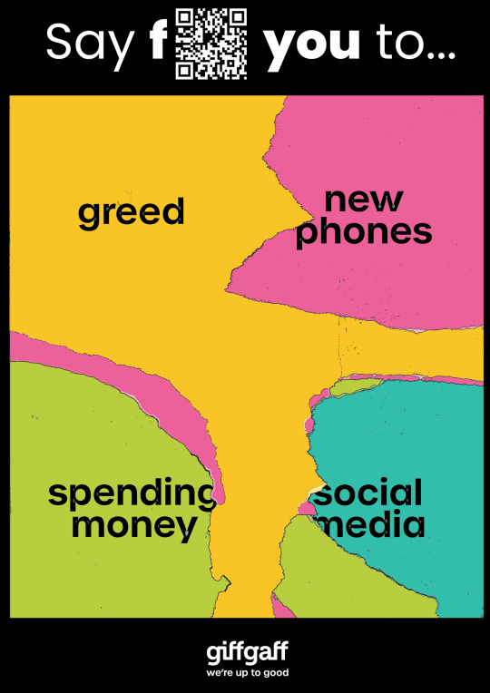
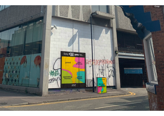
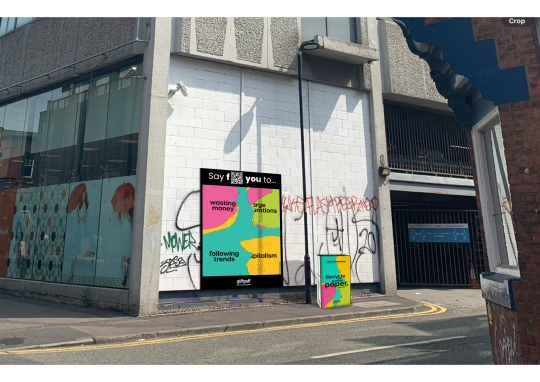
10/03/24 - Final Mockups
I just had to recolour the poster and redo the font. As I had made all the text boxes into outlines so I could remove sections, this took a little longer than I thought as I had to start from scratch with the editing. I definitely prefer the old font, as it looked less clunky, however if I wanted to submit to D&AD I would need to use the font Giff Gaff needed.
These are my final designs for the recycling bins. I think they show Giff Gaff’s funky personality and work well with their brand identity.
0 notes
Text
BROCHURE FIRST DRAFT
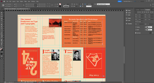
Here is the first pass at my design for my brochure. The front and back cover of the brochure are upside down for a reason since they’ll fold in a specific way which will mean they will be right side up in the end. The front cover is also just a recolour of the main poster to keep things simple, cohesive and the same.
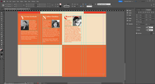
Obviously I kept the same simple colour scheme but also added in elements of black and white for the images of each designer. This is not something I’m so sure about just yet and also because the images are obviously all different sizes and ratios this also makes the design look not as cohesive and it cant be exactly the same for each page. So it might be back to the drawing board when it comes to the images I give each designer. This is also true because of the amount of text each designer has been given, because of the amount of pages we have and need to fill (16) this means some designers, probably the designers with the most information, can be given two pages to go over onto. But also the text box sizes aren’t the same for each designer and they also don’t fit to a specific grid design either unlike the first two introduction pages which I’m more happy with. So I need to find a way to bring the grid design down to the pages talking about each speaker. This is why I also didn’t design a page for every single designer given and left a lot of empty space down below because I’m not happy at all with the design so far with text and images and honestly I think at this point before I get too far it’s important to know print to make sure the colours work well and that the text is the right size, not too small you can’t read it or not too big it’s an awkward size. This will also help direct me in what design decisions I can change to become more happy with how these speaker pages are going.
There’s a similar reason too why I’m keeping the table black too because I want to print it out and see how I feel about the size and get a sense for how cluttered it is before I go through and make all the colour edits which are extremely tedious. This also gives me a chance to ask and see if there is a better way to go around the difficult way to change text colour in a table.
Also my map that I made in a drawing program, although was originally done in very large dimensions so It wouldn’t lose quality, looks fuzzy here online so for the back map cover I have also left simple to at least first make sure the map is legible and good quality when it’s printed. If it isn’t I will go a different route and make this image in Adobe Illustrator since using vectors in Illustrator allows for no loss in quality when messing around with size. I find Illustrator always really difficult to use but this is an important element of the brochure which needs to be perfect and so I will do some learning to make sure it can be done.
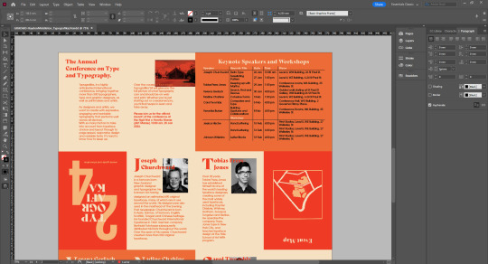
Below is the same images but in preview mode so without the grids getting in the way and you can get a clearer look at whats going on here.

0 notes
Photo
“Lily Evans. One of the brightest I ever taught. Vivacious, you know. Charming girl. I used to tell her she ought to have been in my House. “
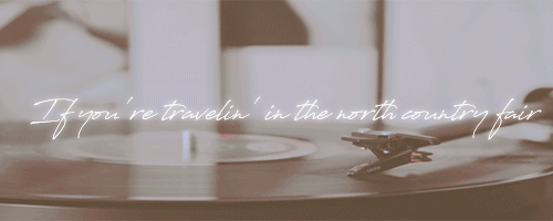
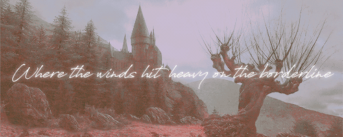
#my edit#not my gifs#just recoloured and added text#credit to psd colourings used#lily evans#hpedit#hpgifedit#marauders era#marauders era gif#marauders era edit#marauders era gif edit#gryffindor#lily potter#hogwarts#song lyrics are from the song : girl from the north country by bob dylan
5 notes
·
View notes
Text

Kerrigan House Designs - Gardenia Set
Converted to the Sims 3 by Keibea

➙ Not featured in the preview images are the lamppost & carriage house lamp
My beautiful, and immensely talented friend (who has managed to put up with me for this long) also known @kerriganhouse AKA Jade, has kindly let me convert her beautiful Gardenia set to the sims 3! Full credit goes to Jade, and thank you for letting me convert it :) The original set for the sims 4 can be found here. Please check out the stuff she makes, she is so incredibly talented and deserves ALL the love and more. Her patreon can be found here :)
➙ General info before you download;
- A lot of the objects in this set are quite high poly (for sims 3 standards anyway but especially the carriage house lamp!!), so I would advise using this set only for pictures! I wrote all the polycounts down in a separate text file, so be sure to check what your computer can handle.
- Due to me adding in mlods + HQ textures, the file sizes might be a bit big...sorry. All have been compressed though!
- This set has 18 items.
- Almost all are recolourable (more information in the text file).
- The mediafire folder has a zip, individual and merged file option. simsfileshare was being a bit mean to me and it only allowed me to upload the individual files :(( I will attempt again tomorrow and update the post notifying you!! Or else you'll just be able to see it added in the folder itself.
DOWNLOAD (sfs) // DOWNLOAD (mf) - no ads and/or paywalls
➙ Everything has been checked in my game and works perfectly for me. If you have any issues or problems or if I got something wrong you can call me, beep me, if you wanna reach me. I bloody hope at least one person got that reference.
➙ There is a .txt file with more information & polycounts included with the file download.
➙ This is Jade's photo from the sims 4, but all items look the same so I stole it for here :)
@katsujiiccfinds @xto3conversionsfinds
430 notes
·
View notes
Text

Thank you for tagging me, @herpixels! 🌼
I'm not going to tag anyone specific because I literally wanna see everyone's take on this. So, please, if you want to, do it!
I went a bit overboard, sorry 😗If you actually read it all, I will love you forever.

YOUR WRITING PROCESS
Show us a part of your script or explain how you write your scenes. Do you write in screenplay format or novel format? Etc, etc.
I love writing in novel format but, for sims storytelling, I feel the need to write a screenplay.
I start by writing all the dialogue along with the action cues and setting descriptions. This helps me visualize how much space I will need for the characters, which and how many props will be necessary etc.
From the simple screenplay, I make a shooting script and a checklist.
The shooting script is super helpful because it allows me to break my screenplay down into shots so I go in game already knowing exactly what I want from it.

This will all sound like I think I'm some big shit but honestly... I just get brain farts WAY too often. So having everything kind of ready helps me remember little things like ADDING THE DAMN POSES INTO THE S4S for examples lmao.
SCENE BUILDING
Show us you in the middle of scene building through pictures, gifs, or a video. Explain what is the best thing about scene building and what is the worst!
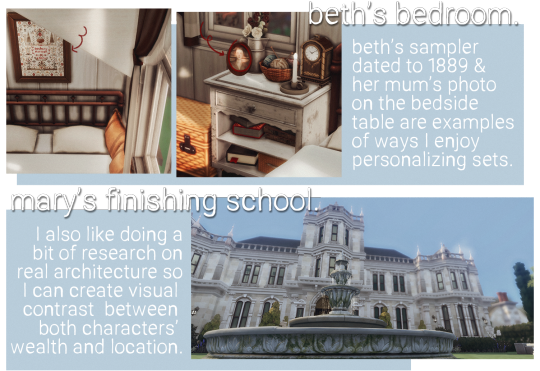
Scene/world building is 100% my favourite part of the whole process!
I use a lot of references from the real world. The small coastal village of Brindleton is based on many places in England, mostly villages/towns in Cornwall and Devon.
I enjoy looking for inspiration pictures on Pinterest and going on Google Earth tours, really LMAO.

Of course, there is only so much I can do with Sims to make it look realistic, but if you squint your eyes and shift your head, maybe? fjhgdfhjkg
I do the same for my residential lots and interiors. But interiors are a bit more fun for me because, besides not needing to worry about background extras, I can personalize the environment to my characters.
CC/POSE MAKING
Do you make your own cc/poses for your scene? If so, what is your process like to create? Do you just go off the top of your head? Do you use reference photos?
Nowadays, I make 98% of my poses. The remaining 2% is just me making some adjustments on pre-existing ones. I can't help it. I absolutely love seeing my visions come to life like this.

I also enjoy making poses because I like giving my characters some distinguished body language.
For example, Beth is the only character who slightly puckers her lips to the left. Usually, when she's thinking or when she's upset. It's basically the main part of her face - other than her eyebrows - that will give her true feelings away.
And Mary, on the other hand, is way less emotionally repressed. Any minor inconvenience will make her upper lips twitch upwards. She also pouts a lot more and has more eyebrow movements.

Yes, I am a loser for paying attention to these things shhhhhhh.
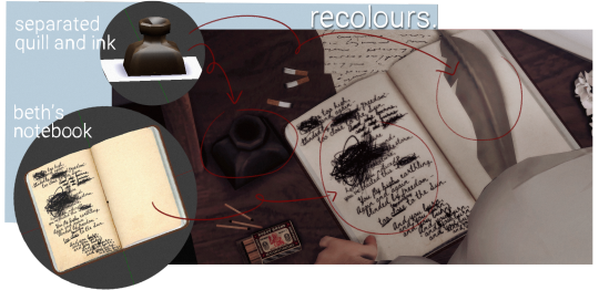
Usually, I don't need anything other than an accessory or two. But lately, I've been LOVING to make recolours and convert objects into pose accessories. Whenever I have my script ready, I take note of what I will need for the scene in my checklist.

You probably don't even notice or care as much as I do, but still! They add much to the narrative imo and I feel like I'm giving depth to the characters by tailoring their accessories and the world around them. It's really fun for me!

GETTING IN THE ZONE
What do you do to get in the zone to work on a scene? Examples include: show us your playlist you use when working on a scene, what’s your go-to scene snack/drink, etc.
I have playlists on my Spotify for the main characters as well as one for the story. Beth and Mary's individual playlists are the ones I listen to the most and they are called Countryside Teacup and European Train Ride respectively because these are the vibes I get from the songs in there dslkfjsklfsd.
I also LOVE listening to instrumental playlists on youtube like this Cottagecore and this Royaltycore ✨massive points to you if you can find my comment on the royalty core video 🌚
I don't really snack while working on my story posts but I drink mate tea like CRAZY or, sometimes, I'll just have a beer to get my creative juices flowing ehe.
SCREENSHOTS FOLDER
Give us a look into your screenshot folder to show us just how much goes into ONE scene for your story. (Scrapped pictures encouraged!!!)

I never take too many screenshots with different angles because of my pre-planning!
However, I do have, like, 10 to 15 repeated shots because I take some with DOF, some without, some with shadows, some without etc. And I'm always terrified of the screenshot not working, so I press the my hot keys like 5x jddjlkgd.
Here are some scrapped pictures from previous story posts:

CAPTIONS
Are you a caption on the picture kind of storyteller or captions in text box type of storyteller? Why? Do you do both?
I love doing the graphic novel format, with "speech bubbles" sort of. I personally find it immersive. But I also love and crave for the novel format, so I'll write a little "after scene" sometimes in the text box for extra depth ☺️
EDITING
Explain and show us your process editing a scene through a video, gif, or picture. A Before and after will suffice if you aren’t in the middle of editing a scene as you answer this.
Since I've done a few posts telling a bit about my editing - and, truthfully, not much goes into it - here is a before and after!

THROWBACK
Show us an ANCIENT story scene you done in the past and explain how you would do the scene differently today!

Okay, ANYTHING from my early simblr days is cringe worthy. The dialogue isn't good, the lighting is extremely yellow - due to my crappy laptop -, the outfits and the settings are all over the place, I--
I chose this one image because it was one of the first times I was doing a story post instead of just a gameplay update. I don't even have much else to add, just look at it jkljdfklgjdf.
But I'm going to have plenty of scenes set in the past where I will get the chance to remake the school and dress my teen girls properly and I'm so excited. Like, making slate pose accessory excited fjdigjfido oh, boy.
166 notes
·
View notes
Text
#showyourprocess
From planning to posting, share your process for making creative content!
To continue supporting content makers, this tag game is meant to show the entire process of making creative content: this can be for any creation.
RULES - When your work is tagged, show the process of its creation from planning to posting, then tag up to 5 people with a specific link to one of their creative works you’d like to see the process of. Use the tag #showyourprocess so we can find yours.
I am lowkey late but I finally have proper time to do this fun thing! Thank you @tomthenetherlands for tagging me (check her process here). I was asked to explain my process of making this lyric animation so here we go
[disclaimer: I’ve deleted everything but the final product from my computer so I’ll mostly explain with text only]

1. PLANNING: Okay first I got this request on my ask box bc I was lowkey doing a series, so I knew the style I was gonna go with: simplistic animation. That’s pretty much all the plan was fhgsdjkfhksda
2. BASEWORK: Now first thing I did is choose the best lyrics for the edit and started searching for videos best fit to use as the base for the edit. Immediately knew to use a clip from the movie 1917 because of the burning city scene, for the first lyric. Then a clip from walls as I wanted to insert Louis into it and went through some true blood ship videos to find a good one of two guys kissing dfhgsdjfsk and for the last one I originally wanted a wedding scene but the one I tried to use was way too difficult to work with it so I used another part from the same video as base. Now that I got my videos I open up photoshop and get working
3. PHOTOSHOP: Starting with GIF number 1

Just like with every GIF I import the video and choose the frames I want yada yada. Now first before I start the ‘animation’ process I sharpen the GIF once and then I over colour the whole thing. Like over saturated and massive contrast so it’s easier to work with. Also in this case made everything super warm like yellow and orange all over. Then comes the fun part! I started painting each frame making sure it’s not too flashy and clear enough so you recognise what’s happening. Since this was the first of the edit I chose a simple colour palette I could use in the other GIFs as well. Ones I was happy with the frames I resize the canvas to 600x400px and compressed the GIF once and then open it again, added the lyrics on top and standard GIF making again.
GIF number 2! This one took me about 3 times until I got it right. I did so much recolouring I almost gave up hdgjkaslga

But just like the first one, colouring, sharping etc. and then again one frame at a time painting the scene and making sure you see human shapes. As you can still see the right side of the gif is a mess bc why did't I just paint it all black idk. But with this I recoloured it again after painting bc I wasn’t happy with the shades, and then again and again bc fun. But yeah, resize, compress, add text, tha-da
GIF number 3, my fave

Okay with this one I cheated a little to get it done quickly. So otherwise same as the others, but instead of going frame by frame to paint, I just put all the frames through a filter at once to get the result. Which is why it’s the smoothest of them all too tbh. But just had to fix the colours with colouring tools but rest is standard GIF making.
GIF number 4, the one that I hated the most
Now see like I said, i had a different idea for this at first, but bc it didn’t work I decided to try this part of the same video (a married couple walking with their wedding party) First I turned everything black and white bc I figured this will be like minimalist (and easier to work with). Now I wanted to get rid of the other people so i basically painted all black and then went frame by frame getting the two people walking. Had to add the shadow of them as it looked painfully stickfigure-y without it djsakdgdfsh. Once I was happy with the animation I slapped on a pride flag bc I wanted it gay u know.. But to match with the rest of the GIFs I multiplied it and warmed up the colours a bit. Then again, compress, add text, standard.
ADDING IT TOGETHER READY FOR POSTING: Then I made sure all the edits match or like look nice together and the text was in the same level and such nice things and made sure I got them all in right size (in these I did 600x400px normally I go with 530px width) then it’s time to open tumblr.com
POSTING: Like with other edits I did for this ‘’series’’ I chose more lyrics from the song and added them as caption along with who requested it and saying do request more (still taking in requests btw even tho i didn’t get into the animation school)

I used the HTML to get the colours I used in the edit into the caption as well (used this when I first learned how to do that)
now with tags I like to be talkative
I have the standard blogs I tag and bc it was Louis’ lyrics I tagged dt and I always use ‘[insert initials] edit’ for everything for my own navigation. And then I obviously make my own comments, which in this one are 100% accurate and I stand by them. I peaked here.
ALL DONE: then I sit back and wait for the notes to roll in :) hjfgsdjkf
That is all thank you for reading if you did! I would like to see the process from
@curlyhairedprince for these motherfucking edits
@ltpolari for this edit bc colouring icon
@thesemptysounds for this incredible edit bc it’s my favorite thing ever and now on my wall forever thank you
@queersue for this edit (and many others posts alike) bc colouring legend
and finally @tomlinsun for this lil drawing which is also on my wall bc i love it so much!!
As always feel free to not reveal your process:

Thank you for coming to my ted talk I’ll see ya later.
#showyourprocess#mun muminaa#i dont really know how to tag this dfdsjfsak#this was fun thanks for the tag!#also sorry it's so long damn#the people i tagged gonna hate me for making them scroll so far to see their tags#long post
3 notes
·
View notes
Text
creator tag game
I was tagged by @jonismitchell, @ofdeepfears and @hermionegrangcr. thanks guys!!
rules: it’s time to love yourself.choose your 5 favourite works you created in the past year (fics, art, edits, etc.) and link them below to reflect on the amazing things you’ve brought into the world in 2020. tag as many writers/artist/etc. you want (fan or original) so we can spread the love and link each other to awesome works!
1. taylor swift eras birthday gifset
this set is by far my favourite edit I’ve done this year on any of my blogs, one of my favourite edits ever. I’m just really really proud of it from the idea itself to how I managed to execute it with the blending and colouring of all of them.
2. ootw, getaway car, cruel summer and august ranting bridges gifset
aksljdfha I was really excited to make this one after I thought of it one day and I just love these songs so much too. did something different with the text too and added a gradient overlay to them that I don’t usually do.
3. folklore + my favourite songs gifset
I’ve been experimenting with using colour overlays and gradients over gifs this year and really liked how this one turned out!
4. lover album anniversary gifset
the first one of a set always ends up being my favourite haha but yes like the one before also experimenting with colour overlays.
5. folklore headers and icon pack
I am so proud of the recolouring I did on these as I don’t usually recolour b&w and I’m afraid of making it look unnatural but I think I did well with these!
I’m tagging @seegoldendaylight, @lizzo, @recklesspath, @nobodynocrime, @tylorswift, @melodramas and anyone else who wants to do this!
#I never know who to tag askldfjhas#tag game#I did this tag game for 2017's edits as well just without commentary haha
8 notes
·
View notes
Photo


RABBIT HOLE RECOLOURS AND RESCRIPTING TUTORIAL
Are you having difficulties getting the outrageously coloured rabbit holes to fit into your moody emo town? Or would you like to make your high street look like a Skittles factory had just exploded? Despair no more! Release your inner MacGyver and DIY!
Programs you need:
S3oc
S3pe
Photoshop or Gimp (DDS plugins for Photoshop -> this and this, Gimp has this feature built in already)
// Disclaimer: This tutorial is picture and text heavy. I hate having to have bazillion different tutorials open because everyone always assumes you know what you are doing and I keep on closing tabs by accident, so this tutorial will run you through each and every step with (far too much) detail because I’m a simpleton and I need both pictures and text when learning new stuff! I have divided this into digestable parts, so you can skip ahead down the tutorial if you are familiar with some of the steps such as cloning. Pictures above are numbered and each step is explained below.
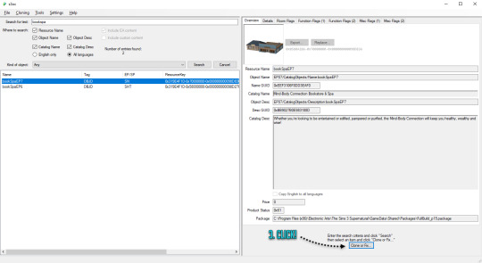
1. CLONING A RABBIT HOLE
1. Open S3oc, click Cloning and Normal objects.
2. Click Tools and Search, type in keywords such as bookspa or hospital. If you still can’t find what you are looking for, then the other option is to just scroll down the list of items and try locating the rabbit hole you need.
3. Once you have found your rabbit hole, click Clone or Fix.
4. Tick all the boxes I have ticked.
5. Edit the Catalog Name and Description, these are the things you see in game when you browse through the items and stuff. If you are not fussed, leave them as is.
6. Change the file name here (Some guides mention changing it, some skip it, but I have changed mine and nothing exploded so far!) and click Start. A window pops up asking where you want to save your package, I usually create separate folders for my projects on my desktop as I don’t want to accidentally mix my .DDS files with other rabbit hole files and stuff, but if chaos is your thing just save wherever.
2. RECOLOURING A RABBIT HOLE
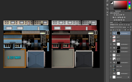
7. Locate your newly created rabbit hole clone .package (You can create a backup copy of it somewhere if you think you will mess up somehow) and open it with S3pe. Look through the IMG tags and find a LOD image like this. Right click and Export to file. If you are organized like I am, you can save it in your project folder with your package file... Or place it wherever because of whatever method of madness you use when editing your files. I’m not your mother. Do whatevs.
8. Now depending on which program you use, open the .DDS file in Gimp or Photoshop, if you get a pop up window just go with default size and no mipmaps. This is the step where you let your creative juices flow and take over. Want to change everything? Or only one colour? Depending on the rabbit hole you have chosen to edit it could be a really simple one click thing fix, or if you picked a more complicated one like I did, you are going to spend some time on this step. I added my before and after picture edits I did in Photoshop as an example.
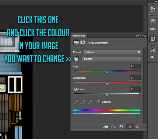
// Photoshop Tip! I’m not familiar with Gimp, so I’m not sure how well this works in there, but I abuse the hell out of Hue/Saturation and the colour picker in Photoshop to get rid of and edit the colours. Press the little hand icon in the Hue/Saturation pop up box and click the colour you want to change in the image and it picks it for you, then just use the three sliders to change your colours, easy! Be careful though! Sometimes it changes too many areas in one go, so you might have to use marquee tool to isolate the bits you want to edit so rest of the image doesn’t change (While using marquee tool you can press either Shift or Alt at the same time which allows you to add into or remove from your current selection!). Or use masks. Up to you. Then once you have selected the areas, create a new layer and hit the Hue/Saturation button and it will only impact the areas you have selected. Play with layer settings if you end up adding separate colours on top, for example my red paint layer looked best with linear light and 80% opacity.
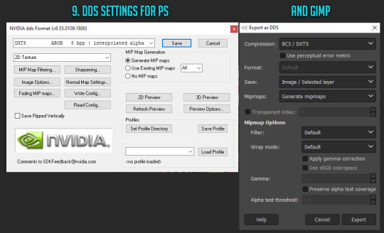
9. Once you are satisfied with your colours and you have merged your layers, this next step is different with Photoshop and Gimp. With Photoshop you can use Save As option while with Gimp you have to use Export As. Either way, save or export over/replace the image you originally opened using the .DDS settings shown (Please correct me if I’m wrong with Gimp settings as I don’t really use it!). If you have been saving as psd or changing the file’s name, make sure the name is now EXACTLY the same as when you exported it earlier. However, I’d urge you to do backup copies before overwriting the file, in case you have coloured something wrong or if you think you might want to change something after doing a test. Just you know, to save you some hassle if shit hits the fan.
10. Back to S3pe, you will now replace the image you previously exported with the edited one. Click Resources (or right click the IMG file on list you are replacing, both ways work), Import from file and pick the newly edited file, click ok on the prompt. Your old IMG file should be crossed out on the list and new IMG added (Once you save the crossed out one simply disappears). Depending on what kind of edits you did to the LOD IMG, you have to repeat exporting, editing and importing each and every IMG file corresponding to the changes you did with the first one. Be extra careful with matching the colours between the IMG files, otherwise you get some funky rabbit holes when zooming in and out! For example for my rather edit heavy LOD image I had to edit another 5 IMG files all in all in the end (Different wall bits, bit of carpet, window trims, roof!).
3. MAKING IT BASE GAME COMPATIBLE
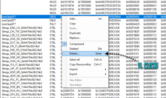
11. Done with your IMG files? Still in S3pe, locate OBJD file on the list, either hit enter or right click for Details.
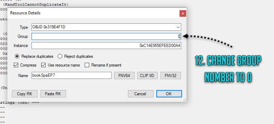
12. Change the group number from whatever to 0. Save your package.
You are done and your rabbit hole is ready to go in game! Drop it with your other .packages in your Mod folder and test it, in edit and live mode in game. Are some parts of the building still showing old colours or are they changing drastically when you zoom in or out? It’s not the end of the world! You must have forgotten to edit one of the IMG files or the colours are not matching, double check that all the bits you edited in the first image match with rest of the IMG files. Even if you got the colours right there will be a slight chance due to how Sims 3 renders items, so don’t panic unless IT’S REALLY BAD! Just look at how other nonedited Sims 3 stuff renders and compare how yours behaves.
// But wait! Maybe you want to make it a default replacement rather than a new individual rabbit hole like my tutorial does? For default replacements, follow this guide.
4. CHANGING THE RABBIT HOLE SCRIPT (OPTIONAL)
Like the look of your rabbit hole building, but don’t think it looks like a spa or a bookshop? Is it giving you a hospital and science lab vibe instead? Again, no need for anxiety! You can fix it! Sort of. It should work but be wary! If you use lets say the Annex script, you got to have University EP installed to make it work. Without the right expansion, you can’t have special careers. Just keep in mind that some scripts may not work with some buildings due to the specific animations and stuff, so test it before you release your masterpiece in the wild.
13. Open your .package in S3pe, locate OBJK file and right click Edit OBJK.
14. Replace the String bit with one of these scripts from the following list. Commit to changes and save your package. You are done!
Bookstore
Sims3.Gameplay.Objects.RabbitHoles.Bookstore
Business and journalism
Sims3.Gameplay.Objects.RabbitHoles.BusinessAndJournalismRabbitHole
City hall
Sims3.Gameplay.Objects.RabbitHoles.CityHall
Criminal building
Sims3.Gameplay.Objects.RabbitHoles.Hideout
Diner
Sims3.Gameplay.Objects.RabbitHoles.Diner
Grocers
Sims3.Gameplay.Objects.RabbitHoles.Grocery
Hospital
Sims3.Gameplay.Objects.RabbitHoles.Hospital
Mausoleum
Sims3.Gameplay.Objects.RabbitHoles.Mausoleum
Military
Sims3.Gameplay.Objects.RabbitHoles.MilitaryBase
Movie studio
Sims3.Gameplay.Objects.RabbitHoles.MovieSet
Police station
Sims3.Gameplay.Objects.RabbitHoles.PoliceStation
School
Sims3.Gameplay.Objects.RabbitHoles.SchoolRabbitHole
Science
Sims3.Gameplay.Objects.RabbitHoles.ScienceLab
Spa
Sims3.Gameplay.Objects.RabbitHoles.DaySpa
Sports stadium
Sims3.Gameplay.Objects.RabbitHoles.Stadium
Theatre
Sims3.Gameplay.Objects.RabbitHoles.Theatre
Vault Of Antiquity
Sims3.Gameplay.Objects.RabbitHoles.VaultOfAntiquity
Subway
Sims3.Gameplay.Objects.RabbitHoles.Subway
Fortune teller caravan
Sims3.Gameplay.Objects.RabbitHoles.GypsyCaravan
Equestrian center
Sims3.Gameplay.Objects.RabbitHoles.EquestrianCenter
Annex
Sims3.Gameplay.Objects.RabbitHoles.Annex
Hospital & science combo
Sims3.Gameplay.Objects.RabbitHoles.ComboHospitalScienceLab
School & stadium combo
Sims3.Gameplay.Objects.RabbitHoles.ComboSchoolStadium
Book & spa combo
Sims3.Gameplay.Objects.RabbitHoles.ComboBookstoreDaySpa
City hall, police & military combo
Sims3.Gameplay.Objects.RabbitHoles.ComboCityhallPoliceMilitary
Business & bistro combo
Sims3.Gameplay.Objects.RabbitHoles.ComboBusinessRestaurant
And I think that’s it. Let me know if you know a better way or I have made an error in this tutorial! Or if you want to fight me, I will meet you behind the mall by the bins for some asskicking.
#the sims 3#ts3#simblr#ts3 tutorial#ts3 rabbit hole recolour tutorial#ts3 base game compatible tutorial#ts3 cloning tutorial
131 notes
·
View notes
Photo

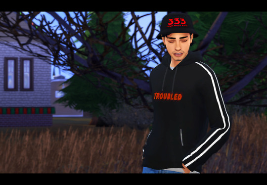

@dalemata loves Life is Strange 2, so this is... Seans? sweater from the game for her (late) bday gift.
It’s actually a hella nice mesh, so I ended up also re-texturing it to be maxis match and adding some lame texts.
- Blue and black variants
- LiS swatch at the end
- English and simlish variants
- ‘Gender Equality’, ‘i hate everyone’, ‘i’m not dead yet’, ‘im sorry its just i literally do not care at all’, ‘troubled’, ‘saiko’, ‘i’ve got a plan! lets give up.’
- Male
- Converted from Life is Strange 2
- Disabled for random
- Cold weather
- Sweater & sweatshirt
- PSD for recolouring (please read my tou)

CLICK HERE
#ts4 cc#sims 4 cc#the sims 4 custom content#ts4 custom content#ts4 male cc#sims 4 male cc#ts4#sims 4#life is strange#life is strange 2#LiS2#lis 2 sean#sims#the sims#simblr#sims cc#simscc
5K notes
·
View notes
Text
Deca-Dence 4 | Maou-jou 2 | Fruits Basket 2 24 (49) | Magatsu 1 | IWGP 2 | Koi to Producer 11 - 12 (FINAL) | HypMic 3
Still chugging away at these summer and spring anime...sorry for the delay...(LOL, that rhymed without me meaning to.)
Also, I’ve been on the fence about whether to keep Golden Kamuy, since almost no one I read the reviews of follows it now and it’s a week’s wait (when accounting for my AniList challenge)...so I’m putting it on pause so I don’t have to suffer later.
Deca-Dence 4
“…who possesses the will to fight.”
…Great. Kurenai is absolutely tethered to Kaburagi in a one-sided love. Just when I thought Natsume had an independent role model to look up to.
Maou-jou 2
Oh, this is from Shonen Sunday? Didn’t know that until now.
“Demon Shroud: A demon with 99 clans. A cloth demon that puts on airs that it won’t be used before it’s finished off, due to its wonderful fabric. It is full of beautiful ghostly power, so its skin is smooth. However, the hero (who commonly uses things he finds in his surroundings) caught one, so now the princess has zeroed in on them. The princess doesn’t need the hands or the head of these demons, so it’s a cycle of killing and taking revenge for them. Their fighting style is squeezing the life out of things.”
Apparently, the teddy is acceptable, LOL.
I like how the window stopped displaying text at one point.
I saw someone with a huge plait in the ED. The queen, maybe…?
I noticed the laughs dropped off significantly in comparison to last time, but it’s still good. I can flex my translation skills even if I can’t laugh at one part.
Fruits Basket 2 24 (49)
…jumping to the 2nd-last episode in a season is pretty unprecendented, but I’m going to watch this for the sake of Jon’s Creator Showcase…then again, I need to finish this anime anyway, so it’s just cutting and changing the order for something I already know the outcomes of.
I used to lose myself in movies so much that I would lose all sense of who I was and would have to “regain the bearings of myself”, so to speak. I would have to reconstruct who I was, even though I technically hadn’t “been broken” and I knew once I did that, it felt different. Like I’d travelled through time and past me would never be the same as present me. That’s why I kind of get what Machi means.
Oh, I didn’t listen to this OP much…probably because I’m emphasising bingeing the spring and summer series I left behind and now that I can skip the ads on most of my anime, I’m leaving behind the anime I’ll be slower on.
The manga was written when there weren’t as many cell phones around, much less smartphones.
Rin’s on bad terms with everyone…
…if I remember the year of the dragon correctly, the last one was 2012, then the one before that is 2000…around the turn of the millennium, huh? Froob is showing its age here, albeit unintentionally.
Now that I’m closer to the Musketeers’ age, I can kind of empathise with their scenes a bit more.
“If I always blame someone or something, I’ll never change.” – True. I realised I’ve been a bit too haughty lately (what with the HypMic anime going on and it being the first thing I could research extensively before the anime’s debut, my feelings are of course reaching fever pitch – combine that with continued COVID lockdown and you get me being all defensive of HypMic, for better or for worse) and so I may have acted like a jerk to someone, but since I only know them online and generally when I try to apologise to people online they don’t see the things I apologise for as things in need of apology, I know the fault lies with me to rein myself in. I guess this means changing yourself is the only way to move forward.
I wonder how Hatori did his doctor training while avoiding hugs from girls who aren’t Sohmas…?
Shigure vs. Gentaro (of HypMic, of course)…a writing competition! That would be fun.
…Crow’s note here makes sense (<- this is why I changed the order). Shigure was clearly asking a question there.
Come to think of it, HypMic and Froob have some similar characters. The stoic doctor is Hatori/Jakurai, the energetic smol one is Momiji/Ramuda, the teasing author is Shigure/Gentaro…that could make for some good fanfic material, really.
Magatsu 1
…that title is an absolute killer, man. Anyways, I’m here for the director, who also worked on Hataraku Maou-sama.
Is this a no guns thing, like IWGP is a no drugs thing?
…this OP has lyrics?! I just hear strange squeaky noises, the kind you hear on some autotuned sogs to make them seem more ominous (I can’t remember if there’s a similar sound in G-Anthem of Y City or Yokohama Walker, but one of the MTC songs has similar noises).
I kinda guessed Leo’s package was the one Schaake and her partner were looking for. I was right.
That CGI (on the truck) is…kinda conspicuous.
These backgrounds are gorgeous.
“The definition of in dubio contra reum is "in doubt, against the accused", meaning that, where there is doubt, the accused in a trial is not given the benefit of that doubt; they are assumed guilty.”
I wonder: how many protagonists start out as absolute wimps, unwilling to fight because they either know or don’t know their own power? It’s a pretty standard introduction for things with fights.
This battle track is nice. I listened to some of the Magatsu music under Masaru Yokoyama’s name on Spotify and it’s pretty cool, but since it’s background music, there’s not a lot of demand to listen to it (from me or anyone else, I don’t think).
Why is there only a single shield if they know the enemy has heavy artillery?
…what the heck is a Zeits? Update: You can see a “Zeits” (or however it’s spelt) in the credits list, suggesting Zeits is a character in this.
I knew this was my last premiere and this might have made or broken my entire watching schedule, but this is just a pretty down-to-earth premiere for a fantasy mobile game. While that cliffhanger compelled me to continue, I don’t think it’s good enough to beat its competition in the long run.
IWGP 2
I know I said Magatsu was my last premiere, but just to be sure, I’m watching this one.
This dance scene is beautifully orchestrated. The fact there’s no music means you focus entirely on the motion.
The OP seems to trade more in colour and spectacle than actual “cool factor”.
…wow, $2.90…? That’s some cheap food.
You know I hate 1st person cam with a passion, right? So…uh…
Eyyyyyyyy…this is basically McDonald’s, curry style.
I think I can almost see Ichiro of HypMic in how the G-Boys seem to mostly be reformed delinquents or actual delinquents.
…yeah, but what’s your name, random messenger guy? Update: We find out later his name is Isogai.
“It’s because I suck at working and communicating.” – Yep, that me.
Ikebukuro licence plate. I still have no idea exactly what places get licence plates in Japan.
There are actually 2 characters before “Hospital”, but no one confirms the reading of those characters…which is probably why they’re omitted.
…oh gosh, if this were a BL, Mitsuki and Masaru would be star-crossed lovers…*sigh*
Maybe it’s an unrelated 3rd party??? (In mysteries, you can never dismiss the work of a 3rd party.)
You can tell exactly which group is which based on the colours they wear. Makoto isn’t affiliated with anyone, so he’s wearing black and had yellow earlier.
I think an anime is cowardly – or trying to save budget – if they deliberately choose an angle where they can’t show the moment of impact clearly.
E! News, LOL.
Archangel, huh? So like a 2nd in command?
I think IWGP is moving in the direction of pushing the gangs against each other in the way Makoto describes in ep. 2.
As for what I think of it now, it's decent if you want something down-to-earth, but it seems to be missing some kind of "wow factor". Like it's afraid to commit to deeper characterisation, even though it has Makoto as the ostensible lead/viewpoint character.
Koi to Producer 11
“Cognitive Science Association” - I thought it was the Cognitive Psychology Association…? (Psychology is shinrigaku, science is kagaku.)
My boy (Lucien)…why must you be so evil??? Why do I keep falling for the tall but mysterious doctor??? (<- guilty as charged re: Jakurai)
…that’s some funky seatbelts.
What’s that look in Victor’s eyes…? Fondness, or something more…?
…ah, so there is “Science” in the place’s name. It was just being less loosely translated then.
Oh dang. Stuff escalated really fast, huh?
You actually set this in 2020, huh, staff? What happens ten years from now and people watch it, only to realise 2020 and 2030 aren’t so different? That’s what happened when people had the Y2K bug.
That yellow sign on the side says “exit”. It’s not of any use.
That’s not a recoloured Kiro, is it? It’s not Shaw, either (who I think we saw somewhere in the previous episodes)…so then who is it?
…geesh, they even changed Helios to Ares. I guess it makes sense: Helios is the god of the sun, but Ares is the god of war.
Koi to Producer 12 (FINAL)
I read on the wiki Lucien’s power is copying powers. No wonder I couldn’t get a solid handle on it!
So that Helios wasn’t a mistake in the credits list in the previous episode???
Can we even hear what Helios says when Protag-chan is pulled away? Based on the lack of subs, probably no, but I wanted to ask anyway. (Or maybe he said “Watashi”, since that’s the pronoun Protag-chan goes by?)
…so that really is Kiro, huh?
Military…what? When did Protag-chan’s father have a military squad???
LOL, at the very end you can see Gavin gesturing at Greenie (the pot plant, presumably a succulent). I logged on to the game 7 days straight (they have a Discord channel!) and got a Gavin R card with Greenie on it, which is how I know about it.
Anyways, that was a fun show. Not the best, but still fun.
HypMic 3
*snickers* Just look at my boi! He’s so tall, he has to bend down for kids! (I don’t mean that teasingly, I mean that endearingly, but lately I’ve been no good at expressing myself…Must be the lockdown.)
If TsudaKen was a guest last time, then Degarashi and Irihatoma could be voiced by guest seiyuus too…
What is Jakurai, hmm? (A Transformer, LOL?...I’m kidding, of course.)
All I knew about this episode going in was that it was an MTR episode. Maybe they’ll cover the stalker story from the manga…?
More literally, Hifumi’s sign says “will you monopolise me until morning?”. This reminds me of the MTR truck one of the servers I was in was talking about…it looked like a giant billboard.
“The most notable thing about Doppo is that he has no notable characteristics.”…and yet, he’s still one of the most popular characters of the series.
Suddenly, HypMic becomes a mystery…? I’ll take it!
Yup, “Doppomine” is now confirmed as “Doppo-chin”.
If all the mysteries I’ve consumed say one thing, it’s “never forget there might be someone out there with a grudge against you willing to pin a crime on you”…or alternatively, “never forget there may be an unrelated 3rd party who would be willing to pin a crime on you”.
These guys (Tom etc.) are just food critics, I swear…(LOL)
Oddly enough(?), googling “Shinjuku waffles” reveals there are several waffle places in Shinjuku…you wouldn’t expect so many waffles away from the home of waffles (probably Belgium), but there you go.
All the results on Shinjuku French toast point to this Café Aaliya (give or take an H at the end). Apparently, it’s so popular, people line up for it on weekdays.
Oh, so Tom’s a (street) photographer…what are Iris and Rex then?
The CGI on that car looks really bad, man. It may be dark to disguise it, but it still looks bad.
Jakurai’s dad car strikes again!...Was it white? I don’t remember, but I’m pretty sure it was a lighter colour than this.
I was quite worried about how much swearing they were going to throw in the MTC episode, but then…they kicked it down a week. So…start worrying about next week, folks!
I…thought he would call Jyuto for some reason. (giggles) I’ve never seen Samatoki look so happy in relation to Jakurai, but maybe that’s because he’s just chilling. (Or maybe he was meant to have a neutral but slightly happy face and they messed up the angle. I know I do that sometimes in fanart.)
There’s Jyuto, right on cue…LOL, that kick to the guts was so random it became epic!
Uwabami…what sort of snake is that, again? *checks* Giant snake. That’s no help. (That host could have a guest seiyuu too.)
Ooh, I’m fairly sure that’s an automatic car.
Jakurai went Jitsu wa kyoumi bukai desu ne?. “Fascinating” isn’t a wrong translation, but they did forget “In fact…” or “Really…” from the start and possibly the “?” at the end (depending on interpretation). Update: It might actually be Jitsu ni, but same deal.
They struttin’ down Kabuki-cho all fancy-like…Doppo sure does get a lot of punchlines, though.
This random guy at the club could also have a guest seiyuu…
…what’s with the random Tahoma?
…oh, hey. If Hifumi’s jacket acts as a security blanket of sorts against women and he gave it to Doppo for extra warmth (presumably), then…he’s trying to protect Doppo, even in his own sort of unique way.
Mimimi vs Hifumi? This is gonna get confusing…(hey, did they actually make a flourish noise when Hifumi put on his jacket? Does the distinction need to be that clear…?)
…see, never forget the presence of an unrelated 3rd party.Wait, so we have motive…what’s the relationship of Mimimi and the dude she killed? Who is that dude? Update: We find out later.
Notice Mimimi says “Hifumi-kun” – she’s still on an outside layer compared to Doppo, who just uses Hifumi’s name. Also, I noticed Mimimi called herself Hifumi’s “onna” – “woman” – explicitly, as if she belonged to him. The subs reflect that, but it seems to have less meaning in English because they outright translated it as such.
Well, they got to demonstrate Doppo’s snapping. I’m more than happy with just that. Also, Hifumi calls Doppo with a -kun here.
LOL, this song is gonna be known as “catchy”, ain’t it? Anything with an easy-to-sing-along chorus like “nananana” is. Update: Or maybe not even a chorus, it’s just lyrics.
Hmm…I noticed the “use Mr with me” line isn’t actually reflected in the subs, but the lyrics are so fast, I don’t know how they are reflected.
Did you notice the da in the lyrics in romaji?
…and s*** goes ka-blooey, as you’ve come to expect by now.
Mimimi-kun…?
Oh, so the background from Hypnosis Mics can get caught in photos? I never thought of that.
It’s almost as if they’re nodding at the Doppo fans through the 4th wall regarding his appeal.
It seems they’re not switching out this Buster Bros track, which is…okay, but I was hoping for an MTR ED. (Tofubeats was on this track IIRC and the anime website didn’t list a future ED, so that’s why I’m okay with it.)
…Okay, so Irihatoma is Mutsumi Iwanaka, who’s a rookie in the seiyuu world. *goes to consult Anime News Network*
Oh! Mimimi Hibakari! I get it! (It means “me, me, me all day” when written differently to her name.)
Uwabami was Shugo Nakamura and Degarashi was Mitsuaki Hoshino. I’ve never heard of these guys – except for Nakamura’s role as Teru in Idolm@ster Side M – so it’s interesting they contrasted TsudaKen with them…eh? Heilong? Whossat? (Probably the guy whose…parts…almost got crushed by Jakurai with a billiards cue.) This Hiroya Eto is even more underground than those guys.
A-hah! Today’s new song is “WELCOME U” (that’s how it’s spelt, don’t diss me for it!) by Kohei from SIMONSAYZ.
Update: I thought that kid at the beginning was Yotsutsuji, so it scared me for a second.
#simulcast commentary#Hypnosis Microphone#Hypnosis Mic#HypMic#ikebukuro west gate park#IWGP#deca-dence#Fruits Basket#maou-jou de oyasumi#sleepy princess in the demon castle#magatsu wahrheit#Koi to Producer: EVOL x LOVE#Chesarka watches Koi to Producer#Mr Love: Queen's Choice#Chesarka watches Furuba#chesarka watches deca-dence#Chesarka watches HypMic#Chesarka watches Maou-jou
1 note
·
View note
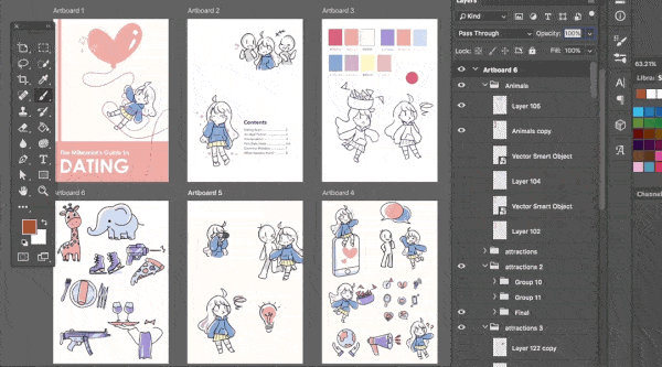
Photo
Planning
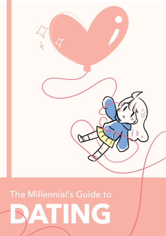
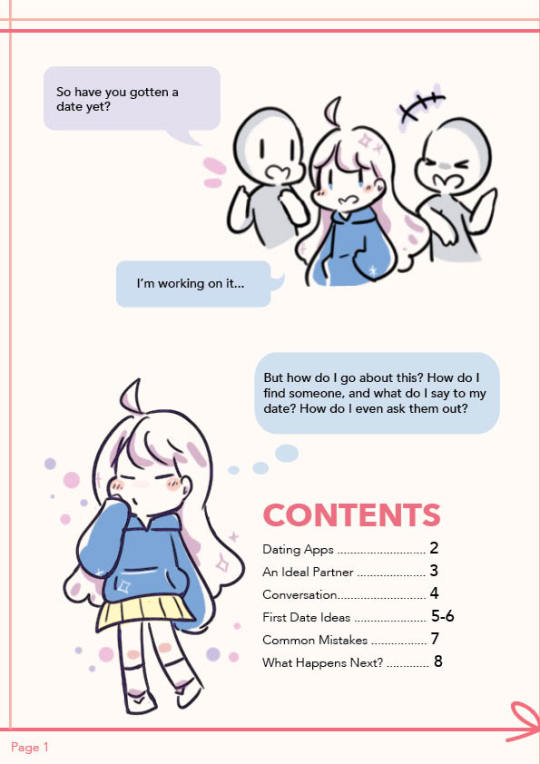
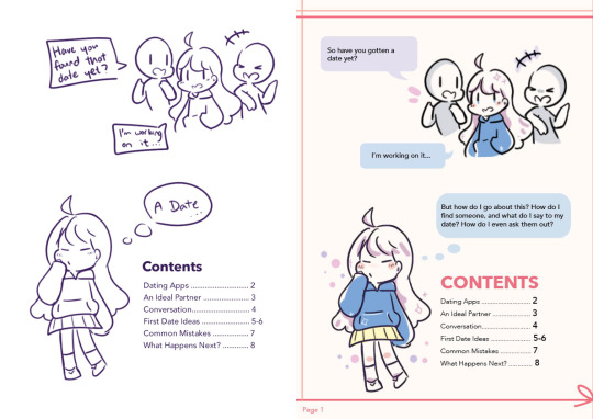
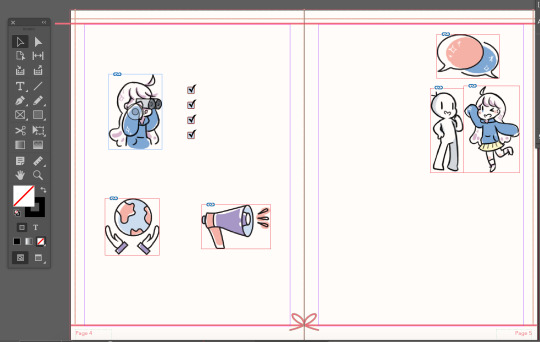
Our group initially planned on creating a guide about dating for Millennials in Singapore. We first came up with the overall content and sketched the layouts of our assigned pages. I was tasked with the Cover, a Comic as the Premise and Content Page.
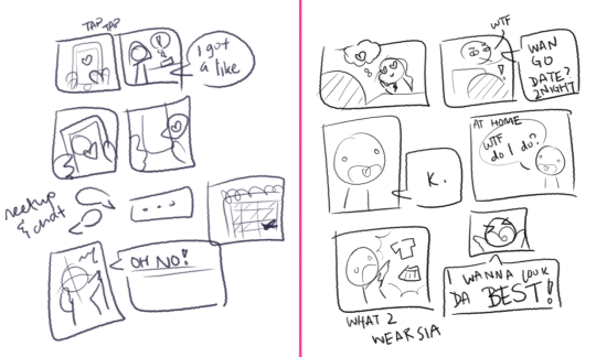
I first came up with 2 comic strip drafts and explained the story to the group to get feedback. They liked the story on the left, which depicts a main character finding a date through a dating app. This established the art style that we were going to use as a cute, cartoon-ish style. Then, I proceeded to draw out the more concrete draft, with a proper layout and text:

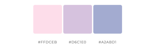
Next, I worked with my group to come up with a general colour scheme. We knew we wanted to use soft colours, and the initial palette was based on pastel pink, purple and blue.
After Feedback 1:
The first feedback was that the comic may be too time-consuming to do. Hence, I decided to scrap it for a much shorter premise for the book. I felt that was enough to introduce our main character, as well as convey our idea of a said main character wanting to find a date.
Our e-book underwent some restructuring in terms of content and flow of pages. We brainstormed and researched for content together to determine the final content flow. We decided to combine the content page with the “comic” so that pages 5-6 could remain a spread of a map. Hence, I came up with a second draft of the content page:

I next worked on character designs. I got inspiration from Pinterest for the stylistic direction of our e-book. I especially liked the style that utilises minimal colours, with cute, hand-drawn, cartoon-ish characters and objects.
My initial idea was to make the main character androgynous, as seen in the first comic sketch. However, I noticed that classmates were more likely to see the character as a girl and suggest adding a male character as a counterpart in their initial feedback. With these references and feedback, I proposed the main character (coloured):

Whilst creating the cover page, I felt that the colour of the girl’s hoodie did not stand out because the cover had a lot of pink and white elements. So I chose a darker shade of blue instead. I also did up the graphics for the content page:
Art Direction and Graphics
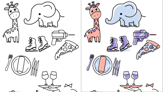
With my pages settled, I begin my role of maintaining the art direction of the e-book. I compiled a list of graphics of the girl that my members needed for their pages so that I may start to draw them. I also devised a way to keep the style of icons as similar as possible. Because there are many people working on the design, having everyone submit their own completed graphics would have been rather disastrous for the art style. Since most of the group enjoyed creating flat icons, I proposed that they sent me the vectors of their icons and I would add colour to them.
I did this by importing the vectors (without fill) from Illustrator to Photoshop and colouring on a layer beneath the vector outlines. We decided to standardise a basic black stroke for our icons. By standardising the colour palette to just 3 colours and applying colours in a stylised manner, I managed to achieve a style that worked coherently despite different people handling the outlines. The colours chosen were analogous colours that complemented each other and of different tonal values to ensure that the coloured icons did not look too flat.

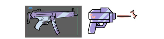
We encountered the problem of different art styles when one particular line work stood out more than the others. It did not really follow the cutesy style we had going. To solve this, I worked with the groupmate to select some references from Google and redid the graphic in a more suitable style:

Compiling the e-book
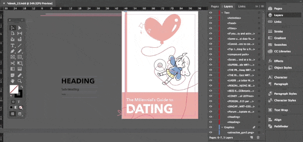
Whilst the rest of the group were working on their pages, I set up the InDesign document to be used and inserted completed graphics first. I created a border made of red-pink lines and a ribbon and included page numbers and a Snow background in the Master page. I also set up character and paragraph styles to standardise the text in the e-book.


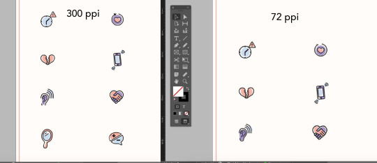
After my group members transferred their Illustrator files to me, I coloured and exported the icons in .PNG as it preserves transparency. Most of the graphics were done in 72ppi as the e-book was not meant to be printed, and that resolution was good enough for web-browsing. However, I found that some icons lose a lot of quality when exported and recoloured them in 300ppi instead. (It is a bit difficult to tell from the image below, try this link instead)
Our group met up on Zoom to work on the e-book together. Since only one person could work on the file at a time, I shared my screen with the group and started compiling all the content. Everyone chipped in by giving feedback on where edits should be made to improve the design. For example, the content on page 3 was divided into 2 sections but did not have a clear-cut distinction between the sections. Some groupmates pointed this out and I added a pink divider to solve it. This was a team effort.
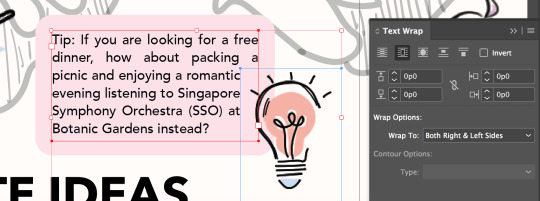
I utilised the text wrap function of InDesign to subtly give text boxes a more interesting look. Since the initial idea was to have a lightbulb overlap a text box, I decided to wrap the text around the lightbulb’s bounding box.
After exporting the e-book to .pdf, I opened it on my macbook preview and found that the colour had changed slightly. I did a bit of research and learnt that different software rendered colours differently. I then tried to open it on the Google Chrome browser and the colours looked correct. Remembering that our e-book was to be viewed on both laptops and mobile, I opened the file on the Google Chrome browser on my iPhone, and it seems the colour looked different as well. The page was more yellowish and the pink was duller. This could be due to the settings for my device’s screen. Therefore, I concluded that the e-book should be viewed on the browser of a laptop or desktop.

After Feedback 2:
One main feedback we got concerned the map page. The outline of the map appeared to be too light and difficult to notice, and the legend looked too much like the bubbles accompanying the geotags.
To fix this, I worked with my groupmate to come up with a few edits to the design of the map. We removed the waiter graphic and shifted the legend down. We also added more content to explain the 3 different categories we had. Finally, we changed the colours of the corresponding geotags on the map to further emphasize that they belonged to their respective categories.

Another feedback we got was the inconsistent spacing between the heart-shaped bullet points and the text beside it, which I promptly fixed.
Challenges
One of the biggest challenges I faced was collaborating on the style for the e-book. Up until now, most of my design works have been solo projects which gave me full control over the design. However, with groupmates, we have to adapt to each other’s styles and sometimes that involves sacrificing our own preferences.
To make things easier, I proposed the workflow and a simple style that I felt was both appealing and easy enough to work with given our project constraints (deadline, inability to have physical meetings, lack of software for some members). I was lucky to be in a very helpful and accommodating group, though keeping the style consistent was a rather persistent problem we faced. Since I was in charge of compiling most of the pages and graphics, it was extremely time-consuming.
Another problem we faced was broken links when passing the InDesign documents around. We did minimal transferring of files. When we did, we found that links sometimes got broken. To fix this, I suggested using InDesign’s package function and explained to the group why links broke and how to fix them. We zipped the packaged folders before sending them to other groupmates. Since I am working on an earlier version of Indesign, I learnt that I should use the .idml files to open the document instead.
Design Document
I helped out with the Design and Layout, Production, and Reflection sections of the design document. Since I handled most of the InDesign and compiled graphics, I helped to add the more technical parts of the design document. I also explained the design principles our group used in our e-book.
Workspaces
Better quality gifs can be found here: ID | PSD
4 notes
·
View notes
Text
JULY CC HAUL
Hi everyone!
Every month I’m going to make a haul post with all of the CC that I downloaded and added to my game.
The purpose of this text post is so that I can keep track of things I actually downloaded during the month because everything I reblog is queued and also so that everything is in one place.
Welcome to Haul edition 1!
Gameplay Mods
LittleMsSam’s Food Delivery Sevice
https://littlemssam.tumblr.com/post/175409490398/littlemssams-food-delivery-service-order-more
Makeup
Be... Eyeshadow by MysteriousDane
https://mysteriousdane.tumblr.com/post/156647246228/be-eyeshadow-palette-so-ive-been-following
Colourpop Pressed Shadows by MysteriousDane
https://mysteriousdane.tumblr.com/post/157650987483/600-followers-gift-4-colourpop-pressed-shadows
The Goddess Collection by CrypticSim
https://crypticsim.tumblr.com/post/176600859755/the-goddess-collection-the-goddess-collection-is
The Penny Palette by CrypticSim
https://crypticsim.tumblr.com/post/185439005165/the-penny-palette-the-penny-palette-is-an
Urban Soft Shadow Collection by Urbansims
https://xurbansimsx.tumblr.com/post/174948736420/urban-soft-shadow-collection-my-first-set-of
Zara Eyeshadow by VanillaSims
https://vanilasimscc.tumblr.com/post/173511502983/zara-eyeshadow
Ariana Eyeliner, Moon Eyeliner, Victoria Lipstick and Toulouse Eyeshadow by SavvySweet and CrypticSim
https://crypticsim.tumblr.com/post/186418514420/savvysweet-savvysweet-and-crypticsim-present
Sweetener Gloss by Crypticsim
https://crypticsim.tumblr.com/post/178088635605/sweetener-gloss-the-sweetener-gloss-is-a-glossy
Shoes
Adidas Gazelle Add-Ons by MysteriousDane
https://mysteriousdane.tumblr.com/post/158635124468/adidas-gazelle-add-ons-i-personally-just-really
Pixicat’s Acne Clover boots by Puresims
https://dreamteamfaves.tumblr.com/post/147814535184/puresims-pixicats-acne-clover-boots-3t4
Dries Van Noten Heeled Sandals by Mauvemorn
https://www.mauvemorn.net/post/186182832739/driesvannotenheeledsandals
Block Heel Mule by Simtone
https://simtone.tumblr.com/post/179199039080/block-heel-mule-10-swatches-more-cas-pictures
Clothes
ZendayaxTommy by Moontrait
https://moontrait.tumblr.com/post/183949687328/moontrait-zendayaxtommy-inspired-cc-ok-so-this
High Waisted Denim Shorts by PickyPikachu
http://pickypikachu.blogspot.com/2014/12/maxis-match-high-waist-denim-shorts.html
Recoloured Cropped Sweater by Purrsephone
https://purrsephonesims.tumblr.com/post/161546823839/parenthood-cropped-sweater-recoloured-let-me-know
Whistle Skinnes by AHarris00Britney
https://aharris00britney.tumblr.com/post/161402757776/whistle-skinnies-bgc-16-swatches-these-are-the
Rolled Trim Shorts by Chocosims
https://chocooosims.tumblr.com/post/177680906320/rolled-trim-shorts-base-game-compatible-it-has
Long Line Button Skirt by Nuagelle
https://sssvitlans.tumblr.com/post/175649177484/nuagelle-long-line-button-skirt-retexture-i
The Jeans Set 2.0 by Greenllamas
https://www.patreon.com/posts/25919086
Desiree Elegant Skirt by Simply-King
http://simply-king.blogspot.com/2016/12/desiree-elegant-skirt.html
Gingham Skirt by Cosimetics
https://www.thesimsresource.com/downloads/details/category/sims4-clothing-female-teenadultelder-everyday/title/g-i-n-g-h-a-m-s-k-i-r-t-./id/1417456/
Stevie Wrap Dress by Ridgeport
https://www.patreon.com/posts/28025431
V-Neck Baseball Tee by PeaceMaker
https://peacemaker-ic.tumblr.com/post/176369563948/baseball-vs-short-%C2%BE-and-long-sleeve-tees-one
Hera Colouttes Retexture by blushchat
https://blushchat.tumblr.com/post/172312738574/hera-culottes-retexture-i-love-these-culottes-so
Two Piece Swimsuit by Moontrait
https://moontrait.tumblr.com/post/185848002538/moontrait-two-piece-swimsuit-we-need-more
Andi Dress by kimoanasims
https://kimoanasims.tumblr.com/post/176727147947/2000-followers-gift-astera-collection-thank
Hair
Bunbun by SimLaughLove
https://simlaughlove.tumblr.com/post/142514499208/sll-hairbunbun
Allyssum by SimLaughLove
https://simlaughlove.tumblr.com/post/170155300893/sll-alyssumhair
Jasmine by isjao
https://isjao.tumblr.com/post/173270300526/i-know-this-is-random-but-like-i-just-felt-like
Kristie by Vikai
https://imvikai.tumblr.com/post/185885685134/kristie-hair-by-vikai-bgc-all-18-ea-swatches
Leela V1 and V3 by Aveira
https://aveirasims.tumblr.com/post/161069767636/wildlyminiaturesandwichs-leela-hair-v1-recolor
https://aveirasims.tumblr.com/post/161359433171/wildlyminiaturesandwichs-leela-hair-v3-recolor
Zendaya by WildPixel
https://wild-pixel.tumblr.com/day/2019/02/09
Nora by AHarris00Britney
https://aharris00britney.tumblr.com/post/182456997890/nora-hair
Emma by AHarris00Britney
https://aharris00britney.tumblr.com/post/182878966691/emma-hair
Belle by AHarris00Britney
https://aharris00britney.tumblr.com/post/185641892086/belle-hair
Curly Ponytails by sisselin
https://sisselin.tumblr.com/post/170865558583/curly-ponytails-after-seeing-cooper322s-pretty
Bali Hair by Greenllamas
https://greenllamas.tumblr.com/post/168323275748/bali-hair-greenllamas-one-of-my-sims-needed-a
Silky Waves by Greenllamas
https://greenllamas.tumblr.com/post/168855358987/silkyhairs
Baddie Hair by Greenllamas
https://greenllamas.tumblr.com/post/170076004418/baddie-hair-greenllamas-a-hair-inspired-by-the
Coral V1 by Greenllamas
https://greenllamas.tumblr.com/post/175139359250/coral-hairs-greenllamas-so-here-we-are-yet-again
Sibel by Mlyssimblr
https://mlyssimblr.tumblr.com/post/186139191138/sibel-rolled-updo-hi-ive-wanted-this-hairstyle
Bluebell by NaevysSims
https://www.patreon.com/posts/bluebell-hair-25434807
Kyan by isjao
https://isjao.tumblr.com/post/185550094796/kyan-hair-long-braid-with-a-one-side-bang-bgc
Thea by isjao
https://isjao.tumblr.com/post/183779395556/thea-hair-cutie-box-buns-hair-bgc-comes-will
Heatwaves by leeleesims
https://leeleesims1.tumblr.com/post/183680892699/heatwaves-a-base-game-compatible-hair-here-are
Cherry Picked Ponytaily by leeleesims
https://leeleesims1.tumblr.com/post/180292338044/cherry-picked-ponytail-a-base-game-compatible-my
Valentina by wild-pixel
https://wild-pixel.tumblr.com/post/167087807152/valentina-hair-female-teen-to-elder-18-ea-colours
Accessories
Scrunchi Accessory by Mapella
https://mapella.tumblr.com/post/180498264736/scrunchie-accessory-something-small-that-took-way
Raspberry Beret by Saurus
https://saurussims.tumblr.com/post/172107145288/a-basic-beret-for-all-ages-and-genders-bgc-30
Cour-dination Jacket by leeleesims
https://leeleesims1.tumblr.com/post/181872242669/cour-dination-jacket-a-base-game-compatible
Long Multiple Hoops Earrings by Natalis
https://www.thesimsresource.com/artists/Natalis/downloads/details/category/sims4-accessories-female-earrings/title/natalis_long-multiple-hoops-earrings/id/1384341/
Layerable Hoops by Nightcrawler
https://www.thesimsresource.com/artists/Nightcrawler_Sims/downloads/details/category/sims4-accessories-female-earrings/title/nightcrawler-layerable-hoops/id/1360866/
Build and Buy Mode
Fitness Bath Set by AsteriaSims
https://sssvitlans.tumblr.com/post/163754631669/asteria-sims-fitness-marble-bathtub-standard
Simlish Crosley by Desertgloom
https://desertgloom.tumblr.com/post/163743892966/crybxbysims-simlish-crosley-super-cute-record
Island Living Curtains Recolour by Sara
https://washburnhoban.tumblr.com/post/185995047575/adore-me-adorn-me-curtain-in-image-spectra-and-rpc
MFPS Loveseat Recoloured by Simmingbee
https://simmingbee.tumblr.com/post/177310207338/mfps-loveseat-recolored-i-personally-love
Wainscotting by PeaceMaker
https://peacemaker-ic.tumblr.com/post/134088054520/i-miss-cas-not-as-much-as-i-thought-but-when-it
Alpha-Beta-Phong Modular Closet System by BrazenLotus
https://brazenlotus.com/alpha-beta-phong-modular-closet-system/
Hanging Planters by Nolan-Sims
https://www.patreon.com/posts/hanging-planters-25535544
Sets/Packs
Cadimumcafe 2k Gift Set
https://wcifsareclosed.tumblr.com/post/186243630052/cadmiumcafe-2k-follower-gift-set-hi-guys
DeligracyxGrimCookies CAS Stuff Pack
https://deligracy.com/post/deligracy-grimcookies-cas-stuff-pack
14 notes
·
View notes
Last Seen Blogs

terrowen
Fake Tits Only

sorssledsen-blog
China led tri-proof lamp warranty 5 years Suppliers
incorrect-bridgerton-family
Incorrect Quotes

a-moth-to-the-light
six!

odliczam-dni
Pamiętnik najczarniejszych myśli