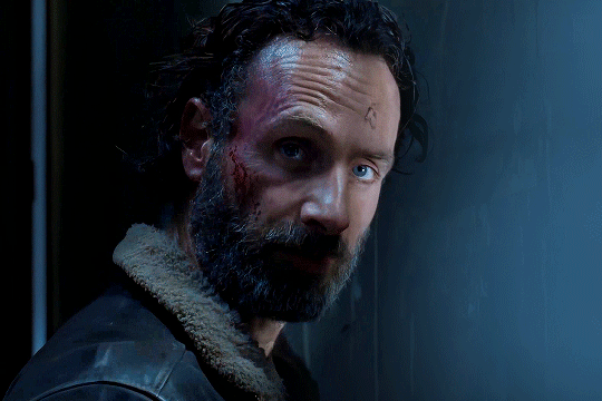
#lightened brightened sharpened
Explore tagged Tumblr posts
Visit Tumblr Blog
Explore Tumblr blogs with no restrictions, modern design and the best experience.
Last Seen Tumblr Blogs


Fun Fact
28.6 is the average number of monthly visits per US mobile user.
Text
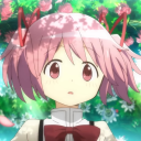
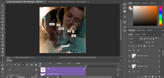
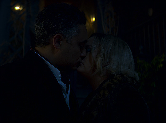
Cute Tech stuff for @bad-batch-lurker from Season 1 Episode 2, "Cut and Run." Lightened, brightened, sharpened, and the bit where Tech flips out of the cargo hold and then catches Omega, slowed down. I added cute stuff at the end. UP! DOWN! UP! DOWN!
(Reposted to extend slo-mo to the flip)
74 notes
·
View notes
Note
about the tutorial: just one about dark scenes in general would be great :)
sure :) here's a tutorial on how I work with dark scenes:
before we start, it's important to mention that working with dark scenes is so much easier when your video/ screencaps are high quality. I personally refuse to gif dark scenes unless I have 4k quality footage lol.
my general coloring tutorial is here in case you want check it out!
alright, let's start! after resizing and sharpening my gif, here's what we're working with:

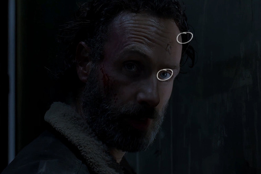
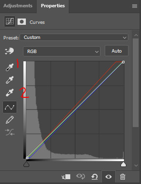
STEP 1: levels. I use the pipette tool to select the lightest and the darkest parts of my gif, it's a great guide that helps to neutralize the overpowering color:
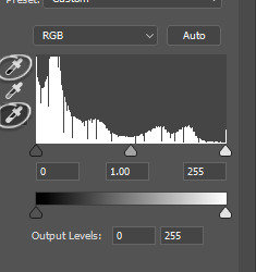
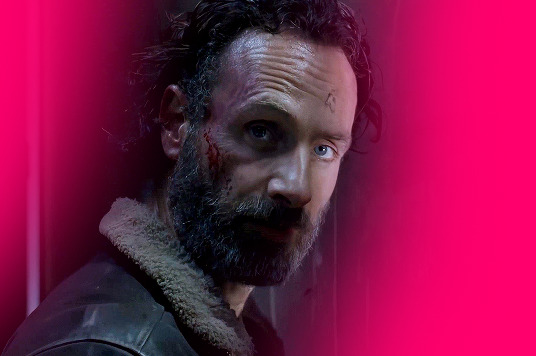
in this case, the lightest part is the little white dot in the corner of his eye and the darkest one is around his hair (if there are many dark shadows in my gif, I just click on a few darkest looking spots and see how it adjusts the coloring and lighting of the gif and just pick the one I think looks the best). basically, this layer is a good guide on how to make the overall look more natural if there is one obvious dominant color and we want to get rid of it (for example, my gif has quite a lot of blues, but it's not too crazy, so I won't need to adjust that much):
and this is what we've got just after using the levels adjustment:
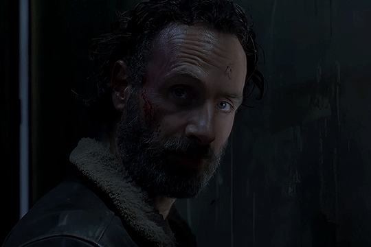
the gif is lighter and the blue was reduced a little bit, the scene now has more green and red undertones. sometimes I mess with the settings myself if I don't like the way it looks, but in this case I'm pretty happy with the automatic adjustments and I didn't even have to do that much!
STEP 2: curves. I do the same thing that I did with the levels, using the pipette tool to select the lightest and the darkest parts and also pull the rgb curve to the middle to brighten my gif even more:
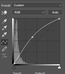
and here's the result after setting the curves layer opacity to 37%:
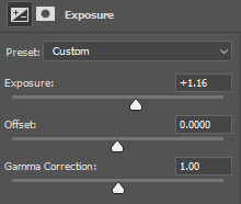
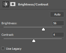
STEP 3: brightness and exposure layers. next up, I just want to brighten the character a little bit more, but not the background, so I'm adding a brightness/contrast layer and an exposure layer, here are my settings:
but since it adjusts the whole gif and I don't want that, I select the mask on my brightness layer and pick the eraser tool. I erase the part of my gif that I don't want to be affected by this adjustment, I colored that part bright pink so it's obvious:
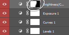
and then I do the same with the exposure layer.
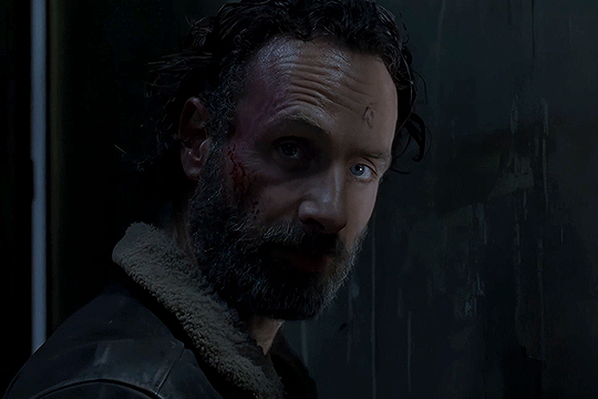
in my gif the character is not moving that much, so it looks pretty natural when I brighten just him. here's where we're at:
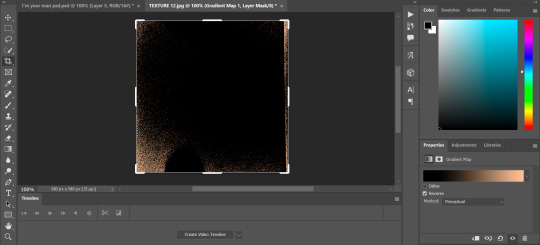
STEP 4: selective color and gradient map. I'm happy with how bright it is, but I do want to deepen the shadows here and just mess with the coloring itself, so next up I'm gonna use a couple more layers.
here are my settings for selective color layer, opacity set to around 40%:
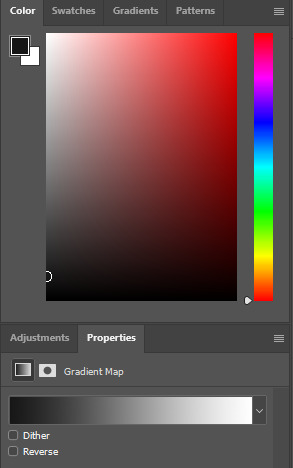
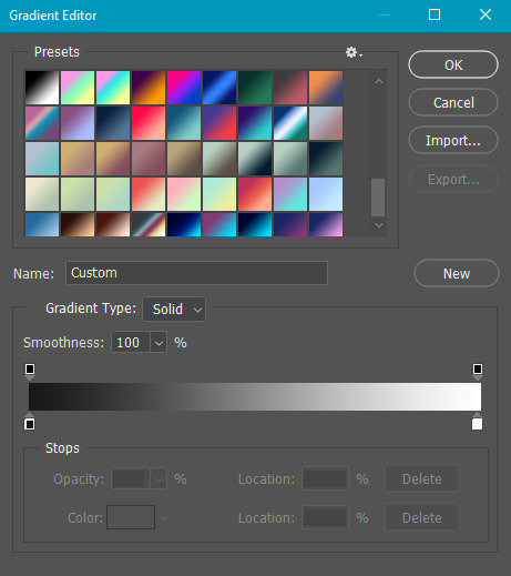
and here are my settings for a gradient map to deepen the shadows:
and here's the result:
ADDITIONAL STEP: I sometimes like to add another layer and just put some soft color gradient to one side of the gif.
in this case I used a soft blue color, set to lighten, 62%:
I'm not very good at tutorials and I put this together pretty quickly, but hopefully this was somewhat helpful, let me know if you have any questions! <3
169 notes
·
View notes
Text
gif tutorial
@bakedbakermom requested a tutorial on how i made the gifs in this set, so i've put together a little walkthrough of the process for this gif under the cut!
(disclaimer: this tutorial assumes that you already have basic photoshop/giffing knowledge - i.e. how to make and colour gifs using correction layers, how to use things like layer masks, etc. if you don't, i recommend these tutorials, they're very comprehensive)
alright! so as stated before, i'm not going to go in-depth here on the basics of gifmaking. for this one in particular, i blended three gifs, but we'll get into the third one later.
(i should also mention that blending gifs as i did here is usually easier if you have scenes with shadowed/dark areas like the ones above, so to keep that in mind when picking your scenes! i also find it easier to use scenes where there isn't a whole ton of movement going on- again, not a requirement but it's easier to plan and position gifs if the characters aren't moving across the whole canvas)
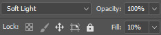
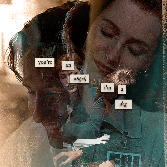
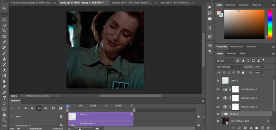
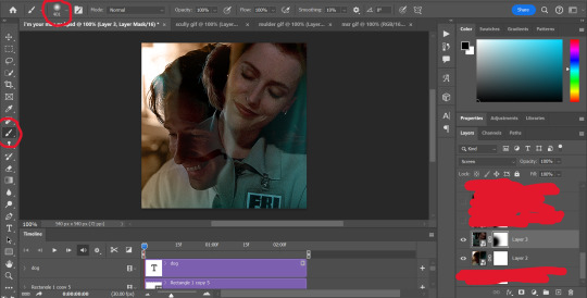
first, i started by making the base gifs of mulder and scully in "paper hearts". both are cropped to 540x540 px, and the same length (around 50 frames). i did some standard sharpening, brightening, and adding contrast (my usual process is curves, a b/w gradient map set to "soft light" at around 20% opacity, and messing with the levels a bit) before using selective colour and hue/saturation layers to highlight the teal and peach colours in the gif. sometimes this is enough colouring on its own, depending on the gif and the look you're going for, but in my case i wanted to add more.
so, on top of my colouring, i used a combination of layers set to "colour" and "hard light" to paint over the background of my gifs in teal and peach. on mulder's gif i also used a gradient fill layer in the two colours set to "colour" and used a layer mask to erase anywhere i didn't want the colour to be. the opacity levels for all of these layers again just depends on how vibrant you want your colours, i just mess with that on a gif-to-gif basis.
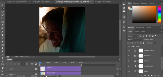
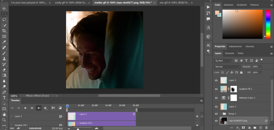
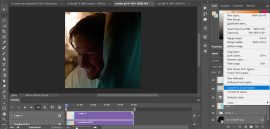
so we have our two gifs, cropped and coloured to fit the palette we want. next, i converted each coloured gif into a smart object, by selecting all my layers, right clicking, and hitting "convert to smart object."
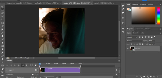
once that's done, you should be able to click and drag one of the gifs onto the other gif's canvas, so that it's sitting on top. then change the blending mode of the top gif- most people use lighten or screen, this again depends on the look you want and the gifs you're using. for this one, i used screen. it'll probably look something like this:
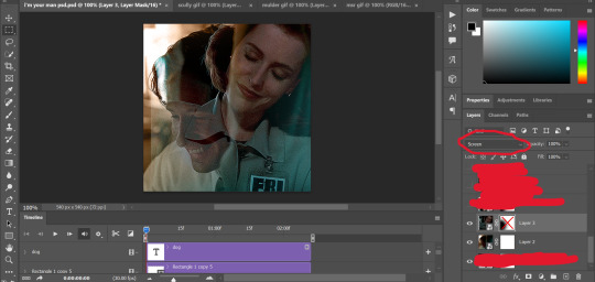
at this point you can move your gifs around and position them as you like. for mine, i just moved scully a little off to the right, as you can see. in order to get rid of the part that's covering mulder's face, i added a layer mask to the scully gif and used a large, soft brush set to black to erase it.
(another note: i didn't need to do it here, but if you want to move/erase parts of your bottom gif, add a layer of solid black underneath both gifs.)
usually i would stop blending here, but for this set i decided to add a third gif, so i made and coloured the gif of mulder and scully holding hands, using the same methods as the first two. this one was cropped to 540x405 px to make it fit better on the canvas, since i knew i only wanted it to cover the bottom part.
i converted it to a smart object and dragged it onto the same canvas as the other two gifs. this time i used "lighten" as my blending mode, positioned it in the bottom right corner, and again used a layer mask to brush away the parts i didn't want.
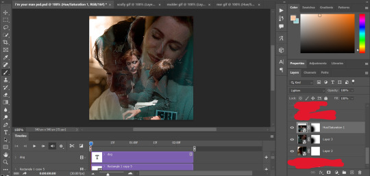
on top of all three gifs, i then used layers set to "normal" and "hard light" to brush some extra colour onto the gif. this part i also just play around with on a gif-to-gif basis, but for this set i mostly used a combo of colour, hard light, and normal layers at varying opacities until i got the look i was going for. i generally just like to use big soft brushes to add colour around the edges, as i did here.
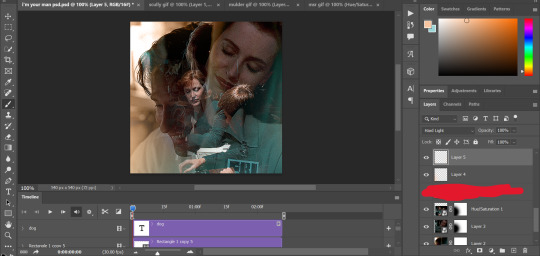
now, i have a bunch of texture/grain pngs saved on my laptop that i like to add to gifs for some extra flair, so i opened one of those and cropped it down to 540x540px. i then added a gradient map to give it that peach colour. (any textured png/jpg should work fine for this, as long as you have your gradient map set to black and white/your accent colour)
like i did with my gifs, i converted the texture + gradient map to a smart object and dragged it onto the shared canvas. i set the blending mode to "screen", with the opacity at 70%. i like to put these textures underneath the extra colouring i've done on the gif, as seen here. i don't always do this, but i feel like it sometimes helps the texture blend into the finished gif. you can also use a layer mask if needed to erase any unwanted parts of the texture.
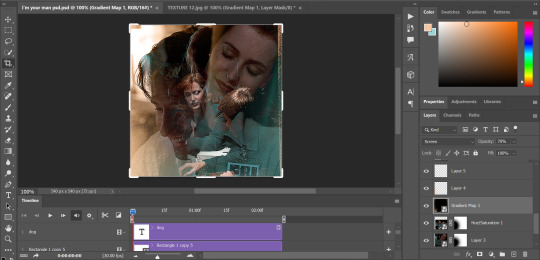
now for the text!
for these gifs i used the font "IM FELL DW Pica" in both regular and italic, in black, at 16px. i didn't do anything fancy with the text itself besides adding a drop shadow in the blending options (right click on the text layer and hit "blending options).
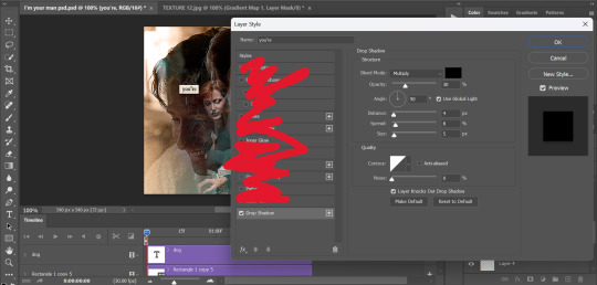
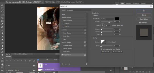
then, underneath the text layer (i was working one word at a time) i used the rectangle tool to draw a small rectangle around the text- i wasn't too picky about the size or evenness since i was going for a collaged look. i set the colour of the rectangle to a light cream colour, and added a drop shadow in the blending options.
then i just selected both the text and rectangle and duplicated them using ctrl+j, changing the text for each word and adjusting the size of the rectangles as needed. once i had all of the words on my canvas, i just moved them around until i found a positioning i liked. again, since i was going for a purposefully scrapbooked look, i didn't overthink this part.
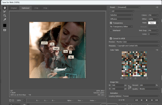
i exported my gif the way i usually do, with these settings:
and that's it! i used pretty much the same process for all the gifs in this set, give or take. hopefully this little walkthrough made sense, but i know i'm not always the best at explaining my process, so if anything needs clarifying feel free to shoot me an ask or dm!
89 notes
·
View notes
Note
I LOVE your colouring!!! do you have a psd / tutorial?
wow thank you so much!! and because you asked so kindly here's a simple tutorial on how i color gifs 💜
(to save on time i won't be showing how to create a gif or how to sharpen them)
CREATE YOUR GIF BASE
first things first is to create your gif and sharpen it to your liking. i'm using the latest version of photoshop just so you know
2. LEVELS LAYER
when coloring, i immediately start with a levels layer. obviously these settings will differ depending on the scene you're giffing. however, my goal is to balance the colors so that the highlights and shadows aren't color tinted. ultimately i want the whites to be white and not off-white - and i want the blacks to be evenly black.
this scene is already pretty bright so i'm not going to lighten it in the RGB channel. instead, i want to wash out the yellow in the whites with the blue channel.
when increasing the blue highlights, the shadows will become blue tinted as well so its important to balance the shadows by dragging that far left dial inwards

repeat that process with the green and red color channels until your satisfied
also important to note that you want your skin tones to be even, meaning not too green/yellow and not too red/blue. play around with the individual channels until you find that sweet spot
⭐ brighten your scene in the RGB channel if needed!
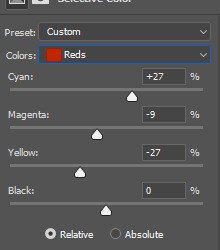
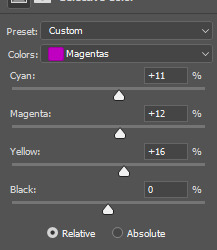
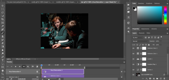
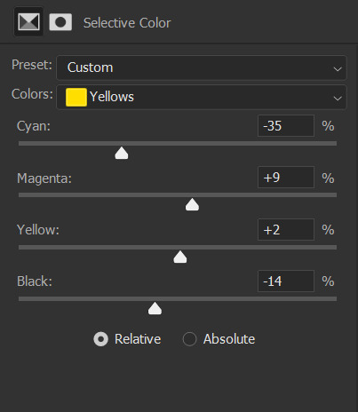
3. SELECTIVE COLOR LAYER 1
next is to saturate the reds in the scene and further dull the yellows with a 'selective color' layer
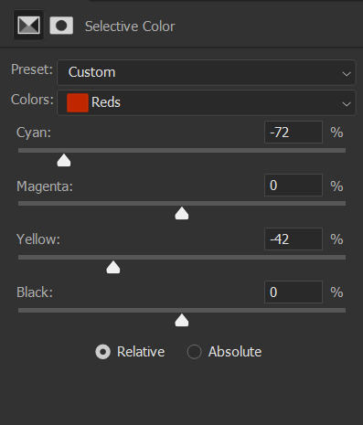
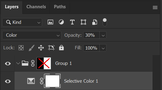
at first your gif will appear to be very discolored. you'll want to go to the 'opacity' tab in the 'layers' channel and set the percentage to 30% for this layer. like so ↴

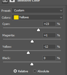
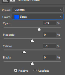
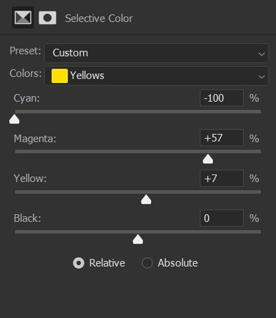
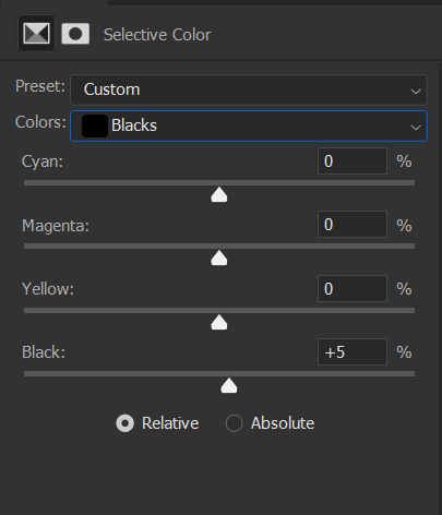
4. SELECTIVE COLOR LAYER 2
time for the second selective color layer. this time the opacity will stay at 100%
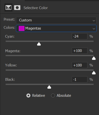
again, just adding saturation to the reds and pinks and dulling out the yellows
i added a bit to the blacks to darken the shadows more
5. VIBRANCE LAYER
this is an optional layer i sometimes add when a gif is lacking in color. in this case it definitely needed it


END NOTES!
i just want to add that i don't always color my gifs this way. it changes with every scene i work on. a lot of the time my colorings are more complex and i end up with like 10+ layers. i wanted to keep this simple. hopefully it helped you a bit. but if you're looking for a more specific tutorial, please feel free to send me another ask 🩷
70 notes
·
View notes
Text
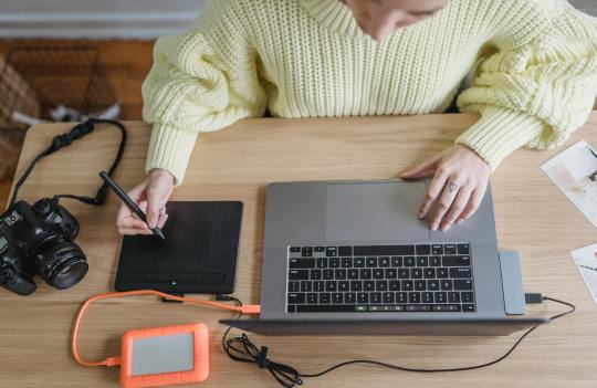
Yvette Heiser - Enhance Your Photography with These Pro-Level Photo Editing Techniques
Photography is more than just capturing a moment—it’s about storytelling, emotion, and creativity. However, even the most well-composed shots can benefit from post-processing. Yvette Heiser Painting with Pixels: A Guide to Advanced Photo Editing Techniques explores how professional editing can elevate an ordinary image into a visually stunning masterpiece. Whether you're a beginner or an experienced photographer, mastering these pro-level editing skills will help you refine your photos and bring out their full potential.

1. Start with RAW Editing for Maximum Control
Shooting in RAW format instead of JPEG gives you more flexibility during editing. RAW files retain all the image data, allowing you to adjust exposure, color, and details without losing quality. Most professional photographers use software like Adobe Lightroom, Capture One, or Photoshop to process RAW images.
Quick Tip:
Adjust the white balance first to ensure accurate colors before making other edits.
2. Perfect the Exposure and Contrast
Even with careful shooting, exposure may need fine-tuning. Adjusting brightness, highlights, and shadows can balance an image and add depth. Contrast adjustments help differentiate between light and dark areas, making your photos pop.
Pro Tip:
Use the histogram in your editing software to ensure a well-balanced exposure without losing details in highlights or shadows.
3. Enhance Colors with Precision
Color correction and grading can completely transform the mood of an image. HSL (Hue, Saturation, and Luminance) adjustments allow you to control specific colors, making them richer or more subdued.
Best Practices:
Use split toning to add artistic color effects to highlights and shadows.
Adjust the vibrance instead of saturation for a more natural color boost.
4. Sharpen and Add Clarity for Crisp Details
Clarity and sharpness adjustments enhance textures and bring out intricate details, making your subject stand out. However, excessive sharpening can create an unnatural look, so it’s essential to find the right balance.
Quick Tip:
Use the "masking" feature in Lightroom when sharpening to apply it selectively, avoiding unnecessary noise in smooth areas like skies.
5. Remove Unwanted Elements with Retouching
Even the best photos may have distractions, such as dust spots, stray hairs, or background clutter. Tools like Clone Stamp, Healing Brush, and Content-Aware Fill in Photoshop can seamlessly remove unwanted elements without affecting the overall quality.
Pro Tip:
Use a low-opacity healing brush for subtle and natural-looking touch-ups.
6. Apply Dodging and Burning for Depth
Dodging (lightening) and burning (darkening) are classic darkroom techniques adapted to digital editing. These adjustments help shape the lighting in an image, drawing attention to important areas while adding dimension.
How to Use It:
Dodge the highlights on faces to create a soft glow.
Burn background elements to add depth and guide the viewer’s focus.
7. Use Gradient and Radial Filters for Dramatic Effects
Filters like gradients and radial adjustments help enhance specific parts of an image while keeping the rest untouched. These are particularly useful for improving skies, adding vignettes, or drawing focus to the subject.
Best Use Cases:
Apply a linear gradient to darken overexposed skies naturally.
Use a radial filter to subtly brighten the subject while keeping the edges darker.
8. Final Touch: Add a Signature Style with Presets and LUTs
Professional photographers often develop a signature look using presets (Lightroom) or LUTs (Look-Up Tables for video and photo editing). These tools speed up editing by applying predefined color and tone adjustments.
Pro Tip:
Customize presets to fit each image rather than applying them universally.
Final Thoughts
Editing is an essential part of modern photography, allowing you to refine your images and bring out their full artistic potential. Yvette Heiser, investigating the Transformative Power of Photography, highlights how post-processing can turn ordinary shots into breathtaking visual narratives. By mastering these professional-level editing techniques, you can transform your raw captures into visually stunning works of art. Whether you’re adjusting colors, enhancing sharpness, or removing distractions, the key is to maintain a natural and polished look.
Experiment with these tips and elevate your photography to the next level! Would you like any additional insights or software recommendations?
#wedding#camera#moments#pictures#childphotography#photographer#photography#yvette heiser#photographytips#events
10 notes
·
View notes
Note
hello I love the psds you share especially the ones you make for dark scenes, idk if someone already asked this but do you have any 'how to colour dark scenes' tutorial or some tips you could share about that?
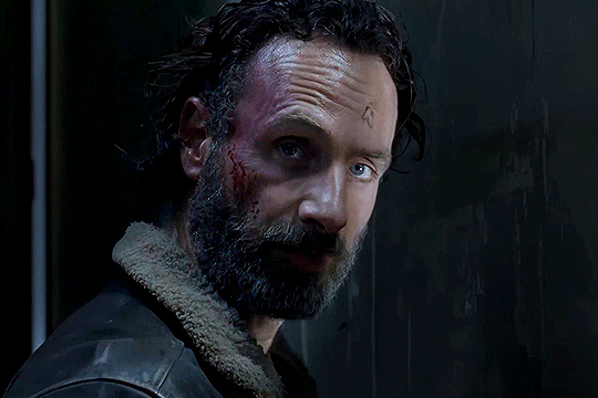
Hi! I do not have any other tutorials but those that are under the tag 'tutorials' on my page, and tbh I am not sure I can add anything new to those, I usually use the same tools.
The best tip I can give is use the best quality video you can grab your hands on.
Best example is the darkest show out there: chilling adventures of sabrina
My files are 2160p and each episode of caos I have is around 10-13GB or more. Did not really try hard to make anything good, cos it's just for example, I used the same tools I use in almost every psd I shared: exposure, curves, brightness and contrast, levels, selective colors, color balance, hue and saturation
Sometimes, when you try to lighten up scene you get the colors all over your image that you did not see on the original image, so you add brightness to a scene and then work on removing those colors. At least, that's how I am lol
So, if you just take and add too much exposure all at once you will get this

With all my love for blue we don't need it that much here. So you add it slowly until you like the result, then you add other things and you get something nice and visible

here's psd for it PSD#331 (hardly gonna work on any other scene)
And that's what happens if you use poor quality video for your work, , for comparison I found same scene screenshots on thetvshows website. Same coloring, same sharpening settings but the result is

Definitely not something I would enjoy watching.
If you are giffing a very red\yellow scene then removing red\yellow by channel mixer also brightens scene, like in this one
Anyway, not sure it will help but the most important thing is having fun, enjoy the process :3
12 notes
·
View notes
Text
Chapter 2, Life on a Shutter, a Good Omens Photographer AU fanfiction

"Standing with his right side to Crowley, Aziraphale was smiling softly, looking at the stunning scenery before him, with sunlight casting a warm glow on his face from up and ahead, lovely eyes brightened by the rays, the blond hair lightened even more. He painted a charming picture, with that amazement in his eyes, the shine reflecting off his smooth skin, laughter lines sharpened with the slight upturn of his lips, crow feet showing themself with the little squint of his lower eyelid, both eyebrows upturned with delight.
Crowley didn't hesitate, nor think, once when he raised his camera, looked through the visor and clicked the shutter."
#good omens#aziracrow#crowley#aziraphale#ineffable husbands#good omens s2#Good Omens Life on a Shutter AU
24 notes
·
View notes
Note
Can I ask you how you make your black and white gifs?
you absolutely can! i'm always happy to help and answer questions/make tutorials whenever i'm able 🥰 generally, black & white gifs are some of my most simple gifs just in terms of coloring and how many layers i use. i'm going to use my latest billy joel set as an example:

i always color my gifs after sharpening them, but that varies from person to person. for this set, i literally only did a curves layer and then the b&w gradient map. curves will depend on your source material, but here are what mine looked like using the turn the lights back on music video:

with curves, i almost always use the eyedroppers on the left side. i don't think the order in which you use them matters, but i typically use the black eyedropper and then the white.
to use these, you click the eyedropper and then click a point on your gif. for the black eyedropper, you typically want to click on the darkest/blackest part of your gif. for the white eyedropper, you want to find the whitest/lightest part. you can definitely experiment a bit, like curves are incredibly useful for tinted scenes. that didn't come into play with this mv, but for heavily tinted media like the haunting of hill house, ready or not, chernobyl, mindhunter, etc. curves are a game changer. sometimes i'll find a dark part of the gif, but slightly lighter than pure black because it will work to counteract the tint. for really blue scenes, it will increase yellow. for red scenes, it compensates with cyan. green is adjusted with magenta. i find the black eyedropper to do most of the heavy lifting, but the white one also helps with the overall brightness of the gif as well.
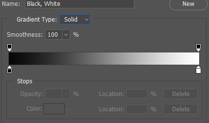
anyway, like i said, my coloring was extremely simple for this gif, so from here, i went right a gradient map adjustment layer.

(alternatively: layer > new adjustment layer > gradient map)
what happens immediately after clicking this icon depends on what two colors are selected as your foreground and background colors on your canvas:
if your colors are something completely different than the gradient map you want, just click on the gradient itself, which brings up this menu:

it depends on the effect you're going for, but this should typically be your darker color. in this case, i did use a very dark grey rather than pure black, but whatever color scheme you're using, this side should be darker than the color on the right side.
your lighter color! in this case, white.
photoshop's pre-made gradient maps, which i definitely play around with from time to time.
if you scroll all the way down in box 3, any new, custom gradients you want to save will appear. to save your current gradient, press new. pictured below:
i save a lot, as you can see lmao. the possibilities are endless!
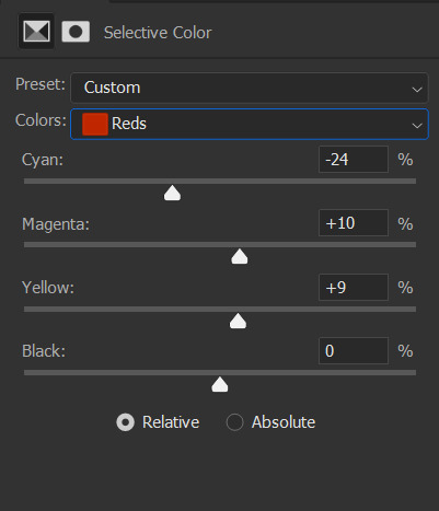
once you're happy with your colors, black and white in this case, hit okay! that's literally all there is to it. sometimes before the gradient map, i'll do a brightness/contrast layer set to screen to brighten the gif, then curves, then levels (where i also use the black and white eyedroppers), then a selective color layer where i darken the blacks by 1-5 and sometimes lighten the neutrals by -1 to -5, but this all depends on the scene i'm working with.
i hope that answers your questions! if you need any additional info, just let me know!
22 notes
·
View notes
Text
Warhammer/Horus Heresy Kinktober 2024
Day 18: Alpha Legion/Mechanodendrites/In Disguise
Summary: POV: You skype call your brother and he accidentally sees some narsty shit
Alpha legion time! This one is not as sexy, and more focus on some comedy as I refuse to treat the legion with Primarchs who are Gen Z coded with any ounce of respect (lovingly). Forgot completely that there was suppose to be a disguise aspect to it, but it's the Alpha Legion, it could be assumed, right? 😅 This will also take care of all the primary, first founding legions, and now we're gonna be branching out to other factions!
"Reedik, report." Graevegor watches the pic-screen flutter to life, fuzzy picture displaying Reedik's scarred face.
"Graevegor," Reedik acknowledges, "The Dark Mechanicum has located the scrambler device within the clutches of the Imperial scum, Évrard Fouché. The Inquisitor in question has been claimed; we have ways of making him talk." The static and skipping of the pic-vid interrupts Reedik a few times, but Graevegor understood his point. This doesn't stop the Alpha Astartes from grimacing, revealing his sharpened teeth.
"We have given the Mechanicum plenty of time to locate and retrieve the device; my lords' patience is running thin, and their time is limited. The location needs to be pinpointed and their defenses learned or torn down!"
"I share in your sentiment, brother," said Reedik. "The Inquisitor is a stubborn sort. His faith in the False Emperor-"
Graevegor lets Reedik explain himself. However, he notices movement in the background. The room around Reedik was dark, a single light illuminating his fellow Alpha Legion brother so that he was visible. Yet, this light source was enough to shadow what looked like someone being suspended in the air. Graevegor, too curious for his own good, taps a few keys on the board before him, enhancing the picture as much as the Machine Spirit would allow. The picture brightens, saturating Reedik's face slightly but revealing in full what was happening in the background.
"Brother, who's that?" Graevegor points out as he notices an individual, naked for all to see, tangled up in what seems to be mechanodendrites. However, he's unsure why this person, mortal in stature, was sucking on the metallic alloys. Or why there were several penetrating their entrance.
"Wh-who's what?" Reedik catches himself, surprised Graevegor was asking such a question.
"Who's that behind you, Reedik," Grae clarifies, even going as far as to point at his screen to where he sees the individual, despite this action not helping anyone but himself.
Reedik continued to stare at the screen, but his eyes shifted slightly, just enough that Graevegor saw a spark that lightened behind the fellow Astartes eyes. As though a hint of realization fell upon Reed. Reedik reaches out to the camera, shifting it so that it no longer showed the action behind Reedik. But he was no longer centered, and the video was facing a different part of the room Reedik was in. Even worse, the maneuver revealed the shadow outline of the mortal still being assaulted by the metal tentacles.
"Brother? Brother, I can't see you; why did you-who was that?" Grae spoke in a puzzled tone.
"It's nothing."
"That doesn't look like nothing, Reedik," Grae huffs. "And if it was nothing, you wouldn't have moved the vid screen to the other side of your room. I can barely see you now; I can only see your shoulder pauldron!"
"I had to move the screen because where it was positioned compromised its...integrity..." Reedik says plainly, keeping his tone steeled despite the poor excuse he gave.
"'Compromised its inte-,' brother, where the vid was positioned earlier was just fine. I heard you fine!"
"I just prefer having the screen show this side of my room."
"What is that supposed to mean, Reedik!?! You didn't do this before!" Grae exasperated, his anger boiling. "And who was that? The mortal in the background!"
There's a moment of silence between the two, just enough quiet time for Grae to hear a static and muffled...Moan? The shadow of the mortal wasn't clearly outlined, but Grae could get a good idea of what was being done to the mortal. The mechanodendrites shoved themselves into the mouth of the mortal, roughly, sliding down the human's throat. While 2 tendrils shoved themselves inside the mortal, bouncing the body in mid-air while the human seemingly tried to keep quiet.
"Brother, is that Inquisitor Évrard?" Grae had no reason to believe it was, but he couldn't imagine who else it could be.
"...Yes."
"What's he doing in your room? Are you interrogating him?"
"...Yes..."
"Reedik, it took you exactly 4.5612853 seconds to answer me."
"I said yes!" Reedik spats back like a vexed child who was caught doing something they shouldn't.
"That doesn't look like an interrogation, brother."
"It's a different method of interrogation." Reedik quickly answers. "You know that violence doesn't guarantee the victim will respond as intended."
"That never stopped you before, nor did it ever impeded us before." Grae points out.
"Do you want my report or not, brother?"
"I do, but if you have the subject of our woes in your room, firstly, why is the Inquisitor in your room to begin with, and two, why are the mechanodendrites doing that to their body?"
~~~~~~~~~~~~~~~~~~~~~~~~~~~~~~~~~~~~~~~~~~~~~~~~~~~~~~~~~~~~~~~
Here's the Kinktober lists for anyone who wants to partake! Let's be extra horny this lovely October
2 notes
·
View notes
Text
Retouching photos is an essential skill.
Let that sink in. Photo retouching isn't just an option. It's a necessity. Because when you retouch photos: • Imperfections disappear • Aesthetics improve • Images stand out • Your work gets noticed But here's the kicker: Retouching needs to be: → Precise → Subtle It's best when done with: → The right tools → The right techniques It's not just about fixing flaws. It's about enhancing the overall look and feel of the image. 10 steps to retouch photos effectively: 1. Choose Your Software Select a photo editing software that suits your needs. Adobe Photoshop is the industry standard, but options like Lightroom, Snapseed, and Photoshop Express can also work for simpler tasks. 2. Import Your Photo Begin by importing your photo into the chosen software. This can usually be done through an "Import" or "Open" option in the menu. 3. Basic Adjustments Before diving into retouching, make some basic adjustments: - Brightness and Contrast: Use sliders to improve overall lighting. - Crop and Composition: Crop the image to remove unwanted areas and improve framing. 4. Remove Blemishes Use tools designed for blemish removal: - Spot Healing Brush: Quickly removes small imperfections like dust spots - Healing Brush Tool: Allows for more control by sampling pixels from a clean area to cover up flaws. - Clone Stamp Tool: Useful for more complex corrections where you need to duplicate parts of the image. 5. Skin Smoothing To achieve smoother skin textures: - Frequency Separation: This technique separates color and texture layers, allowing you to smooth skin without losing detail. - Smoothing Tools: Many apps offer specific tools for skin smoothing; use them sparingly to avoid an unnatural look. 6. Enhance Features Focus on enhancing specific features: - Eye Retouching: Brighten eyes, remove bags, and enhance color using adjustment layers or local adjustments. - Dodge and Burn: Use this technique to selectively lighten (dodge) or darken (burn) areas of the photo, adding depth and dimension. 7. Color Correction Adjust colors for a more vibrant image: - Curves/Levels Adjustment: Use these tools to manipulate brightness and contrast levels across different tonal ranges. - Saturation/Vibrancy: Increase color intensity carefully to avoid oversaturation. 8. Sharpening Enhance details: - Use sharpening filters (like Smart Sharpen) to bring out details without introducing noise or halos around the edges. 9. Apply Filters and Effects (Optional) You should consider applying filters for stylistic effects, but use them carefully. 10. Save Your Work Once you're satisfied with the retouched image, save it in the desired format (e.g., JPEG, PNG) ensuring you keep a copy of the original file intact for future reference. These steps make your photos look professional and polished.

#photographers on tumblr#original photographers#photography#photographer#cute#girlblogging#beauttiful girls
1 note
·
View note
Text
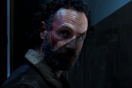
Battle Scars
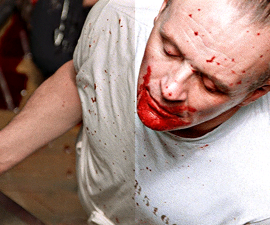
I lightened, brightened, and sharpened the scene where Wrecker attacks Tech in "Battle Scars." I also isolated the voices. You can really hear poor Tech trying to breathe.
The second half is the same clip, only muted and slowed down. I didn't realize until now that Wrecker threw Tech so hard he was nearly horizontal when he hit the wall.

69 notes
·
View notes
Text
Secrets to Seamless Photo Retouching
Introduction
Photo retouching is an essential skill for photographers and editors alike, transforming good images into great ones by enhancing their visual appeal. Seamless photo retouching involves a delicate balance of correcting imperfections while maintaining the natural look of the subject. This guide unveils the secrets to achieving flawless photo retouching, ensuring your images stand out with professional polish.
1. Start with High-Quality Images
Keyword: photo retouch
The foundation of effective photo retouching is starting with high-quality images. Ensure your photos are well-lit, in focus, and have good composition. High-resolution images provide more detail and flexibility for retouching, allowing for finer adjustments without sacrificing quality.
2. Use Non-Destructive Editing Techniques
Non-destructive editing is crucial for maintaining the integrity of your original image. By using layers and masks in software like Adobe Photoshop, you can make adjustments without permanently altering the original photo.
Adjustment Layers: Use these for color corrections, exposure adjustments, and more, allowing you to tweak settings at any time.
Layer Masks: Apply changes selectively to specific parts of the image, ensuring precise control over the retouching process.
3. Master the Healing Tools
Healing tools are indispensable for removing blemishes, spots, and other imperfections. Understanding how to use them effectively is key to seamless retouching.
Healing Brush Tool: Samples pixels from a source area and blends them with the target area, making it ideal for removing spots and minor blemishes.
Spot Healing Brush Tool: Automatically samples surrounding pixels, making it quick and easy to fix small imperfections.
Patch Tool: Useful for larger areas, it allows you to select and replace a section of the image with a similar area, blending the transition smoothly.
4. Perfecting Skin Retouching
Retouching skin is one of the most challenging aspects of photo editing, requiring subtlety to avoid an unnatural look.
Frequency Separation: This advanced technique separates the texture and color of the skin, allowing you to retouch each aspect independently. Use a high-pass filter on the texture layer and a blur filter on the color layer for optimal results.
Dodge and Burn: Lighten and darken specific areas to add depth and dimension. Use a soft brush with low opacity for gradual adjustments.
Avoid Over-Smoothing: Preserve natural skin texture by using a light touch with tools like the Healing Brush and Clone Stamp. Over-smoothing can make the skin look plastic and unrealistic.
5. Enhancing Eyes and Teeth
The eyes and teeth are focal points in portrait photography. Enhancing them can significantly improve the overall impact of the photo.
Eyes: Increase the sharpness and clarity of the eyes by using the Sharpen tool or applying an unsharp mask. Brighten the whites of the eyes with a soft brush and low opacity, but avoid making them too white.
Teeth: Use the Dodge tool to lighten teeth subtly. Adjust the exposure and set the range to midtones. Avoid over-brightening, which can make teeth look unnatural.
6. Balancing Color and Tone
Color and tone adjustments can enhance the mood and atmosphere of your photo.
White Balance: Correct any color casts to ensure natural-looking colors. Use the temperature and tint sliders to achieve the desired balance.
Color Grading: Apply subtle color grading to enhance the photo’s mood. Tools like the Color Balance and Gradient Map in Photoshop can be useful for this.
Contrast and Clarity: Adjust the contrast to add depth and the clarity to enhance midtone details, ensuring the photo looks vibrant and dynamic.
7. Sharpening and Noise Reduction
Sharpening and noise reduction are essential final steps in the retouching process, ensuring your photo looks crisp and clear.
Sharpening: Use tools like Unsharp Mask or Smart Sharpen to enhance edge details. Apply sharpening selectively to avoid introducing noise.
Noise Reduction: Apply noise reduction to minimize grain, especially in low-light photos. Balance noise reduction with preserving detail to avoid a soft look.
8. Final Touches
After completing the major retouching steps, add final touches to perfect your image.
Vignetting: Apply a subtle vignette to draw attention to the subject. Use the Lens Correction tool or create a custom vignette with gradient masks.
Crop and Straighten: Ensure the composition is perfect by cropping and straightening the image as needed. Use the Rule of Thirds for a balanced composition.
Check for Consistency: Review the photo at different zoom levels to ensure consistency and natural transitions. Make final adjustments as necessary.
Conclusion
Seamless photo retouching requires a blend of technical skill and artistic vision. By mastering tools and techniques like non-destructive editing, healing tools, skin retouching, and color correction, you can enhance your photos while maintaining their natural beauty. Whether you are a professional photographer or an enthusiastic hobbyist, these secrets to photo retouching will help you achieve professional-quality results.
0 notes
Text
How to Edit Photos like a Pro: Tips and Tricks for Stunning Images

In today's visually driven world, the importance of high-quality images cannot be overstated. Whether you're a professional photographer, a social media influencer, or a business owner, stunning images can make all the difference in how your work is perceived. At PHOTO EDITING SERVICES COMPANY, we understand the power of visual impact. Our trendsetting photo editing services, image masking, and photo retouching services ensure your images are not only beautiful but also maintain their integrity and detail. In this comprehensive guide, we'll share tips and tricks to help you edit photos like a pro, ensuring your images captivate and impress every time.
Understanding the Basics of Photo Editing
1. Choosing the Right Software
Before diving into editing, it's essential to choose the right software. Popular options include Adobe Photoshop, Lightroom, and GIMP. Each software has its strengths, with Photoshop being renowned for its versatility and precision, Lightroom for its efficient workflow, and GIMP for being a powerful free alternative.
2. Learning the Tools
Understanding the tools at your disposal is crucial. Basic tools include:
Crop Tool: For adjusting the framing and composition.
Adjustment Layers: For non-destructive editing of brightness, contrast, saturation, and more.
Healing Brush: For removing blemishes and imperfections.
Clone Stamp: For duplicating areas of an image to cover up unwanted elements.
Layer Masks: For blending different parts of an image seamlessly.
Essential Editing Techniques
3. Cropping and Straightening
Start with cropping to improve the composition. Ensure the horizon is straight, and apply the rule of thirds for a balanced image. Cropping can also help remove distractions from the edges of the frame, keeping the viewer’s focus on the main subject.
4. Adjusting Exposure and Contrast
Proper exposure is key to a good photo. Adjust the exposure to brighten or darken the image as needed. Increase contrast to make the image pop by enhancing the difference between light and dark areas. Use the histogram to guide your adjustments, ensuring you don't lose detail in shadows or highlights.
5. Color Correction
Colors can significantly affect the mood of an image. Adjust white balance to correct any color casts and ensure natural-looking colors. Use hue, saturation, and luminance adjustments to fine-tune colors. PHOTO EDITING SERVICES COMPANY specializes in color masking, which allows for precise control over specific colors in an image, enhancing its vibrancy and appeal.
6. Sharpening and Noise Reduction
Sharpening enhances the details, making the image appear crisper. However, be cautious not to over-sharpen, as this can introduce artifacts. Noise reduction is crucial for images taken in low light. Balance the noise reduction to smooth out graininess without losing too much detail.
7. Image Retouching
Retouching is an art. Use the healing brush and clone stamp tools to remove blemishes, spots, and unwanted objects. For portrait retouching, smooth skin while preserving texture, whiten teeth, and enhance eyes. Our expert retouching services at PHOTO EDITING SERVICES COMPANY ensure a natural yet polished look.
Advanced Editing Techniques
8. Using Layers and Masks
Layers and masks are fundamental for advanced editing. They allow for non-destructive edits and enable complex compositions. Use layer masks to blend multiple exposures, create composites, and apply adjustments selectively. PHOTO EDITING SERVICES COMPANY’s expertise in alpha and color masking ensures flawless edits with no detail loss.
9. Dodging and Burning
Dodging and burning are techniques used to lighten (dodge) or darken (burn) specific areas of an image. This helps in adding depth and dimension, enhancing the overall look. Use a soft brush and work on a low opacity to build up the effect gradually.
10. Frequency Separation
Frequency separation is a powerful technique for retouching portraits. It involves separating the image into high-frequency (texture) and low-frequency (color and tone) layers. This allows you to retouch skin texture and tone separately, achieving professional-level results.
11. Composite Photography
Creating composite images involves blending multiple photos to create a single, cohesive image. This can be used for adding elements, creating surreal scenes, or enhancing backgrounds. Mastery of selection tools and layer masks is crucial for seamless composites.
Enhancing Creativity
12. Adding Filters and Effects
Filters and effects can transform an ordinary photo into something extraordinary. Experiment with different filters to find the style that best fits your vision. Use effects like vignetting to draw attention to the subject or lens flare to add a sense of realism.
13. Black and White Conversion
Converting images to black and white can add a timeless quality. Focus on contrast and texture to create compelling black-and-white images. Use the black and white adjustment layer to control the conversion process, ensuring the tones are balanced.
14. Creative Masking Techniques
Masking allows for creative possibilities. Use gradient masks for smooth transitions, and experiment with texture and pattern masks to add artistic elements. PHOTO EDITING SERVICES COMPANY excels in creative masking, ensuring your images stand out with unique and innovative effects.
Workflow and Efficiency
15. Batch Processing
For large volumes of photos, batch processing can save time. Programs like Lightroom allow you to apply the same adjustments to multiple images simultaneously. This is particularly useful for maintaining a consistent look across a series of photos.
16. Using Presets
Presets are pre-configured settings that can be applied to images with a single click. They help speed up the editing process and ensure consistency. Create your own presets or use ones available online to achieve the desired look quickly.
17. Organizing Your Workflow
An organized workflow improves efficiency. Use a consistent file naming convention and folder structure. Utilize software features like catalogs in Lightroom to manage and organize your images effectively.
The Role of Professional Photo Editing Services
18. Why Choose Professional Editing?
Professional photo editing services, like those offered by PHOTO EDITING SERVICES COMPANY, bring expertise and experience that can take your images to the next level. Our 10+ years of experience, combined with advanced technical capabilities and a world-class team of Photoshop professionals, ensure that every image meets the highest standards.
19. Services Offered by PHOTO EDITING SERVICES COMPANY
Photo Masking: Precise masking for complex subjects like hair, fur, and feathers.
Portrait Retouching: Enhancing facial features while maintaining a natural look.
Image Clipping: Accurate cutouts for product photography and composites.
Digital Photo Restoration: Reviving old or damaged photos with expert restoration techniques.
Alpha Masking: Advanced masking for transparent and semi-transparent objects.
Color Masking: Enhancing or changing specific colors without affecting the rest of the image.
20. Global Reach and Expertise
PHOTO EDITING SERVICES COMPANY serves clients worldwide, including the USA, UK, Australia, Canada, Dubai, Saudi Arabia, UAE, Germany, Italy, India, Singapore, France, Finland, and Ireland. Our global reach ensures we understand diverse client needs and deliver tailored solutions that exceed expectations.
Conclusion
Editing photos like a pro requires a blend of technical skills, creativity, and an understanding of the tools at your disposal. By following the tips and techniques outlined in this guide, you can elevate your photo editing game and produce stunning images that captivate and impress. For those seeking professional results without the learning curve, PHOTO EDITING SERVICES COMPANY offers a range of expert services to meet all your photo editing needs. With our dedication to excellence and innovative approaches, we ensure every image is a masterpiece.
0 notes
Text
The Importance of Headshot Retouch, High-End Beauty Retouching, and Portrait Photo Editing Service
In the dynamic world of professional photography, the significance of headshot retouching, high-end beauty retouching, and portrait photo editing services cannot be overstated. These processes play a pivotal role in transforming raw images into polished masterpieces, enhancing their visual appeal, and ensuring they meet the highest standards of quality. Let's delve deeper into what these services entail and why they are indispensable for photographers.

Introduction to Headshot Retouching
Headshot retouching involves refining and enhancing facial features in portraits. It encompasses various techniques aimed at perfecting skin texture, removing blemishes, and accentuating facial contours. In professional settings such as corporate headshots or actor portfolios, headshot retouching helps individuals present their best selves, leaving a lasting impression on viewers.
Understanding High-End Beauty Retouching
High-end beauty retouching is a specialized form of photo editing focused on elevating the beauty and glamour of subjects. It goes beyond basic retouching to achieve flawless skin, captivating eyes, and luscious hair while maintaining a natural look. This meticulous process is essential for fashion editorials, advertising campaigns, and magazine covers, where aesthetics play a crucial role in conveying messages and capturing audience attention.
Portrait Photo Editing Service: An Overview
Portrait photo editing encompasses a broader spectrum of enhancements aimed at perfecting overall composition and aesthetics. It includes color correction, background adjustments, and composition refinement to create visually striking portraits that resonate with viewers. Whether it's a family portrait, senior portrait, or corporate team photo, professional editing services can transform ordinary images into timeless keepsakes.
The Importance of Quality Editing in Professional Photography
In the competitive realm of professional photography, quality editing sets apart amateurs from experts. It is not merely about correcting flaws but enhancing the essence and mood of photographs. By leveraging advanced editing techniques, photographers can elevate their work to new heights, leaving a lasting impression on clients and viewers alike.

Headshot Retouching Techniques
Skin Smoothing: Use the clone stamp tool or healing brush to remove blemishes, wrinkles, and imperfections. Be cautious not to overdo it, maintaining skin texture for a natural look.
Dodge and Burn: Use the dodge tool to lighten areas like under the eyes and the burn tool to darken shadows for more dimension and depth.
Frequency Separation: Separate the image into high and low-frequency layers. This allows you to work on texture (high frequency) and color/tone (low frequency) separately, giving you more control over the retouching process.
Color Correction: Adjust the color balance, saturation, and hue to enhance skin tones and overall color harmony.
Eye Enhancement: Brighten and sharpen the eyes using adjustment layers or the dodge and burn tools. You can also enhance the iris color if needed.
Teeth Whitening: Use the hue/saturation adjustment layer to target the yellows and whites of the teeth, making them appear brighter without looking unnaturally white.
Hair Retouching: Use the clone stamp tool or healing brush to remove stray hairs or flyaways. You can also enhance hair volume and color if necessary.
Facial Contouring: Use the liquify tool to subtly adjust facial features such as the jawline, cheekbones, and nose shape for a more flattering appearance.
Background Cleanup: Remove distractions or imperfections in the background using the clone stamp tool or content-aware fill.
Final Touches: Apply sharpening selectively to enhance details and overall clarity. Also, consider adding a subtle vignette to draw attention to the subject.
Conclusion
In conclusion, headshot retouching, high-end beauty retouching, and portrait photo editing services are indispensable tools for professional photographers seeking to deliver exceptional results. By investing in quality editing, photographers can elevate their work, attract more clients, and establish themselves as industry leaders. In an era where visual content reigns supreme, the importance of these services cannot be overstated. So, whether you're a budding photographer or a seasoned professional, remember that the true magic of photography often lies in the art of editing.
#clipping path service#professional photoshop services#best clipping path service#clipping path service usa#remove background from image photoshop#photo editing services#image editing service#clipping path service company#color correction service#clipping usa
0 notes
Text
Mastering Photo Retouching: Your Guide to Professional Results
Photo retouching is a powerful art that can elevate your images to a professional standard. Whether you're a photographer looking to enhance your portfolio, a model seeking flawless pictures, or anyone interested in perfecting their photos, mastering the art of photo retouching is essential. In this comprehensive guide, we'll delve into the fundamental principles of professional photo retouching, the tools and techniques involved, and how to achieve stunning results. We'll also discuss the significance of professional photo retouching services like Clipping World and offer insights on how to enhance your skills by listening to Photo retouching podcasts.
Grasping the Essentials
Before delving into advanced photo retouching techniques, it's essential to understand the core principles of professional photo retouching. These principles will help you achieve a natural, polished look:
a. Skin Retouching: Eradicate imperfections, blemishes, and wrinkles while retaining skin texture and tone. b. Color Enhancement: Adjust exposure, contrast, and color balance to attain vibrant and harmonious images. c. Background Refinement: Ensure that the background complements the subject without distracting from it. d. Detail Enhancement: Accentuate key details like eyes or hair to draw the viewer's attention.
Equipping Yourself with the Right Tools
To retouch photos like a professional, you need access to the right tools and software. Adobe Photoshop and Lightroom are popular choices among professional photo retouchers due to their extensive feature sets. When working on an image, use tools such as the clone stamp, healing brush, and adjustment layers to enhance your photographs.
Non-Destructive Editing
A hallmark of professional photo retouching is non-destructive editing. This method involves making edits on separate layers to preserve the original image. Non-destructive editing allows you to make adjustments or undo changes without compromising image quality. Utilize tools like adjustment layers, layer masks, and smart objects in Photoshop to facilitate this approach.
Skin Retouching Techniques
Achieving flawless skin is often a top priority in professional photo retouching. Effective skin retouching techniques include:
a. Frequency Separation: Split the image into two layers, one for texture and one for color, enabling precise adjustments to each. b. Dodging and Burning: Use dodge and burn tools to selectively lighten and darken areas, resulting in a smoother skin tone. c. Healing and Cloning: Eliminate imperfections using the healing brush and clone stamp while preserving skin texture.
Color Correction and Enhancement
Correcting and enhancing color can significantly transform an image. Techniques include:
a. Curves and Levels: Adjust the image's contrast and tonal range with curves and levels. b. Color Grading: Employ color grading techniques to establish a specific mood or style. c. White Balance: Rectify any color cast by fine-tuning the white balance.
Background Enhancement
The background of an image plays a pivotal role in its overall appeal. To enhance the background:
a. Background Blurring: Employ depth-of-field adjustments to create an appealing bokeh effect. b. Composite Images: Substitute the background with a more suitable one to enhance the overall composition. c. De-clutter: Eliminate distractions and unnecessary elements from the background.
Detail Enhancement
Accentuating specific details can significantly boost an image's impact. Techniques include:
a. Sharpening: Utilize sharpening tools to bring out fine details such as hair or texture. b. Eye Enhancement: Emphasize the eyes with techniques like brightening, enhancing catchlights, and adjusting color.
Continuous Practice and Improvement
Becoming a professional photo retoucher requires continuous practice and experience. Work on a variety of images and consistently refine your skills. Study the work of experienced retouchers and photographers to gain inspiration and insights.
Photo Retouching Services
Achieving professional-level retouching can sometimes be time-consuming. In such cases, professional photo retouching services like Clipping World can provide expertise in retouching, helping you achieve the polished, flawless appearance you desire for your photos.
Conclusion
Mastering photo retouching is a blend of technical knowledge, artistic intuition, and dedication to practice. By grasping the fundamentals, using the right tools, and embracing non-destructive editing, you can bring your images to life, transforming them into truly exceptional visuals. Whether you're an aspiring photographer or an individual seeking to enhance personal photos, photo retouching is a valuable skill that can turn your images into professional works of art. Additionally, listening to relevant podcasts can further enhance your skills and knowledge in the world of photo retouching.
#professional photo editing services#professional photo retouching#professional photo retouching service#Retouching guide#Photo#Photography
1 note
·
View note
Text
i use ps cs6 to make my gifs and i basically have two methods to brighten up their scenes. (i'm gonna assume there's already basic knowledge of gif making and the program for this mini tutorial.)
i'll use this scene for an example:

i haven't done anything to brighten it yet. the only thing i've done is just resize it (1980x1020 → 540x360) and then sharpen it (just normal sharpen.)
so the first method i use to brighten things up is curves and the white eyedropper:

what you want to do is create a curves adjustment layer and then select the white eyedropper tool (which i've highlighted in pink) and then using that, select a part of the gif that's already pretty bright. i used the white reflections of peter's eyes which resulted in this:

(when i'm making gifs, i also do the same thing with another curves adjustment layer but i use the black eyedropper tool to make sure things are still dark enough, too. but instead of selecting the brightest part of the scene, i just pick the darkest.)

(just to note: this method can help to auto color correct scenes. but it can also fuck up the coloring of scenes, too, depending on what color you picked with the eyedropper tool. if you're having problems with that, either keep clicking around with the eyedropper until you find another bright spot that works without screwing up the colors OR you can try setting the curves layer to luminosity which will keep the brightness and can help with the coloring. but if that doesn't work, either, and the coloring is still messed up, then a color balance and/or selective color adjustment layer can help fix things.)
the other method i use is basically just curves + lighten shadow.

you basically just want a curves adjustment layer that looks like that and then underneath that layer add a levels adjustment layer set to lighten shadow. (note: generally speaking when you use this method, it tends to result in more vibrant looking gifs.)
here's how both methods look side by side vs the base gif:

Hello hello steter giffers community! I was wondering how/what programs did yall use to MAKE THOSE GODDAMN DARK SHOTS NOT SO DARK because it's driving me insane!! Everyone makes such crisp and visible gifs and I'd love to know a secret or two 🙏🏻
25 notes
·
View notes