#logo as a Human
Text

andafterthat
1K notes
·
View notes
Text
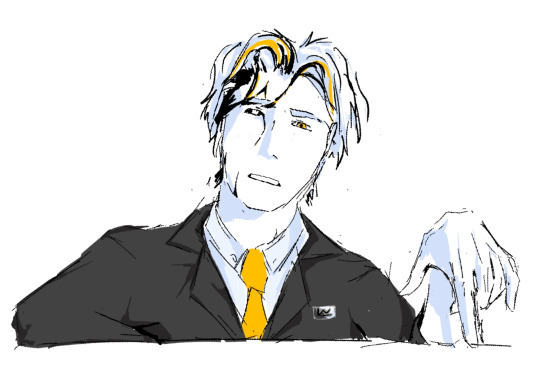
comes out of hibernation to post this. doesnt return for another 6 months
original under the cut
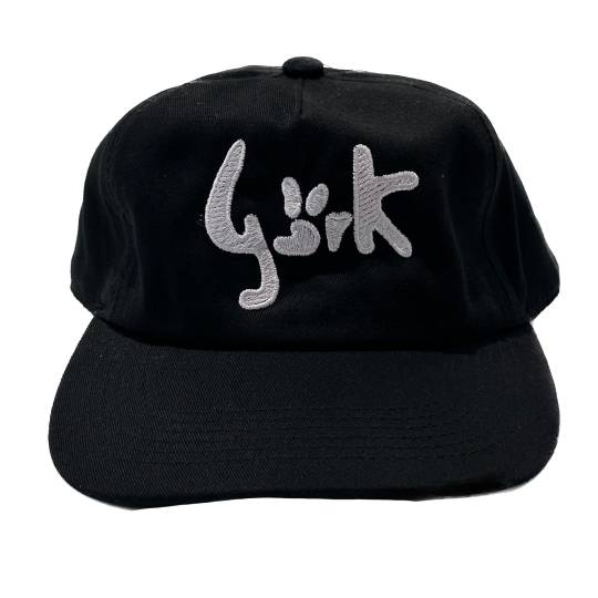
#dbh#markus dbh#dbh fanart#detroit: become human#markus rk200#this is my magnum opus#oh also i made a little logo thingy.... to go with my new username change dhfjhkd#im really hoping this one sticks. if it doesnt i will cry#oh also this was something of an artstyle experiment#trying to learn how to paint sort of#didnt entirely work but thats because i made a stupid meme instead of an actual illustration 💀
191 notes
·
View notes
Text
animation test yeaaaaaaaaaaaaaaaa
#art#adventure time#finn the human#fanart#fern the human#finn mertens#fern mertens#ignore flipaclip logo#lol#animation
216 notes
·
View notes
Text

the yaoi slenderman proportions of her prime interp have charmed and endeared me
#starscream#transformers prime#ps her belt is a simplified decepticon logo#wanna make human vers of more prime charas eventually i just ♥ her the mostest so she gets to be first#+ if you saw me post this on main a minute ago no you didnt.!
63 notes
·
View notes
Text
Millions must waste their lives chasing after an unattainable delusioned reality
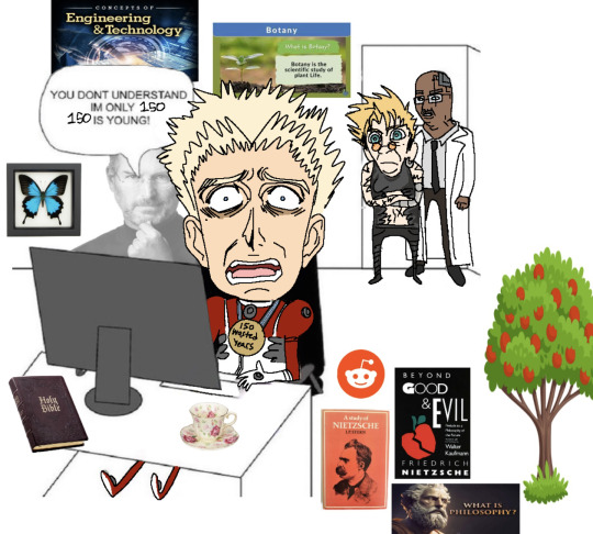
#trigun#vash the stampede#trigun maximum#millions knives#william conrad#knives is such a loser im serious#150 year old basement dweller#wish I put the apple logo on the computer. gerrr#ur problems will not be solved by getting rid of all the humans. 😂 you'll still be a miserable failure !!!#nah love him tho love him#my sillies#I love you mr millions must die
87 notes
·
View notes
Text
Leowook design sketch
#leowook#leow0ok#lssmp#lifesteal fanart#lifesteal smp#you cannot un-convince me that Leo does a bunch of stuff with his hands when he talks#It took some real brainpower to figure out how to fit the logo into the design while still keeping him generally human#I don’t even know what that is#I do believe I was successful though that is what Leo looks like in my mind but a little less businessman and more psychotic#Leowook from accounting#Door to door salesman trying to sell me solar panels looks a little odd and tri-colored
53 notes
·
View notes
Text
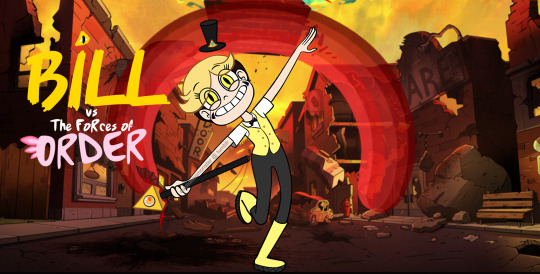
i can't watch or read anything rn w/o immediately making it a gravity falls au. ✌️😔
(au + edit info below the cut)
On the day of his 18th birthday, Crown Prince William "Bill" Cipher of Euclydia is entrusted with the royal family's magic scepter, and almost immediately uses it to bring chaos to his future kingdom. After containing the worst of the damage, Bill's parents send him to Earth -- a place where magic is a far rarer and more closely guarded secret -- in hopes that he will learn the responsibility required of his position.
King Euclid and Queen Scalene secure a foster home for their son in the sleepy Pacific Northwest town of Gravity Falls, with the family of Stanford Pines (formerly Earth's ambassador to Euclydia, now missing and presumed dead.) There, something like friendship begins to blossom between Bill and the younger Pines twins, Dipper and Mabel. Before long, the three find themselves embroiled in inter-dimensional escapades, with consequences more far-reaching than any of them could have anticipated.
heavily edited from an existing svtfoe pic, included below. i'll probably do dipper & mabel edits and add them in to the poster later on!
#gravity falls#bill cipher#human bill cipher#star vs the forces of evil#the book of bill#my art#forces of evil -> forces of order bc i simply couldn't justify pitting Bill Freakin Cipher *against* evil lmfao#but i also didn't want to make him straight up evil for this au. THUS: Order.#seemed like the most obvious oppositional force to a being of chaos#he gets the wand at 18 instead of 14 bc if i ever decide to write this AU i have No interest in writing abt jr high kids lmao 😭#the 'O' in the logo is supposed to have axolotl frills. idk if that reads or not
43 notes
·
View notes
Note
Ek lund leke saara feminism bahaar aayega tera
honey youre just making my points more real.
forget feminism, baat ussey bohot aage badh chuka hai. misandry needs to exist because degenerates like you exist omg. we're calling out the men because men like you exist<3 now go and kill yourself no need to embarrass yourself furthur
#rg kar medical college#feminism#crimes against humanity#violence against girls#kolkata#khoon kaise nahi khaulta aap logo ka???#desiblr#desi tumblr
47 notes
·
View notes
Text
People being rude over my art is like, whatever. Like it’s the internet people are gonna be nasty for no reason. But people who think they’re being cute treating my art as “cursed” or saying stupid shit like “it’s cringe but it’s MY cringe” are deeply annoying.
I’m sorry you’re so boring and insecure that you can’t take earnest art seriously but I don’t want you anywhere near my content.
#txt#like I’m not posting art of bugs or humanized logos to ‘scare off twitter users’ can you people stop being so obnoxious for like. a minute
623 notes
·
View notes
Text


#|| Sneaky robot being sneaky 🤖#|| ......the window between them looks like the shape of the CyberLife logo-#dbh#detroit become human#dbh connor#rk800#detroit become human connor#mun plays dbh
20 notes
·
View notes
Text
i am not immune to being apprehensive to change when it comes to something i really like getting a redesign/rebrand/what have you, but i think what the try guys have been doing lately is an exception. in my opinion, the best like, refreshes of a long-lasting brand/group are the ones that have (at least some of) the same recognizable elements of its previous iteration(s):


from day one, branding with the try guys has had a heavy emphasis on color, with the blue/red/green/purple scheme representing keith/ned/zach/eugene, respectively. the colors were in their intro and outro to their videos, they're still especially present in their merchandise, the whole nine yards. with ned rightfully getting kicked out of the group for his "consensual workplace relationship" (jesus), it made sense that they had to stop and change their branding after this sudden event.
the orange era serves as a good bridge between the quartet group icon they started with and the neon triangle icon we have now, but it was kinda temporary. in a way, the try guys as a brand were having an identity crisis, having lost both a founding member and a (now former) friend. i think the current rebrand is a solid mix of their past and future, the blue/green/purple making a return + the triceratops remaining in the center, and the new elements with the triangles and general neon aesthetic (sidenote: triangle + triceratops + try/tri guys makes me go insane. i love it)
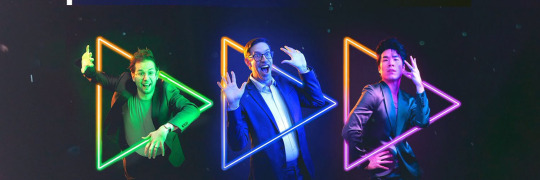
i also really like how the orange is reincorporated with the portraits for each of the guys in the pictures shared on their social accounts. alongside this, their poses showcasing their general personalities with the fact that the triangles are play buttons (which i didn't know until i read some alt text on one of their their tweets, whoops!):
overall present a strong sense of familiarity with the boys, but Also the excitement they have on moving forward with whatever the future brings, and i just think that's neat :)
*i didn't know where to fit this bit besides the very end,

but i like the idea that the triangles can also represent a fast forward button, further pushing the idea of the guys moving forward. likely more of a coincidence here but still cool nonetheless :P
#hey i got the energy to make this post#i had to grab some of these images from the wayback machine#that's how i learned that all twitter profile icons are saved as jpgs and thus lack transparent backgrounds#which is a crime against humanity#the try guys#try guys#i also agreed that on the socials#the hype was greater than it should have for some that is /relatively/ minor#but ah well#and yeah it totally reminds me of doritos (compliment)#a funny contrast to rooster teeth and their new fast food-type logo (derogatory)#that one is garish and childish and ''just playing'' gives off the same childish energy#not great when the whole frat boy culture is one of the most prevalent complaints people who've worked there have had for years#but alas.............................................
150 notes
·
View notes
Text
Allinol logo


#pixar cars#cars 2#fanart#art#I barely see humanized version of this logo#she makes your engines explode literally
23 notes
·
View notes
Text
watching the poor unfortunate souls scene and like. when ursula is telling ariel she has to get a kiss of true love from prince eric
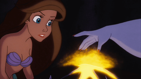
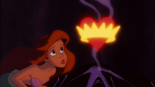
that uh. that symbolism looks

familiar
and of course
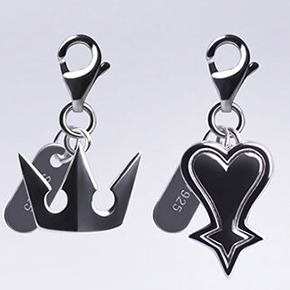
soras symbol in kh is a crown
and rikus is a heart
:^)
#kingdom hearts#soriku#the little mermaid#disney#disney princess#kh meta#ali's kh meta#gifs#ali's gifs#ali's kh gifs#epilespy warning#also riku in ansem form (mermaid) being turned back to normal (human) basically by love B)#i used a ps2 emulator to capture footage of the og kh1 logo btw#i already had it downloaded to grab some scenes for the future 2.0 version of the soriku comp LMAO#popular
164 notes
·
View notes
Text
The case won't stay cold forever.

YO? YO??? YOOOOOOO!??!?!? I posted this on Instagram but imma post it here too! I'm working on something BIG, my very own comic. It features a lot of my object head and human ocs that live in this universe.
The story of a case gone cold 8 years ago in Pralsbridge, California. The disappearance and supposed death of Calloway Jones, Chips Gamesmens old business partner, and the murder of Charlene Allard, a bartender who worked at Royal G. Casino.
The comic will include sub plots and daily life chapters as well as the main plot of the Calloway Case. I've been working on developing characters and plots for years now, and finally it's coming together.
I'm working on the cover art rn, and I already am almost done with the first page of chapter 1! I also have multiple chapter summaries done aswell. I hope you all are as EXCITED as I am.
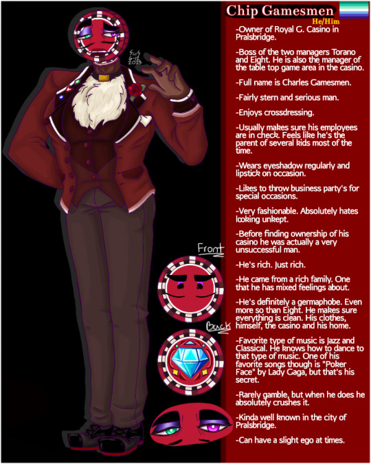
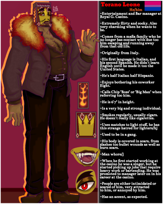
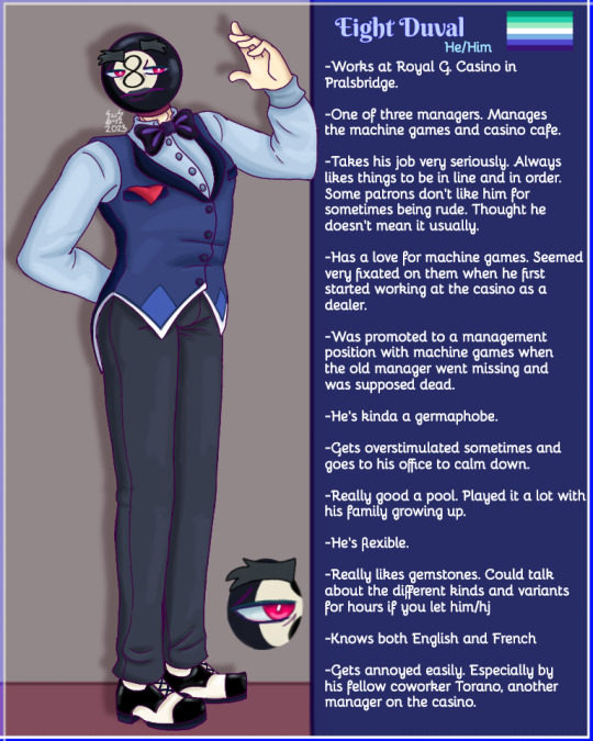
Here's some old refs of some of the main characters. Chip Gamesmen, Torano Leone and Eight Duval
#cold cash#storms goofy comic#original comic#oc#ocs#human oc#human ocs#object head oc#object head ocs#object head#mystery#murder mystery#art#logo#yall im so excited#ive been working up this idea for 3 YEARS#YALL BETTER APPRECIATE IT/lh#does a little dancey dance#oc comic#comic announcement#announcement#cold cash comic#drawing#my art#digital art#digital artwork#digital drawing#digital illustration#artist of tumblr#storms art
21 notes
·
View notes
Text


@emergency-broadcast-system
not actually what she looks like but when i saw the screen gems post my hand slipped and fell over
#my art#throwback to the brief era of when i was into logos enough that i tried to draw human versions of them#tw eyestrain
22 notes
·
View notes
Text

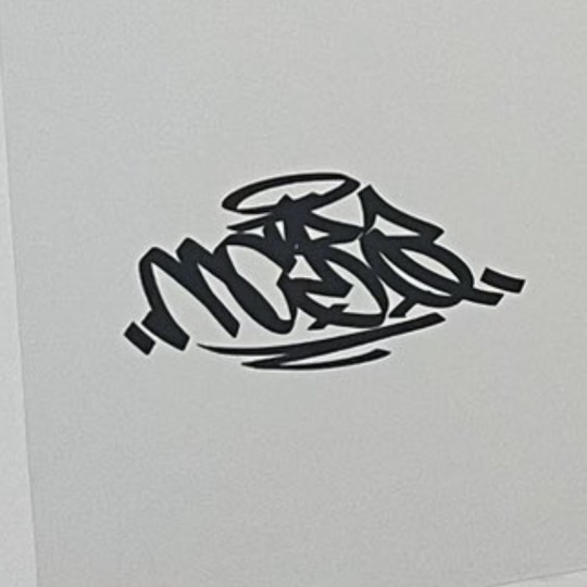
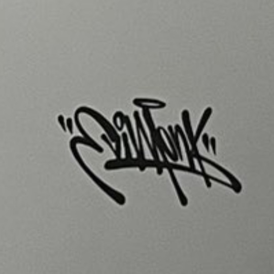
there was some display gallery showing off the various logos in hypmic and the ichikuu peeps on the tl were in shambles over both of them using halos in their mc name signatures lol
#vee queued to fill the void#i understand lol this is a pretty big deal like actually lol#one fan suggested an nb logo could have angel imagery since nb was under stairway to heaven#another in a very fast paced series of tweets cried about it being potential sign of ichiro and kuukou’s bond spanning from life#but even into their deaths and beyond when they reunite in heaven (and even pointed out the meaning of stairway to heaven)#and goddamn i sure love being jacked into the hypmic hive mind i can’t believe i was just musing about kuukou and death#and then directly got food for thought LOL but ichiro!!!!!!! i wasn’t expecting ichiro lol!!!!!!#but bb has been weirdly associated with christmas aka the birth of jesus#who gave his life for humanity and i am too in shambles no way does both ichiro and kuukou have self sacrifice themes NO WAY#god i remember when the hella awesome banquet mv dropped and bat fandom banded together to dissect the video#one person commented it’s strange to see kuukou in association with catholic/christian imagery#but posted a wiki article talking about the similarities between buddha and jesus and the ideologies in those religions#*crying* i even posted about it the black crown above kuukou’s head was both catholic and buddhist and meant to be beneficial for humanity#ichiro constantly being shaken to his core by sacrifices…….. him trying to show the nation the path of hope…………#this is so much lol i love getting food for thought from random observations and drops lol
26 notes
·
View notes
Last Seen Blogs
teriel
Magical Experiments

sztucznie-blog
Best birthday flowers online

nightvoyer7
Nightvoyer

clocloinjapan
CloClo's Japan Plan

jcferg98-blog
Jesse