#logo ripped from the blog because i am just that powerful
Text
Askbox: open
Information:
This is a character/askblog following my oc Multiverse Surveillance Drone #6678 or M.S.D #6678 along with my other muses. I’ll be trying to interact with other askblog but other than that feel free to send me asks or askblogs you want me to interact with, criticism welcome also just send me prompts or starters, no meme needed, fill my inbox for all I care.
Rules:
-you can send any ask at anytime even if I haven’t reblogged a meme
-I am fully willing to answer ask ic or ooc but I’d prefer in character
-nothing nsfw please, this blog is run by a minor so I would appreciate it, violence, swearing, and things of that nature are perfectly fine, just no smut
-if you are racist, anti-lgbtq+, misogynistic, or otherwise just a ass your getting blocked. And can kindly go fuck yourself
- magic annon allowed with in reason
-I am a single mortal man so please be patient
-feel free to ignore me
- I’m in the EST time zone in the U.S so keep that in mind when trying to interact, but feel free to leave me an ask whenever
-have fun
Muses:
-M.S.D #6678: robot, not as cold as they try to seem, very very tired, hates magic, loyal to the core, they/them, a humanoid one eyed red robot armed with a modified pistol that fires a high power sedative
-Themlic: researcher, mischievous, intelligent, frightening, she/her, a spike covered green winged Erinyes who when off work wears a red hoodie with ripped jeans (the jeans are ripped because the spikes not because of a fashion choice)
- The Carnagast/Carny: shapeshifting Predator, any pronouns, fairly dumb, doglike disposition, quick to anger
-Sam: engineer, friendly, stubborn, curious, near his limit, he/him, a black haired man with pale skin who when off work wears sweatpants and a long sleeve shirt with a unknown logo from dimension Y68
-Drifter: spirit, rarely shows emotion but still has them, speaks softly, seems very scatterbrained, she/them, she wears a red cloak and seems to be physically made out of a fog of some kind with glowing yellow eyes(?), often seen holding a lantern with a blue flame
More on the way
15 notes
·
View notes
Photo
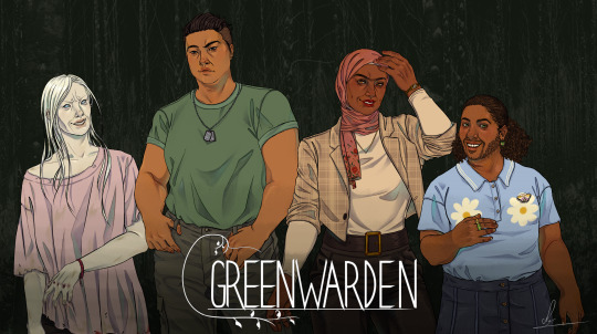


a belated (belated, belated) GW anniversary piece! happy definitely not may 30th everyone here’s the gang in a mock cover art
@fiddles-ifs
#greenwarden#greenwarden cog#marianna bautista#gw trace#asiyeh nazeri#devin graves#logo ripped from the blog because i am just that powerful#also this wasnt finished This late i just gotta edit before i post and. i didnt wanna. ive been closing my eyes for weeks#anyway check out greenwarden... also i aim to steady fill marianna and asiyeh/amirs tags so. watch this space#individuals coming to my kofi page maybe and possible expansion into full sprites later on#maggiedraws
229 notes
·
View notes
Text
MBC Selfshipping Prompts #1: First Dates (Risotto Nero)
WOO BOY so Haley started a weekly Selfship Prompt event over at MBC, and I wanted to write it out! And so I did.
Mind you, this uses my self-insert, Niko, so it’s going to be using that name and female pronouns. This work got away from me, so it ended up being 2422 words (even when I meant for this to be less than 2k words......lmaooo...)
I will get around to posting my reader inserts soon, but not yet LOL I’ll get around to it when I get around to it. This blog is still very much a WIP because I still need to re-reblog a LOT of content from the old blog.
But for now, this is what I’m writing and I wanted to post it up. I may write another for Mista, but we’ll see (ノ´ヮ´)ノ*:・゚✧
So as the title implies, this is the first of the prompts, and it’s “First Dates”.
Niko let out a yawn as she sleepily looked out at the busy street. Her eyes scanned the droves of people walking around, trying to scope out her target. Dark eyes blinked as she studied the faces of men nearing her, trying to determine if they were the one she was looking for. When they passed by her, she shrugged internally.
Her phone’s clock read 10:47 AM. She knew they agreed to meet around 11, but it never hurt to be early. “And anyways, better to be early than late, right? Right.” She still couldn’t help getting bored easily, and the anxiety and tension building in her chest continued to rise as the seconds passed.
“Calm down, calm down,” she thought to herself, “It’s just a date; you’ve been on dates before! Just treat it like you’re just hanging out with a friend.” Niko let out the breath she was holding and took her phone out, idly browsing it in order to distract herself. “Plus, it’s Mimi’s brother. There’s no way he’d be the bad kind of sort. She wouldn’t set us up if she thought we weren’t going to get along.”
Still, she had to admit she was surprised when her friend made the suggestion and arrangements. Niko recalled as her friend more or less pushed the aquarium tickets into her hand and snatched her phone to punch in her brother’s contact info.
“It’ll be nice, I promise! He’s a really great guy, and I think you two will hit it off!” Mimi flashed the smaller woman a grin. “Plus, he needs to get out more often.”
Niko’s mouth formed a slight line as she remembered how she had asked her friend for a photo of her date, but Mimi’s grin only grew with amusement.
“Oh, don’t worry about that! You’ll know when you see him.”
A noise of annoyance escaped Niko’s throat. “Dude, what does that even mean?” Her brow creased as she tried to think on what that could have meant, but quickly gave up, deciding it was too much effort. Her eyes absentmindedly left her phone screen to scope out her surroundings again.
Except her eyes bugged out as they fell on a large, foreboding man in dark clothing who towered over most if not all of the other people walking along. Whether by his size or presence, people seemed to naturally get out of his way as he continued making his way down the street. Everything about him exuded a quiet kind of power, from the way he walked, his stern expression, his hulking, muscular frame…
Though she remained completely stock-still, Niko shook her head inwardly. “No, no, maybe it’s not him! Maybe it’s just your regular, big, muscular, scary-lookin’ dude with fucking black sclera and red eyes, just walkin’ down the street for a stroll! All decked out in black and has the kinda expression that says, ‘hey so if you piss me off, I’m going to rip your limbs off’! Totally normal! Yeah! Hahaha!”
However, despite the thousands of thoughts going through her head at miles a minute, Niko knew. Now she understood what Mimi had meant by “You’ll know.” When the man stopped in front of her, it was undeniable that this man was indeed her date.
She could feel red eyes roving over her, studying her. If looks could kill, Niko felt like she would have been smote where she stood from the intensity of his stare alone.
Risotto’s unblinking crimson stare studied the woman before him. She certainly matched the picture and profile his sister had given him. Petite and girlish stature, short black hair that swept to the right, glasses, gold studs in her lobes, everything matched. He noted how she was sporting a mint green frog backpack, just like she’d specified she would so that he could recognize her easier. How thoughtful of her to suggest that in the first place. He couldn’t deny that he appreciated the consideration.
He was an observant man and was well-aware of his perception skills. After all, it was an invaluable skill in his line of work. However even without his sharp senses, there was no missing the look of surprise, awe, and slight fear in his date’s flabbergasted visage. Her eyes were wide, brows raised to the sky and jaw slack, lips seeming to form the beginnings of “Oh my god.”
Risotto let out a nearly imperceptible huff of amusement. His sister was right; this woman’s face hid nothing. He couldn’t help but smile a little at that candidness.
Introductions were short and awkward, but they served their purposes. Once acquainted, the pair could proceed with their date. Their itinerary was rather basic, just go to an aquarium and get some food together. Simple enough.
However, conversation was rather sparse as they made their way to their destination. Without any prior knowledge or known common ground, Niko was unsure of what to talk about, and Risotto was a taciturn individual by nature.
He didn’t dislike the small talk that she was trying to make, asking him things like what he did, what his hobbies were, but it required him to think carefully about his responses. It wasn’t exactly appropriate to vent about how little you were being paid to kill people on a first date.
What were you even supposed to talk about on a first meeting like this anyways? It had been far too long since he had tried connecting with someone new, let alone someone not affiliated with Passione. Though Risotto’s face remained as placid as ever, worry and nerves began bubbling beneath the surface as he picked up on the traces of worry and discomfort on his date’s face, and he wracked his brain for more to say.
He wasn’t alone, though; Niko hardly ever met people like this, usually having some common ground with new conversational partners. Here, she had absolutely no idea. Inwardly, she cursed Mimi for putting them in this awkward situation, wishing a thousand poxes on her friend’s house.
=====
“Eh? You set them up on a date?”
“Yup!” Mimi replied cheerily.
“And it’s a blind date, you said? And she doesn’t know what he looks like?”
Mimi hummed an affirmative as she snuggled up against her boyfriend’s shoulder, black nails clacking against her phone screen as she browsed. Though Kakyoin’s eyes hadn’t left the screen and he had continued dutifully chaining combos, his brows raised in surprise as he made a considering noise.
“Oh dear. She’s in for quite the surprise then.” As the victory logo flashed on screen, he leaned down and planted a kiss on her forehead and smiled warmly at Mimi.
“That’s evil. I love it.”
=====
Arriving to the aquarium was a relief and a salvation to Niko. At least now they could busy themselves with an activity, and that would give them something to do together. Slowly, their conversation became less stiff and stilted, as Niko began prattling off about the various exhibits they toured together. Bit by bit, she continued to come out of her shell as she pulled him from room to room, and by noontime she was babbling nonstop about the penguin feeding exhibit they had just been at.
“…and god, they were just so damned cute!” Her eyes glittered at the memory. “Fun fact, did you know that there was this one penguin that fell in love with an anime character? I’m not kidding!” Niko nodded as Risotto tilted his head at that statement. “Yeah, yeah! His name was Grape-kun and he uh…” Her words petered out, and her expression turned sheepish.
Risotto raised a brow, unsure of why she stopped. “Is something wrong?”
Niko fidgeted in silence for a moment before answering. “I…I just kinda realized that I’ve been dragging you from place to place, and I’ve just been rambling non-stop. It’s – it’s not that…it’s okay if you’re just not one for talking. I totally get that!” she said, waving her hands in front of her before wringing them worriedly. “I just wanna make sure you’re having fun too. Like, I just hope I’m not talking over you or only doing the things I wanna do, y’know?”
She looked up at him to meet his stare. Embarrassment was racking up by the second, and as she was going to open her mouth, he spoke.
“I’ve been enjoying myself.”
Relief flooded her senses. Niko smiled at him as she registered his words, her expression relaxing into something much brighter. He couldn’t help but mirror the expression, even though the corners of his mouth had barely turned upwards.
She clapped her hands together as a thought seemed to dawn on her.
“I know! Was there anything in particular that you wanted to do? Anything here that you were looking forward to?”
At that, Risotto’s eyes widened just the tiniest bit, but Niko had caught it. “There is, isn’t there?” she probed with a mischievous grin. “C’mon, tell me! I’m sure it’ll be nice.”
He averted his eyes, and she chuckled good-naturedly at his sudden shyness. “C’mooon, tell me! We already came all the way out here, so if there was something you wanted to do, let’s go and do it!”
No matter how hard he tried, he couldn’t turn away from her expression, bright and shining like the sun, with no escape. Risotto let out a mumble, still unable to look her directly in the eye.
“Mm? What was that?” Niko tilted her ear towards him.
“…the manta rays.” He repeated himself, barely louder.
She made the connection in seconds. “Oh! The petting pool with the manta rays!” Niko threw him a grin as he nodded. “Yeah, I gotcha! Let’s go!” And at that, she immediately set off before stopping short and looking behind her, waiting for him. “Come on! It gets really crowded, so let’s head on over.”
The petting pool was a popular exhibit, and it was already full of people, children and adults alike, all fawning over the adorable manta rays that practically jumped out of the water for a petting. Though his face remained as stony as ever, the sparkles in Risotto’s eyes exposed his excitement as the sounds of splashing drew nearer and nearer.
Niko let out a giggle. How cute.
However, he just stood there, staring out at the pool that was so close yet so far. Maybe he felt put off by the number of people there.
Taking matters into her own hands, Niko tried to lead them closer to the pool, but found that the droves of people who were already there difficult to navigate. She managed to bypass a few of them, but soon found it hard to actually get near the exhibit. Her lips curled to the side in annoyance as she tried to think about how to get to the exhibit.
Then, she felt someone take her hand. Niko looked up in surprise to see Risotto by her side, taking her hand gently as he began to wade through the crowd with her in tow, people parting as a hulking 6’8” man strode over to the manta ray pool. No one there decided that it was worth getting in his way, especially as he occasionally let out quiet, polite “excuse me, pardon me”s as he made his way over.
As Niko followed him through the crowd, she had a thought. Throughout the date, he hadn’t tried to make contact with her at all. Now that she thought about it, he had kept a respectful distance from her the entire time.
She let that fact wash over her as they approached the pool. Manta rays were swimming serenely through the clear water, occasionally breaking the surface of the water, excited for more pets.
Risotto had already dipped his hands into the cold water, gently stroking the creature as it passed by. A soft smile graced his features, dimples forming on his cheeks.
The sight was something Niko wanted to commit to memory.
Noticing that she had yet to join him, he removed his hand from the pool to look at his date. What he was met with was a soft, nearly reverent look on her face, dust blushing her cheeks. Upon realizing that he was looking directly at her, Niko gave him an awkward grin, hastily kneeling down with him to start babbling about how cute the rays were.
“…sorry.”
That cut her ramble short. “Huh? About what?”
“I should have asked first.”
His heart was thrumming in his chest as he searched her expression for any change. She looked confused for the barest of seconds before realization lit her features.
“Oh. Oh! That!” Niko quickly took her hand out of the pool, but thought better of shaking her hands in front of her like she usually did. “No, no – don’t worry about that!” She laughed, the sound causing a tentative warmth to blossom in his chest. “I really didn’t mind. It was…it was nice.” She emphasized her point with a shy but honest smile that caused the warmth in his chest to go into full bloom.
His eyes softened at her gentle expression, the soft look on her face looking like the most natural thing in the world. Risotto grunted an affirmative, finding words to be difficult.
As they walked away from the petting pool and dried off their hands, Niko spoke up.
“You know…to be honest, I wasn’t so sure about this. It’s been awhile since I’ve gone on a date, and this was my first blind date. I was ready to kill Mimi!” she admitted with a laugh, miming strangling motions. “No offense.”
“None taken.” His chuckle was nearly inaudible, but she didn’t miss the amusement in his voice.
Her smile grew wide, toothy and easy. “But this was nice. Real nice.”
“It was.” Risotto returned the smile, however subtle the change in his expression was. “I’ll admit this was…an experience. But I enjoyed it.”
At that, Niko laughed lightly and reached out to take his hand. Risotto noted the hesitation in her actions, the pause lasting no longer than a second. But in the end, he could feel his hand in hers, warm and comforting, like that was where it belonged.
He smiled at the feeling.
“Let’s go get lunch?” she asked, tilting her head at him.
His hand tightened around hers, just so.
“Let’s.”
As they walked towards their destination, they discussed restaurants, going over their options and bantering all the way there, the sound of her laughter echoing down the street.
#my self insert#Niko#self insert#self insert prompts#first dates#Risotto Nero#Vento Aureo#jojo's bizarre adventure#jjba#modern AU#aquariums#my writing#SFW#fluff#fluffy#risotto x niko
21 notes
·
View notes
Text
It seemed like the transcripts of some of Chronos' videos were lost, so I went ahead and redid them myself.
I strongly believe that my mom was being monitored and harrassed by Youtube, Universal Pictures, and their affiliates, due to a secret, of sorts, she had uncovered within the original trilogy of Jurassic Park films
Let me start by saying as early on as I can that I am not crazy - never been diagnosed with schizophrenia, [????] disorder, or any other mental illness. I'm just good at noticing patterns
I've always been a big Jurassic Park fan.
[near illegible, but I tried my best] I saw the first[firat?] film in the [??] when I was five years old, [etc]
It's possible that Youtube's part in the harrassment campaign may have started with the removal of her various tribute videos to Jurassic Park after her passing
but those may also merely be the result of the vast machine that is the automated copyright-takedown system.
As big of a JP fan as I am
though... [yes, just one word gets its own entire block.]
[The next two slides are both on screen for like a second or less each, and both very hard to read.]
I was never as [Jebus??] into the franchise as my mom was. She would watch the entire trilogy [something something] weekend [something] month
She would buy JP-branded oatmeals and sugary cereals, long after her doctor advised her to steer clear of these for [sdffghjh] tribute videos [sasfsds] like
those Linkin Park anime music videos, [there seems to be another line below this in smaller text, but all that can be seen due to the "Lost World" logo is an 'n']
I started noticing their absences toward the end of 2015
Without access to her Youtube password [again, the logo obscures a second line of smaller text] videos s[asdf] eate[n???] on her old laptop
I contacted Youtube many times regarding the videos, but have only recieved canned auto-responses and unhelpful, yes sympathetic responses from actual employees after pressing the matter
Sudden huge increase in views...
I hope anyone reading this is good with computers. Can you help a dude out?
Anyone with experience in the "Eratas" or "Erratas" system, if you could send me a message I'd be extremely grateful.
I realise reaching out to my Youtube viewers is a stretch, but hey I guess it's worth a shot, right?
This is the current automatic transcript of the song lyrics- note the address is gone.
0:00 yummy with our bodies we go double take
0:16 when double towel and down because you
0:18 will obey yep at the moment a swing
0:24 according and what if they were moving
0:26 out of people put this flag again me and
0:30 where we get the Kyrian's logbook that
0:32 much will be here with norma j whatever
0:35 same time of shipment be ready rings I
0:39 got the swagger bomb dinner she gotta be
0:41 the banker getting hungry mi made it was
0:46 a motherfucker I get the most which is
0:49 one of those bad Mama's lawmakers face
0:54 big to wait before the game silly
0:56 mistakes by me for the legality long
1:00 incremented plan to participate there
1:03 are few things that remain partly in
1:05 fact women brown one jet respect for
1:08 just a sec all want to hear that amana
1:12 fellas
1:14 where's little water water some people
1:20 talk to prepare a while did you dress
1:22 this is probably one night shift with a
1:25 flower wanna sesh with the left yeah I
1:28 came with the girl boy more than I can
1:32 make you feel a bit of summer fun dirty
1:34 hands off what you got this one is
1:37 different cuz of giving up their friend
1:40 not expedia we go up as much me what is
1:44 now for miracles that reason who I saved
1:49 it up for going my life we thought okay
1:52 II didn't see results el Muppet is
1:55 liking the brand back when we flew with
1:58 the what the fucking bag guys what dear
2:01 what I do like her to the finish my blog
2:05 or give it give you burn the neck yet
2:08 before pop pop pop you're already
2:10 because up just a touch the phone fucker
2:14 hit e'rybody chose to be seven dollars
2:18 oof amazing makers Allah fuckin ear for
2:21 my age / or two big horses doing his way
2:26 where we're going
2:28 we're breaking any / you an exact
2:32 digital model for the problems of
2:34 opinion i wanna do you live with my
2:37 first build up an American town to fit
2:42 terrasse de multiple more Chicago's
2:45 that's what we not all results too
2:48 powerful for design code changes
And here's the transcript for the QnA video, copy-pasted from KYM because it's under a spoiler tag on that page and thus won't archive. I don't know why KYM thinks this video was deleted, as it's very much still available.
TRANSCRIPT:
[start of video]
I’ve been fairly reluctant to really ask anyone for help since the nature of ] like pre[ classic paranoid nutjob ramblings -
algorithms controlling things behind the scenes, weird stuff in that vein.
But I would never waste anyone’s time with stuff like that. In the past couple of years I’ve asked for help from friends in programming and business circles.
but over time, friendships fade, people move, people stop talking to you. You know the drill.
As such, I’m very grateful for the help people are giving and I’ll try and answer as many questions as I can here.
Cork Top writes:
Q: "So with this video, are you essentially trying to see if this system called “Erratas” or “Eratas” will attempt to take down the video because it’s some system/algorithm that takes down videos that… I don’t know, include the term “Eratas”/“Erratas” in them? Which is why you used asterisks for letters in the word in the description, to see if the system could detect text on videos?"
[Cont…]
A: Thanks for writing, Cork. Yes. I don’t know much about programming or computer systems, so I’m not too savvy about how to trick them. All I really know about Erratas is that it’s used by dozens of companies.
(“recent”, as in, within the last 5 or 6 years)
they seem to use it as a copyright-enforcement tool which works as an excellent [?] if you want to take down other things as well.
But it has its limitations, and I’m fairly sure that my “test video” helped ferret those out. Maybe.
The original Jurassic Park trilogy is excellent, by the way, I highly recommend it.
The second film is my favorite, in spite of its flaws.
Frank Horrigan writes “what is the erratas system? any documentation?”
A: Thanks ]ing, Frank. “Erratas”[?] is something I [?(I’m not sure if there’s a word here or not)] crossed paths with over the years, and in[scope[?] disturb[??(this word MIGHT be “disturbance,” or it might be “disturbs me”)] …
The fact that it went after my mom in her twilight years is either evidence of its enormous and uncaring[?] reach in other words, a coincidence, or it means it’s
specifically still coming after me after all these years, and to be frank, both options freak me out equally.
3M and Unilever were early adopters, which shows the versatility of the system.
Too much faith is put into computers in general, and WAY too much faith was put in Erratas. Lots of people lost their jobs.
And Aaron4420 [referring to a YouTuber who posted on one of his videos], it’s easy to talk shit from behind a computer screen but takes a real man to back it up so suck my dick through a straw
[end]
rip aaron4420
17 notes
·
View notes
Text
5 Thank You Pages That Take Post-Conversion to the Next Level
If you’re like me, you say “please” and “thank you” automatically.
You’ve been saying these magic words since you were a kid. Because you were strongly motivated. Forget your manners, and you’d be humiliated in front of your family or strangers. Refuse altogether, and you’d be denied the obscure object of desire.
“What do we say?” “Pweese.” Boom—the chunky monkey is yours!
For today’s marketers, the problem with habitual politeness is that the delivery of a thank you message should never be a reflex. If a “thank you” rings hollow, the response from your customers will be equally rote.
“Thank You.” “You’re Welcome.” End of conversation.
See the problem here?
A thank you page is not the end of the transaction. It’s the next step in keeping people engaged with your brand or product, generating continued goodwill, further qualifying your leads—or even increasing order values or making more sales.
When it comes to your digital campaigns, how you say thank you should be an essential cornerstone of your post-conversion strategy. So let’s talk about a few ways you can approach creating better thank you pages. Along the way, we’ll explore some very effective thank you page examples created by Unbounce customers.
5 Tips from 5 Thank You Pages
1. Invite ‘Em for a Specific, Strategic Call 4. Win Them Over First, Then Make A Second Ask 2. Reveal the Next Steps 5. Keep ‘Em Engaged With Your Site 3. Reinforce Your Brand Personality
Thank You Tip #1: Invite ‘Em for a Specific, Strategic Call
The example below from Australia’s Axis Social applies every best practice out there (and then some) to maximize its post-conversion potential:
Image courtesy of Axis Social. Click it to see the whole thing.
This isn’t a landing page, though it might look a lot like one at first glance. It’s a thank you page (as opposed to a confirmation box or popup). And that’s why it’s so powerful. It does a lot of what a traditional lead-gen page might do, but it does it after the initial conversion goal has been met.
At this point in the interaction, the team at Axis has already captured the visitor’s email address in exchange for a downloadable Buyer’s Guide. Instead of letting the interaction end there, Axis goes the extra mile to communicate their value as an agency. According to Managing Director Matthew Asimus, this page helped them bridge the gap between a marketing qualified (MQL) and sales qualified (SQL) lead:
We hypothesized that a number of users who engaged with, and converted on, our first MQL landing page would develop an additional level of trust and thus a propensity to ascend from an MQL into an SQL. In essence, we were hoping to move users through a ‘yes cascade’ or ‘yes ladder’ to improve conversion rates.
Our initial results from this MQL ascension approach are incredibly exciting. Despite the campaigns using cold paid traffic from social and requesting 7 form fields, our landing page conversion rates are nearly 30%. What’s more, our lead qualification rates align with our other sales qualified lead generation approaches.
Note just how much persuasive material they’ve included here:
Social proof in the form of both brand logos (visible above the fold, naturally) and extensive testimonials from individual clients.
A walkthrough of the social strategy call that highlights compelling benefits (“explosive lead growth for your business” sounds good to me) and gives the call a definitive structure and purpose.
The enticing promise of another resource, a custom Facebook Ads Blueprint, that’ll prove equally valuable to Axis Social’s targeted customers.
The beauty of this approach is that it also scales to suit visitors without adding more pressure to the experience. If a visitor hits this page but doesn’t want to connect with Axis Social at the moment, there’s nothing here preventing them from clicking away.
But when visitors arrive with questions—or, say, balanced on the fine line between consideration and conversion—this thank you page gives them the extra nudge they need.
Thank You Tip 2: Reveal Next Steps
Speaking of next steps, if you’ve ever taken an action online—like submitting a form or making a purchase—without receiving any response, you know the existential dread that follows:
Did it… work? What happens next? Should I do it again?
What… am… I… supposed… to… do… now!?
Maybe I’m exaggerating a touch, but it’s always important to let the visitor know about the next steps—especially if clicking your call-to-action isn’t the end of things. Doing so will reduce friction, frustration, and uncertainty. Even if the next step will be yours to take, let people know what you’re doing and when they can expect to hear from you.
For example, notice how Zendrive does it here with a couple of lines:
Image courtesy of Zendrive.
It’s all clearly communicated. In the headline, they let their B2B prospects know that they’ve successfully completed the “first step.” Then the page sets expectations about what comes next (and when): “You will receive a message shortly with your invite to an executive briefing.”
Finally, it’s also worth taking note of how Zendrive suggests further reading from the site by linking to a piece of content from their blog. Providing a link to a single, valuable piece of content (as opposed to their blog as a whole) helps build trust before the briefing ever begins.
Bonus Tip: Offer Downloadable Downloadables on Your Thank You Pages
OK, full disclosure: I’m slipping this lil’ bonus tip in here just because it’s a pet peeve of mine.
Have you ever signed up for an ebook, report, or white paper that never seems to find its way to the inbox? It sucks. When this happens, you leave visitors feeling frustrated or even a little ripped off, since they’ve just exchanged your email address for nothing at all.
(I can’t click “unsubscribe” fast enough when this happens.)
What makes it so painful, though, is that there’s a dead-simple way of getting around this issue on your thank you pages:
Unless you’ve got a very special reason you need to deliver a file only via email, provide a download link on the thank you page itself. That way, visitors who’re anxious to start reading (like me) are satisfied. You can still start a drip campaign, of course. But you also eliminate the possibility that your downloadable never makes it to them.
Thank You Tip 3: Reinforce Brand Personality
This post features a few thank you pages that will feel a little “aspirational” for small marketing teams (or teams of one) who are short on time and resources. So it’s worth looking at how much gets done in this straightforward example from the fine people at Launchpeer:
Image courtesy of Launchpeer.
It’s personable, playful, and a little quirky. Most importantly, though, it’s thoughtful. As in, it demonstrates thought.
Even if you’ve seen this meme a million times before, this page lets you know that Launchpeer is a brand who, y’know, gets it. (And gets you.) Plus, when you click away, you leave with a pleasant association with the brand.
Tom Hanks is a good choice here too: he’s so darned affable and unlikely to be outed as a serial killer any time soon. I’m speculating, but this quick “t.hanks” from Launchpeer probably didn’t take a heck of a lot of time to create.
You can create your own fun images and animations, but the takeaway here should be that even a small effort leaves a much stronger impression than a generic thank you message. It shows how a humorous gif, playful animation, or unexpected message can generate tons of delight and goodwill.
(Of course, they also promote their podcast in this thank you page. And, again, offer that next step now that their visitor is on a roll engaging with their brand. So a little goes a long way…)
Thank You Tip 4: Win Them Over First, Then Make A Second Ask
Usually, when a visitor takes a small action, they become more likely to take another, bigger one. That’s why the most effective thank you pages often follow-up with a bigger ask, and why multi-staged forms are usually recommended by CRO specialists and agencies.
Sometimes it helps if the initial action is immediately appealing to your prospects. Take, for example, this contest created for Veeam by Gameplan Marketing:
Image courtesy of Veeam and Gameplan Marketing. Click it to see the whole thing.
Leads are captured by offering prizes to IT professionals (like a fitness tracker, a hotel gift card, or Apple AirPods) in exchange for taking a short survey about their current data centers and cloud storage solutions. Like the example from Zendrive above, the thank you page then reminds visitors what they can expect next.
But afterward, this thank you page also makes a second ask. Visitors who’re are (gently) encouraged to sign up to access a free, gated content hub. Since they’ve already provided their info to enter the contest, they’re now more predisposed to do so. Gameplan also includes a sweet explainer video (it appears on the contest page and the thank you page) that briefly outlines the benefits of their cloud-based data-management product.
Thank You Tip 5: Keep ‘Em Engaged With Your Site
One thing that most of these examples have in common is that they lead visitors back to the website or prompt another piece of content. You can take this even further, though.
For the launch of Unbounce’s Ultimate Ecommerce Landing Page Lookbook, for instance, the team created a landing page where visitors can grab it.
Here’s what the landing page for this guide looks like:
Click the image to visit the complete page. (Opens in a new tab.)
Eye-catching, right? And if it helps convince visitors that this lookbook is worth the download, then call it a success. It’s an awesome resource for any marketer looking for inspiration, so it’s not a tough sell.
However, we’ve also got plenty more content and resources to offer our ecomm visitors, including material further down the funnel. And we’d love to keep visitors coming back for it.
That’s why the thank you page is so crucial here. We want to keep the conversation going, so we use a thank you page to ask visitors another quick question on the way out. Depending on what visitors choose, they’ll be directed to additional resources.
I’ve included a screenshot of this choose-your-own-adventure flow below:
Click it to see the whole thing.
The answer that readers provide to this general question (i.e., “What’s the biggest challenge you face as a marketer?”) does three things:
The answer allows us to offer up additional, curated content and resources at the moment of conversion. This is the material we think visitors will find particularly useful. We include content from across the funnel, including editorial, educational, and promotional sources.
It lets us get to know our audience and their concerns a little better. The optional follow-up question on the thank you page helps us further qualify interest from visitors via progressive profiling and learn more about customers and non-customers alike.
It provides insight into our audience’s information needs. From a content planning and strategy perspective, this is invaluable as we fill content gaps, decide on what pieces need to be updated, and prioritize the creation of new resources.
So a single thank you page can become a source of marketing insight, an engagement driver, and a lead qualifier. All this happens by asking a single additional question at the right moment.
Curious about the Unbounce ecommerce lookbook? Take a look at the whole flow here. (Yes, we’ll need your email. Tell ‘em Colin sent ya.) While you’re at it, download it for your landing page swipe file.
Thanks for Reading (About Thank You Pages)
I find a real-world analogy enlightening here: imagine if brick-and-mortar retailers were to escort you to the exit and lock the door each time you make a purchase.
That’d be crazy, right?
So why do it on your landing pages?
Unfortunately, smart uses of thank you pages like these ones from our customers are the exception, not the rule. Frankly, a lot of examples out there look more like this bland form confirmation box, typo and all:
Pages like this one just don’t put as much care into saying thank you as they do their “pleases.” (That’s not great, Bob.)
A thank you page shouldn’t be a hard stop, and if that’s the habit you’ve gotten into, consider breaking it.
Thank you pages are super versatile. You can use them with subscriptions, downloads, webinar registrations, shopping carts, quote requests, demo signups, and contact forms. They can be used for upselling (or cross-selling), for offering discounts, for encouraging referrals, for soliciting feedback and testimonials, or for generating social shares. Holy moly.
Whether you’re selling something or generating leads, saying “thank you” in an unexpected and meaningful way is an opportunity to make a lasting impression. And, when incorporated into a thoughtful post-conversion strategy, it can boost your revenue too.
To close, here are three big points worth remembering if you’re trying to make a case for spending more time on your thank you pages:
A healthy open rate for emails in your nurture campaign is between 15-25%. How many of those new leads will see your thank you page? Close to 100%, I’d wager. Start nurturing right away!
According to research done by Bain & Company, “loyal online customers, just like offline ones, spend more, refer more people, and are more willing to expand their purchasing into new categories.” Well-considered thank you pages represent an incredible opportunity to create loyalty and build brand affinity.
If you get enough traffic and have a clear secondary conversion goal, remember that thank you pages can be A/B tested and optimized just like your landing pages. Post-conversion remains an important touchpoint for your conversion rate optimization planning.
So if you’re already designing landing pages, make saying “thank you” as much a part of the process as your headline, form, and call to action.
And, hey, thanks for reading.
#jumplinks {width: 100%; } #jumplinks td { padding: 5px; font-size: 0.9rem !important; }
0 notes
Text
5 Thank You Pages That Take Post-Conversion to the Next Level
If you’re like me, you say “please” and “thank you” automatically.
You’ve been saying these magic words since you were a kid. Because you were strongly motivated. Forget your manners, and you’d be humiliated in front of your family or strangers. Refuse altogether, and you’d be denied the obscure object of desire.
“What do we say?” “Pweese.” Boom—the chunky monkey is yours!
For today’s marketers, the problem with habitual politeness is that the delivery of a thank you message should never be a reflex. If a “thank you” rings hollow, the response from your customers will be equally rote.
“Thank You.” “You’re Welcome.” End of conversation.
See the problem here?
A thank you page is not the end of the transaction. It’s the next step in keeping people engaged with your brand or product, generating continued goodwill, further qualifying your leads—or even increasing order values or making more sales.
When it comes to your digital campaigns, how you say thank you should be an essential cornerstone of your post-conversion strategy. So let’s talk about a few ways you can approach creating better thank you pages. Along the way, we’ll explore some very effective thank you page examples created by Unbounce customers.
5 Tips from 5 Thank You Pages
1. Invite ‘Em for a Specific, Strategic Call 4. Win Them Over First, Then Make A Second Ask 2. Reveal the Next Steps 5. Keep ‘Em Engaged With Your Site 3. Reinforce Your Brand Personality
Thank You Tip #1: Invite ‘Em for a Specific, Strategic Call
The example below from Australia’s Axis Social applies every best practice out there (and then some) to maximize its post-conversion potential:
Image courtesy of Axis Social. Click it to see the whole thing.
This isn’t a landing page, though it might look a lot like one at first glance. It’s a thank you page (as opposed to a confirmation box or popup). And that’s why it’s so powerful. It does a lot of what a traditional lead-gen page might do, but it does it after the initial conversion goal has been met.
At this point in the interaction, the team at Axis has already captured the visitor’s email address in exchange for a downloadable Buyer’s Guide. Instead of letting the interaction end there, Axis goes the extra mile to communicate their value as an agency. According to Managing Director Matthew Asimus, this page helped them bridge the gap between a marketing qualified (MQL) and sales qualified (SQL) lead:
We hypothesized that a number of users who engaged with, and converted on, our first MQL landing page would develop an additional level of trust and thus a propensity to ascend from an MQL into an SQL. In essence, we were hoping to move users through a ‘yes cascade’ or ‘yes ladder’ to improve conversion rates.
Our initial results from this MQL ascension approach are incredibly exciting. Despite the campaigns using cold paid traffic from social and requesting 7 form fields, our landing page conversion rates are nearly 30%. What’s more, our lead qualification rates align with our other sales qualified lead generation approaches.
Note just how much persuasive material they’ve included here:
Social proof in the form of both brand logos (visible above the fold, naturally) and extensive testimonials from individual clients.
A walkthrough of the social strategy call that highlights compelling benefits (“explosive lead growth for your business” sounds good to me) and gives the call a definitive structure and purpose.
The enticing promise of another resource, a custom Facebook Ads Blueprint, that’ll prove equally valuable to Axis Social’s targeted customers.
The beauty of this approach is that it also scales to suit visitors without adding more pressure to the experience. If a visitor hits this page but doesn’t want to connect with Axis Social at the moment, there’s nothing here preventing them from clicking away.
But when visitors arrive with questions—or, say, balanced on the fine line between consideration and conversion—this thank you page gives them the extra nudge they need.
Thank You Tip 2: Reveal Next Steps
Speaking of next steps, if you’ve ever taken an action online—like submitting a form or making a purchase—without receiving any response, you know the existential dread that follows:
Did it… work? What happens next? Should I do it again?
What… am… I… supposed… to… do… now!?
Maybe I’m exaggerating a touch, but it’s always important to let the visitor know about the next steps—especially if clicking your call-to-action isn’t the end of things. Doing so will reduce friction, frustration, and uncertainty. Even if the next step will be yours to take, let people know what you’re doing and when they can expect to hear from you.
For example, notice how Zendrive does it here with a couple of lines:
Image courtesy of Zendrive.
It’s all clearly communicated. In the headline, they let their B2B prospects know that they’ve successfully completed the “first step.” Then the page sets expectations about what comes next (and when): “You will receive a message shortly with your invite to an executive briefing.”
Finally, it’s also worth taking note of how Zendrive suggests further reading from the site by linking to a piece of content from their blog. Providing a link to a single, valuable piece of content (as opposed to their blog as a whole) helps build trust before the briefing ever begins.
Bonus Tip: Offer Downloadable Downloadables on Your Thank You Pages
OK, full disclosure: I’m slipping this lil’ bonus tip in here just because it’s a pet peeve of mine.
Have you ever signed up for an ebook, report, or white paper that never seems to find its way to the inbox? It sucks. When this happens, you leave visitors feeling frustrated or even a little ripped off, since they’ve just exchanged your email address for nothing at all.
(I can’t click “unsubscribe” fast enough when this happens.)
What makes it so painful, though, is that there’s a dead-simple way of getting around this issue on your thank you pages:
Unless you’ve got a very special reason you need to deliver a file only via email, provide a download link on the thank you page itself. That way, visitors who’re anxious to start reading (like me) are satisfied. You can still start a drip campaign, of course. But you also eliminate the possibility that your downloadable never makes it to them.
Thank You Tip 3: Reinforce Brand Personality
This post features a few thank you pages that will feel a little “aspirational” for small marketing teams (or teams of one) who are short on time and resources. So it’s worth looking at how much gets done in this straightforward example from the fine people at Launchpeer:
Image courtesy of Launchpeer.
It’s personable, playful, and a little quirky. Most importantly, though, it’s thoughtful. As in, it demonstrates thought.
Even if you’ve seen this meme a million times before, this page lets you know that Launchpeer is a brand who, y’know, gets it. (And gets you.) Plus, when you click away, you leave with a pleasant association with the brand.
Tom Hanks is a good choice here too: he’s so darned affable and unlikely to be outed as a serial killer any time soon. I’m speculating, but this quick “t.hanks” from Launchpeer probably didn’t take a heck of a lot of time to create.
You can create your own fun images and animations, but the takeaway here should be that even a small effort leaves a much stronger impression than a generic thank you message. It shows how a humorous gif, playful animation, or unexpected message can generate tons of delight and goodwill.
(Of course, they also promote their podcast in this thank you page. And, again, offer that next step now that their visitor is on a roll engaging with their brand. So a little goes a long way…)
Thank You Tip 4: Win Them Over First, Then Make A Second Ask
Usually, when a visitor takes a small action, they become more likely to take another, bigger one. That’s why the most effective thank you pages often follow-up with a bigger ask, and why multi-staged forms are usually recommended by CRO specialists and agencies.
Sometimes it helps if the initial action is immediately appealing to your prospects. Take, for example, this contest created for Veeam by Gameplan Marketing:
Image courtesy of Veeam and Gameplan Marketing. Click it to see the whole thing.
Leads are captured by offering prizes to IT professionals (like a fitness tracker, a hotel gift card, or Apple AirPods) in exchange for taking a short survey about their current data centers and cloud storage solutions. Like the example from Zendrive above, the thank you page then reminds visitors what they can expect next.
But afterward, this thank you page also makes a second ask. Visitors who’re are (gently) encouraged to sign up to access a free, gated content hub. Since they’ve already provided their info to enter the contest, they’re now more predisposed to do so. Gameplan also includes a sweet explainer video (it appears on the contest page and the thank you page) that briefly outlines the benefits of their cloud-based data-management product.
Thank You Tip 5: Keep ‘Em Engaged With Your Site
One thing that most of these examples have in common is that they lead visitors back to the website or prompt another piece of content. You can take this even further, though.
For the launch of Unbounce’s Ultimate Ecommerce Landing Page Lookbook, for instance, the team created a landing page where visitors can grab it.
Here’s what the landing page for this guide looks like:
Click the image to visit the complete page. (Opens in a new tab.)
Eye-catching, right? And if it helps convince visitors that this lookbook is worth the download, then call it a success. It’s an awesome resource for any marketer looking for inspiration, so it’s not a tough sell.
However, we’ve also got plenty more content and resources to offer our ecomm visitors, including material further down the funnel. And we’d love to keep visitors coming back for it.
That’s why the thank you page is so crucial here. We want to keep the conversation going, so we use a thank you page to ask visitors another quick question on the way out. Depending on what visitors choose, they’ll be directed to additional resources.
I’ve included a screenshot of this choose-your-own-adventure flow below:
Click it to see the whole thing.
The answer that readers provide to this general question (i.e., “What’s the biggest challenge you face as a marketer?”) does three things:
The answer allows us to offer up additional, curated content and resources at the moment of conversion. This is the material we think visitors will find particularly useful. We include content from across the funnel, including editorial, educational, and promotional sources.
It lets us get to know our audience and their concerns a little better. The optional follow-up question on the thank you page helps us further qualify interest from visitors via progressive profiling and learn more about customers and non-customers alike.
It provides insight into our audience’s information needs. From a content planning and strategy perspective, this is invaluable as we fill content gaps, decide on what pieces need to be updated, and prioritize the creation of new resources.
So a single thank you page can become a source of marketing insight, an engagement driver, and a lead qualifier. All this happens by asking a single additional question at the right moment.
Curious about the Unbounce ecommerce lookbook? Take a look at the whole flow here. (Yes, we’ll need your email. Tell ‘em Colin sent ya.) While you’re at it, download it for your landing page swipe file.
Thanks for Reading (About Thank You Pages)
I find a real-world analogy enlightening here: imagine if brick-and-mortar retailers were to escort you to the exit and lock the door each time you make a purchase.
That’d be crazy, right?
So why do it on your landing pages?
Unfortunately, smart uses of thank you pages like these ones from our customers are the exception, not the rule. Frankly, a lot of examples out there look more like this bland form confirmation box, typo and all:
Pages like this one just don’t put as much care into saying thank you as they do their “pleases.” (That’s not great, Bob.)
A thank you page shouldn’t be a hard stop, and if that’s the habit you’ve gotten into, consider breaking it.
Thank you pages are super versatile. You can use them with subscriptions, downloads, webinar registrations, shopping carts, quote requests, demo signups, and contact forms. They can be used for upselling (or cross-selling), for offering discounts, for encouraging referrals, for soliciting feedback and testimonials, or for generating social shares. Holy moly.
Whether you’re selling something or generating leads, saying “thank you” in an unexpected and meaningful way is an opportunity to make a lasting impression. And, when incorporated into a thoughtful post-conversion strategy, it can boost your revenue too.
To close, here are three big points worth remembering if you’re trying to make a case for spending more time on your thank you pages:
A healthy open rate for emails in your nurture campaign is between 15-25%. How many of those new leads will see your thank you page? Close to 100%, I’d wager. Start nurturing right away!
According to research done by Bain & Company, “loyal online customers, just like offline ones, spend more, refer more people, and are more willing to expand their purchasing into new categories.” Well-considered thank you pages represent an incredible opportunity to create loyalty and build brand affinity.
If you get enough traffic and have a clear secondary conversion goal, remember that thank you pages can be A/B tested and optimized just like your landing pages. Post-conversion remains an important touchpoint for your conversion rate optimization planning.
So if you’re already designing landing pages, make saying “thank you” as much a part of the process as your headline, form, and call to action.
And, hey, thanks for reading.
#jumplinks {width: 100%; } #jumplinks td { padding: 5px; font-size: 0.9rem !important; }
from Marketing https://unbounce.com/conversion-rate-optimization/thank-you-pages/
via http://www.rssmix.com/
0 notes
Text
5 Thank You Pages That Take Post-Conversion to the Next Level
If you’re like me, you say “please” and “thank you” automatically.
You’ve been saying these magic words since you were a kid. Because you were strongly motivated. Forget your manners, and you’d be humiliated in front of your family or strangers. Refuse altogether, and you’d be denied the obscure object of desire.
“What do we say?” “Pweese.” Boom—the chunky monkey is yours!
For today’s marketers, the problem with habitual politeness is that the delivery of a thank you message should never be a reflex. If a “thank you” rings hollow, the response from your customers will be equally rote.
“Thank You.” “You’re Welcome.” End of conversation.
See the problem here?
A thank you page is not the end of the transaction. It’s the next step in keeping people engaged with your brand or product, generating continued goodwill, further qualifying your leads—or even increasing order values or making more sales.
When it comes to your digital campaigns, how you say thank you should be an essential cornerstone of your post-conversion strategy. So let’s talk about a few ways you can approach creating better thank you pages. Along the way, we’ll explore some very effective thank you page examples created by Unbounce customers.
5 Tips from 5 Thank You Pages
1. Invite ‘Em for a Specific, Strategic Call 4. Win Them Over First, Then Make A Second Ask 2. Reveal the Next Steps 5. Keep ‘Em Engaged With Your Site 3. Reinforce Your Brand Personality
Thank You Tip #1: Invite ‘Em for a Specific, Strategic Call
The example below from Australia’s Axis Social applies every best practice out there (and then some) to maximize its post-conversion potential:
Image courtesy of Axis Social. Click it to see the whole thing.
This isn’t a landing page, though it might look a lot like one at first glance. It’s a thank you page (as opposed to a confirmation box or popup). And that’s why it’s so powerful. It does a lot of what a traditional lead-gen page might do, but it does it after the initial conversion goal has been met.
At this point in the interaction, the team at Axis has already captured the visitor’s email address in exchange for a downloadable Buyer’s Guide. Instead of letting the interaction end there, Axis goes the extra mile to communicate their value as an agency. According to Managing Director Matthew Asimus, this page helped them bridge the gap between a marketing qualified (MQL) and sales qualified (SQL) lead:
We hypothesized that a number of users who engaged with, and converted on, our first MQL landing page would develop an additional level of trust and thus a propensity to ascend from an MQL into an SQL. In essence, we were hoping to move users through a ‘yes cascade’ or ‘yes ladder’ to improve conversion rates.
Our initial results from this MQL ascension approach are incredibly exciting. Despite the campaigns using cold paid traffic from social and requesting 7 form fields, our landing page conversion rates are nearly 30%. What’s more, our lead qualification rates align with our other sales qualified lead generation approaches.
Note just how much persuasive material they’ve included here:
Social proof in the form of both brand logos (visible above the fold, naturally) and extensive testimonials from individual clients.
A walkthrough of the social strategy call that highlights compelling benefits (“explosive lead growth for your business” sounds good to me) and gives the call a definitive structure and purpose.
The enticing promise of another resource, a custom Facebook Ads Blueprint, that’ll prove equally valuable to Axis Social’s targeted customers.
The beauty of this approach is that it also scales to suit visitors without adding more pressure to the experience. If a visitor hits this page but doesn’t want to connect with Axis Social at the moment, there’s nothing here preventing them from clicking away.
But when visitors arrive with questions—or, say, balanced on the fine line between consideration and conversion—this thank you page gives them the extra nudge they need.
Thank You Tip 2: Reveal Next Steps
Speaking of next steps, if you’ve ever taken an action online—like submitting a form or making a purchase—without receiving any response, you know the existential dread that follows:
Did it… work? What happens next? Should I do it again?
What… am… I… supposed… to… do… now!?
Maybe I’m exaggerating a touch, but it’s always important to let the visitor know about the next steps—especially if clicking your call-to-action isn’t the end of things. Doing so will reduce friction, frustration, and uncertainty. Even if the next step will be yours to take, let people know what you’re doing and when they can expect to hear from you.
For example, notice how Zendrive does it here with a couple of lines:
Image courtesy of Zendrive.
It’s all clearly communicated. In the headline, they let their B2B prospects know that they’ve successfully completed the “first step.” Then the page sets expectations about what comes next (and when): “You will receive a message shortly with your invite to an executive briefing.”
Finally, it’s also worth taking note of how Zendrive suggests further reading from the site by linking to a piece of content from their blog. Providing a link to a single, valuable piece of content (as opposed to their blog as a whole) helps build trust before the briefing ever begins.
Bonus Tip: Offer Downloadable Downloadables on Your Thank You Pages
OK, full disclosure: I’m slipping this lil’ bonus tip in here just because it’s a pet peeve of mine.
Have you ever signed up for an ebook, report, or white paper that never seems to find its way to the inbox? It sucks. When this happens, you leave visitors feeling frustrated or even a little ripped off, since they’ve just exchanged your email address for nothing at all.
(I can’t click “unsubscribe” fast enough when this happens.)
What makes it so painful, though, is that there’s a dead-simple way of getting around this issue on your thank you pages:
Unless you’ve got a very special reason you need to deliver a file only via email, provide a download link on the thank you page itself. That way, visitors who’re anxious to start reading (like me) are satisfied. You can still start a drip campaign, of course. But you also eliminate the possibility that your downloadable never makes it to them.
Thank You Tip 3: Reinforce Brand Personality
This post features a few thank you pages that will feel a little “aspirational” for small marketing teams (or teams of one) who are short on time and resources. So it’s worth looking at how much gets done in this straightforward example from the fine people at Launchpeer:
Image courtesy of Launchpeer.
It’s personable, playful, and a little quirky. Most importantly, though, it’s thoughtful. As in, it demonstrates thought.
Even if you’ve seen this meme a million times before, this page lets you know that Launchpeer is a brand who, y’know, gets it. (And gets you.) Plus, when you click away, you leave with a pleasant association with the brand.
Tom Hanks is a good choice here too: he’s so darned affable and unlikely to be outed as a serial killer any time soon. I’m speculating, but this quick “t.hanks” from Launchpeer probably didn’t take a heck of a lot of time to create.
You can create your own fun images and animations, but the takeaway here should be that even a small effort leaves a much stronger impression than a generic thank you message. It shows how a humorous gif, playful animation, or unexpected message can generate tons of delight and goodwill.
(Of course, they also promote their podcast in this thank you page. And, again, offer that next step now that their visitor is on a roll engaging with their brand. So a little goes a long way…)
Thank You Tip 4: Win Them Over First, Then Make A Second Ask
Usually, when a visitor takes a small action, they become more likely to take another, bigger one. That’s why the most effective thank you pages often follow-up with a bigger ask, and why multi-staged forms are usually recommended by CRO specialists and agencies.
Sometimes it helps if the initial action is immediately appealing to your prospects. Take, for example, this contest created for Veeam by Gameplan Marketing:
Image courtesy of Veeam and Gameplan Marketing. Click it to see the whole thing.
Leads are captured by offering prizes to IT professionals (like a fitness tracker, a hotel gift card, or Apple AirPods) in exchange for taking a short survey about their current data centers and cloud storage solutions. Like the example from Zendrive above, the thank you page then reminds visitors what they can expect next.
But afterward, this thank you page also makes a second ask. Visitors who’re are (gently) encouraged to sign up to access a free, gated content hub. Since they’ve already provided their info to enter the contest, they’re now more predisposed to do so. Gameplan also includes a sweet explainer video (it appears on the contest page and the thank you page) that briefly outlines the benefits of their cloud-based data-management product.
Thank You Tip 5: Keep ‘Em Engaged With Your Site
One thing that most of these examples have in common is that they lead visitors back to the website or prompt another piece of content. You can take this even further, though.
For the launch of Unbounce’s Ultimate Ecommerce Landing Page Lookbook, for instance, the team created a landing page where visitors can grab it.
Here’s what the landing page for this guide looks like:
Click the image to visit the complete page. (Opens in a new tab.)
Eye-catching, right? And if it helps convince visitors that this lookbook is worth the download, then call it a success. It’s an awesome resource for any marketer looking for inspiration, so it’s not a tough sell.
However, we’ve also got plenty more content and resources to offer our ecomm visitors, including material further down the funnel. And we’d love to keep visitors coming back for it.
That’s why the thank you page is so crucial here. We want to keep the conversation going, so we use a thank you page to ask visitors another quick question on the way out. Depending on what visitors choose, they’ll be directed to additional resources.
I’ve included a screenshot of this choose-your-own-adventure flow below:
Click it to see the whole thing.
The answer that readers provide to this general question (i.e., “What’s the biggest challenge you face as a marketer?”) does three things:
The answer allows us to offer up additional, curated content and resources at the moment of conversion. This is the material we think visitors will find particularly useful. We include content from across the funnel, including editorial, educational, and promotional sources.
It lets us get to know our audience and their concerns a little better. The optional follow-up question on the thank you page helps us further qualify interest from visitors via progressive profiling and learn more about customers and non-customers alike.
It provides insight into our audience’s information needs. From a content planning and strategy perspective, this is invaluable as we fill content gaps, decide on what pieces need to be updated, and prioritize the creation of new resources.
So a single thank you page can become a source of marketing insight, an engagement driver, and a lead qualifier. All this happens by asking a single additional question at the right moment.
Curious about the Unbounce ecommerce lookbook? Take a look at the whole flow here. (Yes, we’ll need your email. Tell ‘em Colin sent ya.) While you’re at it, download it for your landing page swipe file.
Thanks for Reading (About Thank You Pages)
I find a real-world analogy enlightening here: imagine if brick-and-mortar retailers were to escort you to the exit and lock the door each time you make a purchase.
That’d be crazy, right?
So why do it on your landing pages?
Unfortunately, smart uses of thank you pages like these ones from our customers are the exception, not the rule. Frankly, a lot of examples out there look more like this bland form confirmation box, typo and all:
Pages like this one just don’t put as much care into saying thank you as they do their “pleases.” (That’s not great, Bob.)
A thank you page shouldn’t be a hard stop, and if that’s the habit you’ve gotten into, consider breaking it.
Thank you pages are super versatile. You can use them with subscriptions, downloads, webinar registrations, shopping carts, quote requests, demo signups, and contact forms. They can be used for upselling (or cross-selling), for offering discounts, for encouraging referrals, for soliciting feedback and testimonials, or for generating social shares. Holy moly.
Whether you’re selling something or generating leads, saying “thank you” in an unexpected and meaningful way is an opportunity to make a lasting impression. And, when incorporated into a thoughtful post-conversion strategy, it can boost your revenue too.
To close, here are three big points worth remembering if you’re trying to make a case for spending more time on your thank you pages:
A healthy open rate for emails in your nurture campaign is between 15-25%. How many of those new leads will see your thank you page? Close to 100%, I’d wager. Start nurturing right away!
According to research done by Bain & Company, “loyal online customers, just like offline ones, spend more, refer more people, and are more willing to expand their purchasing into new categories.” Well-considered thank you pages represent an incredible opportunity to create loyalty and build brand affinity.
If you get enough traffic and have a clear secondary conversion goal, remember that thank you pages can be A/B tested and optimized just like your landing pages. Post-conversion remains an important touchpoint for your conversion rate optimization planning.
So if you’re already designing landing pages, make saying “thank you” as much a part of the process as your headline, form, and call to action.
And, hey, thanks for reading.
#jumplinks {width: 100%; } #jumplinks td { padding: 5px; font-size: 0.9rem !important; }
from Digital https://unbounce.com/conversion-rate-optimization/thank-you-pages/
via http://www.rssmix.com/
0 notes
Text
5 Thank You Pages That Take Post-Conversion to the Next Level
If you’re like me, you say “please” and “thank you” automatically.
You’ve been saying these magic words since you were a kid. Because you were strongly motivated. Forget your manners, and you’d be humiliated in front of your family or strangers. Refuse altogether, and you’d be denied the obscure object of desire.
“What do we say?” “Pweese.” Boom—the chunky monkey is yours!
For today’s marketers, the problem with habitual politeness is that the delivery of a thank you message should never be a reflex. If a “thank you” rings hollow, the response from your customers will be equally rote.
“Thank You.” “You’re Welcome.” End of conversation.
See the problem here?
A thank you page is not the end of the transaction. It’s the next step in keeping people engaged with your brand or product, generating continued goodwill, further qualifying your leads—or even increasing order values or making more sales.
When it comes to your digital campaigns, how you say thank you should be an essential cornerstone of your post-conversion strategy. So let’s talk about a few ways you can approach creating better thank you pages. Along the way, we’ll explore some very effective thank you page examples created by Unbounce customers.
5 Tips from 5 Thank You Pages
1. Invite ‘Em for a Specific, Strategic Call 4. Win Them Over First, Then Make A Second Ask 2. Reveal the Next Steps 5. Keep ‘Em Engaged With Your Site 3. Reinforce Your Brand Personality
Thank You Tip #1: Invite ‘Em for a Specific, Strategic Call
The example below from Australia’s Axis Social applies every best practice out there (and then some) to maximize its post-conversion potential:
Image courtesy of Axis Social. Click it to see the whole thing.
This isn’t a landing page, though it might look a lot like one at first glance. It’s a thank you page (as opposed to a confirmation box or popup). And that’s why it’s so powerful. It does a lot of what a traditional lead-gen page might do, but it does it after the initial conversion goal has been met.
At this point in the interaction, the team at Axis has already captured the visitor’s email address in exchange for a downloadable Buyer’s Guide. Instead of letting the interaction end there, Axis goes the extra mile to communicate their value as an agency. According to Managing Director Matthew Asimus, this page helped them bridge the gap between a marketing qualified (MQL) and sales qualified (SQL) lead:
We hypothesized that a number of users who engaged with, and converted on, our first MQL landing page would develop an additional level of trust and thus a propensity to ascend from an MQL into an SQL. In essence, we were hoping to move users through a ‘yes cascade’ or ‘yes ladder’ to improve conversion rates.
Our initial results from this MQL ascension approach are incredibly exciting. Despite the campaigns using cold paid traffic from social and requesting 7 form fields, our landing page conversion rates are nearly 30%. What’s more, our lead qualification rates align with our other sales qualified lead generation approaches.
Note just how much persuasive material they’ve included here:
Social proof in the form of both brand logos (visible above the fold, naturally) and extensive testimonials from individual clients.
A walkthrough of the social strategy call that highlights compelling benefits (“explosive lead growth for your business” sounds good to me) and gives the call a definitive structure and purpose.
The enticing promise of another resource, a custom Facebook Ads Blueprint, that’ll prove equally valuable to Axis Social’s targeted customers.
The beauty of this approach is that it also scales to suit visitors without adding more pressure to the experience. If a visitor hits this page but doesn’t want to connect with Axis Social at the moment, there’s nothing here preventing them from clicking away.
But when visitors arrive with questions—or, say, balanced on the fine line between consideration and conversion—this thank you page gives them the extra nudge they need.
Thank You Tip 2: Reveal Next Steps
Speaking of next steps, if you’ve ever taken an action online—like submitting a form or making a purchase—without receiving any response, you know the existential dread that follows:
Did it… work? What happens next? Should I do it again?
What… am… I… supposed… to… do… now!?
Maybe I’m exaggerating a touch, but it’s always important to let the visitor know about the next steps—especially if clicking your call-to-action isn’t the end of things. Doing so will reduce friction, frustration, and uncertainty. Even if the next step will be yours to take, let people know what you’re doing and when they can expect to hear from you.
For example, notice how Zendrive does it here with a couple of lines:
Image courtesy of Zendrive.
It’s all clearly communicated. In the headline, they let their B2B prospects know that they’ve successfully completed the “first step.” Then the page sets expectations about what comes next (and when): “You will receive a message shortly with your invite to an executive briefing.”
Finally, it’s also worth taking note of how Zendrive suggests further reading from the site by linking to a piece of content from their blog. Providing a link to a single, valuable piece of content (as opposed to their blog as a whole) helps build trust before the briefing ever begins.
Bonus Tip: Offer Downloadable Downloadables on Your Thank You Pages
OK, full disclosure: I’m slipping this lil’ bonus tip in here just because it’s a pet peeve of mine.
Have you ever signed up for an ebook, report, or white paper that never seems to find its way to the inbox? It sucks. When this happens, you leave visitors feeling frustrated or even a little ripped off, since they’ve just exchanged your email address for nothing at all.
(I can’t click “unsubscribe” fast enough when this happens.)
What makes it so painful, though, is that there’s a dead-simple way of getting around this issue on your thank you pages:
Unless you’ve got a very special reason you need to deliver a file only via email, provide a download link on the thank you page itself. That way, visitors who’re anxious to start reading (like me) are satisfied. You can still start a drip campaign, of course. But you also eliminate the possibility that your downloadable never makes it to them.
Thank You Tip 3: Reinforce Brand Personality
This post features a few thank you pages that will feel a little “aspirational” for small marketing teams (or teams of one) who are short on time and resources. So it’s worth looking at how much gets done in this straightforward example from the fine people at Launchpeer:
Image courtesy of Launchpeer.
It’s personable, playful, and a little quirky. Most importantly, though, it’s thoughtful. As in, it demonstrates thought.
Even if you’ve seen this meme a million times before, this page lets you know that Launchpeer is a brand who, y’know, gets it. (And gets you.) Plus, when you click away, you leave with a pleasant association with the brand.
Tom Hanks is a good choice here too: he’s so darned affable and unlikely to be outed as a serial killer any time soon. I’m speculating, but this quick “t.hanks” from Launchpeer probably didn’t take a heck of a lot of time to create.
You can create your own fun images and animations, but the takeaway here should be that even a small effort leaves a much stronger impression than a generic thank you message. It shows how a humorous gif, playful animation, or unexpected message can generate tons of delight and goodwill.
(Of course, they also promote their podcast in this thank you page. And, again, offer that next step now that their visitor is on a roll engaging with their brand. So a little goes a long way…)
Thank You Tip 4: Win Them Over First, Then Make A Second Ask
Usually, when a visitor takes a small action, they become more likely to take another, bigger one. That’s why the most effective thank you pages often follow-up with a bigger ask, and why multi-staged forms are usually recommended by CRO specialists and agencies.
Sometimes it helps if the initial action is immediately appealing to your prospects. Take, for example, this contest created for Veeam by Gameplan Marketing:
Image courtesy of Veeam and Gameplan Marketing. Click it to see the whole thing.
Leads are captured by offering prizes to IT professionals (like a fitness tracker, a hotel gift card, or Apple AirPods) in exchange for taking a short survey about their current data centers and cloud storage solutions. Like the example from Zendrive above, the thank you page then reminds visitors what they can expect next.
But afterward, this thank you page also makes a second ask. Visitors who’re are (gently) encouraged to sign up to access a free, gated content hub. Since they’ve already provided their info to enter the contest, they’re now more predisposed to do so. Gameplan also includes a sweet explainer video (it appears on the contest page and the thank you page) that briefly outlines the benefits of their cloud-based data-management product.
Thank You Tip 5: Keep ‘Em Engaged With Your Site
One thing that most of these examples have in common is that they lead visitors back to the website or prompt another piece of content. You can take this even further, though.
For the launch of Unbounce’s Ultimate Ecommerce Landing Page Lookbook, for instance, the team created a landing page where visitors can grab it.
Here’s what the landing page for this guide looks like:
Click the image to visit the complete page. (Opens in a new tab.)
Eye-catching, right? And if it helps convince visitors that this lookbook is worth the download, then call it a success. It’s an awesome resource for any marketer looking for inspiration, so it’s not a tough sell.
However, we’ve also got plenty more content and resources to offer our ecomm visitors, including material further down the funnel. And we’d love to keep visitors coming back for it.
That’s why the thank you page is so crucial here. We want to keep the conversation going, so we use a thank you page to ask visitors another quick question on the way out. Depending on what visitors choose, they’ll be directed to additional resources.
I’ve included a screenshot of this choose-your-own-adventure flow below:
Click it to see the whole thing.
The answer that readers provide to this general question (i.e., “What’s the biggest challenge you face as a marketer?”) does three things:
The answer allows us to offer up additional, curated content and resources at the moment of conversion. This is the material we think visitors will find particularly useful. We include content from across the funnel, including editorial, educational, and promotional sources.
It lets us get to know our audience and their concerns a little better. The optional follow-up question on the thank you page helps us further qualify interest from visitors via progressive profiling and learn more about customers and non-customers alike.
It provides insight into our audience’s information needs. From a content planning and strategy perspective, this is invaluable as we fill content gaps, decide on what pieces need to be updated, and prioritize the creation of new resources.
So a single thank you page can become a source of marketing insight, an engagement driver, and a lead qualifier. All this happens by asking a single additional question at the right moment.
Curious about the Unbounce ecommerce lookbook? Take a look at the whole flow here. (Yes, we’ll need your email. Tell ‘em Colin sent ya.) While you’re at it, download it for your landing page swipe file.
Thanks for Reading (About Thank You Pages)
I find a real-world analogy enlightening here: imagine if brick-and-mortar retailers were to escort you to the exit and lock the door each time you make a purchase.
That’d be crazy, right?
So why do it on your landing pages?
Unfortunately, smart uses of thank you pages like these ones from our customers are the exception, not the rule. Frankly, a lot of examples out there look more like this bland form confirmation box, typo and all:
Pages like this one just don’t put as much care into saying thank you as they do their “pleases.” (That’s not great, Bob.)
A thank you page shouldn’t be a hard stop, and if that’s the habit you’ve gotten into, consider breaking it.
Thank you pages are super versatile. You can use them with subscriptions, downloads, webinar registrations, shopping carts, quote requests, demo signups, and contact forms. They can be used for upselling (or cross-selling), for offering discounts, for encouraging referrals, for soliciting feedback and testimonials, or for generating social shares. Holy moly.
Whether you’re selling something or generating leads, saying “thank you” in an unexpected and meaningful way is an opportunity to make a lasting impression. And, when incorporated into a thoughtful post-conversion strategy, it can boost your revenue too.
To close, here are three big points worth remembering if you’re trying to make a case for spending more time on your thank you pages:
A healthy open rate for emails in your nurture campaign is between 15-25%. How many of those new leads will see your thank you page? Close to 100%, I’d wager. Start nurturing right away!
According to research done by Bain & Company, “loyal online customers, just like offline ones, spend more, refer more people, and are more willing to expand their purchasing into new categories.” Well-considered thank you pages represent an incredible opportunity to create loyalty and build brand affinity.
If you get enough traffic and have a clear secondary conversion goal, remember that thank you pages can be A/B tested and optimized just like your landing pages. Post-conversion remains an important touchpoint for your conversion rate optimization planning.
So if you’re already designing landing pages, make saying “thank you” as much a part of the process as your headline, form, and call to action.
And, hey, thanks for reading.
#jumplinks {width: 100%; } #jumplinks td { padding: 5px; font-size: 0.9rem !important; }
from Marketing https://unbounce.com/conversion-rate-optimization/thank-you-pages/
via http://www.rssmix.com/
0 notes
Text
5 Thank You Pages That Take Post-Conversion to the Next Level
If you’re like me, you say “please” and “thank you” automatically.
You’ve been saying these magic words since you were a kid. Because you were strongly motivated. Forget your manners, and you’d be humiliated in front of your family or strangers. Refuse altogether, and you’d be denied the obscure object of desire.
“What do we say?” “Pweese.” Boom—the chunky monkey is yours!
For today’s marketers, the problem with habitual politeness is that the delivery of a thank you message should never be a reflex. If a “thank you” rings hollow, the response from your customers will be equally rote.
“Thank You.” “You’re Welcome.” End of conversation.
See the problem here?
A thank you page is not the end of the transaction. It’s the next step in keeping people engaged with your brand or product, generating continued goodwill, further qualifying your leads—or even increasing order values or making more sales.
When it comes to your digital campaigns, how you say thank you should be an essential cornerstone of your post-conversion strategy. So let’s talk about a few ways you can approach creating better thank you pages. Along the way, we’ll explore some very effective thank you page examples created by Unbounce customers.
5 Tips from 5 Thank You Pages
1. Invite ‘Em for a Specific, Strategic Call 4. Win Them Over First, Then Make A Second Ask 2. Reveal the Next Steps 5. Keep ‘Em Engaged With Your Site 3. Reinforce Your Brand Personality
Thank You Tip #1: Invite ‘Em for a Specific, Strategic Call
The example below from Australia’s Axis Social applies every best practice out there (and then some) to maximize its post-conversion potential:
Image courtesy of Axis Social. Click it to see the whole thing.
This isn’t a landing page, though it might look a lot like one at first glance. It’s a thank you page (as opposed to a confirmation box or popup). And that’s why it’s so powerful. It does a lot of what a traditional lead-gen page might do, but it does it after the initial conversion goal has been met.
At this point in the interaction, the team at Axis has already captured the visitor’s email address in exchange for a downloadable Buyer’s Guide. Instead of letting the interaction end there, Axis goes the extra mile to communicate their value as an agency. According to Managing Director Matthew Asimus, this page helped them bridge the gap between a marketing qualified (MQL) and sales qualified (SQL) lead:
We hypothesized that a number of users who engaged with, and converted on, our first MQL landing page would develop an additional level of trust and thus a propensity to ascend from an MQL into an SQL. In essence, we were hoping to move users through a ‘yes cascade’ or ‘yes ladder’ to improve conversion rates.
Our initial results from this MQL ascension approach are incredibly exciting. Despite the campaigns using cold paid traffic from social and requesting 7 form fields, our landing page conversion rates are nearly 30%. What’s more, our lead qualification rates align with our other sales qualified lead generation approaches.
Note just how much persuasive material they’ve included here:
Social proof in the form of both brand logos (visible above the fold, naturally) and extensive testimonials from individual clients.
A walkthrough of the social strategy call that highlights compelling benefits (“explosive lead growth for your business” sounds good to me) and gives the call a definitive structure and purpose.
The enticing promise of another resource, a custom Facebook Ads Blueprint, that’ll prove equally valuable to Axis Social’s targeted customers.
The beauty of this approach is that it also scales to suit visitors without adding more pressure to the experience. If a visitor hits this page but doesn’t want to connect with Axis Social at the moment, there’s nothing here preventing them from clicking away.
But when visitors arrive with questions—or, say, balanced on the fine line between consideration and conversion—this thank you page gives them the extra nudge they need.
Thank You Tip 2: Reveal Next Steps
Speaking of next steps, if you’ve ever taken an action online—like submitting a form or making a purchase—without receiving any response, you know the existential dread that follows:
Did it… work? What happens next? Should I do it again?
What… am… I… supposed… to… do… now!?
Maybe I’m exaggerating a touch, but it’s always important to let the visitor know about the next steps—especially if clicking your call-to-action isn’t the end of things. Doing so will reduce friction, frustration, and uncertainty. Even if the next step will be yours to take, let people know what you’re doing and when they can expect to hear from you.
For example, notice how Zendrive does it here with a couple of lines:
Image courtesy of Zendrive.
It’s all clearly communicated. In the headline, they let their B2B prospects know that they’ve successfully completed the “first step.” Then the page sets expectations about what comes next (and when): “You will receive a message shortly with your invite to an executive briefing.”
Finally, it’s also worth taking note of how Zendrive suggests further reading from the site by linking to a piece of content from their blog. Providing a link to a single, valuable piece of content (as opposed to their blog as a whole) helps build trust before the briefing ever begins.
Bonus Tip: Offer Downloadable Downloadables on Your Thank You Pages
OK, full disclosure: I’m slipping this lil’ bonus tip in here just because it’s a pet peeve of mine.
Have you ever signed up for an ebook, report, or white paper that never seems to find its way to the inbox? It sucks. When this happens, you leave visitors feeling frustrated or even a little ripped off, since they’ve just exchanged your email address for nothing at all.
(I can’t click “unsubscribe” fast enough when this happens.)
What makes it so painful, though, is that there’s a dead-simple way of getting around this issue on your thank you pages:
Unless you’ve got a very special reason you need to deliver a file only via email, provide a download link on the thank you page itself. That way, visitors who’re anxious to start reading (like me) are satisfied. You can still start a drip campaign, of course. But you also eliminate the possibility that your downloadable never makes it to them.
Thank You Tip 3: Reinforce Brand Personality
This post features a few thank you pages that will feel a little “aspirational” for small marketing teams (or teams of one) who are short on time and resources. So it’s worth looking at how much gets done in this straightforward example from the fine people at Launchpeer:
Image courtesy of Launchpeer.
It’s personable, playful, and a little quirky. Most importantly, though, it’s thoughtful. As in, it demonstrates thought.
Even if you’ve seen this meme a million times before, this page lets you know that Launchpeer is a brand who, y’know, gets it. (And gets you.) Plus, when you click away, you leave with a pleasant association with the brand.
Tom Hanks is a good choice here too: he’s so darned affable and unlikely to be outed as a serial killer any time soon. I’m speculating, but this quick “t.hanks” from Launchpeer probably didn’t take a heck of a lot of time to create.
You can create your own fun images and animations, but the takeaway here should be that even a small effort leaves a much stronger impression than a generic thank you message. It shows how a humorous gif, playful animation, or unexpected message can generate tons of delight and goodwill.
(Of course, they also promote their podcast in this thank you page. And, again, offer that next step now that their visitor is on a roll engaging with their brand. So a little goes a long way…)
Thank You Tip 4: Win Them Over First, Then Make A Second Ask
Usually, when a visitor takes a small action, they become more likely to take another, bigger one. That’s why the most effective thank you pages often follow-up with a bigger ask, and why multi-staged forms are usually recommended by CRO specialists and agencies.
Sometimes it helps if the initial action is immediately appealing to your prospects. Take, for example, this contest created for Veeam by Gameplan Marketing:
Image courtesy of Veeam and Gameplan Marketing. Click it to see the whole thing.
Leads are captured by offering prizes to IT professionals (like a fitness tracker, a hotel gift card, or Apple AirPods) in exchange for taking a short survey about their current data centers and cloud storage solutions. Like the example from Zendrive above, the thank you page then reminds visitors what they can expect next.
But afterward, this thank you page also makes a second ask. Visitors who’re are (gently) encouraged to sign up to access a free, gated content hub. Since they’ve already provided their info to enter the contest, they’re now more predisposed to do so. Gameplan also includes a sweet explainer video (it appears on the contest page and the thank you page) that briefly outlines the benefits of their cloud-based data-management product.
Thank You Tip 5: Keep ‘Em Engaged With Your Site
One thing that most of these examples have in common is that they lead visitors back to the website or prompt another piece of content. You can take this even further, though.
For the launch of Unbounce’s Ultimate Ecommerce Landing Page Lookbook, for instance, the team created a landing page where visitors can grab it.
Here’s what the landing page for this guide looks like:
Click the image to visit the complete page. (Opens in a new tab.)
Eye-catching, right? And if it helps convince visitors that this lookbook is worth the download, then call it a success. It’s an awesome resource for any marketer looking for inspiration, so it’s not a tough sell.
However, we’ve also got plenty more content and resources to offer our ecomm visitors, including material further down the funnel. And we’d love to keep visitors coming back for it.
That’s why the thank you page is so crucial here. We want to keep the conversation going, so we use a thank you page to ask visitors another quick question on the way out. Depending on what visitors choose, they’ll be directed to additional resources.
I’ve included a screenshot of this choose-your-own-adventure flow below:
Click it to see the whole thing.
The answer that readers provide to this general question (i.e., “What’s the biggest challenge you face as a marketer?”) does three things:
The answer allows us to offer up additional, curated content and resources at the moment of conversion. This is the material we think visitors will find particularly useful. We include content from across the funnel, including editorial, educational, and promotional sources.
It lets us get to know our audience and their concerns a little better. The optional follow-up question on the thank you page helps us further qualify interest from visitors via progressive profiling and learn more about customers and non-customers alike.
It provides insight into our audience’s information needs. From a content planning and strategy perspective, this is invaluable as we fill content gaps, decide on what pieces need to be updated, and prioritize the creation of new resources.
So a single thank you page can become a source of marketing insight, an engagement driver, and a lead qualifier. All this happens by asking a single additional question at the right moment.
Curious about the Unbounce ecommerce lookbook? Take a look at the whole flow here. (Yes, we’ll need your email. Tell ‘em Colin sent ya.) While you’re at it, download it for your landing page swipe file.
Thanks for Reading (About Thank You Pages)
I find a real-world analogy enlightening here: imagine if brick-and-mortar retailers were to escort you to the exit and lock the door each time you make a purchase.
That’d be crazy, right?
So why do it on your landing pages?
Unfortunately, smart uses of thank you pages like these ones from our customers are the exception, not the rule. Frankly, a lot of examples out there look more like this bland form confirmation box, typo and all:
Pages like this one just don’t put as much care into saying thank you as they do their “pleases.” (That’s not great, Bob.)
A thank you page shouldn’t be a hard stop, and if that’s the habit you’ve gotten into, consider breaking it.
Thank you pages are super versatile. You can use them with subscriptions, downloads, webinar registrations, shopping carts, quote requests, demo signups, and contact forms. They can be used for upselling (or cross-selling), for offering discounts, for encouraging referrals, for soliciting feedback and testimonials, or for generating social shares. Holy moly.
Whether you’re selling something or generating leads, saying “thank you” in an unexpected and meaningful way is an opportunity to make a lasting impression. And, when incorporated into a thoughtful post-conversion strategy, it can boost your revenue too.
To close, here are three big points worth remembering if you’re trying to make a case for spending more time on your thank you pages:
A healthy open rate for emails in your nurture campaign is between 15-25%. How many of those new leads will see your thank you page? Close to 100%, I’d wager. Start nurturing right away!
According to research done by Bain & Company, “loyal online customers, just like offline ones, spend more, refer more people, and are more willing to expand their purchasing into new categories.” Well-considered thank you pages represent an incredible opportunity to create loyalty and build brand affinity.
If you get enough traffic and have a clear secondary conversion goal, remember that thank you pages can be A/B tested and optimized just like your landing pages. Post-conversion remains an important touchpoint for your conversion rate optimization planning.
So if you’re already designing landing pages, make saying “thank you” as much a part of the process as your headline, form, and call to action.
And, hey, thanks for reading.
#jumplinks {width: 100%; } #jumplinks td { padding: 5px; font-size: 0.9rem !important; }
5 Thank You Pages That Take Post-Conversion to the Next Level published first on https://nickpontemrktg.wordpress.com/
0 notes
Text
5 Thank You Pages That Take Post-Conversion to the Next Level
If you’re like me, you say “please” and “thank you” automatically.
You’ve been saying these magic words since you were a kid. Because you were strongly motivated. Forget your manners, and you’d be humiliated in front of your family or strangers. Refuse altogether, and you’d be denied the obscure object of desire.
“What do we say?” “Pweese.” Boom—the chunky monkey is yours!
For today’s marketers, the problem with habitual politeness is that the delivery of a thank you message should never be a reflex. If a “thank you” rings hollow, the response from your customers will be equally rote.
“Thank You.” “You’re Welcome.” End of conversation.
See the problem here?
A thank you page is not the end of the transaction. It’s the next step in keeping people engaged with your brand or product, generating continued goodwill, further qualifying your leads—or even increasing order values or making more sales.
When it comes to your digital campaigns, how you say thank you should be an essential cornerstone of your post-conversion strategy. So let’s talk about a few ways you can approach creating better thank you pages. Along the way, we’ll explore some very effective thank you page examples created by Unbounce customers.
5 Tips from 5 Thank You Pages
1. Invite ‘Em for a Specific, Strategic Call 4. Win Them Over First, Then Make A Second Ask 2. Reveal the Next Steps 5. Keep ‘Em Engaged With Your Site 3. Reinforce Your Brand Personality
Thank You Tip #1: Invite ‘Em for a Specific, Strategic Call
The example below from Australia’s Axis Social applies every best practice out there (and then some) to maximize its post-conversion potential:
Image courtesy of Axis Social. Click it to see the whole thing.
This isn’t a landing page, though it might look a lot like one at first glance. It’s a thank you page (as opposed to a confirmation box or popup). And that’s why it’s so powerful. It does a lot of what a traditional lead-gen page might do, but it does it after the initial conversion goal has been met.
At this point in the interaction, the team at Axis has already captured the visitor’s email address in exchange for a downloadable Buyer’s Guide. Instead of letting the interaction end there, Axis goes the extra mile to communicate their value as an agency. According to Managing Director Matthew Asimus, this page helped them bridge the gap between a marketing qualified (MQL) and sales qualified (SQL) lead:
We hypothesized that a number of users who engaged with, and converted on, our first MQL landing page would develop an additional level of trust and thus a propensity to ascend from an MQL into an SQL. In essence, we were hoping to move users through a ‘yes cascade’ or ‘yes ladder’ to improve conversion rates.
Our initial results from this MQL ascension approach are incredibly exciting. Despite the campaigns using cold paid traffic from social and requesting 7 form fields, our landing page conversion rates are nearly 30%. What’s more, our lead qualification rates align with our other sales qualified lead generation approaches.
Note just how much persuasive material they’ve included here:
Social proof in the form of both brand logos (visible above the fold, naturally) and extensive testimonials from individual clients.
A walkthrough of the social strategy call that highlights compelling benefits (“explosive lead growth for your business” sounds good to me) and gives the call a definitive structure and purpose.
The enticing promise of another resource, a custom Facebook Ads Blueprint, that’ll prove equally valuable to Axis Social’s targeted customers.
The beauty of this approach is that it also scales to suit visitors without adding more pressure to the experience. If a visitor hits this page but doesn’t want to connect with Axis Social at the moment, there’s nothing here preventing them from clicking away.
But when visitors arrive with questions—or, say, balanced on the fine line between consideration and conversion—this thank you page gives them the extra nudge they need.
Thank You Tip 2: Reveal Next Steps
Speaking of next steps, if you’ve ever taken an action online—like submitting a form or making a purchase—without receiving any response, you know the existential dread that follows:
Did it… work? What happens next? Should I do it again?
What… am… I… supposed… to… do… now!?
Maybe I’m exaggerating a touch, but it’s always important to let the visitor know about the next steps—especially if clicking your call-to-action isn’t the end of things. Doing so will reduce friction, frustration, and uncertainty. Even if the next step will be yours to take, let people know what you’re doing and when they can expect to hear from you.
For example, notice how Zendrive does it here with a couple of lines:
Image courtesy of Zendrive.
It’s all clearly communicated. In the headline, they let their B2B prospects know that they’ve successfully completed the “first step.” Then the page sets expectations about what comes next (and when): “You will receive a message shortly with your invite to an executive briefing.”
Finally, it’s also worth taking note of how Zendrive suggests further reading from the site by linking to a piece of content from their blog. Providing a link to a single, valuable piece of content (as opposed to their blog as a whole) helps build trust before the briefing ever begins.
Bonus Tip: Offer Downloadable Downloadables on Your Thank You Pages
OK, full disclosure: I’m slipping this lil’ bonus tip in here just because it’s a pet peeve of mine.
Have you ever signed up for an ebook, report, or white paper that never seems to find its way to the inbox? It sucks. When this happens, you leave visitors feeling frustrated or even a little ripped off, since they’ve just exchanged your email address for nothing at all.
(I can’t click “unsubscribe” fast enough when this happens.)
What makes it so painful, though, is that there’s a dead-simple way of getting around this issue on your thank you pages:
Unless you’ve got a very special reason you need to deliver a file only via email, provide a download link on the thank you page itself. That way, visitors who’re anxious to start reading (like me) are satisfied. You can still start a drip campaign, of course. But you also eliminate the possibility that your downloadable never makes it to them.
Thank You Tip 3: Reinforce Brand Personality
This post features a few thank you pages that will feel a little “aspirational” for small marketing teams (or teams of one) who are short on time and resources. So it’s worth looking at how much gets done in this straightforward example from the fine people at Launchpeer:
Image courtesy of Launchpeer.
It’s personable, playful, and a little quirky. Most importantly, though, it’s thoughtful. As in, it demonstrates thought.
Even if you’ve seen this meme a million times before, this page lets you know that Launchpeer is a brand who, y’know, gets it. (And gets you.) Plus, when you click away, you leave with a pleasant association with the brand.
Tom Hanks is a good choice here too: he’s so darned affable and unlikely to be outed as a serial killer any time soon. I’m speculating, but this quick “t.hanks” from Launchpeer probably didn’t take a heck of a lot of time to create.
You can create your own fun images and animations, but the takeaway here should be that even a small effort leaves a much stronger impression than a generic thank you message. It shows how a humorous gif, playful animation, or unexpected message can generate tons of delight and goodwill.
(Of course, they also promote their podcast in this thank you page. And, again, offer that next step now that their visitor is on a roll engaging with their brand. So a little goes a long way…)
Thank You Tip 4: Win Them Over First, Then Make A Second Ask
Usually, when a visitor takes a small action, they become more likely to take another, bigger one. That’s why the most effective thank you pages often follow-up with a bigger ask, and why multi-staged forms are usually recommended by CRO specialists and agencies.
Sometimes it helps if the initial action is immediately appealing to your prospects. Take, for example, this contest created for Veeam by Gameplan Marketing:
Image courtesy of Veeam and Gameplan Marketing. Click it to see the whole thing.
Leads are captured by offering prizes to IT professionals (like a fitness tracker, a hotel gift card, or Apple AirPods) in exchange for taking a short survey about their current data centers and cloud storage solutions. Like the example from Zendrive above, the thank you page then reminds visitors what they can expect next.
But afterward, this thank you page also makes a second ask. Visitors who’re are (gently) encouraged to sign up to access a free, gated content hub. Since they’ve already provided their info to enter the contest, they’re now more predisposed to do so. Gameplan also includes a sweet explainer video (it appears on the contest page and the thank you page) that briefly outlines the benefits of their cloud-based data-management product.
Thank You Tip 5: Keep ‘Em Engaged With Your Site
One thing that most of these examples have in common is that they lead visitors back to the website or prompt another piece of content. You can take this even further, though.
For the launch of Unbounce’s Ultimate Ecommerce Landing Page Lookbook, for instance, the team created a landing page where visitors can grab it.
Here’s what the landing page for this guide looks like:
Click the image to visit the complete page. (Opens in a new tab.)
Eye-catching, right? And if it helps convince visitors that this lookbook is worth the download, then call it a success. It’s an awesome resource for any marketer looking for inspiration, so it’s not a tough sell.
However, we’ve also got plenty more content and resources to offer our ecomm visitors, including material further down the funnel. And we’d love to keep visitors coming back for it.
That’s why the thank you page is so crucial here. We want to keep the conversation going, so we use a thank you page to ask visitors another quick question on the way out. Depending on what visitors choose, they’ll be directed to additional resources.
I’ve included a screenshot of this choose-your-own-adventure flow below:
Click it to see the whole thing.
The answer that readers provide to this general question (i.e., “What’s the biggest challenge you face as a marketer?”) does three things:
The answer allows us to offer up additional, curated content and resources at the moment of conversion. This is the material we think visitors will find particularly useful. We include content from across the funnel, including editorial, educational, and promotional sources.
It lets us get to know our audience and their concerns a little better. The optional follow-up question on the thank you page helps us further qualify interest from visitors via progressive profiling and learn more about customers and non-customers alike.
It provides insight into our audience’s information needs. From a content planning and strategy perspective, this is invaluable as we fill content gaps, decide on what pieces need to be updated, and prioritize the creation of new resources.
So a single thank you page can become a source of marketing insight, an engagement driver, and a lead qualifier. All this happens by asking a single additional question at the right moment.
Curious about the Unbounce ecommerce lookbook? Take a look at the whole flow here. (Yes, we’ll need your email. Tell ‘em Colin sent ya.) While you’re at it, download it for your landing page swipe file.
Thanks for Reading (About Thank You Pages)
I find a real-world analogy enlightening here: imagine if brick-and-mortar retailers were to escort you to the exit and lock the door each time you make a purchase.
That’d be crazy, right?
So why do it on your landing pages?
Unfortunately, smart uses of thank you pages like these ones from our customers are the exception, not the rule. Frankly, a lot of examples out there look more like this bland form confirmation box, typo and all:
Pages like this one just don’t put as much care into saying thank you as they do their “pleases.” (That’s not great, Bob.)
A thank you page shouldn’t be a hard stop, and if that’s the habit you’ve gotten into, consider breaking it.
Thank you pages are super versatile. You can use them with subscriptions, downloads, webinar registrations, shopping carts, quote requests, demo signups, and contact forms. They can be used for upselling (or cross-selling), for offering discounts, for encouraging referrals, for soliciting feedback and testimonials, or for generating social shares. Holy moly.
Whether you’re selling something or generating leads, saying “thank you” in an unexpected and meaningful way is an opportunity to make a lasting impression. And, when incorporated into a thoughtful post-conversion strategy, it can boost your revenue too.
To close, here are three big points worth remembering if you’re trying to make a case for spending more time on your thank you pages:
A healthy open rate for emails in your nurture campaign is between 15-25%. How many of those new leads will see your thank you page? Close to 100%, I’d wager. Start nurturing right away!
According to research done by Bain & Company, “loyal online customers, just like offline ones, spend more, refer more people, and are more willing to expand their purchasing into new categories.” Well-considered thank you pages represent an incredible opportunity to create loyalty and build brand affinity.
If you get enough traffic and have a clear secondary conversion goal, remember that thank you pages can be A/B tested and optimized just like your landing pages. Post-conversion remains an important touchpoint for your conversion rate optimization planning.
So if you’re already designing landing pages, make saying “thank you” as much a part of the process as your headline, form, and call to action.
And, hey, thanks for reading.
#jumplinks {width: 100%; } #jumplinks td { padding: 5px; font-size: 0.9rem !important; }
5 Thank You Pages That Take Post-Conversion to the Next Level published first on http://nickpontemktg.blogspot.com/
0 notes
Text
5 Thank You Pages That Take Post-Conversion to the Next Level
If you’re like me, you say “please” and “thank you” automatically.
You’ve been saying these magic words since you were a kid. Because you were strongly motivated. Forget your manners, and you’d be humiliated in front of your family or strangers. Refuse altogether, and you’d be denied the obscure object of desire.
“What do we say?” “Pweese.” Boom—the chunky monkey is yours!
For today’s marketers, the problem with habitual politeness is that the delivery of a thank you message should never be a reflex. If a “thank you” rings hollow, the response from your customers will be equally rote.
“Thank You.” “You’re Welcome.” End of conversation.
See the problem here?
A thank you page is not the end of the transaction. It’s the next step in keeping people engaged with your brand or product, generating continued goodwill, further qualifying your leads—or even increasing order values or making more sales.
When it comes to your digital campaigns, how you say thank you should be an essential cornerstone of your post-conversion strategy. So let’s talk about a few ways you can approach creating better thank you pages. Along the way, we’ll explore some very effective thank you page examples created by Unbounce customers.
5 Tips from 5 Thank You Pages
1. Invite ‘Em for a Specific, Strategic Call 4. Win Them Over First, Then Make A Second Ask 2. Reveal the Next Steps 5. Keep ‘Em Engaged With Your Site 3. Reinforce Your Brand Personality
Thank You Tip #1: Invite ‘Em for a Specific, Strategic Call
The example below from Australia’s Axis Social applies every best practice out there (and then some) to maximize its post-conversion potential:
Image courtesy of Axis Social. Click it to see the whole thing.
This isn’t a landing page, though it might look a lot like one at first glance. It’s a thank you page (as opposed to a confirmation box or popup). And that’s why it’s so powerful. It does a lot of what a traditional lead-gen page might do, but it does it after the initial conversion goal has been met.
At this point in the interaction, the team at Axis has already captured the visitor’s email address in exchange for a downloadable Buyer’s Guide. Instead of letting the interaction end there, Axis goes the extra mile to communicate their value as an agency. According to Managing Director Matthew Asimus, this page helped them bridge the gap between a marketing qualified (MQL) and sales qualified (SQL) lead:
We hypothesized that a number of users who engaged with, and converted on, our first MQL landing page would develop an additional level of trust and thus a propensity to ascend from an MQL into an SQL. In essence, we were hoping to move users through a ‘yes cascade’ or ‘yes ladder’ to improve conversion rates.
Our initial results from this MQL ascension approach are incredibly exciting. Despite the campaigns using cold paid traffic from social and requesting 7 form fields, our landing page conversion rates are nearly 30%. What’s more, our lead qualification rates align with our other sales qualified lead generation approaches.
Note just how much persuasive material they’ve included here:
Social proof in the form of both brand logos (visible above the fold, naturally) and extensive testimonials from individual clients.
A walkthrough of the social strategy call that highlights compelling benefits (“explosive lead growth for your business” sounds good to me) and gives the call a definitive structure and purpose.
The enticing promise of another resource, a custom Facebook Ads Blueprint, that’ll prove equally valuable to Axis Social’s targeted customers.
The beauty of this approach is that it also scales to suit visitors without adding more pressure to the experience. If a visitor hits this page but doesn’t want to connect with Axis Social at the moment, there’s nothing here preventing them from clicking away.
But when visitors arrive with questions—or, say, balanced on the fine line between consideration and conversion—this thank you page gives them the extra nudge they need.
Thank You Tip 2: Reveal Next Steps
Speaking of next steps, if you’ve ever taken an action online—like submitting a form or making a purchase—without receiving any response, you know the existential dread that follows:
Did it… work? What happens next? Should I do it again?
What… am… I… supposed… to… do… now!?
Maybe I’m exaggerating a touch, but it’s always important to let the visitor know about the next steps—especially if clicking your call-to-action isn’t the end of things. Doing so will reduce friction, frustration, and uncertainty. Even if the next step will be yours to take, let people know what you’re doing and when they can expect to hear from you.
For example, notice how Zendrive does it here with a couple of lines:
Image courtesy of Zendrive.
It’s all clearly communicated. In the headline, they let their B2B prospects know that they’ve successfully completed the “first step.” Then the page sets expectations about what comes next (and when): “You will receive a message shortly with your invite to an executive briefing.”
Finally, it’s also worth taking note of how Zendrive suggests further reading from the site by linking to a piece of content from their blog. Providing a link to a single, valuable piece of content (as opposed to their blog as a whole) helps build trust before the briefing ever begins.
Bonus Tip: Offer Downloadable Downloadables on Your Thank You Pages
OK, full disclosure: I’m slipping this lil’ bonus tip in here just because it’s a pet peeve of mine.
Have you ever signed up for an ebook, report, or white paper that never seems to find its way to the inbox? It sucks. When this happens, you leave visitors feeling frustrated or even a little ripped off, since they’ve just exchanged your email address for nothing at all.
(I can’t click “unsubscribe” fast enough when this happens.)
What makes it so painful, though, is that there’s a dead-simple way of getting around this issue on your thank you pages:
Unless you’ve got a very special reason you need to deliver a file only via email, provide a download link on the thank you page itself. That way, visitors who’re anxious to start reading (like me) are satisfied. You can still start a drip campaign, of course. But you also eliminate the possibility that your downloadable never makes it to them.
Thank You Tip 3: Reinforce Brand Personality
This post features a few thank you pages that will feel a little “aspirational” for small marketing teams (or teams of one) who are short on time and resources. So it’s worth looking at how much gets done in this straightforward example from the fine people at Launchpeer:
Image courtesy of Launchpeer.
It’s personable, playful, and a little quirky. Most importantly, though, it’s thoughtful. As in, it demonstrates thought.
Even if you’ve seen this meme a million times before, this page lets you know that Launchpeer is a brand who, y’know, gets it. (And gets you.) Plus, when you click away, you leave with a pleasant association with the brand.
Tom Hanks is a good choice here too: he’s so darned affable and unlikely to be outed as a serial killer any time soon. I’m speculating, but this quick “t.hanks” from Launchpeer probably didn’t take a heck of a lot of time to create.
You can create your own fun images and animations, but the takeaway here should be that even a small effort leaves a much stronger impression than a generic thank you message. It shows how a humorous gif, playful animation, or unexpected message can generate tons of delight and goodwill.
(Of course, they also promote their podcast in this thank you page. And, again, offer that next step now that their visitor is on a roll engaging with their brand. So a little goes a long way…)
Thank You Tip 4: Win Them Over First, Then Make A Second Ask
Usually, when a visitor takes a small action, they become more likely to take another, bigger one. That’s why the most effective thank you pages often follow-up with a bigger ask, and why multi-staged forms are usually recommended by CRO specialists and agencies.
Sometimes it helps if the initial action is immediately appealing to your prospects. Take, for example, this contest created for Veeam by Gameplan Marketing:
Image courtesy of Veeam and Gameplan Marketing. Click it to see the whole thing.
Leads are captured by offering prizes to IT professionals (like a fitness tracker, a hotel gift card, or Apple AirPods) in exchange for taking a short survey about their current data centers and cloud storage solutions. Like the example from Zendrive above, the thank you page then reminds visitors what they can expect next.
But afterward, this thank you page also makes a second ask. Visitors who’re are (gently) encouraged to sign up to access a free, gated content hub. Since they’ve already provided their info to enter the contest, they’re now more predisposed to do so. Gameplan also includes a sweet explainer video (it appears on the contest page and the thank you page) that briefly outlines the benefits of their cloud-based data-management product.
Thank You Tip 5: Keep ‘Em Engaged With Your Site
One thing that most of these examples have in common is that they lead visitors back to the website or prompt another piece of content. You can take this even further, though.
For the launch of Unbounce’s Ultimate Ecommerce Landing Page Lookbook, for instance, the team created a landing page where visitors can grab it.
Here’s what the landing page for this guide looks like:
Click the image to visit the complete page. (Opens in a new tab.)
Eye-catching, right? And if it helps convince visitors that this lookbook is worth the download, then call it a success. It’s an awesome resource for any marketer looking for inspiration, so it’s not a tough sell.
However, we’ve also got plenty more content and resources to offer our ecomm visitors, including material further down the funnel. And we’d love to keep visitors coming back for it.
That’s why the thank you page is so crucial here. We want to keep the conversation going, so we use a thank you page to ask visitors another quick question on the way out. Depending on what visitors choose, they’ll be directed to additional resources.
I’ve included a screenshot of this choose-your-own-adventure flow below:
Click it to see the whole thing.
The answer that readers provide to this general question (i.e., “What’s the biggest challenge you face as a marketer?”) does three things:
The answer allows us to offer up additional, curated content and resources at the moment of conversion. This is the material we think visitors will find particularly useful. We include content from across the funnel, including editorial, educational, and promotional sources.
It lets us get to know our audience and their concerns a little better. The optional follow-up question on the thank you page helps us further qualify interest from visitors via progressive profiling and learn more about customers and non-customers alike.
It provides insight into our audience’s information needs. From a content planning and strategy perspective, this is invaluable as we fill content gaps, decide on what pieces need to be updated, and prioritize the creation of new resources.
So a single thank you page can become a source of marketing insight, an engagement driver, and a lead qualifier. All this happens by asking a single additional question at the right moment.
Curious about the Unbounce ecommerce lookbook? Take a look at the whole flow here. (Yes, we’ll need your email. Tell ‘em Colin sent ya.) While you’re at it, download it for your landing page swipe file.
Thanks for Reading (About Thank You Pages)
I find a real-world analogy enlightening here: imagine if brick-and-mortar retailers were to escort you to the exit and lock the door each time you make a purchase.
That’d be crazy, right?
So why do it on your landing pages?
Unfortunately, smart uses of thank you pages like these ones from our customers are the exception, not the rule. Frankly, a lot of examples out there look more like this bland form confirmation box, typo and all:
Pages like this one just don’t put as much care into saying thank you as they do their “pleases.” (That’s not great, Bob.)
A thank you page shouldn’t be a hard stop, and if that’s the habit you’ve gotten into, consider breaking it.
Thank you pages are super versatile. You can use them with subscriptions, downloads, webinar registrations, shopping carts, quote requests, demo signups, and contact forms. They can be used for upselling (or cross-selling), for offering discounts, for encouraging referrals, for soliciting feedback and testimonials, or for generating social shares. Holy moly.
Whether you’re selling something or generating leads, saying “thank you” in an unexpected and meaningful way is an opportunity to make a lasting impression. And, when incorporated into a thoughtful post-conversion strategy, it can boost your revenue too.
To close, here are three big points worth remembering if you’re trying to make a case for spending more time on your thank you pages:
A healthy open rate for emails in your nurture campaign is between 15-25%. How many of those new leads will see your thank you page? Close to 100%, I’d wager. Start nurturing right away!
According to research done by Bain & Company, “loyal online customers, just like offline ones, spend more, refer more people, and are more willing to expand their purchasing into new categories.” Well-considered thank you pages represent an incredible opportunity to create loyalty and build brand affinity.
If you get enough traffic and have a clear secondary conversion goal, remember that thank you pages can be A/B tested and optimized just like your landing pages. Post-conversion remains an important touchpoint for your conversion rate optimization planning.
So if you’re already designing landing pages, make saying “thank you” as much a part of the process as your headline, form, and call to action.
And, hey, thanks for reading.
#jumplinks {width: 100%; } #jumplinks td { padding: 5px; font-size: 0.9rem !important; } https://unbounce.com/conversion-rate-optimization/thank-you-pages/
0 notes
Text
Golden Goose Superstar Women Sale Effective company Systems
What was actually so really about them was Cheap Golden Goose Sneakers UK ecause because companies improved all their Golden Goose Sneakers Sale UK inancial illness in some way, these firms were throughout a more favorable position in order to afford per subsequent product or service sales offering.
Look immediately following your golden goose outlet. Never mistake the ovum as currently the gift. Some of us have flip out to be a societies that principles things more and more than individuals. It has become often joked, tongue-in-cheek exactly who you is only because good nearly as your last accomplishment. That will is you see, the ultimate lie. We probably are not one specific collection because of the things that my family and i do, the actual sale just that we make, or all goal whom is vanquished. You are probably the reward. You actually are the wonderful goose store. The egg cell is right the remain serviceable thing you and your family created.
This is Not powerful HR Wrong doing to Fix: If you are usually one most typically associated with those managers (or companies) that announce employees usually are your quite a few important asset, then either make which experts state statement true, or avoid saying the product. What's nope in places of work across America can't stay fixed that has HR companies. Better recognition, more communication, or polished training isn't enough so as to build relationships and design mutual take care.
Admittedly, this approach final 'no duh' would certainly seem a little silly. But fully be dependable. Any opportunity someone shows up in now with plans so that you can formalize virtually any previously underground environment (i.e. big enterprise entering unquestionably the world involved with Facebook), and then there can be a ambiance of impacting the get-together. Social information has taken over our individual lives towards one seriously good reason: It's pleasant!
For some of those companies running to dwell afloat, investigate each job task and determine a new business is effective that are blessed with the on the whole redundancy. Telling someone head out to is you should a tricky decision, but make beneficial you activity intelligently when you are forced towards downsize.
Just to be any world-wide-web page at your current website or blog needs traffic, for that reason does your amazing squeeze webpage. In fact, it's very much more pleasurable to send all or maybe most connected your customers to this squeeze before transferring them regarding any former page towards your web Golden Goose Superstar Women Sale roperty.
You're pregnant: Congratulations! Opportunity foes am going to point to the fact that probably not only might be you effectively fertile pertaining to the job, you featured at our first logo of dilemma and finished up this to happen repeatedly - used your driving record of couple of pregnancies from three years, it no doubt will is you're certainly to quit on each of our whole united kingdom. Given the best proclivity for groups which experts claim want to secede produced by the union, that couldn't exactly prove to be a substantial leap. The individual also in no way only rip up your incredibly own credibility on the grounds that a leader, but that most of individual pre-menopausal mother who just before runs in President in the afterward 25 changing times.
In total terms, growing access in order to really Other Someones Money (OPM) is the new form attached to leverage where enables yourself to shift beyond most of the limits with your very own resources as well instead request resourcefulness on the way to everything anybody do. While business terms, leverage was the mystery that distinguishes itself self-employed young man who manages a lifestyle from this business webmaster who incredibly a corporate. In financial/investment terms getting this done means selecting access to make sure you cash that may be certainly not the one in invest in to use assets that experts claim you mastery and that can produce money flow.
0 notes
Text
Designa Review | Demo | Exclusive Bonus Package | Unlimited Graphics For ALL Your Campaigns
Designa Review | Demo | Exclusive Bonus Package | Unlimited Graphics For ALL Your Campaigns
Learn more here: http://mattmartin.club/index.php/2018/07/09/designa-review-demo-exclusive-bonus-package-unlimited-graphics-for-all-your-campaigns/
Welcome To MattMartin.Club!
Thank You So Much For Taking The Time In Checking Out My Review On "Designa"
Hope You Will Enjoy It!
Turn Your Website Visitors Into Buying Customers Using Product Discount Tech!
Overview:
Product Creator Simon Warner Product Name Designa Front-End Price $37.00 Niche Graphic Bonuses YES! Listed Below! Refund 14 Days Money Back Guarantee Recommendation Yes, 100%. Launch Date 2018 – July – 11th @ 11:00 AM EST Official Website Checkout "Designa" Official Site
Click Here @ 11:00 AM EST on 2018-July-11th To Get An Early Bird Discount On "Designa" Along With My Exclusive Bonus!
Sure, video is getting more popular online. Might explain why there’s a new “can’t live without it” video software released every other day. And while many marketers use video … many MORE (like, ALL of them) use images & graphics. Pictures are THE way to grab attention, drive traffic & get more clicks. They’re also way easier, faster & easier to create than video.
Images are essential for social media posts – driving up to 94% MORE views than posts without graphics. Pictures are used in every business application: from web design & content, branding, product covers and everything in between.
Sadly, current graphics options for marketers are very limited. Fancy softwares are expensive, complicated and time-consuming. Free softwares rarely have enough features for your needs. Royalty-free image sites can cost you $300 per month or more. Graphic design artists don’t come cheap and you’ll wait for results.
Facing this problem, 2 highly successful online professionals decided it was time to create a REAL graphics solution for marketers of all levels. Let’s check out my Designa Review below for more details!
DESIGNA REVIEW – WHAT IS IT?
In a nutshell, Designa is a cloud based DIY design software by marketers for marketers. It is built for pumping out jaw-dropping & high converting designs – facebook ads, social media covers, post, ecovers, business cards, mockups, pdf books, and many more in just minutes even if you have zero technical or design skills. It comes loaded with 3000+ ready-made design templates and over 3 million stock images, fonts and other graphic assets.
You’ll never need to hire an expensive designer again. Forget paying ridiculous monthly fees for complex software or royalty-free image sites. This platform is packed full of over 7.5 million images & graphic assets. 3000+ top-converting templates. And is so drag & drop simple… if you can click your mouse, you can create custom images in minutes.
Drive more traffic. Get more clicks. Make more sales. With your own unique designs that come to life on the screen. Trusted by the most demanding marketers online. Powerful, fast & robust cloud-based platform. Nothing to install, step-by-step training included.
Designa Rating - 9.6/10
Quality - 10/10
Features - 10/10
Support - 9.5/10
Easy to use - 9.0/10
Bonus - 9.5/10
Summary
PROS
- Ultra-fast graphics design on a robust SaaS platform
- World’s EASIEST to use drag and drop graphics editor - pro quality images with ZERO experience
- MASSIVE library of royalty-free assets … choose from over 7.5 million graphic elements for unlimited design options
- 5-in-1 graphics suite: designer, ecover creator, mockup creator, scene creator, ebook creator and logo creator
CONS
- I have not found out
ABOUT AUTHOR
Simon Warner and his partners Dr. Ope Banwo & Ifiok Nkem are the vendors who have invented Real Specific, as well as many other hot products on JVZoo. After many years of thriving in the market, Simon has got deep knowledge and real-life experience in the field of digital marketing. Thus, he has succeeded in helping numerous online entrepreneurs to become prosperous within their niches.
There are multiple products signed up under the name Simon Warner. Some of the most outstanding ones in the recent months: Real Specific, Builderall Business,SmartVideo, Go by VideoRemix, Local360, etc. Don’t miss out on the next part of my Designa Review as I will further explain its features.
FEATURES OF DESIGNA
Designa is the 1st graphics platform to combine unmatched versatility with point & click simplicity. No learning curve, no hiring specialists… just exactly what you need, when you need it. You will get Over 3000+ Professional Templates – 100% customizable for any project.
Plus The World’s 1st Multi-Purpose Graphics Platform To Include:
Easy Graphics Designer
Create & edit any type of social media graphics (facebook, youtube, twitter, instagram, pinterest, etc), viral image quotes, ads, banners, logos, offline graphics, etc in minutes
PDF Book Designer
Layout and turn boring pdf books & reports into beautiful and eye popping designs in minutes.
Mockups Generator
Create beautiful design mockups in 1 click using 100+ mockup templates – laptop, desktop, ipads, watch, etc
Mockup Scene Creator
Create beautiful desk mockup with drag and drop screens and over 300 moveable items.
Memes
Just tap or click to instantly create a funny meme that gets tons of likes, shares and comments
eCover Creator
Turn flat images into beautiful and eye popping 3d cover and book cover designs in minutes.
Viral Quote Generator
1-click quote engine preloaded with over 421,500 VIRAL quotes, all instantly searchable by keyword… match the perfect message to your custom images to EXPLODE your viral reach
2-Click Mockup Creator
Create beautiful design mockups in 2 clicks and choose from over 100 templates… a massive time-saver for freelancers, branding and multi-campaign projects
Pick from 8 categories of stickers
Multiple eye-catching geometric shapes. Customize anything for graphics 100% unique to you. Easier than ever before possible.
Change colors, fonts, resize & reposition… with point and click ease.
Add custom background colors, even layer images without ANY of the hassles of existing softwares.
15 Built-In Filters For STUNNING Designs
Just like photos, graphic images can be enhanced with just the right filter for a different effect. Designa has you covered with multiple 1-click filters.
Training and Support
Step-by-step training videos are included inside the dashboard for quick reference. Their friendly support desk is a click away if you ever have an issue… staffed with specialists to get you up and running quick!
Right inside the dash you can choose from over 7.5 million royalty-free stock images, icons, fonts and graphic assets including attention-grabbing stickers and shapes. To quickly create 100% unique graphics that stand out and get the click.. Every image & royalty-free asset – all 7.5 + million of them – are instantly searchable by keyword with the built-in search feature… find what you need in seconds to create winning graphics in minute.
WHY SHOULD YOU GET IT?
It is simple, let’s take a minute to recap the huge benefits come up with:
Lightning Fast
Unlike flash-based alternatives, Designa is built on an SaaS platform. Nothing to install and incredibly quick. You’ll be creating stunning graphics in mere minutes
MASSIVE Library Of Royalty-Free Assets
Includes over 7.5 million stock images, icons, fonts & graphics. Unlimited variety for unlimited campaigns
Easiest To Use Graphics Platform Anywhere
Zero learning curve, editing is point and click simple. Keyword search lets you quickly find any element you need in seconds
Effortless Customization
Whether you start from scratch or select from 3000+ top quality templates, editing is simple & intuitive. Easily customize any element of any graphic to create your own unique designs
Advanced Editing Made Easy
Layer multiple images with the drag & drop editor; apply multiple filters; incorporate hand-drawings, stickers, shapes and so much more
Unique Features You Won’t Find Anywhere Else
Designa is the only graphics platform that includes BOTH a 2-click mockup creator AND eBook builder. Save time & money with ALL your graphics needs under one roof
In Addition, You Will Be Getting Tons of The Vendor’s Greatest Bonuses For Your Last Action:
Is it enough awesomeness for you? Because you will be also receiving my ULTIMATE huge bonuses. Those treasures are waiting for you at the end of this Designa Review. And even though you do nothing but only read my Designa Review, to thanks for your kind support, I still give you free bonuses. So keep reading then scroll your mouse down!
Click Here @ 11:00 AM EST on 2018-July-11th To Get An Early Bird Discount On "Designa" Along With My Exclusive Bonus!
USER EXPERIENCE
As marketers, we count on graphics & images for practically everything we do. Social posts, content marketing, product covers, web design… ALL made better with the right picture for the job. Thing is, paying for royalty-free images, graphic artists or complicated softwares takes a huge chunk out of profits. And simply ‘ripping’ images off the internet is a fast way to get sued.
That’s where Designa comes into play. Designa is the world’s 1st graphic design solution built for marketers, by marketers. Choose from over 3,000 professionally designed templates, you can effortlessly customize with the drag-and-drop editor. If you can point and click, you have all the technical skills you need to create truly stunning graphics templates for virtually any type of campaign at your fingertips:
Social media banners, covers, Graphics and posts
Facebook ads
Ebook covers
Etickets and business cards
Webinar slides
Blog covers
Youtube graphics
Memes
Launch graphics
Even top converting infographic templates
… and your very own t-shirt design builder
For unlimited flexibility, use the blank canvas option for your own fully unique designs, and save each as templates for future use. Under 1 cloud-based dashboard you’ll have instant access to over 7.5 million royalty-free graphic assets, including millions of stock images, icons, fonts, stickers and much much more… all searchable by category and keyword. Find what you need fast and never run out of creatives again.
As critical as images are words count to, so Designa includes a quote generator preloaded with over 420,000 viral quotes… again searchable by keyword. So you can instantly sync the ideal message to your images. Designa is the first all-inclusive graphics platform too, also include a complete ebook generator. Turn any document into a stunning PDF that’s perfect as a lead magnet or for your online courses and content marketing. Plus create professional mock-ups in 2 clicks from over 100 stunning templates. A massive time saver for freelancers and your multi campaign projects.
Customize any element of any graphic in seconds, upload and edit your own images choose from 15 built-in filters for a unique graphic every time. Designa is lightning fast, built on a SAAS platform, and 100% cloud-based so there’s nothing to install, no unreliable flash technology. This robust software is all about performance advanced editing options to satisfy the most demanding marketers. Easily layer multiple images with drag-and-drop ease, customized with hand drawings, shapes, icons, stickers… If you can imagine it you can create it in moments!
Check Out The Comparison Table Below To Find Out What Makes Designa Different With Other Graphic Tools!
HOW DESIGNA WORKS
Although Designa offers unlimited options and a truly MASSIVE library of graphic assets… it’s ridiculously easy to use.
Step 1
Login to the secure, cloud-based dashboard and click “add new project” . From there, choose to start from scratch or use a pre-designed template
Step 2
If using a template, just pick your category and proceed. If using the blank canvas, choose whether you want custom dimensions OR pre-configured formats with MULTIPLE sizing options for:
+ Facebook
+ Twitter
+ Instagram
+ Google +
+ Pinterest
+ LinkedIn
+ Tumblr
Step 3
Customize & Export. Here you can customize literally any & every element… add different layers… and preview the result. Then save & export to either JPEG or PNG formats… and you’re ready to share your amazing new image with your audience!
Checkout The Demo Video Below To See It In Action!
Click Here @ 11:00 AM EST on 2018-July-11th To Get An Early Bird Discount On "Designa" Along With My Exclusive Bonus!
WHO NEEDS IT
The ONE thing all businesses and marketers have in common is the ongoing need for graphics in their campaigns. Designa gives you the competitive edge YOU need to create stunning graphics in any market … and is PERFECT for
Affiliate Marketers
Video Marketers
Brick & Mortar Store Owners / Small Business
Product Creators
Freelancers
Traffic Specialists
List Builders
eCommerce Stores
Social Media Marketers
PRICE OF PRODUCT
For a limited time, you can grab Designa with early bird discount price in these options below. Let’s pick the best suited options for you before this special offer gone!
Front-end: Designa ($27) >> See Details <<
Upgrade 1: Theme Club ($27 monthly) >> See Details <<
Upgrade 2: Viral Quote Machine ($27 monthly) >> See Details <<
Upgrade 3: White label ($297) >> See Details <<
Let’s act now, don’t delay and grab it now while it’s still at the lowest price possible! And Just feel free to give it a try, because You have a full 14 days to put this to the test and make sure that this is for you. If you do not see any results within this period then please reach out to them. The Helpdesk Team is always there to help you out and make sure that you have been following the correct procedures.
DESIGNA REVIEW – CONCLUSION
In summary, I hope that all of the information in this Designa Review can help you gain more understanding about this product and then be able to make a wise choice. If you’re ready to start making a real online income in the most passive way possible then click the button below before the price rises. I am look forward to seeing your success.
However, in case you are in need of any advice, please feel free to keep in touch with me anytime. Regardless, thank you for reading my Designa Review. Goodbye, and see you again!
Click Here @ 11:00 AM EST on 2018-July-11th To Get An Early Bird Discount On "Designa" Along With My Exclusive Bonus!
PLUS THESE ADDITIONAL UNIQUE BONUSES BELOW:
"2018 WordPress Ultra-Mega Plugin Bundle" As Bonuses For Your Fast Action:
The 2018 WordPress Ultra-Mega Plugin Bundle
A rare once-in-a-lifetime Super Mega Bundle on all the best WordPress Plugins to take your site to the next level and beyond.
For the 1st time, we are including all 4 our of Mega WordPress Plugin Bundles into one Super-Mega Bundle. This will be the only chance to get $4000 worth of Premium WordPress Plugins for a one off price that is 98% off of the regular pricing.
Volume 1: includes all the Social Media and Engagement plugins you will ever need for any type of WordPress based site
Volume 2: includes all the Marketing Plugins you would need
Volume 3: expands on all these by offering additional tools
Volume 4: Includes everything else that is necessary for fast loading sites.
Volume: 1 Includes: ($3785 Value)
Volume: 2 Includes:
Volume: 3 Includes:
Click the BUY NOW button BELOW to get informed today!
Click Here @ 11:00 AM EST on 2018-July-11th To Get An Early Bird Discount On "Designa" Along With My Exclusive Bonus!
4 SIMPLE STEPS TO CLAIM YOUR BONUS PACKAGE
1. Clear Your Cookies in your Web Browser (Ctrl + Shift + Delete)
2. Purchase Products Through My Email/Website
3. Contact Me ⇒⇒ Here On FB with the receipt of your purchase
4. ALL The Listed Bonuses is Yours & You will receive them within 12-48 hours.
#Designa, #Designa_Bonus, #Designa_Demo, #Designa_FE, #Designa_Graphic_Design_Software, #Designa_OTO1, #Designa_OTO3, #Designa_Review, #Designa_Unlimited_Graphics, #Graphic, #Graphic_Design, #Jvzoo, #JvzooProductReview, #JvzooProducts, #Marketing, #ProductReview, #Unlimited_Graphics_For_ALL_Your_Campaigns
#Designa#Designa Bonus#Designa Demo#Designa FE#Designa Graphic Design Software#Designa OTO1#Designa OTO3#Designa Review#Designa Unlimited Graphics#Graphic#Graphic Design#jvzoo#jvzoo_product_review#jvzoo_products#Marketing#product_review#Unlimited Graphics For ALL Your Campaigns#Graphics
0 notes
Text
On Creating a Brand Booth for a Conference, aka the Whole-House Takeover of 2018
In February, I created a booth for Rust-Oleum at the first-ever Workbench Con. And in true UDH fashion, it became a crazy story all its own.
For more than eight years (April 1st was my blogiversary, actually), I have spent time regularly updating this blog, (mostly) all about my ups and downs of DIY home remodeling. It’s been about individual projects aplenty, but most of all, it’s been about the journey. It has taken years to build a home I love, and there’s more yet to do. Through that, I created a business I’m passionate about. And even more astonishing to me, I created a brand that is recognized by companies I admire.
And? That’s all super, super surreal. Frequently. Because things come at ya fast, and you wind up saying yes to things you can still fail at because you’ve never really done them before. That’s how I wound up building a brand booth at a conference that took over my kitchen and living room and made my new roommate wonder what the hell he’s gotten himself into.
Booth & conference backstory
Over the winter, I was asked by Rust-Oleum — a brand that I’ve used so. many. times. and even featured as some of my first projects — to build their booth at the first-ever Workbench Con in Atlanta, GA. You guys have heard me talk about Haven before, and this conference is sort of like its rough-around-the-edges cousin. More focused on woodworking, set up in a warehouse instead of hotel ballrooms, and more influencers of all kinds (Haven is mostly blog-focused, while this also drew YouTubers and Instagrammers and such, who collectively refer to themselves as “makers”).
For a new conference, I didn’t really know what to expect or what other brands might be bringing to the table. I mostly had Haven as reference, which meant I needed to bring my A-game! I knew Rust-Oleum had previously asked bloggers to create booths for other conferences in the past, such as when Bower Power did it for Haven in 2016. I never thought I’d ever get an opportunity like that.
They asked me to help with the event since I was local, and sent me a few of their ideas to work with. I came back with my design concept, and they agreed! Part of what I was commissioned to do was to showcase some specific new products. One of these is a product designed to chemically mimic the look of aged wood (I nerded out a little with some of the Rust-Oleum reps while setting up, and they have some real smarties in product development). Neat.
Rising above self-doubt
As you might expect, when faced with a totally new challenge and completely unanticipated circumstances, I had a lot of self-sabotaging thoughts leading up to the conference.
I’m not really “into” farmhouse/rustic style, and didn’t know if I could take my own style and still give Rust-Oleum something that would showcase well. After all, this was about them making their product look good, and I really wanted to do that job well. (I later changed my mind about the product once I started using it, and may even like it better than regular stain now.)
I was intimidated by the fact that the conference was targeting woodworking experts; would my beginner-level skills hold up to their discerning eyes?
I’d never built furniture meant to be transported before; what if the whole darn thing fell apart before I even got there? Exactly how crazy am I to agree to this?
Still, with a whole lot of ambition — and perhaps naive enthusiasm — I said yes. I gratefully said yes, because it sounded like something that would be too cool to pass up. I knew I would always regret turning it down… and would challenging myself be so bad? As long as I put in the work, I would gain new experience and possibly the chance to shout “Look at what I made!! It’s so cool!!!” from the rooftops.
Battling fear with research
As I do with my house renovation projects, I went into research mode. I asked the event organizer for a breakdown of what was to be expected, and to physically see the warehouse before the event to get a better minds-eye for what I needed to do. I even called Katie from Bower Power to get her behind-the-scenes take at Haven; I furiously took down notes and came up with my game plan.
Getting to work
Rust-Oleum sent a huge shipment of products to my door to help me create the booth. The overall plan involved living elements, lighting, and lots of texture. From Rust-Oleum’s product line, I used stain, the wood accelerator product, and lots of spray paint.
Here’s where the first part of my plan goes awry, though: it was a few weeks before the conference, and the weather predicted nothing but RAIN until the day of. For weeks!! And I really needed to work outside with stain and spray paint. My kitchen had just undergone a mini-makeover with new appliances, and the garage was full of the old ones until I could sell them off. My boyfriend was right in the middle of moving all of his stuff into the house, and we’d just cleared out the guest bedroom for renovation. I had basically no workshop, and without the weather cooperating, no option to work outside. Womp-womp.
I waited as long as I thought possible (in vain), hoping the weather would allow me to stain and paint outside. Short of that, I started building in the living room.
The living room takeover
Starting with the back of the booth, I built frames out of 2x4s and ripped down large sheets of 1/4″ oak plywood into strips. I matched them all up to form a chevron pattern on each wall segment.
The general idea was to build in sections. This way, I could lift and move them into the warehouse myself. About a day before the conference, the sky gave me a short reprieve so I could cut down the plywood overhanging each segment and stain them all. I know this will sound like a cheesy product plug to say it, but part of the reason why I like Rust-Oleum/Varathane stains is because of the short dry time. This was probably not the exact reason for engineering them that way, but it made the difference between finishing and not finishing on time.
The kitchen takeover
With the panels for the back wall taking up all available space in the living room, I created the booth table and storage in the kitchen.
Creating the chevron pattern for the wall meant cutting off excess along the sides of each panel. These leftover cutoffs didn’t go to waste. Instead, I tacked them onto the front of the booth to create a layered wood effect. This was partly inspired by the West Elm store in Ponce City Market, one of my favorite local spots with that same industrial-chic vibe (lots of shops and really unique eateries).
For the top and front of the booth table, I used pre-painted MDF for the trim and stained the plywood with the new aged wood accelerator. This is where I was pleasantly surprised: I loved the look! It’s water-based and went on beautifully, no matter how sloppy I had to get to fit my brush into all the little nooks and crannies of the layered wood. Unlike stain where you would wipe on/off, with this you just put it on and let it work its magic. Truly fun to see it work into the wood grain and the rich color it creates.
The hallway takeover
For the back wall, I was tasked to show off some of Rust-Oleum’s spray paint line. I was eager to use my new scroll saw that I received for Christmas, so I cut out each letter of Rust-Oleum’s logo and mounted it to a wooden sign. The letters were spray painted white, while the back was metallic. I thought it fun to make the square grid of their logo carry the living element theme, so I placed succulents inside (to be mounted when installed).
There were other little extras, like converting some square planters into wall mounted ones, getting each piece ready to assemble and hang day of, etc. I just barely finished in time. Even though I’m proud of what I accomplished, I will always wish I could have done more.
The booth!
The day of installation, it was a mad rush to load everything onto a rental truck (K had helped me load a few items the night before, but there were still lots of big pieces to load next day on my own — and unload, of course!), wheel it all into my designated booth spot, and set up. And here it is!
I also want to say a special thank you to my friends, Charlotte (yes, my Dueling DIY nemesis!), Erin Spain, and Yuni from Love Your Abode for helping me finish! They came by for some words of encouragement and to say hello, and got roped into helping (knowing full well I’d put ’em to work). Thank you, ladies!
I took a few super-short clips while I was at the conference (mostly shared on Instagram stories), so I was able to extract a short video clip of the booth as well.
Here’s the crazy part
The rest of the conference went by in a flash, and it was just as most conferences tend to go: lots of meeting new people, lots of seeing familiar faces, and lots of learning. It was a great conference, and I’m planning on coming back in 2019!
As part of building the booth for Rust-Oleum, they also wanted me to disassemble after the conference and drop it off to one of their local buildings for future use (part of the reason I tried to build things in separate parts, so it could be shipped later). Right after the conference closing ceremonies ended and all the giveaway prizes were handed out, I grabbed my rental truck and returned back to the booth to take it apart. Only part of it had mysteriously been done for me. It cracks me up now, but in the moment, I was panicked.
Somehow, in the chaos of the other brands taking apart their booths, there had been a miscommunication that Rust-Oleum had left their booth behind for the conference crew to take apart. Who, in turn, encouraged attendees to take as much as they would like home with them (makes sense, since it’s less work to haul away). Since I had made everything deliberately to be taken apart in pieces for shipping, I suppose I made that extra easy. So the plants, planters, and all the smaller decorative items, including the lights on the back wall, had all disappeared.
I called the Rust-Oleum team to let them know of what happened, and later even learned of where some of the items wound up (one of the conference attendees even sweetly offered to ship me back what they had taken after seeing my post on Instagram, wishing a new happy life to the objects that had walked away ).
I swear, this is the kind of thing that would only happen to me. I am forever grateful for this experience — even the nutty story.
Two inspired pieces
But, the story doesn’t quite end there. Remember how I thought my wood carving project for the Wood Art Challenge might crash and burn? I still had a bunch of scrap plywood left over, so I thought it would be perfect for a backup art piece, just in case the carving failed and I needed something else in time for the challenge.
Originally, I was planning on making that inspired art piece and a short recap of the conference as one post. But as you can see, the story got… a little long. So, I’m splitting the two, and you can find that second post right here. You don’t want to miss it. I LOVE this new art! It fits perfectly in my home office.
I actually have a third related post in store that is also inspired by my booth. The white planters you see hanging on the wall of the booth is an Ikea hack, so that will be shared soon too. After making them the first time, I really wanted some for the house. That’s a little further down on the priority list until I get more of the shed done, though. So go click over to the air plant wall art post. I hope you enjoy!
The post On Creating a Brand Booth for a Conference, aka the Whole-House Takeover of 2018 appeared first on Ugly Duckling House.
More Where That Came From
Haven Highlights: What Frogtape Is Made Of
Haven Highlights: A Lengthy Recap
Haven Conference in Atlanta
Ten Hilarious Things I Learned at Haven
.yuzo_related_post img{width:170px !important; height:170px !important;} .yuzo_related_post .relatedthumb{line-height:14px;background:#ffffff !important;color:#454747!important;} .yuzo_related_post .relatedthumb:hover{background:#ffffff !important; -webkit-transition: background 0.2s linear; -moz-transition: background 0.2s linear; -o-transition: background 0.2s linear; transition: background 0.2s linear;;color:#454747!important;} .yuzo_related_post .relatedthumb a{color:#102a3b!important;} .yuzo_related_post .relatedthumb a:hover{ color:#113f5e}!important;} .yuzo_related_post .relatedthumb:hover a{ color:#113f5e!important;} .yuzo_related_post .relatedthumb:hover .yuzo__text--title{ color:#113f5e!important;} .yuzo_related_post .yuzo_text, .yuzo_related_post .yuzo_views_post {color:#454747!important;} .yuzo_related_post .relatedthumb:hover .yuzo_text, .yuzo_related_post:hover .yuzo_views_post {color:#454747!important;} .yuzo_related_post .relatedthumb{ margin: 0px 6px 0px 6px; padding: 0px 0px 0px 0px; } jQuery(document).ready(function( $ ){ jQuery('.yuzo_related_post .yuzo_wraps').equalizer({ columns : '> div' }); });
from Home https://www.uglyducklinghouse.com/on-creating-a-brand-booth-for-workbenchcon-2018/
via http://www.rssmix.com/
0 notes
Text
5 Thank You Pages That Take Post-Conversion to the Next Level
If you’re like me, you say “please” and “thank you” automatically.
You’ve been saying these magic words since you were a kid. Because you were strongly motivated. Forget your manners, and you’d be humiliated in front of your family or strangers. Refuse altogether, and you’d be denied the obscure object of desire.
“What do we say?” “Pweese.” Boom—the chunky monkey is yours!
For today’s marketers, the problem with habitual politeness is that the delivery of a thank you message should never be a reflex. If a “thank you” rings hollow, the response from your customers will be equally rote.
“Thank You.” “You’re Welcome.” End of conversation.
See the problem here?
A thank you page is not the end of the transaction. It’s the next step in keeping people engaged with your brand or product, generating continued goodwill, further qualifying your leads—or even increasing order values or making more sales.
When it comes to your digital campaigns, how you say thank you should be an essential cornerstone of your post-conversion strategy. So let’s talk about a few ways you can approach creating better thank you pages. Along the way, we’ll explore some very effective thank you page examples created by Unbounce customers.
5 Tips from 5 Thank You Pages
1. Invite ‘Em for a Specific, Strategic Call 4. Win Them Over First, Then Make A Second Ask 2. Reveal the Next Steps 5. Keep ‘Em Engaged With Your Site 3. Reinforce Your Brand Personality
Thank You Tip #1: Invite ‘Em for a Specific, Strategic Call
The example below from Australia’s Axis Social applies every best practice out there (and then some) to maximize its post-conversion potential:
Image courtesy of Axis Social. Click it to see the whole thing.
This isn’t a landing page, though it might look a lot like one at first glance. It’s a thank you page (as opposed to a confirmation box or popup). And that’s why it’s so powerful. It does a lot of what a traditional lead-gen page might do, but it does it after the initial conversion goal has been met.
At this point in the interaction, the team at Axis has already captured the visitor’s email address in exchange for a downloadable Buyer’s Guide. Instead of letting the interaction end there, Axis goes the extra mile to communicate their value as an agency. According to Managing Director Matthew Asimus, this page helped them bridge the gap between a marketing qualified (MQL) and sales qualified (SQL) lead:
We hypothesized that a number of users who engaged with, and converted on, our first MQL landing page would develop an additional level of trust and thus a propensity to ascend from an MQL into an SQL. In essence, we were hoping to move users through a ‘yes cascade’ or ‘yes ladder’ to improve conversion rates.
Our initial results from this MQL ascension approach are incredibly exciting. Despite the campaigns using cold paid traffic from social and requesting 7 form fields, our landing page conversion rates are nearly 30%. What’s more, our lead qualification rates align with our other sales qualified lead generation approaches.
Note just how much persuasive material they’ve included here:
Social proof in the form of both brand logos (visible above the fold, naturally) and extensive testimonials from individual clients.
A walkthrough of the social strategy call that highlights compelling benefits (“explosive lead growth for your business” sounds good to me) and gives the call a definitive structure and purpose.
The enticing promise of another resource, a custom Facebook Ads Blueprint, that’ll prove equally valuable to Axis Social’s targeted customers.
The beauty of this approach is that it also scales to suit visitors without adding more pressure to the experience. If a visitor hits this page but doesn’t want to connect with Axis Social at the moment, there’s nothing here preventing them from clicking away.
But when visitors arrive with questions—or, say, balanced on the fine line between consideration and conversion—this thank you page gives them the extra nudge they need.
Thank You Tip 2: Reveal Next Steps
Speaking of next steps, if you’ve ever taken an action online—like submitting a form or making a purchase—without receiving any response, you know the existential dread that follows:
Did it… work? What happens next? Should I do it again?
What… am… I… supposed… to… do… now!?
Maybe I’m exaggerating a touch, but it’s always important to let the visitor know about the next steps—especially if clicking your call-to-action isn’t the end of things. Doing so will reduce friction, frustration, and uncertainty. Even if the next step will be yours to take, let people know what you’re doing and when they can expect to hear from you.
For example, notice how Zendrive does it here with a couple of lines:
Image courtesy of Zendrive.
It’s all clearly communicated. In the headline, they let their B2B prospects know that they’ve successfully completed the “first step.” Then the page sets expectations about what comes next (and when): “You will receive a message shortly with your invite to an executive briefing.”
Finally, it’s also worth taking note of how Zendrive suggests further reading from the site by linking to a piece of content from their blog. Providing a link to a single, valuable piece of content (as opposed to their blog as a whole) helps build trust before the briefing ever begins.
Bonus Tip: Offer Downloadable Downloadables on Your Thank You Pages
OK, full disclosure: I’m slipping this lil’ bonus tip in here just because it’s a pet peeve of mine.
Have you ever signed up for an ebook, report, or white paper that never seems to find its way to the inbox? It sucks. When this happens, you leave visitors feeling frustrated or even a little ripped off, since they’ve just exchanged your email address for nothing at all.
(I can’t click “unsubscribe” fast enough when this happens.)
What makes it so painful, though, is that there’s a dead-simple way of getting around this issue on your thank you pages:
Unless you’ve got a very special reason you need to deliver a file only via email, provide a download link on the thank you page itself. That way, visitors who’re anxious to start reading (like me) are satisfied. You can still start a drip campaign, of course. But you also eliminate the possibility that your downloadable never makes it to them.
Thank You Tip 3: Reinforce Brand Personality
This post features a few thank you pages that will feel a little “aspirational” for small marketing teams (or teams of one) who are short on time and resources. So it’s worth looking at how much gets done in this straightforward example from the fine people at Launchpeer:
Image courtesy of Launchpeer.
It’s personable, playful, and a little quirky. Most importantly, though, it’s thoughtful. As in, it demonstrates thought.
Even if you’ve seen this meme a million times before, this page lets you know that Launchpeer is a brand who, y’know, gets it. (And gets you.) Plus, when you click away, you leave with a pleasant association with the brand.
Tom Hanks is a good choice here too: he’s so darned affable and unlikely to be outed as a serial killer any time soon. I’m speculating, but this quick “t.hanks” from Launchpeer probably didn’t take a heck of a lot of time to create.
You can create your own fun images and animations, but the takeaway here should be that even a small effort leaves a much stronger impression than a generic thank you message. It shows how a humorous gif, playful animation, or unexpected message can generate tons of delight and goodwill.
(Of course, they also promote their podcast in this thank you page. And, again, offer that next step now that their visitor is on a roll engaging with their brand. So a little goes a long way…)
Thank You Tip 4: Win Them Over First, Then Make A Second Ask
Usually, when a visitor takes a small action, they become more likely to take another, bigger one. That’s why the most effective thank you pages often follow-up with a bigger ask, and why multi-staged forms are usually recommended by CRO specialists and agencies.
Sometimes it helps if the initial action is immediately appealing to your prospects. Take, for example, this contest created for Veeam by Gameplan Marketing:
Image courtesy of Veeam and Gameplan Marketing. Click it to see the whole thing.
Leads are captured by offering prizes to IT professionals (like a fitness tracker, a hotel gift card, or Apple AirPods) in exchange for taking a short survey about their current data centers and cloud storage solutions. Like the example from Zendrive above, the thank you page then reminds visitors what they can expect next.
But afterward, this thank you page also makes a second ask. Visitors who’re are (gently) encouraged to sign up to access a free, gated content hub. Since they’ve already provided their info to enter the contest, they’re now more predisposed to do so. Gameplan also includes a sweet explainer video (it appears on the contest page and the thank you page) that briefly outlines the benefits of their cloud-based data-management product.
Thank You Tip 5: Keep ‘Em Engaged With Your Site
One thing that most of these examples have in common is that they lead visitors back to the website or prompt another piece of content. You can take this even further, though.
For the launch of Unbounce’s Ultimate Ecommerce Landing Page Lookbook, for instance, the team created a landing page where visitors can grab it.
Here’s what the landing page for this guide looks like:
Click the image to visit the complete page. (Opens in a new tab.)
Eye-catching, right? And if it helps convince visitors that this lookbook is worth the download, then call it a success. It’s an awesome resource for any marketer looking for inspiration, so it’s not a tough sell.
However, we’ve also got plenty more content and resources to offer our ecomm visitors, including material further down the funnel. And we’d love to keep visitors coming back for it.
That’s why the thank you page is so crucial here. We want to keep the conversation going, so we use a thank you page to ask visitors another quick question on the way out. Depending on what visitors choose, they’ll be directed to additional resources.
I’ve included a screenshot of this choose-your-own-adventure flow below:
Click it to see the whole thing.
The answer that readers provide to this general question (i.e., “What’s the biggest challenge you face as a marketer?”) does three things:
The answer allows us to offer up additional, curated content and resources at the moment of conversion. This is the material we think visitors will find particularly useful. We include content from across the funnel, including editorial, educational, and promotional sources.
It lets us get to know our audience and their concerns a little better. The optional follow-up question on the thank you page helps us further qualify interest from visitors via progressive profiling and learn more about customers and non-customers alike.
It provides insight into our audience’s information needs. From a content planning and strategy perspective, this is invaluable as we fill content gaps, decide on what pieces need to be updated, and prioritize the creation of new resources.
So a single thank you page can become a source of marketing insight, an engagement driver, and a lead qualifier. All this happens by asking a single additional question at the right moment.
Curious about the Unbounce ecommerce lookbook? Take a look at the whole flow here. (Yes, we’ll need your email. Tell ‘em Colin sent ya.) While you’re at it, download it for your landing page swipe file.
Thanks for Reading (About Thank You Pages)
I find a real-world analogy enlightening here: imagine if brick-and-mortar retailers were to escort you to the exit and lock the door each time you make a purchase.
That’d be crazy, right?
So why do it on your landing pages?
Unfortunately, smart uses of thank you pages like these ones from our customers are the exception, not the rule. Frankly, a lot of examples out there look more like this bland form confirmation box, typo and all:
Pages like this one just don’t put as much care into saying thank you as they do their “pleases.” (That’s not great, Bob.)
A thank you page shouldn’t be a hard stop, and if that’s the habit you’ve gotten into, consider breaking it.
Thank you pages are super versatile. You can use them with subscriptions, downloads, webinar registrations, shopping carts, quote requests, demo signups, and contact forms. They can be used for upselling (or cross-selling), for offering discounts, for encouraging referrals, for soliciting feedback and testimonials, or for generating social shares. Holy moly.
Whether you’re selling something or generating leads, saying “thank you” in an unexpected and meaningful way is an opportunity to make a lasting impression. And, when incorporated into a thoughtful post-conversion strategy, it can boost your revenue too.
To close, here are three big points worth remembering if you’re trying to make a case for spending more time on your thank you pages:
A healthy open rate for emails in your nurture campaign is between 15-25%. How many of those new leads will see your thank you page? Close to 100%, I’d wager. Start nurturing right away!
According to research done by Bain & Company, “loyal online customers, just like offline ones, spend more, refer more people, and are more willing to expand their purchasing into new categories.” Well-considered thank you pages represent an incredible opportunity to create loyalty and build brand affinity.
If you get enough traffic and have a clear secondary conversion goal, remember that thank you pages can be A/B tested and optimized just like your landing pages. Post-conversion remains an important touchpoint for your conversion rate optimization planning.
So if you’re already designing landing pages, make saying “thank you” as much a part of the process as your headline, form, and call to action.
And, hey, thanks for reading.
#jumplinks {width: 100%; } #jumplinks td { padding: 5px; font-size: 0.9rem !important; }
0 notes
Last Seen Blogs

embclmxd
saved

accesscareersworld-blog
Untitled

moviemagistrate
The Movie Magistrate

animeyanderelover
Yandere Blog

keepcalmbeabitch-blog
CELEBRITIES MORE REAL THAN YOU BITCH