#matilda vinberg
Text
Hedge’s Official Ranking of the 24/25 WSL Kits That Literally Nobody Asked For - Home Edition
please please tell me your thoughts in the reblogs or tags!!! i love hearing other people’s critiques. this is the one time the woso community can all come together and complain about the same thing!
1.Liverpool
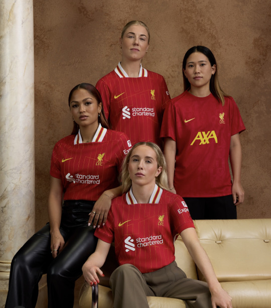
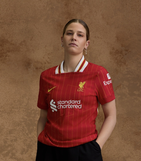
potentially a controversial opinion but this is Nice As Hell! i know a lot of people said the collars are ugly but like idk it’s kinda giving if you ask me. it’s bold, it’s a statement. i love retro. this is just a good kit. it’s doing bits without doing too much. simple, tasteful, plus a little subtle pizzazz with those jaunty ass stripes - werk it ladies!
plus this kit is made from recycled plastic bottles, nice job! save those turtles liverpool!
apparently the pattern spells out ynwa, which i’m totally Not seeing (maybe i misunderstood this). i’m getting a Y, and then like an H in there maybe? and then i’m just lost, so not sure you hit the mark with that one, but love you for trying! it’s a cool pattern regardless, so i’d maybe just ditch the whole symbolism jargon and stick with that. overall nice job guys - 9/10
bonus points for that prematch shirt, love the detailing on it very sexy top marks
2. Arsenal
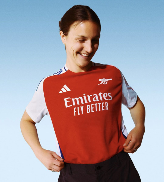

sorry arsenal fans, this shit is ugly as fuckkkkk - i’m not even being biased or trying to start fights (for once) it’s just like so hideous. i didn’t really like last season’s but compared to this that was a masterpiece. it’s so PLAIN! the weird red splodge is like not flattering at all and the blue? what’s that all about? also i fucking hate the back it looks like a used period pad, so hopefully the numbers fix that.
praying for your sakes you get a nice third kit or something bc this is ass.
also i’m a HATER for minimalist badge designs. this cannon logo makes the shirt look like a uniform for a museum volunteer. don’t get me wrong - arsenal is not the only culprit. what has a good old crest ever done to you? why do we hate maximalism? why do we hate fun? - 4/10
3. Manchester City
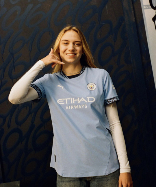
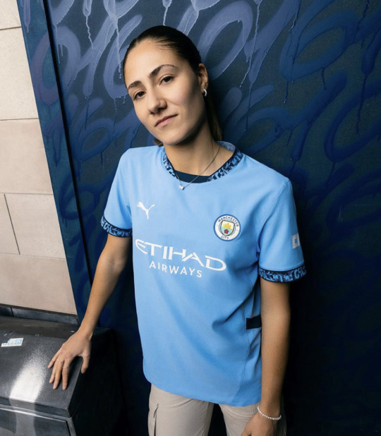
now this is fine. it’s just fine. it’s objectively nice, but it’s also objectively boring! as! fuck! the solid blue is clean but a little too flat. something looks off. it’s missing something. idk it’s nice ig, but it also seems identical to last season? if i saw these pics with no context i’d literally think it was from this year, but that’s the case with most top tier clubs it seems. have some fun guys! push the boat out! where’s the whimsy? but yeah anyway it’s alright.
at least they tried with the sleeves. allegedly they have the manchester dialling code 0161 on them but i mean - do they? do they really? because it looks like a bus seat to me. city fans decide for yourself i guess, because i for one won’t be getting close enough to a city shirt to look
it’s also made from recycled waste textiles so yay again! probably made from all the city shirts people threw out after they all but fucked the title 🤭 - 7/10
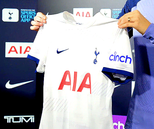
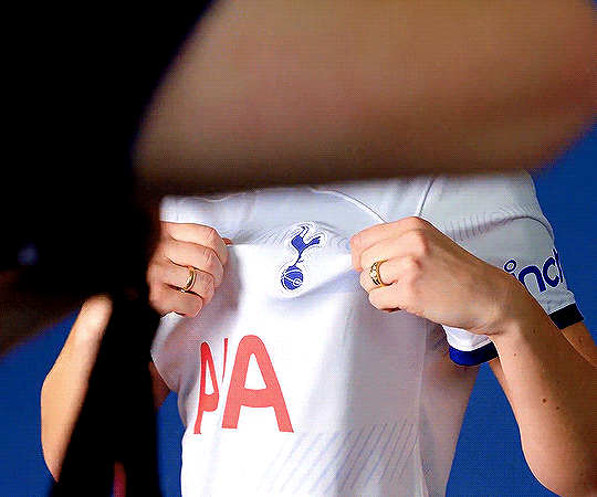
4. Tottenham Hotspur
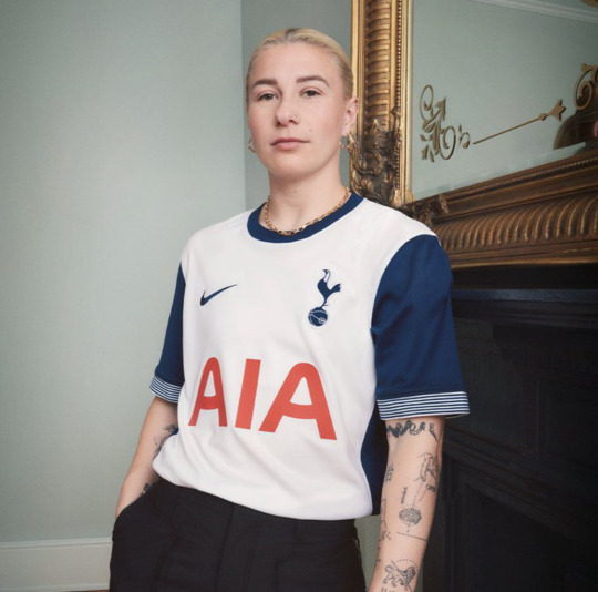
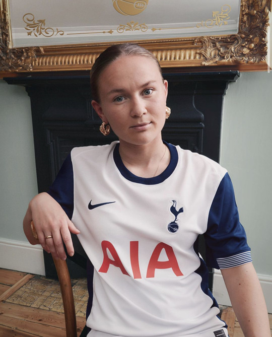
wow spurs this is nice. it’s just so clean, so crisp. my normal issue with spurs kits is their absolute undying commitment to being plain as fuck. they picked one colour, white - arguably the most boring colour of all, arguably even the total absence of colour - and stuck to it. this however? it’s simplicity done well. it’s still plain and simple, but in a gorgeous sexy way. those navy retro colourblock sleeves? stunning! the crispest white you’ve ever seen? stunning! the tiniest of sleeve embellishments? stunning! simplicity done well. it’s just so crispy. pleases my eye.
also huge respect to them for not jumping of the band wagon with the whole ‘every shirt must have ugly details with symbolic meaning we grasped at straws to come up with in order to do something new and edgy’. spurs said no! they said ‘oh this? yeah this is a football shirt. what does it mean? it means football shirt.’ thanks spurs, good job - 9.5/10
5. Crystal Palace
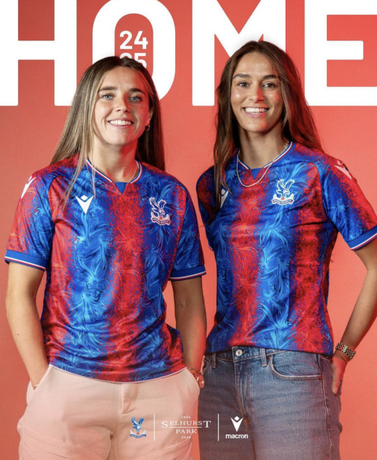
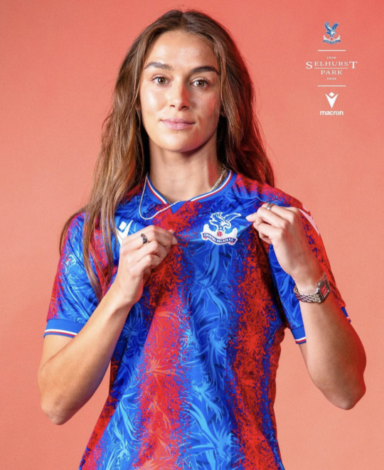
ummmm. now. hmm. uhh. what? this is, um, what? give me a second to get my thoughts in order. i don’t know what is happening here and i’m at a loss for words.
right. crystal palace. inaugural season in the wsl. making a statement. making a splash. right. here’s the thing. i’m always saying wsl kits are too boring. i’m always saying we want fun patterns and whimsy. i’m looking at this in genuine confusion because i actually do not know what is going on here. do i like it? not sure? do i hate it? also not sure?
i think i kind of like it? but i also kind of hate it? it’s insanely busy, it’s probably the most garish kit i’ve ever seen in my life. i think part of the problem is that the club doesn’t have a great colour palette to work from. it’s very bright. i do love the pattern of the eagle crest in the blue, that’s a huge win from me. it’s just those spray paint red splatters that’s throwing me off. it looks like they spent ages making a lovely blue eagle pattern and then remembered they needed red in there so just used the funky spray tools on microsoft paint to draw over the top. it’s giving shit cgi blood splatter in a low budget zombie film. it’s like the barcelona shirts if they were designed by a gcse art student on an acid trip.
the more i’m looking at it however, i’m kind of loving it? kinda camp i guess. this one could be a grower. i’m still confused. at least they’ll make a splash in the wsl - 6/10
6. Manchester United
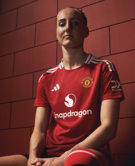
you’d think by now that i would have learnt to not get my hopes up with this club. remember the long long list of disappointments from yanited this season that i never shut up about? yeah, add this kit to that list.
listen it’s not awful. it’s not ugly, it’s not an eyesore. at the very least, it’s classic united. but it’s just so! bloody! dull! i’m literally falling asleep looking at it. it’s a t-shirt. its literally just a t-shirt. the problem is they set the bar too high last year, with that beautiful pattern and beautiful shade of red. and now, in proper united style, we’re straight back to mediocrity.
let’s talk details. oh wait, they aren’t ANY. there is nothing to say about this kit because there is nothing going ON with this kit. i like the white stripes. that’s it. theres the ombré red at the bottom, which is like- it’s okay. problem is - there’s like four too many shades of red on this shirt, and none of them are that nice. it needs a pattern or something! a pop! a little pizzazz! not a fan of the curved back panel, but it does look a whole lot better than arsenal’s at least.
this is absolutely nothing groundbreaking but it’s fine. it’s just so fucking plain. i know my girls will still serve in it, but i hoped for more. of course, in true united fashion: it’s the hope that kills you - 6/10
7. Chelsea


the tagline for this release is 'we burn blue', because 'the hottest part of the flame burns blue'. congrats on passing year seven chemistry guys. anyway, with that in mind, this kit is, naturally of course, patterned with a mystery blue LIQUID. im not seeing flames in any part of this kit. literally how is this meant to look like fire. this tagline is pure bollocks. it literally could not look more like water if it tried. aka, the opposite of fire.
the kit itself, i'm honestly struggling to form an opinion. i dont think i hate it, but i dont love it either. it may have been easier to figure out if i could actually SEE the kit in any of the release photos, instead of some stupid fucking slow motion blur effect. this pic makes mayra look like she's undergoing mitosis. poor girl's been through enough. it says a lot that in your official kit release you're actively preventing me from looking at the kit.
its not awful? i'm not a fan of these kind of realistic graphics on kits, just makes it look fake and cheap, but like, idk its kinda cool ig. the more i look the more i'm down with it. the colours are nice. its shiny. i'm glad we've gone for originality at least. patterns are fun. - 7.5/10
8. Brighton


i missed this release bc i saw the pictures and genuinely did not realise it was a different kit oops. i do feel bad for clubs who have committed to a striped kit because honestly there’s not really many ways you can play with that. but also that’s kind of their own fault. there’s really not much you can say about this. the sleeves are white this time… okay… there’s a faint pinstripe down each stripe… okayyy… yep that’s kind of it really.
it’s clean, it’s classic brighton, it’s a decent kit. there’s just genuinely nothing new about this. it’s fine. they just clearly couldn’t be bothered and i respect that. - 6/10
9. West Ham


okay we’re doing turtlenecks now apparently!! interesting choice!! i think it kinda looks fuckass silly but also i kind of like it actually. bit of fun innit. good stripes.
the rest of the kit is pretty mid. plainer than a toast sandwich. except for the sleeves! because this year, not only are they bringing in turtlenecks, west ham have decided to also bring in milkmaid sleeves! why is it like that? like is it just a weird bad fit or have they put a fucking elasticated band on? who’s idea was that? what is going on! also am i having a stroke or has the badge changed colour. because it looks fucking hideous. what did they do that for.
i do love the fact they did this shoot in a pub though. very funny. and the kit isn’t too bad. i like the stripes - 6/10
10. Leicester


this is the plainest most boring kit i have ever seen with my own two eyes. that is literally all i can say about this. boring. much like the city of leicester itself.
however - the women have a different kit sponsor to the men and i respect that so you can have one bonus point - 4/10
11. Everton


i’ll be totally honest - i wasn’t expecting everton to give me like the best kit of the bunch. this is the kit for me. i like this one a lot. castore may be mega shit quality but at least they don’t just copy paste all their kits.
i fucking love the pattern here. it’s subtle but it’s nice! and it’s different! we’re not doing any mad shit like chelsea, we’re not doing absolutely nothing at all like leicester. the perfect middle ground of the blue kits. the sponsor is hideous but i’m ignoring that. this is just lovely to look at. stylish, sleek. it’s giving high quality bus seats. this is no stagecoach, this is private hire only. i just love it. and then to top it all off, just the perfect amount of collar detailing. i would be a happy toffee if i was wearing this. gorgeous. loses half a point because the badge fell off during the game which is hysterical.- 9.5/10
12. Aston Villa

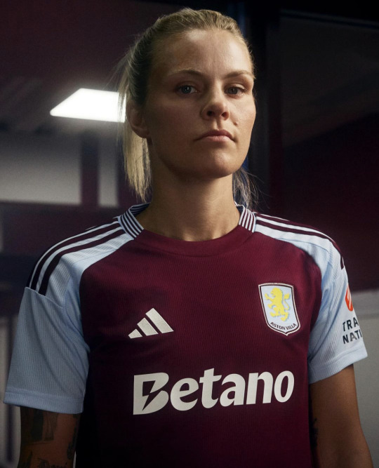
this is just the west ham kit if west ham were normal. it’s nothing to write home about, but i do like it. i like the block sleeves and the stripe colour. i like the subtle stripes down the side. i like the simplicity. i like the collar stripes. i even like the flat badge. also i’m assuming this is a betting sponsor which sucks but i do have to say that the sponsor looks great with this kit. it blends in, which is rare. this is a clean, classic kit, and i’m glad that at least one team could be normal. i don’t like that there’s pretty much nothing i can make fun of here. unfortunate for me, good for villa. good job - 8/10
note - all this was written as soon as each club released their kit, so some of my opinions have changed, and a lot have grown on me (looking at you united), but i’ve left the review untouched so you can get purely my honest first impression.
away, third and goalkeeper ratings are currently in progress so expect them once they've all been released! these posts literally never get any notes but i absolutely love doing them so i'm doing it anyway, but if you did wanna encourage me with some nice comments that wouldn't go amiss ;) xx
#hedge rates kits#awfc#cfcw#muwfc#avwfc#everton#manchester united#lwfc#lcwfc#whwfc#cpwfc#mcwfc#tottenham hotspur#thwfc#spurs women#rachel daly#maya le tissier#millie turner#mayra ramirez#anouk denton#alessia russo#lotte wubben moy#courtney nevin#saori takarada#beth england#jorelyn carabali#vicky losada#matilda vinberg#barclays wsl#wsl 24/25
32 notes
·
View notes
Note
The london swedes
https://www.instagram.com/p/C6WuFBzIp-Z/?igsh=MXgxY284czNwMjdqbQ==
and magda and frido 🥹

#the fact i notices magda before anyone else 😅#swewnt#woso#chelsea fcw#magdalena eriksson#zecira musovic#nathalie björn#fridolina rolfö#amanda nilden#amanda ilestedt#johanna rytting kaneryd#stina blackstenius#matilda vinberg
37 notes
·
View notes
Text
spurswomen | The four ‘Matildas’ together for the first time! 🤗
16 notes
·
View notes
Text

22 notes
·
View notes

Text


tilly 🤍
3 notes
·
View notes
Text
instagram
i think i just fell in love
2 notes
·
View notes
Text
hammarby 💚🤍
#kyra cooney-cross#matilda vinberg#courtney nevin#jonna andersson#elise kellond-knight#madelen janogy#auswnt#swewnt#australia vs sweden
1 note
·
View note
Text
Women's Transfer window
The women's transfer window in January is very busy at the time so Here we go
West ham are busy during the window they signed the Australian and Matildas Midfielder Katrina Gorry from the Swedish side Vittsjö meanwhile Canadian international Shelina Zadorsky on Loan from Spurs until the rest of the season the both of them will join Kristen Mewis who is recently join the Hammers in December from Gotham.
Also, Spurs are in a double swoop on this window where two former Vittsjö players the Matildas Star Charlie Grant and Swedish International Matilda Vinberg from Hammby.
Aston Villa had signed the Swiss international right back Noelle Maritz from Arsenal for a two and half deal.
Bristol City has signed a goalkeeper Shae Yañez from NWSL side San Diego Waves on a disclosure deal.
Chelsea are closing a deal on the Everton centre back Nathaile Bjorn will she be going to Merseyside to West London and now deal is done and now she is now a Chelsea player for a two year contract.
Entracht Frankfurt had announced the signing of the Japanese forward Remina Chiba.
Arsenal had signed U.S international player Emily Fox from the NWSL side North Carolina Courage
Transfer Rumor 😯
Lia Wälit to Real Madrid?- ATA football said that they had entered regarding talks on Arsenal midfielder Lia Wälit maybe and this transfer window or is possible maybe in the summer seems that might be exploring more interesting into a new adventure after her contract deal expires in the summer.
Real Madrid and PSG are really interest on Man United and England's number 1 Mary Earps but Arsenal are interested in the goalkeeper.
The source had said that the PSG left back Sakina Karchaoui but she is available for the summer but Barcelona are interested in her but PSG wants to extend her contract but it is up to her to decide.
Inter Milan are close to sign Bayern Munich Midfielder Lina Magull
Sorry guys I was busy with blogs about the men's transfer window so I will do every two weeks so I will do the following week I will do more women transfer window round up so deadline day for women transfer window is 31st of January so I will keep writing on it so I could get stuck on it.
Taglist ( is there any taglist just let me know)
@pernillecfcw, @wosovandedonk, @arsenalwfcwoso, @chelseafcwmemes, @pernillemagda, @hardersson4life, @sk-20, @wosoimagines @woso-dreamzzz, @wosobutfootball, @kastentatia, @kt-mccabe15, @alexbkrieger13, @samkerrworshipper, @wosoworldsthings , @wildbayou, @wileys-russo, @wosobanterzone @gurxreiten, @arsenalwoso11, @arsenalwfcaddicted @russos-one, @ilikecrowns,@kristies-mewis,
#transfer window#women soccer#woso#west ham wfc#aston villa women#tottenham hotspur women#wsl#nswl#frauen bundesliga#la liga f#woso community#fc bayern frauen
17 notes
·
View notes
Text
soooo.. transfer window update.
kristie mewis to west ham. shelina zadorsky to west ham. matilda vinberg to tottenham. mackenzie hawkesby to sydney fc. charli grant to tottenham.
what else do we expect to see??
4 notes
·
View notes
Note
Idk what Vinberg was doing saving the ball and lost her balance in the process but it looked smooth af

12 notes
·
View notes
Text

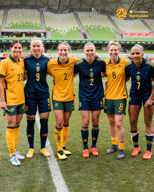
spurswomen | Matilda and a Matilda 🇦🇺
21 notes
·
View notes
Text


#madelen janogy#matilda vinberg#ellen gibson#hammarby if#hammarby fotboll#hammarby v norrkoping#november 11 2023#pm gifs#tw flashing
12 notes
·
View notes

Text


Spurs Women 2-1 Charlton Athletic Women | Pre-season friendly Jan 7 2024
📸: Spurs.com
#coys#spurs women#woso#tottenham hotspur women#grace clinton#tottenham hotspur#charli grant#jess naz#matilda vinberg
5 notes
·
View notes
Text
MY FAVS MASTERLIST 🪩
aggie beever-jones
🌷 day in the life
🎀 one bed
kenzie weir
coming soon…
leah williamson
coming soon…
matilda vinberg
coming soon…
naomi layzell
coming soon…
tara o’hanlon
coming soon…
1 note
·
View note
Last Seen Blogs

gaileyberry
Untitled

sodistinctlyhuman
caught between conscience and guilt

emilyruthgoeslala-blog
My random ramblings!

homemadexraymachine
home made x-ray machine

nainaa1
Untitled