#maybe i could edit more colour palettes ^_^
Photo

hot off the presses with some more edits of badland rumbles wolfwood because its CRIMINAL how dirty they did him.
#trigun#trigun badlands rumble#nicholas d wolfwood#ill continue doing these edits if people like them i love editing things#maybe i could edit more colour palettes ^_^#mine#hes everything to mei l ove his whiskers
199 notes
·
View notes
Text
Was asked about the Cave Story transition effect, wether or not it can work on the SEGA Mega Drive / Genesis, here's an attempt at it.
Read more for an indepth explanation why this isn't so easy and why it still looks weird:
So the backstory was that, as I was watching someone play a bit of this Cave Story homebrew for the Mega Drive, we've noticed that all transitions were palette fades rather than the usual Diamond effect, and so I explained why the effect is much harder to pull off than one would expect it:

This is the animation itself, 16 frames in length repeated for the whole screen, rather simple and something you might(?) expect from an older game but in reality it's a lot more difficult to pull off.
If it were a 8x8 sized animation, this wouldn't be a big issue, you'd just write over every single tile in VRAM for the tileset and fill it in, no problem, Streets of Rage does this in the credits sequence and title as a fade in.
But since we're dealing with a 16x16 pattern, we cna't do this, at least not without curating the tilemap to be friendly for such an effect, which would limit map editing a lot.
So we have another choice, which is to sacrifice one of the available layers for the transition alone. One could sacrifice one of the tilemap layers but unless the other layer's already filling the screen, this would be too noticeable. One could fade the colours for that layer in particular and then overwrite it with the tiles, but ya may as well be doing a full fade at that point, especially if you're intending to use more than one palette for the layers... so i went with an even worse solution: Sprites.
As it turns out, you can just barely fit an entire screen with just sprites, the biggest size you can have is 32x32 and it takes 80 of them to fill the entire 320x224 (NTSC) / 320x240 (PAL) screen area.

The sprite limit is exactly 80 sprites so the sprite table will be filled up with just the transition effect alone.
Now one might think "Hey, the sprite limit for any given horizontal line is 20 sprites and it only takes 10 sprites to fill the screen horizontally, can't we just move the sprites vertically every 32nd scanline? I thought of that too! but there's unfortunately another limit, a Sprite pixel limit.
You can only have 320px of sprites at any given horizontal line, meaning even with free slots, there are too many sprites already on screen so this isn't going to work, there's no way around it.
Now, one could swap between a 16x16 sized version during the start and swap to the 32x32 sized ones after hitting the threshhold to bypass this issue... quite honestly I didn't think of that at the time, it would halve the px limit and should make it near seamless, definitely something I'd like to workshop in the future!
Sure, all sprites will disappear halfway through the transition, but at that point most of the view will already be blocked by the effect so you're ideally not going to notice this happening.
EDIT : Only now am I told that Cave Story has different kinds of transitions depending on doorways and such, maybe giving me more than just the file for the transition for context for someone who didn't grow up playing Cave Story would be nice x.x
#sonic hack#sonic the hedgehog#rom hack#rom hacking#cave story#asm#assembly#m68k#sega genesis#sega mega drive#mega drive#sega
35 notes
·
View notes
Text
Heizou from the arranged marriage au - again, by @throwingstuffhere, very inspiring, thank you
Ayato here for emotional support (and as a point of reference)
some thoughts on that under the cut (and close ups of the coloured Heizous)
i talked previously about this a bit, so there are going to be things i've said previously and a couple of new thoughts. but mostly just rambling
the design choices were made as if Heizou was an in-game character who frequently fights but still needs to look presentable
i’m still on the hakama pants for Heizou, and if not that, he’d probably ask to make the trousers loose (like slacks maybe), with all the splits Heizou can do they’d tear otherwise, unless the material is more flexible than how it looks on Ayato. but quite frankly they look just like normal ones, if a bit more expensive
i am, in fact, speaking from personal experience, dress trousers are very likely to tear if you try kicking something high above your waist level - especially if it's more than once, and i don’t imagine Heizou is very careful about this, and i think he’s used to more freedom in his leg work, or any body part actually, he has a lot of skin showing
as for everything else: it's pending, really.
the vision could be both on his right hip - just like Ayato, or his left one - sort of like it used to be, and mirroring Ayato and also kind of completing the Kamisato's vision placements: Ayato and Thoma on the right hip, Ayaka on her back and Heizou on his left. i also could be reading too much into things (or i'm actually not reading into this enough and it's very important for the characters where they place their visions: like how important their vision is to them, or there's symbolism of the placement, or it's just pure aesthetics)
i had half a mind to put Heizou in a pair of dancing shoes. they look so funky - i have no idea if they are comfortable or not and they look like they could slip off at any moment. for the record i am not planning on putting him in a pair of funky dancing shoes (for now)
tbh i didn't think too much about his footwear previously, i just thought to put him in some dress shoes like Ayato, even if those are not particularly comfortable - but it would be more painful if he delivers some sick kicks: physics of pressure, with the area being smaller and the force staying the same and all that
he could also go with geta (or sandals?) like Ayaka - which would also make sense. Ayato's job requires him to sit a lot so naturally he doesn't walk too much for the shoes to cause him any trouble, but if we're going with the assumption that Heizou tends to work best on foot (old habits die hard, you see), then he'd be miserable if he wore the shoes all the time. counterpoint, however, is that i don't want to draw toes, and i am a coward
also the coloured designs are what i'd consider his formal outfit: as far as my research goes, yukatas (which Heizou usually wears in the au from what i can tell) tend to be worn for less formal events, and it's at the very least not customary to wear yukatas under hakama pants, so..
also also it has been a while since i’ve properly worked with colour so i am extremely unsure how I want this to look, that is why there are two sets of colours of each design. and i don't even think i'm satisfied with that? and obviously the outfit can be a combination of the two styles, i just threw things at the wall to see what sticks
the first version is based on the one i've made previously, with some minor changes, like the Anemo inspired print on the pants and on the inside of the cloak (i don't know if it is noticable, there are sakura petals as well), and the arm guards (also yes, the red does not look very good on him, i just wanted to add something different, spice things up a little). and yes, i still imagine Heizou magically discarding the cloak when he attacks
(edit) additionally, Heizou with more blue in his palette:

the second one is very heavily leaning on Ayato's design, with less layers, loose trousers and a western shirt underneath. this one was done mostly to test out the coat and the trousers
and lastly: i'm not a historian or a fashion designer or a historian fashion expert. i have no idea what i'm doing other than looking at all the pictures available on the internet and drawing inspiration from that
and @raccoonwithacoffeeproblem, if you wish to see it
#arranged marriage au#heizou#shikanoin heizou#ayahei#genshin impact au#will think on it#notecapn art#i guess that is a tag now#hes used to freedom unless its neck lol i have no clue how to integrate the collar (the choker? whatever its called)#i dont think he needs it to be honest but i also kind of think it’d be funny if he left it on. the scandal#why does he wear it anyway? fanservice? i mean it makes him visually more interesting ig#considering the top half of his design looks a lot less detailed than the bottom half. esp without it. it makes sense really#but still it does his reception as a character no good#the fandom at large is convinced hes “sus”#on a completely unrelated note#i need to throw more rope on him#- in a “its a signature element of any inazuman character” way#i swear im not trying to be crass#but it is sort of hysterical#i am not using csp for this one. its procreate this time#i want to draw characters interacting but im stuck here help#started sketching this out after drinking for a bit so dont take it too seriously
21 notes
·
View notes
Text
EDIT: thanks for the likes, comments, and reblogs! I am planning on doing an analysis on each of Schmendrick’s spinoff novelettes, since every single one of them adds layers to his character. I have a huge soft spot for movie-Schmendrick - he is the cutest patatino ever - but unfortunately he lacks most of the depth book-Schmendrick has.
“The Green-Eyed Boy” analysis. Was Schmendrick a neglected child?
Though it’s – maybe - not one of Peter Beagle’s masterpieces, I still think “The Green-Eyed Boy” does a perfect job in its shortness (it’s not even 20 pages long) in portraying Schmendrick’s character and in explaining his behaviour not only in the short novel itself, but also in the other works that feature Schmendrick, being them the ones that predate it (like “The Last Unicorn”) or subsequent ones.
“The Green-Eyed Boy” is a short story about Schmendrick’s apprenticeship with Nikos, the narrating voice of the novelette, and it opens the short tales’ collection “The Overneath,” which includes another Schmendrick’ story, “Schmendrick Alone.” Even though the latter it’s another interesting portray of the magician, “The Green-Eyed Boy” seems to be much more poignant when it comes to explain where Schmendrick comes from and why he acts the way he does.
GREEN EYES

Despite most people would remember Schmendrick’s movie-version, where he has light teal eyes - most possibly due to the overall blue palette of the movie, which would have made the colour green too much of a distraction, but at the same time his clear eyes make a nice contrast with the overall dark tone of the movie – he is described in the book version as having bright, almond-shaped green eyes. It is those green eyes that are his most defining characteristic (rather than his large nose, which it is still mentioned in the novelette but it’s not as notable as in the movie), hence the title itself. But, even though they immediately catch Nikos’ attention and are what ultimately make him decide to take Schmendrick as an apprentice, they seem to be more as a stigma than else, as Nikos mentions: “I don’t know where he got them” … “but no one in his family ever had eyes like those.” Immediately, Schmendrick is presented as separate from his family. His most striking feature is what cuts him off from them, doesn’t matter where the eyes come from. He is different, visibly different, and he is treated as such.
SCHMENDRICK’S PARENTS
What follows next it’s Nikos meeting with Schmendrick. Or, more precisely, Nikos interacting with the boy’s father while the latter gets abandoned at his place. Schmendrick’s father is immediately presented as a rough man, obsessed with his work to the point that he could only measure his kids’ worth with how much they could help with the cooperage. He never directly addresses Schmendrik – except for when he leaves, where he simply gives him a slap on the head and tells him to work hard – and he is always dismissive, when not downright emotionally abusive, calling Schmendrick – who, let’s not forget, is twelve years old in the novel – “useless”, commenting how he cannot help with any of the family's trade, his uncles' included. He does not allow Schmendrick to talk on his own, not even when the boy has to tell his name, and argues with Nikos when he does not accept any fee, in fear that the wizard would send the boy back home.
There’s plenty of information – if indirect – about Schmendrick’s mother as well. She is never seen, only mentioned. In “The Last Unicorn” it is played for laughs, when a very drunk Schmendrick interrupts the head of a cursed village to comment how his mother never liked him. Here it seems clear that his mother has put a lot of expectations on him since his birth, giving him a high-sounding name (“… which was the name of an ancient hero, best remembered for slaying a many-headed sea monster, but dying himself in the battle.”), a name his father immediately objects on, commenting on how it was his wife insisting on giving the baby boy such name. Yet, she is nowhere to be seen, even though Schmendrick’s father comments that she “sends love.” She will never visit Schmendrick, as if he is something she wishes to forget, a boy she put many expectations on which he then failed to comply. I would not be surprised if she is the one who has begun to call the child Schmendrick, a name the boy is so used to that he would not answer any other, as he himself admits, bitterly aware of the meaning and implications of such nickname.
NEGLECT
Schmendrick, as already said, seems bitterly and acutely aware of his nickname, to the point that he can give Nikos a way too much accurate definition of it (“The boy who is sent to do a man’s job” … “The person utterly out of his depth, far beyond his pitiful capacities.”). Nikos himself is shaken both by the name itself and Schmendrick’s self-contempt. There is another one key element, though. This is the first time Schmendrick speaks. And he speaks clearly, with a pretty articulate vocabulary for a boy his age. Until now he has kept quiet, staring in front of himself, apparently even unable to tell his own name without his father’s intervention. It might sound counterintuitive until you realize that Schmendrick is simply doing what most neglected and emotionally abused children do to keep safe: he is trying to avoid to attract attention on himself. Until his father speaks, Schmendrick keeps quiet, staring at nothing, and acts anxious when he is addressed with a question, even if said question is as simple as “What are you called, boy?” He knows far too well – and Nikos notices too – that if he attracts attention, he will get insulted or dismissed as a fool, so he prefers to stay silent. More painfully, he keeps quiet until his father leaves. Only then he speaks freely, in front of a stranger – a potentially scary stranger, being Nikos a wizard.
Immediately after, Nikos comments that all he has done for Schmendrick for the first days was feeding him, musing that maybe his parents had not given him enough food. Schmendrick, still in Nikos’ words, seems to be overly focused on food for a while, something that it’s hinted even later in the story as one thing that might stop Schmendrick from leaving after he has caused a mess with magic (“Go, put your things away and see what’s left of yesterday’s potato stew.”). Given that Schmendrick’s dad seems to be pretty obsessed over work and that Schmendrick’s two (or three, since “Schmendrick Alone” mentions three brothers, but it might be just a mistake since the story is a few years following “The Green-Eyed Boy”) older brothers are said to be trained to take over the cooperage, it is perfectly plausible that Schmendrick, being seen as the most “useless” and expendable child, is given less food, to the point that, at twelve, Nikos is even convinced that the boy has been starved and it is canon that also adult Schmendrick has a very thin frame. Might it be a consequence from childhood, when he was so used to be hungry that he is not bothered by feeling it? In “The Woman Who Married The Man In The Moon” – which is by far the darkest among Schmendrick’s short stories – he is about to refuse Sairey’s invite to dinner, before he accepts and comments: “Many thanks. I sometimes forget that I am hungry.” This might be a clue that Schmendrick is used to hunger pains, both because of his vagrant lifestyle and his childhood.
SCHMENDRICK’S APPRENTICESHIP
Aside from mourning on Schmendrick’s difficulties and mistakes, Nikos is extremely adamant that his student was a hardworking, smart, and mindful one. Schmendrick studies an awful lot and practices incessantly, giving the reader a much different portrait of him from the one anticipated by his father. The boy is far from stupid, and he seems to be – even though Nikos never says it directly, only hinting it through sentences that inform the reader that he had let Schmendrick the run of his private library, or that Schmendrick was an extremely attentive student who not only understood but also could elaborate the lessons – the best student the old wizard has ever had, aside from the natural power Nikos had sensed. Schmendrick is capable and clever, as other stories hint (it is said that he is quite good with riddles and charades, can cipher, knows multiple languages and is wise beyond his years), still it is his motivation to do all this that seems to be his worst hinderance. Schmendrick does see the underlying theme of magic, he knows that nothing is forever, and everything yearns to be something else. So it is his desire. He has been seen as a worthless fool for all his life, and now he wants to be seen as something different, more powerful, and more respectable, such as a wizard just like Nikos (a sentiment that it’s much better portrayed in “Schmendrick Alone,” where a 19yo Schmendrick constantly thinks about what Nikos would - or wouldn’t - do or say, in the circumstances he finds himself into, to the point he even conciously mimicks some of his tutor's mannerisms). Schmendrick is doing the right thing for the wrong reasons, wanting to prove others and himself who he really is and what he is capable of. His most annoying, and notable, characteristic in “The Last Unicorn” is his attention-seeking demeanour and his tendency to brag to whomever interacts with him long enough to let him do so. He alternates moments of incredible wisdom with comical lack of style which are only apparently at odds. Schmendrick is a very smart and capable individual who yearns for praise and attention, a child who has always been measured for what he is not able to do instead of his real capacities. This, however, in a twisted self-fulfilling prophecy, is exactly what makes difficult for him to perform magic, despite all his genuine effort. He sees magical talent as instrumental for him to be recognized – to be seen, and this is what it’s causing him so much trouble and failure.
SARDANA
In the last pages of the novelette, the reader is introduced to the only (acquired) family member who comes to visit Schmendrick, to “see if he was happy and treated well,” an apparently throwaway sentence that it’s instead very telling about Schmendrick’s parents and brothers’ consideration of him, since they have apparently forgotten about him or do not care how he is doing. Sardana is one of Schmendrick’s brothers (the middle son, from what it’s told in the story, which lets us know that Schmendrick has at least two adult brothers while he is still a child) wife and she is very vocal about her worries about Schmendrick. She too has felt an outcast in the cooper’s household - since, as she says, hers was a combined marriage for business reasons - and Schmendrick was the only one who was good to her. Not much else is said about their bond, but it is safe to say that young Schmendrick has seen himself mirrored in poor Sardana. Later, it becomes apparent that Schmendrick, who should be 13 or 14 years old around this time, has a strong infatuation for Sardana. This is extremely telling. Schmendrick, who has never received love or, simply, care and affection, is unable to tell the difference between romantic love and platonic love. He mistakes Sardana’s concern with love, a very common reaction among people who had been emotionally neglected and abused, who might think that the person caring about them is in love or become extremely clingy to those who show affection to them. Very telling is Schmendrick’s reactions. He pesters Nikos for guidance on what to do for Sardana. Schmendrick has been considered a helpless fool until now and puts his personal value in what he can do, not who he is. He cannot think that Sardana might appreciate him for him – which she does – but only for what he might be able to do for her, which will lead him to perform a very dangerous spell that might cost him his sanity.
ESCAPISM

Another thing that can be inferred from “The Green-Eyed Boy” is very covert in the story itself, but it gets clearer in every other Schmendrick’s spin-off short story. In “The Last Unicorn” Schmendrick is the character who appears to be the most genre-savvy about stories and fairytales, while in other novelettes, especially in “The Woman Who Married The Man In The Moon,” it’s obvious that he possesses a wealth of tales he tells others or himself. Most importantly, in the same novelette, he tells these stories right in the moment in which other characters need comfort and soothing, being them lost and confused children or a grieving widow. This might be a sign that Schmendrick is well into the habit of escapism, which might have begun from a young age. Being a lonely child, neglected by his family and – safe to assume from a comment from Nikos – bullied by the rest of the townsfolk, it is very likely that child Schmendrick might have begun to read and invent stories he then told to himself to keep himself company. As previously said, Schmendrick appears to have the tendency to space often in “The Green-Eyed Boy”. While his family considers this a sign that he might be just a simpleton or tossed in the head, it might also mean that he is dissociating from the situation – in “The Green-Eyed Boy” Schmendrick is shown to do that right when his father is insulting him. His might be a coping mechanism to feel less alone and to protect himself when others attack him.
#The Last Unicorn#tlu#schmendrick#schmendrick the magician#the green eyed boy#peterbeagle#schmendrick novelettes#schmendrick spinoffs#schmendrick analysis#child neglect#emotional abuse#review and analysis#schmendrick's childhood#I work with abused children#and they painfully share many characteristics#schmendrick was definitively a neglected child
40 notes
·
View notes
Text


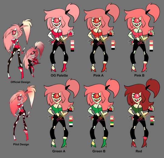

As a "fun" design exercise I decided to mess with the Hazbin characters' designs... Not really "redesigns," but more so "refined-designs"-- Keeping their overall look or "essence" while trying to simplify them and clean up their colour palettes, as well as making sure they all look distinct from one another.
I tried to stick close to the original's style but I couldn't help using thick lines, lol. Along with the simplified shapes, it gives them an early 2000s cartoon vibe I think.
For the colours I tried giving them more unique palettes, as well as making sure that they had enough contrast (the colour value of this show tends to be... not great). Also the lineup at the bottom isn't my final selection, it's just a selection to get a better idea of how they all might look together side-by-side.
Eh, tell me what you think. I could keep editing these but like, I'm tired of looking at them lol. More info on each design (plus a speedpaint) under the cut. It gets wordy, sorry.
Charlie: Not much to say besides she needs more contrast in her colours. I changed her shirt to the same colour as her corneas (yellow) so it doesn't blend in with her skin. I wish her eyes were still black (not only does it bring better attention to her face, but it works better with the idea that she's a doll-- yknow, painted on eyes? Does that make sense lol). In retrospect, maybe it would've been good to try some browns with her colours? Idk. I kept her red since she's the princess of Hell, and Hell's main colour seems to be red. Oh also, I gave her some lines on her face and hands just to make her look more like a puppet/doll. The rest of her body would have the same kind of joints/segments.
Vaggie: Ok I know her hair technically looks more moth-like in her og redesign but... it just seems like too much? Yknow? It's kind of outrageous. Idk how well my solution works but I tried simplifying it. I simplified her bow as well and made her stockings more like leggings. Her X-eye now hides behind her hair. Her gloves are shorter. Also I took away that thing around her waist that.... seems to be a different colour than everything else??? Idk what's up with that. Sorry I took away her feet. I tried out some blue and purple with her, I think it looks nice. Only thought about keeping the red bow because I thought maybe it'll match her with Charlie. Also sorry I took away her boobs 💀💀💀
Angel Dust: So unsure about how I drew him... Specifically, his 2nd set of arms looks so floppy and tacked on, and his legs... Idk I'm not great at digitigrade legs but I'm pretty sure that's officially what kind of legs he has. His head is weird. I think I got the idea of giving him big feet from Meppity's redesign video (her redesigns are some of my faves). I took away his bowtie because... too many of these guys have bowties, and he already has a choker too. Also I had the funny idea of all the Hotel employees wearing bowties/bows of some sort, and Angel is a patron but not an employee... Anyway. Kept his gold tooth to link him to Val (who also has a gold tooth), and kept the dots under his eyes since I THINK they're supposed to be representative of his spider eyes? They can be taken away if need be, though. His gloves don't go all the way up and kind of look like dish-washing gloves again but, the way his gloves go all the way up and his sleeves go into them... it just looks so weird to me. Idk, maybe I should've just given him shorter sleeves, or even no sleeves at all 🤔 And honestly I still have no idea what's going on with his pants. Are they short-shorts? Underwear? Didn't change them anyway. For the colours, I made sure all his gloves were the same colour (still don't know WHY they decided to make his 2nd set not only a different colour, but the SAME colour as his skin/fur????). Turned down the saturation on his hot-pink, and gave his right eye the light pink instead of that almost-black colour (still kept his eyes different colours because I remember seeing a really old sketch page of Angel that insinuated that there was a reason for his eye being black). Made some of the darker parts straight-black just because I've been using that in all the other character's palettes, but this can be changed to his almost-black colour. Also tried a more purple palette to get away from all the pink, kinda really like it.
Alastor: I originally tried his coat with coattails, but wasn't sure about it and made it the original shape. Took away his monocle because fuck that it's unnecessary and clutters his face. Made his antlers bigger. Swapped out his shirt collar to be like the one Charlie's og redesign has, because the way it goes all the way up like that gets on my nerves? Idk maybe I just don't know anything about fashion design but it doesn't scream 30's-suit to me. You could probably take away the collar, though. I wanted to try a lot of darker colours for his palette since he's like... kinda the bad guy. Dark colours would work well for him. I'm worried about his arms getting lost in the black of his coat, but that's why his cuffs and hands are a different colour. Really wanted to give him more than just red so I spread out the yellow of his teeth; I like how it looks for his shirt, it also works well with his eyes to draw you towards his face. I also tried to (again) lessen the saturation of his reds and pushed them more towards orange to better match the yellow. Kept all the brighter colours to his upper body to keep your eyes there, too.
Husk: I think Husk was one of my least favorite designs when the pilot came out because he's a real mess of detail. His wings are the worst. His redesign isn't much better (like dawg why's he got these random-ass hearts everywhere). Simplified his wings to just have some circles and rounded shapes. Kept some heart shapes (like his nose, bowtie, and paws) but added a couple diamond shapes, too (mainly his suspender buttons and the shape of his white chest-fur). Really wanted to have more blatant club and spade shapes too (to add to the poker theme), but didn't want it to get crowed and decided the rest of the rounded and heart shapes worked well enough. Made his eyebrows shorter and more square-shaped. Didn't have many ideas for colours but knew that I wanted to try some oranges and yellows. Made his eyebrows a darker colour, and changed his eyes to yellow corneas with black pupils. Stands out more that way, I think.
Niffty: Did you know her name is spelled with two Fs? I didn't. I don't like it... Anywayyyy. Swirled her hair a little more, and took the yellow streak out. Added some fluff under her dress just to match her apron. Kept the dots on her shirt (though there are only two now instead of three) because I'm assuming it'll make sense later (like idk maybe she was shot to death and that's what they represent), but I wonder if you can take those away for a cleaner design? Gave her more rounded shapes. I said before that all the Hotel employees would have bows/bowties of some sort for these designs: Niffty's would be her handkerchief (yknow, it's tied into a bow in the back? That works right...? Eh.) I took away her cheekmarks 1) to clear up her face and 2) to make Charlie's cheek marks seem more unique and doll-like. For Niffty's colours, I (again) turned down the saturation on her pink. I wanted to try using some green and purple on her, since her inspirations include B-movie aliens and the song One-Eyed, One-Horned, Flying Purple People Eater. Tried using different colours for her skin, since a lot of characters in Hazbin have white skin, and for Niffty specifically I think the white skin along with her white apron dries-out her look (if that makes sense?) Though I do agree her having yellow skin is NOT good if she really does end up being Japanese. I think pink skin works well for her, though. Oh! And again, it helps make Charlie's design more unique with her white skin, making her seem more porcelain. I made Niffty's eyes yellow like her teeth, and then used the same colour for her apron to unify the palette.
Cherri: Ok Cherri's design was my ABSOLUTE least favorite from the pilot, too many senseless details I HATE her ripped pants. So hard to look at. Idk if you noticed in the time lapse but I had to re-sketch Cherri because 1) her pose was too similar to Niffty's (I was making their poses similar to their official art) and 2) her hair was giving me trouble... I kinda hate how her hair hovers to the side like that? Tried re-shaping her hair and now it looks like she uses a TON of hairspray or something, lol. Took away her tattoo but kept her freckles. Took away the skirt thing(?) she's got on her pants. Took the symbol off her shirt, but added an X to her pants (can be taken away, though). Simplified the rips on her pants to just be ripped knees. put a heel on her left shoe so she doesn't look unbalanced/uncomfortable. Made her gloves shorter. For colours, I again took away her white skin for the same reason I took away Niffty's white skin (less "dried out" palette and makes Charlie look more unique/porcelain). Afaik Cherri's not Asian so yellow skin could work for her, though I also tried green skin. Since one of her themes is cherries I wanted to use reds, pinks, greens, and blacks. I tried some green for her clothes (and again her skin), and also turned some of her pinks more red. Made her hair darker for more contrast, and tried using some red for her hair instead of pink (I like the pink hair, but again... red like cherries). In general her colour palette was the hardest to figure out but I think I found some interesting things.
Sir Pentious: Sir Pent was my 2nd least-favorite pilot design by only a little 🤏. It's all his eyes. He's very hard to look at. I took away all the eyes on his tail, and turned down the saturation on the rest of the eyes EXCEPT the ones on his face (maybe I should have just made those reds much different colours, but it still looks a lot better with just the saturation down). Took away his stupid-ass goggles and made the face on his hat a lot simpler (combined the mouth with the hat band; it can still emote btw). Replaced his bowtie with... *quick google search* A jabot? It's supposed to be a jabot I think. I think that's what it's called. More 1700s than 1800s, but eh. Maybe I should've given him *quick google search* a cravat maybe??? Eh, eh, not a fashion expert but anyway. I thickened his mid-section so it eases into his tail better because, the way it is in the official design it always made him look like a slug to me? I looks too... squishy. Banana-slug-lookin' ass Also took away his red-tipped claws and made them straight black. For his colours, I think the grey and yellow works for him already, though I do wanna see how he'd look with more green or blue. Most of what I did colour-wise was the eyes, but also his suit; still grey, but trying both darker colours and pushing it more towards blue and purple. I wonder if I made his skin a little too dark? Is it kinda hard to see his features? Idk. Idk how I feel about these colours. Bleh.
#illustration#character design#hazbin hotel#hazbin critical#redesign#csp#clip studio paint#fanart#fan art#veez art
76 notes
·
View notes
Text


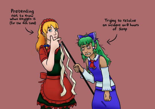
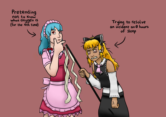
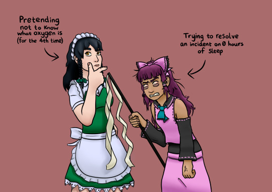
Awawawawa! More Touhou art! And more palette swaps!!!
This is a fun piece. I haven't had a lot of spoons for drawing for a while but I've been whittling away at this over the span of over a month, and I'm proud of how it turned out!
This was partly inspired by this post, but funnily enough I only remembered it after I'd done a lot of work on this piece's sketch. Sakuya has learned what oxygen is at least twice throughout Touhou, and personally I think she's just fucking with people. Coupling that with Reimu's more surly attitude and overworkedness felt fundamentally right to me. They would totally do this.
My bestie @banmitbandit also helped me out when I couldn't figure out what to do with Reimu's head angle and facial expression so give them a thanks! Go into their askbox and say "thanks", do it now!
I also wanted to do palette swaps again! I freaking love palette swaps, I want to make that my whole brand at this point. The second image is based off of their alt costumes in Phantasmagoria of Flower View, the rest of Sakuya's are from Hisoutensoku, which I actually downloaded just so I could get a better look at the sprites. The pictures on the Touhou Wiki don't actually show Sakuya's braids or her eye colour so I had to go straight to the source. Her appearance is remeniscent of Remilia, Youmu, and maybe Flandre?
Reimu's appearance in the third image is more or less a straight translation of one of her alts from that game, it's very similar to Sanae, who I don't know that much about but seems to be something of a foil to Reimu. The other two alts of her I made myself! One is supposed to look like Marisa, the other is just that I saw a pink alt of Reimu from Antinomy of Common Flowers (by the way, I had no idea before that Sakuya wasn't in that game! That feels so weird!) and I wanted to do something cool with pink! I like pink, I think it's the best colour. I was thinking of doing more, but actually I kind of borked up the whole process with the coloured lines on Reimu's outfit, merged it with the regular lines layer, and also hit that layer with a gaussian blur making it *very* difficult to edit it and the lines. Marisa Reimu and Pink Reimu's lines were very involved, I had to make multiple correction layers to change the colours. If you notice, Reimu's eyebrow on the first image is different (and IMO better) than the others, that's also because I wasn't watching and holding onto my layers properly.
I'm still super proud of this piece! Art is inherently good to create, and though I can't do much at the moment but rest, I'm proud I could get this in there a little at a time.I hope you have a safe weekend! Much love! <3
#art#my art#artists on tumblr#drawing#reimu hakurei#blue reimu#beimu#beimu gang rise up#sakuya izayoi#touhou project#touhou#clip studio art#digital art#alternate costume#alt costumes#palette swap#touhou fanart#2hu#fanart#fanart friday
17 notes
·
View notes
Text
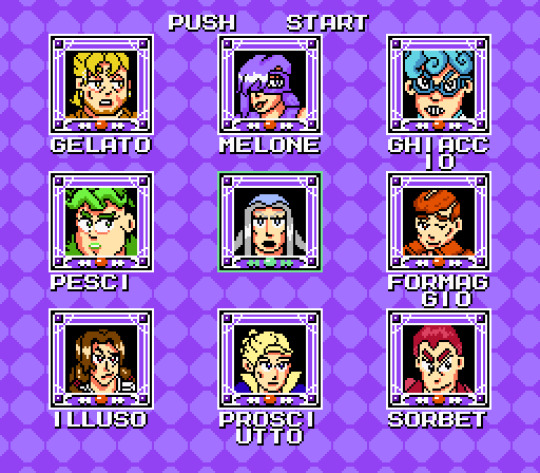

(Edit of Mega Man 3 Stage Select Screen. Inspiration also taken from PS1 Jojo fighting game and other Mega Man games).
When everyone in La Squadra Escuzioni get overtaken by hypnosis stand, it is up to the unexpected help from different part of Passione to help them. Can he rise to the fact, considering his non-offensive stand? (Wow I sure hope he can!)
notes under the keep reading
This was pre state exam project - one of them and I wanted to finish them now. I am disapointed by how this turned out in the end. That is because I am a big idiot and do NOT KNOW THE TECH DETAILS.
As far as I understand it sprites can only have 3 colours plus transparent and each sprite is assigned one of four palettes. Mega Man used special technique to make sort of a hybrid sprite that could have more. The way it looks is nicely laid out on https://www.spriters-resource.com/nes/mm3/sheet/40171/ (thank god for this site lol). I managed to get into 6 colours with everypony but man was it a squeeze.
But then I actually ACTUALLY learned about NES limit of 4 palettes for sprites and four palettes for bg and man I was crushed. It is. understandable I missed it the first time but :( I don't have time to work on this anymore and it was not real game anyway so? If I make it in NES dev kit or something I will think about how to do it but this is just stupid edit. I still wanted it to be vaguely technologically possible so it makes me sad.
Also my redesign for frames reads way worse than the elegant original one but I did not know what to do? And to be fair I am bad with lighting still so I couldnt not stimulate cool 3d effects.
Overall I am really sad this did not work out and pretty mad that I missed the big red flag of same palette for sprite!!! same palette for sprite (which explains why half of the robot mastets are fucking BLUE). But it was fun and I hope it looks fine. Maybe I will animate it as a proper selection screen.
#jojo's bizarre adventure#pixel art#edit#la squadra#nes limitations make me wanna cry ejdjenjwnfnjwef half of the colours are ugly too#leone abbacchio#cw: blood
9 notes
·
View notes
Text
Shooting star emoji review: an special episode.

Apple: smooth trail and a superb decision to include a picture frame. The background is a yellow star utopia. This picture could belong to a lavish fairytale house with a good view of life and challenges. Happiness-inducing not too realistic star but I still love this example. Is it going through a cloud or is just the big shine of the curious twinkle star? 9/10

Google: Gets the indigo elegance right. It’s like hyacinth, vivid and mollifier. The meteoroid is sorrounded by sparkly stars and blue-ish wonders. Is the trail a crystal structure and maybe this is artificial? 6/10

Samsung: good-looking starry emoji and the meteoroid has a big white gleam exposing! Its smoothly detailed border makes this look like an app icon. You could edit it to make it an icon! The stars are a little translucent, but they look cool! The trail is fading out leaving a beautifully colored golden treasure. 8/10

Microsoft: artless, dumb-looking star with an absolutely big spotlight. not even a single tear of love and passion was put into this. no good stars, where’s the magic? Is the purple background the only magical thing about this? 2/10

WhatsApp: What a grandiose night and starry sky with a aesthetically pleasing gradient that it makes it look like it’s coming to some unknown city! The colors harmonize flawlessly with a subtlety detailed color palette which makes the viewer think this is an enchanting bliss! The big Apple’s sibling! 10/10

Twitter: it’s literally day period in this emoji. Are you seriously going to scare people with your shameful morality? Insufficient effort and love. This star has got some serious thoughts, it makes me think “I can’t know what thoughts it has because I can’t ask to it” it is also a star I guess. 1/10

Facebook: Coin-like star and we can distinguish the smoothly detailed lines on the trail! Comparable to saturn’s rings. The shine illuminates the starry night leaving a nice memory. 9/10

Skype: A genious idea to make the star sharpen and the trail having some nice detail that matches the simplicity of this emoji. Sadly, we miss the sky. The sky is an important part of this emoji in my opinion. Looks lonely, you can travel peacefully. 3/10

Twitter emoji stickers: This is comparable to the greatness of the Magellanic cloud nebulas. This shooting star is one of the cutest things I have ever seen in my life. The detail is superb. It deserves to pass through the big-old mountains. The stars are so soft and white, the light pollution forbids this emoji to show more stars though, what a shame. The border with the exquisite detail with an amazing choice of colors. 10/10 add more stars and it 1000/10.

Joypixels: joyfull colorful stars with the main star having a lovely shape! Sadly, the travel is not the thing I wanted exactly as it looks solid. The subtle gradient of the sky gives this an effective look. 6.5/10

TossFace: sorry, I can’t say anything good about this except the fact that it looks just kind of cute. That does not mean this bare-bones disgrace is going to get a high rating. 1/10
Openmoji: I can say that… it looks like a doddle I often make in the middle of school time. How menacing. -10/10

Emojidex: Gets the awesome idea of making the star look 3d. Does not scream beautifulness and power. Just a poor little shooting star with copy-pasted trail. The colours are just a NO. 3/10

LG: Snowy pastel vibes in this soft little shooting star. Milky-colored wonders like this make my heart melt. The sky is calmingly colored and effective. 6.5/10
Thank you all! 💟 This is a review I put a lot of effort in.
“We are made of starstuff” Carl Sagan.
17 notes
·
View notes
Note
Um, hello, been a while! Could I get a fashion board for a Tavros Pyrope (Terezi-ways) kin? I remember wearing what definitely started out as masculine formalwear, and brightly coloured (maybe even scenecore?) accessories, and in general being kind of a um, fashion disaster, so anything that fits that bill would be great! Thanks in advance, no worries if you're not up for it
I'm on it! I went for the more traditional Terezi color palette of teal, red, black, and white, but if you'd like me to edit it with some more rainbow items, just let me know!
-Mod Nepeta
2 notes
·
View notes
Photo
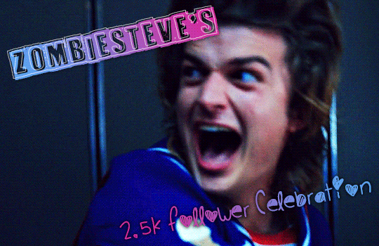
⬆✨My literal face right now while i’m making this post ✨⬆
So it’s official, i hit 2.5k i think sometime last week (woohoo 🥳), i said it in my follower celebration last year that i never thought i’d get this amount of followers but i’m saying it again now, and knowing how long i’ve been on this site (10 long damn yrs on and off) some of those followers are probably inactive at this point but yeah i just wanted to say thanks to everyone who follows me, interacts with me and loves the gifs i create as it motivates me to want to create more and learn more (even when i get annoyed about how bad the like/reblog ratio is nowadays haha)
So i’m gonna take the opportunity to thank you guys (new and old) for sticking with me through the years and through all the fandoms and my multifandom mess blog, i know this place has definitely become more stranger things centric this past year but yeah, it’s still a multifandom mess haha.
I wanna get some gif requests going and maybe some other stuff too.
So if you wanna take part send me some things:
✨ + a colour palette + character/ship/show/whatever i post about
🎨 + 2 colours + character/ship/show/whatever i post about (i know that sounds similar to the colour palette meme but it’ll be different i swear lol...)
🌵 + 2 things and make me choose between them (mix it up doesn’t have to be characters, could be outfits etc.)
⏰ + show ep/movie and i’ll blindly pick scene from them for a gifset
⚡ for some other general gif requests maybe (idk maybe you have an idea of a particular steve harrington scene you want me to add to my growing endless steve gifs - or maybe just well anything related to what i gif?)
🎵 i’ll put my Spotify on shuffle and make 5 song playlist for you
(dunno what to ask for? take a look at my last celebration/ my gifs for some insp)
Some mutual only things:
💜 and i’ll give you a compliment for your blog (i won’t lie it’ll probably end up being something generic from how bad i am at complimenting people but i’ll give it my best shot)
and for my gif/editing making mutuals
⭐ i’ll list my 3 of my fave edits of yours and why i like them
I think that’s all i had? I’m not sure i’ve been typing and re-typing this for hours now so who knows?
Gonna tag some mutuals new and old in no particular order under the cut, i know i don’t actually talk to well over half of you and i’m probably just that rando mutual you see sitting alone in the corner at parties but hey, feel free to promote or not completely up to you i’m not fussed.
@himboharringtxn @agentjemmafitzsimmons @ne8ula @mattssmurdock @spacejesusobiwan @babygirlspector @natasharomanovf @spookyharrington @alivedean @bebecas @pegsccarter @deanncastiel @nikolatexla @tomhollandd @achingly-shy @emziess @werewolfsteve @finalgalnancy @kamala-khann
i know i’ve missed people and if i didn’t tag you i’m sorry, i just never know who to tag in stuff like this
40 notes
·
View notes
Text
MILGRAM but minecraft mobs /j
Haruka- Drowned. blue water zombie, both of his mvs alr have liquid in them, (weakness- water, akaa- formaldehyde), his character colour is ultramarine, his second trial vd is called Metamorphosis of the weak, metamorphosis like a drowning zombie becoming a drowned, and he seems zombielike, he's got some zombielike qualities, but they were more prominent in t1, before he and muu befriended one another
-
Yuno- haven't thought of one yet, will edit
-
Fuuta- Blaze. his mvs and vd titles seem to all have fire themes, and the lyrics in his songs also seem to be around that (in backdraft there's the English words 'fire' and 'burn' + the EN lyrics in the wiki for backdraft, I'll paste a few telling ones 'Burn, burn! An ever-victorious FIRE, burn so high till it becomes ash'
'Burn, burn! Deliciously scorched, till your mouth waters'
'Flames closing in, can’t douse this FIRE') I'm aware the English lyrics may not be reliable, but I'm alr grasping at straws here
-
Muu- Bee. She has insect stuff in her second MV, plus both of her vds have the -- B naming scheme, not to mention how the lyrics of inmf mention honey (again, not the most reliable), and honey is a resource obtained from bees
-
Shidou- Ghast. His colour palette is mostly cold/neutral, with the only warm colours being his skin (debatably, he's quite pale), his shoes (in his t1 sprite), his bag/medkit lookin thing (t2 sprite) and the buckles/metal parts on his prisoner uniform, his colour pallete is very ghastlike, and even his personality seems to be quite inperturbable and his song lyrics/mv are quite sombre, ghasts in minecraft sometimes drop ghast tears, which can be used for regeneration potions. (That was a useless point lmao) Shidou is canonically developing some sort of (minor? I think) saviour complex, wanring/needing to stay alive to help mahiru (i think, dunno much about their characters) in a minecraft au, if he was a ghast, it may make a small amount of sense. (also his fucking story makes me cry aughh)
-
Mahiru- cat/ocelot, parrot or Villager,
Her mvs have birdcage/carousel imagery (maybe it's just prominent in daisuki, haven't watched tihtbilwy mv yet), a Villager is a very docile mob you trade with and it's an overworld mob, and a cat/ocelot are both quite skittish, only coming to you if you're crouched and not making any stark movement with a fish in your hand, which i feel would align with how she acts in rhe second trial, even if she is still just as bright (like a tamed cat), and the fear of sudden touch, although explained by the trauma of what Kotoko did during the t1-t2 intermission, could easily align with a minecraft untamed cat or ocelot, as they tend to back away from the player easily in game
-
Kazui- Enderman. I don't know why, he has enderman vibes.
-
Amane- Zombie. It feels oddly right
-
Mikoto (and john)- Phantom, it feels right
-
Kotoko- fucking wolf idk. I don't like her + both of her MVs have wolf imagery, with the werewolf thing in deep cover and the wolves in HARROW, possibly representing that she has gone too far with her ideals of justice, to an animalistic point of attacking anyone who's "guilty" if the opportunity arises, tamed wolves in minecraft can be sent to attack other players or mobs if the player who tamed them is attacked or actively in a fight with something. at least she (hopefully/v likely) won't be able to do what she did in the t1 intermission. Fucking bitch has the highest guilty percent in MILGRAM 🎉🎉🎉
#haruka sakurai#mikoto kayano#amane momose#fuuta kajiyama#kazui mukuhara#kotoko yuzuriha#mahiru shiina#muu kusunoki#shidou kirisaki#yuno kashiki#milgram#john milgram#john kayano
2 notes
·
View notes
Text
La Squadra and Fashion Aesthetics
i originally wanted to do eras of fashion but i think a post like this works a bit better. i know so little about fashion but it was fun thinking about this lmao (also i’ve made little mood boards of what i think but some of the outfits may be on the more feminine side bc it’s hard to find more masculine things on pinterest sometimes </3 but it’s more for just the whole general idea of what i mean). i might regret making this post and it’s a little chaotic but anyway ✨ (edit: i regret it but i put too much effort into it oops) edit again: here’s the link to some more characters!
୨ ╭ ୨୧ ✦ ︶꒷꒦・⎯⎯・⎯⎯・₊ˎ✧๑
Risotto:
he’s probably one of the easier ones to think of so i’ll start with him
goth/emo vibes for sure. it’s so obvious but i had to say it
lots of chains and harnesses
lots of necklaces and random accessories too
high platform shoes and boots
layers, layers, layers
and maybe a little bit of punk but definitely more leaning on the goth side than anything
i was going to say e-girl but maybe more for the accessories than clothes lmao (i can totally imagine him feeling embarrassed googling ‘e-girl accessories’ just so he can find a nice choker or chain or something)
here’s a little moodboard! it’s not exactly what i was thinking but i’ll roll with it

Formaggio:
i wanted to say more streetwear kind of clothes for him at first but i get a bit of a punk vibe from him
spikes and chains
heavily patterned trousers
the little thing under his shirt in his design already gave me fishnet vibes so a lot of fishnet
maybe chokers too? he’d look cute in one of those
or maybe like old school avril lavigne kind of fashion
skater punk kind of fashion? i think he could skateboard lmao
another moodboard! i’ll do his moodboard kind of half and half for both kinds of fashion because i can’t decide

Ghiaccio:
like cybercore/futuristic y2k fashion?
lots of silver, white, and blue colours
also lots of iridescent clothes and clear clothes
platform shoes? (i think he’d look good with some platform trainers or something)
i think the colour palette of this aesthetic was what reminded me of him more than anything else lmao
sporty vibes which i think works for him
also a bit of a space vibe but let’s not talk about that lmao
again here’s a little moodboard. i tried to find some that actually reminded me of what he already wears
Melone:
i don’t know what to call this but i’m gonna say colourful y2k
lots of that colourful, plastic jewellery (like those resin rings and stuff)
bright colours and bold patterns!
like, way too much colour
way too many accessories too
lots of hair accessories like colourful butterflies clips and hairbands etc!
i could also totally see him wearing like a bright pink juicy couture track suit omg
i’m not entirely sure this moodboard captures what i mean but i tried </3

Prosciutto:
this man was so difficult omg anyway i think he would wear like dark academia style fashion
loose fitting shirts and sweater vests (i can’t 100% see him wearing sweater vests i’m not gonna lie)
blazers and suit jackets all the way
not necessarily a whole coordinated suit thing all the time i don’t think. as long as the clothes go in some sort of way i don’t think he would mind
also wears stuff like this to ANY occasion no matter how casual or fancy the situation is lmao
moodboard time! honestly this is probably the most accurate one in my opinion lmao

Pesci:
maybe like a 90s grunge fashion sort of thing
plaid shirts and baggy t-shirts
ripped jeans and clothes that look like they’re past the point of being wearable tbh
converse and vans? but they also look past the point of being wearable
i don’t have much else to say so moodboard time again (yeah most of these pictures are of nirvana i’m so sorry but it’s the only way to get across what i mean lmao)

Illuso:
i was so stuck for this guy and i wanted to say 90s grunge kind of fashion for him instead (i still think he’d look good in that but this isn’t about my illuso fantasies rn lmao) but his ugly ass duvet looking shirt reminded me of a puffer jacket so i’m going with more streetwear fashion for him
generally just loose fitting, baggy clothes
kind of looks like he didn’t make an effort even though he definitely did
comfort is the key! very comfy clothes
here’s the moodboard! i don’t even know what i’m doing at this point

୨ ╭ ୨୧ ✦ ︶꒷꒦・⎯⎯・⎯⎯・₊ˎ✧๑
i ended up hating this post after i finished it but i spent way too much time on it not to post omg at least i tried lmao. also i know i didn’t include sorbet and gelato in this post but their clothes reminded me of cargo pants and stuff so i think they’d probably wear streetwear kind of fashion too! i realised when i made this post that i literally dress like all of these 😭
#formaggio#ghiaccio#illuso#jjba formaggio#jjba ghiaccio#jjba headcanons#jjba illuso#jjba la squadra#jjba melone#jjba pesci#prosciutto#pesci#risotto#melone#risotto nero#risotto headcanons#jjba risotto#jjba prosciutto#prosciutto headcanons#jojo headcanons#jojo hcs#jjba hcs#la squadra hc#jojo la squadra#la squadra headcanons#sorbet#gelato#sorbet and gelato#jjba sorbet
128 notes
·
View notes
Text
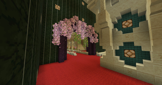

Today's mood was 'procrastinate on the mortuary temple by doing the oasis room' so. :D It was a bit tricky to work the entrance in around the pillar but I think I managed it. It's kinda hidden away, like you can't easily see it. Which is why I added all the cherry leaves so it stood out a lil more. :D Also, particles. I wanted the pretty particles. <3

I wanted to expand on the theme from the flower corridor on the other side of the pyramid. I didn't want to make it look too stylistically different from the rest of the pyramid, so I borrowed the same pillar design from there but used it on the edges of the room instead of down the middle. It's been adapted a little bit to fit but it's essentially the same design.

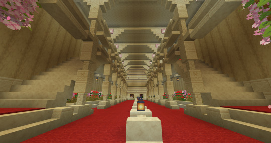
The room has a lot - and I mean A LOT - of vertical space while also being quite narrow, so I decided to make these little walkways around the edge of the room to still make it feel Big and Grand even though it's not that big. I got two floors of this and there was STILL ROOM above that. A LOT of room.

This is the rest of the room that leads to a balcony outside like the front has. It's simple, and maybe I could add more on the carpeted area, but I'm not sure I will. Also I think the biome blending really gives the trees a much nicer look than if they were all the same colour.
This is what I built (VERY CAREFULLY D:) around the door Cub put in, just to make it feel like it fit in a bit more. I wanted to keep with the colour palette, to keep it ornate, but not decorated like the front. No colour, just shapes and textures. And I think it looks much better. I'll probably put in something similar on the balcony as there is on the front, but that's for later. And it might change a bit still but that's the basic design.

What I want to do is take this idea of sand having piled up around the door and extend that around the entrance here, and perhaps around the base of the pyramid. Maybe there's some strong winds coming in from the mesa behind it that's pushed all the sand up against the walls. That kind of thing. I also want to tidy up the terracotta on the side to the left of this one that's all just starkly cut out, and make that look more natural.
This is the space I had above once I was done with the pillars and flowers and such. I haven't quite decided what to do with it, but I might do some more oasis-like gardens and pools. Make it like a healing space maybe. I had thought about making little ponds or hills of dirt, little spots of more organic landscaping up here as opposed to the formality below. But we'll see. It definitely needs a pool or pond or some kind of water thing tho.

I'm thinking this might be a small chapel or shrine area, or perhaps some kind of storage idk yet. It's really too small to do anything useful with but I don't want to leave it empty. So we'll see what I come up with when I tackle this floor.
Also finally I, uh, got myself a Pharaoh head. >_> bc it didn't feel right to just have old man Cub up there. It needed to be the Pharaoh. And, Cub, dammit, didn't have any Pharaoh heads in his storage, just Old Man Cub heads. XD So I had to do it myself.
honestly my java skin history is A Mess bc I don't have a default skin at all like I do when I play Bedrock so it's just a whole pile of random skins, Hermit skins, and whatever else takes my fancy lol. XD I think my player character on java must be some sort of void eldritch creature the way they have no known form and take on other ppl's instead.
...it's not bc i refuse to learn how to edit skins it's just my vibes i swear XD
#minecraft builds#hermitcraft#hc7#cubfan135#pharaoh cub#cub's pyramid#finishing the oasis room :D#bc now i'm procrastinating on the mortuary temple
5 notes
·
View notes
Note
Mayu helphelp I wanna revamp my writing blog’s theme @/bamboowrites and I wanna learn 🥺🤲🏻🪤
look at other people's blogs that you admire and mix and match the ideas from there you would find something that you might be satisfied with.
consider if the BFY and DNI are absolutely important for your blog... some people just don't bother to read those things if they are in another link. having it on the pinned post above the masterlist link can help as they end up glancing at it just dont make it too long if you do.
now the theme itself depends on what you are going for but you can go for a. pick a theme like maybe cottagecore, gothic and such and build a mood board from it on Pinterest and from those pictures choose the colours for like the accent? b. would be picking the colors first (maybe a certain shade of color, or maybe a palette you like) and then the pictures. (another idea/way could be like a "3 words" too, like my main account theme @mayulli has a star, royalty, navy theme, but not necessarily galaxy tho. My reblog account @mayullii focused more on a princess fairytale pink.)
Build a pinterest board, everything usually starts from there to be honest lolll

Now for my own... uhhhhhhhhh okay this is mainly for the people who cant pick a theme and wants them all (or at least most)
A lot of people say that sticking to one theme and staying with it is a good idea and to be honest, they are not wrong, and absolutely right it is just that I don't like staying in one theme I guess lol? Example:

Something like this! Or-

Look at all those differences hehehe. Nowhere here do you see green forest themes except for like Diasomnia (twst)? And then I also have the borders of all my writing posts:

I have like probably over 100 fic/original oneshots by now all that uses the borders above which is like alot and gonna be supppperrrr tiring to edit everything if I think about swapping everything. (will cry if I must.) but one thing is very obvious in all the pictures is that all have this pastel, soft dark, neutral tones, and has a mix of flowers, nature/outdoor and vintage themes/vibes.
I tried to make the blog as colorful as possible with the mindset that I will be changing my blog theme often. I just made the blog take all the themes that I personally like and mix and match. The forest green I currently have matched well with all the leaves in the pictures above cause of the leaves of the flowers. With an odd one here and there, but it is not necessarily painful to the eyes.
For me, with all this, I have multiple options of things I like so from like a white background which I can make it look like a canvas where the pop of colors would be from the multiple masterlists, blue where you could call it the outside/sky and the posts are the flowers essentially a garden, dusty tones, most pastel colors but more so the neutral tones like both dark and light academia would be a-okay most of the time. princesses and fairytales also~
Now what would not match with everything here would be neon colors, most bold/bright colors (my heartslabyul dorm masterlist is suffering rn cause of that red), pure black, city street and downtown, sci-fi stuff would stick out like a sore thumb for me but they are themes that I don't care for much so it is fine.
It doesn't have to flower only, to be honest if you want you can go for something jewels which has an array of colors, or maybe fabrics/clothes as like the main theme. really just make a pin board and add everything that you like and pick all the common stuff they have with each other.
Ah! one more thing that probs might help but who knows but like as you saw my twst wonderland masterlists are all different colors. So I use gray as like a divider from the main theme and the dorms. I also did the same for General/multiple characters masterlist and school staff and other characters. The gray is like a refresh for the eyes in a way (like how you sniff coffee when you smell multiple perfumes so that the scent won't mix?) so that the color of my main theme and the masterlist theme won't mix/crash in the eye much.
Genshin is genshin lol but the colours matches well with the colours of the flowers i have so it is fine. my original works masterlist is white as it was part of the white theme that i had once before, but since it is not related to any fandom it is essentially my own empty canvas (lol) so i kept it like that, naruto masterlist is obviously yellow cause... naruto lolll
#i am to be honest#not the best person to ask about themes heheh ^^'#i am bad at explaining but i still hope that this was somewhat useful#but yeah i just mainly scroll throught pintrest and pick a picture that i like#cause in pinterest when you say pick a pink aesthetic picture#scrolling down they would also show you other kinds of pictures similar aesthetic or colour to the picture that you picked#mayu mailbox#now there are those who make everything#by themselves#drawing and or editing#which are also amazing and keeps everything unique#but it really also depends on the person#hope this helps even a little
4 notes
·
View notes
Text


okay so first of all click on the pictures for the proper colours etc etc second of all.. girlies.. this palette is a fucking mess. anyway i'm thinkinggg maybe the more blue-y green could be the general "bitb" stand-in colour? yes i have perfectly nice non-glittery reds no i will not use them. god help me with organising these so they flow well though. thinking the thumb and pinky are the bitb colours and then the middle three are each of the guys' colours. i just don't know what way to order them right now
edit: clicking on the pictures doesn't even help -_- just imagine they're all more vibrant
4 notes
·
View notes
Note
despite all the biases I agree SVT OT13 ALWAYSSS like if I'm supporting a group I'm gonna love and support ALL the members! WAIT WONWOO (and shua) WAS YOUR FIRST i love Wonwoo and dk biased creatures (this sums up both of us tbh) omg like ya'll slay fr‼️as for shua I was gonna mention him as bias wrecker in my previous ask (as if having 4 biases wasn't already enough 😭)
i will always support having same biases‼️I know some fans don't like having same biases and shit but I love it <33 it's good to meet someone who's as down bad, delulu and desperate for them as I am 🤧
Looking at Wonbin is justifiable like how can anyone NOT look at him??? He's just so majestic??? Like is this guy even real?? 😭😭
You get me fr i thought i was the only aghase to see them as big brothers and dw being mark and jinyoung biased is valid af‼️now that we are talking about got7 being like big brothers I wouldn't mind if fanfic authors and smau writers put in got7 as readers big bros or platonic bffs instead of y'know having the same Jackson party over and over (he's TIRED give my bro a break T^T)
WAIT NO WAY I WAS GONNA PUT JOOHEON AS MY BIAS TOO we're both illoyal when it comes to them 💀 (🤡- my honest to god reaction when i used to think that I'll stay loyal to Jeonghan)
It looks like all my current biases were your previous/first biases heheh
I get not liking action movies they're definitely a hit or miss for me other than Spiderman ofc because who doesn't love Spidey?? (Idk if it's just me but you've seen the mark Spiderman au fanfics right?? Okay now just hear me out for a sec...)
Wong kar wai is a Hong Kong director i found him through tarantino's recommendations and I loved his films so much his style of films are kinda different from your typical hongkong cinema hits. If you love dreamy (?) vivid cinematography with an aesthetically pleasing colour palette, amazing soundtracks and nonlinear narratives or you just appreciate good films i really recommend Wong kar wai! My favs have to be Chungking express (1994) and fallen angels (1995) they are kinda connected but can also be watched as stand alones (maybeee i love fallen angels just a little bit more because of Takeshi Kaneshiro) in the mood for love is also really good
yes😭😭 even though i joke about only looking at dk 90% of the time, i love them all sm😭😭 like my name is literally meant to represent lee (chan), won(woo) and (do)kyeom so i thought at least two of those were obvious😭😭 dino is more of a sympathy thing bc i love him sm but he could never replace dk in my heart (in contrast to wonwoo and shua who are very real threats)😭 me and my irl carat friend watch a lot of svt content together and sometime's she stops and is like "you and dk really are the same person" and it's always when he does something awful😭😭😭
omg mark spider-man🔛🔝 i was also living for those spider-man svt edits that were trending on tiktok a while back 😭 like i'll take a spider-man au any day... on that note... should i just write one myself?😩😩
oh my god the way you described his movies sounds so magical !!!! i'll definitely check them out when i have time (like i never watch movies😭) but it also sounds like something my dad would like so maybe i can get him to watch them with me when i go home for christmas, since i barely watch movies by myself
0 notes
Last Seen Blogs
behnamkhanioffical
https://www.aparat.com/behnamkhanitabriz

badarchitectrecords
Find Undiscovered Indie Music That Includes Lo-Fi Beats, Electro

227538
Untitled
theworldthroughthemindeye
Pratiti Nath (Agantuk)

yui-toyseller2
yui-toyseller2