
Don't wanna be here? Send us removal request.
Statistics
We looked inside some of the posts by emojireviewpage and here's what we found interesting.
Average Info
Notes Per Post
348
Likes Per Post
274
Reblog Per Post
72
Reply Per Post
2
Time Between Posts
2 days
Number of Posts By Type
Text
17
Last Seen Tumblr Blogs


Fun Fact
12.7% of mobile users access Tumblr.
Text
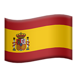
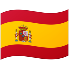
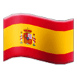
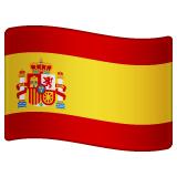
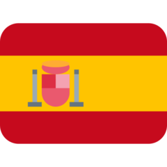
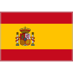
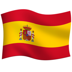
Spain flag emoji review: ESPAÑOL!🇪🇸
Apple: ¡Vamos allá Apple! Me parece un emoji súper conseguido ya que está súper bien detallado y no vea que bien hecho está el escudo aunque podemos ver de que está un poco borroso. ¿Quizás por nuestro punto de vista o que? Los colores podrían haber estado mucho más vivaces porque se ven un poquitín sucios. 8/10
Google: Un toquecito bastante sencillo de detalle. Me gusta bastante. El escudo también lo vemos borroso pero no me importa. Se merece buena nota por ser un emoji bueno y sin carga de detalle extrema. Bueno a mi me gustan mucho los emojis detallados aunque hay que decir de que si algunos están más detallados de lo que deberían de ser, podrían verse un poco abrumadores. 7/10
Samsung: Dios. Cuando dije de que el escudo se veía borroso en los dos emojis… estoy realmente equivocado aquí si que se ve borroso. Veo que hay un contorno gris rodeando a la bandera enteramente pero no pega mucho con los colores. El sombreado se ve súper conseguido pero la bandera se ve un poco tiesa o no curvada del todo. 7/10 me gustan las luces.
WhatsApp: El escudo se va a salir de la bandera si lo desplazan un poco más. A ver, esta mazo bien. Me gustan los detalles. 8/10 Buen detalle en el escudo.
Twitter: Esto no es una bandera. Esto es jartible. 1/10

Facebook: Que deleitante es el renderizado de la bandera. Sombreado con amor y precisión y unas luces adorables que añaden profundidad al emoji. 9/10
Skype: Oye esto está chulo. Ya se que he juzgado mucho si está moviéndose o no, pero tengo que decir que me gusta bastante. A el contorno le han puesto el filtro alfa del gimp. 7/10
Twitter emoji stickers: Esto es la ostia. Una verdadera joya de luz. En su punto. Me siento orgulloso de mi país tan bonito. Hay también muchos países bonitos en el mundo, incluidos el mío. Como se mueve grácilmente con esos sombreados perfectos y una atención al detalle espectacular… para comerselo enterito. 10/10 Colgarlo en mi cuarto por favor.
Joypixels: Uy, estoy viendo que el escudo está un poquito raro ¿no? La granada no se ve del todo. ¿Que hace ahí una mancha roja? ¿Es un círculo?
5/10 único y diferente

Tossface: A mi con que se copien uno al otro me genera malestar. 1/10
Openmoji: Ay, mi alma. ¿España? 0/10
¡Muchísimas gracias a todos! 🥘❤️🔥
Viva Españita. 🇪🇸
#emojis#emojiratings#emojireviews#fyp#España#reseña#guay#vivaespaña#cadiz#andaluz#🇪🇸#español#Castellano
14 notes
·
View notes
Text
Shaking face emoji review: comeback!👍

Apple: I guess this is the only one who has eyebrows and I think it’s such a nice idea because it complements the emoji quite well as it looks dizzy. Good fading and details that make this emoji look fine. I’ll try to stop your dizziness! 8/10

Google: For the cartoonish style, it seems like they wanted to replicate the fading effect with a simple style rather than a real difuminated one, so it does not look blurry. The slight sheen on the eyes looks not bad and adds life to this even though it could have been better if they were bulging eyes. 6/10 weird shake lines

Samsung: lacks some dizziness and i don’t think it is really shacking. I mean, it looks childish, so it reminds of a child. I get why a lot of Samsung emojis look like that. They want their emojis look cute. 6.5/10 because I think it is decent and the shake lines are not too big.

WhatsApp: Could have looked better if it was tilted a little bit. It does not look horrible, but the head is too small and the face is too big. The shake lines make me think they were a part of their face. 6/10

Facebook: It was way too much for them. They look so creeped out their mouth looks odd. I like the fading and I think this is a good emoji. 8/10

Emojipedia: The polished shading on the eyes make they look like some sort of mud. Could they have an inside made out of mud or dirt? I’m the only one who thinks there was a face behind this one? I don’t think you are understanding this but whatever. My English is still unpolished and I’m insecure about it. Got to give points to this because the fading is working and the expression is something not really that horrible. Their mind got exploded so they have this soulless devil face full of deceit and vitriol. 6/10
Thank you! ❤️
i don’t have this emoji. I need to update.
9 notes
·
View notes
Text
Dove emoji review: 🕊

Apple: I don’t know much about birds but I think this one is a mix of unrealism and realism. I can’t find the talons and the eye is a tad too big. It looks like they are shocked. Anyway, the wing has beautifully detailed feathers individually. The shading is pillow styled, but it adds a tranquil vibe. The leaf would be a nice deco for my room. 7.5/10

Google: Adorable! It looks like they came from a children digital textbook. I would call this bird “Piper” I think it is a good name. 6/10

Samsung: Apple’s tracing with an improvement on the tail since it is spread more. It looks lifeless because it lacks the severe detail the apple one had. It doesn’t have the amazing detail on the wings, they have no feathers. I like the dark shade of green on the leaf though. Decent shading. 6.5/10 you are welcome to the club, honey.

Microsoft: The leaf is a little weirdly bent. Weak for my eyes. No good outline does not make sense. This dove tried too much to be like the Google’s one. 3/10 Come back to your home.

WhatsApp: This one has talons. Good sense of detail on the wings as we can see the feathers quite clearly and the glossy eyes give this emoji a lively style as it should be. The leaf has good sense of physics in my opinion. They look a little glassy though. 8/10

Twitter: No real peace and honesty. This bird is an impostor. Really good shape though. 3/10

Facebook: Glorious detail on the beak and good proportions that make this emoji look pleasing to our eyes. The wings are spread nicely and the talons are the most realistic out of all. Good shading and absolutely adorable leaves. 10/10 Real peace. ☮��

Skype: Come on, why are you so terrified? You should simbolize peace. Why do you simbolize horror? 1/10

Twitter emoji stickers: It looks like it could be in a Pixar’s 3d movie or something. Like I said before, their emojis look like they came from a cgi movie. Because they are expressive and welcoming. This dove is ready to spread peace and it looks so happy. Plump body! 10/10 lovely!

Joypixels: The wings are detailed in a smooth sense. I appreciate that. The eyes are cool. A good dove equals to a nice score. 7/10

TossFace: Are you lost? This looks lonely. I feel sad. 1/10

Openmoji: is this a tissue or a dove? 0/10

LG: Not in a good mood. This dove looks hopeless. No leaf and does not simbolize peace at all. It just looks a little dove. Nothing special. No leaf or anything. I like the wings so a 5/10.
Thank you!❤️ Peace ☮️ and love ❤️
9 notes
·
View notes
Text
Clown emoji review: 🤡 requested by cheese2009

Apple: You can feel the unsettling. These oval-shaped eyes are crucial for our lives, this clown may look friendly, but something stays between us. May it be the fact that it would haunt me in my nap? Or is that he’s gonna give me an airy little balloon? The raspberry-hair makes me think if this is a cake or not. Those curved eyebrows give me bad intentions. 7/10

Google: Don’t be a serial killer, not even in the slightlest. This clown is going to make me laugh and have a jolly time. The blush is badly difuminated and too visible. We can’t still find the grotesque yet. 6/10

Samsung: Is this Apple’s cursed wannabe who went bonkers because he tasted the portentous blood of a corpse? He is staring me like if he wants something else. 8/10 points for looking goffy.

Microsoft: I think I've seen this film before And I didn't like the ending. 3/10

WhatsApp: I feel sorry for this buddy. I get he wants to be a frightful being but he looks kitsch instead. Don’t worry, I approve you for trying. Love the eyes makeup, stylishness is their passion. 6/10

Twitter: He wants to see my bleeding livers poisoned by digesting an evil birthday cake that pretended to be decorated but actually turned out to be a crushed child body disguised as a cake. 2/10

Facebook: They look so happy. This giddy little friend is really in love with enjoyment and I’m sure he is the king of the circus! Look at the hat, it’s awesome! 8/10

Skype: He said he wanted to see my family being demolished in a meat mincer. 2/10

Twitter emoji stickers: When I said WhatsApp was kitschy… this takes the cake. Why did they make the Facebook one look stupider. 7/10

Joypixels: Actually, He would force me to consume burundanga. 5/10

TossFace: a dollar store plush. 0/10

Emojipedia: Bland, dry and unfunny. This clown looks depressed and menacing. The lack of hair in this is worrying me. Pretty sure they got diagnosed with cancer at a certain time of their lives. Oops, might it be decoration? 4/10
Thank you! ❤️🔥
have you seen “it”? 🤡
3 notes
·
View notes
Text
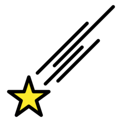
Shooting star emoji review: an special episode.

Apple: smooth trail and a superb decision to include a picture frame. The background is a yellow star utopia. This picture could belong to a lavish fairytale house with a good view of life and challenges. Happiness-inducing not too realistic star but I still love this example. Is it going through a cloud or is just the big shine of the curious twinkle star? 9/10

Google: Gets the indigo elegance right. It’s like hyacinth, vivid and mollifier. The meteoroid is sorrounded by sparkly stars and blue-ish wonders. Is the trail a crystal structure and maybe this is artificial? 6/10

Samsung: good-looking starry emoji and the meteoroid has a big white gleam exposing! Its smoothly detailed border makes this look like an app icon. You could edit it to make it an icon! The stars are a little translucent, but they look cool! The trail is fading out leaving a beautifully colored golden treasure. 8/10

Microsoft: artless, dumb-looking star with an absolutely big spotlight. not even a single tear of love and passion was put into this. no good stars, where’s the magic? Is the purple background the only magical thing about this? 2/10

WhatsApp: What a grandiose night and starry sky with a aesthetically pleasing gradient that it makes it look like it’s coming to some unknown city! The colors harmonize flawlessly with a subtlety detailed color palette which makes the viewer think this is an enchanting bliss! The big Apple’s sibling! 10/10

Twitter: it’s literally day period in this emoji. Are you seriously going to scare people with your shameful morality? Insufficient effort and love. This star has got some serious thoughts, it makes me think “I can’t know what thoughts it has because I can’t ask to it” it is also a star I guess. 1/10

Facebook: Coin-like star and we can distinguish the smoothly detailed lines on the trail! Comparable to saturn’s rings. The shine illuminates the starry night leaving a nice memory. 9/10

Skype: A genious idea to make the star sharpen and the trail having some nice detail that matches the simplicity of this emoji. Sadly, we miss the sky. The sky is an important part of this emoji in my opinion. Looks lonely, you can travel peacefully. 3/10

Twitter emoji stickers: This is comparable to the greatness of the Magellanic cloud nebulas. This shooting star is one of the cutest things I have ever seen in my life. The detail is superb. It deserves to pass through the big-old mountains. The stars are so soft and white, the light pollution forbids this emoji to show more stars though, what a shame. The border with the exquisite detail with an amazing choice of colors. 10/10 add more stars and it 1000/10.

Joypixels: joyfull colorful stars with the main star having a lovely shape! Sadly, the travel is not the thing I wanted exactly as it looks solid. The subtle gradient of the sky gives this an effective look. 6.5/10

TossFace: sorry, I can’t say anything good about this except the fact that it looks just kind of cute. That does not mean this bare-bones disgrace is going to get a high rating. 1/10
Openmoji: I can say that… it looks like a doddle I often make in the middle of school time. How menacing. -10/10

Emojidex: Gets the awesome idea of making the star look 3d. Does not scream beautifulness and power. Just a poor little shooting star with copy-pasted trail. The colours are just a NO. 3/10

LG: Snowy pastel vibes in this soft little shooting star. Milky-colored wonders like this make my heart melt. The sky is calmingly colored and effective. 6.5/10
Thank you all! 💟 This is a review I put a lot of effort in.
“We are made of starstuff” Carl Sagan.
18 notes
·
View notes
Text
🇨🇦Canadian flag emoji review🇨🇦 Requested by: Cheese2009

Apple: Happy nice flag with curious shading and highlights that make it stand out. The maple is adorable because it is really like the Canadian flag. It looks like a magnet though, and I don’t like that idea. 7/10

Google: I think some depth could benefit the ranking of this emoji, so it shows that the tight maple leaf makes sense ‘cause of the perspective. 6/10

Samsung: They upgraded the position of the maple leaf, but it’s not a sincere idea because it looks a little off for my tastes. The white border on the bottom of the flag shows some depth, but it looks like a sticker rather than a flag. The flag is too blocky for my tastes. I think the colors are subtly selected and the shine gives this an unique look. 6/10 improve the flag shape

Microsoft: The maple leaf is too much to the left in my point of view. The curvy borders certainly are a different concept, it’s quite experimental. 6/10

Twitter: This is now a curvy shape. I said in the last one that the shape was curved and it was experimental, but this one takes the cake for being more experimental. The colours are a little muted. 6/10 the simplicity is nice.

Facebook: They stretched this way too much that it looks oddly drawn. Carefully, the shading is placed and it adds waviness and depth. The shines are soft. 8/10

Skype: The maple leaf shape is a little curvy. I guess it is a style choice. The border either makes the colours brighter or darker because it is grey. 6/10

Twitter emoji stickers: It’s so life-like and it looks like it is waving beautifully. I love how the shading and highlights are executed beautifully and it is proudly showing the gracefulness of Canada. 10/10

Joypixels: Change my mind. This is now experimental. 4/10 I don’t get why it is a circle.

Mozilla: Twitter with blueish grey color and more saturated shade of red. 5/10

PS5: Fix the graphics. The maple leaf is literally just pixels. 1/10

Openmoji: The only acceptable thing about this emoji is the black border which gives a good look. They tried to make the maple leaf simple to match their art style, but it does not look right at all. 3/10

Openmoji: The maple leaf should be a little rotated and placed differently. It looks like they just copy pasted it. I like the shading detail, but it could be more difuminated. 5/10

Messenger: What’s going on this emoji. It is a poor try to make it wavy but it looks a little weird in shape. The white border is nice because it makes this emoji look more detailed. 6/10 for effort in shape and maple position. I like the colours, they are not too saturated but also not too desaturated.

LG: The shading gives this a soft look which I appreciate. It is giving me fresh vibes. I also like the maple leaf. 7/10 better than others
Thank you!💗 I’m amped up to know this country!🇨🇦
#Canada#canadian#toronto#ottawa#emoji#emojireviews#emojireview#Emoji#emojis#emojiratings#nice#cute#fyp#fyp page#🇨🇦#Maple leaf#Aesthetic
6 notes
·
View notes
Text
🫒 Olive emoji review 🫒
Apple: Bathed in oil with a subtle touch of pepper on the inside. I guess this is a pepper-stuffed olive, which is pretty common to eat in my country. The colours are spot-on and so is the shading. It looks like it would taste like a real olive. Even though it’s only one unit, Off to a good start. 8/10 I should try these more often.

Google: I like the presentation because it reminds me of olive trees. My country produces a lot of olive oil (guess which one, you already know it if you are my fan) the shading is simple, but also adds to the cuteness of this emoji. 8/10 These look soft
Samsung: An upgraded version of the Google emoji. I love the colors and how it looks cartoonish and also realistic. I would eat these if they were real. 9/10 they look a bit like grapes.
Microsoft: The red hurts my eyes. This looks some disgrace. The colors are the reason this looks like it could taste awfully. 0/10 I’m sorry but no way
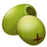
WhatsApp: Nice shading and reflection on the olives as they look cleanly drawn and detailed. It looks like an LG emoji. Curious, right? I like how there are 2 units. 8/10 They lack a bit of flavor

Twitter: Genious take on the design of this emoji! I like the gleam of the olives and they look pleasantly cute. 7/10 I don’t think it’s perfect though.

Facebook. This represents an olive or may it be an hybrid between a pear and an olive? I don’t know. I love the details. Very curious emoji. 9/10 looks sweet.
Twitter emoji stickers: 100000/10 The designer of their emojis deserves a big award.
Joypixels: the texture of this emoji resembles real life olives because of the dots in the skin. I guess I think the pepper looks off because it looks like it is covered in a red paint rather than a piece of pepper. Don’t get me wrong, this is a little confusing to read. I hope you understand what I tried to say. 5/10 the color is highly recommended tho.
TossFace: The hole is really wide. It lacks in expressiveness, does not convey anything. Don’t recommend, it’s like a 1-dollar version of the joypixels example. 1/10
Openmoji: This is a misshapen avocado. 0/10
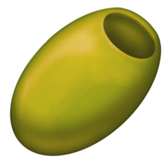
Emojipedia: Unsettlingly detailed texture and unblended airbrush some kind of pillow-shading on this olive. Suffers from oddly placed highlights that make it look like a green vessel instead of an olive. Not in a good condition, in the inside, there would be nothing. Looks like a toxic waste. Would taste like sweaty T-shirt That was worn 3 days in a row. No defined shape that it looks flat, like a sheet of paper. 2/10
Thank you!💗
Who likes olives?🫒
#Emojireview#emoji#emojirates#Emojireviews#Aceituna#olive#oliveoil#fyp#foryou#tumblr#nice#good#cute#food#🫒
6 notes
·
View notes
Text
🤯 Mindblown (Exploding head) emoji review 🤯

Apple: The mushroom cloud is reminding me of an hydrogen bomb. The head bits are going around! Was the explosion too strong for them? I like the details and the crack textures. They had the most shocking moments of their life. 9/10 the expression is a bit fake though.

Google: What were they hiding on their head, marshmallows? The head is cut too sharp. I’d like it better if it had the crack details. I guess it is kinda cute and they look so surprised! 6/10 adorable surprise
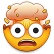
Samsung: Omg this is so cute! I love the colors on the inside of the cloud. It’s like they merged apple and Google emoji. Must be a dorky guy and fun to be around. He even has a realistic mouth! 9/10 he had watched fnaf jump scares.

Microsoft: Cross-eyed. Reminds me of my club’s mate who is Asperger’s. I guess this is kinda cute, but looks like an exploding bowl with a face. 3/10 why does it have a purple mouth.

WhatsApp: Honestly, the explosion is so RED, it looks like it’s raining tomato sauce. Am I the only one who thinks this? 7/10 it’s cold that you can see the outside.

Twitter: No hope for twitter. 2/10 because I don’t think it’s that horrible.

Facebook: it has a shockwave! Must be strong. Sorry, were you so shocked your eyes froze? This might look so good if they animated this emoji for a reaction, or do they already have a reaction version of this emoji? 8/10 I don’t use Facebook.

Skype: If this was a cartoon character, its name would be Richard. Here we have, Mr Richard, who is mindblown because they saw a 1 min Clip of kingda ka. It is understandable since that ride is INSANE. Its parents would be Samsung and Google. 5/10 Yummy inside. Is it chocolate?

Twitter emoji stickers: Can we appreciate how detailed the explosion is. It even has blue sparks and lightnings. They probably got an entire concert on their head. The face reminds me of Toad of Mario bro. I don’t know why. Absolutely exquisite shading below the flying bits. Tilted mouth expressing how intense that was. 9.5/10 Cute eyes don’t really fit though.

Joypixels: I’m digging this. The mouth is nice. The shading, It looks like it is airbrushed with a procreate brush. It is like my drawings. I guess they watched a Tekken fight and got shocked. 7.5/10 btw Who mains Kazuya in smash.

TossFace: No rating because protect this adorable toddler before they die from a fatal injury.
Emojipedia: Ah👏Yes👏You👏Look👏Like👏A👏Chef👏Could👏You👏Please👏Cook👏A👏Tasty👏Rib-eye?👏Im👏Sure👏You👏Are👏A👏Michelin👏Star👏Mastermind👏Is👏The👏Explosion👏White👏Bread?👏 Chef/10

LG: Amber eyes. Posible gem treasure? I like the shockwave and the cracks are amazingly detailed. I like the little glints. 7/10
Thank you! 💗
oh my gosh!🤯
#Emojireview#Emoji#emojis#emojireviews#emojiratings#explosion#mindblown#Fyp#cute#Emojirates#fyp page#2023#nice#Funny#post
7 notes
·
View notes
Text
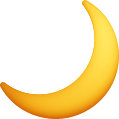
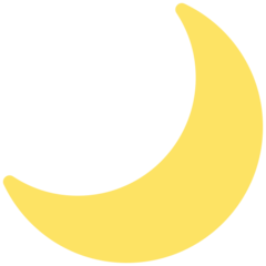
Crescent moon Emoji review:

Apple: Pretty decent. I don’t have too much problem with this. It does resemble a crescent moon but does not have the classic-moon texture. I mean, this looks more like an emblem than a real moon, or titan’s. 7/10 The moon is not really yellow.

Google: It does represent a crescent moon. I mean, the lack of texture is understandable since Google emojis are cartoon-ish. What I’d like is that they could add some textures and make the emoji lighter and it will be a 7/10. 5/10

Samsung: It’s not bad, but it could be better. The crescent moon itself has a nice shape. The shading is a nice idea and it is well done, but it does not really fit the image of this emoji. 7/10 better than Google.
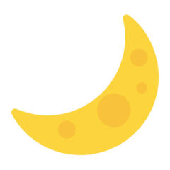
Microsoft: This is not a crescent moon. This is a banana with it’s spots. 1/10 for effort.

WhatsApp: The colour is honestly really cute! The moon is not that glossy though. I like the shape but please you highlighted it too much. 8/10 for the color.

Twitter: Microsoft, but more like a moon so i think it deserves a 1.25/10
Facebook: UHhhh. What’s with the shading? I guess they wanted to make the emoji look 3d but honestly it also looks like a banana. 😭 3/10 you could have done so much better.
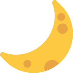
Skype: God please. Is this cheese mixed with a….banana? 0.5/10

Twitter emoji stickers: Chef’s kiss detail with the impact rests and the oceans. It is made with love but I’m not sure if the crescent moon is really like that. It looks sliced out. The colour is not that realistic. 9/10

joypixels: Just by looking at this emoji, it gives me strength and purity. They did a good decision to leave the holes simple and harmonize with the curious and soft moon! The shape is well done as well. 9/10

TossFace: We don’t know. I don’t know. They don’t know. She doesn’t know. He doesn’t know. I’m not sure what rate I’m going to give this emoji. RateItYourself/10

Openmoji: Cute. Resembles a moon. Simple moon staying with their friends in a circle of people. 5/10 I like the border.

Emojidex: Aesthetically pleasing color with a subtle gradient. This emoji is nicely shaped. The designers put their heart on the making of this emoji. 8/10 It’s is not even that good though.

Messenger: This is actually my favorite. Cold and freezing color and it also looks realistic and pleasing. The cell shading is on point. The homes are shaped beautifully and they look good Merged with the mix of cartoon-ish style and realistic style. 10/10 The crown goes to this astounding emoji.

LG: Who had the stupid idea to make the moon like this? It seems like there is even a smaller object forwards the moon and it’s bugging me. 5/10 Because I think it’s at least original and I like the texture.


Docomo-HTC-Mozilla-Softbank:
Because I can’t say much about them:
0/10 3/10 1/10 4/10
Thank you! 💗
Sacred crescent= The wonder of life 🌙
#Emoji review#emojireviews#space#Moon#Aesthetic#Cute#Nice#Fyp#fypシ#emojirating#emojis#tumblr fyp#tumblrpic#spacemoon#Earth#fypppppppppppppppppppppppppppppppppppppppppppppppppppppppppppppppppppppp
13 notes
·
View notes
Text
Brain emoji review: Emoji review page

Apple: This emoji is kinda accurate. I can see the stripes on the cerebellum. Good shape and rosy color. It’s lacking a brainstem, but that’s a good brain. 8/10 Healthy.

Google: Decent attempt at a simplistic emoji. Accurate in human shape. The creases are nicely drawn. It’s again lacking a brainstem. The cerebellum has stripes! 7/10 Good enough.

Samsung: Deserves a mention for having a brainstem this time! It lacks stripes on the cerebellum and the shading is wonky-wise but the shape is decent and I like the details of the creases. 7/10

Twitter: missing a lot. Is the cerebellum just a triangle? Not a good color. Probably belongs to an alien somehow? Maybe enough science in the future could explain that. 2/10 0 Iq candidate.

WhatsApp: Kudos to WhatsApp for making a realistic brain. It’s facing in a different way. The creases are so nicely detailed. The shading is perfect and it has a cerebellum and brainstem! 10/10 Gifted person brain?

Twitter: What is this? Can you at least add stripes on the cerebellum? It’s lacking a brainstem and I don’t think the creases are good-looking. 3/10

Facebook: The shading is kinda blurry, so it looks like a video game render. I actually love this emoji though. It has the esentials, Brainstem, cerebellum… 9/10 looks like clay though.

Skype: That’s a deformed sponge with a tongue. 0/10 no.

Twitter emoji stickers: It’s… oddly realistic. I think this looks the most realistic of all of them. Even though I can’t really see the brainstem, the cerebellum has stripes and the wrinkles are so detailed it amazes me. 9.5/10 only because there’s no brainstem.

joypixels: I kinda love this. I get it’s simple but it is really accurate except the color. the cerebellum has flowy stripes with matches really well. The creases are nicely distributed and it’s shiny! 8/10

TossFace: Cut a brain. This is what it may look like. -1/10

PlayStation: Nice. 5/10 Fix the graphics

Openmoji: Have they ever seen a brain. -10/10
And now we have….

Emojipedia: AAAAAAAAA. THIS IS A BACON CAKE WITH THE SHAPE OF A BRAIN. I TOLD THEM NOT TO MAKE TERRIFYING EMOJIS BUT THEY DIDN’T LISTEN AND NEVER WILL.
NOT RECOMMENDED.
NOT EVEN IN THE F**KING SLIGHTLESS.
-1000000000/10
sorry 😞

Emojidex: I guess I wouldn’t mind if they asked me if they could make this emoji in a different perspective. This emoji is an educative way to learn the parts of the brain in a different view. You can even see the inside too. 8/10 Suited for a Biomed Notebook.

LG: Mid, boring. The creases look like my attempts when I try to make a line. 4/10 no brainstem.
thank you! 💗
I think intelligence is great for life because you can use your logical side and creative side. I’m more of a creative mind instead of a logical mind. 🧠
#Emojireview#emojireviews#fyp#Science#bio#funny#cute#Brain#smart#biology#emojis#emoji#nice#fypシ゚viral#🧠
20 notes
·
View notes
Text
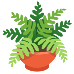
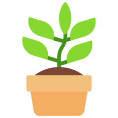
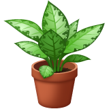
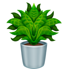
🪴 Potted plant emoji review 🪴

Apple: This plant grows gracefully in this beige pot made out of terracotta. The textures of the soil are harmonizing beautifully and so are the green shades of green of the leafs! 8.5/10 Maybe they are a baby.
Google: Planted in a red round pot, this emoji shows a different type of plant, which honestly is a nice breath of fresh air. 7/10

Samsung: I think the colour scheme works fairly well in this type of plant! Could use some water to grown them more and more. The pot is shaded confusingly, like it’s going back and forth, left to right. 7/10 love the amount of leafs.
Microsoft: I won’t hate these buddies. It reminds of a Children book. Do you know the kind of books our teachers used to give for vacation? This emoji is just as nostalgic as them. I think it’s a fairly simple sprout. 5/10
WhatsApp: Curious fact: I have dumbcanes at my house. I absolutely adore this emoji. Because the details are on point and the shading is just incredible. I have heard they are slightly toxic, which creeps me a little bit. 10/10 amazing emoji.

Twitter: Frankly. I love the shades of green that are manipulated to create this emoji. The cell shading makes me feel so-so but sometimes, you got to agree that some simple emojis can look really nice. 7/10 Google’s Look-alike?

Facebook: This emoji is absolutely ADORABLE. They are shaped like hearts. I would give this plant to my SO. These are blessed and I hope they grow until they become an absolutely SHOCKING tree. 11/10 For the win.

Twitter emoji stickers: love the pot’s texture. It looks like a generic 3d model that’s been used on Nintendo switch video games. These are cute and I hope they grow amazingly. 9/10 Love the shading and the smooth feelings.

Joypixels: Sure, there were emojis with a LOT of leafs, but this one took it a little too much. Anyways what’s bad about it? I think the stem is a little gross (I don’t mean disgusting) I like the shape of the leafs as they feel smooth and classy. 7/10 Would put these on my granny’s backyard.

TossFace: A little baby sprout! This is so cute. 2/10 Everything else is a little…. Uh?
Emojipedia: I feel like I have to say a lot of Emojipedia emojis since there are so many problems about them that it sort of annoys me since a lot of them look distorted versions of apple emojis. The plant is weirdly simetrical. It’s honestly a little scary because maybe this cursed plant came from a parallel world that every plant grows differently. The details on the leaf are weird, because the lines are a bit too thick. The center bugs me A LOT. It’s disturbing and dark. It’s like a leaf monster that haunts you at your garden at midnight. The pot is looking shiny, but is weirdly placed. 4/10 the soil is ok though.

Openmoji: A tiny palm tree? 2/10 because it’s as bad as TossFace.
thank you! 💗
Save our 🌍 and 🪴🌲
#Emoji review#emoji#plant#pot#cute#emojireviews#emojis#fyp#tumblr fyp#fypシ゚viral#Love#amazing#wonderful#niche#plants#trees#flowers
49 notes
·
View notes
Text
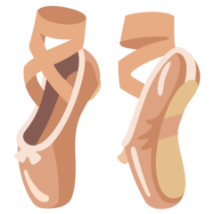
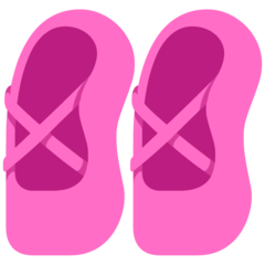
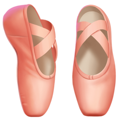
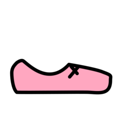
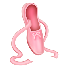
🩰 Ballet shoes Emoji review 🩰
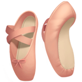
Apple: I don’t dance ballet, so I don’t really have knowledge about ballet shoes. I dance and really love it though. Anyways, These are definitely pinky. They have this pastel pink color I like. The ribbon is a good choice. I love the back, it’s extremely detailed. They look kind of uncomfortable though. 9/10
Google: The color scheme in this one is absolutely gorgeous! It makes me think of a peach and the cell shading is really well done. I would dance with these shoes. 8/10 the ribbons are beautiful.

Samsung: Shouldn’t the emoji have to be less rounded? The points of the shoes are too round for my taste. They look like they are bathed in oil, because it is so shiny. Anyways, the pink is vibrant, but strong. I like the shading. Awesome mini ribbons. 7/10 Suited for a 6-year old toy gift.
Microsoft: Copy-paste. They look too short, which is maybe intented for little people. Awful color. 1/10 Do better.

WhatsApp: It’s cute, but much better if 2 shoes. The ribbon is kinda thin. The pink color is soft. The shoe looks kind of metallic. 7/10 would buy.

Twitter: This looks like meat. 0/10 I wonder if it’s really meat or not. Sad life…
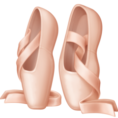
Facebook: I absolutely ADORE this! The ribbons are perfect. The shading is on point. The color is really similar to the common shoes and the shape is really comfortable. I would wear this and take them to my dance classes. 10/10 I want to learn ballet with these.

Skype: Why that shading. This is a disgrace. 0.5/10 points for the unique position.
Twitter: Rosegold!!! These are amazing. I love the details on this. The shading is exquisite. Pretty as flowers. The shape is very good. 9.5/10 Almost as good as Facebook.

Joypixels: Damn. The ribbons are going UP. Flowing gracefully is a good choice. The rest of the emoji is quite normal though. I think they are large. 7/10 Good job.

TossFace: Yeah… No. Ew. 0/10 Bathtub vibes???
Openmoji: DAMNIT. -10/10 AAAAAAAAH
Emojipedia: It’s like you want to shade too much your emoji looks kind of like playdoh. The shading looks dirty and there no exact light source. The ribbon looks printed. I guess they wanted to make the mini-ribbon 3d but it didn’t work. It is only 1 shoe. The ribbons are a little too slippery. This emoji is really weird in shape and shading. 3/10 The only cute thing about this is the color. It looks way too much 2000-Windows Xp esque.

LG: Great shoes! So classy and elegant. The shading is impeccable. I love the ribbons. 9/10 Facebook love child.
Thank you!💕
“Ballet is like dreaming on your feet“
#Emojireview#Ballet#Emoji#reviews#emojiratings#emojis#balletshoes#aesthetic#cute#fyp#tumblr fyp#fypシ゚viral#nice#ballerina
17 notes
·
View notes
Text
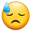
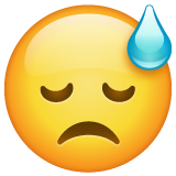
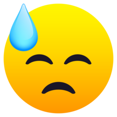
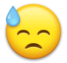
😓 Cold sweat face emoji review 😓

Apple: They feel sorry about something that has happened to them. This is my face when I tell my mom I failed a test. The highlights look expensive, like so shiny as a gem. I wish we could help this buddy to make it feel better. Sorrowful expression. The mouth does look a bit fake though. 8/10 Everything is gonna be OK.

Google: What happened? The eyes and the mouth are too close, but honestly, I don’t mind it because it makes the emoji look more expressive. The sweat tear shine though. 6/10 the shine could be more blended or centered.
Samsung: This emoji is feeling like they are guilty. The eyes are upside down and it’s a nice change. The tear is rendered decently as there are gradients and a little shine. Good shading too. The mouth looks weird. Does not look natural at all. 8/10 you fucked up the mouth.

Microsoft: They straight up believed something was wrong with their job and now they feel worried about their future. The tear is a big NO. 4/10 it’s awful.
WhatsApp: Sincere expression. I think they were told that they didn’t perform good on the show and now they are pissed off thinking they could had passed. The shading in this one is better. 9/10 Can I help you?

Twitter: Holy shit. Its eyes are so close. Honestly, I can’t focus on this emoji that much because I mix up the placement of the eyes and the mouth. It seems like they placed the mouth wrongly or, Is it just me? 3/10 feel sad about them though.

Facebook: So here we have this one with the overwhelming shading and the blueish eyes that have a weird shape. I can see it’s an artistic choice though. They look sad enough, maybe their dog stepped on a bee? 7/10 I LOVE the tear though.

Twitter emoji stickers: Weird shading. The tear looks cute, but the emoji looks sort of textured, which is a little strange. I don’t really love this, but I love the highlights on the emoji. They probably laid too much on their sofa that now their head hurts. 7/10 I expected better.
Joypixels: All of these emojis look kind of similar. The mouth and the eyes are bugging me a little. I can’t really explain, but I guess it is the fact that they nearly have the same shape. I like the tear because it looks smooth. Did you forgot your own bag in your house? 6/10 you can take it. There is no one at your house.

TossFace: I can’t believe I’m going to rate a TossFace emoji high. I like the white tear and the emoji looks cute. Feel better, take a big rest. 6/10 Good rest!

Openmoji: This doesn’t look good. Sorry. 2/10 the face looks too high.

Emojidex: My favorite expression. I just love their “Ohhhhh” expression so much. I like the tear so much. 9/10 This emoji got tanned too much though.

Messenger: They are really experimental with the perspectives. The emoji itself looks wobbly like a slime. Maybe they had mistaken twins, so they want to apologize. 5/10 Looks edible like jelly.
LG: Looks good enough. Feels sad. Good shading. 8/10 Just really good.
Thank you! 💗
I’m sorry for gramatical errors 😓 I’m from spain.
#Emoji review#Emojirating#emoji#sad#apologize#fyp#fyp page#coldsweat#emojireviews#reviews#post#emotes
21 notes
·
View notes
Text
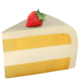
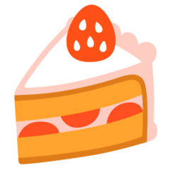
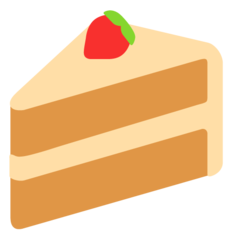
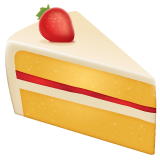
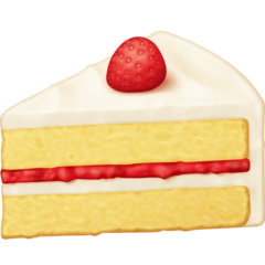
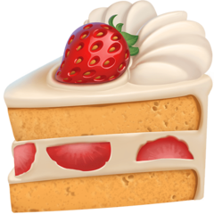
🍰Shortcake emoji review🍰
(While doing this review, An enormous moth scared me 😳)
Apple: It’s a shortcake. I mean, it can have more stuff because it is a little sad to see so little yet so detailed. This emoji has potential and the textures are spot-on. I guess I would eat this. It just misses stuff, because only a strawberry is a little boring. 6.5/10 I approve this.
Google: Cute! The colors remind me of a Pinterest cutesy aesthetic and I’m digging this. I see it has strawberries inside which adds to the average flavor of the cake. Oh wait, since when did strawberries have only 5 seeds and white? 6.5/10 Could be some form of mutation.

Samsung: I love the distribution of the whipped cream! The shiny strawberry is sorrounded by tasty-looking cream. I miss when this emoji had strawberries inside. Why did they change that? 7.5/10 I don’t get the change.
Microsoft: This is basically a simple version of the apple one. The same stuff. I can approve this because the colors are kind of warm. 4.5/10 Cute.
WhatsApp: Exquisite perspective! Strawberry jam is an unique choice and it really adds to this emoji. The shadow below the strawberry makes the strawberry look like a PNG. Am I the only one? 7.5/10 I like the jam.

Twitter: A plate! Not enough for my taste, but I like the simple style. I just need to say this. You can’t spread sprinkles on a strawberry and call it a masterpiece. Too scared of the bugs? 5/10 Did you know there were bugs on strawberries sometimes?
Facebook: Warm and sweet! It’s like WhatsApp. Jam, again, even though it looks like tomato sauce for me. Amazing detail on the strawberry. Pretty realistic. 7.5/10 I don’t like the jam texture…

Skype: Whose birthday is this cake? Strawberries on the inside is a nice touch and the candle is cutely colored. 4.5/10 because everything else about this is mediocre.
Twitter emoji stickers: 11/10 Just look at how creamy this is. The details are perfect. I love how the strawberry is bathed in cream that smoothly. The texture of the dough? Yum.
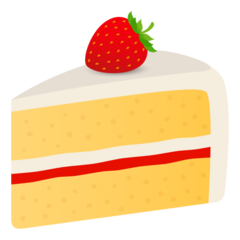
Joypixels: Sorry. I prefer the jam in another order. It does not mean I hate this. I like the strawberry because it resembles pureness. 6.5/10 This review is gonna have a lot of decimal results.

TossFace: Oh. 1/10
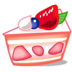
Emojidex: Anime style! Shiny strawberry! The colours are vibrant and lovely and I like that they added a shadow even though it needs to be darker. It looks a little messy though 9/10 Love the blueberry!

Openmoji: Ugh. I wouldn’t be pleased if I had to eat this cake on my birthday. 1/10 Is that a cherry?

Messenger: Noice. I like the four strawberries and the main strawberry is placed nicely. The cell shading is cute and it has a plate! Would want to be served with this cake. The colours could be softer and I think this looks a little slimy. 7.5/10 It’s okay. Not perfect but I like it!

Mozilla: What Twitter had been wishing to be. Thank you for improving. 6.25/10 Cute simplistic example.
thank you!
Yum, who likes strawberry shortcakes?🍰
#Emojireview#Emoji#cake#fyp#tumblr#cakeemoji#Strawberry#cute#funny#emojirating#emojiratings#cuteemojis#fypシ゚viral#streamIvecomeback
63 notes
·
View notes
Text
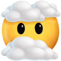
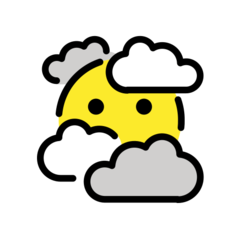
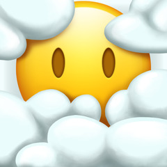
😶🌫️ Face in clouds emoji review 😶🌫️

Apple: Subtle gradients and the smooth clouds make this emoji not as harsh. I mean, it looks confused because there are clouds that block the view. I can see the eyes are like a void, which adds to the overall theme of this emoji. 8/10 Very solid.

Google: I think this could look much better if the clouds were colored entirely. This emoji is shown on a white background so I can see why it looks natural on that. It seems like there are weird lines that make this emoji unpleasant to look at. 4/10 Not bad face.

Samsung: This is what Google could look like if the clouds were colored more. The subtle shading on the clouds make them look like cotton and honestly, that’s a cute idea. Definitely adds to the cuteness. 7/10 I like how the eyes are different from other Samsung emojis.

Microsoft: I’m kinda digging this. The colours are different but they add to the cuteness of this emoji. I like the eyes because they look like they want to solve the problem. 6/10 Thank you for passing.
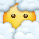
WhatsApp: I love the clouds. They look so puffy! It seems like they aren’t really focused. The highlight on it’s head makes it look like it’s made out of glass. 9/10 Cute eyes.

Twitter: Honestly I can’t say too much about this emoji. It’s a decent simple emoji. Nothing special. 5.5/10 unique placement of the clouds.
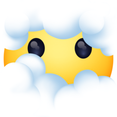
Facebook: It’s like the last one. More robotic vibes. Anime style eyes make this look they are pleading. The clouds are shaded cutely, so It does not look bad. 7.5/10 Doing great Facebook.
Twitter emoji stickers: Not as astounding as their last emojis (Well the Saturn emoji was good but not perfect). You can see they added a tiny glimmer to the eyes (We can say the same about Samsung emojis) which are a cute idea. Decent job on the clouds. 8/10 I wish it had more clouds though.

Joypixels: Same as Google. Except there is no outline. 4/10 I’m disappointed. It had potential.
Openmoji: Not that horrible. The outlines aren’t really bordering the entire emoji. I guess it is an artistic choice. Are the grey clouds going to throw lightnings? I’m scared. 4/10 I don’t want this cutie to be killed.
Emojipedia: I’m going to create a story out of this emoji because why not.
Apple: Hey WhatsApp! WhatsApp: What’s up, Apple? Apple: Do you want to have a child with me? WhatsApp: Yeah, sure. Let’s go! Apple: Let the child have the same face as me and the same clouds as you.
Then they have this… 8.5/10 Nice details.
Thank you! 😶🌫️
😶🌫️I can’t see anything!😶🌫️
#emoji review#emojirating#emojireviews#emoji#emojis#Ratings#Fyp#funny#reviews#emojiratings#cute#clouds
39 notes
·
View notes
Text
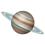
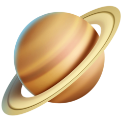
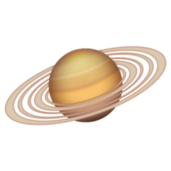
🪐 Ringed planet emoji review 🪐
(I’m not a scientist, I just like Saturn)
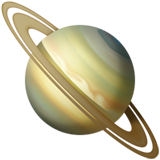
Apple: So here we have Apple’s take on a ringed planet which resembles saturn because of the hexagon. it’s tilted a little wrong. You can see the details on it’s surface and the ring is nicely distributed. 9/10 Strong.

Google: The tilt on this one is more accurate. It looks simplistic, which works fine. I see the hexagon. The color of the rings shouldn’t be that blue. 7/10 Reminds me of my first Saturn drawing.

Samsung: Again, the tilt is pleasant. it’s decently shaded. It needs more coloring as the color scheme is very repetitive and boring. The rings don’t look separated enough for me, even though I like their aesthetic. No hexagon. Pixelated 6/10 Because it’s not as bad.

Microsoft: I can see they wanted to make an adapted simple version of Saturn, which is a nice idea. The execution looks too off. Can you add more rings please? Random colors on the surface. Bad tilt. 1/10 You can see me after work.
WhatsApp: now, that’s a good ring! I love the surface although the tilt should be different. It looks shiny, like a marble. 9/10 You did a good job.

Twitter: Yikes. I can be the only one who thinks this could smell like cheese. Too saturated for my tastes. The rings are lazily done. 2/10 Ok tilt though.
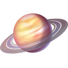
Facebook: Tries too hard to make it super detailed that it looks harsh. The surface is pretty. Doesn’t look much like Saturn, but it looks nice. The rings could be more separated. The tilt is good. 7.5/10 Could be an exoplanet similar to Saturn.

Skype: See? Another simple Saturn like Twitter and Microsoft. Please. Change. The. Colors. 3/10 Good tilt and ring though.
Twitter emoji stickers: It reminds me of blender renders. I like the rings and how 3d it looks. The shading and details are good and the surface is nicely done. It reminds me of my current Saturn drawing. Off tilt. 8/10 I like the shadows

Joypixels: Cutest colors. The tilt is a little off. The rings are distributed nicely and is that the hexagon? I think it could be a good idea to erase the grey space between the rings. 7/10 doesn’t look that bad actually

TossFace: You just drew a purple circle and added a lilac ring. Do better. 0/10 sorry, but no.

PS5-4: This could look decent if not too pixelated. It’s a little sad. 3/10 the tilt looks nice but please fix the graphics.

Openmoji: Actually, the cell shading makes the colors pop. Doesn’t look like Saturn though. 2/10 Adding a red ball won’t make this emoji a masterpiece.
Emojipedia: I love how realistic the surface looks. I think the main purpose of this emoji is to make it classy and elegant. The planet itself lacks an hexagon though. It’s got a lot of rings, which is a nice idea but they are too close. I like the shading. I don’t mind the tilt in this one. 8/10 I see you tried.
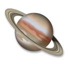
LG: It looks more like Jupiter than Saturn. The rings are good but it’s a better idea to make the surface different. 5/10 Pitty points.
Thank you!
Saturn is so aesthetic 🪐
#Emojireview#emoji#emojireviews#emojiratings#emojirating#Saturn#space#science#planets#aesthetic#tumblr fyp#emojis#ringedplanet
40 notes
·
View notes
Text
🌬 Face blowing the wind emoji review 🌬

Apple: The lips could have been executed better, they look weird. Her chin has a curved shape, which I don’t like. The hair looks like play dough. She blows some strong wind though. 7.5/10 I like her eyebrow.

Google: I don’t know. Let’s give this a 4/10 Lips too high.

Samsung: It seems like they tried to make this emoji similar to the apple one again. The chin is shaped more naturally. The lips are prettier. Worse hair tho. 6/10 Where are her eyebrows

Microsoft: Why does she remind of lapis from Steven universe. 3/10 Aquamarine Gem confirmed

WhatsApp: Twisted a bit and switch the face to a cloud. Good idea, some wind is blowing. 7/10 Originality is my “passion”

Twitter: I like this. I like the cell shading. Looks soft and going to blow some wind. 6/10 Hair is like a wing.

Facebook: Oh yes. Love the hair, the colors and her face. The wind is shaped nicely but doesn’t look wind at all! Looks like clay! 9/10 it’s still nice 👍

Skype: Microsoft. But spitting water instead. 3.5/10 Why are you false.

Twitter emoji stickers: Gentle face. Pure woman charm. Soft colors. What can I say? Easy 10/10 Slayed again.

Joypixels: Cute! I like her colors. She is an elegant lady and blows some wind. 9/10 Let’s go

emojidex: It’s nice. I like the outline. She looks in pain tho. I can’t tell if the shadow below her eye is really a shadow or a teardrop. Wind is so simple. 7.5/10 you can do better. Trust me. You have potential

LG: Depressing. 0/10 it’s original like WhatsApp but does that mean I like this? No.
Thank you!✨💕
🌬Too windy🌬
#Emojireview#Emoji#Emojirating#Fyp#foryou#tumblr#tumblr fyp#Emojiwind#Wind#emojireviews#Emojiratings
14 notes
·
View notes