#mike holmes style
Text
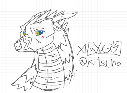
icewing whiteboard doodle (done in GN style)
#kitsumox#my art#doodle#whiteboard fox#wings of fire#wof#wof art#wings of fire art#wof fanart#icewing#icewing wof#wof icewing#wof gn#wof graphic novel#graphic novel wof#gn wof#mike holmes#mike holmes style#Fuuuck
34 notes
·
View notes
Text
I'm so excited for the new graphic novel to come out so I needed to draw him.

4 notes
·
View notes
Text


Two more OCs in the Mike Holmes style!
#wof#art#wings of fire#dragon#seawing#rainwing#mike holmes#why is it so fun to use this style#graphic novel#ocs
1 note
·
View note
Note
mike holmes’ art style isn’t bad or ugly, some people are just unnecessarily mean
.
244 notes
·
View notes
Text


mike holmes replication (i love your work, avid appreciater of your art style)
#art#beginner artist#drawing#sketch#traditional art#pencil#wings of fire#wof art#wof#wof oc#wof oc art#mike holmes
178 notes
·
View notes
Text

Mail Call #1
Responding to messages from @iusedtobemenowimnot @salveofthesandwonks @jrbfrkjbgfk @asleepinglaurel @ironnokana97b @kittykatchao

Link to post in question
I am very happy that you enjoy my content, thank you. The "Pantaloons" was actually not a typo or auto-correct though. Pantala is just a very funny and corruptible name.
Other candidates for least accurate way to refer to the place would be "Pancake Town", "Pantyhose", and "Pantlion" (if any folks over there like to bury themselves in the sand).


Mike Holmes' WoF style is very cozy and relaxing to work with. I'm not getting it exactly right, but then again the deviations and imperfections are what add variety.
It also happens that I read the comics before I went into the books, so the style kind of stuck with me. The dragons in the story are very expressive and animated, so a relatively cartoony and fluid style suits them. At least that's what I think.

I have not drawn Whiteout yet, but I am interested in doing so. If I ever get around to continuing my 3000 AS series of drawings, she will be in it, likely grouped with Darkstalker, Prince Arctic, and Foeslayer.

This might be a bit of a cop-out answer, but the best way I can think of to get into a style is to look at a lot of references. The comics are full of good material in that regard. Look for panels of dragons in flight, or standing around, get a feel for the shapes their bodies are constructed from, etc.. Identify the quirks of that style, then try to incorporate them into your drawing process.
That's my very general advice. I don't know how helpful or applicable it is. For something more detailed I might need a more specific question.
I have to stress though--and listen closely because I can only say it this one time: One thing that is absolutely, imperatively, critically important to keep in mind is--


...
152 notes
·
View notes
Text
timeline of me trying to draw the same thing for several years straight
Figured I'd go through my own old attempts at Joy Ang's style and review them publically; not only would it probably help someone, I get to giggle at how bad my old art used to be! Onwards.

This was attempt no. 1, and it SUCKED. Thin neck, absolutely no chest, overdid AND underdid all of the shading, didn't even get Toad's colors right, FORGOT THE NOSE RING. Beautiful, beautiful stuff.

Attempt no. 2 was significantly better, although the anatomy was deeply fucked and the eyes were massive. There are definite improvements over the other one, but overall the line quality remained poor and the anatomy was horrific.

ATTEMPT NUMBER THREE. This one was so much closer than the other two, but still a swing and a miss overall. The eyes were once again oversized, the shading was patchy and still didn't match Joy Ang's style, and the head was perhaps too angular. There are still a lot more things about this that I like, though, and we can only go up from here, right?

WRONG attempt number four SUCKED. The lines were awful and the face was too short and narrow. I kind of like how I did the bottom jaw, though. Portrays the snout being narrower than the end of the face. Let's try this again.

AUGH oh god those scales why are they so small. And, I see we have reached the opposite problem we had before, with the eyes being TOO small now. Also too far down. <3 Let's take a break from this, for a few months, and then try again.

And, for reference of where we are now, this one. It has its own dedicated post, but I figured it needed to be in the timeline, too.
something something practice makes perfect something something. okay carry on with your day. let me know if you want me to do the same thing with mike holmes' style, there's... actually a lot more attempts for that one
212 notes
·
View notes
Note
i actually like the graphic novel style, idk why everyone hates it so much :(
ME NEITHER!!! it’s so fun and i think we should send more love to mike holmes :))
33 notes
·
View notes
Text
I really hope sometime the WoF fandom grows into an era of loving and embracing the graphic novels and what they've done.
I see a lot of people shit on Mike's style, pointing out how occasionally the anatomy is more human-like or just goofy little quirks. Anything from that one throne scene with Blister and Coral in the TLH GN to the MR GN cover with Moon's extremely long tail.
Yes, I get it. A lot of artists and people are keen on that sort of stuff. I understand that it's fun to pick on inaccuracies and mistakes, but just...
The GNs are so good you guys. They've brought in a whole new wave of fans getting passionate and discovering their love for art and writing with these books. They make WoF so much more accessible. They're really quite well done and I adore flipping through. I genuinely adore Mike Holmes's style and find his work really fun. If you go and see his art portfolio, you'll see what I mean.
The graphic novels are so dunked on despite being so vital to the series. They're just amazing. People like being negative and talking about the mistakes, but never about the really beautiful and gorgeous scenes. Battlewinner's first appearance? All of the stills in MR of the Jade Winglet? Those are so pretty, and they're just the ones off the top of my head. Hell, I wouldn't even be celebrating my three years of writing had it not been for me discovering my passion through trying to write a fanbook, something sparked by me reading the entire series after blitzing through the GNs.
The graphic novels are the perfect gateway for newer fans to come into the series, and I accept them. They're really good books and I'll stand by them until the end.
242 notes
·
View notes
Text

ID in alt text
Decided to redraw my first attempt at replicating Mike Holmes' style. I don't remember the full context of this scene but Queen Crescent is a villain (or maybe THE villain) and wanted land for the NightWings. Queen Valley refused, so she was killed. I have no idea why the SandWings are there.
#beejeans.art#wings of fire#wof#sandwing#skywing#nightwing#blood cw#blood#giving crescent one normal horn and one curled one was the worst decision ever#the sandwings are apart of a group called the sunsingers who i moved to a different story which i have also abandoned lol#shoutout to ironwood the only sandwing i care about
36 notes
·
View notes
Text
the flame meeting

styles:
flame (left): a meh copy of @wof-inbox
flame (center): a pretty bad copy of mike holm's
flame (right): a pretty bad copy of @ravewing 's
12 notes
·
View notes
Text

Guys you won't belive it, Tui saw my Sparrowcatcher post and liked it so much she's putting her in the next graphic novel! I'm so honored 😊😊😊
Jk, this is just a fake comic panel by me. Trying to recreate Mike Holmes' style and making a canon compliant Sparrowcatcher was a lot of fun! (Dw, I am not changing her design, this is just a little what if)
#Wof#Wings of fire#Glory wof#Queen Glory#Sparrowcatcher#Wof oc#Wings of fire oc#Sparrowglory#oc x canon#My art
34 notes
·
View notes
Text

You never saw anything
4 notes
·
View notes
Text

in progress Peril bookmark 🫶
Was gonna be Joy Ang style but then went against it because of watercolors. Making a Mike Holmes style one next of Burn, Blister, and Blaze!
#peril#peril wof#peril wings of fire#wof art#wof#wof design#wof skywing#wings of fire#wings of fire skywing#wings of fire art#wings of fire design#book#book series#book mark#bookmark#diy#diy bookmark#sketch#traditional art#traditional drawing#dragon art#dragon#dragons
12 notes
·
View notes
Note
to all the people complaining about how certain people design characters;
fuck you. geniunely from the bottom of my heart, fuck you. you don't get to decide how artists design characters, you don't get to control how mike holmes draws.
artists are actual PEOPLE. not robots you can control to make them do things YOU want.
you are not mike holmes, you are not those artists, you're just some guy whining about peoples designs and art styles just because it doesn't look appealing 2 you.
stop expecting artists to make complex and extremely-detailed designs all the time, it's starting to make me fucking LOSE IT !!!!!
.
170 notes
·
View notes
Text
the ways in which we are So Fucking Back, cannot even BEGIN to be communicated.
[Splinter Forever. Story: lloyd Goldfine. Art: Khary Randolph Colours: Emilio Lopez Letters: Tom Napolitano and Shawn Lee]

[ID: 03 show styled comic, the turtles crowd around splinter with looks of concern/relief. Splinter doing his best to hug them all back but saying "You so know I could have freed myself anytime I wished too..." Splinter narration: ...And, even if given forever... END]
Next narration: I could not have dreamed of one better.
idw 40th anniversary book. various caps i took cause i really liked them (by they way the few stories i did NOT cap is not cause i didnt like em by any means. and for some it was cause i was TOO SAD! i liked them SO MUCH! they HURT to LOOK AT. kay thx)
book creds. Editor: Nicolas Niño. Supervising Editor: Jamie S. Rich. Design: Nathan Widick
might as well start with the 03 one cause its already up there


[ID: 1. Action shot the turtles jumping thru a window, in varied cool poses, rimlit in blue moonlight.
Leo: Mikey, thin out the foot! Donnie, free Splinter! Shredder's mine!
Raph: I got hun!
Mikey, singing: Turtles, count it off!
Splinter, narrating: Here, I speak not of mutation… but of my sons, could I ever have dreamed I would become a father.
2. Action shot of turtles and Splinter together, all yelling a "Hai-yah!" Splinter narration: Never has there been a father prouder of his children. END]
ur reminder that 03 is the one that was literally just a rat b4 mutation. sometimes life hands u 4 reptiles and some weird alien go and u go. okay these are my beautiful children now
and you know the tweets like. i gotta accept u didnt make the tmnt? u gotta accept youll DIDNT draw a rat this SICK. his swag. unparalleled.
[ID: Splinter punching the Shredder, cropped close, the line of motion accented by his rodent features, carrying from his tail and digitigrade leg, to the pointed tip of his snout. His fur nicely emphasized from show style. END]
okay in presented order now. (again. only the ones im emotionally strong enough for) it opened with eastman's, four pages to a poe poem, Deep lorey in its own way. ALSO SAD!
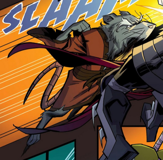
[Monsters. Story, Art and Letters: Jim Lawson Colours: Steve Lavigne]
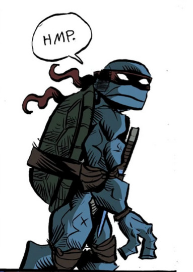
[ID: A very squared jaw turtle style, bold black likes of varying thickness, lots of hashing. It's Raph turning to look over his shoulder with a "Hmp", mask tails flowing behind his head. END]
eeeeee lookit him. mwah. [me explaining] u see. mirage turtles. there so lumpy. and thats EXCELLENT
[Gang Wars. Story: Tristan Jones. Art: Paul Harmon Letters: Tom Napolitano]
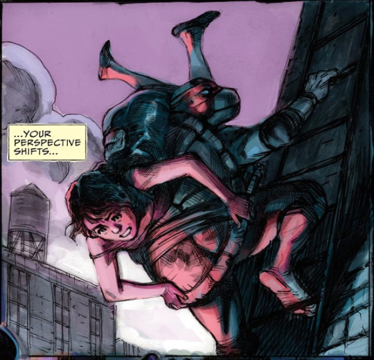

[ID: Rounded head, prominent beak, almost movie puppet turtle style. Art has strong penwork , filled with hatching, but soft impressionistic colours, looking both loose yet detailed.
1. Mike is carrying a women as he climbs a ladder. She's tipped almost complete upside down over his shell. Her narration: You perspective shifts... Soft pinkish hue lights them from below.
2. Mike jumping from the roof with a cheerful "Gotta run!", smiling and offering as salute, both nunchaku in hand. Warm golden light hitting his front as he's half turned. END]
HI. I dont recognize your name (YET) Mr harmon sir. but would u like my award for most gorgeous colour rendering on any mutant turtles ever ever in the whole wide world. (sobbing) mikey.... my boy. my beloved loved boy
(there was comics also repping the image and archies runs here. neither of which ive read yet, SORRY. all the same they were both VERY CHARMING)
[What About Tomorrow. Story: Eric Burnham. Art: Sarah Myer Colour: Luis Antonio Delgado Letters: Shawn Lee]

[ID: 87 show styled comic. Raph is quipping to the villain (or perhaps the audience) "Don't tell me… Sherlock Holmes?" He has a hand on hip, side eyeing Donnie very strongly and says
"Don't give me that look, Donatello. He said guess!" Don is looking at him so incredibly flatly. END]
have u literally very seen something more perfect than that. look at their fucking FACESSSSS. urghh. characterization? perfect. u can hear it. i controlled myself here. i didnt cap the entire fucking comic

[ID: Splinter smiling, eyes close, we see what he is reminiscing on. His human self, reading a book and holding the for normal baby turtles. He say "When I was Hamato Yoshi, I could never have guessed I'd become a mutant rat. Or that I would raise four turtles into heroes I am endlessly proud of. END]
LOOK AT THIS FUCKING RAT. and his turtle sons. (he doesnt call them sons in this cartoon but their his fuckinngggg sons.)
splinter forever we covered.
[Kraang Among Us. Story and Art: Ciro Nieli Letters: Shawn Lee]


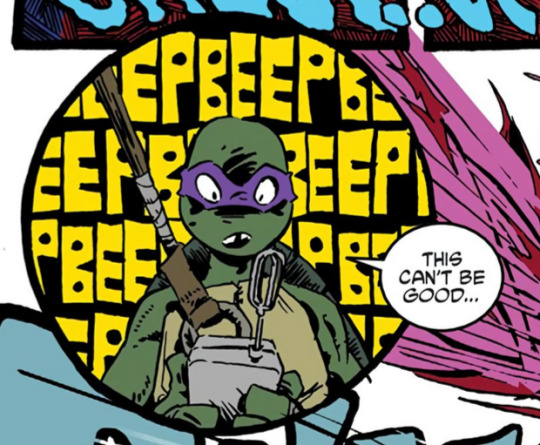
[ID: A 2012 show styled comic, Nieli's style having a punky marker quality to it in comic form.
1. Drawn small, the turtles character-fully posed. Raph casual and aside, Leo earnest out front, Mikey excited and ready, Donnie last, interest in a beeping gadget.
2. Leo bowing on the ground solemn/serene.
3. Graphically bold panel, Mikey has a hand up, smiling cockily, saying "STOP! …My turn. Hit it, Ice Cream Kitty!" Ice cream kitty, (indeed a cat made of Neopolitan) Clicks on a boom box.
4. Donnie says "This can't be good…", with a look of shock at his gadget, wall of text Beeping behind him. A sort of pink viscera explosion just barely in view. END]
which im particular stunned by seeing nieli's creations rendered in 2 dimensions. they looks so fucking good! tho, from all the other aesthetic makers within the show, it totally make sense, the sort of, graphic pop grime. donnie in partic looks so cute, feel like his look is possible BETTER suited for this than the cg, sorry stringbean.
no raph stunner shot sorry he was only in like 2 panels lol.
Rises "Farewell Story" was here. In which Andy Suriano made me cry and cheer and. GUH. look on the internet. u might see some shit. Also a showing from IDW mainline in "Father's Day"... can u maybe GUESS? fantastic gut punch.
[Teen Spirit: Story: Ronda Pattison Art: Pablo Tunica Letters: Tom Napolitano]

[ID: The current mainline comics look, influence from Campbell. The turtles are round and bulky, a light touch used defining the contours of their heads. Wearing grey lose clothes and white limb wraps. Clean detailed black line, water colour like detailed render.
All five turtles in a rocky forest, various states of concentration to summon colour coded magic energies. Jennika on her stomach, kicking feat, playful. Leo hunched close to his, looking intent. Raph with tongue out, first in one hand. Donnie, in eyes closed mediation. Mikey, his hands over head, a rain of fallen leaves from his dispersed magic. He says "Whoops!" END]
Pattison I recconize as a prolific idw turtle colourist. tunica i dont but is another i WILL have to be on the look out for. who doesnt like the sophie campbell era of turtle. they are SOOOO. everything. to me.
bro. which fucking continuity has them all so fucking cute magic hijinks mentored by the SHREDDER. cant wait to find out (i think there was some ghilbi visual ref moments esp. in his panels. VERY CUTE. lord help us all) looook at them. look at raph :p. LOOK AT JENNY JENNY JENNIKA.
okay. thats it. hey guys? turtles is good.
#some shit#turbles...#idw placeholder tag#kjdgjhsdf Okay YAAAAAY. finished this yesterday but decided to WAIT. until i had. less sleep deprived eyes to check my words lol#i loooooove u turtles. i love fictional characters of turtles i love u. turtles as a history of comic story telling. i loooooove.#art. and narrative. in sequence. and the ppl who make it. wahhhhh
7 notes
·
View notes
Last Seen Blogs

elliotironmaidenfan
Elliot

purplebluecrow
Art Hobbyist

abluetournesol-blog
Nabila

mmarzoqi
زوايا الحياة

hyunnstar
Ian ⊹