#moodboard insop
Text


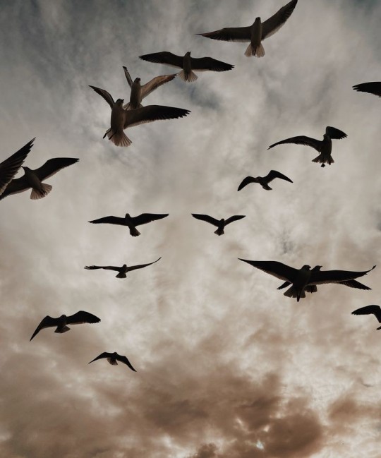

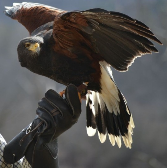
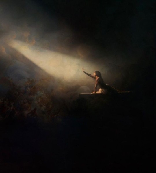
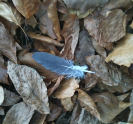
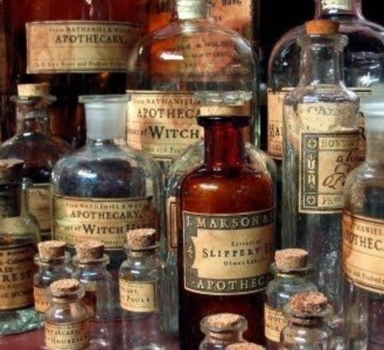

~Weather wizard inspired by @theladyheroine's~
#aesthetic#witch#witchy#witches#witchcore#witchcraft#witchblr#witch community#witch aesthetic#witch moodboard#weather witch#weather wizard#brown#brown aesthetic#brown moodboard#light brown#light brown aesthetic#light brown moodboard#moodboard insop#pastel aesthetic#pastel
17 notes
·
View notes
Text
Data Visualisation Insop - Pinterest
https://www.pinterest.ie/katarinabrennan/series-systems/


After creating a moodboard I could see that circles were a common theme. I really like the bold colours. I think most people switch off when it comes to looking at data, that’s why it’s vital that we make our posters engaging. Colour will definitely help with that.
0 notes
Last Seen Blogs

whopper-t
Whopper

fortvscue
alice fortescue.

kokosgolova
MIYOFUTE

shunqua-blog
Shunqua
jamiesommers23-blog
Jamie's Imaginarium