#nikko g
Text
I want my nibsssss… I want to drawwwwwwww
#I got the nikko g and the maru and the nipponji#I think. They might come next week.#I didn’t know jet pens use asendia for international shipping so it may as well not come at all. Knowing asendia.#(still pissed he didn’t get that Waseon head)
1 note
·
View note
Text
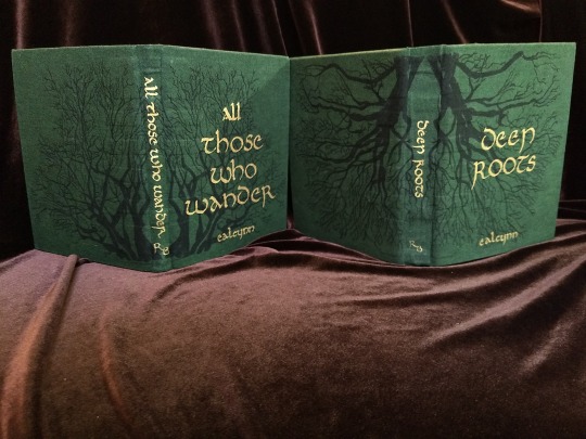


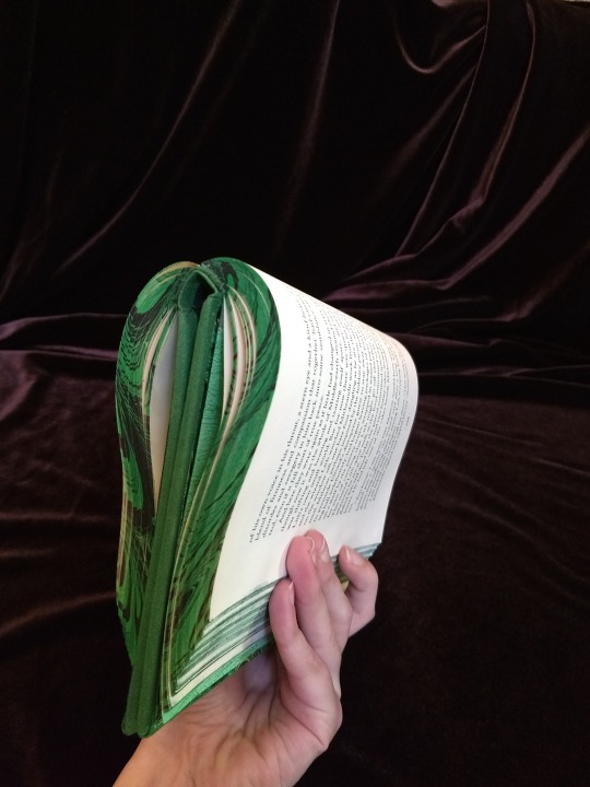
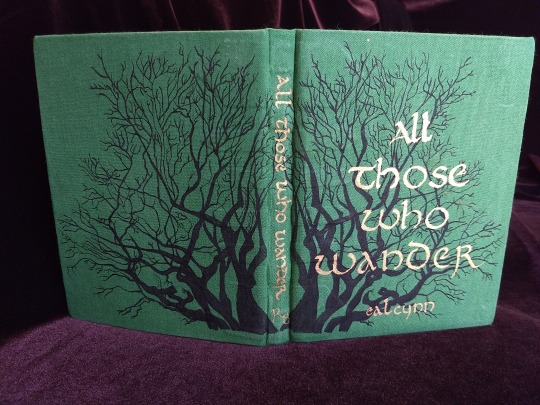
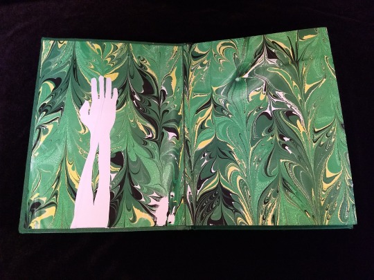
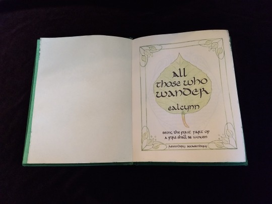
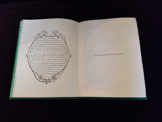

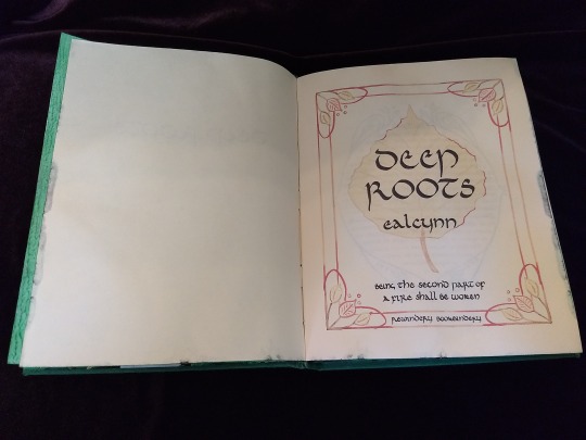
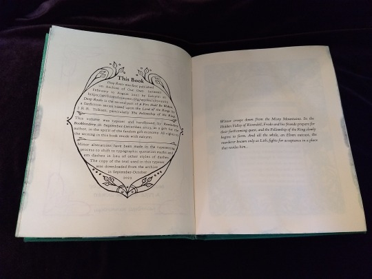


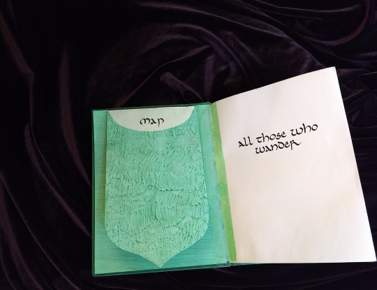

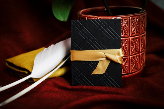
A Fire Shall Be Woken, by Ealcynn. A pair of bindings using the K118 structure, one as a gift for the author and one to keep.
Chapter page illustrations are by Alphonse Mucha, all other illustrations are hand-drawn.
I hope to make a long post later explaining the process in more depth & another to document all my mistakes, but here's the basics.
New techniques learned: Paper marbling, edge marbling, uncial calligraphy, making paste papers, drawing on bookcloth, making paste-filled cloth, fold-out maps
I began work on this project in early September and am completing the finishing touches this week.
Structures:
Binding: K118 tightback
Endpapers: Simple cloth-joined endpapers
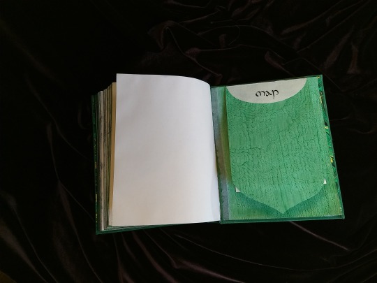
Map fold: Turkish map fold
Materials:
Sewing supports: linen tapes
Thread: 30/3 linen thread
Spine lining: Medium weight kozo tissue bonded to linen fabric
Interior paper: Hammermill Ivory, 11x17, hand-cut to 8.5x11
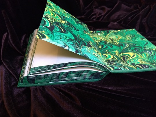
Endpapers: Blick sulphite paper hand-marbled, with masked stenciled silhouettes created with freezer paper
Adhesives: Jade PVA, wheat starch paste, wheat flour paste
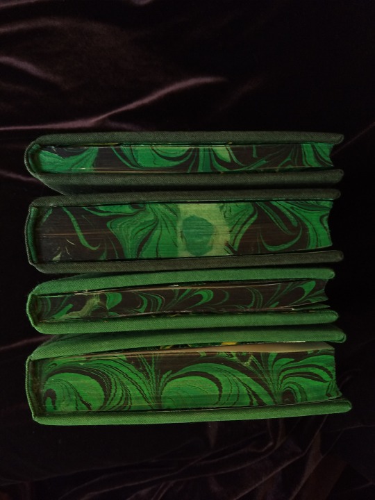
Covers: Davey board, laminated full thickness to half thickness
Cover fabric: Studio E shot cottons in Jungle and Emerald; filled with wheat starch paste
Cover decorations: Speedball india ink and Dr. Ph. Martin's calligraphy ink in Copperplate Gold
Inks for maps and illustrations: Speedball black india ink and a selection of watercolors thickened with gum arabic
Dip pens used for calligraphy: Combination of Brause calligraphy nibs and Leonardt tape nibs
Dip pens used for illustration: Nikko G pointed pen nib
Typesetting:
Typesetting program: Scribus 1.5.5
Body font: Coelacanth in 10 pt caption weight
Headings, titles, chapter titles, drop caps: Hand lettered uncial calligraphy, scanned
Illustrations and References:
Frames on colophon, copyright, author's notes and title page: Hand drawn, with inspiration taken from the vellucent bindings of Cedric Chivers
Frames that illustrate each chapter start: Alphonse Mucha from Cloches de Noël et de Pâques
Cover illustrations: Referenced from a photograph of an European beech tree found on iNaturalist.org
Maps of Imladris: Hand drafted with inspiration from the maps of Barbara Strachey, and Daniel Reeve
Map of Eriador: Traced from a map by Karen Wynn Fonstad, with edits made to coordinate with the geography of the fic
Frames on maps: Referenced from a drawing by Alphonse Mucha that @zhalfirin found for me
Special Thank Yous:
To the tightback council of problem-solvers in the Renegade server: Zhalfirin, Eka, @spockandawe who helped figure out many issues with the structure and technique
To the marbling experts in the Renegade server: Marissa, Aether, AGlance, Jenny, Catz, Badgertide, Rhi, and everyone else who helped me figure out beginnner marbling
To Spock for finding the K118 structure and introducing it to the server!
And to Bruce Levy, who discovered the method and shared his discoveries freely with the bookbinding and conservation world.
#bookbinding#Fanbinding#mine#bookbinding adventures#thank you to everyone i consider this a group effort#it has been 10000 years and I have loved every step#except for sanding. nasty nasty sanding. ew.#fic recs
241 notes
·
View notes
Text

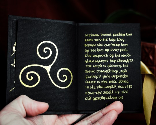
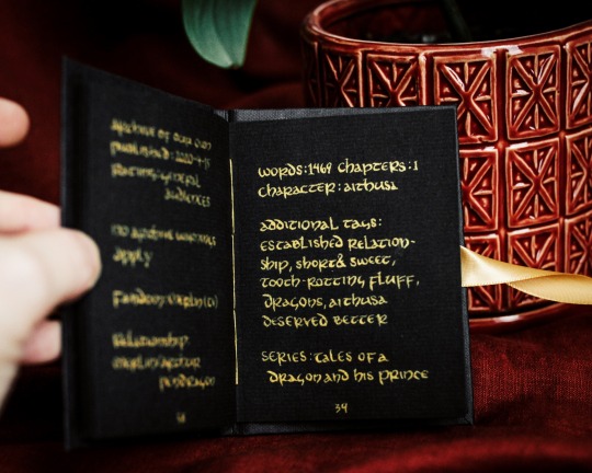


"Aithusa has seen her father's mate in his memories and smelled him on her father's skin when he comes to visit, but this is the first time she gets to meet him for herself."
Nepenthe and Lavender by @0hheytherebigbadwolf
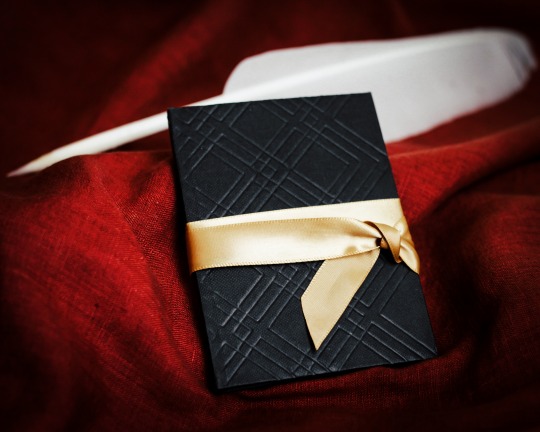
My latest fanARTifact is an entirely handlettered, handbound, and illustrated book of this beautifully fluffy fic (and it has actually been in various states of progress since March 1, 2021.) More below the cut!
So as I said above, I actually started planning this fic over two years ago. Which, yeah, I don't really want to talk about because adhd is a hell of a thing. I love love love this fic (and this entire series) and I was inspired by The Black Hours and other gorgeous manuscripts with metallic on black paper.

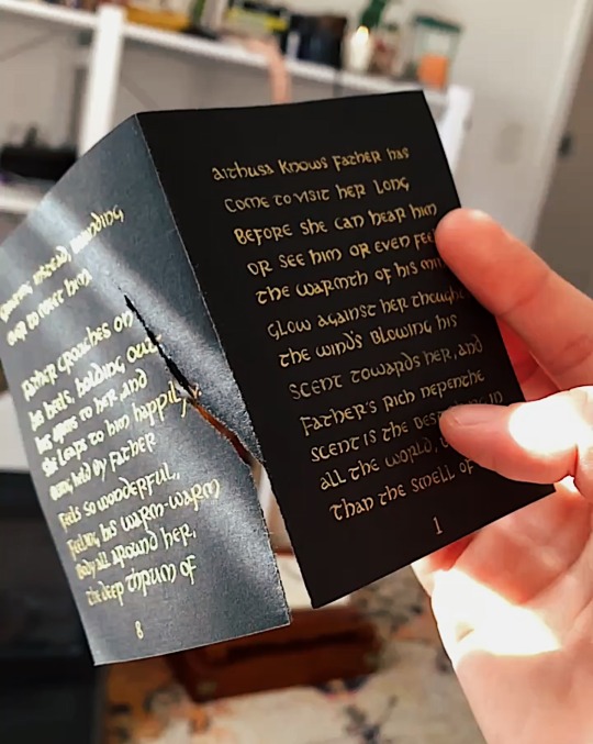
I ordered some black paper from Canson for the text block, used Arabic gold finetec paint mixed with water and gum arabic as my ink (I used three pans of the gold paint...), and a Nikko G nib with a straight pen holder for the calligraphy. I really wanted to use one of my broad tip nibs, but I just couldn't my Uncial letters small enough with it. I used Uncial since that was technically the alphabet/font they used in the Arthurian time period.

The paper was cut down and folded into signatures of three and then I drew out light pencil lines for the text and for the margins. Every single letter was done sooooo slooowwllly because if I messed up on one page there was no way to erase it, which meant I would have to do basically four pages worth of lettering again since they were all connected.
And I did mess up.
More than once.
I think the most heartbreaking mistake was at the very end when I was trying to erase my pencil lines and I just ripped a page completely in half. The tears were real, folks.
Once I finished lettering - which took hours and hours and hours over many weeks - it was time to assemble the text block and sew it. I used gold silk thread I had leftover from Arthur's scarf (which is also used as the backdrop for the photo shoot) to sew the block together and I love how it gives just another little peek of gold to the book.

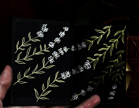
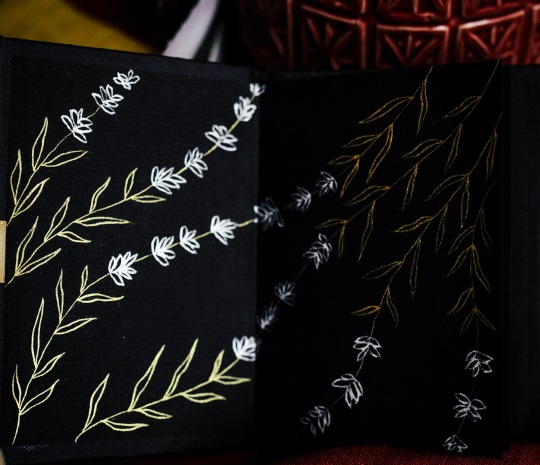
I painted the end papers in a vaguely floral pattern with the same gold and also some silver finetec paint, glued them all together and put them in my book press and then promptly didn't work on it again from October 2022 to July 2023. Sigh.
But once I committed to getting it done, I asked @swanfloatieknight to help be my accountabilibuddy and make sure I finished it this week. I tested out so many different cover designs, from fabric and thread, to paper, to finally settling on this all over design done by my cricut. Historically accurate?? Nah. I'm about as historically accurate as BBC Merlin.
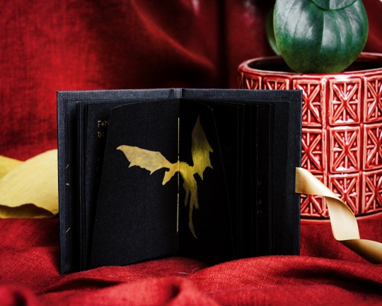
I tried my hand at gold foiling and that was a disaster so I just used a gold silk ribbon to give the color a little bit more color. Once it was bound, I painted in a triskelion and Aithusa on a double page spread I left intentionally blank.
And it was finally done!
All in all, I'm pleased with how it turned out. Was it an exercise in patience? Yes. Did I learn a lot? Also yes. Mostly that handlettering an entire fic is madness and also this is far too small to case bind, but I'm a stubborn ass and it was happening regardless.
All total, I probably worked on this for about 50+ hours. It was most definitely a labor of love and I'm so happy that it's finally done.
Thank you for inspiring me to take on such a project by writing such wonderful fics, @0hheytherebigbadwolf! And thank you for everyone who reads these long fanARTifact posts. 💛
#fanARTifacts#fanARTifact#merlin#bbc merlin#merlin fan art#highlynerdy makes#ficbinding#fanbinding#bookbinding#handmade book#merthur#aithusa#i tried to post a video of me lettering in the read more but tumblr wouldn't let me#the gold handkerchiefs are also made by me#from my marigolds i grew last year and dyed and handsewed them#and the plant is in the picture because his name is Arthur lol#photographing black and gold is a nightmare#especially on red fabric#i need a screen break now whew#merlin fic#art#highlynerdy lettering
513 notes
·
View notes
Text
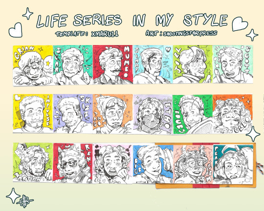
did @xmaruu11 's Life Series In Your Style challenge: except i've been kind of turned off digital art recently, so i did it as a concertina book! inked with a nikko g-nib + dip pen + copic markers! flipthrough video below to see what the book looks like :D
382 notes
·
View notes
Text
MASTERLIST
hi, hi! nikko here! this is where you can see all of my works. i hope you like my stuff here. enjoy reading! 💜
【 ⚠ 】 trigger warning 【 ✰ 】 my favorite fic 【 — 】 series

【 ⚀ 】 home 【 ⚂ 】 anons 【 ⚃ 】 tags
LE SSERAFIM —
» kim chaewon «
→ my number
→ you 【 ✰ 】
» miyawaki sakura «
→ midnight realizations
» huh yunjin «
→ tired
→ soulmate phenomenon 【 pt. 1 】 【 pt. 2 】 【 ✰ 】
→ a slytherin, huh?
→ tv 【 ⚠ 】
→ 18 【 ✰ 】
→ moon flower 【 ft. nakamura kazuha 】 【 ⚠ 】
→ i luvie you
» nakamura kazuha «
→ moon flower 【 ft. huh yunjin 】 【 ⚠ 】
» ot5 «
→ beloved unnie
→ no boys
→ injury and cuddles
→ heavenly 【 — 】
(G)I-DLE —
» cho miyeon «
→ for me, for you
» nicha yontararak «
→ lead me
» yeh shuhua «
→ what a (cute) pain
AESPA —
» yu jimin «
→ i'm sorry 【 pt. 1 】 【 pt. 2 】 【 ✰ 】
BLACKPINK —
» jennie kim «
→ again and again
TWICE —
» park jihyo «
→ be mine
LOONA —
» son hyeju «
→ soft spot
#nikko masterlist!#nikko reqs!#nikko works!#masterlist#kpop masterlist#le sserafim#le sserafim masterlist#le sserafim x reader#gidle#gidle masterlist#gidle x reader#aespa#aespa masterlist#aespa reactions#aespa imagines#aespa x reader#blackpink#blackpink masterlist#blackpink x reader#twice#twice masterlist#twice x reader#loona#loona masterlist#loona x reader
501 notes
·
View notes
Video
Nikko Irohazaka Landscape by Brian G. Kennedy
#Nikko#Irohazaka#Landscape#Nikkō#日光市#Tochigi Prefecture#栃木県#日本#Japan#November#11月#十一月#霜月#jūichigatsu#shimotsuki#frost month#autumn#fall#2023#Reiwa 5#令和5年#flickr#Forest
10 notes
·
View notes
Note
(very shyly) what sketchbooks and art supplies do you like to use?
Rn i am using talens art creation sketchbook, ive not been filling many pages lately as ive been busy with comms and other things, so idk how it holds up to different mediums yet, but I've heard good things, and paper feels nice
I have ohuhu alcohol markers, posca colored pencils and FC polychromos colored pencils ^_^ i also use tombow fudenosuke pen, + kuretake bimoji pen (the hard tip ones, not brush) and sometimes a Nikko Dip Pen G Nib with kuretake sumi ink ^_^
I also have ohuhu water based markers.... literally just like any regular markers from the store but they have brush tip and fine tip which i like ^_^ were also fairly cheap for when i wanna add color without bleeding/ghosting
For gouache i use winsor newton...im still exploring papers and brushes and such for paints, for the traditional comms im doing (alcohol marker + colored pencil) im using canson mixed media paper atm ^_^
And i have arrtx acrylic markers but dont use them as much ^_^ alsp assorted fine point sharpies and fineliners (staedtler and stabilo) but those are mainly for journaling and only incidentally used for drawing
15 notes
·
View notes
Text


Fun fact the Nikko g nib doesn't behave v well on painted surfaces so I had to switch to a brush one word in 🙃
#art#calligraphy#good omens#good omens quotes#fanart#spacing was bad on the second line too boo#but i liked using my new pearlescent pigments
12 notes
·
View notes
Note
hello sweet fairy i have a really good question for u <3 what bllk characters u think are daddy, niichan and uncle material? (the kind of ones we like ofc ofc 🫣)
OOOOO fUn fun fUNN omg ₍ᐢ ›̥̥̥ ༝ ‹̥̥̥ ᐢ₎ ok
DEGEN FATHER: kunigami, AIKU, kaiser (absolute degenerate), REO, baRO, nagi, yukimiya, shidou, loki, prince
SISCONs: isagi, bachira, rIN AND SAE, also kunigami, otOYAAA, CHIGIRI is such a siscon it makes me sick, kira :((, luna, NAGI
GRIMY UNCLES: raichi, gagamaru, KARASU, nikko, aryu, alSO KIRA here wOOF, SHIDOU!!!, and e g o if I gotta put him somewhere
#tw.incest#tw.daddy#I know I missed sOME Of them for sure but this is all I could think of#making me spiRALLL I could talk about all of these in detail bYE#honey mail
64 notes
·
View notes
Text

hey i'm nikko (he/it), welcome to my neopets blog!
i've played neopets since ~2008 and i'm starting over on a (semi) new account, this is where i post dailies, site happenings, reblog art, and talk about my adventures in neopia
if you have questions, trade offers, or just wanna chat, feel free to send me an ask, message me on tumblr, or neomail me!
✩ T A G S ✩
#text post / #txt : plain text posts
#dailies : screenshots of my dailies
#neoboards : posts from the neoboards
#moodboards : item moodboards made by me
#my art / #self reblog : neopets art from my art account @kuromibatwings


#pinned post#neopets#neotag#no dni just please don't talk about proshipping/being proship around me!#and ofc if i have you blocked on main don't follow me here
2 notes
·
View notes
Text


❛ ─ ALL I ASKED FOR WAS A WORLD OF ENDLESS PEACE & COMPASSION. INSTEAD, I WAS MET WITH BLACK FOG, ANGUISH & THE SCREECHING OF CROWS CIRCLING OVERHEAD...
THIS WORLD IS N O T H I N G I BARGAINED FOR. ❜
FCGWISE // PRIVATE && HIGHLY SELECTIVE + LOW ACTIVITY INDIE BLOG FOR DEAD BY DAYLIGHT'S VITTORIO TOSCANO INTERPRETED BY NIKKO. WILL CONTAIN VIOLENT && NSFW MATERIAL. 21+ IS ADVISED. MINORS DNI. CST // BETA EDITOR // 30+.
carrd x starters x memes x threads x nsfw
ADDITIONAL INFO // other blog(s) ;; lycanstark && if you don't see me here, there, or anywhere ;; discord is available via req at writers discretion. a side note, this blog is purely for my enjoyment, i will maintain it as i see fit. do not pester or prod for ( possible ) replies. do not send hate. don't be that person.
2 notes
·
View notes
Text
Day 13: boo. Dip pen artists out there: how do you get your specialty inks to flow properly? I mixed this one yesterday and it worked fine. Came back to it today and it just wouldn't flow off my pen easily. I added water but it didn't help. Those upstrokes are BARELY there. Should my ink be thicker or thinner? Help!
🖋@jetpens Nikko G Nib
🎨 Homemade Pearl Ex Ink using Super Copper
📜 @cansonusa Marker XL
Watermark by @rees.designs
For #SpookySensationChallenge22 @the.jinglebells.art
#calligraphy #letteringpractice #lettering #pointedpen #nikkog #dippen
#handlettering #letteringcommunity #calligraphylovers #calligraphylettering #letteringchallenge #modernletteringpractice #ilovelettering #dailylettering #letteringart #dailyletteringchallenge
2 notes
·
View notes
Text
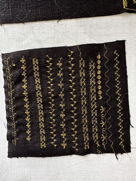
making maps for A Fire Shall Be Woken
it's been a few weeks since I posted an update on my current bookbinding project and that is because I was briefly possessed by the ghost of Christopher Tolkien and decided we needed fold out maps. And, of course, I couldn't find any maps on the internet that suited so...................why not hand draw them? this is reasonable, right?
First I made a map of Eriador (the region to the west of the Misty Mountains), starting with a traced version of Karen Wynn Fonstad's map from The Atlas of Middle Earth. Her map was lovely, but the lettering didn't match the uncial lettering I'm using & I really wanted full color. there were probably easier ways to get a full color map and redo the labels than redrawing the whole damn thing but I am not known for doing things the easy way. I tried to use primarily elvish names for places where available, since that would be how both POV characters refer to them.
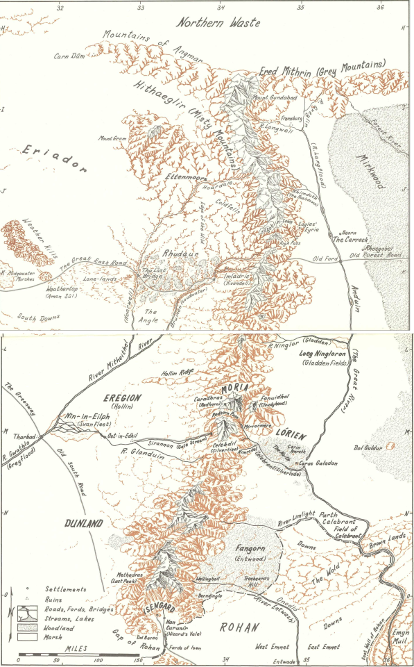
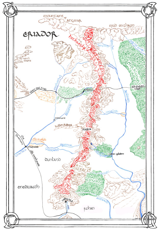
(Karen Fonstad's original on the left, my version on the right)
The whole thing was done with a Nikko G nib dip pen, minus the Eriador label which was a brauss caligraphy nib in 1.5 mm. Most of the colors are watercolors that I diluted & mixed with a little gum arabic to prevent feathering. The black is cheapo speedball india ink.
It's hopefully not *too* obvious in the final version that several sections of the map were redone on a second sheet and spliced together, especially the area around Isengard and Imladris, where I misinterpreted rivers and roads before consulting the Arda Encyclopedia (shoutout to fans who love cataloging information y'all are the best)
The frame is based on a Mucha design that @zhalfirin pointed me towards and felt very fitting.
I finished that map last week and was very happy with it for about two days before I started thinking....oh, but what about the back of the book? What if we had another map for the back of the book? What if we made a map of Rivendell?
9 notes
·
View notes
Text

【塔】
みも/ぽっけ
2024/07/30
第18回歩展出展
■NIKKO Gペン ■証券用インク ■コピックスケッチ ■コピックアクレア ■イラストボード(シリウス)
0 notes
Text
Best Calligraphy Nib Selection: Top Picks for Artists

Best Calligraphy Nib Selection: Uncover the Ultimate Tools for Perfect Penmanship
Calligraphy requires the right nib to achieve beautiful and elegant writing. In this article, we will explore the best calligraphy nibs available in the market. These top picks are suitable for artists of all levels, from beginners to experienced calligraphers. With these high-quality nibs, you can elevate your calligraphy skills and create stunning works of art.
Key Takeaways:
- Choosing the right calligraphy nib is essential for achieving beautiful and elegant writing.
- There are various options available in the market, suitable for artists of all levels.
- The best calligraphy nibs offer excellent performance and help elevate your calligraphy skills.
- Consider the flexibility and sharpness of the nib when making your selection.
- Top picks for different calligraphy styles include nibs for beginners, fine lines, flexible nibs, Copperplate script, modern calligraphy, Gothic Blackletter, brush lettering, and pointed pen calligraphy.
What Makes a Good Calligraphy Nib
When it comes to calligraphy, the choice of nib plays a crucial role in achieving the desired writing style and artistic expression. A good calligraphy nib possesses specific characteristics that contribute to the overall quality of the writing experience. In this section, we will explore the key elements that make a calligraphy nib stand out, including its flexibility and sharpness.
Flexibility of Calligraphy Nibs
Flexibility is an essential characteristic of a calligraphy nib that determines the thickness of the strokes and the amount of pressure required for creating different line widths. A flexible nib allows for greater control over stroke thickness, enabling artists to create varying line widths with ease. On the other hand, a firmer nib provides more stability and is suitable for producing consistent thin lines. The level of flexibility required depends on personal style and the type of calligraphy being practiced.
Sharpness of Calligraphy Nibs
The sharpness of a calligraphy nib directly impacts the thinness of the lines it produces. A sharper nib creates finer hairlines and delicate details in the calligraphy. This characteristic is particularly important for styles that demand precision and intricacy, such as fine-line calligraphy and detailed designs. However, it's worth noting that a nib that is too sharp may require a higher level of skill and control to achieve desired results.
When selecting a calligraphy nib, it's important to consider both flexibility and sharpness to find the perfect balance that suits your needs and artistic style. Experimenting with different nibs can help you discover the ideal combination and unlock new artistic possibilities in your calligraphy journey.
Characteristics
Flexibility
Sharpness
Definition
The ability of a nib to bend with pressure, allowing for varying line widths.
The degree to which the nib produces fine hairlines and delicate details.
Importance
Enables artists to create varying line widths and express different styles.
Contributes to the precision and intricacy of the calligraphy.
Considerations
Choose a nib with flexibility that suits your personal style and desired line widths.
Strike a balance between sharpness for detail and ease of use for your skill level.
Best Calligraphy Nibs for Beginners
Are you new to the world of calligraphy and looking for the best nibs to get started? We've got you covered. Finding the right calligraphy nib as a beginner is crucial for a smooth and enjoyable learning experience. The right nib will make it easier for you to control your strokes and create beautiful lettering. After careful research and analysis, we've identified two top recommendations for beginners: the Nikko G Nib and the Hunt 101 Nib.
The Nikko G Nib is an excellent choice for beginners due to its versatility and user-friendly nature. This nib offers medium flexibility, allowing you to achieve a balance between thicker and thinner strokes. It glides smoothly over the paper, making it easy to work with and minimizing the chances of ink splatters or snags. The Nikko G Nib is highly recommended for both beginners and more advanced artists.
The Hunt 101 Nib is another fantastic option for beginners. This nib offers a sharper and more flexible point, which allows for greater contrast in your calligraphy. With the Hunt 101 Nib, you can easily create both thin hairlines and thick downstrokes, adding depth and dimension to your lettering. It's an ideal choice for beginners who want to experiment with different styles and create eye-catching calligraphy.
Nib
Flexibility
Sharpness
Nikko G Nib
Medium
Moderate
Hunt 101 Nib
Flexible
Sharp
Both the Nikko G Nib and the Hunt 101 Nib are highly recommended for beginners due to their ease of use and forgiving nature. These nibs will help you develop your calligraphy skills and lay a solid foundation for your artistic journey. Remember, as a beginner, it's essential to practice regularly and experiment with different nibs to find the one that suits your style and preferences the best.
Best Calligraphy Nibs for Fine Lines

If you're a calligrapher who loves creating intricate details and fine lines in your artwork, you'll need a calligraphy nib that can deliver exceptional precision. Here are some of the best calligraphy nibs for fine lines:
Leonardt EF Principal Nib
The Leonardt EF Principal Nib is a top choice for calligraphers looking to achieve extremely thin lines. This nib has an extra-fine point that allows for fine, delicate strokes. It offers excellent flexibility, making it easy to control the thickness of your lines. With the Leonardt EF Principal Nib, you can create intricate lettering and add intricate details to your calligraphy.
Brause EF66 Nib
The Brause EF66 Nib is another great option for creating fine lines in calligraphy. This nib features an extra-fine point that allows for precise and detailed lettering. It offers a great balance of flexibility and sharpness, allowing you to achieve consistent and delicate lines. Whether you're working on small-scale lettering or intricate designs, the Brause EF66 Nib is sure to meet your needs.
These nibs are ideal for calligraphers who specialize in styles such as Spencerian script, Copperplate, or any other form of calligraphy that requires fine, intricate lines. With their exceptional precision, these nibs will bring your artwork to life with stunning detail.
So, if you're looking to add beautiful fine lines and delicate details to your calligraphy, consider investing in the Leonardt EF Principal Nib or the Brause EF66 Nib. These nibs offer unmatched precision and control, allowing you to create breathtaking artwork that showcases your talent and skill.
Best Flexible Calligraphy Nibs

Flexible nibs are highly sought after by calligraphers for their ability to create dynamic and expressive strokes. Whether you're a beginner or a seasoned artist, having a nib with great flex can add depth and character to your calligraphic designs. In this section, we will explore some of the best flexible calligraphy nibs available in the market, giving you the freedom to create bold and impactful lettering.
Benefits of Flexible Nibs
Flexible calligraphy nibs offer several advantages for creating expressive lettering. These nibs allow you to vary the line width by adjusting the pressure applied while writing. With a flexible nib, you can effortlessly transition between thin hairlines and broad strokes, adding depth and dimension to your calligraphy. These nibs are especially useful for creating flourishes and intricate details, bringing a unique touch to your artwork.
Furthermore, flexible nibs provide a tactile experience, allowing the calligrapher to feel the flow of the ink on the page. They respond to the pressure applied by your hand, giving you greater control and precision over your strokes. The expressive nature of flexible nibs makes them a popular choice for calligraphers looking to infuse their work with personality and flair.
Top Picks for Flexible Calligraphy Nibs
Nib
Flexibility
Features
Brause 66EF Nib
Excellent flex
Smooth writing experience, suitable for a variety of writing styles
Zebra G Nib
Great flex
Responsive and versatile, ideal for both beginners and experienced calligraphers
These two flexible nibs are highly regarded for their excellent flex and performance. The Brause 66EF Nib offers a smooth writing experience and is suitable for various writing styles. It allows for effortless transitions between thick and thin lines, making it perfect for creating dramatic calligraphy. The Zebra G Nib is another fantastic option that combines great flex with responsiveness. It provides consistent ink flow and is versatile enough to be used by both beginners and experienced calligraphers.
Whether you're looking to add boldness to your lettering or create delicate flourishing, these flexible nibs will give you the freedom and control to unleash your creativity.
Best Calligraphy Nibs for Copperplate Script

Copperplate script is a highly regarded calligraphy style known for its graceful and flowing letterforms. To achieve the best results in Copperplate calligraphy, it's essential to use the right nib. Here are two highly recommended nibs for Copperplate script:
Gillott 303 Nib
The Gillott 303 Nib is a versatile nib that is well-suited for Copperplate calligraphy. It offers a medium flex, allowing for beautiful hairlines and elegant curves. This nib provides excellent control and produces consistent, smooth lines. Whether you're a beginner or an experienced calligrapher, the Gillott 303 Nib is a reliable choice for Copperplate script.
Brause Rose Nib
The Brause Rose Nib is another fantastic option for Copperplate calligraphy. This nib has a medium flex and a fine point, enabling you to create intricate details and delicate hairlines. It offers smooth ink flow and is known for its durability. With the Brause Rose Nib, you can achieve elegant and refined Copperplate script.
Comparison Table: Gillott 303 Nib vs. Brause Rose Nib
Nib
Flexibility
Point Sharpness
Ink Flow
Durability
Gillott 303 Nib
Medium
Good
Smooth
High
Brause Rose Nib
Medium
Fine
Consistent
High
Both the Gillott 303 Nib and the Brause Rose Nib are excellent choices for Copperplate script. While the Gillott 303 Nib offers a slightly more flexible tip, the Brause Rose Nib provides a finer point for intricate details. Ultimately, the best nib for you depends on your personal preference and the specific characteristics you're looking for in your Copperplate calligraphy.
Remember to experiment with different nibs and find the one that suits your style and hand movements the best. The right calligraphy nib can greatly enhance your Copperplate script and help you create stunningly elegant letterforms.
Best Calligraphy Nibs for Modern Calligraphy

Create stunning contemporary lettering with the best calligraphy nibs for modern calligraphy. These nibs are specifically designed to help you achieve the bold downstrokes and varying line widths that define modern script. Whether you're a beginner or an experienced calligrapher, these nibs will enhance your artistic expression and elevate your lettering game.
Top Calligraphy Nib Recommendations
- Leonardt Principal Nib: Known for its versatility, the Leonardt Principal Nib is perfect for creating modern calligraphy. It offers a medium flex, allowing you to achieve both thick downstrokes and delicate upstrokes. With this nib, you can effortlessly create the modern and stylish lettering that's popular today.
- Brause Steno Nib: The Brause Steno Nib is another excellent choice for modern calligraphy. It offers a medium flex and is specially designed for fast writing. This nib allows you to create bold and expressive lettering with ease. Whether you're working on invitations, signage, or personal projects, the Brause Steno Nib will deliver impressive results.
"Modern calligraphy is all about embracing creativity and breaking the rules. These nibs will give you the freedom to experiment and create unique letterforms that reflect your personal style." - Calligraphy Artist
With the best calligraphy nibs for modern calligraphy, you can unleash your creativity and bring your lettering to life. Experiment with different styles, colors, and techniques to make your script truly stand out. Whether you're working on wedding invitations, art prints, or custom designs, these nibs will help you achieve the contemporary look you desire.
Best Calligraphy Nibs for Gothic Blackletter
https://www.youtube.com/watch?v=9bUG-QNKR1Y
When it comes to creating the intricate and classic style of Gothic Blackletter calligraphy, having the right nib is essential. The nib needs to have a sharp point and excellent ink flow to achieve precise and consistent letterforms. Two highly recommended options for this style are the Brause 513 Nib and the Hiro Crown Nib.
The Brause 513 Nib is known for its durability and reliable performance. With its sharp point, it allows for precise and controlled strokes, capturing the delicate details of Gothic Blackletter. It offers a beautiful balance of flexibility and firmness, making it versatile for both thick downstrokes and thin hairlines. The excellent ink flow ensures consistent lines throughout your calligraphy piece.
Another great choice for Gothic Blackletter calligraphy is the Hiro Crown Nib. This nib features an ultra-fine tip that allows for crisp and intricate lines. It is designed specifically for the intricate details and flourishes of this style. With its smooth and consistent ink flow, you can achieve the elegant and flowing letterforms that define Gothic Blackletter.
Nib
Key Features
Brause 513 Nib
Durable, sharp point, excellent ink flow, versatile for thick and thin lines
Hiro Crown Nib
Ultra-fine tip, perfect for intricate details and flourishes, smooth ink flow
Whether you're a beginner or an experienced calligrapher, these nibs will help you create stunning Gothic Blackletter calligraphy pieces. With their precision and performance, you can capture the timeless beauty of this classic style.
Best Calligraphy Nibs for Brush Lettering
Brush lettering is a popular style of calligraphy that allows for bold and expressive letterforms. To achieve stunning brush lettering, you need the right calligraphy nibs that can mimic the fluid strokes of a brush. Here are two excellent options for brush lettering:
Tombow Fudenosuke Brush Pen
The Tombow Fudenosuke Brush Pen is a favorite among calligraphers for its brush-like nib that creates varying line widths. It offers great control and is perfect for both beginners and experienced lettering artists. The flexible nib allows you to create thick downstrokes and thin upstrokes, giving your brush lettering a dynamic and artistic look.
Pentel Sign Pen
The Pentel Sign Pen is another fantastic choice for brush lettering. Its brush-like nib provides a smooth and responsive writing experience, allowing you to achieve consistent and precise strokes. Whether you're creating thick calligraphy or delicate lettering, the Pentel Sign Pen delivers excellent results every time.
Both the Tombow Fudenosuke Brush Pen and the Pentel Sign Pen are highly recommended for brush lettering. They offer the versatility and control you need to create beautiful and expressive brush lettering designs. With these nibs, you can unleash your creativity and take your brush lettering to the next level.
Best Calligraphy Nibs for Pointed Pen Calligraphy
If you are passionate about traditional and elegant calligraphy styles like pointed pen calligraphy, choosing the right nib is crucial. The nib you use directly impacts the quality and beauty of your lettering. For this style, two outstanding options are the Brause Blue Pumpkin Nib and the Brause Bandzug Nib.
The Brause Blue Pumpkin Nib is highly regarded in the calligraphy community for its exceptional performance. It offers a medium flex, allowing you to achieve beautiful hairlines and elegant curves in your letterforms. This nib is a popular choice among calligraphers practicing pointed pen calligraphy.
Another excellent option is the Brause Bandzug Nib, which also provides a medium flex. This nib is known for its consistent ink flow and precise control. It allows for steady hairlines and graceful strokes, making it ideal for creating traditional and classic calligraphic styles.
Nib Name
Flexibility
Performance
Brause Blue Pumpkin Nib
Medium
Exceptional
Brause Bandzug Nib
Medium
Consistent
Both the Brause Blue Pumpkin Nib and the Brause Bandzug Nib are favored by calligraphers for their ability to produce exquisite lettering in the traditional pointed pen style. With these nibs, you can achieve the delicate and precise strokes that define this elegant form of calligraphy.
"The Brause Blue Pumpkin Nib and the Brause Bandzug Nib are highly recommended for pointed pen calligraphy. Their medium flex allows for beautiful hairlines and elegant curves, making them perfect for traditional and classic styles." - Calligraphy expert
Conclusion - Best Calligraphy Nib Selection
The right calligraphy nib can elevate your lettering game and bring your artistic vision to life. Whether you're a beginner or an experienced calligrapher, choosing the perfect nib is essential for creating beautiful and elegant writing.
In this article, we explored the best calligraphy nibs available in the market. From nibs for beginners to those that specialize in fine lines, flexible strokes, Copperplate script, modern calligraphy, Gothic Blackletter, brush lettering, and pointed pen calligraphy, we covered a wide range of options to suit every style and preference.
Remember, when selecting a calligraphy nib, consider the level of flexibility and sharpness you prefer, as well as the overall quality and performance of the nib. By carefully choosing the right nib, you can enhance your calligraphy skills and create stunning works of art.
So go ahead, pick up your pen, and let the perfect calligraphy nib guide your hand as you embark on your creative journey. Happy calligraphy-ing!
FAQ - Best Calligraphy Nib Selection
What are the important characteristics to consider when choosing a calligraphy nib?
The important characteristics to consider when choosing a calligraphy nib are flexibility and sharpness. Flexibility determines the thickness of the strokes and how much pressure is needed, while sharpness affects the thinness of the lines produced.
What are the best calligraphy nibs for beginners?
For beginners, the Nikko G Nib and the Hunt 101 Nib are popular choices. The Nikko G Nib is versatile and suitable for both beginners and advanced artists, while the Hunt 101 Nib offers sharper and more flexible characteristics.
What are the best nibs for creating fine lines in calligraphy?
Read the full article
#BestCalligraphyNibs#CalligraphyNibSelection#NibsforCalligraphy#QualityCalligraphyNibs#TopCalligraphyNibs
0 notes
Text
HOME
hi, hi! i see you've found my navigations, so welcome to my abode! so far, this is the content! please do bear with me because i have school :'D
also, thank you for taking the time to be here! don't be shy to send me random questions or even rants, so you'll feel a tiny bit better because your emotions and opinions are valid 💜
enjoy ^^
important announcement

【 ⚁ 】 masterlist 【 ⚂ 】 anons 【 ⚃ 】 tags
GROUPS!
i write for:
le sserafim, red velvet, dreamcatcher, (g)i-dle, aespa, blackpink, twice, itzy
REQS!
NOT accepting requests! so sorry!
work in progress? 【 tbh, no idea either 】
NIKKO? NIKKO!
⬧ she/her | ‘05 | filo | bisexual | isfj | taurus
⬧ mother of six, father of one!
⬨ ❝nikko❞ is a japanese word for ❝sunshine❞
BIASES!
huh yunjin ; bae joohyun & son seungwan ; kim minji (jiu) ; nicha yontararak ; uchinaga aeri ; jennie kim ; myoui mina ; lee chaeryeong
#nikko masterlist!#nikko reqs!#nikko works!#masterlist#kpop masterlist#le sserafim#red velvet#dreamcatcher#gidle#aespa#blackpink#twice#itzy#le sserafim masterlist#red velvet masterlist#dreamcatcher masterlist#gidle masterlist#aespa masterlist#blackpink masterlist#twice masterlist#itzy masterlist
129 notes
·
View notes
Last Seen Blogs

baneberryjelly
mort

htmlcode
Untitled

thanhtuanfc
Thanh Tuấn FC

ikoreau
I KOREA U

mastrams-blog
Untitled