#one of THE best redesigns I’ve seen
Text
i ADORE star trek alien redesigns. YES trills should be actual huge worms. YES cardassians should be actual big lizards. i know it’s more practical to make most aliens humans with ridges but! but i want more fucked up guys!! more super alien looking aliens!!! and make them recurring aliens that are a core part of the show!!!! betazoids look WAY too much like humans give me humanoid SHRIMP.
Vulcans however. Vulcans are perfect. I can only think of minimal ways to make them less human looking. They are perfect as they are
#best thing i got for vulcan redesign is bigger ears. more severe eyebrows. maybe their eyes are kinda fucked up#maybe digitigrade. less fingers. possibly small little tail with zero purpose because it’s too small#humans and vulcans looking similar is very funny to me though#i’ve seen maybe. 3 episodes of ENT but i’ve seen that one screenshot where an alien asks T’Pol and Human Guy if they’re the same species#and t’pol is like >:\#humans and vulcans look similar on the outside. on the Inside however#this is so much funnier if other aliens look NOTHING like humans or vulcans#humans first contact “oh cool aliens look like us!! neat”#humans meeting Andorians. “NeverMind.”#i actually love the andorian design <33 BUT it’d be cool if they were more buglike. maybe some polar bear influences#conspiracy theories as to why humans and vulcans are so similar physically in this All Aliens Are Weird AU#like Saru? I LOVE HIS DESIGN#ITS SO GOOD#or the little guy from AOS#i do respect that we Do have alien looking aliens in Star Trek. however i want more and I want the popular aliens to look Not like humans
104 notes
·
View notes
Note
your team rose redesign is legitimately the best one i’ve ever seen lol
solidified by the fact that you didn’t change Big much because he’s already perfect
Thanks!!! and yeah,he is perfect.

594 notes
·
View notes
Note
You have one of the best Alastor redesigns I’ve seen, a lot of them are great, but don’t really capture what Alastor is.
I like how yours isn’t over the top, and actually adds onto the original design (by taking less, ironically)


Thank you very much! It sounds very cool :,)
82 notes
·
View notes
Text

Behold, everyone, my most beloved creation… Gowther’s redesign.
Genuinely been tweaking while making with this, ecstatic to show you guys, and he’s finally here!
You mean to tell me that man was a doll the whole time and that never factored into his character design at all? Not in this fuckin’ house, we go full borderline uncanny valley or not at all, because it’s what our boy deserves. Thus, as a doll, Gowther gets to function a bit differently from the others — there had to be a reason he was in that armour for all that time, and I’ve decided that it’s the thing that best protected him from literally breaking because he has porcelain skin and no bones. And, as you can see, there are some Gold Seams from where he’s been broken and put back together before, which I like to imagine the armour has been enchanted to help with.
One of the more glaringly obvious changes, aside from the ball joints, is that Gowther’s hair is now blue. The bright hot pink always felt like a little much to me, especially with his primary colour scheme already being purple, and having a bunch of other bright colours in the cast already. Plus, blue is, surprisingly, the colour that is most associated with Lust.
As for the outfit, I have a friend irl who legit said to “let Gowther be a slut,” being the Sin of Lust and all. So, naturally, I have delivered. I took some partial inspiration from designs I’ve seen for Medieval prostitutes and wenches. With all of these redesigns, I try to have the Sins’ brands showing, and the off the shoulder shirt fit the best both for Gowther’s Sin and the placement of his brand.
As for his brand and the gold seams around it… well, placing a hot brand against anything like porcelain doesn’t mix too well.
My plan for Gowther is to have him be a bit more expressive and lively than he is in canon, in the sense that he’s clearly overcompensating most of the time to appear more normal around others. He’s still got his plot line with figuring out emotions, with some tweaks that I’m still working out, since I always really liked that plot but just not where they went with it, exactly. With strangers, or someone like Elizabeth, he comes off as almost overbearingly friendly; meanwhile, he will roast the rest of Sins into oblivion—largely inspired by his characterization in the Abridged Series, believe it or not.
But that’s enough minor spoilerly stuff for now. Here is Gowther, bask in his glory, let me know what you think, and I will be back relatively soon with another redesign! I think you can guess who the next one will be… ;)
#seven deadly sins#nanatsu no taizai#nnt canon rewrite#nnt rewrite#nnt fanart#nnt Gowther#gowther#sds gowther#seven deadly sins rewrite#sds rewrite comic#NNT FANDOM YOUR DINNER IS READY AND IT’S HOT#my wonderful morally bankrupt boy#in all his ball joint glory
45 notes
·
View notes
Text

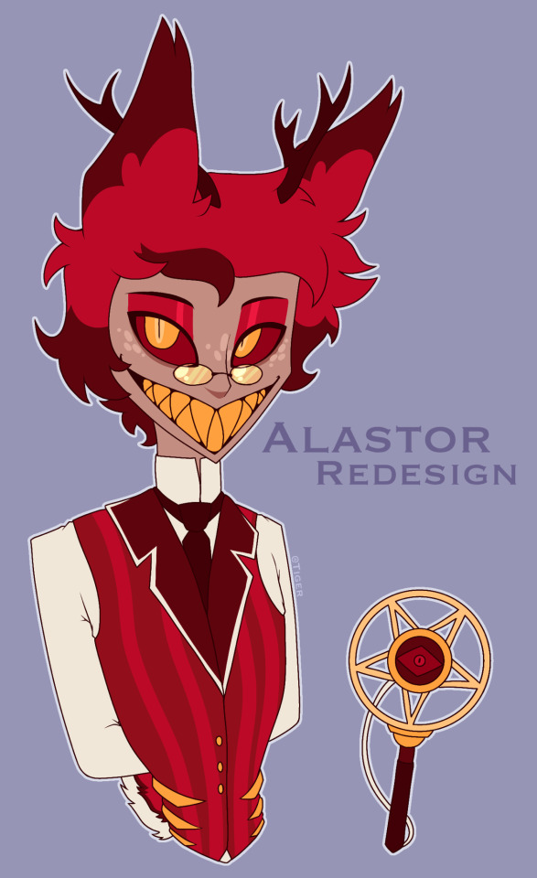
Alastor Redesign! (5/7)
For as much as I hate his guys hair. God that bob. It really is iconic.
Anyway it’s Mr. Hazbin Hotel himself! He’s been growing on me a lot recently (my version, hes boring in the show im so sorry alastor fans)
I think most of my follow have seen my Alastor design so this post may be a bit shorter than the others; still I hope you like seeing him full body
I’ve always thought this guy looked nothing like a deer so I have attempted to fix that. Not sure if it looks the best but you can tell he’s a deer! Alastor is also biomechanical so he has a few technological pieces of his body like his mouth and antlers that are meant to look like those tiny radio tower thingies.
The scar and stitching around his neck is from a fight with Vox. Alastor isn’t able to just design and replace body parts so he has a decent chunk of scars under the suit. I placed it on the neck for vulnerability sake, and also like how you mount deer heads on the wall, I wanted to be like that a little.
For his colours, I did focus a bit on wrath and greed, but his dumb magic stuff is still green to represent envy. Also red and yellow are meant to evoke feelings of hunger and I thought that would be fun because he eats deer and all that :)
The microphone staff Vivzie gave him was stupid so I gave him one more inspired by the 1930’s. The red crescent and gold barings are meant to look like a blood moon and the sun a little bit, I thought that was cool.
Most of his interesting bits are through character interactions rather than how he looks in my opinion, but I think he still looks pretty spiffy. He’s funny, absolutely hate him though! 🥃
#hazbin hotel#hazbin critical#hazbin hotel criticism#hazbin hotel critical#alastor hazbin art#alastor the radio demon#hazbin alastor#alastor hazbin hotel#hazbin hotel alastor#alastor#my art#anti hazbin#anti hazbin hotel#anti vivziepop#hazbin rewrite#hazbin redesign#hazbin rework#hazbin hotel rework#hazbin hotel rewrite#hazbin hotel redesign
52 notes
·
View notes
Text
Amy’s Eye Color
Since I couldn’t get this off my mind I’ve decided to dive deep into the abyss of character design. I’ll mostly add on to what I said in my tags in the, “What Eye Color Looks Good On Amy Rose,” voting post and elaborate.


Short History
Amy’s eye color from the start of her redesign in Sonic Adventure has always been the same as Sonic’s. A warm green that use to be apart of Amy’s classic dress. Which is a nice detail in my opinion. The pink hedgehog’s eyes has been somewhat consistent with Sonic’s from official art, 3D models, to the comics.
It almost always been that way aside from Sonic X. Where her eyes are on the cooler side then Sonic’s. Jade or Emerald to be specific. Her eyes are closer to the color of jewelry. While Sonic has a warmer grassier colored green. I like jade or emerald on Amy’s eyes as well, but I want to keep the topic consistent and less complicated then it already is.
Anyways, I think the minor inconsistencies was done for artistic vision or whenever the lighting would change in the comics. To be honest I’ve noticed color inconsistencies all the time when it comes to Sonic characters. Which isn’t a bad thing. It just shows how much variety you can have when it comes to these characters.
My Thoughts On Amy’s Eye Color
I don’t mind Amy’s eyes being the same as Sonic’s. It doesn’t look bad on her and is one of the reasons her design is as iconic as it is. Especially since it’s been a part of her for so long.
But let’s get into why I personally prefer teal.
I’m no color theory expert, but I’ll do my best. Also, not every Sonic character or cartoon character period, follows these rules. Just a good majority of them do.
Sonic: Blue is a primary color and green is a secondary color. Because green complements blue Sonic’s eyes stands out. Not to mention they symbolize his energy and love for nature.

Blaze: Purple is a secondary color and gold is a primary color. Her purple fur works amazingly with her harsh gold eyes. Symbolizing her fire powers. Also I’ve noticed a few artist add a bit of a reddish orange to her and Silvers eyes and I think they look lovely.
Amy: She’s a bit complicated. Since her red dress takes up most of her design I’ll use it as Amy’s primary color. I believe teal would be a better secondary color for Amy because it stands out a bit better and is less harsh then green. It gives Amy a softer look too.
Teal and pink is also a wonderful combination in general because they balance each other out. With pink’s warmth and energy going with the teal’s calm and coolness. Giving off a more enchanted and mystical feeling to Amy’s eyes. It perfectly compliments her personality too because she’s an energetic character with a soft and sweet nature.
Here are some characters with similar color tones:
They’re not all similar characteristically, but what most of them have in common is they’re kind natured and they’ll protect the people they care about. Just like a certain pink hedgehog.
See how the eyes are the first thing you notice?
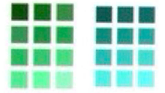
These are around what I have in mind( jade/emerald are cooler greens so they work too):
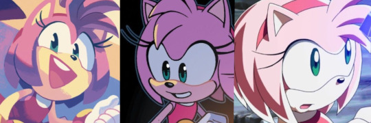
The main reason I prefer Amy’s eyes to be teal is due to a lot of amazing fan-artist. I won’t give out names, (because there’s a bunch of them) but they are so brilliant and I appreciate what they bring to the Sonic feast of wonderful art.
I’ve seen it so much to the point when I think “Amy Rose,” I see her with teal eyes. I know it’s silly, but that’s genuinely what I feel works for her. Besides I enjoy talking about weird topics like these. It keeps the mind turning, you know.
I appreciate the official artist and 3D models as well. Even if Amy’s eyes are barely ever teal, she still looks wonderful without them because of those talented people.
Conclusion
Will Amy’s eyes ever be teal? Probably not. Does any of this matter? No.
Teal eyes or not Amy Rose is a wonderful Sonic character. I hope you had fun with me on exploring this wild world of colors and character design.
Stay Creative! 💜
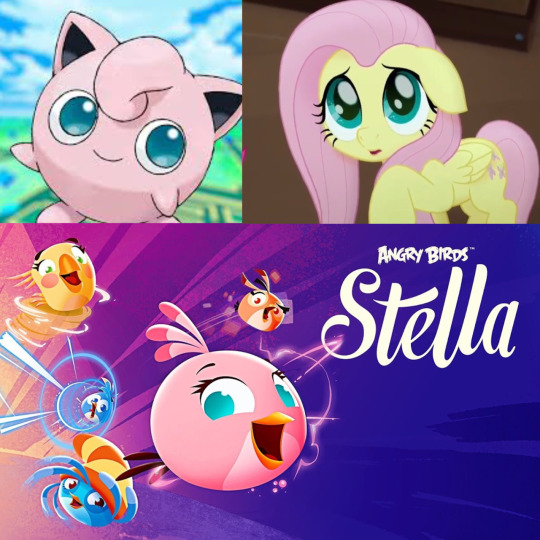
#sonic the hedgehog#sth#amy rose#amy rose hedgehog#sonic and amy#fluttershy#jigglypuff#angry birds stella#gigi#blaze the cat#silver the hedgehog#sonic art#sonic x#sonic idw#sonic fanart#sonic fandom#character design#I adore our energetic girl regardless of eye color#fan artist ROCK#Offical artist ROCK too
111 notes
·
View notes
Text
Yeah I think I am officially done with the Helluva boss critical community… for good.
Before you guys flip your shit and accuse me of being a Stan, let me explain.
So I deleted my tumblr app and decided just to refreshen my mind and focus on other things. (Like my art, my own possible indie project, ect ) and being away for a while… it kind of made me realize how much of the critical community was becoming too much for my mental health.
Originally, I joined because season 2 disappointed with season 2, didn’t like how Vivziepop retconned things like the pilot, the possible workplace allegations, and of course… the fandom being super toxic as hell work promoting toxic positivity.
But holy shit…. Somehow the critical community is even worse than the fandom.
Like I swear nobody talks about what’s wrong with this community. I’ve seen blogs have such an unhealthy hatred to Viv where they post nonstop about her… it’s insane. Like when making account names “wah I hate Vivziepop”
Now don’t get me wrong, I don’t think all critical blogs act like this. I do in fact still follows few, only thing is the ones I follow don’t constantly whine and bitch all the time and actually do critique. And these reblogs I follow just do AUs, rewrites, and redesigns which to me I will always see as harmless fun since that’s what I wanna do.
As for the other half of criticals…. Hell, these people legit get mad and share screenshots making fun of fans with different opinions. Like, bruh, didn’t you guys get angry at stans for doing that to y’all? You guys are literally doing the exact same thing. And no I’m not talking about sharing screenshots of toxic fans that attack former employees and make excuses for a questionable workplace…. But like they’ll just mock fans that didn’t do anything bad.
I’m all for critiquing a fandom and there are Stans that have such an unhealthy parasocial relationships with Viv… but somehow I see people acting the same with their unhealthy hate obsession. Literally going through her IG and bitching and moaning…
Seeing people making assumptions about her and Gooseworks with the glitch x as well as Tracy just shows me how unhealthy this hate is becoming.
Yes, Viv and Tracy had a bit of a heated thing on Twitter. However, I don’t think it’s fair to assume she’s this evil evil hellspawn that’s plotting to destory glitch x. “She’s kissing ass to goodeworks with her fake smile” dude she’s probably a fan of their works, you really don’t know that.
Also, while I’m aware of the allegations concerning Salem (who I hope really recovers and they did really make this episode the best IMO)… it’s probably not fair to assume all employees get treated the same way… the only people that seem to know what went down are Erin, Ken, Salem, and Ashley Nicolas. Do I think the workplace abuse is possible? Yes, it’s why I haven’t bought any merch.
BUT the reason why I don’t like to discuss things like this is because half of the other stuff seems like flimsy evidence besides Salem’s vents. And I think it’s a bit risky to spread such misinformation and make assumptions. (One blog I’ve seen had so many anons sharing rumors and just go along with them which to me is dangerous…)
Like when the new episode aired, unlike everyone else, I actually loved it. This recent episode was so great it’s what I wanna see more of for Helluva boss. But eh… I noticed some haters bitch for the sake of it. Now, some of the critiques aren’t too bad, I did notice some flaws and I understand the concerns for salem. But like other half it’s just bitching for the sake of it…
Also I heard rumors how the deranged stalker fan of Fizz is a parody of critical blogs… tbh I highly doubt that because that trope always existed in cartoons (like Aggrestuko had one too) but considering a good chunk of “criticals” have a hate boner for viv, can you blame some fans for thinking that?
I really don’t like how the critical community became the anti community. Because not every critical person is an anti, I don’t even wanna fuck with that shit and I don’t ever wanna resort to that.
Hell, they drove one critical blog I loved away… over a bad miscommunication.🙃 and that blog was right, you don’t wanna make friends with this community with how some toxic people are.
Also I’ve been drawing a lot of Hazbin hotel stuff for my Heaven AU and it reminded me why I enjoyed Vivziepop’s ideas and stories so much. It somehow was helping me take edge away from my mental health.
I think it’s possible to still be a fan without labeling yourself as a stan or anti. That’s why I made this blog for. I was so worn out by the toxic positivity of the fandom, so this is my comfort space. But now I need to cut the critical community away since it’s now full of toxic negativity.
And as I said, I do plan to make an indie cartoon series and I feel like being part of this critical community is NOT gonna make me professional on my end. That being said, I don’t like Viv as she said things that rubbed me the wrong way BUT I’m not gonna let that kill my joy for Hazbin hotel.(and Helluva boss to an extent) I do think she has good ideas and they CAN work but she does need more writers than animators to help her execute them.
That’s why I’m only a bit more excited for Hazbin hotel lately
Now I’m not angry at anyone who followed me. I just wanna make some boundaries, and that being said, I’m still gonna critique both shows. However, I’m just gonna tag these posts as HH/HB critiques than HH/HB critical for now on. I feel like that’s more professional and more genuine if you wanna share opinions on stuff.
Just wanna get this off my chest, it’s what I wanted to express for a while.
And if fans come across this blog, don’t be afraid to interact I won’t bite. Everyone has their different opinions. I only have an issue with Stans that promote toxic positivity and dismiss employees that were treated badly is all.
#helluva boss critical#helluva boss critique#hazbin hotel critical#hazbin hotel critique#for now on#I wanna restart fresh#and I don’t want antis and Stans to interact with me#you guys need to touch grass with your obsession with viv#it’s hella creepy
75 notes
·
View notes
Text

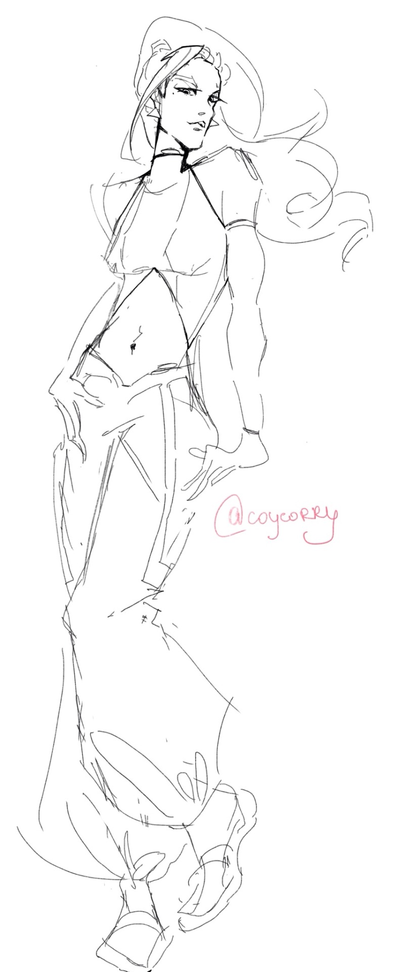


thran, ahito and mei redesign
I always had a feeling like they did such a dirty job on thran’s original design. he was one of my favourite characters, but I’ve heard lots of “nerd” and “ugly” (just like me) from other people, SO I’VE DECIDED THAT HE DESERVES MUCH BETTER and tbh that’s not much that I’ve changed. I only gave him this BTS haircut and changed the colour scheme but he became so sassy (as he should be)
also it seemed bit weird for me that all of them: thran, ahito and rokket (how to pronounce his name) have face-hair in that young age? like in 1st season they’re only 15-16 yo but their facial hair looks perfect??? never seen that happening. I think season 2 is proper enough for them to have their iconic beards, also to show how they grew up since 1st cup, but in season 1 PLEASE.JUST.DON’T.
they are just kids, they need to look younger
ah, mei design is one of the best in the series, so I have nothing to say anymore
#gf reboot when?#nostalgia#2000s#2010s#jetix#galactik football#snowkids#redesign#mei#ahito#thran#i need it for my life#artists on tumblr#fanart#galactic football#please dont tell me they doesn’t look the same as original thats my style#the point of redesigning is CHANGING things#coy corry#au#oc
29 notes
·
View notes
Text
I’ve seen a bunch of really cool alastor redesigns lately and thought I’d have a go at one too
I’m not the best at drawing humans and other things like that so it might look a little rough but I’m proud of it (:
35 notes
·
View notes
Text
I’m always thinking about clothes and clothes hold so much significance in Rebecca and I just need to say that I would redesign Danny’s costume for the musical to set her firmly in the past that she can’t let go of. Everybody else dressed for 1926, Danny dressed for 1916 or thereabouts. I don’t recall if it’s ever explicitly stated how long Maxim and Rebecca were married, but the number 10 is rattling around in my head so it’s what I’m going with. It would distance her further from reality and do some of the storytelling for her character visually. She doesn’t care for what’s new, she wants things to stay the way they were with Rebecca. So she would probably be wearing the same kind of uniform in 1926 that she would’ve been wearing when she and Rebecca first came to Manderley however many years ago.
Something along the lines of this silhouette, which isn’t terribly far off from the existing costume, but is still different. A wash dress or tub dress would simply be the most practical daily attire!
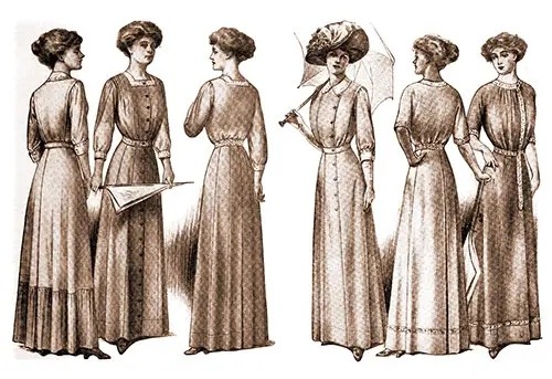
No weird hip peplum thing, and proper undergarments so that the frumpy unfitted bodice has that soft pigeon-breast shape.
There’s still quite a bit of fabric in the skirt, but rather than flaring out at the hips it falls more straight—flattened hips are in from this point on until curves start to come back into fashion later in the 1930s. Remember, fabric was rationed during WW1–and the kind of thrift that was instilled in everyone during that time, let alone someone like Mrs. Danvers, is a value that would likely stick around for awhile in rural areas like the coast where Manderley sits (as opposed to cities, where trends and goods cycle much faster), giving her more reason to keep wearing the same things: they are perfectly serviceable garments, no need to spend the time or money making replacements. That would be inefficient and wasteful.
I’m almost certain that the existing hip peplum and slouchy bodice are intentional to make the actress appear stern and frumpy, but that also doesn’t scan right for me—Mrs. Danvers would keep her clothes perfectly tailored. There’s also something to be said of the implications of an older style—even if you’re not a fashion historian, most people see an older style and immediately have some sort of association of seniority or authority (it distinguishes an older person when in contrast to newer styles) as well as a certain frumpiness or orneriness (the resolution not to change). If it’s properly tailored and has the proper support garments (girdle and brassiere at this point, maybe a bust bodice for shaping, but we’re past corsets and into flattening the hips without accentuating the natural waist), it can have the same effect and communicate more about the character’s past and motivations.
I think one of the best examples of this tactic I’ve seen in costuming is Jessica chastain’s character in crimson peak—I clocked immediately that her clothing was 15-20 years out of style, and it told me right away that the passage of time (and the refusal to accept the passage of time) was an important aspect of the story.
Anyway I’m absolutely supposed to be doing something else right now and none of the books I have in the office go past the 1890s so. This post would be better if I had access to the 1910s catalog reproductions that I have in my workshop at home.
#if I’m feeling artistic again this weekend I might sketch a costume rendering#there’s not enough time left in the day to start a new sewing project and I’ve already cleaned my workstation#so this is where my brain went#I love Edwardian fashion but alas I am confined to 1874-1891#mrs danvers#mrs. danvers#Rebecca#rebecca 1940#rebecca musical#rebecca das musical
45 notes
·
View notes
Text
The Monster Makeovers of Modern Who

With Halloween just around the corner, I thought I would get back into the swing of things and talk about some monsters! No, not Rishi Sunak. Of course, I mean the monsters we actually enjoy! Daleks! Cybermen! And other horrors from the beyond that don’t try and turn trans people into scapegoats for their lack of policy. They say what you really mean- EXTERMINATE! Honesty, transparency, efficiency. Words so alien these days they belong only in Doctor Who! Mr Sunak, you’re so vain. You probably think this blog is about you. But it’s really about fashion. Specifically- makeovers!
I’ve been interested in filmmaking ever since Levar Burton took us to the set of Star Trek on Reading Rainbow. Like Doctor Who, “Star Trek: The Next Generation,” had its own makeover to attempt. They needed to establish a new look from the original series, while still implying continuity. Whole teams came together to reimagine the look of the ship’s interior, the look of the aliens, both classic and new, and even how the characters should dress. It’s truly inspiring to see these crews at work. These passionate people did their best with the available budget and resources. That said, I plan to deconstruct some of the makeovers of modern Doctor Who villains on an aesthetic and (at times) narrative level. It’s just a bit of levity for the horrors of Halloween, so let’s have some fun.
While the topic of updating classic baddies remains subjective, I’d like to think I’ve highlighted ways in which it can be objective. There are no hard rules to the process, but perhaps there are guidelines. I’ve noted a list of classic Doctor Who monsters that have since returned in the new series to discuss which designs I feel were successful and which ones missed the mark. Some of the criticisms I express will already be known to you. The Paradigm Daleks were notoriously reviled amongst fans. But hopefully. some of my opinions may surprise you. I’ve decided to exclude certain redesigns like the Movellans due to their lack of screen time. And while the Ood and Minotaur are cousins of the Sensorites and Nimon respectively, they’re technically not a proper redesign. I will however be covering the cousins of the Silurians- Homo-Reptilia, as they are very much meant to serve the same purpose. I’m presenting this list in alphabetical order, but some creatures will be listed together as a subspecies of another. Buckle up because this is going to be a long one!
Autons

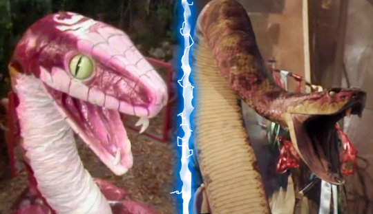
As a child growing up in 90s Kansas, one of my favourite places to visit was the mall. The mall my grandpa used to take me to was known for its extravagant features. One of my favourite things, however, was a clothing store that used mannequins that interacted with the space around them. I don’t mean they moved, but rather that they were dynamically posed. My favourite leaned against the shop window with the palm of its hand. I had never seen that sort of display before. It made them feel as though they were merging into the real world. They were hip if not a touch creepy. I couldn’t tell you the name of the store, but I remember those mannequins. And aside from a granite finish, they looked like the Autons from 2005’s debut episode “Rose.”
Had the Autons returned looking like 70’s mannequins, they would still look creepy. But it would evoke more of a kitschy retro shop than something from a London high street. The creepiness of the Autons isn’t anachronistic, but rather in being timely. The less we notice them, the better. They wear their mundanity like a tiger wears stripes. You only noticed it move when it’s ready. This is a roundabout way for me to say they are brilliantly redesigned. They look modern, and you wouldn’t even notice them if you weren’t predisposed to Doctor Who. They’re exactly the featureless dummy you expect to see in a shop window. The moment their hand gun opens, you would be taken by complete surprise.
A benefit of the Autons coming first alphabetically is that it allows me an opportunity early on to address performance. Because like they say- looks aren’t everything. A Doctor Who baddie is so much more than a costume. And a minor sticking point for me is that the Autons can seem as though they hired a bunch of pop-lockers to stand around in sweaty suits. I’m reminded of the movie theatre scene from “Human Traffic,” where the employees mechanically go about their work. It’s a small grievance, but I wish they would have created a less familiar form of movement than the robot. They’re a hivemind and yet each dancer is doing their own form of popping. I know it costs time and money to do, but it would have been cool to see those dancers come up with a more alien system of movement. It’s not as though the ballet dancers chosen to portray the Weeping Angels were performing pirouettes.
This problem persisted into the Moffat era with Roman Autons. While they were under the impression that they were human, they moved about and spoke like humans. But the moment the Nestine consciousness takes root, their bodies move into a sort of robotic marching. Suddenly whirring can be heard from alien actuators and servos that make no sense for living plastic. Once again, it feels as though they would rather speak in a familiar voice of filmmaking than create one. We all know that little android sounds and robotic movements mean they’re mindless automatons, hell it’s the root of Auton. But the idea of living plastic is so much weirder than a robot. I would love to see them lean more into that.
Cybermen/Cybermats/10th Planet Cybermen

Having started my foray into Doctor Who with Paul McGann and then moving on to the 2005 series, most of the baddies on this list were brand new to me. When I did finally work my way to classic Doctor Who, I was a bit surprised to find the early Cybermen leaned more into the “men,” aspect of their name. Not only were they more articulate than repeating “Delete,” ad nauseum, but their bodies were less robotic. They moved like men. The Cybermen may be the first time I looked at a Doctor Who villain and thought “Oh the old versions were much better.”
This isn’t to say that I disliked the RTD Cybermen, but rather, I find classic Cybermen more effective. While the Cybus Cybermen felt dangerous and militaristic, they lack the humanity present in the Tenth Planet Cybermen. They remind me of the zombies from Return of the Living Dead- they’re smarter, faster, and they feel like the reanimated body of a dead person. You do get glimpses of this in these Cybermen, like in “The Pandorica Opens,” where you see a Cyberhead open to reveal a rotting human skull. The glimpses of the conversion process also imply a deeper dread of body horror.
I would argue that the Moffat era understood the walking dead aspect of the Cybermen better than the Davies era. In “Dark Water/Death in Heaven,” Moffat even pays homage to Return of the Living Dead by reanimating a graveyard of corpses with tainted rain. By this time, the look of the Cybermen had been streamlined from their Cybus look to their svelt “Nightmare in Silver,” look. I liked this redesign as it reminded me of the 80’s Cybermen with their silver space boots. They look more like men than robots. This slimmed-down look was realised even further in the Chibnall era, while also going for a more classic head style. As much as that era of the show disappointed me, its Cybermen were fantastic.
Not every Cyberman update aimed to reinvent their look, however. The updated look for the Tenth Planet Cybermen in “World Enough and Time/The Doctor Falls,” merely added detail to their original appearance. Much like the Type 40 TARDIS the 12th Doctor steals from Gallifrey, the idea was to modernise the look for the high-definition cameras of the modern age. Because of this, these Cybermen may be my favourite of the modern era. It was a risky choice to change their bare hands to flesh-tone gloves, but I understand the decision. I had always liked that the Tenth Planet Cybermen’s hands were bare skin. Historically, hands are one of the hardest things to reproduce in robotics. It also felt that the Cybermen’s hands were the last remaining vestige of their humanity. None of this is lost with the inclusion of gloves. These Cybermen are a nightmare to behold. They languish in physical pain, calling out for solace. The conversion process is still traumatic and bloody. They are horrific.
Another element of the Cybermen that was updated for the new series were the Cybermats. The look of the Cybermats, much like the Cybermen, has always changed, so it’s hard to feel too precious about a redesign. And their appearance in “Closing Time,” is no different. I’ve always liked the look of the modern Cybermat. Their eye shape is a pleasing nod to the Cybermen’s eyes while also calling back to their original appearance. Their segmented tails give an armoured appearance which evokes small creatures like armadillos and insects. My only real complaint about these little munchers would be their very organic teeth. I always figured the “mat” part of their name was meant to be a play on “rat,” so if you were to give them teeth at all, why not rat teeth? What tiny creature was converted to make these little abominations? In the classic series, I never really thought of Cybermats having anything organic about them. You could argue that the Cybermats from “Revenge of the Cybermen,” were snakelike, but I never really thought of them as organic. Regardless, I’m now trolling eBay for one of the 1:1 replicas they sold.
Daleks/Davros

Before their return in 2005, the Daleks made the briefest of cameos in the 1996 Doctor Who TV Movie, sort of. Since we only ever hear their voices, we have no idea what the Daleks would have looked like. Judging by those voices, it’s safe to say they probably would have been a bit of a departure from their general appearance throughout classic Doctor Who. Especially when you consider that adaptations in the ‘90s were known to go for new extremes in design. That’s not to say they would have been bad. The Eighth Doctor’s cathedral-like TARDIS interior was a far cry from the brightly lit round things of the ‘80s TARDISes, and it’s probably my favourite interior. But there is no denying it would be challenging to redesign the universe’s most iconic monsters.
By this measure, I consider the black and bronze Daleks of the RTD era to be a stonking success. Their redesign is mostly effective because it doesn’t aim to reinvent the wheel. It maintains the overall silhouette of the Dalek in a way that makes it immediately recognisable. The changes we do see feel utilitarian, lending these Daleks a tanky quality. You can imagine these Daleks as a product of war. They’re reinforced for battle and feel powerful. Honestly, zero notes. I can’t find a single area for improvement. They even look good in other colours and attachments. Even the mutant inside the casing was given some much-needed continuity in appearance. Where the mutant of the classic series often changed in appearance, it’s now established that Daleks are one-eyed brain squids under all that metal. Simple as can be. No need to change anything.
Enter the Paradigm Daleks. As I said above, the Paradigm Daleks aren’t exactly well-received by the fandom, and not without good reason. I’ve seen at least four different Mighty Morphin’ Power Daleks mash-ups of their big reveal in “Victory of the Daleks.” But is being a big colourful hate machine that bad? I will admit, their silhouette is a bit chonky, giving them bumble-bee bums. But their eye stalks look lethal and their voice modulation fills me with dread down to my stomach. The creepy goat eye nestled in the end of an eyestalk that looks like it would cut to the touch is a great change. I also really like the idea of them having different roles indicated by colour rank. What the hell is an Eternal Dalek? I still want to know.
The biggest issue with the Paradigm Dalek redesign is that unlike it’s predecessor, it seems to miss what is actually scary about Daleks. For starters, Daleks have no concept of elegance, so why the clean lines on the casing? Those neck louvres (that’s what I’m calling them), are far too stylised. Gone is their tank-like appearance, save for their brutal eyestalks. They made them taller as to appear more formidable, which further bolsters why they miss the mark. If you can’t make an hate-filled monster covered in armour scary, the problem isn’t height, it’s writing. Also, we stan a short king in this house.
It’s hard to take the Chibnall-era Dalek redesigns too seriously, because neither of them ever felt like they were meant to be permanent. One was meant to look like a Dalek made of scrap metal, because it was, while the other was the bi-product of two evil forces- the Daleks and the Tories. The “Revolution” Daleks do look a bit like a bootleg toy of a Dalek you could win at a fun fair. Or the result of an AI prompt for the word Dalek. Regardless, they’re fit for purpose and don’t affect my opinion one way or the other. If they had stuck around, I may feel a bit different.
Not to be excluded from the redesign process is the Daleks’ crazed creator- Davros. By the end of the classic era, Davros had a bit of a Rickety Cricket thing going where every time we see him, he’s progressively more mutilated. In the end, he was just a Futurama-style head in a jar. The Davros of the new series is back to a more classic silhouette. His one arm has returned as a cybernetic limb, while the other remains suspiciously under his keyboard. Typing one-handed eh Dave? He’s been given some gimp leather to wear, and his chair has taken on the same armoured look of the Davies Daleks. Much like the mutant inside the casing, Davros has been given a baseline appearance and it's an effective one. Couple that with Julian Bleach’s perfect performance, and you’ve got another success.
Ice Warriors
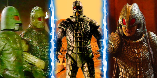
Who doesn’t love a good Ice Warrior? They’re forever cool (no pun intended). While not always villainous, they are fierce and formidable. They’re also a bit weird. The original Ice Warriors stood taller than your average Doctor Who alien. And there is something about their deep green carapace that feels believable. These battle-hardened reptiles wore their outer shells like armour. At the joints of these plated segments sprang tufts of fur. From a costuming perspective, these patches would have been used to hide seams and add points of visual interest for the average black-and-white television. From a narrative perspective, the hair only added to their weirdness. In short, I like the classic Ice Warriors very much.
The Ice Warriors are also the first classic baddie redesign I had to wait to see. By the time I had started watching Doctor Who, Matt Smith was filming series six. The Ice Warriors don’t make their return until series seven, which gave me ample opportunity to imagine what they would look like. What we got was bang on what I had hoped for. They leaned into the weird and won in a big way. When “Cold War,” aired, there was a bit of contention about the reveal of an Ice Warrior outside of its armour. Perhaps it’s because their helmets possess a sort of Judge Dredd quality that in turn causes people to think you can’t show Ice Warriors without their helmets. But they’re going full Stallone and it’s fine. Dare I say it’s even a bit cool?
A sticking point for me on the redesign was the lack of their stupid Lego Minifigure hands, which I love. But when you see their long skinny fingers reaching with their claws out, you might need to give the suit some fingers as well. Their reptilian aspects are also celebrated in their redesign. The Empress is a ferocious take on the look of the commander rank Ice Warriors. I said in my review of “Empress of Mars,” that the guns that turn people into cubes were a bit silly, and I still feel that way. And sure, I would have appreciated the odd "Ssss," at the beginning of an S word. But in the end, they allowed the Ice Warriors to shine for what they are, and that’s all that matters.
The Macra

One of my least favourite Pokémon designs is Raichu. You have Pikachu, an almost perfect marriage of form and cuteness. How do you improve on such a design? You can’t. This is why Raichu’s little curly-Q ear tufts and embellished lines look less like an evolution, and more like someone who didn’t know how to stop drawing Pikachu. Or when to stop spelling bananana. You just can’t improve on perfection. Now you’re probably wondering two things right now-
Why the drive-by on Raichu?
What does this have to do with the Macra?
To answer the second question- “absolutely nothing.” And that’s the point. There was no perfection to mess up in the case of the Macra. The originals looked like a pile of playground equipment. The only place to go was up. First order on the list- does it look like a giant crab? Yes. List over.
Changing the Macra by devolving them into dumb beasts only adds to this winning revamp. Why were they at the bottom of the motorway of New New York? Had their nefarious plot backfired reducing them to mere monsters? It’s a great little incorporation of characters lesser showrunners would have called "embarrassing." I love the Macra. I love that they didn’t overdo the Macra. I love that they don’t tell us everything. Whatever crab rave they had going on down there will be lost to time. Or until Big Finish takes a crack at it.
The Mara
I will admit, this one is a bit of a cheat. It’s one of two on this list that you may think of as a cheat. But hey, they brought the Mara back in the web short “The Passenger,” for the season 20 Blu-ray release. I’m counting it! I’m also counting it because the Mara have been updated not once, but twice to a modern CGI standard. Plus it gives me a chance to talk about “Snakedance,” which I will always relish.
The practice of replacing old footage with newer CGI is not without its detractors. George Lucas released the special edition of the original Star Wars trilogy in 1997 and people are still arguing about it. I’m in two minds about it myself. I like some of the changes they’ve made to Star Wars, ‘60s Star Trek, and even Doctor Who. I dream of the day when they take a crack at Babylon 5. But it also has its limitations. I would be upset if they updated the model shots of Scaroth’s ship in “City of Death.” But in the case of a goofy pink snake puppet? Fine by me.
That is not to say I don’t find the snake puppets of both “Kinda,” and “Snakedance,” charming. They certainly are. But they’re also so very distracting. There’s the suspension of disbelief and then there’s the stifling of laughter. If you can get past the snake, you will see both “Kinda,” and “Snakedance,” for what they are- some of the best of Classic Doctor Who. The CGI snake does exactly that and nothing more. It’s not even a fancy CGI model. Someone probably downloaded a rattlesnake asset and coloured it pink, and that’s absolutely fine. It’s another Macra situation. Does it look more “snake,” than “snek?” Yes. List over.
The Nestine Consciousness
In the words of Vito Corleone- “Look how they massacred my boy!” Ok, maybe massacred is a bit harsh. But even by series one standards, that CGI pool of molten plastic is pretty damn awful. I say this with a handful of caveats. Yes, this was essentially a pilot for the relaunch of the series. Yes, the production crew was brand new. No, the budget wasn’t huge. You could probably list more reasons, but my point is made. They did their best.
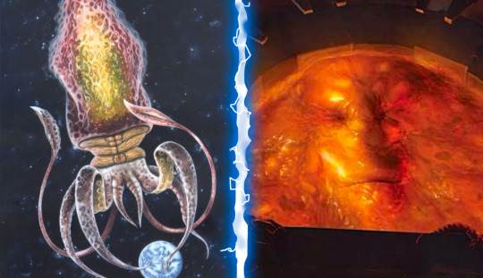
I don’t need to ask why an amorphous blob was easier to depict than a giant space squid. Hell, it was too expensive in the '70s. We only ever saw it’s tentacles back then! I had to use Andrew Skilleter’s illustration from the Target novelisation of “Terror of the Autons.” Mostly because the show never shows the entire squid and also because Skilleter owns! But the kid who grew up on ‘90s Nickelodeon and Beetlejuice in me will never think of a pool of goo as an upgrade from a space squid. It’s just not gonna happen.
As returning readers may have noticed, in the “rad vs. trad,” debate, I have always sided with rad. I like Doctor Who a bit weird. So weird that I am arguing that something is weirder than a glowing vat of sentient plastic. But here I am. The beauty is that RTD explained the change as a devolved form of the Nestine Consciousness. Maybe it was temporary. The squid may return yet! Furthermore, Doctor Who audiences have been watching Talking Tree and Raccoon movies in the intervening years. People are more open to weird these days. Add a bigger budget and we may see the comeback of the cosmic cephalopod!
Rutans

This is the other entry on this list that you may feel is a bit of a cheat. The above illustration on the right comes from an official Doctor Who video game titled “The Gunpowder Plot.” It is a redesign of the Rutan Host for the Matt Smith era. Seeing as their new design is meant to represent the style of the modern series, I’m counting it.
As redesigns go, this one had a lot of wiggle room. Usually only mentioned by name, the only time we ever got to see a Rutan onscreen was “The Horror of Fang Rock.” Throughout most of the story, the Rutan looks like a quenelle of green jelly sloughing slowly up the stairs of a lighthouse. When I was five, my trip to Cocoa Beach was cut short due to an outbreak of jellyfish. The one I almost stepped on with my bare foot looked a lot like that. It’s not hard for me to imagine a little green blob as dangerous.
It feels almost too perfect then that the Rutan redesign would land somewhere in the vicinity of a jellyfish. While they are capable of shapeshifting, tentacles do add to their base physical prowess. You can imagine one of them holding their own against a Sontaran. You can imagine one wrapped around one of their potato noggins and it being lights out. Whoever worked on that game has done the show a favour if they ever bring the Rutans back. Green electric jellyfish will do just fine.
Sea Devils

Back when I reviewed “Legend of the Sea Devils,” I mused that it followed the tradition of Sea Devils stories being “not very interesting.” So it came as a bit of a shock to me back in June when Doctor Who Magazine readers ranked it the eighth-best story of the Pertwee era. What were they seeing that I wasn’t? Because by my standards, it’s about two episodes too long. My thought is that people love it mainly for two reasons- cool vehicles and the Sea Devils themselves. Much like the St Paul’s Cathedral shot from “The Invasion,” the shot of the Sea Devils emerging from the sea is doing most of the heavy lifting. Such is the legacy of effective imagery.
The element of the Sea Devils’ look that has aged the poorest has to be their netted tunics. They look dingy and cheap. I imagine on some level, they helped, as Adam Savage would say, “hide the crimes,” of the costume department. The costumes weren’t playing on camera so maybe they added the netting. I’m just speculating here. After all, their cousins, the SIlurians, walked around in the buff. The next time we see the Sea Devils in “Warriors of the Deep,” they’re decked out in a sort of Samauri attire. Just because they lived underwater doesn’t mean the Sea Devils were unaffected by Feudal Japan. Nobody seems to have cared about this change in costuming. Or perhaps they were busy recoiling from the Myrka. The Silurians remained true to their nudist lifestyle.
Other than the Daleks and the Weeping Angels with Paul Dano’s face of the Chibnall era, I rather liked most of its character redesigns. I particularly liked the Sea Devils. I like that they kept their big fishy eyes and turtle beaks. And did you catch that adorable Baby Sea Devil from “Defenders of Earth?” That thing looks like a cross between Grogu and my own pet tortoise and I would kill for it. Like the Dalek update of the Davies era, they kept the silhouette intact and simply gave it a more believable appearance. Are the eyes a bit more cartoony? Yes. Is that fantastic? Also yes.
The major change to the look of the Sea Devils are their costumes. They’re a sort of mash-up of Asian influences with little references to the netting of their first appearance. If you’re a big fan of the Sea Devils, I think it would be hard to complain about their appearance here. Their bismuth-encrusted swords are a nice addition (just don’t let them touch your skin). You can imagine them as swashbuckling monsters who once ruled the sea. Now if only someone could come along and give them a proper adventure to star in!
Silurians
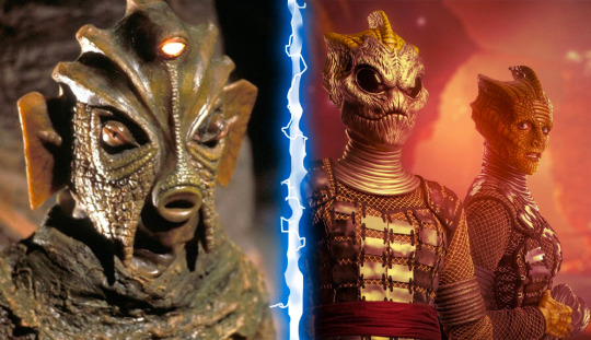
Much like the Royal Family, Doctor Who writers get a lot of leeway out of the word “cousin.” It covers a multitude of sins. Such is the case when dealing with the Silurians and their cousins- Homoreptila. It’s a blink-and-you-miss-it line of dialogue that I unfortunately missed the first time around. I was too busy blinking in disbelief at how depressing Broadchurch with lizards could be. It wasn’t until revisiting the two-part story “The Hungry Earth/Cold Blood,” that I finally heard the line explaining the discrepancy.
Why that matters is that it’s the reason I had a two-year chip on my shoulder about the Silurian redesign. This isn’t to say I thought they looked bad. The makeup job on the modern Silurians is very good. They just don’t look like Silurians. It bothered me because one of the things I liked about Doctor Who is that it often set itself apart from Star Trek. Star Trek aliens are more often than not- rather humanoid. This has always felt like a storytelling device more than anything. Less makeup equals more of the actor’s performance shining through. Doctor Who, on the other hand, asks its viewers to see something relatable in something inhuman. You can still make this complaint against “The Hungry Earth/Cold Blood,” because it does feel like they wanted you to see the human inside the Silurian costume. They couldn’t resist the Spielbergian desire to give the lizards soulful human eyes.
Any design change seems to stem directly from this need, so it feels difficult to judge them otherwise. Even their dehumanising masks were more of a measure to save money on facial prosthetics, though they do add an air of mystery. Those black-eyed masks were downright exciting until they took them off to reveal a very human face. Had they gone with those masks as their faces, I might have been able to overlook the exclusion of their third eye. It would have been very easy to modernise as well. Many reptiles and amphibians have what is known as a parietal eye on top of their heads. They can even sense fluctuations in light. Incorporating one into the design would have been very easy. That said, the ridges on their heads are in keeping with their original design and very striking. Especially on Madame Vastra.
Along with their masks, these Silurians are different in that they are no longer nudists. They now wear clothes. It makes sense that they did this. Their new humanoid appearance makes clothing essential. No need to adapt “The Lusty Argonian Maid,” for television. The costumes aren’t bad either. The netting feels like yet another call-back to their other cousins- the Sea Devils. Even their new guns do a good job echoing the disc-shaped guns the Sea Devils carried but with the aesthetics of the modern era. All in all, this redesign is fine, but I still yearn to see a proper Silurian in the modern style.
Sontarans
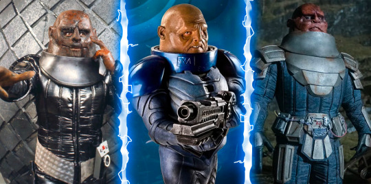
Tumblr user “zagreus-eats-your-bread,” once said of the Chibnall era Sontarans- “Big fan of the redesign. They finally look like absolute shit again. He looks like a knee.” While to some, that sounds like faint praise, I couldn’t agree with their sentiment more. The Sontarans looked awful in classic Doctor Who and I love them for that. There was something unsettling about the way Linx’s tongue would pulsate in “The Time Warrior.” The whiskers poking from his brow and mottled face only added to his vile appearance. His helmet towered over others as he sized them up. A striking foe if there ever was one.
It’s odd then, that the Davies era decided to make the Sontarans squat in stature. They even explain that it is due to the high gravity of Sontar that they’re so short. Their bodies developed for load-bearing. It made sense narratively and wasn’t really a problem. Like I said above- we stan a short king. The problems arose sometime in the Moffat era. The Sontarans had gone from dynamite in a small package to comic relief. I hesitate to blame Strax, but he is when this started to happen.
Cynicism is likely the cause. Writers looked at the Sontarans and said “Ha, potato head and a short body!” One of the fiercest races in Doctor Who history was reduced to an army too stupid to realise that an invisible tank left them completely visible inside. It’s like when people think of the Daleks as embarrassing because they look like pepper pots and completely ignore the fact that they’re also genocidal maniacs. This is why I appreciated Chris Chibnall’s desire to add some ferocity back into the Sontarans. Their stature had returned to that of the classic look, which is fine. Unlike the Daleks, there was a precedent for a tall Sontaran. And yes, they looked like shit again. We could see the Sontarans as a threat once more. Oh, they’re stuck in an off-license eating chocolate like Augustus Gloop? Oh. Right.
Time Lords
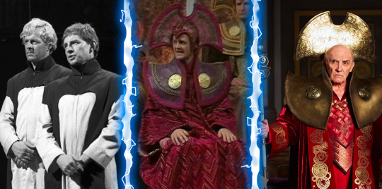
I hemmed and hawed about whether I should include these guys or not. Do I add the Master while I’m at it? But in the end, many Time Lords are monsters and they too received a makeover. Though it isn’t much of one. In fact, I once read that aspects of their costumes were reused from the classic series. You could argue that their biggest redesign happened somewhere between their first appearance in “The War Games,” and “The Deadly Assassin.” They started out looking like a cult that formed in the basement of an Apple Store. But somewhere along the line, they got seriously into collars. It was the ‘70s after all. People’s shirts were 30% collar back then.
Sadly, while the overall look of the ‘70s Time Lords carried on into the modern era, they abandoned their love for colour. Rassilon being the Regina George of Time Lord society decided that we only wear red on Wednesdays. And seeing as they’re time travellers, it’s always Wednesday somewhere! So the Time Lords left their saffron and purple robes at the cleaners. Even the citizens of Gallifrey are shown in “The Day of the Doctor,” wearing variations of red and white. Everyone fell in line and fashion suffered.
When we see the Time Lords in “The Timeless Children,” they’re now wearing very stylish Cyberman headgear. Their red hoods have now been replaced with gold numbers laser-cut with Gallifreyan writing. I would call it a fashion breakthrough if not for the fact that everyone was still decked out in drab silver. I don’t want to see the Time Lords again until they take a page from the Fifteenth Doctor’s book and learn to diversify their wardrobe. Yas hunty! Werk!
Zygons
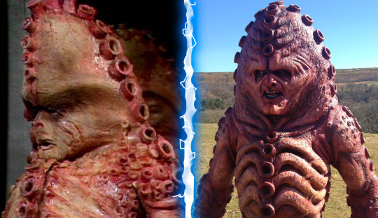
If you’ve not been to Neil Cole’s Museum of Classic Sci-fi in Hexham, you should do yourself a favour and change that. It’s a great day out, and if you’re lucky, Neil might even be available to chat. Something I learned when talking to Neil is that he has some rather strong opinions about the redesign of the Zygons. Primarily, their head shape. Throughout this article, I’ve praised some of the redesigns for their adherence to the basic silhouette of the baddies. If you were to show me either version of a Zygon in a silhouette I would identify them both as Zygons, but dammit Neil, you’re right. The head just isn’t right.
Initially, I thought it was the mouth shape, which is definitely different. When they redesigned the Zygons for “The Day of the Doctor,” my thought was “What happened to their kitty cat faces?” You may not see it, but I have always looked at classic Zygons and thought “Aw, there’s a Mister Kitty!” And they replaced their little button nose and philtrum with a set of far more human features. Seriously Moffat, what is it with you? They’re aliens! Let orange squid men covered in suckers have cat faces!
The top-heavy ridge of their heads gave them a sort of lumbering look, which may have been the impetus to change them. The Zygons of the 50th anniversary needed to do a fair bit of running. But it also detracts from the iconic lines that made them so striking back in 1975. Below the neck, the design choices make a lot of sense. Like the Ice Warriors, the goal seemed to be to add more texture and detail. The ribs seem more defined as do the suckers. Even their bio-tech devices are appropriately slimy and detailed. When they find Kate Stewart in that purple bubbly skin poncho, none of us are offering to trade places with her. Unless that’s your thing. Don’t let me yuck your yum.
My main qualm with the modern Zygon is less with their design and more with their physiology. The Zygons have always been squidgy shapeshifters. But since when do they turn people into smouldering balls of staticky hair? They tried to explain that this was a new development of technology, so why is one of the refugee Zygons able to use it on himself? It’s not as though the Zygon’s body is not already teeming with venomous stingers. If you’ve ever read Mark Morris’ “The Bodysnatchers,” you’ll know exactly what I mean. Mark does such a good job delving into the physiology of the Zygons that he set the standard by which I judge all future Zygon depictions. It’s seriously great stuff.
Aaaaand we're done! Phew! This one took a long time for me to write. I wanted to return with a bit of a long one because I haven't written anything in a while. My sister came to visit from July to August, so I had been very busy. Then I got ill, yadda yadda yadda. Expect to see more of me soon as I plan to cover the 60th Anniversary Specials and beyond. I may even review some classic Doctor Who in the meantime! Stay safe and take care!
#Doctor Who#Monster Makeover#Russell T Davies#Steven Moffat#Chris Chibnall#Auton#Cybermen#Dalek#Davros#Macra#Mara#Snakedance#Kinda#Time Lords#Zygons#Sontarans#Ice Warriors#Rutans#Nestine Consciousness#Silurians#Sea Devils#Modern Doctor Who#Classic Doctor Who#BBC#TARDIS#The Doctor
22 notes
·
View notes
Text

Redesigns of the new strawberry shortcake reboot :]
Design notes under the cut:
Strawberry shortcake: I gave her short hair so the silhouette of her head with the beanie looks more strawberry shaped. Also, something about her new look gives me a skater vibe [maybe it’s the beanie? Idk] so I wanted to lean into that with the rest of the outfit. I gave her a graphic tee over a stripy shirt [the green and white stripes call back to some of her past looks], baggy jeans [calling back to her 2003 look], and sneakers that look like red converse [kept from her current look]. I gave her a cute apron with a heart shaped strawberry on it to make her look more like a baker and to give a bit of a 2000’s skirt-over-pants type of silhouette that I think is fun. Also, I’d like to think that her grandma made it for her :]. I put in a lot of hearts in her design because hearts are kinda strawberry shaped and also she seems like a loving, friendship oriented person, so I felt hearts would fit her personality
Blueberry muffin: I wanted to give her a look that matched her kinda weirdgirl personality in the new show. I’ve only seen an episode and a half so I don’t have too much to go off of, but she seemed kinda spiritual, for lack of a better word [loves ghosts, talks about things having “good energy,” etc.] I gave her long, layered skirts to resemble muffin liners as well as add some flowiness to her outfit. Similarly, I gave her a cropped cardigan thing with wide sleeves. I gave her mismatched socks to make her look a little more eclectic. I tried to incorporate a lot of round/circular shapes into her design to make her more blueberry-ish like her mary janes, the circle pendent on her necklace, the round shape of her bangs, her bubble braid hairstyle [idk if that’s what it’s actually called, i just thought it looked cool], and her blue sunglasses. I made her bangs a little messier so it almost seems like she cut her bangs herself.
Orange blossom: her visor is my favourite part of all of these redesigns. I stole it from one of orange cookie’s costumes from cookie run bc it’s just so nice. I put flowers on her shorts to lean into the blossom part of her name. I also gave her a little orange slice watch to incorporate more oranges into her design. I imagine it’s one of those watches that tells you your heart rate and stuff.
Lime chiffon: I’m not really happy with her design but I tried my best. I have her pigtails in the shape of semicircles to look like lime slices. I made her glasses lime shaped. To lean into her nerdy/preppy look, I gave her a sweater vest over a polo. I kept the design of her skirt to be lime-ish. I gave her blueberry’s Ugg-like boots because I wanted to add some brown into her outfit to be like the cake part of a lime chiffon cake.
Lemon meringue: shes not TOO different from her current canon design. I changed her hair to be more lemon shaped. I also thought the shape gave her a bit more of a mad scientist look. I also put some white in her hair to incorporate some meringue-ness. I put some patches on her overalls like she’s used them for a long time and they’ve gotten worn out. Also, it allowed me to add some more lemon-y elements to her outfit. I put a lightning bolt on the chest of the overalls because her voice reminds me of rainbow dash and also i think you can use lemons to make electricity[? I think I did an experiment like that in elementary school]. I made her goggles look like lemon tarts for funsies. I gave her a tool belt to incorporate more brown into the design and bc all inventors need tools handy.
13 notes
·
View notes
Text
natm 4 has been around for a year. some stuff i’ve noticed since it came out:
people still argue abt the mini redesigns. the reasons vary; usually boils down to personal disgust from opposition, and representation from support.
joan’s one of the crew now. often paired with wea. women stay winning.
ignoring laaa has been taken to a whole new level. haven’t seen him since NATM Week.
noticing how much the minis hold onto each other. we were fed very well.
seth has also been largely ignored.
my gut says that this one will be nostalgic someday, in perhaps a decade or two. not to us from the original trilogy, but to the kids growing up in era 3 now. they’ll see the musical come out and experience era 4.
tbh i’m glad we got natm 4, if only because it was so many people’s first film to work on. so many of the animators don’t have any socials outside of linkedin, and this was their first contract or even first job.
that, and redhead jed. he’s the best thing that ever happened.
17 notes
·
View notes
Text
REDESIGNING FARUZAN (Genshin Impact)
Disclaimer: This redesign is entirely based off of my own perspectives and opinions as a Persian raised in a Zoroastrian household, and do not reflect the opinions of SWANA as a whole. If you have a differing opinion, please don’t hesitate to leave a comment or send me a direct message!
What I think Faruzan’s original design is supposed to be based off of:
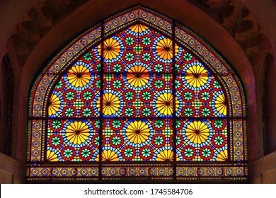
This is a Persian stained glass technique, which can be seen in the “stained glass” look of Faruzan’s skirt in her original design, albeit simplified for ease of animation.
And this is what that stained glass pattern looks like in sunlight. Isn’t it beautiful?
Now on to my Redesign…

I decided to incorporate more of the original stained glass type of pattern to create a longer skirt/trousers combination, since this would allow me more space to draw a “stained glass” texture, while also maintaining Genshin Impact’s aesthetic of combining modern and traditional attire to create a unique look.
I kept Faruzan’s blouse the same, since there’s not a whole lot wrong with it (and drawing the skirt took long enough lol!). Also, given the pattern of the Persian-coded characters wearing white, which has some significance to Zoroastrianism, I decided it would be best to keep it the same color palette.
I decided to add a white cap, with a similar floral motif to her skirt, since her blouse somewhat resembled a Sedreh to me, I thought it would be a good idea to incorporate either a Mathabana like Nilou wears, or a white cap. Due to the volume of Faruzan’s hair and the fact that there is at least one character wearing Mathabana, I decided to go with the cap for Faruzan.
I decided to give Faruzan a healthy tan, because her original color palette looks a bit washed out otherwise, although that is just my opinion. I kept the rest of her color palette the same.
My overall opinions on Faruzan:
The good:
I think the explicit representation of Persian or Persian-coded characters is great, and since there is virtually no other mainstream representation, I have to give some credit to HYV for doing so, and going as far as to look into our ancestral belief systems as well.
I think it’s very creative to construct a dress based on architectural techniques, especially stained glass.
The jewelry that Faruzan is wearing is super cute. If someone out there was selling these, I’d probably buy them.
Like others have said, she looks like Hatsune Miku lol.
The Bad:
Like I said earlier, her color palette is a bit washed out, and would benefit from either a darker skin tone, or less green, blue, and grey tones overall.
Despite the creativity in using stained glass to inspire an outfit, the original dress design feels a bit bland, hence my redesign in the first place. It would have been cool to see a stained-glass floral print or something more elaborate than simple diamond shapes, in my opinion.
I didn’t think the bows added anything of value, so I just scrapped them for no reason other than I didn’t feel like drawing them.
Final Takeaways:
While I don’t think Faruzan has the absolute worst character design I’ve seen out there, I do think there was some room for improvement.
#digital art#genshin impact#genshin fluff#genshin impact fanart#anime#art#anime art#Genshin#genshin faruzan#faruzan#faruzan genshin#Faruzan Genshin impact#Genshin impact faruzan#genshin impact redesign#sumeru characters#sumeru#sumeru redesigns#sumeru redesign#Faruzan redesign#redesign#character redesign#Faruzan fan art#hatsune miku#Genshin impact Faruzan fanart#Genshin faruzan fanart#anemo#Genshin fanart#genshin redesign#persian artists#persian
90 notes
·
View notes
Note
hi there!! first of all, love your art, your line work skill and how dynamic you make your characters is incredible. second, i found your blog through your Lucifer and Paimon redesigns, so i wanted to ask if you had any design advice for someone who isn’t pagan?
I’m a born and raised Christian, so I’ve never really been allowed to look at demonic, wiccan, or pagan stuff, but i find it so cool. Paganism is absolutely awesome and i can say much better things about it’s practitioners than my own religion’s given that i’ve never met a hateful or judgy pagan.
Anyway, I noticed in your Paimon redesign that you said he was your Patron, which is, again, awesome, and you depicted him as a fox and a middle eastern man because that’s how he presented himself to you and others.
I guess the long and short of this ask is how can someone like me who isn’t in touch with paganism best artistically depict these beings?You drew from personal religious experience to design him, which is awesome!! I’ve never seen him depicted as a fox anywhere else, but i trust you know your Patron better than whoever wrote his Wiki page. Given that I can’t connect like that, I guess i’m just wondering if there are, like, pagan run websites where i can learn from actual practitioners? Somewhere with actual, reliable information about pagan culture and how your Patrons present themselves in the modern day? Paganism has a bad rep cause of Christianity, so I’m always a bit concerned that when i’m doing research (which usually only leads to biblical websites) it’ll be biased or paint the deity wrong.
I don’t wanna just say “oh this is my oc now i’m gonna do what i want with them” because i think that’s just really disrespectful to do with a figure from a practiced religion. I wouldn’t want someone to bastardize my God by oc-ifying him, so I don’t wanna poorly represent someone else’s deity.
anyway i’m sorry if this is a lot, i’m a character designer and i’m gradually working my way through the Ars Goetia demons and i want to make sure to represent them as well as possible. If this is too long and/or you just don’t wanna answer it on your blog, i totally understand. If you wanna message me about anything at all in response to this instead of replying to this ask, that’d also be extremely appreciated. If you wanna just ignore this, that is also completely fine and i will not be personally offended. If this in any way made you uncomfortable or bothered you at all, i’m truly sorry as that was never my intention. I’m just looking to learn more about your religion and practices from a reliable source.
If you got to this point, thank you so much for reading all of that (again, i’m so sorry it’s so long) and I hope you have a good day/night!!
This is a pretty long but amazing question.
Please do not apologize, your question was sincere and came from a place of genuine doubt that is open to learn.
First of all, if you want me to answer any other Occult-related questions please send them to side blog! @sonofstarsnsea. Also thank you so much for the compliments! Line work is my favorite part of my art process, and I have never been told my characters are dynamic, it is truly awsome someone thinks of my art that way.
REGARDING PAGAN/OCCULT DESIGNS
It is very nice of you to think on depth on how to make your designs more interesting and unique via research, since not a lot of people do that and just go away with the first thing that they come off with (Netflix's Lucifer ☠️).
You can absolutely design characters based off pagan/occult beigns! Asking us (occultists/pagans) about these matters is actually the best thing you can do, because you are getting unique and personal ideas that can be translated into amazing stories.
Actually, my Stolas' redesign is based on one of my friends' experience with him, so even inside our circles we can ask for advice regarding artistic matters.
BE MINDFUL: CULTURAL APPROPIATION
Unfortunately, as much as I wish for outsiders to see and appreciate the unseen religions, there are going to be people who will take anything they see as theirs and won't do a more in-depth research.
I remember someone asking me to redesign Lilith, and while I could do that, I didn't (and still don't) feel comfortable doing it. Why? Because Lilith is a closed-practice deity from Judaism. I am not jewish nor I am planning into converting into judaism, thats why I keep a respectful distance from those designs/characters and leave them for those who actually have a say/voice into the matter.
There are other closed practices such as the Kabbalah, Voodou, etc; that you can encounter but it is better to respect it and leave it only to those who practice.
So when designing pagan/occult characters or stories ask yourself: Are these beigns from a closed practice? Am I representing them in a respectful way?
But most importantly listen to those who are part of those practices.
RELIABLE SOURCES: WHEN INFORMATION IS NOT TRUSTFUL
Even I struggle to get information and I take everything I read/hear with a grain of salt.
I personally love watching ESOTERICA on YouTube; he is a jewish scholar who focuses on the studies of the occult, esoterism and spirituality with an academic perspective. He doesn't really talk much about the Ars Goetia (although he does have some videos on it) but he explores Hermetic magic and Gnotisism, maybe that could help you!
I feel this channel should be a great start for you.
Regarding other sources, always use critical thinking and here on Tumblr there are actually good sources/masterposts you can look up to!
I hope this answer helped you.
5 notes
·
View notes
Text
Thoughts On Muffins Rescripted So Far
For anyone wondering, I will give a brief summary of what Muffins is. The Muffins Saga is a My Little Pony: Friendship is Magic grimdark fanfiction series. The series started with a short 2013 fanfiction titled "Muffins", which was a spin-off to an infamous MLP:FiM fanfiction "Cupcakes" by Sergeant Sprinkles. Thirty-six prequels, sequels and midquels were written, with six supposedly remaining.
Due to the controversies surrounding the author, Rainbott made their own reclamation of Muffins. This version of Muffins is called ‘Icing On The Cake’, and has a few differences from the original. I want to go over the synopsis I’ve seen so far and give my thoughts on what I like and what I don’t like. I should clarify that while I am critical of some aspects of this re-write, I didn’t make this post to shit on Rainbott. This is a blog hardly anyone reads, and I’m not trying to be rude. I’m just giving my opinion on it. I will clarify this: I like the concepts presented in the re-write, I’m just uncertain about the execution and how that’ll go. I say this out of love for the original, the concepts presented in Icing On The Cake, and my personal opinion.
If you want the tl;dr: I have mixed thoughts on Icing On The Cake, but I like that it makes an attempt to bring new life to an old story. I like the fact that Pinkie is portrayed as more of a manipulator, and I like that there are a lot of unique, creative ideas in the story.
Topic: Onyx ‘Minkie Pie’
So, I’ve seen a lot of Minkie redesigns. I even made my own. And I think this one stays close to the original, while adding some new stuff in with it. The blue and the purple look good together, and her cutie mark is unique with a heart shape to it. It’s a pretty okay redesign.
I don’t really like how in her backstory, as it kind of goes against what Muffins originally characterised Cloudy as. I mean, it’s a re-write, right? Haha, that rhymes. Cloudy… I mean, Peppo… Also, look. I know she isn’t the brightest, but how can a NEWBORN be ‘taught’ demonic things? Cloudy isn’t that thick, even if she pretty is. I don’t know, it seems low stakes to me.
Something I noticed is that Derpy and Apple Bloom’s name are consistently spelt wrong. Derpy Hooves is spelt as Whooves, and Apple Bloom is spelt as Applebloom. Also, I feel like Maud - from the synopsis - doesn’t play a massive role. That’s kinda sad… anyway, I still disagree with giving Minkie the ability to spot lies.
Pinkie Pie’s Project - I think the cheese grater is still a problem. I mean, Nightmare Moon is feared, right? A villain. Why would a child want to replicate a villains actions, especially when fillies fear Nightmare Moon? I thought it was going in the direction of “Pinkie makes a sacrifice for Nightmare Moon” but eh… personally, I’d have Rain Cloud be stumbled across by Pinkie Pie, who was her best friend, and Pinkie breaks down and doesn’t know what to do. The cheese grater incident (which occurred before) gave her inspiration to keep her friend with her forever, by baking her. She then takes revenge on Rain Cloud’s behalf, taking out village bullies, before her morality shrinks as her urges become unbearable and she begins preying on innocent.
Just my idea.
3. Beauty Lies Within
It’s alright. It’s essentially the same as the original, and I loved the original story. I’d say it was my favourite Muffins story.
4. Stuck In The Limelight
Eh, I don’t mind it. It’s alright.
5. The Fun Never Ends
I feel as if this re-write excludes a major detail that was one of the stronger original points: Minkie protecting AB and Derpy. Idk why it was cut.
6. The Last Crusade.
I like it. I like how manipulative Pinkie Pie is.
7. The Rest
The story at this point gets… a bit ridiculous. And then by A Glimmer Of Hope, it gets beyond ridiculous. And the time travel is where I kinda lost it. So, by time travelling, did Apple Bloom just abandon her old timeline? What happened to the Inkie, Minkie, Blinkie and Derpy of that world? The ending also feels a bit too optimistic, too perfect. What did any of it mean, if in the end, Apple Bloom would just travel back in time anyway? What impact did killing Bellatrix really have if it was ‘erased’ from the past? I feel like by having a perfect, rose-tinted ending, it kind of sours what could’ve been a great story. Because I like some of the concepts in Icing On The Cake, I just don’t like the synopsis we’ve been given so far. And it’s that disappointment is something that could’ve been great that’s why I’m even making this post, not hate, not anger, but disappointment and a love for a concept. My comment on Rainbott’s video doesn’t have any of these criticisms, because I don’t like going out of my way to tell people I don’t like this or that. This is just my opinion. This version of the story also treats Pinkie like the ultimate root of evil, when in reality, what the original Muffins did right was highlight the effects that long term abuse from a highly religious family could cause.
To give an example of a good time travelling story, let’s look at one of my favourite pieces of media, Higurashi. In Higurashi, spoilers, the true protagonist is revealed to be Rika Furude, who has been stuck in a time loop for a hundred years or so, trying to find a way to prevent all her friends deaths. In the end, things turned out fine, but there were still sacrifices to be made. The time travel worked in that story because it flips the idea of ‘being given a chance to do things right’ on its head. Rika was given many chances to, but like a human, she couldn’t figure it out easily. So she began to slowly deteriorate in her psyche. Even when she reached the ‘perfect world’, things weren’t guaranteed to be perfect. I mean, Sotsu and Meguri are the result of Satoko not getting therapy for her trauma. In this Muffins Rescripted, all of the characters horrendous actions are undone. They don’t even remember it, except AB & Pinkie Pie. I mean, even in Life Is Strange, Max faces consequences for messing with time. Time travel is generally an overpowered tool of fiction, and it can be used to tie things up neatly, even if a story is written into a corner.
We can’t know for certain how the story will go as we are only given a synopsis, but from what I’ve seen, I have mixed feelings. I think something oddly endearing about Muffins was that it felt down to Earth. There was no magical fights. And while I understand it’s intentional to stray from this, I really think the charm of Muffins is in a way… its edginess. The fact that things reflect the real world. The fact PRISON exists (yes I’m aware there’s a pony cop in the show. one.), the fact that Babs tricks kids into eating apple seeds, the fact that there are *serial killers*. The fact that the plot doesn’t rely on magic. It’s sort of an ironic twist on the original. The fantasy and sci-fi elements out of left field just rub me the wrong way… genre whiplash, sorta.
But hey, we’ll have to wait until the stories are actually out to make our full judgments.
13 notes
·
View notes
Last Seen Blogs
saddarkangel17
🖤Zrozumie Cię ten, który przeżył to co Ty...🖤

doitnowrememberitlater0
Do it now, Remember it later...

typicalot
(the) typical ot
jane-in-kakariko
Adventures in Kakariko
bl4ckt3e
you like your girls insane