#only thing I liked was the sfx
Text
literally, every single person in prometheus is an absolute idiot
3 notes
·
View notes
Text

A Patren -1gou design attempt. Based on one out of 3 unused VS Changer lines (other for Lupin Black and Patren 0. Have no ideas for em, sadly, aside from 0 likely being white ranger? -1 and Black's lines sound more wicked, so I assume they are "evil" rangers, hence the look of this one)
Notes and thoughts rambling under the cut

Zombie and Vampire was rather random, but fitting idea to give something unique and "wrong" to those. That's to say, I only have possible thoughts about -1gou role in context of the show
1.5. Or well, in context of my idea? It takes closer to end of the show, so putting whole new 3 rangers seems to bloat the plot/cut the focus
Yea, judging from the name I feel it be logical to assume it is Keiichiro. Idk human experiments from ganglers y'now. Would happen after 44? or mb early, if to put "skinwalker satoru" 2 ep arc earlier as well (I'm trying to think in context of the show's format)
He's likely not having a good day
Feel Gouche still would want to open up Noel with her knife, so would send -1gou to grab him for her. And to overall support motws and/or "play" with kaitous and cops' feelings.
Could learn Kairi's identity this way? I feel it might trigger him out of the -1gou state for a moment. Classic plot of bringing corrupted protag/main character back to normal through "feelings/pushing on what's important to them" follows.
Okay design notes now
White neck-overall main mold thing across all 8 suits? so I assume this one would have it too
He is black ranger, again, going with whole double red idea of the season, so double black (but again I have no idea where would Lupin Black show up...)
It did turned up more like having palette swap with Lupin Read though...At base elements, I feel.
The legs likely would be of the same base mold as patrens have, I'd liked shoes themselves be more sharp but ig you'd better take this as my style thing, not actual design element. Same goes for claws on hands.
Potential VS Changer darker recolor? The VS Vehicle likely original and idk please I have no idea how to design those, sorry
Anyway, think this is all I remember wanting to say. Honestly, just wanted to try and design this one to see how close I might stay to og style of the suits (ngl...I only really like Patren X, other ones are...well, they are ok ig. Thieves get point for collars). I did take some parts from X, obviously...but still feel that realistically, the jacket/coat would be part of the suit's pattern </3 and I don't like it myself.
Oh yea also, corrupted protags, am I right? <3
#kaitou sentai lupinranger vs keisatsu sentai patranger#lupat#asaka keiichiro#let's take sfx pill together#mecha's shitty doodles#if there's any questions plz ask 'cause i could had forgotten about something i suck at remembering#. i've seen some design works? for other sentais noting the ideas and such (like how king oh bad bug actually stole body from some unknown#sentai red) and wonder if there's one for lupat? do they have any info on those down or vs changer lines are the only things?
21 notes
·
View notes
Text
i used to freehand comics all the time as a child and since the part i liked was the drawing part i would just draw panel after panel because i didn't want to stop drawing to think about icky icky words, plus the story TOTALLY still made perfect sense! to me! and noone else, but 'whoooo caaaaares omgggg its not like comics and sequantial art are a communicative meeediummmm lmaoooooo'. i spent my entire childhood telling myself stuff like "oh pfft I know this story by heart- ill SIMPLY remember the dialogue and write it later" ...and. I can't help but admire baby maiora's (call that a minora ba tm tsk) fucking audacity? hubris? confident wrongness? kid couldn't even remember to finish the comics in the first place? INCREDIBLE levels of unearned self assurance, wish that were me, genuinely- what an icon!!! anyway i think i have forever cursed myself
#maiora garrulates#the maiora overthinks the process of writing dialogue saga continues!!!!!!!#im so tired. i have been overthinking this shit in circles i have not been making any progress in any which way lmao!#im bitching and moaning for funsies this is not that serious in the Grand Scheme Of Things i just wanna improve at my fav thing#and ❤️ Unfortunately ❤️ my favorite thing in the world involves learning MY MOST HATED *NEMESIS*!!!!!!!!!!!!!!!!!! verbal communication. ew#words are fun! i LOVE words! toys!!!!! im using words right now and i didn't combust!!!!! wow look at that!!!!!!!!!!!!!#putting words in SEQUENCE? multiple times?? filtering THOUGHTS into SENTENCES???? sentences that a character would or wouldn't SAY???#AND THEN THERE'S ANOTHER CHARACTER SOMETIMES???? AND THAT BITCH ALSO HAS THOUGHTS AND FEELINGS????? AND THEY ALL HAVE PERSONAL IDIOLECTS#AND TONES THAT S U P P O S E D L Y ARE IMPLICATED BY MANNERISMS AND VERBAL HABITS AND CIRCUMSTANCES (AND THERE'S WRONG ANSWERS! ALSO!!)#AND THEY'RE IN A CONTEXT!! AND THEY'RE INTERACTING WITH EACH OTHER AND INFLUENCING EACH OTHER!!!!!!!!!!!!!!!!!!!!!!!#THE CONVERSATION COULD VARY GIVEN ENERGY LEVELS WHETER OR NOT SOMEONE'S FOOT IS FALLING ASLEEP THE F U C K I N G WEATHER#“oh dialogue is easy just say it out loud to yourself until it 'sounds normal' ^^”#screaming crying throwing up NONE OF THIS IS INTUITIVE TO MEEEEEEEEEEEeeeeeeeeeeeeeeeeee....!#ok dramatics over its out of my system! for now!!!#this is all easily explained bc i just. draw a lot more than i talk to people. so like. OBVIOUSLY i have more practice drawing#so drawing comes natural! talking does not! subsequently dialogue is Hard! No FUCKING Shit Sherlock!!!!! (affectionate)#so yeah. im using y'all (the tumblr void) as practice! hi!!! words at you!!!!!!!!!!#so yeah thanks for baring with me while passing by my corner of the internet#i do love self indulgence this is fun check out my navel gazing actually no do not look at my belly button#anyway i just think this is mildly interesting. some of my writer buds have the same “not good enough” allergy towards visuals#but they use it to be mean2me >:( same bitch that “omg i cant i suck at drawing i can't do this-” does the “uhm. just write? lol.” 2 meeee#we could have peace and love on planet earth and a common experience and yet you KICK miette for being bad at words!!!1!!! </3 heartbreak!!#what the fuck was i talking about even#oh yeah. perfectionism within creatives i guess. LMAO JK i am talking about NOTHIN!!!!G i am just putting Words Out Here ehehehehehe#its practice >;)c#all this bc ive been doodling comics for myself again and im V!! PROUD OF THE ART!!!! wanna share- but DIALOGUE!*⚡sfx!!*....... so! options#a) leaving it blank. no there are NO microphones in the budget. b) leaving blank *balloons* so that the Rythm is there. implied convo!!!#c) ...doing it badly. (tragic)(heartwrenching)(teeny tiny bruise 2 the ego) *dramatic single tear cleches fists * its the only way.........#...we shall see! literally none of this is all that serious i am procrastinating!! <3 playing with my tuoys!!!!!!!! silly time!!!#/all lh! am reaching 30 tags so that is all for THIS episode of the maiora bitches about dialogue saga thank you for joining me!!okilyBuhBY
18 notes
·
View notes
Text
#that post thats like even when u watch a not very good horror movie its still a good time. on account of the horrors😁#anyway i had to get the body horror moments smashed together in an edit as they were [surprising nobody] my favourite parts. love and light#and ive become endeared to miles......#real shame theres not any good pics of the sfx prosthetics i wanted to see that mouth stretch one. fuckin craaaazy#love the dedication to like. quick ass shots. how many different pieces would need to be made for it to land#like the army of darkness face stretch. or pullin the tracker out the schnozz in total recall#i love u practical effects!!!!!!!!!!!! i LOVE the face meld here. [pointing at screen] yooooo anyone getting splitface thing vibes#right let me fire off some tags so this shit is coated and covered#body horror#gore#blood#flashing#..yeah? yeaah👍#miles robbins#daniel isn't real#my edit#chewtoy#also the amount of times he goes for his mouth man. i only noticed the one on the roof before the fall when i was editing this#literally fingers in his mouth friday bleaaauughh
31 notes
·
View notes
Text
ohhhhh im about to be so brave guys you don't even know (<- drenched in cold sweat shaking shuddering heaving wailing thrashing sobbing howling)
#the mortifying ordeal of putting myself in a situation#i may be exaggerating a bit. in reality im only sweating a little. ah the magic of words#don't worry like if it goes sideways i'll bounce back. but i'd like it to work out <3#didnt actually post this when i wrote it. an hour ago 💀#still havent done the brave thing btw. emoji uwaaaaaaaughhh sfx
6 notes
·
View notes
Text
i think it should be mandatory that everyone watch The Social Dilemma at least once every six months
#dear everyone saying that tumblr doesn't have an algorithm: yes it does oh my GOD.#i see people say this so often irt twitter and reddit migration#just because tumblr has a different feed system to facebook/inta/twitter doesn't mean the only things you see are exactly what you want#free of influence or coercion#simplest example is tumblr suggesting users and tags for u to follow. what do you think is informing its suggestions?#how does it know which blogs are similar? it's not by fucking chance#please i know we all clown on what a mess this website is and how poorly it delivers ads but let's not forget that that's a choice they mak#if tumblr wanted to deliver ads in the way other social media sites do they could. but it's part of the image they've created for themselve#hence why they feel they can offer a paid subscription to remove ads that has an off switch so u can still see their weird crazy zany ads#because they know how much we love to clown on their shit ads. they know users will screenshot and share ads if they're weird enough#and they want you to. they're not so incompetent that they can't get us classy ads lol. this is their brand. let's not forget that!#anyway this is all triggered by me sending someone (hi bunni <3) a post of misha collin's sfx make up in gotham knights that popped up as a#recommended post despite me never having watched it or searched for it etc. what triggered that post appearing was me searching/tagging spn#a couple times recently. and of course misha collins and spn are frequently cross tagged. anyway since then i have been bombarded with that#godforsaken show constantly on my dash#sorry to gotham knights enjoyers i get the appeal and i am a dc simp but it's just not for me ig#if u read all this i love u im kissing you sloppystyle and or giving u a firm and warm handshake and or a friendly nod like we're walking#past each other on a beautiful day <3#my post
19 notes
·
View notes
Text

ep 9 thoughts
#i stopped halfway thru HAJHAAJA#i think im coming 2 the conclusion that i can only rly appreciate stamp from an outside perspective#i.e when ppl post edits or whatever#even from like a Show Design standpoint i think the pacing is really bizarre#and im not even talking ab the story itself right. like moreso just character interactions and expressions#nothing really lingers or lasts and i feel like theres no big Oomph to scenes#when i saw the edit of knives fighting the guards it looked SOOO COOL#but when it happened in the show like.. the music wasnt rly fitting and theres a lack of environmental sfx outside of blood splats / metal#its soo hard to explain but somethinf is just MISSINGGG .. also when vash passed out for like .2 sexonds i laughed what was that#blink and u miss it kind of thing.. and vash losing his arm didnt feel suspenseful .. like i want to wnjoy the edits so much#*enjoy the reimagining#but you barely see luida (WAS THAT LUIDA FRR HWLP SHE LOOKS SO DIFFERENT)#you see hee for two seconds and suddenly this like monotone convo turns into omg vash angel arm WHAAT but u arent actually saying WHAAAT bc#u ddint have time to process anything and then its alr over . i just cant get into it im sry IM SRYY!!#and . i do generally just pref the structure of max and the intentional narrative choices w everything#the way knives cuts his arm off in anger in max vs like ‘to save himm❤️’ in stamp is much better @ characterizing him me thinks ..#overall i just think the manga had a better idea of what msg it wanted to convey whereas stamp is just a mixed grabbag of max references#trigun#trigun spoilers
28 notes
·
View notes
Text
after a billion yrs i added a lil line about my gbf verse.....<3 one day i might flesh it out to something in-universe, but since gbf is so "oh ure from another world? ya that happens..." i....am gonna keep w that..........(also cuz i do think discussing the different ways of magic, moon-enemy & this n that is more fun like this
#stardust speaking !#i do wanna write but im unsure when ill do so#anyway i need to talk abut that one 1.5 moment with that weird car horn sfx after murrs fancy speech cuz i#was thinking about it again due to one of the descriptions in the alterego event#i still didnt check the website btw is it available info why snows adult and whites a kid or is that a waiting game cuz#that.....#sometimes when i think abuot paradoxroid i think about them. that one was fkd up#snow&white r so fascinating to me#snow & white & figaro & oz are even more fascinating#oz who only started learning abut the world because arthur asked things about the world.................#oz who made arthur pancakes.................................#they make me ill. figaro feels like he should be the most welladapted cuz in some ways he IS. guy who lies about his power and age and love#humans and that one offhand line in 2nd anni about how he has cared for kids!??!? dude i need to reread 2nd anni did that ever get brought#up again#but figaro & love is................guy who leaves when he thinks he isnt loved anymore#<-guy who was taught by snow&white who valued e/o the most#2nd anni makes me lose my mind. figaro and fausts convo. both who felt like it was the other who left LIKE FIGAROS SURPRISE WAS UNREEEAAALL#somethings deeply wrong with him i am so intrigued#i need to go reread his pt2 parts like what the actual hell dude#the mental gymnastics he does in one part is ? id like to study u and the twins under a microscope#this is all shallowly/casually speaking about it btw theres a lot of things left&right about all of these topics that makes them very yummy#i think what gets me the most about pt2 is that a lot of it is things that we alrdy knew regarding characters feelings etc. such as figaro#but seeing them say it themself makes me faint#OH MY GOOODDDDDD THE FLASHBACK CONVO WITH OZ AND FIGARO? ABOUT WOULD U SAVE THE PERSON U LOVE OR THE WORLD#AND HOW FIGARO ENDS UP FALTERING DEAR LOOOOORRRDDDDDDDDDDDDD#fucked up family (affectionate)#i need to think of modern aus again i thought about arthur calling snow & white granpa for one second and everything hrut#ok im sorry i dont know what possessed me. i promise ill be rereading stuff soon#one more thing. fausts part in pt2. god. but in this cursed world the sage trusted me...
3 notes
·
View notes
Text
So so normal about what a character's music tastes says about them
#[miserable sigh] hello its s0naverse again#how each song wraps around and peers into their psyche#indicators of their sense of style and taste.#do they like sad music? do they like loud music? upbeat and pop-y music?#do you feel your grip on your soul slipping onto a numb nothing every day.#are you full of rage and urges you cant control that scare you beyond belief#are you becoming mortal again. are you losing your mortality. are you two stars hurtling past eachother#desperately reaching out for one another and clinging on for dear life the second you make contact#when you inevitably explode into nothingness will you reform together into a nebula or warp into a black hole?#will you save eachother?#<- inevitably circled back into those tragic little gay men they consume my every waking thought still /ref#nvjdkj god's third wheeling at this point & the only thing holding her into the equation is how deeply she's#wormed her self and her influence into it. into the tboy. metaphorically and literally#and like. he can always leave her but he'll always have her heart. she'll always have his#but by god she cannot stop their supernova of a love#nvkdkkjs I say that like theyre so romantic with eachother. they cant hold hands for more than a few minutes without getting#deeply embarrassed. dork ass nerds /affectionate#s0naverse posting on main. late night rambles from beyond the stars. the shooting stars [joke drum sfx]#gndkks having a ship name for them feels so dumb but going sona x stylus feels even dumber sometimes#hey it leads to cheesy analyses so its good for something#delete or not to delete later#status noir#sonaverse
5 notes
·
View notes
Text
Idk I miss older movies so fucking much. We were watching older Marvel movies last night (Spiderman 3 and Captain America) and like damn I miss that! I miss that! I miss when it was obvious it was a movie!! We need to stop oversaturating our movies with special effects I miss practical effects and obvious green screens and real costumes and makeup so so so much ouuugh
#also yknow their sfx department is grossly overworked#which is so funny cause i think that's why i hated live action so much as a kid fjdhdhshdhsf#i wouldn't want to watch ANYTHING live action as a kid fjdjfjsjfjdjfnsmfg i think the only thing i would watch without complaining was like#night at the museum lmfao fjdhfhdhfhdhfhs#idk i think i can just appreciate older movies a lot more as an art form that i couldn't as a kid fjfbfbdjdf#and i'm not saying modern movies aren't art ot'#they just feel so corporate and shiny and smooth to appeal to everyone and just fjdjdjsjdf#LIKE THERE WERE SO MANY INTERESTING AND GOOD SHOTS IN CAPTAIN AMERICA AND YOU WOULDN'T GET THAT IN A NEWER MARVEL MOVIE YKNOW???#okay i am done being a marvel fan on main but fjdhcnd yknow.#for the record i really don't like new marvel movies i'm mostly just here for spiderman which has#... also been lacking lately fjfjcjdnsndbfbdbdjsf
3 notes
·
View notes
Text


each time I typeset something I feel anguish but also why not, don’t mind me doing only 1 sfx tho it’s just 2.5 from 40+ pages chapter
Dante funny
I do really wonder if they met up later… because lore manga has only 3 vols (I think it should had 4th but for some reason it didn’t happen) and it glosses over some stuff
and I def have no way checking the arcade game orz
this might be the most "how do I get into and understand it" thing I’ve set my eye on ever
#shut up seraph#CyberSanda's scanlation things#oreca battle#Did this quick for fun but also I did somehow speedrun translated 1st chapter of it...for practice#the reason only did 1 sfx is simple: it's a cute-funny one bundled with cute-funny drawn panel#Tanta looks like a guy who would happily circle around you as way of communication/appreciation#if I ever get to this properly I will have to re-do some bubbles orz...positioning eng text into jpn intended ones is a chore
6 notes
·
View notes
Text
I think if I were a horse in the my little pony universe my cutie mark would be whatever represents "I know that sound effect from somewhere else," a completely inapplicable skill only good for forcing people who share my social media space to see, which seems very purposeless a mark but some of the background characters in the '80s cartoon have corn on the cob and footstool so it fits the world
#that footstep sound effect in the dm3 clip I just reblogged is also used in sonic adventure 2#and most likely many other things because it'll be from a sfx library but I only know it from that off the top of my head
3 notes
·
View notes
Text
Ast Tip: Use Synastry as a heal buff for one target
Throw Synastry on a target and heal that same target for a 40% heal buff! When paired with Synastry, Benefic 2 becomes a powerful burst heal and can bring a low target to full in minimal casts. This is a great backup option when Essential Dignity is down and you cannot afford to wait for Aspected Benefic's regen. In dungeon pulls, Synastry+Benefic 2 becomes a very handy combo in emergencies where you have to heal spam to keep your tank up.
Remember that Synastry only buffs Ast's single-target GCD heal spells: Benefic 1, Benefic 2, and the upfront heal on Aspected Benefic (but not the regen). Of these, Benefic 2 is the best choice. In dire MP emergencies, Synastry can make Benefic 1 decently powerful if you need healing ASAP but don't have MP for Benefic 2.
#yes you CAN use synastry to heal two people at once#at certain times it actually works out this way#like when two people eat mechs what usually happens is you throw synastry on one and heal them a bit#and then switch targets and heal the second person to full while catching synastry's incidental healing (or do it vice versa doesnt matter)#but with two dignity charges.. you just usually dont need it unless mistakes are really constant#i'll only do this if aspected helios isnt enough to heal them.. cuz otherwise asp helios is better for ur mp and gcd efficiency#other neat thing about synastry is there's no range limit after you've placed it which works well for healing two awkwardly spread targets#ffxiv#final fantasy xiv#astrologian#healingwithcake#hwc:ast#ive done the benefic 1 thing like once in prog? i mean at that point ur really on ur last leg lol#but it was actually life saving! just needed survive the mechanic and then we had enough downtime for my mp to come back#ngl synastry looks horrid up close LOL#taking pics with it like wow.. i cant see a thing#very warbly wavy looking sfx#hello if u read all my tags ily <3 i do love to ramble
2 notes
·
View notes
Text
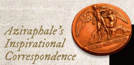
SFX Magazine Issue 372 - Designing Good Omens ❤ 😊
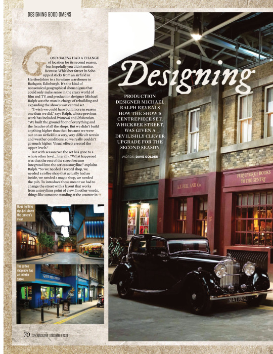


PRODUCTION DESIGNER MICHAEL RALPH REVEALS HOW THE SHOW’S CENTREPIECE SET, WHICKBER STREET, WAS GIVEN A DEVILISHLY CLEVER UPGRADE FOR THE SECOND SEASON
WORDS: DAVE GOLDER
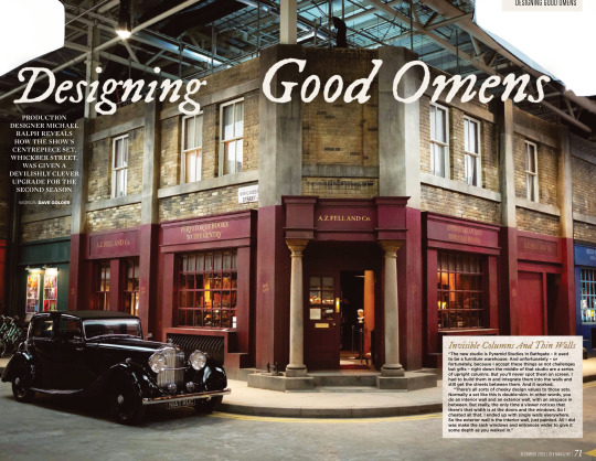
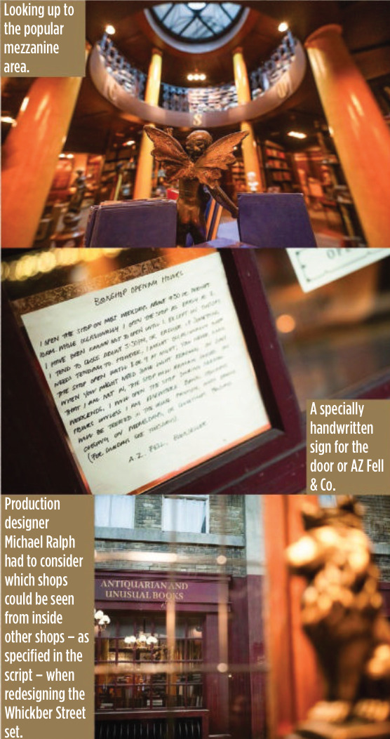
Invisible Columns And Thin Walls “The new studio is Pyramid Studios in Bathgate – it used to be a furniture warehouse. And unfortunately – or fortunately, because I accept these things as not challenges but gifts – right down the middle of that studio are a series of upright columns. But you’ll never spot them on screen. I had to build them in and integrate them into the walls and still get the streets between them. And it worked.
“There’s all sorts of cheeky design values to those sets. Normally a set like this is double-skin. In other words, you do an interior wall and an exterior wall, with an airspace in between. But really, the only time a viewer notices that there’s that width is at the doors and the windows. So I cheated all that. I ended up with single walls everywhere. So the exterior wall is the interior wall, just painted. All I did was make the sash windows and entrances wider to give it some depth as you walked in.”
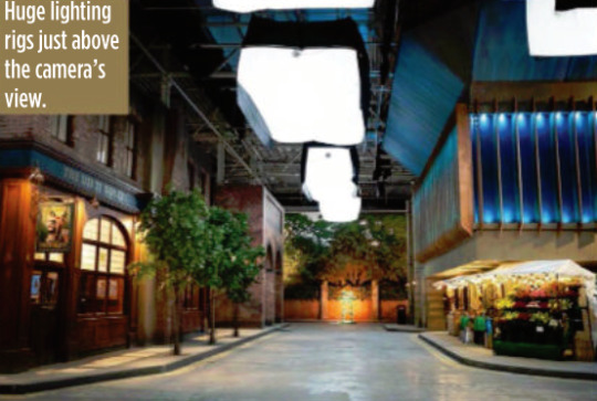
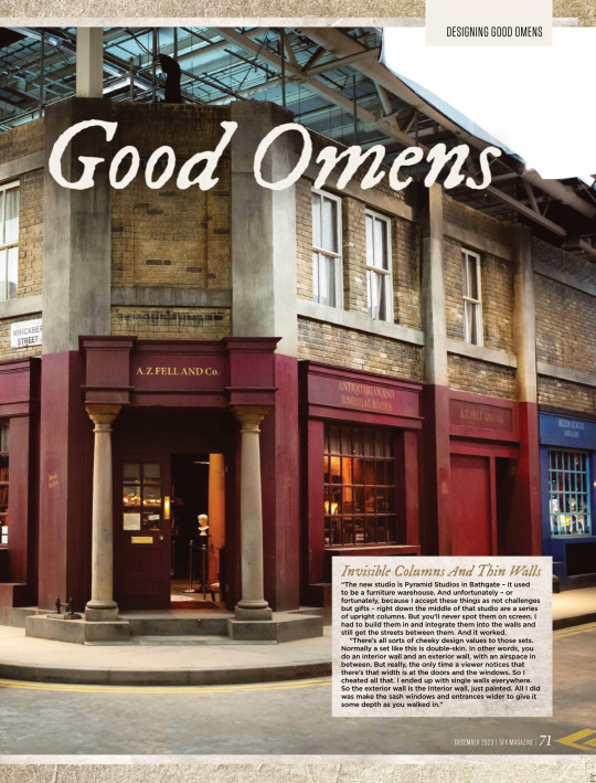
GOOD OMENS HAD A CHANGE of location for its second season, but hopefully you didn’t notice. Because Whickber Street in Soho upped sticks from an airfield in Hertfordshire to a furniture warehouse in Bathgate, Edinburgh. It’s the kind of nonsensical geographical shenanigans that could only make sense in the crazy world of film and TV, and production designer Michael Ralph was the man in charge of rebuilding and expanding the show’s vast central set. “I wish we could have built more in season one than we did,” says Ralph, whose previous work has included Primeval and Dickensian. “We built the ground floor of everything and the facades of all the shops. But we didn’t build anything higher than that, because we were out on an airfield in a very, very difficult terrain and weather conditions, so we really couldn’t go much higher. Visual effects created the upper levels.”
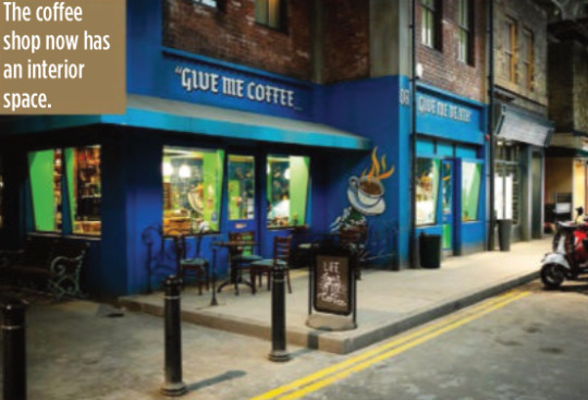
But with season two the set has gone to a whole other level… literally. “What happened was that the rest of the street became integrated into the series’s storyline,” explains Ralph. “So we needed a record shop, we needed a coffee shop that actually had an inside, we needed a magic shop, we needed the pub. To introduce those meant we had to
change the street with a layout that works from a storylines point of view. In other words, things like someone standing at the counter in the record shop had to be able to eyeball somebody standing at the counter in the coffee shop. They had to be able to eyeball Aziraphale
sitting in his office in the window of the bookshop. But the rest of it was a pleasure to do inside, because we could expand it and I could go up two storeys.”
For most of the set, which is around 80 metres long and 60 metres wide, the two storeys only applied to the shop frontages, but in the case of Aziraphale’s bookshop, it allowed Ralph to build the mezzanine level for real this time. According to Ralph it became one of the cast and crews’ favourite places to hang out during down time.
But while AZ Fell & Co has grown in height, it actually has a slightly smaller footprint because of the logistics of adapting it to the new studio.
“Everybody swore to me that no one would notice,” says Ralph wryly. “I walked onto it and instinctively knew there was a difference
immediately, and they hated me for that. I have this innate sense about spatial awareness and an eye like a spirit level.
“It’s not a lot, though – I think we’ve lost maybe two and a half feet on the front wall internally. I think that there’s a couple of other smaller areas, but only I’d notice. So I can be really annoying to my guys, but only on those levels. Not on any other. They actually quite like me…”
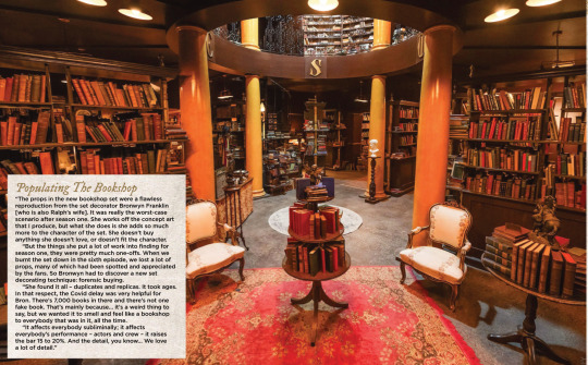
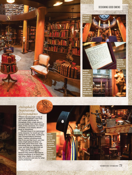
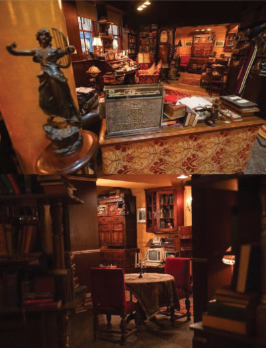
Populating The Bookshop “The props in the new bookshop set were a flawless reproduction from the set decorator Bronwyn Franklin [who is also Ralph’s wife]. It was really the worst-case scenario after season one. She works off the concept art that I produce, but what she does is she adds so much more to the character of the set. She doesn’t buy anything she doesn’t love, or doesn’t fit the character.
“But the things she put a lot of work into finding for season one, they were pretty much one-offs. When we burnt the set down in the sixth episode, we lost a lot of props, many of which had been spotted and appreciated by the fans. So Bronwyn had to discover a new set decorating technique: forensic buying.
“She found it all – duplicates and replicas. It took ages. In that respect, the Covid delay was very helpful for Bron. There’s 7,000 books in there and there’s not one fake book. That’s mainly because… it’s a weird thing to say, but we wanted it to smell and feel like a bookshop
to everybody that was in it, all the time.
“It affects everybody subliminally; it affects everybody’s performance – actors and crew – it raises the bar 15 to 20%. And the detail, you know… We love a lot of detail.”
(look at the description under this, they called him 'Azi' hehehehe :D <3)
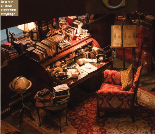
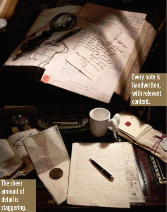
Aziraphale’s Inspirational Correspondence “There’s not one single scrap of paper on Aziraphale’s desk that isn’t written specifically for Aziraphale. Every single piece is not just fodder that’s been shoved
there, it has a purpose; it’s a letter of thanks, or an enquiry about a
book or something.
“Michael Sheen is so submerged in his character he would get lost
sitting at his own desk, reading his own correspondence between
takes. I believe wholeheartedly that if you put that much care into every single piece of detail, on that desk and in that room, that
everybody feels it, including the crew, and then they give that set
the same respect it deserves.
“They also lift their game because they believe that they’re doing something of so much care and value. Really, it’s a domino effect of passion and care for what you’re producing.”

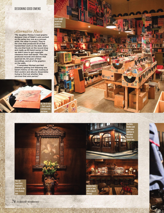
Alternative Music “My daughter Mickey is lead graphic designer [two of Ralph’s sons worked on the series too, one as a concept artist, the other in props]. They’re the ones that produced all of that handwritten work on the desk. She’s the one that took on the record shop and made up 80 band names so that we didn’t have to get copyright clearance from real bands. Then she produced records and sleeves that spanned 50, 60 years of their recordings, and all of the graphics
on the walls.
“I remember Michael and Neil [Gaiman] getting lost following one band’s history on the wall, looking at their posters and albums desperately trying to find out whether they survived that emo period.”


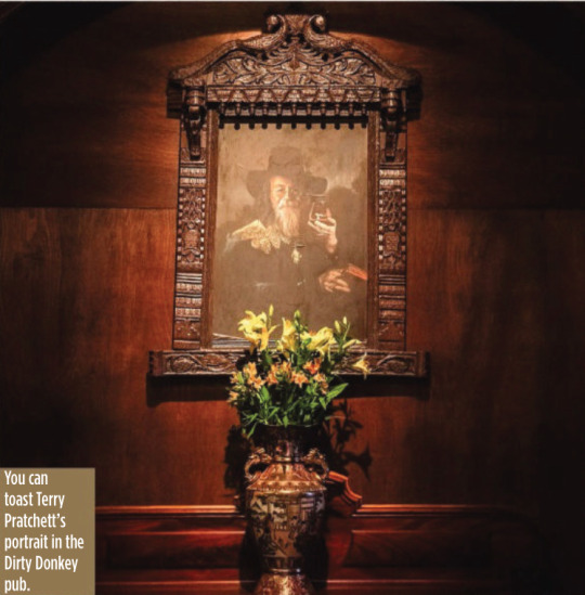

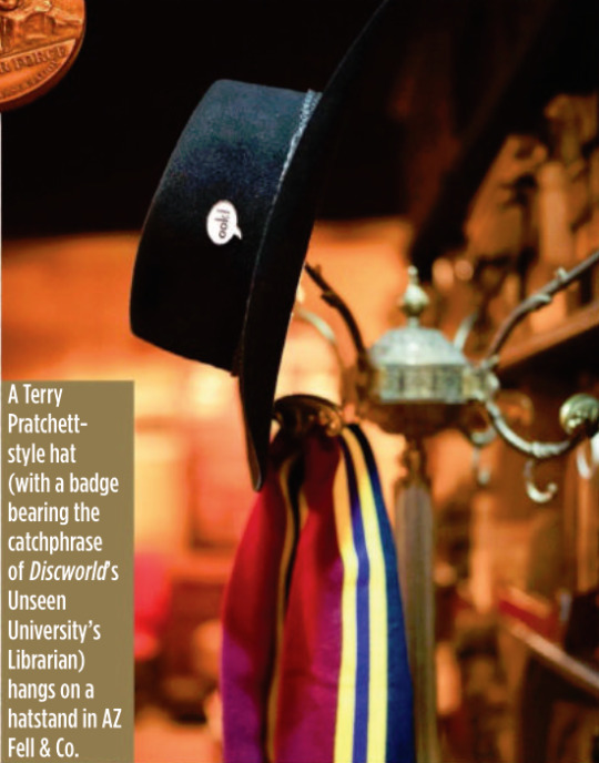
It’s A Kind Of Magic One of the new shops in Whickber Street for season two was Will Goldstone’s Magic Shop, which is full of as many Easter eggs as off-the-shelf conjuring tricks, including a Matt Smith Doctor Who-style fez and a toy orang-utan that’s a nod to Discworld’s
The Librarian. Ralph says that while the series is full of references to Gaiman, Pratchett and Doctor Who, Michael Sheen never complained about a lack of Masters Of Sex in-jokes. “He’d be the last person to make that sort of comment!”
Ralph also reveals that the magic shop counter was another one of his
wife’s purchases, bought at a Glasgow reclamation yard.
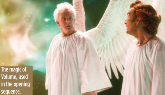
The Anansi Boys Connection Ralph reveals that Good Omens season two used the state-of-the-art special effects tech Volume (famous for its use in The Mandalorian to create virtual backdrops) for just one sequence, but he will be using it extensively elsewhere on another Gaiman TV series being made for Prime Video.
“We used Volume on the opening sequence to create the creation of the universe. I was designing Anansi Boys in duality with this project, which seems an outrageously suicidal thing to do. But it was fantastic and Anansi Boys was all on Volume. So I designed for Volume on
one show and not Volume on the other. The complexities and the psychology of both is different.”
#good omens#gos2#season 2#photos#bts#bts photos#interview#sfx magazine#magazines#hq photos#neil gaiman#terry pratchett#michael sheen#david tennant#michael ralph#mickey ralph#bronwyn franklin#anansi boys#the small back room#maggie's record shop#soho#aziraphale's bookshop#dirty donkey#magic shop#aziraphale's correspondence#give me coffee or give me death#fun fact#michael ralph interview#sfx 372 magazine#s2 interview
4K notes
·
View notes
Text
Deciphering the Angelic Language
DO NOT ASK NEIL ABOUT FAN THEORY

Oh boy, I'm finally tackling a post on this! I haven't seen a ton of discussion about this or progress and I think that's because it's very complicated. I've done a bit of work on it and I'm hoping by sharing here we'll be able to combine our brainpower and make some more progress!
SO! Let's get into it shall we?
Let's start with what we've been told about the Angelic Language:
An SFX team member said that the pillars in heaven "don't translate into words" (so maybe it translates into something like hex? ASCII?)
A speaker at Ineffablecon confirmed that the language "contains meaning and can be decoded"
According to the Chapter 6 VFX Breakdown video, "The creative team broke down the symbols into an alphabet of about 140 runes"
I'm going to start with that last bullet point. An alphabet of about 140 runes, which math-wise narrows down what type of alphabet we might be looking at. Specifically, I think it might point to Consonant/Vowel Pairs, which gives you 126 characters, then add in numbers and punctuation, you've got about 140. That's my best guess anyway.
The next thing i did was look at the Heaven CCTV footage of Gabriel FRAME BY FRAME to analyze the runes on the screen in these scenes. I think this is the best place to start for a number of reasons, first of all, being that the CCTV footage seems to only use a subset of the runes that don't include and modifications like extra dots or ticks. I consider them base runes.
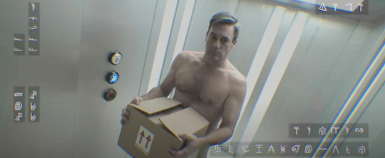
Secondly, the runes cycle through a lot of changes here so it's a great place to look for patterns, and find patterns I did.
I found 4 sets of runes that cycle sequentially through a repeating pattern. Okay I'm going to do my very best to explain this.
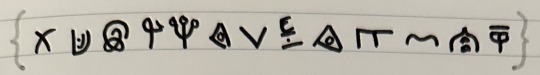
The above we will call set A
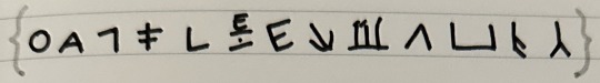
The above we will call set B
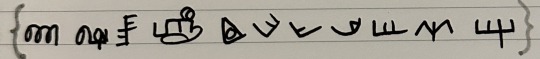
The above we will call set C
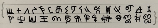
The above we will call set D
The runes on the CCTV will *almost* always follow the sequence of their set, and when they reach the end of the set, they're marked with one of the following first two sequences below which I'm referring to as "indicator runes" after which they either repeat the same set or a different set.
The only time the runes change in the middle of a sequence is when they're denoted by the third row indicator runes before the change occurs.
So there does at least seem to be some pattern to the runes, at least when it comes to the ones used in the CCTV footage. These however are only about half of the total number of runes, the other half are derived from these initial ones, and have additional tick marks and dots added to them to add some sort of meaning and differentiation.

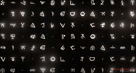
These screen grabs are from the Chapter 6 VFX Breakdown video, and during the lead in to these animations I think I can also say that the language is probably read right to left, as that's the direction the runes scroll in on the screen.
These scenes are also shown with a certain glowing overlay, so I'm wondering if when we can figure the language out, if there is an interesting message here to be read as well.
Anyway! If you have any other info or this has sparked any ideas about the language for you please let me know! I will continue to play with it and update when I have anything of note! :)
#good omens#good omens 2#good omens meta#crowley#aziraphale#crowley x aziraphale#good omens theories#good omens clues#david tennant#michael sheen#good omens fandom#good omens runes#good omens angelic language#good omens clue#good omens theory#ineffable husbands#ineffable idiots#aziracrow#good omens crowley#angelic language
324 notes
·
View notes
Note
Hi Penny! I’ve been recently watching dub/abridged stuff (like your dub videos and TFS DBZ Abridged) and I was wondering if you grow up watching any dub/abridged that may have inspired you to do the dub videos? Or just really enjoyed them!
so the primary thing that inspired me to make SRTF specifically was just being a part of the RTF that SRTF is a spin-off from. i wanted to make a gaming-focused version of the show that incorporated some production value improvements i had been floating around for a bit such as recording remotely and making the whole thing a bit more edited with sfx and music and such.
BUT i will say that even before i was a part of og RTF i had previously really loved the idea of dubbing over movies/games on mute and i always had a fascination with it. i remember a few times on road trips i would be watching a movie in the backseat with my sisters and would be like "hey do u wanna mute this and make up stuff over it", which i only ever convinced them to do like one time and i remember having a blast. i also have to give a huge shout out to some old comedic Sonic dubs i ran into as a kid that almost certainly inspired the direction of the show subconsciously. i believe they were from Mardiculous? i dont think they're public anymore, at least not the ones i watched and was rlly into, but it's something that does immediately come to mind when thinking about early influences so i gotta give the respect.
i actually have never really watched the more popular abridged shows though! i have zero history with DBZA or anything of the sort i only hear about it in passing haha.
112 notes
·
View notes
Last Seen Blogs

coffee-and-tea-time
Coffee and Tea

trans-lady-lover
Trans Lady Lover

potatoed-made
Goop
potatoed-made
Goop
potatoed-made
Goop