#please click for better quality! tumblr likes to destroy it and this is a piece id really appreciate people having a good look at
Text
Thinking a lot about the inherent queerness of Fallen Hero.
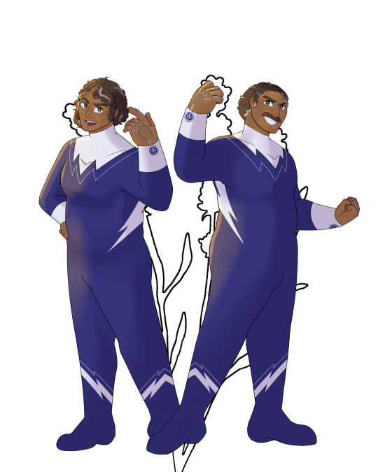

Ortega's endless public performance,


Chen's perceived lack of humanity,


Mortum shaping themself body and mind against the will of others,

Herald's struggle past and present with the world's expectations of him,


Argent's existence being tied to something others perceive as inherently dangerous.
You are all Other.

And you are stronger in each other's company.
—
@cigarettesandinevitablebetrayal
#a tribute to my favourite post in the fhr fandom#ortega#chen#argent#herald#fhr#fallen hero#pulp draws#please click for better quality! tumblr likes to destroy it and this is a piece id really appreciate people having a good look at#its queue and me just us and your friend steve
233 notes
·
View notes
Note
You don't have to answer this I'm just gonna bitch in your inbox about the x reader post you made because I felt this in my bones.
Like you really can't go in the tag for quality stuff lately. Everything is about sex. I'm not a prude. I read occasionally stuff, but omg, not everything has to be like this. Sometimes stories begin hopeful, but they end the same way. I'm just sick of it because it's all there is. And because it's so oversaturated, "normal" fics don't stand a chance because people don't click on that anymore. So yeah, as a creator, if I wanna get attention for my work, of course, I will produce stuff that people will read.
Also what you said about minors, how are they supposed to interact with fics if everything is porn.
In general, people are sooo fixated on "spicy" content. On tiktok, all people read is smut, or they can't handle other stuff. Literally, smut destroyed their brains. How is it any different than guys having a porn addiction?
Also, the tumblr tagging and searching functions are shit. I wanna find new fics from like 2020 or 2021 (before s4 bc I miss those vibes). When you go to the popular tag thing, the earliest you get is 2022. Like tumblr needs to fix that, so content from years ago can still be found. People also need to start tagging accordingly. It's such a pain.
Again sorry for the rant.
HOHOHOHOHO NO APOLOGIES NEEDED NONNIE i love having a bitch and being on my hater shit and i think more people than you might think agree with all of this + its a whole buncha opinions under the cut u have been warned
to some degree to decrease in quality fics will be due to the lull between seasons which always happens- some of the fantastic writers move onto other obsessions for the mean time and truly, i can't fault them for that.
but yet somehow i know it's more than just that - a smut piece will get more attention and notes regardless of the quality of the fic. it's so tough to complain about cos like sigh its all free writing produced by someone so to moan and bitch about stuff getting more attention than others is like. not very nice and being hypercritical but also
not everyone wants to read smut!! and its fuckin everywhere!! wouldn't it be darling if there could simply be a tag that was smut free but noooooo every post gets tagged with as many fuckin things as possible for 'reach' which is the stupidest fucking thing i've ever heard before
and ur absolutely right, because of it fics with no smut get drowned before they get a chance to get noticed. and sorry to say it, but its very rarely that i've read a fluff piece and been like ah, that seemed like it was just thrown together like no its always crafted to some degree- but i cannot say the same for smut in the least. again, often u can mentally sub in different characters and the fic still works which to me = bad writing (if its a steve fic i shouldn't be able to slot in eddie and have it work? ok cos then its not a STEVE fic its just a porn fantasy which is like fine but GOD this is a whole nother can of worms but if u just write smut and then cycle thru joe keery characters its like half a step from writing rpf cos its obvious u just think he's a hot guy and not so much into his characters 😭 maybe im being autistic levels of protective over my lil guy but i also think im right lmao)
and ough trying to write for an audience is so hard, its a vicious cycle of: wants to produce content ppl will read and interact with -> doesn't enjoy writing it as much -> writing isn't as good as u know it could be -> if it flops for whatever reason u feel like asshole. anon babey please dear god write the ideas you want to <3 i can promise you they will be 100x better than trying to cater to an invisible audience ! ppl follow you for your writing !!! and feel free to tag me!!!! i always want to read good steve x reader fics!!! (i just can't be assed hunting them down half the time)
the minors thing is just. god its - i remember hearing the phrase 'virgins write the best smut' and it was when i was 14 and now im like god don't say that they write like porn cos they have fuck all idea what they're talking about. i read so much fanfic when i was 12 years old and what u said is so true, it just used to sneak up in stories and ruin things. its the internet tho so its impossible to truly moderate
omg ur tiktok comment so fucking true babe. when smut is prioritized over plot, u can tell and so many of the booktok rec's they have are just that. there are ways to write smut and have it still be a story. there's also ways to write pwp and still craft it and yet, u dont see that often. also what happened to being excited when two bitches hold HANDS??? AND KISS FOR THE FIRST TIME?? it's appalling the way they thirst for that content but write their captions like "and they have s3x!!! and f@&k in the bathroom hehehe" like what. its such sanitized and shit content honestly
god ur so right i hadn't even thought about hunting down old fics - and it would make such a difference if you could do that because otherwise SO much weighs on when u post it and if it shows in tags and yada yada
this is so much omg u don't have to read all that but genuinely the reason i started writing more steddie and less x reader is the difference in reception and general support. i dont feel like i'm competing against my mutuals, but more like we're here to just hoot and hollar at each other and unless u have a tight knit group of friends on here, u don't get that on x reader fics ://
#so many thoughts#im so sorry#no one except that anon read this LMAO#im worried it never goes too well if you express too strong of an opinion on the internet#tentative#delete later#ruby talks#asks#anon#tw opinion#HAHAHA THATS A TAG#yah ill use that
11 notes
·
View notes
Photo

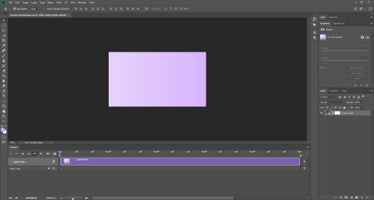
Soph’s Header + Doodle Tutorial (requested by anonymous)
Hi! I’m back again with the sequel to my icon + colouring tutorial, this time with headers and doodles! 🥰 You will need:
I’m using Photoshop CC 2018 to make these headers and doodles, but you could easily make them with earlier/other versions.
Basic gif making knowledge.
A screencap you want to use, some fun textures, and some time and patience!
I always start off with my headers as size 500 by 281 pixels. It doesn’t really matter necessarily, as long as the size is in line with the tumblr dimensions and fits. I find these sizes work to keep a gif or header small, so you can make it a bit longer without going over the tumblr size limit. I know technically tumblr doesn’t have a size limit any more, but I do still try to stick to the 3 MB limit when I can. This is because sometimes gifs lose their quality if you go over. In my opinion, you can afford to go over a bit, but if you go too far, the quality of the gif gets destroyed, and sometimes for me even on 4 MB they just don't play, so 6 MB or 8 MB doesn’t stand a chance. Not sure if anyone else has run into this problem, but you can read more about what I mean here and here.
Okay, so. Making simple headers is actually pretty easy, it’s just a lot of layering of the right things. Once you have your base size, pick a nice gradient to put on it. For me, I’m going with a light purple to a slightly darker purple:
It’s important that you have video timeline turned on for this. If you are not familiar with frame animation and video timeline, I suggest you take a look at this, since we are going to be using both quite a lot in this tutorial.
Next, you want a nice background texture for your header. You don’t have to, but I think it just gives it a little something extra. You can find some textures here they have A LOT to choose from.
Once you have your texture, make it black and white and set it to soft light (unless the texture is the same colour as your background, then sometimes leaving it in colour can enhance the whole thing). Then you should have something that looks like this:

Now add your cap, coloured + smart sharpened and whatever other adjustments you want to make, on top of these layers. If you don’t know how to do this, please see my icon tutorial, where I explain how to do these steps in depth.

Obviously in this instance, Steve is much larger than if this was an icon. Make the picture proportional to the header size, but it’s up to you how big or small you want that to be! So, you could just save the header like that, if you wanted to. BUT, since we’re going to be adding gifs + doodles, I’ve had to make some special adjustments. As you can see down the right-hand side in the layers tab, I’ve added some purple colour over and under Steve (set to soft light, opacity anywhere between 5-30%, whatever suits you) and also lightened the background A LOT. There is a reason for this, which you wouldn’t need to do if you weren’t going to add gifs (unless you wanted the background to be lighter, of course).
So, for the gifs underneath your cap. Here is a pack of gif overlays that I love and adore, once you have chosen one of those, you want to put it underneath your cap. To do this, open the overlay gif, it will look like this:

And you can just drag it across from one file to another, underneath your cap.

I turned off all the layers above the gif, temporarily, so I could move it into place. Once it’s in your header file, make sure to change the gif to “overlay”, which will then bring back your nice background colour. Setting something to overlay makes everything underneath it look darker, hence why we lightened the background before, as I personally didn’t want it to look too dark for the overall header. (You could also put your cap underneath it if you wanted the gif to go over the person, but you’ll have to do extra editing to make sure the cap isn’t too dark if you do so).
Now you should have something that looks like this:

You want to make sure you end the header where the gif ends, even if your layers are “longer”, as you can see above. Again, this is a perfectly acceptable place to leave your header and save it, but this is where I tend to add the doodles!
Open a new file, I usually make them quite big say 800 by 400 px, as you can scale the doodle down later on, rather than starting small and working in a small space, which makes things unnecessarily difficult. If you would like to add some premade doodles onto your gifs, you can find some here, but I will show you how to make your own below!
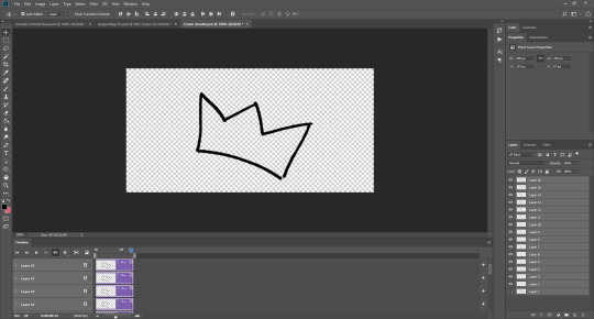
You could draw the doodles yourself, probably making your life a lot easier, but if you’re like me and you don’t want to do that (for me it’s because I suck at drawing on ps, LMAO) you can use a picture too. Find a picture of what you want, I usually just google it, so here I’ve got a simple crown:
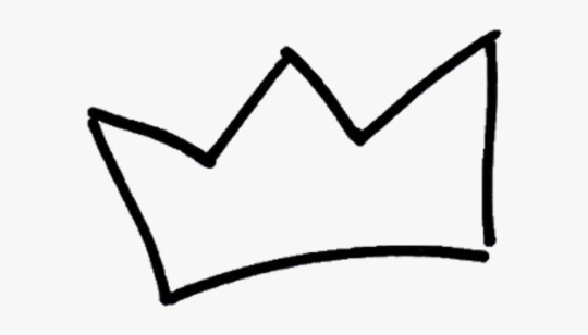
I used the magic wand tool to cut it out, and now we have this:
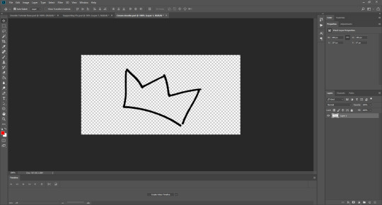
Now what you want to do is change the video timeline to frame animation. Click the “creative video timeline” button if video timeline isn’t already displayed, then the three dots in the left-hand corner to convert to frame animation, and you should get something like this:


Now, here’s the long-winded bit. It’s slightly odd and a bit complicated, so if this doesn’t make sense, please feel free to message me and ask further questions.
So, we want the doodle to look like it draws itself, right? What you want to do is crop the image so bits of it are added as the frames go on, thus achieving that effect. The key to this is turning layers on and off on the right-hand side, so only certain parts of the image show themselves one after the other.
Firstly, duplicate Layer 1 and turn the original image off. This is a safety in case we mess something up later and need to revert to the original image. Now, crop out the first part of your picture. I’m going to start on the bottom of the crown and work my way around clockwise. Use the marquee tool (I’m using the elliptical one) to cut out one section of the image, then right click and select ‘layer via cut’.

Then turn off the rest of the layer, so you’re only left with this tiny piece:
Now, add a new frame. On the bottom bar there is a button, next to the bin/trash, that looks like a sheet of paper, which says “duplicate frame” if you click on it. Do that. Now is where the turning off and on part comes in. Each layer on the right-hand side corresponds to a frame on the bottom, and you want to build up what is shown in each frame every time.
This is going to involve a lot of duplicating and merging of layers, because I haven’t found a better way to do it currently.
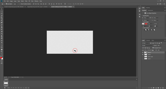
First you want to turn off all the layers when you have Frame 2 selected. When you’re on Frame 1 your tiny piece (Layer 2) should be turned on (you turn layers on and off on the right-hand side, toggling the little eye icon). Like so:

You want to be working with Frame 2 selected for these next parts. Then you want to duplicate the tiny piece layer (so now we have Layer 2 copy). By turning the Layer 1 copy on briefly, you can cut out the next part of your image, so use the marquee tool again to cut out the next little piece. Make sure you have the layer with the rest of the image selected when you do this, otherwise you could be cropping nothing, since the other layers should still be turned off. Once you’ve done that (once again using layer via cut!) you should now have Layer 3. Move this to the top, turn off Layer 1 copy, and turn on Layer 2 copy, like so:
You may not be able to see in the picture, but the two layers aren’t quite touching. Since it doesn’t matter what the original image looks like for the end result of the doodle, you can move Layer 3 in line with your first piece. DO NOT move the original small layer, Layer 2, as then it will be in a different place on Frame 1 and Frame 2, and you’ll have to try to move it back, and that will be a mess. Always adjust the newest layer in line with the previously existing layers so this doesn’t happen.
When you’ve done that, select both Layer 2 copy and Layer 3 at the same time. I usually use the ctrl key to do this, which I think is command on macs, then when you’ve done that, right click on those layers and select merge layers from the menu that appears. They should now be one layer called Layer 3.
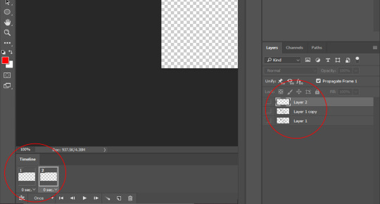
The problem is, when you do this in the second frame, it usually turns itself on in the first frame too, which you don’t want. So click on Frame 1, and make sure to toggle Layer 3 off for Frame 1, and on for Frame 2. And the opposite with Layer 2: make sure it is on for Frame 1, and off for Frame 2, like this:

Now, you want to repeat the process. So, add a new frame at the bottom, so you have three frames. Turn all the layers off when Frame 3 is selected. Duplicate Layer 3. Cut out the next piece from Layer 1 copy, and make sure it aligns with the other layers without moving the previous pieces. Merge Layer 3 copy and Layer 4. Make sure Layer 4 is turned off in Frame 1, because the newest layer WILL turn itself on there every time. Go back to Frame 3, and turn Layer 4 on again.
You should have something that is looking like this:
Can you see how all the different layers are corresponding to the different frames? I don’t mean to be patronising at all, so I hope it doesn’t come across that way. I just know that some people don’t understand how frame animation works, so I’m trying to be as clear as possible.
It doesn’t matter if your doodle is moving away from your original image, because you won’t be seeing the original image when the doodle is done, only the doodle. As long as the layers that correspond to your frames aren’t moved during the process, then don’t worry.
Continue to do this until the whole doodle is made, like so:

I ended up with 15 frames, and 16 layers. You can set this to whatever speed you think is best by highlighting all the Frames. If you click the thee little lines on the right-hand side of the frame animation window, a little menu pops up, and there you can select all frames (or hold shift and click on the first and the last frame). From there, you click on the time underneath the frames and adjust it whatever looks best for your gif, 0.05 usually works well.
Now, you want to convert the doodle into one object that you can move. To do this, click on the little lines in the left-hand corner (where the frame animation dots were before), and all the framers will turn into layers in video timeline. Then, to make them all one object, select all the layers at once on the right-hand side, and go to filter > convert for smart filters.
You should now be able to drag your doodle into your header file! Like so:
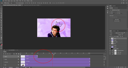
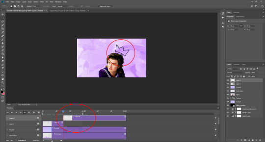
As you can see, sometimes the doodle isn’t as long as the loop of your gif, but that’s okay. What you can do is use the marquee tool and right click when you’ve selected the doodle, choosing layer via copy. This will create a still image of your doodle, which you can place after it ends to ensure it stays on the header until your gif is ready to loop again, as you can see here:
As you can see here, I decided to make the crown white, since I felt it fit better with the header’s aesthetic. To do that, I inverted the gif and the still shape, and set them both to lighten. I also added a white stroke of 1px just to make it stand out (double click your layer on th right-hand side, and find stroke in the pop up that appears, adjust to your liking!)

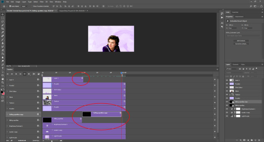
I also added another doodle to mine, using the same process as before. Spelling out ‘king steve’ had a lot more layers and frames, but it was the same process. Then I dragged it over, and copied the layer just before it re-looped so I could have it as a still image for a portion of the gif. You may need to duplicate your overlay gif underneath the cap to ensure eveything has enough time to loop properly, like so:
And that’s it really! If you would like to add a divider on top of your header AKA a header template, these are the ones I use (one, two). To add it, open the file and drag it onto your gif file, then place it where you want it to be. Once you’ve done that, set the layer to screen (here is a tutorial from the op) if you want it to be white, or invert the image (image > adjustments > invert) and then set it to darken if you want it to be black. If you want it to be a different colour, you’ll have to cut out the divider from the background image, and then double click the layer to get the style menu. In layer style, you can select ‘colour overlay’ and make it whatever colour you want!
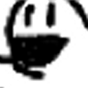
To save your gif, go to file > export > save for web (legacy). It may take a while, so just let ps do its thing until the bar has loaded. You can preview the gif by clicking preview in the bottom left-hand corner, in case you want to cancel and make some changes to your gif before you save it. These are my settings:
And voilà, you have a bright and shiny new gif, doodle, header! If you’d like to use this, you can find it here 💜
#tutorial#header tutorial#tutorial*#resources#headers#chaoticresources#completeresources#yeahps#i hope this helps!!!#thank you to ally @siriusblacks for reading this over for me 🥰
185 notes
·
View notes
Last Seen Blogs

mobiltoyotaauto2000
Untitled
emmic0n
frickin loser lol
mobiltoyotaauto2000
Untitled
emmic0n
frickin loser lol
emmic0n
frickin loser lol