#tutorial*
Explore tagged Tumblr posts
Visit Tumblr Blog
Explore Tumblr blogs with no restrictions, modern design and the best experience.
Last Seen Tumblr Blogs


Fun Fact
The average Tumblr user visits about 67 pages every month.
Text

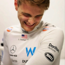
Thank you @cobbbvanth for asking me for this; I’ve never been more flattered! ☺️ I’ve only been making gifs for a little more than 2 years, so I’m really still only figuring Photoshop out, and my colouring owes everything to other people’s tutorials (some of which can be found here). To be honest, I was only asked some tips, but I have no clue what to include and what to leave out; so, here’s my complete (if random) colouring process.
NOTE: This is a colouring tutorial, not a gif-making one. The tutorial that taught me everything I know about that (and to which I am eternally grateful) is this one by @hayaosmiyazaki.
I. SHARPENING My standard sharpening settings are:
One Smart Sharpen filter set to Amount: 500 | Radius: 0,4
A second Smart Sharpen filter set to Amount: 10 | Radius: 10
One Gaussian Blur filter set to Radius: 1,0 and Opacity: 30%
One Add Noise filter set to Amount 0,5 | Distribution: Gaussian
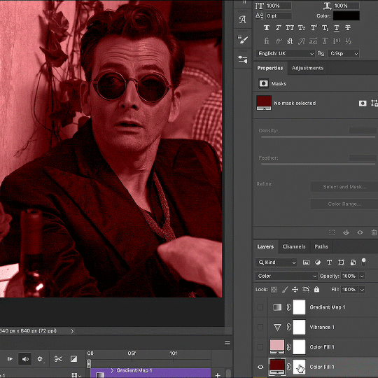
II. BASIC COLOURING This is the part where I add most of the adjustment layers available and just play around with them. Obviously different settings work for different scenes, but I do have some standard ones.
Brightness/Contrast I usually up the Brightness to +10-30, and the Contrast to about +10.
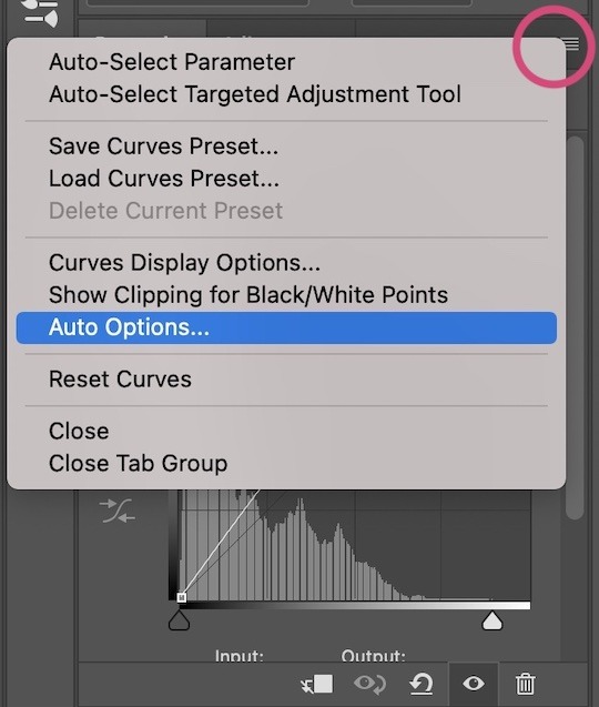
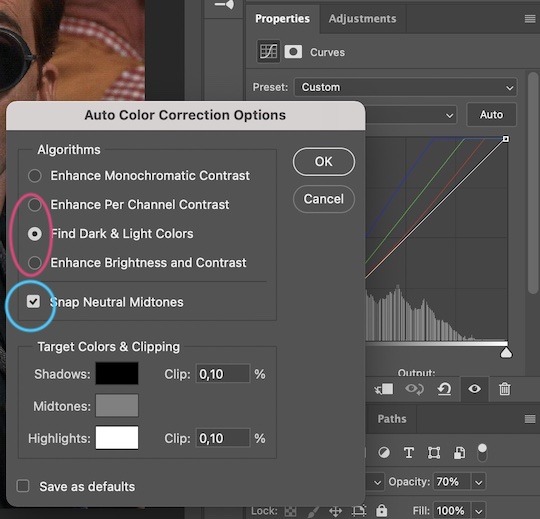
Curves
For the first Curves layer I go to Auto Options > Enhance Brightness and Contrast, and then adjust the opacity until I’m happy.
I might repeat the above step if the gif still looks too dark to me.
I add another Curves layer, I go to Auto Options and this time I pick either Find Dark & Light Colors or Enhance Per Channel Contrast, and check or uncheck the Snap Neutral Midtones option, until I see something I like. I will then adjust the opacity.
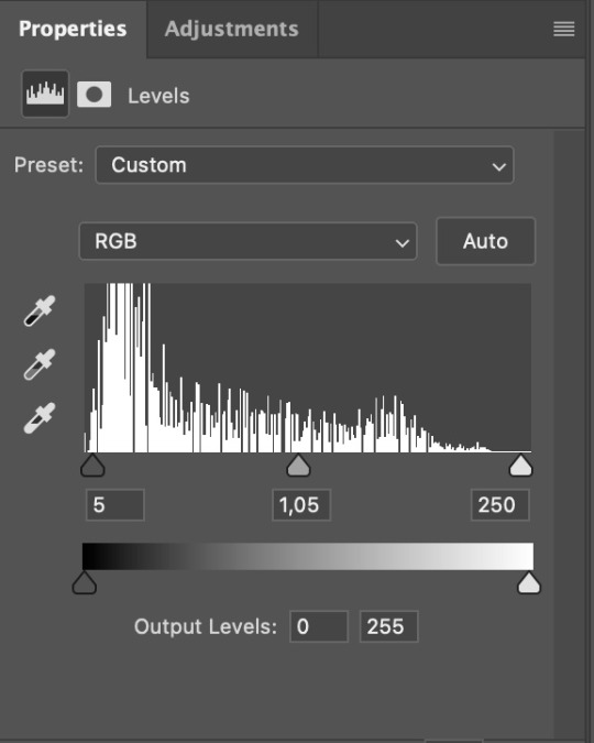
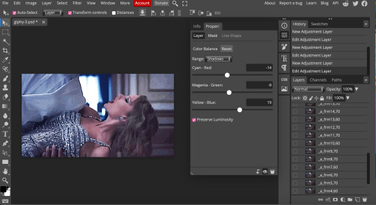
Levels I add a Levels layer that usually looks something like this:
Exposure I add an Exposure layer, where I usually set the Offset to around -0,0010.
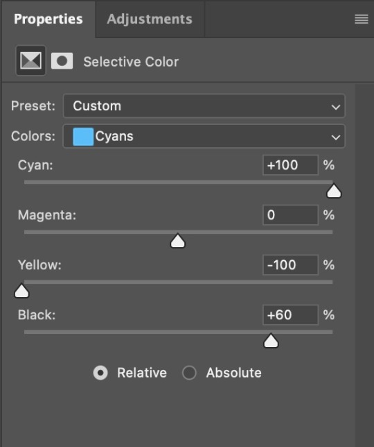
Selective Color To make the faces look okay, I create a Selective Color layer, select the Reds and usually add some Cyan (+10-20%) and play around a little (±5%) with Magenta and Yellow too. I might also add another layer, select the Yellows and make slight tweaks there too.
III. FUN COLOURING About colour manipulation: PiXimperfect just uploaded a tutorial that explains everything so much better than I ever could, so I highly recommend you go watch it. It’s made for static images though, and things are more complicated with moving images, so I also recommend @sabrinaacarpenters’s tutorial.
The reason I usually go for a softer colouring is that a more vivid one requires a lot of patience and precision, and I honestly can’t be bothered. Instead, I try to tweak the colous only a little, so that the edges can be a little rough without it looking too wrong.
One thing to remember is that each gif is different, and there isn’t one foolproof way to do this, so you will need to use a different technique depending on the gif you’re working with.
Okay, so, after I’ve decided what colour I want my background to be:
1. I create a Hue/Saturation layer and change the greens, cyans, blues and magentas to that colour. That’s easy enough, since it doesn’t mess with the face colour. I then set the blending mode to Color. If your background doesn’t include any yellow or red, you might be done here, like in the case bellow:
2. To change the yellows and reds, I create a new Hue/Saturation layer, select the yellows/reds, move Saturation to 100 (temporarily) and then play around with the sliders until the face colour isn’t affected. I then change it to whatever I’ve chosen and change the blending mode to Color.
3. If for whatever reason step 3 doesn’t work (the background is white or black for example, or just too red), I might create a Solid Color layer set to whatever colour I want, set the blending mode to Color and then select the layer mask and carefully paint with a soft, black brush over the people’s faces/bodies. I will then lower the Opacity, to whatever looks smooth enough. If there’s a lot of movement in your gif, you might have to use keyframes (see sabrinaacarpenters's tutorial linked above). However, my main goal is to avoid using those; that’s why I try my hardest to tweak around as many Hue/Saturation layers as needed and not have to create a solid color layer.
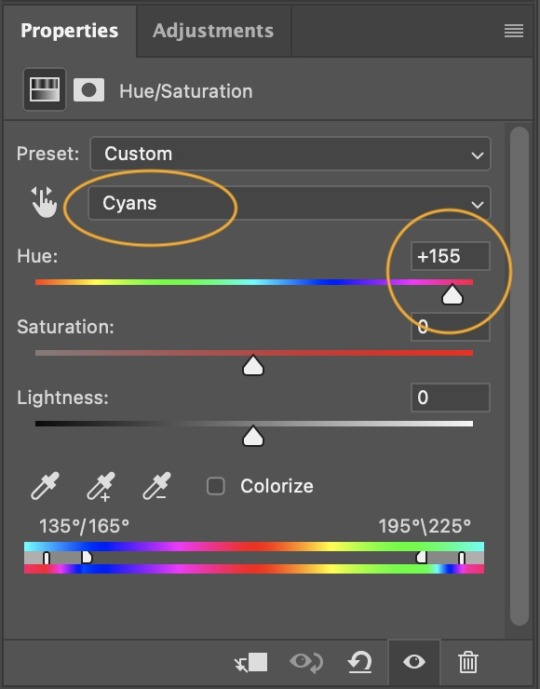
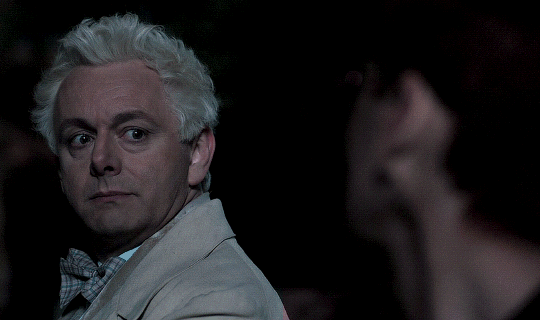
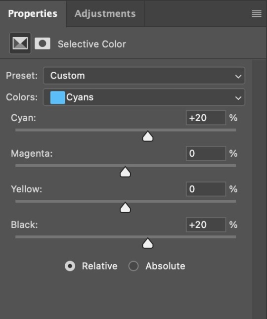
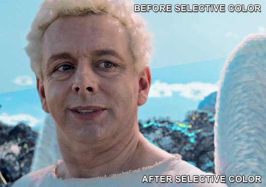
4. Once my background looks the colour I want it, I might add a Selective Color layer that matches my background color and then try to make it look more vibrant. For this Aziraphale gif below for example, I’ve selected the Cyans and then set Cyan to +100%, Yellow to -100% and Black to +60, then created another one, selected the Cyans again and then set Cyan to +20 and Black to +20.
5. If the gif has a white area, I create a Solid Color layer with a colour that matches the rest of the background and then set the Opacity low. I might also create a Selective Color layer, increase the Black and then play around with the colours.
IV. FINISHING TOUCHES
I create a Vibrance layer and set the Vibrance to around +30 and the Saturation to about +5.
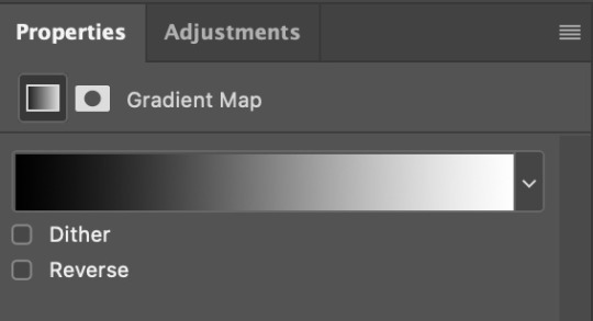
I create a black and white Gradient Map layer (with black on the left end of the spectrum and white on the right), set the blending to Luminosity and the Opacity to about 20-30%.
AAAND that’s about it I think! This ended up way too long and perhaps a little incoherent. I tried to make it as general as possible, so you might have to mix and match for best results. Feel free to ask me for further explanations about any one of these steps, and please tell me if you want me to go through the colouring of a specific gifset (although, as I said, I'm by no means an expert). Happy gifmaking!
#gif tutorial#allresources#completeresources#dailyresources#photoshop tutorial#minee#tutorial#tutorial*#chaoticresources#uservivaldi#userdanahscott#usersanshou#userfanni#userbuckleys#userrobin#tuserjen#userdavid#userzaynab#tusermimi#thingschanged#tuserju#usertj#userhallie
376 notes
·
View notes
Text
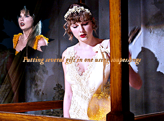
Hi, everyone! @reputayswift asked me how I made this gif where I put several gifs in one using shapes, so I thought I'd write a quick tutorial. Under the cut, just a heads up, this is very screenshot-heavy!
Difficulty level: Easy, basic gifmaking skills are required
Software being used: Photoshop CC 2020, but any version is fine, and I'm sure this can also be adapted to Photopea.
Firstly, you have to pick which shape/png you want to use. For this gifset, I used this maple leaf png that I got from cleanpng.com , a website that I highly recommend for getting transparent pngs.
After picking the png, make your gifs. Just remember that the smaller gif and the base gif need to have the same number of frames. And that the shape/png and the smaller gif need to have the same dimensions.
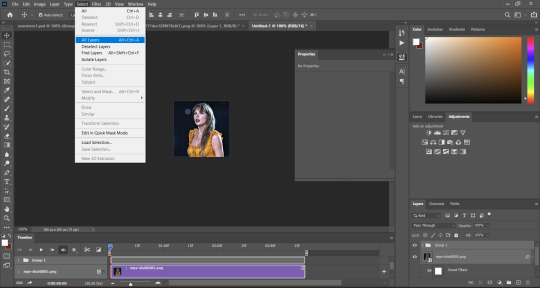
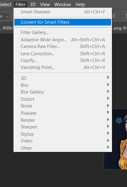
Okay, so after you've made both gifs, go to the smaller gif and convert it to a smart object. It will make it easier to put it inside the shape, since it will convert all the layers into one. Just follow these steps: select > all layers > filter > convert to smart filters:
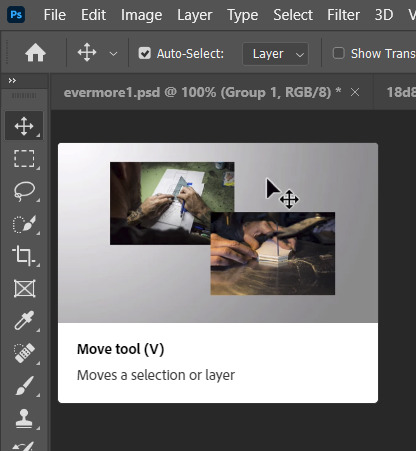
Okay, now open the png you've picked on Photoshop and resize it, so that its dimensions are the same as the smaller gif's. After you've resized the png, select the move tool (shortcut: V key in your computer keyboard), drag the png and drop it on top of the smaller gif:
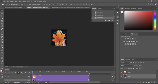
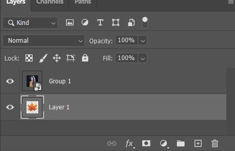
Now, drag the png layer underneath the gif layer:

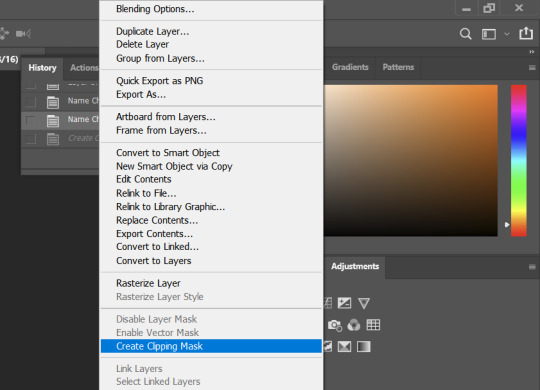
After that, right-click on the gif layer (not the png layer) and then select "create clipping mask":
And here's what we're left with:

Now, it's time to put the smaller on the base gif, which is pretty simple. Select the move tool (shortcut: V key on your keyboard), drag the smaller gif and drop it on the top of the base gif:

And here's our final result:

I hope this helps! Feel free to reach out if you have any questions <3
52 notes
·
View notes
Text
lovely anons have been requesting a gif tutorial, and while there's plenty photoshop ones out there I think there's only a couple photopea ones (if you dont know photo pea is like an internet photoshop basically) so I thought I'd make a little tutorial on how I do my gifs!
first you're gonna want to use any gif making platform to actually turn your video clip into a gif. I personally use giphy but I know there's a bunch of other platforms for this. then you're just going to open the gif in photo pea either by clicking "open from computer" on the home page or dragging it in from finder (Mac) or files.
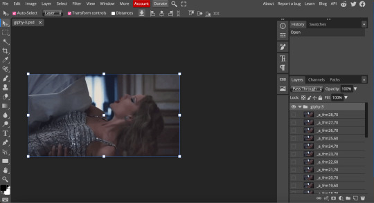
IF YOU'RE MAKING A GIFSET: the first thing I do is make sure all of my gifs are the same number of frames. its important to do this if you want all of your gifs to restart at the same time! to do this I just go to the side where all the frames are listed - this one has 29 frames (note: it says 28 on the top frame, but the very first frame is listed as 0, so always add 1 to the top number to know now many frames there are). what I do is find the gif with the least amount of frames and then make all the gifs the same number - depending on what part of the gif I want to keep/delete I'll delete frames from the beginning, end, or both which usually requires some basic math
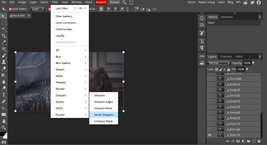
next, I click on the top frame, press shift, and then press on the bottom frame to select all (unfortunately there's no keyboard shortcut for this I don't think). then I'll click filter -> sharpen -> smart sharpen that way I can freely customize the sharpness of each gif depending on it's original quality. usually I do 200% at 0.5 pixels but I'll adjust if necessary.
now comes the actual coloring of the gif! all of these will be adjustment layers (layer -> new adjustment layer).
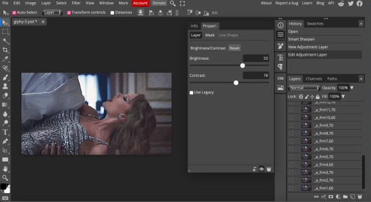
first I'll select the brightness/contrast layer and play around with those settings until it looks good to me.
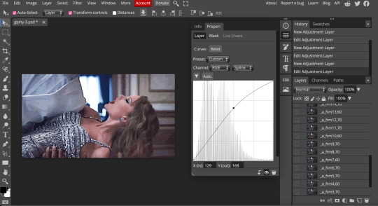
next, I'll play around with the levels and curves layers until it looks how I want it.

sometimes I'll stop here if it looks good, sometimes I'll play around with the saturation adjustment layer, or in this case I'll edit the color balance to deepen some of the shades that aren't popping out how I want.
IF YOU'RE MAKING A GIFSET: the easiest thing I've figured out for coloring multiple gifs to save time is duplicating these adjustment layers to each gif in the set (layer -> duplicate layer into; it'll prompt you to select the psd you want to add the layers to). when I do this I turn off the visibility for each one and one by one turn them back on (starting with brightness/contrast) and adjust them if necessary.
if I'm not adding text this is where I'll end, but sometimes I like to add texts to more of my creative gifts. usually I'll follow a tutorial (@usergif resource directory has a bunch of good tutorials that can be adapted to photo pea, or I'll just look them up on Tumblr itself). sometimes I like to do things a little simpler, which is what I'll show here.
you're going to click on the T towards the bottom on the left sidebar, type put your text, change your font (photopea has a ton and I'm not too picky but you can download fonts from the internet and upload them), as well as color and size (don't forget to select all of the text when you do this!!) then click on the cursor icon to move the text to your desired placement.
then click on the layer in the right sidebar and select blending options.
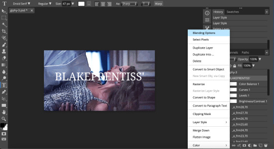
I'm going to add a stroke of 1px in black to my text and position it to the center. I do this on every text I add to gifs (even if the text is black, which I ended up changing this one to) to add some extra size/detail.
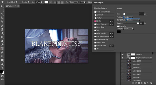
you're more than happy to stop here, but I like to play around with some of the other blending options until I'm satisfied. sometimes I'll lower the fill to 0-30%, or in this case, I changed the blending option to overlay to get the desired effect. (both under blending options)
I followed the same steps with my second row of text, except I changed the font and then warped the text a bit after placing it where I wanted by T -> warp -> arch and changing the settings.

and you're done! file -> export as -> gif to save it! I also like to do this periodically throughout the process to make sure the gif is giffing if you know what I mean

#gif tutorial#photopeablr#photopea#photopea gif tutorial#mine*#tutorial*#tutorial#gif making tutorial#gif making
39 notes
·
View notes
Note
https://www.tumblr.com/kinnporsche/717285264449519616/kpappreciation-week-4-favorite-romantic
hi, cld u pls do a tutorial on this gifset?💗💞it looks so good!
omg thanks! and sure thing—luckily i actually had the base of the top gif in this gifset saved as a .psd file, so i was able to recreate it way more closely than i would have otherwise, lmao. also, i figured you meant like the glitch/transition effects on the top and bottom gifs, so that’s mainly what i’m going to be focusing on here! (tutorial below the cut):
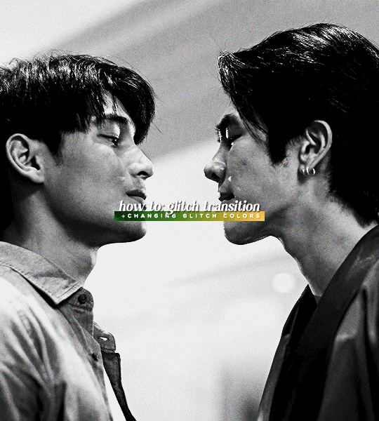
first things first, you need to choose which scenes you want to glitch between. obviously, in this gif i chose to parallel the scenes from episode five & seven where kinn is leaning into porsche’s space all sexy and intimidating lol. if you’re looking to make a gifset that focuses on parallels, you want to use scenes that closely resemble one another—this will make for a more seamless look. however, this glitch effect can definitely be used for transitions between any scenes you want—for example, i used the same general glitch effect in this gifset!
now, using whatever method you usually use (screencaps & ‘load files into stack,’ mp4 & ‘video frames to layers,’ etc.), upload each scene into its own project—make sure to convert from frame animation to video timeline if you haven’t already. resize the gifs (i’m using 540px by 600px), and sharpen them like you usually would. i also like to label my smart objects as ‘scene 1’ and ‘scene 2’ just to make things more organized.
next, drag the second scene onto the first, and fiddle with it until you’re happy with how the scenes switch between one another:

once you’ve got it the way you like it, color your gif however you want. keep in mind, however, that when making the glitch, it’s far easier to manipulate the colors of the glitch (for example, changing it from the typical red/cyan to yellow/green, like it is in my gifset) if you make the gif black & white. it’s possible to change the colors of the glitch on a non-black & white gif, but it really depends on the scene. if you aren’t going to change the colors of the glitch, you don’t have to worry about any of this!
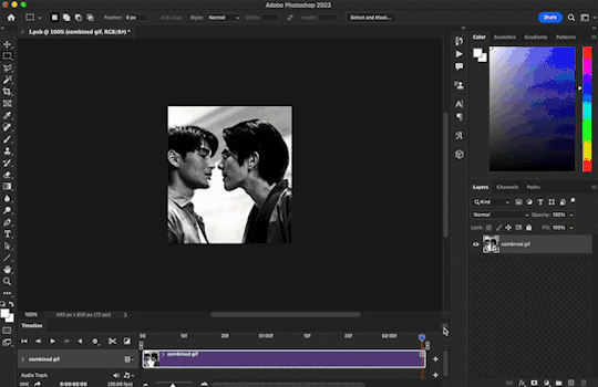
when you’re happy with your coloring, convert all of your layers (‘scene 1,’ ‘scene 2,’ and all coloring adjustment layers) into one smart object—i renamed this smart object ‘combined gif’ for organizational purposes, but it’s not necessary to do that.

remember, once you’ve done this, you can’t edit your adjustment layers on your base gif—if you’re worried about losing these adjustment layers for whatever reason, i suggest saving a duplicate of your current .psd file just in case.
after you’ve combined everything into one smart object, it’s time to convert your project from video timeline back to frame animation, as this is where we’re going to apply our glitch effect. go to the timeline menu > ‘convert frames’ > ‘flatten frames into clips,’ as shown below:
after this, click the button in the bottom left-hand corner, and click ‘continue’ if a dialogue box pops up saying ‘this will convert the timeline to a frame animation.’ then go back to the timeline menu and select ‘make frames from layers,’ as shown below:
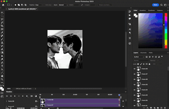
make sure to delete the first frame of your gif (the one that is not timed to ‘0 sec.’) as it is essentially just a long still image, and we don’t want that. now we have our frame animation.
now, in your frames, find the frame where your gif switches scenes—for me, that happens at frame 22. what i like to do is make the glitch span from two frames before to two frames after the cut (so, four frames in total). this means that the first glitch frame will be on frame 20 of my gif.
for my gif, i now want to find the corresponding layer to frame 20. the layer number is not going to be the same as your frame number due to converting from video timeline + deleting the first frame that was not ‘0 sec.’ that’s why it’s important to look for the toggled visibility icon—the little eye next to the layer. on my gif, the corresponding layer is called ‘frame 19,’ as shown below:

to make the glitch effect, i’m going to duplicate this layer, then right click on the duplicated layer (named ‘frame 19 copy’), and click ‘blending options.’ in the blending options panel, uncheck the ‘r’ (a.k.a. ‘red’) channel under ‘advanced blending,’ as shown below:

then, nudge the duplicated layer using your arrow keys to create the glitch effect. for my first glitch frame, i tend to do a simple nudge to the right by 4px, and sometimes i’ll either nudge up or down by an additional 3px. there are no rules for this, however, so feel free to play around.
then, highlight both layers (for me that's ‘frame 19’ & ‘frame 19 copy’) and right click > ‘merge layers.’ i like to rename this newly merged layer as ‘glitch 1’ (once again, just to be organized):
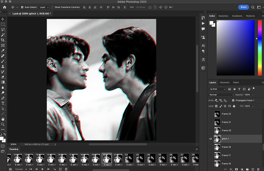
make sure that this new layer’s visibility icon (the little eye) is only toggled for the frame where the glitch is supposed to occur. sometimes this merged layer will appear toggled for all frames for some ungodly reason, so be sure to check and toggle/untoggle accordingly.
for the next glitch frame i like to use a trick to make the glitch look even messier and broken up. so, follow the same steps as before on the following frame/corresponding layer (for my gif that is frame 21 and layer 20)—but before nudging the duplicated layer, we’re going to utilize the ‘rectangular marquee tool’ (found in the top left-hand corner). holding down the shift key, use the ‘rectangular marquee tool’ to create boxes of all random shapes and sizes on top of your duplicated layer. make as many as you want:

after you’ve made all these boxes, switch back to the ‘move tool’ (the one right above the ‘rectangular marquee tool’) and then you may nudge the duplicated layer however you wish—you will notice that the glitch will now appear like it’s been broken up into these boxes! i suggest nudging the duplicated layer in the opposite direction on this frame, this way the overall glitch will look more realistic (so instead of nudging the duplicated layer to the right, nudge it to the left, etc.)—after this, merge the layers.
repeat this process for the following two frames! feel free to play around with the glitch, and do whatever you like best. you can even add a small mini-glitch in between the scene transitions (for this i used three frames instead of four, so it wasn’t as long as the transitional glitches).
once again, we’re going to convert our project back to video timeline. so, highlight all your layers/frames, click ‘convert to video timeline’ in the bottom left-hand corner, right click your layers, and select ‘convert to smart object.’ this is where we make our final adjustments, such as changing the colors of the glitch, adding grain, text, and even overlays if you’re so inclined.
to change the colors of the glitch, add a hue/saturation adjustment layer to your gif. there are two colors in our glitch, cyan & red—so, we are going to target the cyan & red channels on our hue/saturation layer. you can basically mess around with this to get whatever colors you choose. for my gifset, i changed the cyan to dark green and the red to a yellowy-gold by using the hue & lightness sliders:

then, of course, you can do whatever else you wish to your gif! after adding grain and some text, here is how mine turned out:

and that’s all! hopefully this long-winded explanation makes sense—but if you have any follow-up questions, feel free to hit me up again!
8 notes
·
View notes
Note
hi jaelyn! would you consider doing a tutorial of how you did the border in this post: /post/724027705058902016/renaissance-1-year-countdown-act-i-track-x-move? It's so cool!
Hi, anon! I've done this border effect for a few of my gifsets, but I'm gonna use the one you mentioned as an example. (Here's the whole set in question.)
Here's what my gif looks like without a border around it just to start.

Now before we do anything, we have to make sure we add a new layer (Layer > New Layer). If you don't do this, what's gonna happen is that you're gonna have the border basically attached to the gif without any way of editing it later (if you decide that you want to edit it later). I'll explain what I mean once we get to that point.
Now, once you have your new layer over the gif you want to edit, we're going to go over here to where the Rectangular Marquee Tool is.

This is going to create the rectangle shape we need. Then you simply align it at the point where you would like to start making your border. For the purpose of this tutorial, I started at the top left and dragged diagonally to the bottom right.

The rectangle shape we just made created a selection. We're gonna right click on it, and these options come up.

We're gonna go ahead and click on Stroke, and then this comes up.

This part, you can pretty much do anything you like with it, depending on what effect you're going for. For the set I made, the majority of it has teal, white, and black (+ the red text in the final gif), but I want the border to show fairly well in contrast to the teal/black. So for color, I choose white (#ffffff). I also put the location at center and the width at 1 px.
Once you click Okay, you're still going to see the selection surrounding the border you just made. So use your keyboard and do CTRL/CMD + D to deselect the border. This is what we have now.

That's pretty much it, if you like your border the way it is. However — and this is something I mentioned when I brought up the new layer thing — if you find yourself wanting to re-edit your border in any way possible, then we can go back and do as we please since that layer is separate from the gif.
Use your keyboard and press Shift + CTRL/CMD + D to reselect the border, and that same selection will come back up. Repeat the right-click and then click on Stroke again. This time, we're gonna change the color to this shade of red (#780000) and keep everything else.
Once you do that, click Okay, and deselect your layer again. This is what we get now.

These same instructions apply if you want to make the border thicker by a couple of pixels, change the location, etc. It's just a matter of playing around with it.
If you have any questions, never hesitate to ask. ❤️
3 notes
·
View notes
Text
I want to tell a story to the artists and would-be artists out there.
When I was 19, I made a large oil painting of the nerd I would eventually marry. I poured all my attention and care into this painting. It's the only art I have from back then that still holds up as a work I'm proud of today.
I entered it into a judged show at the local art center. It got an honorable mention. I went to see the show with my beloved model. One of the judges came up to talk to me, and highlighted that all the judges really liked the painting. It would have placed, except, you see, the feet were incorrect. They were too wide and short, and if I just studied a bit more anatomy-
I called over my future wife, and asked her to take off her shoe. Being already very used to humoring me, she did. The judge looked at her very short, very wide little foot. Exactly as I'd lovingly rendered it. I would never edit her appearance in any way.
The judge looked me in the eye, and to his credit, he really looked like he meant it when he said "Oh I'm so sorry."
Anyways the moral of the story is that all of those anatomy books that teach you proportions are either showing you averages, or a very specific idea of an idealized body. Actual bodies are much more varied than that.
So don't forget to draw from observation, and remember that humans aren't mass produced mannequins. Delight in our variation. Because it's supposed to be there.
115K notes
·
View notes
Text
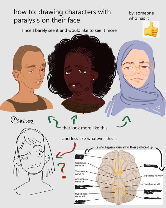

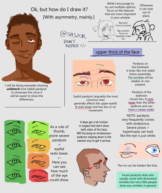
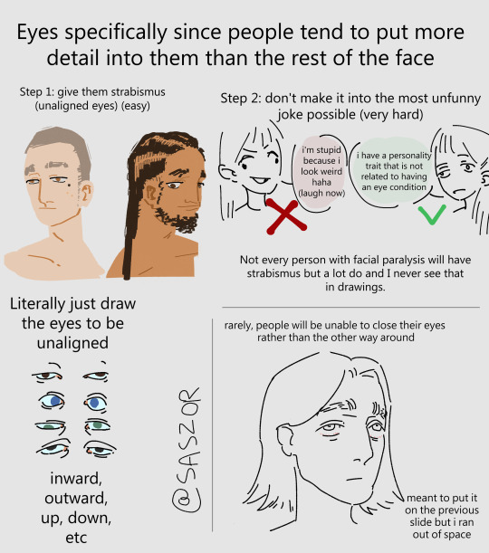
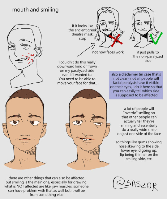
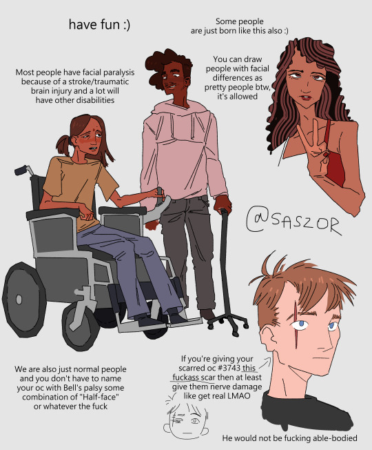
[ID in alt]
Tutorial on drawing characters/OCs who have some sort of facial paralysis. It doesn't cover all possible variants because I was using mirror as my main reference lawl
Keep in mind that this is an introductory drawing tutorial and has some generalizations in it, so not every “X is Z” statement will be true for Actual People 👍
Consider supporting me on ko-fi if you find this to be helpful.
#No 'omg mithrun dungeon meshi' notes that's not even what he has.#my art#artists on tumblr#disabled artist#digital art#id in alt text#art tutorial#drawing disabled characters#facial difference#disabled representation#disabled characters#digital artist#artwork#art on tumblr#art#body positive art#character art#disabled art#original art#personal art#illustration#drawing
24K notes
·
View notes
Text
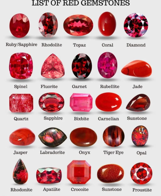
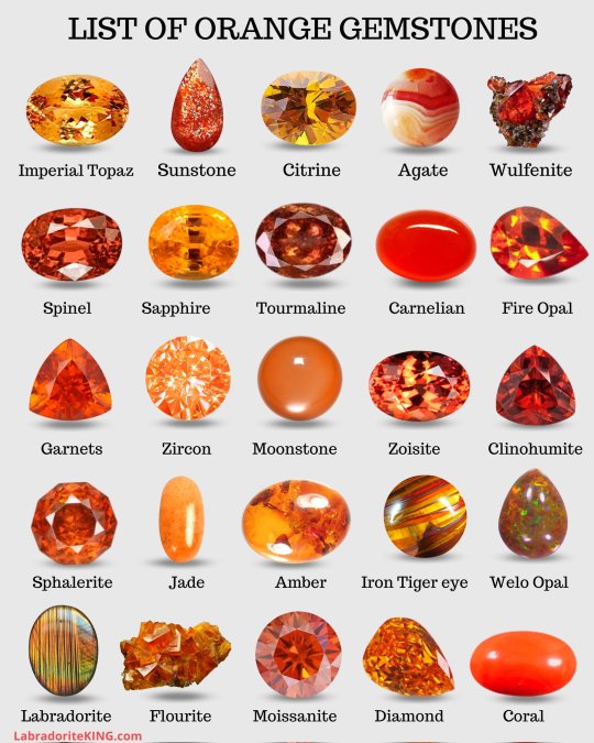
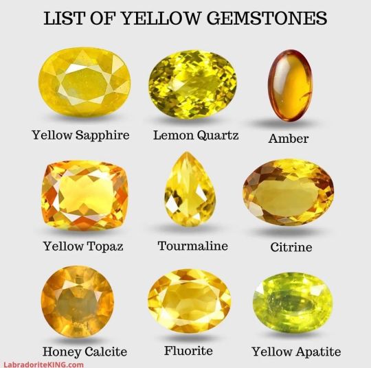
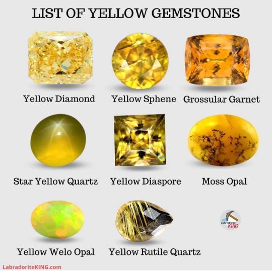
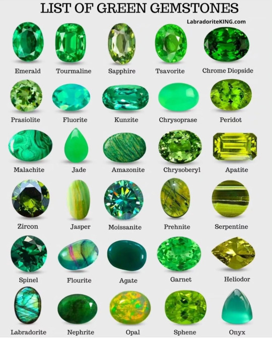
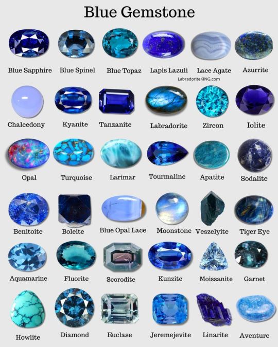
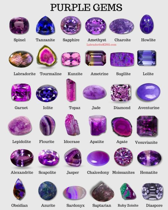
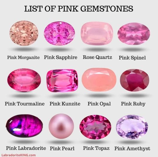
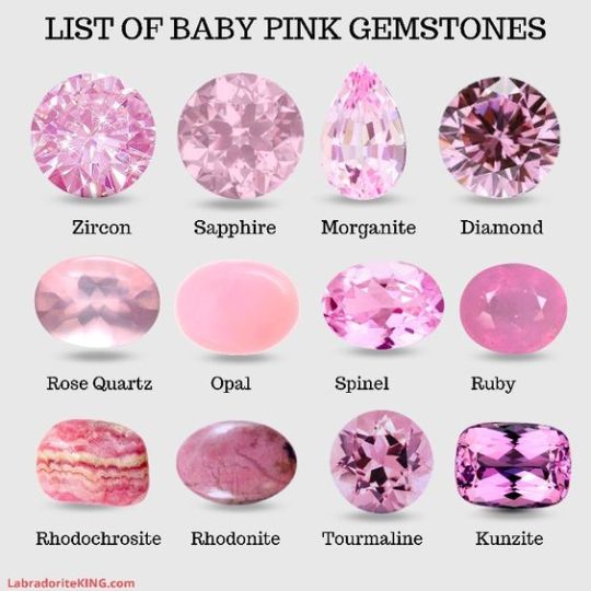
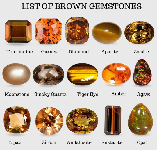
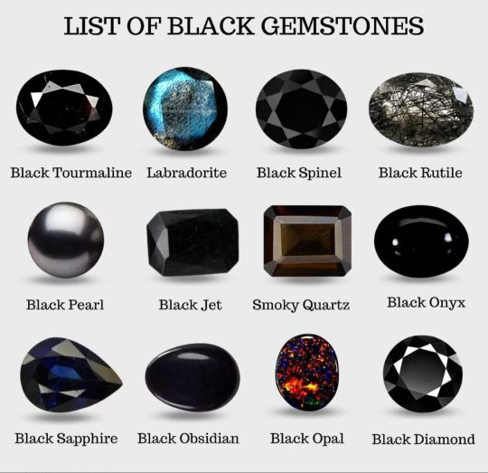

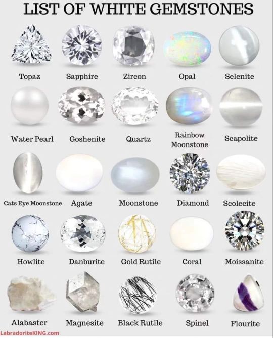
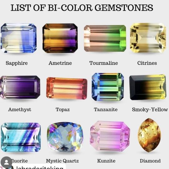
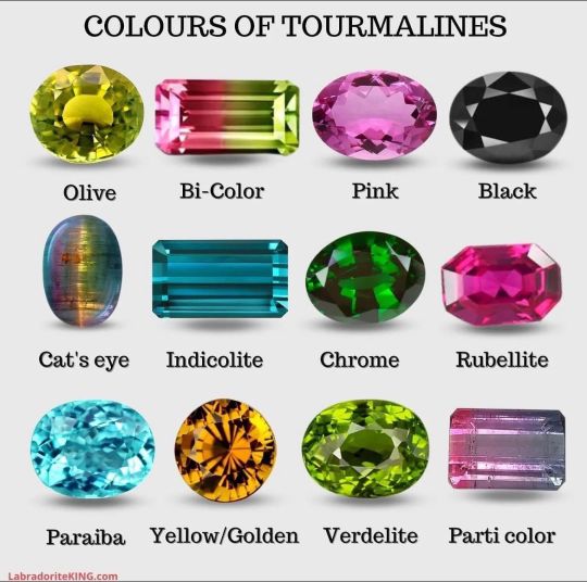
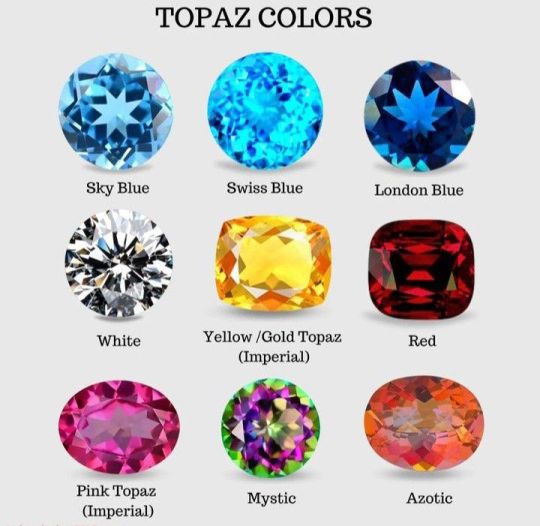
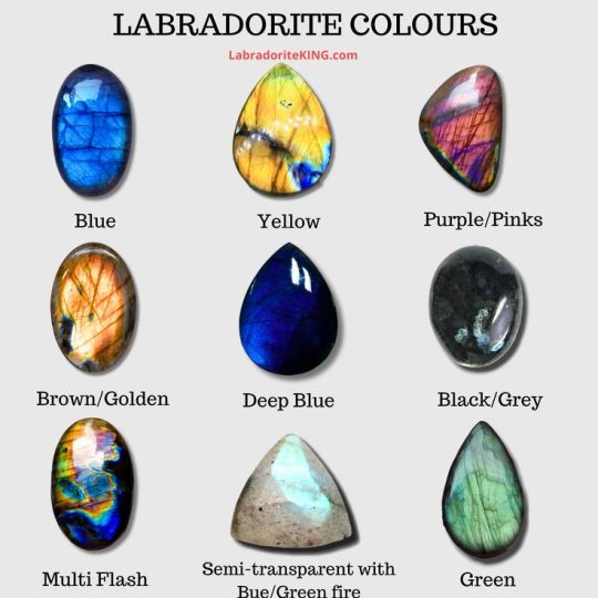
By LabradoriteKing on Pinterest
#Tutorials & References#Gemstones#Jewels#Art Reference#Writing Reference#Gemstones Reference#If the original marker wants me to take this down I will
139K notes
·
View notes
Text
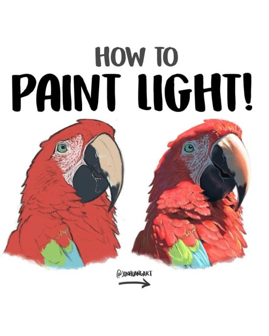
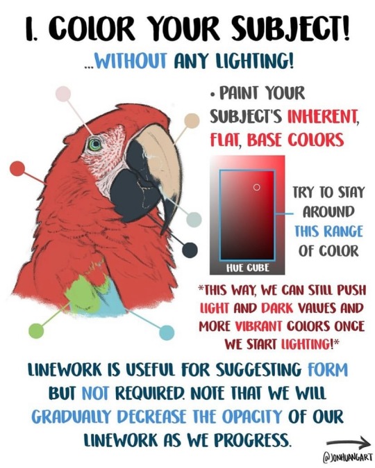
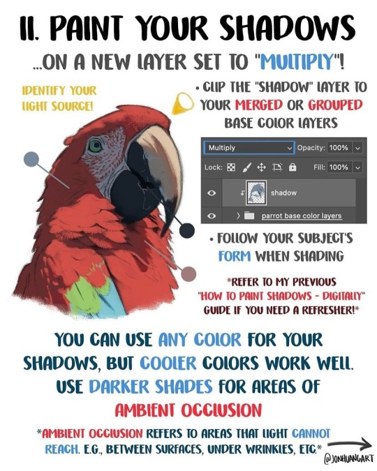
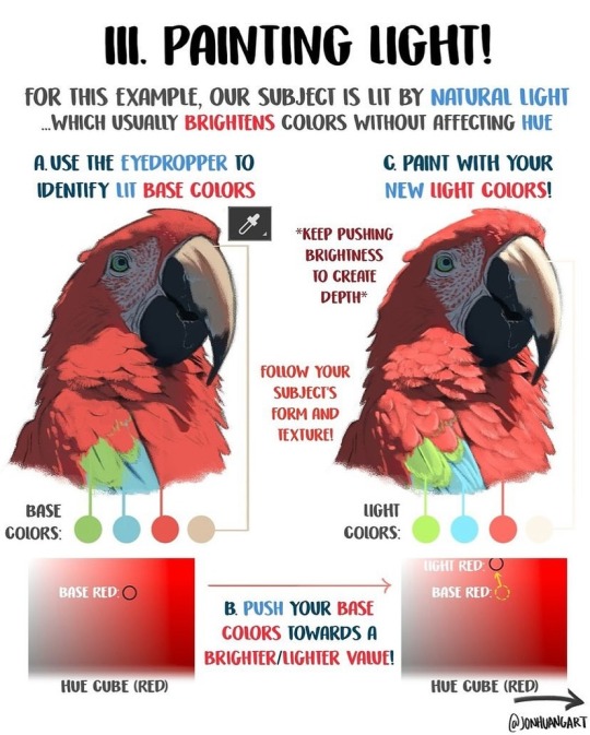
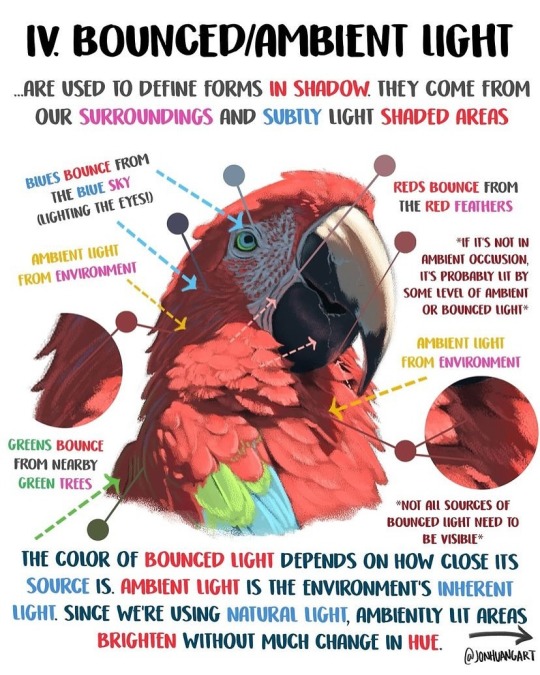
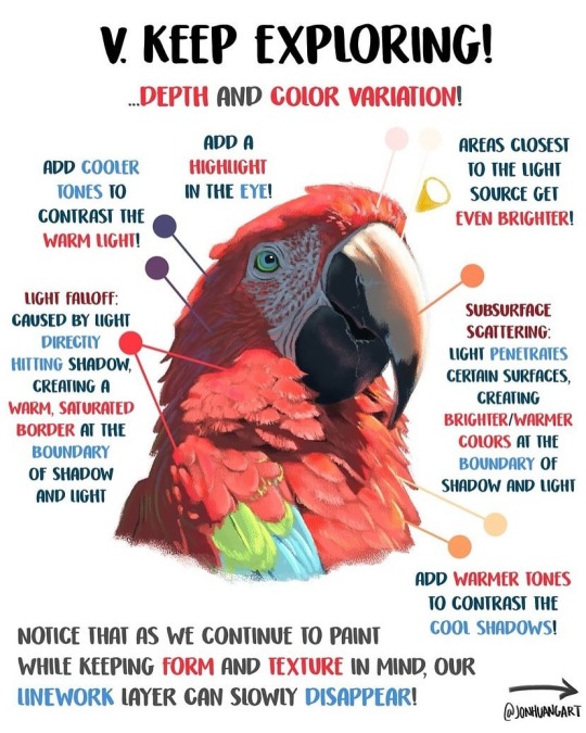
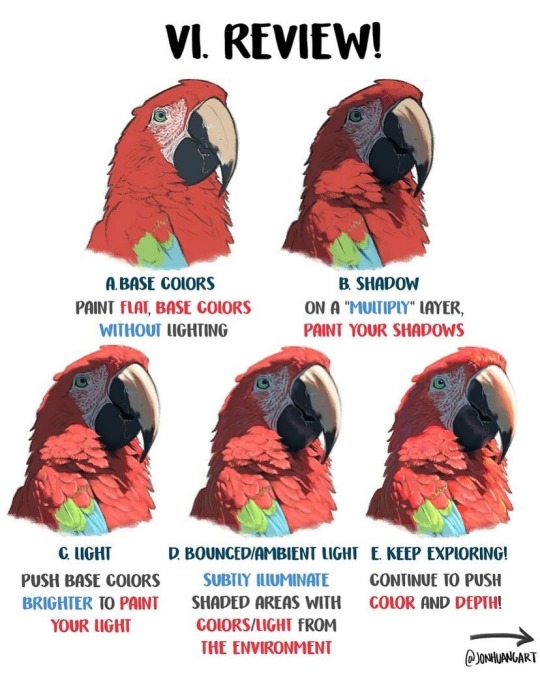
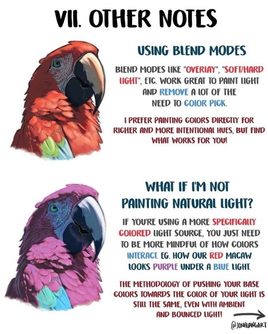
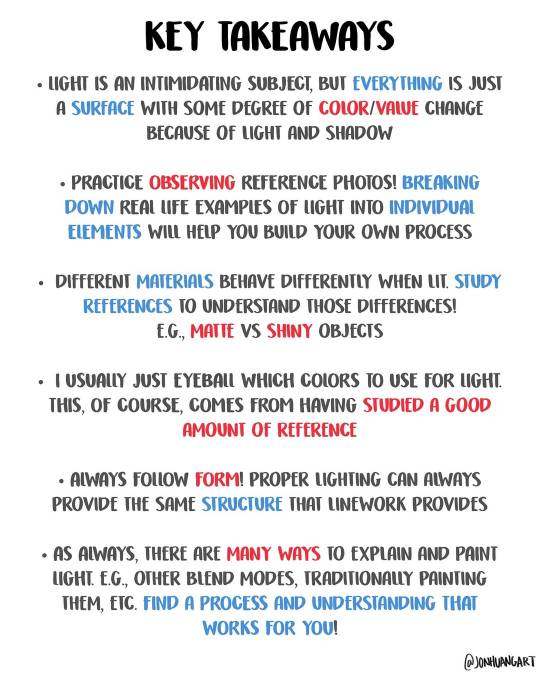
How to Paint Light by jonhuangart
34K notes
·
View notes
Text

Microsoft Productivity Pack for Windows (1992)
24K notes
·
View notes
Text

It's in the eye of the beholder
#comic#birds#my art#I've had this idea for a while#after a lecture that talked about how traits we consider cute are traits found in babies#I feel like birds would have a very different definition of cute from us#anyway after making the bird tutorial I feel the pressure to draw perfect bird anatomy#but tbh I still just wing it a lot of the time!!#hehe “wing it”
62K notes
·
View notes
Text
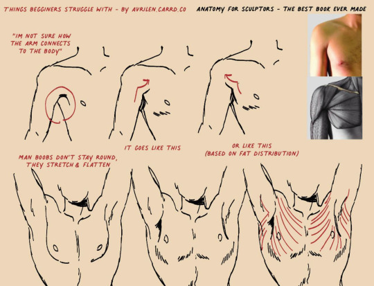
A small guide for people who struggle with this area
24K notes
·
View notes
Text
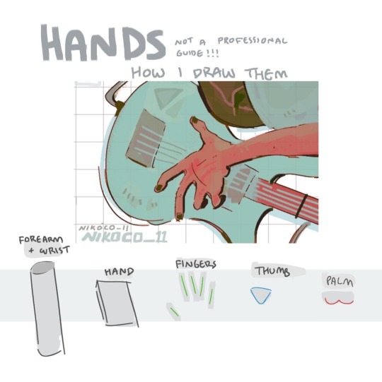


my recipe for drawing hands!
(small note that this is a shortcut that is more abt style and ease than anatomical accuracy. it helps to take time to really properly study hands, makes it easier to bend the rules a bit like this and have it still look good!!)
(learn rules b4 u break them or whatevah)
#qna#tutorial#guide#drawing tutorial#digital art#illustration#drawing#artists on tumblr#my art#clip studio paint
59K notes
·
View notes
Text
how to wave magic wand by 街头尬术师【魔法披风】
17K notes
·
View notes
Text
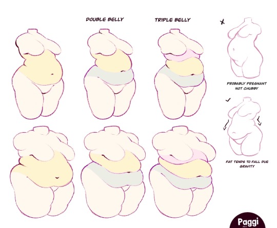
Excellent tutorial to drawing cubby body types
“Some chubby guide for y’all!”
Source: paggiart on twitter
#art tutorial#digital art#art reference#tutorial#art tips#human anatomy#drawing anatomy#drawing torso#drawing stomach
48K notes
·
View notes