#polar graph plots
Explore tagged Tumblr posts
Visit Tumblr Blog
Explore Tumblr blogs with no restrictions, modern design and the best experience.
Last Seen Tumblr Blogs


Fun Fact
25% of US internet users with an annual income of $80-100K use Tumblr.
Text

💚🤍
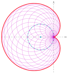
The sine function is a trigonometric function whose output oscillates between one and negative one. Plotting the function in two-dimensional space results in a wave-like graph, whose appearance can change based on the length, amplitude, and frequency of the wave.
“rainbow waves v2.0” is an original generative code art algorithm; each run of the code produces a random visual output. Sine waves are created and stacked on top of each other. Each wave is made from a random number of points, with a random amplitude and frequency. Points are assigned their colors from a color selector that chooses colors from a random palette.
“rainbow waves v2.0” was made with TypeScript, p5.js, and the @batpb/genart library.
The source code of this project is licensed under the GNU Affero General Public Version 3.0 License.
The visual output of this project is licensed under the Creative Commons Attribution-NonCommercial-NoDerivatives 4.0 International (CC BY-NC-ND 4.0) License.
Copyright (C) 2015-2024 brittni and the polar bear LLC. Some rights reserved.
#wip#code art#code artist#algorithmic art#algorithmic artist#generative art#generative artist#genart#digital art#p5js#made with typescript#creative coding#black art#black artist#artists on tumblr#trigonometry#sine#cosine#rainbow waves
2 notes
·
View notes
Text
The shape of a y=x^2 graph isn't maths. There's no way to prove what it looks like.
Think about when you first learn how to draw a graph: you do it by finding various points on the graph and plotting them, then joining the dots. This plotting is the key to drawing a graph: plotting is a map from abstract mathematical points—really just symbols—to real points, in physical space. And we all learn how to do it early. But there's nothing more right about how we do it than any other way. This might seem obvious—after all, you can plot a polar graph too—that's just a graph from another different way of plotting—there are any number of ways you can parameterize the plane.
One could imagine a completely alien way of plotting points on a page, where straight lines become eldritch monstrosities. This is no more right or wrong than our way of plotting—neither have any justification mathematically—the process of plotting can't even be described mathematically.
One could plot a ZFCircle in this system, and all its properties would translate into properties of the eldritch circle, in just the same way as they do for our circles. ZFCircles don't 'look like' our circles any more than they 'look like' those eldritch circles. All the reasons we say ZFCircles correspond to our circles are also reasons ZFCircles correspond to eldritch circles. Both are equally valid ways of translating ZFCircles to physical space. So I don't see how ZFCircles can be said to capture any notion of shape at all.
You might think we can describe the plotting mathematically: we can model the paper we draw on with R^2 and, for example, plotting as a radial graph is then described by the function: (r, θ) → (r cos θ, r sin θ), and the alien plot is described by the ugliest formula imaginable. The Cartesian plot is described by the identity map. But that's only the case because our starting point is an analogy between R^2 and our graph paper, using the Cartesian plot. If, for example, we thought of R^2 in radial coordinates, we would describe the Cartesian plot as (x, y) → (sqrt(x^2+y^2), arg(x, y)).
So we describe the same plot with a different function depending on which other plot we are used to using. Which means we cannot actually capture the plot itself in maths—only how it relates to other plots—which we capture as the notion of a change of coordinates.
But then, analogizing a plot to a function can't break us out of the purely algebraic world and let us describe shapes. That function that we tried to take as an analogy for the radial plot isn't any more objectively an analogy for the radial plot than any other bijection R^2 → R^2. So studying this function cannot directly tell us anything about the radial plot.
The only way we get information back about the radial plot is by translating algebraic facts about that function into geometric facts using the Cartesian plot we started with—which we were trying to justify in the first place. Attempts to justify the analogy between shapes and algebra mathematically are doomed to always end up just chasing their own tail.
Geometry is founded on faith.
8 notes
·
View notes
Text
hey don't cry, plot 1/5-1/m = x/m on a polar graph where x and m are both whole numbers and m is the modulus of the circle for a chance to see the Fivefold Tartan Dimension
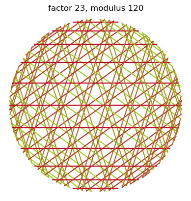
2/5-1/n also works
#modular multiplication circles#math nerd#if this isn't integration of the dragon and the automaton idk what is#math tartan
0 notes
Text
Exploring the Techniques of Data Visualization

Large data sets need in-depth analytics and processing power to manage. This is where data visualization is helpful. Data visualization services have advanced rapidly in recent years, anticipated to alter the business environment shortly.
Data visualization utilizes visual elements such as charts, graphs, and maps to facilitate the observation and comprehension of trends, outliers, and patterns in data. It helps determine which variables to include or discard in the analysis.
This blog on data visualization techniques will provide detailed insights into the techniques and benefits.
What is Data Visualization?
Data visualization is a captivating form of visual art that captures our attention and effectively conveys a message. When we look at a chart, we can easily identify trends and outliers. Visualizing data allows us to quickly internalize information. It's essentially storytelling with a purpose. If you've ever struggled to identify a trend in a large spreadsheet of data, you understand the power of visualization.
Data visualization is a powerful method to explore data and present results effectively. Its primary use is in the pre-processing stage of the data mining process. It supports the data-cleaning process by identifying incorrect and missing values.
Techniques of Data Visualization
Representing visual data requires various techniques that must be followed to achieve this process. Let's explore some of these techniques to make this process simpler and easier.
1. Temporal
Temporal data visualization offers the advantage of familiarity, as we are already accustomed to using such visuals, particularly in educational and professional settings where charts are commonly used for explanations. Linear and one-dimensional data visualizations play a crucial role in temporal data visualization. Examples of temporal data visualizations include linear graphs, polar area diagrams, scatter plots, time series sequences, and timelines.
2. Multidimensional
Multidimensional data visualizations, as their name implies, involve multiple dimensions, typically requiring at least two variables for a 3D data visualization. These visualizations often feature vibrant and striking graphics due to the numerous concurrent layers and datasets. They excel at condensing large amounts of information into key points. Examples of multidimensional data visualizations include histograms, scatter plots, pie charts, Venn diagrams, and stacked bar graphs.
3. Geospatial
Geospatial or spatial data visualizations involve overlaying different data points on familiar maps to connect them to specific geographic locations. Examples of geospatial data visualizations include Cartograms, Heat maps, Flow maps, and Density maps.
4. Network
Users of network data visualization can demonstrate connections between different data sets. Within this network, communication takes place via intricate connections linking one data set to another. Visualizations such as alluvial diagram charts, parallel coordinate plots, node-link diagram charts, word cloud plots, network diagram charts, non-ribbon chord diagram plots, and matrix charts are commonly used to illustrate the relationships between data sets.
5. Hierarchical
When information needs to be organized into clusters, hierarchical data visualizations are very helpful. However, creating these graphs is more complex compared to other forms of visualization. Hierarchical data visualizations can show a company's or organization's data and object hierarchy. Examples of hierarchical data visualizations include ring charts, sunburst diagrams, and tree diagrams.
Wrapping Up
Data visualization solutions are an essential step in data processing techniques. In the new era, data visualization is making its debut. With the introduction of next-generation technologies and the development of apparent frameworks, it is moving from art to science, opening up new opportunities.
Using the above guide, you can use data visualizations for processing your business data or use the help of data visualization consulting services. A leading data visualization company excels at this situation and can help you to implement this approach. There is a plethora of legacy modernization services available to modernize your business applications. To make data-driven decisions, choose top-quality data visualization services to create a data visual model.
0 notes
Text
Project Two: "Solar Eclipse"
Project Two introduced Polar Functions! The designs created by polar functions were what I envisioned I would be making in this class (think Spirograph toys!)
Similarly to the first project, I didn't have much of an idea going into it, but once the pieces started coming together I found the inspiration to call my design "Solar Eclipse":

Most of the design was created by a stroke of luck and plenty of trial-and-error exploration. For most of the Polar Unit, my practice designs had the same outward burst effect. There was just something about focusing in on one aspect of the design and then branching out that appealed to me.

The Inspiration: The Solar Eclipse on April 8th, 2024

In truth, I did not use the eclipse as inspiration until later in the process. I originally wanted to create a sunrise/sunset scene because I had luckily found a curve that looked like clouds while trying out different function combinations. It was only after things started coming together in the design that I decided to base it off of the upcoming (at the time) solar eclipse.
Some Issues...
I had three main problems while working on Project Two.
The first of these was with setting a domain for the polar functions. Even though I had learned about the radians, I often found myself guessing-and-checking by putting random numbers next to pi and seeing if the graph was restricted the way that I wanted it to be.

Secondly, the markers that I used. Posca pens are known for their vibrancy, so I was a little disappointed that the color of the white marker came out watery. It took me more than a few times plotting the same inner ring for the marker to reach a satisfiable opaqueness which could have also put the paper at risk of tearing.

The third problem isn't one that I could have taken into my own hands. I don't know how the MakerSpace works outside of their machines and all my AxiDraw reservation times were taken up by someone else before I got to the space. I am regardless grateful that I was still able to copy the drawing twice despite the trouble.
Overall, I am happy with my outcome for Project Two! I can clearly see my growth between the first project and this one. I was still trying to get comfortable about borrowing cool-looking functions from other people at the time, but I think, even without taking ideas from my peers, this design still came out wonderful!
0 notes
Text
When Paintbrushes Meet Test Tubes: A Comically Genius Guide to the Art-Science Mashup
Ah, the age-old debate: science versus art. It's like choosing between pizza and ice cream for dinner – both fantastic, but oh, so different. But what happens when you mash them together? You get a sundae topped with pepperoni, my friends – weird, but strangely satisfying. This is the space where beakers and brushes coexist in quirky harmony, creating a fusion of knowledge and beauty. And, of course, we're going to explore this delightful conundrum with as many pop culture references as humanly possible. Hold onto your lab coats and berets, folks!
First off, let's address the neon elephant in the room: Art and science are often seen as polar opposites. Science is all logic, numbers, and facts – the Spock of our story. Art, on the other hand, is the Captain Kirk – impulsive, emotional, and wildly creative. But, as any "Star Trek" fan will tell you, Spock and Kirk are better together, and the same goes for art and science.
Now, imagine if Leonardo da Vinci had decided to stick to just art or just anatomy. The world would have been robbed of a man who could sketch a Vitruvian Man in one hand and dissect the mysteries of the human body in the other. Da Vinci was the OG (Original Genius) of combining art and science. He didn't just paint pretty pictures; he used his art to dig into the scientific wonders of the world.
Fast forward a few centuries to the era of Instagram and TikTok, where art promotes science education in the most dazzling ways. Ever seen those hypnotizing videos where someone pours colored liquids into a petri dish, and it blossoms into a psychedelic display? That's art teaching science, folks! It's like watching "Breaking Bad," but instead of cooking meth, they're making art and teaching chemistry.
Speaking of chemistry, let's talk about the explosive reactions that happen when art and science collide. For instance, have you ever seen a sculpture that moves with the wind or changes its appearance with the angle of sunlight? That's not just art; that's physics and engineering donning a beret and calling itself "sculpture." It's like Iron Man building his suit – a perfect blend of tech and aesthetics.
And let's not forget biology, the science of life, which has been inspiring artists since the first caveman drew a woolly mammoth on his living room wall. Today, we have artists using living cells to create bioluminescent art. It's like "Avatar," but in a petri dish.
On the flip side, science benefits immensely from art. Ever heard of data visualization? It's the art of turning rows of snooze-worthy numbers into stunning graphs and charts that even a six-year-old could understand. It's like taking the plot of "Inception" and turning it into a Dr. Seuss book.
Moreover, art challenges scientists to think outside the proverbial box. A scientist might see a blob of cells under a microscope, but an artist sees a potential masterpiece. It's a bit like how MacGyver looks at a paperclip and sees a tool to save the world. Artists can inspire scientists to view their work through a different lens, adding a splash of creativity to their logical minds.
Now, let's talk about technology, the love child of art and science. From stunning video games that teach physics (Portal, anyone?) to virtual reality experiences that let you walk through a human heart, technology is the bridge between art and science. It's like if Tony Stark and Bob Ross had a baby – it would create beautiful landscapes with a suit of armor.
In conclusion, the intersection of art and science is like a Marvel movie – full of unexpected crossovers, collaborations, and a fusion of different worlds. It’s a place where creativity meets logic, where beauty intertwines with facts, and where education becomes fun. So, the next time you think about art and science, remember they're not just two separate subjects; they're two sides of the same coin, flipping endlessly in the air, waiting for us to catch them and marvel at their combined beauty. And who knows, maybe one day we'll have a school subject called "SciArt" – where students paint with chemicals and calculate the geometry of sculptures. Until then, keep mixing those test tubes with your paintbrushes and create some explosively creative magic!
0 notes
Photo
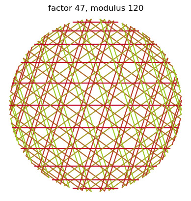
more about the plotting and then some about polar coordinates , this for you to mess with the graph yourself
wild how much you can learn in just 5 minutes
limacon
7 notes
·
View notes
Text
Part 1/2
This seminar, titled Social Media and Polarization, was delivered by Mathew Gentzkow of Stanford University about the about the causes of polarization (he also said he would offer solutions however they did not manifest). Gentzkowposes two key questions, 1) 'is the United States of America more polarized than ever before?', in short yes, dependent on the measurements used, and; 2) is social media to blame, he leads with the assumption that people generally believe this to be so. Building on this, he demonstrates past literature suggesting polarization to a social myth as recently as 2008. Personally, I never had the assertion the USA was more polarized than ever before. I feel Gentzkow assumed something of an international audience that might not translate. He might be referencing a media narrative that I am not privy to. I think considering one's audience's frame of reference is important while giving seminars, therefore in future presentations, I will consider which assumptions I present that are culturally based to foresee how they could be confusing to a foreign audience and try to explain them better.
Genntzkow leads the argument by examening the three areas whereedon't see increasing divisions. I found this to be a very honest way to lead the discussion, as it focuses on the limitations and scope of the evidence he will later produce. These areas are as follows: people's self-described ideologies, they dont self identify on the extremes of left or right; party identification, ergo the polticians similarly do not identify as far-left or far-right; and, views on some individiual issues, we dont see people taking more extreme policy views. These self-reporting results are likely to be biased, I am aware that the terms far-left and far-right have strong negative connotations therefore it makes sense the majority of people would llike to avoid being labeled thus. However, the fact people do not have more polerized policy views demonstrated the polarization in an objective sense does not come from public opinion. It is more likely a trend in mainstream media. I seems the Genztkow is activley avoiding the questioning cui bono.
Gentzkow, introduces us to the observations that show correlational evidence for increasing divisions in American voters, these are as follows: among issue views, party votes, and hostility/negative feelings about the opposite party. First, he uses a bar chart to illustrate the temperament of parties towards one another in 1960 and 2008. The results indicate people perceive the opposite party to be more selfish and of lesser intelligence in 2008 than they did in 1960. The comparison continues in showing that people in 2008 express more displeasure towards their children marrying someone of the opposite party, overtaking race which was a far more divisive issue in 1960. Although this is interesting, I don't find a comparison with just two dates strongly persuasive. Gentzkow's own work can be shown on a basic line graph, data from the 1970s to 2020s plot the divergence of affect towards ones own and the opposite parties. Over time people have become more critical of the opposite party and more loyal to their own.
0 notes
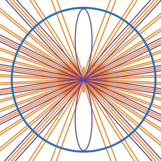
Note
best shape? (2D, 3D, and 4D?)
anon i love you. i'm gonna get really nerdy with this one
favorite 2d shape has to be the cardioid
i like this one for a lot of reasons. i think it's really cool mathematically-speaking that one of the simplest functions you can plot in polar coordinates makes a heart-shaped graph. "simple love"
i think it also has a certain indescribable funny character to it, like if shapes were people this would be a george-from-seinfeld type shape.
favorite 3d shape is probably scutoids

crystalline structures and tessellations have always been really interesting to me. i think there's something special about a shape you can tile infinitely in all directions. the thing is, most of the standard shapes that can do this are pretty regular and simple. i like scutoids cause they can do this and they're not as simple
i'll use an analogy. cube and hexagonal crystalline structures are vanilla, focus-tested, conventionally attractive, Disney-produced Marvel Movie, andy warhol campbell chicken noodle shit. scutoids, they got that upper ear piercing, the big nose, the certain je ne sais quoi that someone especially attractive has, they're like a Wes Anderson movie if Wes Anderson was less mainstream, they're energetic and yet manage to keep this composition, it's like a gustav klimt or joan miro or van gogh
I also like the Boy's surface cause it's called the Boy's surface. projective planes are pretty cool in their own right of course
my favorite 4d shape doesn't really have a name but it's the spacetime manifold created outside the event horizon of a rotating black hole.
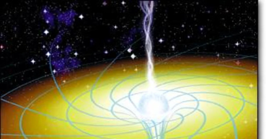
black holes that rotate create the jet streams you might see associated with black holes, and i think astronomically (besides closely related quasars) these are some of the coolest objects around. regular black holes, they're cool and all, they suck like a vacuum, they do the job and they do it well. rotating black holes, they do all that with an added tornado effect, they suck like how i imagine a 6'4" jk simmons-like guy who does mouth exercises sucks, and the result is spectacular
thanks
8 notes
·
View notes
Text

⚫🔵🟣 #wip #codeart
The sine function is a trigonometric function whose output oscillates between one and negative one. Plotting the function in two-dimensional space results in a wave-like graph, whose appearance can change based on the length, amplitude, and frequency of the wave.
“rainbow waves v2.0” is an original generative code art algorithm; each run of the code produces a random visual output. Sine waves are created and stacked on top of each other. Each wave is made from a random number of points, with a random amplitude and frequency. Points are assigned their colors from a color selector that chooses colors from a random palette.
“rainbow waves v2.0” was made with TypeScript, p5.js, and the batpb/genart library.
The source code of this project is licensed under the GNU Affero General Public Version 3.0 License.
The visual output of this project is licensed under the Creative Commons Attribution-NonCommercial-NoDerivatives 4.0 International (CC BY-NC-ND 4.0) License.
Copyright (C) 2015-2024 brittni and the polar bear LLC. Some rights reserved.
#wip#code art#algorithmic art#generative art#genart#digital art#p5js#made with typescript#creative coding#black art#black artist#artists on tumblr#trigonometry#sine#cosine#rainbow waves#code artist#algorithmic artist#generative artist
1 note
·
View note
Text
i tried to figure out the enneagram types of dream smp characters
have you ever wanted to know the enneagram types, and therefore motivations and fears, of your favorite dream smp characters? that’s a rhetorical question. don’t answer. this post contains a quick explanation of the enneagram and an analysis for every included character. i’m just gonna put it all under the cut.
i’d absolutely love to hear your thoughts!
ENNEAGRAM EXPLANATION
a quick low-down on the enneagram, for those who don’t know:
the enneagram actually refers to a funky circular graph, numbers 1-9 on the outside that depict 9 different personality types. each type is adjacent to two other types around the circle (see image for clarification). the two types on either side are the possible wings for that specific type, a wing being an additional set of personality traits alongside the main personality type. an enneagram type is written as [type]w[wing]. for example, my enneagram type is 4, and i have a type 5 wing, so my enneagram type is 4w5.
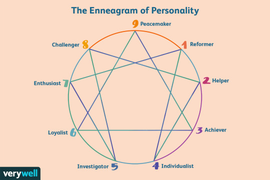
(the lines through the inside of the enneagram won’t be mentioned in this post, but you can find more information on them online if you’re curious. i won’t link anything because links can be sketchy)
the nine enneagram types are mostly easily explained by their basic fears and basic desires. the enneagram is intended to explain the “why” behind someone’s actions, which is why it’s so hard to type someone else. you cannot get inside their head to find out their true motivations. however, today i am working with entirely fictional characters and not the content creators themselves, so i give myself a free pass. please don’t go around psychoanalyzing your friends or people you don’t even know and jumping to conclusions without their input lol
also all of these are just what i think ! if you (respectfully) disagree, i would actually love to hear your opinions - you are probably right and i am probably wrong.i don’t watch every stream or even know of every event, and my reasoning is probably weak at best. enough rambling, here we goooo
the grouping will be by type, just because… idk how else to organize this.
again, /rp /rp /rp ! i don’t know these ccs in real life and will not pretend to. i’m talking about minecraft roleplay.
(also, i didn’t proofread this. sorry fnjakdfda)
type 1: the reformer
principled, purposeful, self-controlled, perfectionistic
desire: to be good, to have integrity
tubbo - type 1w2
tubbo is a classic example of a type 1 being put into the worst possible situation for their current mental state. tubbo was the moral and sensical anchor for tommy’s more eccentric and self-centered actions, and they functioned as this duo UNTIL tubbo was made the president of l’manberg. tubbo’s more self-critical tendencies were amplified because his actions had so much weight. tubbo is quick to turn against and polarize those he sees as “evil”, making broad generalizations like “technoblade is wrong” and “tommy is good”, regardless of all the moral gray areas, and even changes his mind drastically between them as he seeks the right answer. (ex: exiles tommy, but then decides it was the wrong idea, and now seems to agree with everything he says again.) i think part of his flip-flopping comes from a sense of people-pleasing and generosity, again amplified by his position as the (now former) president of a nation.
type 2: the helper
generous, demonstrative, people-pleasing, possessive
desire: to feel loved/appreciated
quackity - type 2w3
(as far as i know) quackity’s first major action on the smp was to run for president. wilbur and tommy wanted quackity (as part of swag 2020) to share the votes of the two parties in order to ensure a victory over schlatt. however, quackity acted out against them because he felt used instead of appreciated for his ideas. schlatt promised him at least some amount of respect, so quackity switched sides regardless of what was better for the smp at large. i believe quackity kept looking for approval from others, but also some sense of accomplishment, by founding mexican l’manberg (is this even canon…idk but i liked it), starting the butcher army, and trying to bring schlatt back to life. quackity even fought technoblade despite being grossly unqualified and i believe this is due to the martyr mindset that often comes with unhealthy type 2s.
type 3: the achiever
adaptable, excelling, driven, image-conscious
desire: to feel valuable
nihachu - type 3w2
(at the time of writing this, niki hasn’t had a ton of canon screentime, so this is mostly based off of the doomsday stream.) when in emotional distress, niki applies her type 3 ideas of being the best she can be to others, hyperfocusing on “teaching them a lesson” by destroying l’manberg. unhealthy 3s also tend to become jealous of other people’s happiness and success to the point they attempt to destroy it, perhaps explaining how niki’s character felt that no one wanted to listen to what she had to say about the political state of things. i see niki as a character that values her image in relation to others, hence the 2 wing. when fundy showed her respect, she became even more sure of herself, and this seems to be the kind of thing she is after.
schlatt - type 3w4
much like ghostbur (as mentioned later), schlatt is a very exaggerated character. it’s hard to type him, because the enneagram focuses around people who behave in the way real people do, and schlatt is a larger-than-life villain. i’ve typed schlatt as a 3 because of his narcissistic tendencies. schlatt not only wanted to be but believed he was integral to l’manberg’s continued function. unhealthy 3s tend to be devious and manipulative in order to hide their own wrongdoing, like how schlatt exiled the main opponents of his rule. schlatt doesn’t have the emotional introspection of a 4, only the temperamental self-absorption, but i think this is the best i can do lol
type 4: the individualist
expressive, dramatic, self-absorbed, temperamental
desire: to be significant, to find identity
tommy - type 4w5
most of my reasoning for tommy’s typing comes from his time in exile. tommy displayed an impressive connection to his emotions, maybe just out of necessity because he was alone. his constant cry was that no one cares about him, but not in the way a 2 may fear the same thing. tommy feared he had faded from significance. when he felt this way, he was quick to make rash conclusions and decisions. he is self-centered, caring more about his discs than about anything on the server. the 5 wing is there because of tommy’s constant assertion that people pity him when they show basic human kindness. he dreads others viewing him as incapable.
type 5: the investigator
perceptive, innovative, secretive, isolated
desire: to be capable and competent
awesamdude: type 5w6
is sam incredibly important to the plot? not as i write this. but i don’t want to leave type 5 empty. sam does cool redstone and built a cool prison. he’s super swag. i’m too lazy to attempt to do an analysis. this is just what i believe to be the objective truth on his character. give sam your primes.
type 6: the loyalist
engaging, responsible, anxious, suspicious
desire: to have security and support
wilbur (alivebur) - type 6w5
(pls disagree with me on this. this was so hard and i didn’t start watching dream smp until after the original “it wasn’t meant to be” moment sjkdfadkl) it’s right in the l’manberg national anthem. a place men could go to emancipate the brutality of their rulers. wilbur created l’manberg for what i interpret as security reasons. a peaceful land without americans. as an american, i understand completely. wilbur demonstrates the tendency of 6’s to shun outsiders and to turn to hysterical violence in times of distress. wilbur’s final action before his death was to blow up his safe place, because he believed the security had been tainted. i have typed wilbur with a 5 wing almost exclusively because of the intentionally radical beliefs that unhealthy 5s exhibit, becoming obsessed with blowing up the place he once called home.
type 7: the enthusiast
spontaneous, versatile, distractible, scattered
desire: to be satisfied and content, to avoid pain
fundy - type 7w6
fundy grew up in constant distress, what with his dad kinda losing it and the constant political turmoil. fundy has acknowledged that there is nothing that comes from conflict except for personal gain. fundy is selfish (taking netherite meant for everyone, hardly taking other people’s feelings into account) by nature of the society he was born into. like most distressed 7s, he has mood swings and comes off as demanding. i gave fundy a 6 wing because of what i see as the origin of his issues: a lack of support and stability. because of this, fundy often seeks external solutions (material possessions) instead of internal ones (fucking THERAPY OH MY GOD).
badboyhalo - type 7w6
“l’manberg? pogtopia? who cares?” :D
type 8: the challenger
self-confident, decisive, willful, confrontational
desire: to protect themselves, to be in control of their own life
dream - type 8w7
(warning, a lot of this typing is based on my own theories about the smp, because dream doesn’t stream rp to give us his own perspective.) dream claims that his motivation, at least presently, is to cause as much chaos as possible, but this has to come from a more philosophical place. dream is the one who started the server, and, i believe, canonically created the world they all populate. dream’s rule was originally questioned by the creation of l’manberg, which he interpreted as a personal attack. as a type 8 would, he is attempting to destroy all that does not conform to the vision he has for a peaceful, unified server. this may make it seem like dream should have 9 wing, but i don’t believe stability factors into his reasoning. dream seeks fun, for himself and others, and also finds this by causing chaos, as mentioned before.
technoblade - type 8w7
now, just because techno and dream have the same enneagram typing here does not mean they are at all similar. techno also lashes out at things that do not conform to his vision (anarchy) but has a stronger connection to his 7 wing. he wants to protect himself because of the comfort and happiness that would provide, not exclusively to be in control. he cares more about the pain and suffering caused by the government. still, i don’t think techno’s primary motivation is to be happy, as he still causes harm and puts himself in danger in order to achieve his goals. when a type 7 would become depressed and isolated, techno decides to spawn six withers. to each their own.
type 9: the peacemaker
receptive, reassuring, agreeable, complacent
desire: to have inner stability, to avoid loss
ghostbur - type 9w1
more than anyone on the server, ghostbur is a two-dimensional character. (absolutely not meant in a negative way. i adore ghostbur as both comic relief and a consistent character. ghostbur simply doesn’t behave like a normal person, and that is the point.) this makes it difficult to type him, but i tried my best. ultimately, ghostbur cares about others, but not in the way a 2 does. blatant negativity from people he interacts with doesn’t affect him in the slightest. he hands out blue because he is good, hence the 1 wing, and not to be loved. the only time (i can remember) that ghostbur has expressed anger was when friend the sheep was killed in techno and dream’s terrorism upon l’manberg. loss is the only thing he seems to be afraid of, and he applies this to all people within the smp.
philza - type 9w8
to put it nicely, philza is a mediator. to put it not-so nicely, he doesn’t give a fuck. philza has actually achieved much of the goals a 9 has, making him an anomaly on the smp. (most every one of these characters expresses extremely unhealthy characteristics of their type.) philza is accepting of others, and does more listening than speaking. however, philza still feels the effects of loss from murdering his own son in cold blood (just minecraft things <3) and presumably fears losing something else important to him, thus forming few attachments (ex: didn’t care his house in l’manberg got blown up, didn’t react much to tommy’s betrayal.) i typed him as a wing 8 because of his healthy self-confidence and confrontationalism.
please keep in mind that this is all referring to the dream smp characters these streamers portray. i don’t claim to know anything about their deeper philosophical reasoning for whatever they do irl. not really on that parasocial type beat, ya feel me? i would love to hear your thoughts.
thanks for reading!
#dsmpblr#dsmp tumblr#dsmp#dreamsmp#dream smp#this took me ages#but it was so fun#the enneagram is the only one of my special interests that isn't a piece of fictional media#pls don't yell at me if i was wrong at all but do share your thoughts if you wish
30 notes
·
View notes
Photo
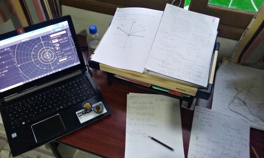
22th Sept. 2020
Yesterday I was trying to solve a list of Calculus exercises and I ended up finding an online calculator website that plots graphs in polar coordinates, like?? perfect??? You can play with the equations, so it’s easier to understand what each thing corresponds to... Needless to say, I spent more time on that website than I needed to 😅😅
Here’s the website: https://www.desmos.com/calculator/ms3eghkkgz?lang=en
#not advertisement#lol#it's just a public utility#studyblr#calculus#desmos#konaeco#mine#study tips#math tips#mathblr#oceanography
5 notes
·
View notes
Text
Deep (Tales From The Heart)
Fandom: One Piece Rating: Gen Warnings: None Characters: Polar Tang, Heart Pirates
For many people, the idea that a submarine had a maximum diving depth was something that never crossed their minds. Even the Heart Pirates barely gave it a second thought, used to cruising along in the twilight zone of the ocean, occasionally going deeper if they needed to.
The Polar Tang hadn't come with a user manual. She probably had one, somewhere – and sometimes Law would worry about that, when he remembered there was confidential information about his ship in the hands of the World Government, if they ever thought to look – but it hadn't been anywhere on here when they'd searched, so everything was a case of trial and error.
They hadn't truly trialled her maximum depth. The first time they'd gone deep had been an accident, three teenagers and a mink cub going into a knee-jerk reaction at a pink flamingo on the horizon. They'd dived through the currents until they'd hit… something. Something fast and furious that wrested all control away from them and sent them hurtling towards the sea floor, only to spit them out at the last possible second.
Torn between the terror of Doflamingo and the terror of the event, the four had ended up huddled together on the floor of the control room, not knowing if they should try to go back up or if they were safe where they were. The Tang's readings proclaimed that they were down at six thousand metres, the first time they'd gone into a four digit number at all. They hadn't thought her scale went down so far, but now, as they watched, the graph rolled, exposing further numbers below.
If the scale went that far, then they were okay, Law eventually determined, extracting himself from the shaking pile to inspect the instruments more carefully. The lower number was still concealed from view, but the pressure gauge alongside told a more worrying story. Law had been vaguely aware that the deeper underwater you went, the higher the pressure would be. The number glaring at him on the screen was far, far higher than he'd even imagined, and for a moment he feared that the submarine would crumple in on itself.
She didn't. There were no groans or creaks of metal, just the humming of the engines as she propelled herself along. The temperature was higher and the humming was louder, but there were no other signs of the additional strain she was under, and for the first time the question struck Law.
Just how deep could she go?
He didn't experiment. First, they had to find a way to get back up to their usual diving levels before their air suffered, and then it would be time for research. What had sucked them down so fast, was it the only way down to their current depths, and how could they utilise it?
Feeling the Polar Tang staying true in such pressure wiped away all of Law's fear, replacing it with curiosity. If they could get to these depths intentionally, Doflamingo would never be able to reach them, not even with his strings. Had they stumbled across the best hiding place in the ocean?
The answer, it transpired after they found a current that carried them skyward and gently deposited them back in the twilight zone, was yes. The Downflow only existed in certain areas, but with additional engine power, the Tang could dive to the same depth under her own power – a far safer, less hair-raising ride – and so six thousand metres below the surface became their new usual haunt.
It wasn't without its dangers, of course. True sea monsters lived at those depths, some scared off by the bright lights of the Tang blinding them but others lured in, and the pirates quickly learnt to use the Polar Tang's built-in weaponry when necessary.
The question didn't come up again for a long time, until the now adult crew, swollen in number to a fully fledged pirate crew with a reputation to match, departed Sabaody for the last time in their journey forwards.
Fishman Island was ten thousand metres below sea level. They'd become fond of cruising at depths of six or seven thousand, but ten thousand was unexplored territory.
"Can she do it?" someone asked nervously as they began the initial descent. "I mean, we could get her coated, to be safe, right?"
"If she can't do it, no-one can," Shachi had said firmly, resting a hand lovingly on the pipes. "We've got the best ship in the whole world, just you watch."
"Coating only works for sailboats," Penguin had added. "Just because she has a sail doesn't make her one of those."
The decision had been to keep going, deeper and deeper through the sunlight zone and into the twilight zone. The Downflow in the twilight zone was the obvious route to take, but the Heart Pirates had become a crew well-versed in hiding. Taking the obvious route meant lining themselves up for potential traps, so with enough research (mainly on Bepo's half, but they'd all chipped in), they'd found and plotted an alternative route to the dark levels, using a smaller version of the current the other side of the archipelago, which would bring them down to the deep sea earlier than most ships. Not having to rely on a bubble for their air supply, they could afford to go deeper earlier.
They'd concluded that using a Downflow (if not the Downflow) was for the best. That way, they could all but cut their engines, using enough power just to keep them on course and thereby saving fuel. After all, who knew what would be waiting for them when they surfaced the other side of the Red Line? They couldn't afford to use up most of their fuel supplies.
Still, that didn't stop more than a few members of the crew gulping in trepidation as the current loomed in front of them, impossibly large and fast as it sucked them in violently, catapulting them into the murky depths far below. Their instruments reported a familiar depth of seven thousand metres when they were spat out, engines roaring to life to control their exit as best the Polar Tang could, and it was then their adventure truly began.
For other crews, snuggled up safely inside their coated sailboats, the hardest part would be over by that point. If they'd survived being tossed around in a violent current surrounded by enough rocks to wreck a fleet, the last three thousand feet were relatively plain sailing, so long as they watched out for the local sea life.
For the Heart Pirates – and the Polar Tang herself – this was where it started. Slowly, they began to dive, keeping a careful eye on both their depth and the surrounding pressure. Fending off the sea monsters was second nature to them, helped by their kairoseki hull and specialised weaponry, which was undoubtedly a good thing, as nerves began to rise the lower they went.
Any moment, they feared they'd hear an out of place creak, or a groan as the metal shell of their beloved submarine began to strain under the ever-increasing pressure. None of them, not even the captain, were at ease as they descended slowly, hoping that keeping the speed gentle would help keep the pressure inside and out even.
When their sonar finally reported Fishman Island, their instruments loudly declaring that they'd reached ten thousand metres below sea level, nervous breaths were shakily released. They'd always known the Polar Tang was special, but as she cruised the last stretch at ten thousand metres below sea level, louder engines and a stuffy heat the only signs that she was battling through pressure a thousand times greater than the surface of the sea, they realised just how special she was.
#one piece#one piece fanfiction#heart pirates#tales from the heart#tsari writes fanfiction#trafalgar law#penguin#shachi#bepo#polar tang
10 notes
·
View notes
Text

I was supposed to plot polar points but the graph looked like a web so I drew you instead
10 notes
·
View notes
Text
What are the core skills of a business analyst?
From an abstract standpoint, business analyst skills are a blend of hard skills and soft skills. This is done to draw attention to the fact that these skills have more to do with a person's emotional intelligence than intellectual ability. Intelligence is, of course, a component in determining their level of professional success.
Unlike solely technical skills, those needed for business analysts are not only learned via formal education. These skills are acquired through experience and a natural ability to read people and understand the context. Enroll in free business analyst courses to develop critical thinking and get employment opportunities.
Decision-making
It is expected of a business analyst to offer solutions that promote organizational expansion. The conclusions of a business analyst can significantly affect how an organization makes decisions. Making decisions based on a business analyst's findings can help your company outperform competitors and reach new heights.
Business analysts should consider all options carefully before concluding. Business analyst online training can help you make better decisions and adopt a mentality that considers multiple factors and foresees potential outcomes.
Skills to conduct stakeholders meetings
Until now, using email to connect with a client efficiently and professionally has been the norm. It is not always the most efficient method, though. Therefore, talking about problems with the client face-to-face can be very effective and even speed up the resolution of problems. One of the key talents needed for business analysts is the ability to plan and lead meetings.
In fact, CEOs frequently have a greater understanding of a project or an issue because employees are more forthcoming in their contact with one another. But to schedule meetings for audit trials, written communication through email is efficient for business analysts.

Data Visualization
Transforming unprocessed data into digital representations that can be used for business requires visualizing data. Business analysts with data visualization skills can help clients understand the data and make strategic decisions to satisfy their demands.
Business analysts employ many kinds of data visualization techniques, such as scatter plots, time series patterns, polar area illustrations, timelines, graphs of lines, and more. A business analyst online training course will make you skilled enough to use all these methods to create elegant and thorough visualizations.
Problem-solving
Having problem-solving skills makes business analysts successful in their careers. Every stage of the job of a business analyst is difficult, and they must be able to overcome these difficulties. Finding the right remedies requires careful consideration of the causes and sources of an issue. People who receive certified business analysis professional training online can efficiently solve problems in a company.
Ability to Understand Delegated Objectives
An important ability for business analysts is interpretation. It is important to understand the big picture and each requirement that the management or technical employees explain. There are often many gaps in the presented information, which the analyst must comprehend and fill in. One should not be reluctant to ask again if there is any confusion regarding the objectives. One of the most important business analyst abilities is the capacity for quick understanding.
Documenting and Writing Reports
Documentation is a great example of the technical skills needed for business analysts. It involves producing various analysis details, plans, reports, and documentation. A business analyst's duties will demand them to write about various topics.
Knowing when to use technical jargon and when to use plain, simple English is one of the most important aspects of producing reports effectively. This skill combines writing prowess and the capacity to understand communication constraints like the target audience and the message you're attempting to convey. Written communication is one of the most important skills taught in a business analyst online training course.
Final thoughts
In short, hard and soft skills combine to make up business analyst capabilities. Work on your interpersonal qualities and hone your technical skills if you want to become a good business analyst. Advanced business analysis certifications, in addition to the usual educational requirements and work experience, are helpful in landing employment with high incomes.
0 notes
Text
🗿pinakahuling math blog sa pisay #2🗿
This is my pangalawang blog tapos yung topic na is Polar Equations and Graphs. DI KO NAGAWA QUIZZZ . Madali lang sana yung quiz pero di ko nagawa.
In summary oks lang kasi plotting lang naman siya na may unting equations. Nakakainis lang talaga kasi di ko nagawa quiz nalimutan ko kasi tapos nangyari pa kasi steam week. Yun lang for this blog.
0 notes