#realifedrawing
Text
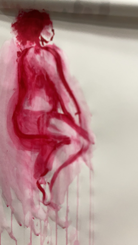
In this workshop, I was taught to remember what it meant to say. I’ve got like with the painting about like watching out for the forms and how to put the table together. I checked out my classmates at work, and I saw many people. It’s just like I went with the background as it seemed to me, so I decided to use dry brushes, go over the outlines of the models, and try to create the shapes and forms. It wasn’t that could help because I still had a dozen left, and he left a white pot salad because many people was left out, like
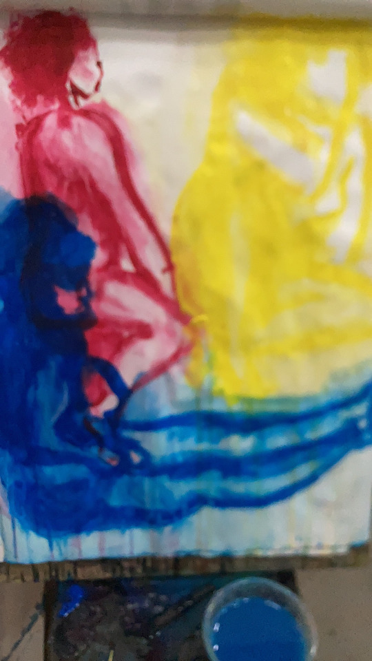
I need to improve on the painting of the face this time, I used quite a thick, large foam brush, and it went pretty well. It’s creating more than one after I use a little bit less thick brushes so I can create the shapes in the form of the outlines. This is how I could tell her it’s more like my very, very abstract work, very abstract my work as it seems to use red, yellowtriedlue and white colours. I try to combine warm and cool colours again or create warm backgrounds for the walk, make the background of excellent colours, and put one colour in. Today, I checked out the Kandinsky books and Matisse books. I also posted a little story as a reminder for myself about inspiration. I still needed to play mixing the colour more often so I could get a similar colour. However, I looked over the images because I still feel like I’m just randomly mixing, like I’m just randomly mixing the face, this time out the colours and don’t go with the box. Ways. It's also better to leave more blank spaces like my tutors, or my class metre did because I can understand how my painting responded to me or the camera in our minds.


0 notes
Photo
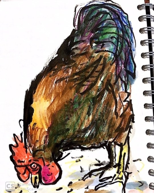
Hackney City Farm. . . . #cockofthewalk #hackneycityfarm #urbansketch #de#realifedrawing #watercolor #draw #drawing #illustration #illustrator #animaldrawing #wildaboutlondon https://www.instagram.com/p/BzBY9sIp8xb/?igshid=q0vvsuiafmu2
#cockofthewalk#hackneycityfarm#urbansketch#de#realifedrawing#watercolor#draw#drawing#illustration#illustrator#animaldrawing#wildaboutlondon
0 notes
Photo

#sketchbook #disegnodalvero #realifedrawing #lifedrawing #suckerpunch #dotd #potd #hulahoop #improoving @hulahoop_club (presso HulaHoop Club)
0 notes
Text
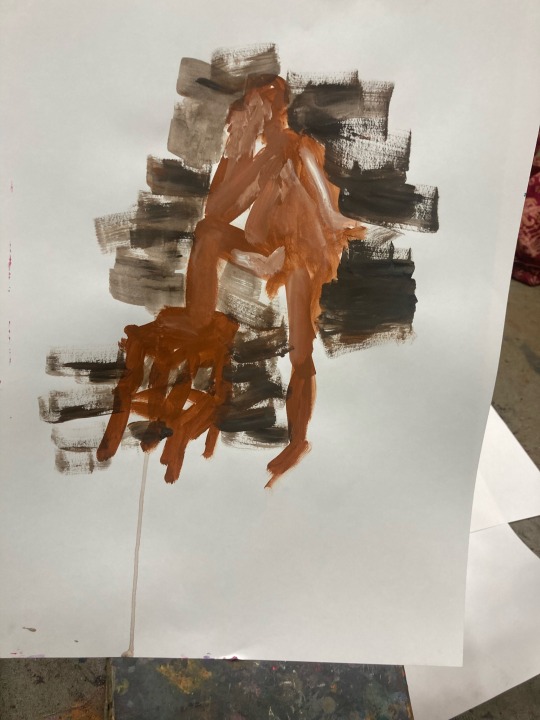
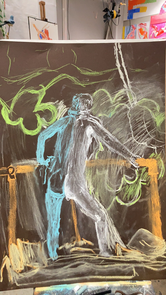
Today, in this workshop, I took part in a three-minute painting. It has to be the same methods we have to do. We have to choose the colours. We had to search for a book, pick our colours, and mix them outside. We have to use the pots, and we have to use them. Quit paints. This time, I used lighter colours. So I used titanium white. I was mixed out a light blue light. Red-orange. Or magenta. I. also mixed out a new one. And yellow and nearly green. It's more like a glass green because it's very light. So, on this three-minute painting, we're done. We are breaking the figures. It's about understanding the statistics because they create a shape. Our tutors were sure to use a sample of charcoal drawings. As we can see from the statistics on the second-minute accent, I have to paint emphasising the eyes. It is a bit tricky because I still don't understand the definitions easily, so this is more like controlling the colour, emphasising, and finding outstanding points. The last one is the background. In this workshop, I feel like I need to be more active. So I was less active and didn't attend it that much, so I could understand this. So, next time, I will participate more often. I may use this technique, too. Get along with this technique because, just like with charcoals, I could get along with the 3-minute drawings. It's also vital that I made a mistake with the brushes, so my brushes seemed like I used, like, um. Around brushes, and also, it's a relatively small brushes. I have been used to it, and this workshop is about something other than how precise work is. Being produced, it's more like how I can control the colours. How can I control the darkness to lighten? How can I control the surface? For instance, my teacher has also shown me an example of some surfaces. The flat surface and The round surface. About the differences with his hand. So, the chalk works as an example. The model was sitting on a flat surface. Mine is more like just the figures that come out so far, with critical paintings. I still need to be leading about the colours and find. The right brushes. I may have to use the big and fun brushes more often instead of the small round brushes. I might be over-focusing on being in a bit to proceed with my work. I also have to watch out next time I have to make myself choose colours inspired by artists and search for more books, even if I was very, very, very enthusiastic about choosing my own ways of colours. So, it's a reminder to pick a colour from the book and pay attention to the mixing.
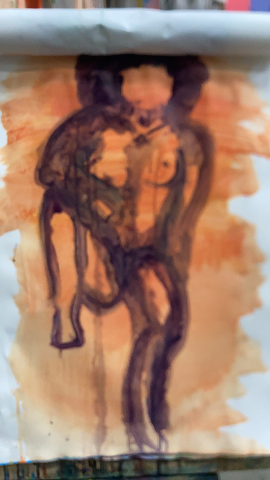
Today, I used. Brown paint. So, with the brown paint, I just use the regular brown paint. Paint the burnet I decided to make. Some with black and white so I could get greyish-brownish tones for myself. I wanted to use a firm tone of ground today. I prefer using only a few primary colours today; I wanted to try something new. I enjoyed mixing the colours. I've also learned about something. About mixing the colours, again, I have to focus on the shapes because everything is more representative of abstract located variation points. Examples include my eyes connecting somewhere or my shoulders, my eyes connecting my feet at different angles, what it covers, or the models sitting in front of their hand having something covering the model's hand or feet that's behind the curtain. I also need more research on abstracts to define my mind, plus position and variation points to study and the artist, my teachers, are mentioning. I have to keep switching water, wash my brushes, and keep my papers from sticking to one another if they're wet or making mistakes and ruining the design. I should immerse myself in my free time. It might help me improve my vision.


0 notes
Text


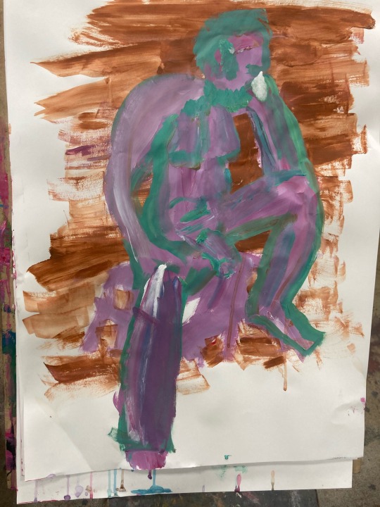
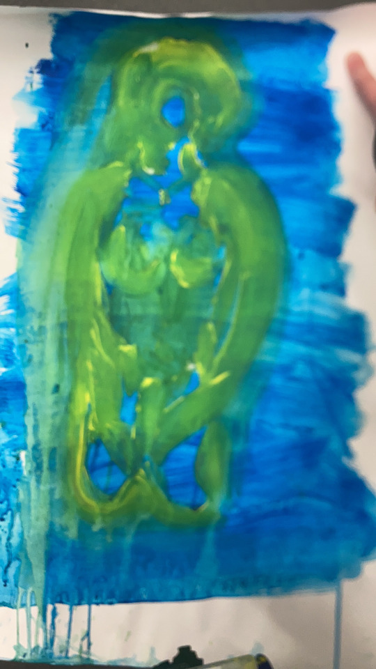
In this workshop, I had to remix three acrylic paint colours. I went with the same colours, red, blue and yellow. I've used the same combination technique and mixed the blue and the yellow. I also mixed red and white. I also needed clarification. Blue and red are. Also, I mix. Yellow and red, but yellow and red are pretty tricky because they could trick my eyes quickly. It seemed. It is more like pink, so the primary reds had some strength. I also put a black on my plate, just in case, but I won't use the black colour. I chose Mattise colours from the books again because the primary colours are in order in my eyesight. I also used black paper on one of my paintings. I approved today's a bit selective with acrylic paint when I mix and save it in a pot with lids. I noticed the time differences between the paintings and the class. The time is more than 1 hour and a half, we spend 20 minutes. I also approved the less detailed model I painted. I also added props for the stages, and the texture changed so I could see something new. I also decided to use a leaf tree for my project with the forest Poe and requested that the model pause for like nature around leaves and yell like a shaman. Also, I like Ash's general changes, set, and props because it quickly feels like I got bored with painting. I still need to improve with painting, washing my pots, and changing the water in the curtain; I still need to improve the blending and outlines with or without any other colour. Today, when I brought a small nature-quality prop, I relied on my video and mind, and AI believed my model was inside the woods and forest chanting, chilling up someone. Locate and identify MoveOn. Are you going to the gallery? You will see people looking to respond to experience, so the idea phenomenon and experience your experience. Lastly, I must stand back from my work, measure it, and reflect on my differences. How they are placed, I can look at how they know. I can think about how the weight is going. You can move quickly through these different focus points and check the moment.
I'm impressed with the yellow-brown, red, purple, purple, orange and red flame because I looked at the outside box and had led my brushes on 5 seconds each switch. Also, the red and green outlines I need to know how to do the next time
0 notes
Text


For this workshop, I had been using different acrylic paint, but this time, my tutor encouraged me to choose the colours and mix them on the pot and gave coverage. I could save them for the next lesson and the amount for the acrylic paint. I used primary colours again, mixing primary red, primary cygnet, and primary yellow, plus I used white so I could improve the darker layers to lighter ones. Today it was 3 course we used. I was now mentioning that I use cartridge papers for all my drawings. The quality, maybe as for painting with acrylic, is questionable, but not always about the materials we use. It's always about how we are applying and water amount and the paint amount. But also, the paint dries quickly, and I have to watch out for my paper to turn thinner and easily rip or rips when I paint.
I enjoy working with acrylic, although it is not my strength, so I am much more confident applying large, fun brushes to create lines because this is not about the precise job I have to do on my drawings. Correct, how would you like me to be? How do you dream? I put it very nicely and begin it all working with colour, but the instructions, I mean, they can all say I’m ignoring instructions, but don’t hear them review your painting something, and your job is to see.
I need to improve the mixing and how I present my work and also practice my time management. The voice told the story, so we got three instructions. Now you have the instructions: fill the paper with the colour, get the colours, and the colours you’re using to get them working. See how they work? OK, the second instruction is to make up the different sorts of applications you think of because all you do is fill in the paper, so you don’t have to worry about getting every bit of Megan right, but the third is what the story is.
same time you had, but you have to rearrange and think about them in a different way, and that takes time, but you Gotta do the thinking what who knows. Mark so you can you can you can keep
The variety, you cannot have one colour without black is the colour oh it’s about all the light bounces off so tell me the paper different types of Mark I thought about everybody different ways no be careful famous.
The red and blu intensive fill did not just just the paper but as colour could draw attention to the warm and cool colour differences. When I mixed it into purple and white, the white became lilac even darker because the blue had a strong dark out of the purplish black. I learned yellow, red and white quite often create a magenta colour, not just orange but also yellow if I add more turns into orange-yellow, and I could layer up with red with red-orange or peach nude colours. I also could make lilac if I used red, yellow, white, and a small amount of blue. I wanted to imitate colours and acrylic paint lines and outcomes for my next lesson. Also, my time range with colour mixing is better if I stick with large brushes. I also need to manage the small brushes and try to be inspired by my classmate's techniques.
Today's model used my prop tools because I wanted inspiration from natural forest animals and hallucinations of Indians. It's better to request the next model to wear my props until my projects are due. It's okay if I sometimes connect my work out of life better inspiration and vision may be a bit of a fine art, but I personally believe Beatrice Potter's ways and her childhood journey with her animals are more like a language communication with work. My communication is from life with toys, people, and sculpture statutes.
0 notes
Text


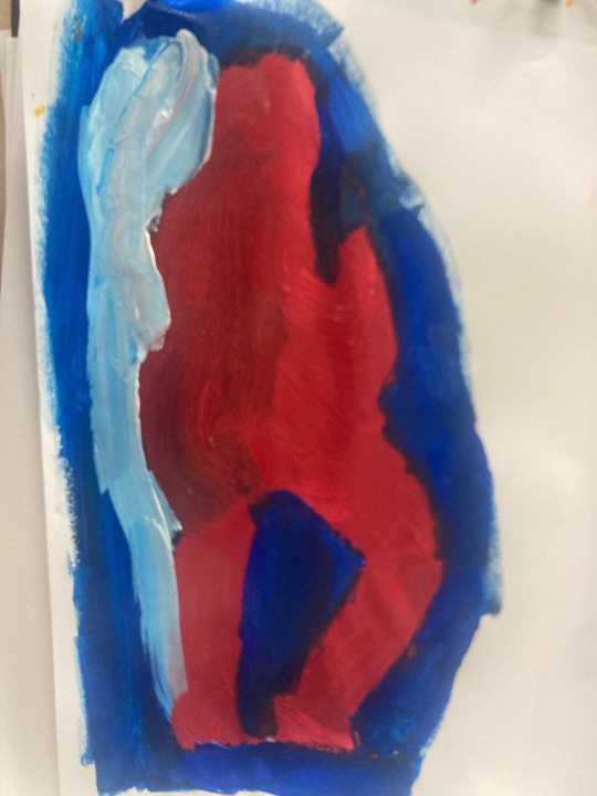
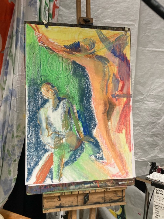
Today at this workshop We have to paint our model with acrylic paint, but this time we have to use coloured paints we also have to use just only two colours for this workshop but not just only using just the colours we have to mix the colours we have a triangle up on the moodboard it a coloured triangle which is more like a colour wheel This little colour wheel triangle shows us how was the coloured could be get combined and how we can make it the primary colours on the triangles we could see the red yellow and sigh and blue these are the main primary colours on the colour well on the colour wheel scales it has the white and the black the white is the one could make like lighter lighter mixing with the colours and making that more lighter colours because the darker could lighter out the colours the black colour is more like about creating grayscales But to be fair the grayscales we not necessarily need it for this workshop to use because like I said we used just only two colours it's also essential with the paintings especially with crooked paint what kind of brush we are using I use more like a fun brush and a flat brush a sizeable flat brush when we are painting with acrylic paint I always believe that if we are using like a large brushes that would be more more like create in the characters and the figures out as 5 minute or 10 minute when we are Drawing. With the shapes and expressions in the images, I learned not to worry about the perfect bodies and more about shaping the body I see instead.
Many of my classmates used blue yellow orange Some of my classmates when they're making their paintings the teachers was showed us which one is more like presenting the character and which one is more like shaped character also he pointed out the paintings what we made is not just only a paint some people will use your paintings more like drawing it's more like an expression of painting or the colours they've been applied so the background created with blue and applying the lines out with yellow as an example I also could see so many people use blue purple or yellow and Purple's a lot on their own works my work is just only about the primary colour conception and the primary colour of mix so the only reason is I decided to use the primary colours because the primary colours could give me green could give me blue darker blue could gave me like purple could gain me like grey could give me like brown and could give me like an orange colour I could even create like more like a cadmium pink cadmium rats a bit like a pink layered and with the white colour I could lighter out a bit more I was more enjoyed to mix in the yellow and direct because the yellow and the red could also create like a pinker tone if I add more red at the same time they could create like a peach red tone and I could make like more arranged tone for sure.
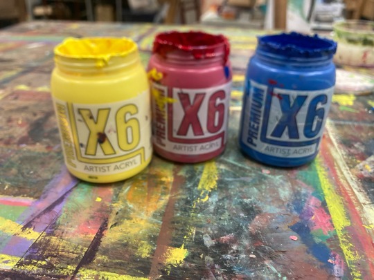
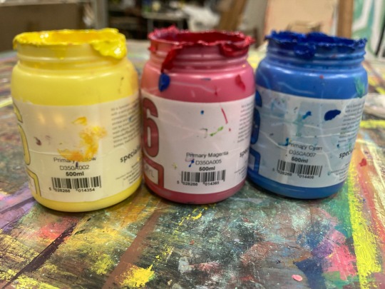
For this workshop I ain't really painted much Today I just only painted just three As I say it's a kind of poor quality but it's as a first goal I say it's more like a beginner quality I say it a bit more fine to be start with like a primary basics from the primary materials like the primary colours because it's always important for every single time five would stop the year ones and start working with colours I also tested I also enjoyed to test it out and mixed out the colours on the afternoon when the models left and painted on many papers to create in like so many mixed in circuit had like experiences out of many papers and I was enjoyed it so much I roughly made an 11 test pieces of mixing colours I used again the primary methods to mix in the colours and place it on the papers I enjoyed it so much I won if I could do a wooden rather do this again because I think it's a great thing to use in just a primary colours especially it's great if people don't have for example green colour and don't have a orange colour I think it's not necessarily needed to had this colours even when I studied in college I don't have any oranges or pinks or or any lighter version of greens yellows or anything else or even brown we don't even have brown on our classrooms so it's a great thing about like to have just only least you read blue and the yellow and the black and the white colour paints on a clothes because I think that's the main key important thing to study on the university is and schools it's sometimes great to have like an extra to green to be had like cover ups or purples but like I said won't necessarily needed to have purpose colours or brown as an extra because I could mix out the primary colours I could playing with the layers like I usually watch also so much people how are they mixing the colours it's also easy if you print out for example or buy yourself like a colour an actual quality says for example green and you're gonna be Graw's green paper you're gonna place it on the table and you gonna be apply the acrylic paint yellow and the and the blue and playing with the layers till you find the colours and if you want to use water or you could use white colour to find if it's that's the right mixture or cottage it's always depending on about like how many yellow you put into the blue you want like really really lighter or really really darker the blue is also has some more like a tiny bit of greyish scales when I'm mixed out the colours the purple colour it's a quite complicated one because I'm mixed out of the red The acrylic paints I had been used is also important to memories this because I used a X 6 it's called primary magenta x 6 primary yellow X6 primary cyan And I used X6 titanium white and I also used essential white titanium white these are the brands I had been used but don't really have to be like a higher quality of brands especially if people was beginner with acrylic paint I was so big in there with chronic pain because I'm not often using acrylic pains and I think with their life drawings workshops is makes me to get more used to be with acrylic pains and gain more independence also my classmates Also my classmates are handing me ideas how can I improve my art work a bit more often so this is also an important thing for me to learn in here.


#realifedrawing#illustration#shapes#acrylic painting#colours#primary colors#secondarycolour#complementary
0 notes
Text
Today, I decided to look outside the box and imagine something new for this workshop.
I was moved by the props the model was on inside my mind. firstly I imagined my model was instead of a chair sitting on her throne and was the queen on her throne. My classmate had a stuffed snake the day before so I imagined it had been crowing around her body. I also changed two more when she wearing her mask she was like a superwoman or Wonder Woman wristband she got. there was another one when she was lying on her bed and watching TV on her bed of the sculpture statue head.
improvements for today
I need to use implement tools more spontaneous which means
Using back of brush as a pen tools for more experiences because I don't used on the lesson also better to learn something new as a reminder.
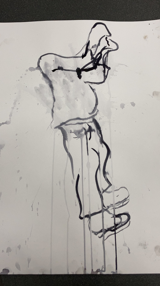
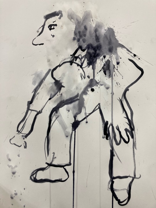
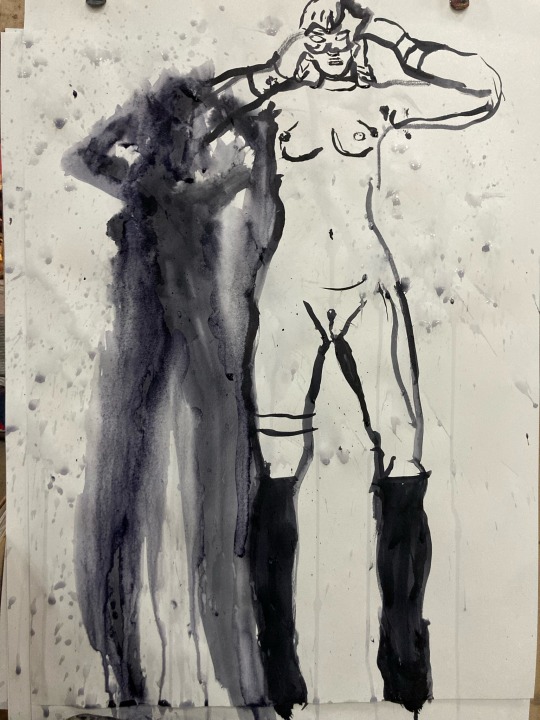
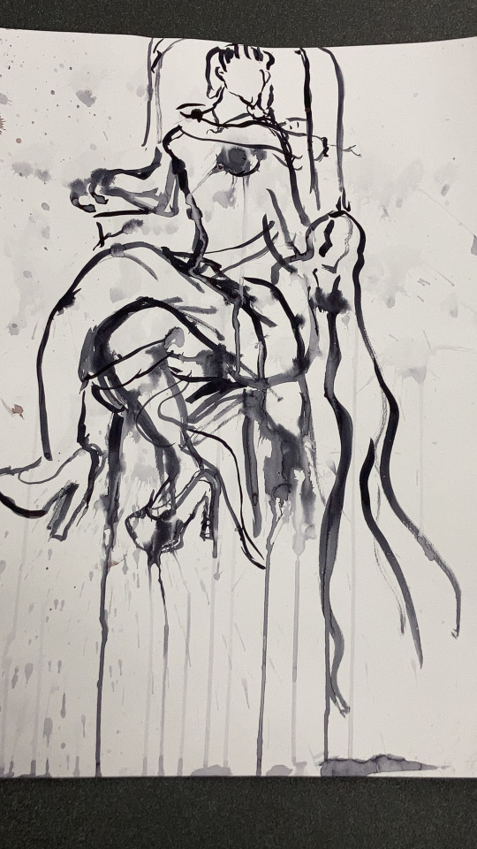
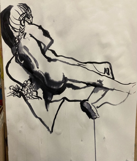
I was find my strength to splashing since I study at college art and design and started year 1 I'm working with ink. My favorite things with ink is plashing or mixing with soap to make a bubble effects.
I was using water, black water resistance ink from seawhite thick fan brush and thin fun brush
People used flat brush to flat surface I wanted to I usually prefer fun prush like straight edged like pen or calligraphy pen and blending with flat brush.
I noticed I don't working with ink more of ten even if I enjoy so I need to learn the ink history more if I had time.
See what is happening with things.
0 notes
Text


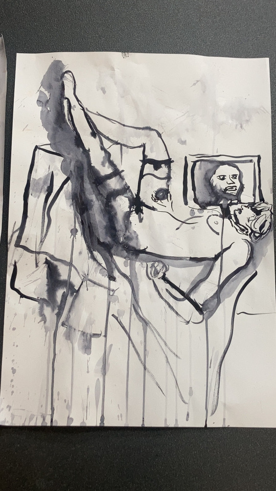
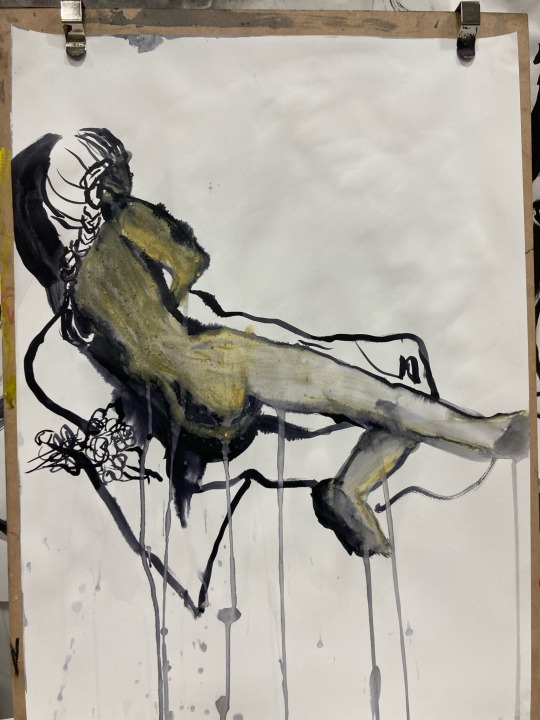
Today, in this lesson, I tried fashion illustration. I also went mad with painting. I used wet material and dry materials. I've enjoyed mixing pastels and ink, and I can splash it a smooth destroyed and reconstruct the clothes and patterns because I wanted to develop drawing at a new level, breaking out of my comfort zone, which means using colours, ink, and acrylic paint more often creating the room spaces ( the background). Indian ink is the best to use with water and thicker paper. Today, I used cartridge paper, but it is better for water or thicker paper like card or mix and media paper because the paper strength holds for longer.
For my drawings to reflect on others, I need to develop the acrylic mixtures using an application and finding the proper contrast and tones + "visual by language believe eyes not to see what you see, not what minds tell points together doing mind an eyes isolate very easily lose sight of a bigger isolating". This is what my teacher taught me and my classmates. This is meant and essential, not just all the projects I was doing but the definitions reflecting when you sketch, you put your eyes on the model, not the paper, but I can imagine the model. Don't hold anything in their hands or don't wear something, all my or don't do. I plan to write more about this because developing this knowledge for my degree is essential, and I can also advise degree students. This lesson and year are over soon, and I need to be spontaneous, so I have to look up colour mix paintings, research some books with colours, and develop my taste, which could be oil painting or printings.
#realifedrawing#illustration#male model#ink#pastels#markerpen#acrylic painting#splash#fashion illustration
1 note
·
View note
Text


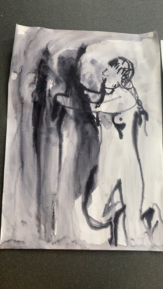
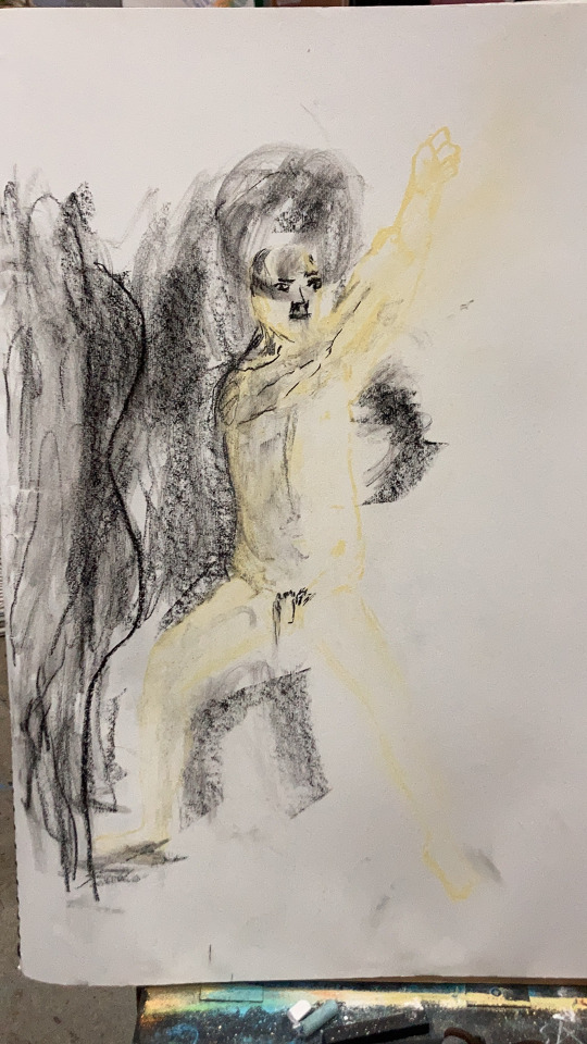
Today I have to draw a shape and focus less on the details of the shape and not look at the paper and create the figure shape. I have to use putty rubber for the light area as feedback to myself. Believe your eyes everything is abstract. we have to not look just at the body the shapes and the story presented in the shadow position background details.
I used black charcoal pastel and purple, blue and mint green. I must develop my inspiration and clarify the artists who inspired my content. Like Donatello and Michelangelo, it is starting to influence my study of real-life drawing because I always imagine my models being status sculptures or dolls standing still and blending in like exhibited pieces. I would also like to mention more artists on my blogs and reflect outside and inside the class today. I was not interested in my group's artwork; I preferred to reflect a Renaissance artist.
0 notes
Text
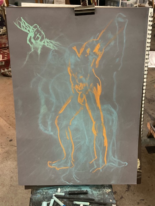

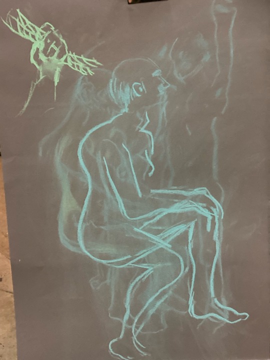

During this session, I had the opportunity to experiment with colored paper and pastels. We were instructed to choose four colors, but I added an extra one during this real-life drawing lesson. I began to understand that I don't have to stick to a specific order when drawing, and I certainly don't have to use the exact same skin colors in my drawings. Thinking outside the box is encouraged.
I reflected on my first experience with charcoal. It was a great expression when I rubbed off the person and started a new sketch, resembling motions in the frame or classic animation. I observed one of my classmates focusing on sketching hands, inspiring me to do the same. I wanted to develop the details of fingers and hands, keeping pace as the models shifted positions, requiring me to wipe and sketch anew.I noticed my sketching evolving to be more spontaneous, realizing that I don't have to focus solely on completing each piece. Both my classmates and tutors showed great ambition with colours and scales. The imaginative perspectives in my classmates' eyes and scales were vast. Creating two models out of one model struck me as more minimalist and simple. I recognize the need to simplify what I see and to follow my tutor's guidance on measuring and scales structures more consistently. While placing two models on my frame might seem challenging, it's akin to the Photoshop technique of duplicating and rotating characters, and I find it intriguing.


#Colouredpastel#charcoal#realifedrawing#blue#orange#pastelyellow#greypaper#brownpaper#reflectingclassmatework
0 notes
Text


I visited the National Gallery and Portion Gallery today. I went there to explore the oil paintings for my blog, focusing on history and still life. Choosing was a bit tricky for me because I appreciate both Renessa's and Impressionist artists. I really enjoyed the still-life portraits, but I admit that oil paintings are not my strong suit. The layering requires more skill and patience.
Among different mediums like ink, watercolor, fine lino print, and engraving, my favorite was the latter. However, I find the portrait and still-life oil paintings fascinating. Even though it's not my forte, I always enjoy letting my mind wander as I explore the pieces.
Discovering the history behind the paintings is always fun. I learned that architectural painting is measured with glass. The paintings in the Portion Gallery were the highlight of my trip, delving into Tudor house history. I wanted to spend more time there, so I returned to the Portion Gallery to fuel my vision, sketchbook, and notes with history.I recognise the need to enhance my sketching skills, relying on them without worrying if I go beyond the frame.
The artists I have chosen for my topics are, Jan Van Kessel, The Elder, Rachel Ruysch, Eduard Manet, James Gillary, and Hans Holbein the Younger. For the rest of the artists I had chosen, I wasn't able to catch their names when I visited, but I will be returning back on the half-term, so this time I will make sure I find the artist names and the portrait gallery artists, and more.
The Still Life section in the art gallery was my favourite, which included the still life portraits of fruits and flowers by Jan Van Kessel, and of bugs and butterflies by Rachel Ruysch.
the coloures more order following up the colourwheel the black background this one more challenging it seems to me to present a black background and colours not smudged nicely blend in like hyperrealist images. ( wasn't able to edit this line as we haven't had time to discuss it, but we can work on it in the next session)
0 notes
Text


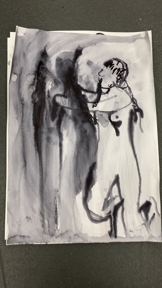
Today I created a sketch with my darkest background with charcoal and pastel I used my sketch book charcoal and pastel to create a very patterned background. Firstly I have to create the background. As a frame, I went over with charcoal creating straight or edgy strokes for this method, it is best to have putty rubber or glue tack. Squint best to do I learned and remind myself this post if I wanted to see shadow and tone start point I had to wrinkle slightly close my eyes and darkness started out Not using a line using 3 tones shapes column
I enjoyed seeing everyone work especially single colours combined together and the outcast was great I noticed many people don’t express faces or just fill the face-up darker shadows I wanted little relevant with colours outs stand on my drawing but over ambitious my work.
My tutor had spoken about the materials being made of charcoal water colour and gauche and oils and other paint I hope I could share on my next post
The more I try to control the less control I have to leave something more alive both abstract believing eyes tell stage to go over the top once o rehearsal then run it poetic distingue character see the tone local colours simplify fill the frame certain things frames stretch the forms observed go around movement can be simple or realistic abstract looking this way or looking down visual clues I find fun to sketch try out new method against with time playing tennis without trying tv report works for everything doing exercise muscle increase so much frame mind.
I need to improve my measuring and layer applying for sure because difficult to balance both colours and black pastel not over lap.
1 note
·
View note
Text


This lesson I have to improve my my painting skills with ink. I used Indian ink, pastel round brush on my painting and fun brush this post I share my class mate and my art work. I used water so I can expand. I want mixed pastel and ink pastel is a great background my painting I sketched 6 people plus the model.
I’m enjoying to working with in both I want to expand myself more and
Today we sketch each other and in the afternoon the model. I decided to use a cartridge paper which is cut half this was new ways improve how can I focus the character as self and not the full body position. How can I variety mark on my work because the face and hands don’t have proper out come
If I have to compare my work with my class I need to improve how I want to detail it was the hatch line cross hatching using different markings different size brush.


0 notes
Text


My classmate art work
I enjoyed seeing how my classmate can be confidentially independent like a screen or mono printer a professional artist both of them improving the shapes we had been playing in the last three weeks impressive to see especially on the female model improved a lot one of the looks like a mannequin doll. some of them don't add anything like me some people just imagine especially today our model slept so someone put their fictional fantasy out (looking outside the box). The model expression in faces changed many of my class mates was mine not always doing it or didn't imagine. we don't using colour yet on the lesson but I see my classmate was more independent then I was and breaking rule out, not just black and white sketching but sketching colouring adding to there work.
On my work so far I used water and pastels like an ink effect maybe some off the time best if I dd more background, patterns and colours for an improve if I feels like I need to improve myself.
0 notes
Text


Comments on my classmate's work
In this post, I was reflecting on my work and the improvements for my drawing next time my classmate is and I was doing what details I miss. This also includes my tutor's, lecture artwork and year 1-3 artwork with permission. I might not picture it up because I don't want people to be confuse or think is my artwork.
The year 1 student exhibitions impressed me last year fascinating colours combining the colours shades of tones backgrounds amazed me the colours can overlap or not lap not blend in just dubbed in and the background curtain is yellow hidden everywhere.
#illustration#lastyear1students#realifedrawing#someoneartwork#analysing#quality analysing#reflectingminewithothers
0 notes
Last Seen Blogs

paginas-capitulos-y-libros
Tinta en papel

visualandimagination
The point

mycityofdevils
My life in the rearview

n8tvehunter
Untitled