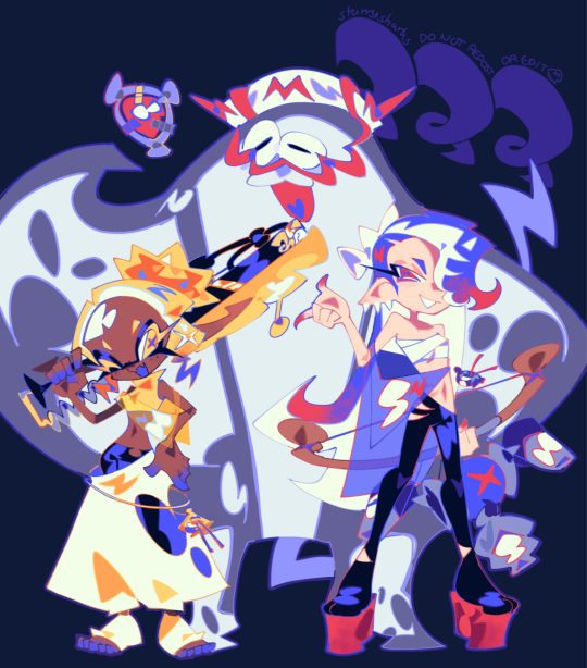
#really working to find my line art and coloring style lately
Note
since your art style has changed (and i love how expressive and mischievous? it feels now, idk if that makes sense but i admire the heck out of your growth) what does your process look like now? do you use the same brushes as before? do you want to talk about what you love about your work now? i saw your tag about tlt redraws now that you like your art and it made me curious. anyway love your art so much, nori!
hi!! thank you so much for this very cool question!! i guess before i just drew without much putting any thought to like... anything at all haha, only when i started doing comics was when i actively tried to make myself enjoy the process more.
i just thought about what I hated and tried to change it and just do a lot more art studies in my own time and try to really think about everything... like composition ! and like with colors, i didn't like how i only used to use desaturated tones, when i enjoyed more colors in other art i see.
or with poses, i didn't like how everything i drew felt very static to me, it still does but i'm getting better!! so i've studied dynamic-ness and whatnot.
i didn't like how "realistic" i would naturally go with proportions while drawing when my personal taste enjoyed more cartoon-ish and whimsical proportions, so i tried to be a little bit more loose with that but i'm not all there yet. for example, when i do some reference studies in my own time i find myself copying it 1:1 as it is, so now i try to incorporate it into a specific style without just copying it, it doesn't feel like i benefited otherwise!
i'm also trying to currently improve my lineart, i'm finding it much more enjoyable to draw with a thin brush! my lines were often thick and bulky and not super clean.
and yes!! i used to be loyal to like one or two brushes but i'm just trying new things constantly and it definitely affects the general vibe of the drawing, i've been obsessed with pencil brushes but i'm retiring it for a bit for a more jagged brush that i'm obsessed with now lol (still haven't posted anything with that, (working on it) but it totally changed the vibe.)
i feel like i often know when something looks right but i struggle on how to get there at times, but lately i've been seeing more right than wrong and just generally enjoying drawing.... drawing is my favorite thing.... i clocked in 9 hours yesterday on procreate.
#sorry for making this an essay#i just really appreciate the question#very passionate!#thank you for the nice words too!!
55 notes
·
View notes
Text

🌿 Fen with a Fern 🌿
#MQ original characters#MQ 2D Art#original character#OC#OC art#original character art#digital art#art#character#character art#fern#drawing#OC: Fen Holloway#your honor I love her#anyways can you believe I drew this all in one sitting#really working to find my line art and coloring style lately#this probably isn’t the best for comics (end goal) but damn do I really like how it turned out#IT DOESNT PASS THE FLIP TEST 😭#but it’s fine#I enjoyed drawing it and that’s all that matters
2 notes
·
View notes
Text
My random comic Recs #1
I've been reading more comics lately, so I wanted to share my love for them in the hopes that someone might give this medium a chance!
Note: I am not a fan of superhero comics, because I simply don't like that genre, so don't expect superheroes below. Gonna make these posts every now and then and they will always include 4 recs.
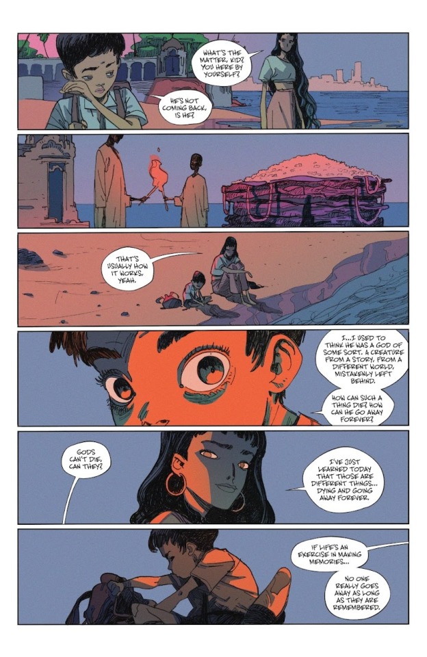
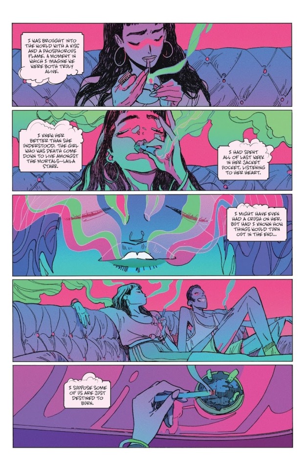
1.) The Many Deaths of Laila Starr
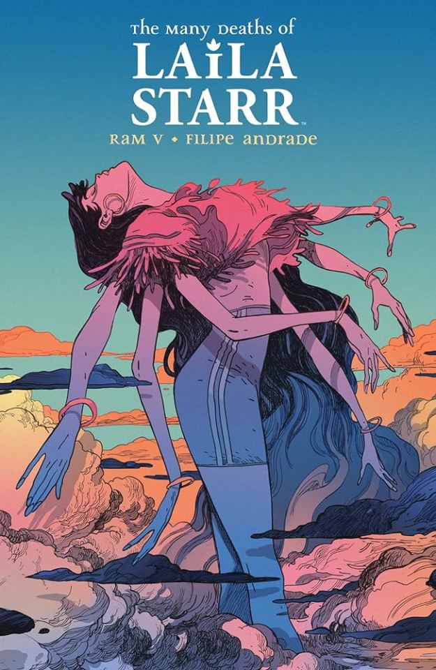
Death got demoted and sent to earth as a mortal! Some boy is going to figure out how to cheat death in the future, and our girl Death really doesn't appreciate that.
The entire graphic novel is only 5 issues long, so it's VERY digestible and easy to get through.There is something so light and playful about the art style, and the vibrant colors really sell it.
For people that are completely new to comics as a medium, I imagine that this is actually an A+ book to start with for the reasons I just mentioned. The way paneling and the flow of time is done in here, is a great example as to why comics are so unique as a medium and why they should be looked at as its own art from, separate from movies or books.
2) Mécanique Céleste (Or "Mechanica Calaestium" in the German translation, or "Aster Of Pan" in the English translation)
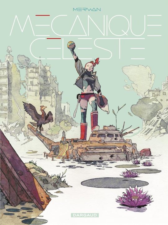
An absolutely breathtaking French comic. Aster lives in Pan, a post-apocalyptic France where she scavenges for wreckage with her friend Wallis. After their people come under a threat by the Federation of Fortuna, they are given a choice —submit to Fortuna’s rule or beat them in a weird Hunger Games-esque version of Dodge, called “Celestial Mechanics”.
The detailed art pieces in each panel, the careful line work, the lively way the characters move and the stunning watercolors captivated me from the first page. This graphic novel (now 2 volumes) is one of a kind and truly unique!
3) Something Is Killing the Children
Note: Comic contains a lot of gore and violence!
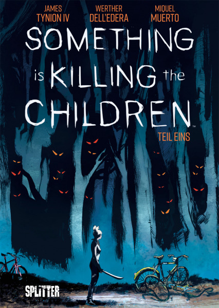
Children are starting to disappear in Archer's Peak. The ones that come back tell impossible stories that no one seems to believe. Only one stranger trusts these tales - a mysterious girl named Erica Slaughter who seems to be able to see these creatures too. And she's here for business.
I loooove Something is Killing the Children. I haven't finished reading the ongoing volumes yet, but I am super fascinated at how well the pacing goes in this story. The rough art style with Erica's freaky large eyes is SO fun, and you start appreciating it even more the longer you read.
4) Mon Ami Pierrot ("Mein Freund Pierrot" in German, "My friend Pierrot" in English)
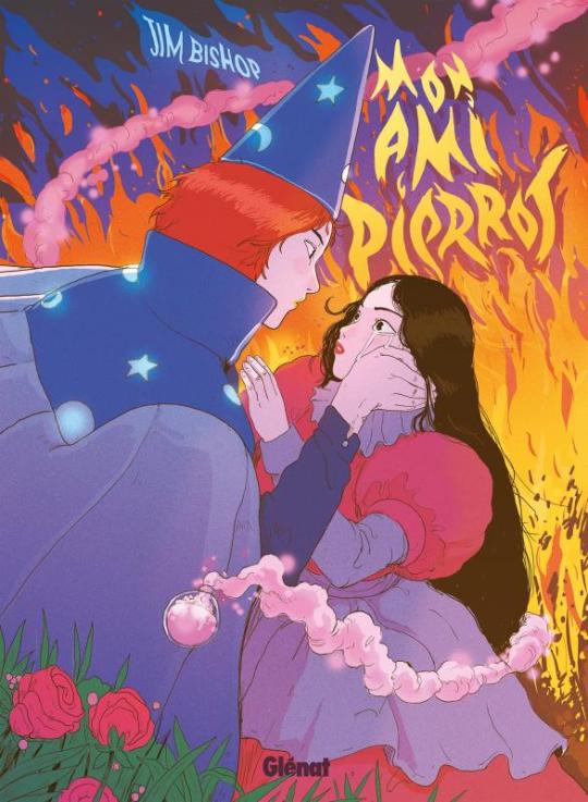
Another fabulous French comic! Cléa is to marry soon - a young man name of Berthier. Right before the wedding she meets the fascinating magician Pierrot though, who completely changes the course of her life. Entranced by his whimsical nature that makes her feel "free" for the first time in her life, she follows him and leaves her previous life behind. During her stay with Pierrot, questions arise, though. Who is he really? All the while her betrothed sets out to find her again.
The Ghibli influence both art- and storywise is easy to make out, and I personally really enjoyed that. I particularly love the colors and the facial expressions the characters are drawn with. Everything feels very whimsical and playful and I had a good time going through this chonker of a graphic novel!
No spoilers, but I expected toothrottingly-sweet wholesome stuff, and ended up surprised on several occasions. I think the colours and art style really help give those moments wham, because you don't expect it.

#i talk sometimes#comics#graphic novels#comic recommendations#long post#comics are super duper cool and you should try them!!
173 notes
·
View notes
Note
hello!! i don’t know if you’ve answered this already, but is there anything or anyone that you feel has had a heavy impact on how you draw?
I appreciate the question! I’ve probably answered it at some point but i do think the answer always shifts around over time :)
Media-wise, Team Fortress 2 official art plays a huge role in shaping my style. Emphasis on strong shapes, silhouettes, and distinct facial features, you know! The show Arcane gave me a much better understanding of faces specifically by learning to view them as 3d shapes, recognizing the planes and levels on the face i guess.
But a lot of it is mostly pulled from my buddies and other artists online!
I started feeling a huge sense of improvement in my lines after talking to and getting to see more of @vatrocvet ‘s art, where the lineart is always a Part of the art itself. I don’t always apply it the same way they do, but its still a huge inspiration to just Do more with my lines, lend them to the perspective in the art. @drzone also has really good lines that i really enjoy looking at :) time’s lines always feel really confident and idk time just utilizes them very well and i like trying to do that as well!! As well as a desire to just get More Experimental with my colors :) And then theres my bestie @illuteridae who’s always doing really interesting, personal comics and full illustrations and being around him and his work has just really made me more interested in doing things that Mean Something to me. Seeing a project through to the end rather than just spending my time doing a lot of small things. Small things are good too!! Dont get me wrong! But i usually avoid doing big things unless i get Big Inspo Boost and blast thru one in a few hours. Getting better at slowing down and let projects take time lately :)
Idk if i think long enough i could probably tag a dozen people and point out where you could find their influence in my style, so i won’t go much further rn bc of how long this already is! But i appreciate the chance to talk about it! I find artistic influence really fascinating and fun to talk about ^_^
20 notes
·
View notes
Note
ive sent like 20 asks to you atp but i really love ur art soooo so so so much like ur like my biggest inspiration fr like seriously i could blab all day abt how much i love your art and your arts almost singlehandedly motivated me to start working on shape language more bc i think thats like the key part of your art (to me at least) and youre like the true embodiment of "same face syndrome fears me" but like fr because all your ocs are so distinct and unique
do you have any tips on creating unique silhouettes / just general character design tips?? also id love to hear abt how your use of shapes and shape language evolved over time if ur fine sharing that!!
ok this is literally the sweetest ask ever like first off thank you so much ;_; i'm glad i was able 2 inspire you!!!
for me if you look at my old art there's little to no focus on shape language cuz i wanted to express a 'pointy' animeish style. examples are from 2020, 2021 respectively
as you can see i did NOT flip my canvas and my art was samey as hell,,, but in 2021 i started going for softer colors and shapes rather than points and spikes and brighter shapes. but, if you were to look through all of my art from either era, you'd see it's identical cuz i didn't care for shape language. this went on for quite a while :,)
then i discovered worlds end club in late 2021 and everything changed !!! i watched playthroughs cuz i didn't have a means to play at the time, and decided on making my artstyle a blend of cartoony and animeish - which ended up in choosing more expensive silhouettes and faces in turn
honestly i'm too tired to actually chronicle my artstyle change so i'll just skip to late 2022 in this timeline, sorry 😭
so by now has my artstyle evolved into aomwthing super cool n expressive ? no actually i think my art got worse in late 2022
as you can see, my colors got super washed out and i didn't really take risks, i guess? but i was finally starting to come into my own in terms of artstyle and was finally acknowledging shape language a little bit.
very early 2023 is the same, so let's skip to the one thing that changed my artstyle - the big 8 lineups


suddenly everybody was like 'wow your shapes are so good!!!' this was because i had tried to challenge myself with character design in these drawings. so i tried to emphasise interesting shapes more - using a technique where i'd just take an interesting shape or line that corresponded with a character's personality and repeating it as much as i could across the design.
like this deep cut art, where i tried to 'dial up'their already exaggerated shapes and design aspects (such as making frye's pants sag more or changing up shiv's hair. big man is perfect and needs no changes)
but this journey is still not over because a few months ago i rewatched all of panty and stocking and watched clone high for the first time, and both of these shows emphasise shapes a LOT in their designs, and i picked those up. here's art from a few months ago - in short, i tried to find the 'focal point' of the design, something that set it apart from other designs with similar body types or clothing, and built around that, if it makes sense? here's some art that i think expresses that well

comparing the new quintet art to the old one, i think you can also see that i started to try and use different body shapes and shapes in general (such as clyde having a more triangular build ig) . and tumblr doesn't let me add more pictures so this is where the overview ends !
my advice is - watch and rewatch anything that might inspire you, because it has the ability to push you in the right direction. for technical tips, id say -
draw different body types and age ranges (often times same face syndrome is born from only drawing the same age range, usually 15-20 for most sufferers)
play around with style - do you want a more western inspired style or something more akin to modern anime ? maybe something entirely different! try drawing in different styles that you like and see which ones stick
research fashion if only a little bit - it can help understand visually pleasing silhouettes (such as the famous big jacket or big pants silhouettes)
speaking of big jacket or big pants, contrast is key !!! top or bottom heavy designs are an easy way to express personality and an expressive silhouette ig
ummm thaz it ithink. once again thank you for your kind words and remember to take advice from multiple artists im just one guy!! i hope anything in here helped or was at least interesting to read
78 notes
·
View notes
Note
When it comes to designing fan characters, do you like to stay within the confines of what people consider to be “acceptable” for certain aspects, like powers/abilities, specie choice, overall design, incorporating certain ties and affiliates to official characters, etc? I guess the “unspoken rules” when it comes to making a “proper” oc that fits the overall spirit and lore, rather than an “oc in sonic style” that “doesn’t fit”. Do you think that taking a leap of faith to originality is bad?
This is a thoughtful question Anon, but I find it concerning that there's an insinuation how wanting to be held to any kind of standard is "bad" for originality. In my experience, this is not always the case.
Having self-imposed restrictions can seem unnecessary if your goal for creating is to not think hard about expectations and instead, purely for self-expression. There are no hard rules for how to make fanart. If you want to add a ton of accessories on fan characters, use every color under the rainbow or construct one in a way that breaks the Sonic standard, it's your choice! What's gained from making characters for the joy of it and without the weight of "perceived expectations" looming over you is a reward in of itself.
With that aside, what really matters is what your ultimate goal is with your fan characters. Because when people ask for my insights on designing one, what I believe most are REALLY searching for is a way to get an audience to CARE.
This is a much deeper conversation beyond whether or not your character is "original" and "breaking the rules". Now you're entering uncharted territory where it's no longer about what only YOU want out of your creations. You HAVE to now consider how OTHERS will perceive them and make intentional design choices that gets the audience and reactions you WANT.
Jolt and Strike's Crew were created in the frame of mind that they would be used for a full story line. The ultimate goal is to create an engaging comic that both appeals to my own interest in this series while still drawing in an audience. And of course, this causes me to have to consider what makes a character bring an audience in and KEEP them. It ultimately defines what kind of character it will be!
Having a standard to measure your creations against isn't a hamper on originality. In fact, by HAVING restrictions, you're challenged to think OUTSIDE of the box and find an elegant solution that can be novel but still fit. Not all good ideas are born from having NO obstacles in our way; rarely does it work like that.
When starting Shadow and Jolt, I had zero clue on how to actually make a likeable character. I knew theories, I had read about it and made fan art of established characters that people already liked.
BUT I had never put it into practice from scratch. I had to learn as I went and made a ton of mistakes until the right solution became apparent!
This is a long answer but basically Anon, what is your intention? Do you just want to create for the sake of it,
or are you creating to be seen and have others engage with your work like that of an Author with an audience of Readers? Do you want to BUILD an audience that likes your fan-characters, wants to learn more about them and is EXCITED to see more of them?
That's the real question to reflect on. And it may require asking yourself if you even know what it means to achieve such a goal.
Because believe me, it's not easy. It took YEARS to build what I have now. But, it's also extremely rewarding and for me, worth all those extra late nights spent working diligently to make it happen.
I hope this helps anon. I get that this may not seem like a very fun answer. It's not always fun to create for an audience. Sometimes it's very hard! But if you love it enough and you are open to knowing what you don't know, you can find joy in a healthy challenge. This project is still just as fun for me to do as it was 6 years ago when it began. And I wouldn't change it one bit. :)
#anon#text#asks#ramble#onlyart#me#Shadow and Jolt#comic help#art help#character design#thoughts#sonic fan character#sonic oc#sonic fc
40 notes
·
View notes
Text
Artfight Postmortem
as you may know, i am prone to reflection on my art and process and progress. herein, i'm gonna navel gaze a bit about artfight 2024.
top line: really enjoyed myself, did a bunch of new things and this was "The Year of Artist Friends" which is spectacular.
i completed 20 attacks this year, including my first ever mass attacks! altogether I drew 28 different characters (incl 4 of my own).
for the first time, I had *users* i wanted to attack, rather than just characters i'd gathered via search or discord. honestly, three years ago when i picked up the stylus i was just excited at the prospect of drawing for other people, period. artfight was a cool way to be in community without prerequisites. i didn't quite dare to dream i might make some real connections and make proper friends. and yet :) here we are! i went in with three 'art friends' and i'm leaving with at least three more
in addition to being the year of artist friends, this could be "the year of clip studio paint was on megasale a week before artfight" because i knocked out like 2 practice pieces before July 1st so i wouldn't be starting with completely unfamiliar tools, but i used/learned csp for the vast majority of my attacks. one i finished in krita (lonnie), and my final attack i only used krita.
definitely trial-by-fired myself! but it motivated me to explore csp, and most important, gave me a reason to practice practice practice. last year i drew almost exclusively humans, lots of full bodys, because i wanted to get a better grip on anatomy and drawing a variety of faces. it worked then, and, well, i think i learned more of csp in one month of artfight than i would have if i was just plodding through my personal projects for 33 days :) *looks at my wip folder with months old files* pretty sure.
ok i'm gonna look at a few faves/standouts now:


came in hot with 0tt0 here! the main brush for this one (froggy pencil) was a mainstay for the whole month. so versatile!!! and lovely texture. this isn't quiiite brat green but this was what made me go, hmm, what if i... did a few pieces inspired by this album i can't stop listening to?
and then i took a huge turn and just used a soft round brush for Desa and Iryna for my dear friend @bobomcfoe bc i really wanted to turn these out in something approaching my "usual style" of late and i feared getting too deep into the temptations of csp if i put them off. and, um, yeah i love them. i got sooo close to matching that angle but ahh i can see the tilt now! nonetheless, love these two, not least bc brookie has some of the most pleasing color palettes to work w :)


then on to Rosé and baby's first vector lines! you can RESIZE lines in csp. did you know that? i didn't know that. i did forget to use it as much as i could have in later ones though, so i still only kinda know it ig. and halftone shading! bc why not? another thing i really only did this once, but want to experiment with more
Rook here, for my new friend @gender-premium-tm, was me realizing how to use filters/filter layers in csp. now THAT is something i used a lot this month! also something i use often in krita. i must say, though the csp options are slightly more limited (afaik), they have oomph!


okay these two are my "explicitly brat pieces"! artfight keeps you moving, which i find really valuable, bc i could have dithered foreverrr over Lonnie's gif here. like, do i add his arm? maybe he should be wearing a shirt? or, what if i just draw him twice, instead of splitting the expressi--see it just never ends. and as i am always going on about, art is so precious bc it is a reflection of us when we make it. maybe for some future artfight i'll redraw this (as Lonnie's artist @wenmistry did for me with Ebon this year), but for july 2024, i'm amazed at how well i executed this for just 2.5 days of work! (i did forget his glasses, which realization gave me a different take on the composition, so this is high on my list of potential redraws)
and then Aagatha. this is in my top 3 for this year. the pink just works so well with the green and her artist added the song to her character playlist AND added the necklace to her actual dnd inventory. like. omg. the impact your art can have!!! how freaking cool is that???


two mass attacks! i was in a silly goofy mood. i feel like i really got a handle on vectors w the anthro mass attack, i adjusted every single point on that one by hand. weird what hyperfocus makes you do sometimes, but i learned a lot from that. mainly that i will probably never user vectors as my main linework tool. there are circumstances it is perfect for, and outside of that i'm good w my raster lines lol
which is exactly what i used for this other mass attack, featuring mostly my ocs. hey, sometimes you need to shake things up! i can see here the style starting to hew back to my "usual style", though i'm thinking that might have a lot to do with drawing 5 people very quickly. falling back on practiced techniques. and by this time i apparently knew csp well enough to reproduce them pretty closely! ooh, one thing this made me miss was the transform tool in krita. that floor was ROUGH to wrestle into place in csp.


purple and green turned up a lot this year!
Echo is my crowning achievement with the froggy pencil, most of the shading here is just layers w that. and one last nod to brat green :)
i've worked in the paper cut style before (both my pfp's use it) but i really exploited csp's clipping layers to make Scraps here. they did make me briefly forget how they work in krita when i switched back, so well done w that
i played with gradient maps a little earlier in the month but for Okanar i actually made my own gradient! really a useful tool for ref'ing real human skin tones to make non-human ones, without muddying them up too much.

finally, Chaos. this actually might be my favorite! ironically this is the one that i made in krita. it was like, ahh, yes my old friend. wait where is the scroll bar. ah, okay, yes my old friend... the line layer is set to burn which just makes the whole thing so warm (and the cause of the red outlines on the earrings). used my old sable brush, a pattern fill set to overlay... my old stomping grounds! but plus a rendering technique i picked up this month and some other random habits i picked up in csp (like copying a detail to a new layer, moving it where i want a copy, and drawing/tracing it back onto the original layer in the new position. nothing i couldn't have been doing in krita all along, but made easier by the tool layout in csp, and therefore now discovered by me. amazing how one integrates new knowledge. it's like magic sometimes!!!)
that was a good roundup! if you actually read this to the end, wow! and thank you! i hope it was interesting... and inspiring! bc i want to read about your process and reflections too! yes you! and plz tag me, i'm always down to gush about art XD
7 notes
·
View notes
Note
your art is so amazing !!! i adored the 3d printed stuff (as someone who has had to design myself 3d printed merch before because i don't usually have much access to the merch in my fandom lol), it's so good?? and all your coloring is beautiful <3
all this to say it might not seem like i reblog much but rest assured all the stuff i liked (or didn't) went into my queue a few times over hehehe. i LOVE your art it's amazing <3
wishing you luck with the identity and health stuff, even if it doesn't get better i hope you find happiness within it 🫡
gah this got away from me sorry for the ramble
aaaaaaa I saw this message in a notification on my phone, said "I'll read that when I actually have time to reply," then the notification got dismissed somehow and if there's no notification prompt to remind me of something, it no longer exists to me. It's been a month I'm so sorry ^^;;
Thank you so much! I wish it was easier to convert more of my stuff to be 3D printable, but my usual modeling style is not watertight in the slightest and disregards gravity entirely. 😆 3D modeling has always been really cool to me because there's so many different workflows depending on what you're trying to make. Keeps things from getting stale!
Speaking of differences, I feel like people don't tend to mention my coloring. :0 I think my line art usually steals the show, heh. I used to be a lot more conscious about color theory and shading when I was younger, but these days there's no thoughts, only vibes 😂
Ok the line, "even if it doesn't get better i hope you find happiness within it" hit me unexpectedly hard (in a good way). Any nice messages I get always means a ton to me, but while I don't seem to be able to articulate why at the moment, I think that line will stick with me for much longer than usual. Thank you so much ♥
---
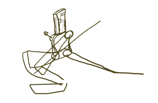
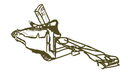
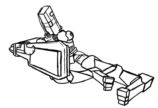
Speaking more generally (this message just gave me a good excuse to talk, heh)- spoilers; the artist in my brain refuses to die. So after, like, a literal year of not touching it, I've started working again on a 3D modeling project that I started in 2021 that has been haunting me ever since. Been trying to redesign a robot OC of mine Rayner, and I'm really particular about wanting his joints to work in a physical space instead of bending the rules artistically. I'm Really bad at designing complex hard surface objects in flat 2D though. However, there's a reason artists tell you not to character design in 3D, and that's because it's slow, it's easy to lose design cohesion, and most importantly it just sucks, awful workflow. But I am Doing it. And while I was super stuck for years and almost developed a friggin phobia of the project, I am now Doing It. And it's actually working out this time. The 3D model itself is MILES from being done, but the design almost is, and while that's a boring end result for other people, it represents a huge milestone and accomplishment for me in many ways.
I've been drawing a little bit lately too! But I feel my social media hiatus has given me a healthier relationship with posting? Like I have a few doodles that I could either post now or post soon, but I don't feel the same pressure to anymore? Where even if I never post them, I think I'm fine with that.
I've always thought I made art for myself, but that's not exactly true because I was also making art for the sake of sharing. And while I don't think there's anything wrong with that, I think being able to separate the two and be content with simply just creating is healthy. Also I'm still not as active on social media in general anymore which is probably healthier as well LOL.
So I'll prrrobably start posting again soon-ish now that I've broken this blog's posting silence? Not sure how to wrap this monologue up. My physical health problems are going to keep on probleming, but in terms of artistic fulfillment I've been in a much better place this past month, and that's a huge yeehaw from me 👍
4 notes
·
View notes
Text
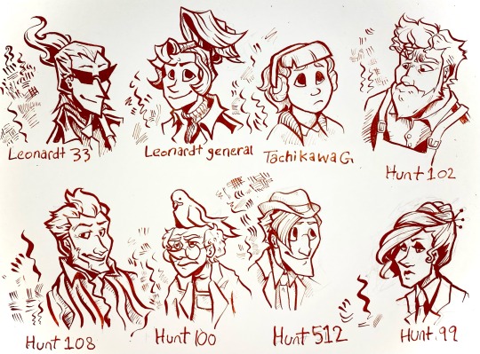
I’ve been drawing with dip pens lately so I did a nib study using my ghost trick redesigns.
for anyone that’s interested here’s some notes on the nibs under the cut.
Leonardt 33 - Easily the one of the most flexible pen nibs I have. Technically this is designed for calligraphy, specifically spencerian, so the sideways movement isn’t great and there’s little control when doing hatching. Really dramatic swoops with high pressure that aren’t entirely appropriate for character portraits but I kinda dig what it did to Sissel’s hair. Will probably use it for special effects like fire and smoke and stuff.
Leondardt 33 - This one is actually intended for drawing so naturally it has a fairly consistent line weight with a low flex. The hatching marks are kinda scratchy but not in a bad way. Would probably work really well for continuous contour and styles of lineart that are more sketchy, loose, and dynamic than my normal character art style. Would prob use for larger pieces or figures closer to the camera cause the line weight is generally a bit too thick for the usual size I work with.
Tachikawa G - This is a nib made for drawing manga specifically and it’s really easy to use for drawing. Some of the calligraphy nibs really take some thought and careful motor control to look good but this one was forgiving. I see myself using this a lot for really casual art. It was kinda hard to do hatching or filling with this one tho, which was kinda surprising. Very gentle line variance, makes really clear shapes. You can see in the other characters than too high flexibility can make it hard for the brain to turn lines into form so this really mellows it out. Prob best to use this nib to block out the lineart then hatch/fill/detail with others.
Hunt 102 - this is a speedball job made for mapping and oh my god do I love this nib. It’s just so 👌👌👌 on the details??? the line variance perfectly matches the brushes I use on photoshop and it’s just. mwah. it holds onto literally so much ink despite being so tiny. interestingly hatching is unstable but two or three lines together seem to be just fine. Kinda sad that jowd’s hair is a little hard to focus on cause of the variance but with a little practice I can prob find ways around that cause I already know I’m gonna love using this nib for heads and faces. Filling is a bit patchy but otherwise I think this is gonna be my go-to detail nib. (also no jowd isn’t in overalls that’s supposed to be an art apron but with only like the top portion showing it’s hard to tell.)
Hunt 108 - ok this is Supposed to be a drawing nib as well as a calligraphy nib and it does mimic brush strokes but I’m pretty heavy handed so it’s hard Not to make those super thick lines. Not bad with details and has enough control to make thickening up the outline super easy, but really easy to mess up. This nib did Cabanela dirty by flexing a bit too much when I was doing his mouth so I had to correct it with a white pen. Spreads the ink too thin in areas for solid filling. I can see this working really well with mixed media, like with watercolor, and once I get some more colored ink I’ll use it for coloring.
Hunt 100 - idiot stupid rat bastard of a pen nib. ok the art looks fine right? can’t be that bad, right? it took me so long to make that because the ink just. wouldn’t come out. so this nib is another mapping nib and it’s super delicate so it breaks really easily. I broke my first one bc I’m heavy handed, so I ordered another like ‘ok I’ll be more careful with this one’. it broke again. I don’t even know how. Ideally I’d use it for small spaces or reeeally fine details but I can’t even get it to work long enough to try. speedball can meet me in the pits.
Hunt 512 - A calligraphy nib that’s actually really easygoing to draw with. There’s not much line variance, so the hairlines have a lot of control. Makes for really good hatching. Also does really great long, thin lines. Sideways movement is kinda meh but it does the job. Definitely the cleanest looking of all them, tho the lack of variance makes it a bit boring to look at. Gonna use this one for shading and textures or for drawing on really rough paper.
Hunt 99 - like the first nib this one is really dramatic, and it’s supposed to be a calligraphy nib, but it has a lot more weight control than the hunt 108. Also the fine lines are easier to control. A lot of ink comes out so it might not be great on paper with risk of bleeding, and it takes a while to dry compared to others, but it would be good for filling since it can cover a large opaque space while having good control over the shape and points. Could also use for different warping/texture techniques.
Other notes:
I used smooth illustration Bristol for the paper, since ink looks more vibrant and swooshy on it and also some of these nibs can Only be used on smooth paper.
Also used terracotta India ink, which is kinda on the thick end but still looks good. matches with the colored lineart in Ghost Trick lol
got all of my pen nibs from Paper & Ink Arts cause u can order a nib for like less than a dollar fifty each. You can also get paper, nib holders, and ink for a good price too.
if u wanna start with dip pens PLEASE prepare your nibs before drawing. stick them in a potato for like 10 minutes. please trust me on this you will have a bad time otherwise.
ok thanks for reading through my Very Indulgent experiment.
#ghost trick#my art#idk maybe this is a bit unconventional for fanart#but I think a lot of ppl only ever post super polished art and not the experimental stuff#which gives ppl who want to start drawing the idea that every drawing has to be a finished one#and that everything you post has to get likes#sometimes art is about the journey#. . . ok my cat just died so maybe I’m being all maudlin and philosophical to cope but still#this is also here cause I could find jack shit useful reviews for pen nibs#so Hopefully this can help ppl that want to try dip pens but don’t know how#feel free to reblog if you want to reference or share the info on nibs lol#character design#traditional art#nib review
65 notes
·
View notes
Text
I can't believe I missed it! Yesterday marked 1 full year since I really started dedicating myself to digital art, after I drew this image because I wanted to play bomb rush cyberfunk. Pretty sure I started drawing it because I saw Twistcmyk made her own custom decals for that game and I wanted to make something like that too. So uh. Thanks for that Twist. Still haven't played bomb rush cyberfunk tho
not a bad starting place I'd say. Although maybe that's because it's not really the starting place and I've been drawing off and on again pretty much since I was born
I think this drawing really helped get my feet off the ground when it came to finding a style that works for me, and learning how to make other styles out of it. See, I've always had shaky hands so I've tended to gravitate towards a more scratchy style since smooth lines are often a challenge for me. And in a lot of cases I'd just leave a drawing as a sketch because finalizing it was very difficult.
being able to draw fast and loose like this is really a boon to get the creative juices flowing. It's the easiest way to draw for me, and I still like to leave it at that if I have a day where I want to draw but I don't want to dedicate more than one night to it
But nowadays I'm usually making art that's a lot smoother and takes a few more nights to finish. But that's still using the rough style. Usually I'll get a vague idea in my head and throw it on the screen with minimal care, and I'll zero in on how it's supposed to look draft by draft. Sometimes it takes 3 drafts, sometimes it takes, like 10
shown here a swordsmachine drawing I made a month or so ago, I still have the krita file on hand (because it's not technically finished yet, needs a final draft with color) so here's the drafts leading up to it
This process often involves a lot of cutting and pasting, resizing and the perspective tool to get a thing exactly where it needs to be. As for making lines as smooth as possible, I just have to take it really slow and sometimes go back, erase, draw it back, erase again. I won't lie it can still be a really tedious process
Like that swordsmachine, I've been making a lot of character portraits lately. Which has been a great exercise in posing, perspective and shading. Shading especially was something I've been needing practice with. I used to draw only with pencil of paper so using color in drawings is still somewhat a new thing for me. Having to figure out the lighting for each shot and which surfaces are whatever is very difficult but doing shading right can make a drawing look that much better
This is the thing I've been working on most recently, I think the shading looks pretty good, especially on the scarf. But I'm not really too sure about it.
Ok I've lost the pacing for this longpost. I wish I had a special drawing for the one year but I forgot until today. Maybe I'll make Anti in a birthday hat sometime later. For now here's some of my favorites over the past year
THING IN THE CLOSET
was a pretty early drawing, but I still really like it because of the unique perspective of peeking into a closet. Also the first time I drew Anti with a body!
ENDNE, GOD OF ENTROPY
I remember when I drew this design in my sketchbook and I knew I had a banger design right away, she barely changed from paper to digital. Unlike Solos, who had quite a few changes, and honestly I might still want to change a few things. Still pretty astounded that I managed to render it so well. Might be my overall favorite of the past year
PSYCHADOLIA
I still think it would make a great album name and cover. Hire me psychedelic music artists
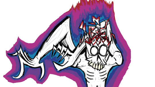
MALAZIROT, GOD OF ROT
This one was made because I told my friends I'd make myself a fursona if a poll about me being a furry reached 15 votes. Love stealing valor. This might be the highest layer count piece to date, I think it clocked in at over 60 with so many small details that you have to super zoom in to see. Regardless, I'm really proud with how I got the rotting flesh to look in this one
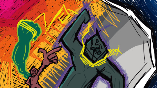
MASH ME UP
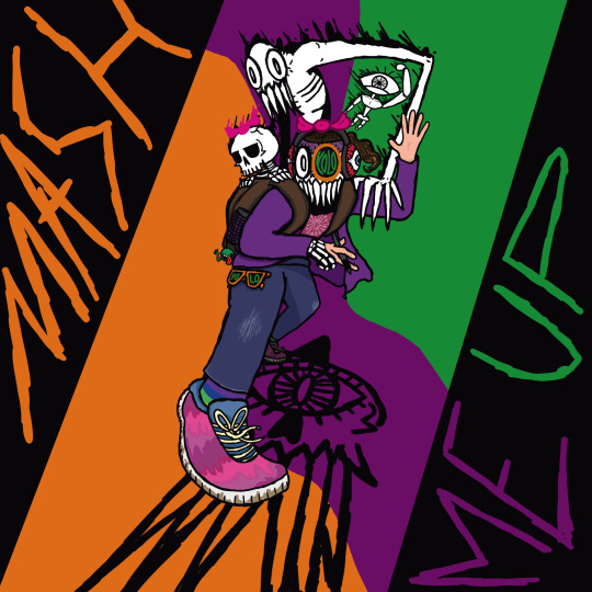
Also a massive undertaking and probably the only one that can rival the layers on malazirot. Idk if I have much to say on it other than, I think it looka pretty neat
SELF-PORTAIT

A real recent one, Probably my most grotesque one to date too. I really think I nailed how disgusting the skin on it is, my only regret is I didn't make any hair follicles poking out of the skin. Oh well, missed opportunities
here's to the next year of art!
6 notes
·
View notes
Text
19th's June 2024 Steam Next Fest Impressions - Day 4
Day 0/Day 1/Day 2/Day 3
Leximan
youtube
You are a wizard with word magic in a shitty wizard school.
In the overworld, that translates to typing out random words to get various effects. In battle, word fragments bounce around the screen, and you have to form a word with whatever you get to handle the situation.
As per it being a comedy game, my experience was making the wrong choices on purpose to see what happens. There doesn't seem to be any actual damage system, so it's just do whatever until you progress.
At it's height it is the best of early homestuck or problem slueth, laughing at the absurd consequences of an obtuse system. At its worst, the jokes feel incredibly forced. It's a land of contrast.
Biggest complaint is that I wish you could redo fights. I often found myself ending one early and wanting to see the other outcomes.
Mind Over Magnet
youtube
After years of telling people how making videos game works, youtubesman Game Makers Toolkit made a video game. A puzzle platformer about being a robbit and throwing your magnet friend around.
From the demo alone, it is... entirely cromulent.
It has puzzles that are puzzles. It's movement is smoothment. Nothing surprising, nothing disappointing.
It is a video game equivalent of a bowl of really good cereal or oatmeal with some effort put into it, with fruit chunks and everything. It's perfectly filling and enjoyable, and then you go about the rest of your day.
49 Keys
Apparently, this is an adaptation of a well received italian puzzle book.
It plays like an attempt to mix the classic text adventure style and the modern adventure game style. Most everything is text description with sparse illustrations, but interaction is done by dragging inventory items onto relevant paragraphs.
The plot is that you are a dominican priest or some other church official. Your teacher had not only been into church stuff but also astrology and occult stuff and would teach whoever had an ear. Church didn't like that, but he came from a wealthy family, so the best they could do is exile him to an island to continue his studies in peace and not corrupt the other clergymen.
On his deathbed, he sends the player a letter saying "hey I'm about to kick the bucket, I got a project I need finished, and I only trust you to do that." Which judging from the art and descriptions is some Lovecraft shit.
Unfortunately, the demo never gets to the lovecraft shit, ending right when you find a way to enter his house. While it didn't clock as "Scary" yet, they've got the historical fiction voice down, nailing the balance of antiquated sounding speech while still being easily legible. And they've got a good UI to add to that atmosphere.
Of course, the hot demon lady color spreads on the steam page kinda clash with that.
Curiosity piqued but expectations reserved.
Raining City: Millions Recollection
youtube
Gotta admit, I recognize it's sort of an unfair expectation, but after being burned by multiple chinese VN demos in previous next fests, it's nice to see one that's been translated to competent english. Not perfect, still has some pronoun switching, name inconsistencies, and some weird phrasing sprinkled throughout, but it was a naturalistic reading experience. I could consistently follow what was meant without much effort.
This is a supernatural mystery thriller. Lu Xuan is a member of a secretive group called "The Agency." She returns from a mission, expecting to relax, only for a mysterious lapse in memory to occur. When she wakes up, she's covered in blood, and there's a pure black hole in her hand. thin black lines wriggle out, spelling "100,000,000."
Before she can figure out what's going on, she's attacked by a creature that seems half dessicated corpse and half withering tree. After it rips off her arm, it regrows, with a few million dropping from her hand number. Thus starts her descent into the supernatural, as the new supposed "wealthiest woman in the world."
From the first two chapters the game has given, it's set up a lot of threads at once. The hand hole, the agency, a mysterious pawn shop, an unusual beached whale incident, the implication of a cult/religious group, multiple characters having simultaneous gaps in memory.
The cast feels well varied in both design and character voice, and I really like what the character designer is doing. I am guessing the backgrounds are based on photos because there's a nice sense of lived-in detail for a lot of them.
Definitely going on my wishlist.
4 notes
·
View notes
Note
What inspired your art style?
Oooh, this is gonna be a longer answer- cause I've been inspired by many things throughout my artistic years, and surely wanna talk about a few of these ^^
First of all, my art was heavily inspired by lineless artists with a very cartoony vibe (which defined an early era of my style), so some of Kasey Golden's works and the 50s modern cartoon styles really had an influence in me.
I could point out the Jenny LeClue game for this too, all the sharp angles and retro textures really left a mark on the types of things I would find aesthetic - while being on the point n' click genre.
Further down the line, I stumbled upon a game called Smile for Me, and eventually discovered more of Yugo Limbo's art! In general, I felt drawn towards the works of many other artists with similar vibes - vibrant colors, eccentric-looking characters, experimental textures and that retro energy.
It's really hard to explain or pinpoint what drew me to em, honestly x] I guess I just really like how wild people's arts can be from different perspectives and backgrounds, and the result is something quite unique, even when I can't relate myself ^^ It's part of the fun of being in a world where expression has so many different angles to peek at and experiment with.
And well, nowadays? I enjoy a mix of messy, painterly styles, together with varying linework vibes and things that lean towards the surreal, kinda horror-esque side. I also grew to really like the aesthetic of low-poly games from the 2000s (mainly things from the DS and PS1 era) and also RPGMaker ones. Things are exciting, I guess!
I could go more into detail on another reblog, since I don't want this post to be extremely long :'] Things such as tagging artists and showing pictures, if you would like.
Also sorry for the late reply aaa-
#artists on tumblr#asks n' crafts#artsy asks#inspirations#art#aesthetic#retro#gosh I stood procrastinating on this... but I'm real glad I got around to replying to it#talking about artistic inspirations and aesthetics is fun#I might develop this post later
4 notes
·
View notes
Note
Maybe some better questions would be: what visual artists inspire you the most? Are there any artists whose style or use of color you like to emulate? (I know nothing about visual arts, so I hope these are not dumb questions lol)
I really need to read more high fantasy. Should I start with The Witcher?
Long response by me (!!!) under cut, I'll not be held accountable for any typos as my autocorrect is currently not present
Letsgooo
Not to emulate a whole artstyle but I it's good to take little parts from different ones and translate it into your own (which honestly I should start doing again bc I'm getting stuck lately)
@/manny.oe (insta) is probably my favourite artists, he changes artsyles whenewher he feels like it but he is a professional and does visual dev work, he does so mych aauuh so much to kearn from him, I used to get inspired by the way he shades and picks colors, he also posts a lot of figure drawing sketches on stories that I try to just copy lolol (but these are the kind of studies you copy and never post)
@/ahmedaldoori_art (insta) when you look up his profile you see a lot of sketches and unfinished stuff but when you find his fully rendered pieces RAHHH THATSS how I want to render, very soft(?) rendering that I like
There is also someone from tumblr aaand from avatar fandom @/allgremlinart and they're my lineart goals (the line weight! yes!)....ok and rendering goals too..... They also have a side blog where they post their original art and yeeea good stuff good stuff
@/jamjoob (tumblr and insta) LINEART GOALS waaauuhhh such a nice light smooth lines, their colors are also tasty cozy..
So there's four digital artists I thought about first, there's WAY more but I'm not writing a book pointing out every artist I like (sadly. Hm ok I'd be too lazy)
(bonus five person a girl I had csush on fhgvjh legit best artist man give me your style. hand it over)
But I can get inspired with others all I want I still should learn color theory my biggest hater and enemy
I told you before you sent a fun good ask but I didn't notice a witcher part then shsjs
So hmmmm mmm m I'm not sure? It really depends on the person but the writing isn't that good, I was personally drawn by the characters and concepts (and the whole idea how witchers work is fun to me) (also I've read them in highschool so)
Some scenes can be kinda weird, it was after all written by a silly old polish guy
First two books- The Last Wish and Sword of Destiny are more of short stories and they're probably the best, after them the tone changes a little and the main plot begins (if I remeber it correctly)
I've read them in polish but I've heard some opinions that the writing in translations can be worse than original
But you already know I loooove legend of Korra, that is an art of taking good characters and concepts form stuff with questionable writing (but legend of korra is justified and forgiven by circumstances the writers struggled with (((and by me)))))))
But honestly that's up to you, I'd say you should try something else for your first time, you can look for other opinions too
#asks#ty for the ask!#its after 2am gnnnn#nvm edit. often it's not a specific artist but just one work thats so good#pinterest is worst and best things ever#soso much inspo but not always proper credits which is annoying
5 notes
·
View notes
Text
Art Fight 2024 Final Thoughts
I'm working on probably my last Art Fight attack for the season. If I get an attack during the extension period I'll still try to revenge but if not I want to be done with Art Fight by the end of the month.
Overall I'm currently at 12 attacks given and only 3 defenses received. Which is an 80% attack rate.
EDIT: Since this post I've done another two attacks and gotten 2 more back so my rate is around 75% now, which is awesome. Late attacks weren't something I was expecting but they mean so much to me.
I definitely still had fun despite the attack ratio, lots of great art came out of this month thanks to the event. I'm pretty sure the lower number of attacks received is because I don't have any specific references for any of my characters (only art that I've done of them in other contexts) and the characters that I want attacks for the most (that are at the top of my profile page) aren't the same as the ones others want to draw so they skip my page after looking at my first row. The attacks I did receive were amazing don't get me wrong but they were all from characters on my 3rd row or below so they had to actually go into my characters page and find something, so I know there's a bit of a mismatch there and maybe I could have gotten more attacks if I put my more unique characters up front for more people to see.
And yeah I wanted to compile all my attacks in one place too so here goes.
My favs are probably these 3, the poses were fun and the non-human elements let me leave me comfort zone but like just barely, they're still very much my style.


This year I did a couple sketchy attacks too which was nice. Some started out sketchy but I colored them and did some minor changes after and they still looked good. Definitely gonna start with a sketch and just go from there more often after this Art Fight. I barely did any separate sketch and line layers at all and it was so nice not having to do that step.


And yeah overall I really enjoyed this year's Art Fight. Definitely made me think about my style a bit. Even though I didn't experiment outside of my style too much this year other than trying some animals and a couple unique BGs which I don't usually do, I kind of got into the flow of it and just kept going. I got to a dozen or so attacks done that I'm super happy with overall.


Here's my attack page if you want to check out any of the people who made the characters or anything like that.
2 notes
·
View notes
Note
hi! I really enjoy your art, it has a very unique touch to it that I really like. do you sell prints of your art anywhere?
I've never been much of an artist myself, but lately I've been feeling like I would really like to try and learn how to draw. I know it takes a LOT of practise and that some have a more natural touch to it than others, but do you have any tips for a beginner? where should I start? I have tried reference pics and stuff like that but I never seem to get them right. how can I keep myself motivated when nothing I try turns out the way I imagine it?
sorry if you've already answered something similar to this, I would love to read that too. sending you good vibes and many thanks in advance ✨
Aaaahh thankyou so much! 💕 I don't yet but will soon I'll update on that 🎉🫶
Absolutely!
And wow that's great to hear! I'm really excited for you honestly because it's really fun :3 Well, my ways have always been a little unconventional but most teachers would tell you to pick up a pen and paper and.. just start drawing/doodling with whatever reference you have. Or if you have a pen tablet already, explore the program you're working with. Any kinds of brushes, try them out, try functions the program has- see what it does, make it a fun experience because you can't make any mistakes. It isn't something you have to deliver to anyone, this is practice and this is for you. Put on some music or watch a show on the side that's easy to follow (not one you have to pay close attention to) and just scribble away. You can use an extra program like 'Pureref' (which is free!) that allows you to drag in any references you need on top of your drawing-program or create an extra window where you can drag in any images and rearrange everything just the way you like it, like this:

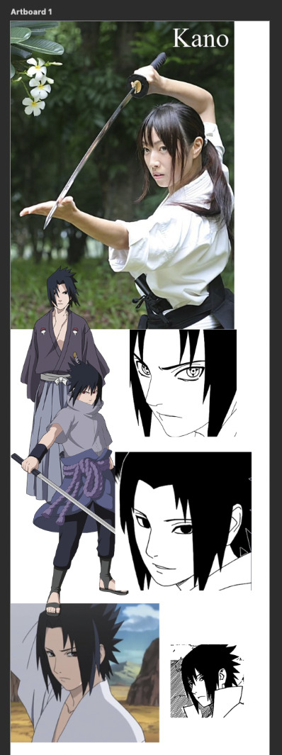
And then let's try a Sasuke sketch in that pose upper-left corner.
I usually flood the document with a bunch of references in case I need it. (It's always more than I need but I hoard my files a lot 😂.. I think it's a fear of it not being enough "just in case"- but it's okay.) When I'm coloring a sketch, I think of colors beforehand but it kinda depends on my mood. Most of the time I don't bother until I get to the lighting stage.
If you feel like you don't really got the hang of using a pen-tablet yet, there is a good tutorial with exercises here. And don't worry at all!!! Because it'll get much easier and easier overtime, just please take care of your hands and stretch gently always. Remember it is never supposed to hurt.
Honestly the way to improve fast with art is... just get obsessed over something 😂 and draw that. Find something you like and enjoy drawing it at least from my understanding that is what happened to many people. For me it's.. well..
If you want to get inspired, go to places, preferably professional spaces and make a board with art in styles you really like. (Or a folder for example!)
This way you can use references to make something and it's a good start/practice ^^! At least it was very helpful for me! If you feel like nothing turns out the way you imagine it, then don't worry about it please.. creating something involves so many steps it is nearly impossible.. or it is impossible actually to have something turn out exactly as you imagine it beforehand. It is more important that the end-result is something that is satisfying which has more to do with the actual process itself. And I know that is not something you might want to hear now but I guess you'd have to experience it? At least for me, every new art I make involves something along the lines of "oh I kinda liked that" or "ew, no, nope, no, not doing that ever again" it's a constant process.
Here are some helpful video's for beginners because I think visual inspiration would be more beneficial for you than just a bunch of text from me!
5 FIRST STEPS TO LEARN TO DRAW
HOW TO DRAW SIMPLE FACES
HOW I STUDY DRAWING
Advice for Starting your Art Journey
Extra (not necessarily for beginners):
Why BELIEF Is More Important Than TALENT
How I Reduce TOXIC Perfection As An Artist (Best Drawing Exercise TO Do)
What to do If you aren't Improving
Why it takes so long to get good at art
I hope any of this is helpful to you and I hope you have a nice day 🌷💕! Happy drawing!
18 notes
·
View notes
Text

LGC STYLE ( SPRING 2024 )
SCHEDULE TYPE: VARIABLE
LGC STYLE is back and here are our participants to kick off the show's comeback:
AHN JAEHWA
HAN HYUNHEE
KIM JINSEO
KIM JINYOUNG
LEE JIHO
LIM SANGHYUN
MIN SOYOUN
MOON HAYOUNG
MOON JIAH
SEO YURA
SON NABI
this season, the contestants will be grouped up and style a person’s outfit sets for a week ! first however, each contestants have to SHOW OFF some of their favorite items in their wardrobe and showcase their personal style ! after this they will get to meet their partner(s) and receive of profile of their assigned individual.
AHN JAEHWA, MIN SOYOUN and SEO YURA: female, early 30s, office worker, her life is mostly centered around her work, she likes to exercise and is currently single. her date will be her first meeting with someone met on a dating application. since she works a lot, her wardrobe mostly consists of comfortable but classic clothes with few colors outside of white, beige, gray and light blue.
HAN HYUNHEE and MOON HAYOUNG: female, mid 20s, stay at home mom of a toddler. for the past three years, her life has mostly been centered around her child. she mostly wears comfortable and casual clothes for convinience and has a good array of jeans. she loves wearing simple t-shirts with pastel colors primarly. since her child is growing up, she wants to find more time to care for herself and her appearance
KIM JINSEO and LIM SANGHYUN: male, mid 20s, newly integrated the work force in marketing. he has an active lifestyle and been dating steadily for 2 years now. he often meets with friends to play sports. he likes to buy the latest trending outfits though he wouldn't be considered a fashion icon.
KIM JINYOUNG and LEE JIHO: male, early 20s, about to begin university after finishing his military service. since bulking up in the army, he currently has only basic clothes that fits him. he doesn't really follow trends, but would like to have a more trendy look. he has a blind date set up by his parents.
MOON JIAH and SON NABI: female, late 10s, last year of high school. she's a shy girl who likes to draw and paint and plans on going in arts design. though her wardrobe is quite simple, she has a lot of unique and colorful items and accessories in it. however, she's the type to put on whatever without caring about the end result and would like to have a more cohesive yet unique style. she's being dragged by two friends to a group blind date.
each group will have to come up with a FORMAL outfit for an official event, a SOCIAL outfit for a event with friends, a CASUAL outfit for a regular day, a DATE outfit. most items will have to come out of the person's own wardrobe, but contestants will get to buy ONE new clothing item for each outfit. an outfit includes the clothes, shoes and accessories.
at the end of the week, the person will choose if they LIKED or PASSED on the oufit chosen. teams with more LIKES than PASS will received a SPECIAL REWARD and CASH PRIZE.
** ooc note; the number of like/pass will be based on requirement completion + randomized generator **
REQUIREMENTS
STYLING: write one thread with your partner(s) while the cameras are rolling. the thread can be anything related to picking the outfits; from brainstorming, to studying the outfits they already have, to shopping, to even arguing about their own ideas ! for every four (4) replies (two posts per muns*, 8 lines minimum) you’ll receive +2 VARIETY, +2 MODELING, +2 NOTORIETY for up to +6 VARIETY, +6 VARIETY, 6 NOTORIETY !
MY STYLE : write a 300+ word solo of your muse showing off their favorite item and personal style for +5 SKILLS TO DISTRIBUTE ANYWHERE, +2 NOTORIETY !
* for the group of 3, keep the count of every 4 replies too, which will equal to one reply for 2 people and 2 replies for one person per set. if the maximum is reached, each muse should have 4 replies on the thread.
make sure to use the hashtag lgc:lgcstyle on your threads and solos ! to validate your skill points and collect your notoriety points, please submit the following form ONCE on the points blog before JULY 6, 2024 11:59 EDT.
TITLE: MUSE NAME ∙ LGC STYLE 002
- STYLING +2/4/6 variety, +2/4/6 modeling, +2/4/6 notoriety [ LINK ]
- MY STYLE: 5 skills points distribution, +2 notoriety [ LINK ]
4 notes
·
View notes
Last Seen Blogs
s1lv3rwingz
🦇~ℌ𝔢𝔩𝔩𝔬 𝔡𝔞𝔯𝔩𝔦𝔫𝔤~🦇
falconchauffeurs-blog
Falcon Chauffeurs

stevesungbo-blog
제목 없음

glitteryyetii
Hello there!
