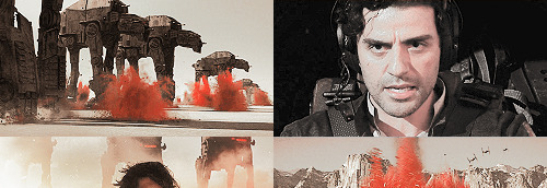
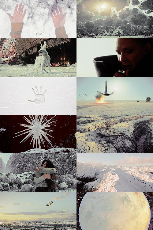
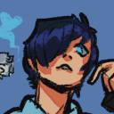
#rebel moon screencaps
Text
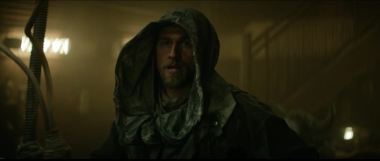
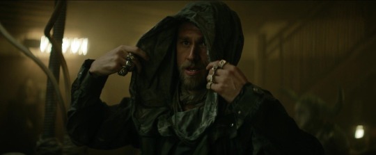

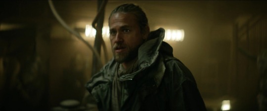
I am spending way too much time looking for the best screens of his rings instead of actually writing the goddamn fic 💀
But he be pretty though 🥹
#charlie hunnam#rebel moon#fanfic#charlie hunnam rebel moon#charlie hunnam kai#kai#rebel moon kai#rebel moon screencaps#charlie hunnam fanfiction#fanfiction writer#rebel moon fanfiction#rebel moon fanfic#kai fanfic#writer problems
17 notes
·
View notes
Text
I'm here to make you an offer. To give you a chance at redemption.
#it's cominnnnng#rebel moon#a child of fire#zack snyder#this one was posted yesterday without me noticing bc i put it on the queue and forgot 🥴#honestly this wasn't my plan i was supposed to post some edits last week but i thought i have to screencap watchmen (for one of the edits)#and i still have half an hour left🙃#admiral noble#ed skrein#jimmy#anthony hopkins#kora rebel moon#kora#sofia boutella#tarak#staz nair#beatrice#bennu#titus#djimon hounsou#general titus#rebelmoonedit#atticus noble
28 notes
·
View notes
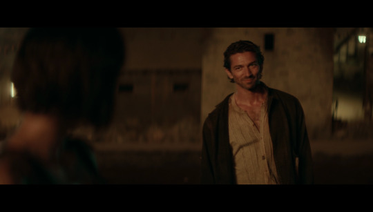
Text


Rebel moon screencaptures 💙
19 notes
·
View notes
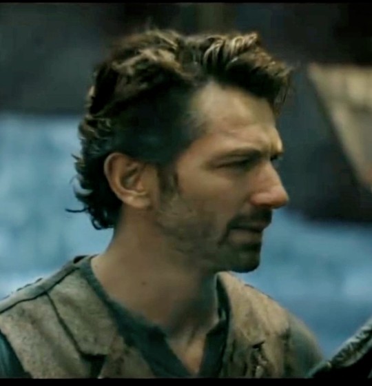
Text
Redemption 🌒❤️🔥🌾


#michiel huisman#gunnar#the hot space farmer#rebel moon#rebels#no heroes#best actor#all day#dopamine#his holy hotness#netflix#zack snyder#my screencaps
14 notes
·
View notes
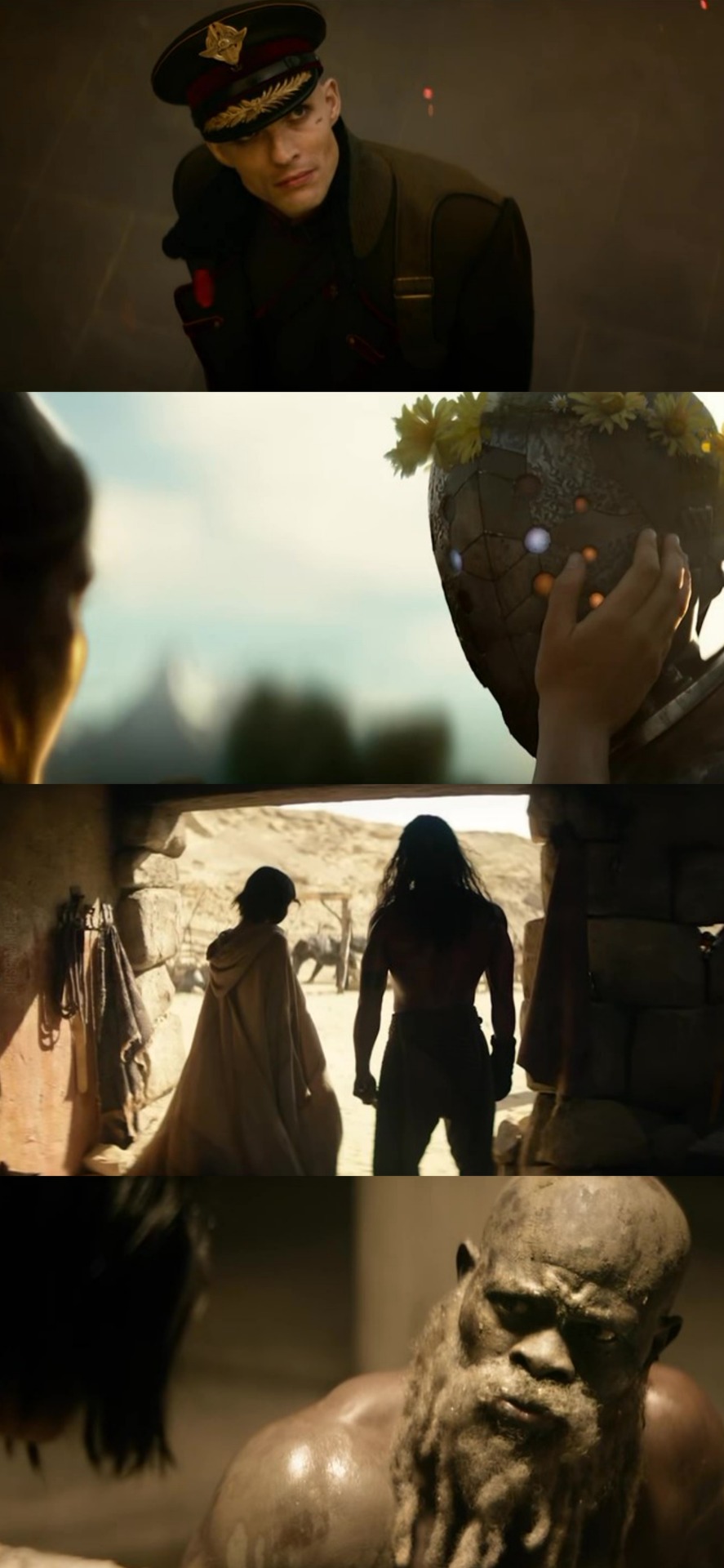
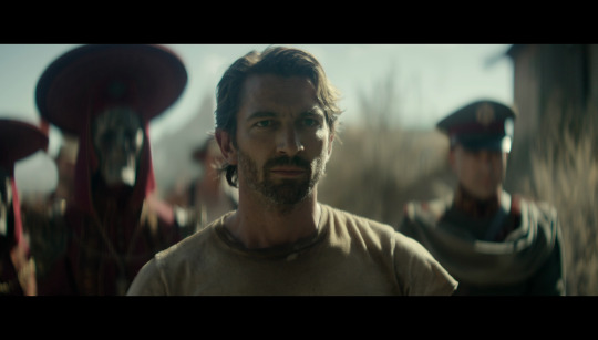
Text
Just watched Rebel Moon Part 2
And this random man's jawline needed to be shared
#what i had to do to get this#netflix blocks screencaps so i took a photo with my phone#rebel moon#imperium#this had to be shared really#attractive men#mensfashion
2 notes
·
View notes
Text
I NEED THIS GUN ON MY HAND RIGHT NOW I NEED THIS GUN ON A SHIRT I NEED THIS GUN AS A MINIATURE I NEED IT TO BE THE WEAPON THAT ENDS MY LIFE. IT'S SO FUCKING SEXY
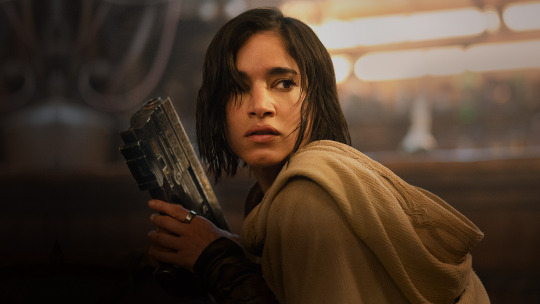
#drawing luke with this gun right this moment i dont want any pansy ass blaster i need him having this huge bulky sexy piece of machinery#mars txt#rebel moon#IM JUST STAERING WITH THW GUN BUR WHEN I GET MORE SCREENCAPS I WILL BE DISSECTING EVERY FUCKING PIECE OF THIS FUCKING TRAILER#sofia boutella#kora
13 notes
·
View notes
Note
Hi, Kat! I saw your post earlier about the New Mandalorians, and wondered if you have the time or energy to expand on that at all? If not, or you don't feel like it, feel free to ignore this. I've been interested in writing a fic where Mandalorians play a major role, but have been avoiding it given how much contention there is around so much of it, and just how challenging it is to keep straight what's Disney canon, Legends, and fanon. I'm also mostly not a comics reader, so I know I'm missing a big chunk of info there. So any chance you could point me to where to look for some of this information? Like, Death Watch being deported to an "overcrowded and undersupplied" moon. Is that extrapolation from what we see of Concordia in TCW, or are there additional sources that get into more detail? I'm also curious where we see Death Watch/warrior Mandalorians being POC? Jango is, of course, but I've heard other people claim that, other than Jango and the KOTOR materials set several thousand years in the past, we don't really see onscreen Mando POC until Rebels, after TCW creators got backlash for making all the New Mandalorians and Death Watch white Vikings. Are there other sources that show the exiled warrior Mandos being POC? Any help you can give me figuring this out would be greatly appreciated! I know fanworks can go in whatever directions their creators want to, but I want to at least make sure I'm working from a clear understanding of what I'm starting from! Thanks you.
It's very definitely an extrapolation, but based on what we see pretty much solely in TCW, specifically "The Mandalore Plot" episodes.
First, if you look at shots of Sundari, the Mandalorian capital, everyone is white and blond and Human. Maybe it was the animators being lazy, maybe it was a conscious choice, but it's still jarring, especially in contrast to most background shots elsewhere in the galaxy. Take a screencap of anywhere else and it's pretty mixed as far as Humans and aliens go. Not in Sundari.
Second, re: Death Watch being deported. I'm not talking about Death Watch. I'm talking about the warriors, who Satine specifically says were "exiled" to Concordia. And she and Obi-Wan have a conversation about how, even though Concordia was once an agricultural settlement, it was strip-mined to the point that forests were just starting to grow back. Extrapolating, that means Concordia probably has to import everything. I can't remember if it's Satine specifically who says it, or one of the other NMs, but they also say they presume all the warriors have all died out. And like. yikes. There's a pretty big implication there.
As for the warrior Mandalorians being POC, at the very least there are more POC characters among them than among the NMs. Clan Wren, I'm thinking of, and then. Jango and his disavowal by the NMs is a whole other can of worms that has a lot of racist overtones, imo. This post has a good breakdown of the issues regarding the Fetts, if you'd like to read it. It dips into Legends, but it's mostly based on TCW and the movies in those sections, so. There are your sources.
Edit: To clarify on why I find the "we presume the warriors all died out" so yikes. It's been about 20 years since Satine took power at most. A lot of the people exiled were probably young, to say nothing of how long people live in the gffa. How exactly are that many people supposed to have died in 20 years max without some outside factor? Add that to the fact that Concordia is mostly barren and like. Hella yikes, imo.
#kat answers#i hate most of the mando legends stuff#because traviss is a hack and a horrible person#so my info is pulled from the episodes#and like i said#i get not wanting to read canon this way#and you can instead take word of god info and just take tcw at its word#for how the new mandalorians are all perfect and totally in the right#but like#it doesn't jive for me#not with what's said and what's shown on screen#like i said though#ymmv
116 notes
·
View notes
Text
It’s MY art, and I decide when it’s too late to jump on a trend!
hhhh Enjoy this really late addition to the Sailor Moon screencap redraw trend from way back when, featuring one of my new ocs, Radar. More to come on her soon, but for now, Enjoy <3
Do NOT repost, copy, or trace my art. Thank you.
#star wars#star wars art#star wars oc#togruta#twilek#hybrid oc#rebels#rebel pilot#star wars ot#sailor moon#screencap#art meme
31 notes
·
View notes
Photo


having a normal one
transcript: okay so. the problem is that it would be so much more interesting if lucy WAS evil, just straight up a stone cold bitch. but i don't think she is. think about it. she calls margie just to openly tell her that she sees her ass and that margie was the betrayer, not the betrayed? that her marriage is one of convenience? that she’s doing everything margie is doing but better? and then a princex from the moon margie is actively on and invested in the politics of just happens to go missing? using a ship that margie can easily track? and checks into a hotel with a fake name only margie would instantly clock as lucy’s? lucien isn’t the betrayer. lucy is hitting on margie and doing it in the most insane possible way: stealing a royal out from under her nose and making margie chase her halfway across the universe just to prove she still would
image 2 starts with a tumblr screencap, reading: imagine ur on like r/anticapitalism and someone is like “hey we should rebel against amazon taking over this planet for real I can and will finance and organize this revolution” and obviously ur like “who are u and how do we stop literal Amazon from taking over our planet.” but op doesn’t post again for days and when they do it’s just a tasteful tgirl nude. and THEN later it comes out that it was literally a random businesswoman playing lesbian 4d chess with her ex. hashtag justrubianvthings I guess. tumblr screencap ends, followed by: shes so important to me you don’t understand.
image 3: so the funniest thing about it is actually that margie and lucien are playing totally different games actually and neither of them is on the same page. because margie is like okay she betrayed me and us by getting engaged to some floozy whose daddy owns the company and taking a promotion so shes my boss now. so im gonna start taking the company down from the inside starting with this rando moon. oh she knows im the one posting on this subreddit? im gonna post my hottest nude so she knows i know shes looking. meanwhile lucien is like okay. she betrayed me and us by going soft. im gonna double down on our common goal of being girlbosswives and fuck some rando for a promotion and because i need her to be jealous so i know she still loves me. also im trying to save this planet but im better at covering my ass than she is. shes flirting with me by doing this. im gonna flirt back by saving the princex and letting her trace us and using a fake name she knows is mine. we’re in love
image 4: like from margies pov lucy is her bitter rival, ex-ride or die, could-have-been, and now margie’s playing 4d chess to see how bad she can wreck shop to prove some kinda point to her about how she never needed her, how she can make it alone, etc. and lucy is like oh yeah we’re flirting. this is flirting. me marrying another woman is me hitting on her, just like her betraying our once common goal publicly is her hitting on me.
#long post#sorry babes lol im normal im normal#not tagging this. none of you are normal about them like i am
0 notes
Text
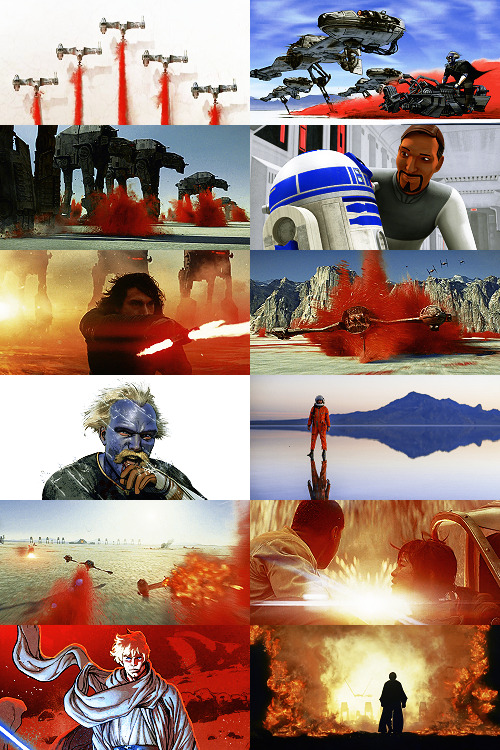
Making A Galaxy Far Far Away: An Aesthetic Photoset Tutorial
Requested by @geleixi (and varying amounts of time ago by @rockett-to-the-purple-moon, @thenameisgreed, @pizzaplanethq, and probably others who sent nice messages that I went “Oh, what a nice message this means so much I LOVE IT SO MUCH I’M TOO ANXIOUS TO ANSWER IT WRONG I’ll just do it later” and then promptly NEVER answered it.)
Brainstorming & Photo Collection
Picking a Color Palette
Choosing Images from Collection
Coloring
Textures & Effects
First off: I am not even going to remotely pretend like graphic design is a Thing I Am Better At Than Anyone Else, because that would be patently false and ridiculous, but I also get a fair number of Asks about making photosets/aesthetic posts, so here we are. I’m planning to do a separate one, maybe, for how I do the Cartoon Girls All Grown Up and Nancy Drew Dream Games series, because the “brainstorming and photo collection” part is so different that it inherently affects the rest of the process.
BUT I also feel like I don’t see a ton of tutorials that go through the brainstorming/finding images part of making aesthetics, and I tend to think of my Graphics Style(TM) as “DEEPLY Uninterested in washed-out faux sepiatone grimdark Tumblr Coloring?? + Not Good Enough At Masks To Do Negative Space Well,” which might be some people’s level of ~graphics design passion(TM)~ too, so. That’s the ride for which this ticket has been bought.

Brainstorming & Photo Collection
Obviously, the specifics of this are totally different for every aesthetic, but all of the GFFA/swworlds start from the same seed: Star Wars Aesthetic.
Star Wars itself has a very particular Lookque, imo: it’s not quite retrofuture, it’s not quite dirtpunk, it’s not quite scifi, even. There are the insanely sumptuous (and hella culturally appropriative) queens of Naboo and the ramshackle toppled AT-AT where Rey lives on Jakku and the not-even-subtle-at-all-jfc Nazi inspiration of the Empire and First Order and the straight-up millennial Tumblr witch Goffik look of the Dathomir Witches and Zabrak siths and the blue, blue water of Scarif. There “isn’t” a unifying aesthetic through Star Wars, and yet, as Gareth Edwards said, there’s a LOOK and FEEL to Star Wars: if you go a little too far to the left or right, it isn’t Star Wars anymore.*
*That said, this tutorial talks about Crait, which was invented by Rilo Jon, who went both too far left and too far right but mostly... too far-right. BA DUM BUM! Anyway.
So part of what makes Star Wars Look Like Star Wars, to me, is that it ISN’T ever Too Scifi. There’s a realism in all of Star Wars’ disparate planets -- their looks, anyway; like, talking about how Crait, in this case, makes NO ecological sense as a planet AT ALL is another post entirely. (IT MAKES NO SENSE.) It’s different from, like, Doctor Who, which I think revels in its “we can make these aliens and planets look like WHATEVER” more? Star Wars tends to be very like... “we want to use practical sets and effects.” Even for planets that only appear thus far in Clone Wars and Rebels? So it’s definitely part of the intention of SW’s Aesthetic.
ALL OF THAT TO SAY, my first step with each planet is to figure out the best way to represent it using as much real-world photography as I can and how best to channel the ~spirit of Star Wars~ in the graphic. Sometimes I fail miserably. CURSE YOU, NAR SHADAA. But most of the time it helps provide a Framework for the rest of the brainstorming and photo collection.
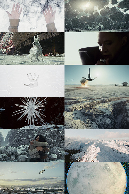
SO. FOR CRAIT. (For another example/totally different look and process, I wrote up a little about Haruun Kal on its post here.)
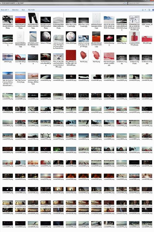
Crait has the definite benefit of appearing in one of the movies, so the first part of photo collection was to screencap TLJ. I took the caps using the 1080p digital release at a 20-frame frequency, so even once I deleted the aps that weren’t of Crait (moving the Canto Bight frames into a folder for Cantonica, of course!), I had like... 1500 images just from TLJ to start the brainstorming and collection with.
First, I trimmed down those ~1500 screencaps to 168 caps that were distinct enough from one another to give me a sense of “what happens” in the scene and, more than that, “What Crait Looks Like.” Then, because there’s additional canon material of Crait besides TLJ, I saved the unlettered images of “Star Wars: The Storms of Crait” from comic penciller Mike Mayhew’s blog @mikemayhew -- if those hadn’t been available, which they’re usually not for planets that appear in the comics (THANX MIKE MAYHEW!!!), I would have taken and cropped panels from the comic at both 100% and screen-fit/60% sizing that had utility for a graphic about planet scenery and not character.
THEN, I looked at Wookieepedia and MSW. Crait was based on the Salar de Uyuni salt flats in Bolivia, so I Google image-searched that. There weren’t actually very many images of the Salar de Uyuni salt flats that I super loved, so I ended up saving images of other salt flats as well, particularly the Bonneville Salt Flats in Utah.
THEN there was the issue of the red minerals, which were entirely fictional and not part of any real-world salt flat. BUT, there IS real red sand... so I saved some images of red-sand dunes (mostly Mui Ne in Vietnam). I also went through my Star Wars Stock Folder to find images of crystal caves and mines that I’d either saved for other planets in the past, but didn’t end up using, OR just saved because there are so fucking many crystal-based planets in SW.
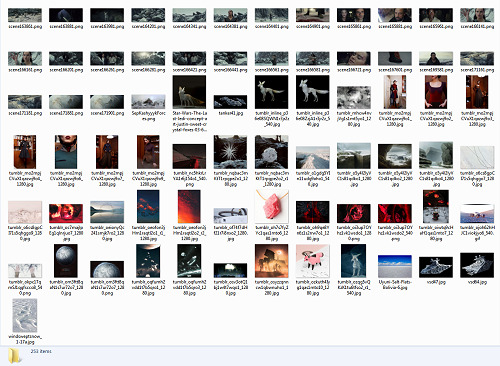
Each of my big graphics series has its own Stock Folder for unorganized images that just strike the right Vibe~ and might be useful someday, in addition to every planet (or cartoon girl, or US state for the Nancy Drews, etc) having its own folder for specific/organized image collection.
My Star Wars Stock Folder:
So there were already a lot of crystals, star destroyers, blasters, and bunkers that were actually in snow but whatever it was white and crystalline, to work with. I added some workable Crait-like images from the stock folder to Crait’s collection, too.
AND THEN, finally, I LOVE the vulptices, so I searched for (and found!) some of the concept art and 3D modeling images from ILM, and I put those in the folder, as well.
I also saved this, hoping I’d be able to make it work because it’s SO CUTE, but I couldn’t, but here LOOK HOW CUTE:
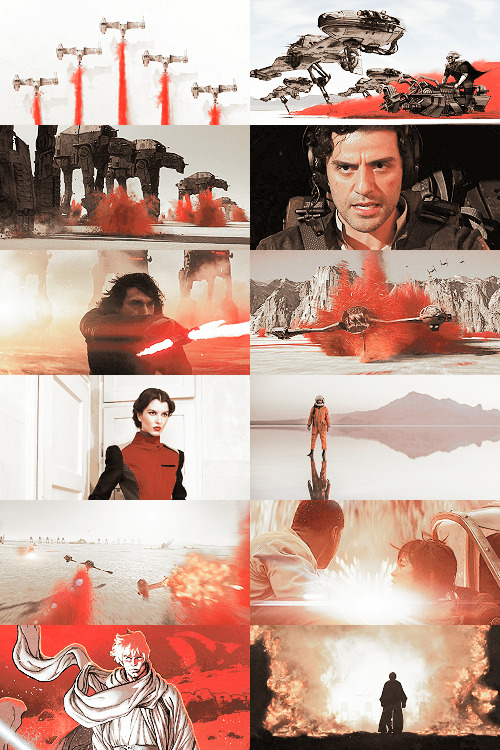
And then, lest I stay in the image-collection rabbithole forever, I said, “OK, that’s enough.” I ended up starting to actually MAKE the Crait graphic from a collection of 272 images:
Picking a Color Palette
Obviously, the dominant colors of Crait are red and white, so the aesthetic had to be based in red and white. My first instinct was to make a duotone aesthetic using only red, white, and black/grayscale. Something like this:
Which... I don’t hate, or even dislike. It’s definitely more in line with popular Tumblr aesthetic, uh, aesthetics. But I usually don’t like landing on that kind of coloring because it ALWAYS, ALWAYS whitewashes people of color (and jeez, it even whitewashes white people -- look at the model in the fourth frame down on the left, or Luke in the bottom-left.) The “vibrance -100 + Selective Color Red>Red + 100″ always ends up doing the above example to, in this case, Poe: turning him into a licorice man.
So then trying to correct THAT either whitewashes the FUCK out of him/people in general:
(Toning down the red)
Or introducing other colors back into the graphic as a whole:
(Upped yellow and cyan.)
So I nixed that coloring before I even started. (These examples were made after the fact purely to serve as examples.)
I went back to the drawing board, AKA the Crait image folder.
But looking at the collected images -- especially the screencaps and the panels from the Storms of Crait comic -- I was struck by how much Crait also incorporates yellow and blue. (Note that I really, really wanted to try to include Trusk Berinato and Bail Organa... but we’ll talk through why that didn’t work out.) I LOVE @droo216‘s bright, almost jewel-tone edits which I 100% know I don’t have either the patience or skill to make, but I liked the idea of trying to make Crait’s aesthetics in a primary colors + black/white scheme.
Which I actually really like! (Again, made post-facto as an example.) But again, red vibrance DiD tHe tHiNG!!! to Poe and ESPECIALLY to Finn and Bail.
So a high-vibrance look emphasizing bright colors was a no-go. Besides, going back to the source material: high-vibrance and high-energy are the opposite of what the planet of Crait is about. It’s a dying husk of a planet, being killed slowly by its own ecology as the salt in its crust dries out everything beneath it, sucking up water until everything either evolves into living crystal-dogs or goes extinct (thank u Rilo for not including dune-worms, this is the one thing you did right). Crait wouldn’t be vibrant.
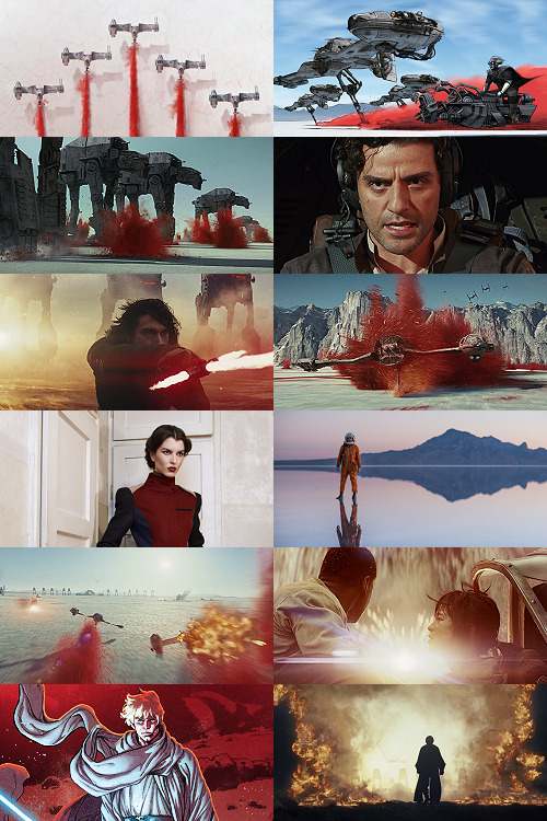
But... aha! It’s also distinctly layered. I’ve done three-panel swworlds aesthetics before, so I decided to do that for Crait, too: first a mostly-white graphic like the salt crust, then white+red+yellows in the middle, and finally a dark layer of almost entirely red like the mineral mines.
Choosing Images from Collection
With the color palette and “feel” decided (dying at the surface, then growing richer and redder and angrier as the photoset moved downwards), I was able to choose images.
NEKKID PHOTOSETS SANS ANY EDITING! XXX! But for reference to see both cropping and for reference on choosing.
TOP IMAGE, MOSTLY WHITE:
L-R, TOP-BOTTOM:
I saved this image from my dash at some point and have been tossing it into planets’ folders every time there’s a white-based color scheme. It almost got used for Ilum, but at the last second wasn’t. I felt like it fit the coalescence of Rey’s Force strength here, and also the kind of “last wisps” of Luke Skywalker, well.
“Lifting rocks.”
I’m actually still not 100% whether I should have landed on a vulptex here, but dammit they were one of the only good parts of TLJ. This vulpie baby is on the salt surface, looking out at the blinding sun, so she seemed like a good fit compared to the other caps of vulptices -- the ones loping on the canyon surface at the end were all very motion-blurry.
Carrie in that gorgeous coat in homage to Harrison in Blade Runner makes me weepy, and those were some of the most beautiful shots in the movie. This one had a good balance of white and black, so it could be placed around any level “busyness” in the surrounding photos. Especially since I suckkkk at negative space.
I saved this image to the Crait folder like the day it was announced as a planet in the upcoming Episode VIII and given its first peek. I love it!
Hi, salt flats, and also Star Wars spaceships. I actually had a lot of trouble with the level of green in this image, but the ~essence of Star Wars is PEW PEW SPACE BATTLE, so.
This is an ice sculpture in real life! It reminds me of the vulptices and is cool as hell.
The Millennium Falcon! I toyed with different caps that showed it in actual battle, but the blue would have been hardest to work with in this photoset compared to the others below. Plus, now I can save a bunch of Falcon-in-flight pictures for use on planets that only appear in the novels or comics.
NECESSARY, ICONIC, PERFECT, THE MOST IMPORTANT THING THAT HAPPENED ON CRAIT.
Fine, this is a snowy mountain and not a salt flat, but I liked the striations in color and gentle variations in grayscale.
This was the palest/least Bright Blue sky of all of the Falcon screencaps from Crait.
I tried a few screencaps of Crait from TLJ, but I landed on using the full-panel image of Crait from Storms of Crait. It has the cleanest definition of the “planet from space” options we have of Crait.
This is a promo image, not a screencap. It’s a much crisper view of the ski-speeders. I love the vivid color difference.
The blue-and-yellow additions to the color scheme didn’t work out, but I did still want to include Storms of Crait. This shot had a little more blue in it than I would have liked, but it has Leia in a ski-speeder back before the salt caused them to rust out, too!
Remember when it seemed like the Crait battle’s new AT-ATs would be super cool and like, do more than stand there menacingly behind Kyle? Me, too.
POE! DAMERON! HAS! NEVER! DONE! ANYTHING! WRONG! IN! HIS! LIFE!
KYLE! HAS! ONLY! EVER! DONE! WRONG! IN! HIS! LIFE!
I tried out like five different tiny-frame-difference screencaps of the ski-speeders kicking up red minerals, and I decided that this one, with a clearly defined spray of red surrounded by white and bluish sky, suited the placement here best: there’s red in the panel to its left as the main color, but minimal red in the above- and below panels.
I wanted to include actual Connix, but she’s wearing yellow and only ever shows up surrounded in brownish-black darkness, so here, have one of my standard Fashion Rebel Officer Stand-Ins instead -- the red and white obviously played a part in picking this shot over the rest of the options from the photoshoot.
I LOVE this slightly mystical shot of a Rebel pilot slash astronaut on a rain-slicked salt flat. How perfect?!
As we get down to the bottom of this middle panel, I wanted to include more destruction and more presence of yellow and orange. This image has a good balance of “negative space” in the sky and salt flat, and then the explosion of Nodin Chavri’s ski-speeder (I think?) ties in well to...
Finn and Rose, post-collision. I wanted to include Rose, and the almost JJ Abrams-esque white starburst in the center of this cap is a good balance to the spray of red around a ski-speeder two panels above.
Luke on Crait in the Rebel Alliance...
And Luke on Crait in the Resistance.
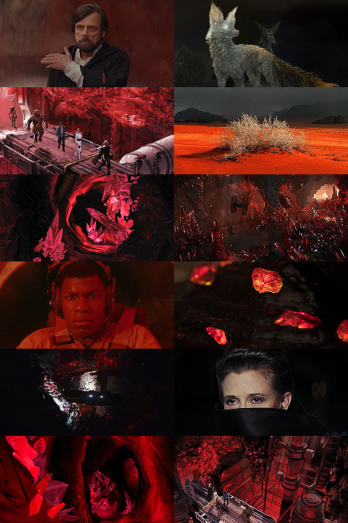
This was a kind of “????” moment of characterization -- and general direction -- in TLJ, but Luke surrounded by red as an old man would fall right below Luke as a young man, on his first mission after the Battle of Yavin, when the three graphics were aligned.
I wanted to use the straight-up concept art of the vulptex, but the black around it was TOO black, if that makes sense? So I layered it over a darkened cap of the vulptex who leads Poe to Rey and freedom. This is one of the very rare shots that I use an edited base image.
Han and Chewie! I had to include Han and Chewie. The unlettered panels from Storms of Crait that show the mineral mines are stunning; I highly recommend heading over to Mike Mayhew’s page and taking a look. The detailing of the crystals is something I wish I could have captured better at this scale.
This is one of the red-sand dunes I saved! Crait doesn’t have any living vegetation, but the drama of the black, stormy sky and the red sand drew me in here.
Some CGI crystal caves... I saved these ages ago for use on Ilum or Dantooine, I think? (Same with what will be #11 below.) I don’t love using CGI, but I think the crags on these crystal growths suited the images from canon!Crait.
A screencap of the TIEs chasing the Falcon through the mines. This was honestly one of the most visually stunning parts of TLJ, and it’s so split-second that most people missed it AND most of the screencaps have a lot of motion-blur. I’m really pleased that this one came out so crisp, and I knew I had to use it as an “anchor image.”
Finn, full-on, in red. I’m realizing belatedly as I write up this tutorial that I showed Poe face-on and Finn face-on, but I stupidly chose to show Rey only from a distance. I AM A FOOL! A FOOL!
Aren’t these resin crystals amazing? The full-size image actually shows them surrounded by snow, by the tree-stump they’re on wouldn’t fit Crait, so I cropped in closer on this image than I did for most of the Crait set.
Another shot of the Falcon in the mines. I like the way the framing of white sunlight here echoes...
Leia’s face, a bright spot in the dark, watching out over the salt flat. :(
(See #5 above!)
And again, the homage of Carrie’s coat looking like Harrison in Blade Runner made me sad, so I THREW IN ANOTHER HAN AND CHEWIE. The mining equipment here shows more detail than in the screencaps above, too.
Coloring
Like I mentioned waaaay above, in the intro: I never use set colorings for photosets. (Except Halloween Spookstravaganza, because jeez so many of those screencaps are like 240p VHS rips and it’s just not worth putting in Effort(TM).)
That said, I think one thing that I do differently than I see in most tutorials is this first step:
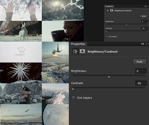
I ALWAYS start Aesthetic photosets by arranging the images and then *BRINGING THE CONTRAST ALL THE WAY DOWN.* This is especially helpful on photosets that include a mix of real photography, CGI screencaps or art, and/or comics panels, but it’s also just useful in general for photosets that use images from a wide variety of places.
The reason I do this is because it helps to “smooth out” the differences in light source, color balance, etc., that are part of the raw base images. For this set, it also helps to define the variations in color between very similar shades: the craters on Crait, the wisps of clouds, etc.
In some cases, I’ll do two layers of Contrast -50. For Crait, I did a later of Contrast -50 and then a layer of Contrast -15.
Then, I Select All > Copy Merged > [Turn Off Contrast Layer View] > Paste As New Layer.
Now, the “smoothed” version is placed as a layer above the raw layer. From there, it depends on the look of the photoset what I do -- sometimes, I leave it as-is, but I almost always lower the opacity on the “smoothed” layer until the level of contrast and balance looks consistent across the whole photoset. For Crait, I ended up with the “smoothed” layer set to Lighten 100%.
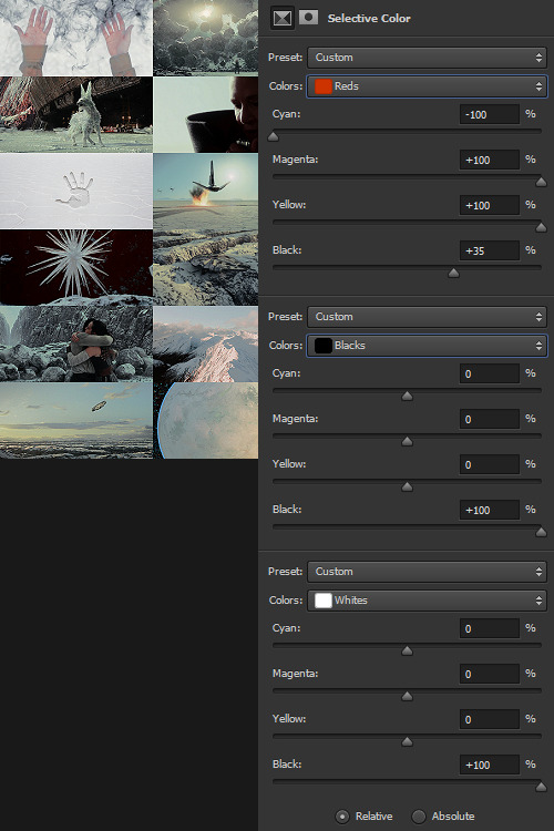
Selective Color time. There are two ways I usually start this: either one color at a time -- especially for Aesthetics like Pheryon that will essentially be monochromatic -- or, in this case, I looked at the balance of the three main colors that would carry through the entire Aesthetic.
REDS
Cyan -100 (This brightens the vivacity of the red.)
Magenta +100
Yellow +100
Black +35
BLACKS
Cyan 0
Magenta 0
Yellow 0
Black +100
WHITES
Cyan 0
Magenta 0
Yellow 0
Black +100 -- This is NOT my usual setting for adjusting white, and since white is one of the main colors in the Crait Aesthetic, it might seem counterintuitive to make the white darker instead of brighter. However, this will help to make next step of color adjustments “take” on the white/whitish surfaces a lot more easily, and it will also help to balance out the bluish sky areas with the white background areas. (I’m not sure this explanation makes sense? But it’s what I did.)
Then, I Select All > Copy Merged > [Turn Off Selective Color Layer View] > Paste As New Layer > Either COLOR or HUE 100%.
“Hue” is more effective for smaller, more incremental color adjustments -- for BIG SWEEPING COLOR CHANGES, “Color” tends to work better. But it totally depends on the photoset! Try both, and see which you like better.
I feel like this is kind of the step where my process of making aesthetics stops being any different from most tutorials -- but this has been HUGELY helpful for me, a non-graphic designer-person, to be able to create a kind of “base image” that has very similar color values, brightness/contrast, and vibrance.
Sometimes this step helps to create really extreme color differences, such as in the Raydonia Aesthetic, and other times, I use it to just adjust one or two color-values so that there’s more consistency in, say, shades of yellow or shades of green, as in the Takodana Aesthetic, for which I just wanted to create a more cohesive palette of green in particular... it started out with a zillion greens, and I wanted to bring it all together into one “aesthetic.”
I think this step, and the reasoning behind it, are why SO MANY PSDs for aesthetics rely on a layer of either gray or sepiatone-ish set to Darken or Multiply as one of their key layers. But I’m just not about the grimdark life, and if I’m making an AESTHETIC OF A THING, I want the aesthetic POST to actually HAVE THAT THING’S AESTHETICS, you know?! I want to use the colors of the thing that I’m saying is meant to evoke the visuals of the thing!
Anyway. Now you have your BASE IMAGE. Often I’ll Merge All here, just for my own sanity.
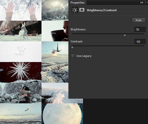
Then I go in and make any other other adjustments on a “coloring” level that I think will help with the “vibe” I’m going for! For this Crait set, I definitely needed to bring the brightness up so that the white and red popped. However, bringing up the brightness also swallowed a lot of the detail in the white surfaces -- especially the planetary surface of Crait in that bottom-right space -- so I decreased the contrast again.
Brightness +70
Contrast -50
And then I go in for the macro-level adjustments of color using any mix of Selective Color, Hue/Saturation, and Color Balance that works. For Crait, that was more Selective Color, because since I had decided on my color palette, and it sadly did not include blue, I needed to start by taking out as much of the blue, cyan, and green that I could.
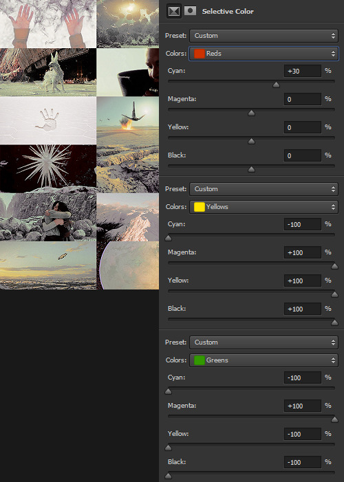
And I’m ngl, I told myself the WHOLE FREAKING TIME I was making this photoset that I needed NOT TO DELETE THE PSD RIGHT AWAY LIKE I USUALLY DO so that I could write up all the settings for this step.
But it was a reflex. And I deleted the PSD right away like I always do.
So suffice to say, I just futzed with the levels one at a time until the RED was brought up a little, the YELLOW was brought up a lot, and everything else was brought down and/or hue-adjusted to sliiiide into being yellow, red, or black/white.
Another Select All > Copy Merged > [Turn Off Selective Color Layer View] > Paste As New Layer > Either COLOR or HUE 100%. I think I also DUPLICATED this layer and set it to SOFT LIGHT 50% and then duplicated it again to SCREEN 50%.

I could have left it like this, but I am me and I am nothing if not Extra All The Time, so I opened up my folder of light textures (and other textures) and decided to Go To Town.
Textures & Effects
For your Aesthetic-Making Purposes, here are the three I used on the Crait set:
The first two were set to Screen 100%, and the bottom one was set to Burn 15%. I layered them in this order.
It still looked incomplete, so I decided to use this POWDR Element from Creative Market, which is actually like 5400x5400 pixels and which I’m not going to share here because I paid for it and don’t want CM to revoke my access or whatever, but it looks like this, only HUGE:
I also set this element to Burn 15% and moved it around the image until it looked the way I wanted it.
Textures and effects aren’t In on Tumblr anymore, but I really like using them -- they add, not to be cheesier than usual, texture to an aesthetic post, and I think that they can also help less-skilled graphic-makers like me to hide any myriad of imperfections in coloring, sharpening, whatever. I’m an especially big fan of this noise element (set as a pattern on Screen), so I’m going to share it here even though I didn’t use it on the Crait set:

Most of my textures have been saved over the last literally twenty years since I started making fannish graphics and photosets, largely from defunct old LiveJournals, but there also used to some great sources for them on Tumblr and still are live sources for them on DeviantArt. Just search around and you’ll find what you want! :)

In conclusion, I think it’s infinitely more fun NOT to rely on premade PSDs or standardized Settings, but I also recognize and fully respect that if I made graphics differently, I would probably get easily 5-10x more notes on each post than I do. But I make graphics the way that’s fun for me, and I just try to learn a little something from every set I make. The GFFA Planets/swworlds in particular have been something that I started, originally, because I wanted to catch up and learn about Star Wars planets that I felt like I was missing because I don’t have any fannish history with the Old EU, and I wanted to learn about them in a way that helped me feel like I was engaging with the SW source material AND making the enormity of the canon more accessible to other newish or casualish fans, like I was two years ago when I started this aesthetic series. I like making aesthetics that are genuinely inspired by the aesthetic of the thing that I’m calling it an aesthetic of, so even when it ends up just looking like rainbow barf (CURSE YOU, NAR SHADDAA!!!) I’m having fun.
THAT SAID, here’s how the time breakdown for the Crait set works out:
TOTAL TIME INCLUDING IMAGE COLLECTION AND SCREENCAPPING: Est. 20 hours.
COLORING AND ACTUAL GRAPHIC-MAKING PART: 7 hours.
WRITING UP THIS TUTORIAL: 5 hours.
So, um, if you are so inclined, here is my Ko-Fi link. I post at least two graphic sets every week, sometimes up to 25 (usually during October).
I hope this was helpful at all! I had a good time thinking about my process in-depth like this, and I would love to get tagged in any aesthetics you might try making using a similar method! :)
57 notes
·
View notes
Photo
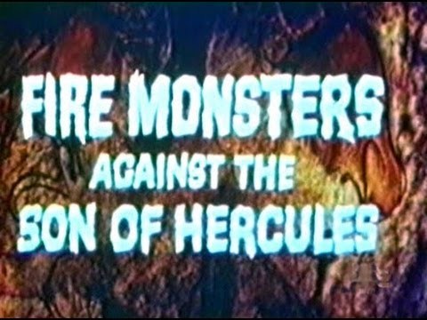
Fire Monsters Against the Son of Hercules
This here Sword-And-Sandal epic was directed by Guido Malatesta, who wrote the screenplay for Colossus and the Headhunters, and stars Margaret Lee, of Secret Agent Super Dragon; Luciano Marin, of Hercules and the Captive Women; and Andrea Aureli, of The Loves of Hercules. Clearly this one is fully qualified, even without the hilariously unconvincing monsters that peer out of every corner. My copy is an ancient VHS that looks like sun-baked shit and for some reason has no title card.
A tribe of cavemen, who I will call the Sun Tribe, are migrating south to escape the ice age. They reach the edge of the glacier, I guess, and build a village, but soon find themselves being menaced from multiple angles. There’s a stupid monster puppet living in the local lake, and another tribe already making their home nearby, the Moon Tribe, who have a strict anti-immigration policy. Lucky for them, Maxus the Son of Hercules happens to be in the area, and he’s all about fighting monsters and protecting the rights of refugees! Lots of people swing Styrofoam clubs and throw fake spears at each other, more terrible puppet things show up so Maxus can kill them, and I sit and think about how Cave Dwellers would be a much better title for this movie than it was for Cave Dwellers.
Holy fuck, you guys, this movie is so bad. It has its dull stretches but most of them don’t go on too long, and whenever something is actually happening it is hilariously awful. I could fill this whole review with a bullet list of the moments that made me laugh.
We’ll start with the dubbing, which critic Howard Hughes (not that Howard Hughes) described as the worst of all time. He clearly hasn’t seen Gamera vs Guiron but it’s still really bad. It’s not so much the performances, which are kind of crappy but no more so than in a thousand other lousy imported movies. It’s the lipsync, or rather, the lack thereof. Nobody made any effort to match the English dialogue to the way the actors’ mouths move. Sometimes it’s distracting. Sometimes it’s funny as hell. Sometimes it’s annoying. Sometimes it loops right back around to being funny again. The best part is that to re-release Maciste Contro i Mostri as Fire Monsters against the Son of Hercules, they had to dub the name Maxus over every occurrence of Maciste. The guy they hired to do so has a voice several notes higher than the original dub actor for Maciste, and introduces himself like he’s on a phone sex line.

The onscreen cast are pretty bad, too. The actors look like they belong in the ice age about as much as anybody in Deathstalker and the Warriors from Hell belonged in the Hyperborean. They’re all standing around dressed in fun fur and those cow rugs you can buy at IKEA, and they all look kind of awkward and embarrassed about it. Maxus has an amusing henna pompadour and his primary facial expression is the ever-popular smug smirk. The women wander around in fake leather miniskirts and bouffant hairdos like they have no idea what they’re doing here. The cannibal tribe wear little horns on their heads, like they’re Vikings who haven’t invented helmets yet.
The monsters are unbelievably bad. I can’t actually think of an adjective to describe how magnificently terrible they are. They’re the fakest, fabricky-est puppets I have ever seen in a movie. The first water dragon Maxus slays looks like a cheap plush toy version of that thing from The Neverending Story. Another is represented by stock footage of what I think is a perentie lizard, which is only seen in a cutaway because they couldn’t be bothered to back-project it. A three-headed cave dragon looks like a hand puppet you’d buy on eBay and leave a bad review about because it fell apart the moment you took it out of the box. It looks like it’s made of construction paper and felt. It makes The Loves of Hercules look like Jurassic Park. The screencap doesn’t do it justice. You’d need to see this thing in motion to truly understand just how stupefyingly shoddy it really is.

Oh, and despite the title of the movie being Fire Monsters, not one of these stupid things breathes fire. I am both disappointed and relieved, in that I would have loved to see it but if they’d tried it on this budget they would probably have burned their sets down.
This delicious chocolate icing of badness is slathered on the rich, gooey cake of what actually happens in the movie, almost all of which is ridiculous. Maxus fights a bunch of boneless water serpent creatures while the camera pays loving attention to his crotch. There’s a bit where several people theatrically lose their balance on a log bridge and fall into the ravine one after another, and it’s funnier every time. Maxus and his love interest get buried up to their necks as a form of punishment and people stand around throwing things at them but never hit them because nobody in this movie can aim. Then they’re freed by a random earthquake that just happens to split the ground right where they are. I was staying with my parents at the time I first saw this movie, and to keep from waking them up in the wee hours with my laughter I had to munch pillows like a vampire wedding night.
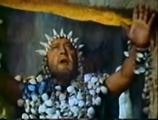
But I’m not here to laugh – or at least, not only to laugh – I’m here to analyze. Believe me when I say that very little in Fire Monsters against the Son of Hercules merits analysis, and even less is intended to be analyzed. The movie tries to set up a dichotomy between the two tribes. Our heroes, the Sun Tribe, worship fire and the sun god, live outdoors in wattle huts, and hold religious observances during the day. The bad guys, the Moon Tribe, worship the moon goddess, wear seashells and live in caves around an underground river, and sacrifice at night. Sun/Moon, Fire/Water, Day/Night, Peace/War, Light/Darkness, and to some extent Male/Female. It’s a list of opposites, so simplistic that I really can’t think of anything more to say than just to write them out. I doubt any deeper meaning was intended by it.
If I want something to actually talk about, Maxus never has an arc (I guess being the son of a demigod, he’s already perfect), but some of the minor characters do. The young chief of the Sun Tribe is supposed to be growing into that role, though he leaves most of the actual heroing to Maxus and it’s unclear how old he’s supposed to be (Luciano Marin was thirty-one when the movie was released). There is an interesting bit where he rails at the sun god for his misfortunes and is warned against it, but whether the gods actually exist or are active in this universe remains mysterious. It is true that a convenient eclipse halts a series of sacrifices, and that Maxus is saved by the volcano, but these could just be coincidences.
The odd thing about these two events, now that I think about it, is that while among the humans the Sun Tribe just want to live peacefully while the Moon Tribe wants to make war, their gods seem to have the opposite idea. If the eclipse (portrayed by effects people who clearly have no idea what an eclipse of the moon actually looks like) is the goddess’ doing, it is a frightening but peaceful intervention. Her worshippers asked for a sign, and she sent one that she does not approve. If the volcano is the work of the sun god, it is a catastrophic event that destroys the Moon Tribe’s home and livelihood, and kills many of the tribesmen. Not to mention that the main villain dies when the solar idol falls over and literally crushes him. Who’s advocating violence now?

I’ve gotten distracted, though. Getting back to the characters – the Sun Tribe’s leader is secondary not only to Maxus, but to Moa, the deposed rightful leader of the Moon Tribe. Moa probably gets more screen time than any other single character, and has the best claim, after Maxus, to main-character-hood. Her father and brothers have been murdered by the evil Fuan, who now wants to cement his claim to being legitimately in charge by marrying her, but she can’t stand him. I think she’s supposed to be one of those Strong Female Characters, but if so she’s a pretty half-assed effort.
For starters, while her introduction makes a big deal of her lost inheritance, she never does anything to try to reclaim it until Maxus turns up inside the caves. You’d think she could nurse a rebel cell biding its time or something, but all she does is sit on her shapely bottom and refuse to marry Fuan. I’m left with the impression that while she may be the obvious genetic heir, she actually doesn’t have any support base. The rest of the Moon Tribe prefers Fuan for some reason, and she’s left to sit there and pout and wait for a man to save her.
At the end of the movie, Maxus tells Moa that her job now is to make peace between her people and the Sun Tribe. One might expect the usual trope in which she does so by marrying the Sun Tribe’s leader, who is much more polite and less hairy than Fuan. He’s already got a wife, though, and saving her from the sacrificial block was a big part of his motivation. It’s no surprise, then, that Moa instead chooses to walk off into the sunset with Maxus. I guess she’s learned that nice girls don’t want political power.
That’s all pretty lousy, but the rest of the movie is all so deliriously fucking awful that there’s no point in taking it seriously, even as an example of shitty gender politics. Give this one a watch if you can. It’s a guilty pleasure, but a pleasure nonetheless.
#mst3k#reviews#episodes that never were#fire monsters against the son of hercules#my cheese steak#60s#we're running out of plots#curiously caucasian cavepeople
9 notes
·
View notes
Text
Editing Irina here: I have to admit this post got a bit away from me. instead of a simple list of anime directors I happen to like it turned into this little diatribe about the role of directors in anime production and now it’s way too long. Still I did enjoy writing it so I’m leaving it in but feel free to skip to the list section. I won’t be sad!
For some time I’ve been under the impression that anime directors have a much bigger impact on their end product than live action directors. By no means am I trying to imply that a traditional director does not shape the works they are a part of but for me, it wasn’t as flagrant. There are a lot of directors whose filmography stuns me. Unless they’re big names they don’t necessarily have that much control over the final cut so even renowned directors have some pretty confusing early movies. To me, I tend to notice writer directors way more, than those that stick to just directing.
But in anime, I almost never get caught off guard. I can usually see clear family resemblances between shows from a same series director even if they get produced by a different studio and are in completely different genres. I’m sure there are a lot of reasons for that but I think one of the main differences is storyboarding.
As far as I know, pretty much all shows and movies have storyboards. It’s a basic part of film production. I’m sure there are some rebels out there who just go out and wing it, but when it comes to animated works it’s considerably less optional. It also has more impact.
Even if a director didn’t write a particular series (or adapt it as is usually the case) they always have a final say on the storyboards, if they didn’t outright create them. The storyboards guide and shape the action in such a precise and deliberate way that it’s impossible not to leave a trace. This makes the director’s input as important and obvious as the writer.
or maybe not… no need to get mad
Of course, anime directors also have control of the appearance of a given series but unlike real life shows they are not bound by physical or budgetary constraints when it comes to setting and are never forced into bad casting…. Actually that’s not true. They don’t have to deal with any particular actor’s looks or physicality but they could get stuck with some horribly miscast voice actor and that can be just as damaging.
This said, as far as appearances go, animation in general allows for a much tighter control over the look of a series than would otherwise be possible. It also allows for easy signature looks. You know certain design styles and colours are favoured by certain directors and show up in most of their works. After a while you can tell at the glance when a new show is likely from a director you like. Of course you can get fooled.
The same type of signature look is very difficult and mostly, very expensive to recreate in a live action setting. Not to mention that because it is so involved, a lot of directors will purposefully avoid creating one as it can end up distracting from the story. I heard that in an interview. I don’t remember the director who said it but I like to think it was subtle shade at Tim Burton.
Animation is a more independent venture than traditional film making. Unlike actors on a set, animators do not have to be physically in the same room to create a scene. Everything is compartmentalized. Designers come up with a design. The tons of artists draw the different elements and scenes, separately. The images go somewhere else to be cleaned up and coloured. They then get put together and edited by different people once more. After that the voice and soundtracks are created. And all these people never even have to meet. The producer and director become much more vital to making sure all the moving parts fit together.
it sometimes works better than others
Because of how central the anime directors role is, they tend to leave their fingerprints all over the production. Not to mention that generally speaking, aside from new media (i.e. YouTube) most media has more oversight than anime and as such anime directors have more freedom to mould their shows than even western animation directors. Let me tell you, most of the stuff that comes out of the big anime studios would never fly at Disney. Wait, does Disney own anime now? It’s possible, they own everything else…
Once again, I want to make sure that I don’t sound like I’m trivializing the role of classic directors. They can make or break a movie or show in any format. I’m just saying that I personally feel the director’s presence more in anime than other mediums.
And it’s therefore particularly bad that I hardly ever acknowledge them. I speak or writers, voice actors, studios but I hardly ever mention directors. I would like to fix that today with a very short list of anime directors I am currently interested in. This is by no means an exhaustive list!
Hiroyuki Imaishi
Renowned key animator, director and co-founder of studio Trigger. Regardless of what people may say about Trigger’s narrative choices, most do agree that their productions are usually stylish and distinctive.
As a director Imaishi has helmed:
Dead Leaves (2004)
Gurren Lagann (2007)
Panty & Stocking with Garterbelt (2010)
Kill la Kill (2013)
Space Patrol Luluco (2016)
Promare (2019)
Considering my deep love for both Gurren Lagann, Kill la Kill and Promare, it’s not surprising that he tops my list. Beyond just the visual flare and fantastic palette choices, I find that Imaishi is very skilled at pacing high action with emotional verve. His works are often tongue in cheek and meant to convey deeper meaning and questioning through high speed antics and crazy over the top moments. He manages to balance out both plot and character development with good ole fashion fun in a way that has always managed to suck me in.
Kunihiko Ikuhara
A fantastic creator and veteran of the anime industry, if his name is attached to a project, it has my attention. Especially as a director. Utena alone was enough to win my devotion but this guy also directed:
Sailor Moon R (and a lot of Sailor Moon in fact – also Hell Yeah Sailor Moon!!!)
Revolutionary Girl Utena
Penguindrum
Yurikuma Arashi (will see this really soon)
Sarazanmai (I fell in love with this)
I don’t think I made my point clear enough, but Sailor Moon was a great series and it does NOT get enough credit. It should have been considered on of the Big Boys but somehow never makes the list. A travesty. Since Ikuhara often has a hand in writing or storyboarding the shows he directs, they often have a certain feel to them. That feel is bonkers. This guy loves him some surrealism and so do I. I don’t know what his next project will be but count me in.
Yuki Yase
Ok, I’m not gonna lie, I enjoy good visuals and strong compositions. I sort of give them disproportionate importance. So the director of Fire Force made this list. Whatever else it may be, the series has given me some of my best gallery posts by far.
Yuki Yase may not be quite as seasoned as the two I mentioned so far and although he’s worked as an episode director a lot (and in some very prestigious shows), he only has a few full series to his name:
Fire Force (TV)
Hidamari Sketch × Honeycomb (TV)
Kubikiri Cycle: Aoiro Savant to Zaregoto Tsukai (OAV)
Mekakucity Actors (TV)
Admittedly aside from Fire Force I’ve only seen Mekakucity Actors but it made an impression. I would say he is one of the most adventures directors I know, unafraid to experiment with productions. Sometimes even a bit too much but then again, I appreciate the verve. Both shows are distinctive and visually interesting which is enough to make me want to see what’s next.
Naoyoshi SHIOTANI
Naoyoshi Shiotani has been in the business for a while and racked up quite a few credits but as a director, he’s basically done two things. Blood+ and Psycho Pass. But pretty much all of Psycho Pass) I haven’t watched the second season of Psycho Pass (and I haven’t great things), but I have seen clips of it. And one thing I enjoy about Shiotani is his consistence. I can tell its Psycho Pass from a mile away. And it’s not all up to character designs and backgrounds. Colour choice, voice actor delivery, movement framing and camera angles. All of them have a very specific style and remain true in both movies and series throughout the years. There’s a dedication to his direction which I just appreciate. He also manages to spread out a complicated story in such a way that it’s clear for the audience without talking down to the viewers. That’s a gift.
Takuya Igarashi
Wikipedia makes a point of stating that Igarashi is a freelance director, I’m not sure why. And I might never have picked up on this guy until last season of Bungo Stray Dogs basically made me get a pinterest account so I could keep all my screencaps safe. It was gorgeous. The framing in the series, the angles… Beautiful and masterfully integrated into the atmosphere and ambiance of the series.
Bungo Stray Dogs (TV) :
Bungo Stray Dogs (TV 3) :
Bungo Stray Dogs 2 (TV) : )
Bungo Stray Dogs: Dead Apple (movie) :
Bungo Stray Dogs: Hitori Ayumu (OAV) :
Captain Earth (TV) :
Ojamajo Doremi (TV) :
Sailor Moon Sailor Stars (TV) (Hells Yeah Sailor Moon)
Soul Eater (TV) (whoa)
Star Driver (TV)
Zatch Bell: Attack of Mechavulcan (movie 2)
So I guess the moral of the story is, I like directors who worked on Sailor Moon at some point? Good moral. Let’s go with that!
I am going to start paying more attention to the production team when new anime get announced cause that’s usually the best indicator of how likely I am to enjoy a show. Who am I kidding..? I’m gonna look at the promo picture band decide entirely based on that. Reading is hard guys! But maybe I’ll look at the production staff of the first few shows! Baby steps.
Do you have any favourite anime directors? Who are they?
Way Too Long My Top 5 Anime Directors post Editing Irina here: I have to admit this post got a bit away from me. instead of a simple list of anime directors I happen to like it turned into this little diatribe about the role of directors in anime production and now it's way too long.
0 notes
Text


Gunnar 💙
16 notes
·
View notes
Text
🌒❤️🔥🌾

Rebel Moon


#michiel huisman#gunnar#best actor#rebel moon#rebels#a child of fire#all day#zack snyder#netflix#my screencaps#redemption
13 notes
·
View notes
Last Seen Blogs

cozyzoeyfavorcoffee
CozyZoeyFavorCoffee

frecciabestetti
Freccia Bestetti

atd-sportscars-blog
ATD-Sportscars
confi-daunts
heurgh persona brainrot
yeahiwasintheshit
yeah, i was in the shit