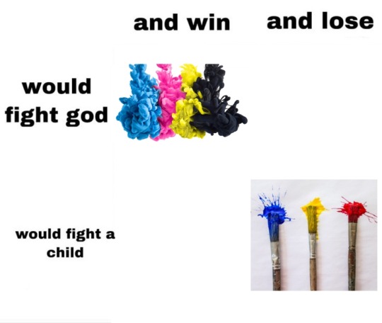
#ryb
Text

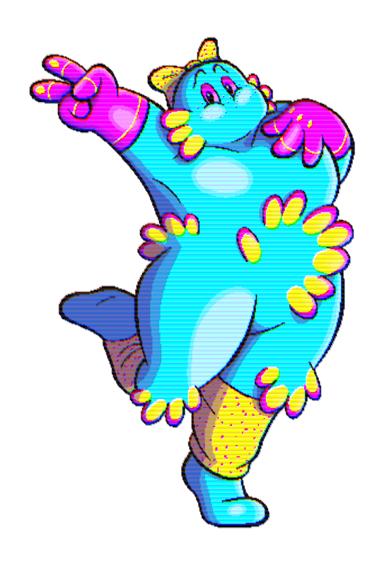
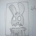
making a face (digital, 2023)
7 notes
·
View notes

Text
Seems like you have a few callers. Would you answer?


AND NOW FOR SOME INFO AND FUNFACTS!!! Cause why not
(From left to right) Their names are Robby, Rigby, and Cimmy. All their last names are Triphex
Robby and Rigby go by “He/They” while Cimmy goes by “She/They”. All of them are Colorgender.
They’re actually triplets (or that’s what they all say at least). Robby is eldest, Cimmy is the middle, and Rigby is youngest
They come from a place in between the Old Web and Kidcore domains of their world. They’re biracial in a way
And here are their interests!
Robby - meteorology, swimming & surfing, beaches, water, anything tropical
Cimmy - theater, critiquing movies/shows, clothes, accessories, anything colorful
Rigby- world history, reading & writing, libraries, museums, anything academia
All of them enjoy teaching others about their interests!
#hal-arts#digital art#artwork#artists on tumblr#ocs#original character#original content#what are life’s pronouns?#robby triphex#cimmy triphex#rigby triphex#webcore#old web#kidcore#kiddiecore#colorful#retro aesthetic#tw eyestrain#rgb#ryb#cmyk#pixel art#webcore oc#kidcore oc#xenogender#colorgender#original worlds
6 notes
·
View notes
Text
Red: The longest wavelength on the spectrum of visible light, often identified first in the rainbow. Humans have cones in our eyes for reading it. Used as a primary colour in painting. Is a secondary colour in printing and can be achieved by mixing the primary colours magenta and yellow in equal amounts. Considered a “warm” colour. Often associated with fire or heat in general. A colour that stands out in nature as sign of edible fruit, a warning of poison, approaching autumn, sunrise and sunset, a wound, or inflammation owing to a burn or infection. Often the first colour named in a given society.
Vermillion: A long wavelength on the spectrum of visible light, rarely if ever identified in the rainbow. It is shorter than true red but longer than orange. Considered a tertiary colour in painting as “red-orange” by mixing 75% red with 25% yellow as primary colours*. It is a quaternary colour in printing made with colour values in ratio of 75% magenta to 100% yellow. Often referred to as a “brilliant red”. Rarely distinguished linguistically from red or orange except in fields of work dealing directly with colour. May otherwise be called a “reddish” orange or an “orangey” red.
Orange: A long wavelength on the spectrum of visible light, commonly identified in the rainbow. It is shorter than vermillion but longer than amber. Some humans have cones in their eyes for reading it, but this is very rare. Most human brains read it by making an approximation between red and what we see as yellow. Considered a secondary colour in painting by mixing the primary colours red and yellow in equal amounts. It is a tertiary colour in printing made with colour values in ratio of 50% magenta to 100% yellow. A relatively recently linguistically distinguished colour, previously simply subsumed under red or yellow. Most associated with the citrus fruit from which it gets its name.
Amber: A long wavelength on the spectrum of visible light, rarely if ever identified in the rainbow. It is shorter than orange but longer than yellow. Considered a tertiary colour in painting as “yellow-orange” by mixing 25% red with 75% yellow as primary colours. It is a quaternary colour in printing made with colour values in ratio of 25% magenta to 100% yellow. Sometimes considered a “golden yellow”. Most often associated with the fossilized tree sap from which it get its name, though this material can also be varying shades of white, red, or brown. It is also associated with honey.
Yellow: A long wavelength on the spectrum of visible light, commonly identified in the rainbow. It is shorter than amber but longer than lime. Used as a primary colour both in painting and in printing, but humans do not have cones for reading it, instead making an approximation between red and green. Considered a “warm” colour and the brightest, being indistinguishable from white when colour images are converted to a gray scale. Often associated with the sun. Considered “cheery”. One of the first colours to be distinguished after red, perhaps owing to its brightness, as another sign of autumn, infection, wilt, ripe fruit, or sunrise and sunset.
Lime: A wavelength on the spectrum of visible light, rarely if ever identified in the rainbow. It is shorter than yellow but longer than chartreuse. Considered a quaternary colour in painting as “yellow yellow-green” by mixing 87.5% yellow with 12.5% blue. It is also a quaternary colour in printing made with colour values in ratio of 25% cyan to 100% yellow. Though it takes its name from green citrus fruits its colour is more often seen in very young leaves or shoots in springtime. Rarely distinguished linguistically from yellow except perhaps to be identified as “greenish”.
Chartreuse: A wavelength on the spectrum of visible light, rarely if ever identified in the rainbow. It is shorter than lime but longer than harlequin. Considered a tertiary colour in painting as “yellow-green” by mixing 75% yellow with 25% blue. It is a tertiary colour in printing as well with colours values in ratio of 50% cyan to 100% yellow. It takes its name from a French liqueur whose shades vary between yellow and green. In nature the colour is observed in young plant growth in the springtime. Often simply subsumed under green.
Harlequin: A wavelength on the spectrum of visible light, rarely if ever identified in the rainbow. It is shorter than chartreuse but longer than true green. Considered a quaternary colour in painting as “green yellow-green” by mixing 62.5% yellow with 37.5% blue, and in printing with colour values in ratio of 75% cyan to 100% yellow. Rarely distinguished linguistically from true green except perhaps as “yellowish” or “bright”. A common colour in nature.
Green: A wavelength on the spectrum of visible light, commonly identified in the rainbow. It is shorter than harlequin but longer than erin. Humans have cones in our eyes for reading it and can distinguish more shades of it than our digital devices can. Despite this it is not the first colour named, likely because of its consistency as a background colour. Considered a secondary colour in painting by mixing yellow and blue in equal amounts, and in printing by mixing cyan and yellow in equal amounts. Most often associated with plants or with nature in general. It mostly has positive connotations, but can also be a sign of rotting food, infection, or a severe storm.
Erin: A wavelength on the spectrum of visible light, rarely if ever identified in the rainbow. It is shorter than green but longer than spring. Considered a quinary colour in painting by mixing 43.75% yellow with 56.25% blue. It is a quaternary colour in printing made with colour values in ratio of 100% cyan to 75% yellow. It takes its name from the country of Ireland, which is associated with lush green as a result of frequent rain. It is rarely distinguished linguistically from green except as “bluish”, “cool”, or “turquoise-ish”. Considered an attractive shade of green for gardens.
Spring: A wavelength on the spectrum of visible light, rarely if ever identified in the rainbow. It is shorter than erin but longer than aquamarine. Considered a quaternary colour in painting by mixing 37.5% yellow with 62.5% blue as “green blue-green”. It is a tertiary colour in printing with colour values in ratio of 100% cyan to 50% yellow. It likely gets its name from the colour of some healthy plants after the spring rains, such as tulip and hosta leaves, but can still be a confusing name due to shades of yellow-green being commonly associated with spring. May also be referred to as “seafoam”, “aqua-green” or even “turquoise”. Considered an attractive shade of green for clothing or jewelry.
Aquamarine: A wavelength on the spectrum of visible light, rarely if ever identified in the rainbow. It is shorter than spring but longer than cyan. Considered a quinary colour in painting by mixing 31.25% yellow with 68.75% blue. It is a quaternary colour in printing with colour values in ratio of 100% cyan to 25% yellow. It takes its name from a colour variety of the beryl gemstone that is most often a light cyan to azure, but sometimes the shade described here. Used much in the same way spring and cyan are in clothing and jewelry. A very uncommon colour in nature outside tropical regions where it is viewed in shallow seas.
Cyan: A wavelength on the spectrum of visible light, sometimes but not always identified in the rainbow. It is shorter than aquamarine but longer than capri. Considered a tertiary colour in painting by mixing 25% yellow with 75% blue as “blue-green” or “teal”. True cyan cannot be made with the RYB colour model+. It is therefore a primary colour in printing, but humans do not have cones for reading it, instead making an approximation between green and blue. The physical colour is considered “brilliant” or “neon”. As a secondary colour of light, its brightness is only succeeded by yellow. Often referred to as “aqua”, “turquoise”, or simply subsumed under blue. A very uncommon colour in nature outside tropical or polar seas.
Capri: A wavelength on the spectrum of visible light, rarely if ever identified in the rainbow. It is shorter than cyan but longer than azure. Considered a quinary colour in painting by mixing 18.75% yellow with 81.25% blue. It is a quaternary colour in printing with colour values in ratio of 100% cyan to 25% magenta. Often subsumed under blue or cyan. Rarely referred to as “aqua”, sometimes referred to as “sky-blue”.
Azure: A short wavelength on the spectrum of visible light, rarely if ever identified in the rainbow, but commonly seen in the sky. It is shorter than capri but longer than cerulean. Considered a quaternary colour in painting by mixing 12.5% yellow with 87.5% blue as “blue blue-green”. It is a tertiary colour in printing with colour values in ratio of 100% cyan to 50% magenta. Often subsumed under blue, most often as “sky-blue”. Considered a calm colour, as indicated by the sky on a clear day.
Cerulean: A short wavelength on the spectrum of visible light, rarely if ever identified in the rainbow. It is shorter than azure but longer than blue. Considered a quinary colour in painting by mixing 6.25% yellow with 93.75% blue. It is a quaternary colour in printing with colour values in ratio of 100% cyan to 75% magenta. Often subsumed under blue. May occasionally be referred to as “sky-blue”. Most often associated with large bodies of water.
Blue: A short wavelength on the spectrum of visible light, commonly identified in the rainbow. It is shorter than cerulean but longer than indigo. Humans have cones in our eyes for reading it and can distinguish countless shades of it. Used as a primary colour in painting. It is a secondary colour in printing, consisting of equal cyan and magenta colour values. It is a considered a “cool” colour, especially when contrasted with red. True print blue is sometimes seen as more on the “purple” side when compared to azure. Blue is often the last colour range to be named, likely due to the consistency of the sky and that it doesn’t signify warning, seasonal change, and only very rarely ripe fruit. It also doesn’t stand out on a landscape of green. However, it is a common favourite colour perhaps because of the positive connotations of water and a clear sky. In gardens it does stand out among red and yellow flowers and is a popular colour choice for clothing and jewelry.
Indigo: A short wavelength on the spectrum of visible light, commonly identified in the rainbow. It is shorter than blue, but longer than violet. Considered a tertiary colour in painting as “blue-violet” by mixing 25% red with 75% blue. It is a quaternary colour in printing with colour values in ratio of 75% cyan to 100% magenta. While often subsumed under blue or violet, it is still more frequently identified than other tertiary-quinary colours, perhaps owing to the availability of dyes that can produce the colour. It is associated with twilight and often confused with or synonymised with “navy blue”, “midnight blue”, or “aubergine”, owing to the relative darkness of its most saturated shade compared with that of other colours.
Violet: The shortest wavelength on the spectrum of visible light, commonly identified in the rainbow. Humans do not have cones for reading it but our brains make an approximation of blue and red, more on the blue side. Considered a secondary colour in painting by mixing equal amounts of red and blue. It is a tertiary colour in printing with colour values in ratio of 50% cyan to 100% magenta. Relatively recently distinguished due to at-the-time rare dyes giving it an association with royalty, it was often and sometimes still is subsumed under blue or rarely red. It is a well-liked colour associated with grapes and plums, twilight, or flowers, some of which it share its name with.
Purple: Beyond the spectrum of visible light, rarely if ever identified in the rainbow unless as a synonym of violet. It is an approximation made by our brains to go between what we see as violet and what we see as magenta. Considered a quaternary colour in painting as “violet red-violet” by mixing 62.5% red with 37.5% blue. It is also a quaternary colour in printing with colour values in ratio of 25% cyan to 100% magenta. Often considered synonymous with violet, though side by side the two are quite distinct, with violet being more “cool” and purple being more “warm” or “pinkish”. May at times be subsumed under magenta. In the past it was subsumed under red or rarely blue.
Magenta: Beyond the spectrum of visible light, yet often identified in the rainbow as the last colour or even sometimes the first before red. It is an approximation our brains make between red and blue that is opposite to green, since green light is absorbed by “magenta” objects. Considered a tertiary colour in painting as “red-violet” by mixing 75% red with 25% blue. True magenta cannot be made with the RYB colour model. It is therefore a primary colour in printing. Also called “fuchsia” or “shocking pink”. Though often associated with pink, pink is more accurately a pale red. It is considered an extremely feminine colour in modern times owing to branding targeting women and girls. Has been subsumed under red in the past. In sweets it is often associated with strawberries, cherries, or raspberries. But the fruits with a “true” magenta colour are some dragonfruits, some gooseberries, some currants, and others not commonly found as flavours in sweets.
Cerise: Beyond the spectrum of visible light, rarely if ever identified in the rainbow. It is an approximation our brains make between what we see as magenta and what we see as rose. Considered a quinary colour in painting by mixing 81.25% red with 18.75% blue. It is a quaternary colour in printing with colour values in ratio of 100% magenta to 25% yellow. It is almost always subsumed under magenta with the same associations with candy flavours. Also called “fuchsia” or “pigeon’s blood”.
Rose: Beyond the spectrum of visible light, rarely if ever identified in the rainbow. It is an approximation our brains make between red and what we see as magenta. Considered a quaternary colour in painting as “red red-violet” by mixing 87.5% red with 12.5% blue. It is a tertiary colour in printing with colour values in ratio of 100% magenta to 50% yellow. It is often subsumed under red or sometimes magenta. The flower from which it gets its name is most often associated with a red-pink-magenta-white colour range, though they can also be yellow, green, or even violet. It is sometimes called “fuchsia”, “pigeon’s blood”, “watermelon”, “ruby” or “pinkish red”. It is considered an attractive colour for clothing or gardens.
Crimson: Beyond the spectrum of visible light, rarely if ever identified in the rainbow. It is an approximation our brains make between red and what we see as rose. Considered a quinary colour in painting by mixing 93.75% red with 6.25% blue. It is a quaternary colour in printing with colour values in ratio of 100% magenta to 75% yellow. It is often subsumed under red or sometimes rose and rarely distinguished from either except as “pinkish red” or “rose red”. It is sometimes called “blue-red” or “ruby”, and confusingly its name “crimson” is often also given to dark red or “blood red”.
This is far from every hue of colour we can visibly distinguish and did not include dark versions or pale versions. And I could have left it at red, orange, yellow, chartreuse, green, spring, cyan, azure, blue, violet, magenta, and rose. But it didn’t feel right to leave out yellow-orange, red-orange, indigo, and purple, and if I had those I had to include the rest.
*This is a baseline, but painting in art rarely involves exact amounts, and in printing digital colour values often don’t reflect the amounts of inks being used.
+Though the RYB model is used in art for basic mixing, artists are not limited only to the shades that model can create. There are many pigments an artist can use directly, and even the CMYK model of printing has its limits in brightness, which is why six-colour printers exist and why press printers may apply PANTONE inks directly.
#colours#RGB#Red Green Blue#CMYK#Cyan Magenta Yellow blacK#RYB#Red Yellow Blue#light vs paint vs ink#visible spectrum#wavelengths of visible light#post no one asked for#except they kind of did#because so many of you assholes keep being like#define the colour red!#without using the word red in the definition!#I did#don't challenge me#colour is literally my job
48 notes
·
View notes
Text

they're competing for love
(etsy)
#digital art#cat#cats#warrior cats#...not any specific cats tho. just had wc in mind while drawing#shape language#red yellow blue#ryb
26 notes
·
View notes
Text

#artists on tumblr#ink drawing#watercolor#aesthetic#artwork#color wheel#winsorandnewton#watercolour sketch#sketchbook#sketch#ryb#modern color#painting
3 notes
·
View notes
Text

red yellow blue
check out these bracelets i made on my main blog <3
#might make a whole set ryb bracelets to post here#ryb#red#yellow#blue#red yellow blue#primary colors#bracelet#jewelry#bead jewelry#gradient
4 notes
·
View notes
Text


got some new markers for Xmas and played around with them a few nights ago!
#my art#ink draws stuff#acrylic markers#acrylic#sketchbook#traditional art#RYB#primary colors#angels
2 notes
·
View notes
Text

catching up with my art - part 28
cute little ghost doodle, originally shared on june 3, 2022
#ghostieking#instagram#ghost#ghostie#cute#cute ghost#comic#comic art#digital art#digital doodle#doodle#colorful#ryb#original art#artists on tumblr#art#aesthetic#artoftheday#digital drawing#small artist#drawing
2 notes
·
View notes
Text
1 note
·
View note


Text

Ultraista - Ordinary Boy - The Remixes
0 notes
Text
1 note
·
View note
Text
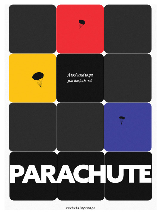
Let's get tf up outta here--
#adobe illustrator#graphic design#graphic art#illustrator#parachute#mentally tired#save yourself#just jump#ryb#primary colors
1 note
·
View note
Text
Had a funky dream about Ryan Bergoogoo - can someone confirm that he’s okay and still terrorizing the internet and the dead lmao
#ryb#it was sexy until he like disappeared into a void and was like screaming#he went out doing the thing he loves I suppose#parting is such sweet sorrow that I shall say goodnight till it be morrow & etc
1 note
·
View note
Last Seen Blogs

aquaritos
kai .ᐟ

arandompigeon5
ARandomPigeon
abyssbun
You have just entered the wut
the-semicolonoscopy
The Semicolonoscopy

nov6l66
N