#Cyan Magenta Yellow blacK
Text
Red: The longest wavelength on the spectrum of visible light, often identified first in the rainbow. Humans have cones in our eyes for reading it. Used as a primary colour in painting. Is a secondary colour in printing and can be achieved by mixing the primary colours magenta and yellow in equal amounts. Considered a “warm” colour. Often associated with fire or heat in general. A colour that stands out in nature as sign of edible fruit, a warning of poison, approaching autumn, sunrise and sunset, a wound, or inflammation owing to a burn or infection. Often the first colour named in a given society.
Vermillion: A long wavelength on the spectrum of visible light, rarely if ever identified in the rainbow. It is shorter than true red but longer than orange. Considered a tertiary colour in painting as “red-orange” by mixing 75% red with 25% yellow as primary colours*. It is a quaternary colour in printing made with colour values in ratio of 75% magenta to 100% yellow. Often referred to as a “brilliant red”. Rarely distinguished linguistically from red or orange except in fields of work dealing directly with colour. May otherwise be called a “reddish” orange or an “orangey” red.
Orange: A long wavelength on the spectrum of visible light, commonly identified in the rainbow. It is shorter than vermillion but longer than amber. Some humans have cones in their eyes for reading it, but this is very rare. Most human brains read it by making an approximation between red and what we see as yellow. Considered a secondary colour in painting by mixing the primary colours red and yellow in equal amounts. It is a tertiary colour in printing made with colour values in ratio of 50% magenta to 100% yellow. A relatively recently linguistically distinguished colour, previously simply subsumed under red or yellow. Most associated with the citrus fruit from which it gets its name.
Amber: A long wavelength on the spectrum of visible light, rarely if ever identified in the rainbow. It is shorter than orange but longer than yellow. Considered a tertiary colour in painting as “yellow-orange” by mixing 25% red with 75% yellow as primary colours. It is a quaternary colour in printing made with colour values in ratio of 25% magenta to 100% yellow. Sometimes considered a “golden yellow”. Most often associated with the fossilized tree sap from which it get its name, though this material can also be varying shades of white, red, or brown. It is also associated with honey.
Yellow: A long wavelength on the spectrum of visible light, commonly identified in the rainbow. It is shorter than amber but longer than lime. Used as a primary colour both in painting and in printing, but humans do not have cones for reading it, instead making an approximation between red and green. Considered a “warm” colour and the brightest, being indistinguishable from white when colour images are converted to a gray scale. Often associated with the sun. Considered “cheery”. One of the first colours to be distinguished after red, perhaps owing to its brightness, as another sign of autumn, infection, wilt, ripe fruit, or sunrise and sunset.
Lime: A wavelength on the spectrum of visible light, rarely if ever identified in the rainbow. It is shorter than yellow but longer than chartreuse. Considered a quaternary colour in painting as “yellow yellow-green” by mixing 87.5% yellow with 12.5% blue. It is also a quaternary colour in printing made with colour values in ratio of 25% cyan to 100% yellow. Though it takes its name from green citrus fruits its colour is more often seen in very young leaves or shoots in springtime. Rarely distinguished linguistically from yellow except perhaps to be identified as “greenish”.
Chartreuse: A wavelength on the spectrum of visible light, rarely if ever identified in the rainbow. It is shorter than lime but longer than harlequin. Considered a tertiary colour in painting as “yellow-green” by mixing 75% yellow with 25% blue. It is a tertiary colour in printing as well with colours values in ratio of 50% cyan to 100% yellow. It takes its name from a French liqueur whose shades vary between yellow and green. In nature the colour is observed in young plant growth in the springtime. Often simply subsumed under green.
Harlequin: A wavelength on the spectrum of visible light, rarely if ever identified in the rainbow. It is shorter than chartreuse but longer than true green. Considered a quaternary colour in painting as “green yellow-green” by mixing 62.5% yellow with 37.5% blue, and in printing with colour values in ratio of 75% cyan to 100% yellow. Rarely distinguished linguistically from true green except perhaps as “yellowish” or “bright”. A common colour in nature.
Green: A wavelength on the spectrum of visible light, commonly identified in the rainbow. It is shorter than harlequin but longer than erin. Humans have cones in our eyes for reading it and can distinguish more shades of it than our digital devices can. Despite this it is not the first colour named, likely because of its consistency as a background colour. Considered a secondary colour in painting by mixing yellow and blue in equal amounts, and in printing by mixing cyan and yellow in equal amounts. Most often associated with plants or with nature in general. It mostly has positive connotations, but can also be a sign of rotting food, infection, or a severe storm.
Erin: A wavelength on the spectrum of visible light, rarely if ever identified in the rainbow. It is shorter than green but longer than spring. Considered a quinary colour in painting by mixing 43.75% yellow with 56.25% blue. It is a quaternary colour in printing made with colour values in ratio of 100% cyan to 75% yellow. It takes its name from the country of Ireland, which is associated with lush green as a result of frequent rain. It is rarely distinguished linguistically from green except as “bluish”, “cool”, or “turquoise-ish”. Considered an attractive shade of green for gardens.
Spring: A wavelength on the spectrum of visible light, rarely if ever identified in the rainbow. It is shorter than erin but longer than aquamarine. Considered a quaternary colour in painting by mixing 37.5% yellow with 62.5% blue as “green blue-green”. It is a tertiary colour in printing with colour values in ratio of 100% cyan to 50% yellow. It likely gets its name from the colour of some healthy plants after the spring rains, such as tulip and hosta leaves, but can still be a confusing name due to shades of yellow-green being commonly associated with spring. May also be referred to as “seafoam”, “aqua-green” or even “turquoise”. Considered an attractive shade of green for clothing or jewelry.
Aquamarine: A wavelength on the spectrum of visible light, rarely if ever identified in the rainbow. It is shorter than spring but longer than cyan. Considered a quinary colour in painting by mixing 31.25% yellow with 68.75% blue. It is a quaternary colour in printing with colour values in ratio of 100% cyan to 25% yellow. It takes its name from a colour variety of the beryl gemstone that is most often a light cyan to azure, but sometimes the shade described here. Used much in the same way spring and cyan are in clothing and jewelry. A very uncommon colour in nature outside tropical regions where it is viewed in shallow seas.
Cyan: A wavelength on the spectrum of visible light, sometimes but not always identified in the rainbow. It is shorter than aquamarine but longer than capri. Considered a tertiary colour in painting by mixing 25% yellow with 75% blue as “blue-green” or “teal”. True cyan cannot be made with the RYB colour model+. It is therefore a primary colour in printing, but humans do not have cones for reading it, instead making an approximation between green and blue. The physical colour is considered “brilliant” or “neon”. As a secondary colour of light, its brightness is only succeeded by yellow. Often referred to as “aqua”, “turquoise”, or simply subsumed under blue. A very uncommon colour in nature outside tropical or polar seas.
Capri: A wavelength on the spectrum of visible light, rarely if ever identified in the rainbow. It is shorter than cyan but longer than azure. Considered a quinary colour in painting by mixing 18.75% yellow with 81.25% blue. It is a quaternary colour in printing with colour values in ratio of 100% cyan to 25% magenta. Often subsumed under blue or cyan. Rarely referred to as “aqua”, sometimes referred to as “sky-blue”.
Azure: A short wavelength on the spectrum of visible light, rarely if ever identified in the rainbow, but commonly seen in the sky. It is shorter than capri but longer than cerulean. Considered a quaternary colour in painting by mixing 12.5% yellow with 87.5% blue as “blue blue-green”. It is a tertiary colour in printing with colour values in ratio of 100% cyan to 50% magenta. Often subsumed under blue, most often as “sky-blue”. Considered a calm colour, as indicated by the sky on a clear day.
Cerulean: A short wavelength on the spectrum of visible light, rarely if ever identified in the rainbow. It is shorter than azure but longer than blue. Considered a quinary colour in painting by mixing 6.25% yellow with 93.75% blue. It is a quaternary colour in printing with colour values in ratio of 100% cyan to 75% magenta. Often subsumed under blue. May occasionally be referred to as “sky-blue”. Most often associated with large bodies of water.
Blue: A short wavelength on the spectrum of visible light, commonly identified in the rainbow. It is shorter than cerulean but longer than indigo. Humans have cones in our eyes for reading it and can distinguish countless shades of it. Used as a primary colour in painting. It is a secondary colour in printing, consisting of equal cyan and magenta colour values. It is a considered a “cool” colour, especially when contrasted with red. True print blue is sometimes seen as more on the “purple” side when compared to azure. Blue is often the last colour range to be named, likely due to the consistency of the sky and that it doesn’t signify warning, seasonal change, and only very rarely ripe fruit. It also doesn’t stand out on a landscape of green. However, it is a common favourite colour perhaps because of the positive connotations of water and a clear sky. In gardens it does stand out among red and yellow flowers and is a popular colour choice for clothing and jewelry.
Indigo: A short wavelength on the spectrum of visible light, commonly identified in the rainbow. It is shorter than blue, but longer than violet. Considered a tertiary colour in painting as “blue-violet” by mixing 25% red with 75% blue. It is a quaternary colour in printing with colour values in ratio of 75% cyan to 100% magenta. While often subsumed under blue or violet, it is still more frequently identified than other tertiary-quinary colours, perhaps owing to the availability of dyes that can produce the colour. It is associated with twilight and often confused with or synonymised with “navy blue”, “midnight blue”, or “aubergine”, owing to the relative darkness of its most saturated shade compared with that of other colours.
Violet: The shortest wavelength on the spectrum of visible light, commonly identified in the rainbow. Humans do not have cones for reading it but our brains make an approximation of blue and red, more on the blue side. Considered a secondary colour in painting by mixing equal amounts of red and blue. It is a tertiary colour in printing with colour values in ratio of 50% cyan to 100% magenta. Relatively recently distinguished due to at-the-time rare dyes giving it an association with royalty, it was often and sometimes still is subsumed under blue or rarely red. It is a well-liked colour associated with grapes and plums, twilight, or flowers, some of which it share its name with.
Purple: Beyond the spectrum of visible light, rarely if ever identified in the rainbow unless as a synonym of violet. It is an approximation made by our brains to go between what we see as violet and what we see as magenta. Considered a quaternary colour in painting as “violet red-violet” by mixing 62.5% red with 37.5% blue. It is also a quaternary colour in printing with colour values in ratio of 25% cyan to 100% magenta. Often considered synonymous with violet, though side by side the two are quite distinct, with violet being more “cool” and purple being more “warm” or “pinkish”. May at times be subsumed under magenta. In the past it was subsumed under red or rarely blue.
Magenta: Beyond the spectrum of visible light, yet often identified in the rainbow as the last colour or even sometimes the first before red. It is an approximation our brains make between red and blue that is opposite to green, since green light is absorbed by “magenta” objects. Considered a tertiary colour in painting as “red-violet” by mixing 75% red with 25% blue. True magenta cannot be made with the RYB colour model. It is therefore a primary colour in printing. Also called “fuchsia” or “shocking pink”. Though often associated with pink, pink is more accurately a pale red. It is considered an extremely feminine colour in modern times owing to branding targeting women and girls. Has been subsumed under red in the past. In sweets it is often associated with strawberries, cherries, or raspberries. But the fruits with a “true” magenta colour are some dragonfruits, some gooseberries, some currants, and others not commonly found as flavours in sweets.
Cerise: Beyond the spectrum of visible light, rarely if ever identified in the rainbow. It is an approximation our brains make between what we see as magenta and what we see as rose. Considered a quinary colour in painting by mixing 81.25% red with 18.75% blue. It is a quaternary colour in printing with colour values in ratio of 100% magenta to 25% yellow. It is almost always subsumed under magenta with the same associations with candy flavours. Also called “fuchsia” or “pigeon’s blood”.
Rose: Beyond the spectrum of visible light, rarely if ever identified in the rainbow. It is an approximation our brains make between red and what we see as magenta. Considered a quaternary colour in painting as “red red-violet” by mixing 87.5% red with 12.5% blue. It is a tertiary colour in printing with colour values in ratio of 100% magenta to 50% yellow. It is often subsumed under red or sometimes magenta. The flower from which it gets its name is most often associated with a red-pink-magenta-white colour range, though they can also be yellow, green, or even violet. It is sometimes called “fuchsia”, “pigeon’s blood”, “watermelon”, “ruby” or “pinkish red”. It is considered an attractive colour for clothing or gardens.
Crimson: Beyond the spectrum of visible light, rarely if ever identified in the rainbow. It is an approximation our brains make between red and what we see as rose. Considered a quinary colour in painting by mixing 93.75% red with 6.25% blue. It is a quaternary colour in printing with colour values in ratio of 100% magenta to 75% yellow. It is often subsumed under red or sometimes rose and rarely distinguished from either except as “pinkish red” or “rose red”. It is sometimes called “blue-red” or “ruby”, and confusingly its name “crimson” is often also given to dark red or “blood red”.
This is far from every hue of colour we can visibly distinguish and did not include dark versions or pale versions. And I could have left it at red, orange, yellow, chartreuse, green, spring, cyan, azure, blue, violet, magenta, and rose. But it didn’t feel right to leave out yellow-orange, red-orange, indigo, and purple, and if I had those I had to include the rest.
*This is a baseline, but painting in art rarely involves exact amounts, and in printing digital colour values often don’t reflect the amounts of inks being used.
+Though the RYB model is used in art for basic mixing, artists are not limited only to the shades that model can create. There are many pigments an artist can use directly, and even the CMYK model of printing has its limits in brightness, which is why six-colour printers exist and why press printers may apply PANTONE inks directly.
#colours#RGB#Red Green Blue#CMYK#Cyan Magenta Yellow blacK#RYB#Red Yellow Blue#light vs paint vs ink#visible spectrum#wavelengths of visible light#post no one asked for#except they kind of did#because so many of you assholes keep being like#define the colour red!#without using the word red in the definition!#I did#don't challenge me#colour is literally my job
48 notes
·
View notes
Text


bahbee.....................
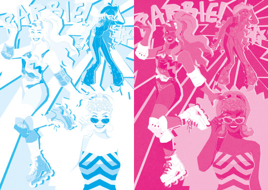
also doodled my barbie movie fit just for fun ^__^
#my art#barbie#barbie movie#barbie 2023#greta gerwig#mattel#margot robbie#fanart#cmyk#drew this only using cyan magenta yellow and black btw (i love making things more difficult than they have to be)#it was fun but it took soooo long dude. the worst part was having to simplify my style but still make her recognizable as margot robbie
902 notes
·
View notes
Text
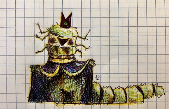
crying your honor i think he is fuzzy and soft. yes i am allergic to any foiliage ever but let me hug him please
#leshy cotl#cotl leshy#leshy#cult of the lamb leshy#cult of the lamb#cotl bishop#cotl bishops#cult of the lamb art#art#drawing#doodle#omega’s art#i did this with my ✨PRINTER PEN✨ that has only yellow cyan magenta and black#iam. a pinter
120 notes
·
View notes
Text
testing the printer. safe to say that it is not doing its job
#there's the smallest bit of magenta at the top but THATS IT... only yellow and cyan are coming through and it's driving me nuts#not even BLACK?#i changed the cartridges yesterday... i think the inks are just mad old and dried up#or however they work#btext
17 notes
·
View notes
Text
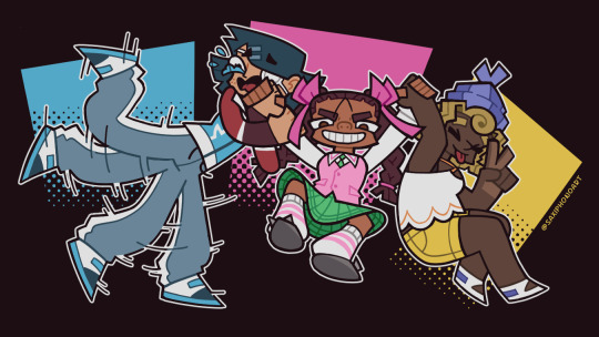
Ride or Dye!
#original character#illustration#character illustration#magical girl#magical girl oc#cmyk palette#oc: sal/cyan#oc: coney/magenta#oc: melissa/yellow#project black gamut#sal would've lined up with her background square if she hadn't chickened out seconds before the picture was taken
21 notes
·
View notes
Text
Rockin' Out
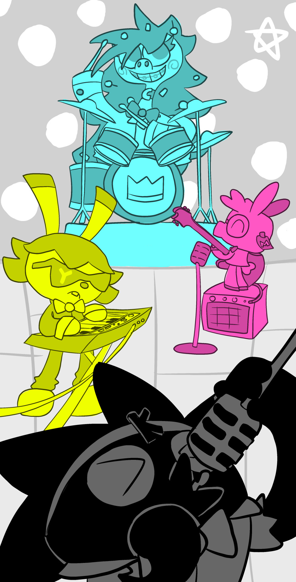
The Antagonists of my story formed a band
#animals#doodle#illustration#starstruck#original character#original art#anthro#anthro art#cmyk#bunny#cute#cartoonart#alpaca#dinosaur#bird#crow#cyan#magenta#yellow#black#SCC
14 notes
·
View notes
Text

Random World Building Tidbits
The World and Society of Palette
The planet Palette is cylindrical in shape. Any and all globes worldwide are just tin cans painted to look like a planet. The poles are on the flat ends, like a battery but with stuff living on it. The other planets in their solar system may or may be shaped the same way, but the moon looks normal.
The show’s universe takes place in the mental realm, as do all other universes of fictional media. Every scrapped idea, including the three cancelled continuities, is a branching timeline from any given show’s canon series.
While the show does not take place on Earth, references to real-world places exist due to the mental realm causing reality to leak into the show.
Such reality glitches exist in all shows that can interfere with the show’s timeline and cause minor inconsistencies the characters are unaware of. These glitches are colloquially known as “retcons”, but the politically correct term is “colossal blunders by the idiot writers”.
While everyone is at least vaguely aware that they’re cartoon characters in the sense that it’s their species, very few people, most of whom are affiliated with the in-universe It’s Color Theory crew, know there’s a greater universe out there. As a result, the more prominent characters have absolutely no regard for the fourth wall and a stronger grasp of cartoon physics.
Despite everyone being color coded, a character’s aesthetic family (Tough, Goofy, Creepy, Beautiful, Cool, Cute, Savvy, and Plain) is the closest thing to an in-universe ethnicity any of the characters have…despite all of them being designed with an ethnicity in mind.
Similarly, Drewmans can be divided into three groups: Enactors (those who do dumb stuff), Inhibitors (those who prevent dumb stuff), and Accomplices (those who upload the dumb stuff to the internet).
Because everybody’s desensitized to the cartoon shenanigans that occur daily, characters usually only derive amusement from things that are deliberately meant to be funny in-universe…unless they’re feeling particularly sadistic.
Domesticated animals share the same level of intelligence as the more humanoid Drewmans and are generally considered citizens. Some are independent home owners, but most simply live as pets to avoid having to pay taxes. Wild animals are also fairly intelligent, but cannot speak and live relatively normal animal lives.
Reality will shift so that the more important characters are more likely to have interesting things happen around them. These characters typically have more familiar colors, which is why the the six main characters happen to be the colors of the rainbow.
The show’s tone directly affects how the show’s continuity works. In general, the darker and edgier the show becomes, the more likely it is for things to stick between episodes.
Drewmans aren’t killed when they die. This is a relatively recent development in the universe’s history due to a long period of peace after the Wartime Cartoon era about a century back keeping the tone positive. As a result, “killing” is considered an incredibly outdated slang word that has been phased out by the younger generations in favor of euphemisms such as “murder”, “make die”, or “encorpsify”. Dying forces them to wait as ghosts to respawn in the next episode, but on a slow day one can potentially recover between shots. However, they can still die of old age or if the aforementioned tone shifts strike at the right time. On a lighter note, being a hitman is a surprisingly lucrative career, and meat consumption is largely guilt-free.
Drewman Biology
A Drewman’s outline is a protective organ that is effectively a balance between an exoskeleton and the natural surface tension of a Drewman’s gelatinous flesh. Inanimate objects also have these organs, which is very weird. Claytonians such as Sylvester lack outlines and are essentially amorphous when not standing still, but can absorb outlines from their surroundings for added rigidity.
Drewmans are naturally elastic, and can temporarily shapeshift new body parts should they desire.
Drewmans can lob off and regrow body parts at will, the latter usually offscreen because it is considered horribly rude to look at somebody as they do so. Subsequently, they can take obscene amounts of punishment. The caveat is that their default character design is the base of recovery, so if they had a preexisting condition, such as being born without a limb, they’re pretty much stuck like that. On the flip side, the fleeting tone shifts can cause permanent changes to a character design…
Drewmans completely lack sex organs, except for when they don’t. It’s just a censor bar. Biologically, they’re genderless. If a Drewman feels romantic attraction, they’re pan without exception. Also, don’t ask how they reproduce. It only seems to happen when nobody’s looking.
Similarly, Drewmans only need to use the bathroom once every three or four months. When they do, the bathroom in question is almost inevitably closed for repairs.
A Drewman’s hair stiffens as it ages. Children may have hairstyles that change between episodes, but by adulthood it’s committed to a standard character design. Getting one’s hair wet can temporarily undo this, and there are a number of products specifically for this purpose.
A Drewman’s color can harmlessly stain objects they handle and even entire rooms through close proximity. This is only a temporary change.
The Dullsville Dirt and ICT’s Founding
Dullsville is a city in Euphoria as the most populous town in the state of Misery. The town was initially populated entirely by Plain Family Gray Drewmans, hence the name, but saw an influx of immigrants following the Wartime Cartoons and is currently among the most diverse cities on the planet.
The mayor of Dullsville as of a couple of years prior to the series is Elroy Reginald Berriman, a Royal Blue Drewman who stepped into the position after forty years of barely restrained anarchy due to absolutely nobody else wanting the title “Mayor of Dullsville”. His goal in life is to make Dullsville a (literally) picturesque town people want to live in…which of course brings him into conflict with Violet and the ICT crew, whose mere presence seems to bring chaos. As a side effect of the extended period of no real authority, the town’s youth, namely the small children, are remarkably more well adjusted than the adults.
Dullsville has two primary claims to fame. The first is its position as the “Supervillain Capital of the World”, due to no less than four distinct villainous factions being based there. The other is the Cosmic Latte Café, a world famous chain of coffee restaurants founded and somehow single-handedly managed by Brock Wipper, the Pitch Black Drewman whose face is unknown to the public despite running every CLC on the planet simultaneously. In the former’s case, Elroy actively hates the supervillain issue and has offered benefits to the superhero factions keeping them in line. The latter is of no concern to him, but he feels that a coffee shop that one could find anywhere isn’t the greatest tourist trap.
Due to the whole villain thing along with the ludicrously lax laws in Dullsville taking toon physics into account, crime rates are notably low, most emergencies being left to the various town superheroes. Only a sole officer is in charge of lesser crimes.
It’s Color Theory, Mayor B.’s main obstacle to a normal life, was founded by Violet Oobay, Gordon Monade, Angie O’Jayes, Rudy Razbry, J. Razbry, and Chloe Spearmin. The company, initially an outlet for a young Violet to publish her creative writing, started life as a small club consisting of the then eight-year-old Violet, Gordon, and a select few other friends in their childhood town of Happy Place in the state of Mind.
Over time, all but Violet and Gordon drifted apart, even Violet herself growing disillusioned with the lack of recognition the two had received, but the company saw new life after three relatively uneventful years in college, when a senior year Violet’s new freshman roommate encouraged (read: dragged) her and Gordon to continue their entertainment activities.
Violet and Gordon married soon after graduating and moved alongside Angie to Dullsville 2 years later, foolishly thinking it was a quiet town to raise their infant daughter. Instead, they immediately meet Rudy and J., twin stepbrothers who seem to personally know everyone in town and are charitable enough to let the startup trio move in. Inspired by the bros’ antics, Violet shifted her focus from simple writing to sketch comedy.
The final founding member, Chloe, was a then-child prodigy working as a company intern for college credit. Initially she only served as an assistant, but her increasingly impressive skills in inventing earned her a spot full time in the company, a spot she accepted since most other companies feared her. With her joining, the Founders of It’s Color Theory (FICT) had formed one year prior to the series’ start.
During that time period after Chloe’s admission, Violet started getting visions of a world on the other side. Visions of people trying to reach through the barrier between worlds to get to her. Visions of people who were invested in her success, even though they had no way of actually seeing her face to face. From then on, Violet’s life took on a new trajectory, starting with her spearheading a project to broadcast the city’s happenings to whatever extradimensional beings were interested. For months on end, Violet and Chloe worked tirelessly for results, but nothing came up…until it did. “Oh my muse, it works.”
Over time, more and more people joined the ICT crew, the first 24 being considered their core cast and longest serving members…but that’s a story for the future.
#dullsville#it’s color theory#ict#character design#original character#artists on tumblr#yellow#magenta#lime green#crimson#tan#gold#teal#violet#white#brown#scarlet#cyan#purple#black#blue#orange#indigo#olive#azure#pink#beige#red#green#grey
16 notes
·
View notes
Text
spinning cymtime concepts around in my brain
#before: black red green and blue color scheme#beginning: grey green and blue color scheme#current: white grey cyan yellow and magenta color scheme
11 notes
·
View notes
Photo

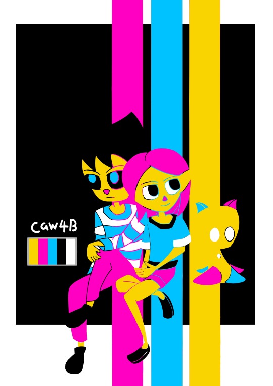
Sadie X Hector: CMYK Challenge
Wishing you a Joyous June! I’m joining in the fun today with this piece of Sadie mac Lir, Radiance The Ginger and returning in his glorious form, Hector James Dagger is back!
The CMYK challenge or the Cartoon Network Challenge is a very simple task where artists are encouraged to draw and color their characters but have them colored in the Cayan, Magenta, Yellow and Black (CMYK) color bar with no lineart.
Caution: bright colors that could cause irritation

It was a challenge proposed by [Moppy-stuff #1ParasiteEnthusiast] and the results were fantastic! I also wanted to take this moment to test out the new skin tones for Sadie and Hector respectively since I’m not really happy with how they were colored.
The changes are minor but they are useful for the long run. Hector is intended to be more tan but not as much. Sadie is pale due to her early age condition that forced her to stay indoors. I made two versions. One is the actual challenge while the other is just the clothing choice being changed.
Thanks for reading
-Caw4B-

#murder the crow#kingshavenacademy#sadie mac lir#hector james dagger#hector dagger#radiance the ginger#radiance#hoodlites#cmyk challenge#Cartoon Network Challenge#cartoon network palette challenge#cmyk#cmyk palette#cartoon network#cyan#magenta#yellow#black#friends#partners#artist challenge
31 notes
·
View notes
Text
tried to make something that looks how my adam green/moldy peaches playlist sounds
12 notes
·
View notes
Text
4CP | Four Color Process
1 note
·
View note
Photo
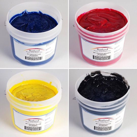
Rutland NPT @IncRutland Process Colours for #CMYK 👉 http://ow.ly/W1fW308LKm3 👈👀😉😊😍❤️ ☎️01942888747 #Textiles #Screenprinting #Cyan #Magenta #Yellow #Black US Gallon & 1ltr sizes Prices Online Ideal for all types of #Silkscreen #Fabric #Handmade #Tshirts #Merchandise #Merch #BandMerch #Apparel #HandPulled #TShirtPrinting #TextilePrinting #FabricPrinting #GarmentPrinting Screen Print Industry #ScreenprintingUK #PrintLife #Ink (at Screenstretch Ltd) https://www.instagram.com/p/Cn-GFlioGZX/?igshid=NGJjMDIxMWI=
#cmyk#textiles#screenprinting#cyan#magenta#yellow#black#silkscreen#fabric#handmade#tshirts#merchandise#merch#bandmerch#apparel#handpulled#tshirtprinting#textileprinting#fabricprinting#garmentprinting#screenprintinguk#printlife#ink
2 notes
·
View notes
Text
i love sorting my items in alphabetical order in minecraft the only issue is fucking dyes
#ANYTHING THAT CAN BE DYED BRINGS ME PAIN#THERE'S SO MANY FUCKING DYEABLE ITEMS#THE B SECTION HAS THREE ENTIRE COLOURS IN IT AND IM RUNNING OUT OF S P A C E#SAME WITH THE FUCKING LS#THERE'S ALSO RED MUSHROOMS AND NTHER BRICKS AND REDSTONE AND LIKE 50 DIFFERENT RED TREES IN THESE MODS#AND DON'T EVEN GET ME STARTED ON THE REDS BECAUSE IT'S NOT JUST DYEABLE THINGS THAT HAVE THE WORD 'RED' IN THEM!!!#it goes black blue brown cyan gray green light blue light gray lime magenta orange purple pink red white yellow#and there is. TOO MANY THINGS
1 note
·
View note
Photo


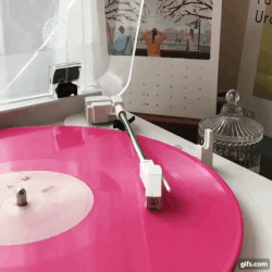

self indulgent cmyk stimboard!!
requests always open!
sources:
[🧠-⭐-🥶]♚[🧠-⭐-🥶]♚[🧠-⭐-🥶]
5 notes
·
View notes
Text
Using the CMYK colour model
#will likely turn out muddy due to being stuck within a total of 100 but eh#poll#polls#1k#5k#cmyk poll
33K notes
·
View notes
Text

Just a couple of gals standing next to a timespace paradox. Typical girl stuff.
#style test#character design#magical girl#original character#fusion#I never know if I should make Black taller than the people she's made of or their average height#the latter is more intuitive but also really funny to look at for some reason#oc: coney/magenta#oc: melissa/yellow#oc: sal/cyan#oc: black gamut#project black gamut
8 notes
·
View notes
Last Seen Blogs
quantumpoem
quantumpoem


cat-berni-blog
Creative Cat...

lazard999
Untitled

madisonmason2468
Madison mason