#schick toikka
Photo
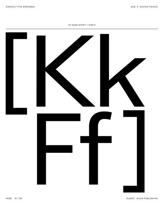
Alex Hunting & Schick Toikka / Kinfolk / KF Sans / Typeface / 2022
3 notes
·
View notes
Text
Final Major project - Artist Research: Alex Hunting
Alex Hunting Studio is an award-winning creative agency. Located in London but with a global client list, they deliver creative consultancy, art direction, editorial direction and content for cultural institutions, luxury, lifestyle and media brands. They create editorially driven design solutions across print and digital media—from visual identities and campaigns, to publications, moving image and websites.
I chose to have a look at Alex Hunting Studio due to their creation of custom letterforms for clients.
Project: Max Richter
This project is the creative direction of composer Max Richter's latest release SLEEP: Tranquility Base.
Within this project Alex Hunting Studio developed a typeface that they named Richter Sans. This started off as a customised version of the typeface ‘Lateral’ by Schick Toikka.
The typeface offers not only a perfect insight into the expertise of Richter’s artistry but provides a powerful tension of faculty and form against the visual’s tactile fluidity. Its earnest, unpretentious and unobtrusive design allows both Max’s melodies and the corresponding spectacle to thrive whilst staying true to the artist’s love of post-war modernist aesthetics.

Project: Kinfolk
This project is the design direction for the world’s most influential lifestyle magazine Kinfolk.
Within this project Alex Hunting Studio, to celebrate Kinfolk’s 10 year anniversary, delivered a brand new redesign in the Summer of 2021. They overhauled the entire magazine, introducing a new grid, paper stocks, logo, and custom typefaces.
With the custom typefaces Kinfolk worked with type foundry Schick Toikka. The custom type family consists of 6 different styles, a Serif and a Sans counterpart with matching italics. The Sans and the Serif fonts share the same vertical dimensions and similar overall proportions, so they can be mixed together harmoniously. The Serif version of the fonts feature a Text style, designed specifically for body copy, captions and small headlines, and a Display style with higher contrast and slightly lighter weight intended for bigger point sizes. The display version also features set of cap ligatures. Together the fonts create a compact but versatile palette that serves all the typographic needs of the magazine, from impressive headlines to longer articles.

0 notes


Photo

Created back in 2019, when I was still a student at the University of the Arts in London. It is a prototype of the concrete magnet for the Southbank Centre in London. Been also experimenting with shades of the concrete. The top part represents the roofline of (from left to right): the Queen Elizabeth Hall, the Royal Festival Hall and the Hayward Gallery - which all are parts of the Southbank Centre. The "Southbank Centre" logotype is in Noe Display font by Schick Toikka, customised by North Design for the Southbank Centre. design: Peter Baran author: @regularconcrete (at Southbank Centre) https://www.instagram.com/p/CiIGkmoI5Rz/?igshid=NGJjMDIxMWI=
0 notes


Photo

Logo for Body Electric. Set in Lateral, an upcoming typeface by Schick Toikka
147 notes
·
View notes
Text
11+ 6 Modern Independent Type Foundries


Klim Type
Schick Toikka
FaType
Grilli Type
Commercial Type
Sharp Type
Colophon Foundry
Swiss Typefaces
Lineto
Milieu Grotesque
Optimo
Neubau Laden
Letters from Sweden
Camelot Typefaces
Dalton Maag
Luzi Type
Dinamo
link
#collezione#fonte: medium#top: fonderie#fonderia: klim type#fonderia: schick toikka#fonderia: fatype#fonderia: grilli type#fonderia: commercial type#fonderia: sharp type#fonderia: colophon#fonderia: swiss typefaces#fonderia: lineto#fonderia: milieu grotesque#fonderia: optimo#fonderia: neubau laden#fonderia: letters from sweden#fonderia: camelot#fonderia: dalton maag#fonderia: luzi type#fonderia: dinamo
0 notes
Photo

Posters and identity by @_tsto for @flowfestivalhelsinki Old but pure gold and full on type! - "In 2018, Tsto returned to design the Flow Festival visual identity once again with the “Flow Font” as its base. The backbone of the typographic system direly needed a refresh after 7 years of extensive use. Tsto redrew the original “Flow Font” to be a bit thicker and bolder for large scale “Poster” purposes and commissioned Schick Toikka to draw a set of 3 typefaces based on the proportions of the old “Flow Font”. The new type system also included a set of ornamental “Dingbat” symbols. These “meaningless characters” were used to create interesting type patterns around the text elements. The dingbats operated inside the typographic layout, repeating in the lines as text elements, but also escaped the lines to float around as large colourful ornaments. - Flow "Dingbats" by @schicktoikka and @_tsto - Photos by : Mona Salminen Konstantin Kondrukhov Petri Anttila Samuli Pentti - Tag and use #typosters to be featured. Follow @typosters for more poster inspiration. - - - - - - - #typographicposter #typographic #typeposters #typeinspire #posters #printisnotdead #goodtype #creativedesign #betype #graphicdesign #graphicdesigner #type #typography #eyeondesign #designwork #artdirection #designfeed #designspiration #postereveryday #inspiration #graphix #editorial #printdesign #layout #typographer #plakat #posterdesign #flowfestival (at Helsinki) https://www.instagram.com/p/CJlYe5Ag6FW/?igshid=1kwgbgbrw4smr
#typosters#typographicposter#typographic#typeposters#typeinspire#posters#printisnotdead#goodtype#creativedesign#betype#graphicdesign#graphicdesigner#type#typography#eyeondesign#designwork#artdirection#designfeed#designspiration#postereveryday#inspiration#graphix#editorial#printdesign#layout#typographer#plakat#posterdesign#flowfestival
4 notes
·
View notes
Photo
Graphic 44: Berlin Issue Available at www.draw-down.com In this issue, fourteen different studios from all over the German metropolis, from iconic studios to lesser-known practices, share stories about Berlin from their own perspectives, about what has and has not changed, and about their expectations and worries, preconceptions and realities. Contributors include Büro Bum Bum, David Benski, Dinamo, Eps51, Fehras Publishing Practices, FM Aussenwerbung, Ham Minjoo, Kim Jungyun, Kulturplakatierung, Madeleine Morley, Martin Conrads, pregnant, Rimini Berlin, Ruohan Wang, Schick Toikka, Serge Rompza (NODE), Stahl R, Studio Pandan, Studio Santiago da Silva and Studio Yukiko #GraphicMagazine #GraphicDesign #BerlinDesign #MagazineDesign #Typography #TypographicDesign (at Berlin, Germany) https://www.instagram.com/p/CB0ZRSgHJSD/?igshid=1103jevgtqjip
9 notes
·
View notes
Photo

Schick Toikka
209 notes
·
View notes
Photo

Schick Toikka https://ift.tt/2SGG3hh
13 notes
·
View notes
Photo


Blackness & the Postmodern
published by Urbanapa
edited by Sonya Lindfors
layed out by me
typefaces Roswell Four ITC & Saol by Schick Toikka
PDF version available for free here.
Soft cover book available on demand from Urbanapa.
35 notes
·
View notes
Photo

Yearbook of Type III
The Yearbook of Type presents an independent selection of new digital typefaces created all over the world—from larger publishers to smaller, independent typographers and foundries.
The comprehensive compendium presents a well curated overview that gives an impression of the typeface and its appearance on paper. The emotional and well constructed informative presentation of the typefaces serves designers and agencies as a source of inspiration and help select the right typeface. As a catalog and reference work it is also of interest to all those who are interested in the contemporary world of typesetting and the latest in typeface design.
A small online microsite (www.yearbookoftype.com) leads to the type’s or foundry’s website, to simplify the connection between print and web and to help the user to select, try, or buy a typeface.
– New edition with all recent typefaces
– Detailed presentation of all selected fonts
– Ample background information
– Index with classification
– Index of all designers and type foundries
– Explanation of all OpenType features
– Essays and articles by Boris Kochan, Ferdinand P. Ulrich, Viktor Nübel, Laurence Penney, David Jonathan Ross, Rainer Erich Scheichelbauer, Stefan Hattenbach
Presented type foundries: 205TF, 29Letters, Antipixel, AinsiFont, Atypical Type Foundry, Autograph, bBox Type, René Bieder, Binnenland, BlackFoundry, BLKBK Inc., Bold Monday, Briefcase Type Foundry, Brownfox, Canada Type, Cape Arcona Type Foundry, Connary Fagen Type Design, Darden Studio, Dharma Type, DizajnDesign, DJR, Emtype Foundry, Fatype, Fontador, Fontef Type Fondry, Jan Fromm, FSdesign, Hoftype, Hungarumlaut, HVD Fonts, JAM Type, Kimmy Design, Kontour Type, Latinotype, Lazydogs, Letterwerk, LiebeFonts, LucasFonts, Lux Typographic + Design, Marin Šantić Typographic Consultancy, Mark Simonson Studio, Microsoft Corporation, Moretype, Mostardesign Type Foundry, NDISCOVER, NEW LETTERS, Nootype, NM type, Indian Type Foundry, P22 Type Foundry, Parachute, phospho, Plau, Playtype, Process Type Foundry, Ana Prodanović, R9 Type+Design, Revolver Type Foundry, Sakkal Design, Sandoll Communications, Schick Toikka, Schriftlabor, Sharp Type, Signal Type Foundry, Signature Type Foundry, Stawix Foundry, Suomi Type Foundry, Swiss Typefaces, Tetradtype, The Designers Foundry, The Northern Block, The Typecraft Initiative, Tour de Force Font Foundry, Dominik Thieme, TIGHTYPE, TipografiaRamis, type matters, typecuts, TypeMates, TypeTogether, Typerepublic, Typesenses, Typocalypse, Typofonderie, Die Typonauten, Typotheque, URW++ Design & Development, VolcanoType, Wiescher Design, Zetafonts
Get you copy at www.yearbookoftype.com
18 notes
·
View notes
Photo

Back in 2019, this concrete magnet was made as a prototype for Hayward Gallery, London. The top part represents the most striking feature of the gallery - the glass pyramids. The shape and angle of these pyramids stayed the same as in real building. The “H” letter, which stands for Hayward Gallery, is in Noe Display font by Schick Toikka, customised by North Design for the Southbank Centre. design: Peter Baran author: @regularconcrete (at Hayward Gallery at Southbank Centre) https://www.instagram.com/p/CgYyk7cKioO/?igshid=NGJjMDIxMWI=
0 notes
Last Seen Blogs