#skoot apparel
Text
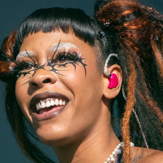
#rico nasty#close up#2022#lyrical lemonade#space buns#skoot apparel#white eyebrows#makeup details#hd#makeup to recreate
15 notes
·
View notes
Note
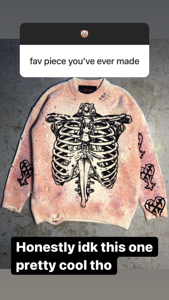
What’s your fav fashion brand
i love this question, i'm obsessed with fashion.
There are a lot because I buy a lot
Tibetan brands: Norlha, Nerhi
Chinese: PersonSoul, ShuShuTong, NüwaHanfu, Mukzin, Shanghai Tang, Beijing Watch (watches⌚️), Florasis (Makeup), Angel Chen, Neiwai, YIRANTIAN, Ms Min
Korean: AderError, Minju Kim, Skoot Apparel
Japanese: Yohji Yamamoto, Sacai, AMBUSH
French: Manieredevoir, DIOR
Italian: A better mistake
USA: FENTY (perfume)
British: ASOS (collusion)
Spanish: Balenciaga (sometimes)
17 notes
·
View notes
Note
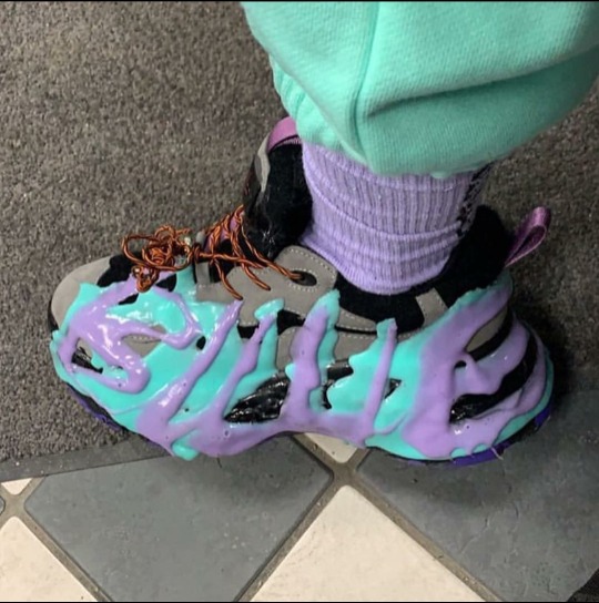
it screams skoot apparels like this sleeve here
https://twitter.com/sapnapoutfits/status/1562236208289300480?s=46&t=LOZJg5DTmLmpBJ58FRR2pA
yess its that type of sleeve
it's definitel from sapnap's closet 😭 she never wears that usually
0 notes
Text
Logo and social media integration
Research
Logo's are vitally important for brand recognition and identity so it was essential to looking into research of what makes an effective logo. "So, why is a logo important? Because it grabs attention, makes a strong first impression, is the foundation of your brand identity, is memorable, separates you from competition, fosters brand loyalty, and is expected by your audience." During the 2010's we saw that minimalism was by far the biggest trend in product and logo design with the most notable example being phone apps switching from previously block-like /bubbly 3 dimensional designs to what we have now over the course of the past decade which are flat and minimalist. But that has slowly began to fall out of favour especially with a younger generation who see it as too corporate and off-putting to actually invest into, where as more authentic designs have began to increase in popularity. bearing all of this in mind I endevaourded to create something both authentic and genuine to my style of creativity as I feel this is more impactful in today's market.
Reference:
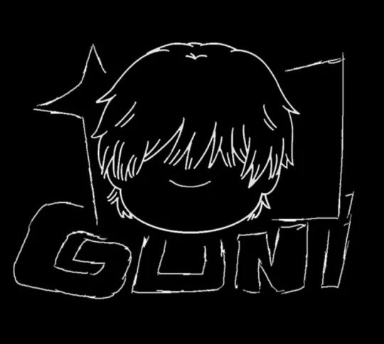
Goni - website
The brand Goni is a small business I have been following for a year now. They specialise in making alternative printed clothes. Their logo is the mascot Goni drawn in a little messy style, as much as I like their minimalist take on the logo it's still a little too messy. What I like about the logo is that it's not just text but also a little mascot which makes the brand stand out from others.
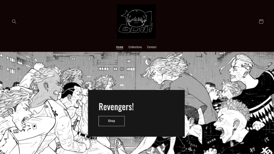
Their website is not that good either, the idea is there but the execution isn't the best. It's very simple the only thing throwing me off is that the background on the header isn't black.
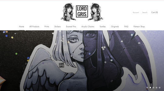
Lord Griss’ website is straightforward to navigate with all the sub-pages being linked under the logo in the same place on all pages, creating a very fluid experience. Their homepage showcases their creation in a very eye-catching manner being the main attention grabber whilst providing the visitor with excellent examples of the products you’ll be able to purchase on their website. She also provides sections to answer FAQ’s as well as options to register for the website for future visits and subscription to an electronic newsletter. However, I do feel like the website lacks any real personality and feels generic with the plain white background throughout which feels a bit shameful considering how outstanding her creations are.
Lord Gris - website
Skoot apparel - website
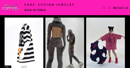
In my opinion, the website that had the best overall design among the websites I researched was Skoot Apparel , Although it doesn’t excel in any particular aspect when compared to Lord Griss’ artwork/logo designs or Goni’s simplicity I believe it has far more identity and is far more impactful with bold eyecatching colours, animated product features on a single page. When you do click on a product you’re shown multiple angles of the fashion as well as multiple models giving the visitor enough information to make an informed decision on whether the product is something they would want to purchase. In addition to the actual website analysis, the products being sold have a fluid theme and all incredibly unique designs further gaining interest of a customer as there are unlikely to be replicas found cheaper elsewhere furthering the authenticity of the product.
Development
For the task of creating my logo I challenged myself creating a large variation of possible designs to uncover which one felt the most sincerely authentic to me
What makes my logo more distinguishable than others is that I use an alias as oppose to my Turkic name for better recognition and readability making it more memorable than it would otherwise be, it is also an extension of my personal identity.
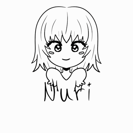
I decided to create a simple portrait of myself as an expression of how I perceive myself as I felt it best displayed my brand/identity which is exactly what I believe is what a logo should represent


Animating my logo
I used Procreate to animate my logo by individually drawing each frame.
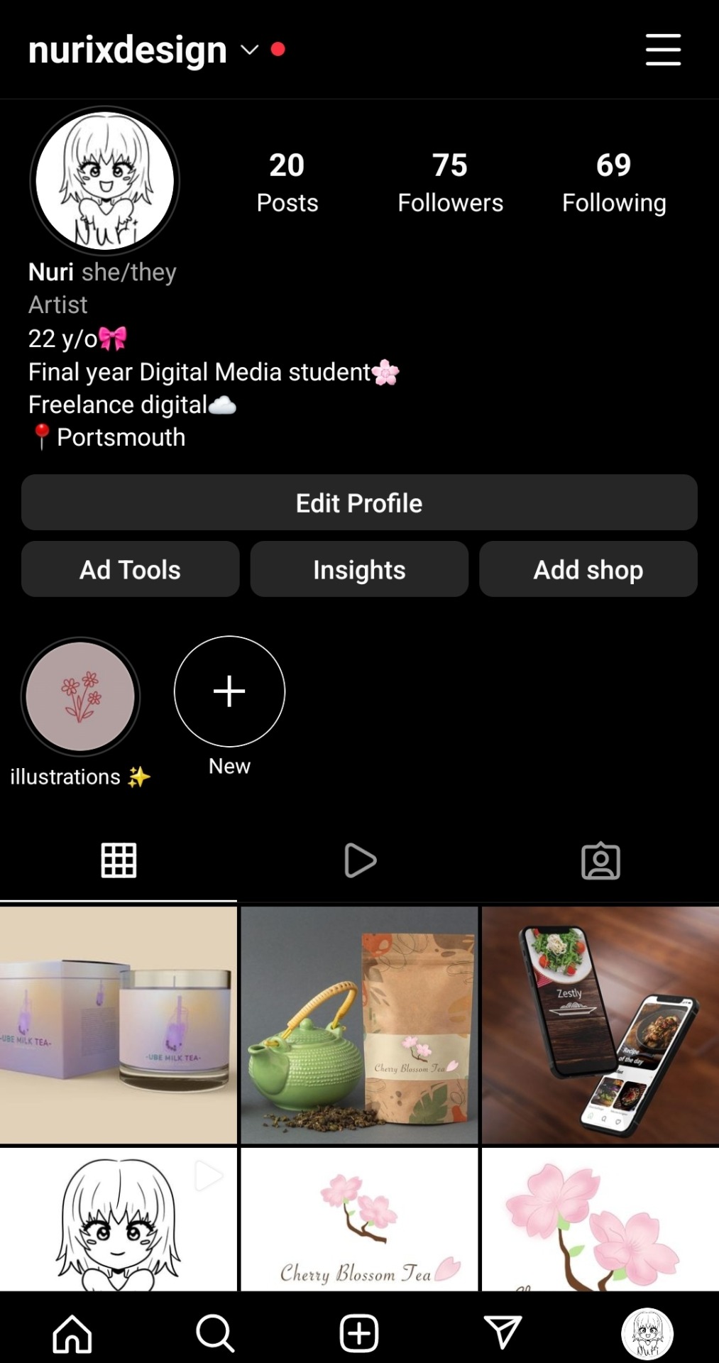
Social media integration
Being that my logo is a transparent PNG it’s easily transferable and cropable between multiple media platforms, additionally, it was produced in high resolution meaning that the resolution remains high even after being resized. I’ve used my logo for my CV, Instagram and my website as well as being used for business cards.
Instagram
0 notes
Photo

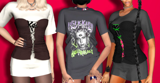
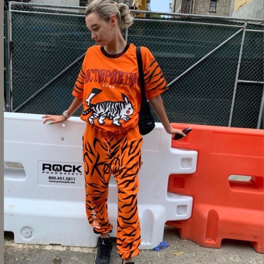
SKOOT COLLECTION | PART 1
Deadly Corset Dress
New Mesh
Female
HQ Texture
2 Swatches
Custom thumbnail
Ugly Kidd Oversized T Shirt
New Mesh
Female
HQ Texture
Custom thumbnail
DOWNLOAD HERE
37 notes
·
View notes
Text
🗡War Nymph🏹
6 notes
·
View notes
Text


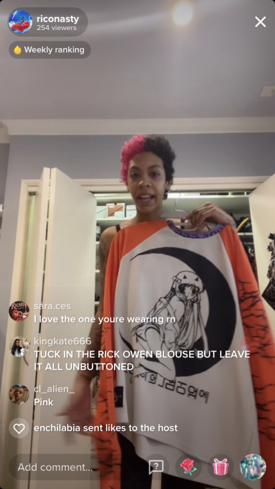
SKOOT SKOOT SKOOT 💸
#style#fashion#styleblogger#street style#stylish#blog#Blogger#Skoot#skoot korea#skoot apparel#sexy#cute#anime#Pokémon#Naruto
3 notes
·
View notes

Text
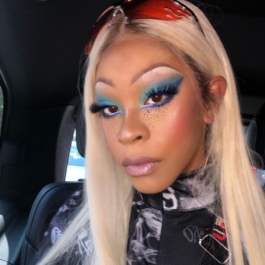

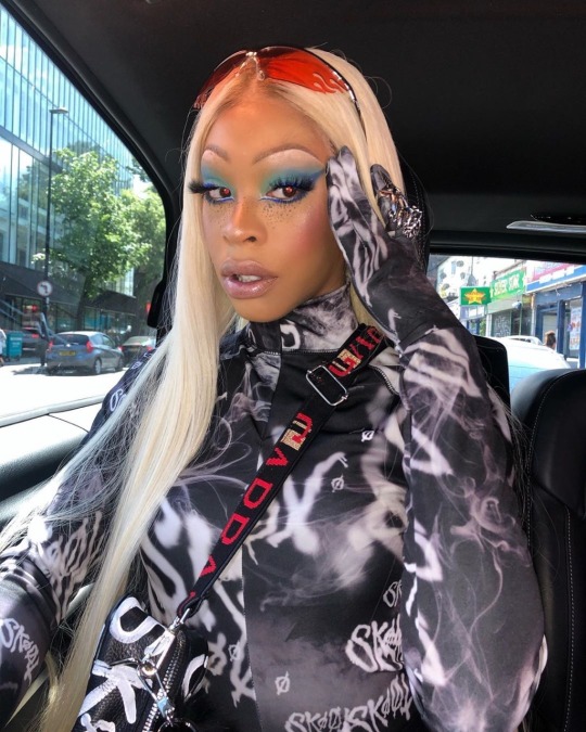

None of these bitches cold as ME!
3K notes
·
View notes
Text
$ԞØØ₮ ₳₱₱₳ɌɆⱠ
https://soundcloud.com/scarlxrd/hxw-they-judge

Credits above
#skoot_apparel#skoot apparel#music#now playing#fav fav fav#𝔉𝔲𝔠𝔨 𝔜𝔬𝔲 𝔇𝔲𝔪𝔟𝔩𝔯 ℭ𝔯𝔢𝔴#music and art#fashion#stay weirdo#6/2020#x-heesy#fucking favorite#phunny#blingbling
26 notes
·
View notes
Text

[191231] Jackson at #HunanTVNewYearConcert2020
• SKOOT - Kindness Killz Sweats.
It's $250 USD.
• ALEXANDER WANG - Adidas Originals by AW Puff Trainer Shoes.
It's $250 USD.
Check it out here:
#got7#got7scloset#got7fashion#191231#got7 jackson#jacksonwang#jackson wang#wang jackson#잭슨왕#갓세븐 잭슨#잭슨#王嘉尔#王嘉爾#team wang#alexander wang#adidas korea#adidas originals#adidas#adidas originals by aw#skoot apparel#skoot#welcome 2020 with jackson
8 notes
·
View notes
Text
https://www.instagram.com/p/Bt57t9HHelo/
7 notes
·
View notes
Last Seen Blogs


attn4077
Attn 4077
writinginavacuum
I Will Be Their Wayfinder.
heyguysitsjasmine-blog
Save Me From Myself

enexbex
Untitled