#slick slider implementation
Explore tagged Tumblr posts
Visit Tumblr Blog
Explore Tumblr blogs with no restrictions, modern design and the best experience.
Last Seen Tumblr Blogs


Fun Fact
Average visit duration of Tumblr.com is 10 mins and 25 secs.
Text

Product Carousel Slider
#product carousel slider#codenewbies#html css#frontenddevelopment#html5 css3#slick slider implementation#slick slider#product slider#carousel#jquery plugins#webdesign
3 notes
·
View notes
Text
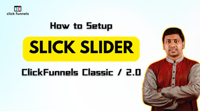
How to Use Slick Slider in ClickFunnels Classic or 2.0?
While a slider is not a mandatory element, it is one of the crucial elements for enhancing the beauty of a website or landing page. A slider automatically showcases different images or videos at predefined intervals. The images or videos to be shown and the intervals at which they appear are predefined. Essentially, it works like a slideshow on a webpage. When visitors see dynamic content such as rotating product images or customer testimonials, can build trust and encourage visitors to take the desired action, whether it’s making a purchase or signing up for a newsletter.
These elements can be particularly impactful in various sections of a website, such as the hero area of a webpage, to display product images from different angles, in customer testimonials, in image or video galleries, and so on. Visual elements like sliders contribute to a more immersive user experience.
Another term often associated with sliders is “Carousel”. Sliders and carousels essentially perform the same function. The difference is that a slider typically shows one item per slide, whereas a carousel can display multiple items simultaneously.
This covers some basic discussions about sliders that you might already know. Now, let’s move on to the main topic of this post, which is slider integration in ClickFunnels. ClickFunnels does not have a default slideshow element. As we know, when a feature is not available by default in ClickFunnels, we have no alternative but to use custom coding to bring that feature in. This is why there is a demand for professional web developers to design sales funnels or landing pages. Since integrating Slick Slider into ClickFunnels involves custom coding, you might need the assistance of a professional ClickFunnels expert. While ClickFunnels’ drag-and-drop builder is user-friendly for basic designs, advanced features like Slick Slider often require professional expertise to implement effectively.
Although various types of sliders can be used in ClickFunnels with custom code, the most commonly used slider is the Slick Slider. Among the various slider plugins available, Slick Slider stands out for its versatility and ease of use. It’s widely adopted across multiple platforms, including both ClickFunnels Classic and ClickFunnels 2.0. The popularity of Slick Slider stems from its ability to integrate seamlessly with minimal customization.
Benefits of Using Slick Slider in ClickFunnels Landing Page:
Improved Visual Appeal
Enhanced User Experience
Increased Conversion Rates
Versatility and Adaptability
As a ClickFunnels expert, I can ensure seamless integration and customization of the Slick Slider to align with your brand’s aesthetics and functionality requirements. For help with implementing Slick Slider in ClickFunnels, you can visit my blog/vlog, or visit my YouTube channel to view the demo.
#clickfunnels#sales funnel#web design#web development#landingpage#landing page#slick#slick slider#carousel
0 notes
Text
WordPress 101: Getting Your Website Up and Running
Did you know that over 75 million websites are made on WordPress? That’s almost 22% of all websites around the world. The following are some of the issues which usually creep up while using WordPress and the ways in which those issues can be fixed. So, stay alert because school is in session.
Your WP Site’s Security
WordPress websites are usually attacked by hackers, or in hacker lingo, script kiddies who can creep into your WordPress websites via some common WordPress security vulnerabilities. When looking to secure your WordPress website it is best to start from the ground up.
While there are many plugins that can act as a firewall for your WP website some of them can also work by modifying your .htaccess file or restricting some access at the Apache level, before it can be processed by WordPress. Some great examples are WordFence or All in One WordPress Security.
Antispam Bee and Growmap Anti Spambot are also all great plugins to keep your site safe from hackers and spammers.
WP Site SEO
After you get the peace of mind that the hackers are at bay, you will need to concentrate on getting the SEO part of your WP website right. While the All in One SEO Pack will get you the tools you need to optimize your site you will need some specific plugins to deal with some of the most common SEO issues. One of the main ideas is being able to track your website’s visitors. For that, plugins like Clicky add a small stats indicator. You can also use Google Analytics by Yoast to keep track of how your WP site is doing on the SERPs. While Yoast has not given people problems in the past, recently some users have complained about receiving a 404 error. A way out of this problem is pretty simple. All you will have to do is open WordPress SEO plugin > Edit Files option and write in the following code.
# WordPress SEO – XML Sitemap Rewrite Fix
RewriteEngine On RewriteBase / RewriteRule ^sitemap_index.xml$ / index.php?sitemap=1 [L] RewriteRule ^([^/]+?) –sitemap([0-9]+)?.xml$ /index.php? Sitemap=$1&sitemap_n=$2 [L]
# END WordPress SEO – XML Sitemap Rewrite Fix
Needless to say, WP Google Analytics and Google XML Sitemaps are also two of the best ways to track WP site statistics. The tools are both easy to grasp and get a hand of even for beginners.
Best Sources for WP Themes
There’s really nothing like a stunning custom theme to set your website apart. Easy Theme and Plugin Upgrades makes your life easy by doing all the heavy lifting for you. Other favorites include Customizr, OmaGue, Xodogo, and well, the WordPress themes directory where you will find all kinds of themes from full screen and slider themes to responsive themes and everything in between.
When you have the designs ready, another important step is to turn your designs into a fully-functional site. Luckily, there are professional web development services like psd2html.com, that can help you out with your WordPress implementations and settings. This is a great way to avoid hassle and save time. The workflow is very straightforward, get a free quote anytime you are ready to bring your blog to life.
Best Social Plugins
Giving the ability to your audience to bookmark and share the content of your WP site is the best thing you can do to make sure the content stays fresh and your business stays in their minds. Sociable is the leader when it comes to sharing within the WordPress space. It continues to be the fastest growing plugin for setting rating systems and for reminding your readers to spread the word. Other notable plugins like ShareThis and AddThis are also used for sharing recommended content.
Best Plugins Offering Contact Us Forms Customizations
Plugins also allow users to create their own contact forms that can give your business a professional look and simplify online communication. Fast Secure Contact Form is an easy and powerful form builder. If you don’t already have Jetpack by WordPress you should seriously consider installing it for your website. Slick Contact Form is another widget based plugin which can be used to create customizable contact us forms. It can also handle multiple forms per page to give your website a more powerful effect. Contact Form 7 is another popular plugin which has been downloaded over 16 million times by WP users. Using plugins is by far the easiest way to get the job done no matter what it may be.
Ending Note
If you put all of these in place but fail to monitor or update your WP website it will be just as bad as if you’d never done any of this to begin with. So, use these plugins and exercise constant diligence to get yourself a water sealed abracadabra kind of WordPress website which is safe for doing business or shooting up a blog.
1 note
·
View note
Link


By Elena Bayda
"Simply a drop in replacement" was what I was told... It so wasn't, but it was a fantastic opportunity to mess about with a new library and get it working like another one; learning something new is always worthwhile, especially if it's better for the business. I wanted to estimate three weeks but then plumped for two instead - fixing the bugs meant that it was at least three, and maybe even a little more.
We used Slick Slider for carousels, but there were questions about the amount of time the JS took to run. We read an article by Javier Villanueva titled Javascript sliders will kill your website performance. He was particularly dismissive of Slick Slider while being less dismissive of Keen Slider, despite keen-slider lacking some of Slick Sliders built-in features. While reading his article, I also found several resources suggesting that we should avoid carousels like the plague:
Joe Rinaldi's Why Homepage Carousels Are Bad (& 3 Alternatives to Try Instead)
Jon MacDonald's Why Image Carousels Are Almost Always A Bad Idea
Peep Laja's Image Carousels and Sliders? Don't Use Them. (Here's why.)
David Miles's Why Website Carousels Are a Bad Idea
Andrew Folts's Carousels Are Killing Your Conversion Rate: Here's How to Fix That
Envato's Design debate: are image carousels UX assets or liabilities? is a good discussion
Jared Smith's Should I use a carousel is an excellent example of using a carousel to explain why you shouldn't use a carousel
I'd suggest reading those articles and following any pertinent links to decide whether or not you want to use carousels, but do that before you implement carousels on your site! If you've already implemented them, and your internal clients are still keen on them (despite being asked to read the links above), then this post details my experiences of moving most - if not all - of our Slick Slider carousels to keen-slider. Be prepared though, I decided to go all ES6 classy - and it's all the better for being that way too!
I decided to use classes because Slick Slider did an awful lot for us to place items. Let me elaborate. If we had two items and the Slick Slider was set to display three, then the two items would be shrunk and inserted from left to right at the correct width, a third of the container's width. That meant a gap on the right was 33.33% wide, and that seemed to be the accepted way of doing it. I changed this and aligned the items in the centre of the container but at the correct width. This change caused a bug to be raised, ah well. It's worth noting that by default, a keen-slider will make the items fit the container.
So anyway, we needed to read some extra data, provided as data attributes, for some carousels. We also needed to be aware that not all carousels were present on page load and that some would be inserted or removed at various points during the customer's journey through the site. Some carousels would only be carousels on mobile devices - that was fun. And to top all that off, we needed to be aware of rotation changes on mobile devices.
Anyway, this is our base class:
class KeenCarousel { constructor(element){ this.element = element } createButton(text) { const button = Helpers.createAndPopulate('button', 'Previous', { 'class': `${text === 'Previous' ? 'slick-prev': 'slick-next'} slick-arrow`, 'aria-label': text, 'type': 'button' }) button.addEventListener('click', () => (text === 'Previous') ? this.slider.prev() : this.slider.next()) return button } createButtonHandler(text) { const button = Helpers.createAndPopulate('button', 'Previous', { 'class': `${text === 'Previous' ? 'slick-prev': 'slick-next'} slick-arrow`, 'aria-label': text, 'type': 'button' }) button.addEventListener('click', () => (text === 'Previous') ? this.handleChange('prev') : this.handleChange('next')) return button } createButtonListener(text) { const button = Helpers.createAndPopulate('button', 'Previous', { 'class': `${text === 'Previous' ? 'slick-prev': 'slick-next'} slick-arrow`, 'aria-label': text, 'type': 'button' }) button.addEventListener('mouseover', () => this.autoplay(false)) button.addEventListener('mouseout', () => this.autoplay(true)) button.addEventListener('click', () => (text === 'Previous') ? this.slider.prev() : this.slider.next()) return button } createDots(instance) { const dots_ul = Helpers.createAndPopulate('ul', null, { 'class': 'slick-dots', 'role': 'tablist' }) this.element.parentNode.insertBefore(dots_ul, this.element.nextSibling) ;[...this.element.querySelectorAll(this.options.slides)].forEach(function (_, index, arr) { const dot_li = Helpers.createAndPopulate('li', null, { 'role': 'presentation' }) if(!index){ dot_li.classList.add('slick-active') } dots_ul.append(dot_li) const button = Helpers.createAndPopulate('button', index + 1, { 'type': 'button', 'role': 'tab', 'aria-label': `${index + 1} of ${arr.length}`, 'tabindex': !index ? '0' : '-1' }) if(!index){ button.setAttribute('aria-selected', 'true') } button.addEventListener('click', function(){ instance.moveToSlide(index) }) dot_li.append(button) }) } updateDots(instance) { const slide = instance.details().relativeSlide const ul = this.element.parentNode.querySelector('.slick-dots') if(ul){ ;[...ul.querySelectorAll('li')].forEach((li, index) => { index === slide ? li.classList.add('slick-active') : li.classList.remove('slick-active') const button = li.querySelector('button') button.setAttribute('aria-selected', index === slide) button.setAttribute('tabindex', index === slide ? '-1' : '0' ) }) } } getTarget(breakpoints) { const target = window.innerWidth return breakpoints.find(breakpoint => { if(breakpoint.min && breakpoint.max) { if(target >= breakpoint.min && target <= breakpoint.max){ return true } } else { if(breakpoint.min){ if(target >= breakpoint.min){ return true } } else { if(target <= breakpoint.max) { return true } } } }).slides } buildBreakpoints(breakpoints) { return breakpoints.reduce((acc, breakpoint) => { if(breakpoint.min && breakpoint.max){ acc[`(min-width: ${breakpoint.min}px) and (max-width: ${breakpoint.max}px)`] = { 'slidesPerView': breakpoint.slides } } else { if(breakpoint.min) { acc[`(min-width: ${breakpoint.min}px)`] = { 'slidesPerView': breakpoint.slides } } else { acc[`(max-width: ${breakpoint.max}px)`] = { 'slidesPerView': breakpoint.slides } } } return acc }, {}) } }
You'll see that I used some utility methods which were in a Helper class, so I should share those here too:
class Helpers { static createElement(element) { return document.createElement(element) } static setText (element, text) { return element.appendChild(document.createTextNode(text)) } static createAndPopulate(element, text = null, attributes = null, styles = null) { const el = this.createElement(element) text && Helpers.setText(el, text) attributes && Helpers.setAttributes(el, attributes) styles && Helpers.setStyles(el, styles) return el } static setAttributes(element, attributes) { for (const attr in attributes) { if(attributes.hasOwnProperty(attr)) { // converts camelCase to hyphen-separated, lowercase, string // e.g. "dataId" becomes "data-id" const attribute = attr.split(/(?=[A-Z])/).join('-').toLowerCase() element.setAttribute(attribute, attributes[attr]) } } } static setStyles(element, declarations) { for (const prop in declarations) { if(declarations.hasOwnProperty(prop)){ const property = prop.split(/(?=[A-Z])/).join('-').toLowerCase() element.style[property] = declarations[prop] } } } static removeElements(elms) { elms.forEach(el => el.remove()) } }
I've used these in multiple projects, and I'm quite happy with their performance. The fun things to note in the KeenCarousel class are those methods associated with breakpoints. We're mobile-first, so we need to be aware of screen sizes and different resolutions. We set our breakpoints at initialisation like this:
this.breakpoints = [ { min: 1440, slides: 4 },{ max: 1439, min: 810, slides: 3 },{ max: 809, min: 750, slides: 2 },{ max: 749, slides: 1 } ]
Then provide them to Keen like this:
this.options = { loop: true, duration: 300, slides, breakpoints: this.buildBreakpoints(this.breakpoints), }
Those options semi-map to the options Slick Slider accepts; for instance, loop is equivalent to infinite. Some things don't work in the same way, and that's why we have so much more code. It's going to be laborious to go through all the child classes, so we'll only look at a few here; they all inherit from KeenCarousel, though.
class PromotionCarousel extends KeenCarousel{ constructor(element, parent){ super(element, element) const slides = '.slick-carousel-item' this.children = this.element.querySelectorAll(slides) this.slidesNumber = this.children.length window.addEventListener('resize', () => this.checkWidth()) this.breakpoints = [ { min: 980, slides: 4 },{ max: 979, min: 540, slides: 3 },{ max: 539, slides: 2 } ] this.options = { loop: true, slides, breakpoints: this.buildBreakpoints(this.breakpoints), } this.resizeTimer = null this.checkWidth() } handleChange(direction) { const relativeSlide = this.slider.details().relativeSlide const slidesPerView = this.slider.options().slidesPerView if(direction === 'prev'){ if(this.slidesNumber >= (slidesPerView * 2)){ this.slider.moveToSlideRelative(relativeSlide - slidesPerView, true) }else{ this.slider.prev() } }else{ if(this.slidesNumber >= (slidesPerView * 2)){ this.slider.moveToSlideRelative(relativeSlide + slidesPerView, true) }else{ this.slider.next() } } } checkWidth() { if (this.resizeTimer){ clearTimeout(this.resizeTimer); } this.resizeTimer = setTimeout(() => { const breakpointSlide = this.getTarget(this.breakpoints) if(this.slidesNumber > breakpointSlide) { if(!this.slider){ this.slider = new KeenSlider(this.element, this.options) this.element.parentNode.insertBefore(this.createButtonHandler('Previous'), this.element.parentNode.firstChild) this.element.parentNode.append(this.createButtonHandler('Next')) } }else{ this.slider && this.slider.destroy() Helpers.removeElements(this.element.parentNode.querySelectorAll('.slick-arrow')) this.slider = null setTimeout(() => { this.children.forEach(slide => { slide.setAttribute('style', `width: ${(100 / breakpointSlide).toFixed(2)}%`); }) }, this.options.duration * 2) } this.resizeTimer = null this.element.parentNode.classList.remove('opacity-0') }, 100) } }
This class is the last one I've worked on, so it's fresh in my mind. It's also worth bearing in mind that the carousel is contained within a _holder div with a small amount of padding to the left and right to hold the arrows which the user can click on to move through the carousel - though dragging works by default, which is nice.
We've added functionality to that movement: if more than twice as many children can be displayed (according to the breakpoints), then the carousel moves the same number of items as the breakpoint for the carousel. Meaning that if there are three items in the carousel, and we're only showing two, then clicking on the arrow moves the carousel one item along. Should there be four or more items, then it moves two items at a time. I like this mechanism, and the logic is in the handleChange method. We use the parent class's createButtonHandler method to create those buttons, and they're attached to the parent _holder element rather than to the carousel itself. We don't initialise the carousel within the constructor method. Instead, we call the checkWidth method - we also add an event listener to the window, which will call checkWidth. checkWidth is the method where most of the heavy lifting occurs.
Upon developing this carousel, I noticed that it was firing multiple times. We make sure to do a sort of debounce using a setTimeout - it's a little bit of a hack, but it works a treat and saves using an external library which - in all likelihood - would do something similar but hide it from us.
After getting the number of items to be displayed, we check it against the number of children elements - which we set during the construction of the class. We know that the items all have a class of slick-carousel-item, so we use a querySelectorAll to get them all from the element (we might need them later) and store their number in the classes slidesNumber property.
If the slidesNumber is higher than the current breakpoint slide number, and we don't currently have a slider in play, we initialise the keen-slider and store it in our slider property. If we don't need to kick off a keen-slider, we destroy the slider if it exists, remove its buttons, and tweak the items within a setTimeout (see, it was a good idea to store them when we initialised the carousel) so that they display appropriately. The carousel element is a horizontal flex-box with overflow hidden, so items automatically float to the left.
We carry on listening, though and, should the resize event occur again, we'll run checkWidth all over again. Neat eh?
On our product display page, we have several images. We have the primary image associated with the product and any other pictures or resources (such as videos). The main carousel only shows one item and another carousel, directly under it, contains thumbnails of that image and any other images or links. Clicking on the thumbnails moves the primary carousel to the appropriate image. As such, one acts as the ParentCarousel; the other is the ChildCarousel. In terms of their relationship, the parent invokes the child but then listens to it; the child only exists to direct the parent and - by default - shows four images.
Let's look at the parent:
class ParentCarousel extends KeenCarousel { constructor(element, passedOptions = {}, rejig = false){ super(element, element) this.passedOptions = passedOptions const slides = '.parent-element' this.children = this.element.querySelectorAll(slides) this.rejig = rejig this.hasButtons = false this.options = { loop: this.children.length > 1, duration: 1000, slides, controls: true, created: () => this.element.parentNode.classList.remove('opacity-0'), mounted: () => setTimeout(() => this.slider.resize(), 3000), afterChange: element => { ;[...this.element.querySelectorAll('iframe')].forEach( iframe => iframe.contentWindow.postMessage(JSON.stringify({ event: "command", func: "stopVideo", args: "" }), '*') ) const slideIdx = element.details().relativeSlide const slide = this.children[slideIdx] const img = slide.querySelector('.parent-carousel_image') if(img && !slide.classList.contains('zoomable')){ slide.classList.add('zoomable') $(slide).zoom({ url: $(slide).data('enlarge-img'), on: 'click', magnify: 0.75, touch: true }) } } } ;[...this.element.querySelectorAll('iframe')].forEach(iframe => { const src = decodeURIComponent(iframe.src) iframe.src = `${src}${!!~src.indexOf('?') ? '&enablejsapi=1' : '?enablejsapi=1'}` }) this.slider = new KeenSlider(element, this.options) this.child = document.querySelector(this.passedOptions.asNavFor) if(this.child){ this.child = new ChildCarousel(this.child, this) } if(this.rejig){ Helpers.removeElements(this.element.parentNode.querySelectorAll(".slick-arrow")) } if(this.children.length > 1){ this.element.parentNode.insertBefore(this.createButtonHandler('Previous'), this.element.parentNode.firstChild) this.element.parentNode.append(this.createButtonHandler('Next')) } this.enableZoom() } handleChange(direction) { if(direction === 'prev'){ this.slider.prev() }else{ this.slider.next() } } }
It's quite similar to the previous carousel except for adding the zoomable class and triggering some jQuery to elements just coming into view - this saves us loads as larger images are only downloaded when required. It also does some fancy stuff with YouTube links which might already have query parameters. If there are already query parameters, we append the new parameter with an ampersand (&); if not, we add it with a question mark (?). That particular issue took a good couple of hours trying to figure out why YouTube videos didn't stop when they were out of view on the carousel. We also have some logic on the backend that links the two carousels - the parent has a data attribute of data-as-nav-for that links to a thumbnail carousels class attribute. We need to check it's there before invoking it:
class ChildCarousel extends KeenCarousel{ constructor(element, parent){ super(element, element) const slides = '.child-element' this.children = this.element.querySelectorAll(slides) const slidesPerView = 4 this.parent = parent this.options = { loop: true, slidesPerView, slides, mounted: () => this.element.parentNode.classList.remove('opacity-0'), } if(this.children.length > 3){ this.slider = new KeenSlider(this.element, this.options) if(this.children.length > 3){ this.element.parentNode.insertBefore(this.createButtonHandler('Previous'), this.element.parentNode.firstChild) this.element.parentNode.append(this.createButtonHandler('Next')) } }else{ this.element.classList.add('justify-content-center') ;[...this.children].forEach((child) => { child.classList.add('w-33') }) this.element.parentNode.classList.remove('opacity-0') } this.handleChildClicks() } handleChildClicks() { ;[...this.children].forEach((child, index) => { child.addEventListener('click', e => { this.parent.slider.moveToSlideRelative(index, true) }) }) } handleChange(direction) { if(direction === 'prev'){ this.slider.prev() }else{ this.slider.next() } } }
Again, we do clever stuff about whether or not we invoke the child carousel's slick-slider. We also add event listeners to the child elements in handleChildClicks, which tells the parent to moveToSlideRelative.
Carousels are marked up with the class of opacity-0, which sets the element to have an opacity of 0. We remove the class once the carousel is initialised (whether or not it's a keen-slider). We sometimes also add an initialised class to ensure we don't re-initialise existing carousels. The opacity-0 class prevents Cummulative Layout Shift - the elements are there; they're invisible! I like this way of doing things - we hide them until they're ready.
These are just three of the carousel classes we use; there are another nine, some of which have dots underneath (which also act as navigation between the elements). Those carousels were fun, and I dare say you can see evidence of them in the keenCarousel classes createDots method.
Replacing Slick Slider with keen-slider was a mammoth task but thoroughly enjoyable. I pondered turning them into components like I considered doing for my interview, but I don't think we're ready for that just yet; perhaps the next time I have to look into this, I'll do just that, though.
0 notes
Photo

Slick Slider Implementation
#how to use slick slider#slick slider#jquery plugins#jquery slider#jquery slider tutorial#slick js#jquery plugins tutorial#divinectorweb
1 note
·
View note
Photo

24 Best jQuery Image Sliders
Add a full-featured and easy-to-implement jQuery image slider to your website to help you keep the attention of your website traffic.
CodeCanyon offers some of the best jQuery image sliders available on the web for a one-time low payment.
Slider Revolution is one of the best selling jQuery image sliders available on CodeCanyon.
Images are an integral part of any website and should be displayed in a visually appealing way on your website. CodeCanyon will allow you to integrate a beautiful looking jQuery image slider into your website and allow you to visually display your business products, services, and promotions.
The Best jQuery Image Sliders on CodeCanyon
Discover CodeCanyon's massive library of the best jQuery image sliders ever created. With a cheap one-time payment, you can purchase these JavaScript image sliders and have them installed on your website in no time.
Here are a few of the best-selling jQuery image sliders available on CodeCanyon for 2020.
Check out some of the best selling jQuery Image Sliders available on CodeCanyon.
The jQuery image sliders give you the ability to display your business's images in the best way possible. These sliders are feature-rich and are completely customizable so you can fit them to your website's specific theme. Here are a few features that you can expect from these jQuery image sliders.
fully responsive
smooth transitions
lazy load images
parallax effect
Give your users the website experience they deserve. Add one of CodeCanyon's high-quality jQuery image sliders to your website and let your images shine.
Top 20 jQuery Image Sliders (From CodeCanyon for 2020
1. RoyalSlider
Having a touch-friendly and responsive slider for your website is more important now than ever before, and RoyalSlider is both.
Developed with HTML5 and CSS3 best practices, it's a solid choice.
Here are a few of the other royally cool features:
SEO optimized
highly configurable
over 10 starter templates
includes fallbacks for CSS3 transitions
and more
I think the best feature is the modular architecture that gives devs the option to exclude what they don't need from the main JS file, keeping things as lean as possible.
The RoyalSlider is a solid JavaScript slider that should be a nice addition to any web dev's toolbox.
2. Slider Revolution
It's not easy to be "revolutionary" in the slider space. There are only so many options you can make available when it comes to sliders, but the Slider Revolution does a great job trying.
When it comes to jQuery sliders, this one delivers on just about everything you'll want.
The list of features for this slider is long, so I'll just hit the high points:
parallax effects and custom animations
SEO optimized and lazy loading options
add unlimited layers and slides with link options
includes "ready to use" styles and is highly customizable
and much more
The ability to drop in an image, video player embed, and social media source makes Slider Revolution one of the most flexible and customizable options you'll find.
3. LayerSlider
The name doesn't do this jQuery slider justice. Its 200+ 2D and 3D slide transitions will turn some heads.
Some of the notable features include:
skin design PSD template included
13 skins and 3 navigation types
add a fixed image over the slider
SEO friendly and lazy load images
hardware-accelerated CSS3 transitions with jQuery fallback
and more
Like the previous slider, you can drop in just about any content—even HTML5 self-hosted multimedia content.
The LayerSlider brings a lot of action to the slider space and is downright handsome.
4. Rama
This jQuery Slider Plugin animates your image and text slides with transition effects with over 21 different transition effects. The plugin is easy to install and will give your website a fresh new look.
Here are a few notable features for this slider:
unlimited amount of texts, images, and animation combinations
3+1 frames, wallpaper, and icon options
auto thumbnail creation
easy installation
5. All In One Slider Responsive jQuery Slider Plugin
Every slider comes to market with its own unique perspective and provides a solution to whatever slider niche is being targeted.
But not this one.
The All In One Slider Responsive jQuery Slider Plugin is, well, all in one.
I think most web devs and designers have a go-to solution, but at the same time are always on the lookout for something new.
This just might be that something new as it includes:
banner rotator
thumbnails banner
banner with playlist
content slider
carousel
And all of these slider styles include most—if not all—of the features needed in a jQuery slider.
Will the All In One Slider Responsive jQuery Slider Plugin be your all-in-one slider solution?
6. Slice
This responsive jQuery Slider and carousel plugin provides fully functional vertical sliders and carousels in addition to the classic horizontal layouts. All customization options can be set directly in HTML and the plugin comes with 5 pre-styled themes.
Here are a few more features that you can expect with Slice:
parallax effect block
100+ customizable options
10+ ready-to-use examples
lazy and smart image load
Don't miss out on this powerful jQuery image slider. Add it to your website today!
7. Slidea
Slidea brings a powerful and lightweight multipurpose content slider that will instantly make your website more competitive. The simple but effective design gives you and your viewers complete control over the slider.
This jQuery image slider has has the following features:
premade templates
compatible with any front-end framework
autoplay
50+ animation presets
8. jQuery Easing Slider
jQuery Easing Slider gives you the ability to create smooth animations between your images. The sleek and modern design will give your website a fresh new look.
Here are a few notable features for this jQuery image slider.
fixed and responsive layouts
compatible with all major browsers
customizable image size and position
easily customizable HTML and CSS
Download the Easing Slider today!
9. Kreatura Slider Plugin for jQuery
Looking for a slider that is easy to install, has plenty of animation effects, and ready to use templates? Kreatura is the perfect plugin for you then. The responsive design, effects such as parallax, and SEO friendly design make this an incredibly powerful slider.
Here is what users are saying about this jQuery image slider:
"Slider of very good quality that works perfectly." — nac6
10. jQuery Slider Zoom In/Out Effect
This is one of those jQuery sliders that makes you visit the demo before you start reading about the features because you want to know what the "zoom in/out effect" even means.
Think screensaver.
While the effect is fairly slight, the zoom effect in a slider adds a nice touch in a web full of static image sliders.
This slick slider's features include:
CSS3 layer transitions
exit animation parameters for layers
fixed, full width, and fullscreen options
CSS and HTML formatted animated text
and more
While most sliders try to deliver many effects in one package, the jQuery Slider Zoom In/Out Effect slider delivers the Ken Burns effect and delivers it well.
11. Transition Slider
Transition Slider is a unique and innovative slider plugin with stunning looking animations. There is no coding required and the plugin is easy to install. The slider is fully customizable and can be fit to your specific website's theme. Create a simple responsive animated hero block, responsive video background, block with animated layers and animated background, or responsive animated banner with this plugin.
Here is what Fle9ma has to say about this jQuery image slider:
"The slider really enabled me to bring the website to life in a modern and interactive way. And support is simply outstanding. Really worth the money!"
12. Slim Before-After Image Comparison Slider
This jQuery image slider couldn't be easier to install. Simply add one line of CSS and include the plugin javascript file to your documents and that is it! If you are in need of a basic but fully functional image slider then this is your go-to plugin.
Here are a few notable features for this jQuery image slider:
lightweight and simple design
mobile ready (touch-enabled)
customizable via CSS
bootstrap compatible
RTL Support
13. Master Slider jQuery Slider Plugin with Visual Builder
The Master Slider jQuery Slider Plugin with Visual Builder makes building a slider a snap—without sacrificing good looks.
This premium image and content slider offers some really nice hardware-accelerated transitions that will surely catch your eye.
Features include:
smart preloading
built for both mobile and desktop
over 80 ready-to-use sample sliders
masked layer transitions, layer actions, and overlay layers
and more
Master Slider jQuery Slider Plugin with Visual Builder is fully customizable, SEO friendly, and also supports videos. And of course, it comes with a visual builder to make creating sliders easy.
14. HOHOR
HOHOR isn't specifically an image slider but it is still worth a mention in this list. HOHOR is a gallery plugin that can be used as a slider plugin. You can feature as many images as you would like on a web page in masonry and grid formats and have them displayed in different sizes.
Here are a few other key features for this plugin:
dark and light version
fully responsive
easy to customize
clean and modern design
masonry and grid version
15. Advanced Bootstrap Carousel Plugin
This Bootstrap carousel and slider plugin comes with over 138 pre-made layouts. Simply install the plugin and choose one of the eye-catching templates and you will be ready to display it on your website.
Here are a few of the features of this plugin:
hero carousel features
full-width slider
cover flow slider
parallax effect
multiple items carousel
16. jQuery Banner Rotator
The jQuery Banner Rotator slider is a straightforward solution. It's simple without sacrificing essentials.
It includes:
tooltips and text descriptions
thumbnail and component viewing options
timer and delay options on a global or per-slider basis
multiple transitions for all slides or different transitions for each one
While the jQuery Banner Rotator is basic compared to other jQuery sliders, it should not be overlooked if you want a simple, clean interface.
17. Slider Evolution
Start a slider revolution with Slider Evolution! Now you can easily create JavaScript sliders with some of the best effects.
With Slider Evolution, you can create an unlimited number of sliders, each with customized settings, to be placed anywhere on your website.
18. UnoSlider
If your slider isn't touch-enabled and responsive, you're not doing it right.
The UnoSlider does it right.
This slider finds its sweet spot between simple and feature-rich.
Features include:
easily themeable
12 pre-built themes
40 present transitions
IE6+ support (because it's still out there!)
and more
The feature set leans more towards design and style, making the UnoSlider a great content slider for a well-designed website.
19. Parallax Slider
The Parallax Slider works like the jQuery Responsive OneByOne Slider Plugin, allowing you to animate each layer separately within a particular slide.
You can do this with multiple slides, or even just one slide, adding some compelling parallax animation to your website.
This comes with four different types of sliders, all offering the same animated, parallax effect.
Like many other jQuery sliders, it also includes:
full customization
touchscreen support
fully responsive layout
unlimited layers
autoplay, loop, size, and timer parameters
Animated layers are not limited to text and images either. You can also include YouTube, Vimeo, and HTML5 video.
The Parallax Slider is another fine example of how Flash-like effects can be executed better than Flash—and be supported across all devices.
5 Free jQuery Image Sliders for Download in 2020
If you are looking for the highest quality jQuery image sliders available, then the premium sliders available on CodeCanyon have you covered. The sliders on CodeCanyon have the most comprehensive set of features available and will give you the greatest level of control over the image sliders.
However, if you are on a budget, you might not be able to afford to purchase these premium jQuery image sliders. That is why I've collected a list of five of the best free jQuery image sliders available on the web.
1. bxSlider
bxSlider is a simple and easy-to-install jQuery image slider that has all the basic features. Just download the zip file, copy the code to your website, and you are ready to go.
2. Owl Carousel 2
This free jQuery image slider has over 60 customizable options. It is also fully responsive and has touch and drag support.
3. ajSlider
ajSlider is a jQuery slideshow plugin that can be used as the main banner for your webpages or as an image gallery. With the plugin, you can enable and disable the automatic slideshow action, specify the colors for the slider bullets, and much more.
4. Jssor jQuery Slider
This jQuery image slider comes with a free and paid version. The free version offers many of the customization features offered in the paid slider and will be suitable for any basic image slider needs.
5. Turntable.js
Turntable.js is a responsive JQuery slider that will let you rotate through a list of images as your mouse sweeps across a container. Just download the .js file, add copy and paste the code onto your website and the slider will be ready to use.
Discover More Great jQuery Image Sliders
The jQuery image sliders mentioned in this article are some of the best available on CodeCanyon. However, some of the jQuery sliders may not have the specific functions that you are looking for.
If you are looking for a different type of jQuery slider or are needing are looking to add even more types of sliders to your website, then feel free to browse the articles below for more high-quality jQuery image slider suggestions.
JavaScript
15 Best jQuery Image Galleries
Monty Shokeen
HTML5
10 Best Responsive HTML5 Sliders for Images and Text... and 3 Free Options
Nona Blackman
jQuery
Best jQuery Flipbook Plugins Compared (Free and Paid)
Esther Vaati
Add a jQuery Image Slider Plugin To Your Website Today!
Images are an integral part of any website. They add interest and excitement to your website that text simply cannot.
To get the most out of your images on your website, you will need to display them in a visually-appealing and interactive way.
CodeCanyon offers some of the most advanced jQuery image slider plugins on the web that will take your website to the next level. Whether you are looking for an image slider that is fully responsive, has eye-catching transition effects, or uses a lightweight design, CodeCanyon will have an image slider for you.
In addition to all the jquery image slider plugins available, there are also thousands of other plugins on CodeCanyon that can help you improve your website. Have a look through this large collection of plugins and you will find all types of plugins including SEO, online store, marketing, and audio player plugins.
by Daniel Strongin via Envato Tuts+ Code https://ift.tt/3aC67o9
0 notes
Photo

🌟 Slick Slider x WooCommerce Gallery 🌟 Today I worked on creating custom product image gallery for WooCommerce using Slick Slider. We were trying to implement custom zoom on hover effect on existing product gallery but it didn't work out so I decided to create my own gallery and implement zoom on hover using elevateZoom plugin of jQuery. After lots of trial and error we got succeed in creating fully working Gallery. What did you work on today? tell me in the comments 🌟 Happy Coding 🔥 #codeismylife #webdesign #programmer #codingdays #dev #codingfun #javascript #fullstacklife #codegoals #programmerrepublic #peoplewhocode #softwaredevelopment #developerlife #programminglife #worldcode #programmerlife #codinglife #javascriptdeveloper #frontenddeveloper #softwareengineer #programmers #webdev #fullstacklife #coding #coder #html #computerscience #webdeveloper #developerstuff https://www.instagram.com/p/CDeZjThAZOV/?igshid=1xo4ypbl0jmpq
#codeismylife#webdesign#programmer#codingdays#dev#codingfun#javascript#fullstacklife#codegoals#programmerrepublic#peoplewhocode#softwaredevelopment#developerlife#programminglife#worldcode#programmerlife#codinglife#javascriptdeveloper#frontenddeveloper#softwareengineer#programmers#webdev#coding#coder#html#computerscience#webdeveloper#developerstuff
0 notes
Text

How to add Slick Slider in HTML
#how to use slick slider#slider plugins#slick slider implementation#slick slider#slider#html css#codenewbies#frontenddevelopment#css#html5 css3#homepage#webdesign#code
1 note
·
View note
Text
Icelander - Accessible Business Portfolio & WooCommerce WordPress Theme
New Post has been published on https://intramate.com/wordpress-themes/icelander-accessible-business-portfolio-woocommerce-wordpress-theme/
Icelander - Accessible Business Portfolio & WooCommerce WordPress Theme
LIVE PREVIEWGet it now for only $60
I C E L A N D E R is 100% GPL licensed accessibility-ready WordPress theme ideal for presenting your business portfolio in modern and unique style. Beautiful WooCommerce plugin integration also ensures the most pleasurable experience for your e-shop site customers.
ABOUT THE THEME, SHORTLY
There is nothing more important than your content. And it deserves a beautiful display! Icelander makes your website content more readable and presents it in a slick, modern style. The theme looks beautiful out of the box and we’ve put everything you need at your fingertips to ensure you get a beautiful website quickly and easily with no coding required. It’s just impossible to create beautiful websites easier
If you want a fast loading, accessible, SEO and mobile devices optimized theme, then have a look at the demo and see for yourself why Icelander is the WordPress theme you have been looking for!
Theme demo: https://themedemos.webmandesign.eu/icelander
Video preview: https://vimeo.com/webmandesigneu/icelander
Documentation: https://webmandesign.github.io/docs/icelander
Support center: https://support.webmandesign.eu
Video tutorials: https://vimeo.com/album/4647015
THEME FEATURES
Everybody is happy with Icelander: your website visitors, your website users and editors, and also your website admins and developers. Here is why:
Accessibility & Inclusivity
Fully accessibility ready WordPress theme
Passes WCAG 2.1 level AA and Section 508 accessibility requirements
Disabilities friendly, barrierless
Keyboard and screen reader friendly
User friendly
With proper headings structure (including the demo content)
With sufficient color contrast
Readability optimized content area and typography
Responsive, adapts to any device
Multilingual support with RTL language support
Content & Layout
Readability-focused and mobile-first approach to displaying your site content
Unique page intro header with special style on front page (with video support)
Control display of any sidebar and widgetized area with via sidebar management plugin
True WYSIWYG experience with dedicated editor stylesheet
Custom styles with post editor “Formats” dropdown button
Custom useful page templates
Special “List child pages” template
Page excerpt support
Automatic table of contents generation for parted (paginated) posts and pages
Demo Content
True one-click full demo content installation
Theme starter content for small websites
Many pre-designed Beaver Builder page builder row templates
Portfolio
2 different projects list styles: standard and unique blurred overlay
Amazing project layouts with support for page builders
Automatic taxonomy filter generated on project archive pages
Dedicated “traditional” project layout template
Complete control over the project display
Individual sidebar display control (compatible with any sidebar management plugin)
Shop
100% WooCommerce compatible with impressive shop pages design
Checkout guide
Conversion rate optimized design
Beautiful product layouts
Blog
3 different creative blog styles: masonry, list and minimal
Option to set up featured image size for masonry blog style
Readability optimized
Beautiful, unique post layouts
Support for page builders also in posts
Complete control over the post display
No confusing post formats
Individual sidebar display control (compatible with any sidebar management plugin)
Customization
Fast real-time preview of theme options change
WordPress video header support
Sticky header
Custom site width setup
Footer overlay image
Fullwidth or boxed layout (for whole site, and also for header and footer)
Integrated directly into WordPress customizer with option pointers and partial refresh
Language Support
Localization ready to create your website in your language
Compatible with Polylang and WPML plugins to create multi-lingual websites
Loco Translate plugin compatible
Right-to-left (RTL) languages compatible
Translated into Slovak language out of the box
Plugins
Full WooCommerce compatibility
Beaver Builder drag & drop page builder compatible (the theme demo website was created with free version of the plugin )
Beaver Themer fully compatible for creating custom header and footer designs, archive pages, error 404 page layouts and others
Compatibility with Elementor Theme Builder
Use any slider plugin
Compatible with any form plugin
Full integration with Jetpack, WP Subtitle, Advanced Custom Fields, Widget CSS Classes and WebMan Amplifier plugin
Plugin-friendly code ensures wide compatible with any decently coded plugin
Any page builder compatible theme: Elementor, Page Builder by SiteOrigin, Visual Composer,…
Updates, Documentation & Support
Dedicated WordPress dashboard “Welcome” page for theme introduction
Extensive documentation with unique “Anatomy” section for fast reference
Narrated video tutorials
Free theme updates
Friendly, timely and helpful support
…others
2 menus in header (“Primary” and “Secondary” one)
Unique “Recent posts” widget date display
Unique custom “Text” widget enhancements (a featured image and an icon)
Bloat-free WordPress theme with no lock-in effect
Easy to use
Built-in simple megamenu functionality
Integrated child theme generator
Search engine optimized (SEO)
Speed optimized code – with honest performance grade of 97, without using any CDN and caching plugin!
Secure, semantic, extensible and developer-friendly code
100% GPL licensed
WE MAKE CUSTOMERS SMILE
Don’t take our words for that. We have a lot of positive feedback from our happy customers. That’s why we are rated as ★★★★★ (5-stars) WordPress themes author. Here is what our customers are saying about us and our products:
★★★★★ from globalser:
Having worked with famous templates like Avada, Salient, Flatsome and others, at first I was skeptical. But I found very easy to work with the Beaver Builder, and the thing I liked most was Oliver’s support. He has a lot of knowledge about accessibility and is very helpful. I could only choose 1 main reason for this review from dropdown, sadly, because other then the fantastic support I would choose also: Documentation Quality, Code Quality, Design, Customizability.
★★★★★ from smamer_nm:
It’s hard to select just one reason. The Customer Support is also the best, just like other elements like the theme’s Customizability or Flexibility. Great job!!!
★★★★★ from lomw527:
This theme is very well designed and modern looking. I am amazed about the customer support service provided. It is the best written electronic support that I’ve ever encountered throughout years of electronic purchases. I can conclude that WebMan Design is truly committed to give the best user experience.
★★★★★ from kronomia:
A well-coded perfectly validated WordPress theme that is fully accessible and nicely designed.
★★★★★ from junejonet:
Very lightweight and fast to install. Great customer service. Everything works. Awesome flexible design. No problem when installing any other plugins. Detailed documentation. Highly recommended. So good, that I’m looking at buying your other themes!
★★★★★ from sep0088:
More than an amazing, flexible theme, it’s the best support!
THEME SUPPORT
Please check the theme documentation (user manual) before submitting any support ticket. In case you can’t find the answer in theme documentation, feel free to to ask (or search for the answer) at the dedicated support center.
Documentation: https://webmandesign.eu/manual/icelander
Video Tutorials: https://vimeo.com/album/4647015
Support center: https://support.webmandesign.eu
THEME UPDATES
Please see the changelog.md file inside the theme folder for more info on theme update changes.
Version 1.5.4:
Fix: Call To Action page builder module throwing PHP error
Version 1.5.3:
Update: Adding nofollow attribute to default site info links
Update: Theme options info
Update: Localization
Fix: Removing post excerpt wrapper when excerpt is empty
Version 1.5.2:
Add: Adding WhatsApp and Google social icon
Update: Implementing WordPress 5.2 code updates
Fix: Preventing PHP error after theme activation*
Version 1.5.1:
Update: Removing obsolete code
Update: Code notes, formatting and version numbers
Fix: Elementor Theme Builder compatibility
Fix: “Continue reading” broken HTML for posts with more tag
Version 1.5.0:
Add: Elementor Pro Theme Builder compatibility
Add: Theme options to edit home page intro overlay colors and opacity
Update: Custom typography info in theme options
Update: Styles
Update: Welcome page and notice
Update: Improving Beaver Themer compatibility
Update: Updating info about demo require plugins
Update: Improving CSS variables functionality for browsers with no support
Update: Navigation accessibility and touch screen functionality
Update: Improving accessibility skip links
Update: Improving intro image accessibility
Update: Updating excerpts display
Update: Improving Recent Posts widget enhancement
Update: Improving code
Update: Improving security
Update: Localization
WHO IS WebMan Design?
Hi, I’m Oliver. A passionate developer striving for simplicity and doing things right in my products at WebManDesign.eu. I build both free and paid WordPress themes and plugins which are used by thousands of happy customers around the world.
Thank you for your interest in Icelander accessible WordPress theme!
My portfolio: https://www.webmandesign.eu/
My Facebook page: https://www.facebook.com/webmandesigneu/
My Twitter: https://www.twitter.com/webmandesigneu/
LIVE PREVIEWGet it now for only $60
0 notes
Text
Shopify how to create a Featured Product Slider
Shopify how to create a Featured Product Slider
We will create a featured collection slideshow for our Shopify homepage. I´m showing you step by step how to implement this product carousel within the debut theme.
Most themes in Shopify already come with some slideshow functionalities. These themes will probably use a Javascript library. I think these days Slick and Flickity are the two most popular slider libraries you will find across themes…
View On WordPress
0 notes
Text
Best WordPress Flat Themes | Templified
New Post has been published on https://templified.com/best-wordpress-flat-themes/
Best WordPress Flat Themes
We found a whole bunch of the best flat WordPress themes that we could find and that’s what this collection is going to be about. Flat WordPress themes are similar to minimalist themes and that they are clean in their design and very simple to look at. Flat themes don’t have any drop shadows, they generally use very basic layouts and the flat WordPress themes that we’ve chosen for this collection represent the absolute best that we could find.
Every single one of these flat themes are all responsive so they look great on any device including handheld and mobile devices. Some are eCommerce ready so you can set up a WooCommerce store on your website. Many of them offer portfolio options to Showcase images or projects that you’ve worked on. And all of them also offer attractive blog Solutions so that you can post to your heart’s content. After all that’s what WordPress is all about. So here they are the finest flat WordPress themes that we could find in 2019.
Flat WordPress themes take their inspiration from iOS and Windows Phone designs, as well as Google Material Design. That means these professional, simple looking themes have a cutting edge, modern style and a really flexible look that will be great for a wide variety of websites. iOS7, iOS8 and iOS9 have been incredibly popular, so the look is pretty widespread at this point, which means if you want a flat WordPress theme, there are a lot of options out there. We’ve selected a bunch of what we think are the best template options, high quality themes that are easy to customize, have powerful options that make blogging fun and easy.
The Agency
WPLook developed The Agency WordPress theme for full compatibility with version 4.1 and up. It uses SASS technology to stay on the forefront of the website development world as well as current HTML, CSS and XML code for fast load times and no errors across browsers. For those with development and design knowledge, full PSD files are included. However, you do not have to understand any of that in order to build a stunning and user-friendly website with The Agency WP theme. Creative professionals who need a solution quickly that will impress site visitors and encourage more customers and clients to return will appreciate the amazing features and various elements that can be implemented with ease.
The Agency offers two unique blog post templates each with three areas for widget inclusion. Personalization is simple. The intuitive advanced theme options panel also allows for edits to the multi-style header, the graphic or a solid color that defines the background of your site, a photo or video full-width slider and even the site’s favicon. Combine these benefits with an easily navigable drop-down menu and visitors will have no reason to leave. If you are looking for a lightning fast and powerful WordPress theme that can be customized to suit every individual’s need, The Agency may be the perfect option.
Demo More Information Get Hosting
Ukiyo
The Ukiyo WordPress theme is a fresh and modern portfolio theme for agencies and Freelancers. The clean and flat style has proven to be very popular for many online creative agencies. The amount of flexibility that a flat WordPress theme can deliver is part of the reason why. It helps to make your projects, products and images look great. There’s no distractions from your content with a well-designed flat template. This responsive theme has plenty of different features to help make running your website easy. I think Ukiyo is certainly worth considering.
DemoMore Information Get Hosting
Shutter
This template is called Shutter, it’s a responses and flat WordPress portfolio and blog combination for photographers and designers. There are five different demo Styles included with this theme. Each one is well thought out, well-designed and helps to make your images and posts look great. If you’re looking for a flat photography theme, this is one of the better ones on the market. This responsive template can be customized very easily and even transformed into something totally different. It’s all based on what you are websites needs are and shutter is able to help deliver on that promise.
DemoMore Information Get Hosting
Phoenix
If you’re looking to set up a website for a portfolio, a simple splash page for your business, or any other site that only requires a single page to get all the information across to your visitors, then Phoenix could be a great choice for you. Phoenix is a simple looking, yet flexible, Bootstrap based WordPress theme with Ajax portfolio, a coming soon page option and it’s a great choice for if you need a theme that’s great at highlighting your information in a stylish and professional way. If you need to transition to aa more traditional, multi-page website, Phoenix can accomodate you there too.
Phoenix is WooCommerce ready, bold an minimal in design doesn’t mean a theme can’t have a full set of features that help make it a real business solution. Visual Composer is included with this theme, which means you’ll never have to pay for somebody else to make a simple design or layout change, because Visual Composer lets you drag and drop content elements to where you’d like them to be. That’s ideal when creating a WordPress single page theme website. For an agency, studio or freelance creative, this theme could be exactly what you need.
To see more parallax WordPress themes, check out this collection.
Demo More Information Get Hosting
Eames
The Eames WordPress theme is another template created by made by minimal. With each and every one of the made by minimal themes, are clean and simple, modern an effective design. Each one of their themes is woocommerce ready and perfect for blogs and portfolio. If you want a very simple and flat design, one of the made by minimal themes might be a great fit. Each one of their templates is well supported and well-documented. And every one of their templates comes with a year of great support. Plenty of people have been satisfied with their purchase of one of these amazing, minimal style themes.
DemoMore Information Get Hosting
Collecto
The Collecto WordPress theme was inspired by glossy, slick fashion magazines. This flat and well laid out template makes for a very impactful website that gets the point across. What’s the point you ask? The point is style. This template is great for magazines or blogs, it offers WooCommerce support and with the cool, clean and sleek flat style that this theme offers, your content will never be overshadowed by overwrought design elements. The Dinamic grid system, the incredible variety of single page styles, the portfolios, the blog posts, they all look amazing and that flat style is a big part of the reason why. That’s what a great flat and mineral theme is all about.
DemoMore Information Get Hosting
Eero
The Eero WordPress theme completely clean and stylish at the same time. It’s tough to have a theme. That is any simpler than the Eero theme. There’s really nothing left to take away from this template, otherwise you would be left with a blank page. Nobody wants that. Eero is a template that was created by minimal, a theme developer that has been around for a few years now. They do a great job with all of their minimalist templates and they have ensured that each one is perfectly responsive, works with WooCommerce and is incredibly stylish.
DemoMore Information Get Hosting
Cre8or
Cre8or is a beautiful flat eCommerce theme from Tesla Themes. This response is beauty has incredible typography and a fine attention to detail. When you want to present your content in the most professional way, I think it flat style WordPress theme is often a really good choice. Flat themes 10 to present content with little to no distraction and that gets and keeps people’s attention better than themes with a lot of ornate designs. That’s just my opinion, but a lot of other people feel the same way. Cre8or uses fun and funky typography to highlight your posts and products and the responsive design looks great on every device tested. This is a high-quality theme that you can purchase with confidence.
DemoMore Information Get Hosting
Milo
This template is called Milo and it’s yet another great flat and simple template from made by minimal. Made by minimal creates nothing but beautiful, WooCommerce ready, responses and well-styled WordPress themes. Milo is a flat, beautiful theme for both blog and portfolio. If you’d like to add an online shop, you can simply install WooCommerce and you’ll be ready to go in no time. With the flat style of this theme, there’s no distractions from your content. Your products, posts and pages, not to mention your images, will practically jump off the screen. They will be the center of attention.
DemoMore Information Get Hosting
Amio
Amio is a clean multipurpose WordPress theme with a flat design that suitable for just about any type of blog or business. You can create a gorgeous flat portfolio, and agency website, a freelance portfolio and plenty more. This Amio WordPress theme was released in January of 2017 and since then it’s gotten a perfect rating of 5 stars. It’s only sold 150 times, but it’s still great that nobody has just like this thing. This WooCommerce ready theme has a very minimalist style that is also flat in nature. It can perfectly frame your creative work with no distractions.
DemoMore Information Get Hosting
CoupShop
The CoupShop WordPress theme is an engaging flat eCommerce theme that has a bold and attractive Style. There is absolutely nothing in this template that will distract your readers. The shop is incredibly simple, and it uses a hidden cart that’s always just a tap away. Perfectly formatted for landscape style or portrait Dimensions, this template has a Blog and portfolio that keep your readers coming back from work. They didn’t forget about typography either, this template has over 800 Google fonts that you can swap out as you choose. Flat themes are a great way to drive attention to your products or pages and with the responsive design, jetpack support, Photoshop files included and all of the great support resources you got, I can highly recommend the CoupShop template.
DemoMore Information Get Hosting
Markesia
This WordPress theme is called Markesia and it is an SEO and marketing agency theme that works hand in hand with the Gutenberg plug-in to allow you to create amazing content that delivers Maximum Impact. For digital marketing agencies, SEO services, online marketing businesses or Consultants, marketing business agencies, social media marketing, digital agencies and more, this WordPress theme has everything that it takes to craft a website that delivers a great first impression and keeps visitors coming back for more.
While this team doesn’t rely on visual composer, which is always a good thing, the wp Bakery page builder plugin. That’s not all, this theme also comes with Elementor, King Composer and a prepackaged version of Gutenberg. Markesia was crafted using the finest, freshest bootstrap 4 code and I think for any company that wants to deliver a fresh, clear message, this template has a lot going for it. There are multiple layout pages, each one flat and beautiful and plenty more to help make your experience a solid one.
If you’d like to see some other cool WordPress themes with the same flat style, we’ve got plenty to choose from in our full collection we keep adding new themes all the time and we only add the very best, so if you see one in one of our collections you’ll know that it is of the highest quality. If you’d like to see something else in our collections and we haven’t found it yet, please let us know and we’ll be sure to add and review anything that you suggest.
DemoMore Information Get Hosting
Turan
This Ecommerce WordPress theme is called Turan. This bold, masculine theme has they flat style to help make a great first impression on your readers. This flat style lends itself to almost any topic. Whether you’re selling products, blogging or showing all the portfolio of recent work, Turan helps frame everything you do incredibly well. Flat themes are always popular because they work for almost any type of contact. With Turan, they’ve added a few new wrinkles that make the same look a little different than some others. I like the typography and the all-around bold and aggressive style of this template.
DemoMore Information Get Hosting
Grimag
I love the style of Grimag, it’s flat, it’s simple, the design is perfect and it’s easy to use too. So far, in around four years on the market, this them has sold over 1000 times and it’s rockin’ a 4.75+ rating on ThemeForest. Folks seem to appreciate this theme since it’s updated very frequently, it’s easy to manage and it’s attractive too. For online magazines, blogs or communities, it works just as well for all three. Since Grimag is WooCommerce ready, you can even set up an online shop to sell products. Optimized for great SEO performance, ready for monetization with AdSense, responsive and translation ready, Grimag is a theme that can work for just about any kind of website. This is a powerful theme that’s well worth considering, no matter what niche you’re into.
Demo More Information Get Hosting
Weston
The Weston WordPress theme is a flat and clean WordPress theme that was created by ThemeTrust. ThemeTrust does a great job with all of their responsive themes and the Weston theme a really great example of what they have to offer. I think this template works great for businesses and blogs, portfolios and even eCommerce Solutions. Weston was built with usability and sustainability in mind, it’s very simple to adapt this theme to work for whatever website you want to use it for. Weston is a thoroughly competent WordPress theme, it’s powerful and versatile, it’s responsive and I think it’s truly a premium theme that can be a flexible and feature filled theme for all kinds of websites. The website customization options are solid, it offers total freedom to create something amazing. I really love everything about this theme.
DemoMore Information Get Hosting
Pond
Pond is a fabulous looking flat, minimalist and creative WordPress theme that has the type of design that really helps your website stand out. Pond is a great option for either you’re or your clients website, if you want bold and stylish looks as well as tons of features, this template might just be the ticket. There are several unique features in this flat WordPress theme, viewport borders, split sections, overlay hairstyles, unique pagination, Parallax as well as video backgrounds, easy demo importer, page builder, full typography control as well as free updates and tremendous support from the developer.
DemoMore Information Get Hosting
Inverto
This theme, Inverto, is a highly rated theme that uses a black and white color palette to tell a story. The story is all about your content, of course. With heavy use of typography and a monochrome look, this personal blog and portfolio theme is very memorable. This template might be too specific for some taste, but I think that it looks great. For a flat, black and white style template, this is among the best choices out there. In fact, there aren’t any other themes quite like this one.
DemoMore Information Get Hosting
Divi
It’s no secret that Divi is one of the best WordPress themes out there, it’s well made and completely flexible. You can use the Divi WordPress theme to create almost any sort of website, about any subject matter. Divi uses the ultimate WordPress page builder plugin, the Divi Builder, and it allows you to build anything you want visually. You have absolute control over design layouts, Global elements, colors, fonts, layouts and plenty more. With the Divi theme you can construct a simple, flat and beautiful template. There are even quite a few pre-made layouts that come with the Divi Builder and plenty more are available online.
Demo More Information Get Hosting
Soledad
Soledad is a wildly popular flat WordPress theme that just keeps getting better and better. Soledad is constantly being updated and upgraded, so it’s always got the most recent features available. This clean, creative WordPress blog, eCommerce and portfolio template is truly multipurpose. If you want create a clean and flat blog or magazine site, this template works amazingly well. It’s even got the ability to let you create a flat online store. You can sell products of any sort with a template like Soledad.
DemoMore Information Get Hosting
Kleanity
Flat style WordPress themes are most often focused on efficiently promoting your content, products and blog posts. It’s all about practicality and with the Kleanity theme for WordPress, you get a very streamlined visual layout, it’s a modern theme that provides an incredible web browsing experience. With it’s flat style, you can use it for almost any type of website and with perfect, fluid and responsive design, it looks great on all devices and all browsers. This Kleanity theme does a great balancing act, blending a beautiful aesthetic with high levels of practicality. The features are plentiful and I think you’ll find it easy to adapt this template to match your desired style. If you want to develop the type of browsing experience, a simple and flat WordPress theme like Kleanity is always a great choice, because it’s very respectful of your reader’s precious time. This theme loads up fast and it’s user friendly for front and back end users alike.
DemoMore Information Get Hosting
Authentic
Authentic is a really nice Blog theme that is one of the highest rated themes we’ve ever reviewed. With over 3000 sales and a nearly perfect rating on themeforest, this template gives you a great starting point to build a user-friendly and highly successful website. Authentic loads up very fast, which can help make your SEO efforts pay off quickly. In terms of flexibility, this theme has a lot to offer. It’s highly customizable and offers nine different home pages as well as several header and footer Styles. The layouts are completely under your control and that allows you to develop your website to fit your vision, not the other way around. Authentic supports WooCommerce as well, an important factor to consider if you need to set up an online shop. Overall, this is one of the best blog themes we’ve ever reviewed.
DemoMore Information Get Hosting
Tabor
Tabor is a fast loading and creative WordPress theme with a cool, flat design. Favor is a great template for writers and bloggers who want they’re content to do the talking, rather than the web templates design. Sabre is all about content marketing and it fully supports lots of great plugins and addons likes Schema, Yoast SEO, OptInMonster and plenty of others. This is also now a Gutenberg friendly WordPress theme, perfectly supporting the newest content block editor around, which is the wave of the future for WordPress design. In fact, Tabor was the first Gutenberg WordPress theme. As such, it has set the standard for what other themes have to offer in terms of Gutenberg support. The developer thinks so much of the tavr WordPress theme, it’s what he uses on his very own home site. This thing is SEO OptimEyes, supports MailChimp and is lightning fast, in addition to being perfectly responsive. All wrapped up in a perfect and stylish flat style? That’s exactly why it’s made this list of themes.
DemoMore Information Get Hosting
Eris
Eris is a clean and creative WordPress blog theme with an awesome flat design. Perfect for creative companies, small or large, who want to have a place to showcase content without distracting from the experience with a lot of extraneous design embellishments. Eris is by ThemesKingdom, which is one of my favorite theme makers, and it’s a really nice theme for any sort of blog, business or creative company.
Demo More Information Get Hosting
Create
Create could be just what you need to craft a top-notch WordPress theme with an awesome flat style. Flat themes are all the rage, for app developers, creative studios, personal blogs and businesses of any kind, flat themes are a wonderful way to let your content do the talking. With themes that don’t have a flat style, sometimes the design gets in the way of a good user experience. That’s not the case with Create. And since Create was made with the Site Origin page builder, it’s incredibly flexible for any variety of website. Add and move any kind of content module as much as you’d like!
Demo More Information Get Hosting
Wright
Flat. Straightforward. Minimalistic in style. MadebyMinimal generated Wright to be completely operational, WooCommerce prepared and completely responsive template for a wide variety of websites. It is a true multipurpose theme that combines simple, flat style WordPress design using bold images and good typography. There is nothing distracting you in the articles on the page, while it’s perfect for fashion or traveling sites, lifestyle or private blogs, or some other assortment of an internet store. Wright is Retina prepared, supplies a vast assortment of font and color management choices, has an inline header design, social networking icons are nicely positioned and you can also upload your own customized logo.
Demo More Information Get Hosting
Coup
This theme is called Coup and it’s a great choice for anyone wanting a nice looking, easy to use flat website design. Whether you require a simple, clean and flat presentation for a portfolio or for a blog site, Coup has exactly what you need. I should mention, there are two versions of Coup and this one is not to be confused with CoupShop, which is the WooCommerce version of the same great design. CoupShop can be found in our WooCommerce ready theme collection. But this version Coup is a perfect option for a beautiful full-screen or boxed layout site, it’s simple, easy to use and really customizable. Coup works perfectly on all the major browsers, Firefox, Explorer 9+, Safari, Opera and Chrome too. The responsive design makes certain everybody gets the same great experience, no matter what device or browser combo they’ve chosen to use. For $59, you get a single license to this theme or if you want to step it up a notch, $89 gets you a year membership with Themes Kingdom and you can download them all. Nice!
Demo More Information Get Hosting
Ambiance Pro
Ambiance Pro is a flat theme with a grid layout portfolio and blog, it’s got a simple, flat and clean design, giving your readers a great look at your content, no matter what the subject matter. Ambiance Pro remembers at all times that your content is the key component to engaging with your readers and potential clients. Ambiance Pro gives your readers a special seat at the table as you share your content with style, making your posts look as good as they possibly can. Ambiance Pro is a responsive theme that will make your website look as great as it can possibly look on all devices, and it’s well known that a well designed Genesis Framework child theme that’s totally loaded with flexibility and features that can make your website a real winner. Genesis is a rock solid framework for any kind of site, they load up fast, they’re stable as any site on the net and each one is highly flexible in terms of design and features.
Demo More Information Get Hosting
Motive
Motive is a flat theme with simple design, it’s creative, modern and sleek, packing in tons of advanced features with various styles of portfolios included, like grid, mosaic and masonry. For blogs, portfolios, agencies, businesses and more, Motive is a wonderful solution. There are two basic styles with Motive and both are powered by the Tesla Framework, which is a rock solid platform for any kind of website. Customize Motive to your heart’s content, you can switch up nearly every setting from colors, typography and layout. Revolution slider, multiple post types and three portfolio styles all make Motive a great choice for any kind of site.
Demo More Information Get Hosting
Monstroid
This theme is called Monstroid, but there’s nothing to fear from this awesome WordPress theme. What we have is just a simple, clean and flat business theme that’s as flexible as it is powerful. This theme gets absolute rave reviews on TemplateMonster, which is the only site you can purchase it at. Buyers have praised the ease of use, the powerful features, the mix of form and function and, of course, the beautiful flat design.
Demo More Information Get Hosting
Smarty
This new and innovative, flat and stunning, user friendly, reliable and versatile WooCommerce ready theme will allow you to build your company from the ground up, using any tool you need, to make for a high performance website. Communicate with customers, market your merchandise and launch brand new merchandise. All that and much more! This flat, stylish WooCommerce WordPress theme is simple to operate, highly modifiable, packed with creative features, gorgeous and well-built, perfectly coded and totally responsive, amazing for small brick and mortar businesses or online retailers alike. Camera equipment stores, internet marketing businesses, digital downloads…it’s all going to look great with this Smarty theme. You can deliver a great first impression with a powerful, well built flat theme for WordPress.
Demo More Information Get Hosting
Caress
The professional developers who created the Caress WordPress theme focused on not only delivering a captivating style but also a very user-friendly experience. Any website created with it will display perfectly on any size screen due to its responsive nature. Caress can handle any type of online platform that you want to build. This versatile and multipurpose WP theme adapts to corporate, small business, professional, and personal pages. You will get the polished look you need to engage your site visitors and plenty of backend power that allows for plenty of customization and capabilities.
Caress comes with 14 pre-built blog templates to make your regularly scheduled content more appealing and organized. With so many websites to choose from, readers need something special to capture their attention. This WordPress theme lets you stay ahead of the competition by engaging site visitors more than ever. Caress comes complete with a vast array of elements, features, and widgets. It can be integrated fully with the popular e-commerce plugin WooCommerce if you wish to sell products on your site. If you do not want to spend time configuring each page using the intuitive control panel, you might choose one of the Caress WordPress themes premade professional templates. These can be launched with one simple button click. Choosing Caress to build your new website with is a smart business or personal decision that will lead you to new levels of success.
Demo More Information Get Hosting
Mountain
Highlight just about any design work or services like a boss! Mountain is a new one-page parallax theme with a stunning fluid layout, clean design elements included. Use Mountain as a personal blog theme, a portfolio (corporate or personal would both look great) or anything else you want. Each section can be customized, so Mountain can have as many different looks as you need, but all of them will be clean, sleek and modern with this cool flat design.
Demo More Information Get Hosting
Breeze
Breeze is a delightful and responsive WordPress theme that will make your blogging and portfolio building experience a real treat. I mean that. It’s made to make your experience painless and fun, with superlative looking design elements, responsive support and more. Breeze makes it easy to reach your audience and impress them with incredible features and options that are easy to customize. WordPress premium themes are an incredibly easy and out of sight tool to use to help set up a WordPress CMS site extremely fast. Any of these marvelous prime themes include quite a few options. Very good tech support, ingenuous functionality, perfect style. Your small business is vital, your internet site absolutely must be amazing.
Demo More Information Get Hosting
Zelle Pro
Looking for a great looking flat WordPress theme? Well, if you can stuff all of your site’s content into a single page, then Zelle Pro could be a pretty solid choice for you. Zelle Pro is a flat theme with WooCommerce capability, a slick and clean design, built in portfolio (as shown in the image above), a professional looking blog, parallax scrolling effect and it’s all powered by Site Origin’s Page builder, which is a dynamic and awesome way to build a site, but dragging and dropping content from place to place, giving you a visual way to see exactly what your site will look like. That’s handy. And again, if you want a flat theme, it’s a good choice.
Demo More Information Get Hosting
Extra
For a flat magazine theme, Extra is a real go to choice for a while lot of webmasters. The features are almost limitless and Elegant Themes keeps Extra, along with all of their themes, up to date with the latest code. The documentation that goes along with Extra is thorough and in depth and the help you get if you run into issues, well, it’s among the very best. Any type of online periodical or blog will look fantastic using Extra, since it’s so flexible and stylish. I’ve included this theme here with the flat style themes and you can see a bit of an example above, but there are a ton of different looks you’ll be able to give your site if you spend a little time customizing things.
Demo More Information Get Hosting
UX Shop
UXShop is all about the user experience. That’s probably why they call it UXShop ? This template has been downloaded over 600 times and it still has a perfect rating. That’s pretty impressive, considering nearly 40 people have rated this template five stars. I think these stunning design is a big reason why. This handsome, flat and modern theme uses the visual composer page builder to allow you to construct a site that looks exactly like you want. With all of the flat design elements, there’s no distraction from your products, Pages or posts. This template has all the tools needed to build a really successful Shop with a fashionable, trendy flat style.
DemoMore Information Get Hosting
Studio 8
With a clean and flat look, flexible layouts and plenty of features, Studio 8 is a theme that is geared toward creative professionals, creative agencies and web designers, not to mention photographers and bloggers. This template as a modern style and can create an eye-catching website that will give you a big edge over your competitors. Everyone who visits your site will notice the professional and flat style, the 100% responsive design and compatibility with all devices, no matter what size or shape. Showcasing projects in a visual way can create an energy that helps drive your visitors to become a customers. I think of that there are plenty of smart and unique features with this tablet, the SEO ability is out of this world, page load speeds or extraordinaire Lee fast and it can be translated into any language possible. The code is clean, the support is top-notch and it is easy to install and customize. With WooCommerce availability, your online shop is going to look absolutely fantastic. Okay, moving on!
DemoMore Information Get Hosting
Elono
The Elono WordPress blog theme has a clean, flat style and plenty of cool demo sites to make any webmaster happy. Elono has a style all it’s own, distinct from other themes thanks to a very clean, highly legible style. The features are intelligent and bright, crisp and stable. The user experience delivered by the Elono theme is absolutely incredible, it’s remarkably fast, phenomenally stable and astonishingly well appointed in terms of features
Readers will love the crystal clear text and navigation, the well-ordered organization of the layouts and the massive, expressive style. With all of the bells and whistles this theme provides, it gives readers a feeling of passion, of meaningful content and of poignant stories, not to mention the alluring images they’re going to see. With a theme like Elono, the reader is treated like a King and the result is a theme that always respects the reader’s valuable time. For more incredible, dramatic and frighteningly well-made flat WordPress themes, check out our collection.
Webmasters and bloggers will take great pleasure in all of the robust, solid and muscular features and tools that the developer has provided. Elono offers the sort of chemistry that many inferior themes simply can not. It’s outstanding in it’s field and with all the clever options for customization, the joyous experience you’ll receive as you blog will help create a rabid following. The Elono theme delivers a complete experience, from design to features, customization to code. Nothing in this theme is needless, everything is dynamic and useful.
If you’d love to see a lush, wondrous and full collection of awesome, powerful minimalist themes, we’ve built a carefully assembled collection of themes to astonish you. These classy and tidy themes are great for all kinds of blogs. It can sometimes be hellish to find the right theme, so we’ve assembled a highly educated list of templates to please the most well versed audience. This broad spectrum of themes contains plenty of handsome, simple WordPress themes that even the greenest of webmasters can make great use of. If you’d like to see a lovely and well-defined set of personal blogging themes, we’ve discovered dozens of fiercely feature filled, absurdly valuable themes that we know you’re going to be elated to see.
Demo More Information Get Hosting
Fajar
What makes Fajar a solid choice for building a responsive WordPress based website? Powerful features, freedom for beginners and experts alike to create a dynamic and engaging site, fantastic support, sweet CSS3 animations, lifetime free updates and incredibly smooth scrolling, plus customizable header and footer styles, simple logo upload process, typography options and more. The demo sites included are a really nice touch, showing you the incredible range of styles and looks you can make with Fajar. I love the user friendly, responsive design, making your site look great on even the smallest of devices, no matter what browser your readers choose to employ. This powerful template is WooCommerce ready, so you can create and change up your web market’s look and features, making a truly unique portal online.
The theme options panel is handy and powerful too, allowing you to customize anything you see with just a few clicks. Visual Composer allows you to create exactly the layout you want, making your content feel right at home with a massive amount of features, modules and areas to place widgets and other content holders. Revolution Slider is a great value add too, with lots of support, solidly coded files, cool and fun transitions that are smooth as can be. Predefined skins make it easy to start on the path to crafting an engaging website with incredible engagement, user experience and true impact. Fajar is incredibly SEO friendly too, increase your traffic potential to the maximum with fast load times. Contact Form 7 support means your customers and clients will find it easy to get in contact with you if they run into issues or if they want to interact and become even more engaged with your website. Custom widgets help make it easy to make truly custom experience for your readers too and the retina display looks sharp on small, medium and large displays. Detailed documentation is also included, so you can rest easy that you won’t find it too complicated to get started down the path of making an amazing website, no matter what your niche is.
Demo More Information Get Hosting
Elegance Pro
Beautiful, flat WordPress themes like Elegance Pro are a great platform for building a successful blog. This theme is well organized, well designed and well coded. This theme is based on the Genesis framework, that can help you create really wonderful website to promote products and stories. With this theme, you get highly capable template for building an outstanding blog. Your readers will have a difficult time looking away from your content, it’s the star of the show after all. Elegance Pro is filled with widgetized areas to help add new functionality to your design, it is easily adaptable and flexible. You can use this theme with any of the most popular plugins to keep in touch with your readers, to sell products and to help with your SEO efforts. This is an all-around personal blog and lifestyle Blog theme with a gorgeous, flat style that I think you are going to enjoy.
DemoMore Information Get Hosting
Cobian
DemoMore Information Get Hosting
Status
DemoMore Information Get Hosting
LuckyShop
DemoMore Information Get Hosting
We’ve gone and done it again, found a collection of the absolute best flat WordPress themes around. These themes don’t have all the extras, the bells and whistles, the unneeded elements that some themes offer. They’re not exactly minimal in style though, these themes are somewhere in between. They don’t use shadows or added elements and many of them are quite simple, but they’re often very colorful too.
What’s a flat style Layout WordPress theme? Flat layouts are the ones which stand out and look good with the fancy bells and whistles. This does not mean that they lack any visual consequences. All of your design elements, such as icons and buttons, seem spectacular whilst adhering to a complex minimalist design. They are very popular in the web design business and therefore are regarded as some of the top layouts. The overarching philosophy behind flat style design is not only doing away with those shades, but also creating the flat style layouts themselves seem elegant and vibrant. They give themselves better to completely responsive layouts. They seem Better on smaller displays and load quicker. Flat layouts seem fresh and modern.
You will find a massive amount, thousands of flat WordPress themes already on the market, but most of them are low quality and can be very hard to customize. We’ve opted to make this outstanding collection of flat style WordPress themes released in the last year or so to help you guide through the best choices. Each one of these is premium themes with incredible flexibility and performance and may be used for multiple purposes beginning from personal blogs all way to complicated real estate sites. Flat Layout has been around for some time and has become more popular through recent years. The prior years of site design tried to create things look 3D. These effects could seem great, but they might also seem occupied and place an unnecessary load on the internet server. What is worse is that they do not translate well to mobile displays.
0 notes
Link
We are experts in building Applications with Scrivito CMS. We help the customer’s business reach to market in short span of time using our experience in utilizing the best available technology platform. We have excellent experience to understand your business requirements and business model better, so to built a cost effective solutions.
SCRIVITO EXPERTISE
Strategic and technical consulting for the implementation of Sitecore XP projects
Published Content & Working Copies
Working with Pages
Using Widgets
Working with Resource
Editing Page and Widget Properties
Transferring Changed Content
Handling Intermediate Changes
Using the Publishing History
Setting Working Copy Owners
Strategic and technical consulting for the implementation of Scrivito projects
Experience in e-commerce projects and individual systems
Implementation: 100% responsive and SEO optimized websites with a focus on more leads, better conversion, more revenue and traffic
Consulting, coaching and implementation of digital marketing measures taking into account all possibilities of the system
Extension of the CMS scope through module programming
Integration of third-party systems (SharePoint, PIM, CRM, Commerce, etc.)
Hosting and running the applications with long-term hosting partners
Project takeovers from other service providers after audit
WIDGET EXPERTISE
Image Widget
Text Widget
Google Maps Widget
Slider Widget
Video Widget
Teaser Widget
Accordion Widget
Headline Widget
Flickr Widget
CRM Event Widget
PDF Widget
Icon Box Widget
Spacing Widget
Highlightjs Widget
Table Widget
SEO Headline Widget
Tabbed Content Widget
CRM Form Widget
Multi Column Widget
Link List Widget
Timeline Widget
Section Widget
Slick Slider Widget
Content Box Widget
Get your free proof of concept
0 notes
Text
What is jQuery Used for? Check out These 10 Plugins to Find Out
If you’re looking to learn skills to put you in position for the more than 45,000 web developer jobs listed on Indeed at the time of this writing, then you need to learn JavaScript (JS). JavaScript is one of three machine languages that are essential for web development. While the first two—HTML and CSS—are used for laying out and stylizing web pages, JavaScript is a scripting language used to build dynamic web content like animated features, interactive forms, and scrolling video.
But if you’re learning JavaScript, you also need to familiarize yourself with a JS-related tool called jQuery. jQuery is a JavaScript library of pre-written JavaScript code that can be implemented in your own coding projects. If you’re new to coding though, this might sound like cheating—shouldn’t you be writing your own code? The reality is—for certain routine coding tasks—there’s absolutely no point in reinventing the wheel. You probably wouldn’t manufacture your own wood if you were building a house, and coding is no different. jQuery allows web developers to plug routine JavaScript features into a web page so they can spend more time focusing on complicated features that are unique to their site.
JavaScript Code vs. jQuery Code Snippets
For a quick visual, consider the following: You want users to receive a “thanks for signing up” confirmation message when they add themselves to your website’s email list. Hand coding that function using JavaScript would look something like this:
window.onload = initAll; function initAll() { document.getElementById(“submit”).onclick = submitMessage; } function submitMessage() { var greeting = document.getElementById(“name”).getAttribute(“value”); document.getElementById(“headline”).innerHTML = “Thank you for joining our email list,” + greeting; return false; }
That’s a lot of code for such a basic function. However, by using jQuery code snippets you’ll end up simplifying it into something along these lines:
$(“#submit”).click(function () { var greeting = $(“#name”).val(); $(“#headline”).html(“Thank you for joining our email list, ” + greeting); return false; });
This much more manageable snippet sends a request to the jQuery library, which you can either install on your own website or use via Google by including a link to Google’s hosted libraries in your code:
<head> <script src=”https://ajax.googleapis.com/ajax/libs/jquery/3.3.1/jquery.min.js”></script> </head>
jQuery then responds to your request and performs the requested function for your user. Either approach (JavaScript or jQuery) will produce a “thank you” message, but jQuery will get you there a lot faster and more efficiently. Further, you’ll be able to reuse this jQuery function whenever the same need arises in this or any other web development projects you work on.
jQuery Plugins
As useful as jQuery is for simplifying individual functions (like the one above), it can be extended out even more powerfully in the form of plugins—collections of JS code from the jQuery library that chain together those individual functions and create robust website features and tools (again, without coding them from the ground up). Plugins are created by jQuery users based on code in the jQuery library, and can then be shared publicly online. While plugins can be found in many places, those found on the official jQuery UI (User Interface) repository can safely be considered quality work, since they are curated by jQuery’s professional community. In order to give a closer look at what exactly jQuery can be used for, here are ten jQuery plugins available from the jQuery site.
1. Effect
This simple jQuery plugin will allow you to assign a number of animation effects to an element on a web page. Pressing the assigned button with the desired effect selected will cause the page element to behave in different ways—bounce, disappear in a folding pattern, slide, fade out, etc.
2. taggingJS
Ever added a categorizing “tag” to a blog post? Chances are, that feature was made possible with JavaScript code. This jQuery script pulls from a JavaScript library and allows you to add a tagging system to your website—a text bar where you can add relevant subject topics to a post, and help boost your indexability and ranking with search engines like Google.
3. Autocomplete
You know how the search bar on big time websites like Google.com has an autocomplete feature that starts offering suggestions to finish what you’re typing? You can add one of those JavaScript beauties to your own project with this jQuery plugin. This particular example is coded to offer autocomplete suggestions for programming terms, but you can add your own list of autocomplete terms into the plugin.
4. ScrollMagic
The ScrollMagic plugin uses jQuery code to animate web page elements based on the positioning of a user’s scroll bar (the bar on the right side of your browser window that lets you move up and down the page). You can either cause an animation to happen as the page scrolls, or synchronize animation with the scroll position (like the jaunty top hat on the plugin demo page that magically transforms into the ScrollMagic logo as you scroll down, or reverts back into a hat as you scroll up).
5. Fine Uploader
Ever used one of those menus online to upload an image where you can either drag the image into a box or click on a button to select the image file from your computer? That’s another everyday example of what JavaScript—and by extension, jQuery—is used for. The Fine Uploader plugin allows web developers to skip the steps of building a new uploader and uses jQuery tools to drop a prebuilt one directly on your web page.
6. blueimp Gallery
blueimp Gallery is a responsive (meaning it adjusts to display on desktop and mobile screens) image gallery that can be controlled by a desktop keyboard and mouse or by swiping on a phone or tablet. This plugin can be set to display either images or videos in a carousel format, and can also display images in a lightbox mode.
7. Slick
Slick is another responsive image carousel plugin with different display options than the blueimp Gallery above. Slick allows for things like singular or multiple display formats, variable width displays, “lazy loading” (where the next image on the carousel fades into view as you scroll rather than displaying statically), and a single image fade in/out display option.
8. Slider
Another ubiquitous web page feature brought to you by JavaScript are the sliders used to adjust volume and other levels on a web page. This Slider plugin uses the jQuery library to assign numerical values on a horizontal bar. The slider can then be moved up and down the bar using a mouse or keyboard arrow keys.
9. Infinite AJAX Scroll
One of the JavaScript related functions that jQuery code can simply for web developers are something called AJAX calls. While we’ve written about what exactly AJAX is elsewhere, in a nutshell it has to do with pulling content from a server and loading it on a web page so that things on a page can change without a user reloading the page themselves. This plugin uses AJAX so that additional content can appear on a page as a user scrolls down (rather than having all the content loaded statically on the page). You’ll notice this effect on blogs or other sites with a lot of written content where you don’t have to click a “more” button to continue reading—the text simply loads as you scroll.
10. AnimateScroll
This plugin jazzes up standard header menus by animating each menu panel as a user scrolls past it with their mouse. As the mouse drags over, the individuals menu elements animates and pops out from its peers.
The big takeaway from all of these jQuery uses? jQuery is a powerful tool that will make your JavaScript skills infinitely more effective than if you were coding each and every one of these features from scratch. jQuery also speaks to the communal nature of coding—all of these plugins are the efforts of individual web developers finding ways to maximize gains out of JavaScript and jQuery and sharing those results with the programming community. As your skills improve, you can (and should) continue to use these tools, and you’ll also have your own opportunities to give back and contribute your own discoveries.
If you’re ready to take on all that jQuery has to offer, you can check out the official jQuery community learning center for some beginning tips and tricks, and—when you’re ready to get even more serious about JavaScript and jQuery—you can consider trying a paid, instructor led course like the Skillcrush Web Developer Blueprint, which includes a unit on both topics.
from Web Developers World https://skillcrush.com/2018/07/13/what-is-jquery-used-for/
0 notes
Link
Project CARS 2 Update 1.4
General
Pagani Monza Clubday invitational event - No longer causes the game to crash when using a specific livery on the Pagani Huayra.
PC - Fixed an issue that would cause the game to crash while watching saved replays, when shared memory is enabled.
PS4 - Anisotropic filtering has been increased to help reduce blurry textures.
PS4 - Temporal anti-aliasing has been further optimized. This reduces the ghosting effect and additionaly gives the player full control via a slider to tweak the resulting image according to personal preference.
Performance improvements
Xbox One - Various performance optimizations, adding up to an average of 5-6% performance improvement. This results in an overall smoother experience.
PS4 - All shaders have been rebuilt using new shader compiler, giving a significant performance boost in some areas.
PS4 - CPU performance gains due to new more aggressive code optimisations.
Physics & AI
The AI loss of grip that results from tyre degradation as a result of wear is now more noticeable.
The AI will now show much more realistic grip loss when running on slick tyres in the rain.
First pass improvements on various tracks to enhance the AI performance and ability (Azure Circuit, Donington GP, Watkins Glen, Bathurst, Nordschliefe)
Pitting, tuning, setups
Fixed an issue where certain street cars would pit for tyre change during rain when they already had the correct tyres fitted.
Fixed an issue where custom vehicle setups were lost when progressing through sessions.
Improved the system used to select the most appropriate tyres based on current and predicted weather conditions.
Ensure that the AI always pit when they need to change tyres based on the weather conditions.
The Default strategy will now correctly show the tyres that will be fitted on the player vehicle during a pit stop.
The pit stop routine will no longer start during online races until the player closes the pit stop menu. This ensures that the player has enough time to select or configure an appropriate set of actions before the pit crew start working on the car.
Tyre pressures will now be correctly set when the player changes to a new set of tyres.
The currently-active Pit strategy will now remain in action when advancing through race sessions.
Online
Fixed an issue where the player was sometimes given a large time penalty when exiting the pit lane.
Fixed an issue where the remaining session time displayed an incorrect value in the Tuning screen.
Fixed an issue that at times would prevent a player from entering a race, after joining a second online lobby.
Fixed and issue where the Track Location popup would at times appear on some screens.
PS4 – The lobby browser now displays random lobbies instead of always the oldest lobbies.
PS4 – Fixed an issue where network features could not be used after resuming from rest mode.
PC - The lobby browser now automatically extends the search distance for lobbies when not enough of them are found using the default filter. Lobbies that are hosted further away (and therefore have potentially worse latency to all peers) appear at the bottom of the browser, and are colour coded with yellow or orange icons do indicate the quality of the connection.
PC - The session host now regularly sets the current timestamp into a session attribute, so that sessions with too old timestamps are not displayed in the browser. This prevents stale sessions with no active host from appearing in the session browser.
PC - When joining a session, the client now attempts to request the member details multiple times before giving up. This helps to improve the success rate of joining online sessions.
Xbox One – Fixed an issue where matchmaking was not filtering the race length correctly.
Controls – All platforms
Fixed pedals and triggers that vibrates during replays.
Fixed an issue that causes the wheel centring spring to be active during driving.
Improved force feedback strength and tweaked the default force feedback parameters for all supported wheels based on community feedback.
Further enhancements to the steering feeling – Improved blending between the tyre force spring and the steering lock spring.
Improved behaviour of the wheel force springs while navigating the menu system.
Controls – PS4
Fixed an issue where the player got stuck on the career screen when entering driver name using a wheel controller.
Improved the support implementation of several older Fanatec wheels, such as the GT2, GT3, and CSR.
Fixed the Fanatec CSS so that it works correctly in sequential mode.
Fixed the Fanatec CSP pedals to save the calibration correctly if player calibrated only pedals.
Fixed the Fanatec CSP ABS rumble.
Fixed the Fanatec CSW handbrake.
Game Pad - Tilt Control support implemented to allow controller tilt to be used to control the vehicles.
Vehicles
Adjusted handbrake strength on vehicles which are equipped with handbrakes.
Fixed an issue where the rain wipers’ state did not reset correctly when restarting a session.
Fixed an issue where light glows from a vehicle behind the player would sometimes appear in front of the player.
Fixed fuel pressure gauge calibration in several cars.
Fixed an issue where a white border would at times appear around the brake light glow of certain cars.
Ford Mk.IV – Improved the collision model to prevent vehicles wedging in under other vehicles.
Formula Gulf, Gumper Apollo, Formula Rookie - Fixed and issue with the livery sets that caused the livery selection to display wrong liveries.
Lykan Hypersport -Statistics updated to latest manufacturer specification.
Lotus 72D - Improved handing characteristics, exposed bump stops to be adjustable in the vehicle setup, reduced cold sensitivities of the slick tyres, adjusted the AI speed, wear and rain tires to match the player’s experience.
Karts - Reworked the Karts optimization to help address performance drops with a lot of Karts on track.
McLaren 12C GT3 - Adjusted the vehicle pose to more closely match the real car.
BMW M3 GT4 – Improved the accuracy of the levels at which the oil and water temperature warning lights will activate.
Ford Escort RS1600 - Improved the collision and wheel contact model to prevent climbing over other cars in collisions.
250cc Superkart – Improved the default setup to address controller issues on higher speed tracks, and improved the AI handling.
Lotus 49 – Improved the AI handling of the vehicle in corners and in close racing.
Pagani Huayra - Reduced fuel consumption to around 3mpg in hard track use, and improved cooling to prevent engine overheating.
Tracks
Bathurst – Removed cones in the pit lane that was causing cars to get stuck.
Watkins Glen – Fixed a number of accuracy issues around the track.
Lemans 24h – Improved the race line at a few corners to keep the LMP cars off the curbs as this was causing the cars to lean over on two wheels.
Silverstone National – Vehicle grid placement reworked to more closely align with the painted start boxes.
Hockenheim (various layouts) – Reworked the wet weather reflection mapping to address incorrect object reflections.
Willow Springs – Fixed an issue where the vehicle could drive through the barriers when exiting the pits.
GUI
Driver Network Profile - Visual tidy up to improve usability.
Fixed an issue where very thin lines would not always appear.
Added support for better info display on the Community Events page.
Fixed the issue where HUD customization was not saved on exiting a session.
Fixed an issue where the Potential Lap time display on the Lap Info board would be inconsistent with the sector times being displayed.
Monitor/Spectate mode - Fixed an issue where the vehicle being viewed would automatically reset to the player’s vehicle on leaving the monitor screen.
http://ift.tt/2FdEulB
0 notes
Photo

10 Best Responsive HTML5 Sliders for Images and Text... and 3 Free Options
In this post, I'll show you some of the best free and paid HTML5 sliders. We'll see responsive text sliders, responsive image sliders with text, banner sliders and more. All built with HTML5 and CSS.
Why Use a Responsive HTML5 Sliders?
HTML5 enables users to have a better and more consistent web experience across several devices. Now that smart devices are the number one way that people access the web, your site needs to be responsive. That is, it needs to work on varying screen sizes and resolutions—from smartphone right up to a full-size computer.
A professional, responsive HTML5 and CSS slider will look great and work great on all these devices. If you have image-rich content or want to present key text in an interesting way on your website, then you just can't go wrong by using an HTML5 slider.
HTML5 Sliders on CodeCanyon
There are currently over 230 premium HTML5 based content sliders available on CodeCanyon. You can start using them on your website right away. Once you purchase a plugin, you will be eligible for free lifetime updates and 6 months of free support.
The large variety of scripts, widgets, and plugins available in the market should meet almost all your needs. You can use them to create sliders for your most popular posts, your best products or customer testimonials. They are easy to use and look great on all devices.
The Best HTML5 Sliders on CodeCanyon for 2020
Because there are such a large number of sliders out there to choose from, I've pulled together, a list of the 10 best HTML5 sliders for images and text available at CodeCanyon.
1. Ultimate 3D Carousel
If you’ve ever seen or used an actual slide carousel, you’ll appreciate the design and aesthetics of the Ultimate 3D Carousel. This carousel slider allows you to display multimedia content with a unique 3D layout that mimics the carousels of film photography days.
There are a number of effects you can apply to your carousel style if you choose, and if you prefer a more traditional slide effect, you can also opt for that instead of the carousel style.
The carousel supports images, MP4 videos, MP3 audio, Google Maps, and more. It runs on all major browsers and uses a responsive layout with auto-scale function so that it works well on all mobile devices.
2. Simple 3D Coverflow
Simple 3D Coverflow is a fully 3D multimedia slider plugin. You can use the plugin to display multimedia content on the website in an original and catchy layout that uses 3D perspective.
You can include all kinds of content in a single slide. This includes images, videos from YouTube and Vimeo etc.
Here are some of its awesome features:
responsive image slider with text that looks great on mobiles as well as desktops
navigation support for mouse wheel and the left/right arrow keys on keyboard
ability to classify thumbnails into categories in a sldieshow
it has two skins with 9 different layouts for each of them
The plugin comes with included Revolution lightbox that can display all kinds of content like images, videos, iFrames and Google maps etc.
Make sure you go and see the live preview of this fantastic plugin.
3. Creative BS-4 Carousel Slider
This slider is ideal for anyone who is already using Bootstrap 4 on their website. The framework already provides a lot of features and capabilities. It makes sense to take advantage of this fact and create a multi-functionality slider.
This is a fully responsive HTML5 slider and has great cross-browser compatibility.
You will be getting 33 different carousels with their own set of animations. This plugin can create carousels for everything from products to testimonials and portfolio to video carousels.
The live preview of the plugin covers all these use cases so do check it out.
4. Vertical Ultimate 3D Carousel
This ultimate vertical 3D carousel offers a unique solution when it comes to sliders and carousels. Instead of presenting the carousel content horizontally, the slides are laid out vertically. This makes it a better option for mobile devices because they have more space available vertically.
The responsive HTML5 text and image slider is incredibly user friendly. It has implemented drag and swipe based navigation for desktop and mobile devices. It also lets you navigate through all the slides using a mouse wheel or with left and right keyboard keys.
It offers a bunch of parameters to control the alignment and separation of different slides in horizontal and vertical direction. There are three different skins each of which can be used with three unique layouts to create a slider.
You can see how all the skins and parameters look and work in this live preview.
5. CSS3 Cube Slider
If you’re looking for a slider with a bit of a difference, check out the CSS3 Cube Slider. This slider shows off your images in a gorgeous slider like the other sliders here, but it does with one of six cool 3D cube transition effects.
The plugin works best in Chrome, Firefox, and Safari browsers, but if the browser doesn’t support CSS3 then the slider falls back to the standard vertical or horizontal slide transition. The plugin is responsive and will adapt to any screen size for the user’s devices.
This is one of the best CSS sliders you will find!
6. Simple Image Slider Carousel
This simple image slider carousel actually comes with a lot of awesome layouts that you can use to showcase all your images. It's "simple" because it's easy to integrate into your own website.
It comes with quite a few important features. The responsive image slider with text layout has multiple display types to fit with all kinds of website designs. You can add lazy loading to the slider so that it only loads images when the user is about to scroll to the slider in visible area.
You can create the image playlist using either HTML markup or JSON data. There are a lot of other features such as navigation based on swipe gestures and keyboard arrow keys. You can read about all of them on the product description page.
7. HTML5 Canvas Carousel
The HTML5 Canvas Carousel gives you another great option to display your images on your website. This 3D photo gallery offers six different options for presenting your images.
Features include touch-screen navigation support for mobile, support for PNG, JPEG and GIF image files, ability to set the carousel position, and the possibility of featuring multiple carousels on the same page of your website.
This responsive HTML5 carousel is highly customisable, and all options can be modified inside the XML file. It is optimized for both Android and iOS mobile devices, and the download file comes with a comprehensive help file explaining all configuration tags and installation.
8. Ultimate Media Gallery
The Ultimate Media Gallery is unique among the sliders in this list, because it can display not just images but video and audio files from a number of external content sources including YouTube, Vimeo, Google Drive media, Podcast, and SoundCloud.
This highly customisable gallery is fully responsive and mobile friendly. It takes full advantage of Font Awesome Library icons, and all demo examples are included in the download package for quick and easy setup.
9. HTML5 Canvas Cover Flow
The HTML5 Canvas Cover Flow slider is a 3D photo gallery that takes its inspiration from the Mac Finder viewer of the same name. The slider has tons of features and allows you to present your images in any way you want: horizontal, vertical, oblique, etc. Alternatively, you can make use of the predefined movements and styles if preferred.
In addition, almost every aspect of the slider including colours and graphic elements can be customised to fit your site, and all the options can be easily modified from the configuration XML file, making maintaining the carousel much easier.
Optimised for mobile devices, it acts like a native app where you can touch, drag, and rotate the controls.
10. Shopping HTML5 Banners with Interactive Slider
These HTML5 banner sliders are meant to be used for creating HTML5 banner ad templates for AdWords, DoubleClick Studio, AdRoll and other ad platforms. This is the perfect plugin for people who want to create interactive ad banners to sell different products.
It is created with and fully editable in Google Web designer. You can also change the colors and background with just a few clicks.
You can create ad banners in 7 different popular sizes: 160×600, 250×250, 336×280, 300×250, 728×90, 200×200 and 300×600. See them all in action in the live preview of the plugin.
The detailed documentation include with the plugin will provide a step by step guide on how to edit the template and create your own interactive banner ads with sliders.
Free HTML5 Sliders for Images and Text
Some of the best HTML5 and CSS sliders are found on CodeCanyon. However, if you just want something simple, you can try out some of the free options first. Here are some of the most popular free HTML5 sliders for image and text.
bxSlider 4
This is a fully loaded, responsive slider built with jQuery. The slides can contain image, video or other HTML content. You can get all the bxSlider 4 files from its GitHub page.
Swiper
Swiper is a free and modern responsive HTML5 slider which is designed as a mobile based touch sliders. It is usable on desktops as well. However, it does not implement keyboard and mouse based navigation.
Slick
Slick calls itself "the last carousel you'll ever need." It relies on jQuery and works in browsers as old as IE8. There are plenty of attributes to precisely control how the carousel behaves.
Tips for Using Sliders on Your Website
Here are a few tips that to keep in mind to get the most value out of any slider carousels that you use on your website.
1. Use Sliders to Showcase Important Products and Services
Sliders and carousels will take up a large portion of the user's screen when they visit your website. This makes them ideal for pitching your best product or service. Also make sure that you avoid clutter. Each slide in the carousel should focus on just one aspect of the product and do it well.
2. Include Call to Action Buttons
It is also important to include a direct call to action button somewhere on the carousel itself. If a visitor likes one of your products, they should not have to go somewhere else to make the purchase.
Other HTML5 Scripts and Templates
These 10 best responsive HTML5 sliders are by no means the only ones available at CodeCanyon. You can find HTML5 widgets, scripts, and templates of every kind!
HTML5
19 Best HTML5 and JavaScript Game Engines and Templates
Franc Lucas
HTML5
19 Best HTML5 Audio Players
Daniel Strongin
HTML5
20 Best HTML5 Game Templates of 2020 With Source Code
Franc Lucas
JavaScript
How to Use Easy Video Player for JavaScript
Monty Shokeen
by Nona Blackman via Envato Tuts+ Code https://ift.tt/2LrKtHq
0 notes
Text
Portfolio Documentation -- Week 15
Website Implementation
This week I finished the development of the portfolio website. I have made a few alternations to my original design based on the technical solution that I have found feasible for the implementation. Here are the four major features of the website: 1, homepage scrolling effect, 2, sidebars for the content pages, 3, the overview page effect, and 4, the slider bar for the detail pages.
1. homepage scrolling effect
The initial idea was to have a long home page that divided into four sections, while each website section can have an introductory page on each screen. To implement this design, I searched online for a javascript solution and I have found the ‘scrollify’ plugin for creating a magnetic effect for the scrolling pages. Therefore, I created a four section homepage based on the example he provided on the product homepage. The background of the website and the foreground images were redesigned from the original project materials. Without the transition effect, each section looks like following:
The first panel:
the second panel:

the third panel:

The fourth panel:

2. sidebars for the content pages
Since the website contents are organized in a tree structure, some of the sections have more than one content. To allow users easily navigate to different articles within the section, I decide to adopt the sidebars in common dashboards. To solve the problem of uneven length of the content and the sidebar, I used the jQuery custom content scroller to fix the sider bar on the top. Therefore, the list in the sidebar is always visible to the viewer.

3. the overview page effect
The overview page effect was inspired by the portfolio website of Mathias Sterner. I wanted to provide a thumbnail of a core image for each article. However, the image size was hard to unify. Therefore, I used a div to represent each tile of the wall and used the background image of the tile to contain the images. I have also added a hover overlay effect to the tiles so that user would see the title of the article. In the following image, the cursor is hovering above the tile with the name Part B.

4. the slider effect
As the website has many article pages, I decided to use one template to reduce the complexity of the modifying the page layout. For the articles that contain more than one images, I used a slider effect to display the images in sequence. The plugin for the effect is from ‘Slick’. I set the slider to an automatic playing mode. To make the picture content more accessible to the audiences, I added captions to the images.
Apart from above major design and implementations, I have also added a hamburger menu to the top right corner of the pages.
Fonts and Icons
The fonts used on the website are: Dosis, Libre Barcode, and Robot from the Google Fonts. The humberger icon is from the Front Awsome library.
Website Content Selection
The content of the portfolio is all selected from my previous works. Most of the images are of my individual work. To rewrite the documentation in the portfolio, I revised my project document, my project design files, and the weekly journals. I rewrote the description of the articles in Design Studio. The articles are mainly in three section, a brief description of my work for the deliverable, a process explanation, and reflection section.
Portfolio Reflection
The current website is the first online version. There are still many other works to be added. Since this is the assessment for Design Studio, the content of other sections, including Graphic Design and Web design requires further polishing. There is also a small glitch on the home page as the scroll effect cannot perform smoothly for the first load. Also, there should be a loading effect for the images, the loading rate for some large images are a bit slow and causes a significant pause in rendering. The sizes of the images were not optimized which causes the loading speed for the images are not even.
For the future development and maintenance of the website, I am planning to use PHP to help me divide the portfolio into sections. It can help me reduce the editing effort for different files and minimize the error rate for duplicated works.
0 notes