#specifically red and cyan
Explore tagged Tumblr posts
Visit Tumblr Blog
Explore Tumblr blogs with no restrictions, modern design and the best experience.
Last Seen Tumblr Blogs


Fun Fact
28.6 is the average number of monthly visits per US mobile user.
Text
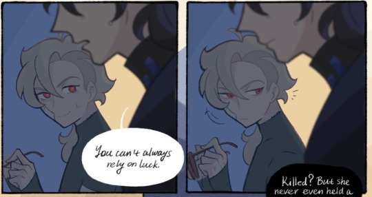
"300 tracks"
you know those hand signals tyler does during the line "300 tracks in my Adidas track jacket"?
i, like probably everyone else, assumed that was him signing 3-0-0 with his hands.
but no. he's signing F-0-0.
consider the ASL signs for F vs 3:
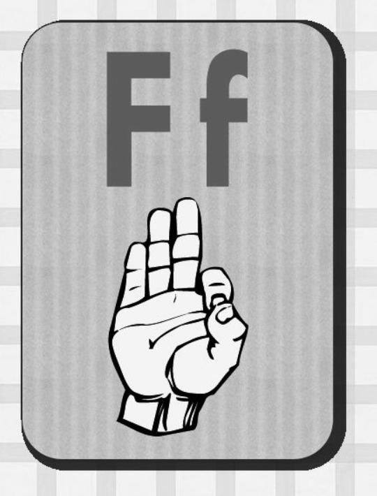
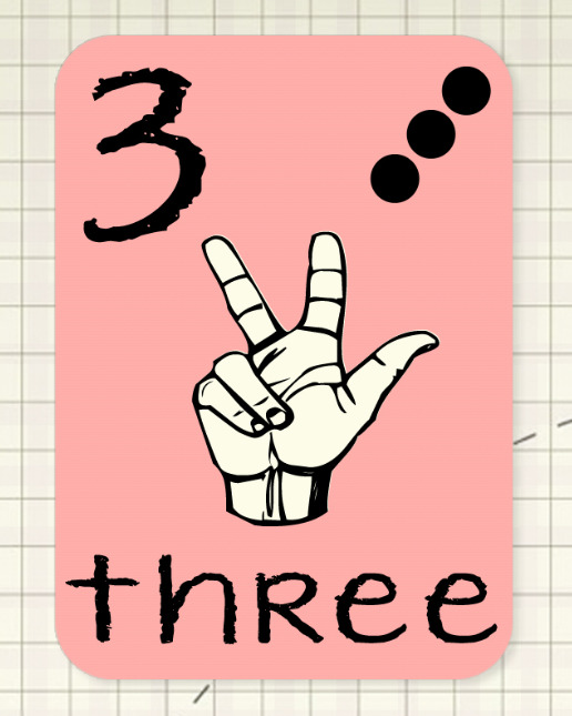
yeah, he's definitely signing F there
so what does F-0-0 mean? well, funny thing about that--you know hexcodes? those 6 digit codes that indicate a specific colour? well, there are also three digit codes as well, where you basically double each number to get the full 6 digit code. wanna guess what #F00 is?

yup, that's pure red babey!!
and, better yet, wanna know what its complementary colour is?
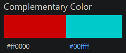
why it's pure cyan of course!!! y'know, like the whole __cla_im00FFFF.jpg = CLAIM CYAN = I AM CLANCY thing.
tyler, you sneaky sneaky bastard.
#twenty one pilots#overcompensate#clancy#i am clancy#claim cyan#fucking. colours man.#its all about the colours#specifically red and cyan#i am SO excited that they're actually. blatantly referencing the dichotomy in this era#colour theory my beloved#tumblr clique#cliqueblr#the clique#clique theories#theories#man idk how to tag this
2K notes
·
View notes
Text
my pettest peeve is when something is orangeish red or redish orange or some other in between color & someone says its orange instead of red, or red instead of orange. & people area like "umm are you colorblind 😂" like first of all. not how colorblindness works. secondly. admit that the lines we draw between things are manmade and not absolute. NOW.
#99.txt#yeah this is highly specific but happens too much#the whole color wheel pisses me off. red and orange especially. why are they so similar but get to be separated into 2 colors#meanwhile blue and cyan have to both be considered ''blue''. theyre different as fuck#<- guy who gets pissed about anything
10 notes
·
View notes
Note
Do you ever get interesting ideas but you can't use them?
i had a vague rw oc idea about something that isnt quite an iterator but actually a sentient virus who has partial or full possession of an iterator
but it needs to be a specific color scheme i dont want to work with right now
#asks.txt#pookapufferfish#the colors are specifically cyan and very bright red that is almost pink#and white#i also wanted to make an iterator based on my sona but i cant get it to work
10 notes
·
View notes
Text
Color blindness is a minor affliction affecting a bit under 9% of the early twenty-first century population. It is caused by the weakness (or absense) of some cones in the eye which degrades (or eliminates) color vision.
The most common form of colorblindness is "red-green" which has difficulty distinguishing between red and green and brown wavelengths, and often has difficulty distinguishing between blue and purple.
"Out of the blue" is an idiomatic expression meaning "unexpected." It refers to something coming out of a clear sky (referred to as "the blue" poetically).
The joke here is the swap of blue and purple, which is appropriate for the preceding color blindness diagnosis. In reality, a colorblind person would not mix up the words for the colors, and would know the expression. People in the early twenty-first century would be familiar with colorblindness (if not the specifics) and the idiomatic phrase.

#period novel details#explaining the joke ruins the joke#not explaining the joke means people 300 years from now won't understand our culture#I refuse to believe “purple” is a real color#it's just a pretentious shade of blue#like a royal phonecian or byzantine blue#and indigo/violet?#you can't HONESTLY expect me to believe those are also color categories#it's just shades like cerulean or cyan or turquoise#overly specific ways to refer to colors#harumph#everyone is just messing with people#I will acknowledge green and red as different colors even if I can't see the difference#but brown is dark green and purple is dark blue#double harumph
51 notes
·
View notes
Text
Just some observations I made about Megane's latest Rota Fortunae crumbs after going back to it over and over again (if you haven't read it yet, go check it out first). Maybe you'll already have noticed most of it, but hopefully not everything. Either way, I really just feel like rambling.
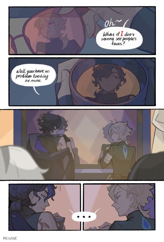
First of all, this is clearly set before their trip to Sunday's shelter. In fact, it's most likely the earliest part of the timeline we've had so far. It's noticeable through the fact Aven just got the glasses and doesn't appear to have the earring he has on his ref sheet and during the animation.
About the earring, if you look at this panel:
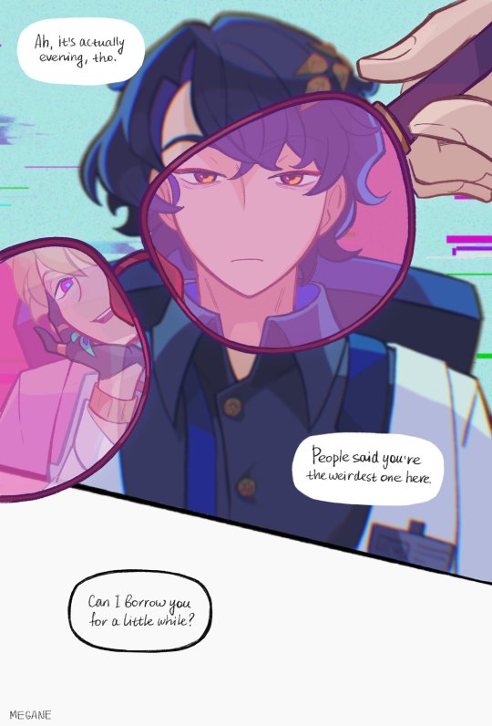
You'll notice that Human!Aven (let's call him that for now) has a peacock feathers earrings. It's not exactly the same Android!Aven has, but it's a similar style. Now, there's two conclusions you can make of that: either Android!Aven bought it himself because it fits his style and he most likely subconsciously remembers his past to an extent, or Ratio gave it to him because it reminded him of the one Human!Aven used to wear.
Now, onto this Human!Aven if you will, because how do I know he's human? It's somewhat easy to guess, but there are still some signs: first, his eyes. As an android, Aven's eyes become magenta and cyan when behind glasses, but here it's a reflection. It would seem his human appearance naturally had the Avgin eyes (if Avgins even exist in the Rota Fortunae lore). But there is a second sign that this Aven is human: his wrist.
If you look at this panel, you'll notice Aven's wrist has a joint (weirdly enough, there doesn't seem to be any joints on his elbow, but it's hard to see so maybe Megane just didn't feel like drawing it?) that isn't here on Human!Aven. Now, how did he go from being a human to being an android? We can only speculate on that, but the general guess seems to be that Aven died and Ratio transferred his consciousness in an android body. I love that theory, but only time (and Megane) can tell how right it is.
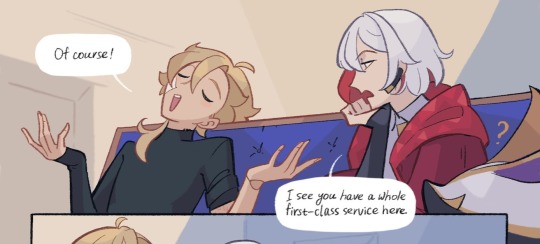
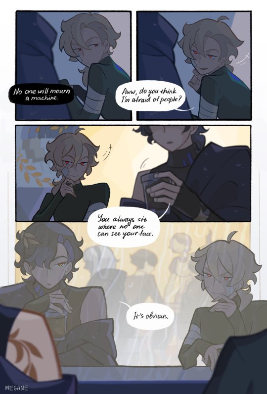
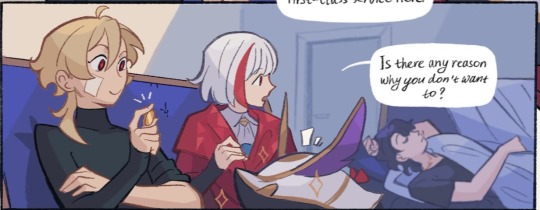
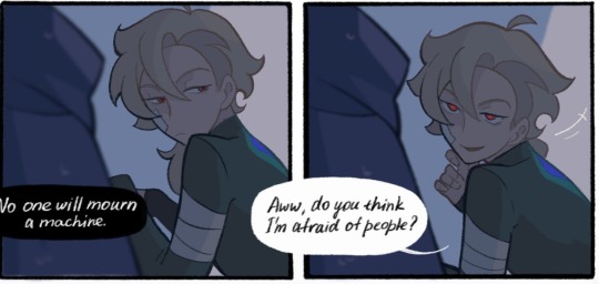
But I'm not done with my observations! Let's talk about Ratio! Though, I'll keep aside all the speculations about why he refuses to repair Aven himself. It's most likely out of guilt, but we can't know more than that for sure.
Just a silly little thing I noticed about him is that his hair curls when wet. It's such a small detail, but it's really adorable.
But what I mostly wanted to talk about is his tattoo (or whatever it is) because there's something really interesting about it. Let's take these two panels:
If you look closely at how far the tattoo reaches up his neck in the second image, you'll most likely notice that it doesn't appear to be there on the first image. Of course, maybe he just had it tattooed later, and it's a plausible explanation. But there's just something odd about the way Ratio uncovers that specific shoulder in that scene:
Maybe I'm just over interpreting. It's entirely possible. But the way he uncovers his tattooed shoulder like that kind of makes me think that it might be uncomfortable to keep covered. Kind of like when you have a healing scar and you don't like the sensation of the fabric rubbing against sensitive skin. In that case, maybe it's more than just a tattoo? Maybe it holds more meanings in relation to the Android rebellion? After all, there are some laurel symbols on the walls of wherever they are in that scene:
It's most likely linked to a faction such as the Intelligentsia Guild or the Genius Society (I'd lean more towards the former) as Megane suggested in the comments of that thread, but it's still interesting to note that tattoo wasn't there before the rebellion.
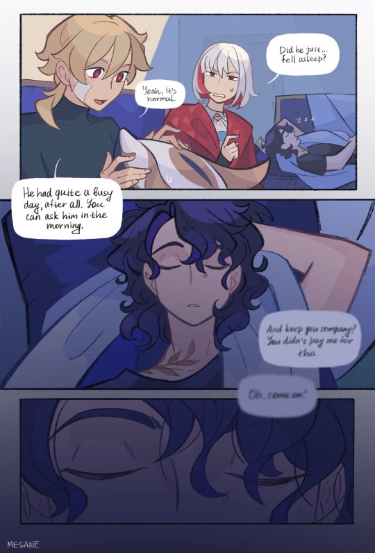
Now, a final observation about Aven and his eyes and it's that the brightness of his pupils seems to change depending on the situation:
Funnily enough, it appears to always brighten whenever he looks at Ratio (smitten much) at the exception of that one panel where he plays with Numby. This leads me to believe it might be some sort of emotional response (bright red eyes mean positive emotion and dark red eyes mean negative emotions. If I recall, the androids in the Rota Fortunae animation had dark red pupils) and it's just kind of cute to see how differently he looks at his Doctor.
Anyway, that's enough rambling for now (if only I could come up with that many words when I write my essays). I was supposed to be writing my fanfic's next chapter but I guess that won't be for tonight lmao. Of course, credit for all the images used in that small analysis goes to Megane. Go check out their work if you haven't already, it's definitely worth it.
Thanks for reading!
#Maki Talks#maki theories#honkai star rail#HSR#Rota Fortunae#Aventurine#HSR Aventurine#Veritas Ratio#Dr Ratio#Hsr Dr Ratio#Ratiorine#Aventio#Golden Ratio#I wrote all of this on my phone at 3am#Hence why the images aren't always in a logical order#And everything is so unstructured#But oh well#I wanted to show stuff I noticed and I did just that#Don't hesitate to point out stuff I missed or misinterpreted
451 notes
·
View notes
Text
We ask your questions anonymously so you don’t have to! Submissions are open on the 1st and 15th of the month.
What colour do you most strongly associate with ghosts? Red Orange Yellow Green Cyan Indigo Purple White Black Some other colour I don't associate ghosts with any colour
#polls#incognito polls#anonymous#tumblr polls#tumblr users#questions#miscellaneous polls#submitted jan 1#ghosts#color#color association
361 notes
·
View notes
Text
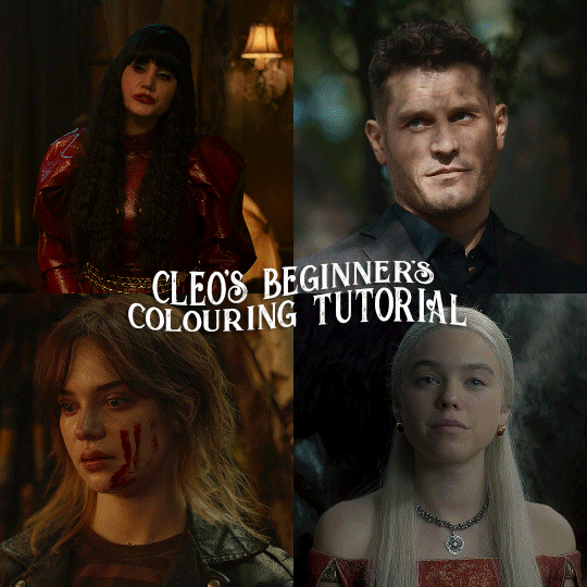
here is the colouring tutorial i promised to go with my beginner's gifmaking tutorial.
to save image space, i've written up a simple explanation of how each adjustment layer works here, so i'm just going to over my colouring for these 4 different gifs.
as always, very image heavy underneath
there are many ways to get the same results and i'll use various methods usually just based on what i'm feeling at the moment. some of it is a little convoluted, but hopefully this will give you a rounded idea of how it all works so you feel more comfortable playing around with your own colouring
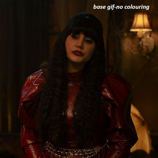
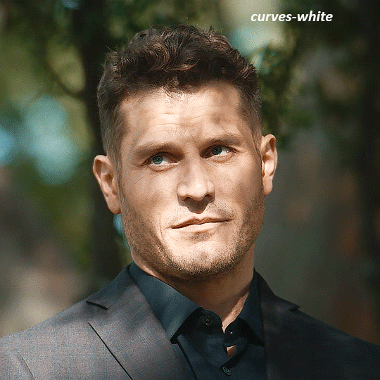
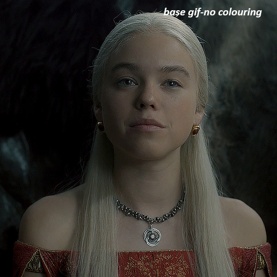
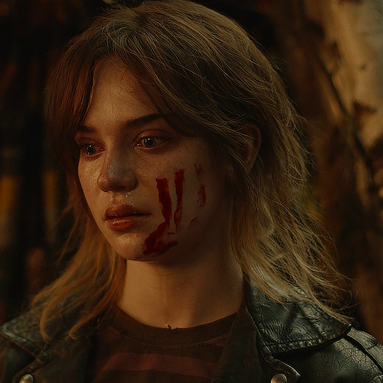
NADJA
this is the base gif with zero colouring adjustments, just resized and sharpened.
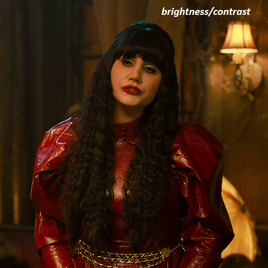
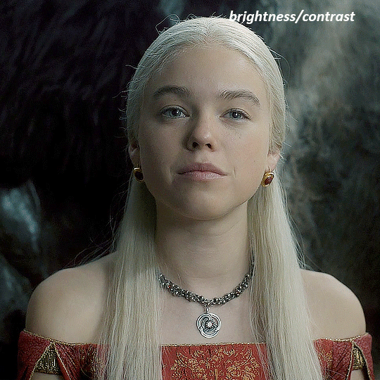
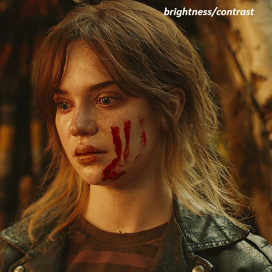
unless the base gif is already very bright, which doesn't often happen because directors nowadays are allergic to light, the first layer i add is always a brightness/contrast layer. i don't adjust any of the sliders, i just change the blending mode to "screen", and then adjust the opacity if needed. this gif was pretty dark, so i left it at 100%,
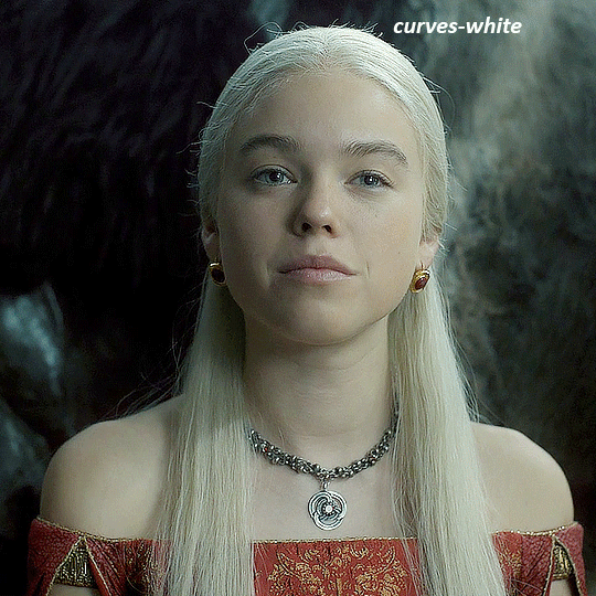
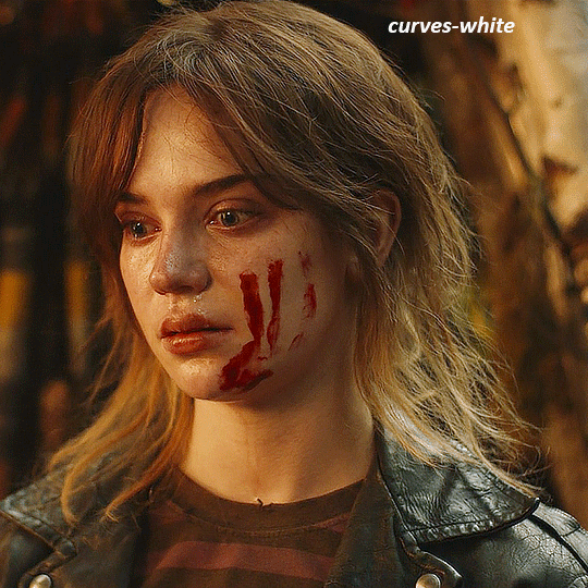
my next layers are always curves to even out the white and blacks. i use two curves layers, one for white and one for black. i used the white drop-picker and selected just below the lightshade on the lamp behind her, and for the black drop-picker i selected her hair near her neck which gives us this
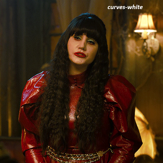
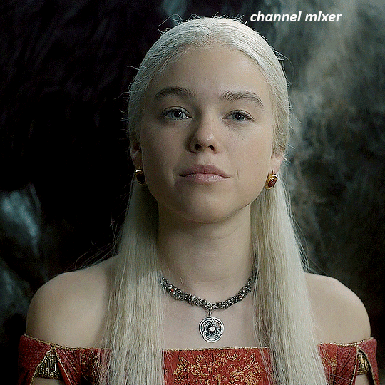
it's already looking much better, it's not as green tinted, but i want to make the red of her dress pop a bit more. in order to do that without making her face too red, i'm gonna remove some of the yellow. so next i'm gonna add a selective colour layer, and under the yellow channel i moved the yellow slider to -5 and the black slider to -52. now
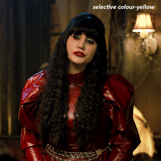
now that the yellow is reduced, i add another selective layer, and under the red i move the cyan slider to -66 and the black slider to +29. now the red of her dress pops and her face is still a realistic tone. when i first made the gif, i added the red selective layer first, then added another selective layer under it and adjusted the yellows to offset it. you can always shift layers around or add a new layer underneath as you go.
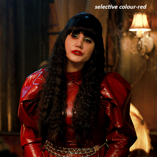
voila
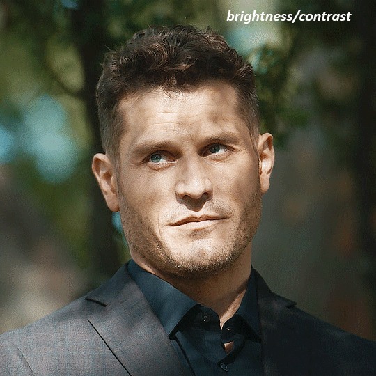
TOMMY
here is our base gif

this scene is better lit than the nadja one, but i prefer bright and colourful gifs, so i'm gonna once again add a brightness/contrast level and keep it at 100%
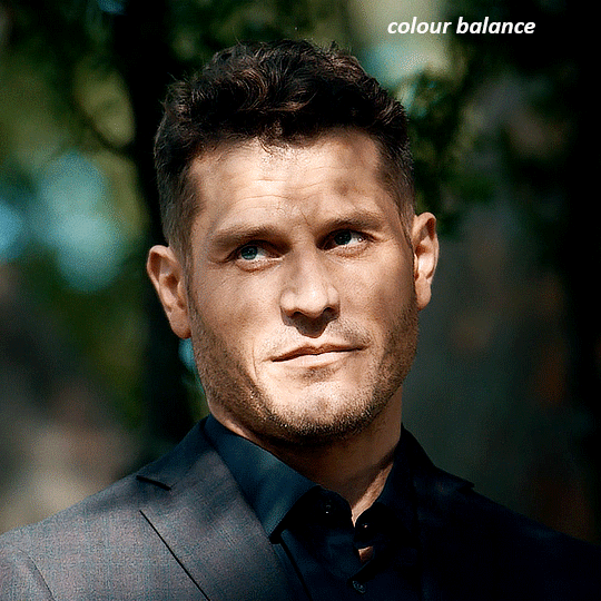
and then the curves layers to even it all out. since there isn't a spot that is immediately noticeable as white, you can hold the alt button with the white dropper selected and it will highlight all the white/very near white pixels. you can also zoom real close in to select specific pixels. i selected a from the white area around his chin/mouth. the same process works for finding a black spot with the black dropper, and for that i selected from a dark spot in his hair
the curves layers evened it out but also made the gif a bit more red and warm toned, and since i've decided i want the end result to be more blue/green, so i'm gonna add a colour balance layer. in the shadows channel i moved the cyan/red slider to -16, and the yellow/blue slider to +11
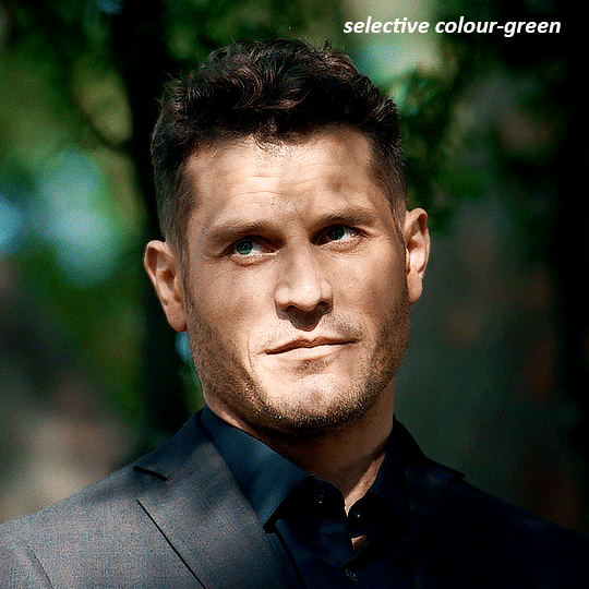
now the gif already looks great, it's bright, skin tone is accurate, he's not washed out, but like i said i like my gifs colourful, so i'm gonna add two more selective colour layers. in the first i'm gonna adjust the greens, bringing the magenta slider to -87, and the black slider to +81. in the second layer i'm gonna adjust both the blues and cyans, because when you see blue in a gif it's rarely ever straight blue or straight cyan, so always adjust both. (you could adjust the blue and green in the same layer, but i prefer to do them separately in case i need to move the layers around)
now finally i'm gonna add a hue/saturation layer because i think the blue of his suit is too blue when the sky behind him is more cyan. (also, since you only have 256 different colours to work with, you don't want too many different colours otherwise it will distort the colouring.) in the blue channel i move the hue slider to -12 to make the blue a bit more cyan, and i also move the saturation to +38 to make it pop more
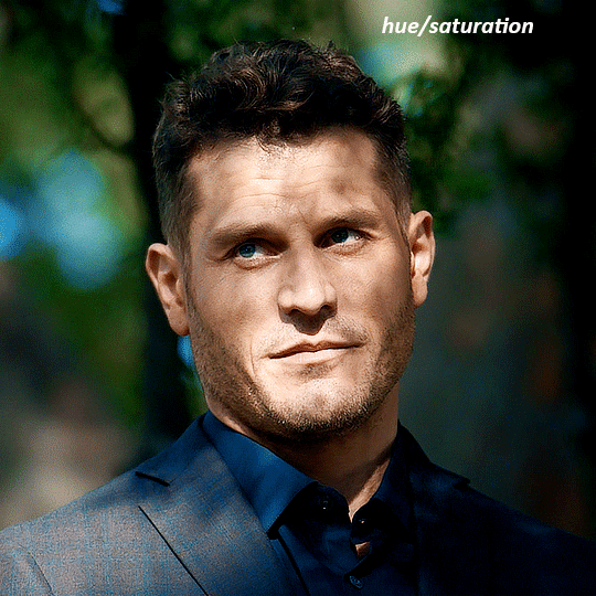
and voila
RHAENYRA
here is the base gif (this one is going to get very convoluted and imo best exemplifies what colouring gifs is like most of the time)
as always, a brightening layer set to screen
now the curves layers. for the white i clicked on her hair at the top of her head, and for the black i i clicked in the shadows to the left of her.
but as you can see, while it added contrast, it also made the gif more green tinted than it was. you could click around more, or manually adjust the red, green, and blue lines on the curves until it looks better but i decided to add a channel mixer layer instead. in the green channel i set the greens to -95, and in the blue channel i set the blue to -97
next i wanted to add a little contrast, but i find that using the contrast in brightness/contrast can saturate it too much, so instead i added a levels layer. first i adjusted the bottom bar, moving the right slider to 230 which reduces the overall brightness of the gif, so when i adjust the top bar it doesn't brighten the gif too much. on the top bar, i moved the right slider to 212, and the left slider to 9
now, i'd like it to be not exactly warm toned, but less cool, and while i could use colour balance or a photo filter, i'm instead going to add a gradient map, using the default gradient pink 08, and setting it to blend mode soft light at 50% opacity

next i just want to increase the blacks a little, so i'm gonna add a selective colour layer and under black i'm gonna set the black slider to +10
it's still not as warm as i'd like, so i'm gonna add a colour balance layer, in the midtones setting the cyan/red to +10 and the yellow/blue to -5
we're almost done, but i want to make her dress pop a bit more, so first i'm gonna add another selective colour to bring the yellows down a bit, setting the black slider to -15

and finally one more selective colour layer, in the reds, setting the cyan slider to -50, the yellow slider to +10, and the black slider to +15
voila
NATALIE
here's the base gif
as always the brightness/contrast layer set the screen
now the curves layer. for the white, i zoomed in and selected a pixel on her cheek under her right eye. for the black i the dark spot just above her head
now she's very yellow, so i added a channel mixer layer. in the red channel i set the reds to +88. in the blue channel i set the reds to +10
she's still a little too yellow for my liking, so i'm gonna add a hue/saturation layer, and under the yellows i'm gonna adjust the saturation to -60
finally, i want her to be a it brighter, so i'm gonna add another curves layer, but instead of using the drop, i'm going to manually adjust it. the two points along the line are where i selected it and then i dragged until it looked how i wanted. i start with the upper dot, which made it brighter and moved the line into an arch, and then selected at the lower end of the line and dragged in back closer to centre to add some darkness and contrast
voila
and that's how i do my colouring. it's generally all trial and error, using a layer to fix one thing and then needing another layer to fix something the previous layer did.
play around, have fun, see what works for you and what doesn't. it will take a while for you to develop your own method and style, and even then you'll come across scenes that make you question if you have any sills at all. you do, directors just hate us
have fun and feel free to ask any questions
#tutorial#gif tutorial#colouring tutorial#photoshop tutorial#gifmakerresource#completeresources#*tutorials
272 notes
·
View notes
Text


Redesigns of Sonic, Manic, Sonia, Amy, Knuckles, and Tails for Sonic Underground: Back in Action!
Bit of lore about the new medallions for ya'll: The medallions of Sonic Underground: Back in Action (SUBIA) now take the place of the chaos emeralds. Each medallion stores its own power and instrument, with each being tied to one specific person Queen Aleena - The Microphone Medallion (Silver) Sonic - The Guitar Medallion (Blue) Manic - The Drum Medallion (Green) Sonia - The Keyboard Medallion (Pink) Tails - The Organ Medallion (Orange) Knuckles - The Saxophone Medallion (Red) Amy - The Bass Medallion (Cyan) Queen Aleena, Tails, Knuckles, and Amy all either had their medallions passed down to them or found them on their own. The triplets (Sonic, Manic, and Sonia) were gifted them at birth due to the prophecy. The caveat however, is that the triplets can only use their medallions when in harmony.
#sonic the hedgehog#sth#sonic#sonic fanart#sonic art#sonic the hedgehog fanart#knuckles#knuckles the echidna#knuckles fanart#knuckles redesign#tails the fox#miles tails prower#tails#tails fanart#amy rose#amy the hedgehog#amy rose fanart#amy rose art#manic the hedgehog#manic#sonic underground fanart#sonic underground#sonia the hedgehog#sonia#sonic underground back in action#SUBIA#sonic underground: back in action
1K notes
·
View notes
Text
#mARTch 2024

text version (with more info!) under the readmore! please check it out if you're confused about anything <3
F.A.Q
do i have to draw every day? no!!!! there are skippable days built into the event, please use them whenever you need them! i really don't want anyone getting a wrist injury!
can you share my art? yep! i try to share entries to @bweirdevents daily during the event!! the tags can get busy tho so i might miss some posts OTL sorry
what are the tags? #mARTch is the main tag, but this year you might find posts in #mARTch2024 too!
wait, i'm confused about a prompt... full breakdown of all the prompts below ↓ with helpful hints if you're stuck!
_____
INTRO WEEK
this week is all about your artistic identity ... technically, you don't have to draw anything new this week if you have some art that already fits. the starter days are:
1 ⭐ self portrait who are you? it doesn't have to be you IRL .. if you feel more comfortable drawing a fursona or mascot, that's fine too! if you don't wanna draw, you can also just share old self portraits today and talk about why you drew yourself that way!
2 🤍 inspirations see how this day doesn't have a star? that means it's optional and you don't have to do it at all! but if you really wanna- tell us all about what inspires you to create art! this could be anything from the people that inspire you, the shows you like, the pins on your big messy pinterest board, or concepts that you're drawn to! you can draw something about it, talk about it, or just post your inspirations! anything is fine
3 ⭐ fav thing to draw what do you like drawing most? backgrounds? animals? one specific animal? bust of your oc facing left? cars? the same anime boy over and over and over? no judgement!! show us :)
_____
STUDY WEEK
this is the week we actually start drawing from reference! polished art is not required at all, quick sketch studies are fine! please don't burn yourself out
4 🤍 plant
5 🤍 body
6 ⭐ animal
7 🤍 object
8 🤍 food
9 🤍 face
10 ⭐ hand
these ones are pretty self explanatory! you can do them as realistic studies, or adapt them into your own art style, it's all fine! you can reference from your own photos or from resources on the web.. have fun!
_____
COLOUR WEEK
this is the week for playing with palettes and working on your colour theory skills! if you're really struggling with these ones, don't worry about drawing scenes or characters, you can just have fun splashing colours around on an abstract canvas!
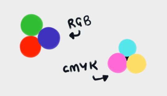
11 🤍 RGB a set or primary colours typically used in digital/screen art - red, green and blue!
12 🤍 CMYK a set of primary colours typically used in traditional/print art - cyan, magenta, yellow ... and key (black!)
for both of these days ↑ you can add in black and white. and feel free to combine the two days into one, if you're struggling with a three-colour palette! use all six!
13 ⭐ WARM COLOURS the warm side of the colour wheel, reds oranges and yellows!
14 🤍 MONOCHROME monochrome doesn't mean black and white ... it means one colour! that can be any colour at all- shades of red, shades of purple, shades of green .. or yeah, grey if you really want!
15 🤍 COMPLIMENTARY complimentary colours are the ones opposite each other on the colour wheel! they're kinda married

16 🤍 YOUR FAV COLOURS pick any palette that works for you! where's your comfort zone? what looks nice to you? what colour combos do you always go back to?
17 ⭐ COOL COLOURS the cool side of the colour wheel, purples, blues and greens!
_____
CREATIVITY WEEK
this week is all about vibes! try to create something that matches the mood of the prompt .. they're vague on purpose! don't overthink it, just draw from the heart!
18 🤍 SMALL you could draw something that's really small, like an ant .. or draw on a canvas that's really small .. or use a really small brush .. get creative with it!
19 🤍 DANGER try to capture the adrenaline .. the rush .. the fear that you associate with the word danger!
20 ⭐ SOFT soft colours, soft textures, soft vibes ... whatever makes you comfy!
21 🤍 MIDNIGHT darkness and secrecy .. spooky witchy vibes .. the tranquility of a forest at night .. the fun of a late-night party .. there's lots of ways you can take this!
22 🤍 POWER what does this word make you think about? superpowers? control and oppression? literal electrical power? something else?
23 🤍 CHILL chill as in calm? or chill as in cold? who knows .. it's up to YOU!
24 ⭐ LOUD try to draw something that feels LOUD! BRASH! IN YOUR FACE! how can you convey sound through art?
_____
FUN + GAMES WEEK
this week is just for enjoying yourself! take it easy and have fun! also .. another reminder! there are skippable prompts! if you're tired and struggling to get to the finish line, please don't hesitate to skip a day!!! or multiple days!! as many as you need!!!
25 🤍 TRY A NEW ART STYLE copy the art style of a show you like, ask a friend if you can try their style, draw the eyes a new way, develop a totally new style on the spot... whatever you want!
26 🤍 DRAW WITH YOUR NON-DOMINANT HAND righties, draw with your left! lefties, draw with your right! ambidextrous nation ... our time to show off!
27 ⭐ DRAW WITH YOUR EYES CLOSED don't peek! try to draw something without looking! if you really want, you can colour it with your eyes open after you draw the lines/sketch with your eyes closed... but please try not to cheat with the actual drawing part!
28 🤍 RE-DRAW SOMETHING OLD find some old artwork you like, or something you feel like you can do better on now, and give it another go!
29 🤍 RE-DRAW A MEME find a silly picture on the internet to redraw .. do you have any in-jokes with your besties?
30 🤍 DRAW A GIFT FOR A FRIEND create something for someone you love <3
31 ⭐ FREE CHOICE final day! you can draw anything you want today! show off your skills! draw something you've been meaning to draw! whatever!
_____
please refrain from reblogging this post after march ends - next year's prompts will be different, thank you! if you have any additional questions, don't hesitate to shoot me an ask!
946 notes
·
View notes
Text

hello and welcome to my tutorial on how to create gifs like this one! full explanation under the cut, but if you wanted to take a little peek at the gifset attached to this tutorial, here ya go!
for the purposes of this tutorial i am assuming you know
how to make a gif
what vhs footage looks like
STEP ONE: MAKING YOUR GIF
choose your footage and plug it into your desired software of choice! i use photoshop for this so i can only attest to the efficacy of these methods in that context
as for shot selection, you could feasibly choose anything. however, i prefer shots without too much movement in them - makes it look more like a home video.
because of the heavy amount of colors and filters, i'd recommend a gif somewhere around the 40-50 frames! but of course you can play around.
oh i also set the frame delay to 0.08 seconds. this is slower than most gifmakers tend to set theirs, but it makes it run buttery smooth imo.
STEP TWO: MAKING THE COLORING
here's where we get vhs specific. if you're unfamiliar with vhs footage, i recommend clicking through this youtube playlist! if you're not interested in the coloring, skip to step three (smart object fuckery + filters)
now while making a set i tend to choose some primary colors for my gifs. in the gifset i linked above, i chose to work with blue and orange-y yellow. in some of the other gifs i'll be using as examples (from an unfinished set) i chose green and yellow.


to create the above coloring i generally use these steps:
1) curves
i'm a maniac so i use the same curves layer to initially edit the luminosity AND colors of my gifs. the purpose of this layer is to edit brightness/contrast like i normally would and already start the process of changing the colors a little bit. this is my curves layer for the blue house gif:

to make the gif go from the left image to the right image:


as you can see i used the brightening curves to make the footage a whole lot lighter. i also increased the reds to get rid of the cyan tint a lot of blue footage has, slightly increased the blues, and once again decreased the greens to get rid of any cyan. this does make the blue hue a bit more purple, which is a nice bonus!
as for the gif of the boy, that one's a little harder to show a before and after for, but i'lls how the curves for good measure:

the original shot was already quite bright so i only edited the brightness a litttle bit. because i knew i wanted the gif to be green and yellow, i increased the greens, decreased the reds (except in the shadows), and decreased the blues (to get yellow)
2) channel mixer
now the channel mixer layer takes a little getting used to so i recommend experimenting. ALWAYS USE THIS LAYER ON THE COLOR BLENDING MODE for a more even result.
i use channel mixers to sort of... unify the colors a bit more. for the house gif, for example, i increased the blue channel to +110% blue, but decreased the blue in the red (-12%) to retain the yellow in the window.
if you want me to explain this more in depth, send an ask! it'll be kinda longwinded though


before / after of the boy gif with curves/channel mixer.
3) levels
this is where it starts looking more vhs-y! vhs footage has light shadows and dark highlights.
first, set your levels layer to luminosity blending mode to retain your beautiful colors.
then, crunch the hell out of your gif to make it very... mid.


this may feel a little wrong at first but i prommy it'll look okay at the end. a before/after for the boy:


now that's starting to look familiar right?
4) color fill/gradient map
because i want to unify my colors/make sure my gif is saturated, i usually add either a color fill or gradient map layer. in the case of the house, i chose to go with a dark blue color fill:


because the coloring of the boy gif was a little more complex, i decided to go with a brown to green gradient map.

this will make the shadows yellow, and the highlights green.


BOTH THESE LAYERS ARE SET TO OVERLAY. i usually fiddle with the opacity of them until i like it, but it's anywhere from 7% - 17% depending on what i feel like that day
5) curves (again)
this layer is probably useless but i do it anyway to make myself feel better. this is just a regular curse layer to up the brightness a tiiiiny bit and amke sure everything's clear. also it helps counteract the darkness your overlay color will add in.
6) color balance
this is my most subtle layer so i won't be able to show before and after but i fiddle with the color distribution a little until i'm satisfied. set this layer to color blending 'cause that's what you wanna affect!
i decided i wanted the house gif shadows to be a little more purple, for example, so i added in red (+3), magenta (-1) and blue (+1). etc etc. do what feels good!
STEP THREE: SMART OBJECT FUCKERY AND FILTERS
OKAY that was a lot. sorry or you're welcome. but good news: now's the fun part. convert your animation to a timeline, then select both your coloring and gif layers, right click, and select convert to smart object.
now that your gif's a smart object, i usually crop it. i tend make vhs aes gifs a 4:3 ratio (so 540 x 405 px) because that's what vhs footage was usually recorded as! crop your gif, resize, and then we can continue.
1) color bleeding
vhs footage usually bleeds its colors - this manifests as a short of... weird subtle halo around any object. the way to recreate this in photoshop is to duplicate your smart object.
set your copied smart object to color blending. now move it to the side a couple of pixels (i usually do around 5px, but you do you!)


as you can see, the tree and chimney (and everything else but less prominently) have a yellow shadow to them. this is exactly what we want!
2) filters
now's the time to add your filters and make it look like shit (but on purpose!) first, select both smart objects and convert to smart object again. this will ensure the filters apply to all layers evenly.
i use the following filters:
unsharp mask (amt 35%, radius 4px) - this will subtly add some sharpening but only on the edges of objects
add noise (amt 7.5%, distr. uniform, not monochromatic) - this will add the signature vhs grain.
box blur (2px) - i edit this to be 75% opacity with the little arrows to the right, just to make sure you can still make SOMETHING out when you're looking at the gif. MAKE SURE THIS FILTER IS ON TOP OF YOUR NOISE FILTER. tumblr will kill your gif otherwise
4) ONE LAST THING
usually at this point i'm not happy with either the saturation or levels. (usually the levels). so on top of your smart object, add another saturation or levels layer and fuck around!
in the case of the house gif, i thought it was too bright still so i set my output levels to 13 and 216. for the boy, i thought the shadows were too dark, so i set my shadow output to 11.
BEFORE & AFTER:


aaaand that's it! thanks for reading! if you have any questions, feel free to come to my askbox, i'm always happy to explain my process. happy giffing 🥰
#gif tutorial#ps tutorial#photoshop#completeresources#allresources#giffing tutorial#vhs gif tutorial#idfk. what do you even tag for tutorials lmao
323 notes
·
View notes
Text

1st horseman - Conquest
(click for better quality)
timelapse and rambles under the cut
i finally fucking did it hell yeah!!!
ok so i had the idea to have each bad sans (killer, dust, horror & nightmare) as each of the horsemen of the apocalypse. i started it about a months ago, planning to release it on halloween (turns out that didnt really work out as you can see)
but now its finally done! the 4 drawings are all finished, im gonna post them over the course of this month so i have time to focus on comics (i have one comic in mind especially where all the scenes are done, i just need to make a clean script and makes the actual pages) (and maybe writing? i've been reading stuff on ao3 and im getting inspired)
also some stuff in the drawing (easter eggs? idk)
the purple color on the bow end & feathers is the KR/karma color (or at least close enough) Dust's eye is red & cyan (obviously), but i always headcanon him as having more patience than perseverance (except purple on red looks like shit so i draw it cyan anyway), but i did add a small sliver of purple between the 2 colors the text in the background is the message you get at the end of a fight when leveling up, and this one specifically (200 XP 0 gold) is for papyrus
anyways
Why Conquest for Dust?
part of it was by elimination, but between the 4 choices i feel Conquest matches best thematically. famine is out of the question, death feels too important to be him, and civil war is too chaotic/not really as calculated as i imagine him to be.
conquest's elements are: the color white, a bow, and the themes of conquest, but also "noble" war (between countries, by opposition to civil war) or religious war. white isn't especially about dust, but the bow i feel works because he would fight at a distance (and generally try to distance himself from what he's doing)
Dust's story is all about fighting an enemy who's on the other side of the barrier (the human), so linking it to war makes sense, and he thinks going on a killing spree is the only way he can save everyone/make things right, so the "noble" side of it matches pretty well. (also conquest can be/has been interpreted as the christ/antichrist, and i headcanon Dust has a huge savior complex so this absolutely matches)
enough ramblings, here's the timelapse!
#liem art#my art#utmv#dust sans#dusttale#conquest#four horsemen of the apocalypse#horseman of conquest#cw for too many ramblings#much text#shit always looks lighter than i want it to#should probably try to color correct my screen but eh#doesnt bother me enough to actually do it
201 notes
·
View notes
Text
Month Colors Poll: Quarter One
Ok, here's the months poll to follow up the season color association poll. These will be split into 4 post chains to prevent them from being a thousand miles long. Here's a key for the genres of color I'm talking about, since people got confused about how I divided blue, but tumblr polls don't let me do image options and I refuse to change my ways. I'm also adding a second green by popular request. Black got removed because of option limits and low votes. Sorry. If the specific color on your mind isn't here, round to the closest alternative.

#Very interested to see the results because while it seems the season colors were driven by the natural environment#I have a hunch these will be more driven by cultural associations.#color association poll#poll
153 notes
·
View notes
Text
Proposing new meanings for the Disability Pride Flag stripes
I love the design of the disability pride flag made by @capricorn-0mnikorn (in consultation with many disabled people!). It’s beautiful, elegant, and distinct. I love the symbolism of the diagonal stripes.
But the more I think about the meanings of the five diagonal stripes, the more uncomfortable I am with them. So I'll explain my discomfort and then give proposed alternative meanings.
For those unfamiliar, these are the meanings that capricorn-0mnikorn gives:
The White Stripe: Invisible and Undiagnosed Disabilities
The Red Stripe: Physical Disabilities
The Gold Stripe: Neurodivergence
The Blue Stripe: Psychiatric Disabilities
The Green Stripe: Sensory Disabilities
With additional and helpful context here! 💙 Like a lot of disabled people my disabilities don't all fit neatly into these boxes, but I recognize some disabled people see themselves in these categories. I do appreciate the symbolism of it being the most common flag colours / internationalism plus the intent of representing diversity amongst the disability community.
Here’s what doesn’t sit well with me:
The yellow was chosen for the neurodiversity stripe because gold = Au = autism (and also as a fuck you to autism speaks, a sentiment I agree with 💯).
So autism is used to represent all of neurodiversity. Even though the 2018 AutisticsUK campaign to associate gold with autism was explicitly motivated by the idea that neurodiversity is larger than just autism and autistic people should have our own colour/symbol distinct from the rainbow infinity used for general neurodiversity.
One specific disability is effectively being given a whole stripe (autism) while the other four stripes are based on abstract ideas: red is associated with body -> physical disability, blue is associated with the mind (and is “opposite” to red) so -> mental disability. This is reasonable but it’s inconsistent. (And I am very much the kind of autistic who gets bothered by internal inconsistency 😅)
The Deaf community has been using cyan blue for ages (since at least 1999, probably older) and they have been so vital in disability rights history. I feel if any single disability deserves to get an entire stripe to themselves it should be them.
I appreciate the honestly that assigning green to sensory disabilities was because “that was the color that was left over” but it still feels wrong given how vital blind & deaf people have been to disability history.
Blue for mental/emotional disabilities also misses that the Mad Pride movement has been using purple as their colour since at least 2013.
If all five stripes were disconnected from actual disability-specific pride flags I think I’d be okay with it. What sets me off is the inconsistency: autism gets the privilege of its own chosen colour but not other disabilities? (Also: autism isn’t the only disability that uses yellow!)
My proposal for new meanings
I propose each stripe represent a different cause of disability, and the associated model(s) of disability that go with that cause:
Red: disability due to injury / the debility model of disability - e.g. injury due to armed conflicts caused by colonialism, injury due to gun violence in a country which fails to regulate gun safety, preventable illness due to sociopolitical neglect 😡🩸
Yellow: disability due to natural differences / affirmative models of disability - e.g. autistic people who lead lives that take advantage of their autistic traits, DSPS folks who are able to work night shifts and take pride in doing so 😄🌟
Blue: situational disabilities / critical models like the social model, social construction model, political/relational model, and radical model - e.g. a Deaf person who feels their only disability is that people don’t speak their signed language and don’t provide captions/etc 🗣️♿️
Green: disability due to illness / biomedical models of disability - e.g. people with conditions like ME/CFS and Long Covid who actually do want to be treated/cured 🤢🦠
White: disability caused by unknown or other factors / other models such as the human rights model - e.g. somebody with a poorly-understood and/or undiagnosed illness who is fighting for access for accommodations and medical care 👀🤍
People may relate to multiple stripes! Whether it’s for the same disability or for having multiple disabilities. Like the old meanings, the intent is to showcase our internal diversity. 🌈
It’s been my experience of disability community that attitudes about disability tend (in general) to be linked more to when/how we were disabled rather than mental/physical/sensory/etc. For example, people like me who were disabled from a young age tend to understand our disabilities differently than people who acquire disability later in life.
Colour choice justifications:
Red as disabilities caused by injury: keeping with capricorn-0mnikorn’s association of red with the body plus the common associations of red with blood, violence, and anger. I want to explicitly include the debility model of disability because a lot of white disabled people tend to forget or gloss over how disability is used as a weapon against racialized & Global South folks.
Yellow is associated with optimism and pleasure as well as enlightenment (such as in the Deaf flag) and so I connect it to the affirmation model of disability (which is the opposite of the charity/tragedy model). From there I associated it to disability due to natural differences, such as congenital neurodivergence. I want yellow to still be something that fellow autistics could still see themselves in the flag for! 💛 And I want intersex people who see their intersex variation as a disability to be able to see themselves here too because being intersex is natural 💛
Blue as disabilities that are social/situational in nature, like Deafness being a disability in situations where signed languages are unavailable. I wanted Deafness to actually be under blue this time. 💙
Blue has also been used for disability writ large for a long time now and so this one being the one associated with the Social Model feels most historically connected to me. I’m also including newer critical/postmodern models like the social construction model and radical model which also posit that disability is a social category rather than a deficiency of individuals’ bodyminds.
The social model is generally contrasted with the medical model - viewing disability as a medical problem. A lot of disability activism is focused on de-medicalizing our bodyminds and challenging the idea that we want to be cured.
But there are chronic illnesses like ME/CFS, long covid, and cancer where the people who are disabled by them do actively (and vocally) want to be cured! And they belong to the disability community too. Green was picked for illness because green has been used to symbolize sickness (e.g. the 🤮 emoji). And biomedical models like the traditional medical model and the more recent biopsychosocal model are thematically connected to disability being due to illness.
For white, I want people who are undiagnosed and/or who feel the invisibility of their disability as important to again be able to see themselves in this stripe. 🩶White is also the catch-all “other models” because of white being the sum of all colours in an additive colour model. Models like the human rights model I see as being appealing to disabled people who are feeling invisibilized by society.
For each stripe I've included both a cause of disability and a model of disability. The causes are concrete, and easy to understand. The models of disability are more abstract and not everybody will know them (especially ableds). But a flag gives us an opportunity to teach others about us and I think it's a great opportunity to increase awareness of the different views/models of disability. 🖤
Overall, I tried to keep as much of capricorn-0mnikorn’s reasoning/associations alive in my new proposed meanings as I could. 💜 I hope people who see themselves in a given stripe of the original flag will see themselves in this scheme as well. I hope people who didn’t see themselves in the original scheme find these options more inclusive. ☮️
#disability pride#disability#disability pride flag#flag meanings#colour meaning#disabled pride#pride month
291 notes
·
View notes
Text

It’s never really explained how Silver time travels in modern (we only see the Chaos Emeralds being used in 06 and never again) so it think it would be neat if they brought back the time stones from CD
Game idea and Time Stone text below
Silver needs his own game and I think it would be neat it they made it so you had to solve puzzles by going back a forth through time to change things
Maybe even incorporate different endings like a good bad and neutral future like in CD or Shadow the Hedgehog
It would be neat to have a Sonic game where you had to slow down and find the little things that change the future
I also thing him having his own game would help explore and explain his powers because I feel like he is a lot more powerful then most people give him credit for
I might make some more posts about game concepts but this is what I have so far
————so on to the Time Stone’s powers————
I decided to give each of the stones their own power (yes I know they can all time travel when used together) but I like to think that when they are together they can use any sort of time based power to the extreme
—
Red
Individual Power - Time Acceleration/Deceleration
(Can speed up or slow down time)
—
Orange
Individual Power - Time Reversal
(Rewinding and turning back time)
—
Yellow
Individual Power - Time Looping
(Making time loop over durning and over a specific period of time)
—
Green
Individual Power - Time Bubbles
(Can make a pocket where time moves differently then the space around it)
—
Cyan
Individual Power - Time Travel
(Being able to move through time and teleport to different time periods)
—
Blue
Individual Power - Time Freezing
(The ability to stop time)
—
Purple
Individual Power - Precognition
(Being able to see and predict the future in multiple time lines)
—————————————————————————
Of course each power from the stone would have some sort of weakness to make sure
1 - they aren’t over powered
And 2 - they don’t accidentally overlap with the others (like how rewind or speed up could “Travel” to the past of future)
The weakness are some what dependent on the user so a user can work to make the powers stronger
(I have Ideas for the other holders of the time stones being; Platinum, Sapphire, Diamond, Gold, Ruby, (Silver), and Bronze based on the jubilee hierarchy but I’ll make a more detailed post about them later)
90 notes
·
View notes
Text
also something I’ve had on my mind ever since the dandys world easter update, bc of flyte. there like. aren’t any pink butterflies? there’s the pink cattleheart and the common rose swallowtail or thr ruby spotted swallowtail but those are all Mostly Black with pink Spots, and even then they all seem to be red usually. there’s the pink foresters and those Have Pink but they’re still not primarily pink. i think the closest i can find is the spotted lilac tree nymph butterfly, but like. is that really it. is that all the pink butterflies can Get
and like by the way, mostly unrelated to what i originally made this post for, but it damn Bothers me how when i want to look for butterflies in a specific color I’m always getting images of Recolored monarch or sometimes morpho butterflies. like idk if you know this but there are a lot of butterflies. that come in like every color except fucking pink i guess. there is a real life butterfly that looks like google’s cyan recolored monarch and it’s called the chestnut tiger butterfly. you want red? maybe the noble leafwing
and idk if you know this but some butterflies are a lot more visually interesting than a monarch. google purple emperor and lesser purple emperor butterflies right now. google malachite butterfly. red spotted purple butterfly. blue hatchet wing butterfly. mourning cloak butterfly. malay red harlequin butterfly. look at the mexican bluewing i just reblogged. take my hand. we don’t need to keep recoloring images of monarch butterflies
i am also big fan of moths☝️. it’s just that they’re allowed to be pink (rosy maple, elephant hawk, pink spirit, and pink silk moths Just Off The Top Of My Head) and also they don’t get the google recolor treatment. like i think the luna moth is maybe the most iconic moth like how the monarch is for butterflies but even then i don’t see Recolored luna moths
69 notes
·
View notes
Text
Hello!
I'm Cyan (or anything you wanna call me) this blog started as just a stash for Dungeon Meshi extras and worldbuilding details but expanded as people asked questions and I did my best to answer! Hope you find it as useful as I do. I try my best to categorize my posts so they're easy to find but sometimes I forget.
If you'd like to share something you compiled yourself feel free to send it to me and I'll reblog it! You can also send a submission if you'd prefer. The main goal is to share Dungeon Meshi information :3
Consider checking the FAQ before sending an ask!
Spoilers are tagged as "Dungeon Meshi Spoilers"
Please support the author by purchasing the manga if available in your region.
TERFs and other bigots aren't welcome
Icon and Banner
Ryoko Kui's Blog
Tag list under the cut
Types of post
For referencing - Canon things and other information you might want to go back to.
Compilation - Posts where I compile lots of canon art/sketches about a specific subject.
Dunmeshi thoughts - My own non canon thoughts. I also use the tag speculation when relevant
Dunmeshi complaint - Tag for more negative subjects/discourse in case you wanna block that. I usually go back and delete the ones that don't seem productive
Asks - Since I post quite a lot of asks I decided to divide them into some tags so they're easier to filter: Lore ask | Character ask | Meta ask | About Cyan
Parties
Laio's Party: Laios Touden | Marcille Donato | Chilchuck Tims | Senshi of Izganda | Izutsumi | Falin Touden
Kabru's Party: Kabru of Utaya, Diamond of Sadena, Mickbell Tomas, Kuro, Rinsha Fana, Holm Kranom
Tansu's Party: Tansu Floke, Yarn Floke, Kiki Floke, Kaka Floke, Namari of Kahka Brud
Shuro's Party: Shuro (Toshiro Nakamoto), Hien, Benichidori, Maizuro, Inutade
Canaries: Mithrun, Pattadol, Lycion, Fleki, Otta, Cithis
Races:
Tallman
Dwarf
Elf
Gnome
Half-Foot
Ogre
Demi humans
Orc
Kobold
Sources (<- check this if you're confused where the extras come from):
Adventurers Bible
Daydream Hour
Monster Tidbits
Bluray
Resources:
Oc reference
Art reference
Cosplay reference
Other tags:
Worldbuilding
Maps
Magic System
Post Canon (Extras about the story after the story)
Clothing (Details about character's clothes and in world fashion)
Dunmeshi Extra (extra comics that aren't in the main story)
Rooms
Modern Clothing
Dunmeshi anime vs manga (comparisons or panels missing from the anime)
Monsters:
Red Dragon
Chimera Falin
Mermaid
Fairies
I'll be updating as I add posts/figure out how to tag stuff
About me: Cyan - Adult - She/He - Brazilian
474 notes
·
View notes