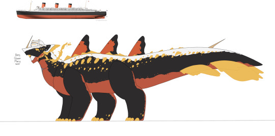
#ss Normandie
Text

75 notes
·
View notes
Text
Oh my god they have escaped.


26 notes
·
View notes
Photo
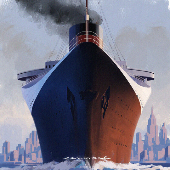
SS Normandie - exmortal
287 notes
·
View notes
Text
SS Normandie portrait by Ken Marschall
22 notes
·
View notes
Text

the normandie leaving le havre
real photo postcard ca. 1930s
19 notes
·
View notes
Text
I made a shippost...this has more effort into it than it's worth...no regrats
9 notes
·
View notes
Note
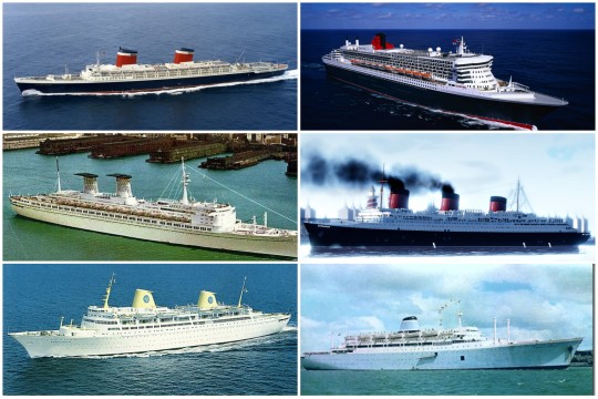
What is it about the RMS Olympic that makes it stand out from other ocean liners?
For me it's a lot of things. I'm going to start with a weird one. Her engines.
The RMS Mauretania was the biggest ship in the world until the Olympic was completed in 1911, and the fastest until 1927. She was designed for speed first and foremost. She had 4 propellers powered by steam turbines, which were the new hot thing at the time. Cunard built 2 "test ships," the Carmania and the Caronia. Carmania had steam turbines, and Caronia had traditional triple expansion steam engines. Carmania was faster, so Cunard used turbines. Mauretania had a top speed (at the time) of about 27.75 knots. Which is impressive. However, her service speed, the speed she went at when she crossed the ocean, was 23.69 knots. Mauretania was designed for speed. This was an impressive speed. The fastest way to cross the ocean for 20 years.
Meanwhile, Olympic was built with comfort in mind. Steam turbines were a relatively new technology and not well understood. Ships that had them had really bad vibration issues, and White Star didn't care about speed. They weren't looking to compete with Cunard on that front. So, they equipped the Olympic with traditional triple expansion steam engines. However, after the steam was exhausted from the final cylinder, it was redirected into a low-pressure turbine. This strange combination engine system gave the Olympic 3 Propellers. Without the turbine, she probably wouldn't have gone above 18 knots. But with that little extra push, her top speed became competitive with Cunard. Her top speed was 21.75 knots. So even without the new fancy turbines, she was effectively only 2 knots slower. But that's not the impressive part about all of this.
In a single day, the Mauretania burned on average 1,000 tons of coal to go 23.69 knots. Meanwhile, Olympic, with her weird engine Mish mash, only consumed 650 tons in a day. And she was only 2 knots slower! And with the turbine propeller right behind her (comparatively) large rudder, she was a really good turner for a ship of her size. I just love the engineering here.
Anyway, that's only one reason I love her so much. Her career was another great thing about her. After Titanic sank, White Star refitted Olympic to make her even safer (she was objectively the safest ship in the world both before and after this refit) and White Star pulled the biggest PR comeback in history. Her return to service in 1913 was widely celebrated. During World War 1, she served as a troop ship, and she is the only Ocean Liner to have ever sunk enemy tonnage in either World Wars. A German U-Boat was trying to torpedo her, but because she could turn so well, they were actually able to swing her around, ram the U-Boat and sink it! She also survived a separate torpedo attack because it failed to detonate when it struck. After the war, when they put her in dry dock, they found the hole. They didn't even know they were hit! The double hull contained the flooding. After the war, she returned to passenger service and became extremely popular with the rich and famous, earning herself the nickname of "the movie star liner." By the 1930s, White Star's new flagship, the Majestic, was having some extreme problems. She was a German ship given to them as compensation for the loss of Britannic. She began having some electrical problems that caused frequent fires, and her hull plates were tearing. Even though she was 10,000 tons bigger than Olympic, and she was a newer and safer ship, Olympic was still in fantastic shape, suffering from none of these problems.
Next, is her interiors. I love the Edwardian wood paneling. Ships before Olympic like the Adriatic are a bit too sparse for my taste, and ships like the Aquitania just don't look comfortable to me. Her interiors are gorgeous, but it's kind of imposing. I wouldn't want to sit on the furniture or get close to the walls. It's like a work of art, but that doesn't make her comfortable. I have the same problem with the Normandie. Beautiful, but not comfortable. People nowadays forget that you actually had to live inside these ships for about a week at a time. We can only look. Occupying these interiors is very different. Meanwhile, I feel like the Olympic gets that perfect balance between looking gorgeous, but not being imposing. I can imagine myself sitting comfortably on a chair in the grand staircase and watching the people go by. I like the pseudo art deco of the Queen Mary, Queen Elizabeth, and Mauretania 2, but I just prefer the Edwardian decor of the Olympic.
Next is her exterior. She's not my favorite in this regard, that title goes to the SS United States. But the Olympic is still gorgeous. I like the height to width ratio of her funnels, I think they're a good size relative to the rest of her. For an example of funnels I don't like, I think the Normandies funnels are way too thick and tall. The Olympics superstructure is appealing and isn't too tall. The rounded bridge atop the flatter lower decks has just an incredible effect. The Big 4 had the bridge separate from the rest of the superstructure, and it looked kinda goofy to me. Olympic is just all around really good in this regard. Not the best, but really good.
I think it's such a shame that she's been reduced to "Titanic's sister." She was so much more than that. I can talk about the Olympic for hours, but this post is too long already.
#ocean liner#ocean liners#oceanliner#rms titanic#titanic#cunard#rms queen mary#rms olympic#olympic#ss normandie#rms majestic#ss united states#world war 1#rms mauretania#mauretania
23 notes
·
View notes
Text

The tragic moment of the t liner SS Normandie grounding at NYC Pier 88 on February 9, 1942.
14 notes
·
View notes
Text

SS Normandie Grand Salon
9 notes
·
View notes
Text

Jean Dupas (1882-1964)
Panel from the 'The Chariot of Thetis' Mural from the Grand Salon of the S.S. Normandie, circa 1934
executed by Jacques Charles Champigneulle, Paris
verre églomisé, pegamoid backing
11 notes
·
View notes
Note
what is it about cruise ships that you find ugly? like are there any specific ones you hate or is it just all of them?
okay so ive been puzzling over to how to answer this for A While™ because:
theres so many ugly cruise ships i would love to roast, and theres a part of me that wants to make a sideblog about it a la @mcmansionhell but for cruise ships
i am autistic and this is my special interest and i also want to infodump about ship design conventions
theres also really pretty oceanliners like the ss france that got converted into cruise ships where the magical girl transformation sequence malfunctioned badly.
its not always just like the exterior thats badly designed, theres both Awful design inside the ship like the disney wish, and Awful business plans and conduct like the epirotiki lines
...but, thats a lot.
so instead, ive settled on four exterior design issues that i think you can see in a lot of cruise ships even if you dont know shit about ships.
this is by no means an exhaustive list but just some common observations that you will see in 97% of cruise ships.
im also gonna include an example ship for each and also further examples when needed.
so without further ado:
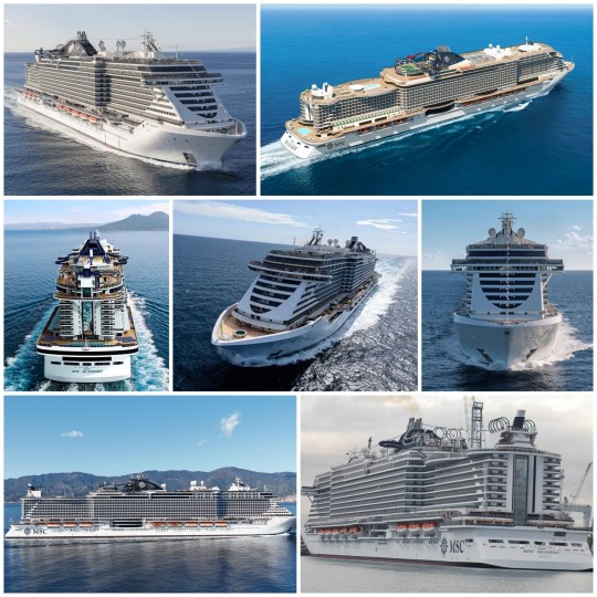
1. your ship looks like a bus and a ferry had an unholy love affair that ended with a baby neither wanted.
as an example of this anchor-christ, may i introduce you to the celebrity edge
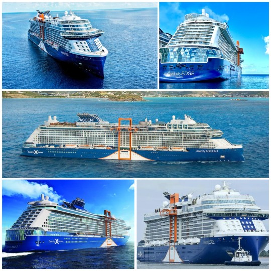
something about the stern (back) just reminds me of diamond busses here in the uk while the bow (front) has a distinctly ferry-like look.
the super-structure that you see peaking above the spaceship-bridge on the bow is giving me double-decker bus energy.
the orange viewing box elevator thingy gives construction site energy, but also gives me public transport vibes? like i can just see something similar being added on buses with no explanation and we'd all just be like i guess buses are getting the budget silicon valley treatment.
further, celebrity edge has relatively sharp angles at the stern and bow. if you look at a lot of ocean liners, youll see shallower sweeping angles curving down, while a lot of cruise ships will have these sharper angles (though by angles, i mean curves still) or just will stop at the stern:
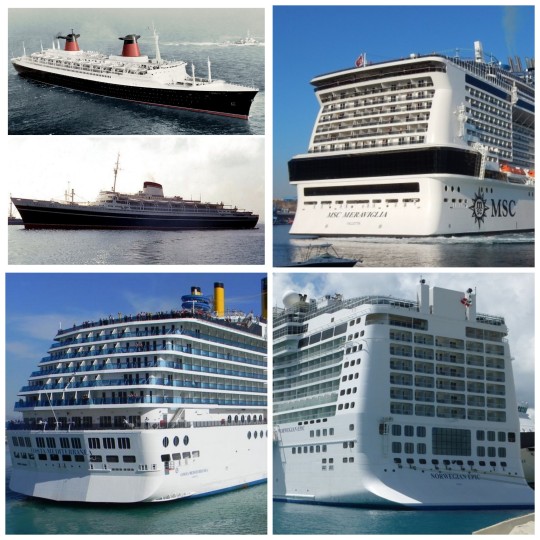
[Image ID: collage with five ships. In the top left corner, there are two images with the profiles of the SS France and the SS Andrea Doria. In the top right, there is the stern of the MSC Meraviglia. Bottom left: the stern of the Costa Deliziosa. Bottom right: stern of the Norwegian Epic]
though not pictured above, the rms queen mary actually earned her title at the miss pacific ocean competition where a cruise ship will never win because theyre just too ugly.
but my point is that the abrupt ending of superstructure and ship at the stern looks like a bus. it just does.
there is also like "this is just a block of flats" energy with the costa deliziosa, but thats getting into the next point:
-
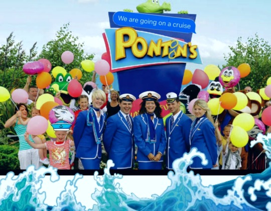
2. oh no gang, billy bear misplaced his msc seaside hotel and now its floating out to sea on a barge! can you help him?
yes this is a butlins reference, what are you gonna do about it? call a red coat on me?
the msc seaside is one of many cruise ships where it looks like someone put a hotel on a barge... which is what a cruise ship actually is.
like, they are barely ships. anyone who says theyre going on a cruise to explore the ocean is trying to buff out their tinder bio. while cruise ships technically can sail across oceans, they dont. their journeys are incredibly short they sail very close to land, avoid any rough weather and its mandatory for all of their captains to have a north american blue grouse fursona.
and thats all because a cruise ship is hotel complex on a barge. its purpose is not to sail far because its just a hotel. there are multiple swimming pools and restaurants and night clubs and fucking rollercoasters on some of them. you can buy souvenirs, you can go do yoga, you can get a massage and as long as your surname doesnt end with a double n, you can put your kid into the available childcare.
forget sending the british army to pontins during covid, lets send them to pontoons!
hotels on barges are the most common version youll see, but there are other variations which include:
chopping mall 2: carnivore cruises
the 2006 remake of the anchor-christ: abargements/if youre renting in a block of flats on a barge, do you pay rent to a waterlord or is your landlord firmly stood on ground?
the happiest place on earth: disneywater!
the entire shenanigans going on with the freedom ship which i do not have time or energy to get into right now, so lets all just calm and down and take a breath and...
-
...3. close your eyes, imagine, feel it. youre on a cruise ship, the ovation of the seas; its an early august night and petrichor deluges the air. the skies above you glisten, a whirlpool of colour illuminated by hundreds of tiny flecks of light. youre alone on the deck, standing at the stern with your arms precariously balanced on the barrier as you turn your attention to the ocean below. its dark, the gentle waves nearly imperceptible yet bar the bone-white crests against the hull. you watch, captivated, listening to the ocean sing its terrible song. yet then somewhere behind you, the mellow thud of hoofs on the wooden deck weaves between the waves and the melody. you look up, lock eyes, feel a hurricane surround you as he stares back, do you remember to count his fingers?
so, you might have noticed that a lot of modern cruise ships, especially the bigger ones, look like some check-mark tech-bro on the bird app used an ai to steal the work of naval architects, photographers, artists, etc. to generate "their own design" for a cruise ship.
the example i chose for this was the ovation of the seas:
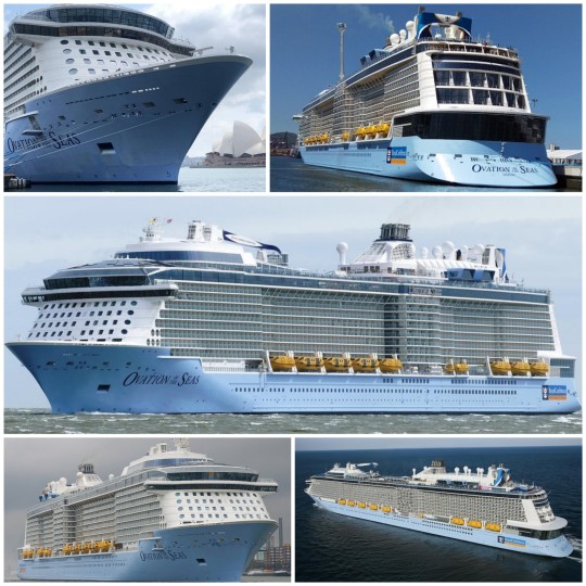
the super-structure has copy and paste vibes. the ship also looks like its lurching forward to attack me but thats beside the point.
one of the issues the designers for these ships - i would say naval architects but cruise lines sometimes choose someone for head of design who is not a naval architect and has never been on a ship before for shits, giggles and profits- run into is that its really difficult to make a long blank wall look good.
if youve ever made a house in the sims, youve probably ran into this yourself. youre happily building your house and it looks really good at the front and the back, but the side of it is just a wall and adding windows is giving copy and paste vibes.
my trick for this is either fake chimney, add an extra small popout, vines everywhere or hide it with trees, but these are not viable options for a cruise ship.
trust me, i checked:
hence, we end up with very long ships where its just ctrl c ctrl v for 300+ metres.
so how do you fix this?
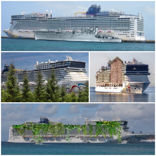
well, idk maybe you could take notes from any of the longer ocean liners built in recent history.
you know, like the ss united states or the rms queen mary 2 or the ss michelangelo or the ss normandie or the mv kungsholm or the ss principe perfeito:
now im not saying all of these liners are the most beautiful boats ever; theyre not. as much as i adore her, queen mary 2 is a little ugly. most of them even have an element of copy and paste.
but none of them feel ai-generated. and a lot of them look really really pretty. you can tell that they were designed by human beings.
because the naval architects and naval designers who knew what they were doing. weve got clever use of colours, gorgeous use of curves and sweeping lines that balance out all the design elements. the sameness is broken up when possible, and the ship has focal points designed within to catch your eye.
and all of them have beautiful bows. most ocean liners had/have noticeable bows due to functionality; they needed sharp bows to cut through waves because they were crossing the ocean every week. and so extra care would be taken to both make the bow work for its function and also, look really fucking cool.
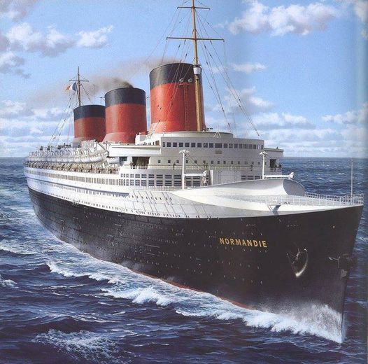
the ss normandie specifically has a unique bow shape and structure designed by vladimir yourkevitch, a russian naval architect who had emigrated to france after the russian revolution.
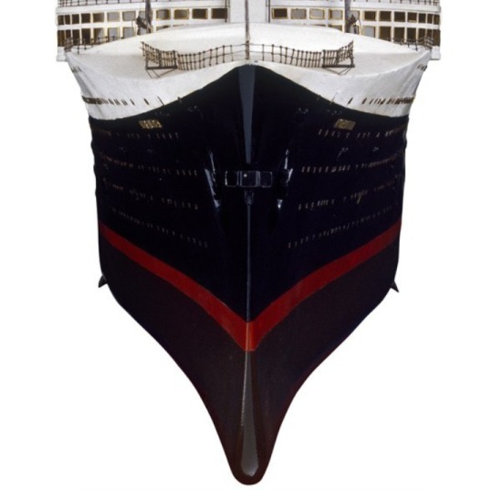
the bow is slanted and looks almost clipper-like. theres this clear bulbous bulb (thats the wrong term but the bit at the bottom) beneath the waterline. this design is matched with a slim hull designed to be hydrodynamic, which made her a very fast ship.
she and the rms queen mary fought over the blue ribband for several years before ww2 broke out. [x][x]
its a little wibbly-wobbly-looking but it gives her a very distinct profile and she just looks really cool. you dont notice the repeating pattern of windows on the super structure because of how striking her entire design is.
and well, there has been attempts to capture this with cruise ships.
they run into problems with it though because their bows are not designed the way ocean liners' bows were because a cruise ship does not need to cut through waves. itd be really weird if you were in a fancy restaurant and you were giving a steak knife for your caesar salad.
so what else can you do to make your bow look so beautiful her kissing booth would be sold out all weekend?
-
4. your bow art is ugly. it is ugly. it is really ugly. please stop putting art on your bow. it is all ugly.
yeah.
take a moment .
.
its okay.
i promise
,
.
shes not real.
.
you can breathe.
take another breath.
.
.
youre okay.
.
.
.
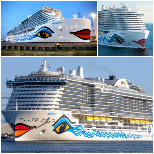
are you scrolled far down enough that you cant see her anymore?
yeah so that was the aidanova. probably the worst bow art i have ever encountered but im yet to encounter any bow art that isnt awful.
pride of america is terrible; caribbean princess' is just completely out of place; norwegian prima is the epitome of "what the fuck?"; majestic princess' makes the ship look naked somehow.
now i will concede that a lot of bow art is probably aimed at children because family cruises are a thing, but i wont concede that it changes anything.
the bow art is still ugly and i struggle to see how it would be appealing to a child. like engaging children is more than just throwing some bright colours and patterns on a canvas? children are smarter than that and even in my joking post making fun of cruise ships, im not gonna stand for the way we invalidate the personhood of children. theyre not things to be distracted with simple solutions.
weirdly the aidanovas is the one id be less harsh about in terms of engaging children because there is more to dig into like a boat version of thomas the tank engine or like how do boat body work? the art isnt surface level.
but its still just ugly. the shape of the bow does not compliment the face and the change in colour in the eyes is very distracting.
tbh, if youre gonna do bow art, youve got two options that arent awful:
actually aim it at kids in a way thats not just surface level look at bright colour braxter. have focus groups with kids, gets their feedback, have kids contribute. respect the intelligence and personhood of kids.
just go all out. balls to the fucking wall, just break every damn rule in the book and apply every technique your art teacher hated. the ship is gonna be ugly anyway, make it fun ugly. camp is in. pantomime it up in this bitch!
-
and anyway, that concludes my "brief" answer to this question 👍
btw if you would follow a blog that just trashes cruise ships because of how ugly they are, please tell me because like, if enough people would enjoy it to make the effort worth it, i Will do it.
#anon#aimed for short and ended up not short#again#long post#i tried but i just#cruise ships are so ugly#cruise ships#ocean liners#shipping history#ss normandie#vladimir yourkevitch#ovation of the seas#aidanova#msc seaside#butlins#pontins#celebrity edge#norwegian epic#ss hellenic prince#billy bear#freedom ship#shipposting
46 notes
·
View notes
Text
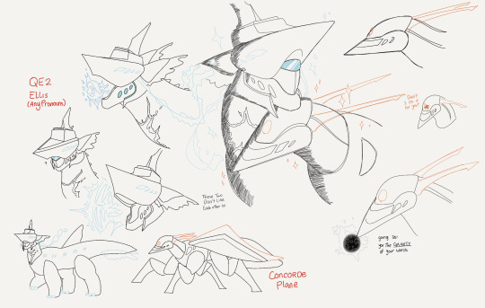
Get Boat’d
(reference pic credit to oceanliner designs)
#core’s art#re:t0ld#locomotion#ocean liners#QM2#RMS Mauretania#RMS Aquitania#RMS Olympic#SS United States#RMS Queen Elizabeth#SS Nomadic#SS Normandie#RMS Carpathia#RMS Queen Mary#cameo from Concorde
57 notes
·
View notes
Text
NOT proud to be an American.

12 notes
·
View notes

Text

29 notes
·
View notes
Text

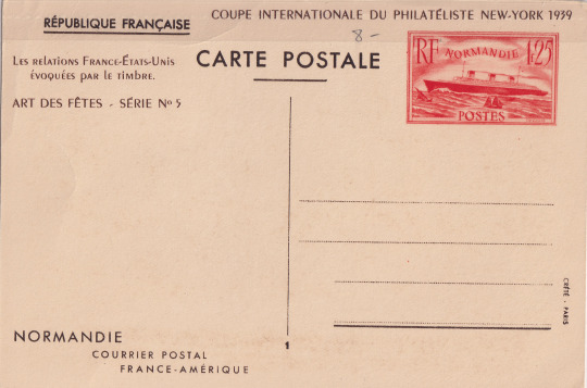
a postcard from the 1939 world's fair in new york city depicting french liner normandie
#postcard#postcards#ocean liners#ss normandie#french line#1930s#back incl#(theres a darker stripe at the top of the back bc i didn't take it out of its sleeve to scan it. it fits too snugly)
24 notes
·
View notes
Last Seen Blogs

itheillfated-archived
Fractusque

jjaybank
I will have you without armor

the-little-troll-blog
The Little Troll Blog
the-little-troll-blog
The Little Troll Blog

acr201
Diversions from prison