#the next step is to go into geospatial data analysis
Explore tagged Tumblr posts
Visit Tumblr Blog
Explore Tumblr blogs with no restrictions, modern design and the best experience.
Last Seen Tumblr Blogs


Fun Fact
Tumblr.com is the 103rd most visited website in the world.
Text

When the only thing you need after a 10h work schedule is to know the distance between two imaginary towns so you can accurately calculate the time to travel between them given the average horse speed so that you can accurately reference this in one line of a fic

4 notes
·
View notes
Text
diy geo app
Esri has been releasing more and more MOOC over the span of 2 years to accommodate its increasingly large expanse of products within the ArcGIS ecosystem.
But of all the MOOCs that I've participated in, 'Do-It-Yourself Geo App MOOC' must be the most underrated ones produced by Esri Training. The functionalities highlighted within the MOOC took the anthem right off their recent Esri UC 2020 that went virtual. The curriculum includes:
The creation of hosted feature layer (without utilizing any GIS software medium like ArcMap or ArcGIS Pro).
The basics of the ArcGIS Online platform ecosystem:
hosted feature layer > web map > web app
Basically, to view a hosted feature layer, you will need to drag it onto a 'Map' and save it as a web map.
Conventionally, web map suffices for the visualization and analytical work for the likes of any geospatialist who are familiar with Web GIS.
But this time, Esri is highlighting a brand new web map product called 'Map Viewer Beta'. Why beta? Cause it is still in beta version but so sleeky cool that they just had to let every have a shot at using it. Truth be told, Map Viewer Beta did not disappoint.
Even so, Map Viewer Beta still has some functionalities that have yet to be implemented.
Using web map to visualize data, configure pop-up, execute simple analysis and extending it to Map Viewer Beta interface
Utilizing Survey123 for crowdsourcing data; the first level of citizen science and creating a webmap out of it.
Creating native apps using AppStudio for ArcGIS; no coding required.
Some tidbits on accessing the ArcGIS API for JavaScript
I love how cool it is that this MOOC actually shows you step-by-step on how to use the new Map Viewer Beta and explain the hierarchy of formats for the published content in the ArcGIS Online platform
I have established my understanding of ArcGIS Online ecosystem 3 years back but I do find it awkward that such powerful information is not actually summarized in a way that is comprehensible for users that have every intention of delving into Web GIS. And Web GIS is the future with all the parallel servers that could handle the processing/analysis of large amount of data. ArcGIS Online is a simplified platform that provides interfaces for the fresh-eyed new geospatial professionals.
It is quite well-know for the fact that there has been some criticism as to the domination of Esri within the GIS tools/resources within the geospatial science industry, but I believe it is something we could take as a pinch of salt. Not everything in Esri's massive line of commercial products are superior to other platforms but it is a starting point for any new geospatialists who wants to explore technologies there are not familiar with.
All in all, this MOOC is heaven-sent. For me, I have been playing with the web apps and web maps for close to 4 years and I can attest to the fact that it covers all the basics. For the developer's bit, maybe not so much as going through it in a distinct step-by-step but it does stoke the curiosity as to how it works. The question is, how do we make it work. Now that's a mystery I am eager to solve.
I'm going to put this on my ever-expanding to-do list and think JavaScript for another few more months of testing out this ArcGIS API for JavaScript implementation. Tell me if you wanna know how this actually works and I'll share what I find out when I do.
For those who had missed out on this cohort, fear not. This MOOC runs twice a year and the next cohort is going to be from Feb 17 to March 17 2021. The registration is already open, so don’t hold back and click the link below:
Do-It-Yourself Geo Apps
Do register for a public account before signing up or just click 'Register' at the MOOC's page and it's open the open to either sign in or 'Create a public account'. It was a blast and I'm sure, if you've never used any of the feature I've mentioned above, you'll be as wide-eyed as I was 3 years ago. :D
Till then, stay spatially mappy comrades!
P/S: If you complete all the assignments and quizzes, you'll get a certificate of completion from Esri. Which is pretty rad!
3 notes
·
View notes
Text
Accessing OpenStreetMap Data and Using it with QGIS 3
This blog post is an instruction for teachers, high school students and all who are interested in creating their own map or in doing geospatial data analysis.
The aim of this post is to show how one can access OpenStreetMap data and how to use it efficiently with QGIS 3.
This instruction deals only with the use of existing data from OpenStreetMap. Those who want to capture their own data can got to the other blog post on this site about "Creating a Thematic Online-Map using uMap" (see also ”Mit uMap eine thematische Online-Karte erstellen” on OpenSchoolMaps).
Extract and download OpenStreetMap data
The data from OpenStreetMap (OSM) can be saved in different formats locally. That's why we will first provide a few examples.
OpenStreetMap and Geographic Information Systems
The geometry of objects in OSM are saved internally in the form of a topological structure (Nodes, Ways). And attributes are saved as tags (Key-Value-Pairs) which means data schema is open. This data schema first has to be mapped to a relational structure to be used in Geographic Information Systems (GIS). There is not a single GIS format for OSM, making each conversion to a GIS format potentially different.
Formats
As a rule one can differentiate between OSMs own and GIS formats.
OSM specific formats are OSM XML and OSM PBF
Formats compatible with GIS are Geopackage (as well as similar ones like Spatialite/SQLite or MBTile/SQLite), Shapefiles or GeoJSON (TopoJSON).
Further GIS vector formats are KML as well as GPX for data exchange with GPS.
Another group of formats are pictures/raster formats like PNG, JPEG, SVG and PDF.
Accessing OpenStreetMap Data for a Country
This website from Geofabrik (Germany) freely offers OSM data for whole countries and regions. The data can be downloaded as OSM PBF, Shapefile zipped or as OSM XML bz2-zipped. If you hover over a region or country, you can see a preview on the right side. The data is divided into regions (continents) and countries. Depending on the size of a country, it is splitted into smaller parts. The OSM data from Geofabrik is updated every 24 hours. That means one has to wait up to 24 hours before changes are available as Geofabrik extracts.
OSM.org
On OSM.org you can download data too, but only areas with a side length smaller than ~10 km, and only in the OSM XML format.
Export Tool maintained by HOTOSM
The Humanitarian OpenStreetMap Team (HOTOSM) offers an online tool to download data from OpenStreetMap (figure 1). To use the Export Tool you need an OpenStreetMap account and a working E-Mail adress. After the registration, you can change the export settings and select what you want to download.

Figure 1. Export Tool maintained by HOTOSM.
After that you can select how you want to download the data.
You can either:
Search a location
Give a bounding box with coordinates
Mark the area on the map
Select your current view
Upload a GeoJSON file
For the first two options you need to use the search bar. Either type in the location you're looking for, or set the bounding box coordinates (West, South, East, North).
To draw a bounding box or area (3), you can use the draw function on the right. To select the current view (4) press the This View button.
If you want to upload a GeoJSON file as polygon boundary (5), you can do that with the Import button. A website that is good for creating such a polygon is GeoJSON.io! Be careful not upload only a single polygon. After you have created your GeoJSON file, you need to adapt it for the Export Tool. For that you need to copy the file into a text editor. The simplest version only needs a type and a list of coordinates.

Figure 2. Format of the GeoJSON file for the HOTOSM Export Tool.
OSMaxx
With OSMaxx you can download existing and new excerpts from OSM in different GIS formats. Its similar to the HOTOSM Export Tool. You will need an OSM account and a valid e-mail for this as well.
You can download existing excerpts under Existing Excerpt / Country, you can also select in what format the file should be downloaded, what kind of coordination system should be used and how detailed the excerpt should be.
Under New Excerpt you can select the area which you want to download from OSM. For that you can draw either a quadrangle or a polygon over the map. You can also select which format should be downloaded, which coordinate system should be used and how many details you want.
It takes roughly 30 minutes until the data extract is ready for download.
BBBike
BBBike offers the data from OSM in many formats. To extract that data you need to create a bounding box. That box has a maximum size of 24.000.000 km2 or 512 MB as a file. After you gave a valid e-mail address and give the extraction a name, you can press extract in order to receive a download link.
Import OpenStreetMap data into QGIS or extract it directly
Import OSM with inbuilt QGIS Tools
With the inbuilt tool of QGIS you can download and import data directly from OSM. In the first step we should select the map from OSM as background. For that you initialize the Plugin QuickMapService, which you can find under Plugins > Manage and Install Plugins… . Look for “QuickMapservices” from there. After installing that, you go to Web > QuickMapServices > OSM. Afterwards it should have added a layer with the whole OSM map. In the next step you go to OSM and search for a place witch you want to export the data from. Zoom in as far as possible to reduce the amount of data you need to download and click on the blue button labeled Export and give the file a clear name. Return to QGIS and go to Add Vector Layer under Layer > Add Layer. Select the file which you just downloaded and click Add. In the dialog window, which ask for what data you want to import, select Points and click OK.

Figure 3. Dialog to import OSM data.
It should have added a new layer, which contains all the points from your OSM excerpt. Close the open dialogs in QGIS.
Now we want to filter the points after certain criteria. In our case we filter after pubs. Of course you can filter after different points.
To filter you just need to right click on the Point-Layer and select Open Attribute Table. A window should open in table format, which contains the data from the layer. Select the tool Select features using an expression with E symbol on the top left of the window. Look at the table again. To filter for pubs you need to look for the keyword amenity in the column Other Tags. If you want to filter after a column, write your query like this: name = 'UBS'.
In our case we need to change the query a bit, since there are many different values in the column. Write the following query into the tool: strpos(other_tags, ' "amenity">"pub" ') != 0. Here other_tags is the column name and "amenity">"pub" is the value for which we search.
With a click on Select features it runs the query.

Figure 4. Filter for pubs in QGIS.
When you now returns back to the map view, all the points that pass the query should be marked yellow. If you're are happy with the selection, you can right click on the layer and press Save Selected Features As under Export.
In the newly open window you can set the name and the format of the file and with OK you confirm your selection and save the points in a separate layer and add it to the map.
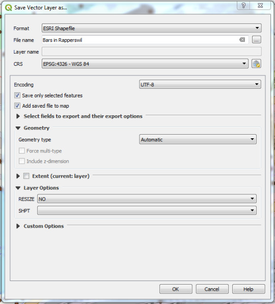
Figure 5. Export selected points.
Import OSM with QGIS-Plugin QuickOSM
You can also import the data into QGIS directly from OSM, using the QuickOSM plugin. If you haven't installed it already you can do so under Plugins > Manage and Install Plugins. Where you can search for QuickOSM and install it.

Figure 6. Installing QuickOSM.
After the installation you open the pluging in a new window under Vector > QuickOSM. Under Quick query you can create a simple query, which will be handled by Overpass-API.
Under the ledge Query and under Parameters you can select the different instances of Overpass-API. You can for example replace the preset Overpass-Instance with http://overpass-turbo.osm.ch/.
You can also create more difficult queries by hand using OverpassQL. You can find more information about OverpassQl, or overpass-turbo on https://wiki.openstreetmap.org/wiki/Overpass_API/Overpass_QL and on http://osmlab.github.io/learnoverpass/en/.

Figure 7. Create query with the QuickOSM Plugin.
The result of the queries will be saved directly in QGIS as a new layer.
2 notes
·
View notes
Text
A Site Suitability Model for Shelter Villages
Hello! It’s been a while!
First of all, an apology for not keeping up with the blog lately. I started a new job and was busy with school. Since then I’ve been reading quite a bit, and I have started some long-form articles that I haven’t quite polished up yet. In the near future, I hope to post an article about natural disasters, based on recent readings of Rebecca Solnit’s “A Paradise Built in Hell” and Mike Davis’ “Ecology of Fear.” I’ll also be writing an article about a monthly event at The Bike Farm, a DIY Wheelchair Repair night helping folks patch the gaps created by our modern medical system.
For now, I’d like to post a short article adapted from a presentation I gave as part of a GIS course I took at Portland Community College. This article leans heavily on the GIS work I did, and is less about the writing component. Thank you and stay tuned for more soon!
In 2015, the City of Portland declared a housing state of emergency. This declaration serves an important purpose as a recognition of the severity of the affordable housing crisis; and also serves a legal purpose, allowing the city greater flexibility when finding and implementing solutions. On their website, they write “The declaration allows for waiving certain procurement processes and, on a case-by-case basis, portions of the zoning and building codes.”
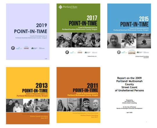
Each year, the city participates in a point-in-time count of people experiencing homelessness. The count takes place in January each year, and since 2013, Portland’s unhoused population has hovered around 4,000 people. This count is based on HUD (the Federal Bureau of Housing and Urban Development) criteria for homelessness, which counts people sleeping in some situation “not meant for human habitation” and people staying in transitional shelters. People who are unhoused temporarily, involuntarily in doubled-up living arrangements with families or friends, or in institutional settings like jails and hospitals are not included in this definition- making the 4,000 number a conservative estimate within a narrow definition of homelessness.
Get involved with the Point-In-Time Counts at http://ahomeforeveryone.net/
Addressing the housing crisis is difficult; and to those of us with warm and dry sleeping arrangements, feels slow-moving. The causes of homelessness are diverse, as is the population of folks living unsheltered, and any meaningful solutions to this crisis will have to address immediate needs while also addressing long-term systemic changes.
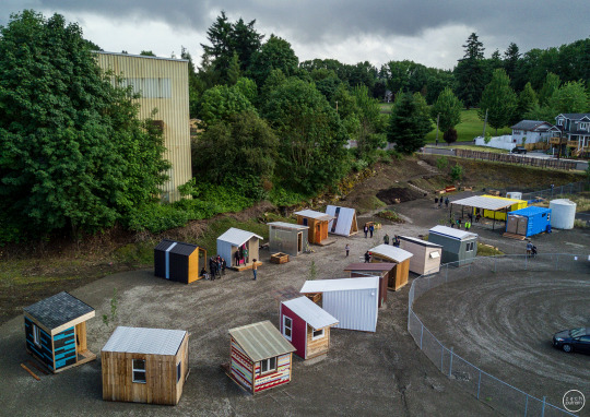
However, we’re beginning to pay closer attention and beginning to identify strategies and triage methods that work. One of my favorite solutions is the tinyhome village.

Dignity Village, p/c http://www.tentcityurbanism.com/
As far as I can tell, Portland’s own Dignity Village was the first incorporated and cooperatively-managed tent city, founded in the year 2000. Since that time, they have found a more permanent location and built shelters that serve 60 residents at a time. The shelters are basic rooms, sometimes with electricity but with plumbing and electricity service elsewhere. They look a lot like their trendier cousin, tinyhomes.
The village solution is easy to deploy and can meet basic needs quickly. It’s difficult to overstate the benefits that a safe and secure place to sleep can have on mental and physical health. Shelter is a safe place to sleep, a secure location to store possessions like clothing and identification documents, and a place for privacy. What’s more is that we know they work. In the first year of operation for the Kenton Women’s Village, 14 of the 24 villagers had moved to permanent housing.
p/c Portland State University’s Center for Public Interest Design: http://www.centerforpublicinterestdesign.org/kenton-womens-village
Villages are also a low-cost solution- many of the villages built so far have made use of donated and up-cycled materials, been constructed by teams of volunteers, and allowed architecture students the opportunity to practice their design skills while getting real-world experience, for good. Plus, the low cost of construction allows villages to take advantage of new-school revenue sources like crowdfunding, instead of relying on slow-moving government dollars.
Most importantly to the project at hand, they are resilient. In the first year of operation for the Kenton Women’s Village, the previously vacant lot they occupied was sold for development and they were forced to move. However, all of the shelters were built on trailer platforms so as soon as a new site was located, they could simply be moved. This mobility is a huge benefit for increasing the resiliency of this solution in the face of a constantly changing urban landscape.
Both in the case of the Kenton Women’s village, or in the case of a new village development, I felt like siting was one of the larger challenges; and one that GIS was particularly poised to solve. My end goal was to develop a site selection model that ranked possible locations for shelter villages. This information could be displayed as a map, in print or on the web; or, simply expressed as a list of ranked site addresses. I wanted to create a map that would help organizations find potential village locations quickly and easily, instead of going through the site selection process each time over again.
The first step was to figure out what was important- what makes a site a good location for one of these villages. I roughed out a list of criteria and got to work finding data to express those metrics.
1- A site must be safe.
2- A site must have easy transit access.
3- A site must be located close to service providers.
4- A site must be in a location with (at least somewhat) favorable public opinion.
5- A site must be developable- vacant but otherwise fit for human habitation.
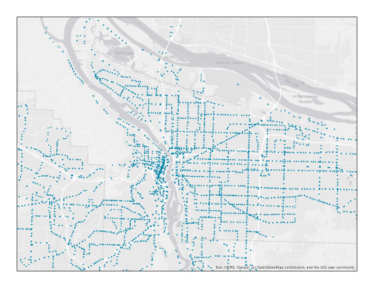
In order to map the safety of relative sites, I downloaded the year 2019’s worth of crime data from the Portland Police Bureau. As part of their open data initiative, the police report an approximate X,Y Coordinate for each crime; making it easy to translate this spreadsheet into geospatial data.
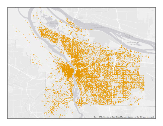
All crimes in Portland, 2019.
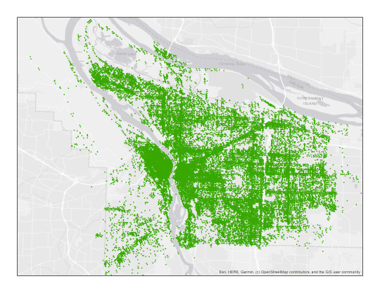
For transit access, I used the locations of all transit stops (bus, light rail, and streetcar) in Portland.
Transit stops in Portland
To map service providers, I used an online version of the Rose City Resource Guide published by Street Roots- with addresses I was able to georeference for most (83%) of the entries.

Homeless Services, according to Street Roots’ Rose City Resource Guide, 2018 edition.
As a map of public opinion, I mapped the location of every Portland Police call regarding “unwanted persons” in the past 5 years.
All calls to the Portland Police regarding “Unwanted Persons,” 2012-2019. A great article on the subject can be found here.
As a map of vacant lots, I found a dataset from the City of Portland that, with some modifications, was pretty close to what I was looking for.
Most of these datasets were in point format. Looking at the point maps, it’s possible to get a sense of “hotspots,” but we can use GIS to translate these point features into raster datasets that express point density. Here are some examples of those maps.
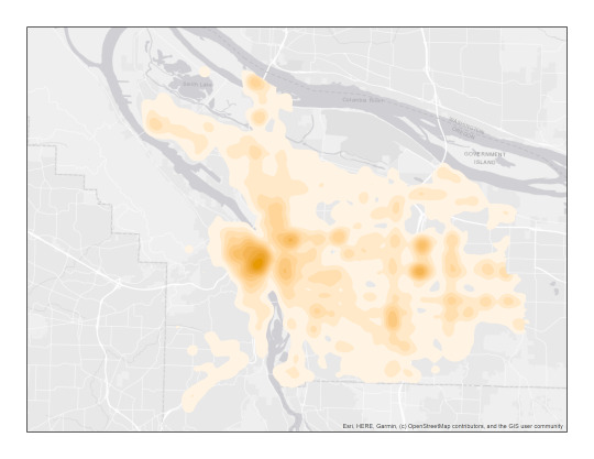
Crimes, expressed as a heatmap.
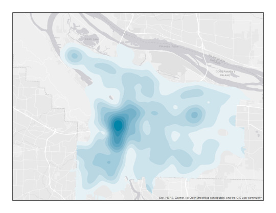
Transit, expressed as a heatmap.
These raster datasets are a better expression of the data than the point data format, but it’s not quite ready for a weighted overlay. First, I reclassified these rasters into meaningful categories. For example, in a city like Portland it’s obvious that transit and crimes will be concentrated on the downtown area, since that’s where the most people are. So, I reclassified these maps using standard deviation, to show areas with more-than or less-than average access to transit; or more-than-average crimes versus less-than-average crimes. Homeless Services are also concentrated in the downtown area, but in this case it made the most sense to classify the map into a “services access score” between 1-9, with 9 being the farthest from services in general.
These maps aren’t as pretty, as this is a more functional step in the process. This map shows unwanted persons calls expressed as more (red) or less (green) than average. Here, less calls are a good thing, and represent favorable public opinion.

This map is a reclassification of the transit heatmap, showing better-than-average (green) and worse-than-average (red) access to transit, where access is density of stops. More density of stops is more access is a good thing.
The next step was to feed all of these datasets into a weighted overlay model. The model interprets the score of a particular cell based on a custom weighting of the inputs, and then spits out a number that represents the weighted score.
For my datasets, I settled on the following weights, where greater percentages correlate to greater influence on the final score.
30% safety, 25% transit, 30% services, 15% public sentiment.
Here’s the map that comes out of this analysis.

Here, colors correspond to site suitability. Better potential sites for villages are represented in greens, average sites in yellows, and poor potential sites in reds.
The final step was to clip the map- I only wanted to show the scores for locations that were actual and potential sites for villages- not schools, parks, or currently existing homes and buildings. I found a dataset from the City of Portland called the Developable Lands Index that happens to have a somewhat-up-to-date inventory of vacant lots. With some careful data cleanup to exclude sites that were industrially zoned or too small to be practical, I had a decent index of potential sites.
I used the Clip tool to treat the final sites like cookie cutters, cutting out the color and score value from the area beneath them. Here is a zoomed-in look at the final product.
Area detail- Southeast Portland: Mt. Tabor, Montavilla, 82nd, and Powell. Potential sites are in color, and the grey is the basemap for reference.
The weights and datasets I used were approximations and guesses, so I wanted to do some testing of my model. Here’s a selection of my map showing the current location of one of the villages in Portland, called Right To Dream too. My model correctly identified this as a high-scoring, suitable site.

Since the exact lot that hosts the Kenton Women’s village doesn’t show up as a vacant lot, I don’t have exact info for it, but I’ll count it as a win that it is surrounded by other high-scoring lots.

Agape Village in Southeast Portland is the city’s newest village, funded and built by Portland Church of the Nazarene, on land they already owned. Also, a site surrounded by green, highly suitable areas.


Although my model tested well, I want to address some of the limitations of this project. First, I made a lot of assumptions when manipulating the data for this project, and interjected a lot of personally-derived guesses. For example, I decided what categories made for a good village site, and then decided how to weight them. However, this model operates on ArcGIS’s model-builder architecture, which means these categories can be tweaked and altered. Ideally, I’d like to refine this model with input from the houseless community, to more accurately reflect their experiences, wants, and needs.
Second, this model is only as good as its data. Due to (processing power and excel spreadsheet size) limitations, I was only able to include one year of crime data (2019). The version of the Rose City Resource Guide I used to map services was a year out of date. Further, I’m not sure the City’s Developable Lands Index is really the best final site map to use- there might exist a more comprehensive dataset for vacant lots and one that may include places like large parking lots that are privately owned but not technically vacant.

This (admittedly uninspiring) graphic shows the model I’ve been describing, with its inputs and eventual output. The flexibility built into the model means I can change inputs, layer weights, and re-run all or part of the series to edit it over time.
However, I’m excited about the model I built as a proof of concept; and can edit things over time with better inputs and more data. As an end goal, I’d like to create a version of this I can host as an interactive web map, making it even easier to distribute to people who might be able to make use of this information.
0 notes
Text
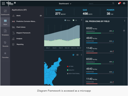
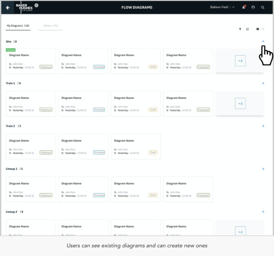
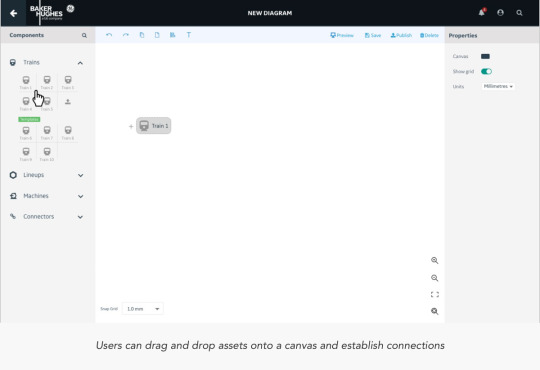
Diagram Framework
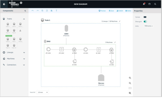
Application to let Users create asset-aware diagrams and workflows
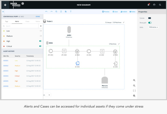
Diagramming Framework a.k.a Process Flow Diagram is a product that will allow customers or professional services teams to build and configure diagrams that are Asset-Aware and can visually display a variety of APM and IntelliStream data elements (tags, alerts, states, KPIs, etc.) associated with those assets.
The Product
The product was envisioned to have a rich set of features to enable the creator to build everything from simple block diagrams to that of complex PFD and P&IDs
The Process Flow Diagram should be a generic component that can be embedded in Dashboard, Analysis or in any other micro-apps depending on the user's use case. The editing and viewing and other capabilities would remain consistent across different micro-apps and also could be placed as an image for PFD diagrams.
It would carry the following core features:
Authoring: An author would have rights to take CRUD actions, create and share templates and also context.
Palette: A board of components/assets that can be dragged and dropped to a canvas (The components/assets will get populated as per the back-end data from the verticals) Assets segregated as per the asset type. Each component is individually a mini product line in itself and would carry parameters to configure, connect and share data.
Configurations: Global and local level configurations and assited navigation patterns include alerts, cases, notifications, KPI’s and statuses.
Interactivity: Intuitive interactions with easy and conventional navigation patterns, including global level CRUD actions
Challenges
Extensive number of white-boarding sessions went into designing the final approach that would be taken. References to similar other applications in the field of geospatial mapping were considered to understand how layers are put together.

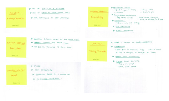
Sketches


User Flows
PFD Home: :https://www.dropbox.com/s/63qizqtq10qdyo2/1.%20Creator%3A%20Home.pdf?dl=0
Create Diagram Diagram: https://www.dropbox.com/s/o2t68xtl7fwu26i/2.%20Create%20Diagram.pdf?dl=0


What I learnt
Designing an application that lets its user design further components is a mammoth task. When Users have no intuitive idea of what the next step is going to be like, it becomes an uphill task as a designer to help them find navigate to discover value in the application and also make it enjoyable in the process of doing so.
0 notes
Text
Check out steps for drone mapping
Let’s understand how drone mapping and surveying can be done.
Drone technology is a leading disrupter of 21 century. From delivering parcels to doorstep to saving lives in remote areas by medical supplies; it’s a technology that cannot be overlooked by any industry, not even by geospatial. Drones have made it possible to map an area very quickly in a very cost-effective manner, pushing those days back when just satellite imagery was an option. Industries like construction, agriculture, healthcare, disaster support, mining, infrastructure inspection etc. are heavily using drone mapping and surveying, as clear, precise image or 3D model of a project area with accurate measurements makes their decision-making work easy. Quick result delivery and low cost add an additional reason to go for it.
Mapping and surveying using a drone are very simple. Now, in market professional standard drones are readily available at affordable prices which allow anyone to take this job. That can be even you. So let’s understand steps that how mapping and surveying can be done using a drone.
Select as per the requirement
Select the drone as per your requirement. If you have a to-do drone survey for agriculture purpose then DJI Agras MG-1 – Best 8 Rotor Drone, senseFly eBee SQ, Precision Hawk Lancaster 5 are some of the best one. If your purpose is for mining then Yuneec H520, DJI Matrice 200 Review, 3DR Solo Quadcopter 2.0 amongst others is best to opt.
Choose Software
Once the drone as per the purpose has been chosen, the next step is the selection of a mapping solution that is a mobile app and a web platform that helps to plan the flight accurately. Mobile mapping automates mapping and photo flights and software creates accurate, high-resolution maps, reports, and 3D models, as well as real-time 2D Live Maps for immediate analysis. For image analysis, transfer the image from storage card to the computer once the data has been captured and upload it to software that will process the data to give final output. There are several software solutions in the market like Pix4D, Drone Deploy, and Precision Hawk amongst many.
Flight Planning
Once the drone and mapping solution has been selected the next step is flight planning. Select the area where you want to do drone mapping along with it ensure safety majors. After finalizing the area, select altitude at which you want to fly the drone. After selecting the area plan the flight using mapping software. For the purpose, log into the software where it will automatically ask to plan a flight. It gives you the satellite image of the area where you just have to click on the square and select it for drone mapping.
Check Camera settings
Before flying the drone over the selected area check the camera settings. Any bad camera setting can completely destroy the work. If you are not pro in camera, best is to use it in automatic mode and if you have mastered in the art of photography then set it manually to adjust camera settings such as shutter speed, white balance, and ISO manually for crisper and more consistent images for your maps
Fly and review
Now the work is on the ground. After all selection processes next take the drone to the area where you have planned your flight and fly it. For the purpose connect drone to smartphone go to the drone mapping app and tap on the fly. Review the images captured by drone then and there to ensure that only relevant image goes for final analysis.
Image processing
Once the images have been captured upload the image on the software. For the purpose login to Data Mapper, browse to survey and click on upload survey. Here upload all images and then select output where the image will be processed in form of orthomosaic or 3D point cloud ready to be used for your purpose.
It is important to note here that the science of photogrammetry is applied in drone mapping where measurements are made from photographs which result into map, measurement or 3D model of a real-world object or scene.
0 notes
Text
Capella joins SpaceNet, shares first radar data with consortium
https://sciencespies.com/space/capella-joins-spacenet-shares-first-radar-data-with-consortium/
Capella joins SpaceNet, shares first radar data with consortium
SAN FRANCISCO – Capella Space, a startup building a constellation of synthetic aperture radar (SAR) satellites, is joining SpaceNet, a nonprofit focused on geospatial applications for artificial intelligence.
Since SpaceNet was established in 2016 by CosmiQ Works, the In-Q-Tel organization focused on commercial space, it has provided free high-resolution electro-optical satellite imagery, advertised challenges and awarded cash prizes to encourage people to test and refine image analysis tools.
SpaceNet has helped expand geospatial research and applications for electro-optical satellite imagery, said Ryan Lewis, SpaceNet general manager and senior vice president at In-Q-Tel, the venture capital arm of U.S. intelligence agencies. “Looking ahead, we want to see the same occur not just for imagery but also for SAR data,” he told SpaceNews.
For Capella, joining SpaceNet is a good way “to get SAR data into the hands of a broader range of data scientists and software engineers,” said Scott Soenen, Capella product engineering vice president. “This is the first step in our engagement with the broader community. Having data out there under an open license is going to foster the development of nontraditional applications for SAR data.”
Capella has raised more than $50 million for a constellation of 36 SAR satellites designed to capture imagery with a resolution of 50 centimeters and revisit sites hourly. Capella launched its first satellite in December 2018. The company has not publicly released data from that spacecraft. Capella plans to launch its first operational spacecraft, Sequoia, in early 2020.
Capella also is capturing imagery with its SAR payload on an aircraft.
“We’ve collected aerial data and produced it according to our product specifications for our upcoming satellite data,” Soenen said. “We will have a high resolution, hourly dataset to contribute to the SpaceNet challenges in advance of the routine operations of Sequoia.”
While some people perceive SAR data to be more difficult to work with than electro-optical imagery, one of the datasets it provides is so similar that some of the same computer vision tools will work on electro-optical and SAR data, Soenen said. SAR satellites also gather imagery and data through clouds, smoke and at night.
“At Capella, we want to break down those barriers to entry in working with SAR and make sure that we’re providing products that are easy to work with,” Soenen said. “Working with partners like CosmiQ Works and the SpaceNet team, we will make sure that there’s a good array of open source tools that can easily plug and play with our dataset,” Soenen said.
For SpaceNet’s fifth and most recent challenge, competitors are automatically identifying roads and determining optimal routes based on travel times by applying artificial intelligence to satellite imagery. Since the first challenge in 2016, “we have seen the community grow over time in the maturity of their solutions,” Lewis said. “That’s why we think it’s an optimal time to be focusing on how to incorporate SAR into a future challenge.”
Before Capella joined, SpaceNet partners were CosmiQ Works, Maxar Technologies, Intel AI and Amazon Web Services.
“The partners have collectively agreed that geospatial mapping challenges are rarely resolved with just one type of data,” Lewis said. “While we’ve seen tremendous improvement in the models that we’ve open-sourced through our internal research as well as through our challenges, we’re now ready and the open-source communities is ready to tackle the next step, which is applying two different types of data simultaneously to solve one problem. We couldn’t be more excited to explore what it’s like to combine both electro-optical and SAR to solve a foundational mapping problem.”
SpaceNet may incorporate SAR in its sixth challenge scheduled to begin in early 2020, Lewis said.
In the past, high resolution SAR data was largely reserved for government and defense applications, Andrew Ulmer, Capella business development vice president, said in an Aug. 21 statement announcing the firm’s participation in SpaceNet. “By opening access to this type of data and lowering barriers to adoption, we aim to foster broad and rapid advances in commerce, conservation and well-being across many industries. We encourage industry leaders, academics and nongovernmental organizations to experiment with the data, as it’s our collective imagination that will unlock the most value and transform how we live.”
#Space
0 notes
Text
Vermont Drone Pilot Training and Part 107 Test Info https://www.dronepilottrainingcenter.com/wp-content/uploads/2016/12/unmanned-drones-300x200.jpg
Vermont Drone Pilot Training and Part 107 Test Info
Find drone training Vermont plus all the information that you need to get your Remote Pilot Certificate aka Drone License and fly drones commercially. The future is bright for the Unmanned Aircraft System industry as the demand for commercial drone pilots increases.
On June 21, 2016, the FAA released its long awaited Part 107 to Title 14 of the Code of Federal Regulations (14CFR). These rules allow small unmanned aircraft systems (UAS) which are under 55 lbs to be flown commercially in the National Airspace System. On August 29, 2016 the new Part 107 rules became effective and you are now required to get a Remote Pilot Certificate with a small UAS Rating in order to legally fly drones for commercial or business purposes. To get this certificate, you must PASS the FAA Part 107 Remote Pilot aeronautical knowledge test. Click here to find an FAA Part 107 test center location. Please note: If you already have a Part 61 pilot certificate, you may only be required to take the online training course Part 107 small Unmanned Aircraft Systems (sUAS)ALC-451. All others can use this online course as a practice test.
To apply for your Remote Pilot Certificate aka drone license after passing the Part 107 knowledge test, click through to How Do I Become A Drone Pilot for your next steps.
Part 107 Knowledge Test Study Guide
The Federal Aviation Administration (FAA) has published a free Study Guide to help prepare you to take the Remote Pilot Certificate with an sUAS Rating Airman Knowledge Test. To download your free copy, click here.
Drone Training in Vermont:
The University of Vermont Burlington, VT
Unmanned Aircraft System (UAS)/Drone Workshop
The Continuing and Distance Education department of UVM is offering a 3-day course for professionals looking to learn about using drones for geospatial analysis. The course includes classroom lectures as well as hands-on work where you will learn how to collect data from drones and turn drone photos into information that can be used for a variety of applications.
Custom Drones Workshop
UVM’s Spatial Analysis Laboratory Team can put together a custom program for your group or company for training in data analytics, 3D modeling, GIS/CAD integration, flight operations and more.
Looking for drone pilot training in a different state? Check out the map on our drone pilot schools page.
youtube
The Spatial Analysis Lab at the University of Vermont has been conducting research using drones for different applications across the state and across the country. They are trying to determine if drones are the best tool for various jobs.
The program was founded in 2013 and their team of drones are equipped with high-resolution still and video cameras with infrared sensors. The data that they collect can then be turned into maps, 3D models of landscapes and infrastructure analysis for engineers and researchers to study.
They have used their drones for studying bridges, monitoring road construction, monitoring crops for farmers, analyzing accident situations for emergency responders.
The Vermont Department of Environmental Conservation is using the drone team to help them control and manage an invasive species of water chestnut that grows in the southern Lake Champlain basin.
This species is very invasive and forms thick mats that makes navigation through the lake very difficult as well as having negative environmental impacts.
The drones can survey the lake taking aerial pictures that can be analyzed to determine the specific areas where volunteers and staff can be sent to pull out the invasive plants.
This is way more efficient than having people go out in kayaks and just paddle around trying to find the areas of dense growth to be pulled out.
Part 107 Highlights:
You must be at least 16 years old.
You must hold a Remote Pilot Certificate with a Small UAS Rating or be supervised directly by someone who does have this certificate.
The drone must not weigh more than 55 lbs including any attached cargo.
The UAS is not allowed to fly higher than 400 feet above the ground.
The maximum speed allowed for the drone is 100 mph.
The UAS needs to always be within the pilot’s line of sight without binoculars.Operation of the UAS is limited to daylight hours and during twilight hours only if the drone has anti-collision lights.
You are not allowed to fly the drone over people who are not directly involved in the UAS operation.
If the FAA requests your drone for inspection or testing, it must be made available with all records that are required under the new rule.
Any UAS operation that causes a serious injury, loss of consciousness or property damage (not to the UAS) of at least $500 must be reported within 10 days to the FAA.
You can read the Summary of Part 107.
Read the complete Small UAS Rule here.
Drone Pilot Training Center is dedicated to providing the information that you need to become a successful drone pilot. Check back for updates at https://www.dronepilottrainingcenter.com for drone pilot license info.
Related Pages:
Drone training Maine
Drone training New York
The post Vermont Drone Pilot Training and Part 107 Test Info appeared first on Drone Pilot Training Center.
from Drone Pilot Training Center https://www.dronepilottrainingcenter.com/drone-training-vermont-part-107 via IFTTT
0 notes
Text
Table to App – Part 1: Create Data
Have you ever found a table of data with some basic spatial fields like ZIP Codes or states and thought, this would be really interesting data to map? After assigning geospatial locations, have you wondered about the best way to highlight the most compelling locations in your dataset? Whether it’s the highest or lowest values or the most recent dates, there are characteristics within datasets that show the significance of your data to your audience. This two-part blog will outline best-practice workflows to turn tabular data into a geographical listicle using the Geo List configurable app.
As U.S. Tax Day quickly approaches, I thought it would be interesting to look at some specific tax return statistics about 2014 income tax returns published by the IRS. I decided to pick a small subset of the available data, the State of California ZIP Codes, and highlight some specific variables to better understand where residents received tax credits or needed to make payments. There is data available for every state on the website, so feel free to give this project a try in your state.
Part 1: Create spatial data
The dataset needs to be formatted so that there is one ZIP Code per field and only one field per column. To do this, I created a formatted CSV file that contains with some selected variables about refunds and tax creditsper ZIP Code. I then used the Join Features< tool, which was introduced in the ArcGIS Online December 2016 update, to create a new polygon ZIP Code dataset from the CSV. Below are the steps I used and some best practice tips for creating polygon ZIP Code data from a CSV.
Publish the CSV file as a table:
Add the CSV file to ArcGIS Online through the My Content > Add Item workflow and publish it as a table. Note: Ensure that the ZIP Code field type is set to string, as you will need this as a joining field.
Add the Source Polygon Data to Map Viewer
Open the hosted table in Map Viewer, click the Analysis button, and click the Join Features tool under Summarize Data.
Under step 1, select Choose Living Atlas Layer and type Zip into the search box. Check the Add layer to map check box and click the USA Zip Code Areas layer. Note. This layer has had the attribute and geometry optimized for use in the analysis tools. In the next step, I will exit the tool box to make some changes to this layer, but going through this workflow is the fastest way to find layers that are optimized for use in analysis tools.
Filter the source data to show your area of interest
Click the Details tab in Map Viewer to close the analysis tool pane and click the filter button under the layer.
As the dataset only contains California ZIP Codes, set a filter on the polygon data so only the state of California is displayed. This will improve performance as it reduces the number of features used in the Join Features tool.
Use the Join Features tool to create the polygon dataset
Open the Join Features tool again and choose the filtered ZIP Code Area layer as the target layer and the table published from the CSV as the join layer.
Use a One to Many join based on the string ZIP Code fields in both datasets. The One to Many join will result in the fields from the table being added to the target data layer where the ZIP Code fields match as a new layer.
Click the Show Credits option to estimate the credit cost for running the tool. Note: For the Join Features tool, credits are charged based on the total number of records in the target and join layer. For this data, there are 1484 table records in the join layer and 1716 records in the filtered California layer, target layer. This equals 3200 total records, costing 3.2 credits.
Click Run Analysis and wait for your layer to be returned as a new hosted feature layer
Now that the data has been created, move to Part 2 of this blog to see how the Geo List app can highlight features in your newly created dataset.
from ArcGIS Blog http://ift.tt/2pb636Q
0 notes
Text
1 November 2019
Bits and pieces
So:
There's an election coming. Finally. Stay tuned to the IfG for all your election needs - and lots of #dataviz, of course *fires up live-blog*
A plea: can we have some useful visualisation about the election results rather than flash but feeble fatuous 3D flapdoodle please? (Yes, broadcasters, I'm looking at you)
Another plea - we've been trying to keep track of MPs announcing they won't stand again in the next election. Spreadsheet here, thread here - get in touch if you spot any we've missed
The subject line on last week's email - 8 March 2019 - was a genuine error and not some deliberate witty comment on the Brexit process and how we haven't moved on since March
Inevitably I missed a brilliant newsletter out of last week's list: Martin Belam's Friday Reading. Last week's included this on the Aberfan disaster
Some great jobs this week (though, as per, subscribe to Jukesie's newsletter if that's what you're after). Of particular note: the brilliant Rachel Rank is stepping down as CEO of 360Giving, a story of real open data impact - an amazing job for someone, and huge shoes to fill. Sam Tazzyman - who gave one of the best Data Bites presentations we've had - has also been in touch with various MoJ jobs, which you can find below
Speaking of Data Bites... there are still a few places left for next Wednesday's event, where we'll hear from Ordnance Survey, the Oil & Gas Authority and the Race Disparity Unit and from DCMS on the National Data Strategy. Join us! Or watch the livestream.
Another data-driven IfG event for your diaries - join us on Wednesday 13 November for the launch of our latest Performance Tracker report on public services.
And finally...
The IfG has launched a new podcast. I am on this week's edition with something completely different. You'll have to listen when it goes live later. But on a completely unrelated note, here are some links about data sonification:
Der Sound zum tiefen Fall der SPD (Berliner Morgenpost)
The gender pay gap in many countries is exacerbated by parenthood—you can hear it in the data* (The Economist)
Chart doctor: the mysterious music of the yield curve* (FT)
Sonification - 50 Years of Income Inequality (Naughty Step)
Data sonification lets you literally hear income inequality (Mic)
What the world map sounds like on a piano (John Keats)
What the world map sounds like on a piano - alternative version (HybridShark)
Have a great weekend, and hopefully see some of you at #odcamp on Sunday
Gavin
Today's links:
Graphic content
The never-ending festival of fun
MPs standing down - thread (me for IfG)
Composition of the Commons (me for IfG)
Membership change (Ketaki for IfG)
Commons defeats (me for IfG)
General elections - days and months (me for IfG)
Vote against a general election (Marcus for IfG)
Vote for a general election (Ketaki for IfG)
How Members of Parliament Voted on Johnson’s December Election Bill* (Bloomberg)
Brexit’s ‘Super Saturday’ (Reuters - a few weeks ago but good)
Countdown to GE2019 (Institute for Government)
‘Toxic’ tweets aimed at MPs soar after Johnson outburst* (FT - with bonus marimekko)
parli-n-grams, now back to 1919 (Giuseppe)
UK general election poll tracker* (FT)
Who is winning the race for 10 Downing Street?* (The Economist)
Why UK election outcome is impossible to predict (Politico)
British politicians - popularity vs fame (BuzzFeed via Duncan Weldon)
Last Orderrrrs! Speaker John Bercow's career in numbers (BBC News)
Politics everywhere else
RESULTADOSEN TODO EL PAÍS (La Nacion)
Landtagswahl 2019 in Thüringen (Thüringer Allgemeine)
Umfragen sind besser als ihr Ruf (Süddeutsche Zeitung)
Weapons of mass control, tactics of mass resistance (Reuters)
People
Ageing, fast and slow: When place and demography collide (Resolution Foundation)
Societies change their minds faster than people do* (The Economist)
The global fertility crash* (Bloomberg)
China worries about its bulging waistlines* (The Economist)
Everything else
Thanks, Whistle-Blower, Your Work Is Done* (New York Times)
Maps: California Fires, Evacuation Zones and Power Outages* (New York Times)
Visualizing personal notes on the history of Western Philosophy (via Alberto Cairo)
How we stopped making all graphics by hand and started printing from our graphics toolbox (NZZ Visuals)
Scraping Hansard with Python and BeautifulSoup (Phil Gorman)
Meta data
UK government
UK lags in Capgemini e-gov rankings for Europe (UKAuthority)
An interview with John Pullinger, former UK National Statistician (Civil Service Quarterly)
Measuring Defence productivity: a first step (Civil Service Quarterly)
Safeguarding our nation's story (Civil Service Quarterly)
DATA-DRIVEN HEALTHCARE: REGULATION & REGULATORS (Reform)
Data as institutional memory (Adam Locker)
Linked identifier schemes: Best practice guide (Geospatial Commission)
Your face or mine
Live facial recognition technology – police forces need to slow down and justify its use (ICO)
Ada Lovelace response
Why did Microsoft fund an Israeli firm that surveils West Bank Palestinians? (NBC News)
Electoral dysfunction
Under the radar: the battle in the online campaigns (Sky News)
Crossing Divides: How a social network could save democracy from deadlock (BBC Click)
Data protection experts want watchdog to investigate Conservative and Labour parties (Sky News)
Revealed: The fearsome data targeting machine that will power Labour's next election campaign – and why some of it could be illegal* (Telegraph)
Twitter's canny political ad ban costs it little – and piles pressure on Facebook (The Guardian)
Key election safeguards won't be ready for December poll (Sky News)
We’ve made the decision to stop all political advertising on Twitter globally... (@jack)
Everything else
Distracted by Data (Elizabeth M. Renieris, Berkman Klein Center)
WE NEED TO TALK ABOUT ARTIFICIAL INTELLIGENCE (RSA)
A biased medical algorithm favored white people for health-care programs (MIT Technology Review)
Book Review | Charles Booth’s London Poverty Maps (LSE British Politics and Policy)
From PDFs to Machine-readable planning data: progress on changing London’s planning system (Smart London)
Media amnesia and the Facebook News Tab (Emily Bell, CJR)
The Internet and the Third Estate (Stratechery)
Opportunities
JOB: Chief Executive Officer (360Giving)
JOB: Grade 7 Senior Interaction Designer (MHCLG)
JOB: Research Assistant or Associate (Global Data Barometer)
JOB: Lead, OGP Local (Open Government Partnership)
OPPORTUNITY: Data Justice Fellowship (Data Justice Lab)
EVENT: Performance Tracker launch - Election 2019: The next five years of spending on public services (Institute for Government)
And MoJ have been in touch with some jobs:
Come and join the Data Engineering team here at MoJ!
We’re doing modern data engineering in Python using AWS, Docker, Kubernetes, and Airflow, and incorporating automated testing, CI/CD workflows, and all of that good stuff. We’re making a genuine difference to how data flows around the Ministry of Justice. Our team and influence are growing all the time. In this recruitment round we are seeking people at three different levels of seniority, and are generally looking for people with coding experience who want to learn about and influence how analysis and data science are going to be done in the near future. Come and be part of a revolution in how data is done in government!
Grade 7
Band B / SEO
Band C / HEO
And finally...
Season's greetings
Halloween... (Keri Blakinger and George Greenwood)
Daylight savings: Brits take lighter evenings over an extra hour in bed (YouGov)
Hellvetica
Haunted houses have a chilling effect on the property market* (The Economist)
Everything else
Bar chart race: NHL top 25 all-time point scorers (Neil Richards)
Every Proper Noun on Kanye West’s Jesus Is King, Charted and Annotated (Slate)
UI vs. UX (Chris Albon)
Swearing on Mumsnet's 'Brexit' board (via Jonathan)
Winning here... (Bath and North East Somerset Lib Dems)
#datagovernance (via Sean McDonald)
Laughing On Line (The Pudding)
0 notes
Text
4 June 2021
Not feeling 100%?
This is more anecdote than data, but I feel like I've been seeing a lot of clustered bar charts (where you have a number of bars, for different series, bunched together in each category) with quite a lot of bars per category recently.
This sort of thing:
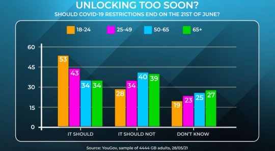
Lest I risk being stripped of my Peston Geek of the Week badges, there isn't anything particularly wrong with this - it just happened to be one example I noticed this week! But personally, I find four bars per category a bit much - I don't think the key stories are as easy to read as they might be. (I should confess my own sins at this point.)
In instances like this one - where the results for a single age group will add up to 100% - I think there's an obvious alternative: a 100% bar chart.
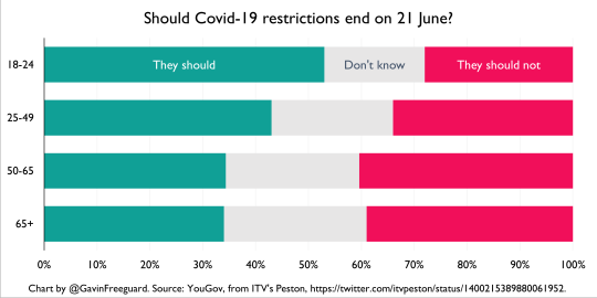
I think this makes the same point - that attitudes to lifting lockdown divide along age lines - more clearly. The thing you might lose is being able to easily compare should/should not for a particular age group, but that's not the main point being made and (personally) I think that takes some time with the original anyway.
Again, there's nothing particularly wrong with the original in this instance. But I've definitely seen more egregious examples, where the number of clustered columns becomes a bar to understanding the data.
Some initial thoughts on other subjects:
DB I thoroughly enjoyed last night's Data Bites geo-special, which you can watch as-live here (and will appear in slightly edited form here). I even included a chart-based quiz - question here (it does get there eventually), answer here. We'll be back on Wednesday 7 July with the next one, and then back on 8 September after a short summer break.
VPs Reports (Meta data, below) suggest the government has backtracked on many of its 'vaccine passport' plans for domestic use. (Rumours government will leave much to the free market are still a concern - government needs to provide clarity and be wary of harms, whoever is developing such systems.) Here's the Ada Lovelace Institute report on vaccine passports I was involved with.
GPDPR Also below are many links about the planned General Practice Data for Planning and Research, a new NHS Digital initiative to use patient data, which is now starting to become A Thing in the press.
LN If you're interested in data sonification, a new podcast - Loud Numbers - is launching with a whole festival on the topic this Saturday. Here are my collected sonifications for the Institute for Government podcast (which I've been saying I'll write up for about a year and a half now...)
ODI There are some great jobs - including researcher and senior researcher roles - going at the Open Data Institute, where I'm a special adviser (but don't let that put you off).
OGP NAP If you'd like to get involved in shaping the UK's next national action plan for open government, remember you can sign up here.
CogX And last but not least, I'm delighted to announce I'll be chairing a session on 'AI Governance: the role of the nation in a transnational world' at this year's CogX at 1pm on Wednesday 16 June.
W:GC will be taking a break next week, and perhaps the week after if I'm feeling really decadent. Remember there are 100+ other data newsletters, podcasts or event series you can sign up to here.
Have a great weekend/week/fortnight
Gavin
Enjoying Warning: Graphic Content?
Tell your friends - forward this email, and they can:
Subscribe via email
Follow on Twitter
Follow on Tumblr
Or:
Buy me a coffee (thank you!)
Follow me, Gavin Freeguard, on Twitter
Visit my website (I'm available for work!)
Today's links:
Graphic content
Viral content
Peru has world’s worst per capita Covid toll after death data revised (The Guardian)
Pretty big validation... (John Burn-Murdoch)
Covid-19 deaths in Wuhan seem far higher than the official count (The Economist)
This is an analysis of the rate of growth of the "delta variant" (Alex Selby)
COVID-19: Indian variant now dominant in a fifth of areas in England - do you live in one? (Sky News)
How the Indian Covid variant has surged in England* (New Statesman)
Side effects
Covid catch-up plan for England pupils ‘pitiful compared with other countries’ (The Guardian)
How England’s school catch-up funding falls £13.6bn short* (New Statesman)
Concerns about missing work may be a barrier to coronavirus vaccination* (Washington Post)
COVID-19 passports: Britons are still in favour even as government scraps plans (YouGov)
Most people in UK did not work from home in 2020, says ONS (The Guardian)
UK
UK's culture war divisions exaggerated but real, say public – as shown by views on equal rights, cultural change and class, and online bubbles (The Policy Institute at King's College London, Ipsos MORI)
Lewis Baston: London voting patterns 2021. Not so much a doughnut as a swirl (On London)
Labour, not the Conservatives, was the largest party among low-income workers in 2019* (New Statesman)
The Greens are on the march. Who should be afraid?* (New Statesman)
Gender in public life (IfG)
Is this the beginning of the end of marriage? (Tortoise)
US
Small share of US police draw third of complaints in big cities* (FT)
Biden Targets Racial, Social Inequities With Vast Spending Push* (Bloomberg)
Hunger has declined dramatically across America in the past year* (The Economist)
NYC’s School Algorithms Cement Segregation. This Data Shows How (The Markup)
The Persistent Grip of Social Class on College Admissions* (The Upshot)
Building a Home in the U.S. Has Never Been More Expensive* (Bloomberg)
Nature, environment, energy
Cicadas, insecticides and children* (The Economist)
Corporate-led $1bn forests scheme is ‘just the beginning’* (FT)
European Banks’ Next Big Problem? The CO2 in Their Loan Books (Bloomberg)
How an Insurgency Threatens Mozambique’s Gas Bonanza* (Bloomberg)
Everything else
English clubs are dominating European football once again* (The Economist)
Unpacking the 2021 Digital Government Survey (FWD50)
#dataviz
A collection of visualization techniques for geospatial network data (GEOSPATIAL NETWORK VISUALIZATION)
Reconstructing the Neighborhood Destroyed in the Tulsa Race Massacre* (New York Times)
Meta data
Viral content
NHS Covid app signs £10m six-month contract extension with developer Zühlke (Public Technology)
The UK’s response to new variants: a story of obfuscation and chaos (BMJ)
Exclusive: UK vaccine passport plans to be scrapped* (Telegraph)
Introducing Covid certificates is a ‘finely balanced’ decision, says Gove (The Guardian)
SCOTTISH LOCAL GOVERNMENT DURING COVID-19: DATA NEEDS, CAPABILITIES, AND USES (Urban Big Data Centre)
Sharing data to help with the Covid-19 vaccination programme (DWP Digital)
How Modi’s fraught relationship with pandemic data has harmed India* (FT)
All those pub apps you’ve downloaded are a privacy nightmare* (Wired)
Losing patients?
Our perspective on the new system for GP data (Understanding Patient Data)
Helen Salisbury: Should patients worry about their data? (BMJ)
Your NHS data will be quietly shared with third parties, with just weeks to opt out – GPs like me are worried (i)
Dear #research, People are opting out in droves – Matt Hancock’s data grab, facilitated by NHSX, is damaging your work (medConfidential)
Matt Hancock has quietly told your GP to hand over your health data. Why? (openDemocracy)
Plans to share NHS data must be reconsidered* (FT)
GPs warn over plans to share patient data with third parties in England (The Guardian)
The Guardian view on medical records: NHS data grab needs explaining (The Guardian)
Your medical records are about to be given away. As GPs, we’re fighting back (The Guardian)
UK government
Government Digital Service: Our strategy for 2021-2024 (Strategic Reading)
Geospatial Commission sets its 2021/22 priorities (Geospatial Commission)
Office for Statistics Regulation Annual Business Plan 2021/22 (OSR)
Office for National Statistics: the number-crunching whizzes keeping Britain afloat are the unsung heroes of the pandemic (Reaction)
Digital Strategy for Defence: Delivering the Digital Backbone and unleashing the power of Defence’s data (MoD)
Introducing a Head of Digital role to DfE (DfE Digital and Technology)
Why we’ve created an accessibility manual – and how you can help shape it (DWP Digital)
Working in data, insight and user research roles at GOV.UK (Inside GOV.UK)
How to make hybrid or ‘blended’ meetings work for your team (MoJ Digital and Technology)
AI got 'rithm
How soft law is used in AI governance (Brookings)
The race to understand the exhilarating, dangerous world of language AI* (MIT Technology Review)
Can AI be independent from big tech?* (Tortoise)
Sentenced by Algorithm* (New York Review of Books)
Google says it’s committed to ethical AI research. Its ethical AI team isn’t so sure. (Recode)
Facebook’s AI treats Palestinian activists like it treats American Black activists. It blocks them.* (Washington Post)
Privacy, people, personal data
Privacy group targets website 'cookie terror' (BBC News)
EU to step up digital push with digital identity wallet (Reuters)
ICO call for views: Anonymisation, pseudonymisation and privacy enhancing technologies guidance (ICO)
Data isn’t oil, whatever tech commentators tell you: it’s people’s lives (The Observer)
Everything else
In big tech’s dystopia, cat videos earn millions while real artists beg for tips (The Guardian)
Rescuers question what3words' use in emergencies (BBC News)
Gadgets have stopped working together, and it’s becoming an issue (The Observer)
German Bundestag adopts autonomous driving law (The Robot Report)
Code is cheap; ignorance is costly (Matt Edgar)
The internet is flat. (Galaxy Brain)
Opportunities
EVENT: AI Governance: the role of the nation in a transnational world (CogX)
Full programme
EVENT: Special Topic Meeting on R/local R/transmission of Covid19 (Royal Statistical Society)
EVENT: Deploying algorithms in government (Global Government Forum)
EVENT: Emerging approaches to the regulation of biometrics: The EU, the US and the challenge to the UK (Ada Lovelace Institute)
SURVEY: Help to shape the National AI Strategy (AI Council, supported by The Alan Turing Institute)
JOB: CEO (Advanced Research and Invention Agency)
BEIS seeks chief for research agency championed by Cummings (Civil Service World)
JOB: Chief Digital Officer for Health and Care for Wales (Health Education and Improvement Wales, via Jukesie)
JOB: Head of Data Strategy (Companies House)
JOB: Head of Data Policy Analysis Team (DCMS)
JOB: Data Architect (GDS)
JOBS: Open Data Institute
JOBS: Open Data Manchester
JOB: Manager, Data and Digital Team (Social Finance, via Jukesie)
And finally...
Baked in
We collected data on 1,500 politicians' favourite biscuit. Here's what we found. (Democracy Club)
NYC Mayor Race: Ranked-Choice Ballot Explained, With Bagels* (Wall Street Journal)
Maps
Countries coloured by the number of other countries they border (Helen McKenzie)
An orange or an egg? Determining the shape of the world* (The Spectator)
I'm planning to cycle around London looking at bits of internet infrastructure and general sites of interest in computer history (Reuben Binns)
"How much of Scotland is further south than the most northerly part of England?" (Alasdair Rae)
Cartoons
'It's just counting!' (Scott Murray)
Help a Computer Win the New Yorker Cartoon Caption Contest (The Pudding)
Everything else
Can you make AI fairer than a judge? Play our courtroom algorithm game (MIT Technology Review)
Behind the painstaking process of creating Chinese computer fonts* (MIT Technology Review)
0 notes