#the show understood the color-coding assignment from beginning to end
Explore tagged Tumblr posts
Visit Tumblr Blog
Explore Tumblr blogs with no restrictions, modern design and the best experience.
Last Seen Tumblr Blogs


Fun Fact
Mobile Tumblr US users spend an average of 4.04 minutes per session on the app.
Text
Season two of Chaser Game W was just as wacky as the first, but I'm going to go on record and state I believe season two was better because Fuyu really got to evolve and kept me entertain with all her hilarious facial expressions.

The finale began with the Red Devil back and back to her old habits, but instead of Fuyu immediately caving, she figured out this was her father's doing.

And when Itsuki was spiraling after Fuyu's mother visited, Fuyu was like, "You told my mother to eat poison, right?"

Because this is a color-coded family and her mother would not abide by the assigned color-coding. She also made their sweet daughter beg to not be sent away, so grandmama gotta GO!

Everything comes back to those gay penguins! I'm not even slightly upset that Fuyu's ex suggested she not tell people about her relationship with Itsuki. Not everybody can be out in all aspects of their lives, so it's reasonable to protect their child, they must rethink how not everyone can be trusted with the truth.

Our mama penguins decide that is solid advice and encourage their daughter to call Itsuki her aunt in public, so the bigots aren't mean to a five-year-old child.

But the bigots are doing the most to teach their children to hate others at a young age.

And even though my babygirl was thrown off by their decision, she also understood the reasoning behind the decision because it's clear they are in love (the color exchanges say so), and they love their child. Not telling others doesn't make that love any less valid.

But after all of that, these two show up in almost-matching outfits to tell the entire PTA that they have big old lesbian crushes on each other, so suck on that, ay yay yah!

As wild as that school scene was, I liked that it ended with the child repeating the question of "What is normal?" because two color-coded parents in love seems pretty normal to me!

Then Fuyu actually told the entire world they were in love as if the colors didn't already do that!

This is how peacefully everyone should sleep after they come out on international platforms and ruin bigoted bitches' day.

Especially this Red Devil's day since she threatened them so many times!

Even though the show went left in the last minutes by making the father be the one to say China needs to change,

And having the Red Devil take the credit for Fuyu's bravery,

I don't care because in fictional works, I want my happy endings however I get them, and this IS a happy ending.

Instead of being a poly series *sad face*, we got more of the story about two women in love!

We have Itsuki being the most adorable Heavenly Human wife to Fuyu.

And Fuyu still being the cringe corporate Black Brooder wife!

Then we have other color-coded girls in love who have witnessed the journey of our protagonists.

We have Itsuki finding other parent friends who aren't homophobic asshats.

We have grandma sending her lesbian granddaughters and cute great-grandchild gifts!

Because grandmas in QLs are really proving the Boomers didn't protest wars and fight for our rights to be wrongfully considered the bad guys now.

We have the ex-husband finally getting to live his best life too with someone who gets him.

And I got COLOR-CODED GIRLS IN LOVE.

And a babygirl.

#chaser game w#chaser game w 2#color coded girls in love#the colors mean things#episode eight#this show was wild from start to finish#but I ain't mad at it#the show understood the color-coding assignment from beginning to end
37 notes
·
View notes
Text
We need to look beyond the concept of the "morally gray"
I don't like the concept of "morally gray" characters because it still basically portrays morality as binary, or, if you don't want to call it "binary," linear. There are good actions and bad actions, good people and bad people, and sure, there might be some stuff in the middle, but all that can still basically be understood in terms of the relation to good and bad.
Because, of course, while we might struggle to understand these people in the "gray areas," no one struggles to categorize our more typical heroes and villains. The beautiful, righteous, trueborn king is obviously good, and the evil, selfish usurper is obviously bad.
That's what the narrative tells us. But I need people to take a step back from the narrative role that has been assigned and actually evaluate the values and actions of the characters. Because when you do that, you begin to see that almost every character can be characterized as "morally gray." And it's here that we see the concept begin to collapse in on itself.
Because good and evil aren't static, defined, objective things, let alone easy to identify at a glance. And if good and evil aren't serving as the anchors at either end of the line, the spectrum itself cannot function.
I don't believe that "good" and "evil" are totally useless concepts. (Though even if they were, it would be difficult to get away from them with how entrenched this concept model is in our society.) But if we're going to have any sort of interesting discussion here, we need to start talking about morality in subjective, not objective, terms.
This is my other issue with the idea of the "morally gray" character—they might be morally gray to you, but I might think they're pretty cut and dry good or evil. One example is characters who are criminals. Most media and most analysis will tend to portray them as "morally gray" simply because of their criminal status. Sorry, but that's a you problem. You may hold that lawfulness is inherently good and unlawfulness inherently evil, but I don't. If a law is unjust, it is morally correct to defy it.
You're welcome to disagree with me, of course. But at some level we all have to accept that there can be disagreement. Morality is inherently one of the most controversial topics in existence and we are not all going to immediately agree, which is why it drives me up the wall when people try to categorize fictional characters in such overly simplistic ways.
The idea of the "morally gray" reinforces the idea that although we might quibble on some details, we all basically agree on what's right and what's wrong. There might be a particularly odd person, or a particularly complex, entangled situation, but for the most part, we all know what's good and what's bad, right, guys?
If we really opened up the discussion, I think people would be shocked by how deep some of these disagreements go. And it's only when we actually start talking about this stuff that we can begin to sift through and find the truth (or as close to the truth as we can get in this world).
The funny thing about the term "morally gray" is that the limitations are pretty self-evident from the metaphor. Sure, you've upgraded from black and white, but you've decided to stop at grayscale. There's hardly even much of a difference! We need the full visual spectrum of colors here.
I think that there was perhaps a time when the idea of "morally gray characters" served a purpose. After all, we are not so far removed from the era of the Hays Code. It was once controversial to even show what was deemed taboo or immoral by mainstream moral authorities. The advent of the "morally gray" character surely did bring greater detail and subtlety to the portrayal of morality in media. But the world has continued to change. We need to press even harder and demand that different moral perspectives be allowed to exist in media and that we be allowed to fully explore those perspectives in our analyses.
0 notes
Text
Planet Brubeck Clock
Assignment: Make a "clock for aliens" using processing.exe
Imagine a planet that runs on brubeck time. That's right, quintuples baby. I wanted to make a sequencer animation vaugely based on the quartet instrumentation in "Take Five". First I took a look at the sheet music for each part and jotted down how many hits were in each bar for each instrument.
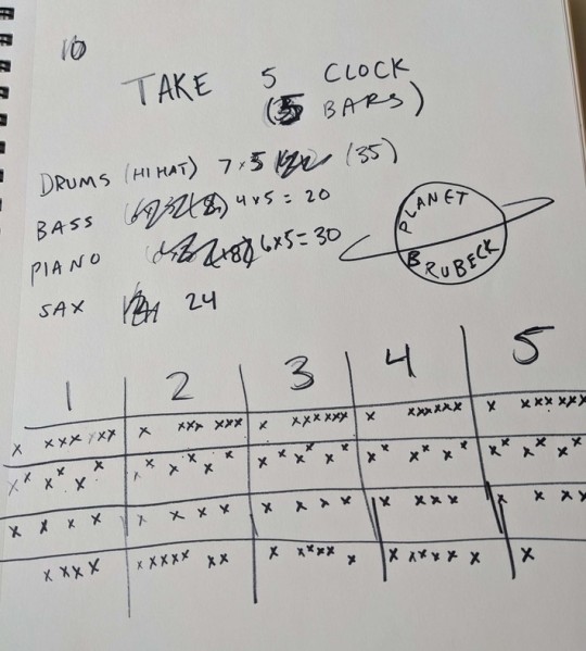
Note that I decided to focus only on the hihat for the drums because you could build a whole other program solely on sequencing the entire drum kit. I wrote down five bars here even though that's more than the proper measure... I fixed this later in the program.
Okay, time to get to coding work. First I started out making a nice grid & color scheme.
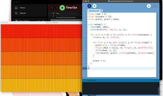
Nested "for" loops, we love em.
Each bar I would have representing an instrument, with the top bar representing the measure. I wanted rectangles to appear that would syncronize with the song (as best as I could without proper, jazzy delays). First I had to make some rectangles.
Werk!!
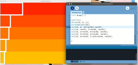
Each rectangle is based off the smaller rectangles in the original grid, henve the rectangle widths being things like 15 * rectW, where rectW is width (of the window) / 60.
Now came the tricky part, which was making multiple rectangles for each bar that would blink across the screen in time with the music.
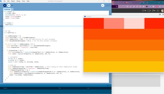
The solution to making multiple rectangles all the way across was another for loop. I understood that to make each rectangle appear and then fade out, I would have to draw the background OVER each rectangle over and over again with an alpha channel creating the fade effect; hence, a nested for loop with the code for the background I wrote first.
The trickiest part was figuring out the timing; when I first wrote the for loop all the rectangles would activate and fade out at the same time. I realized I needed to index each rectangle so I could give them each their own start time as well as a flexible "fade duration" that would allow me to finesse the timing of each loop as much as possible. I thought about using millis() for my timekeeping factors but decided not to overcomplicate things and just stick with frameCount. I bet using millis() and maybe even seconds() might help create more jazzy patterns but... that's hard.
After perfecting the code for the first row(representing four measures, since it is 5 beats over 4 bars, after all), I moved on to the second row.
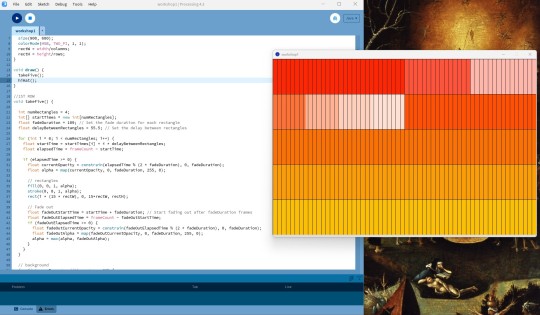
Figuring out how to get the rectangles to fade was the trickiest part, so once that was done it was just a matter of personalizing each row and changing the overall visual style. Writing each row as its own function seemed the easiest way to go to stay organized rather than dumping all the code in the draw() function. I decided to show the grid in the end because I thought it gave the program a more analog look.
The only variables I had to play with when creating each function were the y-position and the width of the rectangles, and the fadeDuration and delayBetweenRectangles to get the timing right, the rest of the function (the opacity and the background) working across all functions.
Et voila! My Brubeck Clock. Again, with some extra finessing with the time functions, I bet I could make each rectangle sync up with each note played on the saxaphone, for example. However I wouldn't really know where to begin or end with trying to mathmetize jazz music. Math rock, maybe....

The last function I wanted to deploy was one where it would save a picture of the screen upon click. As we look at the hands of a clock to tell our time, on Planet Bruebeck, the position of each beat in the five bars is how they tell their time. Oh look, it's 2nd Measure, C7, D12, A#, Closed Hat.... o'clock!
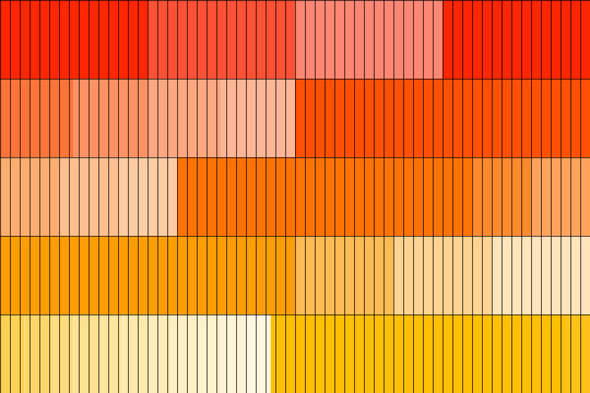
Tried to upload it to openprocessing, a website that seems to hate me because I can never get my animations to show up right. However, if you take the code from there and pop it in processing yourself, it should work swimmingly! Try watching with Take Five on... it's pretty close, I think.
Thank you and enjoy.
0 notes
Text
PURE [5] - Corpse Husband x Fem!Reader
A/N: It’s been a while.
part 1
part 2
part 3
part 4
PURE [5]
“Did you guys find anybody?” Felix’s voice sounded out when the man repeated the same question for what seemed like the third time since he joined the call. The number of players showed 7 of them, which meant that they were still missing three people. Sure, they could start the game now, but it would be way more enjoyable and funny with a full lobby.
“Yeah, Toast will be here any moment. “Sykkuno replied right away. “He just texted me; he should join us in a few.”
“Cool. Anyone else?”
“I think Corpse was also supposed to join us, right? Not sure though why he isn’t here yet.”
“Oh, yeah, Corpse will be here soon too!” Jack suddenly chimed in with an explanation. “He said he needed to take care of something first, but he’ll be here before we start.”
“Great. But that means we’re still one person short.” Felix hummed when Toast’s little astronaut appeared in the lobby “Hey Toast."
“Hey man.”
“Do you have anyone coming?”
“I’m afraid not. I asked MrBeast, but he’s busy, so...”
“Well then, we can just start when Corpse is here, and maybe we’ll find someone in the meantime?” Dave suggested, earning a few hums of approval from the other players.
“Yeah, I think that’s the best option...” Jack agreed. But then his voice blared out in everyone’s headphones with excitement. “Ha! Corpse is bringing someone!”
“Who?”
“I dunno, he just texted me he has one coming and that’s all.”
“Hm, all right. Let’s wait then.”
***
Corpse fidgeted with his phone, glancing between its screen and the chat in his stream. People were already asking countless questions, but rather than answering them, he was waiting for Y/N to call him. He was nervous - the girl still hadn’t commented on his request.
The idea to invite her to the lobby wasn’t spontaneous. In fact, he’d been thinking about it for quite some time now, but never found the courage to actually ask if she would like to join them for the game.
It’s been almost a month now since that memorable phone call. A month since Y/N last played with her friends; a month since she considerably reduced her social media usage.
Sure, she was still active on her youtube channel, but not as much as before the whole haters situation. No matter how hard she tried to just ignore them and simply continue her career, she just couldn’t. There were still these nagging thoughts at the back of her mind, reminding her of all those people and their comments, their messages. It seemed like a good idea to take a short break and sort everything out.
Her fans understood it. They were obviously sad that her videos weren’t as frequent as before, but everyone knew what the situation looked like and that Y/N needed some time for herself.
Her audience knew it, and so did her friends. Especially Corpse.
The man kept his word and talked to the girl whenever she wanted to. Which, in the end, was almost everyday. Although at the beginning their conversations mostly focused on her current problem and dealing with it, their topics broadened over the time.
At one point though, Y/N started worrying that maybe she’s annoying him with her so frequent calls. She thought that she shouldn’t bother him that much - even if talking to him was what really helped her cope with her problems. He already had enough on his plate, and sharing her own concerns with him suddenly seemed like a very selfish thing to do.
But she quickly realized how wrong she was for thinking like that. When one day she didn’t call, figuring out that she should stop troubling him with her own issues, she was very surprised when Corpse reached out to her himself. He expressed how worried he got when she didn’t call, and when she explained what was the reason, he spent the next fifteen minutes lecturing her that she should never think she’s bothering him.
From that day on, they talked every single day. And they talked about almost everything.
Corpse enjoyed their late night-talks more than anything. He liked to listen to Y/N talk about the things she finds exciting, her hobbies, and her dreams. Hell, she could talk about what she ate for breakfast, and he would still listen with interest.
And even though they haven’t seen each other in person, even though she still hasn’t seen his face, they managed to get really close during those past weeks. For an outside observer (who also didn’t have access to Twitter) they would seem like a couple of very good friends.
But not for Corpse.
He couldn’t pinpoint when exactly did it happen. They were talking one evening and Y/N was telling him about the TV series she had finished watching recently. He listened intently and watched as her facial expressions changed from excited to frustrated, as she was enumerating everything she liked and disliked about the series finale.
And then he suddenly got this weird feeling in the pit of his stomach, and simply couldn’t take his eyes off her.
He tried to play it off and act as if nothing changed, but he couldn’t stop his heart from doing backflips whenever she laughed at one of his dumb jokes or called him partner. It was still a running joke between them and among the group of their friends, but there was something in the way she said it that made him instantly smile like an idiot.
He also started paying more attention to the hashtags on Twitter and Instagram. #PartnersInCrime was still rather popular, even though it was a month since anyone last used this phrase on stream. Corpse also found out that #Y/Nforthebride was trending for some time; he even managed to stumble across a few fanarts.
There was this urge to send them to Y/N, but he was too nervous that it would make things awkward between them... After all, he didn’t know how she felt about that whole shipping thing.
That’s why he decided to just leave things between them as they are, and be happy that he’s at least her friend.
Corpse nearly jumped out of his skin, when he was brought back to reality by the sound of an upcoming FaceTime call. Y/N’s photo appeared on his screen, her smiley face which he had assigned as her contact photo. His lips corners curled up in a smile almost unwittingly.
“Hey Y/N/N” he said after answering the call.
“Hi Corpse” she smiled softly upon hearing his voice. Although the screen on her side was dark, she didn’t mind not seeing Corpse’s face. She respected his wish to remain faceless and enjoyed their conversations anyway.
“Whatcha doin’?”
“Just editing the new video. I guess I’ll upload it in the morning... but I’m not sure yet.”
“Well let me know then, I wanna be the first one to see it.”
“Sure thing, Corpse” she chuckled, lowering her gaze bashfully. Corpse just looked at her face for a moment, unable to stop smiling to himself. Then he remembered why they were talking in the first place.
“So... have you seen my text?” Y/N sighed at his question but nodded her head slowly. “And what do you think?”
“I don’t know, Corpse...” she ran a hand through her hair in a nervous gesture. “...if that’s a good idea, I mean.”
“Well, it’s been a while. No pressure though, if you don’t wanna play then it’s totally fine.” he quickly clarified. “I just thought it would be fun if you joined us, even if just for a moment. I’m sure everyone would go crazy.”
Her smile widened slightly at his words, but she still didn’t look convinced. Sure, it was tempting to join them. She wanted to do it each time Sean or Felix bombarded her with messages and codes to the lobby, both inviting her to join the group in the game. But then she remembered how people reacted to her appearance in their streams... and suddenly it didn’t seem like such a good idea anymore.
“We’re gonna play on Polus...” he added after a moment when she still didn’t say anything. “That one map with the planetary base... there’s a lava pit, y’know. Just saying...”
She laughed wholeheartedly at his words, remembering their last game when Corpse jumped into the lava for her.
“Sykkuno’s gonna be there as well” Corpse continued. “And I promise I won’t kill you this time.”
“Even if I’m the last player alive?” she joked.
“Even then, Y/N.”
Corpse stifled a laugh, as she cocked her head to the side and narrowed her eyes slightly as if trying to spot him in the darkness.
“Are you streaming, Corpse?” she then asked.
“Not yet. I’m gonna start the stream as soon as you say yes, though.”
“Oh c’mon” she laughed at his words “That’s emotional blackmail!”
“Maybe. Is it working?” he asked.
Y/N let out a heavy breath and ran a hand down her face. Corpse watched in anticipation as she seemed to have some internal battle with herself. He hoped that she’s gonna agree, he really missed playing with her.
“All right, then.” she suddenly said, and his breath hitched in his throat. “I’m gonna stay for a few rounds I guess...”
“Wait, really?” he asked, a smile on his face only widening.
“Well, yeah, partner.” she replied, which made his cheeks go warm “Your imposter techniques haven’t been very effective lately... Someone needs to help you out, or you’re gonna lose your title of the king of the Imposters.”
“Oh, is that’s how it is now?” he laughed in fake shock. “I wouldn’t have to worry about losing the title if my accomplice hadn’t left me all alone!”
“All right, all right.” she giggled at his accusations. “Your accomplice is on her way to support you.”
Corpse smiled even wider at the sound of her laughter. Her eyes shined with happiness when she was giggling, which only brought out their E/C color. The fact that his stupid babbling was the reason for her smile was making him feel extremely proud of himself.
“But just so you know... I still have no idea how this map works, so I’m afraid I’m gonna need you to guide me around it...”
“Y’know you could as well just say you want to hang out with me...”
“Corpse!” she laughed, her cheeks blushing in embarrassment.
“Just kidding Y/N” he chuckled at her reaction. “Of course I’m gonna guide you, don’t worry.”
“Okay then...” she said after a moment, looking at the screen again. “I’ll be there in a few minutes. Will you send me the code, please?”
“Sure I will, Y/N”
“Okay. See you later, partner” she smiled brightly.
“See you, partner.”
When Y/N ended the call, Corpse let out a breath he didn’t know he was holding. He sighed in relief and ran a hand through his hair, before moving to sit behind his desk.
It was only after he started the stream that he realized he was blushing. Not only because Y/N would join them, but because there was also another thing he wanted to ask her about, but didn’t find the courage to yet...
***
By the time Y/N turned on her computer and started the game, Corpse has already sent her the code, and there was a Discord invite waiting for her as well. She bit her lip nervously as her heartbeat quickened.
Was she nervous? As hell.
She did everything she could to avoid being in unnecessary spotlight since she started receiving those hate messages. Perhaps escaping the problem wasn’t the best solution, but it definitely was a comfortable one. People wouldn’t have a reason to hate on her if she disappeared.
But then she couldn’t say no to Corpse. And truth to be said - she really missed playing with her friends. From what she’d seen on Twitter, the lobby would be filled with those she’d already played with, so she wasn’t that nervous before the game. What she was nervous about though, was how people would react.
Accepting Corpse’s request was something she did due to the sudden rush of courage. And now there was no coming back.
She knew Corpse would understand if she changed her mind... but she heard how excited he was when she had agreed. She couldn’t do it to him.
So, once she’d taken a deep breath and put her headphones on, Y/N accepted the invite and braced herself for the inevitable chaos that was bound to take place in the call. She decided to wait with joining the lobby though - at least until they realize she’s with them.
“..the fuck you’re talking about?!” Felix’s voice was the first thing she heard, which made her roll her eyes with a smile. “It’s not my fault I sound like that! At least I don’t have a liar voice like Rae!”
“HEY!” the girl yelled “I don’t have a liar voice!”
“You do, you’re using it even now!” Jack argued, much to Rae’s dismay.
“What is going on here” Corpse’s deep voice sounded out suddenly.
“Oh, you’re here! Finally” Sykkuno immediately welcomed him with his always happy voice.
“Yeah, sorry that I’m late guys.”
“No worries, man” Pewdiepie spoke up again. “We were just talking about playing the voice card and that you’re basically the only one who can do it.”
“Not fair at all!” Rae chimed in, making Corpse chuckle.
“The voice card...” he hummed after a moment, before adding. “I wouldn’t really say I’m the only one though...”
“Well who else then? Everyone else either starts laughing or have a liar voice” Dave asked, and Rae scoffed at the last words.
“Well what about my guest?”
Y/N inhaled sharply, realizing that now she should probably reveal herself.
“Oh, right! Who you’re bringing man?” Sean asked with curiosity.
That’s when Y/N typed in the game code, and her white astronaut appeared in the lobby.
“Wait, who’s- HOLY SHIT” Sean all but yelled, when realization hit him. Y/N laughed loudly at his reaction, and her voice only seemed to prove to everyone that she really was there.
“KIDDO WHAT THE FUCK” Felix reflected Jack’s response, yelling over his friend.
“Oh my god, hi!”
“What a surprise!” Y/N managed to catch Sykkuno’s words. “It’s so amazing to have you here, Y/N/N!”
“As I live and breathe.” another voice spoke up, and Toast’s little astronaut came face to face with her white bean. “My lifelong nemesis. Back here snap my neck again, huh?”
“Yeah, happy to hear you too, Toast” Y/N giggled at his words, then she adressed the whole group. “Hi guys.”
“Okay I did not expect that in the slightest” Sean laughed happily “You’re here kiddo!”
“I am” she smiled from ear to ear, even though they couldn’t see her.
“Wait- Corpse, is that the thing you had to take care of?” her best friend asked Corpse with suspicious voice.
“Well...” he trailed off and cleared his throat, making everyone laugh.
“That’s so great Y/N! We missed you so much!” Rae thundered over the bickering of the boys. “The game hasn’t been the same without you...”
“Agreed. I suddenly stopped dying.” Toast commented, making her roll her eyes with a laugh.
“I don’t know if I should be happy or fucking scared right now.” Felix laughed nervously. “With Corpse and Y/N? We’re fucked now, guys.”
“I promise I’ll go easy on you, I haven’t played in so long I think I forgot all my strategies...”
“Yeah, sure.” Toast’s forever suspicious voice made her smile wider. “Just don’t kill me in the first roung, okay? I won’t vote you off just stay the fuck away from me you little murderer.”
“Okay, I promise I won’t kill you...”
She couldn’t stop herself from laughing, and the smile remained on her face even when they started the game. It only seemed to widen, when she saw the sign Imposter on her screen.
Only to giggle hysterically when she realized that Toast was the other imposter...
And so the game went on with Y/N and Toast cooperating like perfect serial killers. Corpse did as he promised and guided her through the map, both of them being closely followed by Sykkuno. Because of that she’d just sabotage the map most of the time to give Toast opportunities to kill their friends, but eventually managed to sneak out when her two fellow crewmates were doing their tasks. It just so happen that Pewds was walking past her, and she might’ve accidentally snapped his neck...
“Goddamnit! I knew it! I fucking knew it was you!” Sean yelled once the game was over and Y/N saw the sign VICTORY on her screen, her small character standing next to Toast’s one. He was ejected at some point because Poki managed to walk in on him killing Rae, but Y/N remained undetected until the very end. Perhaps the fact that Corpse was one of the two crewmates who were left alive had something to do wtih it...
“That was rude” Pewds said in a whiny voice, clearly referring to their encounter which led to his death. “I was just happily walking around, doing my tasks like a good crewmate, and then boom! Y/N happened”
“I would say I’m sorry... but I’m really not” she laughed, making Felix gasp in shock.
“That’s what happens when you work with Toast!”
“Good game, Y/N. That was amazing” the man in question said appreciatively.
“Will you finally forgive me for killing you that one time if I say that being imposters with you was cool?” she laughed nervously.
“Actually... Yeah, I guess we can bury the hatchet now. AND we should team up more in the future.”
“Great!”
“Excuse me, what?” Corpse’s voice made the whole lobby laugh. “I don’t remember us cancelling our partnership, Y/N.”
“Corpse...”
“Are you trying to steal my accomplice from me Toast?”
“Well she’s a great partner in crime after all...” Toast deliberately used the phrase, making Corpse gasp.
“Hey! She’s my partner! Find yourself your own, Toast” Corpse joked, making Y/N laugh bashfully, her cheeks warming up at his words.
“Yeah yeah, I remember, don’t worry man. No one’s gonna take your partner in crime away from you...” Toast’s teasing voice made them all laugh, Corpse and Y/N included.
For the next few rounds Y/N played as a crewmate, running around the map with either Corpse or Sykkuno and doing her tasks. During meetings they joked and laughed, and for a moment, she stopped thinking about what people watching her friend’s streams might think about her presence. After all, there was at least a small chance that they didn’t think about it at all, and simply enjoyed watching their favoirte youtubers. Just as she enjoyed playing with her friends.
Oh, and by the way, Corpse kept his promise and didn’t kill her even when she was the last player alive...
It was soon time when everyone started slowly leaving the lobby, having played for over three hours. Y/N also said her goodbyes to the others and promised that she’d join them to play a game called Raft next week.
When she turned her computer off and threw herself on her bed, Y/N immediately grabbed her phone to call Corpse. He answered right away.
“Well hello, partner...” she rolled her eyes with a smile when he accented the last word. “Or should I say, traitor, instead?”
“Corpse... you know I would never betray you...”
“Well how can I be so sure, now that I know how cool it is to be imposters with Toast?” she knew he was joking, she could almost hear the smile in his voice.
“Not nearly as cool as it is with you, Corpse” Y/N grinned from ear to ear when Corpse scoffed.
“I spare your life so many times and that’s what I get in return? You cheat on me with Toast?” he said in disbelief “I’m disappointed, Y/N, I really am.”
“I would never!” she laughed through her words, even though her cheeks were now red because of Corpse’s words. “You’re the best partner in crime, Corpse, I wouldn’t trade you for anyone else!”
Not only in the game, she thought.
“Hmm, alright. Let’s say I believe you.” he said after a moment of thinking.
“I mean it, Corpse...” Y/N said after calming down from her laughter. “I... I really wanted to thank you.”
“Thank me? For what?” he asked, genuinely surprised.
“Well, first of all for inviting me to today’s game... I really had lots of fun, it was great to play and talk with the others. And I wouldn’t be in the lobby if not for you...” Y/N mumbled, before verbalizing her previous thoughts. “And I also wanted to thank you for just... you know... being my friend. My real life partner in crime. I just wanted you to know I’m really glad I met you...”
Corpse was silent for a good few moments, and Y/N started panicking that maybe she said something wrong, or maybe he found her spontaneous confession funny, or worse, dumb. She was almost ready to somehow laugh it all off, when his voice cut her off.
“Thank you, Y/N. It really means a lot to me too.” he sounded like he had some troubles with speaking, which made Y/N furrow her brows in worry.
“Is everything okay, Corpse?”
“Yeah, I...” he stuttered, then laughed nervously. “I just didn’t expect that and... yeah. It’s not something I hear on a daily basis, especially from someone like you.”
Someone like me?
“But what you said... it’s mutual.” he said after a moment, and Y/N couldn’t stop herself from grinning like an idiot. “You’re the best partner in crime I could ask for. And not only in the game.”
She could as well just pass out there and there...
“So uhm... there was one thing I wanted to ask you...”
“Yeah?”
“I was wondering if maybe... you know, if you’d have some time... and if you’d want to of course... would you maybe like to visit me here in San Diego?”
Yeah, passing out seems like a good idea.
***
This is not the last part.
TAG LIST:
@golden-chan @pillowjj @afuckingunicornn @love-and-virtues @ignooynim @crapimahuman @hannahjsworld @laugh-like-the-moon @fallengoddess772 @kingric03 @dolphinpink310 @paigeyisme @bunnychano3o @dxrtygxrl28 @z-nyx @baby-iyania @trashygeek @qmalley @yn-dreamlife @queenshadow142003 @daughterofsmokeandbone23 @my-little-art-world99 @yoongi-holland @rinarecommends @psychoticunicornsblog @goldensunshinestyle @unstableye @pastelvixenbeauty @weallneednamjesus @benakenalove @corpsesimpp @xenos-sonex @jellicorn05 @must-be-a-weasley-92 @keijikunn @infinitely-kate @thisshitisfuckingdifficult @summerbbygirl @mygirlviolet @eat-your-veggies @evans-dejong @jeffxx @weepingdonuthumancookie @myinnergayistakingover @i-love-scott-mccall @thecanterburywitch @annshit @blood-of-fandoms @namjoons-crabssss @guadu-chan @harleyharleycrow @stormyskys13 @soft4kei @ukai-hoe @that-chick212 @campcampie @cookiewhoree @ukiyolixx @princess-skate @newtaholic-staygold @unknown-and-invisible @cherry-piee @marvelenthusiast3000 @apples-of-february @lovelybrit @wineandionysus @faepetersen @vincent-stargogh @idalinette @ggsmashgg @browneyespinkhair @uwucorpse @fluffylittellama-blog @yoshigguk @queentorresstuff @becihadshawn @winged-reader @x3musicismylife @musubipost @missdox @honeyames @dark-o-room @izthefangirl @l0verl0ser @laurenfangirlsout @asianfrustration13 @hopelessfluff @sacrifice-me-please @stopicouldhaavedroppedmycrossant @sleepingalaska @strangenerdsstuff @otakuartist05 @blossom-702 @astream-ofconsciousness @mythicalamphitrite @infinitelycharmed23 @ s1utforfictionalcharacters @ abrokenlink @ lestrangeesme @laazullii @ avesagittarius @ smiithys @zenx2003 @vintagexparker @write-from-the-heart @goalexis123 @ trrcelovesyou @rebloggingeverything @homosexualjohnwayne @xprettyqueenx @just-a-stan @tenebrisirae
#corpse husband#corpse imagines#corpse x reader#corpse husband imagine#corpse husband x reader#youtubers x reader#imagine
833 notes
·
View notes
Text
A Guide In Firefox to New And Creative CSS DevTools
Over the last few years, our team at
Firefox
has been operating on new CSS gear that address both cutting-edge strategies and age-old frustrations. We’re the Layout Tools team, a subset of Firefox Developer Tools, and our quest is to improve the modern-day internet layout workflow.
The internet has seen an first-rate evolution inside the final decade: new HTML/CSS functions, browser improvements, and design strategies. Our crew is dedicated to constructing gear that fit that innovation so that designers and developers can harness extra of the performance and creativity that’s now possible.
In this guide, we’ll proportion a top level view of our seven new equipment, with memories from the design system and realistic steps for trying out each tool.
1. Grid Inspector
It all started out three years in the past while our CSS format expert and dev advocate, Jen Simmons, labored with members of Firefox
DevTools
to construct a device that would aid customers in examining CSS Grid layouts.
As one of the most powerful new functions of the cutting-edge internet, CSS Grid had quick gained decent browser adoption, but it still had low internet site adoption. There’s a steep studying curve, and you nevertheless need fallbacks for sure browsers. Thus, part of our purpose turned into to help popularize Grid by way of giving developers a more hands-on manner to research it.
The middle of the device is a grid outline, overlaid at the page, which facilitates devs visualize how the grid is positioning their elements, and the way the layout modifications once they tweak their styles. We introduced numbered labels to identify each grid line, the capability to view up to 3 grids at once, and colour customization for the overlays. Recently, we also introduced support for subgrid, a modern day CSS specification implemented in Firefox and hopefully in extra browsers soon.
Grid Inspector changed into an idea for all of the tools that followed. It was even an notion for a brand new team: Layout Tools! Formed in late 2017, we’re unfold across 4 time zones and collaborate with many others in Mozilla, like our rendering engine builders and the best parents at MDN.
TRY OUT THE GRID INSPECTOR
In Firefox, go to our Grid example site.
Open the Inspector with Cmd + Shift + C.
Turn on Grid overlay through one of 3 ways:
Layout Panel:
In the Grid section, check the checkbox subsequent to .Content.Grid-content;
Markup View:
Toggle the “grid” badge next to ;
Rules View:
Click the button next to display:grid; inside
#page
-intro .Grid-content;
Experiment with the Grid Inspector:
Change the crimson overlay coloration to red;
Toggle “Line numbers” or “Extend strains infinitely”;
Turn on greater grid overlays;
See what takes place while you disable grid-gap: 15px in Rules.
2. The Editor of Form Path
The next project we have been working on has been the Shape Path Editor: our first visual editing tool.
CSS Shapes permits you to define shapes for textual content to drift around: a circle, a triangle, or a many-sided polygon. It can be used with the clip-path assets which permits you to trim elements to any of those equal shapes. These two techniques collectively open the opportunity for a few very specific graphic design-stimulated layouts.
However, creating these sometimes complicated shapes can be difficult. Typing all the coordinates manually and the use of the right CSS units is error-inclined and some distance eliminated from the creative mind-set that Shapes allows. Therefore, we made a device that allows you to edit your code through at once clicking and dragging shapes on the web page.
This kind of feature—visible editing—became new for us and browser tools in general. It’s an instance of how we will go beyond inspecting and debugging and into the world of design.
TRY OUT THE SHAPE PATH EDITOR
In Firefox, go to this web page at the An Event Apart website.
Open the Inspector with Cmd + Shift + C and pick out the first circular image.
In Rules, click on the icon subsequent to the shape-outside property.
On the web page, click on the factors of the shape and notice what happens while you drag to make the shape massive or tiny. Change it to a size that appears exact to you.
3. Text Reader
We have had a Fonts panel in Firefox for years which displays an informative list of all the fonts used in a website. We decided to convert this into a Font Editor to fine-tune the properties of a font by continuing our trend of designing in the browser.
A driving force behind this assignment become our purpose to support Variable Fonts at the same time that the Firefox rendering engine team changed into adding support for it. Variable Fonts gives font designers a way to offer fine-grained variations alongside axes, like weight, within one font file. It also supports custom axes, which offer each font creators and web designers an exceptional amount of flexibility. Our device routinely detects these custom axes and offers you a manner to alter and visualize them. This would otherwise require specialized websites like Axis-Praxis. Additionally, we added a characteristic that gives the ability to hover over a font name to spotlight in which that particular font is being used at the page. This is helpful because the manner browsers select the font used to render a bit of text can be complex and depend upon one’s computer. Some characters may be abruptly swapped out for a special font due to font subsetting. TRY OUT THE FONTS EDITOR
In Firefox, go to this variable fonts demo site.
Open the Inspector with Cmd + Shift + C and pick out the word “variable” within the title (the element’s selector is .Title__variable-web__variable).
In the 1/3 pane of the Inspector, navigate to the Fonts panel:
Hover over the font name Output Sans Regular to look what receives highlighted;
Try out the load and slant sliders;
Take a take a look at the preset font versions within the Instances dropdown menu.
4. Flexbox Inspector
Our Grid, Shapes, and Variable Fonts equipment can together electricity some very advanced graphic layout at the internet, but they’re still somewhat present day based on browser support. (They’re nearly there, however still require fallbacks.) We didn’t need to work most effective on new features—we were drawn to the problems that maximum web builders face on a every day basis.
So we started work at the Flexbox Inspector. Design-wise, this has been our most ambitious assignment, and it sprouted some new consumer research strategies for our team.
Like Grid, CSS Flexbox has a fairly steep learning curve while you first get started. It takes time to truely recognize it, and a lot of us hotel to trial and error to gain the layouts we need. At the beginning of the assignment, our team wasn’t even sure if we understood Flexbox ourselves, and we didn’t recognize what the main challenges have been. So we leveled up our understanding, and we ran a survey to discover what human beings wanted the most when it got here to Flexbox.
The outcomes had a big effect on our plans, making the case for complicated visualizations like grow/decrease and min/max. We continued operating with the community at some point of the task by means of incorporating remarks into evolving visual prototypes and Nightly builds.
The tool consists of two main parts: a highlighter that works just like the Grid Inspector’s, and a detailed Flexbox device inside the Inspector. The middle of the tool is a flex item diagram with sizing info.
With help from Gecko format engineers, we have been able to show the step-by-step size choices of the rendering engine to offer users a full image of why and the way a flex object ended up with a positive size.
Note: Learn the full tale of our design manner in “Designing the Flexbox Inspector”.
TRY OUT THE FLEXBOX INSPECTOR
In Firefox, visit Mozilla’s Bugzilla.
Open the Inspector with Cmd + Shift + C and pick out the element div.Inner (simply inside the header bar).
Turn on the Flexbox overlay through one of 3 ways:
Layout Panel:
In the Flex Container section, turn on the switch;
Markup View:
Toggle the “flex” badge next to ;
Rules View:
Click the button next to display:flex.
Use the Flex Container panel to navigate to a Flex Item known as nav#header-nav.
Note the sizes shown within the diagram and length chart;
Increase and reduce your browser’s width and see how the diagram modifications.
Interlude: Doubling Down On Research
As a small team and not using a formal person research support, we’ve regularly resorted to design-by-dogfooding: basing our critiques on our personal stories in using the tools. But after our achievement with the Flexbox survey, we knew we wanted to be better at collecting statistics to guide us. We ran a new survey to assist tell our subsequent steps. We crowdsourced a list of the 20 largest demanding situations faced by internet devs and asked our community to rank them using a max-diff format. When we discovered that the huge winner of the demanding situations was CSS Layout Debugging, we ran a follow-up survey on unique CSS insects to discover the largest pain points. We supplemented these surveys with user interviews and user testing. We also asked folks to rank their frustrations with browser developer tools. The clear pinnacle difficulty became moving CSS modifications returned to the editor. This became our subsequent project.
5. Changes Panel
The difficulty in shifting one’s work from a browser developer device to the editor is one of those age-old issues that we all just got used to. We were excited to make a easy and straight away usable solution.
Edge and Chrome DevTools got here out with versions of this device first. Ours is centered on assisting a wide range of CSS workflows: Launch DevTools, trade any patterns you want, and then export your modifications by means of either copying the overall set of changes (for collaboration) or simply one changed rule (for pasting into code). This improves the robustness of the whole workflow, such as our other format tools. And this is just a start: We recognize accidental refreshing and navigation from the web page is a huge source of facts loss, so a manner to bring persistence to the tool may be an essential next step. TRY OUT THE CHANGES PANEL
In Firefox, navigate to any website.
Open the Inspector with Cmd + Shift + C and pick an element.
Make some adjustments to the CSS:
Modify patterns inside the Rules pane;
Adjust fonts within the Fonts pane.
In the right pane of the Inspector, navigate to the Changes tab and do the following:
Click Copy All Changes, then paste it in a text editor to view the output;
Hover over the selector name and click Copy Rule, then paste it to view the output.
6. Inactive CSS
Our Inactive CSS feature solves one of the top troubles from our layout debugging survey on precise CSS bugs: “Why is this CSS assets now not doing anything?”
Design-wise, this feature is very simple��it grays out CSS that doesn’t affect the page, and shows a tooltip to give an explanation for why the property doesn’t have an effect. But we understand this can enhance efficiency and cut down on frustration. We have been bolstered by research from Sarah Lim and her colleagues who constructed a similar device. In their studies, they observed that novice builders had been 50�ster at building with CSS when they used a device that allowed them to ignore beside the point code.
In a way, that is our favorite sort of feature: A low-placing UX fruit that barely registers as a feature, however improves the complete workflow without actually wanting to be determined or learned. Inactive CSS launches in Firefox 70 but may be used now in prerelease variations of Firefox, consisting of Developer Edition, Beta, and Nightly. TRY OUT INACTIVE CSS
Download Firefox Developer Edition;
Open Firefox and navigate to
wikipedia.Org;
Open the Inspector with Cmd + Shift + C and choose the center content material area, called central-featured;
Note the grayed out vertical-align declaration;
Hover over the data icon, and click on “Learn extra” if you’re interested.
7. Accessibility Panel
Along the way we’ve had accessibility functions developed by means of a separate group that’s typically one person — Yura Zenevich, this year together with his intern Maliha Islam.Together they’ve turned the brand new Accessibility panel in Firefox into a powerful inspection and auditing tool. Besides displaying the accessibility tree and properties, you could now run different varieties of checks on a page. So far the checks include shade contrast, textual content labels, and keyboard attention styling.
Now in Nightly, you can strive the new shade blindness simulator which harnesses our upcoming WebRender tech.
TRY OUT THE ACCESSIBILITY PANEL
Download Firefox Developer Edition;
Navigate to
meetup.Com;
In the developer tools, navigate to the Accessibility tab, and click the “Turn on Accessibility Features” button;
Click the drop-down menu subsequent to “Check for problems” and pick out “All Issues”;
Take a have a look at the diverse contrast, keyboard, and text label troubles, and click the “Learn greater” links if you’re interested.
Next Up
We’re currently hard at paintings on a browser compatibility tool that uses facts from MDN to expose browser-specific problems for a particular element. You can follow along on GitHub to learn extra. The Future
We’re committed to helping the modern-day web, and that means continuously converting and growing. New specs get implemented via browser vendors all of the time. Guidelines and nice practices around progressive enhancement, responsiveness, and accessibility evolve constantly. Us device makers need to hold evolving too.
And what of the long-lived, ever-present troubles in creating the web? What ordinary user interfaces need to be rethought? These are a number of the questions that preserve us going!
What approximately a better manner to navigate the DOM tree of a page? That a part of DevTools has gone essentially unchanged since the Firebug days.
We’ve been experimenting with functions like again and forward buttons that might ease navigation between lately visited elements. A extra dramatic trade we’re discussing is including a compact DOM view that makes use of a syntax much like HTML templating engines. The attention could be on the most common use case—navigating to CSS—as opposed to viewing/enhancing the source.
We’ve additionally been thinking about a higher element selector. We realize how it can be more effective to work inside the web page, with much less jumping backward and forward into DevTools. We should make the detail selector extra effective and greater persistent. Perhaps it could choose whitespace on a page and tell you what causes that space, or it can shed mild at the relationships between extraordinary elements.
As a reputed Software Solutions Developer we have expertise in providing dedicated remote and outsourced technical resources for software services at very nominal cost. Besides experts in full stacks We also build web solutions, mobile apps and work on system integration, performance enhancement, cloud migrations and big data analytics. Don’t hesitate to
get in touch with us!
Source:
whizzystack.co
#b2b ecommerce
#b2b content marketing
#b2b seo
#b2b marketing blog
1 note
·
View note
Text
Total War: ATTILA - Blood & Burning Crack

11.1K Total War: ATTILA; 6.6K General Discussion; 674 Community Mods; 159 Assembly Kit; 278 Multiplayer; 3.5K Total War: ATTILA Support; 2K Gameplay Issues; 1.2K Crashes & Performance; 106 Multiplayer; 180 Mac & Linux Support; 1.5K Total War Community Content; 1.3K Community Content; 201 TEd Tips and Tutorials; 87.7K Total War Eras; 82 SHOGUN. Blood & Burning update includes: Added blood effects to over 140 more death and wounding animations. With graphics settings above performance/low, decapitations are now more frequent during battles. Improved blood effects in battles, made blood more visible and in some instances, spurts last longer.
Buy Total War: ATTILA - Blood & Burning Pack as a Steam Key.
As the barbarians rise and the Huns are loosed upon the world, the Western Roman Empire staggers, pierced by a thousand blades. These are the end-times; the age of blood and fire!
Experience the horrors of the apocalypse with Blood & Burning for Total War: ATTILA. This pack adds blood-spurt effects, decapitations, limb-lops, disembowelment and more to the game. Disease-ridden soldiers can even be seen vomiting on the battlefield, adding to the ghastly realism.
Blood & Burning comprises:
Gory new Campaign Map combat anims with blood-spatter, arm severance and decapitations.
Ultraviolent Battlefield combat animations including limb-severance, decapitation and blood spurts.
Soldiers in armies suffering from disease will vomit when idle on the battlefield.
New burning and burn-to-death animations for both soldiers and civilians.
New gore decals in battles depicting vomit, blood and bodily organs.
New, blood-soaked versions of key animated event messages.
All Blood & Burning effects can be enabled or disabled in the Graphics Options menu.
Total War: AttilaDeveloper(s)Creative AssemblyPublisher(s)SegaDirector(s)Mike Simpson János GáspárComposer(s)Richard BeddowSeriesTotal WarEngineWarscapePlatform(s)Microsoft Windows, OS X, LinuxReleaseWindows & OS XLinux
WW: 10 December 2015(1)
Genre(s)Real-time strategy, turn based strategyMode(s)Single-player, multiplayer
Total War: Attila is a strategyvideo game developed by Creative Assembly and published by Sega, released on 17February 2015 for Microsoft Windows, OS X, and Linux. It is the ninth standalone game in the Total War series of video games.
The game begins in 395 AD, during what is now called Late Antiquity (the transition period from Classical Rome to the Medieval age in European history). While the title character will be able to become the leader of the Huns, he is not yet in power at the start of the campaign. Due to its setting near the Dark Ages, the game is possibly a spiritual successor to Rome Total War: Barbarian Invasion.
Gameplay(edit)
Campaign map(edit)
The campaign map for Total War: Attila spans from Bactria to Lusitania and from Caledonia to Garamantia in the Sahara. Provinces are groupings of three regions, and each region within a province can be conquered separately. The number of cities and regions is different from Total War: Rome II, but the size of the map is similar. The map of Total War: Attila further extends into modern-day Russia in lieu of the eastern provinces of the Hindu Kush found in Total War: Rome II, shifting the player's attention to the nomadic Huns. The largest settlement in a province is designated as the province capital. These province capitals have more building slots than the other settlements and are also walled at the start of the game, though in a change from Rome II the small settlements can eventually be upgraded to have walls.
Historical setting of Roman factions(edit)
At the dawn of the Dark Ages the Roman Empire descends into chaos due to volcanic changes rocking the empire as apocalyptic signs foretell of a great scourge to sweep across Europe. Upon the death of Emperor Theodosius I in 395 AD, the empire is divided between his sons who each rule a half: Honorius in the West, and Arcadius in the East. Since the days of Diocletian it has become a custom to divide Rome as the pressures to govern the empire have become too much for a single emperor to handle. With the split of the empire both sides face multiple threats on all sides, including internal instability undermining each of the young emperors' control as part of the long-term repercussions of the Third-Century Crisis. When the game begins, playing as the Western Roman Empire, players will face waves of hordes entering their borders as the arrival of the Huns in the east and the devastation they have caused have forced them to flee in search of new homes. Since the death of Emperor Valentinian I and the division of the empire, the weaknesses in the West have rapidly begun to show and edge the empire closer to ruin. With depleted funds from centuries of internal mismanagement and corruption, the West is unable to muster an effective army to combat the invaders. While players will start the campaign with vast territories under their command, it will quickly become a game of survival as Rome's legions are stretched to breaking point to protect a decaying empire. The Eastern Roman Empire, however, has profited from the division to take control of the civilized world as it begins its transformation into a new empire. With the new administrative capital in Constantinople serving as the gateway for trade between Europe and Asia, along with economic reforms, the eastern empire has become an economic powerhouse in the game. Yet, the Eastern Romans face an initial threat from the Visigoths led by Alaric I in Greece, who makes a direct assault on Constantinople itself, and remain wary of the Sassanid threat in the East. The Romans must find new ways and technologies to cope with this changing world if they are to survive as the old technologies and antiquity systems no longer apply, along with the increasingly growing power of the Church becoming ever more influential. If players choose to play either of the Roman empires, they will be tasked with saving and preserving the once-great empire, and if possible unite Rome under a single emperor.
Features(edit)
As Total War: Attila embraces an era of great change with the people of Europe migrating across the campaign map, Attila adds a new dimension in the form of a faction's religious conversion in the game that brings an array of unique benefits across the player's empire depending on the religion that they choose to favour. The presence of a faction's state religion offers bonuses, including provincial edicts assigned, temple buildings, churches, and even character traits. These factors all play an important role in how dominant the player's religion is over a province. If a province has a population with several religions, it can have a negative effect on public order and thus lead to revolts. Factions also suffer or gain religious penalties when engaging in diplomacy with each other depending on their chosen religious affinity. Should the player choose to convert to a new religion, their faction's overall population must have at least 35% of that religion to convert. To find which religion is dominant in a region, the campaign map may be searched using the religion filter provided. For players who choose Christianity as their state religion, the five cities of Rome, Constantinople, Aelia Capitolina, Antioch, and Alexandria that formed part of the Pentarchy have the exclusive option for their churches to be upgraded to 'Holy See' status, which comes with major bonuses. The game includes a total of 13 religions available throughout the campaign map, although the effects of minor religions are not fully understood.
The game also introduces the ability for players to use their armies to raze settlements once they have been conquered. This new feature allows the player to enact a 'Scorched Earth policy' which destroys the land around the nearby settlement, crippling the enemy's food and money supply. Attila also lets a faction who did not originally begin the campaign as a horde to abandon its settlements at the cost of burning those former settlements or simply abandon a chosen number of cities which before being destroyed, will provide a small amount of wealth to the treasury. However, it is advised to analyze which settlements players destroy; recolonizing it would cost a faction a hefty amount of gold, a separate cost from building expenses to reach its former state.
Total War Attila Steam
Based on historical accounts, a mini Ice Age in this period plays a part for the people of Northern Europe to move to the more fertile south as the winter cold moves further down and engulfs Europe in longer winters as the game progresses. As an added new feature included in Attila, the Fertility of a region plays a crucial part when settling in a region if playing as a migrating horde or creating important buildings that deliver food throughout your empire. The campaign map is divided on various fertility levels that are color-coded and labeled; from highest-lowest: Rich, Good, Average, Poor, Meagre, Infertile. The greater the fertility level, the greater the amount of food can be cultivated with the appropriate buildings. However, the amount of food harvested is affected by a number of various external and internal factors. These include: building consumption costs, razed areas within your controlled province, provincial edicts, character traits, foreign armies raiding within your borders.
The game features 56 factions, 40 of which are unplayable. Each faction has their own unit roster and agenda. Ten factions are playable in the game at launch, with others added via downloadable content (DLC) packs.
Factions(edit)
Factions by Culture(edit)
Nomadic Tribes
Roman Empire
Eastern Empire
Attila Total War Wiki
Great Migrators
Barbarian Kingdoms
Norsemen
Celts
Desert Kingdoms
Slavs
Factions in The Last Roman(edit)
Factions in The Age of Charlemagne(edit)
Downloadable content(edit)
Several DLC packs are available and planned for future release. These add factions, units and new standalone campaigns to expand the original game.
The first of these, 'Viking Forefathers', was released on 17February 2015, adding three new playable factions: the Danes, the Jutes and the Geats. The second, 'Longbeards', was released on 4March 2015 adding a further three factions: the Langobards, the Alamans and the Burgundians, as well as introducing a new narrative chain, 'Lay Of Ybor', which when completed unlocks the titular Ybor as general, with traits tailored by the story.

A third faction pack was released on 25March that contains three Celtic factions: the Picts, Ebdanians and Caledonians.
On 29April 2015, The Creative Assembly released Assembly Kits on Steam, which is a pack that features modification or 'mod' tools that allow players to create, edit, process or customize campaign maps, database entries and textures as well as other features.(2)
On 25 June 2015, The Creative Assembly released its first Campaign Pack, titled the Last Roman. The Campaign focuses on the Wars of Justinian I in the former Western Roman Empire as he sends a Roman Expeditionary force led by his general Belisarius to reclaim the western provinces from the various Barbarian kingdoms that have torn it apart. However, the prospect of rebuilding the Western Empire may influence men to make other agendas such as becoming emperor themselves which is made possible in the campaign once a settlement has been taken. The campaign is unique in that the Expedition functions as a horde using Roman units, and that any captured settlements are controlled by the Emperor unless the general declares independence. It also allows you to play as the Visigoths, the Ostrogoths, the Franks or the Vandals. In addition, the Campaign Pack also includes the Historical Battle of Dara. A free DLC pack, released the same day made the Suebians playable in the Grand Campaign as well.
Total War: Attila - Blood & Burning Cracked
A fourth faction pack, titled 'Empires of Sand' was released on 15 September 2015. This pack adds three new playable factions: the Tanukhids, Himyar and Aksum. Along with it, 3 new religions were introduced into the game each with their own benefits: Eastern Christianity, Judaism, and Semitic Paganism. A Free DLC pack, was released the same day and added the Lakhmids as well.
An expansion, titled Age of Charlemagne was released on December 10, 2015. It is set in the early Medieval Age and features new units and a new campaign that stretches from modern-day Portugal to Western Romania and from Scotland to Sicily. It is in this period from which the medieval kingdoms begin to form. The campaign begins in 768 A.D., depicting Charlemagne's rise to power as the King of the Franks with his brother Carloman I, later becoming the first since Imperial Rome to unite most of Western Europe under a single ruler with the title of Holy Roman Emperor. After centuries of warfare, a leader must rise to bring peace to an entire continent.(3) In addition, a free DLC pack was released the same day making the White Huns playable in the Grand Campaign.
On 25 February 2016 a fifth faction pack was released entitled 'Slavic Nations' along with a free DLC that includes the Garamantians as a free faction. These nations have been tipped to be the 'world's best hope to defeat the Huns'. This new pack includes the Anteans, Sclavenians, and the Venedians each with settlements in the nearby proximity of the Hunnic Hordes advancing into Western Europe. Each faction enters the game with a formidable cultural trait including immunity to snow attrition and becoming the only factions to recolonize razed settlements for no cost.
Reception(edit)
Reception
Aggregate scoreAggregatorScoreMetacritic80/100(4)Review scoresPublicationScoreDestructoid6.5/10(5)GameRevolution(6)GameSpot7/10(7)GamesRadar+(8)IGN8.1/10(9)PC Gamer (US)83/100(10)Polygon8/10(11)Hardcore Gamer4/5(12)
Total War: Attila received 'generally favorable' reviews, according to review aggregatorMetacritic.(4)
Dan Griliopoulos from PC Gamer gave the game 83/100, praising the in-game representation of history, enjoyable multiplayer, stunning music, animation and sound-effect, improved army and character management as well as the themes, which he stated 'has reflected the era accurately' and the new family system, which adds new complexity into the game. He also praised the developer for fixing the long-term problems in the series. However, he criticized the extreme difficulty, AI problem, laggy chat in multiplayer, frame rate issues and bugs. He concluded the game by saying that '(Total War: Attila) is a barbarous twist on Rome II, with a handful of fixes. The Total War games still need work to reach that perfection they’re aiming for, and the bugs this close to release are worrying, but Attila shows that Creative have been listening.'(10)
TJ Hafer from IGN gave the game 8.1/10, praising its dynamic campaign, AI, improved interface, siege battles and utilities, new army types, and enhanced pacing in the real-time battle, which he stated 'adds an extra layer to the choice of army composition'. He also stated that the game has helped people understand 'the perspective of these ancient people, notorious for raiding and pillaging.' However, he criticized the game for its impenetrable, non-user-friendly and frustrating internal politics and diplomacy, occasionally nonsensical AI and the disappointing Celtic factions, which are non-playable and lack their own roster or models. He stated that 'Total War: Attila' is a cleaner, better thought-out experience. It is an adept refinement of Rome 2 instead of a glorified expansion pack for its predecessor. In fact, Attila is proudly its own game, and puts a firm foot forward in contrast to Rome 2's initially unsatisfying jumble.'(9)
Atlas Burke from GamesRadar praised the graphics, audio-design, and new additions. He stated '(New additions) seem to be direct responses to the Rome 2 backlash'. He also praised the satisfying gameplay, outstanding tactical battles, improved AI and UI, the option to turn settlements into armies, and the heavy emphasis on political machinations. However, he criticized the excruciating build turn, technical issues, over-simplistic interface, and unbalanced units. He summarized the game by saying that 'Total War: Attila is a damn fine strategy game in its own right, without having to compare it to its oft-lamented predecessor.'(8)
Writing for Destructoid, Greg Tito was slightly more negative about the game, giving the game 6.5/10. He praised the choice of setting and improvements to the real-time battles. But he was less positive about the campaign side. He criticized the changes to the political system and issues with trade and diplomacy. He thought there was 'a lot to like' in Total War: Attila, and that it 'doesn't need to reinvent its formula each time,' but 'setting even a well-made sequel in the crumbling legacy of the once-mighty may not have been a good choice.'(5)

References(edit)
^'Total War: Attila Performs Miserably On Linux - Phoronix'. www.phoronix.com.
^Nunneley, Stephany (30 April 2015). 'Official mod tools for Total War: Attila are now available'. VG247. Retrieved 30 April 2015.
^Purchese, Robert (24 November 2015). 'Total War goes medieval with Attila expansion Age of Charlemagne'. Eurogamer. Retrieved 25 November 2015.
^ ab'Total War: Attila for PC reviews'. Metacritic. CBS Interactive. Retrieved 13 February 2015.
^ abGreg Tito (12 February 2015). 'Review: Total War: Attila - Be the barbarian'. Destructoid. Retrieved 13 February 2015.
^Griffin Vacheron (12 February 2015). 'Total War: ATTILA review'. Game Revolution. Retrieved 13 February 2015.
^Nick Capozzoli (12 February 2015). 'Total War: Attila review: Horders'. GameSpot. Retrieved 13 February 2015.
^ abAtlas Burke (12 February 2015). 'Total War: Attila review'. GamesRadar. Retrieved 13 February 2015.
^ abTJ Hafer (13 February 2015). 'Total War: Attila review: Greatness from the Ashes'. IGN. Retrieved 13 February 2015.
^ abDan Griliopoulos (12 February 2015). 'Total War: Attila review'. PC Gamer. Retrieved 13 February 2015.
^Colin Campbell (12 February 2015). 'Total War: Attila review: The Empire'. Polygon. Retrieved 13 February 2015.
^Thew, Geoff (13 February 2015). 'Review: Total War: ATTILA'. Hardcore Gamer. Hardcore Gamer. Retrieved 13 March 2015.
External links(edit)
Total War: Attila - Blood & Burning Crack Full
Retrieved from 'https://en.wikipedia.org/w/index.php?title=Total_War:_Attila&oldid=991032397'
0 notes
Text
A Guide In Firefox to New And Creative CSS DevTools
Over the last few years, our team at
Firefox
has been operating on new CSS gear that address both cutting-edge strategies and age-old frustrations. We’re the Layout Tools team, a subset of Firefox Developer Tools, and our quest is to improve the modern-day internet layout workflow.
The internet has seen an first-rate evolution inside the final decade: new HTML/CSS functions, browser improvements, and design strategies. Our crew is dedicated to constructing gear that fit that innovation so that designers and developers can harness extra of the performance and creativity that’s now possible.
In this guide, we’ll proportion a top level view of our seven new equipment, with memories from the design system and realistic steps for trying out each tool.
1. Grid Inspector
It all started out three years in the past while our CSS format expert and dev advocate, Jen Simmons, labored with members of Firefox
DevTools
to construct a device that would aid customers in examining CSS Grid layouts.
As one of the most powerful new functions of the cutting-edge internet, CSS Grid had quick gained decent browser adoption, but it still had low internet site adoption. There’s a steep studying curve, and you nevertheless need fallbacks for sure browsers. Thus, part of our purpose turned into to help popularize Grid by way of giving developers a more hands-on manner to research it.
The middle of the device is a grid outline, overlaid at the page, which facilitates devs visualize how the grid is positioning their elements, and the way the layout modifications once they tweak their styles. We introduced numbered labels to identify each grid line, the capability to view up to 3 grids at once, and colour customization for the overlays. Recently, we also introduced support for subgrid, a modern day CSS specification implemented in Firefox and hopefully in extra browsers soon.
Grid Inspector changed into an idea for all of the tools that followed. It was even an notion for a brand new team: Layout Tools! Formed in late 2017, we’re unfold across 4 time zones and collaborate with many others in Mozilla, like our rendering engine builders and the best parents at MDN.
TRY OUT THE GRID INSPECTOR
In Firefox, go to our Grid example site.
Open the Inspector with Cmd + Shift + C.
Turn on Grid overlay through one of 3 ways:
Layout Panel:
In the Grid section, check the checkbox subsequent to .Content.Grid-content;
Markup View:
Toggle the “grid” badge next to ;
Rules View:
Click the button next to display:grid; inside
#page
-intro .Grid-content;
Experiment with the Grid Inspector:
Change the crimson overlay coloration to red;
Toggle “Line numbers” or “Extend strains infinitely”;
Turn on greater grid overlays;
See what takes place while you disable grid-gap: 15px in Rules.
2. The Editor of Form Path
The next project we have been working on has been the Shape Path Editor: our first visual editing tool.
CSS Shapes permits you to define shapes for textual content to drift around: a circle, a triangle, or a many-sided polygon. It can be used with the clip-path assets which permits you to trim elements to any of those equal shapes. These two techniques collectively open the opportunity for a few very specific graphic design-stimulated layouts.
However, creating these sometimes complicated shapes can be difficult. Typing all the coordinates manually and the use of the right CSS units is error-inclined and some distance eliminated from the creative mind-set that Shapes allows. Therefore, we made a device that allows you to edit your code through at once clicking and dragging shapes on the web page.
This kind of feature—visible editing—became new for us and browser tools in general. It’s an instance of how we will go beyond inspecting and debugging and into the world of design.
TRY OUT THE SHAPE PATH EDITOR
In Firefox, go to this web page at the An Event Apart website.
Open the Inspector with Cmd + Shift + C and pick out the first circular image.
In Rules, click on the icon subsequent to the shape-outside property.
On the web page, click on the factors of the shape and notice what happens while you drag to make the shape massive or tiny. Change it to a size that appears exact to you.
3. Text Reader
We have had a Fonts panel in Firefox for years which displays an informative list of all the fonts used in a website. We decided to convert this into a Font Editor to fine-tune the properties of a font by continuing our trend of designing in the browser.
A driving force behind this assignment become our purpose to support Variable Fonts at the same time that the Firefox rendering engine team changed into adding support for it. Variable Fonts gives font designers a way to offer fine-grained variations alongside axes, like weight, within one font file. It also supports custom axes, which offer each font creators and web designers an exceptional amount of flexibility. Our device routinely detects these custom axes and offers you a manner to alter and visualize them. This would otherwise require specialized websites like Axis-Praxis. Additionally, we added a characteristic that gives the ability to hover over a font name to spotlight in which that particular font is being used at the page. This is helpful because the manner browsers select the font used to render a bit of text can be complex and depend upon one’s computer. Some characters may be abruptly swapped out for a special font due to font subsetting. TRY OUT THE FONTS EDITOR
In Firefox, go to this variable fonts demo site.
Open the Inspector with Cmd + Shift + C and pick out the word “variable” within the title (the element’s selector is .Title__variable-web__variable).
In the 1/3 pane of the Inspector, navigate to the Fonts panel:
Hover over the font name Output Sans Regular to look what receives highlighted;
Try out the load and slant sliders;
Take a take a look at the preset font versions within the Instances dropdown menu.
4. Flexbox Inspector
Our Grid, Shapes, and Variable Fonts equipment can together electricity some very advanced graphic layout at the internet, but they’re still somewhat present day based on browser support. (They’re nearly there, however still require fallbacks.) We didn’t need to work most effective on new features—we were drawn to the problems that maximum web builders face on a every day basis.
So we started work at the Flexbox Inspector. Design-wise, this has been our most ambitious assignment, and it sprouted some new consumer research strategies for our team.
Like Grid, CSS Flexbox has a fairly steep learning curve while you first get started. It takes time to truely recognize it, and a lot of us hotel to trial and error to gain the layouts we need. At the beginning of the assignment, our team wasn’t even sure if we understood Flexbox ourselves, and we didn’t recognize what the main challenges have been. So we leveled up our understanding, and we ran a survey to discover what human beings wanted the most when it got here to Flexbox.
The outcomes had a big effect on our plans, making the case for complicated visualizations like grow/decrease and min/max. We continued operating with the community at some point of the task by means of incorporating remarks into evolving visual prototypes and Nightly builds.
The tool consists of two main parts: a highlighter that works just like the Grid Inspector’s, and a detailed Flexbox device inside the Inspector. The middle of the tool is a flex item diagram with sizing info.
With help from Gecko format engineers, we have been able to show the step-by-step size choices of the rendering engine to offer users a full image of why and the way a flex object ended up with a positive size.
Note: Learn the full tale of our design manner in “Designing the Flexbox Inspector”.
TRY OUT THE FLEXBOX INSPECTOR
In Firefox, visit Mozilla’s Bugzilla.
Open the Inspector with Cmd + Shift + C and pick out the element div.Inner (simply inside the header bar).
Turn on the Flexbox overlay through one of 3 ways:
Layout Panel:
In the Flex Container section, turn on the switch;
Markup View:
Toggle the “flex” badge next to ;
Rules View:
Click the button next to display:flex.
Use the Flex Container panel to navigate to a Flex Item known as nav#header-nav.
Note the sizes shown within the diagram and length chart;
Increase and reduce your browser’s width and see how the diagram modifications.
Interlude: Doubling Down On Research
As a small team and not using a formal person research support, we’ve regularly resorted to design-by-dogfooding: basing our critiques on our personal stories in using the tools. But after our achievement with the Flexbox survey, we knew we wanted to be better at collecting statistics to guide us. We ran a new survey to assist tell our subsequent steps. We crowdsourced a list of the 20 largest demanding situations faced by internet devs and asked our community to rank them using a max-diff format. When we discovered that the huge winner of the demanding situations was CSS Layout Debugging, we ran a follow-up survey on unique CSS insects to discover the largest pain points. We supplemented these surveys with user interviews and user testing. We also asked folks to rank their frustrations with browser developer tools. The clear pinnacle difficulty became moving CSS modifications returned to the editor. This became our subsequent project.
5. Changes Panel
The difficulty in shifting one’s work from a browser developer device to the editor is one of those age-old issues that we all just got used to. We were excited to make a easy and straight away usable solution.
Edge and Chrome DevTools got here out with versions of this device first. Ours is centered on assisting a wide range of CSS workflows: Launch DevTools, trade any patterns you want, and then export your modifications by means of either copying the overall set of changes (for collaboration) or simply one changed rule (for pasting into code). This improves the robustness of the whole workflow, such as our other format tools. And this is just a start: We recognize accidental refreshing and navigation from the web page is a huge source of facts loss, so a manner to bring persistence to the tool may be an essential next step. TRY OUT THE CHANGES PANEL
In Firefox, navigate to any website.
Open the Inspector with Cmd + Shift + C and pick an element.
Make some adjustments to the CSS:
Modify patterns inside the Rules pane;
Adjust fonts within the Fonts pane.
In the right pane of the Inspector, navigate to the Changes tab and do the following:
Click Copy All Changes, then paste it in a text editor to view the output;
Hover over the selector name and click Copy Rule, then paste it to view the output.
6. Inactive CSS
Our Inactive CSS feature solves one of the top troubles from our layout debugging survey on precise CSS bugs: “Why is this CSS assets now not doing anything?”
Design-wise, this feature is very simple—it grays out CSS that doesn’t affect the page, and shows a tooltip to give an explanation for why the property doesn’t have an effect. But we understand this can enhance efficiency and cut down on frustration. We have been bolstered by research from Sarah Lim and her colleagues who constructed a similar device. In their studies, they observed that novice builders had been 50�ster at building with CSS when they used a device that allowed them to ignore beside the point code.
In a way, that is our favorite sort of feature: A low-placing UX fruit that barely registers as a feature, however improves the complete workflow without actually wanting to be determined or learned. Inactive CSS launches in Firefox 70 but may be used now in prerelease variations of Firefox, consisting of Developer Edition, Beta, and Nightly. TRY OUT INACTIVE CSS
Download Firefox Developer Edition;
Open Firefox and navigate to
wikipedia.Org;
Open the Inspector with Cmd + Shift + C and choose the center content material area, called central-featured;
Note the grayed out vertical-align declaration;
Hover over the data icon, and click on “Learn extra” if you’re interested.
7. Accessibility Panel
Along the way we’ve had accessibility functions developed by means of a separate group that’s typically one person — Yura Zenevich, this year together with his intern Maliha Islam.Together they’ve turned the brand new Accessibility panel in Firefox into a powerful inspection and auditing tool. Besides displaying the accessibility tree and properties, you could now run different varieties of checks on a page. So far the checks include shade contrast, textual content labels, and keyboard attention styling.
Now in Nightly, you can strive the new shade blindness simulator which harnesses our upcoming WebRender tech.
TRY OUT THE ACCESSIBILITY PANEL
Download Firefox Developer Edition;
Navigate to
meetup.Com;
In the developer tools, navigate to the Accessibility tab, and click the “Turn on Accessibility Features” button;
Click the drop-down menu subsequent to “Check for problems” and pick out “All Issues”;
Take a have a look at the diverse contrast, keyboard, and text label troubles, and click the “Learn greater” links if you’re interested.
Next Up
We’re currently hard at paintings on a browser compatibility tool that uses facts from MDN to expose browser-specific problems for a particular element. You can follow along on GitHub to learn extra. The Future
We’re committed to helping the modern-day web, and that means continuously converting and growing. New specs get implemented via browser vendors all of the time. Guidelines and nice practices around progressive enhancement, responsiveness, and accessibility evolve constantly. Us device makers need to hold evolving too.
And what of the long-lived, ever-present troubles in creating the web? What ordinary user interfaces need to be rethought? These are a number of the questions that preserve us going!
What approximately a better manner to navigate the DOM tree of a page? That a part of DevTools has gone essentially unchanged since the Firebug days.
We’ve been experimenting with functions like again and forward buttons that might ease navigation between lately visited elements. A extra dramatic trade we’re discussing is including a compact DOM view that makes use of a syntax much like HTML templating engines. The attention could be on the most common use case—navigating to CSS—as opposed to viewing/enhancing the source.
We’ve additionally been thinking about a higher element selector. We realize how it can be more effective to work inside the web page, with much less jumping backward and forward into DevTools. We should make the detail selector extra effective and greater persistent. Perhaps it could choose whitespace on a page and tell you what causes that space, or it can shed mild at the relationships between extraordinary elements.
As a reputed Software Solutions Developer we have expertise in providing dedicated remote and outsourced technical resources for software services at very nominal cost. Besides experts in full stacks We also build web solutions, mobile apps and work on system integration, performance enhancement, cloud migrations and big data analytics. Don’t hesitate to
get in touch with us!
0 notes
Photo

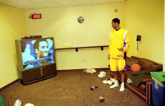
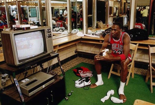


vertex the point of intersection of lines or the point opposite the base of a figure venal capable of being corrupted; “corruptible judges”; “dishonest politicians”; “a purchasable senator”; “a venal police officer” vainglorious feeling self-importance; “too big for his britches”; “had a swelled head”; “he was swelled with pride” virtuosity technical skill or fluency or style exhibited by a virtuoso veracity unwillingness to tell lies atrophy a decrease in size of an organ caused by disease or disuse analogous similar or equivalent in some respects though otherwise dissimilar; “brains and computers are often considered analogous”; “salmon roe is marketed as analogous to caviar" auspicious auguring favorable circumstances and good luck; “an auspicious beginning for the campaign” allegory ~ a short moral story (often with animal characters) ~ a visible symbol representing an abstract idea ~ an expressive style that uses fictional characters and events to describe some subject by suggestive resemblances; an extended metaphor assignation a secret rendezvous (especially between lovers) antipathy ~ a feeling of intense dislike ~ the object of a feeling of intense aversion; something to be avoided; “cats were his greatest antipathy” anachronism ~ something located at a time when it could not have existed or occurred ~ an artifact that belongs to another time ~ a person who seems to be displaced in time; who belongs to another age anomaly ~ deviation from the normal or common order or form or rule ~ a person who is unusual ~ (astronomy) position of a planet as defined by its angular distance from its perihelion (as observed from the sun) afferent a nerve that passes impulses from receptors toward or to the central nervous system affidavit written declaration made under oath; a written statement sworn to be true before someone legally authorized to administer an oath acumen shrewdness shown by keen insight banal repeated too often; overfamiliar through overuse; “bromidic sermons”; “his remarks were trite and commonplace”; “hackneyed phrases”; “a stock answer”; “repeating threadbare jokes”; “parroting some timeworn axiom”; “the trite metaphor `hard as nails’” boffin (British slang) a scientist or technician engaged in military research compunction a feeling of deep regret (usually for some misdeed) chuffed very pleased; “I’m chuffed to have won” competence the quality of being adequately or well qualified physically and intellectually cagey showing self-interest and shrewdness in dealing with others; “a cagey lawyer”; “too clever to be sound” ~ characterized by great caution and wariness; “a cagey avoidance of a definite answer”; “chary of the risks involved”; “a chary investor claptrap pompous or pretentious talk or writing demonstrative given to or marked by the open expression of emotion; “an affectionate and demonstrative family” delegation ~ authorizing subordinates to make certain decisions ~ a group of representatives or delegates denuded without the natural or usual covering; “a bald spot on the lawn”; “bare hills” dilettante an amateur who engages in an activity without serious intentions and who pretends to have knowledge draconian measures of or relating to Draco or his harsh code of laws ~ Draco ~ Athenian lawmaker whose code of laws prescribed death for almost every offense (circa 7th century BC) emphatic forceful and definite in expression or action; “the document contained a particularly emphatic guarantee of religious liberty” episiotomy surgical incision of the perineum to enlarge the vagina and so facilitate delivery during childbirth ephemeral anything short-lived, as an insect that lives only for a day in its winged form eloquent expressing yourself readily, clearly, effectively; “able to dazzle with his facile tongue”; “silver speech” equivocate to be deliberately ambiguous or unclear in order to mislead or withhold information exigent demanding attention; “clamant needs”; “a crying need”; “regarded literary questions as exigent and momentous”- H.L.Mencken; “insistent hunger”; “an instant need” felicity state of well-being characterized by emotions ranging from contentment to intense joy garrotter someone who kills by strangling gird To prepare oneself for a military confrontation germane relevant and appropriate; “he asks questions that are germane and central to the issue Gordian knot ~ any very difficult problem; insoluble in its own terms ~ an intricate knot tied by Gordius, the king of Phrygia, and cut by the sword of Alexander the Great after he heard that whoever undid it would become ruler of Asia galvanize to stimulate to action; “the loud noise startled him awake”; “galvanized into action” haberdashery a store where men’s clothes are sold inscrutable of an obscure nature; “the new insurance policy is written without cryptic or mysterious terms”; “a deep dark secret”; “the inscrutable workings of Providence”; “in its mysterious past it encompasses all the dim origins of life”- Rachel Carson; “rituals totally mystifying to visitors from other lands” intrinsic belonging to a thing by its very nature; “form was treated as something intrinsic, as the very essence of the thing”- John Dewey inculcate teach and impress by frequent repetitions or admonitions; “inculcate values into the young generation” ingenue an artless innocent young girl (especially as portrayed on the stage) indolence inactivity resulting from a dislike of work inextricable not permitting extrication; incapable of being disentangled or untied; “an inextricable knot”; “inextricable unity” jejune ~ of insufficient quantity to meet a need; “an inadequate income”; “a poor salary”; “money is short”; “on short rations”; “food is in short supply”; “short on experience”; “the jejune diets of the very poor ~ lacking interest or significance or impact; “an insipid personality”; “jejune novel” ~ displaying or suggesting a lack of maturity; “adolescent insecurity”; “jejune responses to our problems”; “their behavior was juvenile”; “puerile jokes” knell ~ the sound of a bell rung slowly to announce a death or a funeral or the end of something milieu the environmental condition mores (mor-ay) (sociology) the conventions that embody the fundamental values of a group mesomorph a person with a well-developed muscular body meliorate to make better; “The editor improved the manuscript with his changes” magniloquence high-flown style; excessive use of verbal ornamentation; “the grandiosity of his prose”; “an excessive ornateness of language mercurial liable to sudden unpredictable change; “erratic behavior”; “fickle weather”; “mercurial twists of temperament”; “a quicksilver character, cool and willful at one moment, utterly fragile the next” myopic ~ unable to see distant objects clearly ~ lacking foresight or scope; “a short view of the problem”; “shortsighted policies”; “shortsighted critics derided the plan”; “myopic thinking” officious intrusive in a meddling or offensive manner; “an interfering old woman”; “bustling about self-importantly making an officious nuisance of himself”; “busy about other people’s business” oligarchy a political system governed by a few people; “one of his cardinal convictions was that Britain was not run as a democracy but as an oligarchy”; “the big cities were notoriously in the hands of the oligarchy of local businessmen” punctilious marked by precise accordance with details; “meticulous research”; “punctilious in his attention to rules of etiquette” Plaintive ~ expressing sorrow prescient perceiving the significance of events before they occur; “extraordinarily prescient memoranda on the probable course of postwar relations”-R.H.Rovere proclivity a natural inclination; “he has a proclivity for exaggeration” perfunctory hasty and without attention to detail; not thorough; “a casual (or cursory) inspection failed to reveal the house’s structural flaws”; “a passing glance”; “perfunctory courtesy”; “In his paper, he showed a very superficial understanding of psychoanalytic theory” ponderousness ~ an oppressive quality that is laborious and solemn and lacks grace or fluency; “a book so serious that it sometimes subsided into ponderousness”; “his lectures tend to heaviness and repetition” ~ the property of being large in mass pragmatic guided by practical experience and observation rather than theory proprietary an unincorporated business owned by a single person who is responsible for its liabilities and entitled to its profits perspicaciousness intelligence manifested by being astute (as in business dealings) salubrious ~ promoting health; healthful; “a healthy diet”; “clean healthy air”; “plenty of healthy sleep”; “healthy and normal outlets for youthful energy”; “the salubrious mountain air and water”- C.B.Davis; “carrots are good for you” ~ favorable to health of mind or body; “not the most salubrious campsite”; “one of the less salubrious suburbs” sanguine ~ confidently optimistic and cheerful ~ a blood-red color surreptitious ~ conducted with or marked by hidden aims or methods; “clandestine intelligence operations”; “cloak-and-dagger activities behind enemy lines”; “hole-and-corner intrigue”; “secret missions”; “a secret agent”; “secret sales of arms”; “surreptitious mobilization of troops”; “an undercover investigation”; “underground resistance” ~ marked by quiet and caution and secrecy; taking pains to avoid being observed; “a furtive manner”; “a sneak attack”; “stealthy footsteps”; “a surreptitious glance at his watch” squib firework consisting of a tube filled with powder (as a broken firecracker) that burns with a fizzing noise tacit implied by or inferred from actions or statements; “gave silent consent”; “a tacit agreement”; “the understood provisos of a custody agreement” turpitude ~ a corrupt or depraved or degenerate act or practice; “the various turpitudes of modern society” ubiquitous being present everywhere at once vanguard ~ the leading units moving at the head of an army ~ any creative group active in the innovation and application of new concepts and techniques in a given field (especially in the arts) vacillate ~ move or sway in a rising and falling or wavelike pattern; “the line on the monitor vacillated” ~ be undecided about something; waver between conflicting positions or courses of action; “He oscillates between accepting the new position and retirement” puerile displaying or suggesting a lack of maturity; “adolescent insecurity”; “jejune responses to our problems”; “their behavior was juvenile”; “puerile jokes”
3 notes
·
View notes
Text
Itsuki and Fuyu are back as color-coded girls in love in Chaser Game W2!

And the season starts off with the rainbows we left off with last season!


But a year after the events of the last season, the girls aren't together, but they are still color-coded!

Itsuki is still the Heavenly Human (light) but has easily incorporated the color of her Black Brooder into her wardrobe. (This is the closet shot I wanted from Cosmetic Playlover, so thanks ladies for delivering it to me!)

So when Itsuki picks her outfit, she puts on a white top and a black skirt.

Which is smart because the universe is rooting for these color-coded characters to reunite after a whole year.
But first, Itsuki saves some other Black Brooder from street harassment on her way to work at the cafe she and her Black Brooder frequently visited as she awaits her return.

And this is the exact way she met Fuyu the first time by saving her from street harassment. (I see you show!)

But in the present, the game they worked on together is a huge success.

And getting a sequel, so congratulations on the meta, ladies!

We also learn from the daily television horoscope that last season's earrings are out, and necklaces are in this season!


But famous long-lost first loves are also in, and it seems this girl is determined to cause a ruckus!

Itsuki apparently has a type and it's small but fierce!

So the girls finally reunite in front of the color-coded poster of the game they worked on together which is exactly how last season ended.

But Fuyu's color-coded family is there too!

The husband is now gray and the daughter shares Itsuki and Fuyu's colors.

So Fuyu's tells Itsuki what happened in the past year once she returned back home which was Fuyu's mom was a dictator who took her phone and made her quit her job.

But Fuyu's always kept Itsuki in her heart as well as her color on her body.

And just like Itsuki did in the beginning of the episode, Fuyu wore a white top and black skirt when she was basically a servant to her mother.

And it seems Fuyu's husband embraced the g(r)ayness during this time as well.

The daughter seems to have always understood the queer agenda and the color-coding assignment because, one night, she asks her parents to read her And Tango Makes Three, a book about a little penguin who has two dads WHICH IS A REAL BOOK!

So her mom, in her and Itsuki's colors, and her dad in his g(r)ay era, come to some understandings.

Fuyu's husband offers her color-coded romance a lifeline. They will return to Japan and get the hell out of that house!

So we are back where we started with color-coded clothing decisions needing to be made!

And the final choice being to pick BOTH colors.

So even though this first love is scheming her way back into Itsuki's life, Itsuki knows what the end goal is since she, too, is wearing both her and Fuyu's colors at the end of the episode.

And the ending credits let us know that this little color-coded family will get its happy ending.

Even if the daughter has to single-handedly sail this ship!
#chaser game w#chaser game w 2#color coded girls in love#the colors mean things#and they mean I got a second season#episode one#let's go lesbians#and their little daughter who will make her parents understand the queer agenda
87 notes
·
View notes
Text
Cold Winds: The Team

“A pirate, a Garlean and an Ala Mhigan terrorist walk into a bar,” began the Miqo’te. Green eyes fell on her expectantly, but were only met by impassive purple. “It isn’t the beginning of a joke, Andromeda. It is the beginning of your assignment.”
Rommie sighed and lowered her head. Of course it was. And of course it was an ‘assignment’. “I manage a business now, Iris. A pretty sucessful one. I can’t just run off because you need someone to rouse rabbles in the Brume or put out your messes in Parliament. All debts have been paid. Accounts are settled. My security chief would ne-”
“You’re going to be robbing a Castrum, Rommie.”
This stopped Andromeda mid-thought. She blinked a few times. She leaned back in her chair. She thought. She thought some more. She thought again. A heist? Against a fantastically dangerous and well-secured target? With a pirate, a terrorist and a defector as her team? This was the shit legends were built on. This was the shit that people talked about for generations.
“Go on.”
Iris made a small hand motion and a little red sphere rolled from behind her chair. It began to glow and lifted off, hovering above the ground. It was Odelia, Iris’ data storage node and lab assistant. Rommie’d been uncomfortably catalogued by it once and given the designation S-H133. In response, Rommie called the node ‘Creepybot’.
Creepybot spun her bottom and top hemispheres in opposite directions, revealing a red core at her center, and from that was projected a beam of light. The light cast an image of a map of Coerthas on the table, all red lines and harsh edges. Above the frozen walls of Snowcloak was a large triple-diamond emblem, the symbol of the Empire. Below that symbol read the name “Castrum Aquilonis’.
It was that weekend, a Lightsday, that Rommie met the rest of the team. She’d seen them all before, of course, when she invited them to meet with Iris, but now they were all in one room, the library under the beating heart of advanced science in Eorzea. Equinox Genetic Engineering.
Equinox specialized on refurbished and retrofitted Allagan technology and the opulence of the estate they held showed how well the company had done for itself on that particular course. Outside Garlemald, Equinox was perhaps the most technologically advanced place not built by a dead society. It was a place Iris had invested significant resources, and a place that would be secure against any meaningful government surveillance. It paid to be smart and paranoid, apparently.
The women in the room were an eclectic bunch, by her estimation, but seemed at least passingly capable. Well enough, she supposed. She had too much going for her to agree to take a dangerous assignment with amateurs.
Illua Corcavo was a ‘tol’, which was a very high rank in the Legion as Rommie understood it, when she took her reaper and ran. It was a damned suspicious story as far as Rommie was concerned, but Rommie had also been pretty solidly convinced that her rank had been a way to retire her from serious black operations shit. The kind of stuff that would make the butchers of Doma blush, she figured.
Sasaca Saca was a pirate when she was younger. Then she’d worked for Iris’ dad for a decade or so before buying her own ship and running up Maelstrom colors. Rommie wasn’t going to guess at Captain Saca’s age, both because the lalafell terrified her and because she’d met some seriously ancient lalafell who didn’t look the part, but based on the work history Rommie knew about, Saca had to be at least forty-five, if not substantially older.
Agnes “Agni” Isolde had a few misfortunes in life, not the least of which was having the name Agnes. To hear Agni tell it, she wasn’t a freedom fighter, because freedom fighters had codes and cared about collateral damage and wanted to save those Ala Mhigans helping the Empire. Agni believed that collaborators were guilty as the occupiers themselves. She believed ends justified means.
The tiny rabbit man with Agni, Tidingway, didn’t seem to say or do all that much, but he did listen, take notes, and sit next to Agni the whole time. Iris had said he was a ‘hummingway’, but didn’t explain much beyond that. Some manner of beastman, Rommie assumed.
Rommie herself was Andromeda Dulaque; thief, courtesan, entrepreneur, con artist. She had a variety of talents, and survival was one of them. Rommie fancied herself the leader of the merry band of misfits, if for no other reason than Iris had called them for a heist job and she doubted the other three had the ability to steal a thing - at least Saca probably hadn’t much experience stealing things on land. She was the safecracker, the smash-and-grabber, the confidence woman. This was her field of expertise.
And lastly, there was Iris. Lady Iris Lilith Blanchimont, Matriarch of House Blanchimont, Minister of the Ishgardian Parliament, mad scientist and seriously scary when she wanted to be. Friends with Aymeric de Borel, able to invoke Bahamut’s egi, student of Tonberries and chosen by Hydaelyn Herself to wield the power of perfect communication called the Echo. Iris doing anything meant it was probably insane, probably important and absolutely not going to be done with half-measures.

Here they were. The team assembled. The target was Castrum Aquilonis.
Cold Winds: The Mission >
#vignette#Cold Winds#Illua Corcavo#Sasaca Saca#Agni Isolde#Andromeda Dulaque#Iris Blanchimont#Equinox Genetic Engineering
5 notes
·
View notes
Text
Ocado Assignment Self-reflection
The Ocado assignment was my favourite one so far. Perhaps, it was the one in which I felt more confident. For this project, we had to create a 10-20 second video with the aim to drive more customers to shop on Ocado. Me and my classmate Leonardo wanted to communicate the huge world’s food availability of Ocado using colours, shapes and animations. We showed three representative nations of Asia, Europe and America: China, Italy and U.S.A. for their easily recognizable food. Their movements are just a jump animation and each time the food touch the ground, changes its shape into the food from nation to nation, the background colour will match the colour of the representative flag and a typical music will follow the nation in scene at that moment. In the last jump, the food will turn into the Ocado’s letters, they will move in the middle of the screen and the Ocado Logo will appear. The purpose was to capture the user’s attention in some way and we chose the simplicity that, most of the time, is the most powerful and effective means.
I should start saying that working with Leonardo helped me a lot: we think the same way, we have almost the same vision of art and we have the same work method that is never meticulous enough. We worked together before and this is important to reach better results. I understand that working with strangers or someone who doesn’t agrees with your ideas, would have been more difficult. I have to admit that it was the easier way but thanks to this choice, our idea has built itself. Our work is the perfect union of our respective ideas and we corrected each other during the preparation. This is actually the second idea we thought about. The abandoned idea was represented by a stylized Ocado guy holding a basket full of food who, stumbling, makes the basket explodes, filling the screen with food of every kind and color, to return to walk as if nothing had happened. We finally chose the one we presented because it’s what better contained our key message. I’m pretty proud of our outcome because it matches with the previous storyboard and this is means that we have been able to do what we wanted to do, to make something that was only in our mind real and finally, respect our ambitions and do not change anything.

If I had more time, on the advice of the Ocado’s photographer, I would have changed the size of the food in the foreground to make it more realistic and dynamic. I would also have modified the animation, my main task in this project, because something wasn’t perfect at the temporal level. We had some problems about that: we loved the idea of making the jump and fall animation using a code, an expression that would have made the animation more realistic, bearing in mind gravity, speed and so on. But something went wrong and we spent a full day trying to make it work, without succeed and, since we had no time to waste, we decide to do it by hand making.
In term of regrets, I think we did the right choices. There’s nothing in this project I would have changed except for doing a totally different project; maybe something more complicated like recording a real video with real food. I would have liked to do something more sperimental since we are still studying and we have the right of do mistakes. But like everything, we have to understand the situation in which we are, the context in which we should act and who we are working for. The brief was very clear: “with the ultimate aim to drive more customers to shop at Ocado”, there are not restrictions about being freely creative and being sperimental, however, doing a 360° video, for example, would not have been coherent with the Ocado’s course and style. In my opinion, it would have destabilized the customer and would have obscured the recognisability of their logo. In this sense, we chose to do something that reflected their identity, to give to the customers connections and path to follow, to bring them where I would want.

We received very useful advices from Ocado Team: under their advice, we added the flag’s details on the top right of the screen since the unicolor was not enough to identify the nation taken in consideration. Our first idea was using five Os instead of the five Ocado’s letters and, only after, make them turn in the Logo’s letters, in order to give a plot to follow, something that makes you want to see how it ends. They suggested us to use the five letter from the very beginning. This is because, they explained, people do not have so much brand awareness to recognize it immediately.
Concerning the acquired skills, I feel to have a better mastery of the software. I used After Effects before but every time is like the first time, as there are lots of functions to learn, and it’s always interesting see tutorials about it. Like a said, there were some problems with the animation’s fluidity, we tried to make it smooth as much as possible. I feel more confident in the presentation, talking about the project I create helped me to don’t be nervous and to seem credible.
Having to deal with a real company as Ocado was an amazing experience. It was the first time for me and I appreciated so much the relationship established between them, work team formed by professionals, and us, student team of two. I’m very excited about it because it wasn’t an exercise or a simulation (like ACE experience for instance), everything was real and there was the possibility to be noticed. They assisted us step by step, from the concept to the final project, giving us the feedback and precious advices. For what concerns our feedback, they were impressed from our outcome and we are very happy of this. They like very much the presentation and we are glad they appreciated the simplicity and neatness, we wanted to let the video speak for ourselves. The Ocado’s artistic director liked the idea of add details in the presentation only after saw the video.
Concluding and summing up this experience, I should say that all this will have a positive response in my life. I know better now how to relate with real professionals and how to present them my own project. I’m very proud of what I did, and above all, that what I did was liked by the Ocado’s team. I saw sincere enthusiasm in each of their eyes. I learnt to understand the situation and take a behaviour in response to it and I think I’ve understood what the company wanted from us. For instance, we grasped the concept that they focus a lot on saturated colours, that they prefer stop motion for their promotional video using real food and simple animation. We put all this clues together and we created something that for them was simple, colourful, dynamic, fresh and coherent. We seemed credible and this is the most important thing because means that, with a margin for improvement, we can succeed in our work life. Link to the video:
https://www.youtube.com/watch?v=A8iTLUe03y0&feature=youtu.be&fbclid=IwAR0TYty8_e1bbGH98DHPWVWpr-QeuDV-g_6z_LrOR95CNQsrI7uuv7njZrE
0 notes
Link
(Via: Hacker News)
Why I wrote this tutorial
In attempting to understand the inner workings of JPEG compression, I was unable to find any real details on the net for how Huffman coding is used in the context of JPEG image compression. There are many sites that describe the generic huffman coding scheme, but none that describe how it will appear in a JPEG image, after factoring in the DHT tables, interleaved chroma subsampling components, etc. While it is relatively easy to understand the JPEG marker extraction, the Start of Scan data segment is the least understood and most important part of the image data. Therefore, I decided to create a page to walk through a decompression example. Hopefully others will find this useful!
The relevant sections in the JPEG Standard are quite obscure -- enough so that I set out to analyze several JPEG images to reverse-engineer how the huffman coding was being applied in a JPEG JFIF file.
Latest Update:
[09/22/2009]: Corrected Table 5 (added entry for DC 00 code). [09/19/2008]: Corrected Table 1 (added entry for codes of length 9 bits). [12/03/2007]: Corrected typo in text near Table 5 (code 00101). Added JPEGsnoop output (at end of Tutorial). [01/27/2007]: Added section describing how to expand DHT into bit strings.
The Goal
The goal of this tutorial is to take a simple JPEG image and try to decode the compressed image data by hand, learning how the Huffman compression scheme works in the process.
Simplest JPEG Example
Most digital photos are full-color natural/organic images, which means that all three image components (one luminance and two color channels) will all have both low and high-frequency content. In addition, nearly all digital photos use chroma subsampling, which makes the extraction process a little more complicated. For the purposes of showing the basic huffman extraction, we will start with the simplest of all JPEG images:
Grayscale - no content in the two color channels
Solid color in each MCU - By making all pixels in an 8x8 block the same color, there will be no AC components.
No chroma subsampling - Makes scan data extraction simpler: Y, Cb, Cr, Y, Cb, Cr, etc.
Small Image - Total image size is 16x8 = two MCUs or blocks. This makes the extraction in this tutorial shorter.
Creating the Image
For the purposes of this tutorial, my working image will simply be a 16x8 pixel image, with two solid color blocks: one black and the other white. Note that each block is 8x8 pixels in size. The actual image is here: . If you want to download it, right-click and select Save Picture As...
Creating the sample image was trivial, working at 1600% view. Important that dimensions and any changes in the content are on 8-pixel boundaries. Overall image dimensions should be a multiple of 8 pixels as well, in both directions. The image below is a magnified version with a grid overlayed.
Once the image was created, it was saved with Photoshop CS2's Save for Web... command. This kept the file size down as it discards other extraneous file information (metadata, etc.) that is not relevant to this tutorial. Some other important points:
Use Save for Web - Reduces total file content to minimal subset.
Use Quality level 51+ - This ensures that there is no chroma subsampling enabled in the JPEG encoding process, according to the way that Photoshop Save for Web operates. I used quality 80 for this example.
Turn Optimized Off - For the purposes of this example, I think it is important to work with realistic huffman tables, not degenerate single-entry tables. Therefore I recommend that JPEG Huffman Table Optimization is left off.
Other settings: Blur off, Progressive off, ICC profile off.
Grayscale Photoshop Images
It should be noted that when you save a JPEG image from within Photoshop it always contains three components (Y, Cb, Cr). If you change the mode to grayscale (via Mode->Grayscale), the three components are still saved, even though the JPEG standard supports an image with only one component (which would be assumed to be grayscale).
What is Huffman Coding / Entropy Coding?
Huffman coding is a method that takes symbols (e.g. bytes, DCT coefficients, etc.) and encodes them with variable length codes that are assigned according to statistical probabilities. A frequently-used symbol will be encoded with a code that takes up only a couple bits, while symbols that are rarely used are represented by symbols that take more bits to encode.
A JPEG file contains up to 4 huffman tables that define the mapping between these variable-length codes (which take between 1 and 16 bits) and the code values (which is an 8-bit byte). Creating these tables generally involves counting how frequently each symbol (DCT code word) appears in an image, and allocating the bit strings accordingly. But, most JPEG encoders simply use the huffman tables presented in the JPEG standard. Some encoders allow one to optimize these tables, which means that an optimal binary tree is created which allows a more efficient huffman table to be generated.
For a reasonable explanation of how it works, please see this example of Huffman coding an ASCII string and the overview from Wikipedia.
For more details, please see my article on Optimized JPEGs - optimizing the huffman tables, particularly the first introductory sections and the section near the end titled "Standard Huffman Tables".
Decoding the JPEG Scan Data
Using JPEGsnoop
For those who are trying to understand the complex huffman decoding in a JPEG image, I'm happy to report that JPEGsnoop can now report all of the variable length code decoding for each MCU (use the Detailed Decode option). For the sample output, scroll to the bottom of this tutorial.
Decoding by Hand
The following is the decode method done by hand, which is obviously impractical for most images, but is shown here in detail to help one learn the process involved.
The above hex dump datastream shows the beginning of the Start of Scan (SOS marker 0xFFDA) marked in yellow, followed by some additional details in green and then the actual scan data selected in dark blue. Finally, the image is terminated with an End of Image (EOI marker 0xFFD9). So, the huffman-coded data content is only 9 bytes long.
Comparison of Compression File Sizes
For the sake of comparison, the original image (16 pixels by 8 pixels) contains a total of 128 pixels (2 MCUs). With 8 bits per channel (RGB), this corresponds to an uncompressed image size of 384 bytes (128 pixels x 8 bits/channel x 3 channels x 1 byte/8 bits). Clearly, using a run-length encoded format such as GIF would have produced even more image compression in examples like this (although GIF actually takes 22 bytes to code the stream because there are 16 separate runs). JPEG is not really designed to be optimized for this type of synthetic (non-organic) image.
If one uses optimized JPEG encoding, it is possible to reduce the image content size even further. In the example image, the optimized version has much smaller huffman tables (DHT) and shorter bitstrings to represent the same codewords. The net effect is that the image content size is reduced even further (to 7 bytes).
File Format Total Size Overhead Size Image Content Size BMP (Uncompressed) 440 Bytes 56 Bytes 384 Bytes JPEG 653 Bytes 644 Bytes 9 Bytes JPEG (Optimized) 304 Bytes 297 Bytes 7 Bytes GIF 60 Bytes 38 Bytes 22 Bytes
Scan Data Decode
The scan data is:
FC FF 00 E2 AF EF F3 15 7F
To help resiliency in the case of data corruption, the JPEG standard allows JPEG markers to appear in the huffman-coded scan data segment. Therefore, a JPEG decoder must watch out for any marker (as indicated by the 0xFF byte, followed by a non-zero byte). If the huffman coding scheme needed to write a 0xFF byte, then it writes a 0xFF followed by a 0x00 -- a process known as adding a stuff byte.
For our extraction purposes, we will replaceme any padding bytes (0xFF00 with 0xFF):
FC FF E2 AF EF F3 15 7F
The expectation is that image content is 3 components (Y, Cb, Cr). Within each component, the sequence is always one DC value followed by 63 AC values.
For each MCU, with no chroma subsampling, we would expect the following data to be encoded:
Section 1 2 3 4 5 6 Component Y Cb Cr AC / DC DC AC DC AC DC AC
Note that some people get the order of the chrominance channels mixed up, and assume that it is YCrCb instead.
The figure below shows what the DCT matrix from a single MCU (8x8 pixel square) in a digital photo typically looks like. These are the entries after quantization, which has caused many of the higher-frequency components (towards the bottom-right corner of the matrix) to become zero. By the distribution of values in the frequency-domain matrix representation, it is possible to determine that the 8x8 pixel square had very little high-frequency content (i.e. it had only a gradual intensity / color change).
The DC component represents the average value of all pixels in the 8x8 MCU. Since we have deliberately created an image where all pixels in the 8x8 block are the same, we expect this value to represent either the black or white "color". The code provided in the DC entry (#0) indicates a huffman-encoded size (e.g. 1-10 bits) which is the number of bits needed to represent the average value for the MCU (eg. -511...+511).
Note that the DC component is encoded as a relative value with respect to the DC component of the previous block. The first block in the JPEG image is assumed to have a previous block value of zero.
Following the single DC component entry, one or more entries are used to describe the remaining 63 entries in the MCU. These entries (1..63) represent the low and high-frequency AC coefficients after DCT transformation and quantization. The earlier entries represent low-frequency content, while the later entries represent high-frequency image content. Since the JPEG compression algorithm uses quantization to reduce many of these high-frequency values to zero, one typically has a number of non-zero entries in the earlier coefficients and a long run of zero coefficients to the end of the matrix.
For the purposes of this tutorial, I have deliberately created an image that has constant color across all 8x8 pixels in each of the two MCU. Because there are no changes in value across each 8x8 pixel region, there is no AC (or higher frequency content) within the block. As a result, all 63 entries in the AC portion are expected to be zero (unlike the figure above). This allows us to focus on the DC component, which we do expect to change from MCU to MCU block.
The hex string shown earlier (after removal of padding bytes) can be represented in binary as the following:
1111 1100 1111 1111 1110 0010 1010 1111 1110 1111 1111 0011 0001 0101 0111 1111
Extract Huffman Code Tables
Using a utility such as JPEGsnoop, you can extract the Huffman tables from the JPEG image file. Often, you will find four huffman table entries (tagged with a DHT marker):
DHT Class=0 ID=0 - Used for DC component of Luminance (Y)
DHT Class=1 ID=0 - Used for AC component of Luminance (Y)
DHT Class=0 ID=1 - Used for DC component of Chrominance (Cb & Cr)
DHT Class=1 ID=1 - Used for AC component of Chrominance (Cb & Cr)
The huffman compression tables are encoded in a somewhat confusing manner. Although you can draw out the binary tree by hand, it will be easier if you rely on a tool such as JPEGsnoop to generate all of the binary comparison strings for each huffman code in all four DHT sections.
The following four tables were extracted from the JPEG file that was created by Photoshop for the purposes of this tutorial. Other JPEG images may be reliant on different DHT tables, so it is important to extract them prior to analyzing the file. Note that turning on JPEG Optimization will create vastly different Huffman tables, with far fewer entries. For a point of comparison, the image described in this tutorial would only need optimized huffman tables of one entry each to represent our image content.
NOTE: It is important to realize that in each case the DHT entries in the JPEG file only list the Length and Code values, not the actual Bit String mapping. It is up to you to rebuild the binary tree representation of the DHT table to derive the bit strings! Please see the DHT Expansion section near the end of this tutorial for more details.
Table 1 - Huffman - Luminance (Y) - DC
Length Bits Code 3 bits 000 001 010 011 100 101 110 04 05 03 02 06 01 00 (End of Block) 4 bits 1110 07 5 bits 1111 0 08 6 bits 1111 10 09 7 bits 1111 110 0A 8 bits 1111 1110 0B
Table 2 - Huffman - Luminance (Y) - AC
Length Bits Code 2 bits 00 01 01 02 3 bits 100 03 4 bits 1010 1011 1100 11 04 00 (End of Block) 5 bits 1101 0 1101 1 1110 0 05 21 12 6 bits 1110 10 1110 11 31 41 ... ... ... 12 bits ... 1111 1111 0011 ... ... F0 (ZRL) ... ... ... ... 16 bits ... 1111 1111 1111 1110 ... FA
Table 3 - Huffman - Chrominance (Cb & Cr) - DC
Length Bits Code 2 bits 00 01 01 00 (End of Block) 3 bits 100 101 02 03 4 bits 1100 1101 1110 04 05 06 5 bits 1111 0 07 6 bits 1111 10 08 7 bits 1111 110 09 8 bits 1111 1110 0A 9 bits 1111 1111 0 0B
Table 4 - Huffman - Chrominance (Cb & Cr) - AC
Length Bits Code 2 bits 00 01 01 00 (End of Block) 3 bits 100 101 02 11 4 bits 1100 03 5 bits
1101 0 1101 1
04 21 6 bits 1110 00 1110 01 1110 10 12 31 41 ... ... ... 9 bits ... 1111 1100 0 ... ... F0 (ZRL) ... ... ... ... 16 bits ... 1111 1111 1111 1110 ... FA
Table 5 - Huffman DC Value Encoding
The following table shows how the bit fields that follow a DC entry can be converted into their signed decimal equivalent. To use this table, start with the DC code value and then extract "Size" number of bits after the code. These "Additional Bits" will represent a signed "DC Value" which becomes the DC value for that block. Note that this table applies to any JPEG file -- this table is not written anywhere in the JPEG file itself.
For example, let's assume that one was about to decompress a chrominance DC entry. If the previously-decoded "DC Code" was 05, then we must extract 5 bits following the code bits. If the next 5 bits were 00101, then this can be interpreted as decimal -26. The bits 10001 would be +17 and 11110 would be +30.
DC Code Size Additional Bits DC Value 00 0 0 01 1 0 1 -1 1 02 2 00,01 10,11 -3,-2 2,3 03 3 000,001,010,011 100,101,110,111 -7,-6,-5,-4 4,5,6,7 04 4 0000,...,0111 1000,...,1111 -15,...,-8 8,...,15 05 5 0 0000,... ...,1 1111 -31,...,-16 16,...,31 06 6 00 0000,... ...,11 1111 -63,...,-32 32,...,63 07 7 000 0000,... ...,111 1111 -127,...,-64 64,...,127 08 8 0000 0000,... ...,1111 1111 -255,...,-128 128,...,255 09 9 0 0000 0000,... ...,1 1111 1111 -511,...,-256 256,...,511 0A 10 00 0000 0000,... ...,11 1111 1111 -1023,...,-512 512,...,1023 0B 11 000 0000 0000,... ...,111 1111 1111 -2047,...,-1024 1024,...,2047
Block 1 - Luminance
Luminance (Y) - DC
Referring to the Y(DC) table (Table 1), we start with the first few bits of the coded stream (1111 1100 1111...) and recognize that code x0A matches the bit string 1111 110.
1111 1100 1111 1111 1110 0010 1010 1111 1110 1111 1111 0011 0001 0101 0111 1111 => Code: 0A
This code implies that hex A (10) additional bits follow to represent the signed value of the DC component. The next ten bits after this code is 0 1111 1111 1. Table 5 above shows the DC values represented by these "additional bits" -- in this case, the bit string corresponds to a value of -512.
1111 1100 1111 1111 1110 0010 1010 1111 1110 1111 1111 0011 0001 0101 0111 1111 => Value: -512
Our progress so far:
Bits 1111 1100 1111 1111 1 110 0010 1010 1111 1110 1111 1111 0011 0001 0101 0111 1111 MCU 1 ??? Component Y ??? AC/DC DC ??? Value -512 ???
Luminance (Y) - AC
After the DC component, we begin the 63-entry AC matrix for the Y Luminance. This uses a different Huffman table (Table 2).
1111 1100 1111 1111 1110 0010 1010 1111 1110 1111 1111 0011 0001 0101 0111 1111 => Code: 00 (EOB)
In the above huffman code table, the code 1100 corresponds to an EOB (End of Block). Therefore, the AC components was cut short early (no other codes). This means that all 63 entries of the matrix (all entries except the 1st entry, which is the DC component) are zeros. Since we have finished the luminance component, we then move on to the chrominance components (Cb and Cr).
Bits 1111 1100 1111 1111 1 1100 010 1010 1111 1110 1111 1111 0011 0001 0101 0111 1111 MCU 1 ??? Component Y ??? AC/DC DC AC ??? Value -512 0 ???
Block 1 - Chrominance
Chrominance (Cb) - DC
1111 1100 1111 1111 1110 0010 1010 1111 1110 1111 1111 0011 0001 0101 0111 1111 => Code: 00 (EOB)
End of chrominance DC, start on AC.
Chrominance (Cb) - AC
1111 1100 1111 1111 1110 0010 1010 1111 1110 1111 1111 0011 0001 0101 0111 1111 => Code: 00 (EOB)
Again, the AC is terminated right away. Now, we move on to the second chrominance channel, Cr.
Bits 1111 1100 1111 1111 1 1100 01 01 010 1111 1110 1111 1111 0011 0001 0101 0111 1111 MCU 1 ??? Component Y Cb ??? AC/DC DC AC DC AC ??? Value -512 0 0 0 ???
Chrominance (Cr) - DC
Refer to Table 3 for the relevant Huffman codes.
1111 1100 1111 1111 1110 0010 1010 1111 1110 1111 1111 0011 0001 0101 0111 1111 => Code: 00 (EOB)
This marks the end of the DC.
Chrominance (Cr) - AC
Refer to Table 4 for the relevant Huffman codes.
1111 1100 1111 1111 1110 0010 1010 1111 1110 1111 1111 0011 0001 0101 0111 1111 => Code: 00 (EOB)
This marks the end of the AC.
Bits 1111 1100 1111 1111 1 1100 01 01 01 01 111 1110 1111 1111 0011 0001 0101 0111 1111 MCU 1 ??? Component Y Cb Cr ??? AC / DC DC AC DC AC DC AC ??? Value -512 0 0 0 0 0 ???
Block 2 - Luminance
Luminance (Y) - DC
1111 1100 1111 1111 1110 0010 1010 1111 1110 1111 1111 0011 0001 0101 0111 1111 => CODE: 0A
This code indicates that the value is stored in the next ten bits (A in hex is 10 in decimal):
1111 1100 1111 1111 1110 0010 1010 1111 1110 1111 1111 0011 0001 0101 0111 1111 => Value: +1020
Bits 1111 1100 1111 1111 1 1100 01 01 01 01 111 1110 1111 1111 00 11 0001 0101 0111 1111 MCU 1 2 ??? Component Y Cb Cr Y ??? AC / DC DC AC DC AC DC AC DC ??? Value -512 0 0 0 0 0 +1020 ???
Luminance (Y) - AC
1111 1100 1111 1111 1110 0010 1010 1111 1110 1111 1111 0011 0001 0101 0111 1111 => CODE: EOB
The end-of-block indicator means that all remaining values are zero. Since we haven't even started with the first value, all 63 values can be interpreted as zero. This means that there is no non-DC image content, which is to be expected since all 64 pixels (8x8) in the block are the same color.
Bits 1111 1100 1111 1111 1 1100 01 01 01 01 111 1110 1111 1111 00 1100 01 0101 0111 1111 MCU 1 2 ??? Component Y Cb Cr Y ??? AC / DC DC AC DC AC DC AC DC AC ??? Value -512 0 0 0 0 0 +1020 0 ???
Block 2 - Chrominance
Chrominance (Cb) - DC
1111 1100 1111 1111 1110 0010 1010 1111 1110 1111 1111 0011 0001 0101 0111 1111 => CODE: 00 (EOB)
Chrominance (Cb) - AC
1111 1100 1111 1111 1110 0010 1010 1111 1110 1111 1111 0011 0001 0101 0111 1111 => CODE: 00 (EOB)
Chrominance (Cr) - DC
1111 1100 1111 1111 1110 0010 1010 1111 1110 1111 1111 0011 0001 0101 0111 1111 => CODE: 00 (EOB)
Chrominance (Cr) - AC
1111 1100 1111 1111 1110 0010 1010 1111 1110 1111 1111 0011 0001 0101 0111 1111 => CODE: 00 (EOB)
Bits 1111 1100 1111 1111 1 1100 01 01 01 01 111 1110 1111 1111 00 1100 01 01 01 01 11 1111 MCU 1 2 X Component Y Cb Cr Y Cb Cr X AC / DC DC AC DC AC DC AC DC AC DC AC DC AC X Value -512 0 0 0 0 0 +1020 0 0 0 0 0 X
Remainder
Because the scan data must end on a byte boundary, there may be a remainder of bits that will simply be tossed. In this case we see 6 bits (all-1's) that will be discarded.
1111 1100 1111 1111 1110 0010 1010 1111 1110 1111 1111 0011 0001 0101 0111 1111
Conversion to Spatial Domain
Now that we have the DCT (Discrete Cosine Transform) values, we can try to determine what the content of the image was in the spatial domain. Remember that the DC & AC values that we decompressed from the huffman coding are the frequency-domain representation of the image, not the real YCbCr values.
Given that all of the values in the Cb and Cr channels (chrominance) are zero, we can assume that the image is grayscale and instaed focus on the luminance values (brightness).
Second, all of the AC component values are zero, which means that there is no higher frequency content in the images -- in fact, we can determine that all of the image data in each 8x8 block is of the same color & intensity (i.e. only the DC component remains).
We can determine the following:
Block Encoded (Relative) DC Value 1 Y = -512 2 Y = +1020
Relative DC to Absolute DC
Note that the DC components are encoded as a difference from the previous block (with the first block assumed to start relative to zero). Therefore, we know that block 1 has a DC value of -512, but that block 2 has a DC value of +1020 relative to block 1. So, we now know:
Block Actual (Absolute) DC Value 1 Y = -512 2 Y = +508
DCT to RGB
Finally, we want to convert the DCT DC value to an RGB value. Assuming that the gain of the DCT transform is 4, we divide the values by 4 to get block1 = -128, block2 = +127.
Now, we have to convert between YCbCr and RGB. Please refer to the formulae provided on the JPEG color conversion page. There, you will see that we require a level shift of +128 to get input values in the range (0..255).
Color conversion yields RGB values of:
Block RGB Value (hex) RGB Value (decimal) 1 (0x00,0x00,0x00) (0,0,0) 2 (0xFF,0xFF,0xFF) (255,255,255)
... and these are the original values that were used to create the JPEG image!
Expansion of DHT Table into binary bit strings
Note that the DHT tables that appear in the JPEG file only define the number of codes for each bitstring length, followed by a sequence of all the code words. The bit strings that are used to represent each of these code words is not included! It is the job of the JPEG decoder to derive these bit strings from the little information that is provided.
There are many methods in which the generation of the binary strings is performed in a decoder, and most of them are heavily optimized for performance (e.g. the djpeg huffman routines). These implementations are quite difficult to learn from. I find it much more instructive to generate these bit sequences by drawing out the huffman binary tree by hand.
In an extreme simplification, binary trees are composed of a root node which has a left and right branch to other nodes. Each of these nodes can either be a leaf node (the end of a branch) or split further into two more nodes.
The actual DHT in the JPEG file:
The following was extracted directly from the DHT (Define Huffman Table, shown above in Table 2: Luminance AC) in the JPEG file using JPEGsnoop.
Class = 1 (AC Table) Destination ID = 0 Codes of length 01 bits (000 total): Codes of length 02 bits (002 total): 01 02 Codes of length 03 bits (001 total): 03 Codes of length 04 bits (003 total): 11 04 00 Codes of length 05 bits (003 total): 05 21 12 Codes of length 06 bits (002 total): 31 41 Codes of length 07 bits (004 total): 51 06 13 61 Codes of length 08 bits (002 total): 22 71 Codes of length 09 bits (006 total): 81 14 32 91 A1 07 Codes of length 10 bits (007 total): 15 B1 42 23 C1 52 D1 Codes of length 11 bits (003 total): E1 33 16 Codes of length 12 bits (004 total): 62 F0 24 72 Codes of length 13 bits (002 total): 82 F1 Codes of length 14 bits (006 total): 25 43 34 53 92 A2 Codes of length 15 bits (002 total): B2 63 Codes of length 16 bits (115 total): 73 C2 35 44 27 93 A3 B3 36 17 54 64 74 C3 D2 E2 08 26 83 09 0A 18 19 84 94 45 46 A4 B4 56 D3 55 28 1A F2 E3 F3 C4 D4 E4 F4 65 75 85 95 A5 B5 C5 D5 E5 F5 66 76 86 96 A6 B6 C6 D6 E6 F6 37 47 57 67 77 87 97 A7 B7 C7 D7 E7 F7 38 48 58 68 78 88 98 A8 B8 C8 D8 E8 F8 29 39 49 59 69 79 89 99 A9 B9 C9 D9 E9 F9 2A 3A 4A 5A 6A 7A 8A 9A AA BA CA DA EA FA Total number of codes: 162
So, how do we create the binary bit-strings for each of these codes?
Well, we start to build a binary tree, creating new branches and putting the code words into leaf nodes of the tree. Row 1 of the tree contains code words that only require 1 bit to encode, row 2 contains code words (leaf nodes) that only require 2 bits to encode and so on.
We first start with row 0:
Row 0 (the root node) is almost always a parent node, creating a left and a right branch down to the next row. We label the left branch 0 and the right branch 1.
At row 1, we try to fill in any of the nodes (there are 2 at this level) with code words that take 1 bit to encode. We see from the DHT that there are no codes of length 1 bit. So, for each of the two nodes we spawn off a left and right node below (on row 2), creating a total of 4 nodes. Again, for these branches, we label the left one 0 and the right one 1.
At row 2, we will try to fill in any codes of length 2 bits, starting from left to right. This time we see in the DHT that there are two codes that can be encoded with bit strings of length 2. So, we take the first code value x01 (hex) and place this in the first node, making it a leaf node (no further branches will come from it). We then take the second code value x02 and place this in the second node, making it too a leaf node. At this point we have two more nodes left in this row of the tree but no more codewords listed in the DHT for this bitstring length. Therefore, we create two branches for each of the remaining nodes of this row. Since two nodes are left, this will create a total of 4 branches, meaning that there will be again 4 nodes in the third row of the binary tree.
At row 3, we have four nodes available, but the DHT indicates only one codeword uses 3 bits to encode. So, we place x03 at the leftmost of these nodes, and we create branches for each of the remaining three nodes (making 6 nodes for row 4).
At row 4, we have six nodes available, but the DHT indicates only three codewords use 4 bits to encode. This time we terminate three nodes (making them leaf nodes) and we further extend the other three down to row 5.
This process continues until we have used all of the codewords defined in the DHT table. The diagram below shows the expansion of the first four rows of the above DHT.
Binary Tree Expansion of DHT
NOTE: I understand from VG that the above representation may be "right-oriented" rather than "left-oriented"
Once the binary tree has been completed, you can read off the bit strings for each code word by combining the bit labels of each branch on the path down from the root node. For example, code word 0x04 is encoded by the binary bit string 1011 because we need to take branch 1 from the root node, 0 from the node on row 1, 1 from the node on row 2 and branch 1 from the node on row 3.
This process can be quite laborious, and the binary tree often takes on a shape that would be difficult to draw through to completion. To make this easier, I have added a feature, DHT Expand, to JPEGsnoop that determines the binary bit strings for each of the code words appearing in the DHT table.
Below is the expansion of the first few rows of the table, using JPEGsnoop with the DHT Expand mode enabled.
Expanded Form of Codes: Codes of length 02 bits: 00 = 01 01 = 02 Codes of length 03 bits: 100 = 03 Codes of length 04 bits: 1010 = 11 1011 = 04 1100 = 00 (EOB) Codes of length 05 bits: 11010 = 05 11011 = 21 11100 = 12 Codes of length 06 bits: 111010 = 31 111011 = 41 Codes of length 07 bits: 1111000 = 51 ... Codes of length 15 bits: 111111111000100 = B2 111111111000101 = 63 Codes of length 16 bits: 1111111110001100 = 73 1111111110001101 = C2 ... 1111111111111100 = DA 1111111111111101 = EA 1111111111111110 = FA
Implementations in real JPEG decoders optimize this mechanism heavily as the bitstring search / parsing process is not a trivial task in processors designed to work with 32-bit words or bytes. Most of them end up creating large lookup tables that define lower and upper bounds for a match of a particular bitstring / code.
More Realistic JPEG Images
Obviously the above is an extremely simple example JPEG image. However, real images will have some other characteristics that you will encounter:
Chroma subsampling - You can expect that most photos will have 2x1 chroma subsampling, which will mean that the decoding sequence per MCU will be Y1 Y2 Cb Cr instead of Y Cb Cr.
AC components - You most certainly will have non-zero AC coefficients, unlike the above. In such a case, you will generally have a few non-zero values, which will eventually be terminated with a ZRL (code word 0xF0) which indicates a run of 16 zeros and then probably a EOB (code word 0x00).
Some more detail regarding Huffman coding with chroma subsampling and other factors are described in the JPEG decoder page.
JPEGsnoop Detailed Decode Output
Running JPEGsnoop on the image shown above, with the Scan Segment->Detailed Decode option enabled, the following output is shown:
*** Decoding SCAN Data *** OFFSET: 0x00000282 Scan Decode Mode: Full IDCT (AC + DC) Lum (Tbl #0), MCU=[0,0] [0x00000282.0]: ZRL=[ 0] Val=[ -512] Coef=[00= DC] Data=[0x FC FF 00 E2 = 0b (11111100 11111111 1------- --------)] [0x00000285.1]: ZRL=[ 0] Val=[ 0] Coef=[01..01] Data=[0x E2 AF EF F3 = 0b (-1100--- -------- -------- --------)] EOB DCT Matrix=[-1024 0 0 0 0 0 0 0] [ 0 0 0 0 0 0 0 0] [ 0 0 0 0 0 0 0 0] [ 0 0 0 0 0 0 0 0] [ 0 0 0 0 0 0 0 0] [ 0 0 0 0 0 0 0 0] [ 0 0 0 0 0 0 0 0] [ 0 0 0 0 0 0 0 0] Chr(0) (Tbl #1), MCU=[0,0] [0x00000285.5]: ZRL=[ 0] Val=[ 0] Coef=[00= DC] Data=[0x E2 AF EF F3 = 0b (-----01- -------- -------- --------)] EOB [0x00000285.7]: ZRL=[ 0] Val=[ 0] Coef=[01..01] Data=[0x E2 AF EF F3 = 0b (-------0 1------- -------- --------)] EOB DCT Matrix=[ 0 0 0 0 0 0 0 0] [ 0 0 0 0 0 0 0 0] [ 0 0 0 0 0 0 0 0] [ 0 0 0 0 0 0 0 0] [ 0 0 0 0 0 0 0 0] [ 0 0 0 0 0 0 0 0] [ 0 0 0 0 0 0 0 0] [ 0 0 0 0 0 0 0 0] Chr(0) (Tbl #1), MCU=[0,0] [0x00000286.1]: ZRL=[ 0] Val=[ 0] Coef=[00= DC] Data=[0x AF EF F3 15 = 0b (-01----- -------- -------- --------)] EOB [0x00000286.3]: ZRL=[ 0] Val=[ 0] Coef=[01..01] Data=[0x AF EF F3 15 = 0b (---01--- -------- -------- --------)] EOB DCT Matrix=[ 0 0 0 0 0 0 0 0] [ 0 0 0 0 0 0 0 0] [ 0 0 0 0 0 0 0 0] [ 0 0 0 0 0 0 0 0] [ 0 0 0 0 0 0 0 0] [ 0 0 0 0 0 0 0 0] [ 0 0 0 0 0 0 0 0] [ 0 0 0 0 0 0 0 0] Lum (Tbl #0), MCU=[1,0] [0x00000286.5]: ZRL=[ 0] Val=[ 1020] Coef=[00= DC] Data=[0x AF EF F3 15 = 0b (-----111 11101111 111100-- --------)] [0x00000288.6]: ZRL=[ 0] Val=[ 0] Coef=[01..01] Data=[0x F3 15 7F FF = 0b (------11 00------ -------- --------)] EOB DCT Matrix=[ 2040 0 0 0 0 0 0 0] [ 0 0 0 0 0 0 0 0] [ 0 0 0 0 0 0 0 0] [ 0 0 0 0 0 0 0 0] [ 0 0 0 0 0 0 0 0] [ 0 0 0 0 0 0 0 0] [ 0 0 0 0 0 0 0 0] [ 0 0 0 0 0 0 0 0] Chr(0) (Tbl #1), MCU=[1,0] [0x00000289.2]: ZRL=[ 0] Val=[ 0] Coef=[00= DC] Data=[0x 15 7F FF D9 = 0b (--01---- -------- -------- --------)] EOB [0x00000289.4]: ZRL=[ 0] Val=[ 0] Coef=[01..01] Data=[0x 15 7F FF D9 = 0b (----01-- -------- -------- --------)] EOB DCT Matrix=[ 0 0 0 0 0 0 0 0] [ 0 0 0 0 0 0 0 0] [ 0 0 0 0 0 0 0 0] [ 0 0 0 0 0 0 0 0] [ 0 0 0 0 0 0 0 0] [ 0 0 0 0 0 0 0 0] [ 0 0 0 0 0 0 0 0] [ 0 0 0 0 0 0 0 0] Chr(0) (Tbl #1), MCU=[1,0] [0x00000289.6]: ZRL=[ 0] Val=[ 0] Coef=[00= DC] Data=[0x 15 7F FF D9 = 0b (------01 -------- -------- --------)] EOB [0x0000028A.0]: ZRL=[ 0] Val=[ 0] Coef=[01..01] Data=[0x 7F FF D9 00 = 0b (01------ -------- -------- --------)] EOB DCT Matrix=[ 0 0 0 0 0 0 0 0] [ 0 0 0 0 0 0 0 0] [ 0 0 0 0 0 0 0 0] [ 0 0 0 0 0 0 0 0] [ 0 0 0 0 0 0 0 0] [ 0 0 0 0 0 0 0 0] [ 0 0 0 0 0 0 0 0] [ 0 0 0 0 0 0 0 0]
0 notes
Text
a note to myself
I feel like I can’t do any academic or “productive” work (even though this is a form of productivity) before I type this so I will take my time to type whatever I need to feel that I’ve really detailed my thoughts and emotions.
In a way, this is a guideline/personal tracker/journal etc, whatever you’d want to call a sort of goal setting/learning post.
I feel ready to be a new and improved person.
Realizations
Going into 2017, I thought I should have had my whole year figured out on what to do and how to feel, but little did I know, January was the most eye-opening month for me. As Kylie Jenner would say “it’s just the year of... realizing things” which is true for the first month of 2017. After the first week of being quite nonchalant, I thought I wasn’t doing anything wrong until I had the one of the most biggest arguments in my “adult” life. I never yell at my friends, but this was the first time I raised my voice out of frustration and confusion, genuinely curious at what I did wrong. I was baffled by the reason I got, and since this has happened multiple times with the same person, it really got me to think “is this really worth it?” After a long thought process, I realized this person wasn’t benefitting or growing me mentally at all. Most of the emotions that came from the person was what I deem as “unnecessary stress”. Now, I’m usually quite an understanding person which explains why I rarely ever get emotional in front of my friends, but after a few times of the person really messing with my emotions, I realized that I don’t need this, nor do I have the time or effort to constantly face issues like this. It’s not that I don’t like this person anymore, it’s more like I need to distance myself in order for me to grow, and I’m still in that process of not always feeling bad toward the person. I also tried this new thing where if I didn’t want that person to be there, I wouldn’t ask but it’s okay if someone else asks. So far, the results are subpar, and I don’t think I’ll do it again which is why it leads to my mindset I’ve had previously which works fine and that’s just to deal with it.
Through experiencing rough friendships patches in the month of January, I’ve learned so much about the people around me and myself. I learned that not everyone is going to be like the friends or people I’m comfortable with, and it’s okay to let people go if the friendship is potentially screwing over my emotions and thoughts. After having conversations with two people and just the general contentment I feel I have on this campus, I’m ready to seek for more which is why I am strongly considering transferring.
I always thought that transferring wasn’t a good idea. I don’t know exactly why, but for some reason, I expected the first university I attend to be 100% fitting for me, that’s why I’m here right? But I learned that’s not the case. Here, I’m not necessarily happy, nor am I sad. The academics are great and the class sizes and amount of interactions between students and teachers was what I was looking for in a university, but there are a few aspects that I’m struggling to define whether it’s important or not.
First, there’s the social aspect. to be honest, I don’t really feel connected with anyone [new] here. Even a friend that I thought was fairly close to me decided that they wanted to just do their own thing without me, so it was difficult to see that. I’ve never had to feel like I’m trying so hard to make friends, not saying that friends were super easy to make before, but it was definitely a lot easier than my place now. In the beginning of the year, I went to different club meetings and events, but I never felt like I connected with anyone at all. There was no “it” factor that made me want to come back, there was no community vibes that hinted me to stay. It was just... slightly uncomfortable. In high school, I was easily involved in multiple activities because there was a great sense of community, but I don’t really see any here (except maybe the athletes), so how am I suppose to be involved when it’s hard for me to talk to the people who are?
Even though there are students involved, there’s definitely a lack of diversity (in people and in activities). In a school only 23% students of color (according to 2014-2015), I find it difficult to identify with people who have the same interests as me. Everyone Asian seems to be majoring in the medical field, so they’re doing their own thing, and i know about five Asian people at most who are majoring in my field, and that boggles my mind. I see other people from other universities having societies for those who are minors in a highly competitive field, but there is none here. I really want to attend a school where there’s people who are focused and cares about their identity and their profession.
The biggest question for me is: am I in college strictly for the academics or does the social aspect really matter to me? If my answer was strictly academics, I would not consider transferring, but in a field where networking is dominant and frequent, I feel like i have to at least try to get to know people, but the people here doesn’t really seem all that interested in my as I am with them. So I do value the social aspects in college, but is it really worth for me to spend extra money to just simply enjoy the people I’m around and have alright academics? The finance side is a big reason why it’s difficult for me to transfer just because I want to. I’m not paying a lot to attend my current school, and even if I move to a state school, I would have to take out loans to afford it which is the last thing I want to do. Why can’t I attend a college with amazing extra- circulars and academics that will help me grow?
Call to Action
With that question constantly lingering in my mind and my yearning to grow and learn more, I am going to write a call to action, something I learned in my business call. This will consist of some goals and projects I’d like to work on while balancing my time with academics so I can improve my emotions and exercise my mind.
Try Hard
I never understood why this term was coined with a negative connotation back in high school. I would hear people call each other “try-hards” but what’s wrong with trying hard? What makes those who don’t “try” better? Who idealized the idea that the more you tried, the more you’re trying too hard? Is there even such thing as “trying too hard”? Since we’re older, everyone seems that they regret not “trying hard enough” back then, but they don’t try “hard enough” now, so are they really regretting it? What is even the right amount of trying? Doing the bare minimum? Because I really don’t want to do that. I want to excel. I hope to speak in every class everyday at least once when there’s open discussion and share my insights with the class. I will visit office hours and have conversations with professors and try hard on my assignments and study like crazy to ace my exams and papers to earn all A’s on by the end of the semester. I will seek help when needed, and put in extra work if needed. I do not plan to procrastinate often, and keep myself occupied. In my humanities course especially, I aim to discover new works that genuinely interest me and show how curious I am as a reader in my provisional journals.
Explore
I want to travel and immerse myself everywhere I step foot on. My most upcoming trip is in August and I’m super excited to explore my culture and learn more about my roots, but I really want to travel before that and see what the world has in store for me. I want to enrich my mind through the lenses of hearing stories, reading plaques, visiting local coffee shops, etc. Hopefully, I can study abroad or just travel to places I haven’t seen yet, whether it’s near or far.
Feel Beautiful
Beauty is truly in the eye of the beholder, but it’s also how I feel. For the most part, I never really cared about the way people look at me by the way I dress (I have a tendency to overdress for school), so I want to continue having that mindset of putting on whatever makes me feel beautiful or confident, without thinking about what others think. I want to experiment with make up and perfect whatever I feel looks good on my face, and wear it with confidence and fierceness. I want to document my clothing and face if I feel particularly satisfied with an outfit by taking a picture and posting it on social media or something of that matter. I will find a skincare routine that I will abide by and focus on loving my skin.
Be Creative
First semester, I set my mind on learning how to code and design a basic website along with graphic designing, but I really never got around to it. I hope I can find my love for my creative side, and find inspiration to start pieces and projects that will motivate me to create more and train my brain. I want to do something solely because it interests me (right now it involves a business plan and improving my handwriting) and of course, constantly typing these reflective posts or whatever I feel like really trains my brain and gives me a somewhere to destress.
Stay Informed
With the new policies in place, I feel that as an American, I must stay informed. As of now, I get most my news from Twitter so of course, they are often one-sided, but I hope to do more research just out of genuine curiosity and submit at least one post on Millennials in Action to express my thoughts on different topics. Along with staying informed with current events, I hope to stay informed in all my courses and know the content that I’m learning and interact with it, even if it takes time.
Those are some simple goals that I hope to achieve. In general, I hope to work hard but still have a creative outlet. The ultimate goal is to transfer to a better school where I could call home, and those are some ways I hope to gain one step closer to achieving my ideal future and just to help me grow as a person.
My new year starts now.
0 notes
Note
Hello hello
I don't know if you talked about this before but is there a show that got colors so right that it WOW-ed you, as in they nailed it all from a to z?
Anon, I love this question. Do you understand? LOVE IT! I'm actually doing a colors award post in December because these shows are doing an amazing job with color coding this year. I'm always pleased with the colors I get, and last year's were a treat, but something about this year is feeding my soul DAILY, so allow me to take some small detours to highlight a few favorites before I answer your question:
I Cannot Reach You's color-coded bokeh effect is driving me mad with excitement each episode.


Destiny Seeker had consistent color-coding every episode, from beginning to end, with no missteps. 10/10 color coding. No notes.

Kiseki: Dear to Me and Never Let Me Go delivered consistent coding through the wardrobe of its couples that has me biting my knuckles simply thinking about them.


The Eighth Sense delivered on its dark versus light color dynamic during that phenomenal colorful kiss and the subway ride.

But Dark Blue Kiss will forever remain the best color exchange during a kiss for me.

Semantic Error could have snatched that top spot because everything was included in the color-coding adventure: lighting, wardrobe, props, TODO!

But if you know anything about me, the champion should come as no surprise because this show understood the assignment, and I devoured it each week with lengthy write-ups, so the winner was always gonna be . . .
Big Dragon


Its color-coding game is unbeatable from start to finish.

The houses, the lighting, the clothing, the phones, the hookups, EVERYTHING WAS COLOR-CODED!


And I'm a sucker for the color coding starting when the characters are kids.

Then those sweet sweet color exchanges! Ah, my heart is gonna explode!


And it wasn't just the colors. Big Dragon was feeding me symbolism every damn episode: Yin/Yang, Tiger/Dragon, Moon/Sun, Dark/Light. AND THE SIDES WERE IN ON IT TOO!

This show knew what it was doing, visually, thanks to cinematographer Ratchanon Kaeosaart who was also behind I Promised You the Moon, and it never missed! This is one of the reasons it instantly gained a top spot in my heart. This show didn't just wow me. It made me fall in love with it, easily, and I have been obnoxiously obsessed with it since.

NOW WHERE IS MY SECOND SEASON?!
#big dragon#the answer is always big dragon#shows that wowed me#understanding the color assignment#color coded boys in love#the colors mean things#and it means I'M OBSESSED!#WHERE IS MY SECOND SEASON?!
52 notes
·
View notes
Text
A Guide In Firefox to New And Creative CSS DevTools
Over the last few years, our team at
Firefox
has been operating on new CSS gear that address both cutting-edge strategies and age-old frustrations. We’re the Layout Tools team, a subset of Firefox Developer Tools, and our quest is to improve the modern-day internet layout workflow.
The internet has seen an first-rate evolution inside the final decade: new HTML/CSS functions, browser improvements, and design strategies. Our crew is dedicated to constructing gear that fit that innovation so that designers and developers can harness extra of the performance and creativity that’s now possible.
In this guide, we’ll proportion a top level view of our seven new equipment, with memories from the design system and realistic steps for trying out each tool.
1. Grid Inspector
It all started out three years in the past while our CSS format expert and dev advocate, Jen Simmons, labored with members of Firefox
DevTools
to construct a device that would aid customers in examining CSS Grid layouts.
As one of the most powerful new functions of the cutting-edge internet, CSS Grid had quick gained decent browser adoption, but it still had low internet site adoption. There’s a steep studying curve, and you nevertheless need fallbacks for sure browsers. Thus, part of our purpose turned into to help popularize Grid by way of giving developers a more hands-on manner to research it.
The middle of the device is a grid outline, overlaid at the page, which facilitates devs visualize how the grid is positioning their elements, and the way the layout modifications once they tweak their styles. We introduced numbered labels to identify each grid line, the capability to view up to 3 grids at once, and colour customization for the overlays. Recently, we also introduced support for subgrid, a modern day CSS specification implemented in Firefox and hopefully in extra browsers soon.
Grid Inspector changed into an idea for all of the tools that followed. It was even an notion for a brand new team: Layout Tools! Formed in late 2017, we’re unfold across 4 time zones and collaborate with many others in Mozilla, like our rendering engine builders and the best parents at MDN.
TRY OUT THE GRID INSPECTOR
In Firefox, go to our Grid example site.
Open the Inspector with Cmd + Shift + C.
Turn on Grid overlay through one of 3 ways:
Layout Panel:
In the Grid section, check the checkbox subsequent to .Content.Grid-content;
Markup View:
Toggle the “grid” badge next to ;
Rules View:
Click the button next to display:grid; inside
#page
-intro .Grid-content;
Experiment with the Grid Inspector:
Change the crimson overlay coloration to red;
Toggle “Line numbers” or “Extend strains infinitely”;
Turn on greater grid overlays;
See what takes place while you disable grid-gap: 15px in Rules.
2. The Editor of Form Path
The next project we have been working on has been the Shape Path Editor: our first visual editing tool.
CSS Shapes permits you to define shapes for textual content to drift around: a circle, a triangle, or a many-sided polygon. It can be used with the clip-path assets which permits you to trim elements to any of those equal shapes. These two techniques collectively open the opportunity for a few very specific graphic design-stimulated layouts.
However, creating these sometimes complicated shapes can be difficult. Typing all the coordinates manually and the use of the right CSS units is error-inclined and some distance eliminated from the creative mind-set that Shapes allows. Therefore, we made a device that allows you to edit your code through at once clicking and dragging shapes on the web page.
This kind of feature—visible editing—became new for us and browser tools in general. It’s an instance of how we will go beyond inspecting and debugging and into the world of design.
TRY OUT THE SHAPE PATH EDITOR
In Firefox, go to this web page at the An Event Apart website.
Open the Inspector with Cmd + Shift + C and pick out the first circular image.
In Rules, click on the icon subsequent to the shape-outside property.
On the web page, click on the factors of the shape and notice what happens while you drag to make the shape massive or tiny. Change it to a size that appears exact to you.
3. Text Reader
We have had a Fonts panel in Firefox for years which displays an informative list of all the fonts used in a website. We decided to convert this into a Font Editor to fine-tune the properties of a font by continuing our trend of designing in the browser.
A driving force behind this assignment become our purpose to support Variable Fonts at the same time that the Firefox rendering engine team changed into adding support for it. Variable Fonts gives font designers a way to offer fine-grained variations alongside axes, like weight, within one font file. It also supports custom axes, which offer each font creators and web designers an exceptional amount of flexibility. Our device routinely detects these custom axes and offers you a manner to alter and visualize them. This would otherwise require specialized websites like Axis-Praxis. Additionally, we added a characteristic that gives the ability to hover over a font name to spotlight in which that particular font is being used at the page. This is helpful because the manner browsers select the font used to render a bit of text can be complex and depend upon one’s computer. Some characters may be abruptly swapped out for a special font due to font subsetting. TRY OUT THE FONTS EDITOR
In Firefox, go to this variable fonts demo site.
Open the Inspector with Cmd + Shift + C and pick out the word “variable” within the title (the element’s selector is .Title__variable-web__variable).
In the 1/3 pane of the Inspector, navigate to the Fonts panel:
Hover over the font name Output Sans Regular to look what receives highlighted;
Try out the load and slant sliders;
Take a take a look at the preset font versions within the Instances dropdown menu.
4. Flexbox Inspector
Our Grid, Shapes, and Variable Fonts equipment can together electricity some very advanced graphic layout at the internet, but they’re still somewhat present day based on browser support. (They’re nearly there, however still require fallbacks.) We didn’t need to work most effective on new features—we were drawn to the problems that maximum web builders face on a every day basis.
So we started work at the Flexbox Inspector. Design-wise, this has been our most ambitious assignment, and it sprouted some new consumer research strategies for our team.
Like Grid, CSS Flexbox has a fairly steep learning curve while you first get started. It takes time to truely recognize it, and a lot of us hotel to trial and error to gain the layouts we need. At the beginning of the assignment, our team wasn’t even sure if we understood Flexbox ourselves, and we didn’t recognize what the main challenges have been. So we leveled up our understanding, and we ran a survey to discover what human beings wanted the most when it got here to Flexbox.
The outcomes had a big effect on our plans, making the case for complicated visualizations like grow/decrease and min/max. We continued operating with the community at some point of the task by means of incorporating remarks into evolving visual prototypes and Nightly builds.
The tool consists of two main parts: a highlighter that works just like the Grid Inspector’s, and a detailed Flexbox device inside the Inspector. The middle of the tool is a flex item diagram with sizing info.
With help from Gecko format engineers, we have been able to show the step-by-step size choices of the rendering engine to offer users a full image of why and the way a flex object ended up with a positive size.
Note: Learn the full tale of our design manner in “Designing the Flexbox Inspector”.
TRY OUT THE FLEXBOX INSPECTOR
In Firefox, visit Mozilla’s Bugzilla.
Open the Inspector with Cmd + Shift + C and pick out the element div.Inner (simply inside the header bar).
Turn on the Flexbox overlay through one of 3 ways:
Layout Panel:
In the Flex Container section, turn on the switch;
Markup View:
Toggle the “flex” badge next to ;
Rules View:
Click the button next to display:flex.
Use the Flex Container panel to navigate to a Flex Item known as nav#header-nav.
Note the sizes shown within the diagram and length chart;
Increase and reduce your browser’s width and see how the diagram modifications.
Interlude: Doubling Down On Research
As a small team and not using a formal person research support, we’ve regularly resorted to design-by-dogfooding: basing our critiques on our personal stories in using the tools. But after our achievement with the Flexbox survey, we knew we wanted to be better at collecting statistics to guide us. We ran a new survey to assist tell our subsequent steps. We crowdsourced a list of the 20 largest demanding situations faced by internet devs and asked our community to rank them using a max-diff format. When we discovered that the huge winner of the demanding situations was CSS Layout Debugging, we ran a follow-up survey on unique CSS insects to discover the largest pain points. We supplemented these surveys with user interviews and user testing. We also asked folks to rank their frustrations with browser developer tools. The clear pinnacle difficulty became moving CSS modifications returned to the editor. This became our subsequent project.
5. Changes Panel
The difficulty in shifting one’s work from a browser developer device to the editor is one of those age-old issues that we all just got used to. We were excited to make a easy and straight away usable solution.
Edge and Chrome DevTools got here out with versions of this device first. Ours is centered on assisting a wide range of CSS workflows: Launch DevTools, trade any patterns you want, and then export your modifications by means of either copying the overall set of changes (for collaboration) or simply one changed rule (for pasting into code). This improves the robustness of the whole workflow, such as our other format tools. And this is just a start: We recognize accidental refreshing and navigation from the web page is a huge source of facts loss, so a manner to bring persistence to the tool may be an essential next step. TRY OUT THE CHANGES PANEL
In Firefox, navigate to any website.
Open the Inspector with Cmd + Shift + C and pick an element.
Make some adjustments to the CSS:
Modify patterns inside the Rules pane;
Adjust fonts within the Fonts pane.
In the right pane of the Inspector, navigate to the Changes tab and do the following:
Click Copy All Changes, then paste it in a text editor to view the output;
Hover over the selector name and click Copy Rule, then paste it to view the output.
6. Inactive CSS
Our Inactive CSS feature solves one of the top troubles from our layout debugging survey on precise CSS bugs: “Why is this CSS assets now not doing anything?”
Design-wise, this feature is very simple—it grays out CSS that doesn’t affect the page, and shows a tooltip to give an explanation for why the property doesn’t have an effect. But we understand this can enhance efficiency and cut down on frustration. We have been bolstered by research from Sarah Lim and her colleagues who constructed a similar device. In their studies, they observed that novice builders had been 50�ster at building with CSS when they used a device that allowed them to ignore beside the point code.
In a way, that is our favorite sort of feature: A low-placing UX fruit that barely registers as a feature, however improves the complete workflow without actually wanting to be determined or learned. Inactive CSS launches in Firefox 70 but may be used now in prerelease variations of Firefox, consisting of Developer Edition, Beta, and Nightly. TRY OUT INACTIVE CSS
Download Firefox Developer Edition;
Open Firefox and navigate to
wikipedia.Org;
Open the Inspector with Cmd + Shift + C and choose the center content material area, called central-featured;
Note the grayed out vertical-align declaration;
Hover over the data icon, and click on “Learn extra” if you’re interested.
7. Accessibility Panel
Along the way we’ve had accessibility functions developed by means of a separate group that’s typically one person — Yura Zenevich, this year together with his intern Maliha Islam.Together they’ve turned the brand new Accessibility panel in Firefox into a powerful inspection and auditing tool. Besides displaying the accessibility tree and properties, you could now run different varieties of checks on a page. So far the checks include shade contrast, textual content labels, and keyboard attention styling.
Now in Nightly, you can strive the new shade blindness simulator which harnesses our upcoming WebRender tech.
TRY OUT THE ACCESSIBILITY PANEL
Download Firefox Developer Edition;
Navigate to
meetup.Com;
In the developer tools, navigate to the Accessibility tab, and click the “Turn on Accessibility Features” button;
Click the drop-down menu subsequent to “Check for problems” and pick out “All Issues”;
Take a have a look at the diverse contrast, keyboard, and text label troubles, and click the “Learn greater” links if you’re interested.
Next Up
We’re currently hard at paintings on a browser compatibility tool that uses facts from MDN to expose browser-specific problems for a particular element. You can follow along on GitHub to learn extra. The Future
We’re committed to helping the modern-day web, and that means continuously converting and growing. New specs get implemented via browser vendors all of the time. Guidelines and nice practices around progressive enhancement, responsiveness, and accessibility evolve constantly. Us device makers need to hold evolving too.
And what of the long-lived, ever-present troubles in creating the web? What ordinary user interfaces need to be rethought? These are a number of the questions that preserve us going!
What approximately a better manner to navigate the DOM tree of a page? That a part of DevTools has gone essentially unchanged since the Firebug days.
We’ve been experimenting with functions like again and forward buttons that might ease navigation between lately visited elements. A extra dramatic trade we’re discussing is including a compact DOM view that makes use of a syntax much like HTML templating engines. The attention could be on the most common use case—navigating to CSS—as opposed to viewing/enhancing the source.
We’ve additionally been thinking about a higher element selector. We realize how it can be more effective to work inside the web page, with much less jumping backward and forward into DevTools. We should make the detail selector extra effective and greater persistent. Perhaps it could choose whitespace on a page and tell you what causes that space, or it can shed mild at the relationships between extraordinary elements.
As a reputed Software Solutions Developer we have expertise in providing dedicated remote and outsourced technical resources for software services at very nominal cost. Besides experts in full stacks We also build web solutions, mobile apps and work on system integration, performance enhancement, cloud migrations and big data analytics. Don’t hesitate to
get in touch with us!
#b2b ecommerce
#b2bservices
#b2b seo
#b2bsales
0 notes